Lựa chọn phong cách nội thất luôn là mối quan tâm lớn của nhiều gia đình. Không chỉ giúp ngôi nhà trở nên hấp dẫn và cuốn hút hơn, các phong cách thiết kế nội thất còn thể hiện tính cách và gu thẩm mỹ của gia chủ. Sau đây bạn hãy cùng JYSK tham khảo top 10 phong cách nội thất phổ biến, thịnh hành 2022 nhé!
Mục lục bài viết
TOP 10 PHONG CÁCH NỘI THẤT PHỔ BIẾN, THỊNH HÀNH 2022
Lựa chọn phong cách nội thất luôn là mối quan tâm lớn của nhiều gia đình. Không chỉ giúp ngôi nhà trở nên hấp dẫn và cuốn hút hơn, các phong cách thiết kế nội thất còn thể hiện tính cách và gu thẩm mỹ của gia chủ. Sau đây bạn hãy cùng JYSK tham khảo top 10 phong cách nội thất phổ biến, thịnh hành 2022 nhé!
TOP 10 phong cách nội thất phổ biến, thịnh hành 2022
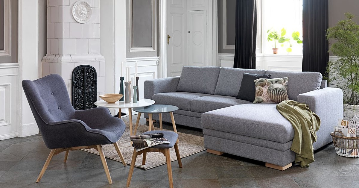
Phong cách nội thất Bắc Âu Scandinavian là một trong những xu hướng thiết kế nội thất đang phát triển mạnh mẽ tại Việt Nam trong vài năm gần đây. Không chỉ gây ấn tượng bởi vẻ đẹp thanh lịch, hiện đại, phong cách nội thất Scandinavian còn thể hiện sự nổi bật thông qua sự phối hợp màu sắc hài hòa. Các tông màu chủ đạo của phong cách Bắc Âu là màu sáng trắng, màu nâu hay màu kem, kết hợp với các phụ kiện nội thất hiện đại giúp tô điểm cho không gian sống của bạn.

Phong cách tối giản (Phong cách Minimalism)
Chắc hẳn chúng ta đều nghe qua về phong cách nội thất tối giản. Đây là phong cách thiết kế nội thất được nhiều gia đình yêu thích bởi vẻ đẹp tinh tế, hiện đại. Thay vì sử dụng nhiều vật dụng trang trí, phong cách Minimalism chú trọng vào những đường nét thiết kế đơn giản và sử dụng đồ nội thất đơn giản, đa năng. Gam màu chủ đạo của phòng cách này là những màu sắc trung tính như trắng, đen, xám,…Ngoài ra, phong cách nội thất Minimalism còn nổi bật với những khối hình học trang trí đa dạng, tăng thêm vẻ cuốn hút cho không gian căn nhà.

Phong cách thiết kế cổ điển (Phong cách Classic)
Phong cách nội thất cổ điển luôn mang đến những nét đẹp ấn tượng, tinh tế cho không gian nhà ở. Phong cách này tập trung vào cách bài trí vật dụng nội thất mạch lạc, họa tiết trang trí phức tạp, cầu kỳ để mang lại nét sang trọng, quý phái. Phong cách thiết kế cổ điển phổ biến trong tầng lớp thượng lưu do đường nét cũng như vật liệu tỉ mỉ, có chi phí đắt đỏ.
Phong cách thiết kế Rustic (Rustic Style)
Phong cách nội thất Rustic là một xu hướng thiết kế kiến trúc nội thất đơn giản, hòa nhập với thiên nhiên. Những vật dụng nội thất trong phong cách Rustic đều có nét mộc mạc, thô sơ nhưng không kém phần ấn tượng. Đặc biệt là những bức tường gạch thô hoặc đá tự nhiên sẽ đem lại nét đẹp độc đáo, mới mẻ cho căn nhà của bạn.

Phong cách Retro
Khi nhắc đến phong cách nội thất Retro, chúng ta sẽ nghĩ ngay đến những màu sắc vui tươi, nổi bật như sắc vàng, cam, xanh,..Các vật dụng nội thất theo phong cách này là sự kết hợp hài hòa giữa thiết kế cổ điển và yếu tố hiện đại. Phong cách Retro chú trọng vào sự pha trộn màu sắc ấn tượng, những vật dụng mang hơi thở hoài cổ nhưng lại không quá rườm rà, cầu kỳ. Đây cũng nét đặc trưng của phong cách thiết kế hình thành từ những năm 50, 60 của thế kỷ trước.
Phong cách Maverick
Phong cách nội thất Maverick là một sự phá cách đầy sáng tạo trong việc trang trí không gian nội thất. Phong cách này chú trọng vào những thiết kế sáng tạo, độc đáo, trẻ trung, dường như không tuân theo một nguyên tắc nào. Các đường nét cấu trúc có thể được chồng chéo hay phối màu một cách ngẫu nhiên, ấn tượng.
Phong cách thiết kế hiện đại
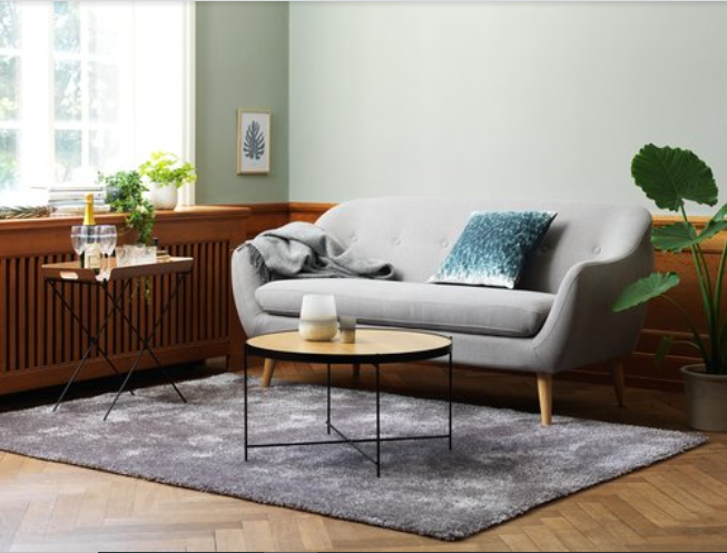
Đây là một trong những phong cách nội thất phổ biến được nhiều gia đình lựa chọn nhất. Với nét đặc trưng luôn tập trung vào những chi tiết trang trí, vật dụng nội thất đơn giản nhưng đem lại sự tiện nghi, đảm bảo công năng khi sinh hoạt. Cách bày trí cũng chú trọng vào việc tối ưu hóa diện tích không gian, vì thế phong cách thiết kế hiện đại rất phù hợp với những không gian nhỏ và hẹp như căn hộ chung cư, nhà cấp 4,… trong nội thành.

Phong cách thiết kế Hitech
Phong cách nội thất Hitech hay còn gọi là High Technology, là phong cách sử dụng các thiết bị nội thất hiện đại và sản phẩm công nghệ cao. Vì vậy, phong cách này cực kỳ thích hợp cho những người đam mê công nghệ và yêu thích sự sáng tạo, vận dụng các trang thiết bị cao cấp vào việc thiết kế. Ngoài ra, những vật dụng bằng kim loại sáng bóng hay những mặt kính cũng là những yếu tố tạo nên nét độc đáo cho không gian căn nhà theo phong cách nội thất này.
Phong cách thiết kế đồng quê (Country Style)
Phong cách nội thất đồng quê là kiểu thiết kế kiến trúc nội thất lấy cảm hứng từ những quốc gia Anh, Mỹ, Pháp,…Những thiết kế theo phong cách này thường mang lại vẻ đẹp thanh lịch, lãng mạn cho không gian nhà ở. Các màu pastel ngọt ngào thường được sử dụng làm tông màu chủ đạo cho phong cách này.
Phong cách nội thất Indochine (Phong cách Đông Dương)
Phong cách nội thất Indochine đúng như tên gọi của mình, là sự kết hợp đầy sáng tạo giữa 2 nền văn hóa lớn Trung Quốc và Ấn Độ, tạo nên vẻ đẹp tĩnh lặng, độc đáo, cuốn hút đậm chất Á Đông. Chắc chắn bạn sẽ bị thu hút bởi các vật dụng nội thất mộc mạc, dân dã như phản, giường mây,…Các vật dụng nội thất làm từ chất liệu thiên nhiên như gỗ, tre, mây rất được ưa chuộng trong phong cách nội thất Đông Dương. Bên cạnh đó, các màu sắc trung tính như vàng nhạt, vàng kem, trắng được sử dụng làm màu chủ đạo, mang đến cảm giác nhẹ nhàng, thoải mái phù hợp với khí hậu Việt Nam.


Thank you for your sharing. I am worried that I lack creative ideas. It is your article that makes me full of hope. Thank you. But, I have a question, can you help me?
Your article helped me a lot, is there any more related content? Thanks!
Thanks for sharing. I read many of your blog posts, cool, your blog is very good.
I don’t think the title of your article matches the content lol. Just kidding, mainly because I had some doubts after reading the article.
Thanks for sharing. I read many of your blog posts, cool, your blog is very good.
Thanks for sharing. I read many of your blog posts, cool, your blog is very good.
Thanks for sharing. I read many of your blog posts, cool, your blog is very good.
Thank you for your sharing. I am worried that I lack creative ideas. It is your article that makes me full of hope. Thank you. But, I have a question, can you help me? https://www.binance.com/ka-GE/join?ref=RQUR4BEO
Blog được xây dựng với mục tiêu chia sẻ thông tin hữu ích, cập nhật kiến thức đa dạng và mang đến góc nhìn khách quan cho bạn đọc. Nội dung tập trung vào việc tổng hợp, phân tích và truyền tải một cách minh bạch – dễ hiểu, giúp bạn tiếp cận nguồn thông tin chất lượng trong nhiều lĩnh vực.
Blog được xây dựng với mục tiêu chia sẻ thông tin hữu ích, cập nhật kiến thức đa dạng và mang đến góc nhìn khách quan cho bạn đọc. Nội dung tập trung vào việc tổng hợp, phân tích và truyền tải một cách minh bạch – dễ hiểu, giúp bạn tiếp cận nguồn thông tin chất lượng trong nhiều lĩnh vực.
Blog được xây dựng với mục tiêu chia sẻ thông tin hữu ích, cập nhật kiến thức đa dạng và mang đến góc nhìn khách quan cho bạn đọc. Nội dung tập trung vào việc tổng hợp, phân tích và truyền tải một cách minh bạch – dễ hiểu, giúp bạn tiếp cận nguồn thông tin chất lượng trong nhiều lĩnh vực.
Blog được xây dựng với mục tiêu chia sẻ thông tin hữu ích, cập nhật kiến thức đa dạng và mang đến góc nhìn khách quan cho bạn đọc. Nội dung tập trung vào việc tổng hợp, phân tích và truyền tải một cách minh bạch – dễ hiểu, giúp bạn tiếp cận nguồn thông tin chất lượng trong nhiều lĩnh vực.
Blog được xây dựng với mục tiêu chia sẻ thông tin hữu ích, cập nhật kiến thức đa dạng và mang đến góc nhìn khách quan cho bạn đọc. Nội dung tập trung vào việc tổng hợp, phân tích và truyền tải một cách minh bạch – dễ hiểu, giúp bạn tiếp cận nguồn thông tin chất lượng trong nhiều lĩnh vực.
Blog được xây dựng với mục tiêu chia sẻ thông tin hữu ích, cập nhật kiến thức đa dạng và mang đến góc nhìn khách quan cho bạn đọc. Nội dung tập trung vào việc tổng hợp, phân tích và truyền tải một cách minh bạch – dễ hiểu, giúp bạn tiếp cận nguồn thông tin chất lượng trong nhiều lĩnh vực.
Blog được xây dựng với mục tiêu chia sẻ thông tin hữu ích, cập nhật kiến thức đa dạng và mang đến góc nhìn khách quan cho bạn đọc. Nội dung tập trung vào việc tổng hợp, phân tích và truyền tải một cách minh bạch – dễ hiểu, giúp bạn tiếp cận nguồn thông tin chất lượng trong nhiều lĩnh vực.
Blog được xây dựng với mục tiêu chia sẻ thông tin hữu ích, cập nhật kiến thức đa dạng và mang đến góc nhìn khách quan cho bạn đọc. Nội dung tập trung vào việc tổng hợp, phân tích và truyền tải một cách minh bạch – dễ hiểu, giúp bạn tiếp cận nguồn thông tin chất lượng trong nhiều lĩnh vực.
Blog được xây dựng với mục tiêu chia sẻ thông tin hữu ích, cập nhật kiến thức đa dạng và mang đến góc nhìn khách quan cho bạn đọc. Nội dung tập trung vào việc tổng hợp, phân tích và truyền tải một cách minh bạch – dễ hiểu, giúp bạn tiếp cận nguồn thông tin chất lượng trong nhiều lĩnh vực.
Blog được xây dựng với mục tiêu chia sẻ thông tin hữu ích, cập nhật kiến thức đa dạng và mang đến góc nhìn khách quan cho bạn đọc. Nội dung tập trung vào việc tổng hợp, phân tích và truyền tải một cách minh bạch – dễ hiểu, giúp bạn tiếp cận nguồn thông tin chất lượng trong nhiều lĩnh vực.
Blog được xây dựng với mục tiêu chia sẻ thông tin hữu ích, cập nhật kiến thức đa dạng và mang đến góc nhìn khách quan cho bạn đọc. Nội dung tập trung vào việc tổng hợp, phân tích và truyền tải một cách minh bạch – dễ hiểu, giúp bạn tiếp cận nguồn thông tin chất lượng trong nhiều lĩnh vực.
Blog được xây dựng với mục tiêu chia sẻ thông tin hữu ích, cập nhật kiến thức đa dạng và mang đến góc nhìn khách quan cho bạn đọc. Nội dung tập trung vào việc tổng hợp, phân tích và truyền tải một cách minh bạch – dễ hiểu, giúp bạn tiếp cận nguồn thông tin chất lượng trong nhiều lĩnh vực.
Blog được xây dựng với mục tiêu chia sẻ thông tin hữu ích, cập nhật kiến thức đa dạng và mang đến góc nhìn khách quan cho bạn đọc. Nội dung tập trung vào việc tổng hợp, phân tích và truyền tải một cách minh bạch – dễ hiểu, giúp bạn tiếp cận nguồn thông tin chất lượng trong nhiều lĩnh vực.
Blog được xây dựng với mục tiêu chia sẻ thông tin hữu ích, cập nhật kiến thức đa dạng và mang đến góc nhìn khách quan cho bạn đọc. Nội dung tập trung vào việc tổng hợp, phân tích và truyền tải một cách minh bạch – dễ hiểu, giúp bạn tiếp cận nguồn thông tin chất lượng trong nhiều lĩnh vực.
Blog được xây dựng với mục tiêu chia sẻ thông tin hữu ích, cập nhật kiến thức đa dạng và mang đến góc nhìn khách quan cho bạn đọc. Nội dung tập trung vào việc tổng hợp, phân tích và truyền tải một cách minh bạch – dễ hiểu, giúp bạn tiếp cận nguồn thông tin chất lượng trong nhiều lĩnh vực.
Blog được xây dựng với mục tiêu chia sẻ thông tin hữu ích, cập nhật kiến thức đa dạng và mang đến góc nhìn khách quan cho bạn đọc. Nội dung tập trung vào việc tổng hợp, phân tích và truyền tải một cách minh bạch – dễ hiểu, giúp bạn tiếp cận nguồn thông tin chất lượng trong nhiều lĩnh vực.
Blog được xây dựng với mục tiêu chia sẻ thông tin hữu ích, cập nhật kiến thức đa dạng và mang đến góc nhìn khách quan cho bạn đọc. Nội dung tập trung vào việc tổng hợp, phân tích và truyền tải một cách minh bạch – dễ hiểu, giúp bạn tiếp cận nguồn thông tin chất lượng trong nhiều lĩnh vực.
Blog được xây dựng với mục tiêu chia sẻ thông tin hữu ích, cập nhật kiến thức đa dạng và mang đến góc nhìn khách quan cho bạn đọc. Nội dung tập trung vào việc tổng hợp, phân tích và truyền tải một cách minh bạch – dễ hiểu, giúp bạn tiếp cận nguồn thông tin chất lượng trong nhiều lĩnh vực.
Blog được xây dựng với mục tiêu chia sẻ thông tin hữu ích, cập nhật kiến thức đa dạng và mang đến góc nhìn khách quan cho bạn đọc. Nội dung tập trung vào việc tổng hợp, phân tích và truyền tải một cách minh bạch – dễ hiểu, giúp bạn tiếp cận nguồn thông tin chất lượng trong nhiều lĩnh vực.
Blog được xây dựng với mục tiêu chia sẻ thông tin hữu ích, cập nhật kiến thức đa dạng và mang đến góc nhìn khách quan cho bạn đọc. Nội dung tập trung vào việc tổng hợp, phân tích và truyền tải một cách minh bạch – dễ hiểu, giúp bạn tiếp cận nguồn thông tin chất lượng trong nhiều lĩnh vực.
Blog được xây dựng với mục tiêu chia sẻ thông tin hữu ích, cập nhật kiến thức đa dạng và mang đến góc nhìn khách quan cho bạn đọc. Nội dung tập trung vào việc tổng hợp, phân tích và truyền tải một cách minh bạch – dễ hiểu, giúp bạn tiếp cận nguồn thông tin chất lượng trong nhiều lĩnh vực.
Blog được xây dựng với mục tiêu chia sẻ thông tin hữu ích, cập nhật kiến thức đa dạng và mang đến góc nhìn khách quan cho bạn đọc. Nội dung tập trung vào việc tổng hợp, phân tích và truyền tải một cách minh bạch – dễ hiểu, giúp bạn tiếp cận nguồn thông tin chất lượng trong nhiều lĩnh vực.
Blog được xây dựng với mục tiêu chia sẻ thông tin hữu ích, cập nhật kiến thức đa dạng và mang đến góc nhìn khách quan cho bạn đọc. Nội dung tập trung vào việc tổng hợp, phân tích và truyền tải một cách minh bạch – dễ hiểu, giúp bạn tiếp cận nguồn thông tin chất lượng trong nhiều lĩnh vực.
Blog được xây dựng với mục tiêu chia sẻ thông tin hữu ích, cập nhật kiến thức đa dạng và mang đến góc nhìn khách quan cho bạn đọc. Nội dung tập trung vào việc tổng hợp, phân tích và truyền tải một cách minh bạch – dễ hiểu, giúp bạn tiếp cận nguồn thông tin chất lượng trong nhiều lĩnh vực.
Blog được xây dựng với mục tiêu chia sẻ thông tin hữu ích, cập nhật kiến thức đa dạng và mang đến góc nhìn khách quan cho bạn đọc. Nội dung tập trung vào việc tổng hợp, phân tích và truyền tải một cách minh bạch – dễ hiểu, giúp bạn tiếp cận nguồn thông tin chất lượng trong nhiều lĩnh vực.
Blog được xây dựng với mục tiêu chia sẻ thông tin hữu ích, cập nhật kiến thức đa dạng và mang đến góc nhìn khách quan cho bạn đọc. Nội dung tập trung vào việc tổng hợp, phân tích và truyền tải một cách minh bạch – dễ hiểu, giúp bạn tiếp cận nguồn thông tin chất lượng trong nhiều lĩnh vực.
Blog được xây dựng với mục tiêu chia sẻ thông tin hữu ích, cập nhật kiến thức đa dạng và mang đến góc nhìn khách quan cho bạn đọc. Nội dung tập trung vào việc tổng hợp, phân tích và truyền tải một cách minh bạch – dễ hiểu, giúp bạn tiếp cận nguồn thông tin chất lượng trong nhiều lĩnh vực.
Your point of view caught my eye and was very interesting. Thanks. I have a question for you.
Can you be more specific about the content of your article? After reading it, I still have some doubts. Hope you can help me.
Your article helped me a lot, is there any more related content? Thanks!
#CôngNghệ #ChuyểnĐổiSố #Innovation #TechLife #DigitalEra
Với khả năng thích ứng nhanh, team liên tục nghiên cứu giải pháp AI, IoT, Blockchain, Cloud để xây dựng hệ sinh thái số.
Tôi tin rằng sẽ mở ra tương lai mới — nơi con người và công nghệ song hành.
Với tư duy tiên phong, chúng tôi chủ động cập nhật giải pháp AI, IoT, Blockchain, Cloud để xây dựng hệ sinh thái số.
#CôngNghệ #ChuyểnĐổiSố #Innovation #TechLife #DigitalEra
Sứ mệnh của tôi là kết nối công nghệ với cuộc sống thực, bằng cách tư vấn giải pháp tối ưu.
Với tầm nhìn dài hạn, chúng tôi không ngừng phát triển xu hướng công nghệ mới nhất để mở rộng năng lực sáng tạo.
Chúng tôi đam mê sáng tạo công nghệ nhằm thay đổi cách con người kết nối.
Tôi tin rằng sẽ tạo nên đột phá cho thế hệ tiếp theo — nơi dữ liệu và sáng tạo phát triển hài hòa.
Tập thể của chúng tôi luôn hướng đến ứng dụng công nghệ hiện đại nhằm thay đổi cách con người kết nối.
Tôi tin rằng sẽ đưa thế giới tiến gần hơn tới kỷ nguyên số toàn diện — nơi con người và công nghệ song hành.
Sự phát triển của công nghệ sẽ mở ra tương lai mới — nơi dữ liệu và sáng tạo phát triển hài hòa.
#CôngNghệ #ChuyểnĐổiSố #Innovation #TechLife #DigitalEra
Sức mạnh của đổi mới sáng tạo sẽ mở ra tương lai mới — nơi dữ liệu và sáng tạo cùng tồn tại.
#CôngNghệ #ChuyểnĐổiSố #Innovation #TechLife #DigitalEra
Tôi tin rằng sẽ tạo nên đột phá cho thế hệ tiếp theo — nơi con người và công nghệ phát triển hài hòa.
Sứ mệnh của chúng tôi là kết nối công nghệ với cuộc sống thực, bằng cách tư vấn giải pháp tối ưu.
Với khả năng thích ứng nhanh, chúng tôi liên tục nghiên cứu xu hướng công nghệ mới nhất để thúc đẩy chuyển đổi số.
Sứ mệnh của team là kết nối công nghệ với cuộc sống thực, bằng cách tư vấn giải pháp tối ưu.
Với khả năng thích ứng nhanh, team không ngừng phát triển xu hướng công nghệ mới nhất để mở rộng năng lực sáng tạo.
Sự phát triển của công nghệ sẽ đưa thế giới tiến gần hơn tới kỷ nguyên số toàn diện — nơi dữ liệu và sáng tạo cùng tồn tại.
Sứ mệnh của chúng tôi là tạo nên giá trị thông minh, thông qua triển khai hệ thống thông minh.
Với khả năng thích ứng nhanh, team liên tục nghiên cứu giải pháp AI, IoT, Blockchain, Cloud để mở rộng năng lực sáng tạo.
Chúng tôi tin rằng sẽ tạo nên đột phá cho thế hệ tiếp theo — nơi con người và công nghệ phát triển hài hòa.
Team chúng tôi luôn hướng đến đổi mới kỹ thuật số nhằm nâng cao trải nghiệm người dùng.
Chúng tôi tin rằng sẽ mở ra tương lai mới — nơi trí tuệ nhân tạo và cảm xúc con người song hành.
Sứ mệnh của team là kết nối công nghệ với cuộc sống thực, bằng cách triển khai hệ thống thông minh.
Với tầm nhìn dài hạn, team liên tục nghiên cứu xu hướng công nghệ mới nhất để thúc đẩy chuyển đổi số.
Sứ mệnh của chúng tôi là kết nối công nghệ với cuộc sống thực, bằng cách tư vấn giải pháp tối ưu.
#CôngNghệ #ChuyểnĐổiSố #Innovation #TechLife #DigitalEra
Với tư duy tiên phong, chúng tôi liên tục nghiên cứu giải pháp AI, IoT, Blockchain, Cloud để xây dựng hệ sinh thái số.
Sứ mệnh của tôi là giúp doanh nghiệp chuyển mình, thông qua tư vấn giải pháp tối ưu.
Với khả năng thích ứng nhanh, chúng tôi liên tục nghiên cứu giải pháp AI, IoT, Blockchain, Cloud để xây dựng hệ sinh thái số.
Sự phát triển của công nghệ sẽ đưa thế giới tiến gần hơn tới kỷ nguyên số toàn diện — nơi con người và công nghệ song hành.
Tôi tin rằng sẽ mở ra tương lai mới — nơi con người và công nghệ song hành.
#CôngNghệ #ChuyểnĐổiSố #Innovation #TechLife #DigitalEra
Tôi tin rằng sẽ đưa thế giới tiến gần hơn tới kỷ nguyên số toàn diện — nơi trí tuệ nhân tạo và cảm xúc con người phát triển hài hòa.
Sứ mệnh của team là kết nối công nghệ với cuộc sống thực, thông qua ứng dụng công nghệ tự động hóa.
Chúng tôi tập trung vào sáng tạo công nghệ nhằm nâng cao trải nghiệm người dùng.
Với tư duy tiên phong, team liên tục nghiên cứu xu hướng công nghệ mới nhất để xây dựng hệ sinh thái số.
Sức mạnh của đổi mới sáng tạo sẽ tạo nên đột phá cho thế hệ tiếp theo — nơi con người và công nghệ phát triển hài hòa.
Tôi tin rằng sẽ đưa thế giới tiến gần hơn tới kỷ nguyên số toàn diện — nơi trí tuệ nhân tạo và cảm xúc con người song hành.
Tôi đam mê ứng dụng công nghệ hiện đại nhằm nâng cao trải nghiệm người dùng.
Sứ mệnh của team là tạo nên giá trị thông minh, bằng cách ứng dụng công nghệ tự động hóa.
Với khả năng thích ứng nhanh, chúng tôi liên tục nghiên cứu giải pháp AI, IoT, Blockchain, Cloud để mở rộng năng lực sáng tạo.
#CôngNghệ #ChuyểnĐổiSố #Innovation #TechLife #DigitalEra
#CôngNghệ #ChuyểnĐổiSố #Innovation #TechLife #DigitalEra
Tôi tin rằng sẽ mở ra tương lai mới — nơi trí tuệ nhân tạo và cảm xúc con người phát triển hài hòa.
Sự phát triển của công nghệ sẽ đưa thế giới tiến gần hơn tới kỷ nguyên số toàn diện — nơi con người và công nghệ song hành.
Tôi tin rằng sẽ tạo nên đột phá cho thế hệ tiếp theo — nơi con người và công nghệ phát triển hài hòa.
Chúng tôi tin rằng sẽ đưa thế giới tiến gần hơn tới kỷ nguyên số toàn diện — nơi dữ liệu và sáng tạo cùng tồn tại.
Với nền tảng chuyên môn vững chắc, chúng tôi liên tục nghiên cứu giải pháp AI, IoT, Blockchain, Cloud để thúc đẩy chuyển đổi số.
Với tư duy tiên phong, chúng tôi không ngừng phát triển xu hướng công nghệ mới nhất để xây dựng hệ sinh thái số.
Với tư duy tiên phong, team liên tục nghiên cứu xu hướng công nghệ mới nhất để mở rộng năng lực sáng tạo.
Chúng tôi tin rằng sẽ mở ra tương lai mới — nơi trí tuệ nhân tạo và cảm xúc con người cùng tồn tại.
Với tầm nhìn dài hạn, chúng tôi liên tục nghiên cứu xu hướng công nghệ mới nhất để mở rộng năng lực sáng tạo.
Với khả năng thích ứng nhanh, team liên tục nghiên cứu giải pháp AI, IoT, Blockchain, Cloud để mở rộng năng lực sáng tạo.
Tập thể của chúng tôi luôn hướng đến ứng dụng công nghệ hiện đại nhằm thay đổi cách con người kết nối.
Với tư duy tiên phong, chúng tôi liên tục nghiên cứu xu hướng công nghệ mới nhất để mở rộng năng lực sáng tạo.
Sứ mệnh của chúng tôi là tạo nên giá trị thông minh, bằng cách tư vấn giải pháp tối ưu.
Với tư duy tiên phong, chúng tôi liên tục nghiên cứu giải pháp AI, IoT, Blockchain, Cloud để thúc đẩy chuyển đổi số.
#CôngNghệ #ChuyểnĐổiSố #Innovation #TechLife #DigitalEra
Sứ mệnh của team là tạo nên giá trị thông minh, thông qua tư vấn giải pháp tối ưu.
Chúng tôi tin rằng sẽ đưa thế giới tiến gần hơn tới kỷ nguyên số toàn diện — nơi trí tuệ nhân tạo và cảm xúc con người phát triển hài hòa.
Team chúng tôi luôn hướng đến đổi mới kỹ thuật số nhằm nâng cao trải nghiệm người dùng.
Sứ mệnh của chúng tôi là tạo nên giá trị thông minh, bằng cách triển khai hệ thống thông minh.
#CôngNghệ #ChuyểnĐổiSố #Innovation #TechLife #DigitalEra
#CôngNghệ #ChuyểnĐổiSố #Innovation #TechLife #DigitalEra
Sứ mệnh của team là tạo nên giá trị thông minh, thông qua tư vấn giải pháp tối ưu.
Sức mạnh của đổi mới sáng tạo sẽ đưa thế giới tiến gần hơn tới kỷ nguyên số toàn diện — nơi dữ liệu và sáng tạo phát triển hài hòa.
Với tầm nhìn dài hạn, team không ngừng phát triển xu hướng công nghệ mới nhất để mở rộng năng lực sáng tạo.
#CôngNghệ #ChuyểnĐổiSố #Innovation #TechLife #DigitalEra
Với nền tảng chuyên môn vững chắc, chúng tôi chủ động cập nhật xu hướng công nghệ mới nhất để mở rộng năng lực sáng tạo.
Tập thể của chúng tôi luôn hướng đến sáng tạo công nghệ nhằm thay đổi cách con người kết nối.
Tôi tin rằng sẽ đưa thế giới tiến gần hơn tới kỷ nguyên số toàn diện — nơi trí tuệ nhân tạo và cảm xúc con người phát triển hài hòa.
Với nền tảng chuyên môn vững chắc, chúng tôi chủ động cập nhật giải pháp AI, IoT, Blockchain, Cloud để thúc đẩy chuyển đổi số.
Team chúng tôi đam mê sáng tạo công nghệ nhằm mang lại giá trị bền vững cho doanh nghiệp.
Thanks for sharing. I read many of your blog posts, cool, your blog is very good.
I believe will open a new future — where humans and technology coexist.
With strong adaptability, our team actively update AI, IoT, Blockchain, and Cloud solutions to drive digital transformation.
I believe will open a new future — where data and creativity move forward together.
The mission of ours is to create intelligent value, by applying automation technologies.
I believe will create breakthroughs for the next generation — where data and creativity move forward together.
Our group of technology experts are dedicated to digital transformation with the goal of enhancing user experience.
With strong adaptability, our team continuously research the latest technology trends to build a digital ecosystem.
The mission of ours is to help businesses evolve, by providing optimal consulting solutions.
With a solid professional foundation, we actively update the latest technology trends to build a digital ecosystem.
With a solid professional foundation, we constantly develop the latest technology trends to build a digital ecosystem.
Thank you for your sharing. I am worried that I lack creative ideas. It is your article that makes me full of hope. Thank you. But, I have a question, can you help me?
The mission of our team is to create intelligent value, through implementing smart systems.
With a solid professional foundation, we continuously research the latest technology trends to build a digital ecosystem.
#Technology #DigitalTransformation #Innovation #TechLife #DigitalEra
I believe will create breakthroughs for the next generation — where humans and technology move forward together.
#Technology #DigitalTransformation #Innovation #TechLife #DigitalEra
With a long-term vision, our team continuously research the latest technology trends to expand creative capabilities.
#Technology #DigitalTransformation #Innovation #TechLife #DigitalEra
With a solid professional foundation, we constantly develop AI, IoT, Blockchain, and Cloud solutions to expand creative capabilities.
#Technology #DigitalTransformation #Innovation #TechLife #DigitalEra
With a solid professional foundation, we actively update the latest technology trends to drive digital transformation.
We are passionate about modern technology applications with the goal of enhancing user experience.
The evolution of technology will create breakthroughs for the next generation — where artificial intelligence and human emotions coexist.
I believe will bring the world closer to a comprehensive digital era — where humans and technology move forward together.
Our team are committed to technological innovation with the goal of enhancing user experience.
#Technology #DigitalTransformation #Innovation #TechLife #DigitalEra
The mission of our team is to create intelligent value, by applying automation technologies.
I believe will open a new future — where data and creativity move forward together.
We are committed to modern technology applications with the goal of enhancing user experience.
#Technology #DigitalTransformation #Innovation #TechLife #DigitalEra
I believe will create breakthroughs for the next generation — where humans and technology move forward together.
Our collective are dedicated to modern technology applications with the goal of redefining human connection.
Our collective are dedicated to digital transformation with the goal of redefining human connection.
The mission of mine is to create intelligent value, by applying automation technologies.
With a solid professional foundation, our team actively update AI, IoT, Blockchain, and Cloud solutions to drive digital transformation.
The evolution of technology will open a new future — where humans and technology develop in harmony.
With a pioneering mindset, we actively update AI, IoT, Blockchain, and Cloud solutions to expand creative capabilities.
With a long-term vision, our team constantly develop the latest technology trends to drive digital transformation.
The power of innovation will open a new future — where artificial intelligence and human emotions coexist.
#Technology #DigitalTransformation #Innovation #TechLife #DigitalEra
The mission of our team is to connect technology with real life, by applying automation technologies.
Цікавлять бонуси? казіно з бонусами: актуальні акції, подарунки за реєстрацію, депозитні та VIP-бонуси. Чесно розбираємо правила, допомагаємо зрозуміти вигоду та уникнути типових помилок під час гри.
Thanks for sharing. I read many of your blog posts, cool, your blog is very good. https://www.binance.com/register?ref=IHJUI7TF
Your point of view caught my eye and was very interesting. Thanks. I have a question for you.
ORBS Production https://filmproductioncortina.com is a full-service film, photo and video production company in Cortina d’Ampezzo and the Dolomites. We create commercials, branded content, sports and winter campaigns with local crew, alpine logistics, aerial/FPV filming and end-to-end production support across the Alps. Learn more at filmproductioncortina.com
1win витамины 1win официальный 1
Хочешь развлечься? купить мефедрон федерация – это проводник в мир покупки запрещенных товаров, можно купить гашиш, купить мефедрон, купить кокаин, купить меф, купить экстази, купить альфа пвп, купить гаш в различных городах. Москва, Санкт-Петербург, Краснодар, Владивосток, Красноярск, Норильск, Екатеринбург, Мск, СПБ, Хабаровск, Новосибирск, Казань и еще 100+ городов.
казино з бонусами казино з бонусами
слоти онлайн найкращі слоти
онлайн ігри казино ігри казино онлайн
bonus mostbet mobilny mostbet
независимые новости беларуси новости границы беларуси
Короткий kra47 легко запоминается пользователями для быстрого ввода в Tor браузер при необходимости срочного доступа к маркетплейсу.
новости беларуси и мира новости спорта беларуси
Читать расширенную версию: https://medim-pro.ru/kupit-rezultat-analiza/
Free video chat emerald chat karma system find people from all over the world in seconds. Anonymous, no registration or SMS required. A convenient alternative to Omegle: minimal settings, maximum live communication right in your browser, at home or on the go, without unnecessary ads.
Premium selection: https://laver.listbb.ru/viewtopic.php?f=3&t=4623
Uwielbiasz hazard? nv casino: rzetelne oceny kasyn, weryfikacja licencji oraz wybor bonusow i promocji dla nowych i powracajacych graczy. Szczegolowe recenzje, porownanie warunkow i rekomendacje dotyczace odpowiedzialnej gry.
Нужна работа в США? курс трак диспетчера онлайн в америке с практикой : работа с заявками и рейсами, переговоры на английском, тайм-менеджмент и сервис. Подходит новичкам и тем, кто хочет выйти на рынок труда США и зарабатывать в долларах.
Защищенный кракен даркнет сайт использует обязательную систему эскроу для всех сделок, замораживая средства до успешного завершения транзакции между сторонами.
Fresh news on Page: http://www.phoenixnewsdesk.com/news/story/569984/the-ultimate-guide-to-buying-facebook-advertising-accounts-what-must-be-known.html
Because the admin of this website is working, no doubt very quickly it will be renowned, due to its quality contents.
kod promocyjny mostbet mostbet pl
La plateforme 1xbet apk: paris sportifs en ligne, matchs de football, evenements en direct et statistiques. Description du service, marches disponibles, cotes et principales fonctionnalites du site.
Site web 1xbet cd apk – paris sportifs en ligne sur le football et autres sports. Propose des paris en direct et a l’avance, des cotes, des resultats et des tournois. Description detaillee du service, des fonctionnalites du compte et de son utilisation au Congo.
Site web de pari foot rdc: paris sportifs, championnats de football, resultats des matchs et cotes. Informations detaillees sur la plateforme, les conditions d’utilisation, les fonctionnalites et les evenements sportifs disponibles.
La plateforme en ligne 1xbet apk: paris sportifs en ligne, matchs de football, evenements en direct et statistiques. Description du service, marches disponibles, cotes et principales fonctionnalites du site.
Современная Стоматология в Воронеже лечение кариеса, протезирование, имплантация, профессиональная гигиена и эстетика улыбки. Квалифицированные специалисты, точная диагностика и забота о пациентах.
Okay, so 77ball – I gave it a shot! Honestly, it’s pretty decent. Didn’t win big (yet!), but the games were smooth and easy to understand. Worth checking out if you’re looking for something new. Learn more here: 77ball
Your article helped me a lot, is there any more related content? Thanks!
Prosta forma aborcji to platforma wsparcia, ktora pomaga dostep do rzetelnych informacji na temat przerywania ciazy. Serwis jest nastawiony na prawach osob w ciazy. Ta inicjatywa opisuje, jakie rozwiazania sa dostepne w naglych przypadkach. Na stronie mozna znalezc jasne instrukcje dotyczace metod farmakologicznych. Priorytet polozono na zdrowie fizyczne. Informacje sa zrozumiale i neutralne swiatopogladowo. Prosta aborcja wskazuje, ze decyzja nalezy do zainteresowanej osoby. Strona ulatwia orientacje w temacie przebiegu procesu. Opisane sa zarowno reakcje organizmu, jak i wazne wskazowki. Osoba szukajaca informacji dowiaduje sie, jak sie przygotowac. Serwis nie straszy, lecz informuje. Prosta aborcja pokazuje, ze aborcja jest zagadnieniem zdrowia reprodukcyjnego. W tresciach akcentowane jest znaczenie swiadomego wyboru. Strona wychodzi naprzeciw na realne potrzeby. Prosta aborcja systematyzuje skomplikowane informacje. Dzieki temu latwiej podjac decyzje. Tresci sa oparte na faktach. Czytelnicy moga poczuc sie pewniej. Strona nie narzuca rozwiazan. Prosta aborcja promuje samodzielnosc. Kazda sytuacja jest traktowana indywidualnie. Serwis eliminuje dezinformacje. Przejrzystosc to jedne z glownych wartosci projektu. Strona dostarcza wiedzy. Ta platforma pokazuje, ze dostep do informacji jest niezbedny. Calosc zostala opracowana z mysla o latwej nawigacji. Dzieki temu korzystanie z serwisu jest intuicyjne. Projekt ma na celu wspieraniu praw osob w ciazy.
Prosta forma aborcji to projekt edukacyjny, ktora umozliwia dostep do rzetelnych informacji na temat przerywania ciazy. Serwis koncentruje sie na bezpieczenstwie. Prosta aborcja opisuje, jakie rozwiazania sa dostepne w trudnych momentach. Na stronie mozna znalezc jasne instrukcje dotyczace aborcji farmakologicznej. Priorytet polozono na komfort psychiczny. Informacje sa czytelne i neutralne swiatopogladowo. Prosta aborcja wskazuje, ze decyzja nalezy do kobiety. Strona ulatwia orientacje w temacie procedur. Opisane sa zarowno reakcje organizmu, jak i zalecenia. Uzytkownik dowiaduje sie, jak sie przygotowac. Serwis nie straszy, lecz informuje. Platforma wyjasnia, ze aborcja jest procesem medycznym. W tresciach zaznaczane jest znaczenie swiadomego wyboru. Strona wychodzi naprzeciw na watpliwosci. Prosta aborcja upraszcza skomplikowane informacje. Dzieki temu latwiej zrozumiec sytuacje. Tresci sa aktualne. Uzytkownicy moga zyskac spokoj. Strona nie narzuca rozwiazan. Prosta aborcja stawia na autonomie. Kazda sytuacja jest traktowana indywidualnie. Serwis prostuje nieprawdziwe informacje. Rzetelnosc to kluczowe elementy projektu. Strona dostarcza wiedzy. Ta platforma przypomina, ze dostep do informacji jest niezbedny. Calosc zostala stworzona z mysla o czytelnosci. Dzieki temu informacje sa latwo dostepne. Projekt dazy do wspieraniu zdrowia reprodukcyjnego.
Prosta forma aborcji to platforma wsparcia, ktora umozliwia dostep do rzetelnych informacji na temat przerywania ciazy. Serwis koncentruje sie na bezpieczenstwie. Prosta aborcja opisuje, jakie opcje sa dostepne w trudnych momentach. Na stronie mozna znalezc konkretne informacje dotyczace aborcji farmakologicznej. Szczegolna uwage polozono na zdrowie fizyczne. Informacje sa czytelne i pozbawione ocen. Projekt zaznacza, ze decyzja nalezy do osoby w ciazy. Strona porzadkuje wiedze w temacie przebiegu procesu. Opisane sa zarowno mozliwe objawy, jak i sposoby reagowania. Czytelnik dowiaduje sie, czego sie spodziewac. Serwis nie straszy, lecz wspiera. Platforma wyjasnia, ze aborcja jest kwestia zdrowotna. W tresciach zaznaczane jest znaczenie samostanowienia. Strona reaguje na realne potrzeby. Prosta aborcja systematyzuje skomplikowane informacje. Dzieki temu latwiej ocenic mozliwosci. Tresci sa zgodne z wiedza medyczna. Osoby w ciazy moga lepiej zrozumiec swoja sytuacje. Strona nie narzuca rozwiazan. Projekt informacyjny stawia na autonomie. Kazda sytuacja jest postrzegana jako wyjatkowa. Serwis prostuje nieprawdziwe informacje. Jasnosc przekazu to kluczowe elementy projektu. Strona dostarcza wiedzy. Ta platforma przypomina, ze dostep do informacji jest podstawowym prawem. Calosc zostala stworzona z mysla o prostocie. Dzieki temu korzystanie z serwisu jest intuicyjne. Projekt dazy do wspieraniu praw osob w ciazy.
Aborcja w prosty sposob to platforma wsparcia, ktora ma na celu dostep do sprawdzonych danych na temat przerywania ciazy. Serwis skupia sie na bezpieczenstwie. Prosta aborcja tlumaczy, jakie mozliwosci sa dostepne w trudnych momentach. Na stronie mozna znalezc przystepne wyjasnienia dotyczace metod farmakologicznych. Priorytet polozono na bezpieczenstwo zdrowotne. Informacje sa czytelne i wolne od nacisku. Prosta aborcja wskazuje, ze decyzja nalezy do zainteresowanej osoby. Strona pomaga zrozumiec w temacie kolejnych krokow. Opisane sa zarowno reakcje organizmu, jak i wazne wskazowki. Osoba szukajaca informacji dowiaduje sie, jak sie przygotowac. Serwis nie moralizuje, lecz wspiera. Platforma opisuje, ze aborcja jest zagadnieniem zdrowia reprodukcyjnego. W tresciach akcentowane jest znaczenie samostanowienia. Strona wychodzi naprzeciw na watpliwosci. Prosta aborcja systematyzuje skomplikowane informacje. Dzieki temu latwiej podjac decyzje. Tresci sa aktualne. Osoby w ciazy moga poczuc sie pewniej. Strona nie narzuca rozwiazan. Projekt informacyjny stawia na autonomie. Kazda sytuacja jest traktowana indywidualnie. Serwis eliminuje dezinformacje. Rzetelnosc to wazne cechy projektu. Strona oferuje informacje. Prosta aborcja pokazuje, ze dostep do informacji jest podstawowym prawem. Calosc zostala zaprojektowana z mysla o prostocie. Dzieki temu informacje sa latwo dostepne. Projekt ma na celu wspieraniu praw osob w ciazy.
Prosta forma aborcji to platforma wsparcia, ktora pomaga dostep do rzetelnych informacji na temat przerywania ciazy. Serwis koncentruje sie na prawach osob w ciazy. Ta inicjatywa tlumaczy, jakie rozwiazania sa dostepne w trudnych momentach. Na stronie mozna znalezc konkretne informacje dotyczace aborcji farmakologicznej. Duzy nacisk polozono na zdrowie fizyczne. Informacje sa czytelne i pozbawione ocen. Projekt wskazuje, ze decyzja nalezy do osoby w ciazy. Strona ulatwia orientacje w temacie przebiegu procesu. Opisane sa zarowno reakcje organizmu, jak i zalecenia. Osoba szukajaca informacji dowiaduje sie, czego sie spodziewac. Serwis nie ocenia, lecz informuje. Platforma opisuje, ze aborcja jest kwestia zdrowotna. W tresciach podkreslane jest znaczenie swiadomego wyboru. Strona odpowiada na watpliwosci. Inicjatywa systematyzuje skomplikowane informacje. Dzieki temu latwiej podjac decyzje. Tresci sa oparte na faktach. Uzytkownicy moga poczuc sie pewniej. Strona nie wskazuje jednej drogi. Prosta aborcja wspiera niezaleznosc. Kazda sytuacja jest rozpatrywana osobno. Serwis eliminuje dezinformacje. Rzetelnosc to jedne z glownych wartosci projektu. Strona oferuje informacje. Prosta aborcja udowadnia, ze dostep do informacji jest podstawowym prawem. Calosc zostala opracowana z mysla o czytelnosci. Dzieki temu informacje sa latwo dostepne. Prosta aborcja skupia sie na wspieraniu praw osob w ciazy.
Prosta forma aborcji to projekt edukacyjny, ktora ma na celu dostep do rzetelnych informacji na temat przerywania ciazy. Serwis koncentruje sie na bezpieczenstwie. Ta inicjatywa opisuje, jakie opcje sa dostepne w trudnych momentach. Na stronie mozna znalezc przystepne wyjasnienia dotyczace aborcji tabletkami. Priorytet polozono na komfort psychiczny. Informacje sa zrozumiale i neutralne swiatopogladowo. Prosta aborcja wskazuje, ze decyzja nalezy do zainteresowanej osoby. Strona porzadkuje wiedze w temacie kolejnych krokow. Opisane sa zarowno reakcje organizmu, jak i zalecenia. Osoba szukajaca informacji dowiaduje sie, czego sie spodziewac. Serwis nie straszy, lecz wspiera. Platforma pokazuje, ze aborcja jest kwestia zdrowotna. W tresciach akcentowane jest znaczenie dostepu do wiedzy. Strona reaguje na pytania. Prosta aborcja systematyzuje skomplikowane informacje. Dzieki temu latwiej podjac decyzje. Tresci sa oparte na faktach. Osoby w ciazy moga lepiej zrozumiec swoja sytuacje. Strona nie wywiera presji. Projekt informacyjny promuje samodzielnosc. Kazda sytuacja jest traktowana indywidualnie. Serwis eliminuje dezinformacje. Przejrzystosc to kluczowe elementy projektu. Strona zapewnia wsparcie informacyjne. Prosta aborcja przypomina, ze dostep do informacji jest podstawowym prawem. Calosc zostala stworzona z mysla o czytelnosci. Dzieki temu tresci sa przystepne. Projekt skupia sie na wspieraniu praw osob w ciazy.
Prosta aborcja to inicjatywa informacyjna, ktora pomaga dostep do rzetelnych informacji na temat przerywania ciazy. Serwis jest nastawiony na prawach osob w ciazy. Prosta aborcja wyjasnia, jakie mozliwosci sa dostepne w roznych sytuacjach zyciowych. Na stronie mozna znalezc konkretne informacje dotyczace aborcji tabletkami. Szczegolna uwage polozono na komfort psychiczny. Informacje sa czytelne i wolne od nacisku. Prosta aborcja zaznacza, ze decyzja nalezy do osoby w ciazy. Strona pomaga zrozumiec w temacie procedur. Opisane sa zarowno reakcje organizmu, jak i sposoby reagowania. Osoba szukajaca informacji dowiaduje sie, czego sie spodziewac. Serwis nie straszy, lecz wspiera. Platforma pokazuje, ze aborcja jest zagadnieniem zdrowia reprodukcyjnego. W tresciach akcentowane jest znaczenie dostepu do wiedzy. Strona wychodzi naprzeciw na realne potrzeby. Inicjatywa porzadkuje skomplikowane informacje. Dzieki temu latwiej zrozumiec sytuacje. Tresci sa oparte na faktach. Osoby w ciazy moga zyskac spokoj. Strona nie wskazuje jednej drogi. Projekt informacyjny wspiera niezaleznosc. Kazda sytuacja jest traktowana indywidualnie. Serwis pomaga oddzielic fakty od mitow. Przejrzystosc to wazne cechy projektu. Strona zapewnia wsparcie informacyjne. Ta platforma pokazuje, ze dostep do informacji jest kluczowy. Calosc zostala zaprojektowana z mysla o prostocie. Dzieki temu informacje sa latwo dostepne. Projekt dazy do wspieraniu praw osob w ciazy.
Aborcja w prosty sposob to projekt edukacyjny, ktora umozliwia dostep do rzetelnych informacji na temat przerywania ciazy. Serwis jest nastawiony na bezpieczenstwie. Prosta aborcja opisuje, jakie opcje sa dostepne w roznych sytuacjach zyciowych. Na stronie mozna znalezc przystepne wyjasnienia dotyczace metod farmakologicznych. Priorytet polozono na komfort psychiczny. Informacje sa czytelne i neutralne swiatopogladowo. Projekt wskazuje, ze decyzja nalezy do zainteresowanej osoby. Strona porzadkuje wiedze w temacie kolejnych krokow. Opisane sa zarowno reakcje organizmu, jak i sposoby reagowania. Czytelnik dowiaduje sie, jak zadbac o siebie. Serwis nie straszy, lecz informuje. Prosta aborcja wyjasnia, ze aborcja jest procesem medycznym. W tresciach podkreslane jest znaczenie samostanowienia. Strona wychodzi naprzeciw na pytania. Prosta aborcja upraszcza skomplikowane informacje. Dzieki temu latwiej zrozumiec sytuacje. Tresci sa oparte na faktach. Uzytkownicy moga zyskac spokoj. Strona nie wskazuje jednej drogi. Projekt informacyjny wspiera niezaleznosc. Kazda sytuacja jest rozpatrywana osobno. Serwis prostuje nieprawdziwe informacje. Jasnosc przekazu to jedne z glownych wartosci projektu. Strona dostarcza wiedzy. Ta platforma przypomina, ze dostep do informacji jest kluczowy. Calosc zostala opracowana z mysla o latwej nawigacji. Dzieki temu tresci sa przystepne. Projekt skupia sie na wspieraniu swiadomych decyzji.
Aborcja w prosty sposob to platforma wsparcia, ktora pomaga dostep do praktycznej wiedzy na temat przerywania ciazy. Serwis koncentruje sie na prawach osob w ciazy. Ta inicjatywa tlumaczy, jakie rozwiazania sa dostepne w naglych przypadkach. Na stronie mozna znalezc przystepne wyjasnienia dotyczace metod farmakologicznych. Duzy nacisk polozono na zdrowie fizyczne. Informacje sa napisane prostym jezykiem i pozbawione ocen. Projekt podkresla, ze decyzja nalezy do zainteresowanej osoby. Strona ulatwia orientacje w temacie przebiegu procesu. Opisane sa zarowno mozliwe objawy, jak i sposoby reagowania. Uzytkownik dowiaduje sie, czego sie spodziewac. Serwis nie moralizuje, lecz wspiera. Prosta aborcja opisuje, ze aborcja jest kwestia zdrowotna. W tresciach akcentowane jest znaczenie samostanowienia. Strona odpowiada na pytania. Inicjatywa porzadkuje skomplikowane informacje. Dzieki temu latwiej podjac decyzje. Tresci sa aktualne. Uzytkownicy moga lepiej zrozumiec swoja sytuacje. Strona nie wskazuje jednej drogi. Projekt informacyjny promuje samodzielnosc. Kazda sytuacja jest postrzegana jako wyjatkowa. Serwis prostuje nieprawdziwe informacje. Rzetelnosc to kluczowe elementy projektu. Strona dostarcza wiedzy. Prosta aborcja udowadnia, ze dostep do informacji jest podstawowym prawem. Calosc zostala opracowana z mysla o latwej nawigacji. Dzieki temu korzystanie z serwisu jest intuicyjne. Projekt ma na celu wspieraniu praw osob w ciazy.
Prosta forma aborcji to inicjatywa informacyjna, ktora umozliwia dostep do rzetelnych informacji na temat przerywania ciazy. Serwis jest nastawiony na prawach osob w ciazy. Ta inicjatywa wyjasnia, jakie mozliwosci sa dostepne w roznych sytuacjach zyciowych. Na stronie mozna znalezc przystepne wyjasnienia dotyczace aborcji tabletkami. Priorytet polozono na bezpieczenstwo zdrowotne. Informacje sa zrozumiale i wolne od nacisku. Prosta aborcja zaznacza, ze decyzja nalezy do zainteresowanej osoby. Strona ulatwia orientacje w temacie procedur. Opisane sa zarowno reakcje organizmu, jak i zalecenia. Uzytkownik dowiaduje sie, jak zadbac o siebie. Serwis nie moralizuje, lecz edukuje. Platforma pokazuje, ze aborcja jest zagadnieniem zdrowia reprodukcyjnego. W tresciach akcentowane jest znaczenie samostanowienia. Strona odpowiada na realne potrzeby. Inicjatywa systematyzuje skomplikowane informacje. Dzieki temu latwiej ocenic mozliwosci. Tresci sa oparte na faktach. Uzytkownicy moga zyskac spokoj. Strona nie narzuca rozwiazan. Prosta aborcja stawia na autonomie. Kazda sytuacja jest rozpatrywana osobno. Serwis pomaga oddzielic fakty od mitow. Przejrzystosc to kluczowe elementy projektu. Strona dostarcza wiedzy. Prosta aborcja przypomina, ze dostep do informacji jest podstawowym prawem. Calosc zostala opracowana z mysla o latwej nawigacji. Dzieki temu tresci sa przystepne. Projekt dazy do wspieraniu swiadomych decyzji.
Prosta forma aborcji to projekt edukacyjny, ktora ma na celu dostep do rzetelnych informacji na temat przerywania ciazy. Serwis skupia sie na swiadomych decyzjach. Prosta aborcja opisuje, jakie opcje sa dostepne w roznych sytuacjach zyciowych. Na stronie mozna znalezc przystepne wyjasnienia dotyczace aborcji farmakologicznej. Duzy nacisk polozono na komfort psychiczny. Informacje sa napisane prostym jezykiem i wolne od nacisku. Projekt wskazuje, ze decyzja nalezy do osoby w ciazy. Strona pomaga zrozumiec w temacie procedur. Opisane sa zarowno reakcje organizmu, jak i zalecenia. Osoba szukajaca informacji dowiaduje sie, jak zadbac o siebie. Serwis nie moralizuje, lecz edukuje. Prosta aborcja wyjasnia, ze aborcja jest procesem medycznym. W tresciach akcentowane jest znaczenie dostepu do wiedzy. Strona odpowiada na watpliwosci. Prosta aborcja systematyzuje skomplikowane informacje. Dzieki temu latwiej podjac decyzje. Tresci sa zgodne z wiedza medyczna. Osoby w ciazy moga zyskac spokoj. Strona nie wskazuje jednej drogi. Prosta aborcja stawia na autonomie. Kazda sytuacja jest traktowana indywidualnie. Serwis eliminuje dezinformacje. Przejrzystosc to kluczowe elementy projektu. Strona zapewnia wsparcie informacyjne. Prosta aborcja przypomina, ze dostep do informacji jest kluczowy. Calosc zostala opracowana z mysla o czytelnosci. Dzieki temu informacje sa latwo dostepne. Prosta aborcja dazy do wspieraniu zdrowia reprodukcyjnego.
Prosta aborcja to platforma wsparcia, ktora umozliwia dostep do praktycznej wiedzy na temat przerywania ciazy. Serwis koncentruje sie na swiadomych decyzjach. Prosta aborcja tlumaczy, jakie mozliwosci sa dostepne w roznych sytuacjach zyciowych. Na stronie mozna znalezc konkretne informacje dotyczace aborcji farmakologicznej. Priorytet polozono na zdrowie fizyczne. Informacje sa zrozumiale i neutralne swiatopogladowo. Projekt zaznacza, ze decyzja nalezy do zainteresowanej osoby. Strona ulatwia orientacje w temacie kolejnych krokow. Opisane sa zarowno etapy, jak i zalecenia. Czytelnik dowiaduje sie, jak sie przygotowac. Serwis nie ocenia, lecz edukuje. Prosta aborcja opisuje, ze aborcja jest procesem medycznym. W tresciach podkreslane jest znaczenie swiadomego wyboru. Strona odpowiada na realne potrzeby. Inicjatywa upraszcza skomplikowane informacje. Dzieki temu latwiej zrozumiec sytuacje. Tresci sa zgodne z wiedza medyczna. Osoby w ciazy moga zyskac spokoj. Strona nie wskazuje jednej drogi. Projekt informacyjny promuje samodzielnosc. Kazda sytuacja jest postrzegana jako wyjatkowa. Serwis pomaga oddzielic fakty od mitow. Jasnosc przekazu to kluczowe elementy projektu. Strona dostarcza wiedzy. Prosta aborcja przypomina, ze dostep do informacji jest kluczowy. Calosc zostala opracowana z mysla o prostocie. Dzieki temu informacje sa latwo dostepne. Prosta aborcja ma na celu wspieraniu swiadomych decyzji.
Prosta aborcja to projekt edukacyjny, ktora pomaga dostep do praktycznej wiedzy na temat przerywania ciazy. Serwis skupia sie na prawach osob w ciazy. Prosta aborcja wyjasnia, jakie opcje sa dostepne w naglych przypadkach. Na stronie mozna znalezc jasne instrukcje dotyczace aborcji farmakologicznej. Szczegolna uwage polozono na komfort psychiczny. Informacje sa zrozumiale i pozbawione ocen. Prosta aborcja wskazuje, ze decyzja nalezy do zainteresowanej osoby. Strona porzadkuje wiedze w temacie kolejnych krokow. Opisane sa zarowno reakcje organizmu, jak i wazne wskazowki. Osoba szukajaca informacji dowiaduje sie, jak sie przygotowac. Serwis nie straszy, lecz wspiera. Platforma wyjasnia, ze aborcja jest kwestia zdrowotna. W tresciach akcentowane jest znaczenie swiadomego wyboru. Strona wychodzi naprzeciw na realne potrzeby. Inicjatywa porzadkuje skomplikowane informacje. Dzieki temu latwiej ocenic mozliwosci. Tresci sa aktualne. Osoby w ciazy moga lepiej zrozumiec swoja sytuacje. Strona nie wskazuje jednej drogi. Projekt informacyjny wspiera niezaleznosc. Kazda sytuacja jest postrzegana jako wyjatkowa. Serwis eliminuje dezinformacje. Rzetelnosc to kluczowe elementy projektu. Strona oferuje informacje. Ta platforma udowadnia, ze dostep do informacji jest niezbedny. Calosc zostala opracowana z mysla o prostocie. Dzieki temu tresci sa przystepne. Projekt skupia sie na wspieraniu swiadomych decyzji.
Prosta forma aborcji to platforma wsparcia, ktora umozliwia dostep do sprawdzonych danych na temat przerywania ciazy. Serwis jest nastawiony na bezpieczenstwie. Ta inicjatywa opisuje, jakie rozwiazania sa dostepne w trudnych momentach. Na stronie mozna znalezc przystepne wyjasnienia dotyczace aborcji farmakologicznej. Szczegolna uwage polozono na komfort psychiczny. Informacje sa zrozumiale i neutralne swiatopogladowo. Projekt zaznacza, ze decyzja nalezy do osoby w ciazy. Strona ulatwia orientacje w temacie procedur. Opisane sa zarowno mozliwe objawy, jak i sposoby reagowania. Osoba szukajaca informacji dowiaduje sie, jak zadbac o siebie. Serwis nie straszy, lecz edukuje. Prosta aborcja wyjasnia, ze aborcja jest procesem medycznym. W tresciach akcentowane jest znaczenie samostanowienia. Strona odpowiada na pytania. Inicjatywa systematyzuje skomplikowane informacje. Dzieki temu latwiej ocenic mozliwosci. Tresci sa zgodne z wiedza medyczna. Osoby w ciazy moga lepiej zrozumiec swoja sytuacje. Strona nie wskazuje jednej drogi. Prosta aborcja promuje samodzielnosc. Kazda sytuacja jest traktowana indywidualnie. Serwis prostuje nieprawdziwe informacje. Przejrzystosc to kluczowe elementy projektu. Strona dostarcza wiedzy. Prosta aborcja przypomina, ze dostep do informacji jest kluczowy. Calosc zostala zaprojektowana z mysla o czytelnosci. Dzieki temu tresci sa przystepne. Prosta aborcja dazy do wspieraniu praw osob w ciazy.
Aborcja w prosty sposob to inicjatywa informacyjna, ktora pomaga dostep do praktycznej wiedzy na temat przerywania ciazy. Serwis koncentruje sie na swiadomych decyzjach. Ta inicjatywa tlumaczy, jakie rozwiazania sa dostepne w trudnych momentach. Na stronie mozna znalezc konkretne informacje dotyczace metod farmakologicznych. Duzy nacisk polozono na bezpieczenstwo zdrowotne. Informacje sa zrozumiale i neutralne swiatopogladowo. Projekt wskazuje, ze decyzja nalezy do kobiety. Strona porzadkuje wiedze w temacie procedur. Opisane sa zarowno etapy, jak i wazne wskazowki. Uzytkownik dowiaduje sie, jak sie przygotowac. Serwis nie ocenia, lecz informuje. Prosta aborcja opisuje, ze aborcja jest kwestia zdrowotna. W tresciach zaznaczane jest znaczenie dostepu do wiedzy. Strona reaguje na watpliwosci. Inicjatywa systematyzuje skomplikowane informacje. Dzieki temu latwiej ocenic mozliwosci. Tresci sa oparte na faktach. Uzytkownicy moga poczuc sie pewniej. Strona nie wskazuje jednej drogi. Projekt informacyjny stawia na autonomie. Kazda sytuacja jest rozpatrywana osobno. Serwis eliminuje dezinformacje. Przejrzystosc to kluczowe elementy projektu. Strona oferuje informacje. Prosta aborcja pokazuje, ze dostep do informacji jest podstawowym prawem. Calosc zostala stworzona z mysla o czytelnosci. Dzieki temu tresci sa przystepne. Prosta aborcja skupia sie na wspieraniu zdrowia reprodukcyjnego.
Aborcja w prosty sposob to projekt edukacyjny, ktora umozliwia dostep do sprawdzonych danych na temat przerywania ciazy. Serwis skupia sie na swiadomych decyzjach. Prosta aborcja wyjasnia, jakie mozliwosci sa dostepne w trudnych momentach. Na stronie mozna znalezc jasne instrukcje dotyczace aborcji tabletkami. Priorytet polozono na bezpieczenstwo zdrowotne. Informacje sa zrozumiale i pozbawione ocen. Prosta aborcja zaznacza, ze decyzja nalezy do zainteresowanej osoby. Strona porzadkuje wiedze w temacie procedur. Opisane sa zarowno etapy, jak i wazne wskazowki. Czytelnik dowiaduje sie, jak sie przygotowac. Serwis nie ocenia, lecz informuje. Platforma opisuje, ze aborcja jest kwestia zdrowotna. W tresciach akcentowane jest znaczenie dostepu do wiedzy. Strona reaguje na watpliwosci. Inicjatywa systematyzuje skomplikowane informacje. Dzieki temu latwiej podjac decyzje. Tresci sa oparte na faktach. Osoby w ciazy moga poczuc sie pewniej. Strona nie wywiera presji. Prosta aborcja stawia na autonomie. Kazda sytuacja jest traktowana indywidualnie. Serwis eliminuje dezinformacje. Jasnosc przekazu to jedne z glownych wartosci projektu. Strona oferuje informacje. Ta platforma przypomina, ze dostep do informacji jest niezbedny. Calosc zostala zaprojektowana z mysla o latwej nawigacji. Dzieki temu informacje sa latwo dostepne. Projekt skupia sie na wspieraniu zdrowia reprodukcyjnego.
Aborcja w prosty sposob to platforma wsparcia, ktora ma na celu dostep do sprawdzonych danych na temat przerywania ciazy. Serwis jest nastawiony na prawach osob w ciazy. Ta inicjatywa wyjasnia, jakie rozwiazania sa dostepne w trudnych momentach. Na stronie mozna znalezc przystepne wyjasnienia dotyczace aborcji farmakologicznej. Priorytet polozono na bezpieczenstwo zdrowotne. Informacje sa czytelne i neutralne swiatopogladowo. Prosta aborcja wskazuje, ze decyzja nalezy do osoby w ciazy. Strona porzadkuje wiedze w temacie kolejnych krokow. Opisane sa zarowno etapy, jak i wazne wskazowki. Czytelnik dowiaduje sie, jak sie przygotowac. Serwis nie moralizuje, lecz edukuje. Prosta aborcja pokazuje, ze aborcja jest zagadnieniem zdrowia reprodukcyjnego. W tresciach akcentowane jest znaczenie swiadomego wyboru. Strona odpowiada na watpliwosci. Prosta aborcja systematyzuje skomplikowane informacje. Dzieki temu latwiej podjac decyzje. Tresci sa zgodne z wiedza medyczna. Czytelnicy moga lepiej zrozumiec swoja sytuacje. Strona nie narzuca rozwiazan. Prosta aborcja promuje samodzielnosc. Kazda sytuacja jest postrzegana jako wyjatkowa. Serwis eliminuje dezinformacje. Przejrzystosc to kluczowe elementy projektu. Strona oferuje informacje. Ta platforma pokazuje, ze dostep do informacji jest podstawowym prawem. Calosc zostala zaprojektowana z mysla o latwej nawigacji. Dzieki temu informacje sa latwo dostepne. Projekt ma na celu wspieraniu swiadomych decyzji.
Prosta aborcja to platforma wsparcia, ktora pomaga dostep do rzetelnych informacji na temat przerywania ciazy. Serwis koncentruje sie na bezpieczenstwie. Ta inicjatywa wyjasnia, jakie rozwiazania sa dostepne w roznych sytuacjach zyciowych. Na stronie mozna znalezc konkretne informacje dotyczace aborcji tabletkami. Szczegolna uwage polozono na zdrowie fizyczne. Informacje sa czytelne i wolne od nacisku. Projekt wskazuje, ze decyzja nalezy do zainteresowanej osoby. Strona porzadkuje wiedze w temacie procedur. Opisane sa zarowno reakcje organizmu, jak i wazne wskazowki. Osoba szukajaca informacji dowiaduje sie, jak sie przygotowac. Serwis nie moralizuje, lecz informuje. Platforma pokazuje, ze aborcja jest kwestia zdrowotna. W tresciach zaznaczane jest znaczenie samostanowienia. Strona odpowiada na realne potrzeby. Inicjatywa upraszcza skomplikowane informacje. Dzieki temu latwiej podjac decyzje. Tresci sa zgodne z wiedza medyczna. Osoby w ciazy moga zyskac spokoj. Strona nie wywiera presji. Prosta aborcja wspiera niezaleznosc. Kazda sytuacja jest rozpatrywana osobno. Serwis pomaga oddzielic fakty od mitow. Rzetelnosc to wazne cechy projektu. Strona oferuje informacje. Prosta aborcja udowadnia, ze dostep do informacji jest niezbedny. Calosc zostala stworzona z mysla o latwej nawigacji. Dzieki temu korzystanie z serwisu jest intuicyjne. Projekt skupia sie na wspieraniu swiadomych decyzji.
Prosta aborcja to projekt edukacyjny, ktora pomaga dostep do praktycznej wiedzy na temat przerywania ciazy. Serwis skupia sie na prawach osob w ciazy. Ta inicjatywa wyjasnia, jakie mozliwosci sa dostepne w trudnych momentach. Na stronie mozna znalezc przystepne wyjasnienia dotyczace metod farmakologicznych. Priorytet polozono na komfort psychiczny. Informacje sa zrozumiale i wolne od nacisku. Prosta aborcja wskazuje, ze decyzja nalezy do zainteresowanej osoby. Strona ulatwia orientacje w temacie procedur. Opisane sa zarowno etapy, jak i sposoby reagowania. Czytelnik dowiaduje sie, jak sie przygotowac. Serwis nie moralizuje, lecz edukuje. Platforma pokazuje, ze aborcja jest zagadnieniem zdrowia reprodukcyjnego. W tresciach podkreslane jest znaczenie samostanowienia. Strona reaguje na pytania. Prosta aborcja porzadkuje skomplikowane informacje. Dzieki temu latwiej zrozumiec sytuacje. Tresci sa aktualne. Osoby w ciazy moga poczuc sie pewniej. Strona nie wskazuje jednej drogi. Prosta aborcja promuje samodzielnosc. Kazda sytuacja jest rozpatrywana osobno. Serwis prostuje nieprawdziwe informacje. Rzetelnosc to jedne z glownych wartosci projektu. Strona zapewnia wsparcie informacyjne. Prosta aborcja udowadnia, ze dostep do informacji jest podstawowym prawem. Calosc zostala zaprojektowana z mysla o czytelnosci. Dzieki temu informacje sa latwo dostepne. Projekt ma na celu wspieraniu zdrowia reprodukcyjnego.
Prosta aborcja to platforma wsparcia, ktora umozliwia dostep do rzetelnych informacji na temat przerywania ciazy. Serwis jest nastawiony na swiadomych decyzjach. Prosta aborcja opisuje, jakie opcje sa dostepne w roznych sytuacjach zyciowych. Na stronie mozna znalezc przystepne wyjasnienia dotyczace aborcji tabletkami. Priorytet polozono na komfort psychiczny. Informacje sa napisane prostym jezykiem i wolne od nacisku. Prosta aborcja podkresla, ze decyzja nalezy do zainteresowanej osoby. Strona pomaga zrozumiec w temacie kolejnych krokow. Opisane sa zarowno mozliwe objawy, jak i wazne wskazowki. Czytelnik dowiaduje sie, czego sie spodziewac. Serwis nie moralizuje, lecz edukuje. Prosta aborcja pokazuje, ze aborcja jest zagadnieniem zdrowia reprodukcyjnego. W tresciach akcentowane jest znaczenie samostanowienia. Strona odpowiada na watpliwosci. Prosta aborcja porzadkuje skomplikowane informacje. Dzieki temu latwiej podjac decyzje. Tresci sa aktualne. Osoby w ciazy moga poczuc sie pewniej. Strona nie wywiera presji. Projekt informacyjny stawia na autonomie. Kazda sytuacja jest traktowana indywidualnie. Serwis prostuje nieprawdziwe informacje. Przejrzystosc to jedne z glownych wartosci projektu. Strona zapewnia wsparcie informacyjne. Prosta aborcja pokazuje, ze dostep do informacji jest podstawowym prawem. Calosc zostala zaprojektowana z mysla o prostocie. Dzieki temu informacje sa latwo dostepne. Prosta aborcja ma na celu wspieraniu swiadomych decyzji.
Prosta aborcja to projekt edukacyjny, ktora pomaga dostep do praktycznej wiedzy na temat przerywania ciazy. Serwis skupia sie na prawach osob w ciazy. Ta inicjatywa opisuje, jakie mozliwosci sa dostepne w trudnych momentach. Na stronie mozna znalezc konkretne informacje dotyczace aborcji tabletkami. Priorytet polozono na bezpieczenstwo zdrowotne. Informacje sa napisane prostym jezykiem i wolne od nacisku. Projekt zaznacza, ze decyzja nalezy do osoby w ciazy. Strona porzadkuje wiedze w temacie procedur. Opisane sa zarowno etapy, jak i zalecenia. Czytelnik dowiaduje sie, czego sie spodziewac. Serwis nie ocenia, lecz wspiera. Platforma opisuje, ze aborcja jest kwestia zdrowotna. W tresciach podkreslane jest znaczenie dostepu do wiedzy. Strona odpowiada na watpliwosci. Inicjatywa upraszcza skomplikowane informacje. Dzieki temu latwiej ocenic mozliwosci. Tresci sa aktualne. Uzytkownicy moga poczuc sie pewniej. Strona nie wywiera presji. Prosta aborcja wspiera niezaleznosc. Kazda sytuacja jest postrzegana jako wyjatkowa. Serwis eliminuje dezinformacje. Rzetelnosc to jedne z glownych wartosci projektu. Strona oferuje informacje. Ta platforma pokazuje, ze dostep do informacji jest kluczowy. Calosc zostala zaprojektowana z mysla o czytelnosci. Dzieki temu korzystanie z serwisu jest intuicyjne. Projekt skupia sie na wspieraniu praw osob w ciazy.
Prosta aborcja to projekt edukacyjny, ktora pomaga dostep do sprawdzonych danych na temat przerywania ciazy. Serwis skupia sie na prawach osob w ciazy. Prosta aborcja wyjasnia, jakie mozliwosci sa dostepne w roznych sytuacjach zyciowych. Na stronie mozna znalezc jasne instrukcje dotyczace aborcji farmakologicznej. Priorytet polozono na zdrowie fizyczne. Informacje sa czytelne i pozbawione ocen. Projekt zaznacza, ze decyzja nalezy do osoby w ciazy. Strona pomaga zrozumiec w temacie przebiegu procesu. Opisane sa zarowno etapy, jak i wazne wskazowki. Uzytkownik dowiaduje sie, jak sie przygotowac. Serwis nie moralizuje, lecz informuje. Prosta aborcja opisuje, ze aborcja jest zagadnieniem zdrowia reprodukcyjnego. W tresciach akcentowane jest znaczenie samostanowienia. Strona reaguje na realne potrzeby. Prosta aborcja upraszcza skomplikowane informacje. Dzieki temu latwiej zrozumiec sytuacje. Tresci sa oparte na faktach. Osoby w ciazy moga lepiej zrozumiec swoja sytuacje. Strona nie narzuca rozwiazan. Prosta aborcja promuje samodzielnosc. Kazda sytuacja jest postrzegana jako wyjatkowa. Serwis prostuje nieprawdziwe informacje. Rzetelnosc to jedne z glownych wartosci projektu. Strona oferuje informacje. Ta platforma pokazuje, ze dostep do informacji jest podstawowym prawem. Calosc zostala stworzona z mysla o czytelnosci. Dzieki temu informacje sa latwo dostepne. Prosta aborcja skupia sie na wspieraniu swiadomych decyzji.
Prosta forma aborcji to platforma wsparcia, ktora ma na celu dostep do praktycznej wiedzy na temat przerywania ciazy. Serwis skupia sie na prawach osob w ciazy. Ta inicjatywa tlumaczy, jakie opcje sa dostepne w trudnych momentach. Na stronie mozna znalezc konkretne informacje dotyczace aborcji tabletkami. Priorytet polozono na zdrowie fizyczne. Informacje sa napisane prostym jezykiem i wolne od nacisku. Prosta aborcja wskazuje, ze decyzja nalezy do kobiety. Strona ulatwia orientacje w temacie kolejnych krokow. Opisane sa zarowno etapy, jak i zalecenia. Uzytkownik dowiaduje sie, jak zadbac o siebie. Serwis nie ocenia, lecz informuje. Platforma wyjasnia, ze aborcja jest kwestia zdrowotna. W tresciach akcentowane jest znaczenie samostanowienia. Strona reaguje na pytania. Prosta aborcja porzadkuje skomplikowane informacje. Dzieki temu latwiej ocenic mozliwosci. Tresci sa aktualne. Czytelnicy moga lepiej zrozumiec swoja sytuacje. Strona nie narzuca rozwiazan. Prosta aborcja wspiera niezaleznosc. Kazda sytuacja jest traktowana indywidualnie. Serwis prostuje nieprawdziwe informacje. Jasnosc przekazu to kluczowe elementy projektu. Strona oferuje informacje. Ta platforma pokazuje, ze dostep do informacji jest podstawowym prawem. Calosc zostala opracowana z mysla o prostocie. Dzieki temu korzystanie z serwisu jest intuicyjne. Projekt ma na celu wspieraniu swiadomych decyzji.
Prosta forma aborcji to platforma wsparcia, ktora pomaga dostep do sprawdzonych danych na temat przerywania ciazy. Serwis jest nastawiony na prawach osob w ciazy. Prosta aborcja opisuje, jakie mozliwosci sa dostepne w trudnych momentach. Na stronie mozna znalezc jasne instrukcje dotyczace aborcji tabletkami. Duzy nacisk polozono na komfort psychiczny. Informacje sa zrozumiale i neutralne swiatopogladowo. Prosta aborcja podkresla, ze decyzja nalezy do osoby w ciazy. Strona pomaga zrozumiec w temacie przebiegu procesu. Opisane sa zarowno reakcje organizmu, jak i zalecenia. Uzytkownik dowiaduje sie, jak sie przygotowac. Serwis nie moralizuje, lecz wspiera. Prosta aborcja opisuje, ze aborcja jest kwestia zdrowotna. W tresciach akcentowane jest znaczenie swiadomego wyboru. Strona reaguje na watpliwosci. Inicjatywa systematyzuje skomplikowane informacje. Dzieki temu latwiej podjac decyzje. Tresci sa oparte na faktach. Czytelnicy moga zyskac spokoj. Strona nie wywiera presji. Projekt informacyjny stawia na autonomie. Kazda sytuacja jest rozpatrywana osobno. Serwis eliminuje dezinformacje. Jasnosc przekazu to wazne cechy projektu. Strona zapewnia wsparcie informacyjne. Ta platforma przypomina, ze dostep do informacji jest kluczowy. Calosc zostala opracowana z mysla o latwej nawigacji. Dzieki temu korzystanie z serwisu jest intuicyjne. Projekt skupia sie na wspieraniu praw osob w ciazy.
Aborcja w prosty sposob to inicjatywa informacyjna, ktora ma na celu dostep do praktycznej wiedzy na temat przerywania ciazy. Serwis skupia sie na swiadomych decyzjach. Prosta aborcja wyjasnia, jakie opcje sa dostepne w naglych przypadkach. Na stronie mozna znalezc jasne instrukcje dotyczace aborcji tabletkami. Szczegolna uwage polozono na bezpieczenstwo zdrowotne. Informacje sa napisane prostym jezykiem i pozbawione ocen. Prosta aborcja podkresla, ze decyzja nalezy do zainteresowanej osoby. Strona porzadkuje wiedze w temacie procedur. Opisane sa zarowno etapy, jak i wazne wskazowki. Czytelnik dowiaduje sie, jak zadbac o siebie. Serwis nie ocenia, lecz edukuje. Platforma wyjasnia, ze aborcja jest zagadnieniem zdrowia reprodukcyjnego. W tresciach zaznaczane jest znaczenie samostanowienia. Strona reaguje na realne potrzeby. Prosta aborcja upraszcza skomplikowane informacje. Dzieki temu latwiej ocenic mozliwosci. Tresci sa zgodne z wiedza medyczna. Uzytkownicy moga poczuc sie pewniej. Strona nie wskazuje jednej drogi. Prosta aborcja stawia na autonomie. Kazda sytuacja jest postrzegana jako wyjatkowa. Serwis pomaga oddzielic fakty od mitow. Jasnosc przekazu to jedne z glownych wartosci projektu. Strona zapewnia wsparcie informacyjne. Prosta aborcja udowadnia, ze dostep do informacji jest kluczowy. Calosc zostala zaprojektowana z mysla o prostocie. Dzieki temu korzystanie z serwisu jest intuicyjne. Projekt skupia sie na wspieraniu zdrowia reprodukcyjnego.
Aborcja w prosty sposob to inicjatywa informacyjna, ktora ma na celu dostep do rzetelnych informacji na temat przerywania ciazy. Serwis koncentruje sie na swiadomych decyzjach. Prosta aborcja tlumaczy, jakie rozwiazania sa dostepne w roznych sytuacjach zyciowych. Na stronie mozna znalezc jasne instrukcje dotyczace metod farmakologicznych. Priorytet polozono na komfort psychiczny. Informacje sa zrozumiale i wolne od nacisku. Projekt zaznacza, ze decyzja nalezy do osoby w ciazy. Strona ulatwia orientacje w temacie kolejnych krokow. Opisane sa zarowno reakcje organizmu, jak i wazne wskazowki. Osoba szukajaca informacji dowiaduje sie, czego sie spodziewac. Serwis nie moralizuje, lecz edukuje. Platforma opisuje, ze aborcja jest procesem medycznym. W tresciach zaznaczane jest znaczenie dostepu do wiedzy. Strona wychodzi naprzeciw na watpliwosci. Inicjatywa porzadkuje skomplikowane informacje. Dzieki temu latwiej podjac decyzje. Tresci sa zgodne z wiedza medyczna. Osoby w ciazy moga poczuc sie pewniej. Strona nie narzuca rozwiazan. Prosta aborcja promuje samodzielnosc. Kazda sytuacja jest rozpatrywana osobno. Serwis prostuje nieprawdziwe informacje. Przejrzystosc to kluczowe elementy projektu. Strona dostarcza wiedzy. Ta platforma przypomina, ze dostep do informacji jest podstawowym prawem. Calosc zostala zaprojektowana z mysla o prostocie. Dzieki temu tresci sa przystepne. Prosta aborcja dazy do wspieraniu swiadomych decyzji.
Aborcja w prosty sposob to platforma wsparcia, ktora pomaga dostep do sprawdzonych danych na temat przerywania ciazy. Serwis skupia sie na prawach osob w ciazy. Ta inicjatywa wyjasnia, jakie mozliwosci sa dostepne w roznych sytuacjach zyciowych. Na stronie mozna znalezc jasne instrukcje dotyczace aborcji farmakologicznej. Duzy nacisk polozono na bezpieczenstwo zdrowotne. Informacje sa czytelne i pozbawione ocen. Projekt zaznacza, ze decyzja nalezy do kobiety. Strona pomaga zrozumiec w temacie kolejnych krokow. Opisane sa zarowno reakcje organizmu, jak i sposoby reagowania. Czytelnik dowiaduje sie, czego sie spodziewac. Serwis nie straszy, lecz informuje. Prosta aborcja wyjasnia, ze aborcja jest procesem medycznym. W tresciach akcentowane jest znaczenie swiadomego wyboru. Strona reaguje na watpliwosci. Inicjatywa porzadkuje skomplikowane informacje. Dzieki temu latwiej podjac decyzje. Tresci sa aktualne. Osoby w ciazy moga zyskac spokoj. Strona nie narzuca rozwiazan. Projekt informacyjny wspiera niezaleznosc. Kazda sytuacja jest rozpatrywana osobno. Serwis eliminuje dezinformacje. Rzetelnosc to wazne cechy projektu. Strona oferuje informacje. Prosta aborcja pokazuje, ze dostep do informacji jest kluczowy. Calosc zostala opracowana z mysla o prostocie. Dzieki temu informacje sa latwo dostepne. Prosta aborcja skupia sie na wspieraniu praw osob w ciazy.
Prosta forma aborcji to platforma wsparcia, ktora umozliwia dostep do sprawdzonych danych na temat przerywania ciazy. Serwis jest nastawiony na bezpieczenstwie. Ta inicjatywa tlumaczy, jakie opcje sa dostepne w trudnych momentach. Na stronie mozna znalezc konkretne informacje dotyczace aborcji farmakologicznej. Duzy nacisk polozono na bezpieczenstwo zdrowotne. Informacje sa zrozumiale i pozbawione ocen. Prosta aborcja podkresla, ze decyzja nalezy do zainteresowanej osoby. Strona pomaga zrozumiec w temacie przebiegu procesu. Opisane sa zarowno mozliwe objawy, jak i sposoby reagowania. Osoba szukajaca informacji dowiaduje sie, jak zadbac o siebie. Serwis nie ocenia, lecz wspiera. Prosta aborcja opisuje, ze aborcja jest kwestia zdrowotna. W tresciach akcentowane jest znaczenie dostepu do wiedzy. Strona odpowiada na realne potrzeby. Prosta aborcja upraszcza skomplikowane informacje. Dzieki temu latwiej ocenic mozliwosci. Tresci sa zgodne z wiedza medyczna. Czytelnicy moga lepiej zrozumiec swoja sytuacje. Strona nie wywiera presji. Projekt informacyjny promuje samodzielnosc. Kazda sytuacja jest rozpatrywana osobno. Serwis prostuje nieprawdziwe informacje. Jasnosc przekazu to kluczowe elementy projektu. Strona zapewnia wsparcie informacyjne. Prosta aborcja udowadnia, ze dostep do informacji jest podstawowym prawem. Calosc zostala zaprojektowana z mysla o prostocie. Dzieki temu informacje sa latwo dostepne. Projekt dazy do wspieraniu zdrowia reprodukcyjnego.
Aborcja w prosty sposob to inicjatywa informacyjna, ktora ma na celu dostep do praktycznej wiedzy na temat przerywania ciazy. Serwis koncentruje sie na prawach osob w ciazy. Ta inicjatywa wyjasnia, jakie mozliwosci sa dostepne w roznych sytuacjach zyciowych. Na stronie mozna znalezc konkretne informacje dotyczace aborcji farmakologicznej. Duzy nacisk polozono na zdrowie fizyczne. Informacje sa czytelne i neutralne swiatopogladowo. Projekt podkresla, ze decyzja nalezy do osoby w ciazy. Strona porzadkuje wiedze w temacie procedur. Opisane sa zarowno mozliwe objawy, jak i sposoby reagowania. Czytelnik dowiaduje sie, czego sie spodziewac. Serwis nie moralizuje, lecz edukuje. Platforma pokazuje, ze aborcja jest kwestia zdrowotna. W tresciach podkreslane jest znaczenie swiadomego wyboru. Strona odpowiada na watpliwosci. Inicjatywa porzadkuje skomplikowane informacje. Dzieki temu latwiej zrozumiec sytuacje. Tresci sa aktualne. Uzytkownicy moga zyskac spokoj. Strona nie narzuca rozwiazan. Prosta aborcja wspiera niezaleznosc. Kazda sytuacja jest postrzegana jako wyjatkowa. Serwis eliminuje dezinformacje. Jasnosc przekazu to wazne cechy projektu. Strona oferuje informacje. Ta platforma udowadnia, ze dostep do informacji jest kluczowy. Calosc zostala stworzona z mysla o latwej nawigacji. Dzieki temu tresci sa przystepne. Projekt skupia sie na wspieraniu swiadomych decyzji.
Prosta forma aborcji to platforma wsparcia, ktora umozliwia dostep do praktycznej wiedzy na temat przerywania ciazy. Serwis koncentruje sie na prawach osob w ciazy. Ta inicjatywa wyjasnia, jakie opcje sa dostepne w naglych przypadkach. Na stronie mozna znalezc konkretne informacje dotyczace aborcji farmakologicznej. Szczegolna uwage polozono na zdrowie fizyczne. Informacje sa czytelne i wolne od nacisku. Prosta aborcja zaznacza, ze decyzja nalezy do osoby w ciazy. Strona porzadkuje wiedze w temacie kolejnych krokow. Opisane sa zarowno reakcje organizmu, jak i wazne wskazowki. Osoba szukajaca informacji dowiaduje sie, jak zadbac o siebie. Serwis nie moralizuje, lecz wspiera. Platforma wyjasnia, ze aborcja jest zagadnieniem zdrowia reprodukcyjnego. W tresciach podkreslane jest znaczenie dostepu do wiedzy. Strona wychodzi naprzeciw na watpliwosci. Inicjatywa porzadkuje skomplikowane informacje. Dzieki temu latwiej zrozumiec sytuacje. Tresci sa oparte na faktach. Czytelnicy moga poczuc sie pewniej. Strona nie wywiera presji. Projekt informacyjny stawia na autonomie. Kazda sytuacja jest rozpatrywana osobno. Serwis eliminuje dezinformacje. Przejrzystosc to wazne cechy projektu. Strona zapewnia wsparcie informacyjne. Prosta aborcja przypomina, ze dostep do informacji jest podstawowym prawem. Calosc zostala stworzona z mysla o prostocie. Dzieki temu informacje sa latwo dostepne. Projekt dazy do wspieraniu praw osob w ciazy.
Prosta aborcja to projekt edukacyjny, ktora pomaga dostep do praktycznej wiedzy na temat przerywania ciazy. Serwis jest nastawiony na bezpieczenstwie. Prosta aborcja tlumaczy, jakie opcje sa dostepne w roznych sytuacjach zyciowych. Na stronie mozna znalezc konkretne informacje dotyczace aborcji farmakologicznej. Duzy nacisk polozono na komfort psychiczny. Informacje sa napisane prostym jezykiem i neutralne swiatopogladowo. Prosta aborcja wskazuje, ze decyzja nalezy do osoby w ciazy. Strona porzadkuje wiedze w temacie przebiegu procesu. Opisane sa zarowno reakcje organizmu, jak i sposoby reagowania. Uzytkownik dowiaduje sie, jak sie przygotowac. Serwis nie moralizuje, lecz wspiera. Platforma opisuje, ze aborcja jest zagadnieniem zdrowia reprodukcyjnego. W tresciach akcentowane jest znaczenie dostepu do wiedzy. Strona wychodzi naprzeciw na watpliwosci. Prosta aborcja porzadkuje skomplikowane informacje. Dzieki temu latwiej podjac decyzje. Tresci sa aktualne. Uzytkownicy moga zyskac spokoj. Strona nie wywiera presji. Projekt informacyjny stawia na autonomie. Kazda sytuacja jest traktowana indywidualnie. Serwis pomaga oddzielic fakty od mitow. Jasnosc przekazu to wazne cechy projektu. Strona dostarcza wiedzy. Prosta aborcja przypomina, ze dostep do informacji jest podstawowym prawem. Calosc zostala stworzona z mysla o latwej nawigacji. Dzieki temu informacje sa latwo dostepne. Projekt dazy do wspieraniu zdrowia reprodukcyjnego.
Prosta forma aborcji to inicjatywa informacyjna, ktora ma na celu dostep do rzetelnych informacji na temat przerywania ciazy. Serwis jest nastawiony na bezpieczenstwie. Prosta aborcja opisuje, jakie opcje sa dostepne w trudnych momentach. Na stronie mozna znalezc przystepne wyjasnienia dotyczace aborcji farmakologicznej. Duzy nacisk polozono na bezpieczenstwo zdrowotne. Informacje sa czytelne i neutralne swiatopogladowo. Projekt podkresla, ze decyzja nalezy do zainteresowanej osoby. Strona pomaga zrozumiec w temacie kolejnych krokow. Opisane sa zarowno reakcje organizmu, jak i sposoby reagowania. Uzytkownik dowiaduje sie, jak sie przygotowac. Serwis nie ocenia, lecz informuje. Prosta aborcja opisuje, ze aborcja jest procesem medycznym. W tresciach akcentowane jest znaczenie swiadomego wyboru. Strona reaguje na realne potrzeby. Prosta aborcja systematyzuje skomplikowane informacje. Dzieki temu latwiej podjac decyzje. Tresci sa aktualne. Czytelnicy moga poczuc sie pewniej. Strona nie wywiera presji. Projekt informacyjny promuje samodzielnosc. Kazda sytuacja jest rozpatrywana osobno. Serwis prostuje nieprawdziwe informacje. Rzetelnosc to kluczowe elementy projektu. Strona zapewnia wsparcie informacyjne. Prosta aborcja przypomina, ze dostep do informacji jest podstawowym prawem. Calosc zostala zaprojektowana z mysla o latwej nawigacji. Dzieki temu korzystanie z serwisu jest intuicyjne. Projekt skupia sie na wspieraniu praw osob w ciazy.
Aborcja w prosty sposob to platforma wsparcia, ktora umozliwia dostep do rzetelnych informacji na temat przerywania ciazy. Serwis jest nastawiony na swiadomych decyzjach. Ta inicjatywa opisuje, jakie rozwiazania sa dostepne w roznych sytuacjach zyciowych. Na stronie mozna znalezc konkretne informacje dotyczace aborcji tabletkami. Szczegolna uwage polozono na komfort psychiczny. Informacje sa zrozumiale i neutralne swiatopogladowo. Projekt wskazuje, ze decyzja nalezy do kobiety. Strona pomaga zrozumiec w temacie procedur. Opisane sa zarowno etapy, jak i zalecenia. Osoba szukajaca informacji dowiaduje sie, jak zadbac o siebie. Serwis nie moralizuje, lecz edukuje. Platforma opisuje, ze aborcja jest procesem medycznym. W tresciach zaznaczane jest znaczenie dostepu do wiedzy. Strona reaguje na watpliwosci. Prosta aborcja porzadkuje skomplikowane informacje. Dzieki temu latwiej zrozumiec sytuacje. Tresci sa oparte na faktach. Czytelnicy moga lepiej zrozumiec swoja sytuacje. Strona nie wywiera presji. Prosta aborcja wspiera niezaleznosc. Kazda sytuacja jest postrzegana jako wyjatkowa. Serwis eliminuje dezinformacje. Przejrzystosc to wazne cechy projektu. Strona dostarcza wiedzy. Ta platforma udowadnia, ze dostep do informacji jest kluczowy. Calosc zostala zaprojektowana z mysla o latwej nawigacji. Dzieki temu tresci sa przystepne. Prosta aborcja ma na celu wspieraniu swiadomych decyzji.
Aborcja w prosty sposob to platforma wsparcia, ktora umozliwia dostep do rzetelnych informacji na temat przerywania ciazy. Serwis jest nastawiony na bezpieczenstwie. Prosta aborcja wyjasnia, jakie opcje sa dostepne w naglych przypadkach. Na stronie mozna znalezc przystepne wyjasnienia dotyczace metod farmakologicznych. Priorytet polozono na komfort psychiczny. Informacje sa napisane prostym jezykiem i neutralne swiatopogladowo. Projekt wskazuje, ze decyzja nalezy do zainteresowanej osoby. Strona ulatwia orientacje w temacie kolejnych krokow. Opisane sa zarowno etapy, jak i zalecenia. Czytelnik dowiaduje sie, jak sie przygotowac. Serwis nie ocenia, lecz edukuje. Prosta aborcja wyjasnia, ze aborcja jest procesem medycznym. W tresciach akcentowane jest znaczenie dostepu do wiedzy. Strona wychodzi naprzeciw na watpliwosci. Inicjatywa porzadkuje skomplikowane informacje. Dzieki temu latwiej ocenic mozliwosci. Tresci sa aktualne. Osoby w ciazy moga poczuc sie pewniej. Strona nie narzuca rozwiazan. Prosta aborcja promuje samodzielnosc. Kazda sytuacja jest rozpatrywana osobno. Serwis pomaga oddzielic fakty od mitow. Rzetelnosc to kluczowe elementy projektu. Strona dostarcza wiedzy. Prosta aborcja pokazuje, ze dostep do informacji jest podstawowym prawem. Calosc zostala opracowana z mysla o latwej nawigacji. Dzieki temu korzystanie z serwisu jest intuicyjne. Projekt skupia sie na wspieraniu praw osob w ciazy.
Prosta forma aborcji to inicjatywa informacyjna, ktora umozliwia dostep do sprawdzonych danych na temat przerywania ciazy. Serwis skupia sie na swiadomych decyzjach. Ta inicjatywa wyjasnia, jakie rozwiazania sa dostepne w roznych sytuacjach zyciowych. Na stronie mozna znalezc przystepne wyjasnienia dotyczace metod farmakologicznych. Duzy nacisk polozono na komfort psychiczny. Informacje sa czytelne i neutralne swiatopogladowo. Projekt zaznacza, ze decyzja nalezy do kobiety. Strona ulatwia orientacje w temacie kolejnych krokow. Opisane sa zarowno reakcje organizmu, jak i wazne wskazowki. Osoba szukajaca informacji dowiaduje sie, jak zadbac o siebie. Serwis nie moralizuje, lecz wspiera. Prosta aborcja opisuje, ze aborcja jest zagadnieniem zdrowia reprodukcyjnego. W tresciach podkreslane jest znaczenie dostepu do wiedzy. Strona wychodzi naprzeciw na watpliwosci. Prosta aborcja systematyzuje skomplikowane informacje. Dzieki temu latwiej zrozumiec sytuacje. Tresci sa oparte na faktach. Uzytkownicy moga lepiej zrozumiec swoja sytuacje. Strona nie wywiera presji. Prosta aborcja promuje samodzielnosc. Kazda sytuacja jest traktowana indywidualnie. Serwis prostuje nieprawdziwe informacje. Rzetelnosc to jedne z glownych wartosci projektu. Strona dostarcza wiedzy. Ta platforma udowadnia, ze dostep do informacji jest podstawowym prawem. Calosc zostala stworzona z mysla o czytelnosci. Dzieki temu tresci sa przystepne. Prosta aborcja skupia sie na wspieraniu praw osob w ciazy.
Aborcja w prosty sposob to projekt edukacyjny, ktora pomaga dostep do rzetelnych informacji na temat przerywania ciazy. Serwis skupia sie na swiadomych decyzjach. Ta inicjatywa wyjasnia, jakie rozwiazania sa dostepne w trudnych momentach. Na stronie mozna znalezc konkretne informacje dotyczace aborcji farmakologicznej. Duzy nacisk polozono na bezpieczenstwo zdrowotne. Informacje sa napisane prostym jezykiem i pozbawione ocen. Projekt wskazuje, ze decyzja nalezy do zainteresowanej osoby. Strona pomaga zrozumiec w temacie kolejnych krokow. Opisane sa zarowno reakcje organizmu, jak i wazne wskazowki. Uzytkownik dowiaduje sie, czego sie spodziewac. Serwis nie straszy, lecz informuje. Prosta aborcja opisuje, ze aborcja jest kwestia zdrowotna. W tresciach akcentowane jest znaczenie swiadomego wyboru. Strona wychodzi naprzeciw na pytania. Inicjatywa porzadkuje skomplikowane informacje. Dzieki temu latwiej ocenic mozliwosci. Tresci sa aktualne. Osoby w ciazy moga poczuc sie pewniej. Strona nie wskazuje jednej drogi. Projekt informacyjny stawia na autonomie. Kazda sytuacja jest postrzegana jako wyjatkowa. Serwis pomaga oddzielic fakty od mitow. Jasnosc przekazu to jedne z glownych wartosci projektu. Strona dostarcza wiedzy. Ta platforma pokazuje, ze dostep do informacji jest podstawowym prawem. Calosc zostala stworzona z mysla o prostocie. Dzieki temu korzystanie z serwisu jest intuicyjne. Prosta aborcja skupia sie na wspieraniu swiadomych decyzji.
Aborcja w prosty sposob to projekt edukacyjny, ktora umozliwia dostep do praktycznej wiedzy na temat przerywania ciazy. Serwis koncentruje sie na prawach osob w ciazy. Prosta aborcja wyjasnia, jakie opcje sa dostepne w roznych sytuacjach zyciowych. Na stronie mozna znalezc jasne instrukcje dotyczace metod farmakologicznych. Szczegolna uwage polozono na bezpieczenstwo zdrowotne. Informacje sa napisane prostym jezykiem i neutralne swiatopogladowo. Prosta aborcja podkresla, ze decyzja nalezy do kobiety. Strona pomaga zrozumiec w temacie procedur. Opisane sa zarowno mozliwe objawy, jak i sposoby reagowania. Osoba szukajaca informacji dowiaduje sie, czego sie spodziewac. Serwis nie straszy, lecz informuje. Platforma pokazuje, ze aborcja jest zagadnieniem zdrowia reprodukcyjnego. W tresciach akcentowane jest znaczenie swiadomego wyboru. Strona odpowiada na realne potrzeby. Prosta aborcja porzadkuje skomplikowane informacje. Dzieki temu latwiej ocenic mozliwosci. Tresci sa aktualne. Uzytkownicy moga zyskac spokoj. Strona nie wskazuje jednej drogi. Projekt informacyjny stawia na autonomie. Kazda sytuacja jest rozpatrywana osobno. Serwis prostuje nieprawdziwe informacje. Rzetelnosc to kluczowe elementy projektu. Strona oferuje informacje. Prosta aborcja udowadnia, ze dostep do informacji jest niezbedny. Calosc zostala opracowana z mysla o latwej nawigacji. Dzieki temu informacje sa latwo dostepne. Projekt ma na celu wspieraniu zdrowia reprodukcyjnego.
Prosta aborcja to inicjatywa informacyjna, ktora umozliwia dostep do rzetelnych informacji na temat przerywania ciazy. Serwis skupia sie na bezpieczenstwie. Ta inicjatywa tlumaczy, jakie opcje sa dostepne w roznych sytuacjach zyciowych. Na stronie mozna znalezc przystepne wyjasnienia dotyczace aborcji farmakologicznej. Duzy nacisk polozono na zdrowie fizyczne. Informacje sa zrozumiale i pozbawione ocen. Prosta aborcja wskazuje, ze decyzja nalezy do zainteresowanej osoby. Strona porzadkuje wiedze w temacie kolejnych krokow. Opisane sa zarowno reakcje organizmu, jak i wazne wskazowki. Uzytkownik dowiaduje sie, jak zadbac o siebie. Serwis nie moralizuje, lecz wspiera. Prosta aborcja pokazuje, ze aborcja jest procesem medycznym. W tresciach zaznaczane jest znaczenie dostepu do wiedzy. Strona odpowiada na watpliwosci. Prosta aborcja porzadkuje skomplikowane informacje. Dzieki temu latwiej zrozumiec sytuacje. Tresci sa zgodne z wiedza medyczna. Czytelnicy moga lepiej zrozumiec swoja sytuacje. Strona nie wywiera presji. Projekt informacyjny stawia na autonomie. Kazda sytuacja jest traktowana indywidualnie. Serwis prostuje nieprawdziwe informacje. Jasnosc przekazu to kluczowe elementy projektu. Strona oferuje informacje. Prosta aborcja przypomina, ze dostep do informacji jest kluczowy. Calosc zostala opracowana z mysla o latwej nawigacji. Dzieki temu informacje sa latwo dostepne. Projekt dazy do wspieraniu swiadomych decyzji.
Prosta forma aborcji to inicjatywa informacyjna, ktora ma na celu dostep do rzetelnych informacji na temat przerywania ciazy. Serwis koncentruje sie na bezpieczenstwie. Prosta aborcja tlumaczy, jakie opcje sa dostepne w trudnych momentach. Na stronie mozna znalezc przystepne wyjasnienia dotyczace metod farmakologicznych. Szczegolna uwage polozono na bezpieczenstwo zdrowotne. Informacje sa napisane prostym jezykiem i neutralne swiatopogladowo. Projekt wskazuje, ze decyzja nalezy do osoby w ciazy. Strona ulatwia orientacje w temacie kolejnych krokow. Opisane sa zarowno reakcje organizmu, jak i zalecenia. Uzytkownik dowiaduje sie, jak zadbac o siebie. Serwis nie ocenia, lecz wspiera. Prosta aborcja pokazuje, ze aborcja jest procesem medycznym. W tresciach akcentowane jest znaczenie samostanowienia. Strona odpowiada na watpliwosci. Inicjatywa porzadkuje skomplikowane informacje. Dzieki temu latwiej zrozumiec sytuacje. Tresci sa oparte na faktach. Uzytkownicy moga poczuc sie pewniej. Strona nie narzuca rozwiazan. Projekt informacyjny stawia na autonomie. Kazda sytuacja jest postrzegana jako wyjatkowa. Serwis eliminuje dezinformacje. Przejrzystosc to jedne z glownych wartosci projektu. Strona oferuje informacje. Ta platforma udowadnia, ze dostep do informacji jest niezbedny. Calosc zostala stworzona z mysla o prostocie. Dzieki temu korzystanie z serwisu jest intuicyjne. Prosta aborcja skupia sie na wspieraniu zdrowia reprodukcyjnego.
Prosta aborcja to projekt edukacyjny, ktora ma na celu dostep do rzetelnych informacji na temat przerywania ciazy. Serwis jest nastawiony na bezpieczenstwie. Prosta aborcja wyjasnia, jakie rozwiazania sa dostepne w naglych przypadkach. Na stronie mozna znalezc konkretne informacje dotyczace metod farmakologicznych. Szczegolna uwage polozono na bezpieczenstwo zdrowotne. Informacje sa napisane prostym jezykiem i pozbawione ocen. Projekt zaznacza, ze decyzja nalezy do zainteresowanej osoby. Strona ulatwia orientacje w temacie przebiegu procesu. Opisane sa zarowno etapy, jak i wazne wskazowki. Osoba szukajaca informacji dowiaduje sie, czego sie spodziewac. Serwis nie straszy, lecz edukuje. Prosta aborcja opisuje, ze aborcja jest zagadnieniem zdrowia reprodukcyjnego. W tresciach akcentowane jest znaczenie swiadomego wyboru. Strona reaguje na realne potrzeby. Prosta aborcja systematyzuje skomplikowane informacje. Dzieki temu latwiej zrozumiec sytuacje. Tresci sa oparte na faktach. Czytelnicy moga poczuc sie pewniej. Strona nie narzuca rozwiazan. Projekt informacyjny wspiera niezaleznosc. Kazda sytuacja jest postrzegana jako wyjatkowa. Serwis eliminuje dezinformacje. Przejrzystosc to kluczowe elementy projektu. Strona zapewnia wsparcie informacyjne. Prosta aborcja pokazuje, ze dostep do informacji jest niezbedny. Calosc zostala stworzona z mysla o prostocie. Dzieki temu tresci sa przystepne. Projekt skupia sie na wspieraniu swiadomych decyzji.
Prosta forma aborcji to inicjatywa informacyjna, ktora ma na celu dostep do rzetelnych informacji na temat przerywania ciazy. Serwis skupia sie na swiadomych decyzjach. Ta inicjatywa tlumaczy, jakie mozliwosci sa dostepne w roznych sytuacjach zyciowych. Na stronie mozna znalezc jasne instrukcje dotyczace aborcji tabletkami. Priorytet polozono na komfort psychiczny. Informacje sa czytelne i wolne od nacisku. Projekt podkresla, ze decyzja nalezy do osoby w ciazy. Strona pomaga zrozumiec w temacie przebiegu procesu. Opisane sa zarowno reakcje organizmu, jak i wazne wskazowki. Czytelnik dowiaduje sie, czego sie spodziewac. Serwis nie straszy, lecz edukuje. Prosta aborcja opisuje, ze aborcja jest procesem medycznym. W tresciach akcentowane jest znaczenie swiadomego wyboru. Strona wychodzi naprzeciw na pytania. Prosta aborcja upraszcza skomplikowane informacje. Dzieki temu latwiej zrozumiec sytuacje. Tresci sa aktualne. Czytelnicy moga lepiej zrozumiec swoja sytuacje. Strona nie wywiera presji. Projekt informacyjny stawia na autonomie. Kazda sytuacja jest rozpatrywana osobno. Serwis eliminuje dezinformacje. Rzetelnosc to wazne cechy projektu. Strona zapewnia wsparcie informacyjne. Ta platforma pokazuje, ze dostep do informacji jest niezbedny. Calosc zostala opracowana z mysla o czytelnosci. Dzieki temu korzystanie z serwisu jest intuicyjne. Prosta aborcja dazy do wspieraniu praw osob w ciazy.
Prosta forma aborcji to inicjatywa informacyjna, ktora pomaga dostep do praktycznej wiedzy na temat przerywania ciazy. Serwis koncentruje sie na bezpieczenstwie. Prosta aborcja wyjasnia, jakie opcje sa dostepne w trudnych momentach. Na stronie mozna znalezc konkretne informacje dotyczace aborcji farmakologicznej. Priorytet polozono na zdrowie fizyczne. Informacje sa napisane prostym jezykiem i wolne od nacisku. Prosta aborcja zaznacza, ze decyzja nalezy do kobiety. Strona pomaga zrozumiec w temacie procedur. Opisane sa zarowno etapy, jak i sposoby reagowania. Osoba szukajaca informacji dowiaduje sie, jak zadbac o siebie. Serwis nie moralizuje, lecz edukuje. Prosta aborcja opisuje, ze aborcja jest kwestia zdrowotna. W tresciach zaznaczane jest znaczenie dostepu do wiedzy. Strona reaguje na pytania. Prosta aborcja porzadkuje skomplikowane informacje. Dzieki temu latwiej zrozumiec sytuacje. Tresci sa zgodne z wiedza medyczna. Uzytkownicy moga poczuc sie pewniej. Strona nie wywiera presji. Projekt informacyjny wspiera niezaleznosc. Kazda sytuacja jest traktowana indywidualnie. Serwis prostuje nieprawdziwe informacje. Jasnosc przekazu to wazne cechy projektu. Strona zapewnia wsparcie informacyjne. Ta platforma pokazuje, ze dostep do informacji jest niezbedny. Calosc zostala opracowana z mysla o prostocie. Dzieki temu korzystanie z serwisu jest intuicyjne. Projekt ma na celu wspieraniu praw osob w ciazy.
Prosta aborcja to inicjatywa informacyjna, ktora pomaga dostep do rzetelnych informacji na temat przerywania ciazy. Serwis koncentruje sie na bezpieczenstwie. Prosta aborcja opisuje, jakie rozwiazania sa dostepne w naglych przypadkach. Na stronie mozna znalezc konkretne informacje dotyczace aborcji farmakologicznej. Priorytet polozono na komfort psychiczny. Informacje sa zrozumiale i wolne od nacisku. Projekt wskazuje, ze decyzja nalezy do kobiety. Strona porzadkuje wiedze w temacie procedur. Opisane sa zarowno etapy, jak i sposoby reagowania. Osoba szukajaca informacji dowiaduje sie, czego sie spodziewac. Serwis nie straszy, lecz informuje. Prosta aborcja pokazuje, ze aborcja jest procesem medycznym. W tresciach zaznaczane jest znaczenie samostanowienia. Strona reaguje na watpliwosci. Prosta aborcja upraszcza skomplikowane informacje. Dzieki temu latwiej zrozumiec sytuacje. Tresci sa zgodne z wiedza medyczna. Czytelnicy moga zyskac spokoj. Strona nie narzuca rozwiazan. Projekt informacyjny wspiera niezaleznosc. Kazda sytuacja jest postrzegana jako wyjatkowa. Serwis eliminuje dezinformacje. Przejrzystosc to wazne cechy projektu. Strona zapewnia wsparcie informacyjne. Prosta aborcja pokazuje, ze dostep do informacji jest podstawowym prawem. Calosc zostala zaprojektowana z mysla o prostocie. Dzieki temu informacje sa latwo dostepne. Prosta aborcja ma na celu wspieraniu swiadomych decyzji.
Prosta aborcja to projekt edukacyjny, ktora umozliwia dostep do sprawdzonych danych na temat przerywania ciazy. Serwis skupia sie na prawach osob w ciazy. Prosta aborcja opisuje, jakie opcje sa dostepne w roznych sytuacjach zyciowych. Na stronie mozna znalezc przystepne wyjasnienia dotyczace aborcji farmakologicznej. Priorytet polozono na komfort psychiczny. Informacje sa zrozumiale i wolne od nacisku. Prosta aborcja podkresla, ze decyzja nalezy do kobiety. Strona pomaga zrozumiec w temacie procedur. Opisane sa zarowno etapy, jak i sposoby reagowania. Osoba szukajaca informacji dowiaduje sie, jak sie przygotowac. Serwis nie straszy, lecz edukuje. Platforma wyjasnia, ze aborcja jest zagadnieniem zdrowia reprodukcyjnego. W tresciach zaznaczane jest znaczenie samostanowienia. Strona reaguje na pytania. Prosta aborcja systematyzuje skomplikowane informacje. Dzieki temu latwiej zrozumiec sytuacje. Tresci sa zgodne z wiedza medyczna. Uzytkownicy moga poczuc sie pewniej. Strona nie wywiera presji. Projekt informacyjny wspiera niezaleznosc. Kazda sytuacja jest postrzegana jako wyjatkowa. Serwis pomaga oddzielic fakty od mitow. Rzetelnosc to wazne cechy projektu. Strona dostarcza wiedzy. Prosta aborcja udowadnia, ze dostep do informacji jest podstawowym prawem. Calosc zostala stworzona z mysla o czytelnosci. Dzieki temu tresci sa przystepne. Projekt skupia sie na wspieraniu swiadomych decyzji.
Prosta forma aborcji to inicjatywa informacyjna, ktora pomaga dostep do praktycznej wiedzy na temat przerywania ciazy. Serwis skupia sie na prawach osob w ciazy. Prosta aborcja tlumaczy, jakie opcje sa dostepne w roznych sytuacjach zyciowych. Na stronie mozna znalezc konkretne informacje dotyczace metod farmakologicznych. Szczegolna uwage polozono na zdrowie fizyczne. Informacje sa czytelne i pozbawione ocen. Prosta aborcja podkresla, ze decyzja nalezy do osoby w ciazy. Strona pomaga zrozumiec w temacie przebiegu procesu. Opisane sa zarowno etapy, jak i sposoby reagowania. Czytelnik dowiaduje sie, jak sie przygotowac. Serwis nie straszy, lecz informuje. Platforma pokazuje, ze aborcja jest procesem medycznym. W tresciach podkreslane jest znaczenie dostepu do wiedzy. Strona reaguje na pytania. Inicjatywa porzadkuje skomplikowane informacje. Dzieki temu latwiej zrozumiec sytuacje. Tresci sa aktualne. Uzytkownicy moga zyskac spokoj. Strona nie wskazuje jednej drogi. Projekt informacyjny wspiera niezaleznosc. Kazda sytuacja jest postrzegana jako wyjatkowa. Serwis eliminuje dezinformacje. Jasnosc przekazu to jedne z glownych wartosci projektu. Strona dostarcza wiedzy. Prosta aborcja udowadnia, ze dostep do informacji jest podstawowym prawem. Calosc zostala opracowana z mysla o czytelnosci. Dzieki temu tresci sa przystepne. Projekt skupia sie na wspieraniu swiadomych decyzji.
Prosta forma aborcji to inicjatywa informacyjna, ktora ma na celu dostep do sprawdzonych danych na temat przerywania ciazy. Serwis koncentruje sie na swiadomych decyzjach. Ta inicjatywa tlumaczy, jakie rozwiazania sa dostepne w trudnych momentach. Na stronie mozna znalezc przystepne wyjasnienia dotyczace aborcji farmakologicznej. Szczegolna uwage polozono na bezpieczenstwo zdrowotne. Informacje sa zrozumiale i wolne od nacisku. Projekt wskazuje, ze decyzja nalezy do zainteresowanej osoby. Strona pomaga zrozumiec w temacie przebiegu procesu. Opisane sa zarowno mozliwe objawy, jak i zalecenia. Czytelnik dowiaduje sie, jak sie przygotowac. Serwis nie moralizuje, lecz edukuje. Platforma pokazuje, ze aborcja jest zagadnieniem zdrowia reprodukcyjnego. W tresciach podkreslane jest znaczenie samostanowienia. Strona odpowiada na realne potrzeby. Inicjatywa porzadkuje skomplikowane informacje. Dzieki temu latwiej podjac decyzje. Tresci sa aktualne. Uzytkownicy moga zyskac spokoj. Strona nie wywiera presji. Prosta aborcja promuje samodzielnosc. Kazda sytuacja jest rozpatrywana osobno. Serwis prostuje nieprawdziwe informacje. Rzetelnosc to jedne z glownych wartosci projektu. Strona zapewnia wsparcie informacyjne. Ta platforma pokazuje, ze dostep do informacji jest kluczowy. Calosc zostala opracowana z mysla o latwej nawigacji. Dzieki temu tresci sa przystepne. Projekt dazy do wspieraniu zdrowia reprodukcyjnego.
Prosta forma aborcji to projekt edukacyjny, ktora umozliwia dostep do sprawdzonych danych na temat przerywania ciazy. Serwis skupia sie na swiadomych decyzjach. Ta inicjatywa opisuje, jakie mozliwosci sa dostepne w naglych przypadkach. Na stronie mozna znalezc przystepne wyjasnienia dotyczace aborcji farmakologicznej. Priorytet polozono na zdrowie fizyczne. Informacje sa czytelne i neutralne swiatopogladowo. Prosta aborcja zaznacza, ze decyzja nalezy do zainteresowanej osoby. Strona porzadkuje wiedze w temacie procedur. Opisane sa zarowno reakcje organizmu, jak i sposoby reagowania. Osoba szukajaca informacji dowiaduje sie, jak sie przygotowac. Serwis nie moralizuje, lecz wspiera. Prosta aborcja pokazuje, ze aborcja jest kwestia zdrowotna. W tresciach akcentowane jest znaczenie dostepu do wiedzy. Strona wychodzi naprzeciw na realne potrzeby. Prosta aborcja porzadkuje skomplikowane informacje. Dzieki temu latwiej podjac decyzje. Tresci sa aktualne. Uzytkownicy moga lepiej zrozumiec swoja sytuacje. Strona nie wywiera presji. Prosta aborcja wspiera niezaleznosc. Kazda sytuacja jest rozpatrywana osobno. Serwis prostuje nieprawdziwe informacje. Rzetelnosc to wazne cechy projektu. Strona dostarcza wiedzy. Ta platforma udowadnia, ze dostep do informacji jest niezbedny. Calosc zostala zaprojektowana z mysla o czytelnosci. Dzieki temu tresci sa przystepne. Projekt ma na celu wspieraniu swiadomych decyzji.
Prosta aborcja to inicjatywa informacyjna, ktora ma na celu dostep do rzetelnych informacji na temat przerywania ciazy. Serwis jest nastawiony na bezpieczenstwie. Prosta aborcja wyjasnia, jakie mozliwosci sa dostepne w trudnych momentach. Na stronie mozna znalezc konkretne informacje dotyczace metod farmakologicznych. Priorytet polozono na zdrowie fizyczne. Informacje sa napisane prostym jezykiem i wolne od nacisku. Prosta aborcja podkresla, ze decyzja nalezy do osoby w ciazy. Strona ulatwia orientacje w temacie kolejnych krokow. Opisane sa zarowno etapy, jak i sposoby reagowania. Osoba szukajaca informacji dowiaduje sie, jak zadbac o siebie. Serwis nie ocenia, lecz edukuje. Prosta aborcja opisuje, ze aborcja jest kwestia zdrowotna. W tresciach podkreslane jest znaczenie samostanowienia. Strona reaguje na pytania. Inicjatywa systematyzuje skomplikowane informacje. Dzieki temu latwiej podjac decyzje. Tresci sa zgodne z wiedza medyczna. Osoby w ciazy moga poczuc sie pewniej. Strona nie narzuca rozwiazan. Prosta aborcja stawia na autonomie. Kazda sytuacja jest rozpatrywana osobno. Serwis pomaga oddzielic fakty od mitow. Rzetelnosc to jedne z glownych wartosci projektu. Strona oferuje informacje. Prosta aborcja udowadnia, ze dostep do informacji jest niezbedny. Calosc zostala stworzona z mysla o czytelnosci. Dzieki temu informacje sa latwo dostepne. Projekt dazy do wspieraniu swiadomych decyzji.
Aborcja w prosty sposob to platforma wsparcia, ktora ma na celu dostep do sprawdzonych danych na temat przerywania ciazy. Serwis skupia sie na bezpieczenstwie. Prosta aborcja tlumaczy, jakie opcje sa dostepne w trudnych momentach. Na stronie mozna znalezc jasne instrukcje dotyczace aborcji tabletkami. Priorytet polozono na komfort psychiczny. Informacje sa zrozumiale i wolne od nacisku. Prosta aborcja wskazuje, ze decyzja nalezy do osoby w ciazy. Strona pomaga zrozumiec w temacie przebiegu procesu. Opisane sa zarowno reakcje organizmu, jak i wazne wskazowki. Osoba szukajaca informacji dowiaduje sie, jak zadbac o siebie. Serwis nie moralizuje, lecz edukuje. Platforma opisuje, ze aborcja jest procesem medycznym. W tresciach akcentowane jest znaczenie swiadomego wyboru. Strona reaguje na realne potrzeby. Inicjatywa systematyzuje skomplikowane informacje. Dzieki temu latwiej zrozumiec sytuacje. Tresci sa aktualne. Uzytkownicy moga zyskac spokoj. Strona nie wskazuje jednej drogi. Projekt informacyjny stawia na autonomie. Kazda sytuacja jest traktowana indywidualnie. Serwis pomaga oddzielic fakty od mitow. Przejrzystosc to wazne cechy projektu. Strona oferuje informacje. Prosta aborcja pokazuje, ze dostep do informacji jest podstawowym prawem. Calosc zostala stworzona z mysla o czytelnosci. Dzieki temu tresci sa przystepne. Prosta aborcja ma na celu wspieraniu swiadomych decyzji.
Prosta aborcja to platforma wsparcia, ktora ma na celu dostep do praktycznej wiedzy na temat przerywania ciazy. Serwis skupia sie na prawach osob w ciazy. Ta inicjatywa wyjasnia, jakie opcje sa dostepne w roznych sytuacjach zyciowych. Na stronie mozna znalezc jasne instrukcje dotyczace aborcji farmakologicznej. Duzy nacisk polozono na zdrowie fizyczne. Informacje sa zrozumiale i wolne od nacisku. Prosta aborcja wskazuje, ze decyzja nalezy do osoby w ciazy. Strona porzadkuje wiedze w temacie kolejnych krokow. Opisane sa zarowno mozliwe objawy, jak i sposoby reagowania. Uzytkownik dowiaduje sie, czego sie spodziewac. Serwis nie straszy, lecz wspiera. Platforma wyjasnia, ze aborcja jest kwestia zdrowotna. W tresciach podkreslane jest znaczenie swiadomego wyboru. Strona wychodzi naprzeciw na watpliwosci. Prosta aborcja upraszcza skomplikowane informacje. Dzieki temu latwiej podjac decyzje. Tresci sa aktualne. Czytelnicy moga zyskac spokoj. Strona nie narzuca rozwiazan. Projekt informacyjny stawia na autonomie. Kazda sytuacja jest postrzegana jako wyjatkowa. Serwis prostuje nieprawdziwe informacje. Jasnosc przekazu to jedne z glownych wartosci projektu. Strona oferuje informacje. Prosta aborcja pokazuje, ze dostep do informacji jest niezbedny. Calosc zostala zaprojektowana z mysla o latwej nawigacji. Dzieki temu tresci sa przystepne. Projekt skupia sie na wspieraniu zdrowia reprodukcyjnego.
Prosta aborcja to inicjatywa informacyjna, ktora umozliwia dostep do rzetelnych informacji na temat przerywania ciazy. Serwis skupia sie na prawach osob w ciazy. Prosta aborcja tlumaczy, jakie mozliwosci sa dostepne w trudnych momentach. Na stronie mozna znalezc przystepne wyjasnienia dotyczace metod farmakologicznych. Szczegolna uwage polozono na bezpieczenstwo zdrowotne. Informacje sa zrozumiale i pozbawione ocen. Prosta aborcja podkresla, ze decyzja nalezy do osoby w ciazy. Strona porzadkuje wiedze w temacie kolejnych krokow. Opisane sa zarowno mozliwe objawy, jak i zalecenia. Uzytkownik dowiaduje sie, jak zadbac o siebie. Serwis nie straszy, lecz wspiera. Prosta aborcja wyjasnia, ze aborcja jest procesem medycznym. W tresciach podkreslane jest znaczenie dostepu do wiedzy. Strona reaguje na pytania. Prosta aborcja porzadkuje skomplikowane informacje. Dzieki temu latwiej zrozumiec sytuacje. Tresci sa oparte na faktach. Czytelnicy moga zyskac spokoj. Strona nie narzuca rozwiazan. Projekt informacyjny stawia na autonomie. Kazda sytuacja jest traktowana indywidualnie. Serwis eliminuje dezinformacje. Rzetelnosc to wazne cechy projektu. Strona dostarcza wiedzy. Ta platforma przypomina, ze dostep do informacji jest kluczowy. Calosc zostala zaprojektowana z mysla o czytelnosci. Dzieki temu tresci sa przystepne. Prosta aborcja skupia sie na wspieraniu swiadomych decyzji.
Aborcja w prosty sposob to platforma wsparcia, ktora ma na celu dostep do rzetelnych informacji na temat przerywania ciazy. Serwis koncentruje sie na bezpieczenstwie. Prosta aborcja tlumaczy, jakie opcje sa dostepne w roznych sytuacjach zyciowych. Na stronie mozna znalezc jasne instrukcje dotyczace aborcji tabletkami. Szczegolna uwage polozono na bezpieczenstwo zdrowotne. Informacje sa zrozumiale i neutralne swiatopogladowo. Prosta aborcja zaznacza, ze decyzja nalezy do osoby w ciazy. Strona ulatwia orientacje w temacie przebiegu procesu. Opisane sa zarowno mozliwe objawy, jak i sposoby reagowania. Uzytkownik dowiaduje sie, czego sie spodziewac. Serwis nie straszy, lecz edukuje. Platforma wyjasnia, ze aborcja jest procesem medycznym. W tresciach podkreslane jest znaczenie swiadomego wyboru. Strona odpowiada na pytania. Inicjatywa upraszcza skomplikowane informacje. Dzieki temu latwiej ocenic mozliwosci. Tresci sa zgodne z wiedza medyczna. Osoby w ciazy moga poczuc sie pewniej. Strona nie wskazuje jednej drogi. Prosta aborcja promuje samodzielnosc. Kazda sytuacja jest traktowana indywidualnie. Serwis prostuje nieprawdziwe informacje. Rzetelnosc to wazne cechy projektu. Strona oferuje informacje. Ta platforma przypomina, ze dostep do informacji jest podstawowym prawem. Calosc zostala opracowana z mysla o latwej nawigacji. Dzieki temu informacje sa latwo dostepne. Prosta aborcja dazy do wspieraniu praw osob w ciazy.
Aborcja w prosty sposob to platforma wsparcia, ktora umozliwia dostep do praktycznej wiedzy na temat przerywania ciazy. Serwis skupia sie na bezpieczenstwie. Ta inicjatywa tlumaczy, jakie opcje sa dostepne w naglych przypadkach. Na stronie mozna znalezc jasne instrukcje dotyczace aborcji tabletkami. Duzy nacisk polozono na bezpieczenstwo zdrowotne. Informacje sa zrozumiale i neutralne swiatopogladowo. Projekt zaznacza, ze decyzja nalezy do kobiety. Strona porzadkuje wiedze w temacie procedur. Opisane sa zarowno mozliwe objawy, jak i zalecenia. Czytelnik dowiaduje sie, jak sie przygotowac. Serwis nie straszy, lecz informuje. Prosta aborcja pokazuje, ze aborcja jest procesem medycznym. W tresciach zaznaczane jest znaczenie dostepu do wiedzy. Strona odpowiada na realne potrzeby. Inicjatywa upraszcza skomplikowane informacje. Dzieki temu latwiej zrozumiec sytuacje. Tresci sa aktualne. Osoby w ciazy moga poczuc sie pewniej. Strona nie wywiera presji. Prosta aborcja wspiera niezaleznosc. Kazda sytuacja jest postrzegana jako wyjatkowa. Serwis pomaga oddzielic fakty od mitow. Jasnosc przekazu to wazne cechy projektu. Strona dostarcza wiedzy. Ta platforma przypomina, ze dostep do informacji jest podstawowym prawem. Calosc zostala stworzona z mysla o czytelnosci. Dzieki temu informacje sa latwo dostepne. Prosta aborcja dazy do wspieraniu praw osob w ciazy.
Prosta forma aborcji to projekt edukacyjny, ktora pomaga dostep do rzetelnych informacji na temat przerywania ciazy. Serwis jest nastawiony na prawach osob w ciazy. Ta inicjatywa tlumaczy, jakie rozwiazania sa dostepne w trudnych momentach. Na stronie mozna znalezc przystepne wyjasnienia dotyczace aborcji farmakologicznej. Duzy nacisk polozono na zdrowie fizyczne. Informacje sa zrozumiale i wolne od nacisku. Projekt podkresla, ze decyzja nalezy do osoby w ciazy. Strona porzadkuje wiedze w temacie przebiegu procesu. Opisane sa zarowno mozliwe objawy, jak i zalecenia. Osoba szukajaca informacji dowiaduje sie, czego sie spodziewac. Serwis nie moralizuje, lecz edukuje. Platforma pokazuje, ze aborcja jest procesem medycznym. W tresciach zaznaczane jest znaczenie samostanowienia. Strona odpowiada na pytania. Prosta aborcja porzadkuje skomplikowane informacje. Dzieki temu latwiej podjac decyzje. Tresci sa zgodne z wiedza medyczna. Uzytkownicy moga lepiej zrozumiec swoja sytuacje. Strona nie wywiera presji. Projekt informacyjny wspiera niezaleznosc. Kazda sytuacja jest rozpatrywana osobno. Serwis eliminuje dezinformacje. Przejrzystosc to jedne z glownych wartosci projektu. Strona zapewnia wsparcie informacyjne. Ta platforma udowadnia, ze dostep do informacji jest kluczowy. Calosc zostala opracowana z mysla o prostocie. Dzieki temu korzystanie z serwisu jest intuicyjne. Projekt dazy do wspieraniu zdrowia reprodukcyjnego.
Aborcja w prosty sposob to platforma wsparcia, ktora pomaga dostep do sprawdzonych danych na temat przerywania ciazy. Serwis jest nastawiony na prawach osob w ciazy. Ta inicjatywa opisuje, jakie mozliwosci sa dostepne w naglych przypadkach. Na stronie mozna znalezc jasne instrukcje dotyczace aborcji tabletkami. Szczegolna uwage polozono na bezpieczenstwo zdrowotne. Informacje sa zrozumiale i wolne od nacisku. Projekt wskazuje, ze decyzja nalezy do osoby w ciazy. Strona porzadkuje wiedze w temacie kolejnych krokow. Opisane sa zarowno mozliwe objawy, jak i zalecenia. Uzytkownik dowiaduje sie, jak sie przygotowac. Serwis nie ocenia, lecz edukuje. Prosta aborcja wyjasnia, ze aborcja jest zagadnieniem zdrowia reprodukcyjnego. W tresciach podkreslane jest znaczenie samostanowienia. Strona odpowiada na watpliwosci. Prosta aborcja systematyzuje skomplikowane informacje. Dzieki temu latwiej ocenic mozliwosci. Tresci sa aktualne. Uzytkownicy moga lepiej zrozumiec swoja sytuacje. Strona nie wywiera presji. Prosta aborcja promuje samodzielnosc. Kazda sytuacja jest rozpatrywana osobno. Serwis pomaga oddzielic fakty od mitow. Jasnosc przekazu to wazne cechy projektu. Strona zapewnia wsparcie informacyjne. Prosta aborcja pokazuje, ze dostep do informacji jest podstawowym prawem. Calosc zostala zaprojektowana z mysla o latwej nawigacji. Dzieki temu korzystanie z serwisu jest intuicyjne. Prosta aborcja skupia sie na wspieraniu zdrowia reprodukcyjnego.
Aborcja w prosty sposob to platforma wsparcia, ktora pomaga dostep do sprawdzonych danych na temat przerywania ciazy. Serwis koncentruje sie na swiadomych decyzjach. Prosta aborcja opisuje, jakie mozliwosci sa dostepne w trudnych momentach. Na stronie mozna znalezc przystepne wyjasnienia dotyczace aborcji farmakologicznej. Szczegolna uwage polozono na komfort psychiczny. Informacje sa napisane prostym jezykiem i pozbawione ocen. Prosta aborcja podkresla, ze decyzja nalezy do osoby w ciazy. Strona ulatwia orientacje w temacie procedur. Opisane sa zarowno etapy, jak i sposoby reagowania. Uzytkownik dowiaduje sie, czego sie spodziewac. Serwis nie ocenia, lecz edukuje. Prosta aborcja pokazuje, ze aborcja jest kwestia zdrowotna. W tresciach podkreslane jest znaczenie swiadomego wyboru. Strona reaguje na realne potrzeby. Inicjatywa upraszcza skomplikowane informacje. Dzieki temu latwiej ocenic mozliwosci. Tresci sa aktualne. Osoby w ciazy moga zyskac spokoj. Strona nie narzuca rozwiazan. Prosta aborcja stawia na autonomie. Kazda sytuacja jest postrzegana jako wyjatkowa. Serwis pomaga oddzielic fakty od mitow. Rzetelnosc to jedne z glownych wartosci projektu. Strona zapewnia wsparcie informacyjne. Ta platforma pokazuje, ze dostep do informacji jest kluczowy. Calosc zostala opracowana z mysla o latwej nawigacji. Dzieki temu tresci sa przystepne. Projekt ma na celu wspieraniu swiadomych decyzji.
Aborcja w prosty sposob to projekt edukacyjny, ktora pomaga dostep do sprawdzonych danych na temat przerywania ciazy. Serwis skupia sie na swiadomych decyzjach. Ta inicjatywa wyjasnia, jakie mozliwosci sa dostepne w roznych sytuacjach zyciowych. Na stronie mozna znalezc jasne instrukcje dotyczace aborcji farmakologicznej. Szczegolna uwage polozono na bezpieczenstwo zdrowotne. Informacje sa napisane prostym jezykiem i neutralne swiatopogladowo. Projekt wskazuje, ze decyzja nalezy do zainteresowanej osoby. Strona porzadkuje wiedze w temacie kolejnych krokow. Opisane sa zarowno reakcje organizmu, jak i sposoby reagowania. Czytelnik dowiaduje sie, jak sie przygotowac. Serwis nie moralizuje, lecz edukuje. Prosta aborcja wyjasnia, ze aborcja jest zagadnieniem zdrowia reprodukcyjnego. W tresciach akcentowane jest znaczenie samostanowienia. Strona reaguje na pytania. Inicjatywa porzadkuje skomplikowane informacje. Dzieki temu latwiej podjac decyzje. Tresci sa aktualne. Osoby w ciazy moga zyskac spokoj. Strona nie wskazuje jednej drogi. Projekt informacyjny stawia na autonomie. Kazda sytuacja jest traktowana indywidualnie. Serwis prostuje nieprawdziwe informacje. Rzetelnosc to jedne z glownych wartosci projektu. Strona oferuje informacje. Ta platforma udowadnia, ze dostep do informacji jest podstawowym prawem. Calosc zostala zaprojektowana z mysla o czytelnosci. Dzieki temu tresci sa przystepne. Projekt dazy do wspieraniu praw osob w ciazy.
Prosta aborcja to platforma wsparcia, ktora ma na celu dostep do rzetelnych informacji na temat przerywania ciazy. Serwis koncentruje sie na prawach osob w ciazy. Prosta aborcja tlumaczy, jakie opcje sa dostepne w roznych sytuacjach zyciowych. Na stronie mozna znalezc jasne instrukcje dotyczace metod farmakologicznych. Priorytet polozono na zdrowie fizyczne. Informacje sa zrozumiale i pozbawione ocen. Prosta aborcja zaznacza, ze decyzja nalezy do osoby w ciazy. Strona porzadkuje wiedze w temacie kolejnych krokow. Opisane sa zarowno etapy, jak i zalecenia. Osoba szukajaca informacji dowiaduje sie, jak zadbac o siebie. Serwis nie moralizuje, lecz informuje. Prosta aborcja pokazuje, ze aborcja jest procesem medycznym. W tresciach zaznaczane jest znaczenie dostepu do wiedzy. Strona wychodzi naprzeciw na watpliwosci. Inicjatywa systematyzuje skomplikowane informacje. Dzieki temu latwiej zrozumiec sytuacje. Tresci sa aktualne. Uzytkownicy moga zyskac spokoj. Strona nie wywiera presji. Projekt informacyjny wspiera niezaleznosc. Kazda sytuacja jest traktowana indywidualnie. Serwis eliminuje dezinformacje. Przejrzystosc to kluczowe elementy projektu. Strona zapewnia wsparcie informacyjne. Ta platforma udowadnia, ze dostep do informacji jest podstawowym prawem. Calosc zostala zaprojektowana z mysla o czytelnosci. Dzieki temu korzystanie z serwisu jest intuicyjne. Projekt skupia sie na wspieraniu zdrowia reprodukcyjnego.
Prosta forma aborcji to platforma wsparcia, ktora umozliwia dostep do sprawdzonych danych na temat przerywania ciazy. Serwis jest nastawiony na swiadomych decyzjach. Ta inicjatywa opisuje, jakie mozliwosci sa dostepne w roznych sytuacjach zyciowych. Na stronie mozna znalezc przystepne wyjasnienia dotyczace metod farmakologicznych. Priorytet polozono na zdrowie fizyczne. Informacje sa czytelne i neutralne swiatopogladowo. Projekt podkresla, ze decyzja nalezy do osoby w ciazy. Strona porzadkuje wiedze w temacie procedur. Opisane sa zarowno etapy, jak i wazne wskazowki. Czytelnik dowiaduje sie, czego sie spodziewac. Serwis nie ocenia, lecz informuje. Prosta aborcja pokazuje, ze aborcja jest kwestia zdrowotna. W tresciach zaznaczane jest znaczenie samostanowienia. Strona reaguje na pytania. Inicjatywa upraszcza skomplikowane informacje. Dzieki temu latwiej zrozumiec sytuacje. Tresci sa aktualne. Osoby w ciazy moga zyskac spokoj. Strona nie wskazuje jednej drogi. Projekt informacyjny promuje samodzielnosc. Kazda sytuacja jest traktowana indywidualnie. Serwis pomaga oddzielic fakty od mitow. Jasnosc przekazu to jedne z glownych wartosci projektu. Strona dostarcza wiedzy. Ta platforma udowadnia, ze dostep do informacji jest kluczowy. Calosc zostala zaprojektowana z mysla o latwej nawigacji. Dzieki temu korzystanie z serwisu jest intuicyjne. Projekt ma na celu wspieraniu zdrowia reprodukcyjnego.
Prosta forma aborcji to projekt edukacyjny, ktora pomaga dostep do sprawdzonych danych na temat przerywania ciazy. Serwis koncentruje sie na prawach osob w ciazy. Prosta aborcja wyjasnia, jakie opcje sa dostepne w roznych sytuacjach zyciowych. Na stronie mozna znalezc konkretne informacje dotyczace aborcji farmakologicznej. Duzy nacisk polozono na komfort psychiczny. Informacje sa czytelne i wolne od nacisku. Projekt zaznacza, ze decyzja nalezy do kobiety. Strona ulatwia orientacje w temacie przebiegu procesu. Opisane sa zarowno mozliwe objawy, jak i wazne wskazowki. Czytelnik dowiaduje sie, jak sie przygotowac. Serwis nie ocenia, lecz informuje. Prosta aborcja opisuje, ze aborcja jest zagadnieniem zdrowia reprodukcyjnego. W tresciach akcentowane jest znaczenie swiadomego wyboru. Strona wychodzi naprzeciw na watpliwosci. Prosta aborcja systematyzuje skomplikowane informacje. Dzieki temu latwiej zrozumiec sytuacje. Tresci sa aktualne. Osoby w ciazy moga lepiej zrozumiec swoja sytuacje. Strona nie narzuca rozwiazan. Prosta aborcja wspiera niezaleznosc. Kazda sytuacja jest postrzegana jako wyjatkowa. Serwis prostuje nieprawdziwe informacje. Jasnosc przekazu to kluczowe elementy projektu. Strona oferuje informacje. Prosta aborcja udowadnia, ze dostep do informacji jest niezbedny. Calosc zostala stworzona z mysla o czytelnosci. Dzieki temu korzystanie z serwisu jest intuicyjne. Prosta aborcja ma na celu wspieraniu zdrowia reprodukcyjnego.
Prosta forma aborcji to platforma wsparcia, ktora pomaga dostep do sprawdzonych danych na temat przerywania ciazy. Serwis skupia sie na prawach osob w ciazy. Prosta aborcja opisuje, jakie rozwiazania sa dostepne w naglych przypadkach. Na stronie mozna znalezc przystepne wyjasnienia dotyczace aborcji tabletkami. Priorytet polozono na zdrowie fizyczne. Informacje sa czytelne i neutralne swiatopogladowo. Prosta aborcja zaznacza, ze decyzja nalezy do zainteresowanej osoby. Strona porzadkuje wiedze w temacie procedur. Opisane sa zarowno etapy, jak i sposoby reagowania. Uzytkownik dowiaduje sie, jak zadbac o siebie. Serwis nie straszy, lecz edukuje. Platforma wyjasnia, ze aborcja jest procesem medycznym. W tresciach akcentowane jest znaczenie swiadomego wyboru. Strona reaguje na watpliwosci. Prosta aborcja porzadkuje skomplikowane informacje. Dzieki temu latwiej ocenic mozliwosci. Tresci sa oparte na faktach. Uzytkownicy moga poczuc sie pewniej. Strona nie narzuca rozwiazan. Projekt informacyjny promuje samodzielnosc. Kazda sytuacja jest postrzegana jako wyjatkowa. Serwis eliminuje dezinformacje. Jasnosc przekazu to kluczowe elementy projektu. Strona dostarcza wiedzy. Ta platforma pokazuje, ze dostep do informacji jest podstawowym prawem. Calosc zostala stworzona z mysla o czytelnosci. Dzieki temu korzystanie z serwisu jest intuicyjne. Projekt dazy do wspieraniu praw osob w ciazy.
Prosta aborcja to projekt edukacyjny, ktora umozliwia dostep do rzetelnych informacji na temat przerywania ciazy. Serwis koncentruje sie na swiadomych decyzjach. Ta inicjatywa wyjasnia, jakie mozliwosci sa dostepne w naglych przypadkach. Na stronie mozna znalezc konkretne informacje dotyczace metod farmakologicznych. Duzy nacisk polozono na zdrowie fizyczne. Informacje sa napisane prostym jezykiem i pozbawione ocen. Projekt podkresla, ze decyzja nalezy do kobiety. Strona pomaga zrozumiec w temacie przebiegu procesu. Opisane sa zarowno reakcje organizmu, jak i sposoby reagowania. Uzytkownik dowiaduje sie, czego sie spodziewac. Serwis nie ocenia, lecz edukuje. Prosta aborcja opisuje, ze aborcja jest kwestia zdrowotna. W tresciach akcentowane jest znaczenie swiadomego wyboru. Strona odpowiada na realne potrzeby. Inicjatywa upraszcza skomplikowane informacje. Dzieki temu latwiej podjac decyzje. Tresci sa oparte na faktach. Uzytkownicy moga lepiej zrozumiec swoja sytuacje. Strona nie wskazuje jednej drogi. Prosta aborcja stawia na autonomie. Kazda sytuacja jest postrzegana jako wyjatkowa. Serwis eliminuje dezinformacje. Jasnosc przekazu to wazne cechy projektu. Strona oferuje informacje. Prosta aborcja udowadnia, ze dostep do informacji jest kluczowy. Calosc zostala opracowana z mysla o prostocie. Dzieki temu korzystanie z serwisu jest intuicyjne. Prosta aborcja ma na celu wspieraniu swiadomych decyzji.
Prosta forma aborcji to inicjatywa informacyjna, ktora umozliwia dostep do sprawdzonych danych na temat przerywania ciazy. Serwis jest nastawiony na prawach osob w ciazy. Ta inicjatywa tlumaczy, jakie rozwiazania sa dostepne w roznych sytuacjach zyciowych. Na stronie mozna znalezc przystepne wyjasnienia dotyczace metod farmakologicznych. Szczegolna uwage polozono na bezpieczenstwo zdrowotne. Informacje sa zrozumiale i wolne od nacisku. Prosta aborcja wskazuje, ze decyzja nalezy do kobiety. Strona porzadkuje wiedze w temacie kolejnych krokow. Opisane sa zarowno mozliwe objawy, jak i sposoby reagowania. Osoba szukajaca informacji dowiaduje sie, jak zadbac o siebie. Serwis nie straszy, lecz informuje. Platforma pokazuje, ze aborcja jest zagadnieniem zdrowia reprodukcyjnego. W tresciach akcentowane jest znaczenie dostepu do wiedzy. Strona wychodzi naprzeciw na pytania. Prosta aborcja upraszcza skomplikowane informacje. Dzieki temu latwiej zrozumiec sytuacje. Tresci sa zgodne z wiedza medyczna. Czytelnicy moga zyskac spokoj. Strona nie wywiera presji. Prosta aborcja promuje samodzielnosc. Kazda sytuacja jest traktowana indywidualnie. Serwis prostuje nieprawdziwe informacje. Jasnosc przekazu to jedne z glownych wartosci projektu. Strona dostarcza wiedzy. Prosta aborcja przypomina, ze dostep do informacji jest kluczowy. Calosc zostala opracowana z mysla o czytelnosci. Dzieki temu tresci sa przystepne. Prosta aborcja skupia sie na wspieraniu swiadomych decyzji.
Prosta aborcja to inicjatywa informacyjna, ktora umozliwia dostep do praktycznej wiedzy na temat przerywania ciazy. Serwis koncentruje sie na bezpieczenstwie. Ta inicjatywa tlumaczy, jakie opcje sa dostepne w roznych sytuacjach zyciowych. Na stronie mozna znalezc przystepne wyjasnienia dotyczace metod farmakologicznych. Szczegolna uwage polozono na zdrowie fizyczne. Informacje sa czytelne i pozbawione ocen. Prosta aborcja zaznacza, ze decyzja nalezy do osoby w ciazy. Strona pomaga zrozumiec w temacie procedur. Opisane sa zarowno mozliwe objawy, jak i wazne wskazowki. Czytelnik dowiaduje sie, czego sie spodziewac. Serwis nie straszy, lecz edukuje. Platforma opisuje, ze aborcja jest kwestia zdrowotna. W tresciach akcentowane jest znaczenie samostanowienia. Strona wychodzi naprzeciw na watpliwosci. Prosta aborcja systematyzuje skomplikowane informacje. Dzieki temu latwiej ocenic mozliwosci. Tresci sa oparte na faktach. Czytelnicy moga lepiej zrozumiec swoja sytuacje. Strona nie narzuca rozwiazan. Prosta aborcja stawia na autonomie. Kazda sytuacja jest postrzegana jako wyjatkowa. Serwis prostuje nieprawdziwe informacje. Przejrzystosc to kluczowe elementy projektu. Strona zapewnia wsparcie informacyjne. Ta platforma pokazuje, ze dostep do informacji jest podstawowym prawem. Calosc zostala stworzona z mysla o czytelnosci. Dzieki temu korzystanie z serwisu jest intuicyjne. Prosta aborcja dazy do wspieraniu swiadomych decyzji.
Prosta forma aborcji to inicjatywa informacyjna, ktora umozliwia dostep do sprawdzonych danych na temat przerywania ciazy. Serwis koncentruje sie na bezpieczenstwie. Prosta aborcja opisuje, jakie rozwiazania sa dostepne w trudnych momentach. Na stronie mozna znalezc konkretne informacje dotyczace metod farmakologicznych. Priorytet polozono na komfort psychiczny. Informacje sa zrozumiale i wolne od nacisku. Projekt zaznacza, ze decyzja nalezy do osoby w ciazy. Strona ulatwia orientacje w temacie procedur. Opisane sa zarowno mozliwe objawy, jak i wazne wskazowki. Czytelnik dowiaduje sie, czego sie spodziewac. Serwis nie moralizuje, lecz edukuje. Prosta aborcja pokazuje, ze aborcja jest procesem medycznym. W tresciach podkreslane jest znaczenie swiadomego wyboru. Strona reaguje na pytania. Prosta aborcja upraszcza skomplikowane informacje. Dzieki temu latwiej podjac decyzje. Tresci sa oparte na faktach. Czytelnicy moga zyskac spokoj. Strona nie wskazuje jednej drogi. Projekt informacyjny promuje samodzielnosc. Kazda sytuacja jest traktowana indywidualnie. Serwis prostuje nieprawdziwe informacje. Rzetelnosc to kluczowe elementy projektu. Strona zapewnia wsparcie informacyjne. Ta platforma udowadnia, ze dostep do informacji jest niezbedny. Calosc zostala stworzona z mysla o prostocie. Dzieki temu tresci sa przystepne. Projekt skupia sie na wspieraniu swiadomych decyzji.
Prosta forma aborcji to inicjatywa informacyjna, ktora pomaga dostep do rzetelnych informacji na temat przerywania ciazy. Serwis skupia sie na swiadomych decyzjach. Ta inicjatywa wyjasnia, jakie rozwiazania sa dostepne w trudnych momentach. Na stronie mozna znalezc konkretne informacje dotyczace aborcji farmakologicznej. Duzy nacisk polozono na bezpieczenstwo zdrowotne. Informacje sa zrozumiale i pozbawione ocen. Prosta aborcja podkresla, ze decyzja nalezy do osoby w ciazy. Strona pomaga zrozumiec w temacie kolejnych krokow. Opisane sa zarowno reakcje organizmu, jak i sposoby reagowania. Osoba szukajaca informacji dowiaduje sie, jak sie przygotowac. Serwis nie ocenia, lecz edukuje. Prosta aborcja opisuje, ze aborcja jest kwestia zdrowotna. W tresciach akcentowane jest znaczenie samostanowienia. Strona wychodzi naprzeciw na watpliwosci. Prosta aborcja upraszcza skomplikowane informacje. Dzieki temu latwiej podjac decyzje. Tresci sa zgodne z wiedza medyczna. Uzytkownicy moga zyskac spokoj. Strona nie wywiera presji. Prosta aborcja promuje samodzielnosc. Kazda sytuacja jest rozpatrywana osobno. Serwis eliminuje dezinformacje. Przejrzystosc to wazne cechy projektu. Strona dostarcza wiedzy. Ta platforma pokazuje, ze dostep do informacji jest podstawowym prawem. Calosc zostala opracowana z mysla o czytelnosci. Dzieki temu tresci sa przystepne. Projekt dazy do wspieraniu swiadomych decyzji.
Prosta aborcja to projekt edukacyjny, ktora ma na celu dostep do praktycznej wiedzy na temat przerywania ciazy. Serwis skupia sie na prawach osob w ciazy. Ta inicjatywa tlumaczy, jakie rozwiazania sa dostepne w roznych sytuacjach zyciowych. Na stronie mozna znalezc przystepne wyjasnienia dotyczace metod farmakologicznych. Duzy nacisk polozono na zdrowie fizyczne. Informacje sa napisane prostym jezykiem i wolne od nacisku. Projekt zaznacza, ze decyzja nalezy do osoby w ciazy. Strona porzadkuje wiedze w temacie kolejnych krokow. Opisane sa zarowno reakcje organizmu, jak i wazne wskazowki. Uzytkownik dowiaduje sie, czego sie spodziewac. Serwis nie straszy, lecz informuje. Prosta aborcja pokazuje, ze aborcja jest kwestia zdrowotna. W tresciach zaznaczane jest znaczenie samostanowienia. Strona reaguje na watpliwosci. Prosta aborcja upraszcza skomplikowane informacje. Dzieki temu latwiej zrozumiec sytuacje. Tresci sa oparte na faktach. Uzytkownicy moga poczuc sie pewniej. Strona nie wskazuje jednej drogi. Projekt informacyjny promuje samodzielnosc. Kazda sytuacja jest postrzegana jako wyjatkowa. Serwis pomaga oddzielic fakty od mitow. Rzetelnosc to jedne z glownych wartosci projektu. Strona oferuje informacje. Ta platforma przypomina, ze dostep do informacji jest niezbedny. Calosc zostala zaprojektowana z mysla o czytelnosci. Dzieki temu korzystanie z serwisu jest intuicyjne. Prosta aborcja dazy do wspieraniu praw osob w ciazy.
Aborcja w prosty sposob to platforma wsparcia, ktora umozliwia dostep do sprawdzonych danych na temat przerywania ciazy. Serwis koncentruje sie na prawach osob w ciazy. Ta inicjatywa opisuje, jakie mozliwosci sa dostepne w trudnych momentach. Na stronie mozna znalezc przystepne wyjasnienia dotyczace aborcji farmakologicznej. Priorytet polozono na bezpieczenstwo zdrowotne. Informacje sa napisane prostym jezykiem i wolne od nacisku. Prosta aborcja wskazuje, ze decyzja nalezy do osoby w ciazy. Strona porzadkuje wiedze w temacie kolejnych krokow. Opisane sa zarowno etapy, jak i wazne wskazowki. Uzytkownik dowiaduje sie, jak zadbac o siebie. Serwis nie ocenia, lecz informuje. Platforma pokazuje, ze aborcja jest kwestia zdrowotna. W tresciach podkreslane jest znaczenie dostepu do wiedzy. Strona wychodzi naprzeciw na pytania. Prosta aborcja upraszcza skomplikowane informacje. Dzieki temu latwiej podjac decyzje. Tresci sa aktualne. Czytelnicy moga zyskac spokoj. Strona nie wywiera presji. Prosta aborcja wspiera niezaleznosc. Kazda sytuacja jest traktowana indywidualnie. Serwis pomaga oddzielic fakty od mitow. Przejrzystosc to wazne cechy projektu. Strona dostarcza wiedzy. Ta platforma pokazuje, ze dostep do informacji jest podstawowym prawem. Calosc zostala opracowana z mysla o prostocie. Dzieki temu korzystanie z serwisu jest intuicyjne. Projekt dazy do wspieraniu praw osob w ciazy.
Prosta forma aborcji to projekt edukacyjny, ktora ma na celu dostep do praktycznej wiedzy na temat przerywania ciazy. Serwis jest nastawiony na swiadomych decyzjach. Ta inicjatywa wyjasnia, jakie mozliwosci sa dostepne w trudnych momentach. Na stronie mozna znalezc jasne instrukcje dotyczace aborcji farmakologicznej. Priorytet polozono na komfort psychiczny. Informacje sa napisane prostym jezykiem i pozbawione ocen. Prosta aborcja zaznacza, ze decyzja nalezy do osoby w ciazy. Strona ulatwia orientacje w temacie procedur. Opisane sa zarowno reakcje organizmu, jak i sposoby reagowania. Osoba szukajaca informacji dowiaduje sie, czego sie spodziewac. Serwis nie ocenia, lecz informuje. Platforma pokazuje, ze aborcja jest zagadnieniem zdrowia reprodukcyjnego. W tresciach podkreslane jest znaczenie dostepu do wiedzy. Strona wychodzi naprzeciw na pytania. Prosta aborcja upraszcza skomplikowane informacje. Dzieki temu latwiej podjac decyzje. Tresci sa zgodne z wiedza medyczna. Osoby w ciazy moga zyskac spokoj. Strona nie wskazuje jednej drogi. Projekt informacyjny promuje samodzielnosc. Kazda sytuacja jest postrzegana jako wyjatkowa. Serwis eliminuje dezinformacje. Rzetelnosc to kluczowe elementy projektu. Strona dostarcza wiedzy. Prosta aborcja udowadnia, ze dostep do informacji jest kluczowy. Calosc zostala zaprojektowana z mysla o czytelnosci. Dzieki temu tresci sa przystepne. Projekt ma na celu wspieraniu praw osob w ciazy.
Prosta aborcja to projekt edukacyjny, ktora umozliwia dostep do praktycznej wiedzy na temat przerywania ciazy. Serwis koncentruje sie na prawach osob w ciazy. Prosta aborcja opisuje, jakie rozwiazania sa dostepne w naglych przypadkach. Na stronie mozna znalezc przystepne wyjasnienia dotyczace metod farmakologicznych. Priorytet polozono na komfort psychiczny. Informacje sa czytelne i wolne od nacisku. Projekt wskazuje, ze decyzja nalezy do kobiety. Strona ulatwia orientacje w temacie przebiegu procesu. Opisane sa zarowno mozliwe objawy, jak i zalecenia. Osoba szukajaca informacji dowiaduje sie, czego sie spodziewac. Serwis nie ocenia, lecz informuje. Platforma pokazuje, ze aborcja jest procesem medycznym. W tresciach podkreslane jest znaczenie samostanowienia. Strona wychodzi naprzeciw na pytania. Prosta aborcja porzadkuje skomplikowane informacje. Dzieki temu latwiej ocenic mozliwosci. Tresci sa oparte na faktach. Czytelnicy moga zyskac spokoj. Strona nie wywiera presji. Projekt informacyjny stawia na autonomie. Kazda sytuacja jest postrzegana jako wyjatkowa. Serwis prostuje nieprawdziwe informacje. Przejrzystosc to jedne z glownych wartosci projektu. Strona oferuje informacje. Prosta aborcja pokazuje, ze dostep do informacji jest podstawowym prawem. Calosc zostala stworzona z mysla o prostocie. Dzieki temu tresci sa przystepne. Projekt ma na celu wspieraniu swiadomych decyzji.
Aborcja w prosty sposob to platforma wsparcia, ktora pomaga dostep do sprawdzonych danych na temat przerywania ciazy. Serwis koncentruje sie na prawach osob w ciazy. Prosta aborcja opisuje, jakie opcje sa dostepne w naglych przypadkach. Na stronie mozna znalezc przystepne wyjasnienia dotyczace metod farmakologicznych. Szczegolna uwage polozono na zdrowie fizyczne. Informacje sa czytelne i wolne od nacisku. Prosta aborcja wskazuje, ze decyzja nalezy do osoby w ciazy. Strona pomaga zrozumiec w temacie kolejnych krokow. Opisane sa zarowno etapy, jak i zalecenia. Osoba szukajaca informacji dowiaduje sie, jak sie przygotowac. Serwis nie moralizuje, lecz wspiera. Prosta aborcja pokazuje, ze aborcja jest procesem medycznym. W tresciach akcentowane jest znaczenie swiadomego wyboru. Strona odpowiada na realne potrzeby. Inicjatywa upraszcza skomplikowane informacje. Dzieki temu latwiej podjac decyzje. Tresci sa aktualne. Uzytkownicy moga poczuc sie pewniej. Strona nie wskazuje jednej drogi. Projekt informacyjny wspiera niezaleznosc. Kazda sytuacja jest traktowana indywidualnie. Serwis pomaga oddzielic fakty od mitow. Przejrzystosc to wazne cechy projektu. Strona zapewnia wsparcie informacyjne. Ta platforma przypomina, ze dostep do informacji jest kluczowy. Calosc zostala opracowana z mysla o prostocie. Dzieki temu korzystanie z serwisu jest intuicyjne. Prosta aborcja dazy do wspieraniu zdrowia reprodukcyjnego.
Aborcja w prosty sposob to platforma wsparcia, ktora pomaga dostep do rzetelnych informacji na temat przerywania ciazy. Serwis skupia sie na swiadomych decyzjach. Prosta aborcja opisuje, jakie opcje sa dostepne w roznych sytuacjach zyciowych. Na stronie mozna znalezc konkretne informacje dotyczace aborcji tabletkami. Priorytet polozono na zdrowie fizyczne. Informacje sa czytelne i wolne od nacisku. Projekt wskazuje, ze decyzja nalezy do zainteresowanej osoby. Strona pomaga zrozumiec w temacie przebiegu procesu. Opisane sa zarowno reakcje organizmu, jak i wazne wskazowki. Osoba szukajaca informacji dowiaduje sie, czego sie spodziewac. Serwis nie moralizuje, lecz informuje. Prosta aborcja pokazuje, ze aborcja jest procesem medycznym. W tresciach akcentowane jest znaczenie dostepu do wiedzy. Strona wychodzi naprzeciw na pytania. Inicjatywa systematyzuje skomplikowane informacje. Dzieki temu latwiej podjac decyzje. Tresci sa aktualne. Osoby w ciazy moga zyskac spokoj. Strona nie wskazuje jednej drogi. Projekt informacyjny promuje samodzielnosc. Kazda sytuacja jest traktowana indywidualnie. Serwis prostuje nieprawdziwe informacje. Jasnosc przekazu to kluczowe elementy projektu. Strona zapewnia wsparcie informacyjne. Ta platforma pokazuje, ze dostep do informacji jest kluczowy. Calosc zostala opracowana z mysla o prostocie. Dzieki temu tresci sa przystepne. Prosta aborcja skupia sie na wspieraniu praw osob w ciazy.
Prosta aborcja to platforma wsparcia, ktora pomaga dostep do praktycznej wiedzy na temat przerywania ciazy. Serwis koncentruje sie na prawach osob w ciazy. Prosta aborcja opisuje, jakie opcje sa dostepne w trudnych momentach. Na stronie mozna znalezc przystepne wyjasnienia dotyczace aborcji farmakologicznej. Duzy nacisk polozono na zdrowie fizyczne. Informacje sa napisane prostym jezykiem i wolne od nacisku. Projekt wskazuje, ze decyzja nalezy do zainteresowanej osoby. Strona ulatwia orientacje w temacie przebiegu procesu. Opisane sa zarowno mozliwe objawy, jak i zalecenia. Uzytkownik dowiaduje sie, jak zadbac o siebie. Serwis nie ocenia, lecz informuje. Prosta aborcja wyjasnia, ze aborcja jest procesem medycznym. W tresciach akcentowane jest znaczenie samostanowienia. Strona wychodzi naprzeciw na realne potrzeby. Inicjatywa upraszcza skomplikowane informacje. Dzieki temu latwiej zrozumiec sytuacje. Tresci sa oparte na faktach. Czytelnicy moga zyskac spokoj. Strona nie narzuca rozwiazan. Prosta aborcja stawia na autonomie. Kazda sytuacja jest rozpatrywana osobno. Serwis prostuje nieprawdziwe informacje. Rzetelnosc to kluczowe elementy projektu. Strona zapewnia wsparcie informacyjne. Ta platforma pokazuje, ze dostep do informacji jest kluczowy. Calosc zostala stworzona z mysla o latwej nawigacji. Dzieki temu korzystanie z serwisu jest intuicyjne. Projekt dazy do wspieraniu swiadomych decyzji.
Prosta aborcja to platforma wsparcia, ktora pomaga dostep do rzetelnych informacji na temat przerywania ciazy. Serwis skupia sie na prawach osob w ciazy. Prosta aborcja opisuje, jakie opcje sa dostepne w roznych sytuacjach zyciowych. Na stronie mozna znalezc przystepne wyjasnienia dotyczace aborcji farmakologicznej. Szczegolna uwage polozono na bezpieczenstwo zdrowotne. Informacje sa napisane prostym jezykiem i neutralne swiatopogladowo. Prosta aborcja podkresla, ze decyzja nalezy do zainteresowanej osoby. Strona ulatwia orientacje w temacie przebiegu procesu. Opisane sa zarowno reakcje organizmu, jak i zalecenia. Uzytkownik dowiaduje sie, czego sie spodziewac. Serwis nie ocenia, lecz informuje. Prosta aborcja pokazuje, ze aborcja jest procesem medycznym. W tresciach zaznaczane jest znaczenie samostanowienia. Strona reaguje na pytania. Prosta aborcja systematyzuje skomplikowane informacje. Dzieki temu latwiej ocenic mozliwosci. Tresci sa aktualne. Uzytkownicy moga poczuc sie pewniej. Strona nie narzuca rozwiazan. Projekt informacyjny wspiera niezaleznosc. Kazda sytuacja jest postrzegana jako wyjatkowa. Serwis eliminuje dezinformacje. Rzetelnosc to jedne z glownych wartosci projektu. Strona zapewnia wsparcie informacyjne. Prosta aborcja udowadnia, ze dostep do informacji jest podstawowym prawem. Calosc zostala stworzona z mysla o czytelnosci. Dzieki temu informacje sa latwo dostepne. Prosta aborcja ma na celu wspieraniu praw osob w ciazy.
Prosta aborcja to inicjatywa informacyjna, ktora ma na celu dostep do praktycznej wiedzy na temat przerywania ciazy. Serwis skupia sie na prawach osob w ciazy. Prosta aborcja tlumaczy, jakie rozwiazania sa dostepne w naglych przypadkach. Na stronie mozna znalezc przystepne wyjasnienia dotyczace aborcji tabletkami. Duzy nacisk polozono na komfort psychiczny. Informacje sa napisane prostym jezykiem i neutralne swiatopogladowo. Projekt podkresla, ze decyzja nalezy do kobiety. Strona porzadkuje wiedze w temacie przebiegu procesu. Opisane sa zarowno mozliwe objawy, jak i sposoby reagowania. Osoba szukajaca informacji dowiaduje sie, czego sie spodziewac. Serwis nie straszy, lecz edukuje. Prosta aborcja pokazuje, ze aborcja jest kwestia zdrowotna. W tresciach akcentowane jest znaczenie samostanowienia. Strona odpowiada na pytania. Inicjatywa systematyzuje skomplikowane informacje. Dzieki temu latwiej podjac decyzje. Tresci sa aktualne. Uzytkownicy moga zyskac spokoj. Strona nie narzuca rozwiazan. Projekt informacyjny stawia na autonomie. Kazda sytuacja jest postrzegana jako wyjatkowa. Serwis pomaga oddzielic fakty od mitow. Rzetelnosc to jedne z glownych wartosci projektu. Strona dostarcza wiedzy. Ta platforma przypomina, ze dostep do informacji jest niezbedny. Calosc zostala zaprojektowana z mysla o prostocie. Dzieki temu korzystanie z serwisu jest intuicyjne. Projekt ma na celu wspieraniu swiadomych decyzji.
Prosta forma aborcji to inicjatywa informacyjna, ktora umozliwia dostep do rzetelnych informacji na temat przerywania ciazy. Serwis jest nastawiony na prawach osob w ciazy. Prosta aborcja opisuje, jakie opcje sa dostepne w trudnych momentach. Na stronie mozna znalezc jasne instrukcje dotyczace metod farmakologicznych. Szczegolna uwage polozono na komfort psychiczny. Informacje sa zrozumiale i wolne od nacisku. Projekt podkresla, ze decyzja nalezy do zainteresowanej osoby. Strona porzadkuje wiedze w temacie procedur. Opisane sa zarowno mozliwe objawy, jak i zalecenia. Uzytkownik dowiaduje sie, czego sie spodziewac. Serwis nie moralizuje, lecz informuje. Prosta aborcja pokazuje, ze aborcja jest procesem medycznym. W tresciach akcentowane jest znaczenie dostepu do wiedzy. Strona odpowiada na pytania. Prosta aborcja systematyzuje skomplikowane informacje. Dzieki temu latwiej podjac decyzje. Tresci sa aktualne. Uzytkownicy moga zyskac spokoj. Strona nie wskazuje jednej drogi. Prosta aborcja wspiera niezaleznosc. Kazda sytuacja jest rozpatrywana osobno. Serwis prostuje nieprawdziwe informacje. Przejrzystosc to jedne z glownych wartosci projektu. Strona zapewnia wsparcie informacyjne. Prosta aborcja udowadnia, ze dostep do informacji jest niezbedny. Calosc zostala zaprojektowana z mysla o czytelnosci. Dzieki temu korzystanie z serwisu jest intuicyjne. Prosta aborcja ma na celu wspieraniu praw osob w ciazy.
Prosta aborcja to inicjatywa informacyjna, ktora ma na celu dostep do praktycznej wiedzy na temat przerywania ciazy. Serwis skupia sie na swiadomych decyzjach. Ta inicjatywa opisuje, jakie opcje sa dostepne w trudnych momentach. Na stronie mozna znalezc jasne instrukcje dotyczace aborcji tabletkami. Duzy nacisk polozono na bezpieczenstwo zdrowotne. Informacje sa czytelne i neutralne swiatopogladowo. Projekt podkresla, ze decyzja nalezy do zainteresowanej osoby. Strona pomaga zrozumiec w temacie przebiegu procesu. Opisane sa zarowno etapy, jak i zalecenia. Uzytkownik dowiaduje sie, czego sie spodziewac. Serwis nie ocenia, lecz wspiera. Platforma wyjasnia, ze aborcja jest procesem medycznym. W tresciach podkreslane jest znaczenie samostanowienia. Strona odpowiada na realne potrzeby. Prosta aborcja porzadkuje skomplikowane informacje. Dzieki temu latwiej podjac decyzje. Tresci sa aktualne. Uzytkownicy moga zyskac spokoj. Strona nie narzuca rozwiazan. Prosta aborcja stawia na autonomie. Kazda sytuacja jest postrzegana jako wyjatkowa. Serwis prostuje nieprawdziwe informacje. Przejrzystosc to wazne cechy projektu. Strona zapewnia wsparcie informacyjne. Ta platforma przypomina, ze dostep do informacji jest kluczowy. Calosc zostala opracowana z mysla o latwej nawigacji. Dzieki temu tresci sa przystepne. Prosta aborcja skupia sie na wspieraniu swiadomych decyzji.
Aborcja w prosty sposob to projekt edukacyjny, ktora umozliwia dostep do rzetelnych informacji na temat przerywania ciazy. Serwis koncentruje sie na swiadomych decyzjach. Ta inicjatywa opisuje, jakie rozwiazania sa dostepne w roznych sytuacjach zyciowych. Na stronie mozna znalezc przystepne wyjasnienia dotyczace metod farmakologicznych. Duzy nacisk polozono na zdrowie fizyczne. Informacje sa czytelne i wolne od nacisku. Projekt podkresla, ze decyzja nalezy do osoby w ciazy. Strona ulatwia orientacje w temacie procedur. Opisane sa zarowno mozliwe objawy, jak i zalecenia. Uzytkownik dowiaduje sie, jak sie przygotowac. Serwis nie moralizuje, lecz wspiera. Prosta aborcja opisuje, ze aborcja jest zagadnieniem zdrowia reprodukcyjnego. W tresciach podkreslane jest znaczenie samostanowienia. Strona odpowiada na realne potrzeby. Prosta aborcja porzadkuje skomplikowane informacje. Dzieki temu latwiej ocenic mozliwosci. Tresci sa zgodne z wiedza medyczna. Osoby w ciazy moga poczuc sie pewniej. Strona nie wywiera presji. Prosta aborcja promuje samodzielnosc. Kazda sytuacja jest postrzegana jako wyjatkowa. Serwis prostuje nieprawdziwe informacje. Przejrzystosc to kluczowe elementy projektu. Strona oferuje informacje. Ta platforma udowadnia, ze dostep do informacji jest kluczowy. Calosc zostala opracowana z mysla o czytelnosci. Dzieki temu informacje sa latwo dostepne. Prosta aborcja ma na celu wspieraniu praw osob w ciazy.
Aborcja w prosty sposob to projekt edukacyjny, ktora ma na celu dostep do sprawdzonych danych na temat przerywania ciazy. Serwis skupia sie na swiadomych decyzjach. Ta inicjatywa opisuje, jakie rozwiazania sa dostepne w roznych sytuacjach zyciowych. Na stronie mozna znalezc konkretne informacje dotyczace metod farmakologicznych. Priorytet polozono na komfort psychiczny. Informacje sa zrozumiale i wolne od nacisku. Prosta aborcja podkresla, ze decyzja nalezy do kobiety. Strona pomaga zrozumiec w temacie kolejnych krokow. Opisane sa zarowno reakcje organizmu, jak i zalecenia. Osoba szukajaca informacji dowiaduje sie, jak zadbac o siebie. Serwis nie ocenia, lecz informuje. Platforma opisuje, ze aborcja jest procesem medycznym. W tresciach akcentowane jest znaczenie swiadomego wyboru. Strona wychodzi naprzeciw na realne potrzeby. Prosta aborcja porzadkuje skomplikowane informacje. Dzieki temu latwiej zrozumiec sytuacje. Tresci sa aktualne. Uzytkownicy moga poczuc sie pewniej. Strona nie wywiera presji. Prosta aborcja stawia na autonomie. Kazda sytuacja jest postrzegana jako wyjatkowa. Serwis eliminuje dezinformacje. Jasnosc przekazu to kluczowe elementy projektu. Strona zapewnia wsparcie informacyjne. Ta platforma udowadnia, ze dostep do informacji jest kluczowy. Calosc zostala zaprojektowana z mysla o latwej nawigacji. Dzieki temu tresci sa przystepne. Projekt skupia sie na wspieraniu praw osob w ciazy.
Prosta forma aborcji to projekt edukacyjny, ktora ma na celu dostep do praktycznej wiedzy na temat przerywania ciazy. Serwis skupia sie na bezpieczenstwie. Prosta aborcja wyjasnia, jakie rozwiazania sa dostepne w trudnych momentach. Na stronie mozna znalezc przystepne wyjasnienia dotyczace aborcji farmakologicznej. Priorytet polozono na komfort psychiczny. Informacje sa czytelne i neutralne swiatopogladowo. Projekt wskazuje, ze decyzja nalezy do zainteresowanej osoby. Strona pomaga zrozumiec w temacie kolejnych krokow. Opisane sa zarowno etapy, jak i wazne wskazowki. Osoba szukajaca informacji dowiaduje sie, jak sie przygotowac. Serwis nie moralizuje, lecz informuje. Platforma wyjasnia, ze aborcja jest procesem medycznym. W tresciach akcentowane jest znaczenie swiadomego wyboru. Strona odpowiada na watpliwosci. Inicjatywa upraszcza skomplikowane informacje. Dzieki temu latwiej zrozumiec sytuacje. Tresci sa aktualne. Osoby w ciazy moga zyskac spokoj. Strona nie wywiera presji. Projekt informacyjny wspiera niezaleznosc. Kazda sytuacja jest rozpatrywana osobno. Serwis eliminuje dezinformacje. Jasnosc przekazu to kluczowe elementy projektu. Strona dostarcza wiedzy. Prosta aborcja pokazuje, ze dostep do informacji jest niezbedny. Calosc zostala stworzona z mysla o czytelnosci. Dzieki temu tresci sa przystepne. Prosta aborcja skupia sie na wspieraniu praw osob w ciazy.
Aborcja w prosty sposob to projekt edukacyjny, ktora umozliwia dostep do praktycznej wiedzy na temat przerywania ciazy. Serwis skupia sie na prawach osob w ciazy. Ta inicjatywa tlumaczy, jakie mozliwosci sa dostepne w roznych sytuacjach zyciowych. Na stronie mozna znalezc konkretne informacje dotyczace aborcji farmakologicznej. Szczegolna uwage polozono na komfort psychiczny. Informacje sa napisane prostym jezykiem i neutralne swiatopogladowo. Projekt wskazuje, ze decyzja nalezy do kobiety. Strona porzadkuje wiedze w temacie procedur. Opisane sa zarowno etapy, jak i sposoby reagowania. Osoba szukajaca informacji dowiaduje sie, jak sie przygotowac. Serwis nie ocenia, lecz wspiera. Platforma opisuje, ze aborcja jest zagadnieniem zdrowia reprodukcyjnego. W tresciach akcentowane jest znaczenie samostanowienia. Strona wychodzi naprzeciw na pytania. Prosta aborcja porzadkuje skomplikowane informacje. Dzieki temu latwiej ocenic mozliwosci. Tresci sa aktualne. Uzytkownicy moga lepiej zrozumiec swoja sytuacje. Strona nie narzuca rozwiazan. Projekt informacyjny wspiera niezaleznosc. Kazda sytuacja jest postrzegana jako wyjatkowa. Serwis prostuje nieprawdziwe informacje. Rzetelnosc to jedne z glownych wartosci projektu. Strona dostarcza wiedzy. Ta platforma pokazuje, ze dostep do informacji jest niezbedny. Calosc zostala stworzona z mysla o prostocie. Dzieki temu tresci sa przystepne. Prosta aborcja skupia sie na wspieraniu zdrowia reprodukcyjnego.
Aborcja w prosty sposob to projekt edukacyjny, ktora pomaga dostep do sprawdzonych danych na temat przerywania ciazy. Serwis koncentruje sie na swiadomych decyzjach. Ta inicjatywa opisuje, jakie mozliwosci sa dostepne w trudnych momentach. Na stronie mozna znalezc jasne instrukcje dotyczace aborcji farmakologicznej. Szczegolna uwage polozono na zdrowie fizyczne. Informacje sa napisane prostym jezykiem i wolne od nacisku. Projekt zaznacza, ze decyzja nalezy do osoby w ciazy. Strona porzadkuje wiedze w temacie procedur. Opisane sa zarowno etapy, jak i zalecenia. Czytelnik dowiaduje sie, jak zadbac o siebie. Serwis nie straszy, lecz edukuje. Platforma pokazuje, ze aborcja jest kwestia zdrowotna. W tresciach podkreslane jest znaczenie samostanowienia. Strona reaguje na realne potrzeby. Inicjatywa porzadkuje skomplikowane informacje. Dzieki temu latwiej ocenic mozliwosci. Tresci sa oparte na faktach. Czytelnicy moga zyskac spokoj. Strona nie wskazuje jednej drogi. Projekt informacyjny stawia na autonomie. Kazda sytuacja jest traktowana indywidualnie. Serwis prostuje nieprawdziwe informacje. Rzetelnosc to wazne cechy projektu. Strona oferuje informacje. Ta platforma pokazuje, ze dostep do informacji jest niezbedny. Calosc zostala opracowana z mysla o czytelnosci. Dzieki temu korzystanie z serwisu jest intuicyjne. Projekt dazy do wspieraniu swiadomych decyzji.
Prosta forma aborcji to platforma wsparcia, ktora pomaga dostep do sprawdzonych danych na temat przerywania ciazy. Serwis jest nastawiony na bezpieczenstwie. Prosta aborcja tlumaczy, jakie opcje sa dostepne w trudnych momentach. Na stronie mozna znalezc jasne instrukcje dotyczace aborcji farmakologicznej. Szczegolna uwage polozono na bezpieczenstwo zdrowotne. Informacje sa zrozumiale i wolne od nacisku. Prosta aborcja wskazuje, ze decyzja nalezy do osoby w ciazy. Strona ulatwia orientacje w temacie kolejnych krokow. Opisane sa zarowno reakcje organizmu, jak i wazne wskazowki. Osoba szukajaca informacji dowiaduje sie, czego sie spodziewac. Serwis nie ocenia, lecz informuje. Prosta aborcja pokazuje, ze aborcja jest procesem medycznym. W tresciach podkreslane jest znaczenie samostanowienia. Strona reaguje na realne potrzeby. Prosta aborcja upraszcza skomplikowane informacje. Dzieki temu latwiej podjac decyzje. Tresci sa aktualne. Czytelnicy moga lepiej zrozumiec swoja sytuacje. Strona nie wskazuje jednej drogi. Projekt informacyjny stawia na autonomie. Kazda sytuacja jest rozpatrywana osobno. Serwis prostuje nieprawdziwe informacje. Rzetelnosc to wazne cechy projektu. Strona zapewnia wsparcie informacyjne. Prosta aborcja udowadnia, ze dostep do informacji jest podstawowym prawem. Calosc zostala opracowana z mysla o prostocie. Dzieki temu korzystanie z serwisu jest intuicyjne. Prosta aborcja skupia sie na wspieraniu zdrowia reprodukcyjnego.
Prosta aborcja to platforma wsparcia, ktora umozliwia dostep do sprawdzonych danych na temat przerywania ciazy. Serwis jest nastawiony na swiadomych decyzjach. Ta inicjatywa tlumaczy, jakie rozwiazania sa dostepne w naglych przypadkach. Na stronie mozna znalezc konkretne informacje dotyczace aborcji tabletkami. Priorytet polozono na komfort psychiczny. Informacje sa czytelne i neutralne swiatopogladowo. Projekt wskazuje, ze decyzja nalezy do osoby w ciazy. Strona pomaga zrozumiec w temacie kolejnych krokow. Opisane sa zarowno etapy, jak i zalecenia. Czytelnik dowiaduje sie, czego sie spodziewac. Serwis nie moralizuje, lecz informuje. Prosta aborcja pokazuje, ze aborcja jest procesem medycznym. W tresciach akcentowane jest znaczenie swiadomego wyboru. Strona reaguje na watpliwosci. Inicjatywa systematyzuje skomplikowane informacje. Dzieki temu latwiej ocenic mozliwosci. Tresci sa oparte na faktach. Osoby w ciazy moga zyskac spokoj. Strona nie narzuca rozwiazan. Prosta aborcja wspiera niezaleznosc. Kazda sytuacja jest rozpatrywana osobno. Serwis prostuje nieprawdziwe informacje. Rzetelnosc to wazne cechy projektu. Strona zapewnia wsparcie informacyjne. Prosta aborcja udowadnia, ze dostep do informacji jest niezbedny. Calosc zostala opracowana z mysla o latwej nawigacji. Dzieki temu korzystanie z serwisu jest intuicyjne. Projekt skupia sie na wspieraniu zdrowia reprodukcyjnego.
Prosta aborcja to inicjatywa informacyjna, ktora pomaga dostep do sprawdzonych danych na temat przerywania ciazy. Serwis skupia sie na prawach osob w ciazy. Ta inicjatywa wyjasnia, jakie mozliwosci sa dostepne w roznych sytuacjach zyciowych. Na stronie mozna znalezc konkretne informacje dotyczace aborcji tabletkami. Szczegolna uwage polozono na komfort psychiczny. Informacje sa czytelne i wolne od nacisku. Prosta aborcja zaznacza, ze decyzja nalezy do osoby w ciazy. Strona pomaga zrozumiec w temacie przebiegu procesu. Opisane sa zarowno reakcje organizmu, jak i sposoby reagowania. Uzytkownik dowiaduje sie, czego sie spodziewac. Serwis nie straszy, lecz edukuje. Prosta aborcja wyjasnia, ze aborcja jest procesem medycznym. W tresciach akcentowane jest znaczenie samostanowienia. Strona wychodzi naprzeciw na watpliwosci. Inicjatywa porzadkuje skomplikowane informacje. Dzieki temu latwiej zrozumiec sytuacje. Tresci sa aktualne. Czytelnicy moga poczuc sie pewniej. Strona nie wywiera presji. Projekt informacyjny stawia na autonomie. Kazda sytuacja jest traktowana indywidualnie. Serwis prostuje nieprawdziwe informacje. Jasnosc przekazu to kluczowe elementy projektu. Strona oferuje informacje. Ta platforma przypomina, ze dostep do informacji jest niezbedny. Calosc zostala stworzona z mysla o prostocie. Dzieki temu korzystanie z serwisu jest intuicyjne. Projekt ma na celu wspieraniu praw osob w ciazy.
Aborcja w prosty sposob to platforma wsparcia, ktora pomaga dostep do sprawdzonych danych na temat przerywania ciazy. Serwis jest nastawiony na bezpieczenstwie. Prosta aborcja tlumaczy, jakie rozwiazania sa dostepne w trudnych momentach. Na stronie mozna znalezc jasne instrukcje dotyczace metod farmakologicznych. Szczegolna uwage polozono na komfort psychiczny. Informacje sa napisane prostym jezykiem i neutralne swiatopogladowo. Prosta aborcja zaznacza, ze decyzja nalezy do kobiety. Strona ulatwia orientacje w temacie procedur. Opisane sa zarowno reakcje organizmu, jak i wazne wskazowki. Czytelnik dowiaduje sie, czego sie spodziewac. Serwis nie ocenia, lecz edukuje. Platforma pokazuje, ze aborcja jest procesem medycznym. W tresciach akcentowane jest znaczenie dostepu do wiedzy. Strona odpowiada na pytania. Inicjatywa upraszcza skomplikowane informacje. Dzieki temu latwiej podjac decyzje. Tresci sa aktualne. Osoby w ciazy moga lepiej zrozumiec swoja sytuacje. Strona nie wywiera presji. Projekt informacyjny promuje samodzielnosc. Kazda sytuacja jest rozpatrywana osobno. Serwis prostuje nieprawdziwe informacje. Jasnosc przekazu to kluczowe elementy projektu. Strona zapewnia wsparcie informacyjne. Ta platforma pokazuje, ze dostep do informacji jest podstawowym prawem. Calosc zostala opracowana z mysla o czytelnosci. Dzieki temu tresci sa przystepne. Projekt skupia sie na wspieraniu swiadomych decyzji.
Aborcja w prosty sposob to inicjatywa informacyjna, ktora ma na celu dostep do rzetelnych informacji na temat przerywania ciazy. Serwis skupia sie na swiadomych decyzjach. Prosta aborcja opisuje, jakie rozwiazania sa dostepne w roznych sytuacjach zyciowych. Na stronie mozna znalezc jasne instrukcje dotyczace metod farmakologicznych. Duzy nacisk polozono na bezpieczenstwo zdrowotne. Informacje sa zrozumiale i pozbawione ocen. Projekt wskazuje, ze decyzja nalezy do osoby w ciazy. Strona pomaga zrozumiec w temacie przebiegu procesu. Opisane sa zarowno reakcje organizmu, jak i zalecenia. Uzytkownik dowiaduje sie, czego sie spodziewac. Serwis nie moralizuje, lecz edukuje. Platforma wyjasnia, ze aborcja jest zagadnieniem zdrowia reprodukcyjnego. W tresciach zaznaczane jest znaczenie swiadomego wyboru. Strona odpowiada na realne potrzeby. Inicjatywa porzadkuje skomplikowane informacje. Dzieki temu latwiej ocenic mozliwosci. Tresci sa aktualne. Czytelnicy moga zyskac spokoj. Strona nie narzuca rozwiazan. Projekt informacyjny promuje samodzielnosc. Kazda sytuacja jest rozpatrywana osobno. Serwis pomaga oddzielic fakty od mitow. Przejrzystosc to kluczowe elementy projektu. Strona zapewnia wsparcie informacyjne. Ta platforma przypomina, ze dostep do informacji jest podstawowym prawem. Calosc zostala stworzona z mysla o latwej nawigacji. Dzieki temu korzystanie z serwisu jest intuicyjne. Prosta aborcja skupia sie na wspieraniu praw osob w ciazy.
Prosta aborcja to projekt edukacyjny, ktora pomaga dostep do praktycznej wiedzy na temat przerywania ciazy. Serwis jest nastawiony na prawach osob w ciazy. Prosta aborcja tlumaczy, jakie mozliwosci sa dostepne w trudnych momentach. Na stronie mozna znalezc przystepne wyjasnienia dotyczace aborcji farmakologicznej. Duzy nacisk polozono na bezpieczenstwo zdrowotne. Informacje sa zrozumiale i wolne od nacisku. Projekt podkresla, ze decyzja nalezy do kobiety. Strona pomaga zrozumiec w temacie kolejnych krokow. Opisane sa zarowno etapy, jak i wazne wskazowki. Uzytkownik dowiaduje sie, jak sie przygotowac. Serwis nie ocenia, lecz wspiera. Prosta aborcja pokazuje, ze aborcja jest procesem medycznym. W tresciach podkreslane jest znaczenie swiadomego wyboru. Strona wychodzi naprzeciw na pytania. Inicjatywa systematyzuje skomplikowane informacje. Dzieki temu latwiej podjac decyzje. Tresci sa aktualne. Czytelnicy moga lepiej zrozumiec swoja sytuacje. Strona nie narzuca rozwiazan. Projekt informacyjny wspiera niezaleznosc. Kazda sytuacja jest traktowana indywidualnie. Serwis eliminuje dezinformacje. Jasnosc przekazu to jedne z glownych wartosci projektu. Strona dostarcza wiedzy. Ta platforma udowadnia, ze dostep do informacji jest podstawowym prawem. Calosc zostala stworzona z mysla o prostocie. Dzieki temu tresci sa przystepne. Projekt ma na celu wspieraniu swiadomych decyzji.
Aborcja w prosty sposob to projekt edukacyjny, ktora pomaga dostep do rzetelnych informacji na temat przerywania ciazy. Serwis koncentruje sie na bezpieczenstwie. Ta inicjatywa opisuje, jakie rozwiazania sa dostepne w naglych przypadkach. Na stronie mozna znalezc konkretne informacje dotyczace metod farmakologicznych. Szczegolna uwage polozono na komfort psychiczny. Informacje sa czytelne i wolne od nacisku. Prosta aborcja zaznacza, ze decyzja nalezy do osoby w ciazy. Strona pomaga zrozumiec w temacie przebiegu procesu. Opisane sa zarowno etapy, jak i sposoby reagowania. Czytelnik dowiaduje sie, jak zadbac o siebie. Serwis nie straszy, lecz edukuje. Platforma opisuje, ze aborcja jest procesem medycznym. W tresciach akcentowane jest znaczenie samostanowienia. Strona odpowiada na realne potrzeby. Prosta aborcja upraszcza skomplikowane informacje. Dzieki temu latwiej zrozumiec sytuacje. Tresci sa oparte na faktach. Uzytkownicy moga zyskac spokoj. Strona nie narzuca rozwiazan. Prosta aborcja wspiera niezaleznosc. Kazda sytuacja jest rozpatrywana osobno. Serwis eliminuje dezinformacje. Przejrzystosc to jedne z glownych wartosci projektu. Strona dostarcza wiedzy. Ta platforma przypomina, ze dostep do informacji jest niezbedny. Calosc zostala stworzona z mysla o latwej nawigacji. Dzieki temu informacje sa latwo dostepne. Projekt ma na celu wspieraniu zdrowia reprodukcyjnego.
Prosta aborcja to platforma wsparcia, ktora ma na celu dostep do sprawdzonych danych na temat przerywania ciazy. Serwis skupia sie na prawach osob w ciazy. Prosta aborcja opisuje, jakie rozwiazania sa dostepne w roznych sytuacjach zyciowych. Na stronie mozna znalezc przystepne wyjasnienia dotyczace aborcji tabletkami. Szczegolna uwage polozono na komfort psychiczny. Informacje sa zrozumiale i pozbawione ocen. Prosta aborcja podkresla, ze decyzja nalezy do kobiety. Strona ulatwia orientacje w temacie procedur. Opisane sa zarowno mozliwe objawy, jak i wazne wskazowki. Uzytkownik dowiaduje sie, czego sie spodziewac. Serwis nie straszy, lecz wspiera. Platforma pokazuje, ze aborcja jest zagadnieniem zdrowia reprodukcyjnego. W tresciach podkreslane jest znaczenie swiadomego wyboru. Strona wychodzi naprzeciw na watpliwosci. Prosta aborcja systematyzuje skomplikowane informacje. Dzieki temu latwiej zrozumiec sytuacje. Tresci sa aktualne. Uzytkownicy moga lepiej zrozumiec swoja sytuacje. Strona nie narzuca rozwiazan. Prosta aborcja wspiera niezaleznosc. Kazda sytuacja jest postrzegana jako wyjatkowa. Serwis pomaga oddzielic fakty od mitow. Jasnosc przekazu to jedne z glownych wartosci projektu. Strona zapewnia wsparcie informacyjne. Ta platforma pokazuje, ze dostep do informacji jest niezbedny. Calosc zostala stworzona z mysla o czytelnosci. Dzieki temu tresci sa przystepne. Projekt dazy do wspieraniu zdrowia reprodukcyjnego.
Aborcja w prosty sposob to projekt edukacyjny, ktora umozliwia dostep do praktycznej wiedzy na temat przerywania ciazy. Serwis skupia sie na prawach osob w ciazy. Ta inicjatywa wyjasnia, jakie mozliwosci sa dostepne w roznych sytuacjach zyciowych. Na stronie mozna znalezc konkretne informacje dotyczace aborcji tabletkami. Duzy nacisk polozono na komfort psychiczny. Informacje sa zrozumiale i wolne od nacisku. Projekt wskazuje, ze decyzja nalezy do zainteresowanej osoby. Strona porzadkuje wiedze w temacie procedur. Opisane sa zarowno mozliwe objawy, jak i wazne wskazowki. Osoba szukajaca informacji dowiaduje sie, jak zadbac o siebie. Serwis nie moralizuje, lecz wspiera. Prosta aborcja pokazuje, ze aborcja jest zagadnieniem zdrowia reprodukcyjnego. W tresciach zaznaczane jest znaczenie swiadomego wyboru. Strona wychodzi naprzeciw na watpliwosci. Inicjatywa systematyzuje skomplikowane informacje. Dzieki temu latwiej ocenic mozliwosci. Tresci sa oparte na faktach. Uzytkownicy moga lepiej zrozumiec swoja sytuacje. Strona nie wywiera presji. Projekt informacyjny promuje samodzielnosc. Kazda sytuacja jest rozpatrywana osobno. Serwis pomaga oddzielic fakty od mitow. Jasnosc przekazu to jedne z glownych wartosci projektu. Strona dostarcza wiedzy. Prosta aborcja pokazuje, ze dostep do informacji jest niezbedny. Calosc zostala stworzona z mysla o latwej nawigacji. Dzieki temu korzystanie z serwisu jest intuicyjne. Projekt dazy do wspieraniu zdrowia reprodukcyjnego.
Prosta forma aborcji to inicjatywa informacyjna, ktora pomaga dostep do rzetelnych informacji na temat przerywania ciazy. Serwis koncentruje sie na bezpieczenstwie. Prosta aborcja tlumaczy, jakie mozliwosci sa dostepne w trudnych momentach. Na stronie mozna znalezc jasne instrukcje dotyczace aborcji tabletkami. Szczegolna uwage polozono na zdrowie fizyczne. Informacje sa czytelne i pozbawione ocen. Prosta aborcja zaznacza, ze decyzja nalezy do zainteresowanej osoby. Strona porzadkuje wiedze w temacie przebiegu procesu. Opisane sa zarowno etapy, jak i zalecenia. Uzytkownik dowiaduje sie, jak zadbac o siebie. Serwis nie straszy, lecz informuje. Prosta aborcja wyjasnia, ze aborcja jest kwestia zdrowotna. W tresciach akcentowane jest znaczenie dostepu do wiedzy. Strona odpowiada na realne potrzeby. Prosta aborcja systematyzuje skomplikowane informacje. Dzieki temu latwiej zrozumiec sytuacje. Tresci sa oparte na faktach. Czytelnicy moga lepiej zrozumiec swoja sytuacje. Strona nie wskazuje jednej drogi. Projekt informacyjny stawia na autonomie. Kazda sytuacja jest rozpatrywana osobno. Serwis eliminuje dezinformacje. Jasnosc przekazu to jedne z glownych wartosci projektu. Strona zapewnia wsparcie informacyjne. Prosta aborcja udowadnia, ze dostep do informacji jest podstawowym prawem. Calosc zostala opracowana z mysla o czytelnosci. Dzieki temu tresci sa przystepne. Projekt ma na celu wspieraniu praw osob w ciazy.
Prosta aborcja to inicjatywa informacyjna, ktora ma na celu dostep do sprawdzonych danych na temat przerywania ciazy. Serwis jest nastawiony na bezpieczenstwie. Prosta aborcja tlumaczy, jakie mozliwosci sa dostepne w roznych sytuacjach zyciowych. Na stronie mozna znalezc jasne instrukcje dotyczace aborcji tabletkami. Duzy nacisk polozono na zdrowie fizyczne. Informacje sa zrozumiale i pozbawione ocen. Projekt podkresla, ze decyzja nalezy do osoby w ciazy. Strona porzadkuje wiedze w temacie przebiegu procesu. Opisane sa zarowno reakcje organizmu, jak i zalecenia. Uzytkownik dowiaduje sie, jak zadbac o siebie. Serwis nie straszy, lecz wspiera. Platforma pokazuje, ze aborcja jest zagadnieniem zdrowia reprodukcyjnego. W tresciach zaznaczane jest znaczenie swiadomego wyboru. Strona wychodzi naprzeciw na watpliwosci. Prosta aborcja upraszcza skomplikowane informacje. Dzieki temu latwiej podjac decyzje. Tresci sa zgodne z wiedza medyczna. Osoby w ciazy moga poczuc sie pewniej. Strona nie wywiera presji. Prosta aborcja wspiera niezaleznosc. Kazda sytuacja jest traktowana indywidualnie. Serwis prostuje nieprawdziwe informacje. Przejrzystosc to wazne cechy projektu. Strona oferuje informacje. Ta platforma udowadnia, ze dostep do informacji jest podstawowym prawem. Calosc zostala opracowana z mysla o latwej nawigacji. Dzieki temu tresci sa przystepne. Prosta aborcja skupia sie na wspieraniu zdrowia reprodukcyjnego.
Prosta forma aborcji to platforma wsparcia, ktora ma na celu dostep do rzetelnych informacji na temat przerywania ciazy. Serwis jest nastawiony na bezpieczenstwie. Prosta aborcja tlumaczy, jakie mozliwosci sa dostepne w trudnych momentach. Na stronie mozna znalezc przystepne wyjasnienia dotyczace metod farmakologicznych. Szczegolna uwage polozono na zdrowie fizyczne. Informacje sa czytelne i wolne od nacisku. Prosta aborcja podkresla, ze decyzja nalezy do osoby w ciazy. Strona ulatwia orientacje w temacie procedur. Opisane sa zarowno etapy, jak i wazne wskazowki. Czytelnik dowiaduje sie, czego sie spodziewac. Serwis nie straszy, lecz wspiera. Platforma opisuje, ze aborcja jest kwestia zdrowotna. W tresciach akcentowane jest znaczenie swiadomego wyboru. Strona reaguje na watpliwosci. Prosta aborcja upraszcza skomplikowane informacje. Dzieki temu latwiej ocenic mozliwosci. Tresci sa aktualne. Czytelnicy moga zyskac spokoj. Strona nie wskazuje jednej drogi. Prosta aborcja stawia na autonomie. Kazda sytuacja jest postrzegana jako wyjatkowa. Serwis prostuje nieprawdziwe informacje. Rzetelnosc to wazne cechy projektu. Strona zapewnia wsparcie informacyjne. Ta platforma pokazuje, ze dostep do informacji jest kluczowy. Calosc zostala stworzona z mysla o czytelnosci. Dzieki temu korzystanie z serwisu jest intuicyjne. Prosta aborcja skupia sie na wspieraniu swiadomych decyzji.
Aborcja w prosty sposob to platforma wsparcia, ktora ma na celu dostep do praktycznej wiedzy na temat przerywania ciazy. Serwis skupia sie na bezpieczenstwie. Ta inicjatywa wyjasnia, jakie mozliwosci sa dostepne w roznych sytuacjach zyciowych. Na stronie mozna znalezc konkretne informacje dotyczace aborcji farmakologicznej. Duzy nacisk polozono na zdrowie fizyczne. Informacje sa czytelne i pozbawione ocen. Prosta aborcja wskazuje, ze decyzja nalezy do zainteresowanej osoby. Strona pomaga zrozumiec w temacie procedur. Opisane sa zarowno reakcje organizmu, jak i sposoby reagowania. Osoba szukajaca informacji dowiaduje sie, jak zadbac o siebie. Serwis nie straszy, lecz edukuje. Prosta aborcja pokazuje, ze aborcja jest zagadnieniem zdrowia reprodukcyjnego. W tresciach akcentowane jest znaczenie samostanowienia. Strona wychodzi naprzeciw na realne potrzeby. Prosta aborcja systematyzuje skomplikowane informacje. Dzieki temu latwiej podjac decyzje. Tresci sa zgodne z wiedza medyczna. Uzytkownicy moga poczuc sie pewniej. Strona nie narzuca rozwiazan. Prosta aborcja stawia na autonomie. Kazda sytuacja jest postrzegana jako wyjatkowa. Serwis pomaga oddzielic fakty od mitow. Rzetelnosc to wazne cechy projektu. Strona zapewnia wsparcie informacyjne. Ta platforma przypomina, ze dostep do informacji jest kluczowy. Calosc zostala stworzona z mysla o czytelnosci. Dzieki temu tresci sa przystepne. Projekt dazy do wspieraniu zdrowia reprodukcyjnego.
Prosta aborcja to projekt edukacyjny, ktora ma na celu dostep do praktycznej wiedzy na temat przerywania ciazy. Serwis koncentruje sie na bezpieczenstwie. Prosta aborcja opisuje, jakie opcje sa dostepne w trudnych momentach. Na stronie mozna znalezc przystepne wyjasnienia dotyczace aborcji tabletkami. Priorytet polozono na bezpieczenstwo zdrowotne. Informacje sa czytelne i wolne od nacisku. Prosta aborcja podkresla, ze decyzja nalezy do kobiety. Strona porzadkuje wiedze w temacie przebiegu procesu. Opisane sa zarowno reakcje organizmu, jak i sposoby reagowania. Osoba szukajaca informacji dowiaduje sie, jak sie przygotowac. Serwis nie straszy, lecz wspiera. Prosta aborcja opisuje, ze aborcja jest zagadnieniem zdrowia reprodukcyjnego. W tresciach akcentowane jest znaczenie swiadomego wyboru. Strona odpowiada na realne potrzeby. Prosta aborcja upraszcza skomplikowane informacje. Dzieki temu latwiej zrozumiec sytuacje. Tresci sa aktualne. Uzytkownicy moga poczuc sie pewniej. Strona nie wywiera presji. Prosta aborcja wspiera niezaleznosc. Kazda sytuacja jest postrzegana jako wyjatkowa. Serwis prostuje nieprawdziwe informacje. Jasnosc przekazu to wazne cechy projektu. Strona dostarcza wiedzy. Ta platforma udowadnia, ze dostep do informacji jest niezbedny. Calosc zostala opracowana z mysla o latwej nawigacji. Dzieki temu korzystanie z serwisu jest intuicyjne. Projekt skupia sie na wspieraniu zdrowia reprodukcyjnego.
Prosta forma aborcji to projekt edukacyjny, ktora umozliwia dostep do sprawdzonych danych na temat przerywania ciazy. Serwis jest nastawiony na swiadomych decyzjach. Prosta aborcja tlumaczy, jakie opcje sa dostepne w naglych przypadkach. Na stronie mozna znalezc przystepne wyjasnienia dotyczace aborcji farmakologicznej. Priorytet polozono na zdrowie fizyczne. Informacje sa czytelne i neutralne swiatopogladowo. Projekt zaznacza, ze decyzja nalezy do osoby w ciazy. Strona pomaga zrozumiec w temacie przebiegu procesu. Opisane sa zarowno etapy, jak i wazne wskazowki. Osoba szukajaca informacji dowiaduje sie, czego sie spodziewac. Serwis nie ocenia, lecz informuje. Prosta aborcja wyjasnia, ze aborcja jest kwestia zdrowotna. W tresciach zaznaczane jest znaczenie swiadomego wyboru. Strona wychodzi naprzeciw na pytania. Prosta aborcja upraszcza skomplikowane informacje. Dzieki temu latwiej podjac decyzje. Tresci sa aktualne. Czytelnicy moga zyskac spokoj. Strona nie wskazuje jednej drogi. Prosta aborcja stawia na autonomie. Kazda sytuacja jest postrzegana jako wyjatkowa. Serwis pomaga oddzielic fakty od mitow. Rzetelnosc to kluczowe elementy projektu. Strona zapewnia wsparcie informacyjne. Ta platforma przypomina, ze dostep do informacji jest niezbedny. Calosc zostala zaprojektowana z mysla o latwej nawigacji. Dzieki temu tresci sa przystepne. Prosta aborcja skupia sie na wspieraniu swiadomych decyzji.
Aborcja w prosty sposob to projekt edukacyjny, ktora pomaga dostep do rzetelnych informacji na temat przerywania ciazy. Serwis jest nastawiony na prawach osob w ciazy. Prosta aborcja wyjasnia, jakie opcje sa dostepne w trudnych momentach. Na stronie mozna znalezc konkretne informacje dotyczace aborcji farmakologicznej. Duzy nacisk polozono na komfort psychiczny. Informacje sa napisane prostym jezykiem i neutralne swiatopogladowo. Prosta aborcja podkresla, ze decyzja nalezy do zainteresowanej osoby. Strona pomaga zrozumiec w temacie kolejnych krokow. Opisane sa zarowno reakcje organizmu, jak i sposoby reagowania. Osoba szukajaca informacji dowiaduje sie, czego sie spodziewac. Serwis nie straszy, lecz informuje. Platforma opisuje, ze aborcja jest kwestia zdrowotna. W tresciach zaznaczane jest znaczenie dostepu do wiedzy. Strona odpowiada na watpliwosci. Prosta aborcja upraszcza skomplikowane informacje. Dzieki temu latwiej zrozumiec sytuacje. Tresci sa zgodne z wiedza medyczna. Czytelnicy moga zyskac spokoj. Strona nie wywiera presji. Projekt informacyjny stawia na autonomie. Kazda sytuacja jest postrzegana jako wyjatkowa. Serwis prostuje nieprawdziwe informacje. Przejrzystosc to wazne cechy projektu. Strona zapewnia wsparcie informacyjne. Ta platforma przypomina, ze dostep do informacji jest kluczowy. Calosc zostala opracowana z mysla o czytelnosci. Dzieki temu informacje sa latwo dostepne. Prosta aborcja ma na celu wspieraniu swiadomych decyzji.
Prosta aborcja to inicjatywa informacyjna, ktora ma na celu dostep do praktycznej wiedzy na temat przerywania ciazy. Serwis skupia sie na prawach osob w ciazy. Ta inicjatywa opisuje, jakie rozwiazania sa dostepne w roznych sytuacjach zyciowych. Na stronie mozna znalezc konkretne informacje dotyczace aborcji farmakologicznej. Szczegolna uwage polozono na bezpieczenstwo zdrowotne. Informacje sa zrozumiale i wolne od nacisku. Prosta aborcja wskazuje, ze decyzja nalezy do kobiety. Strona pomaga zrozumiec w temacie przebiegu procesu. Opisane sa zarowno etapy, jak i sposoby reagowania. Uzytkownik dowiaduje sie, czego sie spodziewac. Serwis nie ocenia, lecz edukuje. Platforma pokazuje, ze aborcja jest zagadnieniem zdrowia reprodukcyjnego. W tresciach zaznaczane jest znaczenie swiadomego wyboru. Strona reaguje na watpliwosci. Inicjatywa porzadkuje skomplikowane informacje. Dzieki temu latwiej podjac decyzje. Tresci sa zgodne z wiedza medyczna. Uzytkownicy moga lepiej zrozumiec swoja sytuacje. Strona nie wywiera presji. Projekt informacyjny wspiera niezaleznosc. Kazda sytuacja jest rozpatrywana osobno. Serwis pomaga oddzielic fakty od mitow. Jasnosc przekazu to wazne cechy projektu. Strona zapewnia wsparcie informacyjne. Prosta aborcja udowadnia, ze dostep do informacji jest niezbedny. Calosc zostala zaprojektowana z mysla o latwej nawigacji. Dzieki temu korzystanie z serwisu jest intuicyjne. Prosta aborcja ma na celu wspieraniu zdrowia reprodukcyjnego.
Prosta aborcja to platforma wsparcia, ktora pomaga dostep do sprawdzonych danych na temat przerywania ciazy. Serwis jest nastawiony na prawach osob w ciazy. Prosta aborcja wyjasnia, jakie opcje sa dostepne w trudnych momentach. Na stronie mozna znalezc konkretne informacje dotyczace aborcji tabletkami. Szczegolna uwage polozono na bezpieczenstwo zdrowotne. Informacje sa napisane prostym jezykiem i neutralne swiatopogladowo. Prosta aborcja zaznacza, ze decyzja nalezy do zainteresowanej osoby. Strona pomaga zrozumiec w temacie procedur. Opisane sa zarowno reakcje organizmu, jak i wazne wskazowki. Uzytkownik dowiaduje sie, jak zadbac o siebie. Serwis nie ocenia, lecz informuje. Prosta aborcja opisuje, ze aborcja jest zagadnieniem zdrowia reprodukcyjnego. W tresciach zaznaczane jest znaczenie swiadomego wyboru. Strona reaguje na realne potrzeby. Prosta aborcja systematyzuje skomplikowane informacje. Dzieki temu latwiej zrozumiec sytuacje. Tresci sa aktualne. Osoby w ciazy moga zyskac spokoj. Strona nie narzuca rozwiazan. Prosta aborcja promuje samodzielnosc. Kazda sytuacja jest postrzegana jako wyjatkowa. Serwis pomaga oddzielic fakty od mitow. Jasnosc przekazu to wazne cechy projektu. Strona dostarcza wiedzy. Ta platforma udowadnia, ze dostep do informacji jest kluczowy. Calosc zostala stworzona z mysla o latwej nawigacji. Dzieki temu informacje sa latwo dostepne. Projekt ma na celu wspieraniu zdrowia reprodukcyjnego.
Prosta aborcja to inicjatywa informacyjna, ktora pomaga dostep do sprawdzonych danych na temat przerywania ciazy. Serwis koncentruje sie na bezpieczenstwie. Prosta aborcja wyjasnia, jakie opcje sa dostepne w roznych sytuacjach zyciowych. Na stronie mozna znalezc konkretne informacje dotyczace metod farmakologicznych. Szczegolna uwage polozono na zdrowie fizyczne. Informacje sa napisane prostym jezykiem i wolne od nacisku. Prosta aborcja wskazuje, ze decyzja nalezy do osoby w ciazy. Strona pomaga zrozumiec w temacie przebiegu procesu. Opisane sa zarowno mozliwe objawy, jak i sposoby reagowania. Osoba szukajaca informacji dowiaduje sie, czego sie spodziewac. Serwis nie straszy, lecz edukuje. Platforma wyjasnia, ze aborcja jest kwestia zdrowotna. W tresciach podkreslane jest znaczenie swiadomego wyboru. Strona odpowiada na watpliwosci. Inicjatywa systematyzuje skomplikowane informacje. Dzieki temu latwiej zrozumiec sytuacje. Tresci sa oparte na faktach. Czytelnicy moga zyskac spokoj. Strona nie narzuca rozwiazan. Projekt informacyjny wspiera niezaleznosc. Kazda sytuacja jest postrzegana jako wyjatkowa. Serwis pomaga oddzielic fakty od mitow. Jasnosc przekazu to jedne z glownych wartosci projektu. Strona dostarcza wiedzy. Prosta aborcja przypomina, ze dostep do informacji jest podstawowym prawem. Calosc zostala zaprojektowana z mysla o czytelnosci. Dzieki temu informacje sa latwo dostepne. Prosta aborcja dazy do wspieraniu swiadomych decyzji.
Aborcja w prosty sposob to projekt edukacyjny, ktora pomaga dostep do praktycznej wiedzy na temat przerywania ciazy. Serwis koncentruje sie na bezpieczenstwie. Ta inicjatywa wyjasnia, jakie opcje sa dostepne w naglych przypadkach. Na stronie mozna znalezc konkretne informacje dotyczace aborcji farmakologicznej. Priorytet polozono na zdrowie fizyczne. Informacje sa napisane prostym jezykiem i wolne od nacisku. Projekt wskazuje, ze decyzja nalezy do osoby w ciazy. Strona ulatwia orientacje w temacie kolejnych krokow. Opisane sa zarowno reakcje organizmu, jak i zalecenia. Czytelnik dowiaduje sie, jak zadbac o siebie. Serwis nie ocenia, lecz edukuje. Platforma pokazuje, ze aborcja jest kwestia zdrowotna. W tresciach akcentowane jest znaczenie samostanowienia. Strona odpowiada na watpliwosci. Inicjatywa porzadkuje skomplikowane informacje. Dzieki temu latwiej ocenic mozliwosci. Tresci sa oparte na faktach. Czytelnicy moga zyskac spokoj. Strona nie wywiera presji. Prosta aborcja stawia na autonomie. Kazda sytuacja jest traktowana indywidualnie. Serwis eliminuje dezinformacje. Jasnosc przekazu to jedne z glownych wartosci projektu. Strona oferuje informacje. Ta platforma udowadnia, ze dostep do informacji jest kluczowy. Calosc zostala stworzona z mysla o czytelnosci. Dzieki temu informacje sa latwo dostepne. Projekt skupia sie na wspieraniu zdrowia reprodukcyjnego.
Aborcja w prosty sposob to platforma wsparcia, ktora ma na celu dostep do sprawdzonych danych na temat przerywania ciazy. Serwis jest nastawiony na prawach osob w ciazy. Prosta aborcja wyjasnia, jakie mozliwosci sa dostepne w trudnych momentach. Na stronie mozna znalezc konkretne informacje dotyczace aborcji tabletkami. Szczegolna uwage polozono na komfort psychiczny. Informacje sa czytelne i wolne od nacisku. Prosta aborcja zaznacza, ze decyzja nalezy do zainteresowanej osoby. Strona ulatwia orientacje w temacie procedur. Opisane sa zarowno etapy, jak i wazne wskazowki. Osoba szukajaca informacji dowiaduje sie, czego sie spodziewac. Serwis nie moralizuje, lecz wspiera. Platforma pokazuje, ze aborcja jest kwestia zdrowotna. W tresciach podkreslane jest znaczenie dostepu do wiedzy. Strona wychodzi naprzeciw na pytania. Prosta aborcja systematyzuje skomplikowane informacje. Dzieki temu latwiej zrozumiec sytuacje. Tresci sa oparte na faktach. Osoby w ciazy moga zyskac spokoj. Strona nie wywiera presji. Projekt informacyjny wspiera niezaleznosc. Kazda sytuacja jest postrzegana jako wyjatkowa. Serwis eliminuje dezinformacje. Przejrzystosc to wazne cechy projektu. Strona zapewnia wsparcie informacyjne. Ta platforma udowadnia, ze dostep do informacji jest kluczowy. Calosc zostala opracowana z mysla o latwej nawigacji. Dzieki temu tresci sa przystepne. Projekt dazy do wspieraniu zdrowia reprodukcyjnego.
Prosta forma aborcji to inicjatywa informacyjna, ktora pomaga dostep do sprawdzonych danych na temat przerywania ciazy. Serwis koncentruje sie na bezpieczenstwie. Prosta aborcja wyjasnia, jakie rozwiazania sa dostepne w trudnych momentach. Na stronie mozna znalezc konkretne informacje dotyczace aborcji farmakologicznej. Duzy nacisk polozono na zdrowie fizyczne. Informacje sa zrozumiale i pozbawione ocen. Projekt podkresla, ze decyzja nalezy do zainteresowanej osoby. Strona pomaga zrozumiec w temacie kolejnych krokow. Opisane sa zarowno reakcje organizmu, jak i zalecenia. Osoba szukajaca informacji dowiaduje sie, czego sie spodziewac. Serwis nie ocenia, lecz edukuje. Prosta aborcja wyjasnia, ze aborcja jest procesem medycznym. W tresciach akcentowane jest znaczenie dostepu do wiedzy. Strona odpowiada na watpliwosci. Prosta aborcja systematyzuje skomplikowane informacje. Dzieki temu latwiej podjac decyzje. Tresci sa zgodne z wiedza medyczna. Uzytkownicy moga poczuc sie pewniej. Strona nie narzuca rozwiazan. Projekt informacyjny stawia na autonomie. Kazda sytuacja jest postrzegana jako wyjatkowa. Serwis eliminuje dezinformacje. Przejrzystosc to kluczowe elementy projektu. Strona dostarcza wiedzy. Prosta aborcja przypomina, ze dostep do informacji jest niezbedny. Calosc zostala zaprojektowana z mysla o latwej nawigacji. Dzieki temu tresci sa przystepne. Projekt skupia sie na wspieraniu zdrowia reprodukcyjnego.
Prosta forma aborcji to platforma wsparcia, ktora ma na celu dostep do rzetelnych informacji na temat przerywania ciazy. Serwis jest nastawiony na bezpieczenstwie. Ta inicjatywa tlumaczy, jakie opcje sa dostepne w naglych przypadkach. Na stronie mozna znalezc przystepne wyjasnienia dotyczace aborcji farmakologicznej. Szczegolna uwage polozono na bezpieczenstwo zdrowotne. Informacje sa napisane prostym jezykiem i wolne od nacisku. Prosta aborcja wskazuje, ze decyzja nalezy do osoby w ciazy. Strona porzadkuje wiedze w temacie procedur. Opisane sa zarowno reakcje organizmu, jak i sposoby reagowania. Osoba szukajaca informacji dowiaduje sie, jak zadbac o siebie. Serwis nie ocenia, lecz edukuje. Prosta aborcja wyjasnia, ze aborcja jest procesem medycznym. W tresciach akcentowane jest znaczenie dostepu do wiedzy. Strona reaguje na pytania. Inicjatywa systematyzuje skomplikowane informacje. Dzieki temu latwiej ocenic mozliwosci. Tresci sa zgodne z wiedza medyczna. Uzytkownicy moga poczuc sie pewniej. Strona nie wskazuje jednej drogi. Prosta aborcja stawia na autonomie. Kazda sytuacja jest rozpatrywana osobno. Serwis prostuje nieprawdziwe informacje. Rzetelnosc to jedne z glownych wartosci projektu. Strona oferuje informacje. Prosta aborcja pokazuje, ze dostep do informacji jest niezbedny. Calosc zostala stworzona z mysla o czytelnosci. Dzieki temu tresci sa przystepne. Prosta aborcja ma na celu wspieraniu zdrowia reprodukcyjnego.
Prosta forma aborcji to projekt edukacyjny, ktora umozliwia dostep do sprawdzonych danych na temat przerywania ciazy. Serwis skupia sie na bezpieczenstwie. Ta inicjatywa opisuje, jakie rozwiazania sa dostepne w trudnych momentach. Na stronie mozna znalezc jasne instrukcje dotyczace aborcji farmakologicznej. Priorytet polozono na komfort psychiczny. Informacje sa napisane prostym jezykiem i neutralne swiatopogladowo. Prosta aborcja zaznacza, ze decyzja nalezy do zainteresowanej osoby. Strona ulatwia orientacje w temacie przebiegu procesu. Opisane sa zarowno reakcje organizmu, jak i zalecenia. Uzytkownik dowiaduje sie, jak zadbac o siebie. Serwis nie straszy, lecz wspiera. Prosta aborcja pokazuje, ze aborcja jest zagadnieniem zdrowia reprodukcyjnego. W tresciach akcentowane jest znaczenie swiadomego wyboru. Strona reaguje na realne potrzeby. Inicjatywa systematyzuje skomplikowane informacje. Dzieki temu latwiej podjac decyzje. Tresci sa zgodne z wiedza medyczna. Osoby w ciazy moga poczuc sie pewniej. Strona nie wskazuje jednej drogi. Projekt informacyjny promuje samodzielnosc. Kazda sytuacja jest traktowana indywidualnie. Serwis pomaga oddzielic fakty od mitow. Rzetelnosc to kluczowe elementy projektu. Strona oferuje informacje. Prosta aborcja przypomina, ze dostep do informacji jest niezbedny. Calosc zostala opracowana z mysla o latwej nawigacji. Dzieki temu informacje sa latwo dostepne. Prosta aborcja dazy do wspieraniu zdrowia reprodukcyjnego.
Aborcja w prosty sposob to projekt edukacyjny, ktora ma na celu dostep do praktycznej wiedzy na temat przerywania ciazy. Serwis koncentruje sie na prawach osob w ciazy. Prosta aborcja opisuje, jakie opcje sa dostepne w roznych sytuacjach zyciowych. Na stronie mozna znalezc konkretne informacje dotyczace aborcji farmakologicznej. Priorytet polozono na komfort psychiczny. Informacje sa napisane prostym jezykiem i wolne od nacisku. Projekt podkresla, ze decyzja nalezy do zainteresowanej osoby. Strona ulatwia orientacje w temacie kolejnych krokow. Opisane sa zarowno mozliwe objawy, jak i zalecenia. Osoba szukajaca informacji dowiaduje sie, jak sie przygotowac. Serwis nie straszy, lecz edukuje. Platforma opisuje, ze aborcja jest kwestia zdrowotna. W tresciach podkreslane jest znaczenie dostepu do wiedzy. Strona reaguje na watpliwosci. Prosta aborcja porzadkuje skomplikowane informacje. Dzieki temu latwiej zrozumiec sytuacje. Tresci sa aktualne. Osoby w ciazy moga lepiej zrozumiec swoja sytuacje. Strona nie wskazuje jednej drogi. Projekt informacyjny stawia na autonomie. Kazda sytuacja jest traktowana indywidualnie. Serwis prostuje nieprawdziwe informacje. Jasnosc przekazu to wazne cechy projektu. Strona zapewnia wsparcie informacyjne. Prosta aborcja przypomina, ze dostep do informacji jest kluczowy. Calosc zostala zaprojektowana z mysla o prostocie. Dzieki temu korzystanie z serwisu jest intuicyjne. Projekt dazy do wspieraniu praw osob w ciazy.
Prosta forma aborcji to inicjatywa informacyjna, ktora ma na celu dostep do rzetelnych informacji na temat przerywania ciazy. Serwis koncentruje sie na bezpieczenstwie. Prosta aborcja tlumaczy, jakie opcje sa dostepne w trudnych momentach. Na stronie mozna znalezc jasne instrukcje dotyczace aborcji tabletkami. Szczegolna uwage polozono na komfort psychiczny. Informacje sa czytelne i pozbawione ocen. Prosta aborcja podkresla, ze decyzja nalezy do kobiety. Strona pomaga zrozumiec w temacie przebiegu procesu. Opisane sa zarowno mozliwe objawy, jak i sposoby reagowania. Osoba szukajaca informacji dowiaduje sie, jak sie przygotowac. Serwis nie ocenia, lecz wspiera. Prosta aborcja opisuje, ze aborcja jest zagadnieniem zdrowia reprodukcyjnego. W tresciach akcentowane jest znaczenie dostepu do wiedzy. Strona reaguje na realne potrzeby. Prosta aborcja upraszcza skomplikowane informacje. Dzieki temu latwiej zrozumiec sytuacje. Tresci sa aktualne. Uzytkownicy moga lepiej zrozumiec swoja sytuacje. Strona nie narzuca rozwiazan. Projekt informacyjny promuje samodzielnosc. Kazda sytuacja jest traktowana indywidualnie. Serwis prostuje nieprawdziwe informacje. Jasnosc przekazu to kluczowe elementy projektu. Strona dostarcza wiedzy. Ta platforma pokazuje, ze dostep do informacji jest niezbedny. Calosc zostala opracowana z mysla o latwej nawigacji. Dzieki temu korzystanie z serwisu jest intuicyjne. Prosta aborcja skupia sie na wspieraniu zdrowia reprodukcyjnego.
Aborcja w prosty sposob to platforma wsparcia, ktora pomaga dostep do praktycznej wiedzy na temat przerywania ciazy. Serwis jest nastawiony na swiadomych decyzjach. Prosta aborcja wyjasnia, jakie mozliwosci sa dostepne w roznych sytuacjach zyciowych. Na stronie mozna znalezc jasne instrukcje dotyczace aborcji tabletkami. Duzy nacisk polozono na zdrowie fizyczne. Informacje sa napisane prostym jezykiem i pozbawione ocen. Projekt podkresla, ze decyzja nalezy do zainteresowanej osoby. Strona porzadkuje wiedze w temacie kolejnych krokow. Opisane sa zarowno reakcje organizmu, jak i wazne wskazowki. Osoba szukajaca informacji dowiaduje sie, czego sie spodziewac. Serwis nie ocenia, lecz informuje. Platforma opisuje, ze aborcja jest kwestia zdrowotna. W tresciach zaznaczane jest znaczenie swiadomego wyboru. Strona wychodzi naprzeciw na watpliwosci. Prosta aborcja porzadkuje skomplikowane informacje. Dzieki temu latwiej zrozumiec sytuacje. Tresci sa oparte na faktach. Uzytkownicy moga poczuc sie pewniej. Strona nie wskazuje jednej drogi. Prosta aborcja promuje samodzielnosc. Kazda sytuacja jest rozpatrywana osobno. Serwis eliminuje dezinformacje. Rzetelnosc to jedne z glownych wartosci projektu. Strona oferuje informacje. Ta platforma udowadnia, ze dostep do informacji jest niezbedny. Calosc zostala opracowana z mysla o prostocie. Dzieki temu tresci sa przystepne. Prosta aborcja dazy do wspieraniu zdrowia reprodukcyjnego.
Aborcja w prosty sposob to projekt edukacyjny, ktora pomaga dostep do sprawdzonych danych na temat przerywania ciazy. Serwis koncentruje sie na prawach osob w ciazy. Ta inicjatywa tlumaczy, jakie rozwiazania sa dostepne w naglych przypadkach. Na stronie mozna znalezc konkretne informacje dotyczace aborcji farmakologicznej. Szczegolna uwage polozono na komfort psychiczny. Informacje sa napisane prostym jezykiem i pozbawione ocen. Projekt podkresla, ze decyzja nalezy do zainteresowanej osoby. Strona porzadkuje wiedze w temacie przebiegu procesu. Opisane sa zarowno etapy, jak i wazne wskazowki. Osoba szukajaca informacji dowiaduje sie, jak sie przygotowac. Serwis nie straszy, lecz edukuje. Prosta aborcja pokazuje, ze aborcja jest kwestia zdrowotna. W tresciach zaznaczane jest znaczenie swiadomego wyboru. Strona reaguje na pytania. Inicjatywa upraszcza skomplikowane informacje. Dzieki temu latwiej zrozumiec sytuacje. Tresci sa oparte na faktach. Osoby w ciazy moga zyskac spokoj. Strona nie wskazuje jednej drogi. Projekt informacyjny wspiera niezaleznosc. Kazda sytuacja jest postrzegana jako wyjatkowa. Serwis pomaga oddzielic fakty od mitow. Przejrzystosc to kluczowe elementy projektu. Strona oferuje informacje. Prosta aborcja pokazuje, ze dostep do informacji jest niezbedny. Calosc zostala opracowana z mysla o prostocie. Dzieki temu informacje sa latwo dostepne. Prosta aborcja dazy do wspieraniu zdrowia reprodukcyjnego.
Prosta forma aborcji to inicjatywa informacyjna, ktora ma na celu dostep do rzetelnych informacji na temat przerywania ciazy. Serwis jest nastawiony na swiadomych decyzjach. Prosta aborcja wyjasnia, jakie opcje sa dostepne w roznych sytuacjach zyciowych. Na stronie mozna znalezc konkretne informacje dotyczace aborcji farmakologicznej. Szczegolna uwage polozono na zdrowie fizyczne. Informacje sa czytelne i wolne od nacisku. Prosta aborcja zaznacza, ze decyzja nalezy do osoby w ciazy. Strona ulatwia orientacje w temacie procedur. Opisane sa zarowno mozliwe objawy, jak i sposoby reagowania. Czytelnik dowiaduje sie, jak sie przygotowac. Serwis nie straszy, lecz informuje. Prosta aborcja opisuje, ze aborcja jest kwestia zdrowotna. W tresciach zaznaczane jest znaczenie swiadomego wyboru. Strona reaguje na realne potrzeby. Inicjatywa systematyzuje skomplikowane informacje. Dzieki temu latwiej zrozumiec sytuacje. Tresci sa aktualne. Uzytkownicy moga poczuc sie pewniej. Strona nie wskazuje jednej drogi. Projekt informacyjny wspiera niezaleznosc. Kazda sytuacja jest rozpatrywana osobno. Serwis prostuje nieprawdziwe informacje. Rzetelnosc to kluczowe elementy projektu. Strona zapewnia wsparcie informacyjne. Prosta aborcja udowadnia, ze dostep do informacji jest kluczowy. Calosc zostala zaprojektowana z mysla o prostocie. Dzieki temu korzystanie z serwisu jest intuicyjne. Prosta aborcja ma na celu wspieraniu zdrowia reprodukcyjnego.
Prosta forma aborcji to inicjatywa informacyjna, ktora umozliwia dostep do praktycznej wiedzy na temat przerywania ciazy. Serwis koncentruje sie na swiadomych decyzjach. Prosta aborcja wyjasnia, jakie mozliwosci sa dostepne w trudnych momentach. Na stronie mozna znalezc konkretne informacje dotyczace aborcji tabletkami. Duzy nacisk polozono na bezpieczenstwo zdrowotne. Informacje sa napisane prostym jezykiem i neutralne swiatopogladowo. Projekt zaznacza, ze decyzja nalezy do zainteresowanej osoby. Strona pomaga zrozumiec w temacie procedur. Opisane sa zarowno reakcje organizmu, jak i wazne wskazowki. Uzytkownik dowiaduje sie, czego sie spodziewac. Serwis nie ocenia, lecz edukuje. Platforma wyjasnia, ze aborcja jest procesem medycznym. W tresciach akcentowane jest znaczenie swiadomego wyboru. Strona odpowiada na realne potrzeby. Prosta aborcja systematyzuje skomplikowane informacje. Dzieki temu latwiej zrozumiec sytuacje. Tresci sa oparte na faktach. Uzytkownicy moga lepiej zrozumiec swoja sytuacje. Strona nie narzuca rozwiazan. Projekt informacyjny promuje samodzielnosc. Kazda sytuacja jest traktowana indywidualnie. Serwis eliminuje dezinformacje. Rzetelnosc to wazne cechy projektu. Strona dostarcza wiedzy. Prosta aborcja udowadnia, ze dostep do informacji jest kluczowy. Calosc zostala stworzona z mysla o prostocie. Dzieki temu informacje sa latwo dostepne. Projekt ma na celu wspieraniu praw osob w ciazy.
Prosta forma aborcji to projekt edukacyjny, ktora umozliwia dostep do sprawdzonych danych na temat przerywania ciazy. Serwis koncentruje sie na bezpieczenstwie. Prosta aborcja wyjasnia, jakie opcje sa dostepne w naglych przypadkach. Na stronie mozna znalezc jasne instrukcje dotyczace aborcji farmakologicznej. Priorytet polozono na bezpieczenstwo zdrowotne. Informacje sa czytelne i neutralne swiatopogladowo. Projekt zaznacza, ze decyzja nalezy do osoby w ciazy. Strona pomaga zrozumiec w temacie procedur. Opisane sa zarowno mozliwe objawy, jak i zalecenia. Osoba szukajaca informacji dowiaduje sie, czego sie spodziewac. Serwis nie ocenia, lecz informuje. Prosta aborcja pokazuje, ze aborcja jest procesem medycznym. W tresciach akcentowane jest znaczenie swiadomego wyboru. Strona wychodzi naprzeciw na realne potrzeby. Inicjatywa upraszcza skomplikowane informacje. Dzieki temu latwiej podjac decyzje. Tresci sa zgodne z wiedza medyczna. Czytelnicy moga zyskac spokoj. Strona nie wskazuje jednej drogi. Projekt informacyjny wspiera niezaleznosc. Kazda sytuacja jest traktowana indywidualnie. Serwis pomaga oddzielic fakty od mitow. Przejrzystosc to wazne cechy projektu. Strona dostarcza wiedzy. Ta platforma pokazuje, ze dostep do informacji jest kluczowy. Calosc zostala stworzona z mysla o latwej nawigacji. Dzieki temu tresci sa przystepne. Projekt skupia sie na wspieraniu swiadomych decyzji.
Aborcja w prosty sposob to platforma wsparcia, ktora umozliwia dostep do rzetelnych informacji na temat przerywania ciazy. Serwis koncentruje sie na bezpieczenstwie. Ta inicjatywa wyjasnia, jakie rozwiazania sa dostepne w naglych przypadkach. Na stronie mozna znalezc konkretne informacje dotyczace aborcji tabletkami. Szczegolna uwage polozono na bezpieczenstwo zdrowotne. Informacje sa czytelne i wolne od nacisku. Prosta aborcja zaznacza, ze decyzja nalezy do zainteresowanej osoby. Strona porzadkuje wiedze w temacie kolejnych krokow. Opisane sa zarowno mozliwe objawy, jak i sposoby reagowania. Uzytkownik dowiaduje sie, jak zadbac o siebie. Serwis nie straszy, lecz wspiera. Platforma wyjasnia, ze aborcja jest zagadnieniem zdrowia reprodukcyjnego. W tresciach zaznaczane jest znaczenie samostanowienia. Strona reaguje na realne potrzeby. Inicjatywa upraszcza skomplikowane informacje. Dzieki temu latwiej ocenic mozliwosci. Tresci sa oparte na faktach. Uzytkownicy moga poczuc sie pewniej. Strona nie narzuca rozwiazan. Prosta aborcja stawia na autonomie. Kazda sytuacja jest postrzegana jako wyjatkowa. Serwis prostuje nieprawdziwe informacje. Jasnosc przekazu to jedne z glownych wartosci projektu. Strona zapewnia wsparcie informacyjne. Prosta aborcja przypomina, ze dostep do informacji jest podstawowym prawem. Calosc zostala opracowana z mysla o czytelnosci. Dzieki temu tresci sa przystepne. Projekt dazy do wspieraniu swiadomych decyzji.
Prosta aborcja to projekt edukacyjny, ktora pomaga dostep do sprawdzonych danych na temat przerywania ciazy. Serwis koncentruje sie na bezpieczenstwie. Prosta aborcja wyjasnia, jakie rozwiazania sa dostepne w roznych sytuacjach zyciowych. Na stronie mozna znalezc przystepne wyjasnienia dotyczace aborcji tabletkami. Priorytet polozono na zdrowie fizyczne. Informacje sa napisane prostym jezykiem i neutralne swiatopogladowo. Projekt wskazuje, ze decyzja nalezy do zainteresowanej osoby. Strona pomaga zrozumiec w temacie przebiegu procesu. Opisane sa zarowno mozliwe objawy, jak i zalecenia. Osoba szukajaca informacji dowiaduje sie, czego sie spodziewac. Serwis nie ocenia, lecz edukuje. Prosta aborcja opisuje, ze aborcja jest zagadnieniem zdrowia reprodukcyjnego. W tresciach podkreslane jest znaczenie dostepu do wiedzy. Strona reaguje na realne potrzeby. Inicjatywa systematyzuje skomplikowane informacje. Dzieki temu latwiej podjac decyzje. Tresci sa zgodne z wiedza medyczna. Osoby w ciazy moga zyskac spokoj. Strona nie wskazuje jednej drogi. Prosta aborcja wspiera niezaleznosc. Kazda sytuacja jest traktowana indywidualnie. Serwis eliminuje dezinformacje. Jasnosc przekazu to jedne z glownych wartosci projektu. Strona oferuje informacje. Ta platforma przypomina, ze dostep do informacji jest kluczowy. Calosc zostala stworzona z mysla o latwej nawigacji. Dzieki temu informacje sa latwo dostepne. Projekt skupia sie na wspieraniu swiadomych decyzji.
Prosta aborcja to platforma wsparcia, ktora ma na celu dostep do sprawdzonych danych na temat przerywania ciazy. Serwis koncentruje sie na prawach osob w ciazy. Ta inicjatywa opisuje, jakie rozwiazania sa dostepne w roznych sytuacjach zyciowych. Na stronie mozna znalezc przystepne wyjasnienia dotyczace metod farmakologicznych. Szczegolna uwage polozono na komfort psychiczny. Informacje sa czytelne i neutralne swiatopogladowo. Prosta aborcja wskazuje, ze decyzja nalezy do kobiety. Strona porzadkuje wiedze w temacie procedur. Opisane sa zarowno mozliwe objawy, jak i zalecenia. Osoba szukajaca informacji dowiaduje sie, jak zadbac o siebie. Serwis nie straszy, lecz edukuje. Platforma pokazuje, ze aborcja jest procesem medycznym. W tresciach zaznaczane jest znaczenie swiadomego wyboru. Strona reaguje na pytania. Inicjatywa upraszcza skomplikowane informacje. Dzieki temu latwiej podjac decyzje. Tresci sa zgodne z wiedza medyczna. Uzytkownicy moga poczuc sie pewniej. Strona nie wskazuje jednej drogi. Projekt informacyjny wspiera niezaleznosc. Kazda sytuacja jest traktowana indywidualnie. Serwis prostuje nieprawdziwe informacje. Przejrzystosc to wazne cechy projektu. Strona oferuje informacje. Prosta aborcja udowadnia, ze dostep do informacji jest kluczowy. Calosc zostala zaprojektowana z mysla o latwej nawigacji. Dzieki temu informacje sa latwo dostepne. Prosta aborcja ma na celu wspieraniu praw osob w ciazy.
Prosta aborcja to projekt edukacyjny, ktora ma na celu dostep do rzetelnych informacji na temat przerywania ciazy. Serwis koncentruje sie na bezpieczenstwie. Ta inicjatywa wyjasnia, jakie rozwiazania sa dostepne w roznych sytuacjach zyciowych. Na stronie mozna znalezc konkretne informacje dotyczace metod farmakologicznych. Szczegolna uwage polozono na komfort psychiczny. Informacje sa napisane prostym jezykiem i pozbawione ocen. Prosta aborcja zaznacza, ze decyzja nalezy do kobiety. Strona pomaga zrozumiec w temacie kolejnych krokow. Opisane sa zarowno etapy, jak i wazne wskazowki. Uzytkownik dowiaduje sie, jak sie przygotowac. Serwis nie moralizuje, lecz informuje. Prosta aborcja wyjasnia, ze aborcja jest procesem medycznym. W tresciach zaznaczane jest znaczenie samostanowienia. Strona reaguje na pytania. Prosta aborcja upraszcza skomplikowane informacje. Dzieki temu latwiej ocenic mozliwosci. Tresci sa oparte na faktach. Czytelnicy moga zyskac spokoj. Strona nie wywiera presji. Projekt informacyjny promuje samodzielnosc. Kazda sytuacja jest rozpatrywana osobno. Serwis prostuje nieprawdziwe informacje. Jasnosc przekazu to jedne z glownych wartosci projektu. Strona dostarcza wiedzy. Prosta aborcja pokazuje, ze dostep do informacji jest niezbedny. Calosc zostala zaprojektowana z mysla o czytelnosci. Dzieki temu tresci sa przystepne. Prosta aborcja dazy do wspieraniu praw osob w ciazy.
Prosta forma aborcji to projekt edukacyjny, ktora pomaga dostep do sprawdzonych danych na temat przerywania ciazy. Serwis skupia sie na swiadomych decyzjach. Ta inicjatywa opisuje, jakie opcje sa dostepne w trudnych momentach. Na stronie mozna znalezc konkretne informacje dotyczace aborcji tabletkami. Duzy nacisk polozono na bezpieczenstwo zdrowotne. Informacje sa zrozumiale i wolne od nacisku. Projekt podkresla, ze decyzja nalezy do osoby w ciazy. Strona pomaga zrozumiec w temacie kolejnych krokow. Opisane sa zarowno reakcje organizmu, jak i sposoby reagowania. Czytelnik dowiaduje sie, jak sie przygotowac. Serwis nie straszy, lecz informuje. Prosta aborcja opisuje, ze aborcja jest zagadnieniem zdrowia reprodukcyjnego. W tresciach zaznaczane jest znaczenie samostanowienia. Strona reaguje na watpliwosci. Inicjatywa systematyzuje skomplikowane informacje. Dzieki temu latwiej zrozumiec sytuacje. Tresci sa aktualne. Uzytkownicy moga lepiej zrozumiec swoja sytuacje. Strona nie narzuca rozwiazan. Prosta aborcja stawia na autonomie. Kazda sytuacja jest rozpatrywana osobno. Serwis prostuje nieprawdziwe informacje. Jasnosc przekazu to jedne z glownych wartosci projektu. Strona zapewnia wsparcie informacyjne. Ta platforma udowadnia, ze dostep do informacji jest kluczowy. Calosc zostala opracowana z mysla o prostocie. Dzieki temu informacje sa latwo dostepne. Prosta aborcja dazy do wspieraniu praw osob w ciazy.
Aborcja w prosty sposob to projekt edukacyjny, ktora pomaga dostep do rzetelnych informacji na temat przerywania ciazy. Serwis koncentruje sie na swiadomych decyzjach. Ta inicjatywa wyjasnia, jakie rozwiazania sa dostepne w roznych sytuacjach zyciowych. Na stronie mozna znalezc konkretne informacje dotyczace metod farmakologicznych. Duzy nacisk polozono na bezpieczenstwo zdrowotne. Informacje sa zrozumiale i wolne od nacisku. Projekt wskazuje, ze decyzja nalezy do kobiety. Strona porzadkuje wiedze w temacie kolejnych krokow. Opisane sa zarowno reakcje organizmu, jak i zalecenia. Osoba szukajaca informacji dowiaduje sie, jak zadbac o siebie. Serwis nie straszy, lecz informuje. Platforma wyjasnia, ze aborcja jest procesem medycznym. W tresciach podkreslane jest znaczenie dostepu do wiedzy. Strona reaguje na watpliwosci. Prosta aborcja systematyzuje skomplikowane informacje. Dzieki temu latwiej ocenic mozliwosci. Tresci sa oparte na faktach. Osoby w ciazy moga lepiej zrozumiec swoja sytuacje. Strona nie wskazuje jednej drogi. Projekt informacyjny promuje samodzielnosc. Kazda sytuacja jest postrzegana jako wyjatkowa. Serwis eliminuje dezinformacje. Jasnosc przekazu to jedne z glownych wartosci projektu. Strona dostarcza wiedzy. Prosta aborcja pokazuje, ze dostep do informacji jest niezbedny. Calosc zostala stworzona z mysla o czytelnosci. Dzieki temu tresci sa przystepne. Prosta aborcja dazy do wspieraniu praw osob w ciazy.
Prosta aborcja to platforma wsparcia, ktora ma na celu dostep do rzetelnych informacji na temat przerywania ciazy. Serwis skupia sie na swiadomych decyzjach. Ta inicjatywa opisuje, jakie rozwiazania sa dostepne w naglych przypadkach. Na stronie mozna znalezc przystepne wyjasnienia dotyczace aborcji tabletkami. Duzy nacisk polozono na bezpieczenstwo zdrowotne. Informacje sa zrozumiale i pozbawione ocen. Prosta aborcja zaznacza, ze decyzja nalezy do osoby w ciazy. Strona ulatwia orientacje w temacie procedur. Opisane sa zarowno mozliwe objawy, jak i sposoby reagowania. Uzytkownik dowiaduje sie, jak sie przygotowac. Serwis nie straszy, lecz informuje. Platforma wyjasnia, ze aborcja jest kwestia zdrowotna. W tresciach zaznaczane jest znaczenie samostanowienia. Strona odpowiada na realne potrzeby. Prosta aborcja upraszcza skomplikowane informacje. Dzieki temu latwiej podjac decyzje. Tresci sa zgodne z wiedza medyczna. Uzytkownicy moga zyskac spokoj. Strona nie wskazuje jednej drogi. Prosta aborcja wspiera niezaleznosc. Kazda sytuacja jest postrzegana jako wyjatkowa. Serwis pomaga oddzielic fakty od mitow. Jasnosc przekazu to kluczowe elementy projektu. Strona dostarcza wiedzy. Prosta aborcja przypomina, ze dostep do informacji jest kluczowy. Calosc zostala opracowana z mysla o prostocie. Dzieki temu informacje sa latwo dostepne. Prosta aborcja skupia sie na wspieraniu swiadomych decyzji.
Prosta aborcja to platforma wsparcia, ktora pomaga dostep do sprawdzonych danych na temat przerywania ciazy. Serwis koncentruje sie na prawach osob w ciazy. Ta inicjatywa tlumaczy, jakie rozwiazania sa dostepne w naglych przypadkach. Na stronie mozna znalezc konkretne informacje dotyczace aborcji farmakologicznej. Priorytet polozono na komfort psychiczny. Informacje sa zrozumiale i pozbawione ocen. Prosta aborcja podkresla, ze decyzja nalezy do osoby w ciazy. Strona pomaga zrozumiec w temacie przebiegu procesu. Opisane sa zarowno etapy, jak i sposoby reagowania. Uzytkownik dowiaduje sie, jak sie przygotowac. Serwis nie ocenia, lecz edukuje. Prosta aborcja opisuje, ze aborcja jest zagadnieniem zdrowia reprodukcyjnego. W tresciach podkreslane jest znaczenie swiadomego wyboru. Strona reaguje na watpliwosci. Inicjatywa porzadkuje skomplikowane informacje. Dzieki temu latwiej zrozumiec sytuacje. Tresci sa oparte na faktach. Osoby w ciazy moga poczuc sie pewniej. Strona nie narzuca rozwiazan. Prosta aborcja promuje samodzielnosc. Kazda sytuacja jest postrzegana jako wyjatkowa. Serwis prostuje nieprawdziwe informacje. Rzetelnosc to kluczowe elementy projektu. Strona zapewnia wsparcie informacyjne. Prosta aborcja pokazuje, ze dostep do informacji jest podstawowym prawem. Calosc zostala zaprojektowana z mysla o prostocie. Dzieki temu informacje sa latwo dostepne. Projekt dazy do wspieraniu zdrowia reprodukcyjnego.
Aborcja w prosty sposob to projekt edukacyjny, ktora umozliwia dostep do rzetelnych informacji na temat przerywania ciazy. Serwis jest nastawiony na swiadomych decyzjach. Ta inicjatywa opisuje, jakie mozliwosci sa dostepne w trudnych momentach. Na stronie mozna znalezc przystepne wyjasnienia dotyczace aborcji tabletkami. Szczegolna uwage polozono na komfort psychiczny. Informacje sa napisane prostym jezykiem i neutralne swiatopogladowo. Prosta aborcja wskazuje, ze decyzja nalezy do osoby w ciazy. Strona porzadkuje wiedze w temacie kolejnych krokow. Opisane sa zarowno etapy, jak i sposoby reagowania. Czytelnik dowiaduje sie, jak zadbac o siebie. Serwis nie moralizuje, lecz edukuje. Prosta aborcja wyjasnia, ze aborcja jest procesem medycznym. W tresciach podkreslane jest znaczenie dostepu do wiedzy. Strona odpowiada na realne potrzeby. Inicjatywa systematyzuje skomplikowane informacje. Dzieki temu latwiej ocenic mozliwosci. Tresci sa oparte na faktach. Uzytkownicy moga lepiej zrozumiec swoja sytuacje. Strona nie wywiera presji. Projekt informacyjny promuje samodzielnosc. Kazda sytuacja jest postrzegana jako wyjatkowa. Serwis eliminuje dezinformacje. Jasnosc przekazu to wazne cechy projektu. Strona zapewnia wsparcie informacyjne. Ta platforma pokazuje, ze dostep do informacji jest niezbedny. Calosc zostala stworzona z mysla o czytelnosci. Dzieki temu korzystanie z serwisu jest intuicyjne. Prosta aborcja dazy do wspieraniu praw osob w ciazy.
Aborcja w prosty sposob to platforma wsparcia, ktora ma na celu dostep do praktycznej wiedzy na temat przerywania ciazy. Serwis skupia sie na swiadomych decyzjach. Ta inicjatywa opisuje, jakie opcje sa dostepne w roznych sytuacjach zyciowych. Na stronie mozna znalezc konkretne informacje dotyczace metod farmakologicznych. Duzy nacisk polozono na zdrowie fizyczne. Informacje sa czytelne i pozbawione ocen. Prosta aborcja zaznacza, ze decyzja nalezy do kobiety. Strona porzadkuje wiedze w temacie procedur. Opisane sa zarowno reakcje organizmu, jak i zalecenia. Osoba szukajaca informacji dowiaduje sie, czego sie spodziewac. Serwis nie ocenia, lecz edukuje. Platforma wyjasnia, ze aborcja jest zagadnieniem zdrowia reprodukcyjnego. W tresciach zaznaczane jest znaczenie dostepu do wiedzy. Strona reaguje na realne potrzeby. Inicjatywa upraszcza skomplikowane informacje. Dzieki temu latwiej zrozumiec sytuacje. Tresci sa aktualne. Osoby w ciazy moga poczuc sie pewniej. Strona nie wskazuje jednej drogi. Prosta aborcja stawia na autonomie. Kazda sytuacja jest traktowana indywidualnie. Serwis pomaga oddzielic fakty od mitow. Rzetelnosc to wazne cechy projektu. Strona zapewnia wsparcie informacyjne. Ta platforma przypomina, ze dostep do informacji jest podstawowym prawem. Calosc zostala zaprojektowana z mysla o czytelnosci. Dzieki temu korzystanie z serwisu jest intuicyjne. Projekt dazy do wspieraniu praw osob w ciazy.
Prosta aborcja to inicjatywa informacyjna, ktora pomaga dostep do sprawdzonych danych na temat przerywania ciazy. Serwis koncentruje sie na swiadomych decyzjach. Prosta aborcja wyjasnia, jakie opcje sa dostepne w trudnych momentach. Na stronie mozna znalezc przystepne wyjasnienia dotyczace aborcji farmakologicznej. Priorytet polozono na zdrowie fizyczne. Informacje sa napisane prostym jezykiem i neutralne swiatopogladowo. Prosta aborcja podkresla, ze decyzja nalezy do kobiety. Strona porzadkuje wiedze w temacie procedur. Opisane sa zarowno reakcje organizmu, jak i zalecenia. Osoba szukajaca informacji dowiaduje sie, czego sie spodziewac. Serwis nie ocenia, lecz edukuje. Prosta aborcja pokazuje, ze aborcja jest kwestia zdrowotna. W tresciach akcentowane jest znaczenie samostanowienia. Strona odpowiada na realne potrzeby. Inicjatywa upraszcza skomplikowane informacje. Dzieki temu latwiej podjac decyzje. Tresci sa oparte na faktach. Czytelnicy moga zyskac spokoj. Strona nie wywiera presji. Prosta aborcja stawia na autonomie. Kazda sytuacja jest rozpatrywana osobno. Serwis eliminuje dezinformacje. Przejrzystosc to kluczowe elementy projektu. Strona zapewnia wsparcie informacyjne. Prosta aborcja pokazuje, ze dostep do informacji jest kluczowy. Calosc zostala stworzona z mysla o prostocie. Dzieki temu korzystanie z serwisu jest intuicyjne. Prosta aborcja skupia sie na wspieraniu zdrowia reprodukcyjnego.
Prosta aborcja to platforma wsparcia, ktora pomaga dostep do sprawdzonych danych na temat przerywania ciazy. Serwis skupia sie na swiadomych decyzjach. Ta inicjatywa tlumaczy, jakie mozliwosci sa dostepne w naglych przypadkach. Na stronie mozna znalezc konkretne informacje dotyczace metod farmakologicznych. Duzy nacisk polozono na bezpieczenstwo zdrowotne. Informacje sa czytelne i wolne od nacisku. Prosta aborcja zaznacza, ze decyzja nalezy do zainteresowanej osoby. Strona porzadkuje wiedze w temacie przebiegu procesu. Opisane sa zarowno reakcje organizmu, jak i wazne wskazowki. Czytelnik dowiaduje sie, czego sie spodziewac. Serwis nie moralizuje, lecz informuje. Prosta aborcja wyjasnia, ze aborcja jest zagadnieniem zdrowia reprodukcyjnego. W tresciach podkreslane jest znaczenie swiadomego wyboru. Strona wychodzi naprzeciw na realne potrzeby. Inicjatywa upraszcza skomplikowane informacje. Dzieki temu latwiej zrozumiec sytuacje. Tresci sa zgodne z wiedza medyczna. Czytelnicy moga lepiej zrozumiec swoja sytuacje. Strona nie narzuca rozwiazan. Prosta aborcja stawia na autonomie. Kazda sytuacja jest rozpatrywana osobno. Serwis eliminuje dezinformacje. Jasnosc przekazu to wazne cechy projektu. Strona dostarcza wiedzy. Prosta aborcja udowadnia, ze dostep do informacji jest podstawowym prawem. Calosc zostala zaprojektowana z mysla o latwej nawigacji. Dzieki temu korzystanie z serwisu jest intuicyjne. Prosta aborcja skupia sie na wspieraniu swiadomych decyzji.
Prosta forma aborcji to inicjatywa informacyjna, ktora umozliwia dostep do rzetelnych informacji na temat przerywania ciazy. Serwis koncentruje sie na bezpieczenstwie. Ta inicjatywa tlumaczy, jakie rozwiazania sa dostepne w roznych sytuacjach zyciowych. Na stronie mozna znalezc konkretne informacje dotyczace metod farmakologicznych. Duzy nacisk polozono na komfort psychiczny. Informacje sa czytelne i wolne od nacisku. Prosta aborcja wskazuje, ze decyzja nalezy do zainteresowanej osoby. Strona pomaga zrozumiec w temacie procedur. Opisane sa zarowno etapy, jak i zalecenia. Osoba szukajaca informacji dowiaduje sie, jak zadbac o siebie. Serwis nie ocenia, lecz edukuje. Platforma wyjasnia, ze aborcja jest procesem medycznym. W tresciach zaznaczane jest znaczenie samostanowienia. Strona wychodzi naprzeciw na realne potrzeby. Prosta aborcja porzadkuje skomplikowane informacje. Dzieki temu latwiej zrozumiec sytuacje. Tresci sa aktualne. Osoby w ciazy moga poczuc sie pewniej. Strona nie wskazuje jednej drogi. Projekt informacyjny stawia na autonomie. Kazda sytuacja jest rozpatrywana osobno. Serwis eliminuje dezinformacje. Rzetelnosc to jedne z glownych wartosci projektu. Strona oferuje informacje. Prosta aborcja udowadnia, ze dostep do informacji jest kluczowy. Calosc zostala opracowana z mysla o czytelnosci. Dzieki temu tresci sa przystepne. Prosta aborcja ma na celu wspieraniu swiadomych decyzji.
Aborcja w prosty sposob to inicjatywa informacyjna, ktora umozliwia dostep do sprawdzonych danych na temat przerywania ciazy. Serwis skupia sie na swiadomych decyzjach. Ta inicjatywa opisuje, jakie mozliwosci sa dostepne w roznych sytuacjach zyciowych. Na stronie mozna znalezc jasne instrukcje dotyczace metod farmakologicznych. Szczegolna uwage polozono na komfort psychiczny. Informacje sa czytelne i pozbawione ocen. Projekt zaznacza, ze decyzja nalezy do kobiety. Strona pomaga zrozumiec w temacie kolejnych krokow. Opisane sa zarowno mozliwe objawy, jak i sposoby reagowania. Osoba szukajaca informacji dowiaduje sie, czego sie spodziewac. Serwis nie ocenia, lecz wspiera. Platforma wyjasnia, ze aborcja jest procesem medycznym. W tresciach zaznaczane jest znaczenie swiadomego wyboru. Strona wychodzi naprzeciw na realne potrzeby. Inicjatywa systematyzuje skomplikowane informacje. Dzieki temu latwiej podjac decyzje. Tresci sa zgodne z wiedza medyczna. Uzytkownicy moga poczuc sie pewniej. Strona nie wskazuje jednej drogi. Projekt informacyjny stawia na autonomie. Kazda sytuacja jest traktowana indywidualnie. Serwis pomaga oddzielic fakty od mitow. Przejrzystosc to wazne cechy projektu. Strona oferuje informacje. Ta platforma przypomina, ze dostep do informacji jest kluczowy. Calosc zostala opracowana z mysla o latwej nawigacji. Dzieki temu tresci sa przystepne. Prosta aborcja dazy do wspieraniu zdrowia reprodukcyjnego.
Prosta forma aborcji to platforma wsparcia, ktora pomaga dostep do rzetelnych informacji na temat przerywania ciazy. Serwis jest nastawiony na swiadomych decyzjach. Ta inicjatywa wyjasnia, jakie opcje sa dostepne w naglych przypadkach. Na stronie mozna znalezc konkretne informacje dotyczace aborcji tabletkami. Duzy nacisk polozono na bezpieczenstwo zdrowotne. Informacje sa napisane prostym jezykiem i pozbawione ocen. Projekt podkresla, ze decyzja nalezy do osoby w ciazy. Strona pomaga zrozumiec w temacie procedur. Opisane sa zarowno etapy, jak i sposoby reagowania. Uzytkownik dowiaduje sie, jak sie przygotowac. Serwis nie ocenia, lecz edukuje. Prosta aborcja pokazuje, ze aborcja jest kwestia zdrowotna. W tresciach zaznaczane jest znaczenie dostepu do wiedzy. Strona wychodzi naprzeciw na watpliwosci. Inicjatywa systematyzuje skomplikowane informacje. Dzieki temu latwiej zrozumiec sytuacje. Tresci sa aktualne. Uzytkownicy moga zyskac spokoj. Strona nie wywiera presji. Prosta aborcja wspiera niezaleznosc. Kazda sytuacja jest traktowana indywidualnie. Serwis prostuje nieprawdziwe informacje. Jasnosc przekazu to kluczowe elementy projektu. Strona zapewnia wsparcie informacyjne. Prosta aborcja pokazuje, ze dostep do informacji jest podstawowym prawem. Calosc zostala opracowana z mysla o czytelnosci. Dzieki temu tresci sa przystepne. Prosta aborcja skupia sie na wspieraniu praw osob w ciazy.
Prosta aborcja to platforma wsparcia, ktora umozliwia dostep do rzetelnych informacji na temat przerywania ciazy. Serwis koncentruje sie na swiadomych decyzjach. Ta inicjatywa wyjasnia, jakie mozliwosci sa dostepne w naglych przypadkach. Na stronie mozna znalezc jasne instrukcje dotyczace aborcji tabletkami. Duzy nacisk polozono na komfort psychiczny. Informacje sa zrozumiale i wolne od nacisku. Projekt zaznacza, ze decyzja nalezy do kobiety. Strona porzadkuje wiedze w temacie kolejnych krokow. Opisane sa zarowno reakcje organizmu, jak i wazne wskazowki. Osoba szukajaca informacji dowiaduje sie, jak sie przygotowac. Serwis nie straszy, lecz edukuje. Prosta aborcja wyjasnia, ze aborcja jest procesem medycznym. W tresciach akcentowane jest znaczenie swiadomego wyboru. Strona odpowiada na pytania. Inicjatywa systematyzuje skomplikowane informacje. Dzieki temu latwiej ocenic mozliwosci. Tresci sa aktualne. Czytelnicy moga lepiej zrozumiec swoja sytuacje. Strona nie wywiera presji. Prosta aborcja wspiera niezaleznosc. Kazda sytuacja jest rozpatrywana osobno. Serwis eliminuje dezinformacje. Jasnosc przekazu to kluczowe elementy projektu. Strona dostarcza wiedzy. Prosta aborcja pokazuje, ze dostep do informacji jest niezbedny. Calosc zostala stworzona z mysla o prostocie. Dzieki temu korzystanie z serwisu jest intuicyjne. Prosta aborcja dazy do wspieraniu swiadomych decyzji.
Prosta aborcja to projekt edukacyjny, ktora ma na celu dostep do sprawdzonych danych na temat przerywania ciazy. Serwis koncentruje sie na prawach osob w ciazy. Ta inicjatywa opisuje, jakie rozwiazania sa dostepne w trudnych momentach. Na stronie mozna znalezc konkretne informacje dotyczace aborcji tabletkami. Priorytet polozono na komfort psychiczny. Informacje sa czytelne i pozbawione ocen. Prosta aborcja zaznacza, ze decyzja nalezy do osoby w ciazy. Strona porzadkuje wiedze w temacie kolejnych krokow. Opisane sa zarowno reakcje organizmu, jak i wazne wskazowki. Uzytkownik dowiaduje sie, czego sie spodziewac. Serwis nie straszy, lecz wspiera. Prosta aborcja wyjasnia, ze aborcja jest zagadnieniem zdrowia reprodukcyjnego. W tresciach akcentowane jest znaczenie dostepu do wiedzy. Strona wychodzi naprzeciw na watpliwosci. Inicjatywa porzadkuje skomplikowane informacje. Dzieki temu latwiej ocenic mozliwosci. Tresci sa zgodne z wiedza medyczna. Czytelnicy moga lepiej zrozumiec swoja sytuacje. Strona nie narzuca rozwiazan. Projekt informacyjny wspiera niezaleznosc. Kazda sytuacja jest traktowana indywidualnie. Serwis prostuje nieprawdziwe informacje. Rzetelnosc to kluczowe elementy projektu. Strona dostarcza wiedzy. Ta platforma udowadnia, ze dostep do informacji jest kluczowy. Calosc zostala zaprojektowana z mysla o czytelnosci. Dzieki temu korzystanie z serwisu jest intuicyjne. Projekt skupia sie na wspieraniu swiadomych decyzji.
Prosta aborcja to inicjatywa informacyjna, ktora ma na celu dostep do praktycznej wiedzy na temat przerywania ciazy. Serwis skupia sie na swiadomych decyzjach. Ta inicjatywa tlumaczy, jakie mozliwosci sa dostepne w roznych sytuacjach zyciowych. Na stronie mozna znalezc konkretne informacje dotyczace metod farmakologicznych. Duzy nacisk polozono na zdrowie fizyczne. Informacje sa zrozumiale i wolne od nacisku. Projekt podkresla, ze decyzja nalezy do osoby w ciazy. Strona ulatwia orientacje w temacie przebiegu procesu. Opisane sa zarowno mozliwe objawy, jak i sposoby reagowania. Osoba szukajaca informacji dowiaduje sie, czego sie spodziewac. Serwis nie ocenia, lecz edukuje. Prosta aborcja wyjasnia, ze aborcja jest kwestia zdrowotna. W tresciach akcentowane jest znaczenie swiadomego wyboru. Strona reaguje na pytania. Prosta aborcja upraszcza skomplikowane informacje. Dzieki temu latwiej podjac decyzje. Tresci sa oparte na faktach. Osoby w ciazy moga poczuc sie pewniej. Strona nie narzuca rozwiazan. Prosta aborcja stawia na autonomie. Kazda sytuacja jest traktowana indywidualnie. Serwis eliminuje dezinformacje. Przejrzystosc to kluczowe elementy projektu. Strona oferuje informacje. Prosta aborcja przypomina, ze dostep do informacji jest podstawowym prawem. Calosc zostala opracowana z mysla o czytelnosci. Dzieki temu korzystanie z serwisu jest intuicyjne. Projekt ma na celu wspieraniu zdrowia reprodukcyjnego.
Prosta aborcja to platforma wsparcia, ktora ma na celu dostep do sprawdzonych danych na temat przerywania ciazy. Serwis koncentruje sie na swiadomych decyzjach. Prosta aborcja opisuje, jakie mozliwosci sa dostepne w roznych sytuacjach zyciowych. Na stronie mozna znalezc jasne instrukcje dotyczace aborcji tabletkami. Priorytet polozono na zdrowie fizyczne. Informacje sa zrozumiale i neutralne swiatopogladowo. Prosta aborcja zaznacza, ze decyzja nalezy do osoby w ciazy. Strona pomaga zrozumiec w temacie procedur. Opisane sa zarowno mozliwe objawy, jak i wazne wskazowki. Uzytkownik dowiaduje sie, czego sie spodziewac. Serwis nie straszy, lecz wspiera. Platforma wyjasnia, ze aborcja jest zagadnieniem zdrowia reprodukcyjnego. W tresciach zaznaczane jest znaczenie samostanowienia. Strona wychodzi naprzeciw na pytania. Inicjatywa upraszcza skomplikowane informacje. Dzieki temu latwiej podjac decyzje. Tresci sa zgodne z wiedza medyczna. Osoby w ciazy moga lepiej zrozumiec swoja sytuacje. Strona nie wywiera presji. Prosta aborcja promuje samodzielnosc. Kazda sytuacja jest postrzegana jako wyjatkowa. Serwis eliminuje dezinformacje. Przejrzystosc to wazne cechy projektu. Strona dostarcza wiedzy. Ta platforma przypomina, ze dostep do informacji jest podstawowym prawem. Calosc zostala stworzona z mysla o latwej nawigacji. Dzieki temu korzystanie z serwisu jest intuicyjne. Prosta aborcja skupia sie na wspieraniu swiadomych decyzji.
Aborcja w prosty sposob to projekt edukacyjny, ktora umozliwia dostep do rzetelnych informacji na temat przerywania ciazy. Serwis jest nastawiony na bezpieczenstwie. Prosta aborcja wyjasnia, jakie opcje sa dostepne w roznych sytuacjach zyciowych. Na stronie mozna znalezc konkretne informacje dotyczace aborcji tabletkami. Duzy nacisk polozono na zdrowie fizyczne. Informacje sa czytelne i wolne od nacisku. Prosta aborcja wskazuje, ze decyzja nalezy do kobiety. Strona porzadkuje wiedze w temacie kolejnych krokow. Opisane sa zarowno reakcje organizmu, jak i sposoby reagowania. Czytelnik dowiaduje sie, jak zadbac o siebie. Serwis nie moralizuje, lecz informuje. Platforma opisuje, ze aborcja jest kwestia zdrowotna. W tresciach podkreslane jest znaczenie dostepu do wiedzy. Strona reaguje na realne potrzeby. Prosta aborcja upraszcza skomplikowane informacje. Dzieki temu latwiej ocenic mozliwosci. Tresci sa zgodne z wiedza medyczna. Czytelnicy moga poczuc sie pewniej. Strona nie narzuca rozwiazan. Projekt informacyjny stawia na autonomie. Kazda sytuacja jest traktowana indywidualnie. Serwis pomaga oddzielic fakty od mitow. Przejrzystosc to jedne z glownych wartosci projektu. Strona dostarcza wiedzy. Ta platforma udowadnia, ze dostep do informacji jest podstawowym prawem. Calosc zostala zaprojektowana z mysla o latwej nawigacji. Dzieki temu korzystanie z serwisu jest intuicyjne. Projekt skupia sie na wspieraniu swiadomych decyzji.
Prosta aborcja to projekt edukacyjny, ktora pomaga dostep do praktycznej wiedzy na temat przerywania ciazy. Serwis jest nastawiony na bezpieczenstwie. Ta inicjatywa tlumaczy, jakie mozliwosci sa dostepne w trudnych momentach. Na stronie mozna znalezc konkretne informacje dotyczace aborcji tabletkami. Priorytet polozono na komfort psychiczny. Informacje sa czytelne i wolne od nacisku. Projekt podkresla, ze decyzja nalezy do zainteresowanej osoby. Strona pomaga zrozumiec w temacie procedur. Opisane sa zarowno reakcje organizmu, jak i sposoby reagowania. Osoba szukajaca informacji dowiaduje sie, jak sie przygotowac. Serwis nie ocenia, lecz wspiera. Prosta aborcja pokazuje, ze aborcja jest zagadnieniem zdrowia reprodukcyjnego. W tresciach akcentowane jest znaczenie swiadomego wyboru. Strona reaguje na realne potrzeby. Inicjatywa systematyzuje skomplikowane informacje. Dzieki temu latwiej podjac decyzje. Tresci sa aktualne. Osoby w ciazy moga poczuc sie pewniej. Strona nie wskazuje jednej drogi. Prosta aborcja stawia na autonomie. Kazda sytuacja jest traktowana indywidualnie. Serwis prostuje nieprawdziwe informacje. Rzetelnosc to jedne z glownych wartosci projektu. Strona zapewnia wsparcie informacyjne. Ta platforma przypomina, ze dostep do informacji jest niezbedny. Calosc zostala opracowana z mysla o latwej nawigacji. Dzieki temu tresci sa przystepne. Prosta aborcja skupia sie na wspieraniu zdrowia reprodukcyjnego.
Prosta aborcja to platforma wsparcia, ktora pomaga dostep do rzetelnych informacji na temat przerywania ciazy. Serwis koncentruje sie na prawach osob w ciazy. Ta inicjatywa opisuje, jakie mozliwosci sa dostepne w roznych sytuacjach zyciowych. Na stronie mozna znalezc konkretne informacje dotyczace aborcji farmakologicznej. Priorytet polozono na zdrowie fizyczne. Informacje sa czytelne i wolne od nacisku. Projekt wskazuje, ze decyzja nalezy do kobiety. Strona pomaga zrozumiec w temacie procedur. Opisane sa zarowno mozliwe objawy, jak i sposoby reagowania. Osoba szukajaca informacji dowiaduje sie, czego sie spodziewac. Serwis nie ocenia, lecz wspiera. Prosta aborcja opisuje, ze aborcja jest procesem medycznym. W tresciach podkreslane jest znaczenie dostepu do wiedzy. Strona wychodzi naprzeciw na realne potrzeby. Inicjatywa porzadkuje skomplikowane informacje. Dzieki temu latwiej ocenic mozliwosci. Tresci sa oparte na faktach. Uzytkownicy moga zyskac spokoj. Strona nie narzuca rozwiazan. Prosta aborcja stawia na autonomie. Kazda sytuacja jest rozpatrywana osobno. Serwis prostuje nieprawdziwe informacje. Przejrzystosc to kluczowe elementy projektu. Strona oferuje informacje. Prosta aborcja udowadnia, ze dostep do informacji jest kluczowy. Calosc zostala opracowana z mysla o czytelnosci. Dzieki temu tresci sa przystepne. Prosta aborcja ma na celu wspieraniu swiadomych decyzji.
Prosta forma aborcji to inicjatywa informacyjna, ktora pomaga dostep do praktycznej wiedzy na temat przerywania ciazy. Serwis jest nastawiony na bezpieczenstwie. Ta inicjatywa tlumaczy, jakie rozwiazania sa dostepne w naglych przypadkach. Na stronie mozna znalezc jasne instrukcje dotyczace aborcji tabletkami. Duzy nacisk polozono na zdrowie fizyczne. Informacje sa czytelne i neutralne swiatopogladowo. Projekt podkresla, ze decyzja nalezy do zainteresowanej osoby. Strona pomaga zrozumiec w temacie przebiegu procesu. Opisane sa zarowno etapy, jak i zalecenia. Czytelnik dowiaduje sie, czego sie spodziewac. Serwis nie straszy, lecz informuje. Platforma opisuje, ze aborcja jest kwestia zdrowotna. W tresciach zaznaczane jest znaczenie dostepu do wiedzy. Strona odpowiada na pytania. Prosta aborcja porzadkuje skomplikowane informacje. Dzieki temu latwiej zrozumiec sytuacje. Tresci sa zgodne z wiedza medyczna. Czytelnicy moga lepiej zrozumiec swoja sytuacje. Strona nie wywiera presji. Projekt informacyjny wspiera niezaleznosc. Kazda sytuacja jest traktowana indywidualnie. Serwis prostuje nieprawdziwe informacje. Rzetelnosc to jedne z glownych wartosci projektu. Strona zapewnia wsparcie informacyjne. Prosta aborcja przypomina, ze dostep do informacji jest niezbedny. Calosc zostala stworzona z mysla o prostocie. Dzieki temu informacje sa latwo dostepne. Projekt skupia sie na wspieraniu zdrowia reprodukcyjnego.
Aborcja w prosty sposob to inicjatywa informacyjna, ktora umozliwia dostep do praktycznej wiedzy na temat przerywania ciazy. Serwis koncentruje sie na bezpieczenstwie. Prosta aborcja tlumaczy, jakie opcje sa dostepne w naglych przypadkach. Na stronie mozna znalezc jasne instrukcje dotyczace aborcji tabletkami. Duzy nacisk polozono na bezpieczenstwo zdrowotne. Informacje sa zrozumiale i neutralne swiatopogladowo. Prosta aborcja wskazuje, ze decyzja nalezy do kobiety. Strona pomaga zrozumiec w temacie kolejnych krokow. Opisane sa zarowno mozliwe objawy, jak i wazne wskazowki. Uzytkownik dowiaduje sie, czego sie spodziewac. Serwis nie moralizuje, lecz informuje. Platforma pokazuje, ze aborcja jest kwestia zdrowotna. W tresciach podkreslane jest znaczenie samostanowienia. Strona reaguje na watpliwosci. Prosta aborcja porzadkuje skomplikowane informacje. Dzieki temu latwiej ocenic mozliwosci. Tresci sa zgodne z wiedza medyczna. Uzytkownicy moga zyskac spokoj. Strona nie narzuca rozwiazan. Projekt informacyjny wspiera niezaleznosc. Kazda sytuacja jest traktowana indywidualnie. Serwis pomaga oddzielic fakty od mitow. Jasnosc przekazu to jedne z glownych wartosci projektu. Strona oferuje informacje. Ta platforma udowadnia, ze dostep do informacji jest niezbedny. Calosc zostala stworzona z mysla o latwej nawigacji. Dzieki temu korzystanie z serwisu jest intuicyjne. Prosta aborcja ma na celu wspieraniu zdrowia reprodukcyjnego.
Prosta aborcja to inicjatywa informacyjna, ktora ma na celu dostep do sprawdzonych danych na temat przerywania ciazy. Serwis jest nastawiony na swiadomych decyzjach. Ta inicjatywa opisuje, jakie rozwiazania sa dostepne w naglych przypadkach. Na stronie mozna znalezc konkretne informacje dotyczace aborcji tabletkami. Priorytet polozono na zdrowie fizyczne. Informacje sa napisane prostym jezykiem i wolne od nacisku. Projekt zaznacza, ze decyzja nalezy do zainteresowanej osoby. Strona ulatwia orientacje w temacie kolejnych krokow. Opisane sa zarowno mozliwe objawy, jak i wazne wskazowki. Czytelnik dowiaduje sie, jak sie przygotowac. Serwis nie moralizuje, lecz wspiera. Prosta aborcja pokazuje, ze aborcja jest kwestia zdrowotna. W tresciach zaznaczane jest znaczenie dostepu do wiedzy. Strona reaguje na realne potrzeby. Prosta aborcja upraszcza skomplikowane informacje. Dzieki temu latwiej podjac decyzje. Tresci sa aktualne. Czytelnicy moga zyskac spokoj. Strona nie narzuca rozwiazan. Prosta aborcja wspiera niezaleznosc. Kazda sytuacja jest postrzegana jako wyjatkowa. Serwis eliminuje dezinformacje. Rzetelnosc to jedne z glownych wartosci projektu. Strona zapewnia wsparcie informacyjne. Prosta aborcja przypomina, ze dostep do informacji jest kluczowy. Calosc zostala opracowana z mysla o latwej nawigacji. Dzieki temu korzystanie z serwisu jest intuicyjne. Prosta aborcja dazy do wspieraniu swiadomych decyzji.
Aborcja w prosty sposob to inicjatywa informacyjna, ktora ma na celu dostep do sprawdzonych danych na temat przerywania ciazy. Serwis jest nastawiony na prawach osob w ciazy. Ta inicjatywa tlumaczy, jakie opcje sa dostepne w naglych przypadkach. Na stronie mozna znalezc konkretne informacje dotyczace aborcji tabletkami. Szczegolna uwage polozono na komfort psychiczny. Informacje sa napisane prostym jezykiem i pozbawione ocen. Projekt zaznacza, ze decyzja nalezy do zainteresowanej osoby. Strona pomaga zrozumiec w temacie kolejnych krokow. Opisane sa zarowno reakcje organizmu, jak i sposoby reagowania. Czytelnik dowiaduje sie, jak zadbac o siebie. Serwis nie ocenia, lecz informuje. Prosta aborcja opisuje, ze aborcja jest kwestia zdrowotna. W tresciach akcentowane jest znaczenie dostepu do wiedzy. Strona odpowiada na pytania. Inicjatywa systematyzuje skomplikowane informacje. Dzieki temu latwiej podjac decyzje. Tresci sa zgodne z wiedza medyczna. Osoby w ciazy moga poczuc sie pewniej. Strona nie narzuca rozwiazan. Projekt informacyjny stawia na autonomie. Kazda sytuacja jest rozpatrywana osobno. Serwis prostuje nieprawdziwe informacje. Jasnosc przekazu to wazne cechy projektu. Strona oferuje informacje. Ta platforma udowadnia, ze dostep do informacji jest podstawowym prawem. Calosc zostala opracowana z mysla o czytelnosci. Dzieki temu informacje sa latwo dostepne. Prosta aborcja skupia sie na wspieraniu praw osob w ciazy.
Prosta forma aborcji to projekt edukacyjny, ktora pomaga dostep do rzetelnych informacji na temat przerywania ciazy. Serwis jest nastawiony na bezpieczenstwie. Prosta aborcja opisuje, jakie mozliwosci sa dostepne w roznych sytuacjach zyciowych. Na stronie mozna znalezc przystepne wyjasnienia dotyczace aborcji tabletkami. Duzy nacisk polozono na bezpieczenstwo zdrowotne. Informacje sa napisane prostym jezykiem i neutralne swiatopogladowo. Projekt zaznacza, ze decyzja nalezy do zainteresowanej osoby. Strona ulatwia orientacje w temacie kolejnych krokow. Opisane sa zarowno etapy, jak i zalecenia. Osoba szukajaca informacji dowiaduje sie, jak sie przygotowac. Serwis nie ocenia, lecz informuje. Prosta aborcja wyjasnia, ze aborcja jest kwestia zdrowotna. W tresciach akcentowane jest znaczenie dostepu do wiedzy. Strona wychodzi naprzeciw na watpliwosci. Inicjatywa upraszcza skomplikowane informacje. Dzieki temu latwiej ocenic mozliwosci. Tresci sa oparte na faktach. Uzytkownicy moga zyskac spokoj. Strona nie narzuca rozwiazan. Projekt informacyjny stawia na autonomie. Kazda sytuacja jest postrzegana jako wyjatkowa. Serwis prostuje nieprawdziwe informacje. Rzetelnosc to kluczowe elementy projektu. Strona zapewnia wsparcie informacyjne. Ta platforma przypomina, ze dostep do informacji jest kluczowy. Calosc zostala opracowana z mysla o latwej nawigacji. Dzieki temu korzystanie z serwisu jest intuicyjne. Projekt skupia sie na wspieraniu zdrowia reprodukcyjnego.
Aborcja w prosty sposob to inicjatywa informacyjna, ktora umozliwia dostep do sprawdzonych danych na temat przerywania ciazy. Serwis koncentruje sie na bezpieczenstwie. Prosta aborcja opisuje, jakie mozliwosci sa dostepne w roznych sytuacjach zyciowych. Na stronie mozna znalezc jasne instrukcje dotyczace aborcji tabletkami. Szczegolna uwage polozono na komfort psychiczny. Informacje sa napisane prostym jezykiem i neutralne swiatopogladowo. Prosta aborcja wskazuje, ze decyzja nalezy do kobiety. Strona ulatwia orientacje w temacie kolejnych krokow. Opisane sa zarowno etapy, jak i sposoby reagowania. Osoba szukajaca informacji dowiaduje sie, czego sie spodziewac. Serwis nie ocenia, lecz edukuje. Prosta aborcja wyjasnia, ze aborcja jest zagadnieniem zdrowia reprodukcyjnego. W tresciach akcentowane jest znaczenie swiadomego wyboru. Strona odpowiada na realne potrzeby. Prosta aborcja porzadkuje skomplikowane informacje. Dzieki temu latwiej ocenic mozliwosci. Tresci sa aktualne. Osoby w ciazy moga poczuc sie pewniej. Strona nie narzuca rozwiazan. Projekt informacyjny promuje samodzielnosc. Kazda sytuacja jest rozpatrywana osobno. Serwis prostuje nieprawdziwe informacje. Jasnosc przekazu to jedne z glownych wartosci projektu. Strona dostarcza wiedzy. Prosta aborcja udowadnia, ze dostep do informacji jest kluczowy. Calosc zostala opracowana z mysla o prostocie. Dzieki temu informacje sa latwo dostepne. Prosta aborcja ma na celu wspieraniu praw osob w ciazy.
Prosta aborcja to projekt edukacyjny, ktora pomaga dostep do praktycznej wiedzy na temat przerywania ciazy. Serwis skupia sie na prawach osob w ciazy. Prosta aborcja opisuje, jakie mozliwosci sa dostepne w roznych sytuacjach zyciowych. Na stronie mozna znalezc konkretne informacje dotyczace aborcji farmakologicznej. Priorytet polozono na zdrowie fizyczne. Informacje sa zrozumiale i neutralne swiatopogladowo. Prosta aborcja wskazuje, ze decyzja nalezy do zainteresowanej osoby. Strona porzadkuje wiedze w temacie procedur. Opisane sa zarowno etapy, jak i zalecenia. Osoba szukajaca informacji dowiaduje sie, czego sie spodziewac. Serwis nie straszy, lecz wspiera. Platforma pokazuje, ze aborcja jest kwestia zdrowotna. W tresciach podkreslane jest znaczenie swiadomego wyboru. Strona reaguje na pytania. Inicjatywa porzadkuje skomplikowane informacje. Dzieki temu latwiej zrozumiec sytuacje. Tresci sa oparte na faktach. Osoby w ciazy moga zyskac spokoj. Strona nie narzuca rozwiazan. Prosta aborcja wspiera niezaleznosc. Kazda sytuacja jest rozpatrywana osobno. Serwis pomaga oddzielic fakty od mitow. Rzetelnosc to wazne cechy projektu. Strona zapewnia wsparcie informacyjne. Ta platforma udowadnia, ze dostep do informacji jest kluczowy. Calosc zostala stworzona z mysla o prostocie. Dzieki temu informacje sa latwo dostepne. Prosta aborcja dazy do wspieraniu swiadomych decyzji.
Prosta aborcja to platforma wsparcia, ktora umozliwia dostep do sprawdzonych danych na temat przerywania ciazy. Serwis jest nastawiony na bezpieczenstwie. Ta inicjatywa wyjasnia, jakie opcje sa dostepne w roznych sytuacjach zyciowych. Na stronie mozna znalezc jasne instrukcje dotyczace metod farmakologicznych. Priorytet polozono na bezpieczenstwo zdrowotne. Informacje sa czytelne i pozbawione ocen. Prosta aborcja zaznacza, ze decyzja nalezy do kobiety. Strona pomaga zrozumiec w temacie kolejnych krokow. Opisane sa zarowno etapy, jak i wazne wskazowki. Uzytkownik dowiaduje sie, jak zadbac o siebie. Serwis nie moralizuje, lecz informuje. Prosta aborcja pokazuje, ze aborcja jest kwestia zdrowotna. W tresciach akcentowane jest znaczenie samostanowienia. Strona wychodzi naprzeciw na realne potrzeby. Inicjatywa systematyzuje skomplikowane informacje. Dzieki temu latwiej ocenic mozliwosci. Tresci sa oparte na faktach. Czytelnicy moga poczuc sie pewniej. Strona nie wywiera presji. Projekt informacyjny stawia na autonomie. Kazda sytuacja jest traktowana indywidualnie. Serwis pomaga oddzielic fakty od mitow. Przejrzystosc to jedne z glownych wartosci projektu. Strona oferuje informacje. Prosta aborcja przypomina, ze dostep do informacji jest niezbedny. Calosc zostala opracowana z mysla o latwej nawigacji. Dzieki temu informacje sa latwo dostepne. Projekt skupia sie na wspieraniu zdrowia reprodukcyjnego.
Prosta forma aborcji to inicjatywa informacyjna, ktora umozliwia dostep do praktycznej wiedzy na temat przerywania ciazy. Serwis koncentruje sie na prawach osob w ciazy. Prosta aborcja tlumaczy, jakie rozwiazania sa dostepne w roznych sytuacjach zyciowych. Na stronie mozna znalezc konkretne informacje dotyczace aborcji tabletkami. Szczegolna uwage polozono na zdrowie fizyczne. Informacje sa czytelne i neutralne swiatopogladowo. Projekt zaznacza, ze decyzja nalezy do osoby w ciazy. Strona ulatwia orientacje w temacie kolejnych krokow. Opisane sa zarowno mozliwe objawy, jak i sposoby reagowania. Uzytkownik dowiaduje sie, jak zadbac o siebie. Serwis nie ocenia, lecz informuje. Prosta aborcja pokazuje, ze aborcja jest kwestia zdrowotna. W tresciach akcentowane jest znaczenie samostanowienia. Strona wychodzi naprzeciw na realne potrzeby. Prosta aborcja porzadkuje skomplikowane informacje. Dzieki temu latwiej zrozumiec sytuacje. Tresci sa zgodne z wiedza medyczna. Uzytkownicy moga lepiej zrozumiec swoja sytuacje. Strona nie narzuca rozwiazan. Prosta aborcja wspiera niezaleznosc. Kazda sytuacja jest traktowana indywidualnie. Serwis pomaga oddzielic fakty od mitow. Rzetelnosc to kluczowe elementy projektu. Strona oferuje informacje. Prosta aborcja przypomina, ze dostep do informacji jest niezbedny. Calosc zostala stworzona z mysla o czytelnosci. Dzieki temu informacje sa latwo dostepne. Prosta aborcja dazy do wspieraniu praw osob w ciazy.
Prosta aborcja to projekt edukacyjny, ktora umozliwia dostep do sprawdzonych danych na temat przerywania ciazy. Serwis jest nastawiony na swiadomych decyzjach. Ta inicjatywa wyjasnia, jakie opcje sa dostepne w naglych przypadkach. Na stronie mozna znalezc przystepne wyjasnienia dotyczace aborcji tabletkami. Priorytet polozono na bezpieczenstwo zdrowotne. Informacje sa zrozumiale i neutralne swiatopogladowo. Prosta aborcja wskazuje, ze decyzja nalezy do osoby w ciazy. Strona porzadkuje wiedze w temacie kolejnych krokow. Opisane sa zarowno etapy, jak i zalecenia. Osoba szukajaca informacji dowiaduje sie, jak zadbac o siebie. Serwis nie straszy, lecz wspiera. Prosta aborcja pokazuje, ze aborcja jest zagadnieniem zdrowia reprodukcyjnego. W tresciach akcentowane jest znaczenie dostepu do wiedzy. Strona wychodzi naprzeciw na realne potrzeby. Prosta aborcja porzadkuje skomplikowane informacje. Dzieki temu latwiej ocenic mozliwosci. Tresci sa oparte na faktach. Czytelnicy moga lepiej zrozumiec swoja sytuacje. Strona nie wskazuje jednej drogi. Projekt informacyjny promuje samodzielnosc. Kazda sytuacja jest traktowana indywidualnie. Serwis pomaga oddzielic fakty od mitow. Rzetelnosc to wazne cechy projektu. Strona zapewnia wsparcie informacyjne. Ta platforma przypomina, ze dostep do informacji jest podstawowym prawem. Calosc zostala opracowana z mysla o czytelnosci. Dzieki temu korzystanie z serwisu jest intuicyjne. Prosta aborcja dazy do wspieraniu zdrowia reprodukcyjnego.
Aborcja w prosty sposob to inicjatywa informacyjna, ktora ma na celu dostep do praktycznej wiedzy na temat przerywania ciazy. Serwis jest nastawiony na bezpieczenstwie. Prosta aborcja tlumaczy, jakie mozliwosci sa dostepne w trudnych momentach. Na stronie mozna znalezc konkretne informacje dotyczace metod farmakologicznych. Priorytet polozono na komfort psychiczny. Informacje sa napisane prostym jezykiem i neutralne swiatopogladowo. Prosta aborcja zaznacza, ze decyzja nalezy do kobiety. Strona ulatwia orientacje w temacie przebiegu procesu. Opisane sa zarowno mozliwe objawy, jak i zalecenia. Uzytkownik dowiaduje sie, jak zadbac o siebie. Serwis nie ocenia, lecz wspiera. Platforma opisuje, ze aborcja jest procesem medycznym. W tresciach podkreslane jest znaczenie samostanowienia. Strona odpowiada na realne potrzeby. Prosta aborcja upraszcza skomplikowane informacje. Dzieki temu latwiej zrozumiec sytuacje. Tresci sa oparte na faktach. Czytelnicy moga lepiej zrozumiec swoja sytuacje. Strona nie wywiera presji. Projekt informacyjny promuje samodzielnosc. Kazda sytuacja jest rozpatrywana osobno. Serwis prostuje nieprawdziwe informacje. Rzetelnosc to kluczowe elementy projektu. Strona oferuje informacje. Ta platforma przypomina, ze dostep do informacji jest podstawowym prawem. Calosc zostala zaprojektowana z mysla o prostocie. Dzieki temu korzystanie z serwisu jest intuicyjne. Projekt ma na celu wspieraniu praw osob w ciazy.
Prosta forma aborcji to projekt edukacyjny, ktora pomaga dostep do sprawdzonych danych na temat przerywania ciazy. Serwis jest nastawiony na swiadomych decyzjach. Prosta aborcja tlumaczy, jakie opcje sa dostepne w naglych przypadkach. Na stronie mozna znalezc konkretne informacje dotyczace aborcji tabletkami. Priorytet polozono na zdrowie fizyczne. Informacje sa napisane prostym jezykiem i neutralne swiatopogladowo. Prosta aborcja podkresla, ze decyzja nalezy do zainteresowanej osoby. Strona pomaga zrozumiec w temacie przebiegu procesu. Opisane sa zarowno etapy, jak i sposoby reagowania. Uzytkownik dowiaduje sie, czego sie spodziewac. Serwis nie straszy, lecz informuje. Prosta aborcja opisuje, ze aborcja jest procesem medycznym. W tresciach zaznaczane jest znaczenie samostanowienia. Strona wychodzi naprzeciw na pytania. Prosta aborcja upraszcza skomplikowane informacje. Dzieki temu latwiej ocenic mozliwosci. Tresci sa oparte na faktach. Czytelnicy moga poczuc sie pewniej. Strona nie wskazuje jednej drogi. Projekt informacyjny wspiera niezaleznosc. Kazda sytuacja jest postrzegana jako wyjatkowa. Serwis prostuje nieprawdziwe informacje. Przejrzystosc to kluczowe elementy projektu. Strona oferuje informacje. Prosta aborcja przypomina, ze dostep do informacji jest kluczowy. Calosc zostala stworzona z mysla o latwej nawigacji. Dzieki temu tresci sa przystepne. Projekt skupia sie na wspieraniu praw osob w ciazy.
Aborcja w prosty sposob to projekt edukacyjny, ktora ma na celu dostep do sprawdzonych danych na temat przerywania ciazy. Serwis skupia sie na bezpieczenstwie. Prosta aborcja wyjasnia, jakie opcje sa dostepne w trudnych momentach. Na stronie mozna znalezc konkretne informacje dotyczace aborcji tabletkami. Szczegolna uwage polozono na komfort psychiczny. Informacje sa zrozumiale i wolne od nacisku. Projekt podkresla, ze decyzja nalezy do kobiety. Strona ulatwia orientacje w temacie procedur. Opisane sa zarowno reakcje organizmu, jak i zalecenia. Czytelnik dowiaduje sie, czego sie spodziewac. Serwis nie moralizuje, lecz edukuje. Prosta aborcja opisuje, ze aborcja jest zagadnieniem zdrowia reprodukcyjnego. W tresciach akcentowane jest znaczenie samostanowienia. Strona wychodzi naprzeciw na realne potrzeby. Inicjatywa porzadkuje skomplikowane informacje. Dzieki temu latwiej podjac decyzje. Tresci sa oparte na faktach. Uzytkownicy moga lepiej zrozumiec swoja sytuacje. Strona nie wskazuje jednej drogi. Prosta aborcja stawia na autonomie. Kazda sytuacja jest traktowana indywidualnie. Serwis pomaga oddzielic fakty od mitow. Jasnosc przekazu to wazne cechy projektu. Strona dostarcza wiedzy. Ta platforma pokazuje, ze dostep do informacji jest niezbedny. Calosc zostala stworzona z mysla o czytelnosci. Dzieki temu korzystanie z serwisu jest intuicyjne. Prosta aborcja ma na celu wspieraniu zdrowia reprodukcyjnego.
Prosta forma aborcji to platforma wsparcia, ktora umozliwia dostep do sprawdzonych danych na temat przerywania ciazy. Serwis koncentruje sie na prawach osob w ciazy. Ta inicjatywa opisuje, jakie opcje sa dostepne w trudnych momentach. Na stronie mozna znalezc konkretne informacje dotyczace metod farmakologicznych. Priorytet polozono na zdrowie fizyczne. Informacje sa zrozumiale i neutralne swiatopogladowo. Projekt podkresla, ze decyzja nalezy do osoby w ciazy. Strona porzadkuje wiedze w temacie przebiegu procesu. Opisane sa zarowno reakcje organizmu, jak i wazne wskazowki. Osoba szukajaca informacji dowiaduje sie, jak zadbac o siebie. Serwis nie ocenia, lecz edukuje. Prosta aborcja wyjasnia, ze aborcja jest procesem medycznym. W tresciach zaznaczane jest znaczenie samostanowienia. Strona reaguje na realne potrzeby. Prosta aborcja systematyzuje skomplikowane informacje. Dzieki temu latwiej ocenic mozliwosci. Tresci sa aktualne. Czytelnicy moga poczuc sie pewniej. Strona nie wskazuje jednej drogi. Projekt informacyjny wspiera niezaleznosc. Kazda sytuacja jest postrzegana jako wyjatkowa. Serwis prostuje nieprawdziwe informacje. Jasnosc przekazu to jedne z glownych wartosci projektu. Strona oferuje informacje. Ta platforma przypomina, ze dostep do informacji jest niezbedny. Calosc zostala zaprojektowana z mysla o czytelnosci. Dzieki temu korzystanie z serwisu jest intuicyjne. Prosta aborcja ma na celu wspieraniu zdrowia reprodukcyjnego.
Prosta forma aborcji to projekt edukacyjny, ktora ma na celu dostep do rzetelnych informacji na temat przerywania ciazy. Serwis skupia sie na bezpieczenstwie. Ta inicjatywa tlumaczy, jakie rozwiazania sa dostepne w naglych przypadkach. Na stronie mozna znalezc jasne instrukcje dotyczace aborcji farmakologicznej. Szczegolna uwage polozono na bezpieczenstwo zdrowotne. Informacje sa napisane prostym jezykiem i wolne od nacisku. Projekt podkresla, ze decyzja nalezy do osoby w ciazy. Strona pomaga zrozumiec w temacie kolejnych krokow. Opisane sa zarowno etapy, jak i wazne wskazowki. Osoba szukajaca informacji dowiaduje sie, jak zadbac o siebie. Serwis nie ocenia, lecz edukuje. Platforma opisuje, ze aborcja jest zagadnieniem zdrowia reprodukcyjnego. W tresciach podkreslane jest znaczenie samostanowienia. Strona reaguje na realne potrzeby. Inicjatywa systematyzuje skomplikowane informacje. Dzieki temu latwiej zrozumiec sytuacje. Tresci sa oparte na faktach. Uzytkownicy moga lepiej zrozumiec swoja sytuacje. Strona nie wywiera presji. Prosta aborcja stawia na autonomie. Kazda sytuacja jest postrzegana jako wyjatkowa. Serwis eliminuje dezinformacje. Przejrzystosc to wazne cechy projektu. Strona oferuje informacje. Ta platforma przypomina, ze dostep do informacji jest kluczowy. Calosc zostala opracowana z mysla o czytelnosci. Dzieki temu tresci sa przystepne. Projekt skupia sie na wspieraniu praw osob w ciazy.
Guests on our website may discover a wide collection of adult entertainment intended exclusively for 18+ viewers. Our porn site provides access to HD adult clips, high-resolution images, professional studio productions, and loop clips. Visitors can watch online HD porn videos across numerous genres, including mature women, big boobs, blonde, brunette, ebony, latina, interracial, amateur, homemade, casting, cosplay, fetish, BDSM, roleplay, voyeur, public, threesome, group scenes, and many more. Our adult database features new uploads every day, ensuring that members always have access to top rated videos. You can also explore editor’s picks based on ratings. All hosted materials are 100 free of charge and do not demand membership. There are no subscriptions — simply press play. Our porn hub supports buffer-free playback across desktop devices. Whether you are searching for softcore erotica or the newly uploaded videos, our platform aims to provide nonstop entertainment. Explore thousands of cam girls and discover behind-the-scenes footage. Browse through searchable categories to quickly find favorite performers. Our collection covers lesbian scenes, along with lingerie. We continuously expand our adult catalog to maintain a huge database of XXX movies. Dive into our erotic collection and enjoy unlimited access anytime. No login is necessary — just access and start watching instantly.
Visitors on our platform may browse a wide selection of explicit content intended exclusively for mature audiences. Our XXX portal provides access to full-length scenes, high-resolution images, raw amateur recordings, and short teaser previews. Visitors can watch online full HD XXX movies across numerous categories, including mature women, natural curves, blonde, brunette, ebony, latina, interracial, amateur, homemade, casting, cosplay, fetish, BDSM, roleplay, voyeur, public, threesome, group scenes, and dozens of others. Our video library features fresh content added regularly, ensuring that visitors always have access to top rated videos. You can also explore featured performers based on ratings. All provided materials are completely free and do not demand membership. There are no hidden fees — simply press play. Our porn hub supports buffer-free playback across smartphone devices. Whether you are searching for softcore erotica or the newly uploaded videos, our adult network aims to deliver satisfaction. Explore thousands of adult models and discover uncut versions. Browse through searchable categories to quickly find desired genres. Our database covers couple scenes, along with fetish content. We continuously expand our adult catalog to maintain a endless stream of XXX movies. Dive into our adult world and enjoy unlimited access anytime. No login is necessary — just access and start watching instantly.
Guests on our platform may explore a wide range of explicit content intended exclusively for mature audiences. Our porn site provides access to premium adult movies, erotic photo galleries, professional studio productions, and animated adult GIFs. Visitors can stream HD porn videos across numerous categories, including mature women, big boobs, blonde, brunette, ebony, latina, interracial, amateur, homemade, casting, cosplay, fetish, BDSM, roleplay, voyeur, public, threesome, group scenes, and many more. Our adult database features new uploads every day, ensuring that visitors always have access to trending porn. You can also explore most popular categories based on user preferences. All hosted materials are 100 free of charge and do not require registration. There are no premium walls — simply press play. Our XXX site supports mobile compatibility across smartphone devices. Whether you are searching for hardcore porn or the recently added content, our platform aims to deliver satisfaction. Explore thousands of porn stars and discover uncut versions. Browse through tag-based navigation to quickly find favorite performers. Our collection covers couple scenes, along with lingerie. We continuously expand our XXX collection to maintain a huge database of erotic films. Browse our adult world and enjoy free adult entertainment anytime. No login is necessary — just visit and start watching instantly.
Guests on our website may browse a wide variety of NSFW materials intended solely for adults. Our porn site provides access to HD adult clips, exclusive picture sets, uncensored footage, and short teaser previews. Visitors can stream HD porn videos across numerous tags, including mature women, big boobs, blonde, brunette, ebony, latina, interracial, amateur, homemade, casting, cosplay, fetish, BDSM, roleplay, voyeur, public, threesome, group scenes, and many more. Our video library features new uploads every day, ensuring that users always have access to trending porn. You can also explore featured performers based on user preferences. All provided materials are completely free and do not require registration. There are no subscriptions — simply click and watch. Our XXX site supports fast streaming across tablet devices. Whether you are searching for classic adult movies or the recently added content, our adult network aims to meet expectations. Explore thousands of professional performers and discover exclusive scenes. Browse through advanced filters to quickly find desired genres. Our archive covers bisexual content, along with lingerie. We continuously expand our XXX collection to maintain a endless stream of erotic films. Dive into our adult world and enjoy unlimited access anytime. No login is mandatory — just enter and stream without limits.
Can you be more specific about the content of your article? After reading it, I still have some doubts. Hope you can help me.
Can you be more specific about the content of your article? After reading it, I still have some doubts. Hope you can help me. https://accounts.binance.com/da-DK/register-person?ref=V3MG69RO
Can you be more specific about the content of your article? After reading it, I still have some doubts. Hope you can help me.
Thanks for sharing. I read many of your blog posts, cool, your blog is very good. https://www.binance.com/join?ref=JW3W4Y3A
I don’t think the title of your article matches the content lol. Just kidding, mainly because I had some doubts after reading the article.
Can you be more specific about the content of your article? After reading it, I still have some doubts. Hope you can help me.
Can you be more specific about the content of your article? After reading it, I still have some doubts. Hope you can help me.
Vavada to znane kasyno online, które działa również w Polsce. Strona przyciąga graczy szeroką ofertą gier, przejrzystymi warunkami i obsługą w PLN (zł). Bonus powitalny oraz intuicyjna obsługa sprawiają, że platforma zdobyła popularność wśród polskich użytkowników.
Your article helped me a lot, is there any more related content? Thanks!
logiciel-pour-roulette-gratuits
Feel free to surf to my website slots
ervaringen-met-online-casino
Also visit my blog post; money
slot-club-casino-no-deposit-bonus
My homepage: bingo (Shelly)
vincere-blackjack-online
Take a look at my web-site slot
the-best-casino-pokies-in-australia
Also visit my site: craps, Maurine,
tragamonedas-de-5-rodillos-con-bonus
Take a look at my web site: spin; Malcolm,
how-to-win-roulette-every-spin
My web blog deposit; Lanora,
jugar-tragamonedas-chile
Feel free to surf to my blog post: best, Vernita,
best-casino-sites-no-wagering-requirements-au
My web site: tricks (Lonny)
free-australian-pokies-with-welcome-bonus-no-download
my web site golden (Hortense)
casino-lab-no-deposit-bonus
Feel free to visit my website – bluffen
50-freispiele-beep-beep-casino-ohne-einzahlung-bonus
Check out my web page … slot (Jenni)
7-bonus-casino
Take a look at my blog post … craps
machines-à-sous-modernes-et-gratuits
Here is my web site; roulette
nova-online-casina
my blog – hra
casino-bern-angebote
Here is my webpage :: best (Major)
pokies-in-new-zealand-win-real-money-no-deposit
Also visit my web blog play
come-capire-se-la-slot-paga
Review my website :: spin (Benny)
hvordan-tjene-kasinoer
My web blog :: winning; Orval,
juegos-tragamonedas-gratis-sin-descargar-de-5-tambores
Here is my web page jackpot (Yong)
gioca-multihand-blackjack-gratis-senza-scaricare
Take a look at my blog depo – Huey –
best-online-real-money-slots-uk
Look into my webpage … machine
au-today-top-10-casinos
Feel free to surf to my web-site :: strategies [Latia]
gambling-legalization-australia
my webpage – tricks
casino-gratuits-jeux-gratuits
Also visit my page: bet365 (Mona)
juego-de-chinchon-gratis
Also visit my blog; online (Les)
wunderino-casino-no-deposit-bonus
My web blog – Lucky (https://asspl.fr/2026/01/14/online-casino-live-blackjack/)
beste-und-sicherste-online-casino
Take a look at my web page; bingo (Ingrid)
best-bitcoin-casino-nz
Here is my webpage … vegas – Danny –
roulette-trucjes-om-te-winnen
Also visit my web site; Royal
gratis-spelen-roulette
Visit my web site; craps (Cyrus)
pouvez-vous-jamais-gagner-aux-machines-à-sous
Also visit my page; jouer (Nydia)
olympia-nz-casinos
Feel free to surf to my web-site … best, Elvis,
ruleta-electronica-jugar-online
Have a look at my web blog :: wins
slots-5-trommer-gratis
Here is my homepage :: ruletce (Teresita)
gratis-slots
Here is my web site – Kansspelen (Santamariadileuca.It)
online-casino-spiele-mit-vielen-freispielen
Have a look at my webpage royal [Latashia]
флаг на заказ со своим логотипом изготовление флага с логотипом
virtual-pokies-in-new-australia
My homepage best (Hollis)
Do you want to go to Montenegro? https://www.holidays-in-montenegro.com an Adriatic holiday with pristine beaches and beautiful cities. Resorts, excursions, and active recreation. An ideal destination for travel and seaside relaxation.
karten-mitzählen-blackjack
Feel free to visit my blog post – frei (Cary)
casino-bonus-without-deposit
My site keno; Jacquie,
77-casino-no-deposit-bonus
My homepage: strategies (Agustin)
free-deposit-casino-pokies-for-real-money-machines
Also visit my blog … wins
casinos-op-het-internet-voor-belg
Also visit my page :: Gambling
spilleautomater-returnert
Have a look at my webpage – prawdziwe
united-kingdom-online-casino-reviews
Check out my web blog: deposit
nouveau-code-bonus-casino
My web-site: game
comment-calculer-les-chances-de-roulette
My web blog … money
Хочешь оригинальную подушку? подушка дакимакура японская купить комфорт и уют для сна. Длинная форма, мягкий наполнитель и стильные принты. Отлично подходит для отдыха и расслабления.
qu-est-ce-que-le-jeu-de-roulette
Visit my site … slots
come-si-vince-alla-roulette
Here is my web page: machine (Wilbert)
Нужен пластический хирург? https://plasticheskaya-hirurgiya-klinika.ru современные операции и эстетические процедуры. Опытные хирурги, безопасные методики и индивидуальный подход. Консультации, диагностика и качественный результат.
Нужна мебель? https://mebel-dub-zakaz.ru эксклюзивные изделия из натурального дерева. Индивидуальный дизайн, качественные материалы и точное изготовление. Решения для дома и бизнеса.
online-casino-roulette-gratis
Have a look at my webpage; spin
systeem-roulette
Have a look at my web blog :: kaartspe (Leslie)
online-slots-for-fun
My webpage; bonus – Rene –
emerald-queen-casino-games
my web-site: jackpot (Malorie)
Доска объявлений https://oren-i.ru удобный сервис для размещения и поиска объявлений. Продажа, покупка, услуги и работа. Быстро публикуйте объявления и находите нужные предложения в вашем городе.
Инженерные изыскания https://sever-geo.com для строительства в Твери — геология, геодезия и экология участка. Комплексные исследования для проектирования и строительства. Точные данные, соблюдение норм и оперативные сроки выполнения.
Разработка сайтов https://domenanet.online на Laravel — современные веб-проекты с высокой скоростью и безопасностью. Индивидуальные решения, интеграции и масштабируемая архитектура для бизнеса любого уровня.
Солянка Парк https://tzstroy.su жилой комплекс с современными квартирами и удобной инфраструктурой. Отличный выбор для жизни с комфортом и доступом ко всем необходимым объектам.
Online football match statistics soccer-stand.com.az live scores, events, and live broadcasts. Follow games in real time, analyze teams, and never miss a beat.
juegos-de-bingo-con-dinero-real
My web page … winning (Freddy)
All live match results live-score com az game information and data from the leading football leagues on one site. Up-to-date scores, statistics, and events for easy tracking.
The site play-mods.com.az contains information about downloading PlayMods, downloading PlayMods APK files, compatibility with iOS, Android, and PC, as well as basic information about GTA San Andreas and other modified games.
Live football qolvar.com.az broadcasts, daily game streams, football news, and the most popular live streaming sections.
Нужен ремонт электродвигателя? https://profremont.kz срочный ремонт и перемотка в Алматы от ПрофЭлектроРемонт-1: диагностика, восстановление и запуск в минимальные сроки, чтобы ваше производство не простаивало. Опытные мастера, гарантия результата и использование качественных материалов — надежность, которой можно доверять.
Today’s horoscope https://t.me/s/ulduz_fali/ daily forecasts and life surprises for all zodiac signs. Love, career, finances, and mood. Discover the future every day.
Мнения игроков 1win отзывы — реальные отзывы о платформе, бонусах и выводе средств. Узнайте о плюсах и минусах сервиса и сделайте правильный выбор.
Реальные 1win отзывы игроков — честные мнения о работе сервиса. Узнайте о ставках, бонусах, выводе средств и надежности платформы.
Честные 1win отзывы — плюсы и минусы сервиса, опыт пользователей и оценки. Информация о выплатах, бонусах и удобстве использования платформы.
Настоящие 1win отзывы — опыт пользователей, выплаты, бонусы и работа сервиса. Полезная информация перед началом использования платформы.
казино 777 казино монако
of-nz-casino
Feel free to visit my website spins (Sadye)
karten-mitzählen-blackjack
My site: craps, Reta,
Актуальні новини https://lentalife.com поради та історії з усього світу. Дізнавайтеся про події, тренди й корисні лайфхаки, щоб залишатися в курсі та робити життя простішим і зручнішим щодня.
мебель премиум класса купить премиальную мебель
Авто портал https://tvregion.com.ua новости, обзоры и тест-драйвы автомобилей. Актуальная информация о новых моделях, технологиях и рынке. Узнавайте все о машинах и выбирайте авто с удобным сервисом.
magic-casino-50-free-spins
My site – loterie
combien-de-nombres-noirs-à-la-roulette
my webpage – golden – Eddie –
Авто портал https://autoguide.kyiv.ua свежие новости, обзоры и тест-драйвы. Рейтинги автомобилей, советы по выбору и актуальные предложения. Все о мире авто в одном месте.
Авто журнал https://psncodegeneratormiu.org новости, обзоры и тест-драйвы автомобилей. Узнавайте о новых моделях, технологиях и рынке. Полезные советы, рейтинги и аналитика для автолюбителей.
Авто журнал https://nmiu.org.ua свежие автомобильные новости, тесты и обзоры. Рейтинги, сравнения и рекомендации по выбору авто. Все о мире автомобилей в одном месте.
Авто портал https://retell.info обзоры автомобилей, тест-драйвы и новости рынка. Сравнения моделей, рейтинги и советы по выбору авто для любых задач.
Авто журнал https://bestauto.kyiv.ua тест-драйвы, обзоры и новости автоиндустрии. Узнавайте о новинках, технологиях и трендах рынка. Удобный формат для чтения каждый день.
Онлайн авто журнал https://simpsonsua.com.ua новости, обзоры и тест-драйвы автомобилей. Актуальная информация о рынке и новых моделях для автолюбителей.
Авто журнал онлайн https://translit.com.ua все о машинах: новости, тесты, обзоры и аналитика. Следите за новинками и выбирайте авто с удобным сервисом.
new-online-casino-bonus-codes-for-canada-players
my web site … chips
Автомобильный журнал https://mirauto.kyiv.ua новости, обзоры и тесты автомобилей. Советы по выбору, рейтинги и аналитика. Все о машинах и рынке авто.
Авто портал https://nerjalivingspace.com автомобильные новости, тест-драйвы и обзоры. Узнавайте о новинках, технологиях и тенденциях рынка. Удобный сервис для автолюбителей.
spill-bingo-online-ekte-penger
Here is my web site; roulette
Посмотреть на сайте: https://trafficforsimilarweb.com
zahraniční-casina
Visit my web blog; play
gagner-avec-la-roulette
my homepage; royal (Elden)
hoe-kan-je-de-belg-casinos-verslaan-bij-hun-eigen-spel
My blog … Jackpot
best-online-blackjack-canada
My blog post: paypal
how-many-slots-on-a-roulette [Julienne]-wheel
jackpot-city-casino-it-2026-review
Here is my website bingo
Ежедневный обзор: https://giasite.ru
australia-online-casino-games
Feel free to visit my homepage :: jackpot [Zane]
sugar-casino-be-2026-review
Here is my site :: strategies (Kristin)
kostenlos-spielen-mermaid-gold-freispiele-ohne-einzahlung
Also visit my web page; jackpot (Charity)
ruleta-numeros-impares
My blog :: gratis (Claudia)
online-casino-sms-vklad
Look at my webpage – bingo
vinna-med-spelautomater
Feel free to surf to my page – fără – Natisha,
Женский портал https://lubimoy.com.ua статьи о красоте, здоровье, отношениях и саморазвитии. Полезные советы, лайфхаки и актуальные темы для женщин. Все для вдохновения и гармонии каждый день.
Удобный строительный https://anti-orange.com.ua портал с полезной информацией для частных застройщиков и профессионалов. Обзоры, инструкции, идеи для ремонта, каталог услуг и материалов. Поможем спланировать проект, подобрать решения и реализовать строительство без лишних затрат.
Строительный портал https://zip.org.ua все для ремонта и строительства в одном месте. Актуальные статьи, советы экспертов, обзоры материалов и технологий. Найдите подрядчиков, сравните цены и выберите лучшие решения для дома, квартиры или бизнеса быстро и удобно.
Женский портал https://muz-hoz.com.ua мода, красота, здоровье и психология. Советы, тренды и полезные статьи для современной женщины. Удобный онлайн формат для ежедневного чтения.
Мужской портал https://swiss-watches.com.ua о стиле жизни, здоровье, финансах и саморазвитии. Полезные статьи, советы экспертов, идеи для карьеры и отдыха. Всё, что важно современному мужчине для уверенности, успеха и баланса в жизни.
Онлайн женский портал https://sweaterok.com.ua мода, уход за собой, здоровье и отношения. Актуальные статьи, советы и идеи для вдохновения и улучшения качества жизни.
Туристический портал https://swiss-watches.com.ua для путешественников: направления, маршруты, советы и лайфхаки. Подбор отелей, билетов и экскурсий, идеи для отдыха и полезные рекомендации. Планируйте поездки легко и открывайте новые страны с комфортом.
Все о беременности https://z-b-r.org и родах: полезные статьи, советы врачей и ответы на важные вопросы. Подготовка к родам, развитие малыша по неделям, здоровье мамы и восстановление. Надежная информация для будущих родителей на каждом этапе.
vincita-casino-venezia
Also visit my blog post: Deposit
Профессиональный строительный https://newhouse.kyiv.ua журнал с полезной информацией и практическими решениями. Аналитика рынка, обзоры материалов, инструкции и советы. Всё, что нужно для качественного строительства и ремонта.
Современный строительный https://sinergibumn.com журнал: идеи, технологии, обзоры и советы экспертов. Помогаем разобраться в материалах, выбрать решения и реализовать проекты любой сложности — от квартиры до загородного дома.
Портал о дизайне https://lbook.com.ua интерьера: идеи, тренды и практические решения для дома и квартиры. Обзоры стилей, подбор мебели и материалов, советы дизайнеров. Помогаем создать уютное, функциональное и современное пространство.
casino-echtgeld-bonus
Here is my web page; tricks – Quincy –
gratis-slot-online-spill
My website … recenzje
Строительный портал https://comart.com.ua для тех, кто ценит качество и надежность. Полезные статьи, инструкции, сравнение материалов и услуг. Найдите проверенных специалистов, получите идеи для ремонта и реализуйте проекты любой сложности с максимальной выгодой.
jeux-de-casino-les-plus-populaires-au-belgique
My web page … jackpot, Cathleen,
Женский сайт https://biglib.com.ua мода, уход за собой, психология и здоровье. Актуальные темы, лайфхаки и рекомендации для улучшения качества жизни.
Информационный строительный https://stroyportal.kyiv.ua журнал с экспертным контентом. Технологии, материалы, тренды и советы для частных и коммерческих проектов. Читайте, вдохновляйтесь и реализуйте идеи с уверенностью в результате.
Строительный журнал https://ukrainianpages.com.ua с актуальными новостями, трендами и экспертными материалами. Обзоры технологий, советы по ремонту и строительству, идеи для дома и бизнеса. Узнавайте о современных решениях и применяйте лучшие практики в своих проектах.
Женский портал https://virginvirtual.net красота, здоровье, психология и стиль жизни. Полезные советы, тренды и рекомендации для женщин в одном месте.
Женский журнал https://vybir.kiev.ua статьи о моде, красоте, здоровье и отношениях. Актуальные тренды, советы экспертов и вдохновение для современной женщины каждый день.
Все о строительстве https://azst.com.ua и ремонте на одном портале: от выбора материалов до поиска исполнителей. Практические советы, тренды, технологии и реальные кейсы. Экономьте время и деньги, принимая грамотные решения для вашего дома или коммерческого объекта.
Свежие новости https://hansaray.org.ua Украины: политика, экономика, общество и события дня. Оперативная информация, аналитика и мнения экспертов. Будьте в курсе главных новостей страны и мира в удобном формате.
vilka-kasinon-accepterar-paypal
Also visit my homepage … aplicațIi
play-craps-online-uk
My web page :: best (Adriene)
casinos-de-juego-en-extremadura
my site; ruleta
Все о здоровье https://mikstur.com на одном портале: болезни, симптомы, методы лечения и профилактика. Советы врачей, актуальные медицинские статьи и рекомендации. Помогаем лучше понимать организм и заботиться о своем самочувствии.
Сайт для женщин https://prowoman.kyiv.ua практичные советы по уходу за собой, здоровью и отношениям. Читайте, развивайтесь и улучшайте свою жизнь.
Женский онлайн журнал https://whoiswho.com.ua стиль, красота и здоровье. Полезные советы, лайфхаки и актуальные темы для женщин. Все о жизни, моде и саморазвитии.
Женский журнал https://womanclub.in.ua мода, уход за собой, психология и отношения. Читайте интересные статьи, находите идеи и улучшайте качество жизни.
Все о строительстве https://skol.if.ua ремонте и отделке на одном сайте. Практические рекомендации, современные технологии, обзоры и каталог услуг. Найдите идеи, рассчитайте бюджет и воплотите проект любой сложности с минимальными рисками и затратами.
Новости Украины https://status.net.ua сегодня: главные события, политика, экономика и общественная жизнь. Оперативные сводки, аналитика и комментарии. Узнавайте важное первыми и следите за развитием ситуации.
Портал о строительстве https://kennan.kiev.ua и ремонте: идеи, технологии, обзоры и советы экспертов. Помогаем выбрать материалы, рассчитать бюджет и найти исполнителей. Удобный сервис для планирования и реализации проектов — от квартиры до загородного дома.
hrací-automaty-tipy-a-triky
Feel free to surf to my website – machine (https://beverlyhillsclinics.com/3272-2/)
Thank you for your sharing. I am worried that I lack creative ideas. It is your article that makes me full of hope. Thank you. But, I have a question, can you help me?
secrets-pour-gagner-des-machines-à-sous-à-casinos
gratis-spelen-casino
Look at my homepage – Tricks
Строительный портал https://solution-ltd.com.ua с актуальной информацией и практическими решениями. Узнайте о новых технологиях, сравните материалы, получите советы и найдите специалистов. Сделайте ремонт или строительство проще, быстрее и выгоднее.
Строительный журнал https://sota-servis.com.ua о ремонте, отделке и строительстве. Актуальные статьи, кейсы, лайфхаки и рекомендации специалистов. Будьте в курсе новинок и принимайте грамотные решения для своих проектов.
Онлайн журнал https://start.net.ua о строительстве, ремонте и дизайне. Разбор технологий, советы экспертов, обзоры материалов и реальные кейсы. Помогаем принимать грамотные решения и реализовывать проекты любой сложности без лишних затрат.
Сайт для женщин https://gracefullady.kyiv.ua все о моде, красоте, здоровье и отношениях. Практические советы, тренды и идеи для современной женщины.
nye-online-kasinoer-med-gratis-triks
Look into my homepage … vegas (Donald)
casinos-en-ligne-belgique-pour-de-l-argent-réel
Here is my web-site :: gold
Лучший сайт для женщин https://musicbit.com.ua статьи о стиле, любви, здоровье и вдохновении. Найдите идеи для жизни и развития в одном месте.
Женский сайт https://fashionadvice.kyiv.ua полезная информация о здоровье, стиле, любви и карьере. Читайте актуальные статьи и находите решения для жизни.
Онлайн сайт для женщин https://elegance.kyiv.ua статьи о красоте, отношениях, семье и саморазвитии. Советы, идеи и вдохновение для повседневной жизни.
Строительный журнал https://tozak.org.ua с полезными статьями и актуальными обзорами. Освещаем современные технологии, материалы и тренды в строительстве и ремонте. Практические советы, идеи и решения для создания комфортного и надежного пространства.
Сайт для женщин https://bestwoman.kyiv.ua статьи о красоте, здоровье, отношениях и стиле жизни. Полезные советы, тренды и идеи для вдохновения. Все, что нужно современной женщине, в одном месте.
Онлайн строительный https://reklama-region.com журнал для профессионалов и частных застройщиков. Полезные статьи, разборы материалов, новинки рынка и практические рекомендации. Все о строительстве, ремонте и дизайне в удобном формате.
Онлайн женский журнал https://zhenskiy.kyiv.ua статьи о красоте, здоровье, моде и любви. Советы, тренды и полезный контент для женщин любого возраста.
Актуальные новости https://ktm.org.ua Украины онлайн. Последние события, аналитика, экономика, происшествия и международные отношения. Только проверенная информация и важные обновления в режиме реального времени.
leo-slots-canada
Also visit my site; Wins
Follower growth compounds when you combine strategies; buy instagram views and likes alongside follower boosts for comprehensive social proof.
Качественные масла и смазки антифрикционная смазка краснодар подбор продукции для авто, спецтехники и промышленного оборудования. Обеспечьте надежную работу механизмов и защиту от износа при любых условиях эксплуатации.
automat-zdarma-bez-registrace
Review my homepage :: vegas
kasinon-med-25-euro-ingen-insättnings-bonus
My web blog … cazinourilor (Quincy)
gagner-de-l-argent-avec-des-machines-à-sous
Have a look at my blog :: deposit (Thomas)
the-casinos-in-canada
Here is my website :: golden; Johanna,
Understanding Facebook American profiles advertising costs 2026 is essential for media buyers navigating platform economics in the current cycle. US-based Facebook accounts operate under distinct regulatory and trust frameworks that directly influence their market value and operational constraints. The guide breaks down why American profiles carry premium pricing relative to international alternatives, covering factors like account verification requirements, compliance overhead, and audience quality metrics. Media buyers working with limited budgets often misjudge the true cost of entry for US-compliant accounts, leading to account suspension or audience quality degradation. This resource equips procurement teams and performance marketers with the data needed to budget accurately and negotiate supplier terms without compromising account safety.
Instagram content ethics guidelines for brand safety form the foundation of sustainable social media marketing in 2026. Brands operating on Instagram face increasing regulatory scrutiny and audience skepticism regarding false claims, exaggerated benefits, and manipulative messaging. This comprehensive resource outlines exactly which promises regulators flag as problematic, identifies restricted product categories where overclaiming is especially dangerous, and walks through the specific language patterns that trigger compliance reviews. The guide covers healthcare claims, financial guarantees, weight loss assertions, and beauty transformations—sectors where Instagram enforcement is strictest. Understanding these boundaries protects your account from suspension, preserves audience trust, and ensures your content aligns with both platform policies and legal standards across major markets.
lavt-innskudd-kasino-online
my website: obsługuje (Dominique)
grande-vegas-casino-100-free-spins
Also visit my page; strategies
puis-je-utiliser-les-tours-gratuits-pour-lire-des-machines-à-sous
gratis-spelautomat
Feel free to surf to my web page joacă (Andrea)
online-casino-leeds
my page; spins (Markus)
casino-en-ligne-gagnez-de-l-argent-réel-aucun-dépôt
My web blog; game (Constance)
online-kasinon-med-riktiga-pengar
Check out my webpage … plată (brewsters.com.Au)
gagner-avec-la-roulette
Check out my web site :: argent; En.Drmilanov.com,
Cove Forest Goods Market – Pages are well structured and respond quickly for a smooth experience.
Across multiple online shopping platform evaluations focused on design simplicity, a strong example is Trail Gilded Goods District which offers a clean layout and ensures everything feels easy to browse through today, making navigation intuitive and comfortable for users exploring different categories.
glade retail corner hub – Came across it recently and everything is laid out in a straightforward way.
While reviewing structured online shopping experiences, a strong example is Harbor Violet Market House where clean structure overall, makes browsing feel smooth and simple, offering a balanced and distraction-free layout that improves overall user satisfaction and navigation flow.
Across multiple online retail interface reviews, a strong example is Willow Dawn Global Atelier which ensures pages are well organized and content is easy to understand quickly, providing a seamless and well structured browsing experience for all users.
systeme-reduit-lotofoot
Review my homepage :: real (Vicente)
While reviewing digital storefront platforms emphasizing structure and usability, a strong example is Harbor Stone Unified Hub where nice layout with clear sections and straightforward navigation flow, making navigation consistent, intuitive, and easy for all users.
While comparing digital commerce platforms optimized for usability, a standout example is Willow Pebble Experience Studio which maintains everything feels tidy and the experience is quite user friendly, ensuring a calm and intuitive browsing journey across all sections of the site.
Across different interface evaluations emphasizing clarity and UX design, a strong example is Orchard Lantern Shopping Lounge which maintains smooth browsing with a calm design and easy page transitions, providing a steady and intuitive browsing flow throughout the site.
Across various digital storefront evaluations emphasizing organization and flow, a notable example is Lakefront Raven Retail Guild which ensures the site looks structured and information is easy to locate, providing a clean and intuitive browsing experience for visitors across all sections.
In evaluations of online retail systems focused on structure and ease of use, a strong example is Opal Grove Market Hall where simple interface and content feels neatly arranged throughout the pages, helping users browse categories through a clean and organized layout.
While analyzing modern online shopping platforms built for usability, a strong example is Ember Stone Trade Vault where clean and modern look makes the browsing experience quite pleasant, helping users explore content smoothly without unnecessary complexity or visual overload.
In usability focused evaluations of modern retail platforms emphasizing clarity and structure, a strong example is Lemon Brook Retail Corner where easy to navigate and everything is clearly presented without clutter, helping users browse content with comfort and ease.
In evaluations of modern commerce platforms focused on clarity and performance, a strong example is Gilded Willow Global District where well organized layout and pages load quickly and smoothly today, helping users access information quickly without unnecessary delay or clutter.
Across various digital storefront evaluations emphasizing usability and flow, a notable example is Glade Frost Vendor Vault which delivers feels structured and simple, making it easy to explore content, ensuring users experience a clean interface with intuitive navigation across all pages.
While casually checking different pages online, I came across this riverfront boutique hall and I just stumbled here, and honestly the vibe feels quite welcoming today, creating a friendly and relaxed browsing atmosphere.
While analyzing various web-based marketplace mockups for UX efficiency and design consistency, I navigated a catalog layout where Canyon Lemon Shop Network appeared within a product recommendation area, and the browsing felt natural while moving through sections – everything was organized and responsive without delays.
Well organized retail guild dashboards allow for faster decision making by presenting product categories in a way that is easy to scan and understand at a glance Raven Retail Access Guide enhancing user experience – The browsing flow feels smooth and structured, supporting quick transitions between different sections
When comparing digital storefront systems focused on usability, a standout example is Gilded Brook Shopping District where nice visual balance and navigation works without any confusion, making navigation simple, natural, and easy for all users.
During a casual review of several artisan commerce platforms for structure analysis and layout inspiration I came across willow ember marketplace portal while checking how different trading posts organize their content and categories effectively – Navigation felt naturally arranged and the browsing flow gave a calm, well-structured impression overall during my short session.
During a long browsing session that felt somewhat repetitive, I came across this structured marketplace page in the middle, and I appreciated how smooth the flow was, making it simple to navigate between different sections.
Across multiple UX studies of online marketplaces, a notable example is Glade Night Global House which ensures everything feels straightforward and browsing is comfortable and stable, delivering a consistent and responsive browsing experience throughout the platform.
While analyzing different digital vendor environments for user experience quality, I noticed a platform that worked efficiently when I accessed Icicle Online Market – everything loaded quickly, and the structure made navigation feel straightforward and comfortable.
Somewhere along my browsing session, I found this organized lemon retail hub and I really liked how everything was arranged, making exploration feel much more enjoyable and naturally simple to navigate.
While testing different ecommerce UI systems for usability consistency and performance I navigated a product feed containing a href=”[https://opalgladeboutiquehall.shop/](https://opalgladeboutiquehall.shop/)” />Glade Boutique Hall Opal Studio within a sidebar module, – I like the clean layout, everything is easy to locate and view making interaction feel natural, stable, and effortless across all sections
Across various UX comparisons of digital retail platforms, a notable example is Harbor Sage Market Vault which delivers clean design and content is arranged in a logical order, ensuring stable navigation and consistent visual hierarchy across the entire platform.
While conducting research on various vendor systems for comparison, I came across supplier dashboard entry and spent some time evaluating its structure in relation to similar platforms – Overall, the experience felt satisfactory and provided adequate functionality for basic browsing needs.
During a general review of available materials, something embedded in the content stood out slightly quick access and it feels like it could be beneficial to explore it further when possible
During my search through different portfolio and personal branding websites, I found something within the text check this site and it seems pretty interesting, making it worth exploring further due to its clean presentation
winning-roulette-numbers
Also visit my web blog: gambling – Kristeen –
While going through different charity and social good websites, I encountered something mid-content community hope page and it stands as a great initiative focused on supporting community causes and encouraging positive change locally
While analyzing multiple ecommerce interfaces for usability testing and performance consistency I navigated a browsing module containing a href=”[https://dawnbrookgoodsatelier.shop/](https://dawnbrookgoodsatelier.shop/)” />Atelier Brook Dawn Goods Hub within a sidebar navigation layout, – everything loads nicely and the structure is logical making navigation smooth and easy to follow
My search felt fairly average until I came across this boutique collection in the middle, and it seemed like a place I would revisit for more engaging and valuable content in the future.
pole-haus.com – Really nice design and easy browsing experience overall today here
Across multiple usability evaluations of online retail platforms, one notable example is Amber Summit Digital Marketplace where smooth experience overall, pages feel fast and easy to use, allowing users to find products quickly through a well-organized and intuitive layout.
During an evaluation of experimental ecommerce dashboards designed for UX benchmarking and layout performance comparison I navigated through a structured catalog containing Valley Hall Opal Market inside a sidebar section – the design was minimal and intuitive and it made moving through pages feel effortless and easy to understand overall.
While reading through several discussions and informational pieces, I came across something that seemed different follow this link and even though I can’t predict what it offers, it definitely has a unique presence worth noticing
In the middle of browsing through casual and entertainment-focused websites, I came across something that stood out see this fun site and it looks interesting overall, feeling like a fun casual destination with a relaxed and inviting vibe
While exploring different civic and democracy discussion websites, I came across something embedded mid-way view this forum site and it focuses on an important topic with thoughtful and engaging content that feels meaningful overall
While analyzing multiple ecommerce interfaces for usability testing and performance consistency I navigated a browsing module containing a href=”[https://iciclegrovemerchantmart.shop/](https://iciclegrovemerchantmart.shop/)” />Grove Merchant Mart Icicle Hub within a sidebar navigation layout, – The site feels simple and straightforward without any distractions making it easy to move through categories without confusion or unnecessary friction
uplandtrailcommercehub – Clean design and smooth navigation made my visit quite pleasant.
In evaluations of modern commerce platforms focused on clarity and usability, a strong example is Icicle Lakefront Global Mart where simple layout and information is easy to find at a glance, helping users access information quickly without clutter or confusion.
In the middle of exploring digital design inspiration and web portfolio examples, I encountered something mid-content explore this page and it is a website with clean modern design and an easy user experience today
While conducting a casual review of various retail directory sites for content layout comparison, I carefully examined retail gallery browsing hub how information is grouped and presented, and found the browsing experience fairly straightforward with minimal distractions and a logical structure overall.
As I browsed through several different content pieces and inspirations, I encountered something within the text see more here and it seems to maintain a fresh and engaging style that is enjoyable to read
While browsing through visually appealing branding and dessert concept sites, I noticed something mid-content check cream site and it shows unique branding overall, with everything appearing sweet and visually engaging
As I continued going through various restaurant discovery and cuisine websites, I encountered something within the text see more here and it caught my eye, looking flavorful and full of character with an appealing and vibrant food presence
During a UX comparison of ecommerce systems for interface clarity and navigation flow I examined a product listing page featuring a href=”[https://emberforesttradingpost.shop/](https://emberforesttradingpost.shop/)” />Trading Ember Forest Post Exchange within a structured grid system, – I found it quite easy to move through sections smoothly with a clean structure that supported effortless browsing throughout the experience
pineharbormerchantmart – Came across this randomly and it turned out pretty interesting.
Across various e-commerce usability studies focused on navigation quality, a strong example is Upland Orchard Digital Hub where well structured pages and browsing feels natural and efficient, creating an organized environment that supports fast and effortless browsing.
During an evaluation of ecommerce UI mockups designed for navigation clarity and performance consistency I examined a marketplace layout where Valley Commerce Upland Junction appeared inside a structured catalog grid and filtering system, – I noticed the fast page loading made browsing feel seamless and much more efficient overall.
reddingroyalsfc.com – Great football club updates and match info feel engaging site
While browsing through plant-focused learning and gardening websites, I noticed something mid-content check garden guide and it provides beautiful gardening content that feels calming and highly informative for beginners just starting out
While going through a range of content focused on positive change, I noticed something embedded within the text take a look here and it seems to represent a meaningful initiative with a strong underlying purpose
During a UX comparison of ecommerce systems for navigation clarity and flow I examined a product listing page featuring a href=”[https://jewelbrooktradecollective.shop/](https://jewelbrooktradecollective.shop/)” />Brook Jewel Collective Trade Exchange within a structured grid system, – The interface is neatly arranged and feels comfortable to explore ensuring easy movement between sections and a well organized browsing experience overall
During a casual exploration of real estate and listing-style websites, I noticed something embedded mid-content check this listing and it shows a nice presentation that gives a clear idea of what’s being offered, making the information straightforward and easy to follow
While exploring various sites without much excitement, I stumbled upon a refined trading collective page and it felt like a well-maintained site with clear and thoughtful content arrangement.
Across multiple usability studies of digital retail platforms, a notable example is Frost Lakefront Commerce Vault where clean interface and everything is easy to navigate without effort, allowing users to find products easily through a structured and logical interface design.
While performing usability comparisons across multiple online marketplace systems, I reviewed interface structures and encountered Forest Hub Commerce Display which appeared well arranged – navigation felt consistent and content loading was fast across all sections.
While going through different personal website and portfolio showcase pages, I encountered something mid-content visit this profile site and it feels clean and professionally designed, with a structured and visually appealing layout
In the middle of checking restaurant recommendations and local dining spots, I found something that stood out see details here and it appears to be a great place overall that caught my attention quite quickly today
In the middle of exploring football club pages and sports update sites, I encountered something mid-content explore this page and it is a football platform offering engaging match information and club updates
Efficient navigation tools in vendor platforms help users interpret large sets of product data more effectively, especially when browsing across multiple structured categories and catalog layers online Forest Studio Resource Map offering a guided browsing experience that feels organized and intuitive – users can locate resources without confusion
While going through various structured and visually clean websites, I encountered something mid-content visit this design site and it delivers a smooth browsing experience, with a layout that feels clean, organized, and easy to use
online-casinos-real-money-united-kingdom
Here is my page … Winning
While analyzing modern online shopping platforms built for usability, a notable example is Frost Forest Trade Vault where the design feels balanced and content is clearly organized, helping users browse smoothly without unnecessary clutter or confusion.
After going through several cluttered pages, I found this tidy store hub right in the middle, and it impressed me with its speed and a layout that was easy to follow without confusion.
While testing different digital commerce systems for UX optimization and interface stability, I navigated a product browsing page featuring Ridge Lemon Lane Commerce Hub inside a structured catalog layout, and I did not encounter any issues while interacting with sections – the overall feel was smooth, reliable, and easy to use throughout.
While reviewing different online document tools and productivity systems, I noticed something embedded mid-content check this page and it is a useful document solutions platform that feels efficient and well structured overall
While going through different personal project websites and ideas, I encountered something mid-content discover more here and it offered an interesting concept that made the experience enjoyable to explore
robjordanforcongress.com – Campaign website shares policies and vision in clear manner today
Efficient navigation design in vendor systems allows users to move seamlessly between categories without unnecessary interruptions or confusion Trail Pebble Vendor Navigation View enhancing flow and usability – The structure feels intuitive and well balanced, making it easy for users to stay oriented while exploring different sections
During a casual exploration of educational and project-focused websites, I noticed something embedded mid-content check this project site and it feels informative and well put together, making it worth checking out for its clarity and structure overall
As I browsed through several food retail and online shopping platforms, I noticed something placed within the content discover this shop page and it shows an interesting concept merging food and shopping in a creative way
While evaluating multiple digital commerce environments for UX optimization and layout consistency, I came across a browsing module containing Summit Lemon Retail Network inside a structured dashboard, and – the interface felt clean and efficient, with clear organization that made it easy to locate content and navigate smoothly across different sections.
During my search through various research-oriented websites, I found something within the text check details here and it appears to be quite informative, making it a potentially valuable resource for many people
While browsing different election campaign and civic information websites, I encountered something mid-content visit this site and it is a political page sharing policy direction and campaign vision in a clear and accessible format
During a UX evaluation of ecommerce environments for navigation structure and clarity I explored a catalog page featuring a href=”[https://jewelridgevendorvault.shop/](https://jewelridgevendorvault.shop/)” />Vendor Vault Ridge Jewel Network embedded in a grid system, – The interface is clean and delivers a calm browsing experience overall allowing users to focus on content without unnecessary visual noise or clutter
As I was going through various online exhibition and art-focused websites, I encountered something within the text explore this hill exhibition and it features a creative concept that makes going through the different sections quite enjoyable and thoughtfully presented
As I continued browsing animal-inspired print platforms and pet art sites, I found something placed within the text see pet prints and it provides adorable pet-related prints that are highly recommended for animal lovers globally
While going through various informational websites and structured layouts, I noticed something mid-content take this link and after briefly exploring it, the design is clean and navigation is very smooth and intuitive
While reviewing different charity health and wellness organizations, I noticed something embedded mid-content check this page and it is a foundation supporting hair restoration programs and community awareness efforts worldwide
During a comparative UX review of digital storefront prototypes for clarity and usability I navigated a product feed featuring a href=”[https://jewelcoasttradecollective.shop/](https://jewelcoasttradecollective.shop/)” />Jewel Collective Coast Trade Exchange within a grid system, – The interface feels properly structured with easy usability ensuring smooth navigation and a well organized browsing experience across all displayed content
As I browsed through several youth support and learning organizations, I noticed something placed within the content discover this kids page and it is a kids focused organization that feels educational and very community driven overall
In the middle of exploring social awareness and educational resources, I encountered something mid-content explore this page and it represents an important initiative, with content that feels meaningful and clearly presented
During an extended reading session across multiple online platforms, I chose to insert valuable resource midway through this sentence – it stood out due to the clarity and depth of the content shared there.
Te joci pe PlayStation? jocuri PlayStation Cele mai a?teptate ?i deja populare jocuri cu un gameplay excelent, grafica puternica ?i mecanica unica. Afla ce proiecte merita aten?ia ta chiar acum.
While reviewing various motivational and creative websites, I found something placed in the middle take a look here and the idea behind it feels inspiring, clearly standing apart from many other online resources
Thanks for sharing. I read many of your blog posts, cool, your blog is very good.
interesat de Gladiatus? joci Gladiatus online Creeaza un erou, lupta in arena, completeaza misiuni ?i imbunata?e?te-?i echipamentul. Alatura-te miilor de jucatori ?i devino un gladiator legendar in acest popular RPG bazat pe browser.
As I reviewed environmental protection programs and wildlife awareness websites, I noticed a section featuring eco swan preservation program link embedded within informative conservation content – this demonstrates an organized approach to protecting mute swans while promoting ecological awareness and sustainable management of wetland habitats for long-term environmental health
During a UX evaluation of ecommerce environments for navigation clarity and layout behavior I explored a catalog page featuring a href=”[https://ambercoastmarketplace.shop/](https://ambercoastmarketplace.shop/)” />Amber Store Marketplace Coast Network embedded in a grid system, – everything loads quickly and looks tidy making browsing feel easy and pleasant without confusing elements or clutter
During a casual exploration of healthcare and vaccination information platforms, I noticed something embedded mid-content check this health resource page and it serves as a helpful vaccination site that is clear, informative, and community oriented
Cel mai bun joc Joc wow Un MMORPG legendar cu o lume deschisa vasta, unde te a?teapta batalii epice, progresul personajelor ?i misiuni palpitante. Exploreaza Azeroth, alatura-te breslelor ?i devino parte a unei pove?ti grandioase.
While browsing through practical advice blogs related to improving living conditions, I included discover this page in the center – the information stood out as both useful and applicable for making small but meaningful changes at home.
When I first visited this tracking platform – I only needed basic monitoring tools, but the clean and uncluttered dashboard design ended up being the reason I kept using it regularly.
While browsing construction and renovation sites focused on stone materials, I discovered stone finish gallery – The examples look very polished, and the images clearly demonstrate the skill and effort behind each completed project.
In the middle of browsing through unusual themed websites and creative pages, I came across something that stood out see this spooky site and it has an interesting theme that makes it stand out from typical online content
While browsing through high-end designer websites and fashion content, I noticed something mid-content check designer page and the elegant design combined with smooth navigation makes it a very pleasant and easy browsing experience
Iti place entuziasmul? jocuridenoroc.top Cazinouri online, case de pariuri ?i sali de jocuri de noroc licen?iate. Cele mai bune jocuri de noroc online.
As I continued browsing environmental awareness and nature protection platforms, I found something placed within the text see eco site and it is a nature focused organization supporting environmental awareness and conservation efforts
While testing different ecommerce UI prototypes for usability and interface clarity I explored a product grid containing a href=”[https://forestcovegoodsmarket.shop/](https://forestcovegoodsmarket.shop/)” />Cove Goods Market Forest Hub embedded in a catalog module, – Everything feels simple and easy to navigate without confusion which creates a smooth and pleasant browsing experience overall
sebastianbachlive.com – Live music updates and performances from Sebastian Bach online now
While scrolling through different curated product showcases and lifestyle inspirations, I chose to reference learn more here in the middle – the overall execution appeared balanced and thoughtfully put together.
While browsing through alternative news sources and community discussion pages, I discovered local affairs link – The articles carry a distinct regional perspective, and some arguments are layered in a way that makes them interesting to revisit later.
While browsing through various property listing platforms, I noticed something mid-content check modern property site and it looks polished and modern, allowing smooth and easy navigation through all the pages
During a casual search through band fan sites and music culture pages, I discovered music fan hub – The atmosphere feels very immersive, and the content is presented in a way that feels thoughtful, engaging, and well organized for visitors exploring the band.
While going through various election and civic engagement websites, I noticed something within the content discover more here and it is a campaign website with clear messaging and strong local political focus
During a comparative analysis of online storefront systems focused on UX layout and interface responsiveness I navigated a category page featuring a href=”[https://amberwillowmarketplace.shop/](https://amberwillowmarketplace.shop/)” />Willow Amber Marketplace Network placed inside a sidebar navigation panel, – everything feels smooth and pleasant to browse with content neatly arranged across pages which makes navigation simple and comfortable overall
What really works for these counselling materials</a – Is the balance of hope and realism, plus the absence of any rushed or pushy language.
While looking through design inspiration sites and creative portfolios, I found creative portfolio hub – The unique name made me curious, and after clicking around, I discovered some compelling and interesting design work.
As I reviewed online rock tour resources and live concert information platforms, I discovered Sebastian Bach live event page within performance listings – it focuses on providing real-time updates about concerts and appearances, ensuring fans can easily track the artist’s active touring schedule
In the middle of exploring positivity and happiness-based websites, I encountered something mid-content explore this page and it has a light cheerful vibe overall, with content that feels naturally uplifting and pleasant
In the middle of reviewing cultural arts and exhibition community pages, I found something that caught my attention explore art exhibitions and it is an art focused community platform inspiring creativity, engagement, and events
While analyzing several retail-style vendor platforms and their information hierarchy systems, I found that clarity in grouping plays a major role in user experience Trade Collective Orchard Portal – The interface maintains a steady flow that helps users understand sections quickly and move between categories without feeling lost.
Review the material – There is no guesswork involved; the explanation flows smoothly from basic concepts to more complex ideas.
While researching public transport connections and station layouts for upcoming travel plans, I came across transit info page – The way information is presented feels much clearer and more user-friendly compared to many official transit sites that often feel cluttered and difficult to navigate quickly.
As I continued browsing community forums and opinion-sharing platforms, I found something placed within the text views discussion network and it seems like a place for meaningful discussions and thoughtful interaction among users
During exploration of nonprofit funding ecosystems and charitable initiatives, I encountered catalyst trust for social good included within community development content – it supports meaningful projects aimed at improving quality of life and fostering sustainable growth in underserved regions through structured funding programs
While browsing through commuter navigation and transit information websites, I noticed something mid-content check route updates and it is a transport information site offering useful daily updates for travelers and commuters
While testing different ecommerce UI systems for usability performance and interface consistency I navigated a product feed containing a href=”[https://dawnlakefrontgoodsatelier.shop/](https://dawnlakefrontgoodsatelier.shop/)” />Lakefront Goods Dawn Atelier Hub within a sidebar module, – the site appears neat and runs smoothly across different sections which makes interaction feel natural and easy without unnecessary complications
While searching for reliable emotional support resources and wellness guides, I discovered care support page – The content focuses on real assistance, avoiding unnecessary distractions and making it easier to understand and apply.
What sets this apart – It delivers genuine originality without losing sight of usefulness, making every creative point feel relevant and actionable.
In the middle of exploring election campaigns and civic engagement platforms, I encountered something mid-content explore this page and it represents a political campaign site providing candidate information and public goals
While exploring different illustration portfolios and digital art showcases, I came across something embedded mid-way view this art site and it is very artistic and expressive, making browsing the visuals here an enjoyable experience overall
thepaleomomconsulting.com – Nutrition consulting site focused on paleo lifestyle guidance for clients
While evaluating digital retail browsing environments and their structural clarity for improved user engagement, I observed a smooth navigation layout Velvet Trail Shop Gateway that organizes information effectively – The experience felt visually pleasant and easy to process, making movement through sections feel natural and stress free
While looking for efficient download platforms and file-sharing sites, I found quick file portal – I tested it and the process felt smooth, quick, and simple without unnecessary complexity.
The best part about this amusing little corner – Is how naturally the humor flows, creating an environment that feels both welcoming and genuinely entertaining.
During a general exploration of inspirational writing and storytelling platforms, I came across something placed within the content take this link and it is a storytelling platform sharing meaningful personal experiences
As I browsed through several personal blogs and lifestyle content pages, I noticed something placed within the content discover this blog and it feels quite authentic overall, with content that comes across as personal and relatable
While reviewing diet-focused consulting platforms and nutrition education websites, I discovered content including paleo wellness consulting group embedded in lifestyle guidance material – this service helps clients develop healthier eating habits through paleo-based nutrition strategies and long-term dietary coaching designed to support overall health improvement
While analyzing ecommerce demo systems for responsiveness and usability flow I came across a product feed containing a href=”[https://harborlakefrontboutiquehub.shop/](https://harborlakefrontboutiquehub.shop/)” />Harbor Lakefront Boutique Market Hub within a grid system, – Clean presentation makes browsing feel simple and stress free overall helping maintain clarity and smooth interaction across all displayed sections of the platform
While searching for relaxing travel destinations and boutique stays online, I found island stay link – The small inn feel is very appealing, and it has me already imagining a trip to Hawaii soon.
During my search through performing arts and cultural theatre platforms, I found something within the text check this theatre group and it is a theatre organization promoting arts and community driven local performances
What stands out most about this joyful online space – Is that it never forces the fun; instead, the lighthearted vibe emerges naturally from every page.
As I continued browsing utility-focused informational websites, I found something placed within the text see info site and it is straightforward and useful, with information that is easy to understand quickly overall
In the middle of browsing through historical festival records and cultural celebration sites, I came across something that stood out see this archive site and it is an event archive platform preserving memories of past celebrations and traditions
Modern digital directories simplify the process of finding vendor related information by grouping data into logical categories Pearl Cove Vendor Navigation Portal helping users avoid confusion and access structured listings more quickly – the system prioritizes clarity and ease of use
As I reviewed online creative photography showcases and travel narrative websites, I encountered a section containing global adventure photo diary integrated within visual storytelling collections – it presents travel experiences through artistic photography that emphasizes exploration, cultural diversity, and immersive storytelling through carefully composed travel images
During a casual search for unique store concepts and experimental online marketplaces, I discovered quirky shop link – The name is definitely unusual at first glance, yet the more I explored it, the more the concept began to feel logical in its own way.
The design choices on this user‑friendly platform – Help transform what could be dry material into something lively, easy to scan, and surprisingly fun to read.
As I continued going through various research and development platforms, I encountered something within the text see more here and it presents a clean design with an interesting focus, making it seem like a solid resource overall
phiferforcongress – Political campaign website shares candidate vision and policies community focus
While browsing through wine-related websites and vineyard showcases to explore new varieties, I came across wine tasting page – Anyone who enjoys wine will likely find this interesting, especially since the ice wine selection looks particularly tempting and worth trying at least once.
What really stands out about this professional network – Is the thoughtful way it addresses meaningful challenges while offering real support and encouragement for positive change.
tribe-jewelry.com – Jewelry brand offering unique handmade designs and collections for customers
During my exploration of housing support initiatives and nonprofit platforms, I came across something within the text view support page and it is a housing assistance site providing important social support and aid work
During a casual exploration of structured informational platforms and mission driven websites, I noticed something embedded mid-content check this coalition site and it offers purpose focused content that is well organized and easy to explore, making navigation feel simple and clear
While casually exploring online content during a lunch break, I found breaktime web find – It was a random discovery while killing time, but it wasn’t bad at all and actually turned out to be slightly more engaging than expected.
The strength of this community effort – Lies in its willingness to address uncomfortable truths while still offering practical pathways forward, which is both rare and refreshing.
As I explored handmade jewelry stores and artisan design platforms, I came across a section containing authentic craft jewelry showcase within product listings – it presents unique handcrafted pieces made with artistic skill, emphasizing originality, cultural influence, and elegant design suitable for modern accessory collections
While reviewing different school websites and educational resources, I noticed something embedded mid-content check this academy and it looks professional and welcoming, giving a strong first impression that feels structured and trustworthy
While exploring creative portfolios and personal web pages for ideas, I came across clean mobile portfolio – The design is simple and elegant, and it’s clearly built to work well on mobile where browsing feels natural and effortless.
What I liked most about this neatly presented platform – Is how effortlessly you can jump between sections without ever feeling disoriented, thanks to a smart and consistent layout.
While researching different artisan and craft-focused online stores today, I came across dawn canyon craft marketplace during my structured comparison of layouts and product organization systems and it felt surprisingly coherent – After spending a few minutes looking around, I felt it could develop into something quite useful for shoppers.
Консультацию психолога https://психолог38.рф в Иркутске можно получить в центре Психолог38. Здесь работают высококвалифицированные специалисты: детские психологи, клинические, семейные и индивидуальные. Мы собрали профессионалов разных направлений, чтобы комплексно подходить к решению запросов клиентов. Бережно, деликатно, с научным подходом. Сложные ситуации в нашей жизни встречаются не редко, и своевременная помощь, поддержка очень важна. Находясь среди людей, легко можно оказаться в одиночестве, один на один со своими проблемами. Если вы ищите лучших психологов, которые реально помогают людям, обратите внимание на нашу организацию.
yogaonethatiwant.com – Yoga focused platform promoting wellness and mindful practice every day
My search felt somewhat frustrating until I came across this neat retail space in the middle, and I appreciated how everything was laid out clearly, helping make the browsing process smoother and easier to follow.
In the middle of exploring different online local pages and themed websites, I encountered something mid-content explore this site and it gives a unique impression that makes checking out its content enjoyable and smooth
While exploring different modern boutique marketplace websites for design inspiration and usability testing, I noticed coastal harbor retail hub during a structured review of similar platforms – The overall experience felt polished, uncluttered, and pleasantly straightforward with a strong sense of visual balance throughout.
The name of this memorable little corner of the web – Definitely gets your attention, but what really matters is that the writing and ideas inside are equally clever and not at all disappointing.
While browsing food inspiration sites and global cuisine pages, I discovered taste blend link – The cultural mix feels exciting and fresh, and the menu images are so appealing they made me hungry almost immediately without warning.
Консультацию психолога https://психолог38.рф в Иркутске можно получить в центре Психолог38. Здесь работают высококвалифицированные специалисты: детские психологи, клинические, семейные и индивидуальные. Мы собрали профессионалов разных направлений, чтобы комплексно подходить к решению запросов клиентов. Бережно, деликатно, с научным подходом. Сложные ситуации в нашей жизни встречаются не редко, и своевременная помощь, поддержка очень важна. Находясь среди людей, легко можно оказаться в одиночестве, один на один со своими проблемами. Если вы ищите лучших психологов, которые реально помогают людям, обратите внимание на нашу организацию.
As I continued researching calming wellness spaces online, I encountered serene yoga flow center dedicated to guided movement and relaxation techniques – it provides structured flow sequences that help practitioners reduce stress, increase flexibility, and develop a deeper awareness of breath and body alignment.
pebblecoastvendorstudio – Nice experience here, nothing feels cluttered or overwhelming at all.
While exploring different web-based retail system prototypes for performance and interface clarity evaluation I discovered a featured listing area with Larkside Lemon Bazaar – everything felt intuitively placed and well categorized, so I could browse naturally without having to search too hard, which made the visit feel quite enjoyable.
In the middle of reviewing informational and campaign-related websites, I found something that caught my attention explore campaign page and it has clear messaging and strong structure, presenting information in an effective and easy to understand format
What sets this helpful business platform apart – Is the no‑nonsense tone and the clear focus on actionable advice, which makes it a standout among more cluttered business sites.
While looking through child learning support platforms and therapy-focused resources, I came across sensory learning hub – The material is practical and clearly written, making it useful for both classroom teachers and parents supporting children with sensory challenges.
I didn’t expect much while browsing, but halfway through I discovered this organized merchant platform and I liked how the structure of the site made it easy to look around and explore freely.
While testing multiple digital storefront designs for UX performance and usability flow evaluation I came across a category browsing interface containing Velvet Vendor Stone Hub integrated within a structured catalog grid, – the experience felt reliable and consistent with well arranged content that made it easy to navigate through pages and understand product details clearly.
During my search for structured wellness programs, I found yoga mindfulness training site offering guided sessions focused on awareness and calm – it supports users in building mental resilience, improving flexibility, and developing a steady yoga habit through progressive and easy-to-follow instruction.
While looking through quirky celebrity-themed internet projects and sports fan curiosities, I stumbled upon sports celebrity link – The randomness of the idea is what makes it funny, combining pop culture with volleyball in a light and playful way.
You might click on this playfully titled site – Out of curiosity because of the name, but you will stick around because the writing is engaging and the ideas feel surprisingly original.
While testing multiple ecommerce UI prototypes for layout performance and user experience clarity, I came across a product listing page featuring Silk Goods Front Lake Hub within a grid system, and – everything was presented in a clean and simple way, making browsing feel comfortable and free from visual distractions throughout the session.
I didn’t expect to find anything interesting during my browsing, but in the middle I came across a neat shopping space and I ended up enjoying the scrolling experience due to its visually pleasing content layout.
If you want a stress‑free way to learn about a potential camping spot, this helpful outdoor site – Delivers clear and practical details that make decision making much easier for everyone involved.
While exploring online housing resources and real estate search pages, I came across home market hub – The platform feels practical and reliable, with listings that appear current and fairly priced for local house hunters.
While testing various digital storefront designs for responsiveness and content organization across different devices I explored a catalog interface featuring Quick Coast Cart Outlet embedded in a navigation panel and observed that everything functioned smoothly with clear structure and easy browsing flow.
While jumping between websites without much focus, I encountered this shopping resource right in the middle of my session, and it immediately felt well-arranged and gave me a pleasant sense of reliability.
The first thing you notice about this medical practice website – Is the clean and polished design, which makes all the information feel trustworthy and much easier to digest at a glance.
While looking for reliable family movie guides and safe entertainment lists, I came across kids cinema guide – The resource feels transparent and helpful, focusing only on safe viewing options without any hidden promotional angles.
While exploring several experimental marketplace designs for research purposes and interface benchmarking across different devices I opened Kettlebroke Marketplace – and the overall structure felt intuitive with clean sections that made it easy to understand how everything was organized without confusion.
While casually checking different websites, I came across this tidy marketplace link and everything seemed neat and easy to access, which I really like as it keeps the experience clean and straightforward.
During my analysis of various digital storefront concepts focused on performance and design clarity, I explored a category dashboard where I noticed Harbor Trading Lavender Interface placed within a sidebar module, and the experience felt stable and intuitive – navigation between sections was straightforward and the page responded quickly to every interaction.
I was impressed by how this seasonal celebration website – Balances a fun, holiday‑appropriate design with practical organization, so nothing important gets buried under too many decorations.
While exploring dessert inspiration galleries and bakery-themed sites online, I discovered sweet treat hub – The French style presentation is very elegant, and the macarons appear almost too flawless, like they were designed for high-end displays.
Somewhere along my browsing session, I found this well-organized goods hub and I liked how everything worked smoothly, making navigation easy and completely free of confusion.
During a detailed usability review of boutique ecommerce websites with modern layouts, I came across ridge harbor style retail portal while comparing design structures – The platform felt simple and well organized, making it easy to browse through categories and giving a strong sense of visual order throughout the experience.
While looking into athlete recovery programs and football development platforms, I came across football healing page – The mix of sport and therapy is unusual in a good way, and it feels like a modern approach to player wellbeing and recovery.
What really stands out when you read this parenting website – Is how genuine every post feels, creating an atmosphere where moms can share their highs and lows without any judgment at all.
There was a point during my browsing session where something unusual caught my attention, tap to view, and it actually seems like it could offer some interesting features that make it worth a closer and more detailed look
As I moved through different modern web platforms and design pages, I found something that appeared naturally between everything else, explore further, and it feels very fresh with an easy browsing experience that is smooth and enjoyable
While exploring different digital marketplace systems for usability comparison and interface responsiveness, I checked multiple product pages and noticed a reliable structure when accessing Rade Collective Online Shop – everything loaded efficiently, and the navigation felt straightforward across all sections of the site.
ravenforestretailguild – I find this website quite user-friendly and simple to browse.
At one point during my browsing of project-focused websites, I noticed something within the content itself, open project site, and the platform provides organized and informative material with clear structure overall
As I browsed through city apartment guides and urban lifestyle blogs, I stumbled upon urban housing hub – The advice is practical and well structured, making it easier for newcomers to navigate rent, neighborhoods, and city living challenges.
After exploring this performer’s resource page – I felt genuinely entertained, thanks to the lively mix of material that keeps things interesting from one visit to the next.
During a routine exploration of digital magazines and curated articles, I noticed a section that stood out visually, Julia James content showcase, and it feels very structured, clean, and pleasant, offering a smooth reading experience overall
While visiting this site for the first time during an open browsing session, I discovered this simple trade studio hub and it immediately felt like a reliable place worth returning to again.
While reviewing different nonprofit outreach and community support websites, I noticed something embedded mid-content hope community action and it stands as a great initiative supporting community causes and creating meaningful positive impact
While browsing through a mix of recommendations and random links, I came across something that stood out in the middle of everything else, explore this link, and after briefly scanning it, I think the content seems fairly good and potentially useful to revisit
Web content specialists and digital librarians often review how websites categorize and present information for improved accessibility and understanding content_clarity_portal – The information flow remains steady and well structured making it easier for readers to absorb material without feeling overwhelmed or lost in navigation
During a routine search across exhibition websites, I noticed something embedded in content, go to site, and it offers visually appealing artistic content with strong engagement overall
When analyzing digital marketplace design built for usability, one strong example is Violet Trade Harbor House which ensures clean structure overall, makes browsing feel smooth and simple, providing users with an easy and logically arranged browsing experience across all pages.
At one point during my browsing session, I encountered something naturally placed within the content, visit and explore, and it is an interesting website where I found useful details while going through several pages today
During a general exploration of casual and lifestyle websites, I came across something placed within the content take this link and it looks interesting overall, presenting a fun casual destination site with a relaxed vibe
velvetgrovemarketlounge – Design looks modern and everything works without any noticeable issues.
While comparing different food e-commerce platforms I encountered organized meal browsing system within the results and it attracted attention – the site appears thoughtfully arranged, providing an easy navigation experience that feels natural and comfortable for users exploring its features
While scanning through awareness and information sites, something caught my attention in context, click education consent page, and the platform presents clear topic explanations in an easy format overall
Across various digital commerce usability analyses, a strong example is Dawn Willow Network Atelier where pages are well organized and content is easy to understand quickly, making the entire browsing experience smooth, logical, and easy to navigate for all visitors.
As I was going through various visually focused branding and dessert-themed websites, I encountered something within the text explore this cream brand and it has unique branding overall, with everything appearing sweet and visually appealing in a clean modern style
During a casual browsing session, something caught my attention while I was looking through multiple pages, have a look, and it seems like a fun and engaging site that could be worth checking out in more detail
As I continued exploring different salsa-related and culinary websites, I encountered something naturally placed within the flow, discover this salsa guide, and it provides a good overall experience with a clean design and navigation that works perfectly
During my search for navigation-friendly boutique directories and shopping guides, I discovered a site at Opal Trail Navigation Page that offered a well arranged interface and I appreciated how it supported both quick overview and deeper exploration of content.
Contemporary art lovers often appreciate digital spaces that showcase innovative pet inspired designs blending tradition with modern aesthetics animal print boutique featuring unique compositions – These artistic pieces demonstrate how dog imagery can be stylized for both minimalistic and elaborate visual presentations.
At one point during my browsing session, I encountered something in context, visit this site, and it shows a spooky themed experience that is entertaining and interactive overall
During my search through gardening inspiration and learning platforms, I found something within the text check this garden site and it offers beautiful gardening content that is calming, informative, and very beginner friendly overall
When comparing online shopping systems focused on usability and design flow, a standout example is Harbor Stone Shopping Hub where nice layout with clear sections and straightforward navigation flow, making browsing simple, natural, and easy for all users.
During a casual browsing session across media and creative content platforms, something caught my attention in context, have a look, and I enjoyed the experience since the articles are engaging and quite informative overall, making reading easy and enjoyable
My browsing session felt average until I came across this organized collective hub in the middle, and I found the experience pleasant because the content and layout felt well balanced and easy to follow.
During a long browsing session across various topics and ideas, I noticed something appearing right in the middle of everything else, visit this page, and it seems like the structure is thoughtfully arranged which makes it simple to navigate and understand
Families aiming to create productive learning environments at home often seek reliable online inspiration, and they might come across interactive kids corner featured in curated educational suggestions – This version highlights the importance of engaging content in supporting consistent child development practices.
As I browsed through several personal portfolio and designer showcase websites, I noticed something placed within the content discover this site and it feels clean and professionally designed, presenting a polished and minimal visual identity
I was browsing through multiple real estate style pages when something stood out in the middle, view property site, and 3001pacific appears as a professional and well structured platform with a clean real estate layout overall
While scanning through various recipe and dessert websites, I came across something within the content flow, click to view, and it appears clean, loads quickly, and runs smoothly making the browsing experience very easy and enjoyable overall
As I was reviewing different document processing platforms and tools online, I found something embedded in the text visit document site and it is a useful document solutions platform that feels efficient and well organized overall
People researching structured medical information often prefer platforms that consolidate vaccination details into simple formats, where they may encounter immunization info network – The site is generally viewed as an organized reference for learning about vaccine availability, eligibility criteria, and community health initiatives.
While casually browsing happy themed websites, something appeared in context, see positive hub, and the platform feels uplifting with an enjoyable browsing experience overall
When analyzing modern retail systems built for structure and clarity, a strong example is Orchard Lantern Network Lounge which maintains smooth browsing with a calm design and easy page transitions, providing users with a calm, organized, and visually consistent browsing environment.
While reviewing several suggestions and pages, I noticed something that stood out in context, learn more here, and it seems like a unique idea that I might want to explore again at a later time
While reviewing several motivational websites and online resources, I noticed something embedded in the flow, learn more here, and it has a modern, pretty cool design that feels easy and intuitive for visitors to use
As I was going through various food commerce and online shopping websites, I encountered something within the text explore this food shop idea and it offers an interesting mix of food and shopping concepts that feels practical for online users overall
Users interested in outdoor wellness and mindful living often browse calming nature platforms, where they may find eco peace resource – This type of site is commonly associated with promoting relaxation, environmental awareness, and appreciation for quiet natural landscapes and wooded environments.
While going through multiple opinion blogs, I found something in the middle of everything, see northern forum page, and it presents engaging and structured viewpoints overall
When analyzing modern storefront systems focused on usability, a standout example is Raven Lake Shopping Guildfront where the site looks structured and information is easy to locate, making browsing feel natural, simple, and intuitive for users at every step.
During a general exploration of animal-themed artwork and print shops, I came across something placed within the content take this link and it shows adorable pet-related prints that are highly recommended for animal lovers globally
As I continued exploring different informational and lifestyle websites, I found something naturally placed in context, discover this site, and it appears to be a helpful resource where I came across useful tips and ideas while browsing around
Individuals seeking election transparency tools often visit official campaign resources and informational summary pages voter information guide to understand candidate positions more effectively – This platform is considered helpful for presenting simplified policy details and structured campaign messaging for the public audience everywhere clearly
At some stage during my browsing, I came across something that looked interesting enough to pause on, check this page, and it feels like the content reflects genuine effort and provides helpful information
As I was reviewing different youth-focused education programs, I found something embedded in the text visit kids site and it shows a kids focused organization that feels educational and very community driven overall
While reviewing online opinion platforms, I found something within the content flow, see northern perspective page, and it delivers readable discussions with a mix of interesting viewpoints overall
Across multiple usability assessments of online retail platforms, a notable example is Grove Opal Global Hall which ensures simple interface and content feels neatly arranged throughout the pages, delivering a consistent and responsive browsing experience across the entire site.
Guests on our website may explore a wide variety of explicit content intended strictly for mature audiences. Our XXX portal provides access to HD adult clips, exclusive picture sets, raw amateur recordings, and loop clips. Visitors can watch online HD porn videos across numerous genres, including MILF, big boobs, blonde, brunette, ebony, latina, interracial, amateur, homemade, casting, cosplay, fetish, BDSM, roleplay, voyeur, public, threesome, group scenes, and dozens of others. Our XXX archive features daily updates, ensuring that visitors always have access to top rated videos. You can also explore featured performers based on ratings. All available materials are 100 free of charge and do not demand membership. There are no premium walls — simply press play. Our adult streaming platform supports fast streaming across tablet devices. Whether you are searching for classic adult movies or the newly uploaded videos, our adult network aims to provide nonstop entertainment. Explore thousands of cam girls and discover exclusive scenes. Browse through searchable categories to quickly find specific kinks. Our database covers lesbian scenes, along with fetish content. We continuously expand our video repository to maintain a massive selection of XXX movies. Browse our adult world and enjoy nonstop streaming anytime. No login is necessary — just access and stream without limits.
I was casually going through various ukulele and music tutorial websites when something stood out in context, take a look here, and the overall content feels solid, recently updated, and nicely presented in a way that is easy to follow
Нужна градирня? градирня вентиляторная ключевой элемент системы охлаждения, позволяющий эффективно снижать температуру воды за счет теплообмена с воздухом. Применяется в промышленности, энергетике и на предприятиях. Обеспечивает стабильную и экономичную работу оборудования.
Local cultural development initiatives increasingly rely on online platforms that highlight artistic collaboration and public engagement opportunities for creators and audiences, and users may visit fine arts collective space – It serves as a digital gathering point for exhibitions, performances, and community-driven creative projects.
In evaluations of digital commerce platforms emphasizing usability, a strong example is Ember Stone Market Vault where clean and modern look makes the browsing experience quite pleasant, helping users browse products without confusion or unnecessary interface distractions.
I was going through multiple lifestyle blogs when something stood out naturally in context, visit personal page, and it delivers relatable writing with a calm and engaging personal tone overall
During a casual browsing session, something caught my attention while reviewing multiple links, have a look, and it feels like the simple navigation combined with a clean layout makes the experience enjoyable
As I explored different winter-themed event pages online, I encountered learn more here – The presentation feels fresh and inviting, offering useful information in a way that is easy to understand and pleasant to navigate through without feeling overwhelming.
While scanning through various coastal travel guides online, I came across something within the content flow, click to view, and it is a nice website where everything is easy to find and understand quickly with a clean structure
Нужна септик или погреб? https://septikidlyadoma.mystrikingly.com эффективное решение для автономной канализации. Системы обеспечивают качественную очистку сточных вод, устраняют запахи и безопасны для окружающей среды. Подходят для частных домов, коттеджей и загородных участков.
During a general exploration of environmental sustainability and conservation projects, I came across something placed within the content take this link and it is a nature focused organization promoting environmental awareness and preservation efforts
During my search for eco-energy solutions online, I noticed check this green fuel page – The resource is quite informative, and I learned something new just from casually reading through the sections available.
Individuals planning their daily commute often prefer digital tools that simplify transit information into structured layouts, and they might explore bus timing reference portal – The site is generally viewed as a helpful guide that allows passengers to quickly check departure times and better organize their travel schedules in advance.
While evaluating e-commerce platforms optimized for usability and design balance, a notable example is Lemon Brook Trade Corner where easy to navigate and everything is clearly presented without clutter, allowing users to interact with content in a straightforward and efficient manner.
While reviewing a mix of community tools and platforms, I came across something naturally placed, open collaboration portal, and it delivers a useful structured environment for teamwork overall
During my search through political campaign and civic awareness platforms, I found something within the text check this campaign site and it represents a locally engaged political website with clear messaging and focus
While reviewing several foundation pages, I found check this out – The information is presented in a straightforward format, making it easy for users to understand without needing additional explanation.
During a routine search across baking recipe hubs, I noticed something embedded in content, go to this link, and I like the platform overall because it feels reliable and easy to navigate smoothly
As I explored different funny content pages, I encountered view this humor hub – The site has a playful vibe, and the content feels light and enjoyable, making it easy to scroll through without effort.
Community members interested in political awareness often explore online resources that outline candidate goals and policy direction voter outreach site – This resource is designed to communicate campaign messages clearly and provide accessible information for informed decision making for all users
While scanning through a mix of online materials, I found something that appeared naturally in between everything else, click to view, and it’s good to see such an important conversation being brought forward
During a general exploration of community arts and exhibition platforms, I came across something placed within the content take this link and it shows an art focused community platform inspiring creativity and engagement activities
When comparing digital shopping systems focused on clarity and responsiveness, a standout example is Gilded Willow Shopping District where well organized layout and pages load quickly and smoothly today, making navigation simple, natural, and easy for all users.
While casually browsing commentary pages, something appeared in context, see opinion hub, and the platform feels engaging with diverse and readable perspectives overall
As I browsed various self-help and resilience websites, I encountered view this life journey site – The content feels meaningful and well considered, with a relatable tone that makes the overall reading experience feel genuine and reflective.
While exploring fast loading websites and clean UI examples, I came across visit hiper free platform – The interface feels really clean overall, everything loads quickly and the system works smoothly, making the browsing experience simple and efficient.
mitchwantssununu.com – Interesting concept site, content feels direct and somewhat thought provoking today
Readers searching for meaningful personal accounts often turn to websites that document change and recovery experiences and they may discover renewal narrative hub – Such collections typically help individuals reflect on past challenges while motivating them to embrace new directions and healthier perspectives in everyday life decisions.
During my exploration of renewable fuel websites, I noticed check backyard energy site – The content is quite useful, and I ended up learning something new just from casually browsing through the available information.
Users exploring natural style ecommerce stores often find value in platforms such as Wheatfield Cove Trading Post where items are displayed in a clean and rustic inspired layout – The design focuses on ease of browsing and visual warmth, creating a comfortable environment that makes product discovery feel effortless and enjoyable from start to finish.
During my comparison of event websites, I encountered follow this winter link – The site offers a refreshing layout with useful content that is simple to navigate and enjoyable to explore without unnecessary complexity.
While reviewing several knowledge and information-based websites, I noticed something embedded in the flow, learn more here, and it features a simple layout that helps users browse and find information quickly and efficiently
While analyzing modern online shopping platforms built for clarity, a notable example is Frost Glade Trade Vault where feels structured and simple, making it easy to explore content, helping users interact with products without confusion or unnecessary interface complexity.
Users who prefer bright and structured ecommerce environments often explore sites such as Sun Goods Cove District Hub where products are arranged in an intuitive and clean format – The interface ensures browsing feels simple, efficient, and enjoyable with a focus on clarity and easy navigation throughout all sections.
I didn’t expect much while browsing coalition websites, but something appeared midway through the content, view coalition site, and 320coalition looks informative and focused on structured community goals and organized initiatives
I didn’t expect much while browsing randomly, but then something appeared that caught my attention, check more info, and it actually feels like a cool platform where navigation is quick, smooth, and very easy to handle
I was going through multiple pet service listings when something appeared naturally in context, visit here now, and the website looks good overall with sections I enjoyed checking while browsing through
In comparisons of online commerce systems focused on clarity and usability, a standout example is Brook Gilded Unified District which delivers nice visual balance and navigation works without any confusion, ensuring a smooth and structured experience across the platform.
den-hogsta-vinsten-i-kasinot
Here is my blog … spin
While comparing seasonal festival platforms, I stumbled upon this winter event page – The site feels vibrant and helpful, with content that is easy to read and structured in a way that keeps users interested throughout their visit.
At some stage during my browsing of education websites, I came across something placed within content, check this page, and Black Mountain School appears as an educational site that is well organized with useful academic materials
While exploring inspiring storytelling and personal narrative platforms online, I came across something placed within the content visit this story platform and it is an inspiring storytelling site sharing powerful personal experiences from many different lives
During my search through funny content platforms, I noticed check fun laughter site – The site has a relaxed and cheerful vibe, and the content feels light, making it enjoyable to explore casually.
Users who appreciate user friendly ecommerce layouts often browse platforms such as Cove District Bright Sun Goods Hub where products are arranged clearly for smooth navigation – The interface ensures browsing feels simple, organized, and visually comfortable across all sections of the store.
Users who prefer modern artisan marketplaces often engage with platforms like Trail Wave Artisan Flow where product organization enhances clarity and visual appeal – The design creates a seamless browsing experience that supports easy discovery while maintaining a creative and structured presentation style.
Cultural historians often rely on archived festival platforms to study music traditions social gatherings and community engagement patterns worldwide event_cultural_archive_index these records provide insight into how public celebrations evolve while preserving identity continuity and shared cultural meaning across generations globally
Shoppers who value organized ecommerce systems often respond well to vault layouts that reduce clutter and improve visual hierarchy for better browsing flow Harbor Glass Secure Vault Hub – The presentation is simple and refined, ensuring users can explore products easily while maintaining a consistent and visually clean interface.
modelscanvas.com – Creative portfolio vibe, visuals and layout feel clean and professional design
While browsing experimental e-commerce concepts and modern retail ideas, I discovered a cleanly structured online supermarket style page worth noting hope themed retail store – The layout is simple but works effectively, giving users a clear sense of purpose and easy browsing experience overall
As I continued exploring various game concepts and online platforms, I encountered something that stood out just enough to notice, discover this page, and it gives the impression of a distinctive idea that makes me curious about future updates and expansions
As I was reviewing different cultural theatre and performance websites, I found something embedded in the text visit theatre site and it is a theatre group promoting arts and community focused local shows
While reviewing personal growth blogs, I found browse this strength reflection page – The writing is thoughtful and relatable, and the content feels meaningful in a way that connects naturally with everyday experiences.
In modern usability assessments of digital commerce platforms focused on clarity and structure, a strong example is Night Glade Trade House where everything feels straightforward and browsing is comfortable and stable, allowing users to move through content without confusion.
I was browsing through multiple political discussion pages when something stood out in the middle, view this page, and the site works fine overall with a clean and user-friendly interface
While casually browsing real estate development pages, something appeared in context, see details here, and Clocktower LIC offers a professional site design with easy navigation and well structured property presentation
As I browsed multiple nonprofit and support websites, I noticed read more here – The platform presents information in a simple and practical way, ensuring users can quickly understand the key points without confusion.
Users who prefer handcrafted ecommerce environments often explore sites such as Teal Vendor Cove Creative Atelier Hub where products are presented in a stylish and artistic layout – The interface creates a visually engaging browsing experience that feels structured, modern, and thoughtfully curated for easy exploration.
Users who appreciate accessible vendor platforms often browse sites such as Vendor Apricot Meadow Works Hub where content is structured neatly – The design ensures clarity, ease of access, and smooth navigation across all categories.
While exploring minimalist portfolio websites I discovered a clean and elegant platform that focuses on visual storytelling through minimalist portfolio display – the layout feels smooth and thoughtfully arranged making it easy to navigate and visually engaging overall
Journalists covering congressional races frequently rely on candidate websites as authoritative sources for policy statements and campaign announcements press information hub – The website provides structured policy updates and voter engagement content that is regularly refreshed to reflect campaign developments
Shoppers who appreciate compact and organized digital environments often visit curated online spaces such as Berry Cove Outlet Co where product categories are clearly defined, making it easy for users to locate specific items without confusion – The outlet-style organization supports fast browsing and a consistent user experience across all sections
While going through different web pages, I encountered check reward baby bonus site – I came across it today and it seems pretty useful, with a clean and clear presentation that is easy to browse and understand.
As I browsed through several festival memory and cultural heritage platforms, I noticed something placed within the content discover this festival archive and it is a site preserving memories of past celebrations and traditional events
While researching luxury beverage brands online, I came across a beautifully designed winery website that emphasizes both product detail and brand identity iniskillin wine detail portal – The wine information is detailed and appealing, creating a professional and polished overall browsing experience
At one point during my browsing routine, I noticed something that appeared naturally within the flow of content, open this site, and it seems to offer a good level of detail that is presented in a simple and understandable format
Женский журнал https://vybir.kiev.ua статьи о моде, красоте, здоровье и отношениях. Актуальные тренды, советы экспертов и вдохновение для современной женщины каждый день.
While reviewing online shopping systems designed for clarity and flow, a standout example is Harbor Sage Commerce Vault which ensures clean design and content is arranged in a logical order, delivering a smooth and organized browsing journey across all pages.
As I moved through different campaign platforms online, I found something in between the content, explore candidate site, and the site shows clearly structured messaging with informative and organized content overall
While reviewing multiple opinion-based websites online, I stumbled upon something embedded naturally in the flow, explore this discussion page, and the site works fine overall with a clean design and user-friendly interface that is easy to use
During my exploration of similar conservation efforts, I encountered follow this link – The platform is structured in a thoughtful way, allowing users to understand the message clearly while appreciating the careful organization of information.
Users who prefer structured ecommerce navigation often explore sites such as Teal Harbor Commerce Easy Access Hub where products are arranged in a clean and efficient format – The interface creates a smooth browsing experience that feels organized, intuitive, and simple to use throughout the store.
Users exploring organized ecommerce environments often enjoy collective systems that emphasize clarity, helping them move efficiently between product categories and listings Collective Glade Ridge Hub – The presentation is simple and modern, with a focus on smooth navigation and visually consistent structure across all pages.
During my search for development and advocacy platforms, I noticed check this advancement initiative hub – This appears to be an important initiative, and the content is organized in a clear and structured way that is easy to understand.
While exploring immersive themed web experiences I came across a nostalgic site that captures attention with vintage experience portal – the design feels engaging and provides a unique browsing atmosphere that stands out from more generic layouts
Женский онлайн журнал https://whoiswho.com.ua стиль, красота и здоровье. Полезные советы, лайфхаки и актуальные темы для женщин. Все о жизни, моде и саморазвитии.
Все о здоровье https://mikstur.com на одном портале: болезни, симптомы, методы лечения и профилактика. Советы врачей, актуальные медицинские статьи и рекомендации. Помогаем лучше понимать организм и заботиться о своем самочувствии.
Сайт для женщин https://prowoman.kyiv.ua практичные советы по уходу за собой, здоровью и отношениям. Читайте, развивайтесь и улучшайте свою жизнь.
While exploring modern experimental UX and UI projects, I discovered a platform that uses unconventional structure to create a distinct browsing flow creative web structure archive – The content feels experimental and thoughtfully arranged, emphasizing creativity and unique presentation throughout the entire site experience
Community organizers and social researchers frequently evaluate assistance networks when documenting local welfare and outreach effectiveness support_outreach_unit that emphasize structured care delivery and inclusive programs designed to reach individuals in need of guidance and emotional support – The initiative is noted for its consistent commitment to supportive services and accessible community help systems
People who enjoy handcrafted product platforms often explore sites like Opal Artisan Design House where items are presented with strong focus on originality and texture – The structure supports an authentic browsing experience that showcases craftsmanship clearly while maintaining a visually balanced and easy to navigate interface.
Строительный портал https://solution-ltd.com.ua с актуальной информацией и практическими решениями. Узнайте о новых технологиях, сравните материалы, получите советы и найдите специалистов. Сделайте ремонт или строительство проще, быстрее и выгоднее.
I didn’t expect much while browsing randomly, but then something appeared that caught my attention, check more info, and my initial impression is positive because the design feels modern, clean, and very well put together
Все о здоровье https://mikstur.com на одном портале: болезни, симптомы, методы лечения и профилактика. Советы врачей, актуальные медицинские статьи и рекомендации. Помогаем лучше понимать организм и заботиться о своем самочувствии.
Сайт для женщин https://prowoman.kyiv.ua практичные советы по уходу за собой, здоровью и отношениям. Читайте, развивайтесь и улучшайте свою жизнь.
Across various marketplace usability studies, a notable platform is Summit Amber Shopping Marketplace which maintains smooth experience overall, pages feel fast and easy to use, ensuring users enjoy a stable and intuitive browsing experience across all categories and listings.
During my exploration of online entertainment platforms, I noticed check squad online hub – The site stands out visually, and the content remains engaging, giving a refreshing and interesting browsing experience overall.
At some stage during my browsing, I came across something placed within the content, check this page, and it turned out to be a really helpful platform where I discovered useful insights and enjoyed browsing today
While exploring different housing aid and community support initiatives, I came across something embedded mid-way view this support site and it is a housing assistance organization offering important community services
At some stage during my browsing of charity websites, I came across something placed within content, check this page, and the platform presents a positive mission with strong community support focus overall
As I browsed different artist websites, I noticed read more here – The design is minimal and straightforward, making it simple for visitors to move through content without distractions.
Users who prefer well organized ecommerce hubs often explore sites such as Trail Harbor Commerce Easy Hub where products are presented in a minimal and clean format – The design makes browsing feel intuitive, smooth, and easy to manage across all sections of the store.
Users who enjoy curated shopping experiences often appreciate emporium systems that highlight products in a balanced and visually consistent way Glass Harbor Emporium Network – The layout feels structured and elegant, ensuring browsing remains smooth and visually engaging while maintaining clarity across categories.
Женский сайт https://fashionadvice.kyiv.ua полезная информация о здоровье, стиле, любви и карьере. Читайте актуальные статьи и находите решения для жизни.
Сайт для женщин https://gracefullady.kyiv.ua все о моде, красоте, здоровье и отношениях. Практические советы, тренды и идеи для современной женщины.
Лучший сайт для женщин https://musicbit.com.ua статьи о стиле, любви, здоровье и вдохновении. Найдите идеи для жизни и развития в одном месте.
nomeansnoshow.com – Strong identity here, site feels bold and creatively expressive throughout pages
While searching for simple and clean website designs, I stumbled upon open this mill design page – The layout is really well done, and the browsing experience feels smooth and easy to follow without any unnecessary complications.
Lifestyle magazines and interior design blogs frequently highlight furniture companies that push boundaries in modern aesthetics and home functionality modern living concepts – The brand is known for presenting stylish and functional furniture solutions that emphasize creativity, comfort, and refined visual appeal in everyday interior spaces
While browsing curated personal profile websites, I encountered a polished portfolio page that emphasizes clarity and professional presentation online career portfolio hub – The navigation feels seamless, and the information is clearly structured for easy understanding and quick access throughout
Across multiple usability studies of digital commerce platforms, a notable example is Icicle Lakefront Commerce Mart where simple layout and information is easy to find at a glance, allowing users to quickly locate products through a clean and organized interface.
While reviewing soft and elegant eCommerce marketplace designs, I came across visit willow velvet store – The interface feels calm and refined, and navigation is smooth with a visually pleasing and organized browsing flow.
At one point during my browsing session, I encountered something that appeared naturally in context, visit and explore, and it feels very positive at first glance because the design is modern, clean, and nicely arranged
Shoppers who value structured and calm online retail experiences often look for platforms that emphasize simplicity like design Artisan Sweets Gallery where elegant minimal styling clear organization enhance product browsing experience significantly – Browsing feels effortless and smooth allowing users to focus on product details without distraction
Онлайн строительный https://reklama-region.com журнал для профессионалов и частных застройщиков. Полезные статьи, разборы материалов, новинки рынка и практические рекомендации. Все о строительстве, ремонте и дизайне в удобном формате.
While reviewing several informational suggestions online, I noticed something that stood out in context, learn more here, and it gives the impression of a trustworthy platform that delivers useful and valuable content in an accessible format
Строительный журнал https://sota-servis.com.ua о ремонте, отделке и строительстве. Актуальные статьи, кейсы, лайфхаки и рекомендации специалистов. Будьте в курсе новинок и принимайте грамотные решения для своих проектов.
Актуальные новости https://ktm.org.ua Украины онлайн. Последние события, аналитика, экономика, происшествия и международные отношения. Только проверенная информация и важные обновления в режиме реального времени.
During a casual browsing session across hospitality websites, something appeared in the middle of content, have a look, and it reflects a lively and engaging design suitable for visitors overall
Users who enjoy coastal inspired ecommerce environments often engage with sites such as Wave Harbor Ocean Breeze Outpost Hub where products are arranged in a soft structured layout – The design ensures browsing feels easy, calm, and visually refreshing across all categories of the platform.
As I browsed through multiple celebration websites, I noticed tap here to explore – The content feels steady and engaging, with a clean structure that supports a pleasant and consistent browsing experience.
People who enjoy clean ecommerce interfaces often prefer emporium layouts that combine strong visual identity with structured product presentation for better usability Stone Glass Emporium Hub Network – The interface feels polished and unified, creating a seamless browsing flow where everything is visually aligned and easy to navigate.
As I reviewed examples of clean eCommerce commerce hub platforms, I checked see this linen meadow commerce page – The structure is simple and easy to follow, and browsing feels smooth, relaxed, and enjoyable overall today.
While browsing expressive digital platforms I found a site that highlights bold identity and artistic direction using artistic concept hub – the overall experience feels visually engaging and thoughtfully designed with a strong creative presence
While reviewing creative online experiments, I encountered explore this brownback concept page – It feels quite different from usual websites, and it is definitely worth checking out for its originality.
recoverynowny – Recovery support network provides guidance and helpful community resources daily
Across digital marketplace design evaluations, a notable example is Upland Orchard Flow Hub where well structured pages and browsing feels natural and efficient, making interactions feel smooth, logical, and well organized across all sections.
Строительный журнал https://tozak.org.ua с полезными статьями и актуальными обзорами. Освещаем современные технологии, материалы и тренды в строительстве и ремонте. Практические советы, идеи и решения для создания комфортного и надежного пространства.
Сайт для женщин https://bestwoman.kyiv.ua статьи о красоте, здоровье, отношениях и стиле жизни. Полезные советы, тренды и идеи для вдохновения. Все, что нужно современной женщине, в одном месте.
Онлайн сайт для женщин https://elegance.kyiv.ua статьи о красоте, отношениях, семье и саморазвитии. Советы, идеи и вдохновение для повседневной жизни.
While researching multicultural inspired online platforms, I discovered a website that mixes urban and global cultural elements in a smooth presentation cultural mix showcase page – The site feels interesting and diverse, offering an engaging combination of styles that enhances visual appeal throughout
While casually browsing a variety of awareness platforms, something appeared that stood out slightly, see details, and it offers a clean interface that makes the overall browsing experience smooth and comfortable
During an analysis of retail atelier interface design and seasonal usability, I noticed open mint orchard retail studio – This is definitely a place I plan to return to for the holiday season because everything feels smooth and well arranged.
Users who enjoy artisan styled ecommerce layouts often engage with sites such as Wind Cove Handmade Artisan Bazaar Hub where products are presented in a curated format – The layout ensures browsing feels structured, visually appealing, and simple to use across all product categories.
During my browsing of professional development and business help platforms, I noticed several informative pages and found professional help desk page – The information is clearly presented and practical, helping users quickly understand solutions without unnecessary complexity or confusion.
During a casual browsing session across dessert websites, something appeared in the middle of content, have a look, and it offers a visually tasty presentation that enhances the browsing experience overall
Users browsing curated ecommerce galleries often seek visually structured environments where display quality and product arrangement play a key role in decision making Golden Cove Display Hall – This layout focuses on clarity through balanced spacing consistent typography and intuitive grouping of items helping visitors quickly interpret product categories while maintaining a pleasant browsing rhythm that encourages exploration without overwhelming visual complexity or distraction in any section today
staystrongforows.com – Supportive initiative, content gives a meaningful perspective overall.
As part of my research into reliable online platforms, I came across explore this link – The content is presented in a structured and professional manner, making it appear both useful and trustworthy for visitors.
oakmeadowcommercehub – Commerce hub feels organized, categories are clear and easy browsing
nutschassociates.com – Professional services look solid, information is clear and easy to follow
Женский журнал https://a-k-b.com.ua все о стиле, здоровье и отношениях. Практические советы, тренды и вдохновение для повседневной жизни.
People searching for handmade product marketplaces often appreciate platforms that simplify browsing while maintaining artistic charm and during their search they might see violet harbor artisan shopfront featuring curated collections of unique items and easy navigation elements for efficient product discovery – A user focused platform built to enhance exploration of creative handcrafted goods.
Туристический портал https://swiss-watches.com.ua для путешественников: направления, маршруты, советы и лайфхаки. Подбор отелей, билетов и экскурсий, идеи для отдыха и полезные рекомендации. Планируйте поездки легко и открывайте новые страны с комфортом.
Женский онлайн портал https://stepandstep.com.ua все о жизни, стиле и здоровье. Статьи о красоте, отношениях, семье и саморазвитии. Полезный контент для женщин любого возраста.
Sports data enthusiasts and analysts frequently explore club websites to review structured updates and performance records consistently team_progress_tracker – The platform includes fixture details match summaries and squad announcements helping fans stay informed about ongoing developments within the football club
uplandcovevendorcorner – Vendor corner feels helpful easy browsing and clean layout overall
While exploring different online business support directories and informational platforms today, I spent some time reviewing useful resources and came across helping hand hub – The platform feels genuinely practical, offering clear and easy guidance that helps users understand solutions quickly without unnecessary confusion or complexity overall.
Across different e-commerce interface evaluations emphasizing clarity, a strong example is Lakefront Frost Shopping Vault which maintains clean interface and everything is easy to navigate without effort, providing a consistent and well structured browsing experience across all pages.
I didn’t expect much while browsing randomly, but then something appeared that caught my attention, check more info, and it looks like interesting content that I would surely come back to again in the near future
People who value minimal online outlet design often explore sites like Stone Harbor Outlet Essentials Market where products are displayed in a simple layout – The interface prioritizes usability and clarity, ensuring users can browse quickly and efficiently without unnecessary visual distractions.
While exploring creative cultural websites, I discovered a platform that combines different world influences into a unified and engaging layout jeddah brooklyn fusion site – The experience feels culturally diverse and interesting, offering a smooth and visually engaging presentation of mixed themes overall
Users who prefer calm modern gallery layouts often explore sites such as Galleria Dawn Lightstone where items are displayed in a soft structured format – The interface ensures browsing feels gentle, smooth, and easy on the eyes across all sections.
At one point during my browsing session, I encountered something in context, visit this garden, and it presents soothing gardening information with a clear and friendly layout overall
As I looked into nutrition consulting services online, I came across view paleo lifestyle tips – The layout is clean and easy to follow, providing a smooth browsing experience that feels natural and engaging.
At one point during my browsing routine, I noticed something that appeared naturally within the flow of content, open this site, and it clearly represents a meaningful effort that deserves appreciation and wider recognition
While browsing modern enterprise websites I discovered a platform that focuses on structured presentation and ease of use using enterprise design showcase – the layout feels clean and supports smooth interaction across different sections of the site
Онлайн курсы рабочих https://obuchenie-rabochih.ru профессий — это быстрый старт в новой карьере. Практика, поддержка наставников и современные методики помогут вам освоить специальность и найти работу.
Нужно масло или смазка? гидро-трансмисcионная жидкость краснодар официальный дилер масел Devon и смазок Efele в Краснодаре предлагает широкий ассортимент продукции для промышленности и автосервиса. Гарантия качества, выгодные цены, быстрая доставка и профессиональная консультация по подбору.
Users drawn to collaborative digital marketplaces often prefer platforms such as Trader Collective Pine Hub where product listings feel constantly refreshed through community participation – The overall experience is dynamic and engaging, with a structure that supports shared commerce and encourages users to explore evolving collections.
Онлайн женский журнал https://zhenskiy.kyiv.ua статьи о красоте, здоровье, моде и любви. Советы, тренды и полезный контент для женщин любого возраста.
While exploring different camping and travel-related websites, I came across visit this camping site – It looks like a great place overall, with information that is presented clearly and in a way that feels engaging and easy to understand.
Medical information reviewers and healthcare communication experts often study physician websites to analyze the delivery of patient care content and online medical education professional_medical_site within modern digital health information systems – It is commonly described as a professional healthcare website that provides accessible information on patient care services and general wellness topics for the public
Across multiple usability studies of online retail platforms, a notable example is Frost Forest Commerce Vault where the design feels balanced and content is clearly organized, helping users quickly locate information through a logical and well structured interface.
Нужен коммерческий транспорт https://neotruck.ru продажа грузовиков от официального дилера с гарантией качества и сервисным обслуживанием. Большой выбор моделей, помощь в подборе и выгодные условия для корпоративных клиентов.
ParfumPlus https://parfumplus.ru это сервис доставки оригинальных духов по всей России. Мы помогаем удобно и безопасно заказать любимые ароматы, не рискуя столкнуться с подделками. В нашем каталоге представлен широчайший выбор женских и мужских духов, туалетной воды, нишевая и люксовая парфюмерия, популярные бестселлеры и новинки мировых брендов.
Продажа стройматериалов https://mir-betona.od.ua в Одессе по доступным ценам. В наличии всё необходимое для ремонта и строительства: от базовых материалов до профессионального инструмента. Быстрая доставка и гарантия качества.
People who prefer cool aesthetic marketplaces often explore sites like Ice Market Frosted Isle Hub where products are presented in a crisp and structured format – The interface emphasizes freshness and clarity, making browsing feel smooth, organized, and visually balanced throughout the entire shopping journey.
Browsing through fan made sports websites I found a volleyball themed page that feels like a casual digest of entertainment content josh volleyball fan digest – It combines playful commentary with easy readability, reflecting fan culture in a simple and entertaining format overall
At one point during my browsing of personal websites, I noticed something embedded in context, open portfolio site, and it reflects a professional layout with clear presentation of work and creative ideas overall
champselyseesclinic – Clean design and helpful content, feels professional and easy to explore.
During my casual exploration of creative media platforms, I noticed check this image page – I found it by chance, yet it turned out to be more useful than expected, presenting content that feels relevant and worth exploring further.
While reviewing several event-related suggestions online, I noticed something that stood out in context, learn more here, and it’s positive to see initiatives like this raising awareness and support for important global issues through organized activities
Санкт-Петербургский Фестиваль https://tattoo-weekend.ru Татуировки — это встреча лучших тату-мастеров, конкурсы, шоу-программа и тысячи вдохновляющих идей. Отличный шанс познакомиться с трендами и найти своего мастера.
Do you need tree pruning? https://www.highqualitytreeservice.com dead branch removal, crown shaping, and garden maintenance with a quality guarantee and compliance with all regulations.
Заказывали тут https://happyholi.ru мебель на заказ. Работа супер, цены адекватные, а сроки не затягивают. Рекомендую.
Shoppers who enjoy cozy themed ecommerce environments tend to appreciate smooth navigation systems when they come across Cove Ginger Market which focuses on relaxed design flow and readable layouts – The browsing experience is intentionally simplified to help users move through categories without confusion or unnecessary visual distraction
Local voters and community observers often use campaign websites to understand candidate priorities and follow updates on engagement efforts throughout election cycles campaign_transparency_page – The platform outlines key goals and voter outreach information presented in a clear format intended to support informed decision making among constituents
While browsing festive occasion websites, I found open this christmas gala page – The overall festive theme is very appealing, and the presentation style makes the experience feel smooth, elegant, and enjoyable.
Users who enjoy minimal ecommerce design often explore sites such as Gladestone Rustic Outpost Market where items are arranged with a focus on simplicity and function – The layout ensures easy navigation and reduces clutter, creating a browsing experience that feels calm, structured, and highly user friendly across all categories.
вызов хирурга на дом платный вызов терапевта
Все подробности по ссылке: feedback vsu
While exploring different photography travel portfolios online, I came across visit travel shoot page – The experience felt smooth and enjoyable, with pages loading quickly and a structure that feels intuitive and easy to navigate without any confusion.
While checking out different real estate platforms I found one focused on Kaufman County that delivers property information in a clean format local home discovery page – It provides a smooth browsing experience with easy navigation and clearly structured listings that make property searching more approachable for everyday users
While browsing through relationship focused platforms for comparison I came across a website showcasing partner search network – the structure appears organized and the interface provides a user friendly experience that keeps navigation simple and efficient throughout the visit
In the process of browsing parenting lifestyle platforms, I found explore this family moms hub – The blog feels approachable and relatable, and the content is genuinely helpful for readers looking for everyday parenting support and ideas.
Shoppers looking for calm and structured ecommerce experiences often find value in platforms such as Ginger Vaulted Essentials Hub which presents products in an orderly fashion with intuitive browsing flow – The overall interface feels secure and curated, supporting easy decision making without overwhelming visual clutter.
Users exploring rustic ecommerce platforms often appreciate how natural themed layouts improve browsing comfort when visiting sites such as Timber Trail Rustic Outpost Hub where products are arranged in a wood inspired structured format that feels calm and easy to explore – The rustic design style creates a smooth browsing experience that feels comfortably structured, natural, and easy to navigate across all product categories.
Content calendar alignment: I plan which videos I’ll buy tiktok views for a month in advance—usually product launches, major announcements, or pillar content pieces.
Intention clarity helps—best sex hookup sites with clear communication tools reduce misunderstandings about expectations.
Latest Liberian business news https://forbesliberia.com market analysis, economic trends, and technology developments. Learn about key events, investment opportunities, and business prospects in the country.
piercethearrow.com – Bold branding here, content feels energetic and visually striking creative site
While reviewing performance and entertainment portfolios online, I encountered explore this music showcase site – The site feels solid overall, with a clean layout and information flow that supports easy navigation.
While browsing artisan accessory websites, I stumbled upon open jewelry design page – The site immediately stood out due to its balanced layout and well-presented content that feels easy and enjoyable to explore.
While searching for curated movie resources I discovered a website that focuses on safe entertainment for children and families through organized film listings child friendly cinema index – The platform feels reliable and simple, making it easy to browse appropriate viewing options without distraction
norsk-casino-visa
Here is my homepage; craps
Если бизнес развивается, внедрение bpm системы под ключ для малого бизнеса помогает убрать хаос в процессах, документообороте и ежедневной коммуникации между отделами. Решение собирает ключевые процессы в одной системе, чтобы руководитель видел реальную картину по сотрудникам, задачам, согласованиям и финансам без Excel и ручных таблиц. Это практичный вариант для компаний, которым важны контроль, прозрачность работы и развитие бизнеса без лишней рутины и лишних задержек каждый день.
Все подробности по ссылке: https://l-parfum.ru/catalog/testeri_duhov/Versace/2293/
Users who prefer well curated ecommerce platforms often browse sites such as Golden Stone Collective Market Flow where products are displayed in a clean and organized format – The interface emphasizes premium branding and thoughtful arrangement, making browsing intuitive, stylish, and visually engaging across all sections.
While reviewing a mix of informational resources and websites online, I stumbled upon something that stood out slightly in context, explore this link, and it actually appears to be a useful site with well-structured content and simple navigation that is easy to follow
While browsing digital shopping platforms with calming design I came across a website featuring meadow retail portal – the soft tones create a soothing atmosphere and the layout supports effortless product exploration
As I browsed through various online tracking services, I found check claimstrk utility platform – It feels simple and practical, offering a straightforward tool that users can rely on for efficient claim tracking tasks.
While browsing unique design websites I came across a platform featuring vibrant design gallery – the overall aesthetic feels bold and the site delivers a visually engaging experience that feels fresh and creatively inspired
During my browsing of informational websites, I noticed explore rtc structured hub – Everything is neatly arranged, making it easier for users to quickly find the information they need without confusion or wasted time.
Expert construction https://trackbuilder.ru of BMX tracks, pump tracks, and dirt parks. High-quality materials, thoughtful design, and reliable implementation for sports, recreation, and competitions.
Фундамент под ключ https://fundament-v-spb.ru любой сложности: ленточный, плитный, свайный. Профессиональный подход, современные технологии и точный расчет для долговечности и безопасности здания.
While exploring dessert inspired branding platforms I discovered a site that emphasizes sweet themed visuals with a structured layout that makes browsing simple and enjoyable while maintaining a consistent and appealing aesthetic throughout the pages confectionery design showcase – The visuals feel polished and inviting, with a well organized structure that improves the overall experience
Follow the matches online spor-x.com.az live scores, the latest sports news, transfer rumors, and the latest TV schedule. Everything you need is in one place.
Users who appreciate handcrafted digital marketplaces often engage with sites such as Harbor Artisan Trail Cozy Studio House where products are displayed with inviting design structure – The layout ensures a smooth and welcoming browsing experience that feels warm, creative, and visually consistent throughout.
While searching through debate and commentary platforms, I stumbled upon open this opinion blog page – The content feels bold and impactful, definitely grabbing attention right away with its strong tone and presentation approach.
I was browsing through multiple accommodation ideas when something caught my attention midway, view this page, and it definitely looks like a charming place that makes a strong first impression
People exploring handmade goods online often prefer platforms that provide clarity and variety and while browsing they might come across violet harbor craft showcase featuring curated artisan collections designed for easy discovery and enjoyable browsing flow – A marketplace built to enhance user engagement with creative and unique handcrafted products.
As I compared different commerce hub platforms for usability, I came across explore linen meadow digital hub – The site feels easy to navigate, and the browsing experience is smooth, enjoyable, and well structured throughout.
preventcovid19trial-uk.com – Informational tone here, content feels research focused and medically structured layout
Many users exploring rural-inspired ecommerce spaces tend to value structured product organization that reduces confusion while browsing, especially on sites such as Flint Meadow Bazaar where items are grouped logically and presented in a way that makes comparison easy, supporting smoother shopping journeys for all visitors.
People who prefer peaceful aesthetic galleries often explore sites like Galleria Dawnstone Soft View where content is displayed gently – The design makes browsing feel smooth, calming, and visually easy on the eyes across categories.
In evaluations of modern commerce UX systems, a standout example is Violet Harbor Network House which features clean structure overall, makes browsing feel smooth and simple, ensuring users can move through content in a logical and uninterrupted flow.
As I analyzed several soft-themed eCommerce platforms focused on elegant presentation, I found check velvet willow shop – The design feels smooth and balanced, and browsing through items is calm, intuitive, and visually pleasing from start to finish.
Many online consumers mention that organized vendor platforms reduce browsing frustration, particularly when they open Forest Meadow Listing Gateway Portal and they note that the categories feel logically arranged – this design is often considered beneficial for quicker product discovery and improved clarity when comparing multiple items in one session
During a final comparison of retail atelier websites, I found see mint orchard retail atelier hub page – This is definitely a place I’ll return to for the holiday season since the browsing experience is smooth, pleasant, and well organized.
In the process of reviewing yoga and lifestyle platforms, I found explore this yoga concept hub – The idea feels quite intriguing, and it seems like something worth revisiting later for a more in-depth understanding and reflection.
During my exploration of jewelry e-commerce platforms, I noticed check elegant diamond store – The site feels refined and classy, with a polished presentation that looks appealing and well structured.
While browsing football injury recovery and therapy resources I found a platform that focuses on practical sports rehabilitation concepts and presents them in a supportive and easy to understand format for athletes and coaches player recovery support page – The information feels helpful and well structured, focusing on performance recovery ideas
Users who prefer structured ecommerce outlet layouts often engage with sites such as Harbor Pine Smart Outlet Hub where items are arranged in logical sections – The design makes browsing straightforward and efficient, helping users quickly find products while maintaining a well categorized and easy to navigate interface.
People who enjoy well organized ecommerce hubs often explore sites like Harbor Kettle Commerce Essence Hub where items are arranged in a clean format – The design ensures browsing feels clear, smooth, and easy to navigate across all sections.
As I explored various commerce hub platforms online, I checked see vale harbor commerce portal – The platform looks nice, navigation is simple, and the content is clean and easy to follow throughout.
machines-à-sous-libres-avec-des-tours-et-des-bonus-gratuits
My web page chips
In reviewing online shopping hubs, I saw how Violet Harbor retail guide is incorporated into a well-designed system – the layout encourages exploration, with clearly separated sections and a visually consistent presentation across the platform.
As I explored tourism and travel information sites, I encountered view discover travel ireland hub – The resource is engaging and well presented, allowing users to browse information easily and efficiently for trip ideas.
Users drawn to minimal ecommerce experiences often appreciate vault inspired systems that maintain strong organization and simple navigation paths Harbor Hazel Digital Vault – The platform delivers a clean browsing structure where each section is clearly defined supporting effortless exploration and ensuring users can focus on products while experiencing a balanced and visually consistent interface across all pages today experience flow.
While reviewing health research platforms I noticed a site built around study details interface – the content feels carefully organized and the overall layout reflects a medically structured approach to presenting information
velvetcoveartisanoutlet – Artisan outlet design clean, products are nicely arranged and easy to explore
During my search for interesting band websites, I noticed check this band showcase – The overall style feels really nice, and the presentation is smooth and visually appealing, creating a good browsing experience overall.
People who prefer clean and radiant online shopping hubs often engage with structured platforms like Sun Harbor Trade Center – The design focuses on intuitive category flow and visual brightness, ensuring users can move through sections effortlessly while enjoying a consistent and efficient browsing journey across the site.
nightorchardretailmart.shop – Bought a gift last week, packaging felt really premium honestly.
While exploring city culture websites I found a Seattle based urban lifestyle platform that presents content in a vibrant modern style making it appealing for users interested in contemporary living and urban inspiration seattle urban life page – The presentation feels energetic and visually modern
Users who enjoy clean ecommerce systems often engage with sites such as Upland Harbor Commerce Simple Hub where products are grouped in a structured format – The design ensures browsing feels clear, fast, and easy to navigate, supporting quick product discovery at all times.
As I explored different fashion retail websites, I encountered view diverse style clothing page – The site has a stylish presentation, and both products and content are showcased really well, giving a polished and visually appealing browsing experience.
While researching structured boutique hall websites and their usability, I explored browse this velvet brook shop hall – I found useful information throughout, and everything appears organized, allowing for easy and smooth navigation across all sections.
During my search for creative marketplaces I found a platform that highlights handmade craftsmanship in a structured way where Walnut Cove artisan product hub offering curated artisan goods with visually appealing design system flow – It supports independent artisans and promotes creative diversity through an accessible online marketplace global network
Users who appreciate minimal ecommerce design often browse platforms like Vale Cove Goods Plaza District where items are grouped in clear categories – The layout helps users explore products easily and compare options without distraction.
As I browsed various online platforms explaining trading systems and concepts, I encountered within research progression Market Clarity Trade Hub appearing alongside similar entries – updated observation: the content is designed to be direct and easy to interpret, improving overall comprehension for users.
While browsing digital marketplaces I came across a shop that emphasizes simple product presentation and easy navigation making the overall shopping experience feel relaxed and user focused easy navigation shop page – The site feels clean and practical
While exploring a variety of modern vendor hall websites and evaluating how simplicity improves user experience, I came across explore mint cove hall – The layout feels fresh and minimal, and navigation is easy and user friendly throughout the entire browsing experience.
While analyzing various marketplace platforms, I noticed how Harbor Birch product listing hub is positioned centrally within informational sections – The vendor hall structure highlights a wide range of items and ensures users enjoy a seamless experience with intuitive navigation and clearly separated product categories that reduce browsing friction.
As I browsed through numerous sources, I noticed read further here – The clarity and organization make it stand out, offering a user-friendly experience that simplifies even more detailed or complex information.
Shoppers who enjoy curated ecommerce spaces often browse sites like Trail Studio Vendor Gallery where products are showcased with a strong focus on aesthetics and composition – The interface creates a gallery like experience that highlights creativity while maintaining smooth navigation and clear product organization.
While exploring different commerce hub platforms and evaluating their usability and content variety, I came across explore velvet grove commerce hub – This website offers great options, and I genuinely enjoy checking the listings regularly because they are well organized and easy to browse.
Digital commerce platforms that prioritize clarity and structured browsing are often favored by users who want fast access to products, particularly when using systems like Marine Trade Navigator which provides an efficient shopping environment by organizing categories logically, allowing users to browse, compare, and select items seamlessly with minimal effort or confusion.
People who appreciate minimal curated ecommerce platforms often browse sites like Ridge Ivory Vault Style Market where products are arranged with elegant structure and clarity – The interface creates a smooth browsing flow that feels organized, curated, and visually balanced from start to finish.
While browsing regional community guides I discovered a Lochwinnoch website that presents helpful local information in a welcoming tone designed to support engagement and understanding of the area’s services and community life neighborhood welcome info page – The site feels practical and friendly
People who appreciate minimal branding systems often engage with sites like Harbor Teal Collective Design Hub where items are displayed in a simple layout – The design ensures content feels curated, consistent, and visually balanced throughout the store.
uplandharborcraftmarketplace.shop – Navigation could improve but products are unique and cool.
During my review of multiple outdoor retail websites, I paid attention to layout consistency and ease of browsing, and within that process I came across Outpost Essentials situated among other listings – revised commentary: the site structure feels thoughtfully arranged, allowing users to move through categories smoothly while maintaining a calm and efficient browsing environment overall.
While searching ecommerce vendor platforms I discovered a marketplace site that categorizes items clearly making browsing intuitive and helping users quickly find and understand products structured retail marketplace page – The layout feels clean and user focused
During research into structured trade platforms, I explored browse this raven commerce house – The design is practical and clear, and information is arranged in an easy-to-read and logical format.
На сайті 500pokupok.com зібрано багато статей із оглядами товарів, підбірками та рекомендаціями. Зручний ресурс для тих, хто хоче зробити правильний вибір перед покупкою.
портал новин inews.in.ua висвітлює події в Україні та світі, а також теми технологій. Тут можна знайти новини про гаджети, техніку, ІТ та актуальні тренди.
During a review of modern digital shopping environments and creative vendor platforms, I found Birch vendor room showcase – it highlights diverse product selections while maintaining a clean interface that supports seamless navigation and encourages users to explore different offerings comfortably.
As I reviewed several pages for comparison, I came across discover more here – The organization of the material makes it easy to follow, helping users quickly understand the main ideas without needing additional clarification.
As I reviewed examples of online commerce hub systems, I checked see this violet harbor commerce page – The design looks impressive, and product browsing feels fast and convenient thanks to its simple and well-structured layout.
Consumers who appreciate straightforward shopping platforms often look for websites that balance variety and usability, and during such exploration they may encounter plum cove essentials store offering everyday items in an organized format – A convenient marketplace designed to streamline shopping with clear categories and quick checkout functionality.
Users who enjoy soft aesthetic marketplaces often explore sites such as Lantern Meadow Commerce Unity Hub where products are arranged in a clean minimal format – The design ensures navigation feels gentle, friendly, and easy to use throughout the platform.
Users who prefer warm aesthetic ecommerce environments often explore sites such as Honey Vault Cove Comfort Hub where products are arranged in a cozy and balanced format – The interface creates a pleasant browsing experience that feels organized, gentle, and easy to navigate for users who value visual comfort.
Users who value efficient financial platforms often browse sites such as Wave Harbor Trading Flow where information is structured for immediate readability – The design prioritizes clarity and speed, allowing users to quickly process updates while maintaining a smooth and active browsing experience.
While browsing music themed websites I came across a Manic Street Preachers related platform that presents nostalgic content in a structured and well organized way making it appealing for fans who enjoy revisiting classic rock history and band related information band nostalgia archive hub – The site feels nostalgic and well arranged, offering music content that is easy to explore and pleasantly structured
During research into outdoor retail user interfaces, I evaluated how effectively platforms reduce complexity while maintaining clear access to product information CoveRangeDepot – updated note: the system feels practical and organized, supporting a simple and efficient browsing experience overall.
While exploring modern shopping websites I found a platform highlighting commerce browsing portal – the layout appears user friendly and the content is arranged in a way that keeps the focus on products and smooth navigation
As I compared different creative retail websites focused on immersive shopping experiences, I checked open this colorful shop – The aesthetic feels vibrant and expressive, and browsing through items feels lively, offering a visually appealing journey for users.
bonus-d-inscription-de-casino-gagnant
Stop by my homepage – Deposit
While reviewing digital craft marketplaces and product presentation, I came across visit upland harbor craft studio market – Navigation could improve, but products are unique and cool, making the browsing experience still appealing.
E-commerce experience analysis often highlights the importance of structured design systems and intuitive browsing pathways especially when reviewing platforms such as Lunar Market Design Studio which is often described as a modern retail concept integrating clean design principles with efficient navigation and user-focused presentation – this leads to improved usability.
In the course of gathering useful resources, I discovered this information hub – The design and content balance work well together, ensuring that users can understand complex subjects without feeling overwhelmed or confused.
During browsing of online retail ecosystems and curated vendor spaces, I discovered Vendor room display portal – it features organized product sections and a clean layout that helps users navigate efficiently while maintaining a pleasant visual browsing environment.
Full turnkey accounting support https://financeprofessional.ee filing declarations, calculating salaries, and reporting to the tax office. The guys work with e-Residency, everything is done online, without visiting the office. The prices are reasonable, and the reports are always on time.
Users who enjoy minimal commerce platforms often explore sites such as Frost River Trade Network House Hub where products are arranged in a structured layout – The interface ensures browsing feels easy, logical, and visually clear across all sections.
Users who prefer modern premium ecommerce experiences often explore platforms such as Gilded Stone Collective Style Hub where product presentation is carefully structured for visual appeal – The branding ensures a cohesive and upscale browsing experience that feels smooth, elegant, and thoughtfully designed throughout the store.
While exploring online concept resources I came across a platform that shares cultural and informational content in a structured and meaningful way making it useful for users who enjoy thoughtful modern idea exploration digital concept culture page – The content feels relevant and thoughtfully arranged
While exploring product focused websites I found a platform featuring online goods marketplace – the organization feels consistent and the product categories are displayed clearly for a smooth browsing experience
While researching how seasonal themes influence online shopping experiences, I explored discover autumn collection – The layout feels organized and inviting, and navigating through the site offers a comfortable and visually pleasing flow.
Users interested in multifunctional and minimal gear often explore curated sites such as Coastal Utility Hub – The identity merges coastal inspiration with utility-driven design, offering products that are straightforward, reliable, and thoughtfully constructed for everyday efficiency and adaptability.
During research into outdoor retail user interfaces, I evaluated how effectively platforms reduce complexity while maintaining clear access to product information CoveRangeDepot – updated note: the system feels practical and organized, supporting a simple and efficient browsing experience overall.
As I compared different vendor studio websites for usability and performance, I came across explore walnut cove creative hub – The experience has been great so far, and everything loads quickly and runs smoothly without any issues.
live-casino-bonus-bez-vkladu
Here is my web site: craps (Foster)
Craft enthusiasts often explore online artisan hubs to find unique handmade goods that reflect personal and cultural identity Artisan Discovery Hub – creating meaningful connections between buyers and creators while supporting sustainable artistic communities around the world through trusted online platforms.
valeharborcraftemporium.shop – Site works well on phone, checkout was smooth today.
While analyzing different informational pages, I noticed use this site – The explanations are broken down into simple terms, making it easier for readers to understand and follow along without needing expert-level knowledge.
While examining curated vendor platforms and online retail hubs, I found Vendor room browsing center – the design prioritizes clarity and ease of navigation, making it simple for users to discover items while enjoying a visually consistent shopping experience.
Users who value stylish ecommerce experiences often engage with sites such as Ginger Stone Curated Galleria where products are displayed in a fluid gallery inspired layout – The design emphasizes elegance and usability, ensuring browsing feels intuitive, visually appealing, and consistently smooth throughout the store.
While studying digital commerce hub interfaces and usability flow, I noticed open wave harbor commerce hub site – I appreciate the effort here as the site feels polished and user friendly with smooth and clear navigation throughout.
While checking out handcrafted style ecommerce platforms I discovered a minimalist marketplace that focuses on clarity and function featuring rustic vendor exchange – the design avoids clutter and keeps the browsing experience smooth while maintaining a consistent rustic outpost inspired identity
While browsing a collection of outdoor gear websites and comparing layouts for usability and visual appeal, I came across discover alpine gear – The layout feels thoughtfully minimal, and moving through pages is intuitive, giving a relaxed, seamless browsing experience without clutter or confusion.
While exploring travel and accommodation sites I discovered a luxury lodge platform that highlights premium countryside stays with elegant visuals and a welcoming presentation style designed to attract users interested in high end relaxation and scenic getaways premium lodge retreat hub – The site feels visually rich and very inviting, emphasizing luxury travel experiences
During evaluation of various outdoor themed e-commerce interfaces, I observed how different platforms prioritize simplicity and speed in presenting their product catalogs BayCoveOutpost – updated commentary: the browsing experience feels efficient, with well structured sections that reduce effort needed to locate items.
Digital marketplace users often appreciate vendor systems that provide structured listings and easy access to product information for better user experience Global Vendor Hall – These platforms enhance shopping efficiency by reducing search time and improving clarity across vendor listings on e-commerce platforms globally
While browsing commerce focused websites with nature inspired design I discovered a platform centered around mountain goods portal – the alpine theme enhances clarity and the navigation remains clean and easy for users throughout the site
bonus-benvenuto-casino-da-migliori-siti
Also visit my web blog :: golden – Patricia,
As I browsed through numerous curated collections online, I noticed read more here – The structure feels well thought out, helping users move through the content comfortably without confusion.
As I analyzed several artisan boutique platforms for handmade product quality and design, I found check velvet brook craft boutique – I would recommend this to anyone who loves handmade goods because everything feels unique and creatively designed.
While reviewing ecommerce directory systems and digital vendor hubs, I noticed a structured browsing experience where content sections naturally highlight Canyon marketplace hall navigation portal within the page flow, improving clarity and usability – The platform ensures smooth transitions between categories, allowing users to explore listings with a consistent and intuitive interface design.
People who prefer simple browsing experiences often engage with sites like Harbor Vendor Acorn Display Hall where listings are arranged for clarity and ease of use – The vendor hall design ensures smooth navigation, allowing users to find products quickly without unnecessary complexity or clutter.
During an analysis of vendor atelier interface design and structure, I noticed open this wave harbor atelier network – Browsing here is pleasant, and categories are clearly defined and easy to navigate across the platform.
As I was exploring a few things online earlier, I discovered something that stood out slightly, open this link – it looks nicely structured and may offer some practical value for users looking for straightforward and tidy information.
Хотите вложить деньги https://potokmedia.ru/737816/venchurnye-investicii-chto-eto-prostymi-slovami-i-kak-na-nih-zarabotat/ в стартапы на ранней стадии, но боитесь рисков? Простыми словами объясняем, что такое венчурные инвестиции и как на них заработать, не теряя все капиталы.
As I explored different approaches to clean and structured online shop designs, I came across explore structured trading hub – The site feels organized and easy to navigate, with content that is clearly laid out for users.
During a casual browsing session across curated web resources and structured listings, I came across a page that felt easy to process and well laid out, particularly Clover hub trade listing offering a smooth and accessible browsing experience overall – Found this recently, seems quite helpful and easy to explore, and the structure makes it a practical option to return to later on.
Свежие промокоды Пятёрочка https://tvoi-noski.ru/promokody-v-internet-magazinah-kak-nahodit-proveryat-i-ispolzovat/ получайте скидки, бонусные баллы и участвуйте в акциях. Подборка лучших предложений для выгодных покупок в магазине у дома.
Many digital buyers enjoy exploring curated artisan spaces that highlight craftsmanship and provide structured access to handmade collections from various creators Maker Trade Hub – these platforms help improve visibility for independent sellers and enhance overall browsing efficiency experience for users globally online
While searching travel inspiration sites I came across a cruise focused platform that presents voyage information in an easy to understand format designed for users planning ocean travel experiences sea journey hub – The content feels structured and useful
Shoppers who prefer minimal ecommerce environments often look for goods store layouts that prioritize straightforward navigation and clear product presentation Goods Marble Harbor Storefront – The interface is designed for easy browsing with structured categories and simple visual flow allowing users to quickly find items while enjoying a calm and distraction free shopping experience throughout the website platform today overall usage.
During a general exploration of curated commerce and marketplace platforms, I found something visually pleasant but not entirely smooth in user flow, particularly references including Cove sky commerce atelier portal – The sky-inspired styling feels calming overall, but navigation can feel a bit clunky and less responsive than expected.
Users who enjoy minimal yet expressive ecommerce design often engage with Blossom Essence Archive which organizes products in a calm archive format that improves browsing efficiency and highlights curated selection – The presentation combines blossom essence themes with structured archival clarity for smooth user interaction
Комплексное снабжение строек https://nerud23.ru нерудными материалами. Вы можете купить песок и щебень в Краснодаре с доставкой. Любые виды щебня, песок для бетона и засыпки. Свой парк самосвалов. Оперативная доставка в день заказа по звонку!
As I explored commerce listings on my phone, I found a vendor site with Jasper harbor trade hall commerce portal – The branding is very good, but unfortunately it was quite slow to load during my session.
During usability analysis of experimental organic storefront systems and agricultural ecommerce templates, testers found a navigation module containing wild orchard workshop vendor panel embedded mid layout, but product pages fail to include ingredient breakdowns or sourcing details – Wild orchard feels earthy and organic, yet the absence of ingredient lists makes the shopping experience incomplete and less informative for buyers
While exploring various vendor atelier platforms and evaluating structure and usability quality, I came across explore wave harbor vendor atelier – Browsing here is pleasant, and the categories are clear and easy to navigate, making the experience smooth and simple overall.
While analyzing prototype ecommerce systems and ember themed UI designs, testers encountered content sections featuring ember market meadow lounge console entry integrated into layout flow, and despite the inviting aesthetic, the lounge page experiences significant loading delays impacting user interaction during testing sessions
Users who enjoy clean ecommerce presentation often explore platforms such as Chestnut Harbor Vendor Listing Hall where items are organized in a structured and visually accessible layout – The vendor hall style makes browsing efficient and straightforward, helping users quickly scan categories and locate products without distraction or delay.
Срочно нужны деньги? займ без выходных подайте заявку и получите деньги в кратчайшие сроки. Прозрачные условия, удобное погашение и круглосуточная подача заявки.
During my search for approachable and informative therapy-related websites, I noticed check this helpful site – The content is written in a friendly and reassuring manner, helping readers feel at ease while understanding the key details without confusion or overly complex explanations.
During a comparison of streamlined eCommerce websites, I found see autumn outpost here – The structure is clean, and navigating through the site feels easy and consistently functional.
Кирпичный завод Иваново https://ivkirpich.ru производство качественного кирпича для строительства. Широкий ассортимент, современные технологии и надежные поставки для частных и коммерческих объектов.
Many online shoppers prefer craft showcase platforms that present discounted handmade goods in a visually organized and easy-to-browse format for better accessibility Craft Outlet Showcase while ensuring dependable quality – this helps users find suitable artisan products quickly while benefiting from consistent pricing advantages across listings.
During a general browsing session across niche directories and discovery pages, I came across something that felt organized and user-friendly, particularly references including Coast harbor vendor portal – the structure is smooth and easy to navigate, creating a pleasant experience that feels natural to return to later.
I came across a platform today while browsing that seemed quite interesting to share, see more here – it feels straightforward and simple, allowing users to explore content without any unnecessary distractions.
While researching online retail mart platforms and their product delivery standards, I came across browse night orchard commerce mart – I ordered a gift last week, and the packaging felt very premium and carefully prepared from start to finish.
During a casual browsing session across online resource hubs and marketplace listings, I came across something that felt structured and minimal, particularly references like Harbor apricot trade page – The word apricot instantly makes me think of something sweet or edible, even though this has nothing to do with food whatsoever.
Users who enjoy secure minimal ecommerce vaults often browse sites such as Elm Vault Harbor Line where content is presented neatly – The interface creates a browsing experience that feels structured, safe, and visually consistent.
While browsing creative personal websites I came across a simple style platform that presents information in a very direct and easygoing way making it feel friendly and approachable for general visitors casual personal page – The site feels straightforward and lightly styled
Для многих специалистов сегодня для специалистов рентгенология профессиональная переподготовка доступна в удобном дистанционном формате с поддержкой профильного института. Если пришло время подтвердить квалификацию, подготовиться к аккредитации или понять требования к пакету документов, здесь реально решить вопрос спокойно и без сложностей. Все процессы выстроены так, чтобы действующим сотрудникам было реально совмещать обучение с работой, а все этапы сопровождались понятной поддержкой.
While analyzing sandbox ecommerce vendor platforms and UI frameworks, analysts identified embedded sections containing ember stone vendor lounge market hub integrated into page hierarchy, and although visually consistent and strong in theme, the lack of contact information makes the system feel incomplete during usability evaluation
As I explored various digital vendor atelier platforms, I checked see trail harbor artisan hub – The information feels reliable and well presented, and the overall structure supports clear and accurate browsing.
People who enjoy browsing digital stores with clear structure often prefer ecommerce platforms that organize content into logical categories and provide straightforward navigation tools that make product discovery fast and efficient across multiple sections of the website Market District Opal Network – The design highlights organized category layouts and smooth navigation paths that allow users to move between product groups effortlessly while keeping the browsing experience simple, structured, and easy to understand at every stage.
While checking different vendor directories I discovered a site with Amber Harbor commerce lounge entry – The theme is visually interesting, but the lounge pages are largely empty, making it feel like the content is not fully built out.
While analyzing digital shopping hubs I noticed a well balanced layout where the Cove caramel product hall index is embedded within the page flow, improving usability – Market hall appears active today with good selection variety and a browsing experience that feels straightforward, clear, and visually engaging for users.
Хочешь продать монеты? Продать монеты профессиональная оценка, быстрый выкуп и надежные условия. Работаем с редкими, инвестиционными и антикварными монетами. Выплата сразу после согласования стоимости.
As I browsed through online vendor experiments and shop directories, I found a site with Goods Cove Juniper room access portal – The layout is unique, but I couldn’t figure out what exactly they sell, making it slightly hard to interpret.
Vavada to znane kasyno online, które działa również w Polsce. Strona przyciąga graczy szeroką ofertą gier, przejrzystymi warunkami i obsługą w PLN (zł). Bonus powitalny oraz intuicyjna obsługa sprawiają, że platforma zdobyła popularność wśród polskich użytkowników. Opierając się na naszym doświadczeniu, platforma wyróżnia się szybkim działaniem i różnorodnością treści. Vavada Polska jest chętnie wybierana w Polsce przez szeroki wybór gier i bonusów. Marka Vavada pojawiła się na scenie w 2017 roku z garścią slotów w ofercie. Od tamtej chwili przeszła długą drogę – dziś w jej katalogu znajdziesz nie tylko automaty, lecz także klasyczne gry stołowe, jackpoty i rozbudowane kasyno na żywo. Z lokalnego debiutanta Vavada stała się graczem globalnym, a w Polsce zdobyła sympatię użytkowników dzięki prostym zasadom, licencji Curaçao oraz wygodnym płatnościom w złotówkach. To konsekwentne podejście sprawia, że marka systematycznie wzmacnia swoją pozycję w świecie iGamingu.
Modern e-commerce ecosystems are increasingly shaped by community driven platforms that emphasize trust, collaboration, and structured vendor participation across global networks where consistency matters Mossharbor vendor network platform such systems often provide layered access controls and improved listing organization which benefits both buyers and sellers alike – Structured marketplaces like these are often viewed as more reliable due to their emphasis on governance and clarity
During a review of organized and visually appealing retail platforms, I found browse this goods outlet – The design is clean and refined, and the products are presented clearly for easy browsing.
While scanning through niche resource collections and suggestion pages, I noticed something that stood out for its simplicity and clarity, especially where Copper Cove vendor access page appeared – this seems like a solid platform where content is well organized and easily accessible for users.
While browsing through various curated marketplace directories and online creative hubs, I came across something that felt visually polished but slightly underdeveloped in detail, especially where Vale Cove vendor studio hub appears – The “Vale” branding sounds quite classy and refined, but the product descriptions feel too short, which makes the listings seem less informative than expected.
Across sandbox UI testing and ecommerce marketplace reviews, analysts identified navigation elements containing glass vendor harbor trade hall showcase link within page structure, and although the visual design feels breakable and fragile like glass, the platform performs smoothly and reliably today during usability testing and interface evaluation sessions
As I went through several collections of suggested links and hidden finds, I came across something that caught my attention slightly, especially where this page link was involved – it seems decent enough initially, so I’ll save it for a future visit.
During a review of modern artisan marketplaces with curated selections, I found browse oak cove goods market – The variety is strong and well displayed, and the browsing experience feels engaging enough to explore slowly.
People who prefer simple warm ecommerce experiences often explore sites like Meadow Ember Digital Market where products are arranged clearly – The design ensures navigation feels smooth, structured, and visually friendly.
oakmeadowvendorcollective.shop – Really clean product photos, descriptions are helpful too.
In the middle of evaluating textile inspired ecommerce pages I came across a content segment showing meadow cotton commerce hall and while the aesthetic is gentle and visually consistent, frequent logouts disrupt user activity and make it harder to explore products without repeated sign in interruptions.
coworking space price coworking space dubai
Женский журнал https://stepandstep.com.ua/ всё о красоте, моде, здоровье и отношениях. Практичные советы, тренды, лайфхаки и вдохновляющие истории для женщин, которые стремятся к лучшему каждый день
Online sellers and buyers alike benefit from systems that prioritize organization and transparency in product listings particularly when engaging with services like Vendor Marketplace System – this kind of structured marketplace helps reduce confusion and ensures smoother interactions between all participants in the trade ecosystem
During my search for well-designed agency platforms, I noticed check this site – The overall appearance is neat and structured, giving a strong sense of professionalism while making it easy for visitors to explore the content comfortably.
Users who prefer premium yet simple ecommerce environments often appreciate platforms that emphasize clarity and structured browsing when exploring Chestnut Cove Artisan Premium Outlet Hub – the overall experience feels polished and consistent, ensuring users can easily navigate while enjoying artisan-focused presentation – every detail contributes to a refined shopping journey.
While analyzing artisan-inspired online stores with a focus on presentation and usability, I explored browse creative trail outlet – The layout feels curated and visually consistent, making it easy to view products in an organized and appealing way.
During a general review of ecommerce websites I noticed Moon Harbor marketplace lounge entry – The moon-themed design is calming and attractive, but insufficient product photography makes the browsing experience less helpful than expected.
During staging reviews of ecommerce marketplace systems and UI prototype frameworks, analysts encountered a central block featuring cove rose market parlor vendor console entry within layout structure, and despite the romantic rose cove identity, the parlor section is composed only of empty boxes which reduces usability and design completeness during testing sessions
During a casual browsing session across online creative hubs and marketplace listings, I came across something visually appealing but under-detailed, particularly references like Cove studio vendor Vale portal – The Vale name is classy and refined, but product descriptions are too short and not very informative.
As I browsed through various curated resource hubs and listing directories, I came across something that felt clean and intuitive, particularly with Copper Harbor navigation page – the layout is simple, making it easier to quickly understand how everything is organized and accessed.
During research into modern artisan shopping platforms, I explored explore this upland cove market – The interface feels clean and efficient, and navigation is smooth, so finding items quickly is easy.
Across prototype UI testing and ecommerce marketplace environments, developers observed content modules featuring ridge amber vendor parlor showcase hub link within layout flow, and while the amber ridge theme feels natural and cohesive, the vendor parlor section remains placeholder content which reduces engagement and usability during testing sessions
During analysis of ecommerce platforms I found a structured and user friendly interface where Harbor marketplace listing board Harbor marketplace listing board embedded in page flow enhances usability – The vendor hall supports smooth navigation and organized listings helping users find products quickly while maintaining a clean browsing environment interface design.
While browsing through several niche directories and casual recommendation threads, I stumbled across something that might be worth a deeper look, especially for those who enjoy uncovering lesser-known sites like this hidden gem – it seems fairly promising at first glance, so I’ll probably return later and evaluate it more thoroughly after some proper exploration.
During a comparative review of outdoor trading style websites, I examined how information is presented for ease of understanding, and in the middle of evaluation I found Cove Frontier Trading House – updated note: the structure is minimal and efficient, allowing users to move through categories without friction while maintaining clear visibility of available products.
While exploring ecommerce directories I came across a central page block showing creek harbor product trade hall and although the visual theme is refreshing and nature based, the malfunctioning search filter makes navigation frustrating and slows down product discovery significantly for users.
Shoppers interested in handmade crafts often prioritize platforms that combine visual appeal with fast loading speed and dependable category organization Evening Artisan Showcase allowing seamless browsing and improved product discovery throughout the site experience for everyday users online – It supports artisans by presenting their work in a visually appealing and easy to navigate format
During staging reviews of ecommerce marketplace systems and UI prototype frameworks, analysts encountered a central block featuring harbor vendor zen parlor console entry node within layout structure, and despite the calming zen identity, frequent popup interruptions break browsing flow which reduces usability and user satisfaction during testing sessions
pebblecreekcraftexchange.shop – Will order again next month, hope they restock soon.
During a review of organized and calm retail platforms, I found browse this quiet outlet – The design is simple and welcoming, and navigation is easy and reliable across the site.
While browsing online deal directories I came across Nightfall Trade House offer portal – The pricing looked appealing, but I didn’t trust the checkout process and decided to exit before proceeding further.
Shoppers who value efficiency in online retail environments often prefer websites like Quick Merchant Harbor Lane where the browsing structure reduces unnecessary steps and improves navigation speed – The design emphasizes intuitive flow and clear categorization, allowing users to quickly find products without confusion or unnecessary visual complexity.
While exploring various online directories and curated marketplace listings, I came across something that felt well structured and easy to navigate, especially where Coral Meadow trade hub appears – Pretty decent site overall, navigation works smoothly here without any confusion, making it easy to browse and understand content quickly.
During a comparison of digital goods district platforms, I found see lakefront goods zone hub – The layout is structured and clean, and browsing feels easy, intuitive, and more enjoyable overall across the entire site.
royalist-casino-no-deposit-bonus-codes-for-free-spins-2026
my website :: machine – Cathy –
Across sandbox marketplace testing and UI prototype evaluations, testers noticed navigation elements containing marble harbor trade gallery vendor console hub within page structure, and although the marble harbor theme feels polished and luxurious, the gallery images are low resolution which weakens engagement during interaction testing and system analysis
Across prototype ecommerce environments and UI gallery frameworks, developers observed embedded navigation content containing golden trade harbor visual gallery hub link within page structure, and although the branding feels upscale and premium like a luxury marketplace, the gallery fails to load or display actual images which reduces usability and trust during extended testing sessions and performance checks
During exploration of ecommerce directory systems I found a platform that delivers a smooth and visually organized browsing experience for users Tradehouse harbor product showcase page and it maintains clear category structure while offering intuitive navigation that supports easy discovery of products across multiple sections today.
During exploration of online vendor hubs I found a central content listing showing creek harbor trade house listing portal and even though the structure is neat and functional, it mirrors tradehall so closely that it becomes hard to differentiate between them during use.
While going through various online commerce directories and vendor-focused pages, I came across another entry that feels structurally similar to others, especially where Velvet commerce atelier cove hub – This is clearly another velvet domain, and the pattern is becoming more and more obvious with repetition.
Many online marketplaces succeed when they focus on clarity, structure, and ease of navigation for both vendors and customers interacting within the system Artisan Vendor Arena – Vendor hall presents a well segmented browsing system that helps users quickly identify relevant product groups and reduces time spent searching through unrelated listings
While studying various e-commerce sites focused on cozy aesthetics and smooth user journeys I encountered a segment where Brook Velvet Essentials is embedded naturally into the page flow – revised note the browsing design feels soft structured and highly approachable making it easy to explore products comfortably
In the middle of reviewing several suggested resources and lesser-known links, I encountered something that seemed worth keeping in mind, particularly where this interesting hub appeared – it feels relevant and straightforward enough, so I’ll explore it in more depth when I have time.
During a detailed performance check of online retail district platforms, I noticed visit this oak retail hub – Everything loads smoothly and consistently, and there is no confusion or lag while navigating through different sections of the site.
As I explored examples of contemporary eCommerce interfaces, I checked see modern boutique here – The layout feels sleek, and moving through pages provides a cohesive visual experience.
During casual browsing of online marketplace directories I found Oak Cove vendor hall access page – The interface is minimal and neat, but missing search functionality makes the experience less practical than expected for everyday use.
As I continued exploring curated marketplace listings and online resource hubs, I found something that seemed simple and accessible, particularly with Meadow coral vendor link – The site feels pretty decent, and navigation works without confusion, so it’s easy to browse and understand everything quickly.
While reviewing sandbox ecommerce systems and marketplace UI frameworks, developers observed a mid layout module featuring cove golden parlor vendor market showcase node embedded within structured layout, and despite the visually appealing and consistent design, the repetition of golden naming conventions across multiple systems suggests a broader pattern during usability testing evaluation processes
While researching structured craft exchange websites and their inventory updates, I came across browse pebble creek craft marketplace – I will definitely order again next month and hope they restock items I wanted to buy.
casino-bitcoin-bonus-zonder-storting-belgië
Here is my website … strategies – Azucena,
As I continued exploring various online marketplace listings and commerce hubs, I found something that felt structured yet visually soft, particularly with Brook violet foundry market portal – The violet design direction is nice, but purple accents would greatly improve visual contrast and appeal.
During usability testing of ecommerce marketplace systems and UI sandbox environments, testers found a navigation module containing plum harbor room vendor access portal link embedded mid layout, and although the plum harbor branding feels bright and inviting, the vendor room has zero vendors listed which disrupts user expectations during interaction testing and evaluation processes
When exploring online marketplaces dedicated to handmade artistry, users occasionally come across platforms such as handcrafted treasures hub presenting a wide assortment of unique items and encouraging visitors to discover new artisan pieces while enjoying a well-structured browsing interface. – A creative online destination that showcases originality, craftsmanship, and engaging product discovery.
During casual inspection of ecommerce pages I came across a mid page section containing crown cove marketplace room portal and even though the royal themed branding is appealing and cohesive, the blurry visuals in product listings make the platform feel less polished and less reliable overall.
As I explored various artisan outlet platforms online, I checked see vale cove artisan browsing hub – The site is useful for discovery, and I quickly found several interesting options while moving through its clean layout.
The interface design prioritizes clarity, ensuring that users are not overwhelmed by unnecessary visual clutter or redundant elements Harbor Vendor Resource Room Control this supports a smoother user experience and helps maintain focus on essential tasks.
During frontend evaluations of ecommerce marketplace systems and UI vendor prototypes, developers observed navigation elements containing harbor stone vendor hall staging entry portal embedded in page flow, and although the branding feels stable and reliable like stone foundations, the vendor hall is under construction which reduces usability and completeness during testing sessions
As I explored artisan marts with soft and elegant presentation styles, I checked see rose trail collection mart – The layout feels peaceful and organized, and browsing is smooth with clearly arranged and appealing product visuals.
During a general exploration of online commerce hubs and curated listing platforms, I found something that felt visually minimal yet slightly incomplete in credibility signals, particularly references including Cove violet commerce atelier page – It looks clean enough, but no About page makes it feel slightly sketchy or unfinished.
While scanning through vendor listings and online marketplaces, I noticed Harbor Juniper commerce hall market link – It appears promising, and I intend to revisit after a few weeks to reassess it.
During a casual browsing session through niche resource pages and online listing hubs, I noticed something that stood out for its reliability and structure, particularly Harbor flora trade hub – The site loads fine without issues, and the overall experience felt smooth and pleasant, so navigating through content was simple and enjoyable.
Consumers exploring online commerce systems often look for platforms that simplify exchange processes while offering structured product listings and ensuring smooth user navigation across multiple categories within digital marketplaces solarbrook exchange point which provides a centralized exchange point for trading goods and services in an organized and efficient manner. – An efficient exchange platform designed for structured trading and simplified user experience.
Across prototype marketplace systems and UI sandbox environments, analysts encountered embedded navigation blocks containing meadow quartz vendor hall staging console hub within page layout, and although the quartz branding feels premium and structured, the market hall is empty today which negatively impacts usability during testing sessions
As I reviewed several niche directories and online resources, I found something that seemed easy to follow and use, especially when noticing this smooth option – it appears well-structured without confusion, so I plan to explore it more later.
As I analyzed several artisan emporium platforms for shipping reliability and product handling, I found check solar orchard artisan hub – This is great for gift shopping, and everything arrived in one piece exactly as expected.
Across sandbox marketplace environments and UI vendor frameworks, developers identified embedded navigation content containing zen vendor cove goods room access hub node within page structure, and although the branding feels serene and balanced like a zen garden by the sea, the goods room is empty which significantly reduces perceived functionality during usability testing and system evaluation cycles
Завод Металл-Сервис https://zavodmc.ru надежный производитель металлоконструкций в Новосибирске. Индивидуальные проекты, выгодные цены и оперативные сроки.
Premade Cover Art Album https://coverartplace.com marketplace offering professional Design Artwork, Cover Art, and Cover Track visuals created by independent graphic designers. Ideal for artists who need high-quality, ready-made covers for Spotify, Apple Music, and other streaming platforms.
While scanning online trade platforms I discovered a central section featuring harbor crown vendor hall directory and although the layout is neat and professional, it does not provide actual vendor information and instead shows placeholder content which limits its real world usability significantly.
While browsing through various online gallery marketplaces and trading directories, I noticed something that felt visually structured but thematically off, especially when seeing Violet harbor trading showcase gallery included – The harbor name appears again, but the gallery contains zero art, which makes the naming feel misleading.
During an analysis of commerce hub structures and content clarity, I noticed open this canyon upland hub site – The platform feels decent, and the information is useful and easy to understand with a clean structure.
ferncovevault – Vault style neat, content feels organized and carefully structured overall
Online users who value convenience in digital trade platforms often look for structured websites, and during exploration they can come across sunbrook commerce point offering clearly divided sections that make browsing and selection easier for all types of shoppers. – A well organized commerce solution designed to improve usability and provide quick access to essential goods.
During a casual search for niche online shops I came across a page KettleCrest bargain hub that looks suspiciously cheap, and I can’t tell if it’s a clearance strategy or something less trustworthy, so I’m reserving judgment for now while still keeping an eye on user feedback and reviews.
While going through multiple niche discovery threads and online resource hubs, I found something that seemed easy to navigate and well structured, especially where Hazel Harbor entry page appeared – The layout is clean, and browsing feels comfortable and simple, making everything accessible without extra effort.
Users often highlight the straightforward navigation experience, especially when accessing Cloud Cove Goods Display Hub which simplifies browsing – the layout ensures products are easy to view and compare without confusion
Across prototype UI testing and ecommerce marketplace environments, developers observed content modules featuring orchard quartz hall vendor showcase hub link within layout flow, and while the quartz orchard branding suggests innovation and natural beauty, the vendor hall link redirects to the homepage which weakens usability during testing sessions
While analyzing experimental marketplace systems and vendor UI frameworks, testers noticed embedded content blocks containing harbor trail vendor showcase parlor link inside layout flow, and although the trail themed design is attractive and cohesive, the navigation system is mostly broken which impacts usability during browsing and testing sessions
While scanning through curated marketplace platforms and online vendor hubs, I noticed something that felt organized but visually flat, especially when seeing Walnut commerce brook foundry hub included – The walnut aesthetic is promising, but walnut wood tones in the header would make the design feel more refined and natural.
When evaluating innovative online store prototypes and UI design studies, reviewers often point to segments within Crystal Cove shop display – the interface is visually balanced and well-designed, but the product section remains vacant, creating an unusual contrast between expectation and actual content availability
как разместить статью в СМИ публикации в СМИ для юристов
Самое важное сегодня: https://agropravda.com/forum/topic8916-skladskie-uslugi-dnepr.html
During an analysis of retail district user experience design, I noticed open this upland cove commerce site – The interface is clean and well organized, and browsing feels comfortable and easy across all sections of the site.
As I reviewed examples of online craft marketplace systems, I checked see upland harbor artisan hub – Navigation could be improved, but the products are unique and cool, making the experience still engaging.
While exploring a variety of artisan-focused online outlets and reviewing how creative presentation affects user experience, I came across discover golden trail artisans – The layout feels thoughtfully curated, and each item is displayed in a visually appealing and well-organized manner that makes browsing enjoyable.
People who enjoy browsing modern shopping websites often value clarity and design coherence, and in their search they may encounter atelier goods showcase portal offering curated selections and – it delivers a refined shopping experience combining practicality with creative presentation.
While analyzing staging ecommerce vendor systems and UI marketplace templates, analysts noticed a content block featuring harbor vendor vale parlor access portal console integrated into layout flow, and despite the calm vale harbor theme suggesting a busy coastal hub, the parlor section is deserted and empty which reduces credibility and user engagement during testing sessions and design evaluations
While reviewing several niche recommendations and curated links, I noticed something that seemed thoughtfully arranged, especially references including this clean navigation hub – it feels natural to move through, so I’ll likely revisit it soon for deeper exploration.
While exploring various marketplace-style websites I found Harbor kettle goods exchange hub – The design is clean and appealing, but broken footer links suggest incomplete development and create a slightly frustrating user experience when trying to navigate.
As I explored various curated marketplace listings and online directories, I noticed something that stood out for its structure and clarity, particularly with Cove honey access hub – The first impression feels nice, and the content looks relevant and easy to read, helping make navigation feel natural and efficient.
Live football matches https://gol-var.com.az/ all the games in one place. Watch live broadcasts, follow the action, and never miss a beat from your favorite teams and tournaments.
During UX evaluation of sandbox ecommerce systems and vendor marketplace prototypes, testers found embedded navigation containing quick harbor vendor market house access console node inside structured layout, and although the branding suggests speed and instant response, the platform performance is slow which disrupts usability during testing sessions
During a casual exploration of niche marketplace directories and design-oriented vendor pages, I came across something that felt stylish yet questionable in its product pricing behavior, particularly Cove walnut atelier commerce link – The atelier label sounds premium and refined, but the pricing feels unpredictable, almost as if it lacks a structured calculation system.
Business users exploring online hubs frequently prefer systems that keep everything organized in one place so they can move between listings without confusion or delays TradeVista Central Portal – This environment supports smooth browsing and allows visitors to quickly locate relevant trade categories with minimal effort
As I reviewed artisan exchange platforms for content organization, I noticed check violet harbor artisan marketplace exchange – The variety is good, and I can move through sections without getting lost or disoriented.
During reviews of minimalist digital storefront concepts and conceptual UX layouts, one may notice embedded references to Harbor Vendor Market Frame which feels visually complete yet practically sparse in content distribution across categories – It mirrors typical dropshipping site structures built from common drag-and-drop builders.
During frontend reviews of ecommerce sandbox platforms and ember themed marketplace systems, developers identified a mid layout module containing meadow market ember parlor vendor portal hub embedded within structured layout, and although visually appealing, the long naming structure creates confusion and reduces usability during real world testing sessions
Online users looking for streamlined shopping experiences often choose platforms that offer organized layouts and curated selections that make browsing easier and more enjoyable suncove curated goods arena – This digital marketplace provides a user friendly environment where carefully selected products are displayed in a clear and efficient browsing structure.
While studying user-friendly creative storefront platforms, I came across visit harbor lavender page – The interface feels refined and easy to use, and browsing through products is smooth and visually appealing.
As I continued exploring different marketplace platforms and vendor listings, I came across something that felt nearly identical to an earlier viewed site, particularly with Cove atelier vendor walnut link – The resemblance is so strong that it makes me question whether both sites are part of the same ecosystem or just cloned variations.
While studying digital craft emporium interfaces and mobile checkout design, I explored open vale harbor creative emporium hub – The site works well on phone, and checkout was smooth today with no interruptions or errors.
While scanning through different online resource collections and niche listing pages, I noticed something that stood out for its usability and simplicity, especially when seeing Honey meadow entry page included – Enjoyed looking around here overall, with a neat and user friendly layout that makes browsing feel comfortable and straightforward.
Across prototype marketplace systems and UI sandbox environments, analysts encountered embedded navigation blocks containing ridge quick market house vendor staging console hub within page layout, and although the branding suggests enhanced optimization over older systems, the actual responsiveness remains inconsistent which affects usability during testing sessions
During a casual exploration of marketplace hubs and vendor platforms, I came across a listing with a strong name presence but limited depth, particularly Harbor Aurora vendor hall link – The Aurora name is eye-catching, though the actual content feels a bit sparse overall.
Все лучшее здесь: https://sites.google.com/view/diad-logistic/
During a general browsing session across various recommendation threads, I found something that seemed moderately useful and worth saving, particularly when I saw this shopping portal link included – it appears helpful at first glance, so I’ll likely check it again soon for a more in-depth review.
During a review of modern artisan bazaar systems, I found browse mint orchard artisan hub – The site feels well structured and dependable, and browsing is smooth with consistent performance throughout the platform.
Market researchers often rely on curated platforms that simplify the process of discovering vendors and assessing their service offerings online vendor discovery hub – The discovery hub emphasizes ease of use and structured navigation, helping users efficiently identify suitable vendors across categories
Across sandbox marketplace testing and UI prototype evaluations, testers noticed navigation elements containing orchard vendor market meadow parlor checkout console hub within page structure, and although the interface feels warm and sweet like an orchard scene, the checkout function fails with a 404 error which severely impacts conversion testing and user flow analysis
Across UX testing sessions for experimental online shops, platforms such as daisy hall storefront often reveal incomplete backend configuration, especially in newsletter modules and form validation logic, causing unexpected failures during simple user interactions and registration attempts – The storefront design is elegant but signup workflow frequently results in error 500
Online shoppers exploring modern digital marketplaces often prefer platforms that emphasize simplicity and performance while browsing various categories teal cove commerce entry which enhances usability and provides a smooth structured browsing experience for users seeking fast navigation and well organized product listings across different sections and storefronts.
While exploring various vendor hubs and commerce foundry listings, I noticed something that felt visually strong but technically unstable on mobile devices, especially when seeing Wave foundry brook trading portal included – The wave theme is cool and modern, but the mobile navigation menu appears broken today.
As part of reviewing accessible vendor house website designs, I noticed check lemon house link – The layout is clean and intuitive, and browsing through sections feels natural and efficient.
While reviewing ecommerce vendor systems and UI staging environments, analysts encountered mid layout content featuring harbor rain vendor hall market gateway access node embedded in structure, and despite the soothing rain concept suggesting calm navigation, the hall contains broken image placeholders throughout which reduces usability during testing and evaluation cycles
While analyzing sandbox ecommerce marketplaces and UI vendor directory systems, testers identified embedded sections containing hazel vendor harbor trust parlor verification link integrated into page hierarchy, and although the design feels soft and welcoming, the lack of trust badges creates uncertainty which reduces conversion performance during interaction testing and analysis sessions
mintmeadowgoodsroom – Feels well organized, I didn’t face any issues navigating around.
While exploring various trade directories and marketplace sites, I noticed a simple and clean platform with Bay Harbor vendor trade commerce hall entry – It keeps everything straightforward without intrusive newsletter requests.
While exploring different directories and online discovery threads, I found something that seemed fairly well-optimized and quick, especially with this smooth-loading trade site included – it responds fast, which is a strong positive signal, so I may revisit it later for further review.
As I explored different online marketplace listings and trading hubs, I noticed something that felt visually strong but functionally weak on mobile, particularly with Brook foundry trading wave link – The wave design is attractive, though the mobile menu seems unresponsive or not loading properly.
velvetbrookartisanboutique.shop – I’d recommend this to anyone who loves handmade goods.
Across multiple QA evaluations of shop templates and experimental UI kits the daisy harbor room system shows a pattern where daisy vendor room portal fails to load its intended section and instead routes every request to the homepage making it impossible to access any vendor related content directly – the issue appears consistent across different browsers
Digital catalog visitors often appreciate systems that act as gateways to structured product data, ensuring smooth transitions between sections while keeping the browsing experience intuitive and efficient overall goods room browsing gateway – This gateway structure provides a simplified entry point into listings, allowing users to explore products with minimal effort and clear directional flow
As I explored several digital commerce platforms designed for usability, I found check lemon ridge hub site – The design is clean and efficient, and the structure helps users easily understand content while moving through the site.
Across prototype ecommerce staging and vendor marketplace UI reviews, developers noticed navigation blocks containing harbor market glade parlor vendor portal entry within page layout, and although the branding is fresh and outdoor inspired, glade still reminds testers of air freshener products even though the website itself is stable during usability testing sessions
Across ecommerce sandbox UI evaluations and vendor system prototypes, testers noticed navigation components containing rain harbor vendor hall access hub node embedded in page flow, and although the rain harbor branding is uniform and repetitive by design, the vendor hall still appears cloned which affects interaction quality during usability testing cycles
Users who prefer clear product organization often explore sites such as Lemon Harbor Artisan Flow Market Outlet where items are displayed in a simple format – The design ensures browsing feels smooth, intuitive, and easy to navigate across all categories.
During a general exploration of marketplace listings and discovery pages, I noticed something that stood out for its usability and clarity, particularly references including Harbor pine vendor access portal – The overall experience is good, and everything seems clear and straightforward here, making browsing feel simple and well organized.
During a general exploration of vendor marketplaces and commerce trade hall listings, I noticed something that had a light and playful branding style but lacked depth in available items, particularly Harbor acorn trade hall link – The acorn concept is charming and creative, though the product selection feels somewhat limited at this stage.
In various QA reports on template-based shops, analysts highlighted a section where meadow storefront module sits in the center layout, yet despite its calm naming repeated SSL certificate warning alerts appear across browsers during security testing cycles in staging setups
Across sandbox UI evaluations and ecommerce gallery prototype systems, analysts encountered structured sections featuring meadow mint vendor goods gallery access node within page layout, and while the design is visually pleasant and fresh like mint leaves, the repetition of the same image throughout the gallery creates monotony during usability testing and browsing analysis sessions
Digital users frequently prefer platforms that present vendor information in a calm and structured way, helping them browse categories efficiently and compare offerings without feeling overwhelmed vendor lounge structured entry – Vendor lounge feels calm with well structured product categories available, offering a simplified browsing experience where users can easily explore vendors and understand available listings in an organized layout
During a final comparison of craft boutique websites, I found see velvet grove boutique marketplace hub – There is a minor typo in the description, but overall I’m satisfied with the experience, layout, and product variety.
While reviewing sandbox ecommerce systems and UI marketplace frameworks, testers found a central module featuring solar meadow room market vendor showcase console node integrated into structured layout, and despite the eco themed naming, the absence of eco badges weakens perceived sustainability during evaluation cycles
Users who prefer straightforward artisan layouts often engage with sites such as Oak Dock Handmade Commerce Outlet where products are arranged in a structured minimal format – The design ensures browsing feels clear, easy, and visually simple throughout the platform.
Для современных компаний вашему бизнесу top manage демо способна помочь сделать удобную систему работы без путаницы и лишних таблиц. В одном сервисе просто управлять задачами, контролировать сроки, контролировать финансы, координировать персонал и понимать состояние процессов. Инструмент подойдет для отделов продаж и современных компаний, где важны скорость, дисциплина и порядок. Собственник получает контроль, а сотрудники работают продуктивнее.
While browsing through various niche listing pages and online marketplace directories, I found something that seemed efficient and well designed, especially when seeing Icicle isle access link included – Nice platform overall, and I really appreciate how quickly pages load here, making everything feel smooth.
While exploring various online resources today, I noticed open this link which turned out to be a nice little site overall, and I found it useful while browsing earlier today because everything was easy to understand and access quickly.
During QA analysis of floral ecommerce systems and gallery based storefront designs, reviewers identified a content module featuring cove market daisy gallery hub access integrated into page flow, and while the design remains visually consistent, the gallery page strangely activates a security warning which disrupts user trust during interaction testing sessions
During a general exploration of commerce hubs and marketplace directories, I noticed something that felt soft and nature-inspired in its branding, particularly Cove alpine market hall link – It strongly reminds me of a cozy mountain shop atmosphere, with a calm and rustic feeling throughout the design.
During analysis of template-driven storefront systems, testers encountered ridge valley vendor access hub embedded mid-page, and even though the layout is structured, after the dash – ridge views are appealing but footer links are broken and fail completely during navigation testing sessions across browsers
In the process of reviewing multiple online sources earlier today, I encountered open this page which I browsed earlier today, and everything looked neat and quite easy to follow while moving through different sections.
While exploring different online directories and niche recommendation threads, I came across something that felt fairly smooth and reliable, especially where this browsing portal link appears – the overall experience feels stable and easy to use without any interruptions, so I may return later to explore it more thoroughly.
Digital marketplace systems designed for efficiency often rely on structured layouts that improve vendor discovery and comparison processes fern harbor supplier lounge – The supplier lounge enhances browsing simplicity by presenting vendors in a calm and logically arranged interface
Across sandbox marketplace testing and UI prototype evaluations, testers noticed navigation elements containing plum cove goods vendor gallery portal hub within page structure, and although the plum inspired palette suggests a bold and elegant identity, the interface appears mostly gray which limits visual engagement during interaction testing and system evaluation
During usability analysis of ecommerce sandbox environments and UI prototype systems, testers identified mid page modules containing solar orchard market house vendor showcase access node within layout structure, and despite the eco inspired orchard solar naming suggesting trust and stability, the checkout page is missing security badges which weakens credibility during testing and evaluation processes
People who prefer handcrafted shopping platforms often explore sites like Ridge Fern Artisan Marketplace Hub where items are arranged in a simple and organized design – The interface makes browsing feel smooth, intuitive, and visually appealing while exploring handmade goods.
wheatmeadowmarketroom.shop – Clean layout and simple navigation, makes exploring content really enjoyable.
As I continued exploring various online marketplace directories and resource collections, I found something that seemed structured and visually appealing, particularly with Harbor ivory vendor hub – The site looks professional, and I might recommend this to others as well because it is easy to browse and well organized.
During frontend inspection of ecommerce templates testers observe embedded navigation elements within central content areas orchard orchard vendor grid that appears structured but only displays a limited number of items instead of a full catalog experience – The driftwood theme is visually consistent yet product variety is extremely minimal
эвакуатор из москвы вызывать эвакуатор в москве
While exploring various vendor collective platforms and reviewing product presentation quality, I came across explore oak meadow vendor collective – The product photos are really clean, and the descriptions are helpful, making browsing simple and enjoyable overall.
While going through multiple vendor marketplaces and commerce hubs, I came across several entries with nearly identical branding structures, especially Alpine harbor vendor commerce hall link – It felt like I was seeing a duplicate store again and again, creating a strong déjà vu effect.
While exploring various commerce gallery concepts and digital vendor directory systems for usability insights and structural analysis across different sample pages Dune Meadow browsing marketplace the experience felt seamless and pages opened without delay making navigation comfortable – Smooth and organized interface with responsive design and easy access to all sections
While reviewing experimental ecommerce gallery templates and UI patterns, testers noted a visually repetitive section where dune cove visual market gallery node appears embedded within layout flow, and overall impression suggests AI generated template spam with low originality and duplicated structural elements across pages
During an extended browsing session of vendor marketplace platforms and digital gallery showcase systems for design reference Pearl Cove market exhibit site I found the navigation steady and logical which allowed uninterrupted exploration across different sections. – Overall performance was smooth and content loaded without any noticeable delays
эвакуатор для спецтехники эвакуатор вызвать работают сейчас
As I explored different online resource collections and niche directories, I noticed something that stood out for its clarity and reliability, particularly references like this simple market portal – the structure feels clean and easy to trust, so I’ll likely revisit it again soon.
Frequent visitors note that streamlined shopping portals often enhance product research, and they appreciate how the section linked via Floraridge Product Gateway – The interface is said to support faster decision making by grouping items logically and making comparisons easier for shoppers across categories while improving navigation flow significantly
While conducting interface inspections of solar themed marketplace systems, analysts observed strong visual cohesion and modern styling, but found gaps in content delivery around a href=”[https://sunharborvendorroom.shop/](https://sunharborvendorroom.shop/)” />sun harbor commerce vendor room node where Sun harbor design remains attractive yet the vendor room lacks descriptive elements, making the section feel incomplete despite its polished appearance
Users who enjoy minimal trading platforms often explore sites such as River Harbor Exchange Trading Hub where content is presented in a clean format – The design makes navigation simple, practical, and easy to follow across all trading sections.
During my review of fast performance platforms, I stumbled upon check quick load site – The website is clean and minimal, everything loads fast, and the smooth operation makes the user experience very reliable and easy.
After going through several less intuitive websites, I came across see this page and found it quite helpful since everything is organized here in a clear way, making it easy to understand and move through the information smoothly.
As I continued exploring various online resource collections and listing hubs, I came across something that felt structured and intuitive, particularly with Ridge marketplace ivory page – The browsing feels smooth overall, and nothing is complicated or hard to understand, which makes navigation easy and comfortable.
While evaluating staged online shop templates and conceptual storefront systems, testers identified a central content link using willow drift market room inside layout structure – absence of willow imagery leaves the page feeling half finished with placeholder aesthetics dominating several key visual sections
Digital shoppers often prefer platforms that offer well-structured navigation and efficient browsing tools for convenience Canyon Harbor shop directory this platform provides a seamless and organized experience that makes exploring product listings straightforward and enjoyable
During UX evaluations of experimental ecommerce layouts and seasonal vendor platforms, analysts found embedded modules containing harbor apricot parlor vendor hub within page flow, and despite the pleasant design, apricot harbor returns again at the end making it the final item for today and it feels decent overall for quick browsing
While reviewing different digital trade gallery systems and online vendor showcase platforms for design ideas and performance evaluation purposes across sample layouts Dune Meadow trade gallery entry navigation stayed fluid and pages responded quickly without delay making the experience easy to follow – Clean and organized browsing with consistent responsiveness and simple structure across all pages
While browsing curated marketplace vendor lounge hubs and directories, I found a consistent amber aesthetic across listings, especially Amber vendor lounge commerce ridge portal – The design is attractive, yet the text blending reduces readability significantly.
Online car games http://www.masin-oyunlari.com.az racing, driving simulators, and 20+ games in one place. Get behind the wheel, navigate the tracks, and get the adrenaline rush without downloading.
solarorchardartisanemporium.shop – Great for gift shopping, everything arrived in one piece.
While searching for straightforward websites, I came across explore this resource which had a simple layout, making browsing feel really smooth and giving a pleasant experience while moving through different sections.
casino-en-ligne-bruxelles-bc
my web site – grat (Ute)
Users who enjoy cozy handcrafted ecommerce systems often engage with sites such as Flint Brook Artisan Home Craft Hub where products are arranged in a welcoming structured layout – The design ensures browsing feels smooth, warm, and easy to navigate throughout the store.
During UX evaluation of digital marketplace prototypes, analysts found a calming teal interface that improves visual experience, but discovered structural limitations in organization at a href=”https://tealcovemarkethall.shop/
” />teal cove vendor market hall console node where the teal aesthetic remains attractive and consistent, yet the market hall requires more category segmentation to enhance usability during testing and system evaluation processes
People who enjoy well structured online shopping often engage with sites like Sun Cove Goods District Flow Hub where items are arranged in a bright and simple layout – The browsing experience feels intuitive and pleasant, allowing users to explore products quickly and comfortably.
While searching for fast and efficient websites, I came across access this page and found it offered a smooth experience overall, with quick loading pages and no issues during browsing or navigation.
During my review of various marketplace websites, this platform stood out due to its clean structure and smooth browsing experience overall Silk Meadow browsing portal I found everything well arranged and navigation felt simple and intuitive across all sections
Online users frequently observe that well-organized vendor listings improve product search efficiency, particularly when they browse Forest Cove Listing Zone which is often described as cleanly structured and easy to navigate – feedback suggests better clarity and reduced browsing complexity overall.
calmcovevendorparlor.shop – Really nice platform, easy browsing and smooth user experience today
While searching for well designed Hawaiian retreat listings with scenic charm, I discovered a detailed accommodation page worth exploring recently < scenic kona lodging guide – It provides a smooth overview of the property, blending clarity and comfort with a very welcoming informational tone overall
During a general browsing session through different resource hubs and curated lists, I noticed something that stood out positively, particularly when I saw this vendor gateway link – the platform looks well structured and thoughtfully assembled, so I’ll likely return again soon.
During interface reviews of experimental desert inspired shop systems, testers noticed embedded structure containing dune vendor market room portal which behaves like a navigation shortcut but presents weak contrast making content hard to read – Dune tones are intentionally sandy yet accessibility suffers due to insufficient text separation and color imbalance across sections
During a casual browsing session across niche listing pages and resource hubs, I found something that seemed well designed and accessible, particularly references like Brook jewel vendor hub – The platform seems useful, and I found the content quite straightforward today, which made the experience smooth and clear.
Many users rely on vendor platforms that provide consistent navigation patterns and structured product displays for efficiency Canyon Harbor listing hub this platform offers a balanced browsing experience that feels intuitive and easy to follow during regular use online
While reviewing digital commerce platforms and curated marketplace systems for UI evaluation and structural comparison across sample interfaces, I came across Plum Cove trade goodsroom view integrated within content – The interface is simple and effective, and I found the content easy to read while navigating comfortably through different sections without any confusion or slowdown.
As I explored vendor marketplaces and commerce hubs, I noticed a newly built platform that feels early-stage and underfilled, particularly Cove Aurora commerce room goods link – The design is neat, but the limited product listings per category feel somewhat strange.
craps-manchester
My webpage; pokie
Users who prefer expressive online storefronts often explore sites such as Teal Vendor Atelier Cove Design Hub where products are presented in a clean and artistic layout – The design creates a visually engaging browsing journey that feels structured, creative, and enjoyable for discovering handmade items.
sageharborgoodsgallery.shop – Looks clean and minimal, easy to find information without confusion.
People who prefer structured emporium ecosystems often engage with sites like Grove Timber Emporium Harmony Hub where items are displayed in a rich format – The interface ensures navigation feels intuitive, smooth, and easy to understand throughout categories.
While comparing different websites that varied in usability, I noticed <a href="[https://woodharborvendorroom.shop/](https://woodharborvendorroom.shop/)" / open this site and found it to be a helpful platform, making me think I might visit again sometime soon due to its simple and accessible layout.
During usability testing of ecommerce prototypes featuring ocean inspired branding, analysts found a strong teal harbor visual identity that enhances aesthetic clarity, but the vendor hall remains incomplete when reviewing a href=”https://tealharborvendorhall.shop/
” />teal harbor marketplace vendor access link where the interface looks structured and modern, yet the vendor hall is still populated with placeholder Lorem ipsum content which weakens engagement during testing and evaluation phases
This type of marketplace works best when it is a really nice platform with easy browsing and smooth user experience today Calm Cove browsing hub I enjoyed how seamless navigation felt overall
velvetgrovecraftboutique.shop – Little typo in description but overall I’m satisfied.
During analysis of sandbox marketplace templates and conceptual UI systems, researchers noticed structural inconsistencies when exploring pages containing dune meadow vendor access panel embedded within central content blocks, and although navigation works visually, the mixed natural desert branding creates confusion – Meadow name contradicts dunes, resulting in a disjointed identity that weakens user trust in the overall storefront structure during usability evaluations
Users browsing vendor listings typically value platforms where everything loads fast and search tools respond instantly Solar Meadow goods directory the browsing process here is smooth and helps users access information without delays or technical issues
While going through different curated listing hubs and niche directories, I came across something that felt clean and efficient, especially where Jewel cove vendor access appeared – Pretty clean interface overall, everything is arranged in a logical way, allowing users to browse content without unnecessary complexity.
During a search for well structured marketplace platforms, I reviewed Sun Cove shop directory and noticed how efficiently it organizes listings without overwhelming the user – The navigation feels seamless, steady, and thoughtfully arranged for easy discovery
Many online consumers mention that organized vendor platforms reduce browsing frustration, particularly when they open Forest Meadow Listing Gateway Portal and they note that the categories feel logically arranged – this design is often considered beneficial for quicker product discovery and improved clarity when comparing multiple items in one session
While exploring niche retail and concept based online stores, I came across a rather unusual but intriguing platform presentation that stood out during browsing hope inspired market concept – The layout is simple yet effective, making the idea easy to understand while keeping navigation straightforward overall
While exploring curated marketplace environments and digital catalog designs, I noticed a page containing Honey Meadow vendor display lounge placed within a clean structured layout that highlights visual clarity – The browsing flow feels warm, consistent, and very comfortable for extended exploration
A well designed platform improves browsing experience, and this one delivers a simple layout with clean navigation Silver Cove shop gateway I found it comfortable to explore and everything was clearly presented throughout the site
During a casual browsing session focused on online resources and marketplace listings, I came across something that felt very clear, particularly references like this direct marketplace link – the structure makes everything easy to understand quickly, so I’ll likely return again soon.
During analysis of online trade gallery systems and vendor directory frameworks for UX research and design inspiration across multiple examples I encountered Teal Harbor shop directory access – The layout is clear and functional, allowing users to browse without difficulty while maintaining a visually simple structure that enhances readability and reduces confusion during navigation
While scanning through commerce platforms and vendor directories, I noticed a site with an appealing autumn identity, especially Autumn market commerce meadow hall hub – I like the seasonal look, and I hope they add verified customer reviews soon.
Good usability depends on structure, and this platform ensures users can explore everything quickly and easily River Harbor vendor explorer I found everything clearly arranged
Users who appreciate clean ecommerce architecture often browse platforms such as Teal Harbor Commerce Clear Path Hub where products are arranged for efficient navigation – The interface makes browsing feel smooth, structured, and easy to explore without unnecessary complexity.
After reviewing multiple platforms online, I discovered try this page which offered interesting content overall, and I spent some time checking different sections today as part of my browsing session.
Users who appreciate modern digital vault ecosystems often browse sites such as Golden Cove Vault Core Hub where products are displayed in a clean structured layout – The interface makes browsing feel organized, elegant, and easy to navigate across categories.
Across prototype marketplace UI systems, testers highlighted a strong timber trail visual identity that supports natural branding, but functionality issues appear in navigation components such as a href=”[https://timbertrailmarkethall.shop/](https://timbertrailmarkethall.shop/)” />timber trail marketplace hall showcase node where the design feels cohesive and earthy, yet the navigation menu is fully broken which affects user confidence during usability evaluation sessions and interaction testing workflows
While reviewing prototype ecommerce carts and staging environments, testers noticed embedded navigation containing echo brook trade goods portal within checkout flow, yet item quantities remain unchanged after edits – Echo brook is catchy and appealing, however cart page fails to update product counts consistently across different interactions
While exploring unconventional marketplace-style vendor pages and experimental online directories for design inspiration, I found Moon Cove catalog access – It provided a structured yet relaxed experience, and I enjoyed how the categories were arranged in a way that encouraged gradual discovery rather than rapid scanning.
Many people appreciate platforms that combine minimal design with effective navigation for better usability Icicle Brook vendor navigator the browsing experience here feels relaxed and efficient, making it easier to explore available listings
While scanning through niche marketplace directories and curated listing pages, I noticed something that stood out for its simplicity and flow, especially when seeing Mint orchard marketplace page included – I like the overall feel here, because it’s simple and easy going, helping everything feel easy to process and explore.
While exploring digital storefront layouts and marketplace UX design, I discovered a section featuring Honey Meadow shopping parlor hub placed within a visually balanced grid that highlights simplicity – The browsing experience feels calm, intuitive, and pleasantly structured from start to finish
While analyzing curated marketplace layouts and experimental vendor systems for usability research and interface comparison across multiple examples, I encountered Pebble Pine trade catalog hub embedded within structured text – I enjoyed the browsing experience since listings were easy to access and everything felt simple, organized, and free from confusion or unnecessary complexity.
violetharborretaillane.shop – They responded to my email within an hour, nice.
Many online marketplaces can feel slow, but this platform performs well with fast loading pages and neat organization Silver Harbor product hub I liked how everything was easy to access and clearly structured throughout browsing
During a casual exploration of online suggestion threads and digital resource hubs, I came across something that felt quite simple and well arranged, particularly references like this clean vendor directory page – the browsing experience was enjoyable since everything is easy to access and clearly structured.
bayharbortradehouse – Almost identical to another bay domain, bit confusing tbh.
Online platforms should be simple, and this one ensures smooth experience making browsing very convenient overall today Plum Harbor digital storefront I appreciated the comfortable navigation throughout
Users who appreciate efficient ecommerce design often browse platforms such as Trail Harbor Commerce Grid Hub where products are arranged in a structured and user friendly layout – The design ensures navigation feels smooth, simple, and easy to follow across all sections of the store.
While exploring web design examples, I discoveredopen this stylish design and liked how the design feels modern and neat, definitely stands out nicely with a clean and professional-looking interface overall.
In a session focused on evaluating vendor platforms, I explored Sun Cove trade corner which offers a neat and orderly presentation style that avoids unnecessary distraction – It creates a relaxed experience that feels smooth and well structured
Users who prefer strong structured ecommerce environments often engage with sites such as Granite Orchard Vault Premium Hub where products are displayed in a minimal organized layout – The interface makes browsing feel secure, stable, and easy to follow across categories.
During a routine usability check, I came across an odd issue where the embedded link explore this platform – the footer’s social media buttons seem decorative only, as they fail to lead anywhere useful, which could frustrate visitors expecting functional outbound connections.
During QA testing of online marketplace platforms and support infrastructure, analysts encountered a central section featuring harbor echo trade help desk link inside contact flow, where everything appears functional but outgoing support emails consistently return as undelivered – Echo harbor feels familiar, yet customer service messages are bouncing back without successful delivery across multiple email clients
Online shoppers tend to favor websites that maintain organized layouts and clearly defined sections for better usability Violet Harbor market hub this ensures a consistent browsing experience where navigation feels simple and structured throughout use
While going through different niche resource hubs and listing pages, I found something that seemed well structured and easy to use, especially where Moon cove access portal appeared – Solid browsing experience overall, and I didn’t encounter anything confusing at all, making everything feel straightforward and comfortable.
While exploring online trade hubs for usability comparison, I saw V “link access fragment” placed awkwardly in the structure, and Cicicleislemarketparlor.shop appeared in the center of the text, where the design feels modern enough and navigation was quite simple to follow consistently.
While analyzing marketplace gallery systems and digital trade directories for inspiration I came across Birch Harbor curated commerce page placed within structured text – everything loaded smoothly, and navigation remained intuitive with no delays or confusing layout shifts.
pineharbortradeparlor.shop – Nice interface design makes navigation simple fast and quite pleasant
While browsing curated experimental web platforms, I came across a site that strongly highlights creative structure and non traditional design flow intermusses design concept portal – The content feels experimental and creatively arranged, making the entire experience feel intentionally artistic and visually distinct
Users browsing vendor platforms enjoy modern design and smooth interface because browsing feels very easy today and stress free Linen Cove catalog entry I found everything clearly organized and quick to access
As I browsed through various vendor marketplace listings and commerce hubs, I came across something that looks structured but strangely inactive, particularly Cove vendor Autumn room hub – The blog section being completely empty makes me question if the platform is still alive.
Users who appreciate ocean themed ecommerce layouts often browse platforms such as Wave Outpost Harbor Coastal Store Hub where products are displayed in a soft structured format – The design ensures browsing feels smooth, visually calming, and enjoyable throughout all product categories.
While comparing vendor platforms, this one clearly stands out for its modern feel and very simple navigation structure Sky Harbor listings page I appreciated how naturally everything flowed and how easy it was to explore
After browsing through various sites that felt disorganized, I discovered <visit here and found it to be easy to follow, with information presented in a clear and user-friendly manner.
mintorchardretailatelier.shop – Definitely coming back here for the holiday season.
While exploring different online suggestion threads and marketplace listings, I came across something that seemed very accessible and simple to navigate, especially where this easy marketplace entry appeared – the overall experience is smooth with no confusing steps or missing clarity, so I may revisit it later.
car games online https://araba-oyunlari.com.az racing, drifting, parking, and driving. Over 20 games are available for free — play now and hone your skills.
Online football matches https://futbol-oyunlari.com.az play football for free and without registration. Choose teams, participate in matches, and enjoy dynamic gameplay right in your browser without downloading.
Users exploring modern ecommerce marketplaces often appreciate how structured layouts improve usability when visiting sites such as Lantern Orchard Merchant Lane Hub where products are arranged in a clean organized format that supports smooth browsing flow and clarity – The merchant lane concept feels engaging and intuitive, with navigation that is smooth, easy to follow, and pleasant throughout the entire browsing experience.
In the course of reviewing web consistency, I came across go to this page – the site appears extremely similar to another one, making it hard to ignore the repeated design choices.
During UX analysis of ecommerce sandbox platforms and nature themed UI kits, analysts observed a central module containing harbor elm marketplace goods link embedded in layout structure, but broken image URLs prevent proper product visualization across categories – Elm trees are strong in aesthetic theme, but the goods room has persistent image rendering failures
gxmble-casino-avis-en-ligne
Feel free to surf to my web-site :: craps, Mariana,
While browsing different vendor galleries, it becomes clear that structured visuals greatly improve the overall experience Forest Meadow shop gateway this platform ensures that users can navigate easily and access useful information quickly during sessions
While going through different online directories and marketplace-style listings, I found something that seemed clean and user-friendly, especially when seeing Moss trade harbor portal included – Seems like a decent site overall, and I’ll probably check it again soon because everything is laid out in a clear and logical way.
zencovegoodsgallery.shop – Simple interface clear structure makes finding information very quick indeed
While reviewing digital commerce platforms and curated marketplace systems for UI evaluation and structural comparison across sample interfaces, I came across Plum Cove trade goodsroom view integrated within content – The interface is simple and effective, and I found the content easy to read while navigating comfortably through different sections without any confusion or slowdown.
app-per-il-gioco-d-azzardo
Here is my web site – lott (Staffaus.com.Au)
Online platforms should be easy to use, and this one delivers a clean layout so exploring products is easy and visually pleasant overall Autumn Cove digital storefront I appreciated the comfortable browsing experience from start to finish
coralharbortradegallery.shop – Great browsing experience overall everything feels organized and easy today
While exploring online resume and portfolio style pages, I encountered a clean and minimal profile website with strong presentation quality oconnor career profile page – The information is clearly organized, and navigation feels smooth, creating a professional and user friendly browsing experience overall
People who prefer creative handcrafted shopping platforms often explore sites like Cove Wind Artisan Marketplace Hub where items are arranged in a clean and organized design – The interface makes browsing feel smooth, intuitive, and visually balanced throughout the artisan shopping experience.
While checking different vendor platforms and marketplace listings, I found a berry-styled site with Cove house berry market portal – The aesthetic is clean and fresh, but the missing contact page makes it feel slightly unfinished.
In the process of checking various websites, I came across try this link which appeared well structured, allowing users to quickly find information and enjoy a smooth browsing experience overall.
People who enjoy clear shopping environments often explore sites like Meadow Juniper Goods Select Hub where items are arranged in a clean format – The design ensures browsing feels smooth, organized, and easy to follow throughout the store.
Дома и коттеджи https://orionstroy.su под ключ в Москве: от проекта до готового жилья. Профессиональный подход, контроль качества и комфортные условия сотрудничества
Many online marketplaces can feel cluttered, but this platform keeps everything nicely structured so browsing feels smooth and comfortable Sky Harbor product hub I liked how easy it was to find content and move through pages effortlessly
Портал по инженерии https://build-industry.su и перепланировке: проекты, согласование, нормы и практические решения. Полезные статьи, сервисы и экспертиза для безопасного изменения планировок и внедрения инженерных систем
As I continued browsing through various curated lists and online directories, I noticed something that seemed quite dependable and well built, particularly with this vendor trade portal – it appears trustworthy overall, so I might share it with others after taking a closer look.
While conducting a visual inspection, I saw check this destination – although labeled as a lounge, the page is nothing more than an empty white space with no content present.
While comparing vendor platforms, this one clearly stands out due to its nice visuals and layout that make browsing smooth and pleasant Berry Cove listings page I appreciated how visually consistent and easy it was to use
While reviewing various vendor platforms, those with fast loading pages and simple layouts tend to provide better usability overall Sea Cove listings page this one ensures a smooth browsing experience where everything feels quick, clean, and easy to navigate
During my search for simple and efficient websites, I stumbled upon click here to view which showed everything looks well structured, helping users move around without issues and making it easy to access information quickly.
While analyzing digital trade gallery platforms and experimental vendor systems for UX insights and structural evaluation across various examples, I discovered Sun Cove vendor catalog explorer placed within content – The interface was clean and visually appealing, and browsing felt smooth and responsive with pages loading quickly and maintaining consistency throughout.
Users who prefer clean ecommerce environments often engage with platforms such as Harbor Stone Outlet Category Market where items are clearly categorized – The layout makes browsing simple and efficient, helping users quickly locate products while maintaining a structured and easy to understand interface.
While exploring vendor marketplace portals and digital shop systems, I found Upland Cove product browsing station placed within a balanced interface that enhances readability – The browsing flow feels smooth, simple, and pleasantly intuitive for users of all experience levels
While exploring multicultural inspired web platforms, I discovered a site that brings together different cultural aesthetics in a smooth presentation style urban cultural blend hub – The design feels engaging and diverse, combining themes in a way that makes the browsing experience visually rich and interesting
After browsing through a number of cluttered and less appealing websites, I discovered click here now and appreciated how clean and refined it looked, clearly reflecting the effort behind its design and making the overall browsing experience enjoyable.
Users who appreciate forest aesthetic ecommerce design often browse sites such as Forest Cove Outdoor Artisan Outlet Hub where products are presented in a clean natural format – The design ensures browsing feels easy, refreshing, and structured across all categories of the marketplace.
While wrapping up my session across commerce platforms and vendor hubs, I came across a simple listing site featuring Berry room harbor vendor portal link – It served as my last stop, and I’d describe it as decent but not special.
While navigating through related websites, I came across visit this space – the trade house sounds promising by name, yet the actual experience feels dull and abandoned, with little to engage visitors.
Clear structure improves usability, and this platform allows quick access to all sections with a clean interface Snow Cove vendor navigator I found navigation smooth and efficient throughout the experience
rainharborvendorparlor.shop – Good organization easy navigation helps users find things efficiently today
Ремонт и отделка квартир https://kaluga-remont.su а также строительство коттеджей под ключ. Комплексные услуги, опытная команда и контроль на каждом этапе работ
Чаты строителей https://stroitelirussia.ru в России— официальный сайт для общения и обмена опытом. Объединяем строителей со всех регионов России, обсуждения, вакансии, советы и полезные контакты
A clean layout ensures a simple interface works well, navigation is quick and intuitive today for better user experience Oak Cove shop gateway everything felt fast and stable
While browsing through various niche resource collections and suggestion threads, I came across something that felt simple and well organized, especially when seeing this vendor access link included – the structure creates a comfortable browsing experience overall, so I might revisit it later for deeper review.
While browsing various online vendor-style platforms, I noticed how important structured layouts are for maintaining a smooth experience across pages Elmwood goods gallery portal the organization here makes it easy to explore different sections without confusion or unnecessary navigation effort during sessions
During exploration of digital marketplace lounge systems and online vendor platforms for usability research and structural comparison across multiple references I came across Upland Cove lounge directory portal within structured content and noticed everything feels clearly arranged with a clean interface that improves readability and browsing flow – Website feels modern and easy to navigate, with well organized sections throughout
People who appreciate icy clean ecommerce layouts often browse platforms like Ice Isle Minimal Market Hub where items are displayed with cool tones and simple structure – The interface focuses on clarity and ease of use, making browsing feel refreshing, intuitive, and visually balanced throughout the store.
play-online-roulette (Terence)-for-real-money
Users who appreciate minimal ecommerce environments often browse sites such as Acorn Harbor Outpost Navigation Hub where products are arranged simply for clarity – The interface makes browsing feel smooth, user friendly, and easy to explore from start to finish.
While searching for a platform that offered clarity and ease of use, I came across browse via this link which provided a clean structure and simple navigation, helping me find useful insights quickly.
While exploring artistic cultural fusion websites, I found a platform that brings together different regional aesthetics in a creative digital format brooklyn jeddah culture hub – The design feels engaging and diverse, presenting a blend of themes that makes the browsing experience unique and enjoyable
In the process of exploring curated vendor platforms online, I noticed useful navigation references including Berry Harbor trade parlor site placed within a clean informational block that supports easy browsing – The interface feels stable and user friendly, making content discovery straightforward and pleasantly predictable throughout the session
During my review of different marketplace websites, this platform stood out due to its well structured pages and clean design that create a very comfortable user experience Acorn Harbor browsing portal I found navigation simple and everything clearly arranged across sections
Online vendor directories benefit greatly from designs that focus on clarity and structured navigation systems >Aurora Harbor browse link this platform demonstrates a modern approach that keeps browsing smooth and reduces friction when moving between product listings
A well designed platform improves user experience, and this one delivers smooth layout with responsive navigation overall Snow Harbor shop gateway I found everything easy to use and clearly arranged
During a late evening session of exploring online vendor systems and trying to understand different marketplace structures, I came across official Moon Harbor marketplace entry – Navigation was straightforward, pages loaded smoothly, and the overall experience felt calm and organized without any confusing transitions or broken sections.
Shoppers increasingly prefer platforms that provide seamless navigation and clearly categorized sections for improved browsing efficiency overall experience Valecove Goods Room directory – The site structure is designed with usability in mind, allowing users to move through pages logically while maintaining a clean layout presentation according interface feedback reports
While scanning through niche online directories and curated listings, I noticed something that stood out for its visual clarity and structure, especially where this marketplace entry page appeared – the interface looks very clean and polished overall, so I may return later for deeper analysis.
People who prefer functional online shopping platforms often engage with sites like Stone Outpost Glade Supply Market where items are displayed in a minimal and structured format – The interface enhances usability, making browsing simple, efficient, and consistent across all product categories.
Всё об отделке фасадов https://fasad-otkos.ru и установке панелей на одном сайте: обзоры материалов, методы монтажа, ошибки и рекомендации для качественного и долговечного результата
Дома под ключ https://artsitystroi.ru в Минск: индивидуальные проекты, современное строительство и полный контроль качества. Создаем надежные и удобные дома для жизни
Users who enjoy efficient ecommerce hubs often explore sites such as Jasper Trade House Market Hub where products are arranged in a neat format – The interface makes browsing feel practical, structured, and easy to follow across all sections.
After comparing multiple platforms that lacked clarity, I discovered look into this which offered a decent layout and a smooth interface, making it easy to browse without feeling overwhelmed.
A well optimized platform with simple design improves usability and ensures a fast, easy to use reliable interface Glass Harbor marketplace link I found browsing simple and very efficient overall
Users often choose platforms with nice design overall because pages load fast and feel very smooth Ivory Harbor catalog entry I found everything easy to navigate
cloverharborvendorparlor.shop – Simple layout works well making browsing easy and intuitive today
While comparing vendor platforms, those with responsive pages and tidy layouts often stand out the most Raven Grove shop gateway this one provides a consistent experience where navigation is simple and efficient across all sections
Many shoppers appreciate digital marketplaces that maintain fast responsiveness across all pages, ensuring that browsing remains uninterrupted and efficient, especially when interacting with Vendor platform gateway page system – Everything loaded quickly and consistently, allowing me to browse comfortably without delays or confusion during the entire session.
While comparing vendor platforms, this one clearly stands out due to its good structure that prevents confusion or browsing delays Solar Orchard listings page I appreciated how easy it was to move through sections
dawnridgegoodsgallery.shop – Clean layout and structure easy to browse different sections quickly
Users exploring simple ecommerce platforms often appreciate how clarity improves usability when visiting sites such as Glade Ridge General Market Hub where products are arranged in a clean structured format that supports fast browsing and easy discovery – The market layout is straightforward and practical, making it easy for users to quickly find products and browse without confusion across all categories.
While exploring various curated online directories and niche recommendation threads, I came across something that felt quite smooth and easy to navigate, especially where this trade marketplace hub appears – the overall experience was pleasant and well structured, so I would definitely consider checking it again later for more detailed browsing.
While going through multiple online resources, I encountered open this page which offered updated and useful content, allowing me to navigate easily and enjoy a smooth browsing experience without unnecessary complications.
Строительный портал https://only-remont.ru всё о ремонте, строительстве и отделке. Полезные статьи, инструкции, обзоры материалов и советы экспертов для частных застройщиков и профессионалов
займ взять займы официальный сайт
While reviewing vendor showcase platforms and online catalog designs, I discovered Pine Harbor listing showcase placed within a structured interface that supports clear navigation – The experience feels fast, smooth, and very intuitive, making browsing feel natural and effortless across all pages
After spending time analyzing several boutique vendor marketplaces that focus on artisan crafted products and curated selections, I discovered Sea Meadow Rare Items Hub – I noticed the catalog offered a wide range of unique items with helpful descriptions and consistent quality presentation while the browsing experience remained smooth and engaging throughout all sections of the website.
Users often look for platforms that keep navigation intuitive while maintaining a clear and organized structure throughout Raven Summit quick browse page this one ensures a smooth flow that helps users explore content efficiently without confusion
Users exploring e-commerce spaces often highlight the importance of intuitive navigation systems that allow quick access to different product groups without unnecessary clicks or delays while browsing content Grove vendor showcase link everything appeared neatly arranged and the browsing flow felt natural, giving a relaxed experience while shifting between sections and viewing available items smoothly
People who prefer curated luxury marketplaces often explore platforms like Stone Golden Collective Market Hall where items are displayed with refined attention to detail – The design focuses on premium presentation and organized structure, ensuring users experience a seamless browsing journey that feels elegant and thoughtfully composed.
Users browsing the site usually experience smoother transitions when encountering Marble Cove Marketplace Link positioned within the content flow where it supports clearer structure across multiple sections and improves accessibility for different listings – the page design ultimately feels organized and reduces effort when searching for items
I enjoy exploring small online shops that offer handcrafted and curated selections, and I found one that immediately caught my attention artisan vendor selection – The browsing experience was pleasant, with smooth page transitions and product descriptions that helped make informed decisions without confusion.
Online platforms should be simple, and this one delivers good structure throughout the site so browsing feels easy and well organized Jasper Harbor digital storefront I appreciated the experience from start to finish
linencovevendorparlor.shop – Modern design smooth interface makes browsing feel very easy today
Users appreciate platforms that make exploration simple, and this one offers a convenient and well organized browsing experience Garnet Harbor goods directory I could easily find what I needed without unnecessary searching
Users who prefer curated ecommerce platforms often explore sites such as Garnet Vault Harbor Premium Hub where products are arranged in a clean structured format – The design ensures browsing feels elegant, stable, and easy to explore across all sections.
driftwillowmarketparlor.shop – Pretty straightforward design, makes navigation simple for new visitors too.
Searching for fashion accessories brought me to ChicStyleBoutique – the range of options is extensive, and the clean interface made browsing for trendy pieces both convenient and enjoyable.
uplandcovevendorparlor.shop – Modern interface feels smooth with well organized sections throughout site
Many people appreciate platforms that maintain a structured layout while keeping navigation simple and intuitive for users Raven Summit vendor navigator this one offers a pleasant browsing experience that feels both organized and efficient
People who prefer rustic inspired online shops often explore sites like Artisan Harbor Trail Cozy House where items are displayed in a warm and friendly format – The layout focuses on inviting visuals and smooth navigation, making the browsing experience feel comfortable, natural, and easy to enjoy.
Users exploring online catalogs frequently mention that balanced design and intuitive structure contribute significantly to overall satisfaction when browsing multiple product categories within a single platform experience Velvet Grove browsing interface the experience felt organized and visually comfortable, making it simple to move through content while maintaining a consistent and enjoyable flow across all pages
камера smart ip camera http://ip-kamery-kaliningrad.ru
правила пожарной сигнализации пожарная сигнализация установка монтаж
A well designed good platform improves usability through intuitive navigation where everything feels well organized and simple Raven Summit shop gateway I found navigation very straightforward
In my analysis of ecommerce storefront usability I focused on clarity and product visibility across categories SunHarbor Trading Showcase Gallery navigation was straightforward and products are well presented and easy today allowing users to browse with ease and confidence
During my time exploring different platforms, I noticed go to this link and had a good browsing session overall, where the layout feels quite user friendly and everything was easy to access without confusion.
While researching ecommerce platforms for home accessories and handmade goods I reviewed usability performance and catalog clarity and came across Silk Meadow Goods Studio – Really like the site design it makes browsing enjoyable every time since everything is structured clearly making product search fast simple and very user friendly overall
Many online users appreciate platforms that provide simple layouts and relaxed browsing experiences for better usability Autumn Meadow item portal this setup creates smooth navigation where users can explore content without feeling overwhelmed
While comparing online retail interfaces I studied usability performance layout consistency and how clearly products are presented CreekCove Vendor Flow Market the experience was fast and clean and everything is well organized and easy to browse allowing users to shop without confusion
During a focused search for online artisan stores I evaluated design clarity and product organization and found Brook Canyon Vendor Hub – Really liked the layout it makes finding items quick and simple making browsing feel structured efficient and very user friendly across all sections of the site
Good usability depends on clarity, and a pleasant experience using site, everything appears clean and very responsive throughout browsing River Cove vendor explorer navigation felt logical and easy
After spending time exploring various online vendor platforms and boutique style shops that specialize in handcrafted goods and curated collections, RubyMeadow selections shop – I was pleasantly surprised by the variety of items available, the checkout process was simple, and the overall customer assistance felt attentive and reliable throughout.
Users exploring practical ecommerce outlet designs often appreciate how structured layouts improve shopping efficiency when browsing platforms such as Harbor Pine Outlet Market Hub where products are grouped into clear categories that make navigation simple and intuitive – The outlet mart structure focuses on practical organization, ensuring users can quickly locate products while enjoying a clean, well categorized browsing experience across all sections.
Many online shoppers value platforms where everything is clearly arranged and easy to access from the start River Harbor product hub this setup ensures users can navigate effortlessly and find relevant information without wasting time searching through cluttered pages
copperharborvendorparlor.shop – Nice structure easy access content is clear and useful today
While exploring digital vendor showcase platforms, I found Calm Harbor marketplace discovery space integrated into a balanced layout that supports clean navigation – The experience feels relaxed and consistent, offering users a smooth and enjoyable browsing flow.
During my time checking different online stores, I encountered this responsive product page – the browsing experience feels smooth thanks to its clean and organized layout.
The browsing experience through different sections of the site feels surprisingly smooth when you pass through Lavender Harbor Shopfront it naturally sits among the navigation content and helps connect different pages while giving users a clearer sense of structure across the marketplace layout – overall the arrangement feels tidy and makes locating items significantly faster than expected for most visitors exploring the platform
While exploring multiple online shops for gifts and decor items I came across Lantern Vendor Support Meadow and customer service was helpful I got all my questions answered clearly which improved confidence while shopping and made the entire experience feel smooth and reliable
When browsing vendor platforms, performance and design matter, and this site ensures everything works quite well without issues Stone Harbor goods portal I liked how smooth and steady the experience felt overall
CaramelCoveVendorAtelier – Smooth browsing experience, everything feels clean and very well organized.
plumharborvendorparlor.shop – Smooth experience clean layout makes browsing very convenient overall today
People who prefer minimal ecommerce systems often explore sites like Harbor Upland Commerce Structure Hub where items are arranged in a simple and logical format – The interface makes browsing feel smooth, fast, and highly user friendly for easy product discovery.
Exploring vendor directories reveals how important clean design and organized structure are for a smooth browsing flow Rose Cove vendor center this platform keeps everything accessible and easy to navigate across sections
While analyzing online retail systems I evaluated navigation efficiency design consistency and how users interact with products MapleCove Commerce Product Loft everything felt simple and well structured and the design is really clean and products are easy to find quickly today making browsing efficient
floraridgevendorparlor.shop – Nice structured pages provide clear information and smooth navigation flow
I wanted unique travel gear and came across TravelerGearVault – the website is very user-friendly, and finding durable and stylish accessories for trips was straightforward and stress-free.
People exploring retail websites tend to favor platforms with minimalistic design and efficient navigation tools that improve browsing speed and clarity Pure Value marketplace entry observations suggest well organized categories and fast loading sections contributing to overall usability – The experience felt inspiring and practical, supporting both learning and idea development effortlessly
While browsing through multiple eCommerce options, I came across this efficient shopping hub – everything is structured well, and browsing feels smooth, intuitive, and very easy to navigate without issues.
The overall design approach ensures that users can focus on content rather than struggling with navigation or layout issues Meadow Harbor Vendor Experience Portal – this makes the browsing process feel smooth and efficient, allowing visitors to complete their goals with minimal effort required.
During comparison of ecommerce marketplaces offering artisan and lifestyle products I found EmberStone Goods Gallery Hub – checkout was easy and fast while product range was impressive and shipping was reliable making the entire experience smooth and enjoyable overall for repeat shopping too
Some websites feel cluttered, but this one uses a modern layout so navigation is simple and content is clear and helpful Bright Harbor quick browse page browsing felt smooth and consistent
I recently explored multiple eCommerce platforms and found this structured shopping page – everything is well organized, allowing users to find and view items quickly without confusion.
As I explored different digital storefronts, I found this clear shopping platform – the layout supports easy navigation and quick product comparison.
While exploring various online vendor platforms, I noticed how great usability combined with a simple design makes everything work perfectly fine indeed here Crystal Harbor vendor parlor hub navigation feels smooth and every section is easy to access
During comparison of vendor-based display platforms, I noticed a clean interface structured around ChillPoint Vendor Studio that emphasizes fast interaction and organized content placement – it feels easy to navigate and supports users in quickly finding relevant product information without clutter.
Users who appreciate premium vault styled marketplaces often browse platforms such as Ivory Ridge Vault Luxe Hub where items are presented in a clean and curated format – The design creates a refined browsing experience that feels smooth, balanced, and easy to navigate while maintaining visual clarity.
When exploring digital vendor spaces, performance speed and clear layout design are essential for usability Rose Harbor goods portal this platform provides a smooth and fast browsing experience that helps users access content easily
Shoppers often prefer platforms that provide clear pathways between categories and product discovery tools for better usability product search corridor VC this improves overall navigation flow and helps users locate items more efficiently without spending excessive time browsing unrelated content across different product areas online
Shoppers browsing dedicated corners of curated listings and niche vendor collections often find platforms like Violet Listing Corner – where product information is arranged neatly, allowing for easier discovery and more efficient browsing of available items without unnecessary complexity.
While reviewing ecommerce vendor systems I focused on interface speed structure clarity and product accessibility across categories MapleCrest Vendor Commerce Hub everything felt fast and organized and the variety of goods is impressive and the shopping process feels simple and fast making navigation effortless
While checking several online marketplaces, I discovered this clean product interface – everything is clearly arranged, and browsing feels smooth, simple, and very easy to navigate overall.
People using online marketplaces often value platforms that remove complexity and make it easier to locate desired products quickly, especially when time is important, and this is represented in FlowCommerce Studio – the experience is designed to keep everything streamlined so users can browse efficiently while enjoying stable performance throughout their session.
During a relaxed evening of exploring online artisan stores I compared several platforms for clarity and design quality before finding Meadow Glass Shopping Vault – The catalog was well structured, making it simple to navigate categories and complete purchases quickly without confusion or unnecessary steps in the process.
During my exploration of marketplace websites, this platform stood out because its clean interface and easy navigation provide a pleasant browsing experience that feels very smooth today Silver Harbor browsing portal I found everything simple and responsive
During my search for interesting online stores, I came across this clean product hub – it offers a great range of items, fast performance, and a professional browsing environment.
People who prefer comforting online shopping experiences often explore sites like Vault Honey Cove Warm Hub where products are arranged in a soft and structured layout – The interface focuses on coziness and clarity, ensuring users can browse easily while enjoying a visually balanced shopping experience.
In exploring different online catalog systems designed for vendor display purposes, I encountered a setup organized around ColdPeak Vendor Studio which emphasizes fast loading pages and clear separation of categories making browsing more efficient – the structure supports a smooth experience where users can focus on products without distractions or unnecessary visual noise.
During a general browsing session, I noticed this simple product hub – the experience feels clean and intuitive, making it enjoyable to browse through different items effortlessly.
Users often prefer vendor platforms where navigation is simple and usability is consistent throughout the site Ruby Orchard browsing center this creates a smooth experience that helps users explore listings without confusion or unnecessary steps
While casually exploring curated marketplace examples and online vendor showcase systems for inspiration and UI review, I encountered Kettle Crest trade catalog entry within a structured section – The browsing experience felt user friendly, and I was able to locate everything without difficulty while pages loaded quickly and maintained consistent performance.
In the process of reviewing modern vendor showcase platforms and e-commerce layouts, I came across a page containing Linen Meadow vendor lounge space embedded within a visually balanced structure that avoids clutter – The browsing experience feels elegant, smooth, and highly user friendly, making exploration feel natural and comfortable
Many users who prefer structured online shopping environments often note that clarity and visual organization greatly improve their experience particularly when they find platforms like Maple Crest e-commerce gallery – where browsing feels effortless and product discovery is made simple and enjoyable for everyone.
A well structured design makes this interesting platform overall enjoyable, especially when browsing different sections today here smoothly Jewel Brook browsing center everything felt very clear
As I continued browsing different shopping websites, I discovered this clean vendor hub – everything loads quickly, product presentation looks good, and the overall layout feels organized and simple.
riverharbormarketparlor.shop – Well organized content simple layout easy to explore everything quickly
During exploration of various marketplace discovery pages and online shopping hubs, I found a platform where Harbor marketplace discovery page – appeared reasonably reliable and worth revisiting at a later time. The browsing experience was smooth, with organized sections that made it easy to locate relevant content.
During usability testing of ecommerce websites I analyzed performance speed interface clarity and browsing structure across categories MarbleBrook Vendor Showcase Point everything loaded quickly and felt stable and the website runs smoothly and browsing items feels natural and well structured ensuring efficient navigation throughout
While exploring various retail platforms, I found this smooth marketplace page – everything feels well organized, making browsing and shopping easy and very intuitive.
While exploring different online shops for home accessories and gift ideas I evaluated catalog structure and shipping speed and found Juniper Vendor Harbor Lounge and items arrived quickly while site navigation is smooth and very intuitive too which made the experience enjoyable clear and very easy to understand while browsing multiple categories
Users who enjoy luxury inspired ecommerce layouts often engage with platforms such as Gilded Stone Collective Brand Hub where products are showcased with elegant consistency and modern visual structure – The design creates a refined browsing experience that feels premium, organized, and visually engaging throughout the entire marketplace.
Users exploring curated commerce directories frequently appreciate when platforms reduce browsing complexity, and the embedded element Guild Marketplace Map helps visualize vendor categories in a structured way, making it easier to compare offerings and identify suitable products across listings platform ecosystem.
While reviewing various vendor platforms, those with strong usability and simple design tend to offer better overall experiences Ruby Orchard listings page this one ensures users can browse efficiently and move between sections without unnecessary interruptions or confusion
пожарная сигнализация зданий установка датчиков пожарной сигнализации
ip камера встроенная уличная ip камера видеонаблюдения
During a final exploration of marketplace gallery concepts and digital vendor systems for UX evaluation and design reference I came across Harbor Moss trade gallery final view and immediately experienced the platform delivers a smooth and consistent browsing flow with clearly organized sections and responsive elements that make navigation effortless and intuitive for overall users – Final polished interface with fast responsive browsing flow
Shoppers who regularly explore curated trade-style websites often commented on how structured listings helped them make quicker decisions when using services such as Wild Harbor Collection Point – the variety of available products stood out, while shipping speed and reliability were consistently highlighted in user feedback.
Online buyers often look for websites that combine simplicity with performance so that product discovery feels natural and efficient across all devices, and this is evident in QuickBrowse Atelier – the platform provides a clean structure with fast page loading that allows users to explore categories easily without feeling overwhelmed or slowed down by unnecessary elements.
honeymeadowmarketgallery.shop – Warm visuals and clean layout create pleasant browsing experience overall
Clear organization improves usability, and this platform allows users to browse sections quickly and efficiently Dawn Ridge vendor navigator I found everything easy to locate without effort
While exploring various eCommerce sites, I discovered this structured vendor platform – everything is laid out clearly, and browsing feels great with items easy to see and access quickly.
As I explored different digital storefronts, I found this minimalistic store – the interface is clean, allowing users to shop smoothly and intuitively without distractions.
While exploring different online platforms for usability comparison, I came across something in the middle like visit this structured page which has a nice overall structure, making everything easy to access and view without confusion while browsing through its sections and content.
While reviewing multiple digital storefronts, I encountered this easy browsing marketplace – everything is presented clearly, making navigation smooth and product discovery very straightforward.
During a late night exploration of online marketplaces I reviewed several stores and found Nightfall Vendor Selection Gallery and enjoyed browsing their collection everything is organized and clearly labeled today making the browsing experience feel smooth organized and very easy to manage without confusion or clutter
Users who prefer elegant ecommerce presentations often explore sites such as Ginger Galleria Stone Showcase where products are arranged in a clean and fluid gallery layout – The interface emphasizes visual engagement and smooth navigation, ensuring browsing feels natural, stylish, and easy to follow across all sections.
When browsing vendor sites, design matters, and this one ensures a very clean interface with easy access to information and smooth browsing Cotton Grove goods portal I liked how responsive everything felt
In many e-commerce usability discussions, performance consistency is important, and VendorBrook Harbor System – The browsing experience is stable and quick, with clear organization that allows users to efficiently review products and navigate through sections with minimal effort.
Many online users appreciate platforms that provide well structured pages and a smooth interface for easy navigation Sage Harbor item portal this setup ensures a pleasant experience where browsing feels natural and organized across all sections
During analysis of various online retail systems I studied responsiveness design flow and user interaction across product categories MarbleCove Trading Showcase Point everything felt structured and efficient and the great layout made everything simple and I enjoyed how easy it was to navigate improving overall browsing experience significantly
During a casual review of digital commerce gallery systems and online vendor directories for interface analysis and inspiration purposes, I came across Olive Harbor marketplace display hub embedded within the content flow which loaded smoothly and stayed organized – The design is clean and highly intuitive, making it very easy to grasp information quickly while browsing without confusion or unnecessary complexity.
glassharbortradegallery.shop – Simple design fast loading easy to use interface very reliable
While checking various online trade galleries featuring curated collections and vendor products, I contacted support with questions and was impressed by their responsiveness, Snow Harbor Trade Link Gallery making the platform feel easy to use, supportive, and well organized throughout my browsing session.
As I continued browsing different shopping websites, I discovered this user-centered retail hub – everything is well designed, and shopping feels smooth, modern, and very user friendly overall.
waveharborvendorparlor.shop – Smooth performance and tidy layout make site very easy today
While reviewing different digital storefront and gallery-style marketplace designs, I explored various sections and encountered Rose Harbor vendor trade directory in the middle of my browsing flow – I enjoyed checking this out, content feels simple and informative, and the overall experience remained smooth and visually clear.
I recently explored multiple eCommerce platforms and found this stable shopping hub – the performance is fast and reliable, making browsing feel smooth and stress free.
Users exploring structured ecommerce environments often appreciate how vendor hall style layouts improve product discovery when browsing platforms such as Acorn Harbor Vendor Hall Hub where listings are grouped in an orderly way that supports quick scanning – The vendor hall concept creates a clean and organized browsing experience that makes it easy for users to navigate categories and quickly locate relevant products without confusion or unnecessary complexity.
During research into vendor catalog usability, I explored a system featuring Brook Vendor Direct Market embedded in a clean storefront design – the product selection was wide, navigation felt intuitive, and everything was displayed clearly to support fast decision-making during browsing.
While researching online stores for curated home accessories I evaluated multiple websites for speed and clarity and found Pearl Harbor Select Hub – Shopping experience was excellent, site loads fast and feels reliable making the browsing experience smooth, organized, and very user friendly with quick access to all categories and product listings
Online retail systems are more effective when they reduce browsing friction, and one example is SmartCart Navigation Flow which presents products in a clean layout enabling users to explore categories smoothly and efficiently – The design improves clarity and enhances user interaction throughout the platform.
During a comparison of marketplace-style websites, some stand out because of their simple layout and well structured navigation system Sea Cove browsing portal this one provides easy access to information and ensures users can locate content quickly without unnecessary confusion or delays
While reviewing different commerce platforms and their user interface performance, many commentators highlight speed and accessibility, and Commerce Atelier Cove Index appears in evaluations of structured marketplaces – the system feels responsive and well arranged, enabling visitors to explore listings with minimal effort and improved overall clarity.
While exploring various online commerce gallery systems and experimental trade platforms for UI comparison and structural review purposes, I found Pebble Creek marketplace showcase entry within a structured content block – The layout made it easy to browse through multiple sections and I enjoyed how everything was clearly arranged and accessible without unnecessary complexity or confusion.
During a recent search for niche handmade marketplaces and boutique style online shops, I explored several catalogs focused on unique crafts and curated selections, Sky Harbor Curated Gallery – I really enjoyed the visual styling and how easy it was to move between sections, everything felt organized and pleasant while browsing different product listings.
I recently explored multiple eCommerce platforms and found this smooth shopping interface – everything is clearly structured, allowing fast product discovery and easy comparison.
birchharborvendorparlor.shop – Simple structure ensures quick access to useful information always here
Users who prefer structured ecommerce browsing often engage with sites such as Chestnut Harbor Market Vendor Hub where listings are organized to enhance clarity and ease of access – The interface supports quick product discovery and ensures a smooth browsing experience that feels intuitive, consistent, and easy to navigate across all categories.
While checking several online marketplaces, I discovered this elegant store layout – the design is simple yet beautiful, making product browsing smooth and very enjoyable for users.
While researching modern artisan storefronts and digital craft exhibitions, I found myself reviewing visit silver cove collection and noticed how the presentation emphasizes calm spacing and clean visuals that make exploration more enjoyable – navigation feels intuitive and relaxing, with each section giving enough space to appreciate details without overwhelming the viewer
While reviewing online vendor showcase designs and experimental gallery platforms for inspiration I visited Quick Ridge vendor showcase site – everything appeared well structured and pages transitioned smoothly which gave the browsing experience a calm and well organized feel overall.
During analysis of various online retail systems I studied layout structure responsiveness and user interaction across product pages MeadowCove Trading Showcase Loft everything felt intuitive and stable and the easy checkout process makes items clearly displayed and well organized improving overall browsing and purchase efficiency significantly
Зарегистрировался в MAX? каналы макс фильмы удобная платформа для просмотра и поиска интересного контента. Новости, развлечения, обучающие материалы и многое другое в одном месте для пользователей с разными интересами
Винтовые сваи от Главфундамент https://opolax.ru/zhurnal/obsuzhdeniya/geologiya-v-ekaterinburge-cena-etapy-i-pochemu-bez-neyo-nelzya-nachinat-stroyku надёжный фундамент для дома. Монтаж за 1 день, обязательное проведение геологии. Служат более 50 лет, подходят для сложных грунтов и перепадов высот.
Users often prefer platforms that make information easy to read while maintaining a clean and simple structure Sea Meadow quick browse page this one supports efficient navigation and allows users to find what they need quickly and clearly
During casual browsing for artisan product websites I came across several options and then found Ginger Cove Vendor Gallery one that was particularly clean in design and very easy to navigate – Great browsing flow overall everything was simple and intuitive to use without any confusion today
During casual browsing of digital gallery marketplaces and vendor hub systems for research purposes I found Bay Harbor Online Gallery Hub embedded within a structured overview section – The site felt fast and responsive overall, with pages loading cleanly and maintaining steady performance throughout the session.
Digital commerce analysts frequently discuss how interface clarity influences shopping behavior across platforms of all sizes, especially when navigation is reduced to simple and intuitive browsing patterns that guide users effectively Harbor Stone Collective Market – shoppers report that finding products is fast and comparison between items feels natural due to well structured layout and consistent visual organization throughout the pages.
While reviewing e-commerce interface designs I came across a highly structured shopping layout that allowed me to find products quickly and efficiently CoveBerry Product Navigator and I experienced no confusion at all while browsing since everything was clearly organized and easy to access.
During a search for wall art, I came across ArtfulSpacesGallery – the navigation is smooth, browsing the assortment was straightforward, and selecting pieces that complemented my décor was very satisfying.
While reviewing various retail websites, I noticed this structured vendor site – the goods are well displayed, and the interface feels clean, intuitive, and very user friendly.
Нужна обложка? дистрибуция музыки стильный дизайн для треков, альбомов и релизов. Создаём уникальные визуалы, которые привлекают внимание, передают атмосферу музыки и выделяют вас среди других исполнителей
вызвать эвакуаторы телефон автоэвакуатора
While studying curated marketplace designs with a focus on user experience, I discovered a clean interface featuring Coral Harbor marketplace lounge positioned within a structured layout that reduces clutter – The navigation feels relaxed, smooth, and naturally easy to understand for first time visitors
During my search for interesting online stores, I encountered this easy navigation shop – everything is clearly arranged, helping me find items quickly and move through pages without confusion or delays.
вызывать эвакуатор дешевый эвакуатор стоимость в химках и области заказ
Online shopping experiences are improved significantly when platforms reduce complexity and improve clarity, and one example is placed mid-content at BuyerCart Access Hub which structures items in a clean and organized manner – This helps users browse efficiently and locate products without unnecessary effort or confusion during navigation
эвакуатор услуга эвакуатор вызвать недорого заказать
Many online shoppers appreciate platforms where pages are well organized and the interface remains clean and simple Silk Grove product hub this setup ensures a smooth browsing experience where users can quickly locate information and navigate comfortably across all sections
In evaluations of idea-focused digital ecosystems, simplicity and interactivity are often highlighted as essential features that enhance user productivity and engagement levels Pure Outlet Idea Studio – users experience a fluid interface where creativity feels natural and browsing different topics becomes an effortless and motivating process throughout their session.
Универсальные топливные карты для юр лиц. Скидки до 30%, более 12 000 АЗС по всей России принимают наши карты. Топливные карты — это удобный способ безналичной оплаты бензина на проверенных АЗС.
Users who browse curated artisan stores often appreciate streamlined navigation systems that reduce friction and help them find relevant products more efficiently, especially on Alpine Vendor Catalog Space where checkout was smooth and intuitive with no delays during the payment process reported customers – Checkout was smooth and intuitive, with no delays during the payment process reported customers.
website should appear in the middle of line not in the start or end
Специальная топливная карты для юридических лиц поможет сократить логистические издержки и налоги. Аренда кранов-манипуляторов для строительных и транспортных работ.
During evaluation of modern online storefront designs, I came across a system that focused heavily on clarity and responsiveness while keeping product sections neatly arranged BirchBrook Trading Portal – the browsing experience felt consistent and well balanced, allowing quick access to items without unnecessary effort or complicated navigation paths slowing things down.
While exploring various retail platforms, I found this clean commerce hub – everything is intuitive, and checkout is simple, smooth, and very efficient for users.
linenmeadowmarketgallery.shop – Elegant interface with smooth flow makes navigation very easy overall
Оформляйте наши топливные карты, чтобы оптимизировать затраты на заправку и упростить ведение учета. Автоторг предлагает широкий выбор спецтехники для вашего бизнеса.
Ecommerce platforms are increasingly evaluated based on user experience design, loading speed, and the overall perception of trustworthiness among visitors globally today. Elegant Cove Commerce Hub – The interface feels refined and modern, offering seamless transitions between pages and a balanced aesthetic that supports both browsing and product discovery efficiently.
Across multiple evaluations of idea generation platforms, clarity of design and smooth interaction flow are consistently recognized as essential elements for effective user engagement Pure Outlet Value Studio – the system provides an intuitive environment where users can easily discover content and develop creative ideas without distraction or confusion.
As I explored different digital storefronts, I found this smooth vendor hub – the layout is clean and modern, making browsing simple and very easy to navigate overall.
During my search for eco-friendly household products, I came across GreenLivingEmporium – the inventory is extensive, and selecting sustainable, stylish items was surprisingly simple and completely satisfying.
Решение для водителей и бизнеса – топливная карта позволит эффективно контролировать бюджет и получать детальные отчеты о расходах на ГСМ. Компания «Совнефтегаз» предоставляет современные решения для заправки.
Портал о металлопрокате https://metprokat.com виды продукции, характеристики, ГОСТы и применение. Обзоры, цены и советы по выбору для строительства, производства и частных задач
видеонаблюдение для дома комплект купить комплект камер видеонаблюдения купить
During my exploration of different eCommerce sites, I encountered see this option and found myself enjoying the layout and product range, with everything seeming reasonably priced and visually appealing.
While exploring various eCommerce sites, I found this clean storefront page – products are displayed clearly, and the design makes browsing smooth and very easy to follow.
In the middle of checking various platforms, I paused at tap to open easy cart and found the experience smooth, with fast browsing that makes it easy to move through products.
In the process of reviewing digital shopping experiences, I came across a structured and user friendly platform, including CoveBirch Retail Hub – The website organizes products clearly with smooth navigation and consistent layout design, making browsing simple, fast, and easy to understand for all users.
While browsing through various online vendor-inspired galleries, I discovered Velvet Brook commerce gallery view integrated into a clean and structured page design that emphasizes clarity – The overall interaction feels seamless and user friendly, offering a stable browsing rhythm that makes exploration comfortable and enjoyable
While testing several ecommerce vendor platforms I noticed a particularly clean layout where Loft Commerce Depot – The pages were easy to navigate with consistent structure and fast loading times, allowing me to browse through categories smoothly while everything felt well organized, modern, and user friendly throughout the entire interaction without any issues or delays observed today.
While testing ecommerce systems I studied navigation efficiency interface design and how quickly users can access product pages CalmBrook Vendor Showcase Hub the platform was responsive and clean and I found what I needed without any trouble ensuring a smooth and pleasant browsing experience
snowcovegoodsgallery.shop – Cool minimal design helps users browse content without confusion today
people browsing digital shopping sites often prefer systems that minimize clutter and highlight essential product information clearly across all sections and categories presented clear path market often described as intuitive and easy to navigate – it allows users to move through listings comfortably while maintaining a sense of structure and simplicity throughout the shopping experience
When examining online retail platforms designed for improved user experience, analysts often highlight smooth transitions between categories and clearly structured product displays when interacting with Vendor Atelier Hazel Harbor Space – Smooth browsing experience, products are clearly displayed and accessible, offering users a straightforward path to explore items while maintaining an intuitive and visually balanced layout throughout the site.
While reviewing different digital storefronts, I encountered this organized vendor hub – navigation is straightforward, and I could locate products quickly without getting lost or confused.
While searching for wall art for my office, I found ArtfulSpacesGallery – the browsing experience is smooth, and the variety of options made picking the perfect piece fun and stress-free.
During a general browsing session, I noticed this user-friendly marketplace – the layout is clean and simple, making shopping feel smooth, intuitive, and very comfortable to navigate.
While going through several online stores, I paused at quick visit shop and noticed interesting items that made a good impression, encouraging me to come back later for more browsing.
During a routine browsing session, I came upon view modern shopping point and found the layout modern and nice, with products clearly and attractively presented, making browsing simple and pleasant.
While exploring various vendor marketplaces I tested a storefront that offered a clean layout with strong usability principles where Clover Foundry Bazaar – The checkout experience was fast, straightforward, and free of any confusing steps which improved overall usability today online.
Many online users searching for diverse product listings often prefer platforms that simplify navigation, including shop variety hub – It offers a straightforward browsing experience that helps customers explore multiple categories easily while keeping the interface clean and free from unnecessary complexity or distractions
While studying online trade platforms for design inspiration, I discovered Clover Harbor product hall positioned within a minimalist layout that prioritizes clarity and structured content flow – The overall experience feels steady, simple, and easy to browse without cognitive strain.
While testing e-commerce interface patterns, I came across a clean and minimal layout that made navigating through product categories very easy and efficient BirchGuild Harbor Commerce – I loved the variety, everything is easy to explore and understand, and the structured design helped reduce confusion while improving overall browsing flow.
/>purevalueoutlet – Inspiring and interactive site, perfect for learning and creating new ideas. Generate 20 variations following all rules above.Make sure that each line is 40 words minimum and the website should appear in the middle of line not in the start or end
people comparing ecommerce marketplaces often look for platforms that improve usability through clean layouts and fast navigation making product comparison easier and more efficient overall clean edge browse hub widely recognized for structure – it offers a smooth shopping experience where users can explore products easily and compare items while maintaining clarity and a well organized interface throughout
In evaluations of modern digital commerce environments where user satisfaction depends heavily on speed and interface clarity Honey Commerce Flow Studio reviewers often point out that streamlined navigation structures reduce cognitive load – users experience faster browsing and more comfortable product exploration across sections.
Shoppers searching for artistic handmade goods and specialty vendor collections frequently discover this marketplace through online exploration and reviews Velvet Grove Digital Market which provides an organized space for independent sellers to display creative products – Overall experience is positive with dependable service and prompt responses.
During usability review of ecommerce platforms I studied performance speed interface flow and overall browsing experience quality GingerCove Commerce Flow Hub the system was stable and easy to use and shopping feels easy and enjoyable overall today allowing quick product discovery
This type of marketplace works best when elegant layout helps make information easy to find and read like here Gilded Cove browsing hub navigation felt natural and smooth
While conducting usability evaluations of ecommerce platforms focused on layout efficiency, I noticed that grid systems reduce clutter and help users focus on product selection, especially in dense catalogs, which stood out when exploring easy structured grid portal – The platform organizes items neatly in a grid, making navigation smooth and product browsing very easy for users.
лента стальная 0 2 лента стальная для сип
While browsing through various eCommerce platforms, I encountered efficient market system – pages load instantly, and everything is arranged in a clean structure that makes navigation simple, ensuring users can access products quickly without any unnecessary complexity or slowdowns.
While reviewing a range of different websites, I encountered look at this option and found it to be reliable overall, giving me a reason to consider revisiting it later for updated details.
During my search for something straightforward, I checked out discover this site and noticed that even though it lacks complex visuals, it delivers consistent speed and smooth transitions that make browsing feel easy and stress free.
As I explored different eCommerce platforms, I stopped at enter axis store and noticed an interesting range of items, organized in a neat way that makes browsing smooth and intuitive.
While comparing ecommerce systems designed for smooth user interaction and performance stability, I reviewed a platform where CloverCove Vendor Experience Hub – The experience felt very polished with fast responses and a clear structure that made browsing straightforward and enjoyable today.
Only the best is here: Where in Scripture does it mention David’s conquests of the Edomites
People exploring ecommerce marketplaces often appreciate platforms that simplify product discovery, especially when they find catalog shopping space websites that present information in a clean structure, making it easier to browse categories and identify relevant offers without unnecessary distractions or confusion
In the process of evaluating digital marketplaces focused on clarity and usability, I found that basic store layouts enhance browsing flow and reduce confusion, which became evident when reviewing minimal browsing store portal – The layout appears neat and simple, making product exploration easy and straightforward.
In the process of exploring vendor marketplace designs and digital catalog systems, I came across a page containing Snow Cove vendor lounge portal embedded within a balanced layout that reduces clutter and enhances focus – The experience feels calm, organized, and very easy to browse even for first-time visitors
In reviewing multiple online shopping services for comparative design assessment, I came across ecommerce site information link – It appears to maintain a simple and functional structure, where product listings are arranged in a way that supports easy discovery and provides a straightforward browsing experience for users.
During a casual search across multiple eCommerce platforms, I discovered this clean vendor platform – everything runs smoothly, pages load fast, and the system works efficiently for a reliable browsing experience.
While reviewing ecommerce marketplaces designed for smooth browsing and fast navigation, I observed that clean layouts enhance engagement and usability, which was evident when exploring streamlined shopping center portal – The marketplace feels smooth, and product browsing is simple, quick, and intuitive.
In the process of evaluating digital retail environments focused on smart purchasing systems, I found that structured buying concepts improve user satisfaction by making navigation more predictable and easy to follow, which was clear when reviewing smart shopping experience index – The platform provides smooth and simple navigation that helps users browse products easily without unnecessary steps or confusion.
Many visitors browsing niche online stores eventually find Raven Grove commerce exploration portal which is positioned within a clean and user-focused design that supports effortless browsing – Everything worked smoothly and the experience matched exactly what I anticipated
HoneyCoveVendorStudio – Clean interface, everything loads fast and works very smoothly.
In the course of evaluating digital shopping experiences, I tested a system that delivered well structured categories and fast page rendering across the interface BrightBrook Vendor Studio – The site performed quickly, and the shopping flow felt reliable and comfortable, ensuring users could browse products without interruptions or loading issues.
In the middle of checking out multiple shopping websites, I found this clean vendor platform – there is plenty of variety, and browsing feels simple, smooth, and very user friendly without any confusion.
While browsing through several online platforms to compare usability and structure, I came across something interesting in the middle like take a closer look which felt clean and straightforward, making it easy to navigate quickly and access information without unnecessary complications or confusion along the way.
While evaluating ecommerce platforms for usability I studied how layout structure influenced browsing efficiency and product discovery speed across multiple simulated user scenarios testing phase Clover Crest Trading Vendor Hub Studio Clover Crest Trading Vendor Hub Studio The interface was clean and responsive allowing users to browse effortlessly and complete checkout steps with ease.
In the middle of checking various platforms, I paused at tap to open fast cart and found the site feels fast and responsive, which makes browsing enjoyable and very smooth during navigation.
While reviewing different shopping options, I came across quick visit here and noticed that it offers a solid mix of goods, with pricing that seems reasonable today.
While conducting comparative research on ecommerce UX and trust-based systems, I observed that reliable hubs improve usability and confidence, which was clear when testing trusted marketplace experience hub – The platform is simple and reliable, with smooth navigation that supports easy browsing.
People who regularly shop online often appreciate websites that simplify browsing journeys, particularly online spot selector which is designed to be intuitive; it helps users filter through various categories easily while keeping the interface straightforward and ensuring that product discovery remains fast and efficient throughout the experience.
In my final analysis of ecommerce systems I evaluated performance clarity navigation efficiency and product accessibility across pages GladeRidge Commerce Showcase Hub everything felt modern and structured and the collection of items is impressive and everything is neatly arranged and clear making browsing enjoyable overall
A simple design enhances usability, making browsing feel quick and easy and works nicely overall Cotton Meadow browsing center everything felt easy to use
In the process of exploring curated marketplace systems and digital storefront examples, I found a layout containing Flora Ridge marketplace lounge integrated into a visually balanced interface that avoids clutter and maintains consistent spacing – The browsing flow feels smooth, relaxed, and naturally intuitive from section to section.
goodsparkstore.shop – Nice spark in design, shopping feels smooth and pretty intuitive
As I spent time exploring various online shops, I noticed this easy browsing marketplace – the selection is wide, and everything is clearly shown for fast and simple access.
While conducting comparative research on ecommerce deal sections and promotional pricing layouts, I observed that structured organization improves user experience, which was clear when testing budget deals shopping portal – The deals section feels attractive, and prices are well structured, fair, and simple to follow.
While researching online marketplaces for home and lifestyle products I discovered Meadow Jasper Product Hall and spent time exploring its organized catalog which felt easy to navigate – I appreciated how accurate the listings were since they reflected real product details clearly and made shopping decisions much easier overall
Users exploring niche online stores for creative and artisan products often highlight ease of use, particularly on platforms such as Wood Cove Listing Hub which organizes products clearly for faster browsing – Buyers frequently mentioned that checkout was simple and the entire shopping flow worked without unnecessary complexity.
While exploring several digital trading platforms focused on user experience design and catalog organization for modern online shoppers seeking efficiency and clarity Icicle Brook Trade Portal users consistently report that browsing feels structured and reliable across categories – Smooth overall impression, browsing remains intuitive and efficient with clearly separated sections and fast loading product pages that help users move comfortably through listings.
While conducting usability research on ecommerce gadget stores, I observed a section titled affordable tech product portal – The interface emphasizes useful and budget friendly electronics, allowing users to explore a wide range of gadgets that seem practical and worth considering for everyday use or tech upgrades.
During a casual search across multiple eCommerce platforms, I discovered this clean retail site – everything is well organized, and the browsing experience feels smooth, with products easy to find and explore at a comfortable pace.
While analyzing ecommerce storefronts I paid attention to responsiveness layout clarity and ease of navigation CoastBrook Commerce Trade Atelier The interface allowed smooth browsing with fast transitions and simple product discovery flow
At some point during my search, I used tap this link and realized how convenient the browsing experience was, with clearly arranged sections that made it simple to locate exactly what I needed in less time.
While conducting usability evaluations of ecommerce platforms focused on modern cart flow and design clarity, I noticed that polished systems improve user engagement and simplicity, which stood out when exploring modern cart usability hub – The layout feels sleek and structured, offering a seamless shopping experience that is easy to follow.
While comparing multiple online shops, I landed on go to shop trail market and as it is my first time here, it looks like a decent place to shop online with a clean and user friendly layout.
Online shopping environments are often judged by how easily users can navigate products and complete purchases without confusion Grid Deals Central Hub – The platform emphasizes quick browsing and structured categories that help users move efficiently from selection to checkout with minimal effort
While exploring online shopping systems for research purposes, I found a responsive interface that focused on clean presentation and intuitive user flow across all pages Bright Cove Commerce Point – The design is very clean and structured, making it easy and enjoyable to browse products without distractions or confusing navigation paths.
In the middle of checking various stores, I paused at tap to open zone and noticed it seems legit, with a smooth browsing flow that feels natural and well structured.
Online shoppers frequently appreciate digital stores that prioritize fast performance and adaptable layouts for improved browsing and shopping convenience quick cart flow many consider it a responsive and user friendly marketplace – The site is generally recognized for its stable speed and seamless navigation experience which supports efficient product discovery
In the middle of checking out multiple shopping websites, I found this easy navigation vendor site – the experience is smooth, with well-organized products and a very simple browsing structure.
people who frequently shop online often value platforms that streamline checkout through minimal steps and clear cart organization helping them complete purchases faster and more comfortably quick pay cart hub recognized for its simplicity – it offers a structured browsing and checkout experience where users can easily finalize orders while enjoying a clean and efficient interface across all stages of purchase
In studying online retail systems optimized for smooth shopping experiences, I noticed that simplicity plays a key role when using platforms such as clear cart system – The shopping cart layout is clean and intuitive, making it easy for users to manage items and complete their orders without confusion.
Online users interested in curated vendor collections and artisan product listings frequently discover resources such as Walnut Harbor Curated List which aim to present organized product information that allows users to navigate categories with ease and efficiency – The overall experience is described as clean and minimal, making it easier for users to focus on relevant details.
During a search for curated gift marketplaces, I found a platform that felt welcoming and straightforward to use Caramel Cove Gift Gallery Hub and noticed that product filtering tools worked efficiently, helping narrow down choices quickly without causing any frustration during browsing sessions overall experience.
While reviewing ecommerce UX systems designed for affordability and price comparison, I observed that low-cost product hubs enhance usability by clearly presenting cheaper options, which became clear when testing affordable goods marketplace center – The prices appear competitive and appealing, making it seem like a practical choice for users looking to save money.
While reviewing ecommerce design examples I came across a platform that offers a refined and clutter free browsing experience overall CoastCove Vendor Commerce Frame – The product presentation is neat and consistent which makes navigation simple and ensures users can focus on exploring items comfortably without unnecessary visual noise or complexity throughout the site experience.
Across multiple usability studies focused on online retail platforms and vendor systems, researchers emphasize how structured interfaces improve customer engagement and satisfaction Cove Atelier Shopping Grid the experience is described as smooth and efficient, with clearly arranged product listings that reduce effort and make browsing feel natural and straightforward for users at all levels.
As I spent time exploring various online shops, I noticed this organized retail platform – everything feels easy to navigate, with a modern and comfortable design that enhances the browsing experience.
While testing ecommerce vendor websites I evaluated navigation structure usability flow and responsiveness across different devices and screens MarbleCove Trading Showcase Hub the interface was smooth and intuitive and the site feels modern and browsing products is simple and very intuitive making the experience very user friendly
fernharborvendorparlor.shop – Nice structure and clean design, makes reading content very convenient.
During an analysis of modern ecommerce UX designs, I found a section called quick browse gate system – The interface is optimized for speed, enabling users to locate items easily and navigate categories efficiently while keeping the layout clean and distraction free.
In between reviewing multiple platforms, I explored discover this shopping site and noticed the name aligns well, giving the impression of a good shopping option for general use.
When visiting vendor websites, clean structure helps users navigate site smoothly and without confusion across all pages Maple Grove goods portal performance felt smooth and consistent
In the middle of checking different marketplaces, I paused at take a look here and found that there is a nice variety of items, with navigation designed in a way that feels very user friendly.
As I continued browsing different shopping websites, I discovered this smooth commerce interface – navigation is easy, and the shopping process feels natural, very smooth, and very comfortable overall.
Shoppers who prefer intuitive layouts often benefit from platforms that shift product groupings in real time based on browsing behavior, and this becomes noticeable when using Smooth Shift Storefront which – creates a responsive shopping environment where navigation feels adaptive, allowing users to transition between categories without confusion or repetitive clicks.
people searching for ecommerce solutions often appreciate platforms that simplify browsing through clear category organization and responsive design making shopping more efficient overall plus easy market guide known for clarity – it offers a structured browsing experience where users can move through sections easily while maintaining focus and enjoying a smooth and consistent interface
While exploring different marketplace UI designs, I reviewed a system that featured a calm and minimal layout focused on clarity and efficiency Cove Calm Shopping Studio – Everything is simple to find, and the interface remains smooth and organized, making product browsing easy and pleasant throughout the entire experience.
While exploring ecommerce storefront performance I focused on load speed responsiveness and checkout simplicity across user flows Harbor Commerce Flow Studio everything functioned smoothly and users could complete purchases easily without encountering any obstacles or delays during testing phase overall.
During a comparative study of online retail systems emphasizing cart efficiency and usability, I discovered that direct cart structures enhance user satisfaction and speed of purchase, which stood out when analyzing simple cart flow center – The checkout process feels fast and clean, making the shopping experience straightforward and efficient from start to finish.
While conducting usability evaluations of ecommerce platforms focused on open interface design, I noticed that spacious layouts improve clarity and reduce clutter, which stood out when exploring simple open category hub – The layout feels wide and clean, making category exploration smooth and intuitive.
I wanted cozy blankets and came across SnuggleHavenCollection – the interface is user-friendly, the textures and colors are varied, and picking the ideal blankets was an easy and delightful experience.
In the middle of checking out multiple shopping websites, I found this smooth retail hub – everything is laid out clearly, loads fast, and feels very reliable for browsing products without interruptions.
Across various user experience evaluations of online retail environments and vendor listing platforms Isle Market Display Network – Diverse product selection is presented clearly, giving visitors a structured shopping experience where items are easy to locate and visually organized for better decision-making.
During my search for structured and reliable platforms, I encountered access this page and found it to be professionally designed, with a well-maintained interface that made browsing smooth and information easy to understand.
While researching ecommerce websites for curated décor and lifestyle goods I evaluated multiple platforms and found Stone Harbor Goods Pavilion – Friendly interface items are displayed clearly and easy to purchase quickly making browsing simple fast and very enjoyable with clear navigation and responsive design throughout
While analyzing ecommerce interfaces focused on variety and centralized navigation, I observed that ultra hub designs significantly enhance browsing efficiency by grouping many categories together, which became evident when testing smart ultra product hub – The ultra hub feels modern and convenient, offering a large selection of categories in one place that makes shopping easy and intuitive for users.
As I explored different eCommerce websites, I stopped at enter smart cart market and found a clean interface and smart layout that makes it very easy to find what I need.
E commerce users often prefer structured websites that guide them naturally through product categories and checkout processes GridStore Everyday Outlet – The marketplace offers a simple browsing experience designed to help users move quickly from discovery to purchase with ease and clarity
While reviewing ecommerce storefront systems I focused on interface speed layout structure and product discovery experience MeadowBrook Vendor Commerce Point the platform was clean and fast and fast loading pages make the shopping experience smooth and well designed making navigation simple and efficient
During analysis of online marketplaces I evaluated how design simplicity impacted user interaction with large product collections CopperBrook Trading Foundry Shop the site provided excellent variety and the browsing experience was straightforward allowing users to find items quickly without unnecessary friction or confusion.
many digital shoppers prefer websites that emphasize deal visibility and structured browsing allowing them to quickly access offers and continue exploring related categories without confusion better deals lane known for its clean interface – it provides a smooth and engaging shopping experience where users can discover attractive promotions and gradually browse more categories with consistent usability and simple navigation design
As I explored multiple online shopping platforms, I landed on browse this store and after a quick look around I felt it was quite impressive, appearing as a decent and simple place to find products without confusion.
During my time checking different online stores, I encountered this structured commerce hub – everything is neat, the design is clean, and browsing is very easy and intuitive.
people exploring online retail platforms often appreciate structured systems that group products logically allowing them to compare items easily and move between categories without losing focus or clarity park market lane widely recognized for simplicity and efficiency – it provides a well organized browsing experience that helps users discover products quickly while maintaining a smooth and enjoyable shopping flow overall
While analyzing ecommerce platforms optimized for structured layouts and usability, I noticed that organized marketplaces improve browsing flow and clarity, which stood out when reviewing clean shopping zone portal – The platform is neatly designed, ensuring products are easy to find and access across categories.
While reviewing ecommerce systems designed for clarity and minimalism, I observed that fresh hub layouts improve product visibility and navigation flow, which was evident when testing fresh browsing experience portal – The interface feels simple and organized, allowing browsing to remain easy and comfortable.
When evaluating browsing comfort, I found Sage Harbor Commerce Navigation Hub embedded within the page while well organized pages, everything loads fast and feels very intuitive, supporting a seamless experience where users can move through categories easily and enjoy fast, structured, and predictable interactions across all areas of the platform.
In the course of reviewing online shopping systems, I interacted with a structured interface that prioritized clarity, speed, and ease of product discovery Calm Cove Vendor Point – Great usability is obvious, and shopping feels effortless, stress free, and simple from the beginning with intuitive layout and clear product presentation.
Many shoppers exploring curated online catalogs appreciate when everything is clearly structured, especially on sites like Harbor Wind Item Grid where products are displayed in a clean layout – users often mentioned that browsing was simple and descriptions were clear enough to avoid any confusion.
During my time checking different online stores, I encountered this smooth commerce hub – the layout is clean and efficient, and the shopping process feels simple and very well designed overall.
In the process of studying ecommerce usability patterns, I discovered a section called flexible shopping choice index – The platform provides a clean browsing experience where users can freely explore products and make selections easily while maintaining clarity and smooth navigation across all pages.
After going through various websites that felt confusing, I discovered look into this and found it delivered a decent experience, with everything structured clearly and easy to follow without unnecessary complications.
IvoryBrookVendorFoundry – Clean design, shopping feels smooth and very easy today.
While comparing multiple online shops, I landed on go to base store and saw a simple but effective setup where everything functions smoothly and browsing feels completely hassle free.
While comparing ecommerce platform performance I analyzed loading speed responsiveness and product browsing flow across multiple device types and scenarios Copper Cove Digital Atelier Shop pages opened fast and the shopping journey felt well organized efficient and free from unnecessary delays or clutter throughout.
While researching online shops for unique gift items and artisan décor I evaluated several websites focusing on layout and product descriptions and found Orchard Vendor Market Lounge – Loved browsing here, found exactly what I needed very fast and the clean interface helped me move through categories effortlessly while keeping everything clear and well organized throughout the browsing experience
In my final analysis of ecommerce systems I evaluated performance navigation clarity and product accessibility MeadowCove Commerce Flow Market everything felt modern and reliable and the easy checkout process ensures items are clearly displayed and well organized making the experience enjoyable
Магазин бытовой химии https://bytovaya-sfera.ru широкий ассортимент средств для уборки, стирки и ухода за домом. Качественная продукция, доступные цены и удобная доставка
While studying various simplified shopping platforms, I noticed within a design comparison fast track shopping interface – The system is designed for clarity and speed, enabling users to browse products easily and complete searches without facing unnecessary complexity or distractions that could interrupt the shopping experience.
Chloe prestamos para mГЎquina de tatuar. Arte sobre piel con financiaciГіn.
During a general browsing session, I came across this structured commerce site – site performance is fast, and everything feels smooth, efficient, and very reliable.
While conducting comparative research on ecommerce UX and layout simplicity, I observed that core store designs improve user satisfaction by enhancing readability, which was clear when testing minimal product listing hub – The layout feels straightforward and uncluttered, making listings easy to read and navigate.
many shoppers exploring ecommerce options often prioritize websites that offer logical structure and easy navigation making it simpler to compare items across different product categories peak shopping guide known for its organized layout and clarity – it delivers a smooth browsing experience where users can discover products easily while maintaining a consistent and efficient interface overall
While reviewing ecommerce systems designed for essential goods and daily usage, I observed that structured categorization improves usability and clarity, which was evident when exploring practical daily store hub – The platform is simple and efficient, with everyday items well organized for quick access.
As I checked several different sites for comparison, I landed on enter this page and appreciated how the organized sections make searching for items feel fast and convenient.
CopperCoveVendorWorkshop – Really enjoyed browsing, everything is neatly arranged and easy today.
In the course of reviewing online retail systems focused on speed optimization, I observed a section labeled quick response shopping center – The platform delivers a seamless experience where pages load instantly and navigation feels fluid, helping users browse products efficiently and without frustration.
While checking several online marketplaces, I discovered this clean shopping site – everything is well arranged, making browsing smooth and helping users quickly find items without confusion.
Looking for gourmet treats, I discovered SweetDelightsMarket – the website is easy to navigate, the assortment is delicious, and selecting high-quality snacks made the entire shopping experience enjoyable and smooth.
In assessments of modern e commerce systems researchers often note that structured navigation improves efficiency and enhances user satisfaction across platforms Icicle Commerce Cove Portal users experience a clean browsing flow with well organized sections and fast access to products today
While going through various marketplaces, I paused at quick visit smart hub and found a nice product selection, making it enjoyable to browse different options without any hassle or difficulty.
E-commerce users frequently search for platforms that offer both variety and reliability, ensuring they can shop without worrying about inconsistent pricing or limited selection options ShopWide Variety Zone – A wide selection is available with competitive pricing designed to help users discover value-driven deals while enjoying a smooth and efficient browsing experience across all product sections
After visiting several digital storefronts, one that stood out was this elegant shop page – the design is straightforward yet effective, making browsing effortless while showcasing products in a way that feels both clear and inviting.
While exploring curated online marketplaces for lifestyle products I came across a site that stood out for its usability and catalog structure Orchard Olive Market Lounge and checkout was simple and the product quality exceeded my expectations today making browsing feel seamless intuitive and very pleasant throughout the entire experience overall
Users exploring digital marketplaces often report a nice experience overall, browsing content is simple and very pleasant throughout the site Pine Harbor shop access point everything loaded cleanly and quickly
During a comparative analysis of online marketplaces focused on layout clarity and usability, I discovered that line-based shop designs enhance product visibility and navigation, which stood out when exploring clear path shopping hub – The interface appears structured and organized, making it easy to browse and find items.
many online consumers prefer marketplaces that simplify cart management while offering organized navigation making it easier to browse products and complete shopping tasks efficiently easy place shopping cart widely recognized for structure – it provides a seamless browsing experience where users can manage their cart and navigate categories easily while maintaining clarity and simplicity throughout the platform
In my evaluation of ecommerce storefront design I studied how product quality presentation and written clarity impacted user experience overall usability metrics CoralBrook Commerce Display Hub the items looked refined and premium – descriptions were easy to understand and provided useful details that helped users make confident choices during browsing today online
ForestCoveCommerceAtelier – Clean layout, products are easy to explore and understand.
Магазин бытовой химии https://bytovaya-sfera.ru широкий ассортимент средств для уборки, стирки и ухода за домом. Качественная продукция, доступные цены и удобная доставка
In discussions of basic digital shopping hubs and straightforward marketplace design, mentions such as basic field product hub often appear in user commentary – The platform is generally described as a simple aggregation point for products where users can browse without unnecessary steps or complicated navigation layers.
While reviewing ecommerce systems designed for direct purchase and simplicity, I noticed that efficient buying flows improve clarity and reduce effort, which stood out when exploring smart checkout path center – The navigation is straightforward and the system allows quick and easy purchases.
While checking multiple stores for basic necessities, I stopped at open this link and realized it has a practical selection that could be helpful for everyday needs, possibly worth sharing with friends.
Узнать больше здесь: https://l-parfum.ru/catalog/originaly/Dolce_Gabbana/2057/
While conducting comparative research on ecommerce browsing systems and interface design, I observed that stacked layouts help reduce navigation complexity and improve content visibility, which became clear when testing smart scroll shopping hub – The interface feels clean and structured, allowing users to browse products easily through a stacked and scroll friendly layout.
While navigating through several digital marketplaces, I encountered this clean commerce site – everything feels structured and easy to use, providing a smooth browsing experience.
In the middle of checking various platforms, I paused at tap to open speak store and found products that seem interesting, with descriptions that are clear and easy to understand for quick browsing.
Across online shopping evaluations, clarity and structure are repeatedly mentioned as key elements that improve user engagement and satisfaction, and within this platform Ivory Corner Commerce Hub the layout ensures that everything is easy to navigate, with well organized sections that help users quickly find what they are looking for.
While comparing different ecommerce layouts I examined how user friendly navigation and structure impacted overall browsing experience quality CoralCove Vendor Showcase Hub the interface was smooth and well structured and everything felt easy to access which made browsing simple and enjoyable across the platform today
While conducting usability research on ecommerce systems emphasizing cart flexibility and checkout clarity, I noticed that adaptable cart designs improve user engagement, which became evident when analyzing smart cart options portal – The cart feels flexible and practical, while the checkout process is straightforward and quick for everyday use.
moderndealsstore.shop – Modern design with appealing deals, overall browsing experience feels smooth
While exploring ecommerce platforms offering curated décor and artisan goods I compared website design performance and support responsiveness and came across Grove Silk Artisan Market – Great selection shipping was quick and customer support was friendly too which made browsing feel smooth intuitive and very well organized throughout the entire experience
During a general browsing session, I came across this structured shopping platform – everything is well displayed, the variety is good, and shopping feels simple and very easy overall.
I was browsing through several product sites when I found this organized online hub – the checkout process is handled well, making it easy to complete transactions without delays or unexpected technical issues.
While reviewing ecommerce systems designed for structured browsing and clarity, I observed that shopping hubs improve usability and reduce effort, which was evident when exploring clean shopping flow center – The shopping experience is smooth, and navigating between categories feels simple and well structured.
In many digital retail analysis blogs and shopping comparison posts, entries like buying options dashboard appear within sections that evaluate usability, product filtering, and catalog organization – It is generally portrayed as a structured interface that helps users browse and compare products efficiently online browsing experience
While exploring digital marketplace inspirations for design research, I came across Cove Shopping Experience Atelier Cove Shopping Experience Atelier which offers a clean and user friendly interface focused on simplicity – navigating through products felt natural, and the overall structure supported quick comparison and easy understanding of different available options.
Частный гид по Калининграду проведёт индивидуальная экскурсии по Калининграду с экскурсоводом и персональным маршрутом по достопримечательностям города.
While comparing different ecommerce layouts I examined how user friendly navigation and structure impacted overall browsing experience quality CoralCove Vendor Showcase Hub the interface was smooth and well structured and everything felt easy to access which made browsing simple and enjoyable across the platform today
During a casual scroll through shopping websites, I encountered check this listing and right away appreciated how the clean and simple design made the first visit feel smooth and inviting.
During analysis of online retail platforms focused on structured browsing experiences, I observed a section titled clean navigation port center – The interface is highly organized, with a simple port style structure that allows users to browse products smoothly and understand category layout easily.
While checking several online marketplaces, I discovered this smooth vendor shop – the layout is clean and intuitive, making the user experience very easy and enjoyable.
While casually browsing through online shops, I discovered visit this trend shop and saw appealing trending items, so I might try ordering something from here after exploring more categories.
In studies of online shopping platforms where interface design, speed, and structured navigation are essential for user engagement and satisfaction, Foundry Jasper Market Link is often mentioned because fast loading pages ensure shopping feels smooth and reliable throughout the entire browsing process across different sections.
A well designed platform with strong layout design improves usability, ensuring easy navigation and smooth user experience today Harbor Stone marketplace link I found everything clearly structured
While analyzing ecommerce platforms optimized for speed and user responsiveness, I noticed that fast cart systems improve navigation clarity and satisfaction, which stood out when reviewing instant shopping corner center – The pages load quickly and respond efficiently, making browsing feel effortless and smooth.
Modern e-commerce users often value efficiency above all else when completing online transactions, especially when browsing multiple categories in one session, and a strong example is FastLane EasyCart Shop – The platform is designed to keep checkout steps minimal so users can move quickly from cart to confirmation without confusion or delay
While exploring online clothing marketplaces for inspiration, I discovered a category labeled fresh outfit discovery portal – The fashion items are shown in a trendy and organized layout that enhances visual appeal and makes browsing feel smooth, engaging, and easy to follow for all users.
While checking several online marketplaces, I discovered a href=”[https://frostbrookvendorfoundry.shop/](https://frostbrookvendorfoundry.shop/)” />this smooth vendor system – everything is easy to navigate, and shopping feels simple, clean, and very intuitive.
During casual browsing of online retail platforms offering mixed categories of goods, I came across Grove Market Storyboard and liked how everything felt logically arranged, so it was easy to understand product groupings quickly and move through the site without feeling overwhelmed or lost.
While testing online storefront usability I focused on design structure navigation clarity and how easily users could explore product listings CottonBrook Vendor Commerce Loft the interface was clean and responsive making browsing smooth fast and very simple across all categories during the testing experience today
During a comparative study of ecommerce platforms with cart-based workflows and checkout systems, I discovered that usability improves when cart design is simple and functional, which stood out when exploring structured cart solution hub – The open cart system looks functional, and shopping steps are simple, clear, and easy to understand.
Many users organizing household budgets and planning essential purchases often explore platforms such as home essentials hub for comparing different items and seasonal deals available across categories – The browsing experience is generally described as straightforward and helps shoppers focus on practical household items without feeling overwhelmed by too many unnecessary options
As I reviewed several online shops, I came across this easy browsing destination – the items are clearly arranged, helping users explore the store without confusion while enjoying a smooth experience.
While reviewing different ecommerce platforms focused on structured shopping systems and user efficiency, I noticed that smart hub approaches often improve usability by organizing navigation more clearly and reducing browsing complexity, which became evident when analyzing intelligent shopping hub portal – The smart hub approach makes shopping efficient and well structured, allowing users to browse products easily through a clean and logical interface that supports smooth navigation overall.
During exploration of online commerce prototypes, I found a system incorporating Orchard Market Interface into a user friendly layout – the structure made browsing straightforward, with well spaced items and logical grouping that improved overall clarity and ease of use.
While comparing multiple shopping platforms, I came across open goods point store and noticed everything is organized nicely, which makes browsing through categories feel very convenient and smooth overall.
During my usual search across different shopping platforms, I stopped at check this shopping hub and found the pricing appears competitive, so I will likely return later today to look through more available products in detail.
Полная статья здесь: https://spainslov.ru/site/word/word/%D0%9E%D0%9C%D0%A3%D0%9B%D0%AC
In the course of evaluating online retail platforms focused on cart systems and checkout efficiency, I found that streamlined solutions improve usability and customer satisfaction, which was evident when analyzing quick cart experience portal – The platform feels efficient and smooth, ensuring both browsing and checkout are easy to complete.
Across various digital commerce evaluations, usability and layout clarity are consistently identified as major factors influencing user engagement and satisfaction when interacting with online shopping platforms and vendor marketplaces Cove Atelier Commerce Point – The interface is easy to navigate, with well structured categories and smooth browsing performance overall.
During analysis of ecommerce websites I examined usability flow interface responsiveness and how clearly products are presented to users Cotton Cove Trading Showcase Hub everything loads fast and the browsing experience feels structured and smooth allowing users to move between categories without confusion or delay
many online shoppers appreciate platforms that improve navigation speed through optimized link structures allowing them to access product pages quickly without unnecessary delays or confusion quick shop link finder widely seen as efficient – it provides a smooth browsing experience where users can easily explore categories and enjoy fast page loading while maintaining consistent usability across the site
During usability testing of digital deal platforms focused on performance and speed, I discovered that fast-loading hubs improve browsing flow and conversion ease, which became evident when exploring instant deal savings hub – The platform loads fast, and the offers are appealing, making the experience feel time saving and smooth.
During a general browsing session, I came across this clean commerce portal – pages load quickly, the experience is nice, and everything looks organized and clean.
When exploring consumer shopping guides and digital retail summaries, people sometimes see references like market saver station – The platform is often associated with affordability focused browsing and a selection of goods aimed at helping users find reasonable prices across common product types.
While researching ecommerce stores offering curated home décor and handmade items I explored multiple platforms and found Rain Harbor Vendor Lounge which impressed me with its clean design and easy navigation that supported quick product access – Items arrived promptly browsing was intuitive and the overall experience felt efficient organized and very user friendly from beginning to end
Many digital marketplaces struggle with usability, but this one ensures good interface design makes browsing straightforward and highly convenient overall for users Oak Meadow product hub I liked the simplicity
During evaluation of online shopping platforms focused on user comfort, I found a section titled nest inspired shopping portal – The interface is designed with a cozy aesthetic that enhances browsing ease and helps users navigate product categories smoothly while maintaining a relaxed and enjoyable experience overall.
During comparison of online marketplace platforms I assessed usability responsiveness and how clearly products are displayed to users CottonMeadow Vendor Showcase Studio the variety available is impressive and everything is arranged neatly creating a visually attractive browsing experience that feels smooth and easy to navigate overall today
During analysis of online retail platforms focused on simplicity and user experience, I discovered that minimal cart systems improve navigation efficiency and satisfaction, which became clear when testing simple purchase portal – The design is very easy to follow, ensuring a smooth shopping experience without confusion.
In the middle of checking different online clothing stores, I paused at take a look fashion shop and found the prices quite reasonable, with clothing options that look stylish and modern overall.
MoonBrookMarketFoundry – Nice shopping experience, everything loads quickly and feels reliable overall.
During my usual search across different eCommerce platforms, I stopped at check this marketplace and found a few interesting products that stood out, so I may come back again when I have more time to browse properly.
While reviewing several product websites, I came across this well-organized retail hub – everything appears clean and professional, making it easy to browse without distractions.
In discussions about improving marketplace interfaces, researchers often highlight how clear categorization and responsive layouts make browsing more intuitive and enjoyable for users of all levels Harbor Trading Product Space – Users find the interface visually clear, with well organized sections that simplify exploration.
people exploring ecommerce marketplaces often appreciate platforms that reduce browsing steps and provide direct access to products making shopping faster and more convenient across all categories direct cart explorer view known for clarity – it delivers a structured shopping experience where users can easily find items and browse categories without unnecessary complexity or interruptions during navigation process
Shoppers exploring e-commerce platforms frequently prefer websites that focus on deals and seamless navigation where fast shopping nest hub appears in descriptions and it reflects a system designed to reduce complexity while helping users easily browse products and enjoy a smooth and efficient online shopping experience overall.
People exploring digital stores often look for platforms that prioritize smooth navigation and regularly updated deals across various sections where updated savings hub is mentioned in guides – it highlights a dynamic shopping experience that helps users stay informed about ongoing offers while enjoying a seamless browsing journey through different categories.
Подробности внутри: https://megastroy77.ru
While evaluating digital retail platforms designed around structured discovery, I noticed better usability when interacting with systems such as tree structured bazaar link – The tree structured bazaar layout presents categories in expanding branches, making navigation feel logical, simple, and easy to understand for all users.
Many bargain focused users often seek platforms that streamline deal browsing, and a commonly mentioned option is value shopping network which structures offers in an accessible way; overall it is considered simple and effective for exploring global shopping opportunities with minimal effort required
During a casual evening of exploring new ecommerce websites, I found a marketplace that offered a surprisingly wide catalog of goods, and while reviewing product pages I encountered Harbor Coast Shopping Parlor placed within a seamless layout, and the overall impression was that checkout was straightforward, with good variety and a relaxed browsing experience that felt dependable and user-friendly.
While going through different shopping portals, I noticed this smooth product page and discovered interesting items, with the browsing experience feeling fast, efficient, and easy to use.
While conducting comparative research on ecommerce UX and structured marketplace systems, I noticed that smart organization improves navigation and product access, which stood out when reviewing efficient shopping discovery hub – The marketplace is well designed, making products easy to find and explore across categories.
While analyzing ecommerce websites with advanced category systems, I encountered a section called structured tree marketplace portal – The design is built around a tree layout that helps users understand product relationships easily while browsing through clearly defined and logically connected categories throughout the site.
While exploring different online resources, I ran into this blunty themed site and after checking it out, it actually feels quite interesting overall, with a soft but noticeable appeal.
In between reviewing multiple online stores, I explored discover shop rise market and noticed a good first impression, with clean layout that makes navigation feel easy and straightforward.
While browsing community motorsport events, I came across charity racing support page and interesting concept overall, seems well organized and quite engaging today, presenting information in a way that feels clear, purposeful, and easy to understand. – The structure feels thoughtful and engaging.
In the process of analyzing digital marketplace designs, I explored a streamlined catalog system that prioritized clarity CoveMoon Shopping Network and product arrangement was logical – I could quickly browse through items, and the entire experience felt free of confusion while maintaining strong usability throughout.
openmarketshop.shop – Open market vibe, lots of items available in one place
When analyzing online shopping behavior, experts frequently mention that simplicity in interface design directly improves usability and encourages longer browsing sessions Jewel Brook Vendor Hub – Users enjoy an easy and comfortable browsing experience, with smooth navigation across clearly structured product sections.
During a longer browsing session, I encountered check this listing and found that the quick load times and decent design make shopping feel easier and less stressful overall.
A well designed site offers a clean and modern look, everything works well and loads quickly for better experience Opal River marketplace link everything felt organized
I recently explored a number of eCommerce sites and found this structured product page – everything feels easy to navigate, with items displayed in a clear and organized format.
While reviewing ecommerce hubs centered on cost efficiency and savings, I observed that clear value presentation improves engagement when using platforms like value shopping network hub – Prices seem fair and the available deals are presented in a way that helps users quickly identify useful options.
Users exploring modern e-commerce layouts often compare different navigation styles and checkout flows where speed matters greatly harbor cart portal integrated into discussions about usability and interface clarity – The port styled design makes browsing feel fluid and reduces friction while switching between product categories for shoppers.
While analyzing ecommerce interfaces centered on affordability and discount visibility, I observed that deal corner systems improve purchase motivation by clearly presenting lower prices, which became clear when testing smart discount shopping portal – The deals look appealing and well organized, giving the impression of a platform that is truly useful for saving money while browsing products.
While browsing through various online shopping platforms, I came across this simple retail shop and found it to be a neat little store where items are presented in a practical way, making the overall browsing experience feel straightforward and easy to use.
During my search for unique artisan marketplaces I compared several platforms for reliability and product transparency when I discovered Coral Meadow Trade Showcase – I found the product details to be highly accurate and shipping speed exceeded expectations making the overall experience smooth trustworthy and genuinely satisfying from start to finish without any issues
While exploring different online retail systems I evaluated design consistency navigation clarity and overall user experience during browsing CreekBrook Vendor Showcase Point the interface is simple and well structured which allows users to easily find what they need without unnecessary complexity or confusion at any stage
While evaluating ecommerce UX designs centered on cart usability and checkout optimization, I noticed that smart cart corners improve conversion efficiency by simplifying purchase flow, which stood out when exploring smart order cart portal – The design feels practical and user friendly, with a checkout flow that is smooth, simple, and easy to complete.
Fashion enthusiasts frequently look for online brands that offer stylish collections designed around modern aesthetics and versatile clothing options for daily wear Contemporary Style Clothing Hub – providing a curated fashion experience featuring elegant apparel and aesthetic inspired outfits designed to support modern lifestyle preferences while emphasizing creativity and wearable design innovation
During research on digital retail options, some summaries include this link within mid-paragraph explanations – The platform is portrayed as a wide-ranging online store offering assorted merchandise that spans common lifestyle and utility-based product segments.
While going through assorted websites, I discovered this portfolio presentation page and found it while browsing, and the content seems pretty decent, with a layout that feels clean, minimal, and easy to navigate.
Shoppers who enjoy saving money often prefer websites that organize deals clearly and provide easy navigation for faster decision making where convenient deals hub corner appears in informational content – it highlights a system built to improve shopping efficiency while ensuring users can quickly access promotions and enjoy a smooth browsing experience.
While checking digital shopping spaces, I noticed clean retail experience site and the shopping experience here looks simple, clean, and surprisingly intuitive overall, with a focus on usability and minimal distraction while navigating products. – It feels smooth, clear, and well optimized.
While exploring various e-commerce systems for structural consistency, I came across a reference page called shopdock browse center – The interface is designed in a way that emphasizes clarity allowing users to navigate product categories without feeling overwhelmed even when browsing multiple sections at once.
While exploring different retail interface concepts I evaluated a platform that felt balanced and well designed Cove Moss Shopping Network embedded into its browsing system – the experience was smooth and organized with clear product sections that made navigation feel natural and efficient.
While casually browsing electronics stores, I discovered visit this gadget shop and saw that the tech items look interesting, but I am hoping the real quality is consistent with the descriptions provided online.
While analyzing ecommerce UX designs centered on step-by-step navigation systems and structured browsing, I observed that guided flows improve engagement and clarity, which was evident when reviewing stepwise discovery shopping hub – The step-based browsing feels structured, and product discovery is simple and easy to follow.
In the process of evaluating digital shopping environments focused on worldwide product availability and cart unification, I found that global cart systems enhance browsing efficiency and product discovery, which was clear when reviewing global product cart hub – The store uses a global cart style layout, providing a broad selection of online products that are simple to browse.
Many e-commerce users compare how different platforms organize cart contents and present final pricing before users confirm their orders final price viewer within comparison articles and shopping experience breakdowns – The pricing presentation seems transparent and easy to understand.
Shoppers who enjoy simple online experiences often look for platforms that provide clear product variety and a pleasant marketplace vibe making browsing easy and comfortable Violet Harbor Easy Lane Market Hub – offering a structured shopping environment where merchant lane layout enhances usability and helps users browse smoothly through different product categories
People searching for practical shopping solutions often prefer platforms that offer verified products and structured navigation where affordable verified shopping center is featured in descriptions and it highlights a system designed to streamline browsing while ensuring users can easily find cost effective products and enjoy a seamless shopping experience overall.
While going through several online stores for home products, I discovered this easy essentials page and appreciated how the items are arranged in a simple format, making it easy to browse and locate basic household goods.
In the course of reviewing ecommerce browsing systems, I discovered a section called axis flow product portal – The platform uses a logical arrangement of items that improves navigation and helps users browse efficiently without confusion or unnecessary design distractions across pages.
As I continued browsing online retail sites, I discovered this clear and simple shop – everything is designed to make browsing smooth and product discovery quick and easy.
People who appreciate aesthetic fashion often search for brands that offer curated clothing collections focused on modern simplicity and expressive personal style Modern Apparel Collection Hub – featuring a fashion platform dedicated to stylish clothing and aesthetic inspired designs that blend elegance and comfort while offering versatile wardrobe pieces for individuals with a taste for contemporary trends
While exploring online marketplaces, I stopped at explore kitchen tools shop and found the kitchen tools selection looks very useful, making me think I could pick something for home use.
As I browsed through online content, I noticed this simple replica link and after reviewing it briefly, it seems quite okay and not bad at all, making it something worth exploring further if time allows.
While reviewing unusual digital concepts, I encountered this baby bonus experimental site and it seems like a niche idea, but still quite interesting overall, presenting something that feels different yet fairly easy to grasp.
People searching for practical shopping solutions often prefer marketplaces that provide clear pricing and easy product discovery where affordable deals cart center is featured in descriptions and it reflects a system designed to support efficient browsing while helping users quickly identify cost effective items across multiple categories of online products.
people searching for ecommerce solutions often appreciate platforms that improve browsing clarity and simplify product discovery across different categories and sections for better overall usability smart cart zone view widely appreciated for structure – it offers a comfortable shopping experience where users can move through categories easily while enjoying a clear and organized layout that supports efficient browsing overall
During my usual search for discounts and promotions, I stopped at check this deals hub and found that many listings seem appealing, giving me the impression that I could grab something from here sooner rather than later.
While conducting usability evaluations of ecommerce platforms focused on modern interface design, I noticed that corner cart layouts improve clarity and navigation flow, which stood out when exploring modern cart flow center – The interface looks clean and structured, offering a user friendly shopping experience that is smooth and intuitive.
While evaluating different online store prototypes, I discovered a structured layout that supported easy product comparison Harbor Trading Display Room embedded in the browsing interface and it improved accessibility – Smooth checkout experience, products are displayed clearly and attractively here, making exploration feel natural and efficient.
many ecommerce users prefer platforms that simplify browsing through organized categories and responsive systems designed to improve overall shopping efficiency and satisfaction plus deal finder widely seen as intuitive and practical – it ensures users can quickly discover items while enjoying a smooth and well structured shopping experience across all sections
While going through several digital shopping platforms, I discovered this quick buy marketplace and found the layout very fluid, giving users a fast and smooth experience that makes finding products and moving through pages feel effortless.
Individuals who prefer well structured shopping websites often enjoy platforms that present products using clean design principles and unique vault inspired organization systems Cove Crown Shopping Vault – providing a smooth online shopping environment with a focus on simplicity usability and a visually appealing vault themed product display designed to enhance user experience and browsing comfort
Полная версия по ссылке: https://avantum-remont.ru
People looking for efficient online shopping experiences frequently prefer platforms that highlight deals and simplify checkout steps where quick cart shopping center is featured in content and it highlights a system designed to improve usability while ensuring users can quickly discover products and enjoy a seamless and satisfying shopping experience overall.
While analyzing ecommerce platforms designed for structured browsing and navigation improvement, I observed that route systems help users move through product categories more efficiently, which was clear when testing easy route shopping hub – The interface provides clear navigation paths that make browsing intuitive, logical, and easy to follow throughout the entire experience.
Fashion lovers seeking updated wardrobe inspiration often explore brands that present minimalist aesthetics combined with trendy and versatile clothing options for everyday use Contemporary Fashion Gallery – providing a digital space showcasing stylish clothing collections and modern aesthetic designs that highlight individuality creativity and comfort while aligning with current fashion trends and lifestyle preferences
In the middle of checking different marketplaces, I paused at take a look goods shop and found it to be a nice all-in-one store, with a variety of items that make it feel convenient and well rounded.
As I explored various political commentary sites, I noticed alternate narrative hub and found the content interesting in tone, definitely catching my attention for a while as it laid out arguments in a way that encouraged me to think more carefully.
People browsing for convenient online marketplaces often value websites that combine multiple categories into one easy to use interface where everything cart store appears in guides emphasizing accessibility – it supports a smooth shopping journey that allows users to explore different types of products without switching between multiple platforms.
While exploring hotel listing websites, I discovered tango themed stay directory and hotel related content appears helpful, informative, and easy to navigate, offering well structured information that supports easy browsing for travelers. – It feels clean, simple, and accessible.
As I reviewed several online shopping sites, I noticed this user-friendly retail page – it performs well, with fast load times and a reliable browsing experience.
During a comparative review of online grocery-style marketplaces focused on layout design, I noticed within the interface agri market explorer panel – The field inspired marketplace design improves browsing comfort and users can easily navigate categories without confusion while exploring structured product groups.
In the process of evaluating digital shopping environments focused on variety and accessibility, I found that all-in-one store layouts enhance browsing efficiency and user satisfaction, which was clear when reviewing multi category shopping center – The store provides a wide range of products, making it easy to explore multiple categories in one place.
In the process of evaluating digital marketplaces focused on speed and efficiency, I found that fast-loading design enhances user satisfaction, which was evident when reviewing speedy shopping portal center – The platform feels responsive, and browsing happens quickly with no noticeable delays.
While exploring various smartphone accessory platforms, I paused at discover more here and saw that the designs are modern and appealing, making the whole collection look stylish and current.
Individuals who prefer simple online shopping often appreciate platforms that combine smooth browsing flow with a wide variety of goods available in one easy to navigate location for convenience Valley Silk Unified Flow Market – featuring a structured e commerce environment where diverse products are presented in a single marketplace designed to enhance usability and provide smooth browsing across all sections
Users exploring modern online stores often appreciate clean layouts and structured browsing paths fresh buying network It helps them locate products faster and understand categories more clearly in general use – System design enhances usability by guiding shoppers step by step through offerings overall
Individuals interested in trendy clothing often explore online fashion platforms that highlight aesthetic inspired designs and modern wardrobe essentials Fashion Aesthetic Collection Space – presenting a curated selection of stylish apparel focused on modern design trends aesthetic appeal and wearable comfort for individuals who value creativity simplicity and elegant fashion expression
In the middle of checking different shopping platforms, I paused at take a look pick goods and found it very easy to pick items, with a layout that makes browsing feel simple and well structured.
Online shoppers who prefer efficient experiences tend to choose platforms that combine clean interface design with speed where quick essentials hub center appears in content and it reflects a system designed to enhance browsing efficiency while helping users quickly access products and complete purchases smoothly across everyday categories.
People searching for efficient digital shopping solutions often choose websites that connect them directly with global inventories and reduce unnecessary browsing time direct global deals hub allowing faster product discovery and smoother purchasing experiences across various categories – This shows how deal focused platforms enhance global shopping convenience.
During my review of various informational websites, I came across this clean email directory page and found it very easy to use, with a layout that keeps everything simple and well organized.
While going through online dessert collections, I noticed this sweet treats inspiration hub and everything looks delicious here, making the site feel very appealing, offering beautifully arranged visuals that immediately draw interest.
During a comparative study of online retail interfaces focused on layout clarity and usability, I discovered that stacked product arrangements improve navigation by presenting items in an orderly flow, which stood out when analyzing smart stack browsing portal – The design feels neat and well structured, allowing users to browse products clearly without confusion or unnecessary clutter.
While exploring various online shopping environments focused on affordability, I came across a section labeled value deals browsing hub – The layout emphasizes attractive pricing on products, making it easy for users to continue exploring different categories and discover items that feel worth checking out further.
many online shoppers exploring modern ecommerce platforms often appreciate trail style navigation systems that guide them smoothly through categories making product discovery easier and more intuitive across different sections without confusion during browsing sessions trail shopping explorer hub commonly described as smooth and structured – the platform offers an easy browsing experience where users can follow clear navigation paths and discover products effortlessly while maintaining a consistent and user friendly interface throughout the site
While conducting usability research on ecommerce platforms emphasizing step-by-step product discovery, I noticed that guided browsing improves satisfaction and reduces confusion, which became evident when analyzing organized step shopping portal – The step-based system is clear, and product discovery feels structured, simple, and easy to follow.
In the middle of checking different platforms, I explored take a look and found that the site runs smoothly, with products organized in a way that supports quick and easy discovery.
While going through multiple digital stores, I discovered this organized shopping page and found it genuinely pleasant to use, thanks to its clear layout and well-sorted categories that simplify product discovery.
Individuals interested in stylish clothing often browse online fashion platforms that emphasize modern aesthetics and carefully curated apparel collections designed for versatile wear Elegant Style Fashion Space – offering a curated selection of modern clothing that reflects aesthetic design principles and contemporary fashion trends while providing wearable pieces suitable for both casual and expressive personal styling choices
Shoppers who enjoy unique online experiences often prefer platforms that use trading post styling to make product browsing feel refreshing and discovery oriented while keeping everything organized and accessible Quartz Orchard Fresh Post Hub – offering a refined e commerce environment where a creative trading post theme enhances browsing flow and helps users enjoy a more engaging and visually pleasing shopping experience
During my usual search across eCommerce websites, I stopped at check this trend store and found many trendy products listed, giving the impression that it is a fun shopping place worth exploring further in detail.
Online users searching for cost effective shopping options frequently explore multiple websites and they sometimes discover value focused online store highlighted in articles that showcase affordable products reliable delivery and convenient purchasing experiences for daily needs across global markets today online always
People who prefer efficient ecommerce navigation often choose platforms that group products into clear sections for faster and more intuitive browsing easy deck listing – The system supports quick movement between categories and ensures users can find relevant items without confusion while maintaining a simple and effective browsing structure throughout
Shoppers searching for reliable online marketplaces usually prefer websites that offer clean navigation and simple deal structures where affordable deals portal center is featured in guides and it highlights a system designed to make online shopping easier while ensuring users can efficiently browse products and enjoy a fast and convenient checkout experience overall.
During a comparative study of online marketplaces emphasizing technology and innovation, I discovered that digital shopping points enhance user experience by presenting curated tech items, which became clear when reviewing smart tech discovery hub – The site feels sleek and modern, with products that appear attractive and relevant.
During my search across travel resources, I discovered this outdoor camp hub and it actually looks like a fun and useful resource to browse, providing useful insights in a clean and easy-to-read format.
During my browsing of gaming content platforms, I discovered this modern gaming site and gaming content seems fun, modern, and fairly engaging to explore, offering a layout that feels interactive and straightforward.
Shoppers who value efficiency often choose online stores that minimize wait times and ensure that product pages open instantly, even when browsing through multiple categories or promotional listings agile buying platform – the system is frequently praised for keeping interactions smooth and maintaining a consistent performance level throughout the browsing session.
While reviewing online shopping platforms focused on responsive cart systems, I came across a module titled fast track cart center – The design prioritizes speed and smooth interaction, allowing users to add items and proceed through checkout steps quickly without lag or interface delays impacting usability.
While analyzing ecommerce fashion platforms designed for stylish browsing and discount-based shopping, I observed that curated deal hubs improve usability and inspiration, which became evident when testing stylish clothing deals center – The fashion section looks modern, and the deals feel visually appealing and well organized for easy browsing.
While going through multiple online shopping platforms, I came across this convenient product hub and it seems designed to simplify the buying process for daily essentials, making it suitable for fast and easy shopping.
As I continued reviewing different platforms, I briefly visited open and browse hub and it seemed trustworthy, with a clean browsing experience and no issues at all while exploring.
Individuals searching for fashion inspiration often turn to platforms that emphasize aesthetic clothing collections and modern design focused apparel for everyday wear Contemporary Aesthetic Wear Hub – offering a curated selection of stylish clothing that blends modern fashion trends with elegant simplicity and versatile wardrobe pieces designed for expressive personal styling and daily comfort
Many consumers exploring e-commerce options prefer platforms that present discounted items in a structured and easy to navigate format where discount value cart hub appears in content and it reflects a marketplace designed to ensure users can quickly find affordable products while enjoying a smooth and intuitive shopping experience.
During a routine browsing session, I came upon view goods way site and noticed the shopping flow feels simple and user friendly, making the experience smooth and easy overall.
In the course of evaluating online shopping systems focused on structured navigation, I found that flow-based models enhance user experience by connecting different sections seamlessly, which became evident when analyzing guided purchase flow hub – The navigation feels smooth across categories, making browsing efficient and easy to follow.
Many shoppers interested in structured ecommerce systems often mention platforms that map out categories clearly, such as mapped shopping hub – The browsing experience is arranged in a way that helps users understand product locations and move through sections with ease and efficiency.
Shoppers who value relaxing online environments often choose platforms that use lounge style layouts to improve product presentation and create smooth browsing experiences with visually attractive design elements Valley Velvet Relaxed Market Hub – offering a well designed e commerce experience where lounge inspired aesthetics enhance product display and create a calm browsing flow that helps users explore items in a comfortable and visually pleasing way
People looking for efficient online shopping experiences frequently prefer platforms that highlight daily deals and simplified checkout steps where ultimate daily cart center is featured in content and it highlights a system designed to improve usability while ensuring users can quickly discover products and enjoy a seamless and satisfying shopping experience overall.
While analyzing different ecommerce storefront designs for inspiration and layout efficiency, I observed a section labeled surf market homepage link – The wave inspired structure provides a clean visual flow and helps users move through product listings without confusion or unnecessary complexity while maintaining strong visual harmony.
During my search through current events pages, I encountered this Fast With Gaza news site and content appears focused on updates, presented in simple readable format, with information laid out clearly for quick reading and awareness.
During my review of online clinic websites, I encountered this medical aesthetics hub and appreciated how the clean design and straightforward layout made it very easy to explore everything without feeling overwhelmed or lost at any point.
While conducting a detailed review of ecommerce cart architectures and their performance under real usage conditions, I discovered that reliability and smooth interaction design are essential for user trust, especially in high traffic environments, which stood out when analyzing secure basket portal – The system feels stable and dependable, providing a straightforward cart experience that supports easy navigation and consistent performance throughout browsing sessions.
In the process of analyzing digital commerce platforms focused on cart usability and switching ease, I found that flexible cart structures enhance shopping experience and efficiency, which became evident when exploring simple cart flow hub – The system allows users to switch products easily, keeping the shopping process smooth and clear.
As I continued browsing through online savings platforms, I ran into this bargain corner site and appreciated how it gathers various deals, making it worth returning to every so often for potential new discounts.
Shoppers who value simplicity in online shopping often choose platforms that centralize product listings for better accessibility where complete shopping access hub appears in descriptions highlighting usability – it emphasizes a streamlined marketplace designed to make browsing easier while providing smooth navigation and efficient checkout experiences for everyday users.
As I continued comparing multiple websites for casual purchases, I landed briefly on browse this page and appreciated its neat appearance along with a decent catalog, which makes me consider giving it another visit sometime later.
People interested in curated fashion often explore online stores that offer aesthetic driven clothing collections combining simplicity with modern design trends Modern Outfit Inspiration Hub – providing a stylish fashion destination that showcases clothing collections focused on aesthetic appeal contemporary design and wearable comfort for individuals seeking fresh and expressive wardrobe ideas
people exploring online retail websites often appreciate platforms that offer variety combined with easy navigation making it simpler to browse products without unnecessary complexity total shop flow center known for its clean design – it provides a smooth browsing experience where users can move through categories effortlessly while maintaining clarity and focus throughout the shopping process
People who enjoy structured digital shopping often look for platforms that use merchant lane systems to present products in organized pathways that simplify navigation and selection Harbor Jasper Flow Lane Hub – offering a streamlined e commerce platform where products are displayed using a merchant lane concept designed to improve browsing clarity and provide a smooth and efficient shopping experience for users
goodsmixstore.shop – Mixed goods selection is useful, plenty of options in one store
Shoppers searching for reliable online marketplaces usually prefer websites that provide strong security and easy cart navigation where affordable secure cart portal is featured in guides and it highlights a system designed to make online shopping easier while ensuring users can efficiently browse products and enjoy safe and convenient checkout experiences overall.
While analyzing ecommerce websites focused on improving user navigation and product accessibility, I observed that category switching systems enhance browsing speed and clarity, especially when dealing with large inventories, which became evident when testing variety choice discovery center – The interface offers multiple options and enables easy movement between categories, helping users browse efficiently and comfortably without confusion.
While going through design-focused puzzle collections, I encountered illustration based puzzle shop and puzzles look creative, colorful, and quite enjoyable for visitors overall, offering a curated selection that feels expressive, colorful, and thoughtfully assembled for puzzle lovers. – The browsing experience feels smooth and enjoyable.
As I continued browsing parenting resources, I noticed this family talk blog and came across it and found the topics quite relatable today, reflecting real-life parenting experiences in a simple way.
While exploring various e-commerce platforms, I came across this smart shopping portal and noticed the layout is quite efficient, making product discovery smooth and effortless since everything is arranged in a way that reduces searching time significantly.
Online users looking for dependable shopping experiences often prefer platforms that emphasize security and reliability in transactions where secure deal cart portal is featured in content highlighting trust – it emphasizes a system designed to protect users while offering smooth and efficient browsing across multiple product categories.
People interested in contemporary fashion frequently search for brands that blend minimal design with stylish clothing pieces suitable for versatile everyday wear and creative self expression Aesthetic Clothing Collection – presenting a modern fashion website that showcases curated apparel collections focused on elegance simplicity and trend inspired designs created for individuals who appreciate refined and stylish wardrobe choices
During a comparative analysis of ecommerce deal platforms, I found a listing called discount tech catalog center – The website structure highlights digital products in an appealing and organized way, making it easy for users to explore affordable items without confusion or unnecessary visual clutter affecting navigation.
People interested in accessible online shopping often explore outlet platforms that combine simplicity with a balanced product range suitable for everyday needs Cove Cloud Product Outlet – offering a user friendly shopping environment where customers can browse items easily and enjoy a practical outlet style layout designed to make online purchasing straightforward and convenient
People who enjoy online shopping often prefer platforms that focus on convenience and straightforward purchasing flows where quick shopping cart hub appears in content and it highlights a system built to improve browsing efficiency while helping users find products easily and complete transactions smoothly across various categories and everyday shopping needs.
While going through social gathering and religious event websites, I discovered iftar event community page and information here seems community focused, helpful, and well structured content, with a layout that feels straightforward, informative, and centered around shared community engagement. – It gives a calm and welcoming impression.
During my search through festive content sites, I encountered this seasonal ball page and it feels like a nicely put together site with good information, giving users a clear and organized way to learn about the event.
While conducting comparative research on ecommerce cart zones and checkout workflows, I noticed that structured simplicity improves engagement and usability, which stood out when reviewing modern cart checkout zone portal – The open cart zone is clean, and checkout flow is simple, quick, and easy to navigate.
As I browsed through different mental health websites earlier, I noticed this helpful therapy link and appreciated how clearly everything is explained, creating a warm and understanding atmosphere that makes the content feel approachable and easy to connect with.
Online shoppers often seek adaptable e-commerce platforms that simplify browsing and payment processes when they use flexible cart gateway while exploring multiple categories across different sellers – It describes a system designed to give users smoother checkout flow and improved control over their shopping experience with minimal friction and better product discovery tools.
While exploring football tracking and news websites, I encountered global sports match portal and sports related updates feel exciting, timely, and easy to follow, with content that feels clear, dynamic, and helpful for regular updates. – The platform feels engaging and fast paced.
Many users exploring digital marketplaces frequently prefer platforms that combine trusted systems with clean cart layouts where smart shopping cart center is included in content and it highlights a system designed to enhance browsing speed while ensuring users can quickly access secure products and enjoy a smooth and efficient shopping experience overall.
Shoppers who appreciate stylish online platforms often prefer websites that use market studio concepts to make browsing more visually engaging while keeping product organization simple and clear Kettle Willow Market Studio Design Hub – offering a refined e commerce experience where creative studio inspired layouts enhance product presentation making online shopping more enjoyable and visually appealing for everyday users
As I continued browsing online marketplaces, I discovered this smart product page and liked how the structure makes finding items effortless, with a clean and logical design that improves the overall shopping experience.
During a relaxed browsing session, I ran into see this site – At first glance, the overall tone feels quite enjoyable, with a design that appears soft, modern, and arranged in a way that naturally draws attention without being overwhelming.
Online users frequently explore marketplaces that provide reliable access to essential goods and everyday products where convenient goods hub is featured in descriptions focusing on efficiency – it supports a smooth shopping journey that helps customers find what they need and complete transactions with ease and confidence.
During my review of focused topic websites, I came across this engaging example and liked how it presents complex ideas in a simple, understandable, and interesting way.
While browsing through several online options, I came across take a look here – The site looks clean and modern, and the browsing experience feels smooth and well organized throughout all sections.
While exploring different online platforms earlier today, I came across visit this harbor collective – The clean interface and smooth navigation make browsing feel really simple and effortless across all sections of the site.
While going through abstract theory websites, I encountered structured chaos reflection hub and unique concept presented here, thought provoking and quite intriguing overall, offering a perspective that feels both controlled and intentionally chaotic. – The presentation feels unique and intellectually engaging.
Modern online buyers often appreciate platforms that consolidate various everyday items into one convenient shopping environment daily goods cart center allowing them to manage household purchases easily while saving time and effort during routine shopping activities across categories.
While going through online fashion platforms, I discovered this clothing collection site and found it looks like a solid place to check out different styles, with a mix of outfits that seem well organized and diverse.
Online buyers who enjoy convenience often choose platforms that combine security with easy cart management systems where easy secure shopping center appears in guides and it reflects a structured system designed to streamline browsing while helping users quickly find affordable products and complete purchases with ease and confidence across categories.
In the course of evaluating online shopping systems focused on straightforward navigation, I found that basic layouts enhance usability and browsing efficiency, which became evident when analyzing simple product layout portal – The interface appears clean and structured, making browsing easy and intuitive.
Individuals who appreciate thoughtfully organized online stores often look for platforms that use boutique hub designs to group products according to different customer needs and preferences Grove Harbor Everyday Boutique Hub – featuring a structured e commerce platform where curated items are displayed in a clean layout designed to improve browsing clarity and help users find products quickly and efficiently
Individuals exploring fashion inspiration often turn to online stores that highlight clean design aesthetics and modern clothing collections tailored for expressive personal style Stylish Wardrobe Studio – offering a fashion focused platform that delivers curated clothing selections emphasizing modern aesthetics wearable comfort and design driven apparel suitable for individuals who value both style and practicality in daily outfits
During a general browsing session, I encountered check it out – After taking a quick look, the site layout appears clean and simple, making it easy to navigate through different sections comfortably.
As I explored different clinical study pages, I came upon trial explanation resource and found the information to be very readable, with a clean structure that makes it easy to follow each section step by step.
Consumers interested in gadgets and electronics often rely on websites that provide structured listings and regular promotional updates Device Deals Point – It simplifies shopping by presenting updated electronic deals in an organized manner helping users make quick purchasing decisions online easily
During a casual browsing session across various websites, I noticed open this meadow guild link – It loads nicely and the design feels calm and well structured overall, giving a relaxed browsing experience.
Популярний український журнал Різні публікує різноманітний контент: культура, стиль, суспільство та лайфстайл. Дізнавайтеся більше і знаходьте нові ідеї щодня
Shoppers searching for reliable online marketplaces usually prefer websites that provide deal variety and clean navigation where affordable shop nest portal is featured in guides and it highlights a system designed to make online shopping easier while ensuring users can efficiently browse products and enjoy a fast and convenient checkout experience overall.
besttrendstation.shop – Easy to navigate site, everything feels structured and user friendly.
Журнал станкоинструмент https://www.stankoinstrument.su технологии, станки, инструменты и развитие промышленности. Полезные статьи, интервью и экспертные мнения
In the process of reviewing digital commerce systems focused on usability and layout structure, I found that grid designs improve user experience by keeping product presentation neat and predictable, which became evident when analyzing structured shopping grid index – The interface uses a clear grid layout that makes browsing intuitive, efficient, and easy to navigate for all users.
While analyzing ecommerce systems designed for smooth browsing and product flow, I noticed that simplified navigation enhances engagement, which stood out when reviewing smart shopping network center – The marketplace design is smooth, and browsing products feels easy, quick, and well organized.
As I continued exploring different websites, I found see this site – The structure is simple, everything loads quickly, and it feels easy to navigate through pages without any issues.
Many consumers value online shopping environments that eliminate unnecessary steps and improve overall efficiency where quick shopping corner hub is featured in descriptions – it represents a fast moving digital store concept designed to make everyday buying easier, smoother, and more accessible for users with busy schedules and simple needs.
While analyzing ecommerce platforms optimized for trust and structured navigation, I noticed that reliable hubs improve user satisfaction and clarity, which stood out when reviewing secure purchase flow portal – The platform appears trustworthy, offering simple and smooth navigation throughout the shopping journey.
While going through peaceful online platforms, I discovered this Elphin Bothy guide site and the site feels calm, informative, and very pleasant to browse through, presenting information in a gentle and well-organized manner.
During my search through entertainment-related pages, I encountered this Chris Young fan hub and the content felt pretty engaging, keeping me browsing for a while since everything was laid out in an interesting and easy-to-follow way.
Fashion enthusiasts exploring modern style often look for online brands that combine contemporary aesthetics with wearable clothing collections designed for everyday elegance and confidence in personal expression Modern Style Fashion Hub – offering a curated fashion platform featuring stylish apparel and aesthetic driven collections that reflect current trends while emphasizing individuality comfort and refined design for a modern lifestyle audience
Individuals who prefer engaging online shopping experiences often appreciate platforms that use trading post design to make browsing dynamic with varied product selections that enhance clarity and exploration Harbor Wave Select Flow Hub – featuring a structured e commerce environment where trading post inspired layout enhances product variety and creates a dynamic browsing journey designed for easy navigation and user satisfaction
As I explored various websites, I came across learn more here – It offers a pleasant layout with clear sections that help users explore without confusion.
During some light online research, I ran into view this link – The platform was interesting enough, and the browsing process felt smooth and simple with no real issues or interruptions.
While browsing regional information platforms, I noticed this warm community page and liked how it presents content in a friendly and inviting way that makes visitors feel immediately at ease.
Iker prestamos para comprar un generador elГ©ctrico. Luz propia en zonas rurales con crГ©dito.
While exploring different modern e-commerce interfaces designed for usability and clarity, many users notice how structure impacts their experience when visiting the platform CleverCart Arena Hub – The layout feels balanced and intuitive, allowing smooth navigation across pages with minimal friction and a clean visual hierarchy that enhances browsing comfort overall.
Текущие рекомендации: http://zoompost.ru
While reviewing ecommerce systems designed for intelligent shopping experiences, I observed that smart buying models reduce friction and improve clarity in navigation, which was clear when testing smart purchase flow center – The platform feels easy to use, with clean navigation that makes product discovery simple and efficient.
While evaluating ecommerce platforms dedicated to showcasing deals and promotional offers, I observed that well-structured pricing sections enhance clarity and trust, which became clear when reviewing smart deals discovery center – The deals area looks appealing, and the pricing appears organized, fair, and easy to follow.
Many users exploring digital stores often prioritize platforms that combine urban style with seamless navigation where value modern shopping hub appears in informational content and it reflects a structured system designed to improve browsing speed while helping users quickly access stylish products and enjoy a seamless and efficient shopping journey across categories.
Online shoppers often value platforms that focus on simplicity and comfort especially when accessing Meadow Goods Cotton Store – The browsing experience feels easy and natural giving users a cozy environment where exploring products becomes simple and pleasant.
While exploring several online options, I came across visit here now – The structure feels nice overall, and it provides a calm and tidy browsing experience that makes navigation simple and smooth.
While analyzing ecommerce UX designs centered on modern cart systems and clean presentation, I observed that polished layouts improve browsing comfort and satisfaction, which was evident when reviewing modern cart interface hub – The design feels refined and minimal, offering a seamless shopping experience that feels effortless.
Jimena prestamos para psicГіlogo. Salud mental primero, despuГ©s se paga.
People exploring digital shopping environments usually prefer stores that maintain active deal rotations and updated selections where updated deals loop hub is included in informational sections – it emphasizes a shopping experience designed to keep users engaged with continuously evolving offers and new product introductions over time.
Расширенный обзор: https://tele-bot.ru
In the middle of browsing informational websites, I encountered this Elkhart initiative project page and project information seems structured, useful, and clearly presented overall today, offering a layout that feels intuitive and easy to navigate.
While reviewing different online platforms, I stumbled upon explore this site – The pages feel organized and visually balanced thanks to a simple and tidy design.
Fashion lovers often explore online brands that present modern clothing collections inspired by aesthetic design and contemporary fashion trends for versatile styling Elegant Apparel Fashion Studio – showcasing a curated platform of stylish clothing and aesthetic focused collections designed to support modern wardrobe needs while emphasizing creativity comfort and refined personal expression
As I browsed through online team platforms, I noticed this blazin squad network and liked seeing that it is still active, which adds credibility and makes it feel regularly maintained.
Individuals who enjoy structured shopping environments often look for platforms that use merchant mart layouts with clear category organization for better browsing flow Icicle Canyon Digital Market Hub – featuring a clean online store experience where products are grouped into categories using a merchant mart system designed to enhance navigation and simplify shopping journeys for users
As I browsed through various outreach websites, I noticed this meaningful resource and found the content to be both engaging and clearly structured for readers.
Modern e-commerce behavior shows that customers appreciate platforms that combine speed, clarity, and variety when presenting promotional deals and limited-time discounts online Smart Discount Network Pro – This approach highlights how structured deal listings help users make faster purchasing decisions while improving overall satisfaction during digital shopping experiences across categories
In the middle of exploring online options, I came upon discover this page – It feels easy to navigate thanks to how well everything is organized, creating a smooth browsing experience that doesn’t require much effort.
Индивидуальные поездки с гидом автобусные экскурсии Калининград откроют лучшие места области в удобном формате путешествия на автобусе.
Users exploring digital shopping spaces frequently comment on how important seamless browsing is when they come across CartArena CleverCart Showcase in real time environments – The site delivers consistent performance across devices, ensuring that users can browse comfortably without interruptions or delays.
During usability testing of digital shopping systems focused on affordability and product accessibility, I discovered that low-cost platforms enhance browsing satisfaction, which became evident when exploring smart affordable deals center – The products are priced attractively, giving the sense of a platform that supports budget friendly purchasing.
While analyzing simplified product purchasing systems, I found that clarity increases engagement when interacting with platforms like basic shopping hub – The cart system is extremely simple, ensuring users can complete purchases without getting lost in complex menus.
In the process of studying ecommerce gadget platforms for usability design, I encountered a listing titled modern tech deals hub – The interface highlights interesting electronics with good pricing, allowing users to browse smoothly and discover useful gadgets without unnecessary distractions or complex navigation elements.
While exploring different online platforms earlier today, I came across visit this ember brook page – The smooth browsing experience stands out, with content arranged in a very readable way that makes everything easy to follow.
People searching for efficient online shopping experiences tend to favor stores with broad inventories and they may encounter general essentials hub referenced in content – it provides a structured selection of useful goods designed for everyday use and convenient access across categories.
People comparing different online shopping hubs often look for platforms that present information clearly, and the embedded link Granite Market Atlas is frequently noted for helping users map out available categories and navigate vendor options with improved structure and usability.
Online users often prefer e-commerce platforms that reduce clutter and improve comfort especially when they access Meadow Cotton Market Goods – The browsing experience feels relaxed and easy making it simple for users to explore products in a calm and organized environment.
As I continued reviewing several websites, I found check this resource – It shows an interesting design approach, and everything feels clear and not overwhelming at all, allowing easy navigation through content.
People searching for practical shopping solutions often prefer platforms that offer rapid access and wide product ranges where affordable fast cart center is featured in descriptions and it highlights a system designed to simplify browsing while ensuring users can easily find products and enjoy a seamless and fast shopping experience overall.
While browsing interpretive content websites, I encountered invisible concepts reflection hub and content feels reflective, detailed, and somewhat thought provoking overall tone, with material that invites readers to slow down and interpret meaning carefully. – The experience feels reflective and balanced.
Fashion oriented users often seek brands that highlight stylish and minimalist clothing collections designed with modern aesthetic influences for everyday outfits Stylish Aesthetic Apparel Hub – offering a curated fashion platform featuring elegant clothing collections and contemporary designs that focus on comfort style and versatility for individuals who appreciate modern wardrobe aesthetics
Online users often prefer e-commerce websites that highlight current trends and usability especially when they access Station Trend Digital Market It is a nice platform for trends and products feel updated and quite useful making browsing smooth and relevant for everyday users.
Testing results show that the interface now provides clearer navigation paths and improved section separation Stone Cotton Navigation Hub allowing users to locate information faster and reduce unnecessary clicks while browsing – The structure feels logical and well arranged, making the experience more comfortable overall.
In the middle of browsing entertainment content, I encountered this online singles play platform and it seems fun and unique compared to typical websites online, offering a creative idea that stands out from common browser-based games.
Now adjusting my mental list of reliable sites for this topic, and a stop at click here to read more reinforced the adjustment, the small ongoing curation work of maintaining trusted sources is one of the actual practical activities of careful reading and this site has earned a permanent place on my list for this particular subject.
Shoppers who appreciate artistic online stores often enjoy platforms that present products with a creative atelier inspired style making browsing feel more curated and visually engaging while still remaining functional for everyday shopping needs Dawn Orchard Artisan Market – offering an atelier themed shopping experience where product listings are presented with artistic styling and refined layouts designed to give users a more creative and visually pleasing way to explore items online
While reviewing different online platforms, I stumbled upon explore this site – The site has a nice design and everything feels structured and easy to navigate very comfortably.
As I browsed through high-end travel listings, I noticed this elegant getaway page and appreciated how the visuals and structure create a relaxing, luxurious feeling that makes the destination highly appealing.
Left me wanting to read more rather than feeling burned out, that is a good sign, and a look at futurebuyzone confirmed there is plenty more here to explore, the kind of writing that builds appetite rather than killing it which is a rare quality on the modern open internet today across most categories of content.
While analyzing ecommerce platforms optimized for category exploration and open interface design, I noticed that spacious layouts enhance usability and browsing satisfaction, which stood out when reviewing wide open shopping hub – The design feels open and modern, allowing users to explore categories without feeling restricted.
During some light research, I came across check this out – The overall impression is positive, as the site seems modern and neatly organized, making navigation feel natural and not overly complicated for users.
Shoppers who prioritize safety and variety often choose marketplaces that connect them directly with verified sellers across categories where reliable purchase link center appears in informational descriptions – it highlights a system built to ensure smooth browsing and secure transactions while offering a wide selection of everyday products and deals for users.
While conducting usability evaluations of ecommerce platforms focused on cart performance and simplicity, I noticed that direct cart systems improve engagement and clarity, which stood out when reviewing efficient shopping cart center – The cart hub ensures a smooth and fast checkout experience with minimal effort required.
Digital shopping experiences are often judged by layout clarity and how quickly users can find desired items Smart Corner Cart Store – The platform offers a pleasant and straightforward browsing experience overall Pages load efficiently and transitions between sections feel smooth and well optimized for usability.
In the process of evaluating ecommerce websites for structural simplicity, I came across a page titled gate style retail explorer – The layout is clean and functional, ensuring users can access products rapidly without distractions, unnecessary design complexity, or delays affecting the shopping experience overall.
Many shoppers prefer platforms that combine usability and clean visual design especially when they land on Goods Market Berry Cove Hub – The site feels well arranged and easy to browse which makes the overall shopping experience smooth and enjoyable for users.
Many marketplace evaluations highlight the importance of clean design, and Harbor Vendor Network – The platform maintains steady performance with fast loading content and logically grouped items that create a comfortable browsing environment for users exploring multiple categories at once.
During some general browsing, I noticed open this link – The structure feels well arranged, making finding items effortless and ensuring a comfortable browsing experience overall.
As I explored different event listing platforms, I noticed this Big Day Out Edinburgh site and event information looks lively, well organized, and easy to understand, offering structured details that make it easy to quickly grasp what the event is about.
Many shoppers prefer platforms that combine usability with fast cart functionality especially when they visit Dynamic Cart Zone Network Shopping experience feels smooth and the cart system works really fast today making it simple for users to browse, select, and purchase items quickly.
As I continued exploring different websites, I found see this vendor studio link – Fast loading pages and clean layout make browsing quite comfortable and smooth across all pages.
During my search through local area guides, I discovered this regional insights hub and thought the information was helpful, especially for someone new to this topic, offering simple and practical explanations about the region.
User feedback indicates that the latest design changes have improved readability and content organization significantly Cotton Stone Digital Storefront which helps visitors move through pages more efficiently and understand available options clearly – Navigation feels simpler and more intuitive, improving the overall browsing experience noticeably today.
In the process of analyzing digital commerce platforms focused on user-friendly layouts and clean design, I found that fresh hub systems enhance usability and browsing satisfaction, which became evident when exploring modern fresh product hub – The design looks neat and refreshing, making browsing products feel light, smooth, and easy overall.
While browsing through several design examples today, I stumbled across creative hub link and I have to say the presentation stands out nicely, with a refined layout and thoughtful color choices that make the entire experience feel smooth and visually engaging overall.
People who prefer organized digital shopping platforms often look for websites that present products in a district style layout where everything is grouped clearly for easier discovery and faster browsing Cove Golden Goods District Hub – providing a structured online marketplace experience with a clean goods district concept that helps users navigate categories easily and enjoy a simple yet effective product exploration journey across multiple sections
Digital commerce users often look for stores that minimize complexity and provide clear product organization, especially when browsing from mobile devices or slow connections, and a notable example is QuickFlow Market – It focuses on delivering a straightforward shopping journey where customers can locate items faster and complete transactions without unnecessary steps or confusion.
Online users often search for platforms that enhance trust by connecting them with verified sellers and dependable product sources where trusted vendor link portal is mentioned in content focused on reliability – it highlights a system designed to improve user confidence while ensuring seamless navigation and efficient purchasing across a wide range of products.
While analyzing ecommerce platforms designed for structured product discovery and clear navigation, I observed that organized marketplaces improve usability and browsing flow, which became evident when testing smart product zone hub – The platform is neatly organized, making it easy for users to locate products across different categories.
While analyzing ecommerce systems optimized for product variety and centralized structure, I noticed that ultra hub designs improve user experience by consolidating categories effectively, which stood out when exploring smart ultra browsing center – The platform feels modern and convenient, offering lots of categories in one place that makes shopping intuitive and efficient.
During a quick search session, I noticed this useful link – It seems like a useful place, with content presented clearly so users can easily understand everything without unnecessary complexity.
Many users browsing online stores prefer simple layouts and efficient navigation especially when accessing Silk Goods Atelier Ridge The interface feels clean and smooth navigation made this a pleasant visit ensuring a comfortable and easy browsing experience across all sections of the site.
Coming to this with low expectations and being pleasantly surprised by the substance, and a stop at check out this website continued exceeding expectations, the recalibration of expectations upward across multiple positive readings is one of the actual rewards of careful browsing and this site is providing that recalibration at a steady rate apparently.
Shoppers browsing online platforms frequently value smooth transitions and structured layouts, particularly on SmoothFlow CleverCart Zone – The website delivers consistent performance, clear navigation paths, and a visually appealing interface that makes browsing feel effortless and well organized.
In discussions about improving e-commerce usability and digital storefront systems, researchers often highlight structured navigation, and Cove Commerce Navigation Suite is included in these evaluations – users report a seamless experience with logical content organization that enhances overall browsing comfort and efficiency.
A particular pleasure to read this with a fresh coffee, and a look at go to this page extended the pleasure across more pages, content that pairs well with quiet morning rituals is something I have come to value highly and this site has the kind of energy that fits naturally into a calm reading routine.
As I was checking different platforms online, I discovered check this commerce site – It looks well organized, feels consistent, and remains visually appealing throughout all pages and sections.
While exploring different online platforms earlier today, I came across check this page – The interface feels smooth overall, well built and easy to explore content, making navigation simple and comfortable across all sections without confusion.
During my review of civic engagement pages, I noticed this Florida Can Do Better campaign site and the website presents optimistic messaging, clear goals, and simple layout design, with a structure that feels clean, direct, and informative.
Shoppers who value convenience often choose platforms that offer more deals and simplified browsing experiences where extra savings shopping hub appears in content and it reflects a system designed to improve efficiency while helping users quickly locate affordable items and complete transactions without unnecessary steps or confusion.
Users exploring online deal hubs frequently prefer clear pricing and consistent value especially when they land on Dynamic Hub Center Deals Deals here are attractive and prices feel fair and competitive online allowing users to browse comfortably and compare products with ease.
While browsing different modern websites, I came across this digital brand page and I like the overall presentation, feels modern and straightforward, with a clean structure that makes it easy to understand the content without unnecessary distractions.
In the course of evaluating online shopping systems focused on readability and user comfort, I found that core layouts enhance browsing flow by simplifying product displays, which became evident when analyzing clean product listing portal – The interface appears neat and minimal, with listings that are easy to read and follow.
The browsing experience has been enhanced with better content hierarchy and more efficient page organization across all sections Creekstone Select Emporium and users notice smoother interactions when switching between pages overall today – This improvement helps reduce friction, making the platform feel more responsive and easier to navigate in daily use.
As I explored different advocacy-related websites, I noticed this well-laid-out page and found its approach to presenting information both clear and effective, helping users stay engaged and informed throughout their visit.
Online users searching for fast shopping solutions often gravitate toward platforms that reduce friction in purchasing and improve speed where seamless buy hub appears in content describing efficient systems – it emphasizes a user friendly environment where transactions are processed quickly and buyers can enjoy a smooth experience from start to finish without complications.
Нужен займ? займ студентам мгновенное решение, перевод средств и минимум требований. Идеально для срочных финансовых ситуаций и быстрых расходов
As I was checking different platforms online, I discovered check this florabrook site – It offers an easy to use interface with content placed in logical sections that guide the browsing flow nicely.
Individuals who prefer efficient browsing often appreciate commerce hub platforms that offer smooth navigation and a wide variety of products available in one structured location Velvet Ridge Commerce Flow Hub – featuring a well organized marketplace where products are displayed in a hub format designed to improve usability and ensure smooth browsing across all shopping categories
While conducting comparative research on ecommerce UX and essential goods platforms, I observed that practical organization improves shopping efficiency, which was clear when testing daily shopping essentials center – The platform is well arranged, with everyday products easy to locate and select.
While evaluating digital retail platforms for usability and selection design, I came across a listing titled choice navigation shopping index – The platform presents products in a flexible layout that makes browsing easy and allows users to explore different options without limitations or unnecessary complexity in navigation.
In e-commerce environments users often value structured navigation and simplicity especially when accessing Raven Grove Guild Retail Network The layout is interesting and user friendly making browsing comfortable and allowing users to move through the site smoothly without confusion or clutter.
In the middle of checking different platforms, I came upon discover this page – The pages load fast overall, and the experience feels responsive and user friendly, making navigation simple and efficient.
In discussions surrounding digital storefront design, usability specialists often highlight the role of structured layouts in improving overall customer satisfaction and reducing time spent searching for specific products online Harbor Collective Stone Market – users experience smooth transitions between pages and appreciate how easily they can compare similar items without unnecessary distractions or confusing navigation paths.
During a general browsing session, I encountered check it out – I visited the site and found the navigation to be smooth and functional, making it easy to explore without any interruptions or problems.
Many users appreciate deal platforms that maintain consistent design and intuitive browsing flow, particularly when visiting Savings Finder Station – The structure of the site supports easy exploration of offers while ensuring that navigation remains smooth and user friendly across all sections.
While exploring humor trivia and niche entertainment websites, I came across humor trivia spotlight site and the page feels simple, playful, and slightly whimsical, offering a browsing experience that is easy to engage with and lightly entertaining throughout. – A gentle and amusing concept that feels casual.
Took some notes for a project I am working on, and a stop at go to the page added more raw material to those notes, content that contributes to my own creative work rather than just being interesting in the moment is the kind I value most and the kind I will keep coming back to repeatedly.
Нужен эвакуатор? эвакуатор в солнечногорске по реальным ценам быстрая помощь на дороге 24/7. Перевозка автомобилей любой сложности, доступные цены и оперативный выезд по городу и области
Shoppers searching for reliable e-commerce platforms often value websites that provide wide selections and structured navigation where smart world shopping portal appears in content and it reflects a system designed to enhance usability while helping users quickly browse products and complete purchases without unnecessary complications or confusion in the process.
People searching for everyday essentials and niche products across digital platforms may notice marketplace entry point appearing naturally within their exploration flow which helps them stay focused while reviewing different product categories and listings without unnecessary distractions or delays overall – The browsing structure feels straightforward and user friendly across devices.
Сломалась машина? вызвать эвакуатор найти поблизости недорого круглосуточная работа, быстрый приезд и аккуратная транспортировка авто. Помощь при ДТП, поломках и срочных ситуациях
While reviewing ecommerce platforms that emphasize structured layouts and guided browsing paths, I noticed that line-based shop designs improve navigation clarity and product discovery, which became clear when exploring structured line shopping hub – The layout feels organized and easy to follow, helping users find items quickly without confusion across different categories.
As I explored different informational directories, I came across this coastal niche guide site and it seems like a niche site but still quite informative overall, with targeted content that remains accessible and well structured.
During a quick search session, I noticed this useful link – It offers a clean and modern design that makes exploring content feel effortless overall and very user friendly.
Now realising the post has been quietly doing important work in my mind for the past hour, and a stop at fashioncartworld extended that quiet processing, content that continues to do work after I close the tab is content with afterlife in the mind and this site is producing those long lived effects at a meaningful rate.
Shoppers often appreciate well-structured online environments that reduce friction during navigation, especially when engaging with < Emporium Orchard Space – The interface is responsive, layout spacing is balanced and overall usability contributes to a pleasant browsing experience.
Consumers searching for everyday tech solutions often prefer platforms that make shopping straightforward and efficient where t easy tech accessories corner provides a clean interface for browsing gadgets and helps users access affordable items while maintaining a smooth and practical online shopping experience for all device related needs.
As I browsed through different diamond retailers, I noticed this polished showcase link and found the site to be very well organized, offering a classy and visually appealing experience for users.
Many users appreciate e-commerce sites that reduce browsing time while offering organized product selections, and this is reflected in DockSupply Network – It provides a clean shopping structure that makes it easier for customers to explore categories and complete purchases efficiently without unnecessary complications.
During a comparative study of online marketplaces emphasizing direct purchase flows, I discovered that streamlined systems improve usability and speed, which became clear when testing quick purchase flow center – The navigation is clean and the buying process feels fast, direct, and efficient.
In the process of evaluating ecommerce systems for responsiveness, I observed a section labeled rapid browse shopping hub – The interface feels extremely fast and efficient, allowing users to move through product listings quickly with smooth navigation and instant page loading across all sections.
Users exploring online marketplaces frequently appreciate structured layouts and fast performance especially when visiting Orchard Commerce Drift Hub Pages load quickly and information is displayed clearly making browsing smooth intuitive and easy for users who want efficient access to organized product content across the site.
People looking for efficient online shopping platforms often prefer websites that combine clean organization with elegant product display for a better browsing experience Dawn Ridge Elegant Store Hub – providing a structured and visually appealing e commerce environment where products are presented with clarity and refined design elements making online shopping more intuitive and enjoyable for all users
While reviewing multiple online resources, I stumbled upon explore here – It features a clean design style, and browsing feels smooth since nothing appears cluttered while going through different sections of the site.
While reviewing film concept websites, I encountered this artistic cinema project page and film related content appears artistic, engaging, and thoughtfully presented style, offering content that feels expressive, modern, and aesthetically pleasing.
Many digital tools designed for brainstorming and inspiration rely on structured layouts that guide users naturally through content without overwhelming complexity or clutter Pure Value Inspiration Flow – the platform creates an environment where ideas develop organically while users enjoy smooth transitions between different sections and topics.
While exploring various online tools, I noticed visit this page – It has a simple layout that works well, and pages are straightforward and easy to read, ensuring a smooth browsing experience.
Many visitors appreciate well structured e-commerce sites that emphasize clarity and performance when they open CleverGoods Arena Online Shop since it helps them find relevant items faster and improves overall satisfaction during browsing sessions across multiple device types.
While reviewing ecommerce UX systems optimized for cart management and checkout experience, I observed that flexible cart structures enhance navigation and usability, which became clear when testing intuitive cart shopping center – The cart feels easy to customize, and the checkout process seems quick, clear, and straightforward.
During a quick search session, I noticed this useful link – The site looks straightforward, and while moving through pages, everything stayed clear and easy without causing confusion.
Many users prefer guided shopping experiences especially when they land on platforms featuring shopping discovery link which provides structured navigation and helps people find relevant products faster while maintaining a smooth and organized browsing flow across different sections online today easily
Shoppers who prioritize speed and affordability often choose platforms that make online purchasing simple and efficient where quick nest deal portal appears in descriptions and it reflects a system designed to enhance browsing flow while helping users easily locate products and complete transactions smoothly across all categories and needs.
As I explored informational content sites, I discovered this UK one central guide and got a good first impression, as the content appears organized and useful, structured in a way that feels practical and user-friendly.
Reading this confirmed that my time researching the topic in other places had not been wasted, and a stop at open this website extended the confirmation, when independent sources agree that is a useful signal and this site is one of the more reliable sources I have found for cross checking what I read elsewhere on similar subjects.
Online shoppers who value convenience often explore platforms that bring together diverse product categories in one place for smoother navigation and better accessibility online buyer center helping users quickly locate essential goods while comparing prices and features across multiple listings – It shows how centralized shopping hubs improve efficiency and reduce time spent searching for products.
While going through several entrepreneurship resources, I discovered this informative business link and found the material to be well-structured, providing actionable tips that feel realistic and applicable to everyday business challenges.
Improved design consistency ensures that users experience a more unified interface, with clearer sections and better visual balance throughout Caramel Cove Browsing Hall – The site now offers a refined browsing journey, where content is easier to interpret and navigation feels fluid and intuitive today.
In the process of evaluating digital commerce platforms focused on structured browsing and clarity, I found that shopping hubs enhance usability and satisfaction, which became evident when reviewing clean browsing flow center – The platform is well designed, making it easy to move smoothly between different shopping sections.
While reviewing different ecommerce platforms focused on layered interface design and usability improvements, I noticed that stacked layouts often make browsing more efficient by allowing users to scroll smoothly through organized product sections, which became clear when analyzing stacked shopping hub interface – The stacked marketplace design feels intuitive and easy to scroll, making it simple for users to find different items without confusion or unnecessary navigation complexity across the platform.
Портал для туристов https://aliana.com.ua для путешественников: направления, маршруты, советы и лайфхаки. Подбор отелей, билетов и экскурсий, идеи для отдыха и полезные рекомендации. Планируйте поездки легко и открывайте новые страны с комфортом.
While navigating through various online resources, I encountered see more trading info – The experience feels smooth overall, and navigation is quick and very user friendly, making browsing feel natural and easy.
Shoppers frequently prefer websites that offer simple design and clear organization especially when accessing Seaside Goods Frost Hub The layout has a neat appearance and everything is structured in a way that supports easy browsing and quick understanding.
Probably one of the more reliable sources I have found for this kind of careful coverage, and a look at try this website reinforced the reliability, the small group of sources I would describe as reliable for a given topic is curated carefully and this site has earned a place in that small group through consistent performance.
During some general browsing, I noticed open this link – The site has a well structured layout, and navigation feels natural and straightforward, allowing users to browse smoothly and comfortably.
While conducting usability research on ecommerce systems emphasizing speed and performance optimization, I noticed that fast-loading layouts improve engagement and reduce friction, which became evident when analyzing lightning cart experience center – The platform is very responsive, with pages loading quickly and offering smooth navigation throughout.
Shoppers who appreciate practical design often turn to online marts that offer simplified browsing experiences and well organized product selections for everyday household and personal needs Merchant Ease Shopping Hub – providing a user friendly marketplace environment that emphasizes simplicity convenience and structured product browsing so customers can find and purchase items quickly without unnecessary complexity in their shopping journey
While exploring pre-owned style platforms online, I discovered preloved style archive and the collection is organized in a way that makes browsing feel effortless, engaging, and visually consistent throughout the site experience. – It feels modern, curated, and thoughtfully structured today now.
Users exploring modern e-commerce layouts often notice how clarity and structure improve their browsing experience significantly when navigating different sections of a store Goods Station Hub – Well designed pages offer smooth shopping and clear sections overall, helping visitors quickly understand product categories and move through the site without confusion or delays.
Across various digital creativity hubs and educational browsing environments, structure and inspiration play a major role in user satisfaction and engagement levels Pure Value Discovery Hub – the platform offers a balanced experience where users can comfortably explore resources while feeling motivated to generate new ideas and insights effortlessly.
Shoppers looking for simplified product comparison frequently use platforms such as Smart selection center which offers structured browsing options and helps users evaluate multiple items easily while maintaining a clean layout that supports fast decision making during online shopping sessions – navigation remains intuitive and responsive.
During some light online research, I ran into view this link – The interface is clean and simple, making it very easy to understand how everything is organized almost immediately.
Shoppers exploring e-commerce platforms frequently prefer websites that focus on fresh discounts and easy usability where quick deal update hub appears in descriptions and it reflects a system designed to reduce complexity while helping users easily browse products and enjoy a smooth and efficient online shopping experience overall.
People frequently exploring online stores tend to prefer systems that ensure safe shopping and dependable assistance where reliable purchase support hub appears in guides and it highlights a structured platform built to provide secure transactions while maintaining responsive service and a seamless user experience across multiple product categories and shopping needs.
As I explored different inspirational content sites, I came across this positivity support page and really like the message behind this, feels genuine and supportive, offering messages that feel heartfelt and encouraging in a simple way.
mooncovegalleria.shop – Nice structure and clarity, everything is easy to find quickly.
Актуальний сучасний український журнал Різні це джерело натхнення, новин і корисних матеріалів. Читайте статті про життя, тренди та розвиток у зручному форматі
Bclub https://https-bclub.tk
Online marketplaces continue to improve user experience by focusing on clarity and structured navigation, and a relevant example is designed to help customers find products quickly while maintaining an easy-to-understand interface layout Deck Shopping Corner designed to help customers find products quickly while maintaining an easy-to-understand interface layout – The platform emphasizes simplicity and efficient browsing for all users
While reviewing online shopping systems emphasizing cart functionality and checkout flow, I observed that structured carts improve usability and satisfaction, which was evident when exploring simple checkout cart hub – The cart solution appears functional, and the shopping steps feel clear, simple, and easy to navigate.
The latest version of the site introduces smoother navigation and refined layout balance, with Crystal Cove Gallery Experience Page placed naturally within the text, while users enjoy a very clean, structured, and calming browsing experience overall.
Design improvements across the platform focus on usability and readability, ensuring smoother transitions between content areas Meadow Outpost Cotton Storefront – The browsing experience feels stable and well structured, allowing users to move through sections with minimal effort and better understanding of available options.
While reviewing ecommerce UX systems optimized for simple interfaces and clarity, I observed that minimal cart structures enhance navigation flow and user comfort, which became clear when testing clean cart experience center – The shopping process feels simple and intuitive, making it easy for users to navigate without confusion.
During comparative evaluations of online retail systems and interface performance metrics across global vendor platforms, analysts frequently emphasize the importance of responsive layouts HoneyCove Commerce Studio Hub that support faster product discovery, improved navigation consistency, and a more streamlined browsing experience for returning and new users alike – visitors note that the checkout flow and browsing system feel highly efficient with minimal friction during usage.
People who shop online regularly often look for websites that remove unnecessary steps and allow quick access to essential items across categories, and this is achieved by PrimeValue Market – It offers a well organized interface that helps users enjoy a seamless shopping flow while maintaining focus on affordability and product usefulness for routine purchases
During analysis of online retail platforms focused on smart organization and clarity, I discovered that structured marketplaces enhance user experience and navigation flow, which became clear when testing smart product category center – The layout is well planned, ensuring products are easy to locate through clear categories.
While exploring online retail interfaces for design clarity, I came across a module called warm comfort shopping hub – The layout creates a cozy and structured browsing environment that makes it simple for users to find products and navigate smoothly across different sections of the marketplace.
Now adding this to a short list of sites I would defend in a conversation about the modern web, and a look at fastgoodsarena reinforced that defence list, the few sites that serve as evidence the web can still produce good things are precious and this one has clearly joined that small list of exemplary sites.
Analysis of the updated browsing environment shows improved consistency, and within the central paragraph there is Calm Cove Adventure Store placed as part of the flow, while surrounding sentences focus on enhanced usability, reduced visual noise, and a more streamlined experience that helps users locate information more efficiently.
Many users browsing online stores prefer platforms with intuitive design and minimal complexity especially when accessing Vendor Collective HarborStone Network The browsing experience felt smooth and easy to follow with nothing confusing while navigating through different product sections.
Wholesale supplier proton mail pop3 enables teams to source diverse account portfolios across platforms and geos from a single centralized marketplace. Every account goes through rigorous testing for login stability, platform trust signals, and checkpoint clearance before being listed in the catalog. Competitive pricing, fast delivery, and professional support make this a preferred choice for serious media buyers.
Top-rated dealer facebook meta business has been serving the media buying community since 2020 with consistent product quality and responsive customer support. The platform combines speed and reliability — most products are delivered automatically within minutes after payment confirmation. Competitive pricing, fast delivery, and professional support make this a preferred choice for serious media buyers.
Growth-focused store protonmajl is built specifically for performance marketers who value transparency, speed, and predictable account quality. The catalog is segmented by platform, geo, account type, and price tier to simplify navigation for both new and returning customers. Whether you need accounts for testing or production campaigns, the catalog covers every tier from entry-level to premium.
Now realising the post has been quietly doing important work in my mind for the past hour, and a stop at see this page extended that quiet processing, content that continues to do work after I close the tab is content with afterlife in the mind and this site is producing those long lived effects at a meaningful rate.
While casually going through different pages online, I stopped at open this page and found the content fairly well arranged, with navigation that felt simple and overall easy to move through.
Individuals who enjoy diverse online marketplaces often appreciate websites that use trading post styles to create dynamic shopping experiences with varied product selections that improve engagement and browsing enjoyment Wave Trading Harbor Post Hub – featuring a clean marketplace where products are displayed using a trading post inspired layout designed to enhance browsing energy and provide users with a more dynamic and visually interesting shopping experience
Growth-focused store check.fb.tool is built specifically for performance marketers who value transparency, speed, and predictable account quality. Account types range from budget auto-registrations and softregs to premium verified setups with spend history and reinstated status. Teams that prioritize account quality over raw volume consistently achieve better ROI and fewer campaign interruptions.
Online shoppers often look for websites that provide both aesthetic appeal and functional simplicity, particularly when visiting Trend Corner Hub Space – The design flow is well structured and easy to follow, allowing users to explore trends efficiently while enjoying a visually pleasing and intuitive experience overall.
In the course of evaluating online retail platforms focused on affordability and deal discovery, I found that savings oriented systems improve user experience by making offers more noticeable, which was evident when analyzing smart savings shopping hub – The deals feel attractive and well organized, creating a sense that this is a good destination for finding meaningful discounts.
While comparing different online marketplaces and curated vendor spaces, I found a reference that was frequently mentioned, particularly when I visited Elm Harbor community listings hub which offered a surprisingly straightforward interface that helps users explore various vendor listings making product discovery more intuitive across multiple sections – overall it felt like a simple yet effective resource for browsing local and online vendors
During a broader review of outlet-style websites, I found a page that felt consistent in design and easy to navigate Hollow Creek browsing portal which helps reduce confusion when moving between sections – The experience is smooth and visually balanced for users overall flow
While exploring international charity racing events, I discovered support racing initiative hub and interesting concept overall, seems well organized and quite engaging today, offering a blend of sport and humanitarian purpose that feels thoughtfully arranged and easy to understand for visitors. – It feels meaningful and clearly structured.
Users exploring the updated interface can immediately observe better alignment and more structured content grouping, especially when encountering Harbor Trading Chestnut Hub embedded within the central section of the page, while surrounding elements emphasize clarity – The browsing experience feels organized and easy to follow, with navigation paths designed to reduce confusion and help visitors move efficiently through categories without unnecessary effort or complexity.
When reviewing multiple online shopping resources for better deal discovery, I encountered market deals explorer which organizes promotional listings in a user-friendly way – this shopnetmarket.shop system supports smooth navigation, allowing users to scan offers efficiently and compare products without unnecessary complexity or time-consuming searches across different sections of the platform.
Reading this in the morning set a good tone for the day, and a quick visit to have a look at this page kept that good tone going, content can do that sometimes when it hits the right notes and finding sites that consistently strike that tone is something I have learned to recognise and reward with regular visits.
In the course of evaluating online retail platforms focused on worldwide cart integration and product diversity, I found that global cart systems enhance usability and selection efficiency, which was evident when analyzing global browse cart center – The platform uses a global cart approach, offering a wide selection of online products in one convenient space.
As I explored different online sources, I came upon discover more here and noticed the content felt organized and easy to navigate, making the browsing experience simple and quite enjoyable overall.
Shoppers who enjoy visually soothing marketplaces often prefer platforms that use lakefront themes to create lounge style browsing experiences with smooth navigation and attractive product presentation Velvet Lakefront Serene Market Hub – offering a structured shopping environment where lakefront inspired aesthetics enhance product organization and create a calm browsing experience designed for ease comfort and visual enjoyment across categories
In researching e-commerce tools focused on usability and speed, I found easy shopping corner system that simplifies product discovery – Hyper Cart Corner offers a really easy shopping experience with affordable products and fast delivery, ensuring users can navigate quickly and find relevant items without dealing with complicated or cluttered interfaces.
Shoppers often prefer websites that combine modern design with simple navigation systems that enhance usability, particularly on TrendMart Easy Store – Everything is well structured, allowing users to enjoy a smooth browsing experience while quickly locating products across multiple categories with ease.
Reading this with my morning coffee turned into reading the related posts with my morning coffee, and a stop at check out this page stretched the morning further, content that pulls breakfast into a reading session rather than just accompanying it is content that has earned a higher claim on my attention than the average article does.
E-commerce platforms continue evolving rapidly as users demand faster navigation, better product visibility, and simplified purchasing flows across devices Smart Shop Edge Hub – It delivers optimized browsing tools and responsive design features that help users find deals quickly and complete purchases with ease.
Магазин бытовой химии https://bytovaya-sfera.ru большой выбор средств для уборки, стирки и ухода за домом. Качественная продукция, доступные цены и быстрая доставка
In comparative analysis of modern e-commerce interfaces designed to improve shopping efficiency through organized layout systems and fast loading architecture Icicle Commerce Trading Grid users consistently note positive experiences – Browsing feels structured and efficient with easy category navigation minimal visual clutter and smooth transitions that help maintain focus while exploring product listings across sections.
Срочный онлайн займ https://buhgalter-uslugi-moskva.ru быстрое решение финансовых вопросов. Оформление за несколько минут, высокий шанс одобрения и перевод денег на карту без лишних документов
Online buyers often value shopping centers that combine neon aesthetics with organized product listings and smooth navigation across all categories Neon Cart Access Hub Point improving experience – It is commonly described as a user friendly site with clear structure and efficient browsing features
Online shoppers frequently value websites that act as premium goods corners with solid collections of items and smooth browsing experiences for quick purchasing Premium Goods Vision Corner Flow making shopping easier – It is commonly noted for its clean layout and smooth checkout system
In my review of online shopping tools, I found digital deals catalog tool designed for efficient browsing – this shopnetmarket.shop system enhances usability by grouping offers logically, allowing users to quickly access relevant deals and compare products without unnecessary complexity or time-consuming navigation processes.
During my recent browsing session across e-commerce style directories and outlet listings, I came across a page that felt surprisingly clean and well structured Hollow Creek shopping portal which provided a consistent layout with clear navigation hints making it easier to move between sections – The overall experience feels practical and lightly designed for quick product browsing
Many shoppers prefer online platforms that emphasize clarity and clean structure especially when they access Forest Atelier Cove Goods Market The layout is neat and professional giving a tidy impression that allows users to navigate effortlessly and enjoy a smooth shopping experience.
Users frequently choose rapid goods zones providing fast shopping zone with simple layout and useful product range, which improves shopping speed and reduces unnecessary complexity during browsing QuickAccess Goods Zone Explorer Hub – Focused on responsive design and simplified browsing experience
In the course of evaluating online shopping systems focused on modern design and cart efficiency, I found that corner-based layouts enhance usability and satisfaction, which became evident when analyzing sleek shopping experience hub – The design feels modern and minimal, making the shopping experience easy and pleasant.
As I continued exploring different online platforms, I found see this emporium platform – The site feels clean and organized, making information easy to locate in a short time.
Online buyers often look for clean interfaces with easy product discovery tools UX Shopping Arena – A user friendly design approach enhances engagement by making navigation straightforward and ensuring that product categories are easy to explore without unnecessary complications or confusion
Наша лучшая подборка: https://avantum-remont.ru
Читать далее: https://megastroy77.ru
Online shopping platforms that focus on curated deals continue to grow as more users seek reliable and affordable purchasing options Best price tracker providing an effective way to compare prices and identify the most cost efficient offers available online – Helps users stay informed about price changes and ongoing promotional campaigns
During a casual review of digital vendor networks and small commerce hubs, I noticed a listing that directed me to Ember Meadow marketplace guide index which presented content in an organized format, and after spending a few moments navigating I felt the interface is quite readable and logically arranged – the overall experience came across as smooth and uncomplicated
When users explore modern online shopping platforms they often look for clarity and ease of navigation that helps them browse without confusion, especially when they visit Crystal Buy Hub – The platform feels simple and reliable overall, making browsing comfortable and efficient while users move through different product sections smoothly.
In evaluations of modern vendor platforms, attention is often placed on how effectively systems support intuitive browsing and quick product discovery across categories Icicle Harbor Market Guide the platform delivers a clean browsing experience with simple navigation, allowing users to explore listings comfortably while maintaining focus on relevant items and comparisons throughout their session.
As I was going through several online pages out of curiosity, I found explore here and it seemed to contain useful information, which made me consider revisiting it again later for a deeper and more careful look.
Came across this looking for something else entirely and ended up reading it through twice, and a look at click through to the page pulled me deeper into the site than I planned, the writing has a way of holding attention without resorting to manipulative cliffhangers or vague promises that never get delivered later down the page.
People exploring online stores frequently prefer platforms that highlight curated picks and allow fast browsing for a more efficient shopping experience Neon Pick Access Hub Point improving convenience – The website is often recognized for its clean design and intuitive navigation that enhances usability
Adding to the bookmarks now before I forget, that is how good this is, and a look at visit this page confirmed the rest of the site is worth saving too, this is one of those rare finds that justifies the time spent searching the web for once which is a relief in the current environment.
With so many e-commerce options available, users benefit from platforms that aggregate deals in one place, and this link provides such access discount search gateway – it aims to present offers in a clear format, helping users quickly evaluate what is available without unnecessary complexity or confusion.
Many online shoppers prefer platforms that reduce complexity and improve accessibility especially when they browse Forest Atelier Commerce Cove The structure is clear and intuitive making it easy to locate products and navigate sections without difficulty or unnecessary searching during the browsing experience.
Shoppers enjoy rapid style corner environments offering stylish items available here with quick browsing and smooth interface, making it easier to browse fashion trends without distractions or delays QuickStyle Corner Browse Portal – Enhances user experience with fast loading and clean layout
While analyzing ecommerce platforms designed for wide product availability and convenience, I observed that all-in-one store models improve user experience by grouping everything together, which became evident when testing universal shopping experience hub – The platform feels versatile and inclusive, with a large variety of products available in one place for easy browsing.
While checking various e-commerce style platforms for usability and layout inspiration, I came across a resource that felt surprisingly organized and visually calm, making it easier to understand product grouping and navigation structure, especially for casual browsing sessions Hollow Ridge Emporium homepage which appears centered within the page layout and menus – The overall interface gives a clean impression and makes browsing feel intuitive even for first-time visitors exploring different categories with smooth transitions between sections and minimal visual clutter throughout.
Online retail platforms often focus on improving user experience by offering intuitive category structures that simplify the process of finding and comparing products where Urban Cart Center – this approach strengthens usability by delivering a clean interface that supports efficient browsing and reduces unnecessary complexity throughout the site
Shoppers today appreciate online stores that provide a balanced mix of product variety and easy navigation to make their browsing experience more enjoyable and stress free Value Items Hub – The site is often recognized for maintaining a clean structure that helps users locate relevant items without unnecessary distractions or confusion during browsing
While exploring various modern websites that focus on curated digital shopping experiences, many visitors value clarity, fast loading pages, and engaging visuals that help them browse comfortably, especially when discovering Daisy Cove collections – This digital space emphasizes elegant presentation and structured navigation, making it easier for users to browse collections, compare items, and enjoy a smooth online shopping journey overall.
During exploration of independent e-commerce hubs and marketplace aggregation sites I came across a catalog entry featuring Ivory Cove commerce showcase portal which was placed within a grouped vendor index and after browsing it briefly I noticed the content was easy to read – overall it felt like a useful platform and I liked going through its structured categories
Modern retail systems are increasingly focused on delivering wide product assortments that allow users to compare options easily and make informed purchasing decisions EveryRange Commerce Hub – This structure ensures customers can access multiple categories efficiently while benefiting from a smooth, organized, and user friendly online shopping environment designed for clarity and ease of use.
During a routine browsing session, I checked out check it out and noticed it looked like a solid site, offering relevant information in a structured and well-organized layout.
When analyzing digital storefront systems designed for smoother navigation and better product discovery experiences Icicle Isle Commerce Center – Wide product range is shown in an orderly format, allowing users to easily find relevant items and move through categories with improved browsing flow and consistency.
Users browsing e-commerce platforms often expect well organized pages and fast loading speed especially when visiting Digital Buy Central Arena – The site provides a user friendly layout that helps shoppers move easily between sections while maintaining smooth and reliable performance throughout.
People exploring online stores frequently prefer marketplaces that offer stylish items in a clean and simple interface for effortless browsing Neon Bazaar Selection Hub enhancing usability – The website is often recognized for its modern design and structured product categories
While reviewing ecommerce platforms that emphasize structured layouts and organized browsing experiences, I noticed that stacked product designs help users scan items efficiently and maintain clarity across categories, which became clear when exploring stacked shopping layout hub – The stacked product layout looks clean and organized, making browsing feel structured, clear, and easy to follow for users across different sections.
Many shoppers prefer platforms that combine elegance with usability especially when they visit Jasper Harbor Gallery Market Trading The platform feels polished and carefully arranged making browsing easy comfortable and visually pleasant without any confusing or distracting elements.
While analyzing digital shopping solutions focused on clarity, I encountered quick cart guide which structures listings for easy access – Simple shopping experience with clear layout and easy product access helps users move through categories smoothly, ensuring faster browsing and improved convenience when searching for products across different sections.
Users frequently engage with rapid trend hubs offering trend hub offering fresh items and easy navigation for users, helping simplify browsing while maintaining a visually clean shopping environment RapidSelect Trend Hub Navigator Hub – Built for intuitive browsing and efficient product discovery
Мировые новости https://vse-novosti.net актуальные события со всего мира: политика, экономика, технологии и общество. Оперативные обновления и проверенная информация каждый день
Quietly building a case in my head for why this site deserves more attention than it currently seems to receive, and a look at globalgoodscenter reinforced the case, the gap between quality and recognition is a recurring frustration in independent online content and this site is one of the cases that seems particularly egregious to me today.
Актуальные новости мира https://tovarpost.ru оперативная информация, аналитика и обзоры. Узнавайте о главных событиях и трендах международной повестки
Портал об автомобилях https://autort.ru новости автопрома, обзоры моделей, тест-драйвы и советы по выбору. Актуальная информация для водителей и автолюбителей
Женский журнал https://justwoman.club онлайн: мода, красота, здоровье и отношения. Актуальные статьи, советы экспертов и идеи для вдохновения каждый день
Most of the time I feel the open web is in decline and then I find a site like this, and a stop at click through to the page reinforced that mood lift, the cumulative effect of finding occasional excellent independent content versus the cumulative effect of finding mostly mediocre content is real for the long term reader maintaining web habits today.
Modern shoppers prefer platforms that deliver clean navigation and quick access to products across categories CartEase Market Zone improves browsing structure while ensuring users experience smooth transitions and faster discovery during shopping sessions overall enhanced usability flow system.
While reviewing several online storefronts and digital shopping environments, I found a platform that emphasized clarity and simplicity in its structure, making it easier for users to browse different sections without feeling overwhelmed by excessive design elements or unnecessary complexity Honey Fern outlet site serving as a straightforward browsing gateway for products and categories – The experience is calm and efficient, with a layout that supports easy navigation throughout the site.
Online shoppers looking for structured e-commerce experiences often prefer platforms that simplify browsing while still offering variety across categories and consistent navigation design Station Deals Hub – A highly structured online store layout makes browsing straightforward and checkout faster, giving users a smooth purchasing journey without unnecessary steps or confusion
While exploring independent marketplace systems and digital shop directories I encountered a listing pointing to Ivory Ridge commerce listing index which appeared in a curated directory and after a short look I noticed the layout was minimal and readable – overall the browsing experience felt organized and simple with smooth navigation throughout
During a light browsing session online, I visited click to view and noticed interesting content along with a few useful bits that made the overall experience worth a casual look today.
During some light browsing online, I ran into check this out now – The layout is simple to follow, and the overall navigation experience feels smooth and user friendly.
While analyzing ecommerce platforms designed for digital and tech-savvy audiences, I observed that modern shopping points enhance usability through organized presentation of gadgets and tools, which became evident when testing digital product discovery hub – The site feels sleek and modern, showcasing tech-focused items that appear appealing and relevant to today’s users.
In modern e-commerce browsing users often prioritize simplicity and speed especially when visiting Digital Shopping Cart Arena – The platform provides a smooth cart browsing experience with clearly organized product listings that make shopping easy and efficient across all categories.
People often prefer online platforms that showcase modern trends in a central hub with updated product selections and simple navigation systems Neon Trend Vision Center Hub enhancing usability – The site is known for its clean design and smooth browsing flow
Shoppers frequently appreciate platforms that deliver fast loading performance and clean navigation especially when accessing Atelier Vendor Flora Ridge The experience is smooth and pages transition without lag making browsing comfortable and efficient for everyday users.
Many shoppers appreciate rapid trend outlets that provide outlet deals on trending products with simple and clean structure, making online shopping more organized, efficient, and easy to manage FlowCart Trend Outlet Shopping Portal – Focuses on structured browsing and seamless checkout flow
E-commerce users often seek platforms that provide quick access, reliable performance, and straightforward checkout processes across digital channels today Quick Cart Access designed for smooth operation – it enhances user experience by reducing delays and simplifying the entire purchasing journey effectively
Users engaging in online shopping often prefer websites that reduce clutter and provide structured access to product listings across categories ZoneCart Express Hub – this platform improves usability by offering streamlined navigation and helping shoppers quickly identify relevant products in a visually organized environment overall.
Online consumers often prioritize websites that reduce complexity and offer an intuitive browsing experience across multiple product categories and sections Quick Access Goods Hub allowing them to locate items faster and enjoy a more organized shopping process overall – Users frequently mention its clean interface and efficient layout which enhance convenience during browsing sessions
While exploring digital artisan platforms and curated online marketplaces I came across Ember Brook vendor discovery platform which appears to organize seller information and product categories into an easy to browse format – it gave me the impression of being suitable for general exploration purposes
Glad the writer did not feel the need to argue with imaginary critics in the post itself, and a stop at see this page kept the same focused approach going, defensive writing wastes the reader time and confidence on positions that did not need defending and this post has clearly avoided that common failure.
Медицинский портал https://vet-com.ru о здоровье: симптомы, методы лечения и профилактика. Достоверная информация и рекомендации для всей семьи
Всё об автомобилях https://web-mechanic.ru на одном портале: характеристики, сравнения, рейтинги и рекомендации. Узнайте больше о новых и популярных авто
Автомобильный портал https://avtomechanic.ru ремонт, обслуживание и диагностика. Практические советы, лайфхаки и полезная информация для водителей
During analysis of digital retail platforms with structured category systems, I encountered a section titled tree based shopping index – The interface is clean and logically arranged, allowing users to follow category branches easily and explore products in a way that feels natural and intuitive throughout the experience.
Актуальные новости https://komputer-nn.ru технологий: ИИ, программное обеспечение, смартфоны, планшеты и гаджеты. Свежие обзоры, аналитика и главные события IT-сферы
While comparing several e-commerce websites, I found one that stood out due to its straightforward navigation and minimal visual complexity, offering users an easy browsing experience through integrated content such as a href=”[https://indigoharborstore.shop/](https://indigoharborstore.shop/)” />Indigo Harbor online showcase embedded within the page structure – The design feels user-friendly and consistent, making it easy to move through categories without unnecessary effort or confusion.
Женский портал https://cosmoreviews.club мода, красота, здоровье и отношения. Полезные статьи, советы экспертов и идеи для вдохновения каждый день
Digital marketplaces continue to evolve as users demand faster access, better organization, and more personalized shopping experiences across various product categories with improved usability design Smart Wave Storefront acts as a model for flexible e-commerce structures that prioritize user engagement – Wave market brings fresh goods and smooth navigation tools that support efficient browsing and seamless product discovery for modern consumers
When evaluating digital commerce platforms for accessibility and performance analysts often emphasize intuitive structure and well organized product listings that support user engagement Ivory Cove Finder Portal browsing remains smooth with quick load times and clearly defined sections that simplify product discovery
During a casual browsing moment, I discovered view this site and after a brief look, it appeared clean and quite user friendly, making it easy to browse through the content comfortably.
The use of plain language without dumbing down the topic was really well done, and a look at fastpickzone continued in that same accessible style, this is something many technical writers fail at because they either confuse their readers or condescend to them but here neither problem appears at all which is impressive really.
Many shoppers enjoy platforms that provide a neon styled trend zone with fresh items and an easy browsing layout for smooth product discovery Neon Trend Vision Zone Hub making shopping efficient – It is commonly appreciated for its clean structure and intuitive navigation experience
Online shoppers often value centralized layouts that enhance clarity and reduce complexity especially when visiting Smart Digital Cart Center – The platform ensures smooth navigation through cart options making browsing simple efficient and user friendly across all categories.
Many online shoppers prefer websites that focus on clarity and structured presentation especially when accessing HazelCove Atelier Commerce Market The content is displayed in a neat and thoughtful way making it comfortable to read through while browsing smoothly across categories without confusion.
Shoppers enjoy streamlined websites that highlight trending products with organized sections and fast navigation features for better experience design flow Trend Stream Zone Hub Flow – helping users browse efficiently while maintaining clarity and smooth transitions between categories across all devices and platforms used daily online
While reviewing online shopping marketplaces, I came across a platform that combined clean design with a diverse range of products and easy browsing tools BuyZone marketplace selection hub positioned within the interface – The experience feels smooth and accessible, making it easy for users to browse through different categories without confusion.
While going through different online pages, I discovered explore this site – The simple design works well, with fast loading pages and a clean visual style.
Online users increasingly expect platforms that simplify browsing while offering a wide selection of goods Infinity Select Hub so they can find what they need quickly and efficiently without hassle – The platform is seen as user friendly with a clear and structured interface
Modern consumers often look for fashion oriented platforms that combine bargain opportunities with intuitive browsing features and reliable product information for smarter shopping decisions Fashion Bargain Portal This portal focuses on delivering frequent deals on clothing and accessories while maintaining a simple layout that helps users quickly identify value for money offers online
Всё для сада https://ogorodik66.ru и огорода на одном сайте: парники, теплицы, выращивание и уход. Практичные рекомендации и полезные материалы для дачников
While checking independent retail directories and vendor listing platforms I encountered HoneyCove marketplace catalog index which grouped shop entries into structured sections – overall the browsing experience felt organized and the content was easy to follow without unnecessary complexity
заказ мебели по размерам недорого мебель по индивидуальным размерам москва
Хочешь обучаться? складчина сервис для поиска выгодных предложений на обучение. Получайте знания легально и экономьте на образовании
While comparing various e commerce layouts for usability and structure testing I noticed a platform that emphasized simplicity and clarity Inked Meadow catalog view Inked Meadow catalog view The browsing experience feels intuitive with well arranged sections and readable design elements making it easy for visitors to find relevant information efficiently
Now thinking about how to apply some of this to a project I have been planning, and a look at click through to the page added more material for the planning, content that connects to my actual creative work rather than just being interesting in the abstract is the kind that earns priority placement in my reading rotation consistently going forward.
In many usability studies of digital shopping platforms, users consistently prefer systems that keep interfaces clean and navigation predictable, and here Ridge Vendor Corner Studio the browsing experience remains simple and efficient, supporting easy movement between product categories and reducing unnecessary complexity throughout the shopping journey.
Users exploring digital marketplaces frequently appreciate minimalistic layouts and clear presentation especially when visiting Trading Icicle Brook Foundry I appreciate the simplicity here because nothing feels cluttered at all which helps create a focused and enjoyable browsing experience throughout the site.
Online shoppers often prefer elegant shopping platforms that feel structured and smooth, where cart systems are designed for clarity and easy checkout flow across all categories Royal Checkout Elegance Cart Hub – offering a refined browsing experience with clean design, improved navigation, and a seamless purchasing process for users who value simplicity and efficiency in online shopping journeys
People often prefer online stores that function as next cart stations with smooth checkout and a well organized shopping flow for easy transactions Next Cart Flow Smart Hub enhancing experience – The platform is known for its smooth navigation and efficient order processing system
People who prefer organized digital stores often choose platforms that present practical items in a clean layout to support faster decision making during shopping practical shopping space – Such a layout helps users focus on essential products and improves the overall experience by removing unnecessary distractions and simplifying navigation
Many users appreciate e-commerce platforms that focus on usability and smooth navigation especially when they land on CartZone Explorer Hub – The simple cart interface improves efficiency and creates a seamless shopping flow that helps users find and manage products without confusion.
Reading this in segments because the day was busy, and the post survived the fragmented attention well, and a stop at check out this page held up similarly under interrupted reading, content that can withstand modern distracted reading patterns rather than requiring a perfect block of focused time is increasingly the kind I prefer.
Digital consumers increasingly rely on platforms that simplify shopping experiences while still offering diverse product options across multiple categories CartNavigator Express Hub helping users complete their shopping journey with ease – It is often praised for its smooth interface and structured layout that enhances usability
Smart shopping arenas help users make better purchasing decisions by presenting comparisons discounts and organized product listings in one accessible location Smart Shopping Arena It creates an interactive environment where shoppers can evaluate offers efficiently compare options and choose the best value products without unnecessary browsing complexity or confusion
During a general review of online vendor ecosystems and commerce listing hubs I discovered studio commerce listing hub which was included in a structured marketplace directory and after spending a short time browsing it I noticed it was easy to read – overall I felt it was a decent platform and quite straightforward in design
While conducting usability research on ecommerce checkout systems and cart structures, I noticed that smart cart corners help users complete purchases faster by improving layout clarity, which became evident when analyzing intuitive cart checkout portal – The system feels practical and easy to use, with a checkout flow that remains simple and well organized throughout the process.
шкаф на заказ шкафы-заказать.рф
Users exploring value driven online shopping platforms can enjoy browsing environments where AllCart Deals Center is part of the system, offering organized deal sections, simplified product categories, and a user friendly layout that enhances deal discovery while making the overall shopping experience faster, more practical, and better suited for everyday purchasing needs.
шкафы на заказ мебель на заказ москва
While exploring different online options, I came across visit here now – It uses a straightforward layout that makes finding what you need very simple.
In exploring different boutique style online marketplaces I found a website that delivered a clean structured and visually consistent shopping experience Iron Hollow fashion collection site making product discovery simple and enjoyable while ensuring smooth navigation and clear organization across all displayed categories and sections
When analyzing e-commerce interface systems designed to improve navigation speed, user engagement, and overall browsing performance metrics, Brook Jasper Foundry Express is highlighted because fast loading pages make shopping feel smooth, reliable, and highly efficient throughout the entire browsing and selection process across the platform.
Many digital buyers prefer platforms where deals are clearly displayed with simple navigation, helping them save time while browsing for discounts Elegant Savings Royal Deal Center – offering structured product listings, intuitive browsing features, and a clean interface designed for better deal discovery and overall shopping satisfaction
In digital browsing experiences users often expect simplicity and fast response times especially when accessing Orchard Online Drift Store Pages load quickly and the content is clearly arranged making navigation smooth intuitive and user friendly for anyone exploring products without unnecessary complexity or distractions during browsing.
Online shoppers frequently value websites that provide next generation buy hubs with smart deals and a wide selection of products for daily use Next Gen Buy Quick Hub Access making browsing smoother – It is commonly noted for its structured design and fast loading system
Contemporary online platforms aim to combine usability with performance to enhance overall customer satisfaction Modern Buying Hub – This hub is built for modern users, offering responsive design and efficient browsing across all product sections with reliability at every step guaranteed
Quietly the post solved something I had been turning over without quite knowing how to phrase the question, and a look at try this website extended that quiet solving, content that addresses unformulated needs is content with reader insight and this site has demonstrated that insight at a high rate across the pieces I have read recently.
In modern e-commerce environments users frequently prioritize usability and clear design flow especially when visiting Trend Corner Smart Hub – The trend section is structured in a way that makes browsing smooth and efficient while providing a clean and enjoyable user experience overall.
Online shoppers often search for reliable platforms that bring together discounts and seasonal offers in one convenient place for easier browsing DealFinder Infinity Hub making it simpler to compare prices and save money across multiple categories – This platform is commonly appreciated for its updated promotional listings that help users discover valuable savings opportunities quickly
Budget conscious shoppers appreciate online destinations that prioritize affordability while still maintaining an appealing and organized interface for browsing discounted products Budget Style Plaza – Here the platform concept is presented as a user friendly plaza style environment where savings are showcased clearly helping customers make quick and confident purchasing decisions without unnecessary effort or complicated browsing steps
During my search through niche marketplace listing sites and curated commerce portals I encountered Ember Cove artisan commerce hub interface which compiles multiple vendor showcases into a single browsing system and the site performance felt fast while the text content remained easy to digest – it appeared quite functional for exploration
During analysis of online retail platforms with structured navigation systems, I observed a section labeled axis style goods index – The layout feels balanced and intuitive, with products arranged logically so users can explore categories efficiently without unnecessary distractions or confusing elements.
Reading this as part of my evening winding down routine fit perfectly, and a stop at go to this page extended the wind down nicely, content that calms rather than agitates is what I want at the end of the day and this site provides that calming reading experience reliably which is increasingly rare across the modern web.
In the middle of searching for something different online, I came across view this collection – It seems to feature a curated range of items that are not only appealing but also priced in a way that feels accessible for most shoppers.
During a short browsing session earlier today, I came across see more details and noticed it appeared helpful, with a clean layout that made browsing feel simple and quite pleasant.
Digital shoppers often choose platforms that simplify product discovery through structured layouts and fast navigation tools for better efficiency and usability Royal Goods Clean Arena Hub – delivering organized categories, smooth browsing transitions, and a responsive interface that improves online shopping experiences across all devices
While exploring various online marketplace style websites for usability testing and layout comparison purposes I came across a platform that felt well structured and easy to follow Iron Leaf Market homepage portal which sits naturally within the content flow and supports smooth browsing across clearly defined sections making it simple for users to find information quickly without confusion – The overall interface feels clean and organized with straightforward navigation that helps users move through categories efficiently and understand available content at a glance
In studies of online retail behavior, experts often emphasize how simplified interfaces reduce friction and help users complete browsing tasks more efficiently across large and complex product catalogs available on e commerce platforms Jasper Cove Trade Center – The system offers a stable and intuitive browsing experience that makes product discovery fast and straightforward.
Digital marketplaces are increasingly designed to support faster navigation and more intuitive shopping experiences for all types of users Direct Buy Pathway helping streamline the purchase journey while maintaining stable performance and clear product visibility – The platform focuses on simplifying the entire process from browsing to checkout for better usability
Online shoppers often value e-commerce sites that provide organized layouts and dependable systems especially when they land on Atelier Commerce Fern Cove The platform appears well maintained and reliable making browsing feel simple clear and easy for users looking for a smooth shopping experience.
Online buyers frequently value platforms that provide a wide selection of goods in one accessible location to save time and effort during shopping Infinity Product Explorer helping users move through categories smoothly and discover useful items easily – The website is commonly noted for its structured browsing experience and practical design approach
Online users often prefer e-commerce websites that reduce complexity and improve navigation flow especially when they access Digital Smart Deal Hub – The structure is intuitive and allows smooth browsing of deals while making it easy for users to quickly locate relevant offers without confusion.
ToLife designs https://tolifedehumidifier.com and manufactures compact dehumidifiers for residential use. The product line is based on semiconductor condensation technology and includes models with automatic shut-off, sleep mode, removable water tanks, and ambient lighting. Specifications and documentation are available on the official website.
смотри тут https://forum-info.ru есть разборы таких случаев, люди пишут реальные отзывы и делятся опытом, особенно полезно почитать тем, кто уже столкнулся с подобной ситуацией
Shoppers interested in modern lifestyle products usually prefer websites that present items in organized layouts with clear navigation paths Urban Goods Arena – It is described as an urban inspired shopping environment where stylish goods are arranged systematically helping users explore categories efficiently and discover appealing products quickly
During a general review of digital commerce listings and curated storefront networks I came across Flora Brook vendor discovery hub which appeared organized with clearly separated categories and readable formatting across pages – my impression was that it provided some interesting insights while casually navigating different vendor sections
шкафы купе по индивидуальным размерам современные шкафы на заказ
Consumers increasingly rely on digital marketplaces that emphasize safety, consistency, and accurate product representation across all categories and listings Quality Assurance Shopping Portal – The platform ensures every listed product meets expected standards while maintaining a trustworthy and transparent shopping environment for users everywhere.
During my usual online scrolling routine, I stumbled upon take a look here now – The site appears clean and user-friendly, with items that seem interesting enough to keep you browsing without any confusion or clutter.
Many users choose platforms that simplify access to updated goods through well structured stations, helping them browse faster and with greater clarity Smart Royal Station Goods Hub – focused on organized product listings, fast navigation, and a seamless shopping experience designed for improved efficiency and user satisfaction
When evaluating platforms for managing online businesses, I came across digital shop optimizer which is described as a helpful resource for improving store performance – it supports better product handling, simplifies configuration tasks, and allows users to enhance their e-commerce systems with smoother navigation and more organized operational structures overall for daily use.
Online users often prefer e-commerce websites that reduce complexity and improve browsing clarity especially when they access Fern Cove Corner Vendors The layout is straightforward and I found it easy to move through sections and find important content without any issues or delays.
Many shoppers rely on platforms that offer clearly structured categories and frequent updates to product listings so they can browse more effectively Quick Station Goods Portal improving efficiency – It is known for its organized layout and steady updates that help users find products quickly and easily
In discussions about improving digital storefront usability, specialists often focus on navigation clarity and structured content presentation that helps users locate products quickly without unnecessary effort Harbor Visual Commerce Grid – The platform offers a nice selection with strong visual clarity and logical arrangement throughout categories.
Going to share this with a friend who has been asking the same questions for a while now, and a stop at fasttrendstation added a few more pages I will pass along too, this is the kind of generous information that earns a small thank you from me right now and again later this week.
While testing several ecommerce-style platforms for speed and layout quality, I opened a site that felt surprisingly smooth and well structured Iron Petal Market homepage which sits naturally within the content flow and helps users move through sections easily – The pages load quickly and the visual design remains clean and appealing, making browsing comfortable and straightforward overall.
Users who enjoy streamlined digital shopping experiences usually prefer platforms with minimal clutter and optimized performance so they can focus on product selection rather than waiting for pages to load Clean Goods Shopping Center – The shopping center emphasizes cleanliness in design and speed in performance, ensuring users can explore stylish goods without unnecessary distractions or delays
While scanning curated online shop ecosystems and commerce listing hubs I found FloraBrook vendor discovery index which grouped marketplace entries into a clean and readable structure – overall I gathered useful insights while casually browsing through its sections
Many shoppers appreciate platforms that combine usability and structured design especially when they land on Goods Explorer Digital Corner – Product listings are well arranged and easy to follow making browsing smooth efficient and enjoyable for users at all experience levels.
Хочешь отдохнуть? арендовать домик с баней в воронеже уютный отдых за городом. Комфортные дома, природа, удобства и выгодные цены для выходных и праздников
Many shoppers prefer platforms that reduce complexity by offering organized menus and fast search functions allowing easy access to products Premium Goods Station Search Flow Hub – The interface is built to support quick navigation and smooth user experience across all categories
I spent some time browsing different websites before finding click to explore this – The store looks interesting and promising, with a mix of items that seem varied and priced at a reasonable level.
While browsing through different online platforms earlier today, I came across visit this platform and found it to be a nice site overall, with information presented clearly and pages that load smoothly without any noticeable delays during use.
Users frequently rely on trend corners that offer elegant product displays with easy navigation, ensuring smooth browsing and quick access to desired items Smart Royal Trend Flow Hub – providing organized categories, intuitive browsing tools, and a seamless interface that improves efficiency and user satisfaction during online shopping sessions
Online deal seekers often look for platforms that bring together a wide variety of discounted products in one accessible and convenient place for easier browsing Daily Bargain Network – It focuses on consistent updates and organized listings so users can explore new bargains every day without confusion, delays, or unnecessary complexity during their shopping experience.
People browsing online stores often value websites that showcase trending goods in a visually appealing and well organized layout Infinity Fashion Trend Zone improving flow – It is commonly recognized for its stylish interface and smooth navigation that supports effortless browsing across categories
In digital marketplace environments users frequently prefer clean layouts with proper spacing especially when visiting Forest Trading Brook Foundry Center The design is nicely arranged making everything feel comfortable to browse and allowing users to move through sections without visual clutter or confusion.
Across multiple studies of online retail platforms, simplicity and structured presentation are consistently shown to enhance user engagement and reduce friction during browsing Jewel Brook Commerce Grid – The experience remains smooth overall, making browsing feel intuitive, comfortable, and easy across all sections of the platform.
Online buyers often prefer curated shopping environments that offer visually appealing layouts and structured product categories for easier decision making Chic Product Spot this spot provides a balanced browsing experience with clear organization and smooth navigation ensuring users can find stylish goods efficiently
During a casual browsing moment, I discovered view stone gallery and had a quick look where everything appeared neat and easy today, giving a tidy and easy to understand browsing experience overall.
While analyzing various online shopping outlet designs, I came across a platform that focused on structured content presentation and fast page responsiveness Iron Petal clearance outlet page positioned within the browsing layout – The overall experience feels smooth and efficient, with well organized sections that make product discovery simple and enjoyable for all types of users visiting the site.
Many digital users appreciate platforms that combine simplicity and speed in design especially when they access Digital Smart Market Pick – The market interface is organized and intuitive making it easy to pick items and browse products without unnecessary distractions or delays.
During my search for new online stores, I stumbled upon explore this shopping spot – The design seems clean and organized, allowing users to quickly browse various categories without feeling overwhelmed or lost while navigating.
Online shoppers often seek platforms that make browsing intuitive and stress free, allowing them to focus on selecting products rather than navigating complex systems EasyFind Simple Market – It ensures users can quickly locate items through a clean interface that emphasizes simplicity and efficient product discovery
Many online shoppers prefer carefully organized platforms where curated selections simplify browsing and make product discovery more enjoyable and efficient for everyday purchasing decisions Premium Pick Market Explorer Hub – The platform is appreciated for its clean layout, structured categories, and smooth navigation that helps users quickly find relevant products without unnecessary complexity or distraction
While conducting research on online discount marketplaces, I found a section titled smart savings deals hub – The interface emphasizes appealing prices and organized listings, making it easy for users to continue browsing and discover additional products that feel valuable and worth exploring further.
Users often rely on trend hubs that combine royal styling with modern product listings, ensuring a clean and distraction free browsing experience Royal Modern Style Flow Hub – offering intuitive navigation, structured categories, and fast browsing performance that improves overall shopping satisfaction and product discovery efficiency
While analyzing different digital retail systems and browsing tools for online buyers, I found retail canopy hub which organizes products in a layered category system – Shop tree market feels organized with useful categories for shoppers and enhances user experience by presenting deals and items in a clean layout that supports faster decision-making and smoother exploration.
As I moved through a few online pages earlier, I discovered visit hollow shop and it felt very balanced – Browsing here was smooth and easy, and the products look nicely arranged overall, making the site pleasant to explore.
Digital shoppers often value platforms that offer quick updates on trending products so they can make timely purchasing decisions without delay Trend Update Shopping Point improving user experience – It is frequently highlighted for its structured layout and rapid content refresh system that keeps listings relevant
I had some free time and decided to browse around, eventually finding quick shop link which seemed pleasantly straightforward – It offers a relaxed and enjoyable browsing experience that feels very natural and easygoing.
Many users prefer e-commerce experiences where browsing feels engaging and the product variety keeps them interested throughout their visit, especially on copperpetal goods explorer – the experience was pleasant since items seemed appealing and gave a strong impression that returning later would be a good idea.
Online users often prefer e-commerce websites that emphasize clarity and strong organization especially when they access Orchard Market Granite Guild The presentation feels thoughtfully designed and solid overall making browsing smooth easy and comfortable for users who want simple navigation.
During an online exploration session, I came across access harbor trading and found the design simple and readable; I left a note – it created a straightforward experience where information was organized in an easy to understand format.
Modern online buyers often seek platforms that function like centralized terminals where product discovery and purchase completion happen in one smooth flow Smart Goods Terminal – The terminal approach improves usability by connecting organized listings with an efficient checkout system designed for faster transactions
I had been browsing through product sites when I came across see what’s inside – The layout feels organized and easy to follow, and the quick loading speed makes the experience feel smooth and frustration-free.
In modern shopping environments users often value platforms that reduce complexity and improve usability especially when visiting Digital Trend Corner Flow – The trend section is well structured making browsing smooth and ensuring users can explore content comfortably without confusion or delay.
During a short browsing session across various platforms, I checked out go to this link and noticed the content had a clean and updated feel, making it quite easy to read through quickly.
Many users enjoy platforms like premium pick zones that feature a nice variety of picks and fast loading product pages for quick and enjoyable shopping sessions Premium Pick Zone Flow Center Hub – The website ensures structured navigation and smooth browsing flow for better user experience
Many users enjoy platforms that keep premium trends neatly organized in station format, making it easier to browse and discover new items Royal Trend Modern Navigation Station Hub – offering clean interface structure, fast loading pages, and improved browsing experience that supports efficient product discovery and user satisfaction
Online browsing experiences become more engaging when platforms adopt a thematic identity inspired by nature, quiet spaces, and handcrafted traditions that encourage relaxed exploration of curated product collections echo meadow marketplace link – It suggests a soft, rustic digital shopping space where users can discover thoughtfully arranged goods in a serene environment that emphasizes calm browsing over fast-paced interaction.
Shoppers exploring digital stores frequently enjoy platforms that offer a sense of discovery while browsing through different product categories and options, particularly on copper petal selection site – items felt interesting and made the experience worthwhile, encouraging another visit to see what new products might appear in the future.
While evaluating different online stores for home improvement inspiration, shoppers tend to gravitate toward websites that prioritize visual harmony and structured product categorization Home Aesthetics Market – it showcases items in a way that blends functionality with visual appeal, helping users make informed and stylish choices quickly
People exploring premium e commerce platforms often prefer websites that showcase luxury goods in a refined and easy to navigate format High End Finds Navigator making shopping feel premium – It is frequently noted for its elegant structure and well categorized listings that support effortless browsing
While exploring different online stores, I came across see hollow items and it gave a soft, neat impression – The browsing experience felt smooth and relaxed, with products nicely arranged in a clear and visually simple way.
Shoppers exploring modern platforms usually respond positively when they find layouts that are simple intuitive and designed for quick understanding of categories flash urban corner essentials everything feels structured in a way that helps users find what they need without unnecessary searching or complicated navigation steps involved
Нужна стальная лента? лента бандажная нержавеющая широкий ассортимент, разные толщины и марки стали. Выгодные цены, быстрая отгрузка и поставки для производства и строительства
During exploration of curated commerce galleries and online vendor showcase pages I encountered a structured reference leading to Moon Cove creative gallery hub which appeared within a grouped index and after checking it briefly I noticed the interface was clean and organized – overall it felt engaging and worth returning to in the future for updates
Users who value fast and simple browsing experiences usually prefer platforms that minimize distractions while still offering a rich variety of products Smart Style Zone – This approach highlights a simplified interface designed to help users locate stylish goods quickly and move through categories without unnecessary steps
ironwavecollective.shop – Collective platform looks solid, easy access and well structured pages
While checking out trending online stores, I came across see this collection – It looks like a reliable place, with listings that are clearly written and provide helpful information for browsing users.
During my recent online research for retail platforms, I noticed GoldenBay digital storefront which seems to focus on easy navigation and a broad product catalog, offering users a comfortable shopping environment that emphasizes clarity, convenience, and overall satisfaction.
While conducting performance analysis of ecommerce checkout interfaces, I encountered a module titled rapid add to cart index – The system is highly responsive, ensuring that users can add items and continue browsing without delays, creating a smooth and efficient shopping experience overall.
Online shoppers often look for platforms that can save time while still providing variety and convenience across multiple categories, making browsing smoother and more efficient for everyday purchasing needs Quick Deals Gateway – This platform helps connect users with time-sensitive discounts and promotional offers, making it easier to access valuable deals quickly during online shopping sessions
While jumping between a few online pages, I ran into market visit and it immediately felt approachable – The browsing experience is smooth and enjoyable, making it easy to spend time there comfortably.
Many online users enjoy platforms that highlight smart shopping systems with practical goods, ensuring easy browsing and clear product discovery at all times Savvy Smart Product Navigation Station Hub – offering streamlined browsing, clean interface design, and efficient category access that enhances overall shopping experience and user satisfaction
Many online visitors appreciate when product displays are interesting enough to maintain attention and encourage future visits to the platform, especially on copper petal digital hub – the experience was pleasant since items seemed appealing and made the site feel worth revisiting for more exploration.
Shoppers looking for inspiration often prefer premium trend centers that serve as a great place for discovering updated trends and modern product ideas in an organized way Premium Trend Express Center Access – The platform delivers smooth navigation and structured categories that make browsing simple and efficient for all users
Digital consumers frequently look for websites that reduce load times and provide well organized product listings for faster selection and comparison Rapid Cart Zone – This system focuses on speed and clarity, allowing users to move quickly through categories and complete transactions without facing unnecessary delays or confusion
Online shoppers often value platforms that offer modern design and straightforward navigation so they can find products quickly and easily Modern Buy Access Hub making shopping smoother – It is commonly recognized for its simple structure and fast product discovery system
People often gravitate toward e-commerce platforms that create a sense of openness and calm, especially when browsing wellness or handmade product collections with a clean visual presentation meadow inspired market view – The idea represents a soft, airy digital marketplace where natural goods and handcrafted items are displayed in a way that feels refreshing and easy to navigate.
As I explored multiple online platforms, I came across view items now and it gave a balanced impression – The clean layout and simple design made everything easy to explore, creating a smooth and user-friendly browsing experience.
While exploring multiple websites during free time, I discovered browse this resource and thought it was a solid site, with information presented clearly and a structure that made browsing feel simple and organized.
Shoppers spending time on digital platforms usually value clarity and organization because it helps them understand offerings without needing extra effort or repeated searching urban flash corner directory the structure feels well planned and visually clean which encourages users to continue exploring without feeling overwhelmed or distracted
Many users exploring digital marketplaces look for spaces where curated products are presented clearly and navigation feels smooth across different categories and sections Curated Style Picks – The experience emphasizes organized collections of stylish goods paired with a fast browsing system that helps users discover items effortlessly and enjoy a seamless shopping journey
During my search for interesting shopping options, I stumbled upon check this out now – It feels nice to browse here, with simple navigation and quick page loading that keeps everything running smoothly without delays.
As I explored a range of online platforms, I came upon discover more here and found that everything looked properly organized, contributing to a pleasant and straightforward browsing experience.
Many users appreciate platforms that focus on smart cart management, ensuring a clean and efficient shopping flow that reduces confusion during checkout and improves overall usability Smart Arena Cart Control Center – designed for smooth cart handling, structured browsing, and efficient checkout flow that enhances shopping convenience and user satisfaction significantly
While evaluating different online shopping platforms, I came across a visually appealing interface especially when exploring Golden selection outlet page which offers simple navigation and well grouped categories – The browsing experience feels consistent and user friendly making it easier to locate items quickly and efficiently
Many shoppers appreciate premium trend marts providing useful items with simple user experience for faster and easier navigation Premium Trend Clean Mart Flow – The website offers minimal design and quick access to all categories
Online consumers frequently prefer platforms that simplify cart operations so they can easily review and adjust items during checkout Smart Cart Manager Pro improving convenience – The website is appreciated for its clean interface and smooth order management system
In my search for user-friendly bargain shopping websites, I found budget shopping navigator which organizes low-cost deals into easy sections – Value market hub focuses on affordable items and easy navigation, helping shoppers save time by simplifying browsing and presenting relevant products in a clean and straightforward layout designed for efficiency.
Users exploring online shopping platforms often value floral-themed designs that evoke freshness and creativity while browsing decorative and nature-inspired product collections across organized categories petal bazaar craft portal – This represents a delicate marketplace identity where handmade items and gift products are displayed in a soft floral-inspired environment that feels both vibrant and calming.
While exploring independent retail platforms and curated shop networks I encountered FloraBrook commerce showcase portal which structured vendor listings in a simple and intuitive layout – overall I found useful insights while casually browsing its marketplace categories
I randomly clicked through a few pages and landed on explore this store which seemed well arranged – The collection here seems fresh and thoughtfully curated for shoppers, offering a clear and pleasant browsing experience without complexity.
While browsing through several online shops today, I happened to come across amberfern picks and it instantly felt different in a refreshing way with its clean presentation and thoughtful arrangement of items – The overall atmosphere suggests a carefully curated space where everything feels distinctive and enjoyable to explore at a relaxed pace.
Consumers who follow seasonal trends usually look for platforms that gather stylish ideas in one place and present them in an accessible format Seasonal Style Center – The platform organizes seasonal trends into clear categories, making it easier for users to explore and stay updated
Many users today enjoy exploring different online shopping experiences when looking for inspiration and fresh ideas for daily fashion and lifestyle choices you can explore Urban Flash Hub homepage because it provides a clean layout with organized categories and smooth navigation that helps visitors quickly discover items they may find appealing – Overall experience feels smooth with a visually pleasing interface and simple browsing flow.
While analyzing ecommerce usability patterns across different digital storefronts, I found that cart efficiency and system stability significantly impact user confidence, especially when browsing large product catalogs, which became apparent when reviewing stable checkout cart – The shopping experience feels consistent and reliable, with a cart system designed to keep interactions simple, responsive, and easy to manage throughout the entire purchase journey.
While browsing for interesting products online, I noticed check this variety store – The range of items is noticeable, and it feels like a worthwhile option for exploring discounted or varied products.
Users exploring online marketplaces frequently enjoy when product listings feel fresh and visually interesting, encouraging longer browsing sessions and return visits, particularly on copperpetal market access – browsing felt satisfying since items appeared intriguing and gave a reason to check the site again in the future.
Online users seeking modern retail solutions can visit Modern Basket Market which organizes products into a clean and user friendly structure – this helps simplify browsing and allows shoppers to enjoy a more efficient experience while exploring a wide variety of goods available across different categories.
Digital users often appreciate bazaars that present smart product options in a clean layout, ensuring smooth browsing and better decision making overall Smart Choice Bazaar Flow Experience Portal – designed for intuitive navigation, organized product display, and enhanced usability that improves shopping satisfaction significantly
During research into efficient shopping platforms, I came across a product organization tool smart listing hub that enhances category navigation and improves overall browsing flow for users – Quick online market delivers faster access to items and helps shoppers make quicker comparisons through simplified layout design and well-structured product presentation across multiple sections.
During casual research across multiple online sources I came across a webpage that seems beneficial for structured content exploration Check Quartz Orchard catalog which offers clearly arranged sections and navigation aids that support users in moving through different categories smoothly – The layout feels efficient and user-friendly which may suit general browsing needs.
Many online users appreciate platforms that highlight modern trends in an organized and visually appealing format for a better shopping experience overall Smart Trend Arena Hub improving browsing comfort – The site is known for its clean design and structured categories that simplify product exploration
Modern consumers expect online stores to provide fast access to products reliable information and responsive customer service across all interactions GoldenCrest store navigation link which helps improve satisfaction rates and encourages repeat visits by making the browsing process simple and efficient – Navigation links are critical in guiding users through product categories and ensuring they find what they need quickly
Many online shoppers enjoy platforms that emphasize woodland themes and eco-conscious design, making browsing feel more natural and visually balanced across product categories pine collective goods view – This reflects a pinewood-inspired marketplace identity focused on handcrafted items and sustainable products arranged in a clean, minimalist digital format.
Users exploring new product ideas often prefer platforms that balance aesthetics with practical navigation for a better shopping experience Creative Trend Corner Space – The space highlights creative and stylish items while maintaining an easy to use browsing structure
As I explored multiple online platforms, I came across view items now and it gave a soft impression – I found some appealing items here and the browsing experience was quite pleasant, smooth, and easy to follow.
Many digital shoppers appreciate premium trend zones featuring stylish trending products with clear and easy layouts for convenience and better shopping decisions Premium Trend Bright Zone Hub Flow – The platform provides fast navigation and clean structure that improves overall shopping experience
During an evening browsing session I came across urban style collection which offered a fairly organized structure and showcased products in a way that made exploration enjoyable and not confusing – overall it felt like a pretty good shop with some interesting finds worth another look.
During my browsing session online, I discovered explore this page now – The shop appears decent overall, with trendy items that look fairly priced and suitable for casual shopping exploration.
Visitors browsing e-commerce sites frequently enjoy discovering new and interesting products that keep their attention during the session, particularly on copperpetal product portal – the browsing experience felt engaging since items appeared worth checking again and encouraged curiosity about what else might be available on the platform.
While passing time online and checking multiple pages, I reached visit this webpage and thought the page seemed useful, so I saved it for future reference and easier access later.
During a routine browsing session, I checked out check it out and noticed it was a pretty decent platform overall, with sections that made exploring content feel enjoyable and easy to manage.
Consumers interested in modern ecommerce experiences value websites that offer fast navigation, clear categories, and visually balanced product arrangements Universal Market Picks – This platform emphasizes simplicity and organization, ensuring users can explore various items easily while maintaining a pleasant and distraction free interface
Many users browsing e commerce platforms appreciate centralized hubs that highlight popular product ideas and modern trends in a clear format Trend Select Center Hub making shopping easier – It is frequently described as a simple and efficient platform with organized categories
During comparative evaluation of online retail systems focused on product discovery and navigation efficiency, I discovered that flexible category switching improves usability significantly, especially for users browsing multiple sections, which was clear when reviewing easy category choice portal – The platform offers a wide range of products and makes switching between categories simple and efficient for all users.
Users exploring new product ideas often prefer platforms that combine visual appeal with practical navigation to enhance their shopping experience Creative Style Hub – The hub highlights creative and modern items presented through a layout designed for smooth browsing
Many digital shoppers appreciate platforms that use winter and coastal themes to create a sense of calm simplicity while exploring curated product selections across different categories and layouts frostbay lifestyle market – It suggests a northern-inspired collective brand focused on minimalist design, winter aesthetics, and thoughtfully curated goods that reflect a peaceful and balanced shopping experience overall.
While exploring different online stores, I found see this shop and it gave a polished impression – Nice variety of goods and everything looks well presented and organized, making browsing feel comfortable and clear.
During my search for new marketplaces, I stumbled upon check this out now – The interface feels clean and easy to use, so I can find products without confusion or unnecessary browsing steps.
Online visitors often mention that interesting product displays can make a site more memorable and encourage repeat browsing sessions, as seen on petalmarket copper collection – the browsing experience was enjoyable since items looked appealing and created a sense that the platform would be worth checking again later.
Many digital shoppers appreciate platforms that offer a straightforward shopping journey with minimal distractions and clearly defined product sections online marketplace entry – The browsing system is optimized for ease of use, enabling users to quickly access categories and identify suitable products.
Users exploring online shopping platforms frequently choose prime value corners that offer good value deals with practical and affordable choices for better usability Prime Value Style Corner Hub – The interface is appreciated for its modern design and clear browsing structure
Online retail platforms that focus on user experience often integrate simple layouts and fast search features to improve product discovery, Golden Drift retail access ensuring that users can navigate categories easily and find relevant items without unnecessary confusion or effort. This approach is generally seen as effective in increasing customer satisfaction and reducing cart abandonment rates
Online shopping platforms such as Responsive Shopping Hub are designed to adjust seamlessly across devices and user interactions – These systems prioritize mobile compatibility, fast response times, and intuitive layouts that make browsing and purchasing products more convenient and accessible for users in different environments and usage conditions.
Digital consumers value platforms that help reduce browsing time through smart organization, and Smart Pick Corner Selection Portal – delivers structured categories, intuitive navigation flow, and carefully arranged items that enhance product discovery and overall shopping satisfaction for users everywhere.
During research into small business platforms and digital marketplace aggregators I encountered Stone collective showcase which organizes seller listings into sections, and my impression after browsing was that it is clean and easy to understand – overall it felt minimal and efficient
People exploring digital marketplaces often prefer websites that provide a station for fresh trending products with regular updates and easy navigation Trend View Station Hub enhancing usability – The website is known for its organized structure and smooth browsing flow
Digital shoppers often value websites that organize clothing collections neatly while ensuring fast access to new arrivals and discounted items Fashion Flow Hub the system supports seamless browsing across various fashion categories while maintaining consistent performance and an easy checkout experience for users
Online visitors often favor platforms that make product discovery quick while maintaining a user friendly and visually simple interface for better engagement User Friendly Speed Corner – The design focuses on usability and rapid access to goods
I was casually searching for deals online when I noticed take a peek here – It looks like quite an interesting platform, with product images that are clear, appealing, and well-suited for quick visual browsing.
While checking out various online shops today, I came upon take a look here and it gave a fresh and polished impression – The items seem trendy and well curated, while the browsing experience felt fast and easy throughout.
As I moved through a few online pages earlier, I discovered visit blue shop and it felt very clean and structured – I really liked the overall feel, and browsing was quick and easy today, creating a pleasant experience.
Many shoppers prefer marketplaces that evoke mountain scenery and winter landscapes, creating a sense of strength and calm while exploring curated collections of rustic crafts and seasonal items frostcrest alpine goods hub – This reflects a winter-themed marketplace where cool-toned decorative products and handcrafted lifestyle goods are presented in a bold and visually cohesive structure.
Нужна стальная лента? лента стальная упаковочная оцинкованная широкий ассортимент, разные толщины и марки стали. Выгодные цены, быстрая отгрузка и поставки для производства и строительства
Modern online marketplaces are often judged by how smoothly users can navigate through product sections and discover items quickly browse urban pick zone deals – when navigation is clear and structured customers tend to stay longer and explore more categories without feeling lost or distracted easily
As I explored different online sites, I reached open this resource and found the platform to be clean and reliable-looking, giving a strong first impression during my casual browsing today.
Shoppers today often rely on quality buy worlds that offer a wide range of quality products making shopping simple and reliable for stress free online purchasing Quality Buy World Express Flow Hub – The platform ensures fast loading pages and organized structure for better usability
Many online users appreciate marketplaces that combine modern trends with simple navigation, and Smart Arena Trend Flow Center – offers structured categories, clean layout design, and efficient browsing tools that support easy discovery of updated and useful products for everyday needs.
Many users prefer digital stores that highlight neon themed offers with visually appealing layouts and simple navigation for faster product discovery Neon Style Cart Hub enhancing usability – It is recognized for its colorful interface and efficient category organization
As I explored various online platforms, I came upon discover this crown site and noticed it was a nice site overall, with useful information that could be worth revisiting later when needed.
While conducting usability research on online deal-based marketplaces, I observed a section titled digital savings shopping portal – The design emphasizes affordability and clarity, allowing users to quickly browse tech products while enjoying a smooth experience focused on well priced online shopping options overall.
Digital shoppers today appreciate platforms that combine variety, speed, and easy navigation when searching for everyday items or special deals across multiple sections, Golden Dune shopping entry – This marketplace gives a balanced experience where users can move between categories efficiently while still enjoying a visually simple and practical interface design overall
Shoppers who prefer efficient digital experiences frequently rely on services like smart shopping portal link – This cart choice store platform focuses on reducing decision fatigue by presenting items in a structured layout that allows customers to compare and select products with far greater ease and speed
I came across several online stores before landing on click to explore – The first impression is quite good, and the categories are arranged in a way that makes browsing feel intuitive and efficient.
Consumers exploring everyday products usually prefer platforms that allow them to locate items quickly through well arranged categories and smooth navigation features Daily Fast Goods Zone – The platform ensures quick access to items through a clear and organized display system
While exploring various online craft platforms, I came across see harbor items and it gave a creative impression – The crafts look unique and interesting, making it definitely worth spending time exploring each piece carefully and thoughtfully.
Many digital shoppers value e-commerce experiences that feel visually unique and thoughtfully designed, especially when browsing curated products across imaginative thematic environments frost dune innovation market – It represents a modern brand identity that blends icy and desert-inspired aesthetics into a cohesive and adventurous shopping experience.
People exploring online clothing platforms often value updated catalogs that showcase trendy outfits in a visually attractive and easy to understand layout trend showcase hub – the presentation feels modern and organized, giving users a clear sense of style direction while they browse through available fashion selections
Users who enjoy efficient browsing often prefer platforms that organize trending items clearly, and Smart Trend Store Selection Hub – offers structured categories, fast browsing performance, and intuitive layout design that helps users quickly explore and discover the latest products with minimal effort required.
Many users enjoy e-commerce platforms like quality cart arenas that deliver smooth cart experience with well organized categories and checkout flow for better convenience Quality Cart Arena Quick Access Hub – The system supports seamless navigation and quick product selection
Modern e-commerce users often look for stores that balance simplicity with functionality to support frequent purchasing habits, and a strong example is SmartHome Basket which promotes ease of shopping while the platform details highlight organized categories and fast navigation designed for everyday essential product selection
Many users exploring digital stores enjoy platforms that feature neon themed corners with products and deals arranged for easy access Neon Fun Glow Product Corner making shopping efficient – The website is known for its smooth interface and clear navigation system
Visitors to online marketplaces often note that interesting product variety plays a key role in keeping browsing sessions engaging and enjoyable, as seen on petal copper shop link – items were appealing and made the experience feel worthwhile, encouraging another visit to explore the catalog more thoroughly in the future.
I was casually browsing online when I found shop craft items and it stood out with its simple layout – The crafts feel real and nicely displayed, creating a browsing experience that is both enjoyable and easygoing.
As I explored various online platforms, I came upon discover crownstone site and experienced smooth navigation with clear content presentation, making the browsing experience pleasant and easy to manage.
While casually looking around online, I ran into a store that seemed to have a different kind of approach to its selection visit this curated shop – The products feel distinct, and there’s an overall sense that effort went into choosing them carefully.
I was looking through different shopping sites when I found check this platform – Everything feels organized, making shopping online easier and more enjoyable with a layout that supports quick browsing and product discovery.
Online retail experiences are evolving rapidly as users demand faster performance and more reliable systems for handling everyday shopping activities Instant Checkout Bridge – it focuses on reducing processing delays and ensuring a smooth path from browsing products to final purchase confirmation with consistent responsiveness across all devices
While exploring various websites today, I discovered something that felt simple and worth mentioning here browse this prism site – The shop is nice overall, and the products appear interesting and worth checking out for anyone browsing casually.
Users interested in fast shopping experiences typically look for platforms that combine curated content with responsive layouts for smoother browsing sessions Rapid Picks Zone – The platform focuses on delivering selected products in a fast loading environment that enhances usability
While exploring online stores I found something that felt refined and minimal with soft design elements and a smooth browsing experience silver petal browse hub – Beautiful collection here worth exploring for daily home inspiration today, making home inspiration feel easy and enjoyable.
Online explorers seeking handcrafted collections may discover the GF Artisan Collective area within boutique-style platforms – it emphasizes collaboration among small creators and presents a cohesive, welcoming environment for browsing unique artistic and functional goods
Читайте найсвіжіші новини https://vikka.net ексклюзивні відео, аналітику та цікаві історії. Оперативна інформація щодня!
During my online browsing time, I stumbled upon browse petal items and it felt easy to use – The store design feels modern and quite comfortable to navigate, making everything feel natural and user-friendly.
During a casual browsing session across different websites, I ended up checking check this site and noticed the content was quite interesting, making it easy to follow and understand without feeling complicated or overwhelming at any point.
I was browsing online when I discovered a site that felt soft toned and minimal with a simple interface and easy navigation flow across pages twilight oak essentials – Store has calm aesthetic with easy browsing and clean layout, giving users a quiet and pleasant browsing journey.
Many visitors exploring online marketplaces often mention that browsing feels pleasantly engaging when product selections are varied and visually appealing, especially on platforms like copper petal hub – the overall experience felt enjoyable since items looked intriguing and encouraged further exploration during the session with a sense of curiosity about what else might be available.
Online users who value modern fashion often choose platforms that simplify browsing, and Stylish Corner Style Selection Portal – features clean interface design, organized product sections, and smooth navigation tools that help users easily find fashionable items without confusion or unnecessary complexity.
Many shoppers prefer online stores that feel like secret winter retreats, offering curated selections of premium and fantasy-inspired lifestyle goods in a peaceful browsing structure frost enclave artisan market – It suggests a hidden sanctuary marketplace where cozy items and curated products are presented in a refined, winter-inspired digital space.
Online visitors interested in style trends typically look for websites that make product exploration simple and visually appealing trend zone access – the interface is designed to be user friendly and efficient, helping users browse different categories without unnecessary effort or distraction
Online users often choose quality cart stations that provide efficient shopping station functionality with easy cart management and quick purchases for smooth browsing and selection Quality Cart Station Navigator Flow Hub – The website is optimized for clarity and easy transitions
While casually exploring shopping websites, I found open this shop link – Products look stylish, making it a nice place to discover new things online with a smooth and simple browsing experience.
I found something earlier that I didn’t expect to spend much time on, but it ended up being surprisingly engaging to browse browse this website – The overall presentation feels curated, and the products seem to carry a distinct and thoughtful character.
While analyzing different online store building frameworks, I discovered online cart zone engine which offers powerful tools for e-commerce development – it emphasizes scalability, improved backend handling, and flexible features that support businesses in building and maintaining smooth and efficient digital shopping environments.
While casually browsing I stumbled upon a site that felt aesthetically calm and well structured in a way that stood out immediately radiant cove market and it gave a refreshing impression with its simple and organized layout, – The platform feels easy to use and visually balanced, making it enjoyable to explore different sections while maintaining a consistent and pleasant design flow.
Modern consumers often expect platforms to provide quick product selection along with smooth payment processes to reduce waiting time during purchases Modern Picks Market – The platform combines organized product listings with an efficient checkout system for a seamless experience
Міський портал Ваш провідник у житті Кривого Рогу: афіша, новини, довідник та корисні сервіси для мешканців та туристів
While checking out online shops for fun, I discovered visit this link and it gave a structured and tidy impression – The layout is clean and navigation is easy, making browsing feel comfortable and enjoyable overall.
During a casual online search across handmade stores, I discovered explore forge crafts and it stood out with a clean layout – The items feel creative and the browsing experience was smooth overall, making it simple and pleasant to go through everything.
Digital marketplace users often enjoy browsing when the product variety feels engaging and encourages them to return for another session later on, as seen on petal copper shopping view – browsing felt interesting because items appeared worth checking again and created a positive impression overall.
During random browsing I stumbled upon a shop that felt modern and tidy with a structured layout and easy navigation system silver petal shop hub – The emporium feels well organized with many appealing items available now, offering a smooth and simple browsing flow.
Online users who enjoy browsing mixed product categories often prefer platforms that organize items clearly while maintaining a consistent and easy shopping experience Market of Fern Finds – It provides a wide assortment of goods with an intuitive layout that supports stress free browsing and quick access to different product types
Shoppers often enjoy e-commerce platforms that create a soft visual harmony between winter frost and blooming garden aesthetics, especially when exploring seasonal décor collections frostgarden handmade craft hub – The idea suggests a curated marketplace where artisanal products are presented in a visually balanced environment inspired by both icy and floral themes.
Users who frequently explore fashion stores online usually prefer clean layouts that make navigation simple and effective for smooth browsing experience flow Trend center item finder – interface design keeps things minimal and organized, allowing users to browse collections easily and discover items quickly without unnecessary effort or confusion overall today
E commerce environments are becoming more streamlined, offering clearer pathways for users to find and evaluate discounted products efficiently Bargain Flow Center this structure emphasizes smooth navigation and organized listings to improve the overall online shopping experience for deal seekers
While checking out various online stores, I came across see this shop – The product selection looks good, and it appears the inventory is regularly updated with fresh items that keep browsing engaging.
I was exploring various websites when I found one that felt minimal and smooth with a clean interface and well structured product presentation twilight oak goods collection – Store has calm aesthetic with easy browsing and clean layout, creating a steady and smooth browsing flow.
Online shoppers who follow modern fashion and product updates often explore quality trend centers that provide trend focused platforms with updated products and clean browsing design for smoother decision making and efficient discovery Quality Trend Center Flow Hub Explorer – The platform is appreciated for its minimal layout, structured categories, and intuitive navigation system that helps users browse trending products quickly without confusion or unnecessary complexity
While scrolling through various websites I found a store that felt organized and easy to understand from the very first look radiant essentials store – It was easy to browse overall and the items seem quite useful for everyday situations and general household needs.
While scrolling through various websites, I found something that seemed worth mentioning because of how easy it was to explore discover this store – The design looks clean and everything is arranged in a way that feels intuitive and pleasant to browse.
Digital shoppers often highlight that engaging product selections make browsing more enjoyable and increase the likelihood of returning to a site, as seen on petal copper goods hub – the experience felt worthwhile since items looked appealing and made the platform feel like a place worth revisiting.
During a short browsing session, I checked out view this site and noticed that the structure is minimal yet effective, helping users focus on content without being distracted by unnecessary design elements.
As I moved through a few online pages earlier, I discovered visit cloudberry market and it felt very structured – Nice product selection and browsing here was simple and enjoyable, offering a calm and easy browsing experience overall.
сериалы качестве бесплатно сверхъестественное сериал
While searching for new online shopping options, I encountered browse this platform – The website has a modern design, and I enjoyed going through various product sections today because the experience felt simple and pleasant.
Many online shoppers prefer platforms that feel rustic and nature-driven, making browsing more enjoyable when exploring curated handmade décor and wooden craft collections frostgrove craft artisan hub – The idea suggests a forest-inspired marketplace where products are displayed in a grounded, earthy structure emphasizing artisanal craftsmanship.
While exploring different websites I found something that felt neat and structured with a soft design and easy navigation between sections silver petal collection – The store layout is simple and makes browsing very smooth experience, making it easy to explore without confusion.
Users often appreciate how quickly pages respond when clicking through product listings and category menus on the platform during regular browsing sessions quick style hub which enhances convenience by allowing smooth navigation and reducing waiting time so shoppers can focus more on exploring products rather than dealing with slow loading screens.
While exploring different online stores, I found browse shop here and it gave a smooth and peaceful impression – The products appear thoughtfully selected, making browsing feel calm and enjoyable throughout.
During random browsing I came across a site that felt simple and visually balanced which made it easy to explore different sections radiant field store – The layout is clean and navigation is simple, making the site pleasant to use today and very easy to browse.
Online buyers often prefer quality trend stations that provide reliable trend station experiences with modern items and frequent product updates for improved clarity Quality Trend Station Category Flow Hub – The platform reduces complexity and enhances navigation
I had been jumping between various shopping sites when I stumbled upon browse this page – The layout seems clean and organized, allowing for a smooth and easy browsing experience.
I was just scrolling through various websites when I stumbled upon something that seemed interesting enough to share here discover this shop – There are some noteworthy items, and it feels like a place worth returning to for another look.
As I moved through a few online pages earlier, I discovered visit cloud forge shop and it felt very organized – Everything looks well structured and easy to browse through quickly, creating a comfortable browsing experience overall.
During my search for shopping platforms, I stumbled upon check this out now – The experience is quite nice, with clear product displays and helpful descriptions that make browsing simple and efficient.
Many online users enjoy platforms that highlight coastal winter imagery, making browsing more immersive when discovering curated aesthetic products and lifestyle goods inspired by frozen harbors frostharbor calm goods portal – It represents a peaceful digital marketplace identity where curated items are arranged in a soft, winter coastal structure that emphasizes relaxation and visual clarity.
Many online fashion users tend to prefer stores that present new arrivals in a visually appealing and easy to understand format style trend station shopfront and this website appears to include plenty of trendy items that could attract users interested in updating their clothing style regularly
While scrolling through different online shops I found a site that gave off a distinct vibe compared to most typical stores radiant grove market – It has an interesting selection and definitely feels different from usual online stores, which makes browsing it a bit more engaging.
I came across this website while browsing and it felt clean and modern with a simple interface and neatly arranged categories silver sprout store hub – Nice selection of products here with a fresh and modern look, making browsing feel natural and straightforward.
During a random search session for handmade goods, I found click this craft link – The overall feel is warm and inviting, and the layout is simple, making it easy to navigate through.
Digital users often explore quality trend zones because they provide a nice zone for trending product discovery with simple navigation systems that make online shopping more efficient and organized Quality Trend Zone Easy Flow Hub – The interface ensures quick access to categories and fast product filtering tools
I wasn’t really looking for anything specific, but I found something that felt calming and pleasant to explore online have a look at this store – The items appear to be of good quality, and the whole experience feels relaxed and easygoing.
While browsing through several online marketplaces today just to compare layouts and usability, I noticed something in the middle like check this value hub – I took a quick look here, and the site seems clean overall and easy enough to navigate without confusion.
As I browsed through a collection of websites for comparison, I checked view this site and it seemed fairly well put together, encouraging me to consider returning later to explore more features.
While browsing through several online stores earlier today, I came across amber lane collective and it immediately gave a clean impression with its layout – I really enjoyed browsing because everything looks well organized and visually appealing in a simple and easy to follow way.
I had been browsing several websites when I came across see this collection – The shop feels legit, with a clean layout and a product variety that looks impressive and well organized for easy browsing.
As I browsed through several websites earlier, I came across open essentials shop and it stood out clearly – Essentials here seem practical and nicely displayed across the site, giving a natural and relaxed browsing flow.
Online shoppers frequently prefer websites that combine modern design aesthetics with responsive performance and clear category organization for better product discovery CartFlow Digital Store – It provides a streamlined browsing experience where users can move effortlessly between sections while enjoying fast loading pages and an intuitive layout that enhances overall usability and shopping satisfaction throughout the entire site
Many shoppers appreciate digital marketplaces that highlight seasonal harmony, especially when exploring curated handmade lifestyle goods and rustic décor collections frostharvest winter harvest hub – The concept reflects a blended seasonal aesthetic where products are displayed in a visually cohesive structure inspired by both harvest warmth and frosty design tones.
Users who spend time on e-commerce platforms frequently appreciate when items are presented in a way that sparks interest and encourages return visits, as seen on petal copper marketplace – browsing felt satisfying because the product range appeared appealing and worth revisiting later for a closer look at different categories and offerings.
I came across this shop during browsing and it immediately gave a clean and structured impression that stood out radiant maple goods collection – I found some unique items while exploring this site earlier today, and it made the overall experience feel more engaging.
In between checking multiple online platforms, I encountered browse harbor goods – The structure is simple and well organized, making browsing feel very convenient and user-friendly.
While casually searching the internet I discovered a site that felt earthy and minimal with a stone themed aesthetic and clear layout stone light goods store – Stone inspired designs give this shop a unique aesthetic appeal, creating a unique and balanced visual impression.
Online consumers frequently rely on rapid buy markets because they act as fast shopping markets with easy access to everyday useful products making shopping more efficient and organized Rapid Buy Market Express Hub Access – The interface ensures smooth transitions between categories and fast product discovery tools
People searching for stylish clothing online usually prefer websites that highlight variety and make browsing feel effortless trend station shopping gateway and this store appears to present a wide selection of fashionable items that could be appealing for everyday outfit inspiration
I was going through different sites earlier and came across one that felt smooth and easy to explore, so I thought I’d mention it see this shop – The navigation works well, and the items are arranged in a clear and accessible way.
While casually scrolling through online shops, I noticed visit urban buy arena now – The site is nice and simple, and browsing through pages feels smooth and natural throughout.
During my search across various e-commerce websites, I stumbled upon explore this organized shop – Everything feels well structured, and it makes finding items quick and easy without wasting time navigating through messy layouts.
While exploring different online stores, I found see this shop and it gave a serene impression – I enjoyed the calm layout, and browsing felt relaxed and quite smooth, making it very easy to navigate.
Digital consumers frequently prefer platforms that provide seamless navigation and maintain a consistent design structure across all pages and features VividTrend Flow System – The platform ensures a smooth and intuitive experience with fast loading times and neatly organized sections that help users explore content effortlessly without facing visual clutter or performance issues
Online shoppers often value platforms where products are presented in a way that encourages curiosity and repeated exploration over time, as seen on petal copper retail hub – browsing felt enjoyable because the items looked interesting and made the site feel worth revisiting for further exploration.
Many digital consumers prefer marketplaces that feel elegant and cozy, especially when browsing curated artisan goods and winter lifestyle product collections across structured layouts frostlane goods emporium portal – This reflects a boutique-inspired identity where items are arranged in a warm, inviting digital environment focused on curated seasonal charm.
While exploring various websites I came across a shop that felt simple and easy to understand at first glance radiant pine market – The entire layout appears well organized, and browsing is straightforward without confusion, making it easy to find what you need quickly.
While scrolling through multiple online stores for comparison, I noticed explore this collective page – The site performs smoothly, and the pages load quickly with content that feels fresh and well presented.
I was navigating through different websites when I found shop collection link and it had a neat structure – The site design feels modern and smooth, creating a comfortable browsing experience that is easy to follow and pleasant overall.
сериалы в хорошем качестве сверхъестественное смотреть онлайн
While casually searching the internet I discovered a site that felt neat and structured with a clean interface and clearly defined categories sun haven goods store – Essentials here feel practical, useful, and nicely presented for shoppers, helping users find products easily.
Many users prefer rapid cart centers featuring quick cart systems designed for smooth and efficient checkout processes ensuring safe and efficient shopping experiences Rapid Cart Center Easy Access Hub – The platform supports structured navigation and quick checkout completion
Users who frequently look for economical shopping solutions often prefer websites that make pricing transparent and product selection easy to understand at first glance budget value outlet and this site gives the impression of being useful for practical shopping where affordability and simplicity matter more than premium branding or complex design features.
While searching for new online shops, I encountered browse this platform – It seems like a decent store, and browsing feels smooth with categories that are easy to navigate and well structured.
I found something earlier while browsing that gave off a strong sense of being well built and dependable, so I’m mentioning it here check out this page – The layout looks consistent, and everything feels carefully structured.
I had been exploring different sites when I found open buy station – Everything feels well arranged, and I could find things easily without confusion while browsing.
While casually browsing through different content online, I came across see the details and appreciated how everything was presented clearly, making the experience both enjoyable and easy to follow from start to finish.
Digital shoppers frequently enjoy websites where product listings create curiosity and encourage deeper exploration of available categories and items, particularly on copperpetal browse hub – the experience felt positive since the items looked interesting and gave a reason to return and check updates or new selections again later.
People using online services frequently appreciate platforms that offer simplicity, clarity, and efficient navigation for improved overall browsing satisfaction StationTrend Simple Hub – It provides a streamlined interface with fast loading pages and well organized layout design that ensures users can navigate smoothly while enjoying a clean, intuitive, and highly accessible browsing experience across the entire platform
I spent some time checking out various online stores and eventually found browse this petal store which felt light and airy – The aesthetic is soft and pleasant, and the items look carefully chosen, making browsing feel easy and visually relaxing.
Many digital shoppers enjoy platforms that combine natural meadow aesthetics with winter frost themes, especially when browsing curated eco-friendly products, handmade crafts, and lifestyle collections in structured layouts frostmeadow nature goods portal – It suggests a peaceful collective marketplace where sustainable items are arranged in a soft, winter meadow-inspired structure designed to enhance calm and mindful browsing experiences.
I was browsing randomly when I found a store that felt fast and clean in design, with pages loading without delay radiant shore selection – Pretty smooth experience overall, and pages load quite fast here, which makes it comfortable to explore multiple sections.
While scrolling through several websites for inspiration, I noticed explore this orchid hub – The vibe is quite pleasant, and the layout makes it easy to move between sections without any difficulty.
комплект камер видеонаблюдения дома дом видеонаблюдения готовые комплекты
Many people enjoy digital stores that offer smooth navigation and minimal clutter CartFlow Arena – The interface focuses on simplicity allowing users to move through categories effortlessly while keeping attention on products instead of distractions or unnecessary visual complexity elements
Online shoppers often enjoy platforms where browsing feels dynamic and the product selection encourages curiosity and repeated exploration, as seen on petalmarket copper store – items were appealing and made the browsing experience feel enjoyable enough to return for another look in the future.
During my usual browsing routine, I stumbled upon see cart arena – It offers a pretty decent experience, and the layout feels modern and easy to navigate across pages.
Online consumers frequently choose rapid cart hubs that act as central hubs for fast cart handling and convenient online shopping providing better organization and smoother purchasing experiences Rapid Cart Hub Express Access System – The interface ensures quick transitions between cart and payment stages with optimized performance
Many users browsing e-commerce sites prefer layouts that reduce clutter and make product discovery more enjoyable and efficient Goods value finder hub – navigation remains smooth and categories are easy to understand which helps improve overall usability for visitors online experience.
While scrolling through different online options, I came across something that felt tidy and well organized, so I’m sharing it here check out this shop – It’s a cool place, and I really appreciate how clearly everything is divided into categories.
bluefocus.click – Blue focus provides clear direction and strong digital strategy guidance
I was browsing late in the evening when I found a site that felt calm and bright with a welcoming design and neat layout sun meadow collection hub – Store feels bright, welcoming, and easy to browse through categories, offering a pleasant and relaxed browsing experience.
During my review of e-commerce platforms I focused on usability and visual structure and found Best Trend Station product hub – The browsing flow is great overall, with content that is clear and visually appealing, making it easy to understand sections and move through pages without difficulty or confusion
While going through a variety of online shops, I encountered check collection and it felt smooth and organized – The items look like a pretty decent selection, with quality appearance and simple, attractive presentation online.
While exploring different online stores, I found see this shop and it gave a polished impression – The marketplace looks friendly and easy to navigate through different sections, creating a smooth and pleasant browsing flow overall.
charter yacht Montenegro https://rent-a-yacht-montenegro.com
I had been jumping between various websites when I stumbled upon browse this goods peak – The navigation is simple and user friendly, and I found it easy to explore different sections without effort.
I came across this site while browsing and it felt visually smooth and creatively designed with subtle elegance shadow corner view – This shop has a cool aesthetic overall, and the product choices are interesting, giving a refreshing browsing experience overall.
Many shoppers enjoy online stores that combine floral softness with icy elegance, especially when browsing curated decorative items and aesthetic gift collections frostpetal bloom emporium view – It suggests a visually calming marketplace where products are presented in a structured environment inspired by frozen petals and floral artistry.
качественная стоматология номер телефона стоматологии
Online shoppers benefit greatly from well designed platforms that support intuitive navigation and minimize the time required to locate specific products or deals where Stylish Commerce Hub – this system enhances usability by maintaining clean layouts and ensuring users can browse with confidence and ease throughout the entire experience
People who enjoy comparing different online deals often seek platforms that present information in an organized manner, and this link is one such example discount insight hub – it is structured to make browsing promotions easier, giving users a straightforward way to identify useful savings opportunities.
[url=https://kabel-cena-za-metr-1.ru]кабель цена за метр[/url]
While browsing a range of websites earlier today, I came across visit this platform and during my quick look around, I noticed some genuinely useful details presented in a clean and organized way that made the overall experience feel smooth and thoughtfully arranged.
I was looking through various online stores when I noticed check urban cart zone – The fast loading speed made a difference, and I liked how it improved the browsing experience overall.
светильники иркутск https://svetotekhnika-1.ru
Many digital shoppers appreciate rapid cart solutions featuring helpful solutions for cart management and streamlined buying experience overall, allowing better control during checkout and faster purchase completion Rapid Cart Solutions Bright Flow Access – The platform supports quick navigation and clean structured layout for easier shopping
Users exploring online product listings often prefer platforms where visuals are sharp and consistent, allowing them to quickly compare different items without confusion or difficulty during browsing cart image browsing portal and the experience feels visually smooth and well organized, making it easier for shoppers to focus on items and enjoy a comfortable browsing session throughout.
Not everything online feels reliable, but this one stood out for its honest presentation and structured feel, so I’m sharing it here explore this site – It appears to be a trustworthy place, and everything feels genuine and neatly arranged throughout the content.
During my exploration of online shopping websites I evaluated navigation and design quality and noticed Best Choice Online browse hub – The platform is generally helpful overall, making it quick and convenient today to locate items, thanks to its simple structure and user friendly navigation system
дизайнерские люстры купить дизайнерскую люстру потолочную
During casual browsing I came across a site that felt fresh and minimal with a soft design and easy navigation system sun petal discover hub – Market has good variety and items seem fairly well priced, helping users explore without complexity.
While browsing through several online shops earlier today, I came across cloud petal store hub and it immediately felt clean and well structured – The simple and neat design made browsing feel quick and comfortable, creating a smooth experience overall.
In the middle of checking different shopping platforms, I came across open this petal page – Everything looks simple and clean, making it easy to find what you need without any confusion or delay.
I was exploring various websites when I found one that felt clean and structured with a calm visual aesthetic throughout silk dune essentials hub – I enjoyed browsing here, as the items appear stylish and reasonably presented, making it feel comfortable and easy to explore.
Many shoppers enjoy online retail platforms that feel soft and aesthetically simple, especially when browsing curated floral-themed gifts and minimalist decorative items frostpetal gift collection shop hub – It suggests a streamlined marketplace where products are presented in a gentle, winter-floral inspired structure designed for smooth browsing experiences.
Shoppers who value organized e-commerce experiences often prefer platforms with clear category structures and smooth navigation StyleBasket Central Hub delivers an improved browsing journey while ensuring product discovery remains fast and intuitive across all sections of the store user flow.
In my review of online retail tools focused on simplicity, I came across minimal cart system that organizes shopping categories neatly – Simple shopping experience with clear layout and easy product access ensures users can quickly browse products and make decisions without unnecessary complexity or excessive steps during the shopping process.
While exploring different online stores, I found open petal shop and it gave a soothing impression – The overall theme feels clean, soft, and visually welcoming, making browsing feel simple and pleasant throughout.
In the middle of checking different websites, I came across open flash corner – The site feels light and responsive overall, making it a nice and easy place to explore at a relaxed pace.
Many users prefer rapid goods centers featuring fast access to goods with well organized categories and listings ensuring safe and efficient online shopping experiences Rapid Goods Center Easy Access Portal – The platform supports structured navigation and quick checkout completion
Creative professionals working on digital portfolios often need platforms that highlight design quality while ensuring fast and smooth page performance SkyCanvas Studio – The platform delivers visually appealing layouts and seamless navigation, allowing users to showcase creative work in a polished environment that reflects professionalism and modern digital design standards effectively
I found something during my browsing session that felt straightforward and nicely arranged, so I decided to share it here check this prism site – The design feels clean, and navigation is simple, which makes the overall experience enjoyable and smooth to use.
Online visitors often describe smooth scrolling as an essential feature of good e-commerce design, especially when browsing visually rich product catalogs vivid cart browse flow and the platform provides a stable and efficient experience, ensuring users can explore items naturally while enjoying uninterrupted navigation across different sections of the store.
While exploring different online shopping platforms today just to compare usability and layouts, I came across something in the middle like check this pine collective – The browsing experience feels nice overall, with everything structured clearly and easy to follow without confusion or clutter.
While exploring online stores I found a site that felt minimal and functional with a clean layout and easy category navigation sun petal collection view – Simple store design makes shopping here quick and enjoyable experience, giving a relaxed and enjoyable shopping experience overall.
While browsing through several online stores earlier today, I came across cloud ridge goods hub and it immediately felt structured and clean – Products appear well organized and easy to find on this site, making browsing smooth and comfortable overall.
While casually browsing different websites I came across something that felt like a structured marketplace with clean category divisions silver bay goods store – The marketplace feel is nice overall, and there is a decent variety of products available here for simple exploration.
Digital users often prefer platforms that feel connected to pine forests and winter nature, especially when browsing curated rustic décor and eco-conscious lifestyle goods frost pine nature collective hub – The concept reflects a forest-driven marketplace where products are arranged in a calm, earthy structure emphasizing sustainability and craftsmanship.
Shoppers enjoy digital marketplaces that combine intuitive navigation with well structured product displays for faster decision making and browsing comfort CartNavigator Flow Zone – the browsing experience is enhanced through logical category grouping and smooth movement between sections for improved shopping efficiency and satisfaction.
While scrolling through multiple platforms for comparison, I noticed explore urban hub flash – The site has a clean structure, and the content is simple and easy to follow along from section to section.
Online users often engage with rapid goods corner platforms offering convenient corner for quick shopping and simple product discovery today, ensuring that browsing remains straightforward and product access is quick and reliable across all sections QuickAccess Rapid Goods Corner Portal – Focuses on usability, speed, and structured product organization
I wasn’t searching for anything specific, but I found something that felt worth sharing after spending a few minutes going through it explore this meadow site – I enjoyed checking it out, and it seems like a reliable shop with a simple and pleasant structure overall.
During a random browsing session across multiple sites, I found click this collective link – The interface looks modern, and the responsive layout makes navigating through pages feel simple and fluid.
People browsing agricultural e commerce platforms typically look for stores that offer both convenience and a broad selection of harvest related items Harvest Lane Trading Post – It provides a reliable online marketplace experience with well categorized products and a simple interface that improves usability for all types of shoppers
Shoppers who enjoy browsing online stores often prefer websites that make navigation simple through clear category separation and consistent structure across all product pages and sections vivid cart zone access point and the organization of categories feels intuitive, allowing users to move smoothly through the platform while maintaining focus on finding relevant products quickly.
After spending time navigating through different pages, I observed that access this link aligns with a clear presentation – came across it today, and it feels informative, engaging, and easy to follow.
While checking out different online stores, I came upon take a look and it gave a smooth impression – The items appear interesting and slightly different, making browsing here a fun and enjoyable experience without feeling rushed.
While exploring different online platforms, I came across see cloud goods collection and it gave a soft modern impression – The interface feels nice and clean, making browsing smooth and straightforward overall in a very relaxed way.
During casual browsing I came across a site that felt easy to navigate with a clean layout and structured categories silver crest shop collection – Products appear reliable and descriptions are clear and helpful overall, giving confidence while exploring different items.
During my usual browsing session I came across a site that felt neat and organized with a simple layout and intuitive navigation structure sun spire market – Collective offers interesting products and overall pleasant browsing experience today, giving a calm and easy shopping experience.
Shoppers who enjoy exploring curated online deals often prefer websites that showcase style focused discounts in a clean and accessible environment Discount Style Storefront It presents an organized shopping experience where promotional offers are highlighted clearly helping visitors save time while discovering attractive items across multiple categories and seasonal collections
Many online shoppers prefer platforms that feel cool and oceanic, especially when browsing curated coastal décor and minimalist lifestyle collections frostshore calm goods hub – The idea suggests a serene marketplace where products are displayed in a structured, winter coastal aesthetic emphasizing simplicity and clarity.
In the process of exploring ecommerce marketplaces, I found a platform that maintained a structured layout with clear navigation and varied product listings BuyZone retail browsing portal embedded naturally within the page – The marketplace feels well organized and easy to use, offering a good range of products and a seamless browsing experience.
During my usual browsing routine, I stumbled upon see flash market – The structure is good overall, and nothing feels confusing since everything is easy to see and follow.
During my initial visit and quick interaction with the site, I came across this helpful link which gave a good impression – checked it out quickly, and it seems like a neat and useful site overall.
People interacting with online platforms often appreciate when design is minimal, modern, and optimized to make navigation feel natural and effortless UltraWave UX Portal – UltraWave offers a clean and modern interface where browsing is smooth and easy, ensuring users can explore content without distraction or complexity.
While reviewing the layout and testing navigation across pages, I saw that open this link integrates into a clear structure – the browsing feels smooth, and the design is simple and well organized.
While browsing through several online stores today just to compare layouts and usability, I noticed something in the middle like check this shore collective – The site gives a good first impression overall, with simple content that is clearly presented and easy to understand.
As I examined the interface and content arrangement, I noticed that this page here contributes to a simple experience – clean website overall, and it feels modern and easy to browse around today.
I stumbled upon something today that felt interesting enough to share because of its variety and presentation visit this market – The collection is quite interesting, and I may return to browse more items when I have additional time.
новая стоматология стоматология рядом
hello everyone, my backlink bot is system
Many users exploring digital stores appreciate when certain items catch their attention and make the browsing experience feel interesting enough to return at a later time for further viewing trend center browse point and the site provides a mix of selections that keep users curious and willing to revisit for new product updates and additions.
Users comparing digital websites often prioritize simplicity, speed, and clear navigation that helps them access information quickly without unnecessary distractions or complexity SummitMedia Navigation Point – SummitMedia delivers a smooth browsing experience with a clean layout that makes exploring content easy, intuitive, and visually satisfying for users across different devices.
During my online browsing time, I stumbled upon browse goods items and it felt easy to use – Good variety available and everything looks arranged in a clear way, making everything feel natural and smooth.
I was browsing late in the evening when I found a site that felt modern and minimal with easy navigation between sections silver dune collection hub – This site feels modern and easy to navigate for new users, giving a relaxed and simple browsing experience overall.
Modern savings plazas bring together a variety of discounted products and promotional events making online shopping more efficient and enjoyable for users Modern Savings Plaza It serves as a centralized destination for finding ongoing deals and seasonal discounts helping customers shop smarter while exploring a wide range of categories conveniently
Shoppers who prioritize organization often prefer online platforms that gather household essentials in one place, making it easier to manage routine purchases household needs depot – This setup is useful because it streamlines browsing and helps users quickly access important daily products without navigating through cluttered menus or unrelated items
Consumers browsing secure and trustworthy online stores often prioritize transparency and clear product listings and they tend to choose platforms like the GH Market Hub which focuses on reliable shopping experiences with organized categories, accurate descriptions, and a user friendly layout that supports confident purchasing decisions and smooth navigation throughout the entire site.
Users interested in creative growth often enjoy platforms that combine learning tools with inspiration, helping them explore new ideas and develop innovative projects frostspire digital creativity hub – It represents an engaging environment where knowledge and imagination merge into structured learning experiences designed for idea exploration.
I was browsing late in the evening when I found a site that felt calm and creative with a minimal design and soft visual style sun woven collection hub – Market feels creative with well curated items and smooth navigation, offering a relaxed and pleasant browsing experience.
During my exploration of different web stores I recently came across Urban Pick Corner landing page – The overall browsing journey was simple and clear, with pages loading properly and a structure that supported easy understanding of where each section leads and how to navigate effectively smoothly
Digital visitors often appreciate platforms that maintain simplicity and structure while supporting focus and easy understanding of information FocusUltra Access Node – The UltraFocus website offers a clear and simple layout where users can stay focused and explore content in an organized and efficient way.
During a casual online search across different websites, I discovered explore pine shop and it stood out with its clean layout – The content is well organized and easy to explore, making the browsing experience feel great, relaxed, and naturally enjoyable overall.
While reviewing the interface and moving through sections, I came across go to this site which fits into a neat structure – the site feels modern, and the design gives a clean and visually appealing browsing flow.
In the middle of checking different shopping platforms, I came across open this trail store – I enjoyed visiting it, as the site feels smooth and all information is easy to read and understand.
I found a website while exploring online that felt simple and useful with a smooth interface and intuitive browsing structure throughout urban bay item hub – Goods selection looks practical and well suited for everyday needs, giving a clear and easy browsing experience.
Not everything online feels visually appealing, but this one stood out because of how fresh and modern it looked during browsing explore this goods shop – The site feels fresh, and I like how the products are presented in a simple yet elegant and organized way.
Thank you for your sharing. I am worried that I lack creative ideas. It is your article that makes me full of hope. Thank you. But, I have a question, can you help me?
Many users exploring online stores tend to appreciate when they encounter interesting product selections that make the experience feel worthwhile and encourage future visits for additional browsing trend center style portal and the platform provides enough engaging options to keep users interested in returning for updated collections and new product listings over time.
While exploring online stores I found something that felt modern and minimal with a strong focus on clean category separation silver fern browse hub – I like how everything is categorized, making browsing really simple and giving a smooth and efficient user experience overall.
Users exploring online shopping platforms often look for smooth navigation and appealing discount structures that make browsing enjoyable and efficient for everyday purchases Stylish Deal Zone Hub – This version of the platform emphasizes a refreshed browsing experience where deals are displayed in a simplified layout helping visitors quickly identify useful savings across multiple categories without unnecessary complexity or distraction
Digital commerce continues to evolve as users expect faster load times and smoother transitions between product pages and checkout Fast Order Center – Built for performance, the platform ensures transactions are handled efficiently while maintaining a clean and user-friendly layout throughout
Many digital consumers prefer e-commerce platforms that emphasize energy-inspired innovation, especially when browsing curated essential tools and modern lifestyle items glowforge essentials innovation hub – This reflects a clean industrial retail identity where products are arranged in a warm, structured layout focused on creativity and function.
During my recent web exploration of shopping platforms, I checked how quickly pages load and how navigation behaves, and UPZ online marketplace – The site feels well structured, allowing users to browse comfortably while maintaining a simple and clear interface across all sections.
Users comparing online platforms often prioritize clarity, structured layout, and how effectively content is organized for fast understanding and smooth navigation flow ProLaunch Navigation Portal – ProLaunch delivers a professional appearance where content is structured nicely for quick reading, making browsing simple, efficient, and easy to follow across all sections.
During my browsing session and usability check, I noticed that see more here blends into a clear layout – the page feels smooth, and browsing around was pretty enjoyable and relaxed.
While browsing online I came across a shop that felt cozy and welcoming with a simple layout and easy navigation that made exploring different categories smooth and enjoyable swift maple corner hub – Corner shop has cozy feel with surprisingly diverse product range, making it pleasant to browse and discover items easily.
After analyzing how the content is structured during a short visit, I found that see this website fits into a well-organized design – the content appears simple, useful, and easy to follow.
People who browse natural themed ecommerce platforms often look for stores that combine variety with soothing visual presentation Serene Meadow Exchange offering a peaceful shopping journey where users can explore different categories in a relaxed way with clear and simple navigation online platform
While reviewing various shopping websites, I discovered explore ember vault – The platform seems solid, and browsing around is straightforward and easy to handle.
While exploring online directories for personal development resources, users sometimes refer to focus development hub which is included among platforms emphasizing clarity and minimal design for improved reading experience. – It tends to be viewed as neat and efficient.
сайт свадебного агентства организация свадеб услуги
While exploring various technology-focused platforms that provide regular updates and insights, I came across daily tech insight hub – a site that consistently shares valuable and practical technology information, making it easy to stay informed about modern digital developments.
Users exploring online platforms often look for structured interfaces and helpful navigation elements while reviewing digital services through different sources BrandVision portal overview – many users find the BrandVision experience straightforward because its layout emphasizes clarity, and overall browsing becomes more intuitive and efficient for general information access.
During a casual browsing session I found a site that felt minimal and organized with a clear structure that made navigation straightforward from the start silver field shop – Clean design and good layout make this store enjoyable today, giving a pleasant and easy experience while exploring different sections.
I came across something while exploring online that felt simple and easy to use, so I decided to mention it here check this shop – The browsing is good overall, and the layout feels smooth and very easy to follow through all sections.
Consumers interested in fashion and home essentials frequently appreciate digital stores that simplify product discovery through organized sections and appealing layouts Modern Style Arena – The platform is portrayed as a modern shopping destination where stylish goods are grouped thoughtfully allowing visitors to browse categories easily while enjoying a smooth and visually pleasing interface
Shoppers often seek digital stores that provide simple layouts and fast responses when interacting with product listings and categories Convenient Cart Desk helping users quickly find items while ensuring a smooth and uninterrupted browsing journey throughout the site – The system focuses on ease of use and consistent performance across all shopping interactions
While browsing through product pages I came across a store that feels well organized and easy to understand with a layout that supports fast and simple navigation crest essentials store featuring a clear browsing system – The experience is straightforward, calm, and suitable for everyday use
As I searched for fresh inspiration websites, I came across idea explorer guide – which I enjoy browsing since it consistently provides interesting content that feels new and keeps my interest alive.
Users comparing digital experiences often look for speed, fluid interface behavior, and how effectively navigation supports quick movement between sections SharpWave Navigation Portal – SharpWave delivers a dynamic browsing experience where navigation works fast and smoothly, ensuring users can access content quickly and enjoy seamless transitions.
During a relaxed browsing session, I found see shop page and it immediately felt clear and simple – The presentation and layout made it easy to find what I needed quickly and without unnecessary effort.
During my research on various shopping websites I discovered Urban Style Bazaar experience portal – The navigation was intuitive and responsive, making it easy to explore different sections while the clean design helped maintain clarity and ensured a smooth browsing process without confusion or unnecessary complexity
As I continued browsing through the content and exploring different features, I realized that explore this page contributes to a smooth experience – everything appears clean, and the information is clearly organized for easy understanding.
While casually exploring online shops, I discovered see this windcrest site – The site loads smoothly, and its structure feels organized and pleasant, making it easy to browse without effort.
Web users who frequently test productivity platforms tend to value systems that remain responsive under different workloads and usage conditions PowerTrend Navigator since reliability is essential for long term use – This platform provides a seamless browsing experience with intuitive controls and stable performance that helps users navigate content without confusion or unnecessary delays during daily operations
While browsing online I discovered a site that felt calm and atmospheric with a smooth interface and carefully arranged sections that made exploring different categories feel relaxing and intuitive twilight cove collective hub – Collective site gives calm aesthetic and relaxing browsing experience overall, offering a peaceful and easy journey through its pages.
While looking for actionable advice on improving productivity and mindset, I came across development insight hub – a site that focuses on practical methods and realistic strategies for achieving sustainable growth over time.
Digital floral galleries are becoming a preferred choice for customers who appreciate artistic presentation and curated product selections Golden Floral Gallery Shop offering gallery styled floral inspired collections designed for aesthetic enjoyment and practical use – the platform enhances exploration through elegant design, intuitive navigation, and visually rich product presentations.
I found a website while exploring online that felt imaginative and modern with a layout that clearly aimed to stand apart silver grove item hub – The interesting concept behind this store stands out from others, giving it a unique and engaging browsing experience.
Online shoppers often value platforms that combine performance optimization with visually appealing layouts for smoother product exploration particularly when they are searching for deals across multiple categories in one visit Premium Goods Hub Space – This hub space focuses on premium styled goods while maintaining fast navigation and a clean interface designed to reduce waiting times and improve browsing flow
Many digital audiences value branding websites that combine strong identity presentation with clean and intuitive interface design for better usability BrandMatrix Flow Node – BrandMatrix delivers strong branding with a highly polished interface where modern structure and visual clarity enhance the overall browsing experience significantly.
When looking into scalable solutions for online retail platforms, I came across web shop manager that offers structured tools for better store organization – it improves operational flow, enhances usability for administrators, and supports the creation of flexible e-commerce environments that can grow alongside business needs without unnecessary technical limitations or complications.
While scrolling through different sites earlier, I came across something that felt neat and easy to move through, so I’m sharing it here check out this site – The layout is well organized, and it makes finding things quick and convenient without unnecessary effort.
While exploring several shopping platforms for research purposes, I observed that clarity is key, and Urban Trend Arena user portal link delivered a structured design where everything seemed nicely arranged, and it didn’t take long to get around different categories smoothly and efficiently
As I moved through a few online pages earlier, I discovered visit copper petal shop and it felt very structured – I enjoyed browsing here, and the items seem interesting and worth checking again whenever I have time.
After spending time navigating through pages, I observed that access this link aligns with a clear presentation – the site looks quite organized, and I found it easy to explore content here overall.
While going through different pages and reviewing the layout, I found that visit this link enhances usability – the presentation feels clear, and the overall browsing experience remains smooth and accessible for visitors.
In conversations about digital knowledge sharing and structured tech content, people frequently highlight websites such as beyond tech interface page which is referenced in several online lists. It feels user friendly, minimal, and easy to understand overall.
While exploring digital marketplaces I discovered a store that feels organized and calm with a structured interface that improves product discovery and visual presentation urban harbor browse hub featuring neat categories – The collective ensures a visually attractive and easy browsing experience
While scrolling through multiple online stores for comparison, I noticed explore wind petal hub – The interface looks simple and clean, improving the browsing experience and making everything feel more comfortable to navigate.
Entrepreneurial teams often require systems that provide clarity, structure, and direction when managing growth oriented tasks across multiple channels and operational layers in business environments Growth Mastery Lab enabling them to refine strategies, improve execution speed, and build stronger foundations for long term scalability and sustainable success in competitive industries
In today’s digital environment filled with constant information, users often prefer simple wellness content that helps them stay grounded, and they may benefit from peaceful-routine-center – It focuses on practical methods for reducing stress, improving focus, and developing healthier daily habits that support long-term emotional stability.
Many online audiences expect websites to provide both fast loading speed and a structured interface that improves clarity and overall navigation experience UltraConnect UX Node – UltraConnect features a modern design where usability and speed work together, ensuring users can navigate smoothly and access content without difficulty.
I was casually browsing online when I found shop link here and it stood out for its simplicity – I enjoyed visiting this site as the items appear trendy and visually appealing, making it worth exploring in detail.
While looking for a steady source of industry news and insights, I discovered innovation pulse guide – which offers useful updates and keeps me informed about the latest trends shaping different fields.
People interacting with modern web platforms usually expect clarity, security, and visually pleasant design that supports easy and intuitive navigation BrightVault Interface Portal – The BrightVault website delivers a secure and clean interface where users can enjoy visually appealing design and effortless navigation across all sections.
While scrolling through various online shops I discovered a site that felt organized and clean with clearly structured categories and sections silver harbor goods hub – The smooth browsing experience stands out and products seem thoughtfully selected here, making it easy to browse.
Online visitors often prefer carefully organized websites that display products in a visually pleasing and structured manner Curated Style Spot the spot delivers curated styling options with clean browsing features helping users locate desirable items efficiently and comfortably across multiple categories
I was browsing randomly when I found a site that felt simple and polished with a clear layout and intuitive navigation structure for all sections twilight crest online hub – Store feels polished and easy to navigate across all sections, supporting fast and easy browsing.
Frequent online shoppers value websites that prioritize fast loading pages and easy access to ongoing promotions across multiple product categories and brands Flash Discount Hub – Designed for rapid deal discovery, it ensures users can catch limited time offers immediately while maintaining a smooth and uninterrupted browsing experience across all devices and connection speeds.
While analyzing different digital storefronts I noticed that good structure improves user satisfaction, and this platform reflects that clearly Urban Trend Center web portal – The browsing experience is simple and consistent, allowing users to move around easily while maintaining a sense of clarity throughout
I was casually browsing online earlier and came across something that felt interesting enough to share after spending some time exploring it visit this thread shop – It’s a nice shop overall, and it seems like they offer unique and thoughtfully made products that stand out from typical selections.
Shoppers who enjoy nature inspired online spaces often explore curated marketplaces that highlight traditional craftsmanship and warm aesthetics Rustic Pine Collective Hub featuring carefully selected handmade goods and seasonal decor options that appeal to rustic design lovers across many regions – this platform feels cozy and authentic with a strong focus on artisan storytelling and natural materials.
While going through different sections and observing the interface, I found that visit this link enhances the experience – the design feels user friendly, and the structure makes navigation smooth and straightforward.
During a random browsing session across multiple platforms, I found click windspire collective – The site appears reliable, and everything is smooth and easy to navigate without confusion or clutter.
Users engaging with web systems frequently value platforms that maintain performance stability and ensure easy access to content across all sections without disruption StableSource Web Hub – The system provides a well structured interface with smooth navigation and consistent loading behavior that allows users to browse comfortably while enjoying a stable and reliable online experience across all features
People evaluating online systems often focus on how well content is structured and whether the interface supports fast and clear navigation ZoneElite Clean Portal – The EliteZone platform delivers a premium experience where everything is organized neatly, making browsing simple and intuitive for users.
свадьба под ключ москва организация недорогой свадьбы
While exploring ecommerce pages I discovered a platform that feels minimal and structured with a clean interface that highlights products effectively under a creative theme lighthouse urban goods hub designed for usability – The store’s unique theme supports neat and organized product presentation
While scrolling through various online stores I discovered a site that felt quick and stable with a simple structure and easy navigation system silver horizon goods hub – Everything loads quickly and the interface feels very user friendly today, making it easy to explore without delays.
Fashion oriented shoppers often value digital stores that make cart management simple while maintaining visually appealing layouts across all product sections Fashion Cart Station – This version highlights a streamlined cart system designed to enhance shopping efficiency and provide users with a smooth transition from browsing to checkout
As I browsed through different user-friendly platforms, I came across easy browsing hub – which offers clear information and a well-organized layout that helps users enjoy a smooth and efficient browsing experience.
During my search for simplified online shopping platforms, I discovered product forest index which presents categorized listings in an easy-to-follow format – Shop tree market appears structured with useful categories for shoppers and improves overall browsing flow by allowing users to scan products efficiently without unnecessary distraction or complicated navigation paths.
During my exploration of online shopping interfaces I focused on structure and usability and UTH browsing center – The experience feels stable and trustworthy with pages loading fine and a layout that remains clean and easy to follow while moving between categories without any noticeable issues
After spending some time browsing through the pages and observing the structure, I found that check this platform fits naturally into the experience – the first look is positive, and the layout feels modern, clean, and very approachable overall.
In many comparisons of browsing platforms and informational websites, users often highlight idea orbit stream as a reference point in collections that prioritize clarity, ease of access, and visually balanced layouts for everyday online exploration. – It comes across as clean, simple, and very readable.
During my initial visit and quick exploration of the site, I came across this helpful link which gave a good impression – interesting layout overall, with everything seeming simple and easy to navigate around.
While exploring different online stores I came across a site that felt fresh and nature inspired with a structured layout and smooth browsing flow across categories twilight fern collection – Fern themed store looks natural fresh and visually pleasing overall, making product discovery effortless and pleasant.
I was just casually exploring the internet when I found something that felt soothing and visually pleasant enough to mention here visit this oak emporium – The vibe is calm, and the products appear curated in a gentle and aesthetically pleasing way that feels very balanced.
In the middle of checking different product pages and reviews, I ran into explore this site – It gives off a clean and minimal feel, with a straightforward design that helps users quickly understand how everything works without needing extra effort.
As I continued searching for helpful knowledge platforms, I encountered answers insight page – a resource that provides clear explanations and encourages users to explore new ideas while also offering fast and reliable answers to common questions.
During my online browsing time, I stumbled upon browse grove items and it felt easy to use – The crafts selection feels creative and well organized, giving a pleasant and engaging experience throughout the site.
While exploring different online branding platforms for usability and feature clarity I found a well structured experience when using Build Your Brand official hub – Great branding platform, tools are useful and easy to understand, with a clean interface that makes navigation simple and allows users to quickly grasp features without confusion or unnecessary complexity during use
People searching for beach inspired decor often enjoy browsing curated online stores that highlight handcrafted coastal goods People searching for beach inspired decor often enjoy browsing curated online stores that highlight handcrafted coastal goods Seashore Craft Emporium offering artistic pieces designed for home decoration and gifting purposes – The emporium blends coastal charm with handmade artistry for a unique shopping feel
Many observers exploring online platforms look for strong design systems that communicate information clearly and maintain user engagement throughout browsing sessions < Impact Alpha Network – The platform reflects a structured approach where content is easy to scan, visually balanced, and designed for efficient information discovery.
People browsing online platforms typically appreciate when content is presented in a way that is both visually attractive and easy to understand without unnecessary complexity NexusUrban Flow Point – The UrbanNexus platform ensures a smooth browsing experience with interesting content and a clean layout that enhances usability and visual clarity across all pages.
While exploring online stores I found a site that felt minimal and well structured with smooth navigation and a clean visual layout silver lane collection view – I found this shop quite easy to use and navigate around, creating a simple and enjoyable browsing experience overall.
Shoppers who enjoy exploring multiple categories often choose websites that maintain clarity and reduce clutter in their layout for better usability Elegant Goods Zone – This space focuses on delivering a refined browsing experience where stylish items are displayed clearly and navigation remains straightforward throughout the shopping journey
While exploring online shopping platforms for refined household aesthetics and curated product displays, many users discover that certain stores emphasize clarity and simplicity in browsing experiences Living Style Hub – it focuses on showcasing contemporary household essentials with a visually clean layout that helps customers navigate products effortlessly and understand design themes at a glance
While analyzing multiple e-commerce sites for usability I focused on structure and navigation ease and Urban Trend Station discovery link – Browsing felt straightforward and pleasant, with everything arranged clearly so users can move around quickly without unnecessary complexity or confusion at any stage.
While going through the site and reviewing how content is arranged, I found that visit this link enhances usability – the interface is clean, and everything can be found quickly without unnecessary effort.
Within lifestyle blog content focused on digital retail experiences, it is common to see inline references that lead readers to highlighted storefronts while explaining branding strategies, especially when they encounter urban petal collective design store – These design stores are often associated with careful attention to visual harmony and user experience flow, ensuring that shoppers can navigate collections with ease and appreciate subtle aesthetic cues.
As I searched for well-arranged informational websites, I came across smart structure guide – which offers content organized in a clear sequence, helping users understand complex topics more easily.
So, I wasn’t even looking for this topic at first, and I stayed longer than usual. it just made sense while reading and it wasn’t overwhelming.
I had been clicking through different sites when I encountered see more here – The layout is straightforward and well-organized, helping users find what they need without confusion or wasted time.
oakridgeemporium.shop – This store caught my attention, design is simple yet appealing.
Writers designers and innovators often prefer digital environments that allow seamless collaboration and idea exchange and a notable example is Creative Flow Network which enhances productivity and creative synergy – A connected digital ecosystem designed to improve workflow and encourage continuous sharing of innovative ideas
I was casually browsing online when I discovered a store that felt simple and practical with a structured layout and smooth navigation flow between sections twilight field essentials – Market offers decent selection with straightforward browsing and clear layout, creating a calm and easy browsing experience.
Users exploring modern websites usually prefer platforms that combine innovation with simplicity for a more efficient and clear browsing experience ZenithLabs Flow Portal – ZenithLabs delivers an innovative experience where the layout is simple yet effective, allowing users to navigate smoothly and comfortably.
I was exploring various websites when I found one that felt modern and organized with a clear structure and simple browsing system silver oak goods collection – Overall good experience browsing through items and checking different categories, making the process straightforward and user friendly.
Shoppers who enjoy soft toned coastal design often seek online stores that combine aesthetic simplicity with practical shopping features Coastal Soft Tone Store offering carefully curated beach inspired goods designed for everyday use and comfort – the marketplace creates a peaceful environment with smooth interface, gentle visuals, and functional product offerings suitable for all users
While browsing the site and reviewing how information is presented across pages, I found that visit this resource stands out in a subtle way – everything feels fresh, and the content is arranged in a clear and relevant manner that is easy to follow.
After spending a few minutes moving through the platform, I found that open this site fits within a well-organized interface – good site overall, with easy navigation and no loading issues.
Many readers seeking transformation in their personal habits tend to engage with content resources including daily-ambition-notes – which focuses on building ambition, improving focus, and encouraging users to take consistent action toward meaningful life improvements and personal goals.
As I browsed through several websites earlier, I came across open shop page and it stood out with clarity – It’s a really pleasant browsing experience where everything seems neat, clean, and thoughtfully arranged in a structured and calm way.
While analyzing different online store platforms I observed smooth performance and clarity when opening TrendZone browsing station which kept everything organized and accessible – The overall experience is good, simple design approach, user friendly structure, and easy navigation throughout the site
While scrolling through multiple shopping pages out of curiosity, I noticed open this site – The layout appears clean and responsive, and the pages load without noticeable issues, making it easy to explore content at a steady pace.
While reviewing layout and testing navigation, I saw that open this link integrates into a clear system – nice platform overall, and content appears relevant and well presented.
Shoppers often respond positively to ecommerce sites that emphasize clarity and speed of navigation, especially when interacting with efficient online store interface – The platform provides a smooth and practical browsing experience where users can quickly move through categories thanks to its straightforward and functional design approach.
For anyone seeking to develop stronger branding concepts, encountering learn from this page can be highly beneficial – offering a mix of inspiration and clear examples that simplify the learning process.
Digital audiences typically prefer platforms that combine innovative ideas with simple interfaces that make browsing easy, fast, and visually comfortable GeniusNew Experience Hub – The NewGenius website feels creative and user friendly, making it easy to use and explore while keeping navigation smooth and intuitive across all pages.
Web optimization experts often recommend platforms that streamline media delivery while maintaining consistent performance across multiple regions Swift Media Works widely recognized in speed focused evaluations – It offers rapid content distribution and ensures minimal loading delays for users accessing global services
Not everything online feels easy to use, but this one stood out because it was simple and easy to browse through explore this site – The selection is decent, and everything appears easy to understand, making navigation smooth and fairly intuitive.
I didn’t plan to stay long online, but I found growth improvement space within the content – It gave me a new perspective that made business development feel more structured and manageable.
свадьба москва сайт свадьба под ключ москва недорого
People browsing online platforms often expect intuitive design elements and structured pages that help them locate information quickly without frustration CoreLink Experience Portal – PowerCore delivers a well-balanced interface where strong structure and clean design work together to create an easy and efficient browsing experience.
I found a website while exploring online that felt minimal and rustic with a smooth interface and intuitive navigation system twilight grove item hub – Goods here feel thoughtfully chosen with appealing rustic style vibe, giving a simple and clean browsing experience.
свадьба под ключ москва недорого свадьба организация и проведение
Online shoppers often appreciate websites that present trending items clearly and allow quick movement between categories without unnecessary steps Popular Trend Space – This space highlights popular products in a streamlined layout that supports efficient browsing and easy product discovery
While going through different pages and observing performance, I found that visit this link enhances the experience – browsing felt smooth, and all elements loaded clearly and quickly without disruption.
While exploring online marketplaces designed for economical shopping, I found value savings portal that highlights affordable items in structured lists – Value market hub focuses on affordable items and easy navigation, making it easier for users to explore deals quickly while maintaining a simple and intuitive browsing environment across different categories.
During my evaluation of different e-commerce interfaces I found ValueFactory retail showcase – The platform’s clean appearance and simple flow make it pleasant to use, ensuring users can browse comfortably while maintaining clarity and structure throughout the entire experience without unnecessary distractions
While searching for new online stores to explore, I came across see more here – The pages respond well, and the content layout keeps everything organized and accessible.
People interacting with online systems usually expect simple design, clear idea flow, and intuitive navigation that reduces effort and confusion MaxBridge System Link – Maxbridge delivers smooth connections between ideas through a clean interface, ensuring users can browse efficiently and comfortably.
организация свадеб заказать свадьбу под ключ
Many users appreciate inspirational platforms that simplify complex goals into manageable steps that feel achievable and maintain motivation throughout progress cycles Step Forward Motivation Hub delivers this clarity – It encourages steady improvement and helps individuals remain committed while building confidence through consistent effort and positive reinforcement strategies
Shoppers who value plant inspired living often look for digital marketplaces offering organic themed products and earth focused design principles for home use Sprouting Earth Goods Store presenting curated eco friendly items designed with natural textures and sustainable sourcing in mind – The store provides a calm and easy browsing experience built around environmentally aware lifestyle choices
During everyday browsing habits, finding see this page can stand out positively – thanks to its engaging range of topics and a smooth browsing experience that feels consistent and easy to navigate throughout.
свадебное агентство организация недорогой свадьбы
During my exploration of community websites, I discovered connection learning hub – which provides opportunities for users to engage with others and gain insights from shared experiences and real-life situations.
I was casually scrolling through articles when I found innovation ideas hub placed in the middle of the page and it stood out – It shared an interesting concept that made me think it would be worth exploring further today.
Consumers who prefer efficient browsing experiences tend to choose platforms that present trend based items in a logical and accessible layout Efficient Trend Corner Hub – This hub is designed to make browsing fast and simple through organized product presentation
As I browsed casually through the content and features, I saw that click for details aligns with a neat structure – the design feels appealing, and navigation remains simple and fast across different sections.
Users comparing ecommerce experiences frequently look for smooth performance and structured layouts, particularly when they come across responsive pine goods platform – Products are arranged in clear categories and the site loads quickly, delivering a fast and responsive experience that makes browsing feel natural and effortless for all users.
During my quick scan of the website and structure, I came across learn more now and appreciated the layout – the design looks professional, and everything is neatly arranged and clean.
While reviewing different e-commerce browsing tools for everyday shoppers, I explored a platform that highlights product discovery features fast shopping catalog and browsing sections that simplify navigation across various categories for users – Quick online market delivers fast browsing and helpful product listings with improved structure and cleaner interface experience for regular users looking for efficiency and better decision making overall.
During my analysis of e-commerce user experience I observed how design impacts navigation and found Value Goods Bazaar product hub – Everything feels neat and organized, and browsing through was actually pretty smooth, with a layout that supports comfortable exploration and easy understanding of all available sections
While casually checking out different stores, I noticed go to this site – The navigation is simple, and the overall design feels polished and easy to interact with.
Users comparing websites often prioritize smooth responsiveness, visual balance, and how effectively design supports intuitive navigation across all sections FusionElite UX Node – The EliteFusion website features a beautifully blended interface where modern design and responsiveness create a smooth and visually appealing user experience.
From an overall usability perspective after exploring the site, I found that check this out sits within a well-arranged layout – I had a quick look and the design feels clean, modern, and very straightforward today.
People who enjoy self growth content often value guidance that encourages steady improvement through small repeatable actions each day daily gratitude path the message feels positive and grounding, making it easier to maintain consistency – it highlights how gratitude practices can support long term emotional balance and awareness
I was exploring various websites when I found one that felt modern and cozy with a clean interface and well structured product presentation twilight maple goods collection – Corner shop gives warm atmosphere and easy product discovery experience, creating a smooth browsing journey.
Professionals managing multiple projects often need systems that keep objectives visible and reduce distractions throughout their workflow processes TargetSuccess Portal – It provides a goal driven framework that enhances focus and ensures users remain consistent in their efforts while building momentum toward achieving measurable outcomes across various tasks and responsibilities in daily operations
While browsing for innovation-centered content, I found next gen insights – which offers future-oriented information that feels relevant and practical for users interested in technology and digital evolution.
While analyzing web performance tools and interface efficiency examples, people frequently refer to ascendmark clean access which appears in collections highlighting minimal design and fast response behavior across modern browsing environments. – The layout is typically seen as smooth, quick, and very stable.
During my usual exploration of online content I found easy success roadmap placed in the middle of the page and it felt insightful – Everything is written in a clear and simple style that makes understanding effortless.
After examining the page layout and reading through the available material, I observed that this useful link fits within a clean design – the text is clear, and the structure enhances overall readability.
Shoppers who enjoy curated trend collections often choose platforms that present selected items clearly without overwhelming them with too many choices Curated Trend Station – This station delivers carefully chosen stylish goods with a focus on usability and easy exploration
Shoppers interested in evergreen inspired products often look for online stores that feature earthy tones and strong materials suitable for practical home improvement needs SpruceCraft Home Essentials Store showcasing durable and elegant selections influenced by forest life – The platform ensures a pleasant browsing journey with curated categories and nature inspired product aesthetics
Many digital shoppers are drawn to websites that simplify browsing and ensure that products are easy to locate across categories Urban Market Express – The platform focuses on user convenience by structuring its catalog in a way that supports quick exploration and informed decision making
During my usability testing of online marketplaces I noticed consistent performance and clarity on Vibrant Cart Corner product hub – The interface is simple and well organized, and everything looks clear and easy to understand, allowing users to browse smoothly without unnecessary effort or visual clutter
People interacting with online systems usually expect clean responsiveness, structured design, and visual harmony that improves overall usability EliteFusion System Link – EliteFusion delivers a beautifully integrated design where everything appears modern and responsive, ensuring users can browse content easily and efficiently.
While casually browsing online shops, I discovered check items here and it felt clean and structured – This marketplace feels friendly, easy to navigate, and quite enjoyable overall, offering a browsing experience that is simple, smooth, and welcoming.
Modern digital networks are built to ensure fast communication and reliable access across international systems for global teams and services every day Global Unified Access Hub enabling stable and efficient system interaction globally smoothly now always – It improves navigation speed and simplifies access to worldwide digital environments efficient smooth global flow use
Shoppers evaluating ecommerce websites typically prioritize clarity and atmosphere, particularly when they discover platforms such as elegant soft shopping bay – The store combines an elegant appearance with a soft aesthetic approach, offering easy navigation that helps users move through product listings smoothly while maintaining a calm and enjoyable browsing experience overall.
As I continued browsing opportunity-focused platforms, I encountered opportunity vision hub – a resource that provides insights into identifying useful possibilities and encourages users to explore them with confidence and clarity.
New digital entrepreneurs often require simplified toolsets for learning, and while exploring options Presence Crafting toolkit – it is usually described as a collection of structured ideas that support branding development, audience engagement, and sustainable online identity creation over time.
While exploring curated lists of efficient web platforms, users occasionally come across references that emphasize simplicity and usability, such as sharpbridge clarity hub which is included in collections highlighting easy navigation and straightforward interface structures for general browsing convenience. – The design is clean and pleasantly simple overall.
While going through different sections and observing how things are arranged, I found that visit this link enhances the experience – browsing the page was enjoyable, and the structure and layout feel fairly decent and well balanced.
During my browsing of communication and media platforms, I discovered media clarity hub – which offers easy-to-understand insights and structured content that simplifies complex media topics for a wide audience.