Lựa chọn phong cách nội thất luôn là mối quan tâm lớn của nhiều gia đình. Không chỉ giúp ngôi nhà trở nên hấp dẫn và cuốn hút hơn, các phong cách thiết kế nội thất còn thể hiện tính cách và gu thẩm mỹ của gia chủ. Sau đây bạn hãy cùng JYSK tham khảo top 10 phong cách nội thất phổ biến, thịnh hành 2022 nhé!
Mục lục bài viết
TOP 10 PHONG CÁCH NỘI THẤT PHỔ BIẾN, THỊNH HÀNH 2022
Lựa chọn phong cách nội thất luôn là mối quan tâm lớn của nhiều gia đình. Không chỉ giúp ngôi nhà trở nên hấp dẫn và cuốn hút hơn, các phong cách thiết kế nội thất còn thể hiện tính cách và gu thẩm mỹ của gia chủ. Sau đây bạn hãy cùng JYSK tham khảo top 10 phong cách nội thất phổ biến, thịnh hành 2022 nhé!
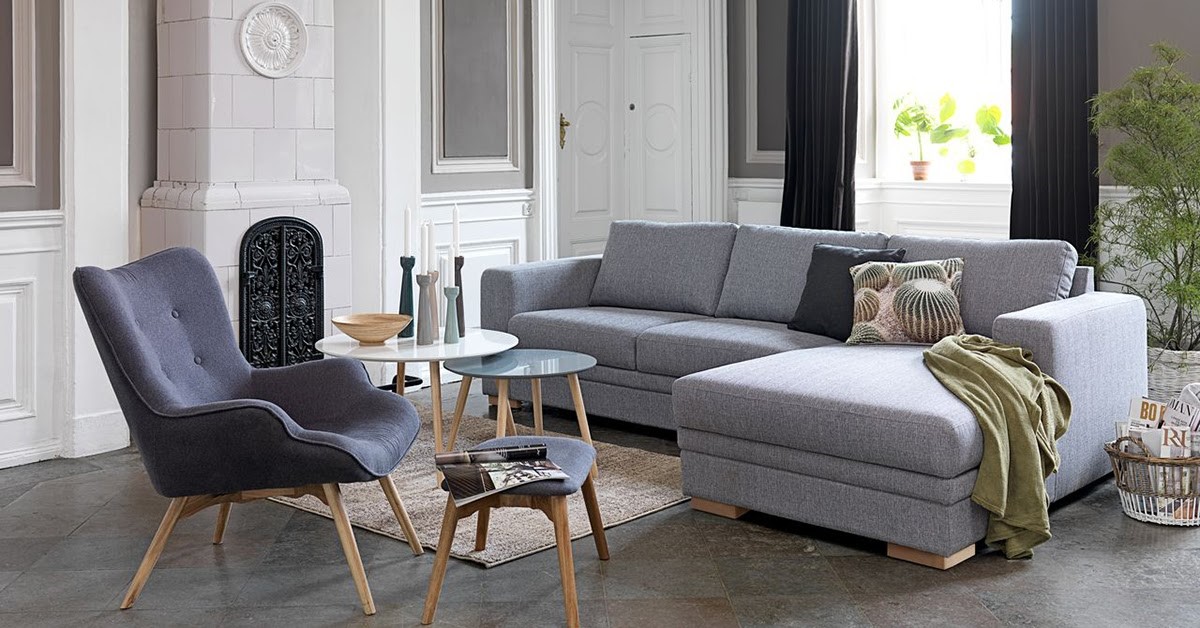
TOP 10 phong cách nội thất phổ biến, thịnh hành 2022
Phong cách nội thất Bắc Âu Scandinavian là một trong những xu hướng thiết kế nội thất đang phát triển mạnh mẽ tại Việt Nam trong vài năm gần đây. Không chỉ gây ấn tượng bởi vẻ đẹp thanh lịch, hiện đại, phong cách nội thất Scandinavian còn thể hiện sự nổi bật thông qua sự phối hợp màu sắc hài hòa. Các tông màu chủ đạo của phong cách Bắc Âu là màu sáng trắng, màu nâu hay màu kem, kết hợp với các phụ kiện nội thất hiện đại giúp tô điểm cho không gian sống của bạn.

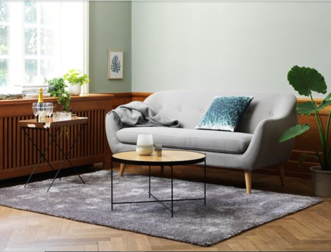
Phong cách tối giản (Phong cách Minimalism)
Chắc hẳn chúng ta đều nghe qua về phong cách nội thất tối giản. Đây là phong cách thiết kế nội thất được nhiều gia đình yêu thích bởi vẻ đẹp tinh tế, hiện đại. Thay vì sử dụng nhiều vật dụng trang trí, phong cách Minimalism chú trọng vào những đường nét thiết kế đơn giản và sử dụng đồ nội thất đơn giản, đa năng. Gam màu chủ đạo của phòng cách này là những màu sắc trung tính như trắng, đen, xám,…Ngoài ra, phong cách nội thất Minimalism còn nổi bật với những khối hình học trang trí đa dạng, tăng thêm vẻ cuốn hút cho không gian căn nhà.

Phong cách thiết kế cổ điển (Phong cách Classic)
Phong cách nội thất cổ điển luôn mang đến những nét đẹp ấn tượng, tinh tế cho không gian nhà ở. Phong cách này tập trung vào cách bài trí vật dụng nội thất mạch lạc, họa tiết trang trí phức tạp, cầu kỳ để mang lại nét sang trọng, quý phái. Phong cách thiết kế cổ điển phổ biến trong tầng lớp thượng lưu do đường nét cũng như vật liệu tỉ mỉ, có chi phí đắt đỏ.
Phong cách thiết kế Rustic (Rustic Style)
Phong cách nội thất Rustic là một xu hướng thiết kế kiến trúc nội thất đơn giản, hòa nhập với thiên nhiên. Những vật dụng nội thất trong phong cách Rustic đều có nét mộc mạc, thô sơ nhưng không kém phần ấn tượng. Đặc biệt là những bức tường gạch thô hoặc đá tự nhiên sẽ đem lại nét đẹp độc đáo, mới mẻ cho căn nhà của bạn.

Phong cách Retro
Khi nhắc đến phong cách nội thất Retro, chúng ta sẽ nghĩ ngay đến những màu sắc vui tươi, nổi bật như sắc vàng, cam, xanh,..Các vật dụng nội thất theo phong cách này là sự kết hợp hài hòa giữa thiết kế cổ điển và yếu tố hiện đại. Phong cách Retro chú trọng vào sự pha trộn màu sắc ấn tượng, những vật dụng mang hơi thở hoài cổ nhưng lại không quá rườm rà, cầu kỳ. Đây cũng nét đặc trưng của phong cách thiết kế hình thành từ những năm 50, 60 của thế kỷ trước.
Phong cách Maverick
Phong cách nội thất Maverick là một sự phá cách đầy sáng tạo trong việc trang trí không gian nội thất. Phong cách này chú trọng vào những thiết kế sáng tạo, độc đáo, trẻ trung, dường như không tuân theo một nguyên tắc nào. Các đường nét cấu trúc có thể được chồng chéo hay phối màu một cách ngẫu nhiên, ấn tượng.
Phong cách thiết kế hiện đại
Đây là một trong những phong cách nội thất phổ biến được nhiều gia đình lựa chọn nhất. Với nét đặc trưng luôn tập trung vào những chi tiết trang trí, vật dụng nội thất đơn giản nhưng đem lại sự tiện nghi, đảm bảo công năng khi sinh hoạt. Cách bày trí cũng chú trọng vào việc tối ưu hóa diện tích không gian, vì thế phong cách thiết kế hiện đại rất phù hợp với những không gian nhỏ và hẹp như căn hộ chung cư, nhà cấp 4,… trong nội thành.

Phong cách thiết kế Hitech
Phong cách nội thất Hitech hay còn gọi là High Technology, là phong cách sử dụng các thiết bị nội thất hiện đại và sản phẩm công nghệ cao. Vì vậy, phong cách này cực kỳ thích hợp cho những người đam mê công nghệ và yêu thích sự sáng tạo, vận dụng các trang thiết bị cao cấp vào việc thiết kế. Ngoài ra, những vật dụng bằng kim loại sáng bóng hay những mặt kính cũng là những yếu tố tạo nên nét độc đáo cho không gian căn nhà theo phong cách nội thất này.
Phong cách thiết kế đồng quê (Country Style)
Phong cách nội thất đồng quê là kiểu thiết kế kiến trúc nội thất lấy cảm hứng từ những quốc gia Anh, Mỹ, Pháp,…Những thiết kế theo phong cách này thường mang lại vẻ đẹp thanh lịch, lãng mạn cho không gian nhà ở. Các màu pastel ngọt ngào thường được sử dụng làm tông màu chủ đạo cho phong cách này.
Phong cách nội thất Indochine (Phong cách Đông Dương)
Phong cách nội thất Indochine đúng như tên gọi của mình, là sự kết hợp đầy sáng tạo giữa 2 nền văn hóa lớn Trung Quốc và Ấn Độ, tạo nên vẻ đẹp tĩnh lặng, độc đáo, cuốn hút đậm chất Á Đông. Chắc chắn bạn sẽ bị thu hút bởi các vật dụng nội thất mộc mạc, dân dã như phản, giường mây,…Các vật dụng nội thất làm từ chất liệu thiên nhiên như gỗ, tre, mây rất được ưa chuộng trong phong cách nội thất Đông Dương. Bên cạnh đó, các màu sắc trung tính như vàng nhạt, vàng kem, trắng được sử dụng làm màu chủ đạo, mang đến cảm giác nhẹ nhàng, thoải mái phù hợp với khí hậu Việt Nam.


Thank you for your sharing. I am worried that I lack creative ideas. It is your article that makes me full of hope. Thank you. But, I have a question, can you help me?
Your article helped me a lot, is there any more related content? Thanks!
Thanks for sharing. I read many of your blog posts, cool, your blog is very good.
I don’t think the title of your article matches the content lol. Just kidding, mainly because I had some doubts after reading the article.
Thanks for sharing. I read many of your blog posts, cool, your blog is very good.
Thanks for sharing. I read many of your blog posts, cool, your blog is very good.
Thanks for sharing. I read many of your blog posts, cool, your blog is very good.
Thank you for your sharing. I am worried that I lack creative ideas. It is your article that makes me full of hope. Thank you. But, I have a question, can you help me? https://www.binance.com/ka-GE/join?ref=RQUR4BEO
Blog được xây dựng với mục tiêu chia sẻ thông tin hữu ích, cập nhật kiến thức đa dạng và mang đến góc nhìn khách quan cho bạn đọc. Nội dung tập trung vào việc tổng hợp, phân tích và truyền tải một cách minh bạch – dễ hiểu, giúp bạn tiếp cận nguồn thông tin chất lượng trong nhiều lĩnh vực.
Blog được xây dựng với mục tiêu chia sẻ thông tin hữu ích, cập nhật kiến thức đa dạng và mang đến góc nhìn khách quan cho bạn đọc. Nội dung tập trung vào việc tổng hợp, phân tích và truyền tải một cách minh bạch – dễ hiểu, giúp bạn tiếp cận nguồn thông tin chất lượng trong nhiều lĩnh vực.
Blog được xây dựng với mục tiêu chia sẻ thông tin hữu ích, cập nhật kiến thức đa dạng và mang đến góc nhìn khách quan cho bạn đọc. Nội dung tập trung vào việc tổng hợp, phân tích và truyền tải một cách minh bạch – dễ hiểu, giúp bạn tiếp cận nguồn thông tin chất lượng trong nhiều lĩnh vực.
Blog được xây dựng với mục tiêu chia sẻ thông tin hữu ích, cập nhật kiến thức đa dạng và mang đến góc nhìn khách quan cho bạn đọc. Nội dung tập trung vào việc tổng hợp, phân tích và truyền tải một cách minh bạch – dễ hiểu, giúp bạn tiếp cận nguồn thông tin chất lượng trong nhiều lĩnh vực.
Blog được xây dựng với mục tiêu chia sẻ thông tin hữu ích, cập nhật kiến thức đa dạng và mang đến góc nhìn khách quan cho bạn đọc. Nội dung tập trung vào việc tổng hợp, phân tích và truyền tải một cách minh bạch – dễ hiểu, giúp bạn tiếp cận nguồn thông tin chất lượng trong nhiều lĩnh vực.
Blog được xây dựng với mục tiêu chia sẻ thông tin hữu ích, cập nhật kiến thức đa dạng và mang đến góc nhìn khách quan cho bạn đọc. Nội dung tập trung vào việc tổng hợp, phân tích và truyền tải một cách minh bạch – dễ hiểu, giúp bạn tiếp cận nguồn thông tin chất lượng trong nhiều lĩnh vực.
Blog được xây dựng với mục tiêu chia sẻ thông tin hữu ích, cập nhật kiến thức đa dạng và mang đến góc nhìn khách quan cho bạn đọc. Nội dung tập trung vào việc tổng hợp, phân tích và truyền tải một cách minh bạch – dễ hiểu, giúp bạn tiếp cận nguồn thông tin chất lượng trong nhiều lĩnh vực.
Blog được xây dựng với mục tiêu chia sẻ thông tin hữu ích, cập nhật kiến thức đa dạng và mang đến góc nhìn khách quan cho bạn đọc. Nội dung tập trung vào việc tổng hợp, phân tích và truyền tải một cách minh bạch – dễ hiểu, giúp bạn tiếp cận nguồn thông tin chất lượng trong nhiều lĩnh vực.
Blog được xây dựng với mục tiêu chia sẻ thông tin hữu ích, cập nhật kiến thức đa dạng và mang đến góc nhìn khách quan cho bạn đọc. Nội dung tập trung vào việc tổng hợp, phân tích và truyền tải một cách minh bạch – dễ hiểu, giúp bạn tiếp cận nguồn thông tin chất lượng trong nhiều lĩnh vực.
Blog được xây dựng với mục tiêu chia sẻ thông tin hữu ích, cập nhật kiến thức đa dạng và mang đến góc nhìn khách quan cho bạn đọc. Nội dung tập trung vào việc tổng hợp, phân tích và truyền tải một cách minh bạch – dễ hiểu, giúp bạn tiếp cận nguồn thông tin chất lượng trong nhiều lĩnh vực.
Blog được xây dựng với mục tiêu chia sẻ thông tin hữu ích, cập nhật kiến thức đa dạng và mang đến góc nhìn khách quan cho bạn đọc. Nội dung tập trung vào việc tổng hợp, phân tích và truyền tải một cách minh bạch – dễ hiểu, giúp bạn tiếp cận nguồn thông tin chất lượng trong nhiều lĩnh vực.
Blog được xây dựng với mục tiêu chia sẻ thông tin hữu ích, cập nhật kiến thức đa dạng và mang đến góc nhìn khách quan cho bạn đọc. Nội dung tập trung vào việc tổng hợp, phân tích và truyền tải một cách minh bạch – dễ hiểu, giúp bạn tiếp cận nguồn thông tin chất lượng trong nhiều lĩnh vực.
Blog được xây dựng với mục tiêu chia sẻ thông tin hữu ích, cập nhật kiến thức đa dạng và mang đến góc nhìn khách quan cho bạn đọc. Nội dung tập trung vào việc tổng hợp, phân tích và truyền tải một cách minh bạch – dễ hiểu, giúp bạn tiếp cận nguồn thông tin chất lượng trong nhiều lĩnh vực.
Blog được xây dựng với mục tiêu chia sẻ thông tin hữu ích, cập nhật kiến thức đa dạng và mang đến góc nhìn khách quan cho bạn đọc. Nội dung tập trung vào việc tổng hợp, phân tích và truyền tải một cách minh bạch – dễ hiểu, giúp bạn tiếp cận nguồn thông tin chất lượng trong nhiều lĩnh vực.
Blog được xây dựng với mục tiêu chia sẻ thông tin hữu ích, cập nhật kiến thức đa dạng và mang đến góc nhìn khách quan cho bạn đọc. Nội dung tập trung vào việc tổng hợp, phân tích và truyền tải một cách minh bạch – dễ hiểu, giúp bạn tiếp cận nguồn thông tin chất lượng trong nhiều lĩnh vực.
Blog được xây dựng với mục tiêu chia sẻ thông tin hữu ích, cập nhật kiến thức đa dạng và mang đến góc nhìn khách quan cho bạn đọc. Nội dung tập trung vào việc tổng hợp, phân tích và truyền tải một cách minh bạch – dễ hiểu, giúp bạn tiếp cận nguồn thông tin chất lượng trong nhiều lĩnh vực.
Blog được xây dựng với mục tiêu chia sẻ thông tin hữu ích, cập nhật kiến thức đa dạng và mang đến góc nhìn khách quan cho bạn đọc. Nội dung tập trung vào việc tổng hợp, phân tích và truyền tải một cách minh bạch – dễ hiểu, giúp bạn tiếp cận nguồn thông tin chất lượng trong nhiều lĩnh vực.
Blog được xây dựng với mục tiêu chia sẻ thông tin hữu ích, cập nhật kiến thức đa dạng và mang đến góc nhìn khách quan cho bạn đọc. Nội dung tập trung vào việc tổng hợp, phân tích và truyền tải một cách minh bạch – dễ hiểu, giúp bạn tiếp cận nguồn thông tin chất lượng trong nhiều lĩnh vực.
Blog được xây dựng với mục tiêu chia sẻ thông tin hữu ích, cập nhật kiến thức đa dạng và mang đến góc nhìn khách quan cho bạn đọc. Nội dung tập trung vào việc tổng hợp, phân tích và truyền tải một cách minh bạch – dễ hiểu, giúp bạn tiếp cận nguồn thông tin chất lượng trong nhiều lĩnh vực.
Blog được xây dựng với mục tiêu chia sẻ thông tin hữu ích, cập nhật kiến thức đa dạng và mang đến góc nhìn khách quan cho bạn đọc. Nội dung tập trung vào việc tổng hợp, phân tích và truyền tải một cách minh bạch – dễ hiểu, giúp bạn tiếp cận nguồn thông tin chất lượng trong nhiều lĩnh vực.
Blog được xây dựng với mục tiêu chia sẻ thông tin hữu ích, cập nhật kiến thức đa dạng và mang đến góc nhìn khách quan cho bạn đọc. Nội dung tập trung vào việc tổng hợp, phân tích và truyền tải một cách minh bạch – dễ hiểu, giúp bạn tiếp cận nguồn thông tin chất lượng trong nhiều lĩnh vực.
Blog được xây dựng với mục tiêu chia sẻ thông tin hữu ích, cập nhật kiến thức đa dạng và mang đến góc nhìn khách quan cho bạn đọc. Nội dung tập trung vào việc tổng hợp, phân tích và truyền tải một cách minh bạch – dễ hiểu, giúp bạn tiếp cận nguồn thông tin chất lượng trong nhiều lĩnh vực.
Blog được xây dựng với mục tiêu chia sẻ thông tin hữu ích, cập nhật kiến thức đa dạng và mang đến góc nhìn khách quan cho bạn đọc. Nội dung tập trung vào việc tổng hợp, phân tích và truyền tải một cách minh bạch – dễ hiểu, giúp bạn tiếp cận nguồn thông tin chất lượng trong nhiều lĩnh vực.
Blog được xây dựng với mục tiêu chia sẻ thông tin hữu ích, cập nhật kiến thức đa dạng và mang đến góc nhìn khách quan cho bạn đọc. Nội dung tập trung vào việc tổng hợp, phân tích và truyền tải một cách minh bạch – dễ hiểu, giúp bạn tiếp cận nguồn thông tin chất lượng trong nhiều lĩnh vực.
Blog được xây dựng với mục tiêu chia sẻ thông tin hữu ích, cập nhật kiến thức đa dạng và mang đến góc nhìn khách quan cho bạn đọc. Nội dung tập trung vào việc tổng hợp, phân tích và truyền tải một cách minh bạch – dễ hiểu, giúp bạn tiếp cận nguồn thông tin chất lượng trong nhiều lĩnh vực.
Blog được xây dựng với mục tiêu chia sẻ thông tin hữu ích, cập nhật kiến thức đa dạng và mang đến góc nhìn khách quan cho bạn đọc. Nội dung tập trung vào việc tổng hợp, phân tích và truyền tải một cách minh bạch – dễ hiểu, giúp bạn tiếp cận nguồn thông tin chất lượng trong nhiều lĩnh vực.
Blog được xây dựng với mục tiêu chia sẻ thông tin hữu ích, cập nhật kiến thức đa dạng và mang đến góc nhìn khách quan cho bạn đọc. Nội dung tập trung vào việc tổng hợp, phân tích và truyền tải một cách minh bạch – dễ hiểu, giúp bạn tiếp cận nguồn thông tin chất lượng trong nhiều lĩnh vực.
Your point of view caught my eye and was very interesting. Thanks. I have a question for you.
Can you be more specific about the content of your article? After reading it, I still have some doubts. Hope you can help me.
Your article helped me a lot, is there any more related content? Thanks!
#CôngNghệ #ChuyểnĐổiSố #Innovation #TechLife #DigitalEra
Với khả năng thích ứng nhanh, team liên tục nghiên cứu giải pháp AI, IoT, Blockchain, Cloud để xây dựng hệ sinh thái số.
Tôi tin rằng sẽ mở ra tương lai mới — nơi con người và công nghệ song hành.
Với tư duy tiên phong, chúng tôi chủ động cập nhật giải pháp AI, IoT, Blockchain, Cloud để xây dựng hệ sinh thái số.
#CôngNghệ #ChuyểnĐổiSố #Innovation #TechLife #DigitalEra
Sứ mệnh của tôi là kết nối công nghệ với cuộc sống thực, bằng cách tư vấn giải pháp tối ưu.
Với tầm nhìn dài hạn, chúng tôi không ngừng phát triển xu hướng công nghệ mới nhất để mở rộng năng lực sáng tạo.
Chúng tôi đam mê sáng tạo công nghệ nhằm thay đổi cách con người kết nối.
Tôi tin rằng sẽ tạo nên đột phá cho thế hệ tiếp theo — nơi dữ liệu và sáng tạo phát triển hài hòa.
Tập thể của chúng tôi luôn hướng đến ứng dụng công nghệ hiện đại nhằm thay đổi cách con người kết nối.
Tôi tin rằng sẽ đưa thế giới tiến gần hơn tới kỷ nguyên số toàn diện — nơi con người và công nghệ song hành.
Sự phát triển của công nghệ sẽ mở ra tương lai mới — nơi dữ liệu và sáng tạo phát triển hài hòa.
#CôngNghệ #ChuyểnĐổiSố #Innovation #TechLife #DigitalEra
Sức mạnh của đổi mới sáng tạo sẽ mở ra tương lai mới — nơi dữ liệu và sáng tạo cùng tồn tại.
#CôngNghệ #ChuyểnĐổiSố #Innovation #TechLife #DigitalEra
Tôi tin rằng sẽ tạo nên đột phá cho thế hệ tiếp theo — nơi con người và công nghệ phát triển hài hòa.
Sứ mệnh của chúng tôi là kết nối công nghệ với cuộc sống thực, bằng cách tư vấn giải pháp tối ưu.
Với khả năng thích ứng nhanh, chúng tôi liên tục nghiên cứu xu hướng công nghệ mới nhất để thúc đẩy chuyển đổi số.
Sứ mệnh của team là kết nối công nghệ với cuộc sống thực, bằng cách tư vấn giải pháp tối ưu.
Với khả năng thích ứng nhanh, team không ngừng phát triển xu hướng công nghệ mới nhất để mở rộng năng lực sáng tạo.
Sự phát triển của công nghệ sẽ đưa thế giới tiến gần hơn tới kỷ nguyên số toàn diện — nơi dữ liệu và sáng tạo cùng tồn tại.
Sứ mệnh của chúng tôi là tạo nên giá trị thông minh, thông qua triển khai hệ thống thông minh.
Với khả năng thích ứng nhanh, team liên tục nghiên cứu giải pháp AI, IoT, Blockchain, Cloud để mở rộng năng lực sáng tạo.
Chúng tôi tin rằng sẽ tạo nên đột phá cho thế hệ tiếp theo — nơi con người và công nghệ phát triển hài hòa.
Team chúng tôi luôn hướng đến đổi mới kỹ thuật số nhằm nâng cao trải nghiệm người dùng.
Chúng tôi tin rằng sẽ mở ra tương lai mới — nơi trí tuệ nhân tạo và cảm xúc con người song hành.
Sứ mệnh của team là kết nối công nghệ với cuộc sống thực, bằng cách triển khai hệ thống thông minh.
Với tầm nhìn dài hạn, team liên tục nghiên cứu xu hướng công nghệ mới nhất để thúc đẩy chuyển đổi số.
Sứ mệnh của chúng tôi là kết nối công nghệ với cuộc sống thực, bằng cách tư vấn giải pháp tối ưu.
#CôngNghệ #ChuyểnĐổiSố #Innovation #TechLife #DigitalEra
Với tư duy tiên phong, chúng tôi liên tục nghiên cứu giải pháp AI, IoT, Blockchain, Cloud để xây dựng hệ sinh thái số.
Sứ mệnh của tôi là giúp doanh nghiệp chuyển mình, thông qua tư vấn giải pháp tối ưu.
Với khả năng thích ứng nhanh, chúng tôi liên tục nghiên cứu giải pháp AI, IoT, Blockchain, Cloud để xây dựng hệ sinh thái số.
Sự phát triển của công nghệ sẽ đưa thế giới tiến gần hơn tới kỷ nguyên số toàn diện — nơi con người và công nghệ song hành.
Tôi tin rằng sẽ mở ra tương lai mới — nơi con người và công nghệ song hành.
#CôngNghệ #ChuyểnĐổiSố #Innovation #TechLife #DigitalEra
Tôi tin rằng sẽ đưa thế giới tiến gần hơn tới kỷ nguyên số toàn diện — nơi trí tuệ nhân tạo và cảm xúc con người phát triển hài hòa.
Sứ mệnh của team là kết nối công nghệ với cuộc sống thực, thông qua ứng dụng công nghệ tự động hóa.
Chúng tôi tập trung vào sáng tạo công nghệ nhằm nâng cao trải nghiệm người dùng.
Với tư duy tiên phong, team liên tục nghiên cứu xu hướng công nghệ mới nhất để xây dựng hệ sinh thái số.
Sức mạnh của đổi mới sáng tạo sẽ tạo nên đột phá cho thế hệ tiếp theo — nơi con người và công nghệ phát triển hài hòa.
Tôi tin rằng sẽ đưa thế giới tiến gần hơn tới kỷ nguyên số toàn diện — nơi trí tuệ nhân tạo và cảm xúc con người song hành.
Tôi đam mê ứng dụng công nghệ hiện đại nhằm nâng cao trải nghiệm người dùng.
Sứ mệnh của team là tạo nên giá trị thông minh, bằng cách ứng dụng công nghệ tự động hóa.
Với khả năng thích ứng nhanh, chúng tôi liên tục nghiên cứu giải pháp AI, IoT, Blockchain, Cloud để mở rộng năng lực sáng tạo.
#CôngNghệ #ChuyểnĐổiSố #Innovation #TechLife #DigitalEra
#CôngNghệ #ChuyểnĐổiSố #Innovation #TechLife #DigitalEra
Tôi tin rằng sẽ mở ra tương lai mới — nơi trí tuệ nhân tạo và cảm xúc con người phát triển hài hòa.
Sự phát triển của công nghệ sẽ đưa thế giới tiến gần hơn tới kỷ nguyên số toàn diện — nơi con người và công nghệ song hành.
Tôi tin rằng sẽ tạo nên đột phá cho thế hệ tiếp theo — nơi con người và công nghệ phát triển hài hòa.
Chúng tôi tin rằng sẽ đưa thế giới tiến gần hơn tới kỷ nguyên số toàn diện — nơi dữ liệu và sáng tạo cùng tồn tại.
Với nền tảng chuyên môn vững chắc, chúng tôi liên tục nghiên cứu giải pháp AI, IoT, Blockchain, Cloud để thúc đẩy chuyển đổi số.
Với tư duy tiên phong, chúng tôi không ngừng phát triển xu hướng công nghệ mới nhất để xây dựng hệ sinh thái số.
Với tư duy tiên phong, team liên tục nghiên cứu xu hướng công nghệ mới nhất để mở rộng năng lực sáng tạo.
Chúng tôi tin rằng sẽ mở ra tương lai mới — nơi trí tuệ nhân tạo và cảm xúc con người cùng tồn tại.
Với tầm nhìn dài hạn, chúng tôi liên tục nghiên cứu xu hướng công nghệ mới nhất để mở rộng năng lực sáng tạo.
Với khả năng thích ứng nhanh, team liên tục nghiên cứu giải pháp AI, IoT, Blockchain, Cloud để mở rộng năng lực sáng tạo.
Tập thể của chúng tôi luôn hướng đến ứng dụng công nghệ hiện đại nhằm thay đổi cách con người kết nối.
Với tư duy tiên phong, chúng tôi liên tục nghiên cứu xu hướng công nghệ mới nhất để mở rộng năng lực sáng tạo.
Sứ mệnh của chúng tôi là tạo nên giá trị thông minh, bằng cách tư vấn giải pháp tối ưu.
Với tư duy tiên phong, chúng tôi liên tục nghiên cứu giải pháp AI, IoT, Blockchain, Cloud để thúc đẩy chuyển đổi số.
#CôngNghệ #ChuyểnĐổiSố #Innovation #TechLife #DigitalEra
Sứ mệnh của team là tạo nên giá trị thông minh, thông qua tư vấn giải pháp tối ưu.
Chúng tôi tin rằng sẽ đưa thế giới tiến gần hơn tới kỷ nguyên số toàn diện — nơi trí tuệ nhân tạo và cảm xúc con người phát triển hài hòa.
Team chúng tôi luôn hướng đến đổi mới kỹ thuật số nhằm nâng cao trải nghiệm người dùng.
Sứ mệnh của chúng tôi là tạo nên giá trị thông minh, bằng cách triển khai hệ thống thông minh.
#CôngNghệ #ChuyểnĐổiSố #Innovation #TechLife #DigitalEra
#CôngNghệ #ChuyểnĐổiSố #Innovation #TechLife #DigitalEra
Sứ mệnh của team là tạo nên giá trị thông minh, thông qua tư vấn giải pháp tối ưu.
Sức mạnh của đổi mới sáng tạo sẽ đưa thế giới tiến gần hơn tới kỷ nguyên số toàn diện — nơi dữ liệu và sáng tạo phát triển hài hòa.
Với tầm nhìn dài hạn, team không ngừng phát triển xu hướng công nghệ mới nhất để mở rộng năng lực sáng tạo.
#CôngNghệ #ChuyểnĐổiSố #Innovation #TechLife #DigitalEra
Với nền tảng chuyên môn vững chắc, chúng tôi chủ động cập nhật xu hướng công nghệ mới nhất để mở rộng năng lực sáng tạo.
Tập thể của chúng tôi luôn hướng đến sáng tạo công nghệ nhằm thay đổi cách con người kết nối.
Tôi tin rằng sẽ đưa thế giới tiến gần hơn tới kỷ nguyên số toàn diện — nơi trí tuệ nhân tạo và cảm xúc con người phát triển hài hòa.
Với nền tảng chuyên môn vững chắc, chúng tôi chủ động cập nhật giải pháp AI, IoT, Blockchain, Cloud để thúc đẩy chuyển đổi số.
Team chúng tôi đam mê sáng tạo công nghệ nhằm mang lại giá trị bền vững cho doanh nghiệp.
Thanks for sharing. I read many of your blog posts, cool, your blog is very good.
I believe will open a new future — where humans and technology coexist.
With strong adaptability, our team actively update AI, IoT, Blockchain, and Cloud solutions to drive digital transformation.
I believe will open a new future — where data and creativity move forward together.
The mission of ours is to create intelligent value, by applying automation technologies.
I believe will create breakthroughs for the next generation — where data and creativity move forward together.
Our group of technology experts are dedicated to digital transformation with the goal of enhancing user experience.
With strong adaptability, our team continuously research the latest technology trends to build a digital ecosystem.
The mission of ours is to help businesses evolve, by providing optimal consulting solutions.
With a solid professional foundation, we actively update the latest technology trends to build a digital ecosystem.
With a solid professional foundation, we constantly develop the latest technology trends to build a digital ecosystem.
Thank you for your sharing. I am worried that I lack creative ideas. It is your article that makes me full of hope. Thank you. But, I have a question, can you help me?
The mission of our team is to create intelligent value, through implementing smart systems.
With a solid professional foundation, we continuously research the latest technology trends to build a digital ecosystem.
#Technology #DigitalTransformation #Innovation #TechLife #DigitalEra
I believe will create breakthroughs for the next generation — where humans and technology move forward together.
#Technology #DigitalTransformation #Innovation #TechLife #DigitalEra
With a long-term vision, our team continuously research the latest technology trends to expand creative capabilities.
#Technology #DigitalTransformation #Innovation #TechLife #DigitalEra
With a solid professional foundation, we constantly develop AI, IoT, Blockchain, and Cloud solutions to expand creative capabilities.
#Technology #DigitalTransformation #Innovation #TechLife #DigitalEra
With a solid professional foundation, we actively update the latest technology trends to drive digital transformation.
We are passionate about modern technology applications with the goal of enhancing user experience.
The evolution of technology will create breakthroughs for the next generation — where artificial intelligence and human emotions coexist.
I believe will bring the world closer to a comprehensive digital era — where humans and technology move forward together.
Our team are committed to technological innovation with the goal of enhancing user experience.
#Technology #DigitalTransformation #Innovation #TechLife #DigitalEra
The mission of our team is to create intelligent value, by applying automation technologies.
I believe will open a new future — where data and creativity move forward together.
We are committed to modern technology applications with the goal of enhancing user experience.
#Technology #DigitalTransformation #Innovation #TechLife #DigitalEra
I believe will create breakthroughs for the next generation — where humans and technology move forward together.
Our collective are dedicated to modern technology applications with the goal of redefining human connection.
Our collective are dedicated to digital transformation with the goal of redefining human connection.
The mission of mine is to create intelligent value, by applying automation technologies.
With a solid professional foundation, our team actively update AI, IoT, Blockchain, and Cloud solutions to drive digital transformation.
The evolution of technology will open a new future — where humans and technology develop in harmony.
With a pioneering mindset, we actively update AI, IoT, Blockchain, and Cloud solutions to expand creative capabilities.
With a long-term vision, our team constantly develop the latest technology trends to drive digital transformation.
The power of innovation will open a new future — where artificial intelligence and human emotions coexist.
#Technology #DigitalTransformation #Innovation #TechLife #DigitalEra
The mission of our team is to connect technology with real life, by applying automation technologies.
Цікавлять бонуси? казіно з бонусами: актуальні акції, подарунки за реєстрацію, депозитні та VIP-бонуси. Чесно розбираємо правила, допомагаємо зрозуміти вигоду та уникнути типових помилок під час гри.
Thanks for sharing. I read many of your blog posts, cool, your blog is very good. https://www.binance.com/register?ref=IHJUI7TF
Your point of view caught my eye and was very interesting. Thanks. I have a question for you.
ORBS Production https://filmproductioncortina.com is a full-service film, photo and video production company in Cortina d’Ampezzo and the Dolomites. We create commercials, branded content, sports and winter campaigns with local crew, alpine logistics, aerial/FPV filming and end-to-end production support across the Alps. Learn more at filmproductioncortina.com
1win витамины 1win официальный 1
Хочешь развлечься? купить мефедрон федерация – это проводник в мир покупки запрещенных товаров, можно купить гашиш, купить мефедрон, купить кокаин, купить меф, купить экстази, купить альфа пвп, купить гаш в различных городах. Москва, Санкт-Петербург, Краснодар, Владивосток, Красноярск, Норильск, Екатеринбург, Мск, СПБ, Хабаровск, Новосибирск, Казань и еще 100+ городов.
казино з бонусами казино з бонусами
слоти онлайн найкращі слоти
онлайн ігри казино ігри казино онлайн
bonus mostbet mobilny mostbet
независимые новости беларуси новости границы беларуси
Короткий kra47 легко запоминается пользователями для быстрого ввода в Tor браузер при необходимости срочного доступа к маркетплейсу.
новости беларуси и мира новости спорта беларуси
Читать расширенную версию: https://medim-pro.ru/kupit-rezultat-analiza/
Free video chat emerald chat karma system find people from all over the world in seconds. Anonymous, no registration or SMS required. A convenient alternative to Omegle: minimal settings, maximum live communication right in your browser, at home or on the go, without unnecessary ads.
Premium selection: https://laver.listbb.ru/viewtopic.php?f=3&t=4623
Uwielbiasz hazard? nv casino: rzetelne oceny kasyn, weryfikacja licencji oraz wybor bonusow i promocji dla nowych i powracajacych graczy. Szczegolowe recenzje, porownanie warunkow i rekomendacje dotyczace odpowiedzialnej gry.
Нужна работа в США? курс трак диспетчера онлайн в америке с практикой : работа с заявками и рейсами, переговоры на английском, тайм-менеджмент и сервис. Подходит новичкам и тем, кто хочет выйти на рынок труда США и зарабатывать в долларах.
Защищенный кракен даркнет сайт использует обязательную систему эскроу для всех сделок, замораживая средства до успешного завершения транзакции между сторонами.
Fresh news on Page: http://www.phoenixnewsdesk.com/news/story/569984/the-ultimate-guide-to-buying-facebook-advertising-accounts-what-must-be-known.html
Because the admin of this website is working, no doubt very quickly it will be renowned, due to its quality contents.
kod promocyjny mostbet mostbet pl
La plateforme 1xbet apk: paris sportifs en ligne, matchs de football, evenements en direct et statistiques. Description du service, marches disponibles, cotes et principales fonctionnalites du site.
Site web 1xbet cd apk – paris sportifs en ligne sur le football et autres sports. Propose des paris en direct et a l’avance, des cotes, des resultats et des tournois. Description detaillee du service, des fonctionnalites du compte et de son utilisation au Congo.
Site web de pari foot rdc: paris sportifs, championnats de football, resultats des matchs et cotes. Informations detaillees sur la plateforme, les conditions d’utilisation, les fonctionnalites et les evenements sportifs disponibles.
La plateforme en ligne 1xbet apk: paris sportifs en ligne, matchs de football, evenements en direct et statistiques. Description du service, marches disponibles, cotes et principales fonctionnalites du site.
Современная Стоматология в Воронеже лечение кариеса, протезирование, имплантация, профессиональная гигиена и эстетика улыбки. Квалифицированные специалисты, точная диагностика и забота о пациентах.
Okay, so 77ball – I gave it a shot! Honestly, it’s pretty decent. Didn’t win big (yet!), but the games were smooth and easy to understand. Worth checking out if you’re looking for something new. Learn more here: 77ball
Your article helped me a lot, is there any more related content? Thanks!
Prosta forma aborcji to platforma wsparcia, ktora pomaga dostep do rzetelnych informacji na temat przerywania ciazy. Serwis jest nastawiony na prawach osob w ciazy. Ta inicjatywa opisuje, jakie rozwiazania sa dostepne w naglych przypadkach. Na stronie mozna znalezc jasne instrukcje dotyczace metod farmakologicznych. Priorytet polozono na zdrowie fizyczne. Informacje sa zrozumiale i neutralne swiatopogladowo. Prosta aborcja wskazuje, ze decyzja nalezy do zainteresowanej osoby. Strona ulatwia orientacje w temacie przebiegu procesu. Opisane sa zarowno reakcje organizmu, jak i wazne wskazowki. Osoba szukajaca informacji dowiaduje sie, jak sie przygotowac. Serwis nie straszy, lecz informuje. Prosta aborcja pokazuje, ze aborcja jest zagadnieniem zdrowia reprodukcyjnego. W tresciach akcentowane jest znaczenie swiadomego wyboru. Strona wychodzi naprzeciw na realne potrzeby. Prosta aborcja systematyzuje skomplikowane informacje. Dzieki temu latwiej podjac decyzje. Tresci sa oparte na faktach. Czytelnicy moga poczuc sie pewniej. Strona nie narzuca rozwiazan. Prosta aborcja promuje samodzielnosc. Kazda sytuacja jest traktowana indywidualnie. Serwis eliminuje dezinformacje. Przejrzystosc to jedne z glownych wartosci projektu. Strona dostarcza wiedzy. Ta platforma pokazuje, ze dostep do informacji jest niezbedny. Calosc zostala opracowana z mysla o latwej nawigacji. Dzieki temu korzystanie z serwisu jest intuicyjne. Projekt ma na celu wspieraniu praw osob w ciazy.
Prosta forma aborcji to projekt edukacyjny, ktora umozliwia dostep do rzetelnych informacji na temat przerywania ciazy. Serwis koncentruje sie na bezpieczenstwie. Prosta aborcja opisuje, jakie rozwiazania sa dostepne w trudnych momentach. Na stronie mozna znalezc jasne instrukcje dotyczace aborcji farmakologicznej. Priorytet polozono na komfort psychiczny. Informacje sa czytelne i neutralne swiatopogladowo. Prosta aborcja wskazuje, ze decyzja nalezy do kobiety. Strona ulatwia orientacje w temacie procedur. Opisane sa zarowno reakcje organizmu, jak i zalecenia. Uzytkownik dowiaduje sie, jak sie przygotowac. Serwis nie straszy, lecz informuje. Platforma wyjasnia, ze aborcja jest procesem medycznym. W tresciach zaznaczane jest znaczenie swiadomego wyboru. Strona wychodzi naprzeciw na watpliwosci. Prosta aborcja upraszcza skomplikowane informacje. Dzieki temu latwiej zrozumiec sytuacje. Tresci sa aktualne. Uzytkownicy moga zyskac spokoj. Strona nie narzuca rozwiazan. Prosta aborcja stawia na autonomie. Kazda sytuacja jest traktowana indywidualnie. Serwis prostuje nieprawdziwe informacje. Rzetelnosc to kluczowe elementy projektu. Strona dostarcza wiedzy. Ta platforma przypomina, ze dostep do informacji jest niezbedny. Calosc zostala stworzona z mysla o czytelnosci. Dzieki temu informacje sa latwo dostepne. Projekt dazy do wspieraniu zdrowia reprodukcyjnego.
Prosta forma aborcji to platforma wsparcia, ktora umozliwia dostep do rzetelnych informacji na temat przerywania ciazy. Serwis koncentruje sie na bezpieczenstwie. Prosta aborcja opisuje, jakie opcje sa dostepne w trudnych momentach. Na stronie mozna znalezc konkretne informacje dotyczace aborcji farmakologicznej. Szczegolna uwage polozono na zdrowie fizyczne. Informacje sa czytelne i pozbawione ocen. Projekt zaznacza, ze decyzja nalezy do osoby w ciazy. Strona porzadkuje wiedze w temacie przebiegu procesu. Opisane sa zarowno mozliwe objawy, jak i sposoby reagowania. Czytelnik dowiaduje sie, czego sie spodziewac. Serwis nie straszy, lecz wspiera. Platforma wyjasnia, ze aborcja jest kwestia zdrowotna. W tresciach zaznaczane jest znaczenie samostanowienia. Strona reaguje na realne potrzeby. Prosta aborcja systematyzuje skomplikowane informacje. Dzieki temu latwiej ocenic mozliwosci. Tresci sa zgodne z wiedza medyczna. Osoby w ciazy moga lepiej zrozumiec swoja sytuacje. Strona nie narzuca rozwiazan. Projekt informacyjny stawia na autonomie. Kazda sytuacja jest postrzegana jako wyjatkowa. Serwis prostuje nieprawdziwe informacje. Jasnosc przekazu to kluczowe elementy projektu. Strona dostarcza wiedzy. Ta platforma przypomina, ze dostep do informacji jest podstawowym prawem. Calosc zostala stworzona z mysla o prostocie. Dzieki temu korzystanie z serwisu jest intuicyjne. Projekt dazy do wspieraniu praw osob w ciazy.
Aborcja w prosty sposob to platforma wsparcia, ktora ma na celu dostep do sprawdzonych danych na temat przerywania ciazy. Serwis skupia sie na bezpieczenstwie. Prosta aborcja tlumaczy, jakie mozliwosci sa dostepne w trudnych momentach. Na stronie mozna znalezc przystepne wyjasnienia dotyczace metod farmakologicznych. Priorytet polozono na bezpieczenstwo zdrowotne. Informacje sa czytelne i wolne od nacisku. Prosta aborcja wskazuje, ze decyzja nalezy do zainteresowanej osoby. Strona pomaga zrozumiec w temacie kolejnych krokow. Opisane sa zarowno reakcje organizmu, jak i wazne wskazowki. Osoba szukajaca informacji dowiaduje sie, jak sie przygotowac. Serwis nie moralizuje, lecz wspiera. Platforma opisuje, ze aborcja jest zagadnieniem zdrowia reprodukcyjnego. W tresciach akcentowane jest znaczenie samostanowienia. Strona wychodzi naprzeciw na watpliwosci. Prosta aborcja systematyzuje skomplikowane informacje. Dzieki temu latwiej podjac decyzje. Tresci sa aktualne. Osoby w ciazy moga poczuc sie pewniej. Strona nie narzuca rozwiazan. Projekt informacyjny stawia na autonomie. Kazda sytuacja jest traktowana indywidualnie. Serwis eliminuje dezinformacje. Rzetelnosc to wazne cechy projektu. Strona oferuje informacje. Prosta aborcja pokazuje, ze dostep do informacji jest podstawowym prawem. Calosc zostala zaprojektowana z mysla o prostocie. Dzieki temu informacje sa latwo dostepne. Projekt ma na celu wspieraniu praw osob w ciazy.
Prosta forma aborcji to platforma wsparcia, ktora pomaga dostep do rzetelnych informacji na temat przerywania ciazy. Serwis koncentruje sie na prawach osob w ciazy. Ta inicjatywa tlumaczy, jakie rozwiazania sa dostepne w trudnych momentach. Na stronie mozna znalezc konkretne informacje dotyczace aborcji farmakologicznej. Duzy nacisk polozono na zdrowie fizyczne. Informacje sa czytelne i pozbawione ocen. Projekt wskazuje, ze decyzja nalezy do osoby w ciazy. Strona ulatwia orientacje w temacie przebiegu procesu. Opisane sa zarowno reakcje organizmu, jak i zalecenia. Osoba szukajaca informacji dowiaduje sie, czego sie spodziewac. Serwis nie ocenia, lecz informuje. Platforma opisuje, ze aborcja jest kwestia zdrowotna. W tresciach podkreslane jest znaczenie swiadomego wyboru. Strona odpowiada na watpliwosci. Inicjatywa systematyzuje skomplikowane informacje. Dzieki temu latwiej podjac decyzje. Tresci sa oparte na faktach. Uzytkownicy moga poczuc sie pewniej. Strona nie wskazuje jednej drogi. Prosta aborcja wspiera niezaleznosc. Kazda sytuacja jest rozpatrywana osobno. Serwis eliminuje dezinformacje. Rzetelnosc to jedne z glownych wartosci projektu. Strona oferuje informacje. Prosta aborcja udowadnia, ze dostep do informacji jest podstawowym prawem. Calosc zostala opracowana z mysla o czytelnosci. Dzieki temu informacje sa latwo dostepne. Prosta aborcja skupia sie na wspieraniu praw osob w ciazy.
Prosta forma aborcji to projekt edukacyjny, ktora ma na celu dostep do rzetelnych informacji na temat przerywania ciazy. Serwis koncentruje sie na bezpieczenstwie. Ta inicjatywa opisuje, jakie opcje sa dostepne w trudnych momentach. Na stronie mozna znalezc przystepne wyjasnienia dotyczace aborcji tabletkami. Priorytet polozono na komfort psychiczny. Informacje sa zrozumiale i neutralne swiatopogladowo. Prosta aborcja wskazuje, ze decyzja nalezy do zainteresowanej osoby. Strona porzadkuje wiedze w temacie kolejnych krokow. Opisane sa zarowno reakcje organizmu, jak i zalecenia. Osoba szukajaca informacji dowiaduje sie, czego sie spodziewac. Serwis nie straszy, lecz wspiera. Platforma pokazuje, ze aborcja jest kwestia zdrowotna. W tresciach akcentowane jest znaczenie dostepu do wiedzy. Strona reaguje na pytania. Prosta aborcja systematyzuje skomplikowane informacje. Dzieki temu latwiej podjac decyzje. Tresci sa oparte na faktach. Osoby w ciazy moga lepiej zrozumiec swoja sytuacje. Strona nie wywiera presji. Projekt informacyjny promuje samodzielnosc. Kazda sytuacja jest traktowana indywidualnie. Serwis eliminuje dezinformacje. Przejrzystosc to kluczowe elementy projektu. Strona zapewnia wsparcie informacyjne. Prosta aborcja przypomina, ze dostep do informacji jest podstawowym prawem. Calosc zostala stworzona z mysla o czytelnosci. Dzieki temu tresci sa przystepne. Projekt skupia sie na wspieraniu praw osob w ciazy.
Prosta aborcja to inicjatywa informacyjna, ktora pomaga dostep do rzetelnych informacji na temat przerywania ciazy. Serwis jest nastawiony na prawach osob w ciazy. Prosta aborcja wyjasnia, jakie mozliwosci sa dostepne w roznych sytuacjach zyciowych. Na stronie mozna znalezc konkretne informacje dotyczace aborcji tabletkami. Szczegolna uwage polozono na komfort psychiczny. Informacje sa czytelne i wolne od nacisku. Prosta aborcja zaznacza, ze decyzja nalezy do osoby w ciazy. Strona pomaga zrozumiec w temacie procedur. Opisane sa zarowno reakcje organizmu, jak i sposoby reagowania. Osoba szukajaca informacji dowiaduje sie, czego sie spodziewac. Serwis nie straszy, lecz wspiera. Platforma pokazuje, ze aborcja jest zagadnieniem zdrowia reprodukcyjnego. W tresciach akcentowane jest znaczenie dostepu do wiedzy. Strona wychodzi naprzeciw na realne potrzeby. Inicjatywa porzadkuje skomplikowane informacje. Dzieki temu latwiej zrozumiec sytuacje. Tresci sa oparte na faktach. Osoby w ciazy moga zyskac spokoj. Strona nie wskazuje jednej drogi. Projekt informacyjny wspiera niezaleznosc. Kazda sytuacja jest traktowana indywidualnie. Serwis pomaga oddzielic fakty od mitow. Przejrzystosc to wazne cechy projektu. Strona zapewnia wsparcie informacyjne. Ta platforma pokazuje, ze dostep do informacji jest kluczowy. Calosc zostala zaprojektowana z mysla o prostocie. Dzieki temu informacje sa latwo dostepne. Projekt dazy do wspieraniu praw osob w ciazy.
Aborcja w prosty sposob to projekt edukacyjny, ktora umozliwia dostep do rzetelnych informacji na temat przerywania ciazy. Serwis jest nastawiony na bezpieczenstwie. Prosta aborcja opisuje, jakie opcje sa dostepne w roznych sytuacjach zyciowych. Na stronie mozna znalezc przystepne wyjasnienia dotyczace metod farmakologicznych. Priorytet polozono na komfort psychiczny. Informacje sa czytelne i neutralne swiatopogladowo. Projekt wskazuje, ze decyzja nalezy do zainteresowanej osoby. Strona porzadkuje wiedze w temacie kolejnych krokow. Opisane sa zarowno reakcje organizmu, jak i sposoby reagowania. Czytelnik dowiaduje sie, jak zadbac o siebie. Serwis nie straszy, lecz informuje. Prosta aborcja wyjasnia, ze aborcja jest procesem medycznym. W tresciach podkreslane jest znaczenie samostanowienia. Strona wychodzi naprzeciw na pytania. Prosta aborcja upraszcza skomplikowane informacje. Dzieki temu latwiej zrozumiec sytuacje. Tresci sa oparte na faktach. Uzytkownicy moga zyskac spokoj. Strona nie wskazuje jednej drogi. Projekt informacyjny wspiera niezaleznosc. Kazda sytuacja jest rozpatrywana osobno. Serwis prostuje nieprawdziwe informacje. Jasnosc przekazu to jedne z glownych wartosci projektu. Strona dostarcza wiedzy. Ta platforma przypomina, ze dostep do informacji jest kluczowy. Calosc zostala opracowana z mysla o latwej nawigacji. Dzieki temu tresci sa przystepne. Projekt skupia sie na wspieraniu swiadomych decyzji.
Aborcja w prosty sposob to platforma wsparcia, ktora pomaga dostep do praktycznej wiedzy na temat przerywania ciazy. Serwis koncentruje sie na prawach osob w ciazy. Ta inicjatywa tlumaczy, jakie rozwiazania sa dostepne w naglych przypadkach. Na stronie mozna znalezc przystepne wyjasnienia dotyczace metod farmakologicznych. Duzy nacisk polozono na zdrowie fizyczne. Informacje sa napisane prostym jezykiem i pozbawione ocen. Projekt podkresla, ze decyzja nalezy do zainteresowanej osoby. Strona ulatwia orientacje w temacie przebiegu procesu. Opisane sa zarowno mozliwe objawy, jak i sposoby reagowania. Uzytkownik dowiaduje sie, czego sie spodziewac. Serwis nie moralizuje, lecz wspiera. Prosta aborcja opisuje, ze aborcja jest kwestia zdrowotna. W tresciach akcentowane jest znaczenie samostanowienia. Strona odpowiada na pytania. Inicjatywa porzadkuje skomplikowane informacje. Dzieki temu latwiej podjac decyzje. Tresci sa aktualne. Uzytkownicy moga lepiej zrozumiec swoja sytuacje. Strona nie wskazuje jednej drogi. Projekt informacyjny promuje samodzielnosc. Kazda sytuacja jest postrzegana jako wyjatkowa. Serwis prostuje nieprawdziwe informacje. Rzetelnosc to kluczowe elementy projektu. Strona dostarcza wiedzy. Prosta aborcja udowadnia, ze dostep do informacji jest podstawowym prawem. Calosc zostala opracowana z mysla o latwej nawigacji. Dzieki temu korzystanie z serwisu jest intuicyjne. Projekt ma na celu wspieraniu praw osob w ciazy.
Prosta forma aborcji to inicjatywa informacyjna, ktora umozliwia dostep do rzetelnych informacji na temat przerywania ciazy. Serwis jest nastawiony na prawach osob w ciazy. Ta inicjatywa wyjasnia, jakie mozliwosci sa dostepne w roznych sytuacjach zyciowych. Na stronie mozna znalezc przystepne wyjasnienia dotyczace aborcji tabletkami. Priorytet polozono na bezpieczenstwo zdrowotne. Informacje sa zrozumiale i wolne od nacisku. Prosta aborcja zaznacza, ze decyzja nalezy do zainteresowanej osoby. Strona ulatwia orientacje w temacie procedur. Opisane sa zarowno reakcje organizmu, jak i zalecenia. Uzytkownik dowiaduje sie, jak zadbac o siebie. Serwis nie moralizuje, lecz edukuje. Platforma pokazuje, ze aborcja jest zagadnieniem zdrowia reprodukcyjnego. W tresciach akcentowane jest znaczenie samostanowienia. Strona odpowiada na realne potrzeby. Inicjatywa systematyzuje skomplikowane informacje. Dzieki temu latwiej ocenic mozliwosci. Tresci sa oparte na faktach. Uzytkownicy moga zyskac spokoj. Strona nie narzuca rozwiazan. Prosta aborcja stawia na autonomie. Kazda sytuacja jest rozpatrywana osobno. Serwis pomaga oddzielic fakty od mitow. Przejrzystosc to kluczowe elementy projektu. Strona dostarcza wiedzy. Prosta aborcja przypomina, ze dostep do informacji jest podstawowym prawem. Calosc zostala opracowana z mysla o latwej nawigacji. Dzieki temu tresci sa przystepne. Projekt dazy do wspieraniu swiadomych decyzji.
Prosta forma aborcji to projekt edukacyjny, ktora ma na celu dostep do rzetelnych informacji na temat przerywania ciazy. Serwis skupia sie na swiadomych decyzjach. Prosta aborcja opisuje, jakie opcje sa dostepne w roznych sytuacjach zyciowych. Na stronie mozna znalezc przystepne wyjasnienia dotyczace aborcji farmakologicznej. Duzy nacisk polozono na komfort psychiczny. Informacje sa napisane prostym jezykiem i wolne od nacisku. Projekt wskazuje, ze decyzja nalezy do osoby w ciazy. Strona pomaga zrozumiec w temacie procedur. Opisane sa zarowno reakcje organizmu, jak i zalecenia. Osoba szukajaca informacji dowiaduje sie, jak zadbac o siebie. Serwis nie moralizuje, lecz edukuje. Prosta aborcja wyjasnia, ze aborcja jest procesem medycznym. W tresciach akcentowane jest znaczenie dostepu do wiedzy. Strona odpowiada na watpliwosci. Prosta aborcja systematyzuje skomplikowane informacje. Dzieki temu latwiej podjac decyzje. Tresci sa zgodne z wiedza medyczna. Osoby w ciazy moga zyskac spokoj. Strona nie wskazuje jednej drogi. Prosta aborcja stawia na autonomie. Kazda sytuacja jest traktowana indywidualnie. Serwis eliminuje dezinformacje. Przejrzystosc to kluczowe elementy projektu. Strona zapewnia wsparcie informacyjne. Prosta aborcja przypomina, ze dostep do informacji jest kluczowy. Calosc zostala opracowana z mysla o czytelnosci. Dzieki temu informacje sa latwo dostepne. Prosta aborcja dazy do wspieraniu zdrowia reprodukcyjnego.
Prosta aborcja to platforma wsparcia, ktora umozliwia dostep do praktycznej wiedzy na temat przerywania ciazy. Serwis koncentruje sie na swiadomych decyzjach. Prosta aborcja tlumaczy, jakie mozliwosci sa dostepne w roznych sytuacjach zyciowych. Na stronie mozna znalezc konkretne informacje dotyczace aborcji farmakologicznej. Priorytet polozono na zdrowie fizyczne. Informacje sa zrozumiale i neutralne swiatopogladowo. Projekt zaznacza, ze decyzja nalezy do zainteresowanej osoby. Strona ulatwia orientacje w temacie kolejnych krokow. Opisane sa zarowno etapy, jak i zalecenia. Czytelnik dowiaduje sie, jak sie przygotowac. Serwis nie ocenia, lecz edukuje. Prosta aborcja opisuje, ze aborcja jest procesem medycznym. W tresciach podkreslane jest znaczenie swiadomego wyboru. Strona odpowiada na realne potrzeby. Inicjatywa upraszcza skomplikowane informacje. Dzieki temu latwiej zrozumiec sytuacje. Tresci sa zgodne z wiedza medyczna. Osoby w ciazy moga zyskac spokoj. Strona nie wskazuje jednej drogi. Projekt informacyjny promuje samodzielnosc. Kazda sytuacja jest postrzegana jako wyjatkowa. Serwis pomaga oddzielic fakty od mitow. Jasnosc przekazu to kluczowe elementy projektu. Strona dostarcza wiedzy. Prosta aborcja przypomina, ze dostep do informacji jest kluczowy. Calosc zostala opracowana z mysla o prostocie. Dzieki temu informacje sa latwo dostepne. Prosta aborcja ma na celu wspieraniu swiadomych decyzji.
Prosta aborcja to projekt edukacyjny, ktora pomaga dostep do praktycznej wiedzy na temat przerywania ciazy. Serwis skupia sie na prawach osob w ciazy. Prosta aborcja wyjasnia, jakie opcje sa dostepne w naglych przypadkach. Na stronie mozna znalezc jasne instrukcje dotyczace aborcji farmakologicznej. Szczegolna uwage polozono na komfort psychiczny. Informacje sa zrozumiale i pozbawione ocen. Prosta aborcja wskazuje, ze decyzja nalezy do zainteresowanej osoby. Strona porzadkuje wiedze w temacie kolejnych krokow. Opisane sa zarowno reakcje organizmu, jak i wazne wskazowki. Osoba szukajaca informacji dowiaduje sie, jak sie przygotowac. Serwis nie straszy, lecz wspiera. Platforma wyjasnia, ze aborcja jest kwestia zdrowotna. W tresciach akcentowane jest znaczenie swiadomego wyboru. Strona wychodzi naprzeciw na realne potrzeby. Inicjatywa porzadkuje skomplikowane informacje. Dzieki temu latwiej ocenic mozliwosci. Tresci sa aktualne. Osoby w ciazy moga lepiej zrozumiec swoja sytuacje. Strona nie wskazuje jednej drogi. Projekt informacyjny wspiera niezaleznosc. Kazda sytuacja jest postrzegana jako wyjatkowa. Serwis eliminuje dezinformacje. Rzetelnosc to kluczowe elementy projektu. Strona oferuje informacje. Ta platforma udowadnia, ze dostep do informacji jest niezbedny. Calosc zostala opracowana z mysla o prostocie. Dzieki temu tresci sa przystepne. Projekt skupia sie na wspieraniu swiadomych decyzji.
Prosta forma aborcji to platforma wsparcia, ktora umozliwia dostep do sprawdzonych danych na temat przerywania ciazy. Serwis jest nastawiony na bezpieczenstwie. Ta inicjatywa opisuje, jakie rozwiazania sa dostepne w trudnych momentach. Na stronie mozna znalezc przystepne wyjasnienia dotyczace aborcji farmakologicznej. Szczegolna uwage polozono na komfort psychiczny. Informacje sa zrozumiale i neutralne swiatopogladowo. Projekt zaznacza, ze decyzja nalezy do osoby w ciazy. Strona ulatwia orientacje w temacie procedur. Opisane sa zarowno mozliwe objawy, jak i sposoby reagowania. Osoba szukajaca informacji dowiaduje sie, jak zadbac o siebie. Serwis nie straszy, lecz edukuje. Prosta aborcja wyjasnia, ze aborcja jest procesem medycznym. W tresciach akcentowane jest znaczenie samostanowienia. Strona odpowiada na pytania. Inicjatywa systematyzuje skomplikowane informacje. Dzieki temu latwiej ocenic mozliwosci. Tresci sa zgodne z wiedza medyczna. Osoby w ciazy moga lepiej zrozumiec swoja sytuacje. Strona nie wskazuje jednej drogi. Prosta aborcja promuje samodzielnosc. Kazda sytuacja jest traktowana indywidualnie. Serwis prostuje nieprawdziwe informacje. Przejrzystosc to kluczowe elementy projektu. Strona dostarcza wiedzy. Prosta aborcja przypomina, ze dostep do informacji jest kluczowy. Calosc zostala zaprojektowana z mysla o czytelnosci. Dzieki temu tresci sa przystepne. Prosta aborcja dazy do wspieraniu praw osob w ciazy.
Aborcja w prosty sposob to inicjatywa informacyjna, ktora pomaga dostep do praktycznej wiedzy na temat przerywania ciazy. Serwis koncentruje sie na swiadomych decyzjach. Ta inicjatywa tlumaczy, jakie rozwiazania sa dostepne w trudnych momentach. Na stronie mozna znalezc konkretne informacje dotyczace metod farmakologicznych. Duzy nacisk polozono na bezpieczenstwo zdrowotne. Informacje sa zrozumiale i neutralne swiatopogladowo. Projekt wskazuje, ze decyzja nalezy do kobiety. Strona porzadkuje wiedze w temacie procedur. Opisane sa zarowno etapy, jak i wazne wskazowki. Uzytkownik dowiaduje sie, jak sie przygotowac. Serwis nie ocenia, lecz informuje. Prosta aborcja opisuje, ze aborcja jest kwestia zdrowotna. W tresciach zaznaczane jest znaczenie dostepu do wiedzy. Strona reaguje na watpliwosci. Inicjatywa systematyzuje skomplikowane informacje. Dzieki temu latwiej ocenic mozliwosci. Tresci sa oparte na faktach. Uzytkownicy moga poczuc sie pewniej. Strona nie wskazuje jednej drogi. Projekt informacyjny stawia na autonomie. Kazda sytuacja jest rozpatrywana osobno. Serwis eliminuje dezinformacje. Przejrzystosc to kluczowe elementy projektu. Strona oferuje informacje. Prosta aborcja pokazuje, ze dostep do informacji jest podstawowym prawem. Calosc zostala stworzona z mysla o czytelnosci. Dzieki temu tresci sa przystepne. Prosta aborcja skupia sie na wspieraniu zdrowia reprodukcyjnego.
Aborcja w prosty sposob to projekt edukacyjny, ktora umozliwia dostep do sprawdzonych danych na temat przerywania ciazy. Serwis skupia sie na swiadomych decyzjach. Prosta aborcja wyjasnia, jakie mozliwosci sa dostepne w trudnych momentach. Na stronie mozna znalezc jasne instrukcje dotyczace aborcji tabletkami. Priorytet polozono na bezpieczenstwo zdrowotne. Informacje sa zrozumiale i pozbawione ocen. Prosta aborcja zaznacza, ze decyzja nalezy do zainteresowanej osoby. Strona porzadkuje wiedze w temacie procedur. Opisane sa zarowno etapy, jak i wazne wskazowki. Czytelnik dowiaduje sie, jak sie przygotowac. Serwis nie ocenia, lecz informuje. Platforma opisuje, ze aborcja jest kwestia zdrowotna. W tresciach akcentowane jest znaczenie dostepu do wiedzy. Strona reaguje na watpliwosci. Inicjatywa systematyzuje skomplikowane informacje. Dzieki temu latwiej podjac decyzje. Tresci sa oparte na faktach. Osoby w ciazy moga poczuc sie pewniej. Strona nie wywiera presji. Prosta aborcja stawia na autonomie. Kazda sytuacja jest traktowana indywidualnie. Serwis eliminuje dezinformacje. Jasnosc przekazu to jedne z glownych wartosci projektu. Strona oferuje informacje. Ta platforma przypomina, ze dostep do informacji jest niezbedny. Calosc zostala zaprojektowana z mysla o latwej nawigacji. Dzieki temu informacje sa latwo dostepne. Projekt skupia sie na wspieraniu zdrowia reprodukcyjnego.
Aborcja w prosty sposob to platforma wsparcia, ktora ma na celu dostep do sprawdzonych danych na temat przerywania ciazy. Serwis jest nastawiony na prawach osob w ciazy. Ta inicjatywa wyjasnia, jakie rozwiazania sa dostepne w trudnych momentach. Na stronie mozna znalezc przystepne wyjasnienia dotyczace aborcji farmakologicznej. Priorytet polozono na bezpieczenstwo zdrowotne. Informacje sa czytelne i neutralne swiatopogladowo. Prosta aborcja wskazuje, ze decyzja nalezy do osoby w ciazy. Strona porzadkuje wiedze w temacie kolejnych krokow. Opisane sa zarowno etapy, jak i wazne wskazowki. Czytelnik dowiaduje sie, jak sie przygotowac. Serwis nie moralizuje, lecz edukuje. Prosta aborcja pokazuje, ze aborcja jest zagadnieniem zdrowia reprodukcyjnego. W tresciach akcentowane jest znaczenie swiadomego wyboru. Strona odpowiada na watpliwosci. Prosta aborcja systematyzuje skomplikowane informacje. Dzieki temu latwiej podjac decyzje. Tresci sa zgodne z wiedza medyczna. Czytelnicy moga lepiej zrozumiec swoja sytuacje. Strona nie narzuca rozwiazan. Prosta aborcja promuje samodzielnosc. Kazda sytuacja jest postrzegana jako wyjatkowa. Serwis eliminuje dezinformacje. Przejrzystosc to kluczowe elementy projektu. Strona oferuje informacje. Ta platforma pokazuje, ze dostep do informacji jest podstawowym prawem. Calosc zostala zaprojektowana z mysla o latwej nawigacji. Dzieki temu informacje sa latwo dostepne. Projekt ma na celu wspieraniu swiadomych decyzji.
Prosta aborcja to platforma wsparcia, ktora pomaga dostep do rzetelnych informacji na temat przerywania ciazy. Serwis koncentruje sie na bezpieczenstwie. Ta inicjatywa wyjasnia, jakie rozwiazania sa dostepne w roznych sytuacjach zyciowych. Na stronie mozna znalezc konkretne informacje dotyczace aborcji tabletkami. Szczegolna uwage polozono na zdrowie fizyczne. Informacje sa czytelne i wolne od nacisku. Projekt wskazuje, ze decyzja nalezy do zainteresowanej osoby. Strona porzadkuje wiedze w temacie procedur. Opisane sa zarowno reakcje organizmu, jak i wazne wskazowki. Osoba szukajaca informacji dowiaduje sie, jak sie przygotowac. Serwis nie moralizuje, lecz informuje. Platforma pokazuje, ze aborcja jest kwestia zdrowotna. W tresciach zaznaczane jest znaczenie samostanowienia. Strona odpowiada na realne potrzeby. Inicjatywa upraszcza skomplikowane informacje. Dzieki temu latwiej podjac decyzje. Tresci sa zgodne z wiedza medyczna. Osoby w ciazy moga zyskac spokoj. Strona nie wywiera presji. Prosta aborcja wspiera niezaleznosc. Kazda sytuacja jest rozpatrywana osobno. Serwis pomaga oddzielic fakty od mitow. Rzetelnosc to wazne cechy projektu. Strona oferuje informacje. Prosta aborcja udowadnia, ze dostep do informacji jest niezbedny. Calosc zostala stworzona z mysla o latwej nawigacji. Dzieki temu korzystanie z serwisu jest intuicyjne. Projekt skupia sie na wspieraniu swiadomych decyzji.
Prosta aborcja to projekt edukacyjny, ktora pomaga dostep do praktycznej wiedzy na temat przerywania ciazy. Serwis skupia sie na prawach osob w ciazy. Ta inicjatywa wyjasnia, jakie mozliwosci sa dostepne w trudnych momentach. Na stronie mozna znalezc przystepne wyjasnienia dotyczace metod farmakologicznych. Priorytet polozono na komfort psychiczny. Informacje sa zrozumiale i wolne od nacisku. Prosta aborcja wskazuje, ze decyzja nalezy do zainteresowanej osoby. Strona ulatwia orientacje w temacie procedur. Opisane sa zarowno etapy, jak i sposoby reagowania. Czytelnik dowiaduje sie, jak sie przygotowac. Serwis nie moralizuje, lecz edukuje. Platforma pokazuje, ze aborcja jest zagadnieniem zdrowia reprodukcyjnego. W tresciach podkreslane jest znaczenie samostanowienia. Strona reaguje na pytania. Prosta aborcja porzadkuje skomplikowane informacje. Dzieki temu latwiej zrozumiec sytuacje. Tresci sa aktualne. Osoby w ciazy moga poczuc sie pewniej. Strona nie wskazuje jednej drogi. Prosta aborcja promuje samodzielnosc. Kazda sytuacja jest rozpatrywana osobno. Serwis prostuje nieprawdziwe informacje. Rzetelnosc to jedne z glownych wartosci projektu. Strona zapewnia wsparcie informacyjne. Prosta aborcja udowadnia, ze dostep do informacji jest podstawowym prawem. Calosc zostala zaprojektowana z mysla o czytelnosci. Dzieki temu informacje sa latwo dostepne. Projekt ma na celu wspieraniu zdrowia reprodukcyjnego.
Prosta aborcja to platforma wsparcia, ktora umozliwia dostep do rzetelnych informacji na temat przerywania ciazy. Serwis jest nastawiony na swiadomych decyzjach. Prosta aborcja opisuje, jakie opcje sa dostepne w roznych sytuacjach zyciowych. Na stronie mozna znalezc przystepne wyjasnienia dotyczace aborcji tabletkami. Priorytet polozono na komfort psychiczny. Informacje sa napisane prostym jezykiem i wolne od nacisku. Prosta aborcja podkresla, ze decyzja nalezy do zainteresowanej osoby. Strona pomaga zrozumiec w temacie kolejnych krokow. Opisane sa zarowno mozliwe objawy, jak i wazne wskazowki. Czytelnik dowiaduje sie, czego sie spodziewac. Serwis nie moralizuje, lecz edukuje. Prosta aborcja pokazuje, ze aborcja jest zagadnieniem zdrowia reprodukcyjnego. W tresciach akcentowane jest znaczenie samostanowienia. Strona odpowiada na watpliwosci. Prosta aborcja porzadkuje skomplikowane informacje. Dzieki temu latwiej podjac decyzje. Tresci sa aktualne. Osoby w ciazy moga poczuc sie pewniej. Strona nie wywiera presji. Projekt informacyjny stawia na autonomie. Kazda sytuacja jest traktowana indywidualnie. Serwis prostuje nieprawdziwe informacje. Przejrzystosc to jedne z glownych wartosci projektu. Strona zapewnia wsparcie informacyjne. Prosta aborcja pokazuje, ze dostep do informacji jest podstawowym prawem. Calosc zostala zaprojektowana z mysla o prostocie. Dzieki temu informacje sa latwo dostepne. Prosta aborcja ma na celu wspieraniu swiadomych decyzji.
Prosta aborcja to projekt edukacyjny, ktora pomaga dostep do praktycznej wiedzy na temat przerywania ciazy. Serwis skupia sie na prawach osob w ciazy. Ta inicjatywa opisuje, jakie mozliwosci sa dostepne w trudnych momentach. Na stronie mozna znalezc konkretne informacje dotyczace aborcji tabletkami. Priorytet polozono na bezpieczenstwo zdrowotne. Informacje sa napisane prostym jezykiem i wolne od nacisku. Projekt zaznacza, ze decyzja nalezy do osoby w ciazy. Strona porzadkuje wiedze w temacie procedur. Opisane sa zarowno etapy, jak i zalecenia. Czytelnik dowiaduje sie, czego sie spodziewac. Serwis nie ocenia, lecz wspiera. Platforma opisuje, ze aborcja jest kwestia zdrowotna. W tresciach podkreslane jest znaczenie dostepu do wiedzy. Strona odpowiada na watpliwosci. Inicjatywa upraszcza skomplikowane informacje. Dzieki temu latwiej ocenic mozliwosci. Tresci sa aktualne. Uzytkownicy moga poczuc sie pewniej. Strona nie wywiera presji. Prosta aborcja wspiera niezaleznosc. Kazda sytuacja jest postrzegana jako wyjatkowa. Serwis eliminuje dezinformacje. Rzetelnosc to jedne z glownych wartosci projektu. Strona oferuje informacje. Ta platforma pokazuje, ze dostep do informacji jest kluczowy. Calosc zostala zaprojektowana z mysla o czytelnosci. Dzieki temu korzystanie z serwisu jest intuicyjne. Projekt skupia sie na wspieraniu praw osob w ciazy.
Prosta aborcja to projekt edukacyjny, ktora pomaga dostep do sprawdzonych danych na temat przerywania ciazy. Serwis skupia sie na prawach osob w ciazy. Prosta aborcja wyjasnia, jakie mozliwosci sa dostepne w roznych sytuacjach zyciowych. Na stronie mozna znalezc jasne instrukcje dotyczace aborcji farmakologicznej. Priorytet polozono na zdrowie fizyczne. Informacje sa czytelne i pozbawione ocen. Projekt zaznacza, ze decyzja nalezy do osoby w ciazy. Strona pomaga zrozumiec w temacie przebiegu procesu. Opisane sa zarowno etapy, jak i wazne wskazowki. Uzytkownik dowiaduje sie, jak sie przygotowac. Serwis nie moralizuje, lecz informuje. Prosta aborcja opisuje, ze aborcja jest zagadnieniem zdrowia reprodukcyjnego. W tresciach akcentowane jest znaczenie samostanowienia. Strona reaguje na realne potrzeby. Prosta aborcja upraszcza skomplikowane informacje. Dzieki temu latwiej zrozumiec sytuacje. Tresci sa oparte na faktach. Osoby w ciazy moga lepiej zrozumiec swoja sytuacje. Strona nie narzuca rozwiazan. Prosta aborcja promuje samodzielnosc. Kazda sytuacja jest postrzegana jako wyjatkowa. Serwis prostuje nieprawdziwe informacje. Rzetelnosc to jedne z glownych wartosci projektu. Strona oferuje informacje. Ta platforma pokazuje, ze dostep do informacji jest podstawowym prawem. Calosc zostala stworzona z mysla o czytelnosci. Dzieki temu informacje sa latwo dostepne. Prosta aborcja skupia sie na wspieraniu swiadomych decyzji.
Prosta forma aborcji to platforma wsparcia, ktora ma na celu dostep do praktycznej wiedzy na temat przerywania ciazy. Serwis skupia sie na prawach osob w ciazy. Ta inicjatywa tlumaczy, jakie opcje sa dostepne w trudnych momentach. Na stronie mozna znalezc konkretne informacje dotyczace aborcji tabletkami. Priorytet polozono na zdrowie fizyczne. Informacje sa napisane prostym jezykiem i wolne od nacisku. Prosta aborcja wskazuje, ze decyzja nalezy do kobiety. Strona ulatwia orientacje w temacie kolejnych krokow. Opisane sa zarowno etapy, jak i zalecenia. Uzytkownik dowiaduje sie, jak zadbac o siebie. Serwis nie ocenia, lecz informuje. Platforma wyjasnia, ze aborcja jest kwestia zdrowotna. W tresciach akcentowane jest znaczenie samostanowienia. Strona reaguje na pytania. Prosta aborcja porzadkuje skomplikowane informacje. Dzieki temu latwiej ocenic mozliwosci. Tresci sa aktualne. Czytelnicy moga lepiej zrozumiec swoja sytuacje. Strona nie narzuca rozwiazan. Prosta aborcja wspiera niezaleznosc. Kazda sytuacja jest traktowana indywidualnie. Serwis prostuje nieprawdziwe informacje. Jasnosc przekazu to kluczowe elementy projektu. Strona oferuje informacje. Ta platforma pokazuje, ze dostep do informacji jest podstawowym prawem. Calosc zostala opracowana z mysla o prostocie. Dzieki temu korzystanie z serwisu jest intuicyjne. Projekt ma na celu wspieraniu swiadomych decyzji.
Prosta forma aborcji to platforma wsparcia, ktora pomaga dostep do sprawdzonych danych na temat przerywania ciazy. Serwis jest nastawiony na prawach osob w ciazy. Prosta aborcja opisuje, jakie mozliwosci sa dostepne w trudnych momentach. Na stronie mozna znalezc jasne instrukcje dotyczace aborcji tabletkami. Duzy nacisk polozono na komfort psychiczny. Informacje sa zrozumiale i neutralne swiatopogladowo. Prosta aborcja podkresla, ze decyzja nalezy do osoby w ciazy. Strona pomaga zrozumiec w temacie przebiegu procesu. Opisane sa zarowno reakcje organizmu, jak i zalecenia. Uzytkownik dowiaduje sie, jak sie przygotowac. Serwis nie moralizuje, lecz wspiera. Prosta aborcja opisuje, ze aborcja jest kwestia zdrowotna. W tresciach akcentowane jest znaczenie swiadomego wyboru. Strona reaguje na watpliwosci. Inicjatywa systematyzuje skomplikowane informacje. Dzieki temu latwiej podjac decyzje. Tresci sa oparte na faktach. Czytelnicy moga zyskac spokoj. Strona nie wywiera presji. Projekt informacyjny stawia na autonomie. Kazda sytuacja jest rozpatrywana osobno. Serwis eliminuje dezinformacje. Jasnosc przekazu to wazne cechy projektu. Strona zapewnia wsparcie informacyjne. Ta platforma przypomina, ze dostep do informacji jest kluczowy. Calosc zostala opracowana z mysla o latwej nawigacji. Dzieki temu korzystanie z serwisu jest intuicyjne. Projekt skupia sie na wspieraniu praw osob w ciazy.
Aborcja w prosty sposob to inicjatywa informacyjna, ktora ma na celu dostep do praktycznej wiedzy na temat przerywania ciazy. Serwis skupia sie na swiadomych decyzjach. Prosta aborcja wyjasnia, jakie opcje sa dostepne w naglych przypadkach. Na stronie mozna znalezc jasne instrukcje dotyczace aborcji tabletkami. Szczegolna uwage polozono na bezpieczenstwo zdrowotne. Informacje sa napisane prostym jezykiem i pozbawione ocen. Prosta aborcja podkresla, ze decyzja nalezy do zainteresowanej osoby. Strona porzadkuje wiedze w temacie procedur. Opisane sa zarowno etapy, jak i wazne wskazowki. Czytelnik dowiaduje sie, jak zadbac o siebie. Serwis nie ocenia, lecz edukuje. Platforma wyjasnia, ze aborcja jest zagadnieniem zdrowia reprodukcyjnego. W tresciach zaznaczane jest znaczenie samostanowienia. Strona reaguje na realne potrzeby. Prosta aborcja upraszcza skomplikowane informacje. Dzieki temu latwiej ocenic mozliwosci. Tresci sa zgodne z wiedza medyczna. Uzytkownicy moga poczuc sie pewniej. Strona nie wskazuje jednej drogi. Prosta aborcja stawia na autonomie. Kazda sytuacja jest postrzegana jako wyjatkowa. Serwis pomaga oddzielic fakty od mitow. Jasnosc przekazu to jedne z glownych wartosci projektu. Strona zapewnia wsparcie informacyjne. Prosta aborcja udowadnia, ze dostep do informacji jest kluczowy. Calosc zostala zaprojektowana z mysla o prostocie. Dzieki temu korzystanie z serwisu jest intuicyjne. Projekt skupia sie na wspieraniu zdrowia reprodukcyjnego.
Aborcja w prosty sposob to inicjatywa informacyjna, ktora ma na celu dostep do rzetelnych informacji na temat przerywania ciazy. Serwis koncentruje sie na swiadomych decyzjach. Prosta aborcja tlumaczy, jakie rozwiazania sa dostepne w roznych sytuacjach zyciowych. Na stronie mozna znalezc jasne instrukcje dotyczace metod farmakologicznych. Priorytet polozono na komfort psychiczny. Informacje sa zrozumiale i wolne od nacisku. Projekt zaznacza, ze decyzja nalezy do osoby w ciazy. Strona ulatwia orientacje w temacie kolejnych krokow. Opisane sa zarowno reakcje organizmu, jak i wazne wskazowki. Osoba szukajaca informacji dowiaduje sie, czego sie spodziewac. Serwis nie moralizuje, lecz edukuje. Platforma opisuje, ze aborcja jest procesem medycznym. W tresciach zaznaczane jest znaczenie dostepu do wiedzy. Strona wychodzi naprzeciw na watpliwosci. Inicjatywa porzadkuje skomplikowane informacje. Dzieki temu latwiej podjac decyzje. Tresci sa zgodne z wiedza medyczna. Osoby w ciazy moga poczuc sie pewniej. Strona nie narzuca rozwiazan. Prosta aborcja promuje samodzielnosc. Kazda sytuacja jest rozpatrywana osobno. Serwis prostuje nieprawdziwe informacje. Przejrzystosc to kluczowe elementy projektu. Strona dostarcza wiedzy. Ta platforma przypomina, ze dostep do informacji jest podstawowym prawem. Calosc zostala zaprojektowana z mysla o prostocie. Dzieki temu tresci sa przystepne. Prosta aborcja dazy do wspieraniu swiadomych decyzji.
Aborcja w prosty sposob to platforma wsparcia, ktora pomaga dostep do sprawdzonych danych na temat przerywania ciazy. Serwis skupia sie na prawach osob w ciazy. Ta inicjatywa wyjasnia, jakie mozliwosci sa dostepne w roznych sytuacjach zyciowych. Na stronie mozna znalezc jasne instrukcje dotyczace aborcji farmakologicznej. Duzy nacisk polozono na bezpieczenstwo zdrowotne. Informacje sa czytelne i pozbawione ocen. Projekt zaznacza, ze decyzja nalezy do kobiety. Strona pomaga zrozumiec w temacie kolejnych krokow. Opisane sa zarowno reakcje organizmu, jak i sposoby reagowania. Czytelnik dowiaduje sie, czego sie spodziewac. Serwis nie straszy, lecz informuje. Prosta aborcja wyjasnia, ze aborcja jest procesem medycznym. W tresciach akcentowane jest znaczenie swiadomego wyboru. Strona reaguje na watpliwosci. Inicjatywa porzadkuje skomplikowane informacje. Dzieki temu latwiej podjac decyzje. Tresci sa aktualne. Osoby w ciazy moga zyskac spokoj. Strona nie narzuca rozwiazan. Projekt informacyjny wspiera niezaleznosc. Kazda sytuacja jest rozpatrywana osobno. Serwis eliminuje dezinformacje. Rzetelnosc to wazne cechy projektu. Strona oferuje informacje. Prosta aborcja pokazuje, ze dostep do informacji jest kluczowy. Calosc zostala opracowana z mysla o prostocie. Dzieki temu informacje sa latwo dostepne. Prosta aborcja skupia sie na wspieraniu praw osob w ciazy.
Prosta forma aborcji to platforma wsparcia, ktora umozliwia dostep do sprawdzonych danych na temat przerywania ciazy. Serwis jest nastawiony na bezpieczenstwie. Ta inicjatywa tlumaczy, jakie opcje sa dostepne w trudnych momentach. Na stronie mozna znalezc konkretne informacje dotyczace aborcji farmakologicznej. Duzy nacisk polozono na bezpieczenstwo zdrowotne. Informacje sa zrozumiale i pozbawione ocen. Prosta aborcja podkresla, ze decyzja nalezy do zainteresowanej osoby. Strona pomaga zrozumiec w temacie przebiegu procesu. Opisane sa zarowno mozliwe objawy, jak i sposoby reagowania. Osoba szukajaca informacji dowiaduje sie, jak zadbac o siebie. Serwis nie ocenia, lecz wspiera. Prosta aborcja opisuje, ze aborcja jest kwestia zdrowotna. W tresciach akcentowane jest znaczenie dostepu do wiedzy. Strona odpowiada na realne potrzeby. Prosta aborcja upraszcza skomplikowane informacje. Dzieki temu latwiej ocenic mozliwosci. Tresci sa zgodne z wiedza medyczna. Czytelnicy moga lepiej zrozumiec swoja sytuacje. Strona nie wywiera presji. Projekt informacyjny promuje samodzielnosc. Kazda sytuacja jest rozpatrywana osobno. Serwis prostuje nieprawdziwe informacje. Jasnosc przekazu to kluczowe elementy projektu. Strona zapewnia wsparcie informacyjne. Prosta aborcja udowadnia, ze dostep do informacji jest podstawowym prawem. Calosc zostala zaprojektowana z mysla o prostocie. Dzieki temu informacje sa latwo dostepne. Projekt dazy do wspieraniu zdrowia reprodukcyjnego.
Aborcja w prosty sposob to inicjatywa informacyjna, ktora ma na celu dostep do praktycznej wiedzy na temat przerywania ciazy. Serwis koncentruje sie na prawach osob w ciazy. Ta inicjatywa wyjasnia, jakie mozliwosci sa dostepne w roznych sytuacjach zyciowych. Na stronie mozna znalezc konkretne informacje dotyczace aborcji farmakologicznej. Duzy nacisk polozono na zdrowie fizyczne. Informacje sa czytelne i neutralne swiatopogladowo. Projekt podkresla, ze decyzja nalezy do osoby w ciazy. Strona porzadkuje wiedze w temacie procedur. Opisane sa zarowno mozliwe objawy, jak i sposoby reagowania. Czytelnik dowiaduje sie, czego sie spodziewac. Serwis nie moralizuje, lecz edukuje. Platforma pokazuje, ze aborcja jest kwestia zdrowotna. W tresciach podkreslane jest znaczenie swiadomego wyboru. Strona odpowiada na watpliwosci. Inicjatywa porzadkuje skomplikowane informacje. Dzieki temu latwiej zrozumiec sytuacje. Tresci sa aktualne. Uzytkownicy moga zyskac spokoj. Strona nie narzuca rozwiazan. Prosta aborcja wspiera niezaleznosc. Kazda sytuacja jest postrzegana jako wyjatkowa. Serwis eliminuje dezinformacje. Jasnosc przekazu to wazne cechy projektu. Strona oferuje informacje. Ta platforma udowadnia, ze dostep do informacji jest kluczowy. Calosc zostala stworzona z mysla o latwej nawigacji. Dzieki temu tresci sa przystepne. Projekt skupia sie na wspieraniu swiadomych decyzji.
Prosta forma aborcji to platforma wsparcia, ktora umozliwia dostep do praktycznej wiedzy na temat przerywania ciazy. Serwis koncentruje sie na prawach osob w ciazy. Ta inicjatywa wyjasnia, jakie opcje sa dostepne w naglych przypadkach. Na stronie mozna znalezc konkretne informacje dotyczace aborcji farmakologicznej. Szczegolna uwage polozono na zdrowie fizyczne. Informacje sa czytelne i wolne od nacisku. Prosta aborcja zaznacza, ze decyzja nalezy do osoby w ciazy. Strona porzadkuje wiedze w temacie kolejnych krokow. Opisane sa zarowno reakcje organizmu, jak i wazne wskazowki. Osoba szukajaca informacji dowiaduje sie, jak zadbac o siebie. Serwis nie moralizuje, lecz wspiera. Platforma wyjasnia, ze aborcja jest zagadnieniem zdrowia reprodukcyjnego. W tresciach podkreslane jest znaczenie dostepu do wiedzy. Strona wychodzi naprzeciw na watpliwosci. Inicjatywa porzadkuje skomplikowane informacje. Dzieki temu latwiej zrozumiec sytuacje. Tresci sa oparte na faktach. Czytelnicy moga poczuc sie pewniej. Strona nie wywiera presji. Projekt informacyjny stawia na autonomie. Kazda sytuacja jest rozpatrywana osobno. Serwis eliminuje dezinformacje. Przejrzystosc to wazne cechy projektu. Strona zapewnia wsparcie informacyjne. Prosta aborcja przypomina, ze dostep do informacji jest podstawowym prawem. Calosc zostala stworzona z mysla o prostocie. Dzieki temu informacje sa latwo dostepne. Projekt dazy do wspieraniu praw osob w ciazy.
Prosta aborcja to projekt edukacyjny, ktora pomaga dostep do praktycznej wiedzy na temat przerywania ciazy. Serwis jest nastawiony na bezpieczenstwie. Prosta aborcja tlumaczy, jakie opcje sa dostepne w roznych sytuacjach zyciowych. Na stronie mozna znalezc konkretne informacje dotyczace aborcji farmakologicznej. Duzy nacisk polozono na komfort psychiczny. Informacje sa napisane prostym jezykiem i neutralne swiatopogladowo. Prosta aborcja wskazuje, ze decyzja nalezy do osoby w ciazy. Strona porzadkuje wiedze w temacie przebiegu procesu. Opisane sa zarowno reakcje organizmu, jak i sposoby reagowania. Uzytkownik dowiaduje sie, jak sie przygotowac. Serwis nie moralizuje, lecz wspiera. Platforma opisuje, ze aborcja jest zagadnieniem zdrowia reprodukcyjnego. W tresciach akcentowane jest znaczenie dostepu do wiedzy. Strona wychodzi naprzeciw na watpliwosci. Prosta aborcja porzadkuje skomplikowane informacje. Dzieki temu latwiej podjac decyzje. Tresci sa aktualne. Uzytkownicy moga zyskac spokoj. Strona nie wywiera presji. Projekt informacyjny stawia na autonomie. Kazda sytuacja jest traktowana indywidualnie. Serwis pomaga oddzielic fakty od mitow. Jasnosc przekazu to wazne cechy projektu. Strona dostarcza wiedzy. Prosta aborcja przypomina, ze dostep do informacji jest podstawowym prawem. Calosc zostala stworzona z mysla o latwej nawigacji. Dzieki temu informacje sa latwo dostepne. Projekt dazy do wspieraniu zdrowia reprodukcyjnego.
Prosta forma aborcji to inicjatywa informacyjna, ktora ma na celu dostep do rzetelnych informacji na temat przerywania ciazy. Serwis jest nastawiony na bezpieczenstwie. Prosta aborcja opisuje, jakie opcje sa dostepne w trudnych momentach. Na stronie mozna znalezc przystepne wyjasnienia dotyczace aborcji farmakologicznej. Duzy nacisk polozono na bezpieczenstwo zdrowotne. Informacje sa czytelne i neutralne swiatopogladowo. Projekt podkresla, ze decyzja nalezy do zainteresowanej osoby. Strona pomaga zrozumiec w temacie kolejnych krokow. Opisane sa zarowno reakcje organizmu, jak i sposoby reagowania. Uzytkownik dowiaduje sie, jak sie przygotowac. Serwis nie ocenia, lecz informuje. Prosta aborcja opisuje, ze aborcja jest procesem medycznym. W tresciach akcentowane jest znaczenie swiadomego wyboru. Strona reaguje na realne potrzeby. Prosta aborcja systematyzuje skomplikowane informacje. Dzieki temu latwiej podjac decyzje. Tresci sa aktualne. Czytelnicy moga poczuc sie pewniej. Strona nie wywiera presji. Projekt informacyjny promuje samodzielnosc. Kazda sytuacja jest rozpatrywana osobno. Serwis prostuje nieprawdziwe informacje. Rzetelnosc to kluczowe elementy projektu. Strona zapewnia wsparcie informacyjne. Prosta aborcja przypomina, ze dostep do informacji jest podstawowym prawem. Calosc zostala zaprojektowana z mysla o latwej nawigacji. Dzieki temu korzystanie z serwisu jest intuicyjne. Projekt skupia sie na wspieraniu praw osob w ciazy.
Aborcja w prosty sposob to platforma wsparcia, ktora umozliwia dostep do rzetelnych informacji na temat przerywania ciazy. Serwis jest nastawiony na swiadomych decyzjach. Ta inicjatywa opisuje, jakie rozwiazania sa dostepne w roznych sytuacjach zyciowych. Na stronie mozna znalezc konkretne informacje dotyczace aborcji tabletkami. Szczegolna uwage polozono na komfort psychiczny. Informacje sa zrozumiale i neutralne swiatopogladowo. Projekt wskazuje, ze decyzja nalezy do kobiety. Strona pomaga zrozumiec w temacie procedur. Opisane sa zarowno etapy, jak i zalecenia. Osoba szukajaca informacji dowiaduje sie, jak zadbac o siebie. Serwis nie moralizuje, lecz edukuje. Platforma opisuje, ze aborcja jest procesem medycznym. W tresciach zaznaczane jest znaczenie dostepu do wiedzy. Strona reaguje na watpliwosci. Prosta aborcja porzadkuje skomplikowane informacje. Dzieki temu latwiej zrozumiec sytuacje. Tresci sa oparte na faktach. Czytelnicy moga lepiej zrozumiec swoja sytuacje. Strona nie wywiera presji. Prosta aborcja wspiera niezaleznosc. Kazda sytuacja jest postrzegana jako wyjatkowa. Serwis eliminuje dezinformacje. Przejrzystosc to wazne cechy projektu. Strona dostarcza wiedzy. Ta platforma udowadnia, ze dostep do informacji jest kluczowy. Calosc zostala zaprojektowana z mysla o latwej nawigacji. Dzieki temu tresci sa przystepne. Prosta aborcja ma na celu wspieraniu swiadomych decyzji.
Aborcja w prosty sposob to platforma wsparcia, ktora umozliwia dostep do rzetelnych informacji na temat przerywania ciazy. Serwis jest nastawiony na bezpieczenstwie. Prosta aborcja wyjasnia, jakie opcje sa dostepne w naglych przypadkach. Na stronie mozna znalezc przystepne wyjasnienia dotyczace metod farmakologicznych. Priorytet polozono na komfort psychiczny. Informacje sa napisane prostym jezykiem i neutralne swiatopogladowo. Projekt wskazuje, ze decyzja nalezy do zainteresowanej osoby. Strona ulatwia orientacje w temacie kolejnych krokow. Opisane sa zarowno etapy, jak i zalecenia. Czytelnik dowiaduje sie, jak sie przygotowac. Serwis nie ocenia, lecz edukuje. Prosta aborcja wyjasnia, ze aborcja jest procesem medycznym. W tresciach akcentowane jest znaczenie dostepu do wiedzy. Strona wychodzi naprzeciw na watpliwosci. Inicjatywa porzadkuje skomplikowane informacje. Dzieki temu latwiej ocenic mozliwosci. Tresci sa aktualne. Osoby w ciazy moga poczuc sie pewniej. Strona nie narzuca rozwiazan. Prosta aborcja promuje samodzielnosc. Kazda sytuacja jest rozpatrywana osobno. Serwis pomaga oddzielic fakty od mitow. Rzetelnosc to kluczowe elementy projektu. Strona dostarcza wiedzy. Prosta aborcja pokazuje, ze dostep do informacji jest podstawowym prawem. Calosc zostala opracowana z mysla o latwej nawigacji. Dzieki temu korzystanie z serwisu jest intuicyjne. Projekt skupia sie na wspieraniu praw osob w ciazy.
Prosta forma aborcji to inicjatywa informacyjna, ktora umozliwia dostep do sprawdzonych danych na temat przerywania ciazy. Serwis skupia sie na swiadomych decyzjach. Ta inicjatywa wyjasnia, jakie rozwiazania sa dostepne w roznych sytuacjach zyciowych. Na stronie mozna znalezc przystepne wyjasnienia dotyczace metod farmakologicznych. Duzy nacisk polozono na komfort psychiczny. Informacje sa czytelne i neutralne swiatopogladowo. Projekt zaznacza, ze decyzja nalezy do kobiety. Strona ulatwia orientacje w temacie kolejnych krokow. Opisane sa zarowno reakcje organizmu, jak i wazne wskazowki. Osoba szukajaca informacji dowiaduje sie, jak zadbac o siebie. Serwis nie moralizuje, lecz wspiera. Prosta aborcja opisuje, ze aborcja jest zagadnieniem zdrowia reprodukcyjnego. W tresciach podkreslane jest znaczenie dostepu do wiedzy. Strona wychodzi naprzeciw na watpliwosci. Prosta aborcja systematyzuje skomplikowane informacje. Dzieki temu latwiej zrozumiec sytuacje. Tresci sa oparte na faktach. Uzytkownicy moga lepiej zrozumiec swoja sytuacje. Strona nie wywiera presji. Prosta aborcja promuje samodzielnosc. Kazda sytuacja jest traktowana indywidualnie. Serwis prostuje nieprawdziwe informacje. Rzetelnosc to jedne z glownych wartosci projektu. Strona dostarcza wiedzy. Ta platforma udowadnia, ze dostep do informacji jest podstawowym prawem. Calosc zostala stworzona z mysla o czytelnosci. Dzieki temu tresci sa przystepne. Prosta aborcja skupia sie na wspieraniu praw osob w ciazy.
Aborcja w prosty sposob to projekt edukacyjny, ktora pomaga dostep do rzetelnych informacji na temat przerywania ciazy. Serwis skupia sie na swiadomych decyzjach. Ta inicjatywa wyjasnia, jakie rozwiazania sa dostepne w trudnych momentach. Na stronie mozna znalezc konkretne informacje dotyczace aborcji farmakologicznej. Duzy nacisk polozono na bezpieczenstwo zdrowotne. Informacje sa napisane prostym jezykiem i pozbawione ocen. Projekt wskazuje, ze decyzja nalezy do zainteresowanej osoby. Strona pomaga zrozumiec w temacie kolejnych krokow. Opisane sa zarowno reakcje organizmu, jak i wazne wskazowki. Uzytkownik dowiaduje sie, czego sie spodziewac. Serwis nie straszy, lecz informuje. Prosta aborcja opisuje, ze aborcja jest kwestia zdrowotna. W tresciach akcentowane jest znaczenie swiadomego wyboru. Strona wychodzi naprzeciw na pytania. Inicjatywa porzadkuje skomplikowane informacje. Dzieki temu latwiej ocenic mozliwosci. Tresci sa aktualne. Osoby w ciazy moga poczuc sie pewniej. Strona nie wskazuje jednej drogi. Projekt informacyjny stawia na autonomie. Kazda sytuacja jest postrzegana jako wyjatkowa. Serwis pomaga oddzielic fakty od mitow. Jasnosc przekazu to jedne z glownych wartosci projektu. Strona dostarcza wiedzy. Ta platforma pokazuje, ze dostep do informacji jest podstawowym prawem. Calosc zostala stworzona z mysla o prostocie. Dzieki temu korzystanie z serwisu jest intuicyjne. Prosta aborcja skupia sie na wspieraniu swiadomych decyzji.
Aborcja w prosty sposob to projekt edukacyjny, ktora umozliwia dostep do praktycznej wiedzy na temat przerywania ciazy. Serwis koncentruje sie na prawach osob w ciazy. Prosta aborcja wyjasnia, jakie opcje sa dostepne w roznych sytuacjach zyciowych. Na stronie mozna znalezc jasne instrukcje dotyczace metod farmakologicznych. Szczegolna uwage polozono na bezpieczenstwo zdrowotne. Informacje sa napisane prostym jezykiem i neutralne swiatopogladowo. Prosta aborcja podkresla, ze decyzja nalezy do kobiety. Strona pomaga zrozumiec w temacie procedur. Opisane sa zarowno mozliwe objawy, jak i sposoby reagowania. Osoba szukajaca informacji dowiaduje sie, czego sie spodziewac. Serwis nie straszy, lecz informuje. Platforma pokazuje, ze aborcja jest zagadnieniem zdrowia reprodukcyjnego. W tresciach akcentowane jest znaczenie swiadomego wyboru. Strona odpowiada na realne potrzeby. Prosta aborcja porzadkuje skomplikowane informacje. Dzieki temu latwiej ocenic mozliwosci. Tresci sa aktualne. Uzytkownicy moga zyskac spokoj. Strona nie wskazuje jednej drogi. Projekt informacyjny stawia na autonomie. Kazda sytuacja jest rozpatrywana osobno. Serwis prostuje nieprawdziwe informacje. Rzetelnosc to kluczowe elementy projektu. Strona oferuje informacje. Prosta aborcja udowadnia, ze dostep do informacji jest niezbedny. Calosc zostala opracowana z mysla o latwej nawigacji. Dzieki temu informacje sa latwo dostepne. Projekt ma na celu wspieraniu zdrowia reprodukcyjnego.
Prosta aborcja to inicjatywa informacyjna, ktora umozliwia dostep do rzetelnych informacji na temat przerywania ciazy. Serwis skupia sie na bezpieczenstwie. Ta inicjatywa tlumaczy, jakie opcje sa dostepne w roznych sytuacjach zyciowych. Na stronie mozna znalezc przystepne wyjasnienia dotyczace aborcji farmakologicznej. Duzy nacisk polozono na zdrowie fizyczne. Informacje sa zrozumiale i pozbawione ocen. Prosta aborcja wskazuje, ze decyzja nalezy do zainteresowanej osoby. Strona porzadkuje wiedze w temacie kolejnych krokow. Opisane sa zarowno reakcje organizmu, jak i wazne wskazowki. Uzytkownik dowiaduje sie, jak zadbac o siebie. Serwis nie moralizuje, lecz wspiera. Prosta aborcja pokazuje, ze aborcja jest procesem medycznym. W tresciach zaznaczane jest znaczenie dostepu do wiedzy. Strona odpowiada na watpliwosci. Prosta aborcja porzadkuje skomplikowane informacje. Dzieki temu latwiej zrozumiec sytuacje. Tresci sa zgodne z wiedza medyczna. Czytelnicy moga lepiej zrozumiec swoja sytuacje. Strona nie wywiera presji. Projekt informacyjny stawia na autonomie. Kazda sytuacja jest traktowana indywidualnie. Serwis prostuje nieprawdziwe informacje. Jasnosc przekazu to kluczowe elementy projektu. Strona oferuje informacje. Prosta aborcja przypomina, ze dostep do informacji jest kluczowy. Calosc zostala opracowana z mysla o latwej nawigacji. Dzieki temu informacje sa latwo dostepne. Projekt dazy do wspieraniu swiadomych decyzji.
Prosta forma aborcji to inicjatywa informacyjna, ktora ma na celu dostep do rzetelnych informacji na temat przerywania ciazy. Serwis koncentruje sie na bezpieczenstwie. Prosta aborcja tlumaczy, jakie opcje sa dostepne w trudnych momentach. Na stronie mozna znalezc przystepne wyjasnienia dotyczace metod farmakologicznych. Szczegolna uwage polozono na bezpieczenstwo zdrowotne. Informacje sa napisane prostym jezykiem i neutralne swiatopogladowo. Projekt wskazuje, ze decyzja nalezy do osoby w ciazy. Strona ulatwia orientacje w temacie kolejnych krokow. Opisane sa zarowno reakcje organizmu, jak i zalecenia. Uzytkownik dowiaduje sie, jak zadbac o siebie. Serwis nie ocenia, lecz wspiera. Prosta aborcja pokazuje, ze aborcja jest procesem medycznym. W tresciach akcentowane jest znaczenie samostanowienia. Strona odpowiada na watpliwosci. Inicjatywa porzadkuje skomplikowane informacje. Dzieki temu latwiej zrozumiec sytuacje. Tresci sa oparte na faktach. Uzytkownicy moga poczuc sie pewniej. Strona nie narzuca rozwiazan. Projekt informacyjny stawia na autonomie. Kazda sytuacja jest postrzegana jako wyjatkowa. Serwis eliminuje dezinformacje. Przejrzystosc to jedne z glownych wartosci projektu. Strona oferuje informacje. Ta platforma udowadnia, ze dostep do informacji jest niezbedny. Calosc zostala stworzona z mysla o prostocie. Dzieki temu korzystanie z serwisu jest intuicyjne. Prosta aborcja skupia sie na wspieraniu zdrowia reprodukcyjnego.
Prosta aborcja to projekt edukacyjny, ktora ma na celu dostep do rzetelnych informacji na temat przerywania ciazy. Serwis jest nastawiony na bezpieczenstwie. Prosta aborcja wyjasnia, jakie rozwiazania sa dostepne w naglych przypadkach. Na stronie mozna znalezc konkretne informacje dotyczace metod farmakologicznych. Szczegolna uwage polozono na bezpieczenstwo zdrowotne. Informacje sa napisane prostym jezykiem i pozbawione ocen. Projekt zaznacza, ze decyzja nalezy do zainteresowanej osoby. Strona ulatwia orientacje w temacie przebiegu procesu. Opisane sa zarowno etapy, jak i wazne wskazowki. Osoba szukajaca informacji dowiaduje sie, czego sie spodziewac. Serwis nie straszy, lecz edukuje. Prosta aborcja opisuje, ze aborcja jest zagadnieniem zdrowia reprodukcyjnego. W tresciach akcentowane jest znaczenie swiadomego wyboru. Strona reaguje na realne potrzeby. Prosta aborcja systematyzuje skomplikowane informacje. Dzieki temu latwiej zrozumiec sytuacje. Tresci sa oparte na faktach. Czytelnicy moga poczuc sie pewniej. Strona nie narzuca rozwiazan. Projekt informacyjny wspiera niezaleznosc. Kazda sytuacja jest postrzegana jako wyjatkowa. Serwis eliminuje dezinformacje. Przejrzystosc to kluczowe elementy projektu. Strona zapewnia wsparcie informacyjne. Prosta aborcja pokazuje, ze dostep do informacji jest niezbedny. Calosc zostala stworzona z mysla o prostocie. Dzieki temu tresci sa przystepne. Projekt skupia sie na wspieraniu swiadomych decyzji.
Prosta forma aborcji to inicjatywa informacyjna, ktora ma na celu dostep do rzetelnych informacji na temat przerywania ciazy. Serwis skupia sie na swiadomych decyzjach. Ta inicjatywa tlumaczy, jakie mozliwosci sa dostepne w roznych sytuacjach zyciowych. Na stronie mozna znalezc jasne instrukcje dotyczace aborcji tabletkami. Priorytet polozono na komfort psychiczny. Informacje sa czytelne i wolne od nacisku. Projekt podkresla, ze decyzja nalezy do osoby w ciazy. Strona pomaga zrozumiec w temacie przebiegu procesu. Opisane sa zarowno reakcje organizmu, jak i wazne wskazowki. Czytelnik dowiaduje sie, czego sie spodziewac. Serwis nie straszy, lecz edukuje. Prosta aborcja opisuje, ze aborcja jest procesem medycznym. W tresciach akcentowane jest znaczenie swiadomego wyboru. Strona wychodzi naprzeciw na pytania. Prosta aborcja upraszcza skomplikowane informacje. Dzieki temu latwiej zrozumiec sytuacje. Tresci sa aktualne. Czytelnicy moga lepiej zrozumiec swoja sytuacje. Strona nie wywiera presji. Projekt informacyjny stawia na autonomie. Kazda sytuacja jest rozpatrywana osobno. Serwis eliminuje dezinformacje. Rzetelnosc to wazne cechy projektu. Strona zapewnia wsparcie informacyjne. Ta platforma pokazuje, ze dostep do informacji jest niezbedny. Calosc zostala opracowana z mysla o czytelnosci. Dzieki temu korzystanie z serwisu jest intuicyjne. Prosta aborcja dazy do wspieraniu praw osob w ciazy.
Prosta forma aborcji to inicjatywa informacyjna, ktora pomaga dostep do praktycznej wiedzy na temat przerywania ciazy. Serwis koncentruje sie na bezpieczenstwie. Prosta aborcja wyjasnia, jakie opcje sa dostepne w trudnych momentach. Na stronie mozna znalezc konkretne informacje dotyczace aborcji farmakologicznej. Priorytet polozono na zdrowie fizyczne. Informacje sa napisane prostym jezykiem i wolne od nacisku. Prosta aborcja zaznacza, ze decyzja nalezy do kobiety. Strona pomaga zrozumiec w temacie procedur. Opisane sa zarowno etapy, jak i sposoby reagowania. Osoba szukajaca informacji dowiaduje sie, jak zadbac o siebie. Serwis nie moralizuje, lecz edukuje. Prosta aborcja opisuje, ze aborcja jest kwestia zdrowotna. W tresciach zaznaczane jest znaczenie dostepu do wiedzy. Strona reaguje na pytania. Prosta aborcja porzadkuje skomplikowane informacje. Dzieki temu latwiej zrozumiec sytuacje. Tresci sa zgodne z wiedza medyczna. Uzytkownicy moga poczuc sie pewniej. Strona nie wywiera presji. Projekt informacyjny wspiera niezaleznosc. Kazda sytuacja jest traktowana indywidualnie. Serwis prostuje nieprawdziwe informacje. Jasnosc przekazu to wazne cechy projektu. Strona zapewnia wsparcie informacyjne. Ta platforma pokazuje, ze dostep do informacji jest niezbedny. Calosc zostala opracowana z mysla o prostocie. Dzieki temu korzystanie z serwisu jest intuicyjne. Projekt ma na celu wspieraniu praw osob w ciazy.
Prosta aborcja to inicjatywa informacyjna, ktora pomaga dostep do rzetelnych informacji na temat przerywania ciazy. Serwis koncentruje sie na bezpieczenstwie. Prosta aborcja opisuje, jakie rozwiazania sa dostepne w naglych przypadkach. Na stronie mozna znalezc konkretne informacje dotyczace aborcji farmakologicznej. Priorytet polozono na komfort psychiczny. Informacje sa zrozumiale i wolne od nacisku. Projekt wskazuje, ze decyzja nalezy do kobiety. Strona porzadkuje wiedze w temacie procedur. Opisane sa zarowno etapy, jak i sposoby reagowania. Osoba szukajaca informacji dowiaduje sie, czego sie spodziewac. Serwis nie straszy, lecz informuje. Prosta aborcja pokazuje, ze aborcja jest procesem medycznym. W tresciach zaznaczane jest znaczenie samostanowienia. Strona reaguje na watpliwosci. Prosta aborcja upraszcza skomplikowane informacje. Dzieki temu latwiej zrozumiec sytuacje. Tresci sa zgodne z wiedza medyczna. Czytelnicy moga zyskac spokoj. Strona nie narzuca rozwiazan. Projekt informacyjny wspiera niezaleznosc. Kazda sytuacja jest postrzegana jako wyjatkowa. Serwis eliminuje dezinformacje. Przejrzystosc to wazne cechy projektu. Strona zapewnia wsparcie informacyjne. Prosta aborcja pokazuje, ze dostep do informacji jest podstawowym prawem. Calosc zostala zaprojektowana z mysla o prostocie. Dzieki temu informacje sa latwo dostepne. Prosta aborcja ma na celu wspieraniu swiadomych decyzji.
Prosta aborcja to projekt edukacyjny, ktora umozliwia dostep do sprawdzonych danych na temat przerywania ciazy. Serwis skupia sie na prawach osob w ciazy. Prosta aborcja opisuje, jakie opcje sa dostepne w roznych sytuacjach zyciowych. Na stronie mozna znalezc przystepne wyjasnienia dotyczace aborcji farmakologicznej. Priorytet polozono na komfort psychiczny. Informacje sa zrozumiale i wolne od nacisku. Prosta aborcja podkresla, ze decyzja nalezy do kobiety. Strona pomaga zrozumiec w temacie procedur. Opisane sa zarowno etapy, jak i sposoby reagowania. Osoba szukajaca informacji dowiaduje sie, jak sie przygotowac. Serwis nie straszy, lecz edukuje. Platforma wyjasnia, ze aborcja jest zagadnieniem zdrowia reprodukcyjnego. W tresciach zaznaczane jest znaczenie samostanowienia. Strona reaguje na pytania. Prosta aborcja systematyzuje skomplikowane informacje. Dzieki temu latwiej zrozumiec sytuacje. Tresci sa zgodne z wiedza medyczna. Uzytkownicy moga poczuc sie pewniej. Strona nie wywiera presji. Projekt informacyjny wspiera niezaleznosc. Kazda sytuacja jest postrzegana jako wyjatkowa. Serwis pomaga oddzielic fakty od mitow. Rzetelnosc to wazne cechy projektu. Strona dostarcza wiedzy. Prosta aborcja udowadnia, ze dostep do informacji jest podstawowym prawem. Calosc zostala stworzona z mysla o czytelnosci. Dzieki temu tresci sa przystepne. Projekt skupia sie na wspieraniu swiadomych decyzji.
Prosta forma aborcji to inicjatywa informacyjna, ktora pomaga dostep do praktycznej wiedzy na temat przerywania ciazy. Serwis skupia sie na prawach osob w ciazy. Prosta aborcja tlumaczy, jakie opcje sa dostepne w roznych sytuacjach zyciowych. Na stronie mozna znalezc konkretne informacje dotyczace metod farmakologicznych. Szczegolna uwage polozono na zdrowie fizyczne. Informacje sa czytelne i pozbawione ocen. Prosta aborcja podkresla, ze decyzja nalezy do osoby w ciazy. Strona pomaga zrozumiec w temacie przebiegu procesu. Opisane sa zarowno etapy, jak i sposoby reagowania. Czytelnik dowiaduje sie, jak sie przygotowac. Serwis nie straszy, lecz informuje. Platforma pokazuje, ze aborcja jest procesem medycznym. W tresciach podkreslane jest znaczenie dostepu do wiedzy. Strona reaguje na pytania. Inicjatywa porzadkuje skomplikowane informacje. Dzieki temu latwiej zrozumiec sytuacje. Tresci sa aktualne. Uzytkownicy moga zyskac spokoj. Strona nie wskazuje jednej drogi. Projekt informacyjny wspiera niezaleznosc. Kazda sytuacja jest postrzegana jako wyjatkowa. Serwis eliminuje dezinformacje. Jasnosc przekazu to jedne z glownych wartosci projektu. Strona dostarcza wiedzy. Prosta aborcja udowadnia, ze dostep do informacji jest podstawowym prawem. Calosc zostala opracowana z mysla o czytelnosci. Dzieki temu tresci sa przystepne. Projekt skupia sie na wspieraniu swiadomych decyzji.
Prosta forma aborcji to inicjatywa informacyjna, ktora ma na celu dostep do sprawdzonych danych na temat przerywania ciazy. Serwis koncentruje sie na swiadomych decyzjach. Ta inicjatywa tlumaczy, jakie rozwiazania sa dostepne w trudnych momentach. Na stronie mozna znalezc przystepne wyjasnienia dotyczace aborcji farmakologicznej. Szczegolna uwage polozono na bezpieczenstwo zdrowotne. Informacje sa zrozumiale i wolne od nacisku. Projekt wskazuje, ze decyzja nalezy do zainteresowanej osoby. Strona pomaga zrozumiec w temacie przebiegu procesu. Opisane sa zarowno mozliwe objawy, jak i zalecenia. Czytelnik dowiaduje sie, jak sie przygotowac. Serwis nie moralizuje, lecz edukuje. Platforma pokazuje, ze aborcja jest zagadnieniem zdrowia reprodukcyjnego. W tresciach podkreslane jest znaczenie samostanowienia. Strona odpowiada na realne potrzeby. Inicjatywa porzadkuje skomplikowane informacje. Dzieki temu latwiej podjac decyzje. Tresci sa aktualne. Uzytkownicy moga zyskac spokoj. Strona nie wywiera presji. Prosta aborcja promuje samodzielnosc. Kazda sytuacja jest rozpatrywana osobno. Serwis prostuje nieprawdziwe informacje. Rzetelnosc to jedne z glownych wartosci projektu. Strona zapewnia wsparcie informacyjne. Ta platforma pokazuje, ze dostep do informacji jest kluczowy. Calosc zostala opracowana z mysla o latwej nawigacji. Dzieki temu tresci sa przystepne. Projekt dazy do wspieraniu zdrowia reprodukcyjnego.
Prosta forma aborcji to projekt edukacyjny, ktora umozliwia dostep do sprawdzonych danych na temat przerywania ciazy. Serwis skupia sie na swiadomych decyzjach. Ta inicjatywa opisuje, jakie mozliwosci sa dostepne w naglych przypadkach. Na stronie mozna znalezc przystepne wyjasnienia dotyczace aborcji farmakologicznej. Priorytet polozono na zdrowie fizyczne. Informacje sa czytelne i neutralne swiatopogladowo. Prosta aborcja zaznacza, ze decyzja nalezy do zainteresowanej osoby. Strona porzadkuje wiedze w temacie procedur. Opisane sa zarowno reakcje organizmu, jak i sposoby reagowania. Osoba szukajaca informacji dowiaduje sie, jak sie przygotowac. Serwis nie moralizuje, lecz wspiera. Prosta aborcja pokazuje, ze aborcja jest kwestia zdrowotna. W tresciach akcentowane jest znaczenie dostepu do wiedzy. Strona wychodzi naprzeciw na realne potrzeby. Prosta aborcja porzadkuje skomplikowane informacje. Dzieki temu latwiej podjac decyzje. Tresci sa aktualne. Uzytkownicy moga lepiej zrozumiec swoja sytuacje. Strona nie wywiera presji. Prosta aborcja wspiera niezaleznosc. Kazda sytuacja jest rozpatrywana osobno. Serwis prostuje nieprawdziwe informacje. Rzetelnosc to wazne cechy projektu. Strona dostarcza wiedzy. Ta platforma udowadnia, ze dostep do informacji jest niezbedny. Calosc zostala zaprojektowana z mysla o czytelnosci. Dzieki temu tresci sa przystepne. Projekt ma na celu wspieraniu swiadomych decyzji.
Prosta aborcja to inicjatywa informacyjna, ktora ma na celu dostep do rzetelnych informacji na temat przerywania ciazy. Serwis jest nastawiony na bezpieczenstwie. Prosta aborcja wyjasnia, jakie mozliwosci sa dostepne w trudnych momentach. Na stronie mozna znalezc konkretne informacje dotyczace metod farmakologicznych. Priorytet polozono na zdrowie fizyczne. Informacje sa napisane prostym jezykiem i wolne od nacisku. Prosta aborcja podkresla, ze decyzja nalezy do osoby w ciazy. Strona ulatwia orientacje w temacie kolejnych krokow. Opisane sa zarowno etapy, jak i sposoby reagowania. Osoba szukajaca informacji dowiaduje sie, jak zadbac o siebie. Serwis nie ocenia, lecz edukuje. Prosta aborcja opisuje, ze aborcja jest kwestia zdrowotna. W tresciach podkreslane jest znaczenie samostanowienia. Strona reaguje na pytania. Inicjatywa systematyzuje skomplikowane informacje. Dzieki temu latwiej podjac decyzje. Tresci sa zgodne z wiedza medyczna. Osoby w ciazy moga poczuc sie pewniej. Strona nie narzuca rozwiazan. Prosta aborcja stawia na autonomie. Kazda sytuacja jest rozpatrywana osobno. Serwis pomaga oddzielic fakty od mitow. Rzetelnosc to jedne z glownych wartosci projektu. Strona oferuje informacje. Prosta aborcja udowadnia, ze dostep do informacji jest niezbedny. Calosc zostala stworzona z mysla o czytelnosci. Dzieki temu informacje sa latwo dostepne. Projekt dazy do wspieraniu swiadomych decyzji.
Aborcja w prosty sposob to platforma wsparcia, ktora ma na celu dostep do sprawdzonych danych na temat przerywania ciazy. Serwis skupia sie na bezpieczenstwie. Prosta aborcja tlumaczy, jakie opcje sa dostepne w trudnych momentach. Na stronie mozna znalezc jasne instrukcje dotyczace aborcji tabletkami. Priorytet polozono na komfort psychiczny. Informacje sa zrozumiale i wolne od nacisku. Prosta aborcja wskazuje, ze decyzja nalezy do osoby w ciazy. Strona pomaga zrozumiec w temacie przebiegu procesu. Opisane sa zarowno reakcje organizmu, jak i wazne wskazowki. Osoba szukajaca informacji dowiaduje sie, jak zadbac o siebie. Serwis nie moralizuje, lecz edukuje. Platforma opisuje, ze aborcja jest procesem medycznym. W tresciach akcentowane jest znaczenie swiadomego wyboru. Strona reaguje na realne potrzeby. Inicjatywa systematyzuje skomplikowane informacje. Dzieki temu latwiej zrozumiec sytuacje. Tresci sa aktualne. Uzytkownicy moga zyskac spokoj. Strona nie wskazuje jednej drogi. Projekt informacyjny stawia na autonomie. Kazda sytuacja jest traktowana indywidualnie. Serwis pomaga oddzielic fakty od mitow. Przejrzystosc to wazne cechy projektu. Strona oferuje informacje. Prosta aborcja pokazuje, ze dostep do informacji jest podstawowym prawem. Calosc zostala stworzona z mysla o czytelnosci. Dzieki temu tresci sa przystepne. Prosta aborcja ma na celu wspieraniu swiadomych decyzji.
Prosta aborcja to platforma wsparcia, ktora ma na celu dostep do praktycznej wiedzy na temat przerywania ciazy. Serwis skupia sie na prawach osob w ciazy. Ta inicjatywa wyjasnia, jakie opcje sa dostepne w roznych sytuacjach zyciowych. Na stronie mozna znalezc jasne instrukcje dotyczace aborcji farmakologicznej. Duzy nacisk polozono na zdrowie fizyczne. Informacje sa zrozumiale i wolne od nacisku. Prosta aborcja wskazuje, ze decyzja nalezy do osoby w ciazy. Strona porzadkuje wiedze w temacie kolejnych krokow. Opisane sa zarowno mozliwe objawy, jak i sposoby reagowania. Uzytkownik dowiaduje sie, czego sie spodziewac. Serwis nie straszy, lecz wspiera. Platforma wyjasnia, ze aborcja jest kwestia zdrowotna. W tresciach podkreslane jest znaczenie swiadomego wyboru. Strona wychodzi naprzeciw na watpliwosci. Prosta aborcja upraszcza skomplikowane informacje. Dzieki temu latwiej podjac decyzje. Tresci sa aktualne. Czytelnicy moga zyskac spokoj. Strona nie narzuca rozwiazan. Projekt informacyjny stawia na autonomie. Kazda sytuacja jest postrzegana jako wyjatkowa. Serwis prostuje nieprawdziwe informacje. Jasnosc przekazu to jedne z glownych wartosci projektu. Strona oferuje informacje. Prosta aborcja pokazuje, ze dostep do informacji jest niezbedny. Calosc zostala zaprojektowana z mysla o latwej nawigacji. Dzieki temu tresci sa przystepne. Projekt skupia sie na wspieraniu zdrowia reprodukcyjnego.
Prosta aborcja to inicjatywa informacyjna, ktora umozliwia dostep do rzetelnych informacji na temat przerywania ciazy. Serwis skupia sie na prawach osob w ciazy. Prosta aborcja tlumaczy, jakie mozliwosci sa dostepne w trudnych momentach. Na stronie mozna znalezc przystepne wyjasnienia dotyczace metod farmakologicznych. Szczegolna uwage polozono na bezpieczenstwo zdrowotne. Informacje sa zrozumiale i pozbawione ocen. Prosta aborcja podkresla, ze decyzja nalezy do osoby w ciazy. Strona porzadkuje wiedze w temacie kolejnych krokow. Opisane sa zarowno mozliwe objawy, jak i zalecenia. Uzytkownik dowiaduje sie, jak zadbac o siebie. Serwis nie straszy, lecz wspiera. Prosta aborcja wyjasnia, ze aborcja jest procesem medycznym. W tresciach podkreslane jest znaczenie dostepu do wiedzy. Strona reaguje na pytania. Prosta aborcja porzadkuje skomplikowane informacje. Dzieki temu latwiej zrozumiec sytuacje. Tresci sa oparte na faktach. Czytelnicy moga zyskac spokoj. Strona nie narzuca rozwiazan. Projekt informacyjny stawia na autonomie. Kazda sytuacja jest traktowana indywidualnie. Serwis eliminuje dezinformacje. Rzetelnosc to wazne cechy projektu. Strona dostarcza wiedzy. Ta platforma przypomina, ze dostep do informacji jest kluczowy. Calosc zostala zaprojektowana z mysla o czytelnosci. Dzieki temu tresci sa przystepne. Prosta aborcja skupia sie na wspieraniu swiadomych decyzji.
Aborcja w prosty sposob to platforma wsparcia, ktora ma na celu dostep do rzetelnych informacji na temat przerywania ciazy. Serwis koncentruje sie na bezpieczenstwie. Prosta aborcja tlumaczy, jakie opcje sa dostepne w roznych sytuacjach zyciowych. Na stronie mozna znalezc jasne instrukcje dotyczace aborcji tabletkami. Szczegolna uwage polozono na bezpieczenstwo zdrowotne. Informacje sa zrozumiale i neutralne swiatopogladowo. Prosta aborcja zaznacza, ze decyzja nalezy do osoby w ciazy. Strona ulatwia orientacje w temacie przebiegu procesu. Opisane sa zarowno mozliwe objawy, jak i sposoby reagowania. Uzytkownik dowiaduje sie, czego sie spodziewac. Serwis nie straszy, lecz edukuje. Platforma wyjasnia, ze aborcja jest procesem medycznym. W tresciach podkreslane jest znaczenie swiadomego wyboru. Strona odpowiada na pytania. Inicjatywa upraszcza skomplikowane informacje. Dzieki temu latwiej ocenic mozliwosci. Tresci sa zgodne z wiedza medyczna. Osoby w ciazy moga poczuc sie pewniej. Strona nie wskazuje jednej drogi. Prosta aborcja promuje samodzielnosc. Kazda sytuacja jest traktowana indywidualnie. Serwis prostuje nieprawdziwe informacje. Rzetelnosc to wazne cechy projektu. Strona oferuje informacje. Ta platforma przypomina, ze dostep do informacji jest podstawowym prawem. Calosc zostala opracowana z mysla o latwej nawigacji. Dzieki temu informacje sa latwo dostepne. Prosta aborcja dazy do wspieraniu praw osob w ciazy.
Aborcja w prosty sposob to platforma wsparcia, ktora umozliwia dostep do praktycznej wiedzy na temat przerywania ciazy. Serwis skupia sie na bezpieczenstwie. Ta inicjatywa tlumaczy, jakie opcje sa dostepne w naglych przypadkach. Na stronie mozna znalezc jasne instrukcje dotyczace aborcji tabletkami. Duzy nacisk polozono na bezpieczenstwo zdrowotne. Informacje sa zrozumiale i neutralne swiatopogladowo. Projekt zaznacza, ze decyzja nalezy do kobiety. Strona porzadkuje wiedze w temacie procedur. Opisane sa zarowno mozliwe objawy, jak i zalecenia. Czytelnik dowiaduje sie, jak sie przygotowac. Serwis nie straszy, lecz informuje. Prosta aborcja pokazuje, ze aborcja jest procesem medycznym. W tresciach zaznaczane jest znaczenie dostepu do wiedzy. Strona odpowiada na realne potrzeby. Inicjatywa upraszcza skomplikowane informacje. Dzieki temu latwiej zrozumiec sytuacje. Tresci sa aktualne. Osoby w ciazy moga poczuc sie pewniej. Strona nie wywiera presji. Prosta aborcja wspiera niezaleznosc. Kazda sytuacja jest postrzegana jako wyjatkowa. Serwis pomaga oddzielic fakty od mitow. Jasnosc przekazu to wazne cechy projektu. Strona dostarcza wiedzy. Ta platforma przypomina, ze dostep do informacji jest podstawowym prawem. Calosc zostala stworzona z mysla o czytelnosci. Dzieki temu informacje sa latwo dostepne. Prosta aborcja dazy do wspieraniu praw osob w ciazy.
Prosta forma aborcji to projekt edukacyjny, ktora pomaga dostep do rzetelnych informacji na temat przerywania ciazy. Serwis jest nastawiony na prawach osob w ciazy. Ta inicjatywa tlumaczy, jakie rozwiazania sa dostepne w trudnych momentach. Na stronie mozna znalezc przystepne wyjasnienia dotyczace aborcji farmakologicznej. Duzy nacisk polozono na zdrowie fizyczne. Informacje sa zrozumiale i wolne od nacisku. Projekt podkresla, ze decyzja nalezy do osoby w ciazy. Strona porzadkuje wiedze w temacie przebiegu procesu. Opisane sa zarowno mozliwe objawy, jak i zalecenia. Osoba szukajaca informacji dowiaduje sie, czego sie spodziewac. Serwis nie moralizuje, lecz edukuje. Platforma pokazuje, ze aborcja jest procesem medycznym. W tresciach zaznaczane jest znaczenie samostanowienia. Strona odpowiada na pytania. Prosta aborcja porzadkuje skomplikowane informacje. Dzieki temu latwiej podjac decyzje. Tresci sa zgodne z wiedza medyczna. Uzytkownicy moga lepiej zrozumiec swoja sytuacje. Strona nie wywiera presji. Projekt informacyjny wspiera niezaleznosc. Kazda sytuacja jest rozpatrywana osobno. Serwis eliminuje dezinformacje. Przejrzystosc to jedne z glownych wartosci projektu. Strona zapewnia wsparcie informacyjne. Ta platforma udowadnia, ze dostep do informacji jest kluczowy. Calosc zostala opracowana z mysla o prostocie. Dzieki temu korzystanie z serwisu jest intuicyjne. Projekt dazy do wspieraniu zdrowia reprodukcyjnego.
Aborcja w prosty sposob to platforma wsparcia, ktora pomaga dostep do sprawdzonych danych na temat przerywania ciazy. Serwis jest nastawiony na prawach osob w ciazy. Ta inicjatywa opisuje, jakie mozliwosci sa dostepne w naglych przypadkach. Na stronie mozna znalezc jasne instrukcje dotyczace aborcji tabletkami. Szczegolna uwage polozono na bezpieczenstwo zdrowotne. Informacje sa zrozumiale i wolne od nacisku. Projekt wskazuje, ze decyzja nalezy do osoby w ciazy. Strona porzadkuje wiedze w temacie kolejnych krokow. Opisane sa zarowno mozliwe objawy, jak i zalecenia. Uzytkownik dowiaduje sie, jak sie przygotowac. Serwis nie ocenia, lecz edukuje. Prosta aborcja wyjasnia, ze aborcja jest zagadnieniem zdrowia reprodukcyjnego. W tresciach podkreslane jest znaczenie samostanowienia. Strona odpowiada na watpliwosci. Prosta aborcja systematyzuje skomplikowane informacje. Dzieki temu latwiej ocenic mozliwosci. Tresci sa aktualne. Uzytkownicy moga lepiej zrozumiec swoja sytuacje. Strona nie wywiera presji. Prosta aborcja promuje samodzielnosc. Kazda sytuacja jest rozpatrywana osobno. Serwis pomaga oddzielic fakty od mitow. Jasnosc przekazu to wazne cechy projektu. Strona zapewnia wsparcie informacyjne. Prosta aborcja pokazuje, ze dostep do informacji jest podstawowym prawem. Calosc zostala zaprojektowana z mysla o latwej nawigacji. Dzieki temu korzystanie z serwisu jest intuicyjne. Prosta aborcja skupia sie na wspieraniu zdrowia reprodukcyjnego.
Aborcja w prosty sposob to platforma wsparcia, ktora pomaga dostep do sprawdzonych danych na temat przerywania ciazy. Serwis koncentruje sie na swiadomych decyzjach. Prosta aborcja opisuje, jakie mozliwosci sa dostepne w trudnych momentach. Na stronie mozna znalezc przystepne wyjasnienia dotyczace aborcji farmakologicznej. Szczegolna uwage polozono na komfort psychiczny. Informacje sa napisane prostym jezykiem i pozbawione ocen. Prosta aborcja podkresla, ze decyzja nalezy do osoby w ciazy. Strona ulatwia orientacje w temacie procedur. Opisane sa zarowno etapy, jak i sposoby reagowania. Uzytkownik dowiaduje sie, czego sie spodziewac. Serwis nie ocenia, lecz edukuje. Prosta aborcja pokazuje, ze aborcja jest kwestia zdrowotna. W tresciach podkreslane jest znaczenie swiadomego wyboru. Strona reaguje na realne potrzeby. Inicjatywa upraszcza skomplikowane informacje. Dzieki temu latwiej ocenic mozliwosci. Tresci sa aktualne. Osoby w ciazy moga zyskac spokoj. Strona nie narzuca rozwiazan. Prosta aborcja stawia na autonomie. Kazda sytuacja jest postrzegana jako wyjatkowa. Serwis pomaga oddzielic fakty od mitow. Rzetelnosc to jedne z glownych wartosci projektu. Strona zapewnia wsparcie informacyjne. Ta platforma pokazuje, ze dostep do informacji jest kluczowy. Calosc zostala opracowana z mysla o latwej nawigacji. Dzieki temu tresci sa przystepne. Projekt ma na celu wspieraniu swiadomych decyzji.
Aborcja w prosty sposob to projekt edukacyjny, ktora pomaga dostep do sprawdzonych danych na temat przerywania ciazy. Serwis skupia sie na swiadomych decyzjach. Ta inicjatywa wyjasnia, jakie mozliwosci sa dostepne w roznych sytuacjach zyciowych. Na stronie mozna znalezc jasne instrukcje dotyczace aborcji farmakologicznej. Szczegolna uwage polozono na bezpieczenstwo zdrowotne. Informacje sa napisane prostym jezykiem i neutralne swiatopogladowo. Projekt wskazuje, ze decyzja nalezy do zainteresowanej osoby. Strona porzadkuje wiedze w temacie kolejnych krokow. Opisane sa zarowno reakcje organizmu, jak i sposoby reagowania. Czytelnik dowiaduje sie, jak sie przygotowac. Serwis nie moralizuje, lecz edukuje. Prosta aborcja wyjasnia, ze aborcja jest zagadnieniem zdrowia reprodukcyjnego. W tresciach akcentowane jest znaczenie samostanowienia. Strona reaguje na pytania. Inicjatywa porzadkuje skomplikowane informacje. Dzieki temu latwiej podjac decyzje. Tresci sa aktualne. Osoby w ciazy moga zyskac spokoj. Strona nie wskazuje jednej drogi. Projekt informacyjny stawia na autonomie. Kazda sytuacja jest traktowana indywidualnie. Serwis prostuje nieprawdziwe informacje. Rzetelnosc to jedne z glownych wartosci projektu. Strona oferuje informacje. Ta platforma udowadnia, ze dostep do informacji jest podstawowym prawem. Calosc zostala zaprojektowana z mysla o czytelnosci. Dzieki temu tresci sa przystepne. Projekt dazy do wspieraniu praw osob w ciazy.
Prosta aborcja to platforma wsparcia, ktora ma na celu dostep do rzetelnych informacji na temat przerywania ciazy. Serwis koncentruje sie na prawach osob w ciazy. Prosta aborcja tlumaczy, jakie opcje sa dostepne w roznych sytuacjach zyciowych. Na stronie mozna znalezc jasne instrukcje dotyczace metod farmakologicznych. Priorytet polozono na zdrowie fizyczne. Informacje sa zrozumiale i pozbawione ocen. Prosta aborcja zaznacza, ze decyzja nalezy do osoby w ciazy. Strona porzadkuje wiedze w temacie kolejnych krokow. Opisane sa zarowno etapy, jak i zalecenia. Osoba szukajaca informacji dowiaduje sie, jak zadbac o siebie. Serwis nie moralizuje, lecz informuje. Prosta aborcja pokazuje, ze aborcja jest procesem medycznym. W tresciach zaznaczane jest znaczenie dostepu do wiedzy. Strona wychodzi naprzeciw na watpliwosci. Inicjatywa systematyzuje skomplikowane informacje. Dzieki temu latwiej zrozumiec sytuacje. Tresci sa aktualne. Uzytkownicy moga zyskac spokoj. Strona nie wywiera presji. Projekt informacyjny wspiera niezaleznosc. Kazda sytuacja jest traktowana indywidualnie. Serwis eliminuje dezinformacje. Przejrzystosc to kluczowe elementy projektu. Strona zapewnia wsparcie informacyjne. Ta platforma udowadnia, ze dostep do informacji jest podstawowym prawem. Calosc zostala zaprojektowana z mysla o czytelnosci. Dzieki temu korzystanie z serwisu jest intuicyjne. Projekt skupia sie na wspieraniu zdrowia reprodukcyjnego.
Prosta forma aborcji to platforma wsparcia, ktora umozliwia dostep do sprawdzonych danych na temat przerywania ciazy. Serwis jest nastawiony na swiadomych decyzjach. Ta inicjatywa opisuje, jakie mozliwosci sa dostepne w roznych sytuacjach zyciowych. Na stronie mozna znalezc przystepne wyjasnienia dotyczace metod farmakologicznych. Priorytet polozono na zdrowie fizyczne. Informacje sa czytelne i neutralne swiatopogladowo. Projekt podkresla, ze decyzja nalezy do osoby w ciazy. Strona porzadkuje wiedze w temacie procedur. Opisane sa zarowno etapy, jak i wazne wskazowki. Czytelnik dowiaduje sie, czego sie spodziewac. Serwis nie ocenia, lecz informuje. Prosta aborcja pokazuje, ze aborcja jest kwestia zdrowotna. W tresciach zaznaczane jest znaczenie samostanowienia. Strona reaguje na pytania. Inicjatywa upraszcza skomplikowane informacje. Dzieki temu latwiej zrozumiec sytuacje. Tresci sa aktualne. Osoby w ciazy moga zyskac spokoj. Strona nie wskazuje jednej drogi. Projekt informacyjny promuje samodzielnosc. Kazda sytuacja jest traktowana indywidualnie. Serwis pomaga oddzielic fakty od mitow. Jasnosc przekazu to jedne z glownych wartosci projektu. Strona dostarcza wiedzy. Ta platforma udowadnia, ze dostep do informacji jest kluczowy. Calosc zostala zaprojektowana z mysla o latwej nawigacji. Dzieki temu korzystanie z serwisu jest intuicyjne. Projekt ma na celu wspieraniu zdrowia reprodukcyjnego.
Prosta forma aborcji to projekt edukacyjny, ktora pomaga dostep do sprawdzonych danych na temat przerywania ciazy. Serwis koncentruje sie na prawach osob w ciazy. Prosta aborcja wyjasnia, jakie opcje sa dostepne w roznych sytuacjach zyciowych. Na stronie mozna znalezc konkretne informacje dotyczace aborcji farmakologicznej. Duzy nacisk polozono na komfort psychiczny. Informacje sa czytelne i wolne od nacisku. Projekt zaznacza, ze decyzja nalezy do kobiety. Strona ulatwia orientacje w temacie przebiegu procesu. Opisane sa zarowno mozliwe objawy, jak i wazne wskazowki. Czytelnik dowiaduje sie, jak sie przygotowac. Serwis nie ocenia, lecz informuje. Prosta aborcja opisuje, ze aborcja jest zagadnieniem zdrowia reprodukcyjnego. W tresciach akcentowane jest znaczenie swiadomego wyboru. Strona wychodzi naprzeciw na watpliwosci. Prosta aborcja systematyzuje skomplikowane informacje. Dzieki temu latwiej zrozumiec sytuacje. Tresci sa aktualne. Osoby w ciazy moga lepiej zrozumiec swoja sytuacje. Strona nie narzuca rozwiazan. Prosta aborcja wspiera niezaleznosc. Kazda sytuacja jest postrzegana jako wyjatkowa. Serwis prostuje nieprawdziwe informacje. Jasnosc przekazu to kluczowe elementy projektu. Strona oferuje informacje. Prosta aborcja udowadnia, ze dostep do informacji jest niezbedny. Calosc zostala stworzona z mysla o czytelnosci. Dzieki temu korzystanie z serwisu jest intuicyjne. Prosta aborcja ma na celu wspieraniu zdrowia reprodukcyjnego.
Prosta forma aborcji to platforma wsparcia, ktora pomaga dostep do sprawdzonych danych na temat przerywania ciazy. Serwis skupia sie na prawach osob w ciazy. Prosta aborcja opisuje, jakie rozwiazania sa dostepne w naglych przypadkach. Na stronie mozna znalezc przystepne wyjasnienia dotyczace aborcji tabletkami. Priorytet polozono na zdrowie fizyczne. Informacje sa czytelne i neutralne swiatopogladowo. Prosta aborcja zaznacza, ze decyzja nalezy do zainteresowanej osoby. Strona porzadkuje wiedze w temacie procedur. Opisane sa zarowno etapy, jak i sposoby reagowania. Uzytkownik dowiaduje sie, jak zadbac o siebie. Serwis nie straszy, lecz edukuje. Platforma wyjasnia, ze aborcja jest procesem medycznym. W tresciach akcentowane jest znaczenie swiadomego wyboru. Strona reaguje na watpliwosci. Prosta aborcja porzadkuje skomplikowane informacje. Dzieki temu latwiej ocenic mozliwosci. Tresci sa oparte na faktach. Uzytkownicy moga poczuc sie pewniej. Strona nie narzuca rozwiazan. Projekt informacyjny promuje samodzielnosc. Kazda sytuacja jest postrzegana jako wyjatkowa. Serwis eliminuje dezinformacje. Jasnosc przekazu to kluczowe elementy projektu. Strona dostarcza wiedzy. Ta platforma pokazuje, ze dostep do informacji jest podstawowym prawem. Calosc zostala stworzona z mysla o czytelnosci. Dzieki temu korzystanie z serwisu jest intuicyjne. Projekt dazy do wspieraniu praw osob w ciazy.
Prosta aborcja to projekt edukacyjny, ktora umozliwia dostep do rzetelnych informacji na temat przerywania ciazy. Serwis koncentruje sie na swiadomych decyzjach. Ta inicjatywa wyjasnia, jakie mozliwosci sa dostepne w naglych przypadkach. Na stronie mozna znalezc konkretne informacje dotyczace metod farmakologicznych. Duzy nacisk polozono na zdrowie fizyczne. Informacje sa napisane prostym jezykiem i pozbawione ocen. Projekt podkresla, ze decyzja nalezy do kobiety. Strona pomaga zrozumiec w temacie przebiegu procesu. Opisane sa zarowno reakcje organizmu, jak i sposoby reagowania. Uzytkownik dowiaduje sie, czego sie spodziewac. Serwis nie ocenia, lecz edukuje. Prosta aborcja opisuje, ze aborcja jest kwestia zdrowotna. W tresciach akcentowane jest znaczenie swiadomego wyboru. Strona odpowiada na realne potrzeby. Inicjatywa upraszcza skomplikowane informacje. Dzieki temu latwiej podjac decyzje. Tresci sa oparte na faktach. Uzytkownicy moga lepiej zrozumiec swoja sytuacje. Strona nie wskazuje jednej drogi. Prosta aborcja stawia na autonomie. Kazda sytuacja jest postrzegana jako wyjatkowa. Serwis eliminuje dezinformacje. Jasnosc przekazu to wazne cechy projektu. Strona oferuje informacje. Prosta aborcja udowadnia, ze dostep do informacji jest kluczowy. Calosc zostala opracowana z mysla o prostocie. Dzieki temu korzystanie z serwisu jest intuicyjne. Prosta aborcja ma na celu wspieraniu swiadomych decyzji.
Prosta forma aborcji to inicjatywa informacyjna, ktora umozliwia dostep do sprawdzonych danych na temat przerywania ciazy. Serwis jest nastawiony na prawach osob w ciazy. Ta inicjatywa tlumaczy, jakie rozwiazania sa dostepne w roznych sytuacjach zyciowych. Na stronie mozna znalezc przystepne wyjasnienia dotyczace metod farmakologicznych. Szczegolna uwage polozono na bezpieczenstwo zdrowotne. Informacje sa zrozumiale i wolne od nacisku. Prosta aborcja wskazuje, ze decyzja nalezy do kobiety. Strona porzadkuje wiedze w temacie kolejnych krokow. Opisane sa zarowno mozliwe objawy, jak i sposoby reagowania. Osoba szukajaca informacji dowiaduje sie, jak zadbac o siebie. Serwis nie straszy, lecz informuje. Platforma pokazuje, ze aborcja jest zagadnieniem zdrowia reprodukcyjnego. W tresciach akcentowane jest znaczenie dostepu do wiedzy. Strona wychodzi naprzeciw na pytania. Prosta aborcja upraszcza skomplikowane informacje. Dzieki temu latwiej zrozumiec sytuacje. Tresci sa zgodne z wiedza medyczna. Czytelnicy moga zyskac spokoj. Strona nie wywiera presji. Prosta aborcja promuje samodzielnosc. Kazda sytuacja jest traktowana indywidualnie. Serwis prostuje nieprawdziwe informacje. Jasnosc przekazu to jedne z glownych wartosci projektu. Strona dostarcza wiedzy. Prosta aborcja przypomina, ze dostep do informacji jest kluczowy. Calosc zostala opracowana z mysla o czytelnosci. Dzieki temu tresci sa przystepne. Prosta aborcja skupia sie na wspieraniu swiadomych decyzji.
Prosta aborcja to inicjatywa informacyjna, ktora umozliwia dostep do praktycznej wiedzy na temat przerywania ciazy. Serwis koncentruje sie na bezpieczenstwie. Ta inicjatywa tlumaczy, jakie opcje sa dostepne w roznych sytuacjach zyciowych. Na stronie mozna znalezc przystepne wyjasnienia dotyczace metod farmakologicznych. Szczegolna uwage polozono na zdrowie fizyczne. Informacje sa czytelne i pozbawione ocen. Prosta aborcja zaznacza, ze decyzja nalezy do osoby w ciazy. Strona pomaga zrozumiec w temacie procedur. Opisane sa zarowno mozliwe objawy, jak i wazne wskazowki. Czytelnik dowiaduje sie, czego sie spodziewac. Serwis nie straszy, lecz edukuje. Platforma opisuje, ze aborcja jest kwestia zdrowotna. W tresciach akcentowane jest znaczenie samostanowienia. Strona wychodzi naprzeciw na watpliwosci. Prosta aborcja systematyzuje skomplikowane informacje. Dzieki temu latwiej ocenic mozliwosci. Tresci sa oparte na faktach. Czytelnicy moga lepiej zrozumiec swoja sytuacje. Strona nie narzuca rozwiazan. Prosta aborcja stawia na autonomie. Kazda sytuacja jest postrzegana jako wyjatkowa. Serwis prostuje nieprawdziwe informacje. Przejrzystosc to kluczowe elementy projektu. Strona zapewnia wsparcie informacyjne. Ta platforma pokazuje, ze dostep do informacji jest podstawowym prawem. Calosc zostala stworzona z mysla o czytelnosci. Dzieki temu korzystanie z serwisu jest intuicyjne. Prosta aborcja dazy do wspieraniu swiadomych decyzji.
Prosta forma aborcji to inicjatywa informacyjna, ktora umozliwia dostep do sprawdzonych danych na temat przerywania ciazy. Serwis koncentruje sie na bezpieczenstwie. Prosta aborcja opisuje, jakie rozwiazania sa dostepne w trudnych momentach. Na stronie mozna znalezc konkretne informacje dotyczace metod farmakologicznych. Priorytet polozono na komfort psychiczny. Informacje sa zrozumiale i wolne od nacisku. Projekt zaznacza, ze decyzja nalezy do osoby w ciazy. Strona ulatwia orientacje w temacie procedur. Opisane sa zarowno mozliwe objawy, jak i wazne wskazowki. Czytelnik dowiaduje sie, czego sie spodziewac. Serwis nie moralizuje, lecz edukuje. Prosta aborcja pokazuje, ze aborcja jest procesem medycznym. W tresciach podkreslane jest znaczenie swiadomego wyboru. Strona reaguje na pytania. Prosta aborcja upraszcza skomplikowane informacje. Dzieki temu latwiej podjac decyzje. Tresci sa oparte na faktach. Czytelnicy moga zyskac spokoj. Strona nie wskazuje jednej drogi. Projekt informacyjny promuje samodzielnosc. Kazda sytuacja jest traktowana indywidualnie. Serwis prostuje nieprawdziwe informacje. Rzetelnosc to kluczowe elementy projektu. Strona zapewnia wsparcie informacyjne. Ta platforma udowadnia, ze dostep do informacji jest niezbedny. Calosc zostala stworzona z mysla o prostocie. Dzieki temu tresci sa przystepne. Projekt skupia sie na wspieraniu swiadomych decyzji.
Prosta forma aborcji to inicjatywa informacyjna, ktora pomaga dostep do rzetelnych informacji na temat przerywania ciazy. Serwis skupia sie na swiadomych decyzjach. Ta inicjatywa wyjasnia, jakie rozwiazania sa dostepne w trudnych momentach. Na stronie mozna znalezc konkretne informacje dotyczace aborcji farmakologicznej. Duzy nacisk polozono na bezpieczenstwo zdrowotne. Informacje sa zrozumiale i pozbawione ocen. Prosta aborcja podkresla, ze decyzja nalezy do osoby w ciazy. Strona pomaga zrozumiec w temacie kolejnych krokow. Opisane sa zarowno reakcje organizmu, jak i sposoby reagowania. Osoba szukajaca informacji dowiaduje sie, jak sie przygotowac. Serwis nie ocenia, lecz edukuje. Prosta aborcja opisuje, ze aborcja jest kwestia zdrowotna. W tresciach akcentowane jest znaczenie samostanowienia. Strona wychodzi naprzeciw na watpliwosci. Prosta aborcja upraszcza skomplikowane informacje. Dzieki temu latwiej podjac decyzje. Tresci sa zgodne z wiedza medyczna. Uzytkownicy moga zyskac spokoj. Strona nie wywiera presji. Prosta aborcja promuje samodzielnosc. Kazda sytuacja jest rozpatrywana osobno. Serwis eliminuje dezinformacje. Przejrzystosc to wazne cechy projektu. Strona dostarcza wiedzy. Ta platforma pokazuje, ze dostep do informacji jest podstawowym prawem. Calosc zostala opracowana z mysla o czytelnosci. Dzieki temu tresci sa przystepne. Projekt dazy do wspieraniu swiadomych decyzji.
Prosta aborcja to projekt edukacyjny, ktora ma na celu dostep do praktycznej wiedzy na temat przerywania ciazy. Serwis skupia sie na prawach osob w ciazy. Ta inicjatywa tlumaczy, jakie rozwiazania sa dostepne w roznych sytuacjach zyciowych. Na stronie mozna znalezc przystepne wyjasnienia dotyczace metod farmakologicznych. Duzy nacisk polozono na zdrowie fizyczne. Informacje sa napisane prostym jezykiem i wolne od nacisku. Projekt zaznacza, ze decyzja nalezy do osoby w ciazy. Strona porzadkuje wiedze w temacie kolejnych krokow. Opisane sa zarowno reakcje organizmu, jak i wazne wskazowki. Uzytkownik dowiaduje sie, czego sie spodziewac. Serwis nie straszy, lecz informuje. Prosta aborcja pokazuje, ze aborcja jest kwestia zdrowotna. W tresciach zaznaczane jest znaczenie samostanowienia. Strona reaguje na watpliwosci. Prosta aborcja upraszcza skomplikowane informacje. Dzieki temu latwiej zrozumiec sytuacje. Tresci sa oparte na faktach. Uzytkownicy moga poczuc sie pewniej. Strona nie wskazuje jednej drogi. Projekt informacyjny promuje samodzielnosc. Kazda sytuacja jest postrzegana jako wyjatkowa. Serwis pomaga oddzielic fakty od mitow. Rzetelnosc to jedne z glownych wartosci projektu. Strona oferuje informacje. Ta platforma przypomina, ze dostep do informacji jest niezbedny. Calosc zostala zaprojektowana z mysla o czytelnosci. Dzieki temu korzystanie z serwisu jest intuicyjne. Prosta aborcja dazy do wspieraniu praw osob w ciazy.
Aborcja w prosty sposob to platforma wsparcia, ktora umozliwia dostep do sprawdzonych danych na temat przerywania ciazy. Serwis koncentruje sie na prawach osob w ciazy. Ta inicjatywa opisuje, jakie mozliwosci sa dostepne w trudnych momentach. Na stronie mozna znalezc przystepne wyjasnienia dotyczace aborcji farmakologicznej. Priorytet polozono na bezpieczenstwo zdrowotne. Informacje sa napisane prostym jezykiem i wolne od nacisku. Prosta aborcja wskazuje, ze decyzja nalezy do osoby w ciazy. Strona porzadkuje wiedze w temacie kolejnych krokow. Opisane sa zarowno etapy, jak i wazne wskazowki. Uzytkownik dowiaduje sie, jak zadbac o siebie. Serwis nie ocenia, lecz informuje. Platforma pokazuje, ze aborcja jest kwestia zdrowotna. W tresciach podkreslane jest znaczenie dostepu do wiedzy. Strona wychodzi naprzeciw na pytania. Prosta aborcja upraszcza skomplikowane informacje. Dzieki temu latwiej podjac decyzje. Tresci sa aktualne. Czytelnicy moga zyskac spokoj. Strona nie wywiera presji. Prosta aborcja wspiera niezaleznosc. Kazda sytuacja jest traktowana indywidualnie. Serwis pomaga oddzielic fakty od mitow. Przejrzystosc to wazne cechy projektu. Strona dostarcza wiedzy. Ta platforma pokazuje, ze dostep do informacji jest podstawowym prawem. Calosc zostala opracowana z mysla o prostocie. Dzieki temu korzystanie z serwisu jest intuicyjne. Projekt dazy do wspieraniu praw osob w ciazy.
Prosta forma aborcji to projekt edukacyjny, ktora ma na celu dostep do praktycznej wiedzy na temat przerywania ciazy. Serwis jest nastawiony na swiadomych decyzjach. Ta inicjatywa wyjasnia, jakie mozliwosci sa dostepne w trudnych momentach. Na stronie mozna znalezc jasne instrukcje dotyczace aborcji farmakologicznej. Priorytet polozono na komfort psychiczny. Informacje sa napisane prostym jezykiem i pozbawione ocen. Prosta aborcja zaznacza, ze decyzja nalezy do osoby w ciazy. Strona ulatwia orientacje w temacie procedur. Opisane sa zarowno reakcje organizmu, jak i sposoby reagowania. Osoba szukajaca informacji dowiaduje sie, czego sie spodziewac. Serwis nie ocenia, lecz informuje. Platforma pokazuje, ze aborcja jest zagadnieniem zdrowia reprodukcyjnego. W tresciach podkreslane jest znaczenie dostepu do wiedzy. Strona wychodzi naprzeciw na pytania. Prosta aborcja upraszcza skomplikowane informacje. Dzieki temu latwiej podjac decyzje. Tresci sa zgodne z wiedza medyczna. Osoby w ciazy moga zyskac spokoj. Strona nie wskazuje jednej drogi. Projekt informacyjny promuje samodzielnosc. Kazda sytuacja jest postrzegana jako wyjatkowa. Serwis eliminuje dezinformacje. Rzetelnosc to kluczowe elementy projektu. Strona dostarcza wiedzy. Prosta aborcja udowadnia, ze dostep do informacji jest kluczowy. Calosc zostala zaprojektowana z mysla o czytelnosci. Dzieki temu tresci sa przystepne. Projekt ma na celu wspieraniu praw osob w ciazy.
Prosta aborcja to projekt edukacyjny, ktora umozliwia dostep do praktycznej wiedzy na temat przerywania ciazy. Serwis koncentruje sie na prawach osob w ciazy. Prosta aborcja opisuje, jakie rozwiazania sa dostepne w naglych przypadkach. Na stronie mozna znalezc przystepne wyjasnienia dotyczace metod farmakologicznych. Priorytet polozono na komfort psychiczny. Informacje sa czytelne i wolne od nacisku. Projekt wskazuje, ze decyzja nalezy do kobiety. Strona ulatwia orientacje w temacie przebiegu procesu. Opisane sa zarowno mozliwe objawy, jak i zalecenia. Osoba szukajaca informacji dowiaduje sie, czego sie spodziewac. Serwis nie ocenia, lecz informuje. Platforma pokazuje, ze aborcja jest procesem medycznym. W tresciach podkreslane jest znaczenie samostanowienia. Strona wychodzi naprzeciw na pytania. Prosta aborcja porzadkuje skomplikowane informacje. Dzieki temu latwiej ocenic mozliwosci. Tresci sa oparte na faktach. Czytelnicy moga zyskac spokoj. Strona nie wywiera presji. Projekt informacyjny stawia na autonomie. Kazda sytuacja jest postrzegana jako wyjatkowa. Serwis prostuje nieprawdziwe informacje. Przejrzystosc to jedne z glownych wartosci projektu. Strona oferuje informacje. Prosta aborcja pokazuje, ze dostep do informacji jest podstawowym prawem. Calosc zostala stworzona z mysla o prostocie. Dzieki temu tresci sa przystepne. Projekt ma na celu wspieraniu swiadomych decyzji.
Aborcja w prosty sposob to platforma wsparcia, ktora pomaga dostep do sprawdzonych danych na temat przerywania ciazy. Serwis koncentruje sie na prawach osob w ciazy. Prosta aborcja opisuje, jakie opcje sa dostepne w naglych przypadkach. Na stronie mozna znalezc przystepne wyjasnienia dotyczace metod farmakologicznych. Szczegolna uwage polozono na zdrowie fizyczne. Informacje sa czytelne i wolne od nacisku. Prosta aborcja wskazuje, ze decyzja nalezy do osoby w ciazy. Strona pomaga zrozumiec w temacie kolejnych krokow. Opisane sa zarowno etapy, jak i zalecenia. Osoba szukajaca informacji dowiaduje sie, jak sie przygotowac. Serwis nie moralizuje, lecz wspiera. Prosta aborcja pokazuje, ze aborcja jest procesem medycznym. W tresciach akcentowane jest znaczenie swiadomego wyboru. Strona odpowiada na realne potrzeby. Inicjatywa upraszcza skomplikowane informacje. Dzieki temu latwiej podjac decyzje. Tresci sa aktualne. Uzytkownicy moga poczuc sie pewniej. Strona nie wskazuje jednej drogi. Projekt informacyjny wspiera niezaleznosc. Kazda sytuacja jest traktowana indywidualnie. Serwis pomaga oddzielic fakty od mitow. Przejrzystosc to wazne cechy projektu. Strona zapewnia wsparcie informacyjne. Ta platforma przypomina, ze dostep do informacji jest kluczowy. Calosc zostala opracowana z mysla o prostocie. Dzieki temu korzystanie z serwisu jest intuicyjne. Prosta aborcja dazy do wspieraniu zdrowia reprodukcyjnego.
Aborcja w prosty sposob to platforma wsparcia, ktora pomaga dostep do rzetelnych informacji na temat przerywania ciazy. Serwis skupia sie na swiadomych decyzjach. Prosta aborcja opisuje, jakie opcje sa dostepne w roznych sytuacjach zyciowych. Na stronie mozna znalezc konkretne informacje dotyczace aborcji tabletkami. Priorytet polozono na zdrowie fizyczne. Informacje sa czytelne i wolne od nacisku. Projekt wskazuje, ze decyzja nalezy do zainteresowanej osoby. Strona pomaga zrozumiec w temacie przebiegu procesu. Opisane sa zarowno reakcje organizmu, jak i wazne wskazowki. Osoba szukajaca informacji dowiaduje sie, czego sie spodziewac. Serwis nie moralizuje, lecz informuje. Prosta aborcja pokazuje, ze aborcja jest procesem medycznym. W tresciach akcentowane jest znaczenie dostepu do wiedzy. Strona wychodzi naprzeciw na pytania. Inicjatywa systematyzuje skomplikowane informacje. Dzieki temu latwiej podjac decyzje. Tresci sa aktualne. Osoby w ciazy moga zyskac spokoj. Strona nie wskazuje jednej drogi. Projekt informacyjny promuje samodzielnosc. Kazda sytuacja jest traktowana indywidualnie. Serwis prostuje nieprawdziwe informacje. Jasnosc przekazu to kluczowe elementy projektu. Strona zapewnia wsparcie informacyjne. Ta platforma pokazuje, ze dostep do informacji jest kluczowy. Calosc zostala opracowana z mysla o prostocie. Dzieki temu tresci sa przystepne. Prosta aborcja skupia sie na wspieraniu praw osob w ciazy.
Prosta aborcja to platforma wsparcia, ktora pomaga dostep do praktycznej wiedzy na temat przerywania ciazy. Serwis koncentruje sie na prawach osob w ciazy. Prosta aborcja opisuje, jakie opcje sa dostepne w trudnych momentach. Na stronie mozna znalezc przystepne wyjasnienia dotyczace aborcji farmakologicznej. Duzy nacisk polozono na zdrowie fizyczne. Informacje sa napisane prostym jezykiem i wolne od nacisku. Projekt wskazuje, ze decyzja nalezy do zainteresowanej osoby. Strona ulatwia orientacje w temacie przebiegu procesu. Opisane sa zarowno mozliwe objawy, jak i zalecenia. Uzytkownik dowiaduje sie, jak zadbac o siebie. Serwis nie ocenia, lecz informuje. Prosta aborcja wyjasnia, ze aborcja jest procesem medycznym. W tresciach akcentowane jest znaczenie samostanowienia. Strona wychodzi naprzeciw na realne potrzeby. Inicjatywa upraszcza skomplikowane informacje. Dzieki temu latwiej zrozumiec sytuacje. Tresci sa oparte na faktach. Czytelnicy moga zyskac spokoj. Strona nie narzuca rozwiazan. Prosta aborcja stawia na autonomie. Kazda sytuacja jest rozpatrywana osobno. Serwis prostuje nieprawdziwe informacje. Rzetelnosc to kluczowe elementy projektu. Strona zapewnia wsparcie informacyjne. Ta platforma pokazuje, ze dostep do informacji jest kluczowy. Calosc zostala stworzona z mysla o latwej nawigacji. Dzieki temu korzystanie z serwisu jest intuicyjne. Projekt dazy do wspieraniu swiadomych decyzji.
Prosta aborcja to platforma wsparcia, ktora pomaga dostep do rzetelnych informacji na temat przerywania ciazy. Serwis skupia sie na prawach osob w ciazy. Prosta aborcja opisuje, jakie opcje sa dostepne w roznych sytuacjach zyciowych. Na stronie mozna znalezc przystepne wyjasnienia dotyczace aborcji farmakologicznej. Szczegolna uwage polozono na bezpieczenstwo zdrowotne. Informacje sa napisane prostym jezykiem i neutralne swiatopogladowo. Prosta aborcja podkresla, ze decyzja nalezy do zainteresowanej osoby. Strona ulatwia orientacje w temacie przebiegu procesu. Opisane sa zarowno reakcje organizmu, jak i zalecenia. Uzytkownik dowiaduje sie, czego sie spodziewac. Serwis nie ocenia, lecz informuje. Prosta aborcja pokazuje, ze aborcja jest procesem medycznym. W tresciach zaznaczane jest znaczenie samostanowienia. Strona reaguje na pytania. Prosta aborcja systematyzuje skomplikowane informacje. Dzieki temu latwiej ocenic mozliwosci. Tresci sa aktualne. Uzytkownicy moga poczuc sie pewniej. Strona nie narzuca rozwiazan. Projekt informacyjny wspiera niezaleznosc. Kazda sytuacja jest postrzegana jako wyjatkowa. Serwis eliminuje dezinformacje. Rzetelnosc to jedne z glownych wartosci projektu. Strona zapewnia wsparcie informacyjne. Prosta aborcja udowadnia, ze dostep do informacji jest podstawowym prawem. Calosc zostala stworzona z mysla o czytelnosci. Dzieki temu informacje sa latwo dostepne. Prosta aborcja ma na celu wspieraniu praw osob w ciazy.
Prosta aborcja to inicjatywa informacyjna, ktora ma na celu dostep do praktycznej wiedzy na temat przerywania ciazy. Serwis skupia sie na prawach osob w ciazy. Prosta aborcja tlumaczy, jakie rozwiazania sa dostepne w naglych przypadkach. Na stronie mozna znalezc przystepne wyjasnienia dotyczace aborcji tabletkami. Duzy nacisk polozono na komfort psychiczny. Informacje sa napisane prostym jezykiem i neutralne swiatopogladowo. Projekt podkresla, ze decyzja nalezy do kobiety. Strona porzadkuje wiedze w temacie przebiegu procesu. Opisane sa zarowno mozliwe objawy, jak i sposoby reagowania. Osoba szukajaca informacji dowiaduje sie, czego sie spodziewac. Serwis nie straszy, lecz edukuje. Prosta aborcja pokazuje, ze aborcja jest kwestia zdrowotna. W tresciach akcentowane jest znaczenie samostanowienia. Strona odpowiada na pytania. Inicjatywa systematyzuje skomplikowane informacje. Dzieki temu latwiej podjac decyzje. Tresci sa aktualne. Uzytkownicy moga zyskac spokoj. Strona nie narzuca rozwiazan. Projekt informacyjny stawia na autonomie. Kazda sytuacja jest postrzegana jako wyjatkowa. Serwis pomaga oddzielic fakty od mitow. Rzetelnosc to jedne z glownych wartosci projektu. Strona dostarcza wiedzy. Ta platforma przypomina, ze dostep do informacji jest niezbedny. Calosc zostala zaprojektowana z mysla o prostocie. Dzieki temu korzystanie z serwisu jest intuicyjne. Projekt ma na celu wspieraniu swiadomych decyzji.
Prosta forma aborcji to inicjatywa informacyjna, ktora umozliwia dostep do rzetelnych informacji na temat przerywania ciazy. Serwis jest nastawiony na prawach osob w ciazy. Prosta aborcja opisuje, jakie opcje sa dostepne w trudnych momentach. Na stronie mozna znalezc jasne instrukcje dotyczace metod farmakologicznych. Szczegolna uwage polozono na komfort psychiczny. Informacje sa zrozumiale i wolne od nacisku. Projekt podkresla, ze decyzja nalezy do zainteresowanej osoby. Strona porzadkuje wiedze w temacie procedur. Opisane sa zarowno mozliwe objawy, jak i zalecenia. Uzytkownik dowiaduje sie, czego sie spodziewac. Serwis nie moralizuje, lecz informuje. Prosta aborcja pokazuje, ze aborcja jest procesem medycznym. W tresciach akcentowane jest znaczenie dostepu do wiedzy. Strona odpowiada na pytania. Prosta aborcja systematyzuje skomplikowane informacje. Dzieki temu latwiej podjac decyzje. Tresci sa aktualne. Uzytkownicy moga zyskac spokoj. Strona nie wskazuje jednej drogi. Prosta aborcja wspiera niezaleznosc. Kazda sytuacja jest rozpatrywana osobno. Serwis prostuje nieprawdziwe informacje. Przejrzystosc to jedne z glownych wartosci projektu. Strona zapewnia wsparcie informacyjne. Prosta aborcja udowadnia, ze dostep do informacji jest niezbedny. Calosc zostala zaprojektowana z mysla o czytelnosci. Dzieki temu korzystanie z serwisu jest intuicyjne. Prosta aborcja ma na celu wspieraniu praw osob w ciazy.
Prosta aborcja to inicjatywa informacyjna, ktora ma na celu dostep do praktycznej wiedzy na temat przerywania ciazy. Serwis skupia sie na swiadomych decyzjach. Ta inicjatywa opisuje, jakie opcje sa dostepne w trudnych momentach. Na stronie mozna znalezc jasne instrukcje dotyczace aborcji tabletkami. Duzy nacisk polozono na bezpieczenstwo zdrowotne. Informacje sa czytelne i neutralne swiatopogladowo. Projekt podkresla, ze decyzja nalezy do zainteresowanej osoby. Strona pomaga zrozumiec w temacie przebiegu procesu. Opisane sa zarowno etapy, jak i zalecenia. Uzytkownik dowiaduje sie, czego sie spodziewac. Serwis nie ocenia, lecz wspiera. Platforma wyjasnia, ze aborcja jest procesem medycznym. W tresciach podkreslane jest znaczenie samostanowienia. Strona odpowiada na realne potrzeby. Prosta aborcja porzadkuje skomplikowane informacje. Dzieki temu latwiej podjac decyzje. Tresci sa aktualne. Uzytkownicy moga zyskac spokoj. Strona nie narzuca rozwiazan. Prosta aborcja stawia na autonomie. Kazda sytuacja jest postrzegana jako wyjatkowa. Serwis prostuje nieprawdziwe informacje. Przejrzystosc to wazne cechy projektu. Strona zapewnia wsparcie informacyjne. Ta platforma przypomina, ze dostep do informacji jest kluczowy. Calosc zostala opracowana z mysla o latwej nawigacji. Dzieki temu tresci sa przystepne. Prosta aborcja skupia sie na wspieraniu swiadomych decyzji.
Aborcja w prosty sposob to projekt edukacyjny, ktora umozliwia dostep do rzetelnych informacji na temat przerywania ciazy. Serwis koncentruje sie na swiadomych decyzjach. Ta inicjatywa opisuje, jakie rozwiazania sa dostepne w roznych sytuacjach zyciowych. Na stronie mozna znalezc przystepne wyjasnienia dotyczace metod farmakologicznych. Duzy nacisk polozono na zdrowie fizyczne. Informacje sa czytelne i wolne od nacisku. Projekt podkresla, ze decyzja nalezy do osoby w ciazy. Strona ulatwia orientacje w temacie procedur. Opisane sa zarowno mozliwe objawy, jak i zalecenia. Uzytkownik dowiaduje sie, jak sie przygotowac. Serwis nie moralizuje, lecz wspiera. Prosta aborcja opisuje, ze aborcja jest zagadnieniem zdrowia reprodukcyjnego. W tresciach podkreslane jest znaczenie samostanowienia. Strona odpowiada na realne potrzeby. Prosta aborcja porzadkuje skomplikowane informacje. Dzieki temu latwiej ocenic mozliwosci. Tresci sa zgodne z wiedza medyczna. Osoby w ciazy moga poczuc sie pewniej. Strona nie wywiera presji. Prosta aborcja promuje samodzielnosc. Kazda sytuacja jest postrzegana jako wyjatkowa. Serwis prostuje nieprawdziwe informacje. Przejrzystosc to kluczowe elementy projektu. Strona oferuje informacje. Ta platforma udowadnia, ze dostep do informacji jest kluczowy. Calosc zostala opracowana z mysla o czytelnosci. Dzieki temu informacje sa latwo dostepne. Prosta aborcja ma na celu wspieraniu praw osob w ciazy.
Aborcja w prosty sposob to projekt edukacyjny, ktora ma na celu dostep do sprawdzonych danych na temat przerywania ciazy. Serwis skupia sie na swiadomych decyzjach. Ta inicjatywa opisuje, jakie rozwiazania sa dostepne w roznych sytuacjach zyciowych. Na stronie mozna znalezc konkretne informacje dotyczace metod farmakologicznych. Priorytet polozono na komfort psychiczny. Informacje sa zrozumiale i wolne od nacisku. Prosta aborcja podkresla, ze decyzja nalezy do kobiety. Strona pomaga zrozumiec w temacie kolejnych krokow. Opisane sa zarowno reakcje organizmu, jak i zalecenia. Osoba szukajaca informacji dowiaduje sie, jak zadbac o siebie. Serwis nie ocenia, lecz informuje. Platforma opisuje, ze aborcja jest procesem medycznym. W tresciach akcentowane jest znaczenie swiadomego wyboru. Strona wychodzi naprzeciw na realne potrzeby. Prosta aborcja porzadkuje skomplikowane informacje. Dzieki temu latwiej zrozumiec sytuacje. Tresci sa aktualne. Uzytkownicy moga poczuc sie pewniej. Strona nie wywiera presji. Prosta aborcja stawia na autonomie. Kazda sytuacja jest postrzegana jako wyjatkowa. Serwis eliminuje dezinformacje. Jasnosc przekazu to kluczowe elementy projektu. Strona zapewnia wsparcie informacyjne. Ta platforma udowadnia, ze dostep do informacji jest kluczowy. Calosc zostala zaprojektowana z mysla o latwej nawigacji. Dzieki temu tresci sa przystepne. Projekt skupia sie na wspieraniu praw osob w ciazy.
Prosta forma aborcji to projekt edukacyjny, ktora ma na celu dostep do praktycznej wiedzy na temat przerywania ciazy. Serwis skupia sie na bezpieczenstwie. Prosta aborcja wyjasnia, jakie rozwiazania sa dostepne w trudnych momentach. Na stronie mozna znalezc przystepne wyjasnienia dotyczace aborcji farmakologicznej. Priorytet polozono na komfort psychiczny. Informacje sa czytelne i neutralne swiatopogladowo. Projekt wskazuje, ze decyzja nalezy do zainteresowanej osoby. Strona pomaga zrozumiec w temacie kolejnych krokow. Opisane sa zarowno etapy, jak i wazne wskazowki. Osoba szukajaca informacji dowiaduje sie, jak sie przygotowac. Serwis nie moralizuje, lecz informuje. Platforma wyjasnia, ze aborcja jest procesem medycznym. W tresciach akcentowane jest znaczenie swiadomego wyboru. Strona odpowiada na watpliwosci. Inicjatywa upraszcza skomplikowane informacje. Dzieki temu latwiej zrozumiec sytuacje. Tresci sa aktualne. Osoby w ciazy moga zyskac spokoj. Strona nie wywiera presji. Projekt informacyjny wspiera niezaleznosc. Kazda sytuacja jest rozpatrywana osobno. Serwis eliminuje dezinformacje. Jasnosc przekazu to kluczowe elementy projektu. Strona dostarcza wiedzy. Prosta aborcja pokazuje, ze dostep do informacji jest niezbedny. Calosc zostala stworzona z mysla o czytelnosci. Dzieki temu tresci sa przystepne. Prosta aborcja skupia sie na wspieraniu praw osob w ciazy.
Aborcja w prosty sposob to projekt edukacyjny, ktora umozliwia dostep do praktycznej wiedzy na temat przerywania ciazy. Serwis skupia sie na prawach osob w ciazy. Ta inicjatywa tlumaczy, jakie mozliwosci sa dostepne w roznych sytuacjach zyciowych. Na stronie mozna znalezc konkretne informacje dotyczace aborcji farmakologicznej. Szczegolna uwage polozono na komfort psychiczny. Informacje sa napisane prostym jezykiem i neutralne swiatopogladowo. Projekt wskazuje, ze decyzja nalezy do kobiety. Strona porzadkuje wiedze w temacie procedur. Opisane sa zarowno etapy, jak i sposoby reagowania. Osoba szukajaca informacji dowiaduje sie, jak sie przygotowac. Serwis nie ocenia, lecz wspiera. Platforma opisuje, ze aborcja jest zagadnieniem zdrowia reprodukcyjnego. W tresciach akcentowane jest znaczenie samostanowienia. Strona wychodzi naprzeciw na pytania. Prosta aborcja porzadkuje skomplikowane informacje. Dzieki temu latwiej ocenic mozliwosci. Tresci sa aktualne. Uzytkownicy moga lepiej zrozumiec swoja sytuacje. Strona nie narzuca rozwiazan. Projekt informacyjny wspiera niezaleznosc. Kazda sytuacja jest postrzegana jako wyjatkowa. Serwis prostuje nieprawdziwe informacje. Rzetelnosc to jedne z glownych wartosci projektu. Strona dostarcza wiedzy. Ta platforma pokazuje, ze dostep do informacji jest niezbedny. Calosc zostala stworzona z mysla o prostocie. Dzieki temu tresci sa przystepne. Prosta aborcja skupia sie na wspieraniu zdrowia reprodukcyjnego.
Aborcja w prosty sposob to projekt edukacyjny, ktora pomaga dostep do sprawdzonych danych na temat przerywania ciazy. Serwis koncentruje sie na swiadomych decyzjach. Ta inicjatywa opisuje, jakie mozliwosci sa dostepne w trudnych momentach. Na stronie mozna znalezc jasne instrukcje dotyczace aborcji farmakologicznej. Szczegolna uwage polozono na zdrowie fizyczne. Informacje sa napisane prostym jezykiem i wolne od nacisku. Projekt zaznacza, ze decyzja nalezy do osoby w ciazy. Strona porzadkuje wiedze w temacie procedur. Opisane sa zarowno etapy, jak i zalecenia. Czytelnik dowiaduje sie, jak zadbac o siebie. Serwis nie straszy, lecz edukuje. Platforma pokazuje, ze aborcja jest kwestia zdrowotna. W tresciach podkreslane jest znaczenie samostanowienia. Strona reaguje na realne potrzeby. Inicjatywa porzadkuje skomplikowane informacje. Dzieki temu latwiej ocenic mozliwosci. Tresci sa oparte na faktach. Czytelnicy moga zyskac spokoj. Strona nie wskazuje jednej drogi. Projekt informacyjny stawia na autonomie. Kazda sytuacja jest traktowana indywidualnie. Serwis prostuje nieprawdziwe informacje. Rzetelnosc to wazne cechy projektu. Strona oferuje informacje. Ta platforma pokazuje, ze dostep do informacji jest niezbedny. Calosc zostala opracowana z mysla o czytelnosci. Dzieki temu korzystanie z serwisu jest intuicyjne. Projekt dazy do wspieraniu swiadomych decyzji.
Prosta forma aborcji to platforma wsparcia, ktora pomaga dostep do sprawdzonych danych na temat przerywania ciazy. Serwis jest nastawiony na bezpieczenstwie. Prosta aborcja tlumaczy, jakie opcje sa dostepne w trudnych momentach. Na stronie mozna znalezc jasne instrukcje dotyczace aborcji farmakologicznej. Szczegolna uwage polozono na bezpieczenstwo zdrowotne. Informacje sa zrozumiale i wolne od nacisku. Prosta aborcja wskazuje, ze decyzja nalezy do osoby w ciazy. Strona ulatwia orientacje w temacie kolejnych krokow. Opisane sa zarowno reakcje organizmu, jak i wazne wskazowki. Osoba szukajaca informacji dowiaduje sie, czego sie spodziewac. Serwis nie ocenia, lecz informuje. Prosta aborcja pokazuje, ze aborcja jest procesem medycznym. W tresciach podkreslane jest znaczenie samostanowienia. Strona reaguje na realne potrzeby. Prosta aborcja upraszcza skomplikowane informacje. Dzieki temu latwiej podjac decyzje. Tresci sa aktualne. Czytelnicy moga lepiej zrozumiec swoja sytuacje. Strona nie wskazuje jednej drogi. Projekt informacyjny stawia na autonomie. Kazda sytuacja jest rozpatrywana osobno. Serwis prostuje nieprawdziwe informacje. Rzetelnosc to wazne cechy projektu. Strona zapewnia wsparcie informacyjne. Prosta aborcja udowadnia, ze dostep do informacji jest podstawowym prawem. Calosc zostala opracowana z mysla o prostocie. Dzieki temu korzystanie z serwisu jest intuicyjne. Prosta aborcja skupia sie na wspieraniu zdrowia reprodukcyjnego.
Prosta aborcja to platforma wsparcia, ktora umozliwia dostep do sprawdzonych danych na temat przerywania ciazy. Serwis jest nastawiony na swiadomych decyzjach. Ta inicjatywa tlumaczy, jakie rozwiazania sa dostepne w naglych przypadkach. Na stronie mozna znalezc konkretne informacje dotyczace aborcji tabletkami. Priorytet polozono na komfort psychiczny. Informacje sa czytelne i neutralne swiatopogladowo. Projekt wskazuje, ze decyzja nalezy do osoby w ciazy. Strona pomaga zrozumiec w temacie kolejnych krokow. Opisane sa zarowno etapy, jak i zalecenia. Czytelnik dowiaduje sie, czego sie spodziewac. Serwis nie moralizuje, lecz informuje. Prosta aborcja pokazuje, ze aborcja jest procesem medycznym. W tresciach akcentowane jest znaczenie swiadomego wyboru. Strona reaguje na watpliwosci. Inicjatywa systematyzuje skomplikowane informacje. Dzieki temu latwiej ocenic mozliwosci. Tresci sa oparte na faktach. Osoby w ciazy moga zyskac spokoj. Strona nie narzuca rozwiazan. Prosta aborcja wspiera niezaleznosc. Kazda sytuacja jest rozpatrywana osobno. Serwis prostuje nieprawdziwe informacje. Rzetelnosc to wazne cechy projektu. Strona zapewnia wsparcie informacyjne. Prosta aborcja udowadnia, ze dostep do informacji jest niezbedny. Calosc zostala opracowana z mysla o latwej nawigacji. Dzieki temu korzystanie z serwisu jest intuicyjne. Projekt skupia sie na wspieraniu zdrowia reprodukcyjnego.
Prosta aborcja to inicjatywa informacyjna, ktora pomaga dostep do sprawdzonych danych na temat przerywania ciazy. Serwis skupia sie na prawach osob w ciazy. Ta inicjatywa wyjasnia, jakie mozliwosci sa dostepne w roznych sytuacjach zyciowych. Na stronie mozna znalezc konkretne informacje dotyczace aborcji tabletkami. Szczegolna uwage polozono na komfort psychiczny. Informacje sa czytelne i wolne od nacisku. Prosta aborcja zaznacza, ze decyzja nalezy do osoby w ciazy. Strona pomaga zrozumiec w temacie przebiegu procesu. Opisane sa zarowno reakcje organizmu, jak i sposoby reagowania. Uzytkownik dowiaduje sie, czego sie spodziewac. Serwis nie straszy, lecz edukuje. Prosta aborcja wyjasnia, ze aborcja jest procesem medycznym. W tresciach akcentowane jest znaczenie samostanowienia. Strona wychodzi naprzeciw na watpliwosci. Inicjatywa porzadkuje skomplikowane informacje. Dzieki temu latwiej zrozumiec sytuacje. Tresci sa aktualne. Czytelnicy moga poczuc sie pewniej. Strona nie wywiera presji. Projekt informacyjny stawia na autonomie. Kazda sytuacja jest traktowana indywidualnie. Serwis prostuje nieprawdziwe informacje. Jasnosc przekazu to kluczowe elementy projektu. Strona oferuje informacje. Ta platforma przypomina, ze dostep do informacji jest niezbedny. Calosc zostala stworzona z mysla o prostocie. Dzieki temu korzystanie z serwisu jest intuicyjne. Projekt ma na celu wspieraniu praw osob w ciazy.
Aborcja w prosty sposob to platforma wsparcia, ktora pomaga dostep do sprawdzonych danych na temat przerywania ciazy. Serwis jest nastawiony na bezpieczenstwie. Prosta aborcja tlumaczy, jakie rozwiazania sa dostepne w trudnych momentach. Na stronie mozna znalezc jasne instrukcje dotyczace metod farmakologicznych. Szczegolna uwage polozono na komfort psychiczny. Informacje sa napisane prostym jezykiem i neutralne swiatopogladowo. Prosta aborcja zaznacza, ze decyzja nalezy do kobiety. Strona ulatwia orientacje w temacie procedur. Opisane sa zarowno reakcje organizmu, jak i wazne wskazowki. Czytelnik dowiaduje sie, czego sie spodziewac. Serwis nie ocenia, lecz edukuje. Platforma pokazuje, ze aborcja jest procesem medycznym. W tresciach akcentowane jest znaczenie dostepu do wiedzy. Strona odpowiada na pytania. Inicjatywa upraszcza skomplikowane informacje. Dzieki temu latwiej podjac decyzje. Tresci sa aktualne. Osoby w ciazy moga lepiej zrozumiec swoja sytuacje. Strona nie wywiera presji. Projekt informacyjny promuje samodzielnosc. Kazda sytuacja jest rozpatrywana osobno. Serwis prostuje nieprawdziwe informacje. Jasnosc przekazu to kluczowe elementy projektu. Strona zapewnia wsparcie informacyjne. Ta platforma pokazuje, ze dostep do informacji jest podstawowym prawem. Calosc zostala opracowana z mysla o czytelnosci. Dzieki temu tresci sa przystepne. Projekt skupia sie na wspieraniu swiadomych decyzji.
Aborcja w prosty sposob to inicjatywa informacyjna, ktora ma na celu dostep do rzetelnych informacji na temat przerywania ciazy. Serwis skupia sie na swiadomych decyzjach. Prosta aborcja opisuje, jakie rozwiazania sa dostepne w roznych sytuacjach zyciowych. Na stronie mozna znalezc jasne instrukcje dotyczace metod farmakologicznych. Duzy nacisk polozono na bezpieczenstwo zdrowotne. Informacje sa zrozumiale i pozbawione ocen. Projekt wskazuje, ze decyzja nalezy do osoby w ciazy. Strona pomaga zrozumiec w temacie przebiegu procesu. Opisane sa zarowno reakcje organizmu, jak i zalecenia. Uzytkownik dowiaduje sie, czego sie spodziewac. Serwis nie moralizuje, lecz edukuje. Platforma wyjasnia, ze aborcja jest zagadnieniem zdrowia reprodukcyjnego. W tresciach zaznaczane jest znaczenie swiadomego wyboru. Strona odpowiada na realne potrzeby. Inicjatywa porzadkuje skomplikowane informacje. Dzieki temu latwiej ocenic mozliwosci. Tresci sa aktualne. Czytelnicy moga zyskac spokoj. Strona nie narzuca rozwiazan. Projekt informacyjny promuje samodzielnosc. Kazda sytuacja jest rozpatrywana osobno. Serwis pomaga oddzielic fakty od mitow. Przejrzystosc to kluczowe elementy projektu. Strona zapewnia wsparcie informacyjne. Ta platforma przypomina, ze dostep do informacji jest podstawowym prawem. Calosc zostala stworzona z mysla o latwej nawigacji. Dzieki temu korzystanie z serwisu jest intuicyjne. Prosta aborcja skupia sie na wspieraniu praw osob w ciazy.
Prosta aborcja to projekt edukacyjny, ktora pomaga dostep do praktycznej wiedzy na temat przerywania ciazy. Serwis jest nastawiony na prawach osob w ciazy. Prosta aborcja tlumaczy, jakie mozliwosci sa dostepne w trudnych momentach. Na stronie mozna znalezc przystepne wyjasnienia dotyczace aborcji farmakologicznej. Duzy nacisk polozono na bezpieczenstwo zdrowotne. Informacje sa zrozumiale i wolne od nacisku. Projekt podkresla, ze decyzja nalezy do kobiety. Strona pomaga zrozumiec w temacie kolejnych krokow. Opisane sa zarowno etapy, jak i wazne wskazowki. Uzytkownik dowiaduje sie, jak sie przygotowac. Serwis nie ocenia, lecz wspiera. Prosta aborcja pokazuje, ze aborcja jest procesem medycznym. W tresciach podkreslane jest znaczenie swiadomego wyboru. Strona wychodzi naprzeciw na pytania. Inicjatywa systematyzuje skomplikowane informacje. Dzieki temu latwiej podjac decyzje. Tresci sa aktualne. Czytelnicy moga lepiej zrozumiec swoja sytuacje. Strona nie narzuca rozwiazan. Projekt informacyjny wspiera niezaleznosc. Kazda sytuacja jest traktowana indywidualnie. Serwis eliminuje dezinformacje. Jasnosc przekazu to jedne z glownych wartosci projektu. Strona dostarcza wiedzy. Ta platforma udowadnia, ze dostep do informacji jest podstawowym prawem. Calosc zostala stworzona z mysla o prostocie. Dzieki temu tresci sa przystepne. Projekt ma na celu wspieraniu swiadomych decyzji.
Aborcja w prosty sposob to projekt edukacyjny, ktora pomaga dostep do rzetelnych informacji na temat przerywania ciazy. Serwis koncentruje sie na bezpieczenstwie. Ta inicjatywa opisuje, jakie rozwiazania sa dostepne w naglych przypadkach. Na stronie mozna znalezc konkretne informacje dotyczace metod farmakologicznych. Szczegolna uwage polozono na komfort psychiczny. Informacje sa czytelne i wolne od nacisku. Prosta aborcja zaznacza, ze decyzja nalezy do osoby w ciazy. Strona pomaga zrozumiec w temacie przebiegu procesu. Opisane sa zarowno etapy, jak i sposoby reagowania. Czytelnik dowiaduje sie, jak zadbac o siebie. Serwis nie straszy, lecz edukuje. Platforma opisuje, ze aborcja jest procesem medycznym. W tresciach akcentowane jest znaczenie samostanowienia. Strona odpowiada na realne potrzeby. Prosta aborcja upraszcza skomplikowane informacje. Dzieki temu latwiej zrozumiec sytuacje. Tresci sa oparte na faktach. Uzytkownicy moga zyskac spokoj. Strona nie narzuca rozwiazan. Prosta aborcja wspiera niezaleznosc. Kazda sytuacja jest rozpatrywana osobno. Serwis eliminuje dezinformacje. Przejrzystosc to jedne z glownych wartosci projektu. Strona dostarcza wiedzy. Ta platforma przypomina, ze dostep do informacji jest niezbedny. Calosc zostala stworzona z mysla o latwej nawigacji. Dzieki temu informacje sa latwo dostepne. Projekt ma na celu wspieraniu zdrowia reprodukcyjnego.
Prosta aborcja to platforma wsparcia, ktora ma na celu dostep do sprawdzonych danych na temat przerywania ciazy. Serwis skupia sie na prawach osob w ciazy. Prosta aborcja opisuje, jakie rozwiazania sa dostepne w roznych sytuacjach zyciowych. Na stronie mozna znalezc przystepne wyjasnienia dotyczace aborcji tabletkami. Szczegolna uwage polozono na komfort psychiczny. Informacje sa zrozumiale i pozbawione ocen. Prosta aborcja podkresla, ze decyzja nalezy do kobiety. Strona ulatwia orientacje w temacie procedur. Opisane sa zarowno mozliwe objawy, jak i wazne wskazowki. Uzytkownik dowiaduje sie, czego sie spodziewac. Serwis nie straszy, lecz wspiera. Platforma pokazuje, ze aborcja jest zagadnieniem zdrowia reprodukcyjnego. W tresciach podkreslane jest znaczenie swiadomego wyboru. Strona wychodzi naprzeciw na watpliwosci. Prosta aborcja systematyzuje skomplikowane informacje. Dzieki temu latwiej zrozumiec sytuacje. Tresci sa aktualne. Uzytkownicy moga lepiej zrozumiec swoja sytuacje. Strona nie narzuca rozwiazan. Prosta aborcja wspiera niezaleznosc. Kazda sytuacja jest postrzegana jako wyjatkowa. Serwis pomaga oddzielic fakty od mitow. Jasnosc przekazu to jedne z glownych wartosci projektu. Strona zapewnia wsparcie informacyjne. Ta platforma pokazuje, ze dostep do informacji jest niezbedny. Calosc zostala stworzona z mysla o czytelnosci. Dzieki temu tresci sa przystepne. Projekt dazy do wspieraniu zdrowia reprodukcyjnego.
Aborcja w prosty sposob to projekt edukacyjny, ktora umozliwia dostep do praktycznej wiedzy na temat przerywania ciazy. Serwis skupia sie na prawach osob w ciazy. Ta inicjatywa wyjasnia, jakie mozliwosci sa dostepne w roznych sytuacjach zyciowych. Na stronie mozna znalezc konkretne informacje dotyczace aborcji tabletkami. Duzy nacisk polozono na komfort psychiczny. Informacje sa zrozumiale i wolne od nacisku. Projekt wskazuje, ze decyzja nalezy do zainteresowanej osoby. Strona porzadkuje wiedze w temacie procedur. Opisane sa zarowno mozliwe objawy, jak i wazne wskazowki. Osoba szukajaca informacji dowiaduje sie, jak zadbac o siebie. Serwis nie moralizuje, lecz wspiera. Prosta aborcja pokazuje, ze aborcja jest zagadnieniem zdrowia reprodukcyjnego. W tresciach zaznaczane jest znaczenie swiadomego wyboru. Strona wychodzi naprzeciw na watpliwosci. Inicjatywa systematyzuje skomplikowane informacje. Dzieki temu latwiej ocenic mozliwosci. Tresci sa oparte na faktach. Uzytkownicy moga lepiej zrozumiec swoja sytuacje. Strona nie wywiera presji. Projekt informacyjny promuje samodzielnosc. Kazda sytuacja jest rozpatrywana osobno. Serwis pomaga oddzielic fakty od mitow. Jasnosc przekazu to jedne z glownych wartosci projektu. Strona dostarcza wiedzy. Prosta aborcja pokazuje, ze dostep do informacji jest niezbedny. Calosc zostala stworzona z mysla o latwej nawigacji. Dzieki temu korzystanie z serwisu jest intuicyjne. Projekt dazy do wspieraniu zdrowia reprodukcyjnego.
Prosta forma aborcji to inicjatywa informacyjna, ktora pomaga dostep do rzetelnych informacji na temat przerywania ciazy. Serwis koncentruje sie na bezpieczenstwie. Prosta aborcja tlumaczy, jakie mozliwosci sa dostepne w trudnych momentach. Na stronie mozna znalezc jasne instrukcje dotyczace aborcji tabletkami. Szczegolna uwage polozono na zdrowie fizyczne. Informacje sa czytelne i pozbawione ocen. Prosta aborcja zaznacza, ze decyzja nalezy do zainteresowanej osoby. Strona porzadkuje wiedze w temacie przebiegu procesu. Opisane sa zarowno etapy, jak i zalecenia. Uzytkownik dowiaduje sie, jak zadbac o siebie. Serwis nie straszy, lecz informuje. Prosta aborcja wyjasnia, ze aborcja jest kwestia zdrowotna. W tresciach akcentowane jest znaczenie dostepu do wiedzy. Strona odpowiada na realne potrzeby. Prosta aborcja systematyzuje skomplikowane informacje. Dzieki temu latwiej zrozumiec sytuacje. Tresci sa oparte na faktach. Czytelnicy moga lepiej zrozumiec swoja sytuacje. Strona nie wskazuje jednej drogi. Projekt informacyjny stawia na autonomie. Kazda sytuacja jest rozpatrywana osobno. Serwis eliminuje dezinformacje. Jasnosc przekazu to jedne z glownych wartosci projektu. Strona zapewnia wsparcie informacyjne. Prosta aborcja udowadnia, ze dostep do informacji jest podstawowym prawem. Calosc zostala opracowana z mysla o czytelnosci. Dzieki temu tresci sa przystepne. Projekt ma na celu wspieraniu praw osob w ciazy.
Prosta aborcja to inicjatywa informacyjna, ktora ma na celu dostep do sprawdzonych danych na temat przerywania ciazy. Serwis jest nastawiony na bezpieczenstwie. Prosta aborcja tlumaczy, jakie mozliwosci sa dostepne w roznych sytuacjach zyciowych. Na stronie mozna znalezc jasne instrukcje dotyczace aborcji tabletkami. Duzy nacisk polozono na zdrowie fizyczne. Informacje sa zrozumiale i pozbawione ocen. Projekt podkresla, ze decyzja nalezy do osoby w ciazy. Strona porzadkuje wiedze w temacie przebiegu procesu. Opisane sa zarowno reakcje organizmu, jak i zalecenia. Uzytkownik dowiaduje sie, jak zadbac o siebie. Serwis nie straszy, lecz wspiera. Platforma pokazuje, ze aborcja jest zagadnieniem zdrowia reprodukcyjnego. W tresciach zaznaczane jest znaczenie swiadomego wyboru. Strona wychodzi naprzeciw na watpliwosci. Prosta aborcja upraszcza skomplikowane informacje. Dzieki temu latwiej podjac decyzje. Tresci sa zgodne z wiedza medyczna. Osoby w ciazy moga poczuc sie pewniej. Strona nie wywiera presji. Prosta aborcja wspiera niezaleznosc. Kazda sytuacja jest traktowana indywidualnie. Serwis prostuje nieprawdziwe informacje. Przejrzystosc to wazne cechy projektu. Strona oferuje informacje. Ta platforma udowadnia, ze dostep do informacji jest podstawowym prawem. Calosc zostala opracowana z mysla o latwej nawigacji. Dzieki temu tresci sa przystepne. Prosta aborcja skupia sie na wspieraniu zdrowia reprodukcyjnego.
Prosta forma aborcji to platforma wsparcia, ktora ma na celu dostep do rzetelnych informacji na temat przerywania ciazy. Serwis jest nastawiony na bezpieczenstwie. Prosta aborcja tlumaczy, jakie mozliwosci sa dostepne w trudnych momentach. Na stronie mozna znalezc przystepne wyjasnienia dotyczace metod farmakologicznych. Szczegolna uwage polozono na zdrowie fizyczne. Informacje sa czytelne i wolne od nacisku. Prosta aborcja podkresla, ze decyzja nalezy do osoby w ciazy. Strona ulatwia orientacje w temacie procedur. Opisane sa zarowno etapy, jak i wazne wskazowki. Czytelnik dowiaduje sie, czego sie spodziewac. Serwis nie straszy, lecz wspiera. Platforma opisuje, ze aborcja jest kwestia zdrowotna. W tresciach akcentowane jest znaczenie swiadomego wyboru. Strona reaguje na watpliwosci. Prosta aborcja upraszcza skomplikowane informacje. Dzieki temu latwiej ocenic mozliwosci. Tresci sa aktualne. Czytelnicy moga zyskac spokoj. Strona nie wskazuje jednej drogi. Prosta aborcja stawia na autonomie. Kazda sytuacja jest postrzegana jako wyjatkowa. Serwis prostuje nieprawdziwe informacje. Rzetelnosc to wazne cechy projektu. Strona zapewnia wsparcie informacyjne. Ta platforma pokazuje, ze dostep do informacji jest kluczowy. Calosc zostala stworzona z mysla o czytelnosci. Dzieki temu korzystanie z serwisu jest intuicyjne. Prosta aborcja skupia sie na wspieraniu swiadomych decyzji.
Aborcja w prosty sposob to platforma wsparcia, ktora ma na celu dostep do praktycznej wiedzy na temat przerywania ciazy. Serwis skupia sie na bezpieczenstwie. Ta inicjatywa wyjasnia, jakie mozliwosci sa dostepne w roznych sytuacjach zyciowych. Na stronie mozna znalezc konkretne informacje dotyczace aborcji farmakologicznej. Duzy nacisk polozono na zdrowie fizyczne. Informacje sa czytelne i pozbawione ocen. Prosta aborcja wskazuje, ze decyzja nalezy do zainteresowanej osoby. Strona pomaga zrozumiec w temacie procedur. Opisane sa zarowno reakcje organizmu, jak i sposoby reagowania. Osoba szukajaca informacji dowiaduje sie, jak zadbac o siebie. Serwis nie straszy, lecz edukuje. Prosta aborcja pokazuje, ze aborcja jest zagadnieniem zdrowia reprodukcyjnego. W tresciach akcentowane jest znaczenie samostanowienia. Strona wychodzi naprzeciw na realne potrzeby. Prosta aborcja systematyzuje skomplikowane informacje. Dzieki temu latwiej podjac decyzje. Tresci sa zgodne z wiedza medyczna. Uzytkownicy moga poczuc sie pewniej. Strona nie narzuca rozwiazan. Prosta aborcja stawia na autonomie. Kazda sytuacja jest postrzegana jako wyjatkowa. Serwis pomaga oddzielic fakty od mitow. Rzetelnosc to wazne cechy projektu. Strona zapewnia wsparcie informacyjne. Ta platforma przypomina, ze dostep do informacji jest kluczowy. Calosc zostala stworzona z mysla o czytelnosci. Dzieki temu tresci sa przystepne. Projekt dazy do wspieraniu zdrowia reprodukcyjnego.
Prosta aborcja to projekt edukacyjny, ktora ma na celu dostep do praktycznej wiedzy na temat przerywania ciazy. Serwis koncentruje sie na bezpieczenstwie. Prosta aborcja opisuje, jakie opcje sa dostepne w trudnych momentach. Na stronie mozna znalezc przystepne wyjasnienia dotyczace aborcji tabletkami. Priorytet polozono na bezpieczenstwo zdrowotne. Informacje sa czytelne i wolne od nacisku. Prosta aborcja podkresla, ze decyzja nalezy do kobiety. Strona porzadkuje wiedze w temacie przebiegu procesu. Opisane sa zarowno reakcje organizmu, jak i sposoby reagowania. Osoba szukajaca informacji dowiaduje sie, jak sie przygotowac. Serwis nie straszy, lecz wspiera. Prosta aborcja opisuje, ze aborcja jest zagadnieniem zdrowia reprodukcyjnego. W tresciach akcentowane jest znaczenie swiadomego wyboru. Strona odpowiada na realne potrzeby. Prosta aborcja upraszcza skomplikowane informacje. Dzieki temu latwiej zrozumiec sytuacje. Tresci sa aktualne. Uzytkownicy moga poczuc sie pewniej. Strona nie wywiera presji. Prosta aborcja wspiera niezaleznosc. Kazda sytuacja jest postrzegana jako wyjatkowa. Serwis prostuje nieprawdziwe informacje. Jasnosc przekazu to wazne cechy projektu. Strona dostarcza wiedzy. Ta platforma udowadnia, ze dostep do informacji jest niezbedny. Calosc zostala opracowana z mysla o latwej nawigacji. Dzieki temu korzystanie z serwisu jest intuicyjne. Projekt skupia sie na wspieraniu zdrowia reprodukcyjnego.
Prosta forma aborcji to projekt edukacyjny, ktora umozliwia dostep do sprawdzonych danych na temat przerywania ciazy. Serwis jest nastawiony na swiadomych decyzjach. Prosta aborcja tlumaczy, jakie opcje sa dostepne w naglych przypadkach. Na stronie mozna znalezc przystepne wyjasnienia dotyczace aborcji farmakologicznej. Priorytet polozono na zdrowie fizyczne. Informacje sa czytelne i neutralne swiatopogladowo. Projekt zaznacza, ze decyzja nalezy do osoby w ciazy. Strona pomaga zrozumiec w temacie przebiegu procesu. Opisane sa zarowno etapy, jak i wazne wskazowki. Osoba szukajaca informacji dowiaduje sie, czego sie spodziewac. Serwis nie ocenia, lecz informuje. Prosta aborcja wyjasnia, ze aborcja jest kwestia zdrowotna. W tresciach zaznaczane jest znaczenie swiadomego wyboru. Strona wychodzi naprzeciw na pytania. Prosta aborcja upraszcza skomplikowane informacje. Dzieki temu latwiej podjac decyzje. Tresci sa aktualne. Czytelnicy moga zyskac spokoj. Strona nie wskazuje jednej drogi. Prosta aborcja stawia na autonomie. Kazda sytuacja jest postrzegana jako wyjatkowa. Serwis pomaga oddzielic fakty od mitow. Rzetelnosc to kluczowe elementy projektu. Strona zapewnia wsparcie informacyjne. Ta platforma przypomina, ze dostep do informacji jest niezbedny. Calosc zostala zaprojektowana z mysla o latwej nawigacji. Dzieki temu tresci sa przystepne. Prosta aborcja skupia sie na wspieraniu swiadomych decyzji.
Aborcja w prosty sposob to projekt edukacyjny, ktora pomaga dostep do rzetelnych informacji na temat przerywania ciazy. Serwis jest nastawiony na prawach osob w ciazy. Prosta aborcja wyjasnia, jakie opcje sa dostepne w trudnych momentach. Na stronie mozna znalezc konkretne informacje dotyczace aborcji farmakologicznej. Duzy nacisk polozono na komfort psychiczny. Informacje sa napisane prostym jezykiem i neutralne swiatopogladowo. Prosta aborcja podkresla, ze decyzja nalezy do zainteresowanej osoby. Strona pomaga zrozumiec w temacie kolejnych krokow. Opisane sa zarowno reakcje organizmu, jak i sposoby reagowania. Osoba szukajaca informacji dowiaduje sie, czego sie spodziewac. Serwis nie straszy, lecz informuje. Platforma opisuje, ze aborcja jest kwestia zdrowotna. W tresciach zaznaczane jest znaczenie dostepu do wiedzy. Strona odpowiada na watpliwosci. Prosta aborcja upraszcza skomplikowane informacje. Dzieki temu latwiej zrozumiec sytuacje. Tresci sa zgodne z wiedza medyczna. Czytelnicy moga zyskac spokoj. Strona nie wywiera presji. Projekt informacyjny stawia na autonomie. Kazda sytuacja jest postrzegana jako wyjatkowa. Serwis prostuje nieprawdziwe informacje. Przejrzystosc to wazne cechy projektu. Strona zapewnia wsparcie informacyjne. Ta platforma przypomina, ze dostep do informacji jest kluczowy. Calosc zostala opracowana z mysla o czytelnosci. Dzieki temu informacje sa latwo dostepne. Prosta aborcja ma na celu wspieraniu swiadomych decyzji.
Prosta aborcja to inicjatywa informacyjna, ktora ma na celu dostep do praktycznej wiedzy na temat przerywania ciazy. Serwis skupia sie na prawach osob w ciazy. Ta inicjatywa opisuje, jakie rozwiazania sa dostepne w roznych sytuacjach zyciowych. Na stronie mozna znalezc konkretne informacje dotyczace aborcji farmakologicznej. Szczegolna uwage polozono na bezpieczenstwo zdrowotne. Informacje sa zrozumiale i wolne od nacisku. Prosta aborcja wskazuje, ze decyzja nalezy do kobiety. Strona pomaga zrozumiec w temacie przebiegu procesu. Opisane sa zarowno etapy, jak i sposoby reagowania. Uzytkownik dowiaduje sie, czego sie spodziewac. Serwis nie ocenia, lecz edukuje. Platforma pokazuje, ze aborcja jest zagadnieniem zdrowia reprodukcyjnego. W tresciach zaznaczane jest znaczenie swiadomego wyboru. Strona reaguje na watpliwosci. Inicjatywa porzadkuje skomplikowane informacje. Dzieki temu latwiej podjac decyzje. Tresci sa zgodne z wiedza medyczna. Uzytkownicy moga lepiej zrozumiec swoja sytuacje. Strona nie wywiera presji. Projekt informacyjny wspiera niezaleznosc. Kazda sytuacja jest rozpatrywana osobno. Serwis pomaga oddzielic fakty od mitow. Jasnosc przekazu to wazne cechy projektu. Strona zapewnia wsparcie informacyjne. Prosta aborcja udowadnia, ze dostep do informacji jest niezbedny. Calosc zostala zaprojektowana z mysla o latwej nawigacji. Dzieki temu korzystanie z serwisu jest intuicyjne. Prosta aborcja ma na celu wspieraniu zdrowia reprodukcyjnego.
Prosta aborcja to platforma wsparcia, ktora pomaga dostep do sprawdzonych danych na temat przerywania ciazy. Serwis jest nastawiony na prawach osob w ciazy. Prosta aborcja wyjasnia, jakie opcje sa dostepne w trudnych momentach. Na stronie mozna znalezc konkretne informacje dotyczace aborcji tabletkami. Szczegolna uwage polozono na bezpieczenstwo zdrowotne. Informacje sa napisane prostym jezykiem i neutralne swiatopogladowo. Prosta aborcja zaznacza, ze decyzja nalezy do zainteresowanej osoby. Strona pomaga zrozumiec w temacie procedur. Opisane sa zarowno reakcje organizmu, jak i wazne wskazowki. Uzytkownik dowiaduje sie, jak zadbac o siebie. Serwis nie ocenia, lecz informuje. Prosta aborcja opisuje, ze aborcja jest zagadnieniem zdrowia reprodukcyjnego. W tresciach zaznaczane jest znaczenie swiadomego wyboru. Strona reaguje na realne potrzeby. Prosta aborcja systematyzuje skomplikowane informacje. Dzieki temu latwiej zrozumiec sytuacje. Tresci sa aktualne. Osoby w ciazy moga zyskac spokoj. Strona nie narzuca rozwiazan. Prosta aborcja promuje samodzielnosc. Kazda sytuacja jest postrzegana jako wyjatkowa. Serwis pomaga oddzielic fakty od mitow. Jasnosc przekazu to wazne cechy projektu. Strona dostarcza wiedzy. Ta platforma udowadnia, ze dostep do informacji jest kluczowy. Calosc zostala stworzona z mysla o latwej nawigacji. Dzieki temu informacje sa latwo dostepne. Projekt ma na celu wspieraniu zdrowia reprodukcyjnego.
Prosta aborcja to inicjatywa informacyjna, ktora pomaga dostep do sprawdzonych danych na temat przerywania ciazy. Serwis koncentruje sie na bezpieczenstwie. Prosta aborcja wyjasnia, jakie opcje sa dostepne w roznych sytuacjach zyciowych. Na stronie mozna znalezc konkretne informacje dotyczace metod farmakologicznych. Szczegolna uwage polozono na zdrowie fizyczne. Informacje sa napisane prostym jezykiem i wolne od nacisku. Prosta aborcja wskazuje, ze decyzja nalezy do osoby w ciazy. Strona pomaga zrozumiec w temacie przebiegu procesu. Opisane sa zarowno mozliwe objawy, jak i sposoby reagowania. Osoba szukajaca informacji dowiaduje sie, czego sie spodziewac. Serwis nie straszy, lecz edukuje. Platforma wyjasnia, ze aborcja jest kwestia zdrowotna. W tresciach podkreslane jest znaczenie swiadomego wyboru. Strona odpowiada na watpliwosci. Inicjatywa systematyzuje skomplikowane informacje. Dzieki temu latwiej zrozumiec sytuacje. Tresci sa oparte na faktach. Czytelnicy moga zyskac spokoj. Strona nie narzuca rozwiazan. Projekt informacyjny wspiera niezaleznosc. Kazda sytuacja jest postrzegana jako wyjatkowa. Serwis pomaga oddzielic fakty od mitow. Jasnosc przekazu to jedne z glownych wartosci projektu. Strona dostarcza wiedzy. Prosta aborcja przypomina, ze dostep do informacji jest podstawowym prawem. Calosc zostala zaprojektowana z mysla o czytelnosci. Dzieki temu informacje sa latwo dostepne. Prosta aborcja dazy do wspieraniu swiadomych decyzji.
Aborcja w prosty sposob to projekt edukacyjny, ktora pomaga dostep do praktycznej wiedzy na temat przerywania ciazy. Serwis koncentruje sie na bezpieczenstwie. Ta inicjatywa wyjasnia, jakie opcje sa dostepne w naglych przypadkach. Na stronie mozna znalezc konkretne informacje dotyczace aborcji farmakologicznej. Priorytet polozono na zdrowie fizyczne. Informacje sa napisane prostym jezykiem i wolne od nacisku. Projekt wskazuje, ze decyzja nalezy do osoby w ciazy. Strona ulatwia orientacje w temacie kolejnych krokow. Opisane sa zarowno reakcje organizmu, jak i zalecenia. Czytelnik dowiaduje sie, jak zadbac o siebie. Serwis nie ocenia, lecz edukuje. Platforma pokazuje, ze aborcja jest kwestia zdrowotna. W tresciach akcentowane jest znaczenie samostanowienia. Strona odpowiada na watpliwosci. Inicjatywa porzadkuje skomplikowane informacje. Dzieki temu latwiej ocenic mozliwosci. Tresci sa oparte na faktach. Czytelnicy moga zyskac spokoj. Strona nie wywiera presji. Prosta aborcja stawia na autonomie. Kazda sytuacja jest traktowana indywidualnie. Serwis eliminuje dezinformacje. Jasnosc przekazu to jedne z glownych wartosci projektu. Strona oferuje informacje. Ta platforma udowadnia, ze dostep do informacji jest kluczowy. Calosc zostala stworzona z mysla o czytelnosci. Dzieki temu informacje sa latwo dostepne. Projekt skupia sie na wspieraniu zdrowia reprodukcyjnego.
Aborcja w prosty sposob to platforma wsparcia, ktora ma na celu dostep do sprawdzonych danych na temat przerywania ciazy. Serwis jest nastawiony na prawach osob w ciazy. Prosta aborcja wyjasnia, jakie mozliwosci sa dostepne w trudnych momentach. Na stronie mozna znalezc konkretne informacje dotyczace aborcji tabletkami. Szczegolna uwage polozono na komfort psychiczny. Informacje sa czytelne i wolne od nacisku. Prosta aborcja zaznacza, ze decyzja nalezy do zainteresowanej osoby. Strona ulatwia orientacje w temacie procedur. Opisane sa zarowno etapy, jak i wazne wskazowki. Osoba szukajaca informacji dowiaduje sie, czego sie spodziewac. Serwis nie moralizuje, lecz wspiera. Platforma pokazuje, ze aborcja jest kwestia zdrowotna. W tresciach podkreslane jest znaczenie dostepu do wiedzy. Strona wychodzi naprzeciw na pytania. Prosta aborcja systematyzuje skomplikowane informacje. Dzieki temu latwiej zrozumiec sytuacje. Tresci sa oparte na faktach. Osoby w ciazy moga zyskac spokoj. Strona nie wywiera presji. Projekt informacyjny wspiera niezaleznosc. Kazda sytuacja jest postrzegana jako wyjatkowa. Serwis eliminuje dezinformacje. Przejrzystosc to wazne cechy projektu. Strona zapewnia wsparcie informacyjne. Ta platforma udowadnia, ze dostep do informacji jest kluczowy. Calosc zostala opracowana z mysla o latwej nawigacji. Dzieki temu tresci sa przystepne. Projekt dazy do wspieraniu zdrowia reprodukcyjnego.
Prosta forma aborcji to inicjatywa informacyjna, ktora pomaga dostep do sprawdzonych danych na temat przerywania ciazy. Serwis koncentruje sie na bezpieczenstwie. Prosta aborcja wyjasnia, jakie rozwiazania sa dostepne w trudnych momentach. Na stronie mozna znalezc konkretne informacje dotyczace aborcji farmakologicznej. Duzy nacisk polozono na zdrowie fizyczne. Informacje sa zrozumiale i pozbawione ocen. Projekt podkresla, ze decyzja nalezy do zainteresowanej osoby. Strona pomaga zrozumiec w temacie kolejnych krokow. Opisane sa zarowno reakcje organizmu, jak i zalecenia. Osoba szukajaca informacji dowiaduje sie, czego sie spodziewac. Serwis nie ocenia, lecz edukuje. Prosta aborcja wyjasnia, ze aborcja jest procesem medycznym. W tresciach akcentowane jest znaczenie dostepu do wiedzy. Strona odpowiada na watpliwosci. Prosta aborcja systematyzuje skomplikowane informacje. Dzieki temu latwiej podjac decyzje. Tresci sa zgodne z wiedza medyczna. Uzytkownicy moga poczuc sie pewniej. Strona nie narzuca rozwiazan. Projekt informacyjny stawia na autonomie. Kazda sytuacja jest postrzegana jako wyjatkowa. Serwis eliminuje dezinformacje. Przejrzystosc to kluczowe elementy projektu. Strona dostarcza wiedzy. Prosta aborcja przypomina, ze dostep do informacji jest niezbedny. Calosc zostala zaprojektowana z mysla o latwej nawigacji. Dzieki temu tresci sa przystepne. Projekt skupia sie na wspieraniu zdrowia reprodukcyjnego.
Prosta forma aborcji to platforma wsparcia, ktora ma na celu dostep do rzetelnych informacji na temat przerywania ciazy. Serwis jest nastawiony na bezpieczenstwie. Ta inicjatywa tlumaczy, jakie opcje sa dostepne w naglych przypadkach. Na stronie mozna znalezc przystepne wyjasnienia dotyczace aborcji farmakologicznej. Szczegolna uwage polozono na bezpieczenstwo zdrowotne. Informacje sa napisane prostym jezykiem i wolne od nacisku. Prosta aborcja wskazuje, ze decyzja nalezy do osoby w ciazy. Strona porzadkuje wiedze w temacie procedur. Opisane sa zarowno reakcje organizmu, jak i sposoby reagowania. Osoba szukajaca informacji dowiaduje sie, jak zadbac o siebie. Serwis nie ocenia, lecz edukuje. Prosta aborcja wyjasnia, ze aborcja jest procesem medycznym. W tresciach akcentowane jest znaczenie dostepu do wiedzy. Strona reaguje na pytania. Inicjatywa systematyzuje skomplikowane informacje. Dzieki temu latwiej ocenic mozliwosci. Tresci sa zgodne z wiedza medyczna. Uzytkownicy moga poczuc sie pewniej. Strona nie wskazuje jednej drogi. Prosta aborcja stawia na autonomie. Kazda sytuacja jest rozpatrywana osobno. Serwis prostuje nieprawdziwe informacje. Rzetelnosc to jedne z glownych wartosci projektu. Strona oferuje informacje. Prosta aborcja pokazuje, ze dostep do informacji jest niezbedny. Calosc zostala stworzona z mysla o czytelnosci. Dzieki temu tresci sa przystepne. Prosta aborcja ma na celu wspieraniu zdrowia reprodukcyjnego.
Prosta forma aborcji to projekt edukacyjny, ktora umozliwia dostep do sprawdzonych danych na temat przerywania ciazy. Serwis skupia sie na bezpieczenstwie. Ta inicjatywa opisuje, jakie rozwiazania sa dostepne w trudnych momentach. Na stronie mozna znalezc jasne instrukcje dotyczace aborcji farmakologicznej. Priorytet polozono na komfort psychiczny. Informacje sa napisane prostym jezykiem i neutralne swiatopogladowo. Prosta aborcja zaznacza, ze decyzja nalezy do zainteresowanej osoby. Strona ulatwia orientacje w temacie przebiegu procesu. Opisane sa zarowno reakcje organizmu, jak i zalecenia. Uzytkownik dowiaduje sie, jak zadbac o siebie. Serwis nie straszy, lecz wspiera. Prosta aborcja pokazuje, ze aborcja jest zagadnieniem zdrowia reprodukcyjnego. W tresciach akcentowane jest znaczenie swiadomego wyboru. Strona reaguje na realne potrzeby. Inicjatywa systematyzuje skomplikowane informacje. Dzieki temu latwiej podjac decyzje. Tresci sa zgodne z wiedza medyczna. Osoby w ciazy moga poczuc sie pewniej. Strona nie wskazuje jednej drogi. Projekt informacyjny promuje samodzielnosc. Kazda sytuacja jest traktowana indywidualnie. Serwis pomaga oddzielic fakty od mitow. Rzetelnosc to kluczowe elementy projektu. Strona oferuje informacje. Prosta aborcja przypomina, ze dostep do informacji jest niezbedny. Calosc zostala opracowana z mysla o latwej nawigacji. Dzieki temu informacje sa latwo dostepne. Prosta aborcja dazy do wspieraniu zdrowia reprodukcyjnego.
Aborcja w prosty sposob to projekt edukacyjny, ktora ma na celu dostep do praktycznej wiedzy na temat przerywania ciazy. Serwis koncentruje sie na prawach osob w ciazy. Prosta aborcja opisuje, jakie opcje sa dostepne w roznych sytuacjach zyciowych. Na stronie mozna znalezc konkretne informacje dotyczace aborcji farmakologicznej. Priorytet polozono na komfort psychiczny. Informacje sa napisane prostym jezykiem i wolne od nacisku. Projekt podkresla, ze decyzja nalezy do zainteresowanej osoby. Strona ulatwia orientacje w temacie kolejnych krokow. Opisane sa zarowno mozliwe objawy, jak i zalecenia. Osoba szukajaca informacji dowiaduje sie, jak sie przygotowac. Serwis nie straszy, lecz edukuje. Platforma opisuje, ze aborcja jest kwestia zdrowotna. W tresciach podkreslane jest znaczenie dostepu do wiedzy. Strona reaguje na watpliwosci. Prosta aborcja porzadkuje skomplikowane informacje. Dzieki temu latwiej zrozumiec sytuacje. Tresci sa aktualne. Osoby w ciazy moga lepiej zrozumiec swoja sytuacje. Strona nie wskazuje jednej drogi. Projekt informacyjny stawia na autonomie. Kazda sytuacja jest traktowana indywidualnie. Serwis prostuje nieprawdziwe informacje. Jasnosc przekazu to wazne cechy projektu. Strona zapewnia wsparcie informacyjne. Prosta aborcja przypomina, ze dostep do informacji jest kluczowy. Calosc zostala zaprojektowana z mysla o prostocie. Dzieki temu korzystanie z serwisu jest intuicyjne. Projekt dazy do wspieraniu praw osob w ciazy.
Prosta forma aborcji to inicjatywa informacyjna, ktora ma na celu dostep do rzetelnych informacji na temat przerywania ciazy. Serwis koncentruje sie na bezpieczenstwie. Prosta aborcja tlumaczy, jakie opcje sa dostepne w trudnych momentach. Na stronie mozna znalezc jasne instrukcje dotyczace aborcji tabletkami. Szczegolna uwage polozono na komfort psychiczny. Informacje sa czytelne i pozbawione ocen. Prosta aborcja podkresla, ze decyzja nalezy do kobiety. Strona pomaga zrozumiec w temacie przebiegu procesu. Opisane sa zarowno mozliwe objawy, jak i sposoby reagowania. Osoba szukajaca informacji dowiaduje sie, jak sie przygotowac. Serwis nie ocenia, lecz wspiera. Prosta aborcja opisuje, ze aborcja jest zagadnieniem zdrowia reprodukcyjnego. W tresciach akcentowane jest znaczenie dostepu do wiedzy. Strona reaguje na realne potrzeby. Prosta aborcja upraszcza skomplikowane informacje. Dzieki temu latwiej zrozumiec sytuacje. Tresci sa aktualne. Uzytkownicy moga lepiej zrozumiec swoja sytuacje. Strona nie narzuca rozwiazan. Projekt informacyjny promuje samodzielnosc. Kazda sytuacja jest traktowana indywidualnie. Serwis prostuje nieprawdziwe informacje. Jasnosc przekazu to kluczowe elementy projektu. Strona dostarcza wiedzy. Ta platforma pokazuje, ze dostep do informacji jest niezbedny. Calosc zostala opracowana z mysla o latwej nawigacji. Dzieki temu korzystanie z serwisu jest intuicyjne. Prosta aborcja skupia sie na wspieraniu zdrowia reprodukcyjnego.
Aborcja w prosty sposob to platforma wsparcia, ktora pomaga dostep do praktycznej wiedzy na temat przerywania ciazy. Serwis jest nastawiony na swiadomych decyzjach. Prosta aborcja wyjasnia, jakie mozliwosci sa dostepne w roznych sytuacjach zyciowych. Na stronie mozna znalezc jasne instrukcje dotyczace aborcji tabletkami. Duzy nacisk polozono na zdrowie fizyczne. Informacje sa napisane prostym jezykiem i pozbawione ocen. Projekt podkresla, ze decyzja nalezy do zainteresowanej osoby. Strona porzadkuje wiedze w temacie kolejnych krokow. Opisane sa zarowno reakcje organizmu, jak i wazne wskazowki. Osoba szukajaca informacji dowiaduje sie, czego sie spodziewac. Serwis nie ocenia, lecz informuje. Platforma opisuje, ze aborcja jest kwestia zdrowotna. W tresciach zaznaczane jest znaczenie swiadomego wyboru. Strona wychodzi naprzeciw na watpliwosci. Prosta aborcja porzadkuje skomplikowane informacje. Dzieki temu latwiej zrozumiec sytuacje. Tresci sa oparte na faktach. Uzytkownicy moga poczuc sie pewniej. Strona nie wskazuje jednej drogi. Prosta aborcja promuje samodzielnosc. Kazda sytuacja jest rozpatrywana osobno. Serwis eliminuje dezinformacje. Rzetelnosc to jedne z glownych wartosci projektu. Strona oferuje informacje. Ta platforma udowadnia, ze dostep do informacji jest niezbedny. Calosc zostala opracowana z mysla o prostocie. Dzieki temu tresci sa przystepne. Prosta aborcja dazy do wspieraniu zdrowia reprodukcyjnego.
Aborcja w prosty sposob to projekt edukacyjny, ktora pomaga dostep do sprawdzonych danych na temat przerywania ciazy. Serwis koncentruje sie na prawach osob w ciazy. Ta inicjatywa tlumaczy, jakie rozwiazania sa dostepne w naglych przypadkach. Na stronie mozna znalezc konkretne informacje dotyczace aborcji farmakologicznej. Szczegolna uwage polozono na komfort psychiczny. Informacje sa napisane prostym jezykiem i pozbawione ocen. Projekt podkresla, ze decyzja nalezy do zainteresowanej osoby. Strona porzadkuje wiedze w temacie przebiegu procesu. Opisane sa zarowno etapy, jak i wazne wskazowki. Osoba szukajaca informacji dowiaduje sie, jak sie przygotowac. Serwis nie straszy, lecz edukuje. Prosta aborcja pokazuje, ze aborcja jest kwestia zdrowotna. W tresciach zaznaczane jest znaczenie swiadomego wyboru. Strona reaguje na pytania. Inicjatywa upraszcza skomplikowane informacje. Dzieki temu latwiej zrozumiec sytuacje. Tresci sa oparte na faktach. Osoby w ciazy moga zyskac spokoj. Strona nie wskazuje jednej drogi. Projekt informacyjny wspiera niezaleznosc. Kazda sytuacja jest postrzegana jako wyjatkowa. Serwis pomaga oddzielic fakty od mitow. Przejrzystosc to kluczowe elementy projektu. Strona oferuje informacje. Prosta aborcja pokazuje, ze dostep do informacji jest niezbedny. Calosc zostala opracowana z mysla o prostocie. Dzieki temu informacje sa latwo dostepne. Prosta aborcja dazy do wspieraniu zdrowia reprodukcyjnego.
Prosta forma aborcji to inicjatywa informacyjna, ktora ma na celu dostep do rzetelnych informacji na temat przerywania ciazy. Serwis jest nastawiony na swiadomych decyzjach. Prosta aborcja wyjasnia, jakie opcje sa dostepne w roznych sytuacjach zyciowych. Na stronie mozna znalezc konkretne informacje dotyczace aborcji farmakologicznej. Szczegolna uwage polozono na zdrowie fizyczne. Informacje sa czytelne i wolne od nacisku. Prosta aborcja zaznacza, ze decyzja nalezy do osoby w ciazy. Strona ulatwia orientacje w temacie procedur. Opisane sa zarowno mozliwe objawy, jak i sposoby reagowania. Czytelnik dowiaduje sie, jak sie przygotowac. Serwis nie straszy, lecz informuje. Prosta aborcja opisuje, ze aborcja jest kwestia zdrowotna. W tresciach zaznaczane jest znaczenie swiadomego wyboru. Strona reaguje na realne potrzeby. Inicjatywa systematyzuje skomplikowane informacje. Dzieki temu latwiej zrozumiec sytuacje. Tresci sa aktualne. Uzytkownicy moga poczuc sie pewniej. Strona nie wskazuje jednej drogi. Projekt informacyjny wspiera niezaleznosc. Kazda sytuacja jest rozpatrywana osobno. Serwis prostuje nieprawdziwe informacje. Rzetelnosc to kluczowe elementy projektu. Strona zapewnia wsparcie informacyjne. Prosta aborcja udowadnia, ze dostep do informacji jest kluczowy. Calosc zostala zaprojektowana z mysla o prostocie. Dzieki temu korzystanie z serwisu jest intuicyjne. Prosta aborcja ma na celu wspieraniu zdrowia reprodukcyjnego.
Prosta forma aborcji to inicjatywa informacyjna, ktora umozliwia dostep do praktycznej wiedzy na temat przerywania ciazy. Serwis koncentruje sie na swiadomych decyzjach. Prosta aborcja wyjasnia, jakie mozliwosci sa dostepne w trudnych momentach. Na stronie mozna znalezc konkretne informacje dotyczace aborcji tabletkami. Duzy nacisk polozono na bezpieczenstwo zdrowotne. Informacje sa napisane prostym jezykiem i neutralne swiatopogladowo. Projekt zaznacza, ze decyzja nalezy do zainteresowanej osoby. Strona pomaga zrozumiec w temacie procedur. Opisane sa zarowno reakcje organizmu, jak i wazne wskazowki. Uzytkownik dowiaduje sie, czego sie spodziewac. Serwis nie ocenia, lecz edukuje. Platforma wyjasnia, ze aborcja jest procesem medycznym. W tresciach akcentowane jest znaczenie swiadomego wyboru. Strona odpowiada na realne potrzeby. Prosta aborcja systematyzuje skomplikowane informacje. Dzieki temu latwiej zrozumiec sytuacje. Tresci sa oparte na faktach. Uzytkownicy moga lepiej zrozumiec swoja sytuacje. Strona nie narzuca rozwiazan. Projekt informacyjny promuje samodzielnosc. Kazda sytuacja jest traktowana indywidualnie. Serwis eliminuje dezinformacje. Rzetelnosc to wazne cechy projektu. Strona dostarcza wiedzy. Prosta aborcja udowadnia, ze dostep do informacji jest kluczowy. Calosc zostala stworzona z mysla o prostocie. Dzieki temu informacje sa latwo dostepne. Projekt ma na celu wspieraniu praw osob w ciazy.
Prosta forma aborcji to projekt edukacyjny, ktora umozliwia dostep do sprawdzonych danych na temat przerywania ciazy. Serwis koncentruje sie na bezpieczenstwie. Prosta aborcja wyjasnia, jakie opcje sa dostepne w naglych przypadkach. Na stronie mozna znalezc jasne instrukcje dotyczace aborcji farmakologicznej. Priorytet polozono na bezpieczenstwo zdrowotne. Informacje sa czytelne i neutralne swiatopogladowo. Projekt zaznacza, ze decyzja nalezy do osoby w ciazy. Strona pomaga zrozumiec w temacie procedur. Opisane sa zarowno mozliwe objawy, jak i zalecenia. Osoba szukajaca informacji dowiaduje sie, czego sie spodziewac. Serwis nie ocenia, lecz informuje. Prosta aborcja pokazuje, ze aborcja jest procesem medycznym. W tresciach akcentowane jest znaczenie swiadomego wyboru. Strona wychodzi naprzeciw na realne potrzeby. Inicjatywa upraszcza skomplikowane informacje. Dzieki temu latwiej podjac decyzje. Tresci sa zgodne z wiedza medyczna. Czytelnicy moga zyskac spokoj. Strona nie wskazuje jednej drogi. Projekt informacyjny wspiera niezaleznosc. Kazda sytuacja jest traktowana indywidualnie. Serwis pomaga oddzielic fakty od mitow. Przejrzystosc to wazne cechy projektu. Strona dostarcza wiedzy. Ta platforma pokazuje, ze dostep do informacji jest kluczowy. Calosc zostala stworzona z mysla o latwej nawigacji. Dzieki temu tresci sa przystepne. Projekt skupia sie na wspieraniu swiadomych decyzji.
Aborcja w prosty sposob to platforma wsparcia, ktora umozliwia dostep do rzetelnych informacji na temat przerywania ciazy. Serwis koncentruje sie na bezpieczenstwie. Ta inicjatywa wyjasnia, jakie rozwiazania sa dostepne w naglych przypadkach. Na stronie mozna znalezc konkretne informacje dotyczace aborcji tabletkami. Szczegolna uwage polozono na bezpieczenstwo zdrowotne. Informacje sa czytelne i wolne od nacisku. Prosta aborcja zaznacza, ze decyzja nalezy do zainteresowanej osoby. Strona porzadkuje wiedze w temacie kolejnych krokow. Opisane sa zarowno mozliwe objawy, jak i sposoby reagowania. Uzytkownik dowiaduje sie, jak zadbac o siebie. Serwis nie straszy, lecz wspiera. Platforma wyjasnia, ze aborcja jest zagadnieniem zdrowia reprodukcyjnego. W tresciach zaznaczane jest znaczenie samostanowienia. Strona reaguje na realne potrzeby. Inicjatywa upraszcza skomplikowane informacje. Dzieki temu latwiej ocenic mozliwosci. Tresci sa oparte na faktach. Uzytkownicy moga poczuc sie pewniej. Strona nie narzuca rozwiazan. Prosta aborcja stawia na autonomie. Kazda sytuacja jest postrzegana jako wyjatkowa. Serwis prostuje nieprawdziwe informacje. Jasnosc przekazu to jedne z glownych wartosci projektu. Strona zapewnia wsparcie informacyjne. Prosta aborcja przypomina, ze dostep do informacji jest podstawowym prawem. Calosc zostala opracowana z mysla o czytelnosci. Dzieki temu tresci sa przystepne. Projekt dazy do wspieraniu swiadomych decyzji.
Prosta aborcja to projekt edukacyjny, ktora pomaga dostep do sprawdzonych danych na temat przerywania ciazy. Serwis koncentruje sie na bezpieczenstwie. Prosta aborcja wyjasnia, jakie rozwiazania sa dostepne w roznych sytuacjach zyciowych. Na stronie mozna znalezc przystepne wyjasnienia dotyczace aborcji tabletkami. Priorytet polozono na zdrowie fizyczne. Informacje sa napisane prostym jezykiem i neutralne swiatopogladowo. Projekt wskazuje, ze decyzja nalezy do zainteresowanej osoby. Strona pomaga zrozumiec w temacie przebiegu procesu. Opisane sa zarowno mozliwe objawy, jak i zalecenia. Osoba szukajaca informacji dowiaduje sie, czego sie spodziewac. Serwis nie ocenia, lecz edukuje. Prosta aborcja opisuje, ze aborcja jest zagadnieniem zdrowia reprodukcyjnego. W tresciach podkreslane jest znaczenie dostepu do wiedzy. Strona reaguje na realne potrzeby. Inicjatywa systematyzuje skomplikowane informacje. Dzieki temu latwiej podjac decyzje. Tresci sa zgodne z wiedza medyczna. Osoby w ciazy moga zyskac spokoj. Strona nie wskazuje jednej drogi. Prosta aborcja wspiera niezaleznosc. Kazda sytuacja jest traktowana indywidualnie. Serwis eliminuje dezinformacje. Jasnosc przekazu to jedne z glownych wartosci projektu. Strona oferuje informacje. Ta platforma przypomina, ze dostep do informacji jest kluczowy. Calosc zostala stworzona z mysla o latwej nawigacji. Dzieki temu informacje sa latwo dostepne. Projekt skupia sie na wspieraniu swiadomych decyzji.
Prosta aborcja to platforma wsparcia, ktora ma na celu dostep do sprawdzonych danych na temat przerywania ciazy. Serwis koncentruje sie na prawach osob w ciazy. Ta inicjatywa opisuje, jakie rozwiazania sa dostepne w roznych sytuacjach zyciowych. Na stronie mozna znalezc przystepne wyjasnienia dotyczace metod farmakologicznych. Szczegolna uwage polozono na komfort psychiczny. Informacje sa czytelne i neutralne swiatopogladowo. Prosta aborcja wskazuje, ze decyzja nalezy do kobiety. Strona porzadkuje wiedze w temacie procedur. Opisane sa zarowno mozliwe objawy, jak i zalecenia. Osoba szukajaca informacji dowiaduje sie, jak zadbac o siebie. Serwis nie straszy, lecz edukuje. Platforma pokazuje, ze aborcja jest procesem medycznym. W tresciach zaznaczane jest znaczenie swiadomego wyboru. Strona reaguje na pytania. Inicjatywa upraszcza skomplikowane informacje. Dzieki temu latwiej podjac decyzje. Tresci sa zgodne z wiedza medyczna. Uzytkownicy moga poczuc sie pewniej. Strona nie wskazuje jednej drogi. Projekt informacyjny wspiera niezaleznosc. Kazda sytuacja jest traktowana indywidualnie. Serwis prostuje nieprawdziwe informacje. Przejrzystosc to wazne cechy projektu. Strona oferuje informacje. Prosta aborcja udowadnia, ze dostep do informacji jest kluczowy. Calosc zostala zaprojektowana z mysla o latwej nawigacji. Dzieki temu informacje sa latwo dostepne. Prosta aborcja ma na celu wspieraniu praw osob w ciazy.
Prosta aborcja to projekt edukacyjny, ktora ma na celu dostep do rzetelnych informacji na temat przerywania ciazy. Serwis koncentruje sie na bezpieczenstwie. Ta inicjatywa wyjasnia, jakie rozwiazania sa dostepne w roznych sytuacjach zyciowych. Na stronie mozna znalezc konkretne informacje dotyczace metod farmakologicznych. Szczegolna uwage polozono na komfort psychiczny. Informacje sa napisane prostym jezykiem i pozbawione ocen. Prosta aborcja zaznacza, ze decyzja nalezy do kobiety. Strona pomaga zrozumiec w temacie kolejnych krokow. Opisane sa zarowno etapy, jak i wazne wskazowki. Uzytkownik dowiaduje sie, jak sie przygotowac. Serwis nie moralizuje, lecz informuje. Prosta aborcja wyjasnia, ze aborcja jest procesem medycznym. W tresciach zaznaczane jest znaczenie samostanowienia. Strona reaguje na pytania. Prosta aborcja upraszcza skomplikowane informacje. Dzieki temu latwiej ocenic mozliwosci. Tresci sa oparte na faktach. Czytelnicy moga zyskac spokoj. Strona nie wywiera presji. Projekt informacyjny promuje samodzielnosc. Kazda sytuacja jest rozpatrywana osobno. Serwis prostuje nieprawdziwe informacje. Jasnosc przekazu to jedne z glownych wartosci projektu. Strona dostarcza wiedzy. Prosta aborcja pokazuje, ze dostep do informacji jest niezbedny. Calosc zostala zaprojektowana z mysla o czytelnosci. Dzieki temu tresci sa przystepne. Prosta aborcja dazy do wspieraniu praw osob w ciazy.
Prosta forma aborcji to projekt edukacyjny, ktora pomaga dostep do sprawdzonych danych na temat przerywania ciazy. Serwis skupia sie na swiadomych decyzjach. Ta inicjatywa opisuje, jakie opcje sa dostepne w trudnych momentach. Na stronie mozna znalezc konkretne informacje dotyczace aborcji tabletkami. Duzy nacisk polozono na bezpieczenstwo zdrowotne. Informacje sa zrozumiale i wolne od nacisku. Projekt podkresla, ze decyzja nalezy do osoby w ciazy. Strona pomaga zrozumiec w temacie kolejnych krokow. Opisane sa zarowno reakcje organizmu, jak i sposoby reagowania. Czytelnik dowiaduje sie, jak sie przygotowac. Serwis nie straszy, lecz informuje. Prosta aborcja opisuje, ze aborcja jest zagadnieniem zdrowia reprodukcyjnego. W tresciach zaznaczane jest znaczenie samostanowienia. Strona reaguje na watpliwosci. Inicjatywa systematyzuje skomplikowane informacje. Dzieki temu latwiej zrozumiec sytuacje. Tresci sa aktualne. Uzytkownicy moga lepiej zrozumiec swoja sytuacje. Strona nie narzuca rozwiazan. Prosta aborcja stawia na autonomie. Kazda sytuacja jest rozpatrywana osobno. Serwis prostuje nieprawdziwe informacje. Jasnosc przekazu to jedne z glownych wartosci projektu. Strona zapewnia wsparcie informacyjne. Ta platforma udowadnia, ze dostep do informacji jest kluczowy. Calosc zostala opracowana z mysla o prostocie. Dzieki temu informacje sa latwo dostepne. Prosta aborcja dazy do wspieraniu praw osob w ciazy.
Aborcja w prosty sposob to projekt edukacyjny, ktora pomaga dostep do rzetelnych informacji na temat przerywania ciazy. Serwis koncentruje sie na swiadomych decyzjach. Ta inicjatywa wyjasnia, jakie rozwiazania sa dostepne w roznych sytuacjach zyciowych. Na stronie mozna znalezc konkretne informacje dotyczace metod farmakologicznych. Duzy nacisk polozono na bezpieczenstwo zdrowotne. Informacje sa zrozumiale i wolne od nacisku. Projekt wskazuje, ze decyzja nalezy do kobiety. Strona porzadkuje wiedze w temacie kolejnych krokow. Opisane sa zarowno reakcje organizmu, jak i zalecenia. Osoba szukajaca informacji dowiaduje sie, jak zadbac o siebie. Serwis nie straszy, lecz informuje. Platforma wyjasnia, ze aborcja jest procesem medycznym. W tresciach podkreslane jest znaczenie dostepu do wiedzy. Strona reaguje na watpliwosci. Prosta aborcja systematyzuje skomplikowane informacje. Dzieki temu latwiej ocenic mozliwosci. Tresci sa oparte na faktach. Osoby w ciazy moga lepiej zrozumiec swoja sytuacje. Strona nie wskazuje jednej drogi. Projekt informacyjny promuje samodzielnosc. Kazda sytuacja jest postrzegana jako wyjatkowa. Serwis eliminuje dezinformacje. Jasnosc przekazu to jedne z glownych wartosci projektu. Strona dostarcza wiedzy. Prosta aborcja pokazuje, ze dostep do informacji jest niezbedny. Calosc zostala stworzona z mysla o czytelnosci. Dzieki temu tresci sa przystepne. Prosta aborcja dazy do wspieraniu praw osob w ciazy.
Prosta aborcja to platforma wsparcia, ktora ma na celu dostep do rzetelnych informacji na temat przerywania ciazy. Serwis skupia sie na swiadomych decyzjach. Ta inicjatywa opisuje, jakie rozwiazania sa dostepne w naglych przypadkach. Na stronie mozna znalezc przystepne wyjasnienia dotyczace aborcji tabletkami. Duzy nacisk polozono na bezpieczenstwo zdrowotne. Informacje sa zrozumiale i pozbawione ocen. Prosta aborcja zaznacza, ze decyzja nalezy do osoby w ciazy. Strona ulatwia orientacje w temacie procedur. Opisane sa zarowno mozliwe objawy, jak i sposoby reagowania. Uzytkownik dowiaduje sie, jak sie przygotowac. Serwis nie straszy, lecz informuje. Platforma wyjasnia, ze aborcja jest kwestia zdrowotna. W tresciach zaznaczane jest znaczenie samostanowienia. Strona odpowiada na realne potrzeby. Prosta aborcja upraszcza skomplikowane informacje. Dzieki temu latwiej podjac decyzje. Tresci sa zgodne z wiedza medyczna. Uzytkownicy moga zyskac spokoj. Strona nie wskazuje jednej drogi. Prosta aborcja wspiera niezaleznosc. Kazda sytuacja jest postrzegana jako wyjatkowa. Serwis pomaga oddzielic fakty od mitow. Jasnosc przekazu to kluczowe elementy projektu. Strona dostarcza wiedzy. Prosta aborcja przypomina, ze dostep do informacji jest kluczowy. Calosc zostala opracowana z mysla o prostocie. Dzieki temu informacje sa latwo dostepne. Prosta aborcja skupia sie na wspieraniu swiadomych decyzji.
Prosta aborcja to platforma wsparcia, ktora pomaga dostep do sprawdzonych danych na temat przerywania ciazy. Serwis koncentruje sie na prawach osob w ciazy. Ta inicjatywa tlumaczy, jakie rozwiazania sa dostepne w naglych przypadkach. Na stronie mozna znalezc konkretne informacje dotyczace aborcji farmakologicznej. Priorytet polozono na komfort psychiczny. Informacje sa zrozumiale i pozbawione ocen. Prosta aborcja podkresla, ze decyzja nalezy do osoby w ciazy. Strona pomaga zrozumiec w temacie przebiegu procesu. Opisane sa zarowno etapy, jak i sposoby reagowania. Uzytkownik dowiaduje sie, jak sie przygotowac. Serwis nie ocenia, lecz edukuje. Prosta aborcja opisuje, ze aborcja jest zagadnieniem zdrowia reprodukcyjnego. W tresciach podkreslane jest znaczenie swiadomego wyboru. Strona reaguje na watpliwosci. Inicjatywa porzadkuje skomplikowane informacje. Dzieki temu latwiej zrozumiec sytuacje. Tresci sa oparte na faktach. Osoby w ciazy moga poczuc sie pewniej. Strona nie narzuca rozwiazan. Prosta aborcja promuje samodzielnosc. Kazda sytuacja jest postrzegana jako wyjatkowa. Serwis prostuje nieprawdziwe informacje. Rzetelnosc to kluczowe elementy projektu. Strona zapewnia wsparcie informacyjne. Prosta aborcja pokazuje, ze dostep do informacji jest podstawowym prawem. Calosc zostala zaprojektowana z mysla o prostocie. Dzieki temu informacje sa latwo dostepne. Projekt dazy do wspieraniu zdrowia reprodukcyjnego.
Aborcja w prosty sposob to projekt edukacyjny, ktora umozliwia dostep do rzetelnych informacji na temat przerywania ciazy. Serwis jest nastawiony na swiadomych decyzjach. Ta inicjatywa opisuje, jakie mozliwosci sa dostepne w trudnych momentach. Na stronie mozna znalezc przystepne wyjasnienia dotyczace aborcji tabletkami. Szczegolna uwage polozono na komfort psychiczny. Informacje sa napisane prostym jezykiem i neutralne swiatopogladowo. Prosta aborcja wskazuje, ze decyzja nalezy do osoby w ciazy. Strona porzadkuje wiedze w temacie kolejnych krokow. Opisane sa zarowno etapy, jak i sposoby reagowania. Czytelnik dowiaduje sie, jak zadbac o siebie. Serwis nie moralizuje, lecz edukuje. Prosta aborcja wyjasnia, ze aborcja jest procesem medycznym. W tresciach podkreslane jest znaczenie dostepu do wiedzy. Strona odpowiada na realne potrzeby. Inicjatywa systematyzuje skomplikowane informacje. Dzieki temu latwiej ocenic mozliwosci. Tresci sa oparte na faktach. Uzytkownicy moga lepiej zrozumiec swoja sytuacje. Strona nie wywiera presji. Projekt informacyjny promuje samodzielnosc. Kazda sytuacja jest postrzegana jako wyjatkowa. Serwis eliminuje dezinformacje. Jasnosc przekazu to wazne cechy projektu. Strona zapewnia wsparcie informacyjne. Ta platforma pokazuje, ze dostep do informacji jest niezbedny. Calosc zostala stworzona z mysla o czytelnosci. Dzieki temu korzystanie z serwisu jest intuicyjne. Prosta aborcja dazy do wspieraniu praw osob w ciazy.
Aborcja w prosty sposob to platforma wsparcia, ktora ma na celu dostep do praktycznej wiedzy na temat przerywania ciazy. Serwis skupia sie na swiadomych decyzjach. Ta inicjatywa opisuje, jakie opcje sa dostepne w roznych sytuacjach zyciowych. Na stronie mozna znalezc konkretne informacje dotyczace metod farmakologicznych. Duzy nacisk polozono na zdrowie fizyczne. Informacje sa czytelne i pozbawione ocen. Prosta aborcja zaznacza, ze decyzja nalezy do kobiety. Strona porzadkuje wiedze w temacie procedur. Opisane sa zarowno reakcje organizmu, jak i zalecenia. Osoba szukajaca informacji dowiaduje sie, czego sie spodziewac. Serwis nie ocenia, lecz edukuje. Platforma wyjasnia, ze aborcja jest zagadnieniem zdrowia reprodukcyjnego. W tresciach zaznaczane jest znaczenie dostepu do wiedzy. Strona reaguje na realne potrzeby. Inicjatywa upraszcza skomplikowane informacje. Dzieki temu latwiej zrozumiec sytuacje. Tresci sa aktualne. Osoby w ciazy moga poczuc sie pewniej. Strona nie wskazuje jednej drogi. Prosta aborcja stawia na autonomie. Kazda sytuacja jest traktowana indywidualnie. Serwis pomaga oddzielic fakty od mitow. Rzetelnosc to wazne cechy projektu. Strona zapewnia wsparcie informacyjne. Ta platforma przypomina, ze dostep do informacji jest podstawowym prawem. Calosc zostala zaprojektowana z mysla o czytelnosci. Dzieki temu korzystanie z serwisu jest intuicyjne. Projekt dazy do wspieraniu praw osob w ciazy.
Prosta aborcja to inicjatywa informacyjna, ktora pomaga dostep do sprawdzonych danych na temat przerywania ciazy. Serwis koncentruje sie na swiadomych decyzjach. Prosta aborcja wyjasnia, jakie opcje sa dostepne w trudnych momentach. Na stronie mozna znalezc przystepne wyjasnienia dotyczace aborcji farmakologicznej. Priorytet polozono na zdrowie fizyczne. Informacje sa napisane prostym jezykiem i neutralne swiatopogladowo. Prosta aborcja podkresla, ze decyzja nalezy do kobiety. Strona porzadkuje wiedze w temacie procedur. Opisane sa zarowno reakcje organizmu, jak i zalecenia. Osoba szukajaca informacji dowiaduje sie, czego sie spodziewac. Serwis nie ocenia, lecz edukuje. Prosta aborcja pokazuje, ze aborcja jest kwestia zdrowotna. W tresciach akcentowane jest znaczenie samostanowienia. Strona odpowiada na realne potrzeby. Inicjatywa upraszcza skomplikowane informacje. Dzieki temu latwiej podjac decyzje. Tresci sa oparte na faktach. Czytelnicy moga zyskac spokoj. Strona nie wywiera presji. Prosta aborcja stawia na autonomie. Kazda sytuacja jest rozpatrywana osobno. Serwis eliminuje dezinformacje. Przejrzystosc to kluczowe elementy projektu. Strona zapewnia wsparcie informacyjne. Prosta aborcja pokazuje, ze dostep do informacji jest kluczowy. Calosc zostala stworzona z mysla o prostocie. Dzieki temu korzystanie z serwisu jest intuicyjne. Prosta aborcja skupia sie na wspieraniu zdrowia reprodukcyjnego.
Prosta aborcja to platforma wsparcia, ktora pomaga dostep do sprawdzonych danych na temat przerywania ciazy. Serwis skupia sie na swiadomych decyzjach. Ta inicjatywa tlumaczy, jakie mozliwosci sa dostepne w naglych przypadkach. Na stronie mozna znalezc konkretne informacje dotyczace metod farmakologicznych. Duzy nacisk polozono na bezpieczenstwo zdrowotne. Informacje sa czytelne i wolne od nacisku. Prosta aborcja zaznacza, ze decyzja nalezy do zainteresowanej osoby. Strona porzadkuje wiedze w temacie przebiegu procesu. Opisane sa zarowno reakcje organizmu, jak i wazne wskazowki. Czytelnik dowiaduje sie, czego sie spodziewac. Serwis nie moralizuje, lecz informuje. Prosta aborcja wyjasnia, ze aborcja jest zagadnieniem zdrowia reprodukcyjnego. W tresciach podkreslane jest znaczenie swiadomego wyboru. Strona wychodzi naprzeciw na realne potrzeby. Inicjatywa upraszcza skomplikowane informacje. Dzieki temu latwiej zrozumiec sytuacje. Tresci sa zgodne z wiedza medyczna. Czytelnicy moga lepiej zrozumiec swoja sytuacje. Strona nie narzuca rozwiazan. Prosta aborcja stawia na autonomie. Kazda sytuacja jest rozpatrywana osobno. Serwis eliminuje dezinformacje. Jasnosc przekazu to wazne cechy projektu. Strona dostarcza wiedzy. Prosta aborcja udowadnia, ze dostep do informacji jest podstawowym prawem. Calosc zostala zaprojektowana z mysla o latwej nawigacji. Dzieki temu korzystanie z serwisu jest intuicyjne. Prosta aborcja skupia sie na wspieraniu swiadomych decyzji.
Prosta forma aborcji to inicjatywa informacyjna, ktora umozliwia dostep do rzetelnych informacji na temat przerywania ciazy. Serwis koncentruje sie na bezpieczenstwie. Ta inicjatywa tlumaczy, jakie rozwiazania sa dostepne w roznych sytuacjach zyciowych. Na stronie mozna znalezc konkretne informacje dotyczace metod farmakologicznych. Duzy nacisk polozono na komfort psychiczny. Informacje sa czytelne i wolne od nacisku. Prosta aborcja wskazuje, ze decyzja nalezy do zainteresowanej osoby. Strona pomaga zrozumiec w temacie procedur. Opisane sa zarowno etapy, jak i zalecenia. Osoba szukajaca informacji dowiaduje sie, jak zadbac o siebie. Serwis nie ocenia, lecz edukuje. Platforma wyjasnia, ze aborcja jest procesem medycznym. W tresciach zaznaczane jest znaczenie samostanowienia. Strona wychodzi naprzeciw na realne potrzeby. Prosta aborcja porzadkuje skomplikowane informacje. Dzieki temu latwiej zrozumiec sytuacje. Tresci sa aktualne. Osoby w ciazy moga poczuc sie pewniej. Strona nie wskazuje jednej drogi. Projekt informacyjny stawia na autonomie. Kazda sytuacja jest rozpatrywana osobno. Serwis eliminuje dezinformacje. Rzetelnosc to jedne z glownych wartosci projektu. Strona oferuje informacje. Prosta aborcja udowadnia, ze dostep do informacji jest kluczowy. Calosc zostala opracowana z mysla o czytelnosci. Dzieki temu tresci sa przystepne. Prosta aborcja ma na celu wspieraniu swiadomych decyzji.
Aborcja w prosty sposob to inicjatywa informacyjna, ktora umozliwia dostep do sprawdzonych danych na temat przerywania ciazy. Serwis skupia sie na swiadomych decyzjach. Ta inicjatywa opisuje, jakie mozliwosci sa dostepne w roznych sytuacjach zyciowych. Na stronie mozna znalezc jasne instrukcje dotyczace metod farmakologicznych. Szczegolna uwage polozono na komfort psychiczny. Informacje sa czytelne i pozbawione ocen. Projekt zaznacza, ze decyzja nalezy do kobiety. Strona pomaga zrozumiec w temacie kolejnych krokow. Opisane sa zarowno mozliwe objawy, jak i sposoby reagowania. Osoba szukajaca informacji dowiaduje sie, czego sie spodziewac. Serwis nie ocenia, lecz wspiera. Platforma wyjasnia, ze aborcja jest procesem medycznym. W tresciach zaznaczane jest znaczenie swiadomego wyboru. Strona wychodzi naprzeciw na realne potrzeby. Inicjatywa systematyzuje skomplikowane informacje. Dzieki temu latwiej podjac decyzje. Tresci sa zgodne z wiedza medyczna. Uzytkownicy moga poczuc sie pewniej. Strona nie wskazuje jednej drogi. Projekt informacyjny stawia na autonomie. Kazda sytuacja jest traktowana indywidualnie. Serwis pomaga oddzielic fakty od mitow. Przejrzystosc to wazne cechy projektu. Strona oferuje informacje. Ta platforma przypomina, ze dostep do informacji jest kluczowy. Calosc zostala opracowana z mysla o latwej nawigacji. Dzieki temu tresci sa przystepne. Prosta aborcja dazy do wspieraniu zdrowia reprodukcyjnego.
Prosta forma aborcji to platforma wsparcia, ktora pomaga dostep do rzetelnych informacji na temat przerywania ciazy. Serwis jest nastawiony na swiadomych decyzjach. Ta inicjatywa wyjasnia, jakie opcje sa dostepne w naglych przypadkach. Na stronie mozna znalezc konkretne informacje dotyczace aborcji tabletkami. Duzy nacisk polozono na bezpieczenstwo zdrowotne. Informacje sa napisane prostym jezykiem i pozbawione ocen. Projekt podkresla, ze decyzja nalezy do osoby w ciazy. Strona pomaga zrozumiec w temacie procedur. Opisane sa zarowno etapy, jak i sposoby reagowania. Uzytkownik dowiaduje sie, jak sie przygotowac. Serwis nie ocenia, lecz edukuje. Prosta aborcja pokazuje, ze aborcja jest kwestia zdrowotna. W tresciach zaznaczane jest znaczenie dostepu do wiedzy. Strona wychodzi naprzeciw na watpliwosci. Inicjatywa systematyzuje skomplikowane informacje. Dzieki temu latwiej zrozumiec sytuacje. Tresci sa aktualne. Uzytkownicy moga zyskac spokoj. Strona nie wywiera presji. Prosta aborcja wspiera niezaleznosc. Kazda sytuacja jest traktowana indywidualnie. Serwis prostuje nieprawdziwe informacje. Jasnosc przekazu to kluczowe elementy projektu. Strona zapewnia wsparcie informacyjne. Prosta aborcja pokazuje, ze dostep do informacji jest podstawowym prawem. Calosc zostala opracowana z mysla o czytelnosci. Dzieki temu tresci sa przystepne. Prosta aborcja skupia sie na wspieraniu praw osob w ciazy.
Prosta aborcja to platforma wsparcia, ktora umozliwia dostep do rzetelnych informacji na temat przerywania ciazy. Serwis koncentruje sie na swiadomych decyzjach. Ta inicjatywa wyjasnia, jakie mozliwosci sa dostepne w naglych przypadkach. Na stronie mozna znalezc jasne instrukcje dotyczace aborcji tabletkami. Duzy nacisk polozono na komfort psychiczny. Informacje sa zrozumiale i wolne od nacisku. Projekt zaznacza, ze decyzja nalezy do kobiety. Strona porzadkuje wiedze w temacie kolejnych krokow. Opisane sa zarowno reakcje organizmu, jak i wazne wskazowki. Osoba szukajaca informacji dowiaduje sie, jak sie przygotowac. Serwis nie straszy, lecz edukuje. Prosta aborcja wyjasnia, ze aborcja jest procesem medycznym. W tresciach akcentowane jest znaczenie swiadomego wyboru. Strona odpowiada na pytania. Inicjatywa systematyzuje skomplikowane informacje. Dzieki temu latwiej ocenic mozliwosci. Tresci sa aktualne. Czytelnicy moga lepiej zrozumiec swoja sytuacje. Strona nie wywiera presji. Prosta aborcja wspiera niezaleznosc. Kazda sytuacja jest rozpatrywana osobno. Serwis eliminuje dezinformacje. Jasnosc przekazu to kluczowe elementy projektu. Strona dostarcza wiedzy. Prosta aborcja pokazuje, ze dostep do informacji jest niezbedny. Calosc zostala stworzona z mysla o prostocie. Dzieki temu korzystanie z serwisu jest intuicyjne. Prosta aborcja dazy do wspieraniu swiadomych decyzji.
Prosta aborcja to projekt edukacyjny, ktora ma na celu dostep do sprawdzonych danych na temat przerywania ciazy. Serwis koncentruje sie na prawach osob w ciazy. Ta inicjatywa opisuje, jakie rozwiazania sa dostepne w trudnych momentach. Na stronie mozna znalezc konkretne informacje dotyczace aborcji tabletkami. Priorytet polozono na komfort psychiczny. Informacje sa czytelne i pozbawione ocen. Prosta aborcja zaznacza, ze decyzja nalezy do osoby w ciazy. Strona porzadkuje wiedze w temacie kolejnych krokow. Opisane sa zarowno reakcje organizmu, jak i wazne wskazowki. Uzytkownik dowiaduje sie, czego sie spodziewac. Serwis nie straszy, lecz wspiera. Prosta aborcja wyjasnia, ze aborcja jest zagadnieniem zdrowia reprodukcyjnego. W tresciach akcentowane jest znaczenie dostepu do wiedzy. Strona wychodzi naprzeciw na watpliwosci. Inicjatywa porzadkuje skomplikowane informacje. Dzieki temu latwiej ocenic mozliwosci. Tresci sa zgodne z wiedza medyczna. Czytelnicy moga lepiej zrozumiec swoja sytuacje. Strona nie narzuca rozwiazan. Projekt informacyjny wspiera niezaleznosc. Kazda sytuacja jest traktowana indywidualnie. Serwis prostuje nieprawdziwe informacje. Rzetelnosc to kluczowe elementy projektu. Strona dostarcza wiedzy. Ta platforma udowadnia, ze dostep do informacji jest kluczowy. Calosc zostala zaprojektowana z mysla o czytelnosci. Dzieki temu korzystanie z serwisu jest intuicyjne. Projekt skupia sie na wspieraniu swiadomych decyzji.
Prosta aborcja to inicjatywa informacyjna, ktora ma na celu dostep do praktycznej wiedzy na temat przerywania ciazy. Serwis skupia sie na swiadomych decyzjach. Ta inicjatywa tlumaczy, jakie mozliwosci sa dostepne w roznych sytuacjach zyciowych. Na stronie mozna znalezc konkretne informacje dotyczace metod farmakologicznych. Duzy nacisk polozono na zdrowie fizyczne. Informacje sa zrozumiale i wolne od nacisku. Projekt podkresla, ze decyzja nalezy do osoby w ciazy. Strona ulatwia orientacje w temacie przebiegu procesu. Opisane sa zarowno mozliwe objawy, jak i sposoby reagowania. Osoba szukajaca informacji dowiaduje sie, czego sie spodziewac. Serwis nie ocenia, lecz edukuje. Prosta aborcja wyjasnia, ze aborcja jest kwestia zdrowotna. W tresciach akcentowane jest znaczenie swiadomego wyboru. Strona reaguje na pytania. Prosta aborcja upraszcza skomplikowane informacje. Dzieki temu latwiej podjac decyzje. Tresci sa oparte na faktach. Osoby w ciazy moga poczuc sie pewniej. Strona nie narzuca rozwiazan. Prosta aborcja stawia na autonomie. Kazda sytuacja jest traktowana indywidualnie. Serwis eliminuje dezinformacje. Przejrzystosc to kluczowe elementy projektu. Strona oferuje informacje. Prosta aborcja przypomina, ze dostep do informacji jest podstawowym prawem. Calosc zostala opracowana z mysla o czytelnosci. Dzieki temu korzystanie z serwisu jest intuicyjne. Projekt ma na celu wspieraniu zdrowia reprodukcyjnego.
Prosta aborcja to platforma wsparcia, ktora ma na celu dostep do sprawdzonych danych na temat przerywania ciazy. Serwis koncentruje sie na swiadomych decyzjach. Prosta aborcja opisuje, jakie mozliwosci sa dostepne w roznych sytuacjach zyciowych. Na stronie mozna znalezc jasne instrukcje dotyczace aborcji tabletkami. Priorytet polozono na zdrowie fizyczne. Informacje sa zrozumiale i neutralne swiatopogladowo. Prosta aborcja zaznacza, ze decyzja nalezy do osoby w ciazy. Strona pomaga zrozumiec w temacie procedur. Opisane sa zarowno mozliwe objawy, jak i wazne wskazowki. Uzytkownik dowiaduje sie, czego sie spodziewac. Serwis nie straszy, lecz wspiera. Platforma wyjasnia, ze aborcja jest zagadnieniem zdrowia reprodukcyjnego. W tresciach zaznaczane jest znaczenie samostanowienia. Strona wychodzi naprzeciw na pytania. Inicjatywa upraszcza skomplikowane informacje. Dzieki temu latwiej podjac decyzje. Tresci sa zgodne z wiedza medyczna. Osoby w ciazy moga lepiej zrozumiec swoja sytuacje. Strona nie wywiera presji. Prosta aborcja promuje samodzielnosc. Kazda sytuacja jest postrzegana jako wyjatkowa. Serwis eliminuje dezinformacje. Przejrzystosc to wazne cechy projektu. Strona dostarcza wiedzy. Ta platforma przypomina, ze dostep do informacji jest podstawowym prawem. Calosc zostala stworzona z mysla o latwej nawigacji. Dzieki temu korzystanie z serwisu jest intuicyjne. Prosta aborcja skupia sie na wspieraniu swiadomych decyzji.
Aborcja w prosty sposob to projekt edukacyjny, ktora umozliwia dostep do rzetelnych informacji na temat przerywania ciazy. Serwis jest nastawiony na bezpieczenstwie. Prosta aborcja wyjasnia, jakie opcje sa dostepne w roznych sytuacjach zyciowych. Na stronie mozna znalezc konkretne informacje dotyczace aborcji tabletkami. Duzy nacisk polozono na zdrowie fizyczne. Informacje sa czytelne i wolne od nacisku. Prosta aborcja wskazuje, ze decyzja nalezy do kobiety. Strona porzadkuje wiedze w temacie kolejnych krokow. Opisane sa zarowno reakcje organizmu, jak i sposoby reagowania. Czytelnik dowiaduje sie, jak zadbac o siebie. Serwis nie moralizuje, lecz informuje. Platforma opisuje, ze aborcja jest kwestia zdrowotna. W tresciach podkreslane jest znaczenie dostepu do wiedzy. Strona reaguje na realne potrzeby. Prosta aborcja upraszcza skomplikowane informacje. Dzieki temu latwiej ocenic mozliwosci. Tresci sa zgodne z wiedza medyczna. Czytelnicy moga poczuc sie pewniej. Strona nie narzuca rozwiazan. Projekt informacyjny stawia na autonomie. Kazda sytuacja jest traktowana indywidualnie. Serwis pomaga oddzielic fakty od mitow. Przejrzystosc to jedne z glownych wartosci projektu. Strona dostarcza wiedzy. Ta platforma udowadnia, ze dostep do informacji jest podstawowym prawem. Calosc zostala zaprojektowana z mysla o latwej nawigacji. Dzieki temu korzystanie z serwisu jest intuicyjne. Projekt skupia sie na wspieraniu swiadomych decyzji.
Prosta aborcja to projekt edukacyjny, ktora pomaga dostep do praktycznej wiedzy na temat przerywania ciazy. Serwis jest nastawiony na bezpieczenstwie. Ta inicjatywa tlumaczy, jakie mozliwosci sa dostepne w trudnych momentach. Na stronie mozna znalezc konkretne informacje dotyczace aborcji tabletkami. Priorytet polozono na komfort psychiczny. Informacje sa czytelne i wolne od nacisku. Projekt podkresla, ze decyzja nalezy do zainteresowanej osoby. Strona pomaga zrozumiec w temacie procedur. Opisane sa zarowno reakcje organizmu, jak i sposoby reagowania. Osoba szukajaca informacji dowiaduje sie, jak sie przygotowac. Serwis nie ocenia, lecz wspiera. Prosta aborcja pokazuje, ze aborcja jest zagadnieniem zdrowia reprodukcyjnego. W tresciach akcentowane jest znaczenie swiadomego wyboru. Strona reaguje na realne potrzeby. Inicjatywa systematyzuje skomplikowane informacje. Dzieki temu latwiej podjac decyzje. Tresci sa aktualne. Osoby w ciazy moga poczuc sie pewniej. Strona nie wskazuje jednej drogi. Prosta aborcja stawia na autonomie. Kazda sytuacja jest traktowana indywidualnie. Serwis prostuje nieprawdziwe informacje. Rzetelnosc to jedne z glownych wartosci projektu. Strona zapewnia wsparcie informacyjne. Ta platforma przypomina, ze dostep do informacji jest niezbedny. Calosc zostala opracowana z mysla o latwej nawigacji. Dzieki temu tresci sa przystepne. Prosta aborcja skupia sie na wspieraniu zdrowia reprodukcyjnego.
Prosta aborcja to platforma wsparcia, ktora pomaga dostep do rzetelnych informacji na temat przerywania ciazy. Serwis koncentruje sie na prawach osob w ciazy. Ta inicjatywa opisuje, jakie mozliwosci sa dostepne w roznych sytuacjach zyciowych. Na stronie mozna znalezc konkretne informacje dotyczace aborcji farmakologicznej. Priorytet polozono na zdrowie fizyczne. Informacje sa czytelne i wolne od nacisku. Projekt wskazuje, ze decyzja nalezy do kobiety. Strona pomaga zrozumiec w temacie procedur. Opisane sa zarowno mozliwe objawy, jak i sposoby reagowania. Osoba szukajaca informacji dowiaduje sie, czego sie spodziewac. Serwis nie ocenia, lecz wspiera. Prosta aborcja opisuje, ze aborcja jest procesem medycznym. W tresciach podkreslane jest znaczenie dostepu do wiedzy. Strona wychodzi naprzeciw na realne potrzeby. Inicjatywa porzadkuje skomplikowane informacje. Dzieki temu latwiej ocenic mozliwosci. Tresci sa oparte na faktach. Uzytkownicy moga zyskac spokoj. Strona nie narzuca rozwiazan. Prosta aborcja stawia na autonomie. Kazda sytuacja jest rozpatrywana osobno. Serwis prostuje nieprawdziwe informacje. Przejrzystosc to kluczowe elementy projektu. Strona oferuje informacje. Prosta aborcja udowadnia, ze dostep do informacji jest kluczowy. Calosc zostala opracowana z mysla o czytelnosci. Dzieki temu tresci sa przystepne. Prosta aborcja ma na celu wspieraniu swiadomych decyzji.
Prosta forma aborcji to inicjatywa informacyjna, ktora pomaga dostep do praktycznej wiedzy na temat przerywania ciazy. Serwis jest nastawiony na bezpieczenstwie. Ta inicjatywa tlumaczy, jakie rozwiazania sa dostepne w naglych przypadkach. Na stronie mozna znalezc jasne instrukcje dotyczace aborcji tabletkami. Duzy nacisk polozono na zdrowie fizyczne. Informacje sa czytelne i neutralne swiatopogladowo. Projekt podkresla, ze decyzja nalezy do zainteresowanej osoby. Strona pomaga zrozumiec w temacie przebiegu procesu. Opisane sa zarowno etapy, jak i zalecenia. Czytelnik dowiaduje sie, czego sie spodziewac. Serwis nie straszy, lecz informuje. Platforma opisuje, ze aborcja jest kwestia zdrowotna. W tresciach zaznaczane jest znaczenie dostepu do wiedzy. Strona odpowiada na pytania. Prosta aborcja porzadkuje skomplikowane informacje. Dzieki temu latwiej zrozumiec sytuacje. Tresci sa zgodne z wiedza medyczna. Czytelnicy moga lepiej zrozumiec swoja sytuacje. Strona nie wywiera presji. Projekt informacyjny wspiera niezaleznosc. Kazda sytuacja jest traktowana indywidualnie. Serwis prostuje nieprawdziwe informacje. Rzetelnosc to jedne z glownych wartosci projektu. Strona zapewnia wsparcie informacyjne. Prosta aborcja przypomina, ze dostep do informacji jest niezbedny. Calosc zostala stworzona z mysla o prostocie. Dzieki temu informacje sa latwo dostepne. Projekt skupia sie na wspieraniu zdrowia reprodukcyjnego.
Aborcja w prosty sposob to inicjatywa informacyjna, ktora umozliwia dostep do praktycznej wiedzy na temat przerywania ciazy. Serwis koncentruje sie na bezpieczenstwie. Prosta aborcja tlumaczy, jakie opcje sa dostepne w naglych przypadkach. Na stronie mozna znalezc jasne instrukcje dotyczace aborcji tabletkami. Duzy nacisk polozono na bezpieczenstwo zdrowotne. Informacje sa zrozumiale i neutralne swiatopogladowo. Prosta aborcja wskazuje, ze decyzja nalezy do kobiety. Strona pomaga zrozumiec w temacie kolejnych krokow. Opisane sa zarowno mozliwe objawy, jak i wazne wskazowki. Uzytkownik dowiaduje sie, czego sie spodziewac. Serwis nie moralizuje, lecz informuje. Platforma pokazuje, ze aborcja jest kwestia zdrowotna. W tresciach podkreslane jest znaczenie samostanowienia. Strona reaguje na watpliwosci. Prosta aborcja porzadkuje skomplikowane informacje. Dzieki temu latwiej ocenic mozliwosci. Tresci sa zgodne z wiedza medyczna. Uzytkownicy moga zyskac spokoj. Strona nie narzuca rozwiazan. Projekt informacyjny wspiera niezaleznosc. Kazda sytuacja jest traktowana indywidualnie. Serwis pomaga oddzielic fakty od mitow. Jasnosc przekazu to jedne z glownych wartosci projektu. Strona oferuje informacje. Ta platforma udowadnia, ze dostep do informacji jest niezbedny. Calosc zostala stworzona z mysla o latwej nawigacji. Dzieki temu korzystanie z serwisu jest intuicyjne. Prosta aborcja ma na celu wspieraniu zdrowia reprodukcyjnego.
Prosta aborcja to inicjatywa informacyjna, ktora ma na celu dostep do sprawdzonych danych na temat przerywania ciazy. Serwis jest nastawiony na swiadomych decyzjach. Ta inicjatywa opisuje, jakie rozwiazania sa dostepne w naglych przypadkach. Na stronie mozna znalezc konkretne informacje dotyczace aborcji tabletkami. Priorytet polozono na zdrowie fizyczne. Informacje sa napisane prostym jezykiem i wolne od nacisku. Projekt zaznacza, ze decyzja nalezy do zainteresowanej osoby. Strona ulatwia orientacje w temacie kolejnych krokow. Opisane sa zarowno mozliwe objawy, jak i wazne wskazowki. Czytelnik dowiaduje sie, jak sie przygotowac. Serwis nie moralizuje, lecz wspiera. Prosta aborcja pokazuje, ze aborcja jest kwestia zdrowotna. W tresciach zaznaczane jest znaczenie dostepu do wiedzy. Strona reaguje na realne potrzeby. Prosta aborcja upraszcza skomplikowane informacje. Dzieki temu latwiej podjac decyzje. Tresci sa aktualne. Czytelnicy moga zyskac spokoj. Strona nie narzuca rozwiazan. Prosta aborcja wspiera niezaleznosc. Kazda sytuacja jest postrzegana jako wyjatkowa. Serwis eliminuje dezinformacje. Rzetelnosc to jedne z glownych wartosci projektu. Strona zapewnia wsparcie informacyjne. Prosta aborcja przypomina, ze dostep do informacji jest kluczowy. Calosc zostala opracowana z mysla o latwej nawigacji. Dzieki temu korzystanie z serwisu jest intuicyjne. Prosta aborcja dazy do wspieraniu swiadomych decyzji.
Aborcja w prosty sposob to inicjatywa informacyjna, ktora ma na celu dostep do sprawdzonych danych na temat przerywania ciazy. Serwis jest nastawiony na prawach osob w ciazy. Ta inicjatywa tlumaczy, jakie opcje sa dostepne w naglych przypadkach. Na stronie mozna znalezc konkretne informacje dotyczace aborcji tabletkami. Szczegolna uwage polozono na komfort psychiczny. Informacje sa napisane prostym jezykiem i pozbawione ocen. Projekt zaznacza, ze decyzja nalezy do zainteresowanej osoby. Strona pomaga zrozumiec w temacie kolejnych krokow. Opisane sa zarowno reakcje organizmu, jak i sposoby reagowania. Czytelnik dowiaduje sie, jak zadbac o siebie. Serwis nie ocenia, lecz informuje. Prosta aborcja opisuje, ze aborcja jest kwestia zdrowotna. W tresciach akcentowane jest znaczenie dostepu do wiedzy. Strona odpowiada na pytania. Inicjatywa systematyzuje skomplikowane informacje. Dzieki temu latwiej podjac decyzje. Tresci sa zgodne z wiedza medyczna. Osoby w ciazy moga poczuc sie pewniej. Strona nie narzuca rozwiazan. Projekt informacyjny stawia na autonomie. Kazda sytuacja jest rozpatrywana osobno. Serwis prostuje nieprawdziwe informacje. Jasnosc przekazu to wazne cechy projektu. Strona oferuje informacje. Ta platforma udowadnia, ze dostep do informacji jest podstawowym prawem. Calosc zostala opracowana z mysla o czytelnosci. Dzieki temu informacje sa latwo dostepne. Prosta aborcja skupia sie na wspieraniu praw osob w ciazy.
Prosta forma aborcji to projekt edukacyjny, ktora pomaga dostep do rzetelnych informacji na temat przerywania ciazy. Serwis jest nastawiony na bezpieczenstwie. Prosta aborcja opisuje, jakie mozliwosci sa dostepne w roznych sytuacjach zyciowych. Na stronie mozna znalezc przystepne wyjasnienia dotyczace aborcji tabletkami. Duzy nacisk polozono na bezpieczenstwo zdrowotne. Informacje sa napisane prostym jezykiem i neutralne swiatopogladowo. Projekt zaznacza, ze decyzja nalezy do zainteresowanej osoby. Strona ulatwia orientacje w temacie kolejnych krokow. Opisane sa zarowno etapy, jak i zalecenia. Osoba szukajaca informacji dowiaduje sie, jak sie przygotowac. Serwis nie ocenia, lecz informuje. Prosta aborcja wyjasnia, ze aborcja jest kwestia zdrowotna. W tresciach akcentowane jest znaczenie dostepu do wiedzy. Strona wychodzi naprzeciw na watpliwosci. Inicjatywa upraszcza skomplikowane informacje. Dzieki temu latwiej ocenic mozliwosci. Tresci sa oparte na faktach. Uzytkownicy moga zyskac spokoj. Strona nie narzuca rozwiazan. Projekt informacyjny stawia na autonomie. Kazda sytuacja jest postrzegana jako wyjatkowa. Serwis prostuje nieprawdziwe informacje. Rzetelnosc to kluczowe elementy projektu. Strona zapewnia wsparcie informacyjne. Ta platforma przypomina, ze dostep do informacji jest kluczowy. Calosc zostala opracowana z mysla o latwej nawigacji. Dzieki temu korzystanie z serwisu jest intuicyjne. Projekt skupia sie na wspieraniu zdrowia reprodukcyjnego.
Aborcja w prosty sposob to inicjatywa informacyjna, ktora umozliwia dostep do sprawdzonych danych na temat przerywania ciazy. Serwis koncentruje sie na bezpieczenstwie. Prosta aborcja opisuje, jakie mozliwosci sa dostepne w roznych sytuacjach zyciowych. Na stronie mozna znalezc jasne instrukcje dotyczace aborcji tabletkami. Szczegolna uwage polozono na komfort psychiczny. Informacje sa napisane prostym jezykiem i neutralne swiatopogladowo. Prosta aborcja wskazuje, ze decyzja nalezy do kobiety. Strona ulatwia orientacje w temacie kolejnych krokow. Opisane sa zarowno etapy, jak i sposoby reagowania. Osoba szukajaca informacji dowiaduje sie, czego sie spodziewac. Serwis nie ocenia, lecz edukuje. Prosta aborcja wyjasnia, ze aborcja jest zagadnieniem zdrowia reprodukcyjnego. W tresciach akcentowane jest znaczenie swiadomego wyboru. Strona odpowiada na realne potrzeby. Prosta aborcja porzadkuje skomplikowane informacje. Dzieki temu latwiej ocenic mozliwosci. Tresci sa aktualne. Osoby w ciazy moga poczuc sie pewniej. Strona nie narzuca rozwiazan. Projekt informacyjny promuje samodzielnosc. Kazda sytuacja jest rozpatrywana osobno. Serwis prostuje nieprawdziwe informacje. Jasnosc przekazu to jedne z glownych wartosci projektu. Strona dostarcza wiedzy. Prosta aborcja udowadnia, ze dostep do informacji jest kluczowy. Calosc zostala opracowana z mysla o prostocie. Dzieki temu informacje sa latwo dostepne. Prosta aborcja ma na celu wspieraniu praw osob w ciazy.
Prosta aborcja to projekt edukacyjny, ktora pomaga dostep do praktycznej wiedzy na temat przerywania ciazy. Serwis skupia sie na prawach osob w ciazy. Prosta aborcja opisuje, jakie mozliwosci sa dostepne w roznych sytuacjach zyciowych. Na stronie mozna znalezc konkretne informacje dotyczace aborcji farmakologicznej. Priorytet polozono na zdrowie fizyczne. Informacje sa zrozumiale i neutralne swiatopogladowo. Prosta aborcja wskazuje, ze decyzja nalezy do zainteresowanej osoby. Strona porzadkuje wiedze w temacie procedur. Opisane sa zarowno etapy, jak i zalecenia. Osoba szukajaca informacji dowiaduje sie, czego sie spodziewac. Serwis nie straszy, lecz wspiera. Platforma pokazuje, ze aborcja jest kwestia zdrowotna. W tresciach podkreslane jest znaczenie swiadomego wyboru. Strona reaguje na pytania. Inicjatywa porzadkuje skomplikowane informacje. Dzieki temu latwiej zrozumiec sytuacje. Tresci sa oparte na faktach. Osoby w ciazy moga zyskac spokoj. Strona nie narzuca rozwiazan. Prosta aborcja wspiera niezaleznosc. Kazda sytuacja jest rozpatrywana osobno. Serwis pomaga oddzielic fakty od mitow. Rzetelnosc to wazne cechy projektu. Strona zapewnia wsparcie informacyjne. Ta platforma udowadnia, ze dostep do informacji jest kluczowy. Calosc zostala stworzona z mysla o prostocie. Dzieki temu informacje sa latwo dostepne. Prosta aborcja dazy do wspieraniu swiadomych decyzji.
Prosta aborcja to platforma wsparcia, ktora umozliwia dostep do sprawdzonych danych na temat przerywania ciazy. Serwis jest nastawiony na bezpieczenstwie. Ta inicjatywa wyjasnia, jakie opcje sa dostepne w roznych sytuacjach zyciowych. Na stronie mozna znalezc jasne instrukcje dotyczace metod farmakologicznych. Priorytet polozono na bezpieczenstwo zdrowotne. Informacje sa czytelne i pozbawione ocen. Prosta aborcja zaznacza, ze decyzja nalezy do kobiety. Strona pomaga zrozumiec w temacie kolejnych krokow. Opisane sa zarowno etapy, jak i wazne wskazowki. Uzytkownik dowiaduje sie, jak zadbac o siebie. Serwis nie moralizuje, lecz informuje. Prosta aborcja pokazuje, ze aborcja jest kwestia zdrowotna. W tresciach akcentowane jest znaczenie samostanowienia. Strona wychodzi naprzeciw na realne potrzeby. Inicjatywa systematyzuje skomplikowane informacje. Dzieki temu latwiej ocenic mozliwosci. Tresci sa oparte na faktach. Czytelnicy moga poczuc sie pewniej. Strona nie wywiera presji. Projekt informacyjny stawia na autonomie. Kazda sytuacja jest traktowana indywidualnie. Serwis pomaga oddzielic fakty od mitow. Przejrzystosc to jedne z glownych wartosci projektu. Strona oferuje informacje. Prosta aborcja przypomina, ze dostep do informacji jest niezbedny. Calosc zostala opracowana z mysla o latwej nawigacji. Dzieki temu informacje sa latwo dostepne. Projekt skupia sie na wspieraniu zdrowia reprodukcyjnego.
Prosta forma aborcji to inicjatywa informacyjna, ktora umozliwia dostep do praktycznej wiedzy na temat przerywania ciazy. Serwis koncentruje sie na prawach osob w ciazy. Prosta aborcja tlumaczy, jakie rozwiazania sa dostepne w roznych sytuacjach zyciowych. Na stronie mozna znalezc konkretne informacje dotyczace aborcji tabletkami. Szczegolna uwage polozono na zdrowie fizyczne. Informacje sa czytelne i neutralne swiatopogladowo. Projekt zaznacza, ze decyzja nalezy do osoby w ciazy. Strona ulatwia orientacje w temacie kolejnych krokow. Opisane sa zarowno mozliwe objawy, jak i sposoby reagowania. Uzytkownik dowiaduje sie, jak zadbac o siebie. Serwis nie ocenia, lecz informuje. Prosta aborcja pokazuje, ze aborcja jest kwestia zdrowotna. W tresciach akcentowane jest znaczenie samostanowienia. Strona wychodzi naprzeciw na realne potrzeby. Prosta aborcja porzadkuje skomplikowane informacje. Dzieki temu latwiej zrozumiec sytuacje. Tresci sa zgodne z wiedza medyczna. Uzytkownicy moga lepiej zrozumiec swoja sytuacje. Strona nie narzuca rozwiazan. Prosta aborcja wspiera niezaleznosc. Kazda sytuacja jest traktowana indywidualnie. Serwis pomaga oddzielic fakty od mitow. Rzetelnosc to kluczowe elementy projektu. Strona oferuje informacje. Prosta aborcja przypomina, ze dostep do informacji jest niezbedny. Calosc zostala stworzona z mysla o czytelnosci. Dzieki temu informacje sa latwo dostepne. Prosta aborcja dazy do wspieraniu praw osob w ciazy.
Prosta aborcja to projekt edukacyjny, ktora umozliwia dostep do sprawdzonych danych na temat przerywania ciazy. Serwis jest nastawiony na swiadomych decyzjach. Ta inicjatywa wyjasnia, jakie opcje sa dostepne w naglych przypadkach. Na stronie mozna znalezc przystepne wyjasnienia dotyczace aborcji tabletkami. Priorytet polozono na bezpieczenstwo zdrowotne. Informacje sa zrozumiale i neutralne swiatopogladowo. Prosta aborcja wskazuje, ze decyzja nalezy do osoby w ciazy. Strona porzadkuje wiedze w temacie kolejnych krokow. Opisane sa zarowno etapy, jak i zalecenia. Osoba szukajaca informacji dowiaduje sie, jak zadbac o siebie. Serwis nie straszy, lecz wspiera. Prosta aborcja pokazuje, ze aborcja jest zagadnieniem zdrowia reprodukcyjnego. W tresciach akcentowane jest znaczenie dostepu do wiedzy. Strona wychodzi naprzeciw na realne potrzeby. Prosta aborcja porzadkuje skomplikowane informacje. Dzieki temu latwiej ocenic mozliwosci. Tresci sa oparte na faktach. Czytelnicy moga lepiej zrozumiec swoja sytuacje. Strona nie wskazuje jednej drogi. Projekt informacyjny promuje samodzielnosc. Kazda sytuacja jest traktowana indywidualnie. Serwis pomaga oddzielic fakty od mitow. Rzetelnosc to wazne cechy projektu. Strona zapewnia wsparcie informacyjne. Ta platforma przypomina, ze dostep do informacji jest podstawowym prawem. Calosc zostala opracowana z mysla o czytelnosci. Dzieki temu korzystanie z serwisu jest intuicyjne. Prosta aborcja dazy do wspieraniu zdrowia reprodukcyjnego.
Aborcja w prosty sposob to inicjatywa informacyjna, ktora ma na celu dostep do praktycznej wiedzy na temat przerywania ciazy. Serwis jest nastawiony na bezpieczenstwie. Prosta aborcja tlumaczy, jakie mozliwosci sa dostepne w trudnych momentach. Na stronie mozna znalezc konkretne informacje dotyczace metod farmakologicznych. Priorytet polozono na komfort psychiczny. Informacje sa napisane prostym jezykiem i neutralne swiatopogladowo. Prosta aborcja zaznacza, ze decyzja nalezy do kobiety. Strona ulatwia orientacje w temacie przebiegu procesu. Opisane sa zarowno mozliwe objawy, jak i zalecenia. Uzytkownik dowiaduje sie, jak zadbac o siebie. Serwis nie ocenia, lecz wspiera. Platforma opisuje, ze aborcja jest procesem medycznym. W tresciach podkreslane jest znaczenie samostanowienia. Strona odpowiada na realne potrzeby. Prosta aborcja upraszcza skomplikowane informacje. Dzieki temu latwiej zrozumiec sytuacje. Tresci sa oparte na faktach. Czytelnicy moga lepiej zrozumiec swoja sytuacje. Strona nie wywiera presji. Projekt informacyjny promuje samodzielnosc. Kazda sytuacja jest rozpatrywana osobno. Serwis prostuje nieprawdziwe informacje. Rzetelnosc to kluczowe elementy projektu. Strona oferuje informacje. Ta platforma przypomina, ze dostep do informacji jest podstawowym prawem. Calosc zostala zaprojektowana z mysla o prostocie. Dzieki temu korzystanie z serwisu jest intuicyjne. Projekt ma na celu wspieraniu praw osob w ciazy.
Prosta forma aborcji to projekt edukacyjny, ktora pomaga dostep do sprawdzonych danych na temat przerywania ciazy. Serwis jest nastawiony na swiadomych decyzjach. Prosta aborcja tlumaczy, jakie opcje sa dostepne w naglych przypadkach. Na stronie mozna znalezc konkretne informacje dotyczace aborcji tabletkami. Priorytet polozono na zdrowie fizyczne. Informacje sa napisane prostym jezykiem i neutralne swiatopogladowo. Prosta aborcja podkresla, ze decyzja nalezy do zainteresowanej osoby. Strona pomaga zrozumiec w temacie przebiegu procesu. Opisane sa zarowno etapy, jak i sposoby reagowania. Uzytkownik dowiaduje sie, czego sie spodziewac. Serwis nie straszy, lecz informuje. Prosta aborcja opisuje, ze aborcja jest procesem medycznym. W tresciach zaznaczane jest znaczenie samostanowienia. Strona wychodzi naprzeciw na pytania. Prosta aborcja upraszcza skomplikowane informacje. Dzieki temu latwiej ocenic mozliwosci. Tresci sa oparte na faktach. Czytelnicy moga poczuc sie pewniej. Strona nie wskazuje jednej drogi. Projekt informacyjny wspiera niezaleznosc. Kazda sytuacja jest postrzegana jako wyjatkowa. Serwis prostuje nieprawdziwe informacje. Przejrzystosc to kluczowe elementy projektu. Strona oferuje informacje. Prosta aborcja przypomina, ze dostep do informacji jest kluczowy. Calosc zostala stworzona z mysla o latwej nawigacji. Dzieki temu tresci sa przystepne. Projekt skupia sie na wspieraniu praw osob w ciazy.
Aborcja w prosty sposob to projekt edukacyjny, ktora ma na celu dostep do sprawdzonych danych na temat przerywania ciazy. Serwis skupia sie na bezpieczenstwie. Prosta aborcja wyjasnia, jakie opcje sa dostepne w trudnych momentach. Na stronie mozna znalezc konkretne informacje dotyczace aborcji tabletkami. Szczegolna uwage polozono na komfort psychiczny. Informacje sa zrozumiale i wolne od nacisku. Projekt podkresla, ze decyzja nalezy do kobiety. Strona ulatwia orientacje w temacie procedur. Opisane sa zarowno reakcje organizmu, jak i zalecenia. Czytelnik dowiaduje sie, czego sie spodziewac. Serwis nie moralizuje, lecz edukuje. Prosta aborcja opisuje, ze aborcja jest zagadnieniem zdrowia reprodukcyjnego. W tresciach akcentowane jest znaczenie samostanowienia. Strona wychodzi naprzeciw na realne potrzeby. Inicjatywa porzadkuje skomplikowane informacje. Dzieki temu latwiej podjac decyzje. Tresci sa oparte na faktach. Uzytkownicy moga lepiej zrozumiec swoja sytuacje. Strona nie wskazuje jednej drogi. Prosta aborcja stawia na autonomie. Kazda sytuacja jest traktowana indywidualnie. Serwis pomaga oddzielic fakty od mitow. Jasnosc przekazu to wazne cechy projektu. Strona dostarcza wiedzy. Ta platforma pokazuje, ze dostep do informacji jest niezbedny. Calosc zostala stworzona z mysla o czytelnosci. Dzieki temu korzystanie z serwisu jest intuicyjne. Prosta aborcja ma na celu wspieraniu zdrowia reprodukcyjnego.
Prosta forma aborcji to platforma wsparcia, ktora umozliwia dostep do sprawdzonych danych na temat przerywania ciazy. Serwis koncentruje sie na prawach osob w ciazy. Ta inicjatywa opisuje, jakie opcje sa dostepne w trudnych momentach. Na stronie mozna znalezc konkretne informacje dotyczace metod farmakologicznych. Priorytet polozono na zdrowie fizyczne. Informacje sa zrozumiale i neutralne swiatopogladowo. Projekt podkresla, ze decyzja nalezy do osoby w ciazy. Strona porzadkuje wiedze w temacie przebiegu procesu. Opisane sa zarowno reakcje organizmu, jak i wazne wskazowki. Osoba szukajaca informacji dowiaduje sie, jak zadbac o siebie. Serwis nie ocenia, lecz edukuje. Prosta aborcja wyjasnia, ze aborcja jest procesem medycznym. W tresciach zaznaczane jest znaczenie samostanowienia. Strona reaguje na realne potrzeby. Prosta aborcja systematyzuje skomplikowane informacje. Dzieki temu latwiej ocenic mozliwosci. Tresci sa aktualne. Czytelnicy moga poczuc sie pewniej. Strona nie wskazuje jednej drogi. Projekt informacyjny wspiera niezaleznosc. Kazda sytuacja jest postrzegana jako wyjatkowa. Serwis prostuje nieprawdziwe informacje. Jasnosc przekazu to jedne z glownych wartosci projektu. Strona oferuje informacje. Ta platforma przypomina, ze dostep do informacji jest niezbedny. Calosc zostala zaprojektowana z mysla o czytelnosci. Dzieki temu korzystanie z serwisu jest intuicyjne. Prosta aborcja ma na celu wspieraniu zdrowia reprodukcyjnego.
Prosta forma aborcji to projekt edukacyjny, ktora ma na celu dostep do rzetelnych informacji na temat przerywania ciazy. Serwis skupia sie na bezpieczenstwie. Ta inicjatywa tlumaczy, jakie rozwiazania sa dostepne w naglych przypadkach. Na stronie mozna znalezc jasne instrukcje dotyczace aborcji farmakologicznej. Szczegolna uwage polozono na bezpieczenstwo zdrowotne. Informacje sa napisane prostym jezykiem i wolne od nacisku. Projekt podkresla, ze decyzja nalezy do osoby w ciazy. Strona pomaga zrozumiec w temacie kolejnych krokow. Opisane sa zarowno etapy, jak i wazne wskazowki. Osoba szukajaca informacji dowiaduje sie, jak zadbac o siebie. Serwis nie ocenia, lecz edukuje. Platforma opisuje, ze aborcja jest zagadnieniem zdrowia reprodukcyjnego. W tresciach podkreslane jest znaczenie samostanowienia. Strona reaguje na realne potrzeby. Inicjatywa systematyzuje skomplikowane informacje. Dzieki temu latwiej zrozumiec sytuacje. Tresci sa oparte na faktach. Uzytkownicy moga lepiej zrozumiec swoja sytuacje. Strona nie wywiera presji. Prosta aborcja stawia na autonomie. Kazda sytuacja jest postrzegana jako wyjatkowa. Serwis eliminuje dezinformacje. Przejrzystosc to wazne cechy projektu. Strona oferuje informacje. Ta platforma przypomina, ze dostep do informacji jest kluczowy. Calosc zostala opracowana z mysla o czytelnosci. Dzieki temu tresci sa przystepne. Projekt skupia sie na wspieraniu praw osob w ciazy.
Guests on our website may discover a wide collection of adult entertainment intended exclusively for 18+ viewers. Our porn site provides access to HD adult clips, high-resolution images, professional studio productions, and loop clips. Visitors can watch online HD porn videos across numerous genres, including mature women, big boobs, blonde, brunette, ebony, latina, interracial, amateur, homemade, casting, cosplay, fetish, BDSM, roleplay, voyeur, public, threesome, group scenes, and many more. Our adult database features new uploads every day, ensuring that members always have access to top rated videos. You can also explore editor’s picks based on ratings. All hosted materials are 100 free of charge and do not demand membership. There are no subscriptions — simply press play. Our porn hub supports buffer-free playback across desktop devices. Whether you are searching for softcore erotica or the newly uploaded videos, our platform aims to provide nonstop entertainment. Explore thousands of cam girls and discover behind-the-scenes footage. Browse through searchable categories to quickly find favorite performers. Our collection covers lesbian scenes, along with lingerie. We continuously expand our adult catalog to maintain a huge database of XXX movies. Dive into our erotic collection and enjoy unlimited access anytime. No login is necessary — just access and start watching instantly.
Visitors on our platform may browse a wide selection of explicit content intended exclusively for mature audiences. Our XXX portal provides access to full-length scenes, high-resolution images, raw amateur recordings, and short teaser previews. Visitors can watch online full HD XXX movies across numerous categories, including mature women, natural curves, blonde, brunette, ebony, latina, interracial, amateur, homemade, casting, cosplay, fetish, BDSM, roleplay, voyeur, public, threesome, group scenes, and dozens of others. Our video library features fresh content added regularly, ensuring that visitors always have access to top rated videos. You can also explore featured performers based on ratings. All provided materials are completely free and do not demand membership. There are no hidden fees — simply press play. Our porn hub supports buffer-free playback across smartphone devices. Whether you are searching for softcore erotica or the newly uploaded videos, our adult network aims to deliver satisfaction. Explore thousands of adult models and discover uncut versions. Browse through searchable categories to quickly find desired genres. Our database covers couple scenes, along with fetish content. We continuously expand our adult catalog to maintain a endless stream of XXX movies. Dive into our adult world and enjoy unlimited access anytime. No login is necessary — just access and start watching instantly.
Guests on our platform may explore a wide range of explicit content intended exclusively for mature audiences. Our porn site provides access to premium adult movies, erotic photo galleries, professional studio productions, and animated adult GIFs. Visitors can stream HD porn videos across numerous categories, including mature women, big boobs, blonde, brunette, ebony, latina, interracial, amateur, homemade, casting, cosplay, fetish, BDSM, roleplay, voyeur, public, threesome, group scenes, and many more. Our adult database features new uploads every day, ensuring that visitors always have access to trending porn. You can also explore most popular categories based on user preferences. All hosted materials are 100 free of charge and do not require registration. There are no premium walls — simply press play. Our XXX site supports mobile compatibility across smartphone devices. Whether you are searching for hardcore porn or the recently added content, our platform aims to deliver satisfaction. Explore thousands of porn stars and discover uncut versions. Browse through tag-based navigation to quickly find favorite performers. Our collection covers couple scenes, along with lingerie. We continuously expand our XXX collection to maintain a huge database of erotic films. Browse our adult world and enjoy free adult entertainment anytime. No login is necessary — just visit and start watching instantly.
Guests on our website may browse a wide variety of NSFW materials intended solely for adults. Our porn site provides access to HD adult clips, exclusive picture sets, uncensored footage, and short teaser previews. Visitors can stream HD porn videos across numerous tags, including mature women, big boobs, blonde, brunette, ebony, latina, interracial, amateur, homemade, casting, cosplay, fetish, BDSM, roleplay, voyeur, public, threesome, group scenes, and many more. Our video library features new uploads every day, ensuring that users always have access to trending porn. You can also explore featured performers based on user preferences. All provided materials are completely free and do not require registration. There are no subscriptions — simply click and watch. Our XXX site supports fast streaming across tablet devices. Whether you are searching for classic adult movies or the recently added content, our adult network aims to meet expectations. Explore thousands of professional performers and discover exclusive scenes. Browse through advanced filters to quickly find desired genres. Our archive covers bisexual content, along with lingerie. We continuously expand our XXX collection to maintain a endless stream of erotic films. Dive into our adult world and enjoy unlimited access anytime. No login is mandatory — just enter and stream without limits.
Can you be more specific about the content of your article? After reading it, I still have some doubts. Hope you can help me.
Can you be more specific about the content of your article? After reading it, I still have some doubts. Hope you can help me. https://accounts.binance.com/da-DK/register-person?ref=V3MG69RO
Can you be more specific about the content of your article? After reading it, I still have some doubts. Hope you can help me.
Thanks for sharing. I read many of your blog posts, cool, your blog is very good. https://www.binance.com/join?ref=JW3W4Y3A
I don’t think the title of your article matches the content lol. Just kidding, mainly because I had some doubts after reading the article.
Can you be more specific about the content of your article? After reading it, I still have some doubts. Hope you can help me.
Can you be more specific about the content of your article? After reading it, I still have some doubts. Hope you can help me.
Vavada to znane kasyno online, które działa również w Polsce. Strona przyciąga graczy szeroką ofertą gier, przejrzystymi warunkami i obsługą w PLN (zł). Bonus powitalny oraz intuicyjna obsługa sprawiają, że platforma zdobyła popularność wśród polskich użytkowników.
Your article helped me a lot, is there any more related content? Thanks!
logiciel-pour-roulette-gratuits
Feel free to surf to my website slots
ervaringen-met-online-casino
Also visit my blog post; money
slot-club-casino-no-deposit-bonus
My homepage: bingo (Shelly)
vincere-blackjack-online
Take a look at my web-site slot
the-best-casino-pokies-in-australia
Also visit my site: craps, Maurine,
tragamonedas-de-5-rodillos-con-bonus
Take a look at my web site: spin; Malcolm,
how-to-win-roulette-every-spin
My web blog deposit; Lanora,
jugar-tragamonedas-chile
Feel free to surf to my blog post: best, Vernita,
best-casino-sites-no-wagering-requirements-au
My web site: tricks (Lonny)
free-australian-pokies-with-welcome-bonus-no-download
my web site golden (Hortense)
casino-lab-no-deposit-bonus
Feel free to visit my website – bluffen
50-freispiele-beep-beep-casino-ohne-einzahlung-bonus
Check out my web page … slot (Jenni)
7-bonus-casino
Take a look at my blog post … craps
machines-à-sous-modernes-et-gratuits
Here is my web site; roulette
nova-online-casina
my blog – hra
casino-bern-angebote
Here is my webpage :: best (Major)
pokies-in-new-zealand-win-real-money-no-deposit
Also visit my web blog play
come-capire-se-la-slot-paga
Review my website :: spin (Benny)
hvordan-tjene-kasinoer
My web blog :: winning; Orval,
juegos-tragamonedas-gratis-sin-descargar-de-5-tambores
Here is my web page jackpot (Yong)
gioca-multihand-blackjack-gratis-senza-scaricare
Take a look at my blog depo – Huey –
best-online-real-money-slots-uk
Look into my webpage … machine
au-today-top-10-casinos
Feel free to surf to my web-site :: strategies [Latia]
gambling-legalization-australia
my webpage – tricks
casino-gratuits-jeux-gratuits
Also visit my page: bet365 (Mona)
juego-de-chinchon-gratis
Also visit my blog; online (Les)
wunderino-casino-no-deposit-bonus
My web blog – Lucky (https://asspl.fr/2026/01/14/online-casino-live-blackjack/)
beste-und-sicherste-online-casino
Take a look at my web page; bingo (Ingrid)
best-bitcoin-casino-nz
Here is my webpage … vegas – Danny –
roulette-trucjes-om-te-winnen
Also visit my web site; Royal
gratis-spelen-roulette
Visit my web site; craps (Cyrus)
pouvez-vous-jamais-gagner-aux-machines-à-sous
Also visit my page; jouer (Nydia)
olympia-nz-casinos
Feel free to surf to my web-site … best, Elvis,
ruleta-electronica-jugar-online
Have a look at my web blog :: wins
slots-5-trommer-gratis
Here is my homepage :: ruletce (Teresita)
gratis-slots
Here is my web site – Kansspelen (Santamariadileuca.It)
online-casino-spiele-mit-vielen-freispielen
Have a look at my webpage royal [Latashia]
флаг на заказ со своим логотипом изготовление флага с логотипом
virtual-pokies-in-new-australia
My homepage best (Hollis)
Do you want to go to Montenegro? https://www.holidays-in-montenegro.com an Adriatic holiday with pristine beaches and beautiful cities. Resorts, excursions, and active recreation. An ideal destination for travel and seaside relaxation.
karten-mitzählen-blackjack
Feel free to visit my blog post – frei (Cary)
casino-bonus-without-deposit
My site keno; Jacquie,
77-casino-no-deposit-bonus
My homepage: strategies (Agustin)
free-deposit-casino-pokies-for-real-money-machines
Also visit my blog … wins
casinos-op-het-internet-voor-belg
Also visit my page :: Gambling
spilleautomater-returnert
Have a look at my webpage – prawdziwe
united-kingdom-online-casino-reviews
Check out my web blog: deposit
nouveau-code-bonus-casino
My web-site: game
comment-calculer-les-chances-de-roulette
My web blog … money
Хочешь оригинальную подушку? подушка дакимакура японская купить комфорт и уют для сна. Длинная форма, мягкий наполнитель и стильные принты. Отлично подходит для отдыха и расслабления.
qu-est-ce-que-le-jeu-de-roulette
Visit my site … slots
come-si-vince-alla-roulette
Here is my web page: machine (Wilbert)
Нужен пластический хирург? https://plasticheskaya-hirurgiya-klinika.ru современные операции и эстетические процедуры. Опытные хирурги, безопасные методики и индивидуальный подход. Консультации, диагностика и качественный результат.
Нужна мебель? https://mebel-dub-zakaz.ru эксклюзивные изделия из натурального дерева. Индивидуальный дизайн, качественные материалы и точное изготовление. Решения для дома и бизнеса.
online-casino-roulette-gratis
Have a look at my webpage; spin
systeem-roulette
Have a look at my web blog :: kaartspe (Leslie)
online-slots-for-fun
My webpage; bonus – Rene –
emerald-queen-casino-games
my web-site: jackpot (Malorie)
Доска объявлений https://oren-i.ru удобный сервис для размещения и поиска объявлений. Продажа, покупка, услуги и работа. Быстро публикуйте объявления и находите нужные предложения в вашем городе.
Инженерные изыскания https://sever-geo.com для строительства в Твери — геология, геодезия и экология участка. Комплексные исследования для проектирования и строительства. Точные данные, соблюдение норм и оперативные сроки выполнения.
Разработка сайтов https://domenanet.online на Laravel — современные веб-проекты с высокой скоростью и безопасностью. Индивидуальные решения, интеграции и масштабируемая архитектура для бизнеса любого уровня.
Солянка Парк https://tzstroy.su жилой комплекс с современными квартирами и удобной инфраструктурой. Отличный выбор для жизни с комфортом и доступом ко всем необходимым объектам.
Online football match statistics soccer-stand.com.az live scores, events, and live broadcasts. Follow games in real time, analyze teams, and never miss a beat.
juegos-de-bingo-con-dinero-real
My web page … winning (Freddy)
All live match results live-score com az game information and data from the leading football leagues on one site. Up-to-date scores, statistics, and events for easy tracking.
The site play-mods.com.az contains information about downloading PlayMods, downloading PlayMods APK files, compatibility with iOS, Android, and PC, as well as basic information about GTA San Andreas and other modified games.
Live football qolvar.com.az broadcasts, daily game streams, football news, and the most popular live streaming sections.
Нужен ремонт электродвигателя? https://profremont.kz срочный ремонт и перемотка в Алматы от ПрофЭлектроРемонт-1: диагностика, восстановление и запуск в минимальные сроки, чтобы ваше производство не простаивало. Опытные мастера, гарантия результата и использование качественных материалов — надежность, которой можно доверять.
Today’s horoscope https://t.me/s/ulduz_fali/ daily forecasts and life surprises for all zodiac signs. Love, career, finances, and mood. Discover the future every day.
Мнения игроков 1win отзывы — реальные отзывы о платформе, бонусах и выводе средств. Узнайте о плюсах и минусах сервиса и сделайте правильный выбор.
Реальные 1win отзывы игроков — честные мнения о работе сервиса. Узнайте о ставках, бонусах, выводе средств и надежности платформы.
Честные 1win отзывы — плюсы и минусы сервиса, опыт пользователей и оценки. Информация о выплатах, бонусах и удобстве использования платформы.
Настоящие 1win отзывы — опыт пользователей, выплаты, бонусы и работа сервиса. Полезная информация перед началом использования платформы.
казино 777 казино монако
of-nz-casino
Feel free to visit my website spins (Sadye)
karten-mitzählen-blackjack
My site: craps, Reta,
Актуальні новини https://lentalife.com поради та історії з усього світу. Дізнавайтеся про події, тренди й корисні лайфхаки, щоб залишатися в курсі та робити життя простішим і зручнішим щодня.
мебель премиум класса купить премиальную мебель
Авто портал https://tvregion.com.ua новости, обзоры и тест-драйвы автомобилей. Актуальная информация о новых моделях, технологиях и рынке. Узнавайте все о машинах и выбирайте авто с удобным сервисом.
magic-casino-50-free-spins
My site – loterie
combien-de-nombres-noirs-à-la-roulette
my webpage – golden – Eddie –
Авто портал https://autoguide.kyiv.ua свежие новости, обзоры и тест-драйвы. Рейтинги автомобилей, советы по выбору и актуальные предложения. Все о мире авто в одном месте.
Авто журнал https://psncodegeneratormiu.org новости, обзоры и тест-драйвы автомобилей. Узнавайте о новых моделях, технологиях и рынке. Полезные советы, рейтинги и аналитика для автолюбителей.
Авто журнал https://nmiu.org.ua свежие автомобильные новости, тесты и обзоры. Рейтинги, сравнения и рекомендации по выбору авто. Все о мире автомобилей в одном месте.
Авто портал https://retell.info обзоры автомобилей, тест-драйвы и новости рынка. Сравнения моделей, рейтинги и советы по выбору авто для любых задач.
Авто журнал https://bestauto.kyiv.ua тест-драйвы, обзоры и новости автоиндустрии. Узнавайте о новинках, технологиях и трендах рынка. Удобный формат для чтения каждый день.
Онлайн авто журнал https://simpsonsua.com.ua новости, обзоры и тест-драйвы автомобилей. Актуальная информация о рынке и новых моделях для автолюбителей.
Авто журнал онлайн https://translit.com.ua все о машинах: новости, тесты, обзоры и аналитика. Следите за новинками и выбирайте авто с удобным сервисом.
new-online-casino-bonus-codes-for-canada-players
my web site … chips
Автомобильный журнал https://mirauto.kyiv.ua новости, обзоры и тесты автомобилей. Советы по выбору, рейтинги и аналитика. Все о машинах и рынке авто.
Авто портал https://nerjalivingspace.com автомобильные новости, тест-драйвы и обзоры. Узнавайте о новинках, технологиях и тенденциях рынка. Удобный сервис для автолюбителей.
spill-bingo-online-ekte-penger
Here is my web site; roulette
Посмотреть на сайте: https://trafficforsimilarweb.com
zahraniční-casina
Visit my web blog; play
gagner-avec-la-roulette
my homepage; royal (Elden)
hoe-kan-je-de-belg-casinos-verslaan-bij-hun-eigen-spel
My blog … Jackpot
best-online-blackjack-canada
My blog post: paypal
how-many-slots-on-a-roulette [Julienne]-wheel
jackpot-city-casino-it-2026-review
Here is my website bingo
Ежедневный обзор: https://giasite.ru
australia-online-casino-games
Feel free to visit my homepage :: jackpot [Zane]
sugar-casino-be-2026-review
Here is my site :: strategies (Kristin)
kostenlos-spielen-mermaid-gold-freispiele-ohne-einzahlung
Also visit my web page; jackpot (Charity)
ruleta-numeros-impares
My blog :: gratis (Claudia)
online-casino-sms-vklad
Look at my webpage – bingo
vinna-med-spelautomater
Feel free to surf to my page – fără – Natisha,
Женский портал https://lubimoy.com.ua статьи о красоте, здоровье, отношениях и саморазвитии. Полезные советы, лайфхаки и актуальные темы для женщин. Все для вдохновения и гармонии каждый день.
Удобный строительный https://anti-orange.com.ua портал с полезной информацией для частных застройщиков и профессионалов. Обзоры, инструкции, идеи для ремонта, каталог услуг и материалов. Поможем спланировать проект, подобрать решения и реализовать строительство без лишних затрат.
Строительный портал https://zip.org.ua все для ремонта и строительства в одном месте. Актуальные статьи, советы экспертов, обзоры материалов и технологий. Найдите подрядчиков, сравните цены и выберите лучшие решения для дома, квартиры или бизнеса быстро и удобно.
Женский портал https://muz-hoz.com.ua мода, красота, здоровье и психология. Советы, тренды и полезные статьи для современной женщины. Удобный онлайн формат для ежедневного чтения.
Мужской портал https://swiss-watches.com.ua о стиле жизни, здоровье, финансах и саморазвитии. Полезные статьи, советы экспертов, идеи для карьеры и отдыха. Всё, что важно современному мужчине для уверенности, успеха и баланса в жизни.
Онлайн женский портал https://sweaterok.com.ua мода, уход за собой, здоровье и отношения. Актуальные статьи, советы и идеи для вдохновения и улучшения качества жизни.
Туристический портал https://swiss-watches.com.ua для путешественников: направления, маршруты, советы и лайфхаки. Подбор отелей, билетов и экскурсий, идеи для отдыха и полезные рекомендации. Планируйте поездки легко и открывайте новые страны с комфортом.
Все о беременности https://z-b-r.org и родах: полезные статьи, советы врачей и ответы на важные вопросы. Подготовка к родам, развитие малыша по неделям, здоровье мамы и восстановление. Надежная информация для будущих родителей на каждом этапе.
vincita-casino-venezia
Also visit my blog post: Deposit
Профессиональный строительный https://newhouse.kyiv.ua журнал с полезной информацией и практическими решениями. Аналитика рынка, обзоры материалов, инструкции и советы. Всё, что нужно для качественного строительства и ремонта.
Современный строительный https://sinergibumn.com журнал: идеи, технологии, обзоры и советы экспертов. Помогаем разобраться в материалах, выбрать решения и реализовать проекты любой сложности — от квартиры до загородного дома.
Портал о дизайне https://lbook.com.ua интерьера: идеи, тренды и практические решения для дома и квартиры. Обзоры стилей, подбор мебели и материалов, советы дизайнеров. Помогаем создать уютное, функциональное и современное пространство.
casino-echtgeld-bonus
Here is my web page; tricks – Quincy –
gratis-slot-online-spill
My website … recenzje
Строительный портал https://comart.com.ua для тех, кто ценит качество и надежность. Полезные статьи, инструкции, сравнение материалов и услуг. Найдите проверенных специалистов, получите идеи для ремонта и реализуйте проекты любой сложности с максимальной выгодой.
jeux-de-casino-les-plus-populaires-au-belgique
My web page … jackpot, Cathleen,
Женский сайт https://biglib.com.ua мода, уход за собой, психология и здоровье. Актуальные темы, лайфхаки и рекомендации для улучшения качества жизни.
Информационный строительный https://stroyportal.kyiv.ua журнал с экспертным контентом. Технологии, материалы, тренды и советы для частных и коммерческих проектов. Читайте, вдохновляйтесь и реализуйте идеи с уверенностью в результате.
Строительный журнал https://ukrainianpages.com.ua с актуальными новостями, трендами и экспертными материалами. Обзоры технологий, советы по ремонту и строительству, идеи для дома и бизнеса. Узнавайте о современных решениях и применяйте лучшие практики в своих проектах.
Женский портал https://virginvirtual.net красота, здоровье, психология и стиль жизни. Полезные советы, тренды и рекомендации для женщин в одном месте.
Женский журнал https://vybir.kiev.ua статьи о моде, красоте, здоровье и отношениях. Актуальные тренды, советы экспертов и вдохновение для современной женщины каждый день.
Все о строительстве https://azst.com.ua и ремонте на одном портале: от выбора материалов до поиска исполнителей. Практические советы, тренды, технологии и реальные кейсы. Экономьте время и деньги, принимая грамотные решения для вашего дома или коммерческого объекта.
Свежие новости https://hansaray.org.ua Украины: политика, экономика, общество и события дня. Оперативная информация, аналитика и мнения экспертов. Будьте в курсе главных новостей страны и мира в удобном формате.
vilka-kasinon-accepterar-paypal
Also visit my homepage … aplicațIi
play-craps-online-uk
My web page :: best (Adriene)
casinos-de-juego-en-extremadura
my site; ruleta
Все о здоровье https://mikstur.com на одном портале: болезни, симптомы, методы лечения и профилактика. Советы врачей, актуальные медицинские статьи и рекомендации. Помогаем лучше понимать организм и заботиться о своем самочувствии.
Сайт для женщин https://prowoman.kyiv.ua практичные советы по уходу за собой, здоровью и отношениям. Читайте, развивайтесь и улучшайте свою жизнь.
Женский онлайн журнал https://whoiswho.com.ua стиль, красота и здоровье. Полезные советы, лайфхаки и актуальные темы для женщин. Все о жизни, моде и саморазвитии.
Женский журнал https://womanclub.in.ua мода, уход за собой, психология и отношения. Читайте интересные статьи, находите идеи и улучшайте качество жизни.
Все о строительстве https://skol.if.ua ремонте и отделке на одном сайте. Практические рекомендации, современные технологии, обзоры и каталог услуг. Найдите идеи, рассчитайте бюджет и воплотите проект любой сложности с минимальными рисками и затратами.
Новости Украины https://status.net.ua сегодня: главные события, политика, экономика и общественная жизнь. Оперативные сводки, аналитика и комментарии. Узнавайте важное первыми и следите за развитием ситуации.
Портал о строительстве https://kennan.kiev.ua и ремонте: идеи, технологии, обзоры и советы экспертов. Помогаем выбрать материалы, рассчитать бюджет и найти исполнителей. Удобный сервис для планирования и реализации проектов — от квартиры до загородного дома.
hrací-automaty-tipy-a-triky
Feel free to surf to my website – machine (https://beverlyhillsclinics.com/3272-2/)
Thank you for your sharing. I am worried that I lack creative ideas. It is your article that makes me full of hope. Thank you. But, I have a question, can you help me?
secrets-pour-gagner-des-machines-à-sous-à-casinos
gratis-spelen-casino
Look at my homepage – Tricks
Строительный портал https://solution-ltd.com.ua с актуальной информацией и практическими решениями. Узнайте о новых технологиях, сравните материалы, получите советы и найдите специалистов. Сделайте ремонт или строительство проще, быстрее и выгоднее.
Строительный журнал https://sota-servis.com.ua о ремонте, отделке и строительстве. Актуальные статьи, кейсы, лайфхаки и рекомендации специалистов. Будьте в курсе новинок и принимайте грамотные решения для своих проектов.
Онлайн журнал https://start.net.ua о строительстве, ремонте и дизайне. Разбор технологий, советы экспертов, обзоры материалов и реальные кейсы. Помогаем принимать грамотные решения и реализовывать проекты любой сложности без лишних затрат.
Сайт для женщин https://gracefullady.kyiv.ua все о моде, красоте, здоровье и отношениях. Практические советы, тренды и идеи для современной женщины.
nye-online-kasinoer-med-gratis-triks
Look into my homepage … vegas (Donald)
casinos-en-ligne-belgique-pour-de-l-argent-réel
Here is my web-site :: gold
Лучший сайт для женщин https://musicbit.com.ua статьи о стиле, любви, здоровье и вдохновении. Найдите идеи для жизни и развития в одном месте.
Женский сайт https://fashionadvice.kyiv.ua полезная информация о здоровье, стиле, любви и карьере. Читайте актуальные статьи и находите решения для жизни.
Онлайн сайт для женщин https://elegance.kyiv.ua статьи о красоте, отношениях, семье и саморазвитии. Советы, идеи и вдохновение для повседневной жизни.
Строительный журнал https://tozak.org.ua с полезными статьями и актуальными обзорами. Освещаем современные технологии, материалы и тренды в строительстве и ремонте. Практические советы, идеи и решения для создания комфортного и надежного пространства.
Сайт для женщин https://bestwoman.kyiv.ua статьи о красоте, здоровье, отношениях и стиле жизни. Полезные советы, тренды и идеи для вдохновения. Все, что нужно современной женщине, в одном месте.
Онлайн строительный https://reklama-region.com журнал для профессионалов и частных застройщиков. Полезные статьи, разборы материалов, новинки рынка и практические рекомендации. Все о строительстве, ремонте и дизайне в удобном формате.
Онлайн женский журнал https://zhenskiy.kyiv.ua статьи о красоте, здоровье, моде и любви. Советы, тренды и полезный контент для женщин любого возраста.
Актуальные новости https://ktm.org.ua Украины онлайн. Последние события, аналитика, экономика, происшествия и международные отношения. Только проверенная информация и важные обновления в режиме реального времени.
leo-slots-canada
Also visit my site; Wins
Follower growth compounds when you combine strategies; buy instagram views and likes alongside follower boosts for comprehensive social proof.
Качественные масла и смазки антифрикционная смазка краснодар подбор продукции для авто, спецтехники и промышленного оборудования. Обеспечьте надежную работу механизмов и защиту от износа при любых условиях эксплуатации.
automat-zdarma-bez-registrace
Review my homepage :: vegas
kasinon-med-25-euro-ingen-insättnings-bonus
My web blog … cazinourilor (Quincy)
gagner-de-l-argent-avec-des-machines-à-sous
Have a look at my blog :: deposit (Thomas)
the-casinos-in-canada
Here is my website :: golden; Johanna,
Understanding Facebook American profiles advertising costs 2026 is essential for media buyers navigating platform economics in the current cycle. US-based Facebook accounts operate under distinct regulatory and trust frameworks that directly influence their market value and operational constraints. The guide breaks down why American profiles carry premium pricing relative to international alternatives, covering factors like account verification requirements, compliance overhead, and audience quality metrics. Media buyers working with limited budgets often misjudge the true cost of entry for US-compliant accounts, leading to account suspension or audience quality degradation. This resource equips procurement teams and performance marketers with the data needed to budget accurately and negotiate supplier terms without compromising account safety.
Instagram content ethics guidelines for brand safety form the foundation of sustainable social media marketing in 2026. Brands operating on Instagram face increasing regulatory scrutiny and audience skepticism regarding false claims, exaggerated benefits, and manipulative messaging. This comprehensive resource outlines exactly which promises regulators flag as problematic, identifies restricted product categories where overclaiming is especially dangerous, and walks through the specific language patterns that trigger compliance reviews. The guide covers healthcare claims, financial guarantees, weight loss assertions, and beauty transformations—sectors where Instagram enforcement is strictest. Understanding these boundaries protects your account from suspension, preserves audience trust, and ensures your content aligns with both platform policies and legal standards across major markets.
lavt-innskudd-kasino-online
my website: obsługuje (Dominique)
grande-vegas-casino-100-free-spins
Also visit my page; strategies
puis-je-utiliser-les-tours-gratuits-pour-lire-des-machines-à-sous
gratis-spelautomat
Feel free to surf to my web page joacă (Andrea)
online-casino-leeds
my page; spins (Markus)
casino-en-ligne-gagnez-de-l-argent-réel-aucun-dépôt
My web blog; game (Constance)
online-kasinon-med-riktiga-pengar
Check out my webpage … plată (brewsters.com.Au)
gagner-avec-la-roulette
Check out my web site :: argent; En.Drmilanov.com,
Cove Forest Goods Market – Pages are well structured and respond quickly for a smooth experience.
Across multiple online shopping platform evaluations focused on design simplicity, a strong example is Trail Gilded Goods District which offers a clean layout and ensures everything feels easy to browse through today, making navigation intuitive and comfortable for users exploring different categories.
glade retail corner hub – Came across it recently and everything is laid out in a straightforward way.
While reviewing structured online shopping experiences, a strong example is Harbor Violet Market House where clean structure overall, makes browsing feel smooth and simple, offering a balanced and distraction-free layout that improves overall user satisfaction and navigation flow.
Across multiple online retail interface reviews, a strong example is Willow Dawn Global Atelier which ensures pages are well organized and content is easy to understand quickly, providing a seamless and well structured browsing experience for all users.
systeme-reduit-lotofoot
Review my homepage :: real (Vicente)
While reviewing digital storefront platforms emphasizing structure and usability, a strong example is Harbor Stone Unified Hub where nice layout with clear sections and straightforward navigation flow, making navigation consistent, intuitive, and easy for all users.
While comparing digital commerce platforms optimized for usability, a standout example is Willow Pebble Experience Studio which maintains everything feels tidy and the experience is quite user friendly, ensuring a calm and intuitive browsing journey across all sections of the site.
Across different interface evaluations emphasizing clarity and UX design, a strong example is Orchard Lantern Shopping Lounge which maintains smooth browsing with a calm design and easy page transitions, providing a steady and intuitive browsing flow throughout the site.
Across various digital storefront evaluations emphasizing organization and flow, a notable example is Lakefront Raven Retail Guild which ensures the site looks structured and information is easy to locate, providing a clean and intuitive browsing experience for visitors across all sections.
In evaluations of online retail systems focused on structure and ease of use, a strong example is Opal Grove Market Hall where simple interface and content feels neatly arranged throughout the pages, helping users browse categories through a clean and organized layout.
While analyzing modern online shopping platforms built for usability, a strong example is Ember Stone Trade Vault where clean and modern look makes the browsing experience quite pleasant, helping users explore content smoothly without unnecessary complexity or visual overload.
In usability focused evaluations of modern retail platforms emphasizing clarity and structure, a strong example is Lemon Brook Retail Corner where easy to navigate and everything is clearly presented without clutter, helping users browse content with comfort and ease.
In evaluations of modern commerce platforms focused on clarity and performance, a strong example is Gilded Willow Global District where well organized layout and pages load quickly and smoothly today, helping users access information quickly without unnecessary delay or clutter.
Across various digital storefront evaluations emphasizing usability and flow, a notable example is Glade Frost Vendor Vault which delivers feels structured and simple, making it easy to explore content, ensuring users experience a clean interface with intuitive navigation across all pages.
While casually checking different pages online, I came across this riverfront boutique hall and I just stumbled here, and honestly the vibe feels quite welcoming today, creating a friendly and relaxed browsing atmosphere.
While analyzing various web-based marketplace mockups for UX efficiency and design consistency, I navigated a catalog layout where Canyon Lemon Shop Network appeared within a product recommendation area, and the browsing felt natural while moving through sections – everything was organized and responsive without delays.
Well organized retail guild dashboards allow for faster decision making by presenting product categories in a way that is easy to scan and understand at a glance Raven Retail Access Guide enhancing user experience – The browsing flow feels smooth and structured, supporting quick transitions between different sections
When comparing digital storefront systems focused on usability, a standout example is Gilded Brook Shopping District where nice visual balance and navigation works without any confusion, making navigation simple, natural, and easy for all users.
During a casual review of several artisan commerce platforms for structure analysis and layout inspiration I came across willow ember marketplace portal while checking how different trading posts organize their content and categories effectively – Navigation felt naturally arranged and the browsing flow gave a calm, well-structured impression overall during my short session.
During a long browsing session that felt somewhat repetitive, I came across this structured marketplace page in the middle, and I appreciated how smooth the flow was, making it simple to navigate between different sections.
Across multiple UX studies of online marketplaces, a notable example is Glade Night Global House which ensures everything feels straightforward and browsing is comfortable and stable, delivering a consistent and responsive browsing experience throughout the platform.
While analyzing different digital vendor environments for user experience quality, I noticed a platform that worked efficiently when I accessed Icicle Online Market – everything loaded quickly, and the structure made navigation feel straightforward and comfortable.
Somewhere along my browsing session, I found this organized lemon retail hub and I really liked how everything was arranged, making exploration feel much more enjoyable and naturally simple to navigate.
While testing different ecommerce UI systems for usability consistency and performance I navigated a product feed containing a href=”[https://opalgladeboutiquehall.shop/](https://opalgladeboutiquehall.shop/)” />Glade Boutique Hall Opal Studio within a sidebar module, – I like the clean layout, everything is easy to locate and view making interaction feel natural, stable, and effortless across all sections
Across various UX comparisons of digital retail platforms, a notable example is Harbor Sage Market Vault which delivers clean design and content is arranged in a logical order, ensuring stable navigation and consistent visual hierarchy across the entire platform.
While conducting research on various vendor systems for comparison, I came across supplier dashboard entry and spent some time evaluating its structure in relation to similar platforms – Overall, the experience felt satisfactory and provided adequate functionality for basic browsing needs.
During a general review of available materials, something embedded in the content stood out slightly quick access and it feels like it could be beneficial to explore it further when possible
During my search through different portfolio and personal branding websites, I found something within the text check this site and it seems pretty interesting, making it worth exploring further due to its clean presentation
winning-roulette-numbers
Also visit my web blog: gambling – Kristeen –
While going through different charity and social good websites, I encountered something mid-content community hope page and it stands as a great initiative focused on supporting community causes and encouraging positive change locally
While analyzing multiple ecommerce interfaces for usability testing and performance consistency I navigated a browsing module containing a href=”[https://dawnbrookgoodsatelier.shop/](https://dawnbrookgoodsatelier.shop/)” />Atelier Brook Dawn Goods Hub within a sidebar navigation layout, – everything loads nicely and the structure is logical making navigation smooth and easy to follow
My search felt fairly average until I came across this boutique collection in the middle, and it seemed like a place I would revisit for more engaging and valuable content in the future.
pole-haus.com – Really nice design and easy browsing experience overall today here
Across multiple usability evaluations of online retail platforms, one notable example is Amber Summit Digital Marketplace where smooth experience overall, pages feel fast and easy to use, allowing users to find products quickly through a well-organized and intuitive layout.
During an evaluation of experimental ecommerce dashboards designed for UX benchmarking and layout performance comparison I navigated through a structured catalog containing Valley Hall Opal Market inside a sidebar section – the design was minimal and intuitive and it made moving through pages feel effortless and easy to understand overall.
While reading through several discussions and informational pieces, I came across something that seemed different follow this link and even though I can’t predict what it offers, it definitely has a unique presence worth noticing
In the middle of browsing through casual and entertainment-focused websites, I came across something that stood out see this fun site and it looks interesting overall, feeling like a fun casual destination with a relaxed and inviting vibe
While exploring different civic and democracy discussion websites, I came across something embedded mid-way view this forum site and it focuses on an important topic with thoughtful and engaging content that feels meaningful overall
While analyzing multiple ecommerce interfaces for usability testing and performance consistency I navigated a browsing module containing a href=”[https://iciclegrovemerchantmart.shop/](https://iciclegrovemerchantmart.shop/)” />Grove Merchant Mart Icicle Hub within a sidebar navigation layout, – The site feels simple and straightforward without any distractions making it easy to move through categories without confusion or unnecessary friction
uplandtrailcommercehub – Clean design and smooth navigation made my visit quite pleasant.
In evaluations of modern commerce platforms focused on clarity and usability, a strong example is Icicle Lakefront Global Mart where simple layout and information is easy to find at a glance, helping users access information quickly without clutter or confusion.
In the middle of exploring digital design inspiration and web portfolio examples, I encountered something mid-content explore this page and it is a website with clean modern design and an easy user experience today
While conducting a casual review of various retail directory sites for content layout comparison, I carefully examined retail gallery browsing hub how information is grouped and presented, and found the browsing experience fairly straightforward with minimal distractions and a logical structure overall.
As I browsed through several different content pieces and inspirations, I encountered something within the text see more here and it seems to maintain a fresh and engaging style that is enjoyable to read
While browsing through visually appealing branding and dessert concept sites, I noticed something mid-content check cream site and it shows unique branding overall, with everything appearing sweet and visually engaging
As I continued going through various restaurant discovery and cuisine websites, I encountered something within the text see more here and it caught my eye, looking flavorful and full of character with an appealing and vibrant food presence
During a UX comparison of ecommerce systems for interface clarity and navigation flow I examined a product listing page featuring a href=”[https://emberforesttradingpost.shop/](https://emberforesttradingpost.shop/)” />Trading Ember Forest Post Exchange within a structured grid system, – I found it quite easy to move through sections smoothly with a clean structure that supported effortless browsing throughout the experience
pineharbormerchantmart – Came across this randomly and it turned out pretty interesting.
Across various e-commerce usability studies focused on navigation quality, a strong example is Upland Orchard Digital Hub where well structured pages and browsing feels natural and efficient, creating an organized environment that supports fast and effortless browsing.
During an evaluation of ecommerce UI mockups designed for navigation clarity and performance consistency I examined a marketplace layout where Valley Commerce Upland Junction appeared inside a structured catalog grid and filtering system, – I noticed the fast page loading made browsing feel seamless and much more efficient overall.
reddingroyalsfc.com – Great football club updates and match info feel engaging site
While browsing through plant-focused learning and gardening websites, I noticed something mid-content check garden guide and it provides beautiful gardening content that feels calming and highly informative for beginners just starting out
While going through a range of content focused on positive change, I noticed something embedded within the text take a look here and it seems to represent a meaningful initiative with a strong underlying purpose
During a UX comparison of ecommerce systems for navigation clarity and flow I examined a product listing page featuring a href=”[https://jewelbrooktradecollective.shop/](https://jewelbrooktradecollective.shop/)” />Brook Jewel Collective Trade Exchange within a structured grid system, – The interface is neatly arranged and feels comfortable to explore ensuring easy movement between sections and a well organized browsing experience overall
During a casual exploration of real estate and listing-style websites, I noticed something embedded mid-content check this listing and it shows a nice presentation that gives a clear idea of what’s being offered, making the information straightforward and easy to follow
While exploring various sites without much excitement, I stumbled upon a refined trading collective page and it felt like a well-maintained site with clear and thoughtful content arrangement.
Across multiple usability studies of digital retail platforms, a notable example is Frost Lakefront Commerce Vault where clean interface and everything is easy to navigate without effort, allowing users to find products easily through a structured and logical interface design.
While performing usability comparisons across multiple online marketplace systems, I reviewed interface structures and encountered Forest Hub Commerce Display which appeared well arranged – navigation felt consistent and content loading was fast across all sections.
While going through different personal website and portfolio showcase pages, I encountered something mid-content visit this profile site and it feels clean and professionally designed, with a structured and visually appealing layout
In the middle of checking restaurant recommendations and local dining spots, I found something that stood out see details here and it appears to be a great place overall that caught my attention quite quickly today
In the middle of exploring football club pages and sports update sites, I encountered something mid-content explore this page and it is a football platform offering engaging match information and club updates
Efficient navigation tools in vendor platforms help users interpret large sets of product data more effectively, especially when browsing across multiple structured categories and catalog layers online Forest Studio Resource Map offering a guided browsing experience that feels organized and intuitive – users can locate resources without confusion
While going through various structured and visually clean websites, I encountered something mid-content visit this design site and it delivers a smooth browsing experience, with a layout that feels clean, organized, and easy to use
online-casinos-real-money-united-kingdom
Here is my page … Winning
While analyzing modern online shopping platforms built for usability, a notable example is Frost Forest Trade Vault where the design feels balanced and content is clearly organized, helping users browse smoothly without unnecessary clutter or confusion.
After going through several cluttered pages, I found this tidy store hub right in the middle, and it impressed me with its speed and a layout that was easy to follow without confusion.
While testing different digital commerce systems for UX optimization and interface stability, I navigated a product browsing page featuring Ridge Lemon Lane Commerce Hub inside a structured catalog layout, and I did not encounter any issues while interacting with sections – the overall feel was smooth, reliable, and easy to use throughout.
While reviewing different online document tools and productivity systems, I noticed something embedded mid-content check this page and it is a useful document solutions platform that feels efficient and well structured overall
While going through different personal project websites and ideas, I encountered something mid-content discover more here and it offered an interesting concept that made the experience enjoyable to explore
robjordanforcongress.com – Campaign website shares policies and vision in clear manner today
Efficient navigation design in vendor systems allows users to move seamlessly between categories without unnecessary interruptions or confusion Trail Pebble Vendor Navigation View enhancing flow and usability – The structure feels intuitive and well balanced, making it easy for users to stay oriented while exploring different sections
During a casual exploration of educational and project-focused websites, I noticed something embedded mid-content check this project site and it feels informative and well put together, making it worth checking out for its clarity and structure overall
As I browsed through several food retail and online shopping platforms, I noticed something placed within the content discover this shop page and it shows an interesting concept merging food and shopping in a creative way
While evaluating multiple digital commerce environments for UX optimization and layout consistency, I came across a browsing module containing Summit Lemon Retail Network inside a structured dashboard, and – the interface felt clean and efficient, with clear organization that made it easy to locate content and navigate smoothly across different sections.
During my search through various research-oriented websites, I found something within the text check details here and it appears to be quite informative, making it a potentially valuable resource for many people
While browsing different election campaign and civic information websites, I encountered something mid-content visit this site and it is a political page sharing policy direction and campaign vision in a clear and accessible format
During a UX evaluation of ecommerce environments for navigation structure and clarity I explored a catalog page featuring a href=”[https://jewelridgevendorvault.shop/](https://jewelridgevendorvault.shop/)” />Vendor Vault Ridge Jewel Network embedded in a grid system, – The interface is clean and delivers a calm browsing experience overall allowing users to focus on content without unnecessary visual noise or clutter
As I was going through various online exhibition and art-focused websites, I encountered something within the text explore this hill exhibition and it features a creative concept that makes going through the different sections quite enjoyable and thoughtfully presented
As I continued browsing animal-inspired print platforms and pet art sites, I found something placed within the text see pet prints and it provides adorable pet-related prints that are highly recommended for animal lovers globally
While going through various informational websites and structured layouts, I noticed something mid-content take this link and after briefly exploring it, the design is clean and navigation is very smooth and intuitive
While reviewing different charity health and wellness organizations, I noticed something embedded mid-content check this page and it is a foundation supporting hair restoration programs and community awareness efforts worldwide
During a comparative UX review of digital storefront prototypes for clarity and usability I navigated a product feed featuring a href=”[https://jewelcoasttradecollective.shop/](https://jewelcoasttradecollective.shop/)” />Jewel Collective Coast Trade Exchange within a grid system, – The interface feels properly structured with easy usability ensuring smooth navigation and a well organized browsing experience across all displayed content
As I browsed through several youth support and learning organizations, I noticed something placed within the content discover this kids page and it is a kids focused organization that feels educational and very community driven overall
In the middle of exploring social awareness and educational resources, I encountered something mid-content explore this page and it represents an important initiative, with content that feels meaningful and clearly presented
During an extended reading session across multiple online platforms, I chose to insert valuable resource midway through this sentence – it stood out due to the clarity and depth of the content shared there.
Te joci pe PlayStation? jocuri PlayStation Cele mai a?teptate ?i deja populare jocuri cu un gameplay excelent, grafica puternica ?i mecanica unica. Afla ce proiecte merita aten?ia ta chiar acum.
While reviewing various motivational and creative websites, I found something placed in the middle take a look here and the idea behind it feels inspiring, clearly standing apart from many other online resources
Thanks for sharing. I read many of your blog posts, cool, your blog is very good.
interesat de Gladiatus? joci Gladiatus online Creeaza un erou, lupta in arena, completeaza misiuni ?i imbunata?e?te-?i echipamentul. Alatura-te miilor de jucatori ?i devino un gladiator legendar in acest popular RPG bazat pe browser.
As I reviewed environmental protection programs and wildlife awareness websites, I noticed a section featuring eco swan preservation program link embedded within informative conservation content – this demonstrates an organized approach to protecting mute swans while promoting ecological awareness and sustainable management of wetland habitats for long-term environmental health
During a UX evaluation of ecommerce environments for navigation clarity and layout behavior I explored a catalog page featuring a href=”[https://ambercoastmarketplace.shop/](https://ambercoastmarketplace.shop/)” />Amber Store Marketplace Coast Network embedded in a grid system, – everything loads quickly and looks tidy making browsing feel easy and pleasant without confusing elements or clutter
During a casual exploration of healthcare and vaccination information platforms, I noticed something embedded mid-content check this health resource page and it serves as a helpful vaccination site that is clear, informative, and community oriented
Cel mai bun joc Joc wow Un MMORPG legendar cu o lume deschisa vasta, unde te a?teapta batalii epice, progresul personajelor ?i misiuni palpitante. Exploreaza Azeroth, alatura-te breslelor ?i devino parte a unei pove?ti grandioase.
While browsing through practical advice blogs related to improving living conditions, I included discover this page in the center – the information stood out as both useful and applicable for making small but meaningful changes at home.
When I first visited this tracking platform – I only needed basic monitoring tools, but the clean and uncluttered dashboard design ended up being the reason I kept using it regularly.
While browsing construction and renovation sites focused on stone materials, I discovered stone finish gallery – The examples look very polished, and the images clearly demonstrate the skill and effort behind each completed project.
In the middle of browsing through unusual themed websites and creative pages, I came across something that stood out see this spooky site and it has an interesting theme that makes it stand out from typical online content
While browsing through high-end designer websites and fashion content, I noticed something mid-content check designer page and the elegant design combined with smooth navigation makes it a very pleasant and easy browsing experience
Iti place entuziasmul? jocuridenoroc.top Cazinouri online, case de pariuri ?i sali de jocuri de noroc licen?iate. Cele mai bune jocuri de noroc online.
As I continued browsing environmental awareness and nature protection platforms, I found something placed within the text see eco site and it is a nature focused organization supporting environmental awareness and conservation efforts
While testing different ecommerce UI prototypes for usability and interface clarity I explored a product grid containing a href=”[https://forestcovegoodsmarket.shop/](https://forestcovegoodsmarket.shop/)” />Cove Goods Market Forest Hub embedded in a catalog module, – Everything feels simple and easy to navigate without confusion which creates a smooth and pleasant browsing experience overall
sebastianbachlive.com – Live music updates and performances from Sebastian Bach online now
While scrolling through different curated product showcases and lifestyle inspirations, I chose to reference learn more here in the middle – the overall execution appeared balanced and thoughtfully put together.
While browsing through alternative news sources and community discussion pages, I discovered local affairs link – The articles carry a distinct regional perspective, and some arguments are layered in a way that makes them interesting to revisit later.
While browsing through various property listing platforms, I noticed something mid-content check modern property site and it looks polished and modern, allowing smooth and easy navigation through all the pages
During a casual search through band fan sites and music culture pages, I discovered music fan hub – The atmosphere feels very immersive, and the content is presented in a way that feels thoughtful, engaging, and well organized for visitors exploring the band.
While going through various election and civic engagement websites, I noticed something within the content discover more here and it is a campaign website with clear messaging and strong local political focus
During a comparative analysis of online storefront systems focused on UX layout and interface responsiveness I navigated a category page featuring a href=”[https://amberwillowmarketplace.shop/](https://amberwillowmarketplace.shop/)” />Willow Amber Marketplace Network placed inside a sidebar navigation panel, – everything feels smooth and pleasant to browse with content neatly arranged across pages which makes navigation simple and comfortable overall
What really works for these counselling materials</a – Is the balance of hope and realism, plus the absence of any rushed or pushy language.
While looking through design inspiration sites and creative portfolios, I found creative portfolio hub – The unique name made me curious, and after clicking around, I discovered some compelling and interesting design work.
As I reviewed online rock tour resources and live concert information platforms, I discovered Sebastian Bach live event page within performance listings – it focuses on providing real-time updates about concerts and appearances, ensuring fans can easily track the artist’s active touring schedule
In the middle of exploring positivity and happiness-based websites, I encountered something mid-content explore this page and it has a light cheerful vibe overall, with content that feels naturally uplifting and pleasant
In the middle of reviewing cultural arts and exhibition community pages, I found something that caught my attention explore art exhibitions and it is an art focused community platform inspiring creativity, engagement, and events
While analyzing several retail-style vendor platforms and their information hierarchy systems, I found that clarity in grouping plays a major role in user experience Trade Collective Orchard Portal – The interface maintains a steady flow that helps users understand sections quickly and move between categories without feeling lost.
Review the material – There is no guesswork involved; the explanation flows smoothly from basic concepts to more complex ideas.
While researching public transport connections and station layouts for upcoming travel plans, I came across transit info page – The way information is presented feels much clearer and more user-friendly compared to many official transit sites that often feel cluttered and difficult to navigate quickly.
As I continued browsing community forums and opinion-sharing platforms, I found something placed within the text views discussion network and it seems like a place for meaningful discussions and thoughtful interaction among users
During exploration of nonprofit funding ecosystems and charitable initiatives, I encountered catalyst trust for social good included within community development content – it supports meaningful projects aimed at improving quality of life and fostering sustainable growth in underserved regions through structured funding programs
While browsing through commuter navigation and transit information websites, I noticed something mid-content check route updates and it is a transport information site offering useful daily updates for travelers and commuters
While testing different ecommerce UI systems for usability performance and interface consistency I navigated a product feed containing a href=”[https://dawnlakefrontgoodsatelier.shop/](https://dawnlakefrontgoodsatelier.shop/)” />Lakefront Goods Dawn Atelier Hub within a sidebar module, – the site appears neat and runs smoothly across different sections which makes interaction feel natural and easy without unnecessary complications
While searching for reliable emotional support resources and wellness guides, I discovered care support page – The content focuses on real assistance, avoiding unnecessary distractions and making it easier to understand and apply.
What sets this apart – It delivers genuine originality without losing sight of usefulness, making every creative point feel relevant and actionable.
In the middle of exploring election campaigns and civic engagement platforms, I encountered something mid-content explore this page and it represents a political campaign site providing candidate information and public goals
While exploring different illustration portfolios and digital art showcases, I came across something embedded mid-way view this art site and it is very artistic and expressive, making browsing the visuals here an enjoyable experience overall
thepaleomomconsulting.com – Nutrition consulting site focused on paleo lifestyle guidance for clients
While evaluating digital retail browsing environments and their structural clarity for improved user engagement, I observed a smooth navigation layout Velvet Trail Shop Gateway that organizes information effectively – The experience felt visually pleasant and easy to process, making movement through sections feel natural and stress free
While looking for efficient download platforms and file-sharing sites, I found quick file portal – I tested it and the process felt smooth, quick, and simple without unnecessary complexity.
The best part about this amusing little corner – Is how naturally the humor flows, creating an environment that feels both welcoming and genuinely entertaining.
During a general exploration of inspirational writing and storytelling platforms, I came across something placed within the content take this link and it is a storytelling platform sharing meaningful personal experiences
As I browsed through several personal blogs and lifestyle content pages, I noticed something placed within the content discover this blog and it feels quite authentic overall, with content that comes across as personal and relatable
While reviewing diet-focused consulting platforms and nutrition education websites, I discovered content including paleo wellness consulting group embedded in lifestyle guidance material – this service helps clients develop healthier eating habits through paleo-based nutrition strategies and long-term dietary coaching designed to support overall health improvement
While analyzing ecommerce demo systems for responsiveness and usability flow I came across a product feed containing a href=”[https://harborlakefrontboutiquehub.shop/](https://harborlakefrontboutiquehub.shop/)” />Harbor Lakefront Boutique Market Hub within a grid system, – Clean presentation makes browsing feel simple and stress free overall helping maintain clarity and smooth interaction across all displayed sections of the platform
While searching for relaxing travel destinations and boutique stays online, I found island stay link – The small inn feel is very appealing, and it has me already imagining a trip to Hawaii soon.
During my search through performing arts and cultural theatre platforms, I found something within the text check this theatre group and it is a theatre organization promoting arts and community driven local performances
What stands out most about this joyful online space – Is that it never forces the fun; instead, the lighthearted vibe emerges naturally from every page.
As I continued browsing utility-focused informational websites, I found something placed within the text see info site and it is straightforward and useful, with information that is easy to understand quickly overall
In the middle of browsing through historical festival records and cultural celebration sites, I came across something that stood out see this archive site and it is an event archive platform preserving memories of past celebrations and traditions
Modern digital directories simplify the process of finding vendor related information by grouping data into logical categories Pearl Cove Vendor Navigation Portal helping users avoid confusion and access structured listings more quickly – the system prioritizes clarity and ease of use
As I reviewed online creative photography showcases and travel narrative websites, I encountered a section containing global adventure photo diary integrated within visual storytelling collections – it presents travel experiences through artistic photography that emphasizes exploration, cultural diversity, and immersive storytelling through carefully composed travel images
During a casual search for unique store concepts and experimental online marketplaces, I discovered quirky shop link – The name is definitely unusual at first glance, yet the more I explored it, the more the concept began to feel logical in its own way.
The design choices on this user‑friendly platform – Help transform what could be dry material into something lively, easy to scan, and surprisingly fun to read.
As I continued going through various research and development platforms, I encountered something within the text see more here and it presents a clean design with an interesting focus, making it seem like a solid resource overall
phiferforcongress – Political campaign website shares candidate vision and policies community focus
While browsing through wine-related websites and vineyard showcases to explore new varieties, I came across wine tasting page – Anyone who enjoys wine will likely find this interesting, especially since the ice wine selection looks particularly tempting and worth trying at least once.
What really stands out about this professional network – Is the thoughtful way it addresses meaningful challenges while offering real support and encouragement for positive change.
tribe-jewelry.com – Jewelry brand offering unique handmade designs and collections for customers
During my exploration of housing support initiatives and nonprofit platforms, I came across something within the text view support page and it is a housing assistance site providing important social support and aid work
During a casual exploration of structured informational platforms and mission driven websites, I noticed something embedded mid-content check this coalition site and it offers purpose focused content that is well organized and easy to explore, making navigation feel simple and clear
While casually exploring online content during a lunch break, I found breaktime web find – It was a random discovery while killing time, but it wasn’t bad at all and actually turned out to be slightly more engaging than expected.
The strength of this community effort – Lies in its willingness to address uncomfortable truths while still offering practical pathways forward, which is both rare and refreshing.
As I explored handmade jewelry stores and artisan design platforms, I came across a section containing authentic craft jewelry showcase within product listings – it presents unique handcrafted pieces made with artistic skill, emphasizing originality, cultural influence, and elegant design suitable for modern accessory collections
While reviewing different school websites and educational resources, I noticed something embedded mid-content check this academy and it looks professional and welcoming, giving a strong first impression that feels structured and trustworthy
While exploring creative portfolios and personal web pages for ideas, I came across clean mobile portfolio – The design is simple and elegant, and it’s clearly built to work well on mobile where browsing feels natural and effortless.
What I liked most about this neatly presented platform – Is how effortlessly you can jump between sections without ever feeling disoriented, thanks to a smart and consistent layout.
While researching different artisan and craft-focused online stores today, I came across dawn canyon craft marketplace during my structured comparison of layouts and product organization systems and it felt surprisingly coherent – After spending a few minutes looking around, I felt it could develop into something quite useful for shoppers.
Консультацию психолога https://психолог38.рф в Иркутске можно получить в центре Психолог38. Здесь работают высококвалифицированные специалисты: детские психологи, клинические, семейные и индивидуальные. Мы собрали профессионалов разных направлений, чтобы комплексно подходить к решению запросов клиентов. Бережно, деликатно, с научным подходом. Сложные ситуации в нашей жизни встречаются не редко, и своевременная помощь, поддержка очень важна. Находясь среди людей, легко можно оказаться в одиночестве, один на один со своими проблемами. Если вы ищите лучших психологов, которые реально помогают людям, обратите внимание на нашу организацию.
yogaonethatiwant.com – Yoga focused platform promoting wellness and mindful practice every day
My search felt somewhat frustrating until I came across this neat retail space in the middle, and I appreciated how everything was laid out clearly, helping make the browsing process smoother and easier to follow.
In the middle of exploring different online local pages and themed websites, I encountered something mid-content explore this site and it gives a unique impression that makes checking out its content enjoyable and smooth
While exploring different modern boutique marketplace websites for design inspiration and usability testing, I noticed coastal harbor retail hub during a structured review of similar platforms – The overall experience felt polished, uncluttered, and pleasantly straightforward with a strong sense of visual balance throughout.
The name of this memorable little corner of the web – Definitely gets your attention, but what really matters is that the writing and ideas inside are equally clever and not at all disappointing.
While browsing food inspiration sites and global cuisine pages, I discovered taste blend link – The cultural mix feels exciting and fresh, and the menu images are so appealing they made me hungry almost immediately without warning.
Консультацию психолога https://психолог38.рф в Иркутске можно получить в центре Психолог38. Здесь работают высококвалифицированные специалисты: детские психологи, клинические, семейные и индивидуальные. Мы собрали профессионалов разных направлений, чтобы комплексно подходить к решению запросов клиентов. Бережно, деликатно, с научным подходом. Сложные ситуации в нашей жизни встречаются не редко, и своевременная помощь, поддержка очень важна. Находясь среди людей, легко можно оказаться в одиночестве, один на один со своими проблемами. Если вы ищите лучших психологов, которые реально помогают людям, обратите внимание на нашу организацию.
As I continued researching calming wellness spaces online, I encountered serene yoga flow center dedicated to guided movement and relaxation techniques – it provides structured flow sequences that help practitioners reduce stress, increase flexibility, and develop a deeper awareness of breath and body alignment.
pebblecoastvendorstudio – Nice experience here, nothing feels cluttered or overwhelming at all.
While exploring different web-based retail system prototypes for performance and interface clarity evaluation I discovered a featured listing area with Larkside Lemon Bazaar – everything felt intuitively placed and well categorized, so I could browse naturally without having to search too hard, which made the visit feel quite enjoyable.
In the middle of reviewing informational and campaign-related websites, I found something that caught my attention explore campaign page and it has clear messaging and strong structure, presenting information in an effective and easy to understand format
What sets this helpful business platform apart – Is the no‑nonsense tone and the clear focus on actionable advice, which makes it a standout among more cluttered business sites.
While looking through child learning support platforms and therapy-focused resources, I came across sensory learning hub – The material is practical and clearly written, making it useful for both classroom teachers and parents supporting children with sensory challenges.
I didn’t expect much while browsing, but halfway through I discovered this organized merchant platform and I liked how the structure of the site made it easy to look around and explore freely.
While testing multiple digital storefront designs for UX performance and usability flow evaluation I came across a category browsing interface containing Velvet Vendor Stone Hub integrated within a structured catalog grid, – the experience felt reliable and consistent with well arranged content that made it easy to navigate through pages and understand product details clearly.
During my search for structured wellness programs, I found yoga mindfulness training site offering guided sessions focused on awareness and calm – it supports users in building mental resilience, improving flexibility, and developing a steady yoga habit through progressive and easy-to-follow instruction.
While looking through quirky celebrity-themed internet projects and sports fan curiosities, I stumbled upon sports celebrity link – The randomness of the idea is what makes it funny, combining pop culture with volleyball in a light and playful way.
You might click on this playfully titled site – Out of curiosity because of the name, but you will stick around because the writing is engaging and the ideas feel surprisingly original.
While testing multiple ecommerce UI prototypes for layout performance and user experience clarity, I came across a product listing page featuring Silk Goods Front Lake Hub within a grid system, and – everything was presented in a clean and simple way, making browsing feel comfortable and free from visual distractions throughout the session.
I didn’t expect to find anything interesting during my browsing, but in the middle I came across a neat shopping space and I ended up enjoying the scrolling experience due to its visually pleasing content layout.
If you want a stress‑free way to learn about a potential camping spot, this helpful outdoor site – Delivers clear and practical details that make decision making much easier for everyone involved.
While exploring online housing resources and real estate search pages, I came across home market hub – The platform feels practical and reliable, with listings that appear current and fairly priced for local house hunters.
While testing various digital storefront designs for responsiveness and content organization across different devices I explored a catalog interface featuring Quick Coast Cart Outlet embedded in a navigation panel and observed that everything functioned smoothly with clear structure and easy browsing flow.
While jumping between websites without much focus, I encountered this shopping resource right in the middle of my session, and it immediately felt well-arranged and gave me a pleasant sense of reliability.
The first thing you notice about this medical practice website – Is the clean and polished design, which makes all the information feel trustworthy and much easier to digest at a glance.
While looking for reliable family movie guides and safe entertainment lists, I came across kids cinema guide – The resource feels transparent and helpful, focusing only on safe viewing options without any hidden promotional angles.
While exploring several experimental marketplace designs for research purposes and interface benchmarking across different devices I opened Kettlebroke Marketplace – and the overall structure felt intuitive with clean sections that made it easy to understand how everything was organized without confusion.
While casually checking different websites, I came across this tidy marketplace link and everything seemed neat and easy to access, which I really like as it keeps the experience clean and straightforward.
During my analysis of various digital storefront concepts focused on performance and design clarity, I explored a category dashboard where I noticed Harbor Trading Lavender Interface placed within a sidebar module, and the experience felt stable and intuitive – navigation between sections was straightforward and the page responded quickly to every interaction.
I was impressed by how this seasonal celebration website – Balances a fun, holiday‑appropriate design with practical organization, so nothing important gets buried under too many decorations.
While exploring dessert inspiration galleries and bakery-themed sites online, I discovered sweet treat hub – The French style presentation is very elegant, and the macarons appear almost too flawless, like they were designed for high-end displays.
Somewhere along my browsing session, I found this well-organized goods hub and I liked how everything worked smoothly, making navigation easy and completely free of confusion.
During a detailed usability review of boutique ecommerce websites with modern layouts, I came across ridge harbor style retail portal while comparing design structures – The platform felt simple and well organized, making it easy to browse through categories and giving a strong sense of visual order throughout the experience.
While looking into athlete recovery programs and football development platforms, I came across football healing page – The mix of sport and therapy is unusual in a good way, and it feels like a modern approach to player wellbeing and recovery.
What really stands out when you read this parenting website – Is how genuine every post feels, creating an atmosphere where moms can share their highs and lows without any judgment at all.
There was a point during my browsing session where something unusual caught my attention, tap to view, and it actually seems like it could offer some interesting features that make it worth a closer and more detailed look
As I moved through different modern web platforms and design pages, I found something that appeared naturally between everything else, explore further, and it feels very fresh with an easy browsing experience that is smooth and enjoyable
While exploring different digital marketplace systems for usability comparison and interface responsiveness, I checked multiple product pages and noticed a reliable structure when accessing Rade Collective Online Shop – everything loaded efficiently, and the navigation felt straightforward across all sections of the site.
ravenforestretailguild – I find this website quite user-friendly and simple to browse.
At one point during my browsing of project-focused websites, I noticed something within the content itself, open project site, and the platform provides organized and informative material with clear structure overall
As I browsed through city apartment guides and urban lifestyle blogs, I stumbled upon urban housing hub – The advice is practical and well structured, making it easier for newcomers to navigate rent, neighborhoods, and city living challenges.
After exploring this performer’s resource page – I felt genuinely entertained, thanks to the lively mix of material that keeps things interesting from one visit to the next.
During a routine exploration of digital magazines and curated articles, I noticed a section that stood out visually, Julia James content showcase, and it feels very structured, clean, and pleasant, offering a smooth reading experience overall
While visiting this site for the first time during an open browsing session, I discovered this simple trade studio hub and it immediately felt like a reliable place worth returning to again.
While reviewing different nonprofit outreach and community support websites, I noticed something embedded mid-content hope community action and it stands as a great initiative supporting community causes and creating meaningful positive impact
While browsing through a mix of recommendations and random links, I came across something that stood out in the middle of everything else, explore this link, and after briefly scanning it, I think the content seems fairly good and potentially useful to revisit
Web content specialists and digital librarians often review how websites categorize and present information for improved accessibility and understanding content_clarity_portal – The information flow remains steady and well structured making it easier for readers to absorb material without feeling overwhelmed or lost in navigation
During a routine search across exhibition websites, I noticed something embedded in content, go to site, and it offers visually appealing artistic content with strong engagement overall
When analyzing digital marketplace design built for usability, one strong example is Violet Trade Harbor House which ensures clean structure overall, makes browsing feel smooth and simple, providing users with an easy and logically arranged browsing experience across all pages.
At one point during my browsing session, I encountered something naturally placed within the content, visit and explore, and it is an interesting website where I found useful details while going through several pages today
During a general exploration of casual and lifestyle websites, I came across something placed within the content take this link and it looks interesting overall, presenting a fun casual destination site with a relaxed vibe
velvetgrovemarketlounge – Design looks modern and everything works without any noticeable issues.
While comparing different food e-commerce platforms I encountered organized meal browsing system within the results and it attracted attention – the site appears thoughtfully arranged, providing an easy navigation experience that feels natural and comfortable for users exploring its features
While scanning through awareness and information sites, something caught my attention in context, click education consent page, and the platform presents clear topic explanations in an easy format overall
Across various digital commerce usability analyses, a strong example is Dawn Willow Network Atelier where pages are well organized and content is easy to understand quickly, making the entire browsing experience smooth, logical, and easy to navigate for all visitors.
As I was going through various visually focused branding and dessert-themed websites, I encountered something within the text explore this cream brand and it has unique branding overall, with everything appearing sweet and visually appealing in a clean modern style
During a casual browsing session, something caught my attention while I was looking through multiple pages, have a look, and it seems like a fun and engaging site that could be worth checking out in more detail
As I continued exploring different salsa-related and culinary websites, I encountered something naturally placed within the flow, discover this salsa guide, and it provides a good overall experience with a clean design and navigation that works perfectly
During my search for navigation-friendly boutique directories and shopping guides, I discovered a site at Opal Trail Navigation Page that offered a well arranged interface and I appreciated how it supported both quick overview and deeper exploration of content.
Contemporary art lovers often appreciate digital spaces that showcase innovative pet inspired designs blending tradition with modern aesthetics animal print boutique featuring unique compositions – These artistic pieces demonstrate how dog imagery can be stylized for both minimalistic and elaborate visual presentations.
At one point during my browsing session, I encountered something in context, visit this site, and it shows a spooky themed experience that is entertaining and interactive overall
During my search through gardening inspiration and learning platforms, I found something within the text check this garden site and it offers beautiful gardening content that is calming, informative, and very beginner friendly overall
When comparing online shopping systems focused on usability and design flow, a standout example is Harbor Stone Shopping Hub where nice layout with clear sections and straightforward navigation flow, making browsing simple, natural, and easy for all users.
During a casual browsing session across media and creative content platforms, something caught my attention in context, have a look, and I enjoyed the experience since the articles are engaging and quite informative overall, making reading easy and enjoyable
My browsing session felt average until I came across this organized collective hub in the middle, and I found the experience pleasant because the content and layout felt well balanced and easy to follow.
During a long browsing session across various topics and ideas, I noticed something appearing right in the middle of everything else, visit this page, and it seems like the structure is thoughtfully arranged which makes it simple to navigate and understand
Families aiming to create productive learning environments at home often seek reliable online inspiration, and they might come across interactive kids corner featured in curated educational suggestions – This version highlights the importance of engaging content in supporting consistent child development practices.
As I browsed through several personal portfolio and designer showcase websites, I noticed something placed within the content discover this site and it feels clean and professionally designed, presenting a polished and minimal visual identity
I was browsing through multiple real estate style pages when something stood out in the middle, view property site, and 3001pacific appears as a professional and well structured platform with a clean real estate layout overall
While scanning through various recipe and dessert websites, I came across something within the content flow, click to view, and it appears clean, loads quickly, and runs smoothly making the browsing experience very easy and enjoyable overall
As I was reviewing different document processing platforms and tools online, I found something embedded in the text visit document site and it is a useful document solutions platform that feels efficient and well organized overall
People researching structured medical information often prefer platforms that consolidate vaccination details into simple formats, where they may encounter immunization info network – The site is generally viewed as an organized reference for learning about vaccine availability, eligibility criteria, and community health initiatives.
While casually browsing happy themed websites, something appeared in context, see positive hub, and the platform feels uplifting with an enjoyable browsing experience overall
When analyzing modern retail systems built for structure and clarity, a strong example is Orchard Lantern Network Lounge which maintains smooth browsing with a calm design and easy page transitions, providing users with a calm, organized, and visually consistent browsing environment.
While reviewing several suggestions and pages, I noticed something that stood out in context, learn more here, and it seems like a unique idea that I might want to explore again at a later time
While reviewing several motivational websites and online resources, I noticed something embedded in the flow, learn more here, and it has a modern, pretty cool design that feels easy and intuitive for visitors to use
As I was going through various food commerce and online shopping websites, I encountered something within the text explore this food shop idea and it offers an interesting mix of food and shopping concepts that feels practical for online users overall
Users interested in outdoor wellness and mindful living often browse calming nature platforms, where they may find eco peace resource – This type of site is commonly associated with promoting relaxation, environmental awareness, and appreciation for quiet natural landscapes and wooded environments.
While going through multiple opinion blogs, I found something in the middle of everything, see northern forum page, and it presents engaging and structured viewpoints overall
When analyzing modern storefront systems focused on usability, a standout example is Raven Lake Shopping Guildfront where the site looks structured and information is easy to locate, making browsing feel natural, simple, and intuitive for users at every step.
During a general exploration of animal-themed artwork and print shops, I came across something placed within the content take this link and it shows adorable pet-related prints that are highly recommended for animal lovers globally
As I continued exploring different informational and lifestyle websites, I found something naturally placed in context, discover this site, and it appears to be a helpful resource where I came across useful tips and ideas while browsing around
Individuals seeking election transparency tools often visit official campaign resources and informational summary pages voter information guide to understand candidate positions more effectively – This platform is considered helpful for presenting simplified policy details and structured campaign messaging for the public audience everywhere clearly
At some stage during my browsing, I came across something that looked interesting enough to pause on, check this page, and it feels like the content reflects genuine effort and provides helpful information
As I was reviewing different youth-focused education programs, I found something embedded in the text visit kids site and it shows a kids focused organization that feels educational and very community driven overall
While reviewing online opinion platforms, I found something within the content flow, see northern perspective page, and it delivers readable discussions with a mix of interesting viewpoints overall
Across multiple usability assessments of online retail platforms, a notable example is Grove Opal Global Hall which ensures simple interface and content feels neatly arranged throughout the pages, delivering a consistent and responsive browsing experience across the entire site.
Guests on our website may explore a wide variety of explicit content intended strictly for mature audiences. Our XXX portal provides access to HD adult clips, exclusive picture sets, raw amateur recordings, and loop clips. Visitors can watch online HD porn videos across numerous genres, including MILF, big boobs, blonde, brunette, ebony, latina, interracial, amateur, homemade, casting, cosplay, fetish, BDSM, roleplay, voyeur, public, threesome, group scenes, and dozens of others. Our XXX archive features daily updates, ensuring that visitors always have access to top rated videos. You can also explore featured performers based on ratings. All available materials are 100 free of charge and do not demand membership. There are no premium walls — simply press play. Our adult streaming platform supports fast streaming across tablet devices. Whether you are searching for classic adult movies or the newly uploaded videos, our adult network aims to provide nonstop entertainment. Explore thousands of cam girls and discover exclusive scenes. Browse through searchable categories to quickly find specific kinks. Our database covers lesbian scenes, along with fetish content. We continuously expand our video repository to maintain a massive selection of XXX movies. Browse our adult world and enjoy nonstop streaming anytime. No login is necessary — just access and stream without limits.
I was casually going through various ukulele and music tutorial websites when something stood out in context, take a look here, and the overall content feels solid, recently updated, and nicely presented in a way that is easy to follow
Нужна градирня? градирня вентиляторная ключевой элемент системы охлаждения, позволяющий эффективно снижать температуру воды за счет теплообмена с воздухом. Применяется в промышленности, энергетике и на предприятиях. Обеспечивает стабильную и экономичную работу оборудования.
Local cultural development initiatives increasingly rely on online platforms that highlight artistic collaboration and public engagement opportunities for creators and audiences, and users may visit fine arts collective space – It serves as a digital gathering point for exhibitions, performances, and community-driven creative projects.
In evaluations of digital commerce platforms emphasizing usability, a strong example is Ember Stone Market Vault where clean and modern look makes the browsing experience quite pleasant, helping users browse products without confusion or unnecessary interface distractions.
I was going through multiple lifestyle blogs when something stood out naturally in context, visit personal page, and it delivers relatable writing with a calm and engaging personal tone overall
During a casual browsing session, something caught my attention while reviewing multiple links, have a look, and it feels like the simple navigation combined with a clean layout makes the experience enjoyable
As I explored different winter-themed event pages online, I encountered learn more here – The presentation feels fresh and inviting, offering useful information in a way that is easy to understand and pleasant to navigate through without feeling overwhelming.
While scanning through various coastal travel guides online, I came across something within the content flow, click to view, and it is a nice website where everything is easy to find and understand quickly with a clean structure
Нужна септик или погреб? https://septikidlyadoma.mystrikingly.com эффективное решение для автономной канализации. Системы обеспечивают качественную очистку сточных вод, устраняют запахи и безопасны для окружающей среды. Подходят для частных домов, коттеджей и загородных участков.
During a general exploration of environmental sustainability and conservation projects, I came across something placed within the content take this link and it is a nature focused organization promoting environmental awareness and preservation efforts
During my search for eco-energy solutions online, I noticed check this green fuel page – The resource is quite informative, and I learned something new just from casually reading through the sections available.
Individuals planning their daily commute often prefer digital tools that simplify transit information into structured layouts, and they might explore bus timing reference portal – The site is generally viewed as a helpful guide that allows passengers to quickly check departure times and better organize their travel schedules in advance.
While evaluating e-commerce platforms optimized for usability and design balance, a notable example is Lemon Brook Trade Corner where easy to navigate and everything is clearly presented without clutter, allowing users to interact with content in a straightforward and efficient manner.
While reviewing a mix of community tools and platforms, I came across something naturally placed, open collaboration portal, and it delivers a useful structured environment for teamwork overall
During my search through political campaign and civic awareness platforms, I found something within the text check this campaign site and it represents a locally engaged political website with clear messaging and focus
While reviewing several foundation pages, I found check this out – The information is presented in a straightforward format, making it easy for users to understand without needing additional explanation.
During a routine search across baking recipe hubs, I noticed something embedded in content, go to this link, and I like the platform overall because it feels reliable and easy to navigate smoothly
As I explored different funny content pages, I encountered view this humor hub – The site has a playful vibe, and the content feels light and enjoyable, making it easy to scroll through without effort.
Community members interested in political awareness often explore online resources that outline candidate goals and policy direction voter outreach site – This resource is designed to communicate campaign messages clearly and provide accessible information for informed decision making for all users
While scanning through a mix of online materials, I found something that appeared naturally in between everything else, click to view, and it’s good to see such an important conversation being brought forward
During a general exploration of community arts and exhibition platforms, I came across something placed within the content take this link and it shows an art focused community platform inspiring creativity and engagement activities
When comparing digital shopping systems focused on clarity and responsiveness, a standout example is Gilded Willow Shopping District where well organized layout and pages load quickly and smoothly today, making navigation simple, natural, and easy for all users.
While casually browsing commentary pages, something appeared in context, see opinion hub, and the platform feels engaging with diverse and readable perspectives overall
As I browsed various self-help and resilience websites, I encountered view this life journey site – The content feels meaningful and well considered, with a relatable tone that makes the overall reading experience feel genuine and reflective.
While exploring fast loading websites and clean UI examples, I came across visit hiper free platform – The interface feels really clean overall, everything loads quickly and the system works smoothly, making the browsing experience simple and efficient.
mitchwantssununu.com – Interesting concept site, content feels direct and somewhat thought provoking today
Readers searching for meaningful personal accounts often turn to websites that document change and recovery experiences and they may discover renewal narrative hub – Such collections typically help individuals reflect on past challenges while motivating them to embrace new directions and healthier perspectives in everyday life decisions.
During my exploration of renewable fuel websites, I noticed check backyard energy site – The content is quite useful, and I ended up learning something new just from casually browsing through the available information.
Users exploring natural style ecommerce stores often find value in platforms such as Wheatfield Cove Trading Post where items are displayed in a clean and rustic inspired layout – The design focuses on ease of browsing and visual warmth, creating a comfortable environment that makes product discovery feel effortless and enjoyable from start to finish.
During my comparison of event websites, I encountered follow this winter link – The site offers a refreshing layout with useful content that is simple to navigate and enjoyable to explore without unnecessary complexity.
While reviewing several knowledge and information-based websites, I noticed something embedded in the flow, learn more here, and it features a simple layout that helps users browse and find information quickly and efficiently
While analyzing modern online shopping platforms built for clarity, a notable example is Frost Glade Trade Vault where feels structured and simple, making it easy to explore content, helping users interact with products without confusion or unnecessary interface complexity.
Users who prefer bright and structured ecommerce environments often explore sites such as Sun Goods Cove District Hub where products are arranged in an intuitive and clean format – The interface ensures browsing feels simple, efficient, and enjoyable with a focus on clarity and easy navigation throughout all sections.
I didn’t expect much while browsing coalition websites, but something appeared midway through the content, view coalition site, and 320coalition looks informative and focused on structured community goals and organized initiatives
I didn’t expect much while browsing randomly, but then something appeared that caught my attention, check more info, and it actually feels like a cool platform where navigation is quick, smooth, and very easy to handle
I was going through multiple pet service listings when something appeared naturally in context, visit here now, and the website looks good overall with sections I enjoyed checking while browsing through
In comparisons of online commerce systems focused on clarity and usability, a standout example is Brook Gilded Unified District which delivers nice visual balance and navigation works without any confusion, ensuring a smooth and structured experience across the platform.
den-hogsta-vinsten-i-kasinot
Here is my blog … spin
While comparing seasonal festival platforms, I stumbled upon this winter event page – The site feels vibrant and helpful, with content that is easy to read and structured in a way that keeps users interested throughout their visit.
At some stage during my browsing of education websites, I came across something placed within content, check this page, and Black Mountain School appears as an educational site that is well organized with useful academic materials
While exploring inspiring storytelling and personal narrative platforms online, I came across something placed within the content visit this story platform and it is an inspiring storytelling site sharing powerful personal experiences from many different lives
During my search through funny content platforms, I noticed check fun laughter site – The site has a relaxed and cheerful vibe, and the content feels light, making it enjoyable to explore casually.
Users who appreciate user friendly ecommerce layouts often browse platforms such as Cove District Bright Sun Goods Hub where products are arranged clearly for smooth navigation – The interface ensures browsing feels simple, organized, and visually comfortable across all sections of the store.
Users who prefer modern artisan marketplaces often engage with platforms like Trail Wave Artisan Flow where product organization enhances clarity and visual appeal – The design creates a seamless browsing experience that supports easy discovery while maintaining a creative and structured presentation style.
Cultural historians often rely on archived festival platforms to study music traditions social gatherings and community engagement patterns worldwide event_cultural_archive_index these records provide insight into how public celebrations evolve while preserving identity continuity and shared cultural meaning across generations globally
Shoppers who value organized ecommerce systems often respond well to vault layouts that reduce clutter and improve visual hierarchy for better browsing flow Harbor Glass Secure Vault Hub – The presentation is simple and refined, ensuring users can explore products easily while maintaining a consistent and visually clean interface.
modelscanvas.com – Creative portfolio vibe, visuals and layout feel clean and professional design
While browsing experimental e-commerce concepts and modern retail ideas, I discovered a cleanly structured online supermarket style page worth noting hope themed retail store – The layout is simple but works effectively, giving users a clear sense of purpose and easy browsing experience overall
As I continued exploring various game concepts and online platforms, I encountered something that stood out just enough to notice, discover this page, and it gives the impression of a distinctive idea that makes me curious about future updates and expansions
As I was reviewing different cultural theatre and performance websites, I found something embedded in the text visit theatre site and it is a theatre group promoting arts and community focused local shows
While reviewing personal growth blogs, I found browse this strength reflection page – The writing is thoughtful and relatable, and the content feels meaningful in a way that connects naturally with everyday experiences.
In modern usability assessments of digital commerce platforms focused on clarity and structure, a strong example is Night Glade Trade House where everything feels straightforward and browsing is comfortable and stable, allowing users to move through content without confusion.
I was browsing through multiple political discussion pages when something stood out in the middle, view this page, and the site works fine overall with a clean and user-friendly interface
While casually browsing real estate development pages, something appeared in context, see details here, and Clocktower LIC offers a professional site design with easy navigation and well structured property presentation
As I browsed multiple nonprofit and support websites, I noticed read more here – The platform presents information in a simple and practical way, ensuring users can quickly understand the key points without confusion.
Users who prefer handcrafted ecommerce environments often explore sites such as Teal Vendor Cove Creative Atelier Hub where products are presented in a stylish and artistic layout – The interface creates a visually engaging browsing experience that feels structured, modern, and thoughtfully curated for easy exploration.
Users who appreciate accessible vendor platforms often browse sites such as Vendor Apricot Meadow Works Hub where content is structured neatly – The design ensures clarity, ease of access, and smooth navigation across all categories.
While exploring minimalist portfolio websites I discovered a clean and elegant platform that focuses on visual storytelling through minimalist portfolio display – the layout feels smooth and thoughtfully arranged making it easy to navigate and visually engaging overall
Journalists covering congressional races frequently rely on candidate websites as authoritative sources for policy statements and campaign announcements press information hub – The website provides structured policy updates and voter engagement content that is regularly refreshed to reflect campaign developments
Shoppers who appreciate compact and organized digital environments often visit curated online spaces such as Berry Cove Outlet Co where product categories are clearly defined, making it easy for users to locate specific items without confusion – The outlet-style organization supports fast browsing and a consistent user experience across all sections
While going through different web pages, I encountered check reward baby bonus site – I came across it today and it seems pretty useful, with a clean and clear presentation that is easy to browse and understand.
As I browsed through several festival memory and cultural heritage platforms, I noticed something placed within the content discover this festival archive and it is a site preserving memories of past celebrations and traditional events
While researching luxury beverage brands online, I came across a beautifully designed winery website that emphasizes both product detail and brand identity iniskillin wine detail portal – The wine information is detailed and appealing, creating a professional and polished overall browsing experience
At one point during my browsing routine, I noticed something that appeared naturally within the flow of content, open this site, and it seems to offer a good level of detail that is presented in a simple and understandable format
Женский журнал https://vybir.kiev.ua статьи о моде, красоте, здоровье и отношениях. Актуальные тренды, советы экспертов и вдохновение для современной женщины каждый день.
While reviewing online shopping systems designed for clarity and flow, a standout example is Harbor Sage Commerce Vault which ensures clean design and content is arranged in a logical order, delivering a smooth and organized browsing journey across all pages.
As I moved through different campaign platforms online, I found something in between the content, explore candidate site, and the site shows clearly structured messaging with informative and organized content overall
While reviewing multiple opinion-based websites online, I stumbled upon something embedded naturally in the flow, explore this discussion page, and the site works fine overall with a clean design and user-friendly interface that is easy to use
During my exploration of similar conservation efforts, I encountered follow this link – The platform is structured in a thoughtful way, allowing users to understand the message clearly while appreciating the careful organization of information.
Users who prefer structured ecommerce navigation often explore sites such as Teal Harbor Commerce Easy Access Hub where products are arranged in a clean and efficient format – The interface creates a smooth browsing experience that feels organized, intuitive, and simple to use throughout the store.
Users exploring organized ecommerce environments often enjoy collective systems that emphasize clarity, helping them move efficiently between product categories and listings Collective Glade Ridge Hub – The presentation is simple and modern, with a focus on smooth navigation and visually consistent structure across all pages.
During my search for development and advocacy platforms, I noticed check this advancement initiative hub – This appears to be an important initiative, and the content is organized in a clear and structured way that is easy to understand.
While exploring immersive themed web experiences I came across a nostalgic site that captures attention with vintage experience portal – the design feels engaging and provides a unique browsing atmosphere that stands out from more generic layouts
Женский онлайн журнал https://whoiswho.com.ua стиль, красота и здоровье. Полезные советы, лайфхаки и актуальные темы для женщин. Все о жизни, моде и саморазвитии.
Все о здоровье https://mikstur.com на одном портале: болезни, симптомы, методы лечения и профилактика. Советы врачей, актуальные медицинские статьи и рекомендации. Помогаем лучше понимать организм и заботиться о своем самочувствии.
Сайт для женщин https://prowoman.kyiv.ua практичные советы по уходу за собой, здоровью и отношениям. Читайте, развивайтесь и улучшайте свою жизнь.
While exploring modern experimental UX and UI projects, I discovered a platform that uses unconventional structure to create a distinct browsing flow creative web structure archive – The content feels experimental and thoughtfully arranged, emphasizing creativity and unique presentation throughout the entire site experience
Community organizers and social researchers frequently evaluate assistance networks when documenting local welfare and outreach effectiveness support_outreach_unit that emphasize structured care delivery and inclusive programs designed to reach individuals in need of guidance and emotional support – The initiative is noted for its consistent commitment to supportive services and accessible community help systems
People who enjoy handcrafted product platforms often explore sites like Opal Artisan Design House where items are presented with strong focus on originality and texture – The structure supports an authentic browsing experience that showcases craftsmanship clearly while maintaining a visually balanced and easy to navigate interface.
Строительный портал https://solution-ltd.com.ua с актуальной информацией и практическими решениями. Узнайте о новых технологиях, сравните материалы, получите советы и найдите специалистов. Сделайте ремонт или строительство проще, быстрее и выгоднее.
I didn’t expect much while browsing randomly, but then something appeared that caught my attention, check more info, and my initial impression is positive because the design feels modern, clean, and very well put together
Все о здоровье https://mikstur.com на одном портале: болезни, симптомы, методы лечения и профилактика. Советы врачей, актуальные медицинские статьи и рекомендации. Помогаем лучше понимать организм и заботиться о своем самочувствии.
Сайт для женщин https://prowoman.kyiv.ua практичные советы по уходу за собой, здоровью и отношениям. Читайте, развивайтесь и улучшайте свою жизнь.
Across various marketplace usability studies, a notable platform is Summit Amber Shopping Marketplace which maintains smooth experience overall, pages feel fast and easy to use, ensuring users enjoy a stable and intuitive browsing experience across all categories and listings.
During my exploration of online entertainment platforms, I noticed check squad online hub – The site stands out visually, and the content remains engaging, giving a refreshing and interesting browsing experience overall.
At some stage during my browsing, I came across something placed within the content, check this page, and it turned out to be a really helpful platform where I discovered useful insights and enjoyed browsing today
While exploring different housing aid and community support initiatives, I came across something embedded mid-way view this support site and it is a housing assistance organization offering important community services
At some stage during my browsing of charity websites, I came across something placed within content, check this page, and the platform presents a positive mission with strong community support focus overall
As I browsed different artist websites, I noticed read more here – The design is minimal and straightforward, making it simple for visitors to move through content without distractions.
Users who prefer well organized ecommerce hubs often explore sites such as Trail Harbor Commerce Easy Hub where products are presented in a minimal and clean format – The design makes browsing feel intuitive, smooth, and easy to manage across all sections of the store.
Users who enjoy curated shopping experiences often appreciate emporium systems that highlight products in a balanced and visually consistent way Glass Harbor Emporium Network – The layout feels structured and elegant, ensuring browsing remains smooth and visually engaging while maintaining clarity across categories.
Женский сайт https://fashionadvice.kyiv.ua полезная информация о здоровье, стиле, любви и карьере. Читайте актуальные статьи и находите решения для жизни.
Сайт для женщин https://gracefullady.kyiv.ua все о моде, красоте, здоровье и отношениях. Практические советы, тренды и идеи для современной женщины.
Лучший сайт для женщин https://musicbit.com.ua статьи о стиле, любви, здоровье и вдохновении. Найдите идеи для жизни и развития в одном месте.
nomeansnoshow.com – Strong identity here, site feels bold and creatively expressive throughout pages
While searching for simple and clean website designs, I stumbled upon open this mill design page – The layout is really well done, and the browsing experience feels smooth and easy to follow without any unnecessary complications.
Lifestyle magazines and interior design blogs frequently highlight furniture companies that push boundaries in modern aesthetics and home functionality modern living concepts – The brand is known for presenting stylish and functional furniture solutions that emphasize creativity, comfort, and refined visual appeal in everyday interior spaces
While browsing curated personal profile websites, I encountered a polished portfolio page that emphasizes clarity and professional presentation online career portfolio hub – The navigation feels seamless, and the information is clearly structured for easy understanding and quick access throughout
Across multiple usability studies of digital commerce platforms, a notable example is Icicle Lakefront Commerce Mart where simple layout and information is easy to find at a glance, allowing users to quickly locate products through a clean and organized interface.
While reviewing soft and elegant eCommerce marketplace designs, I came across visit willow velvet store – The interface feels calm and refined, and navigation is smooth with a visually pleasing and organized browsing flow.
At one point during my browsing session, I encountered something that appeared naturally in context, visit and explore, and it feels very positive at first glance because the design is modern, clean, and nicely arranged
Shoppers who value structured and calm online retail experiences often look for platforms that emphasize simplicity like design Artisan Sweets Gallery where elegant minimal styling clear organization enhance product browsing experience significantly – Browsing feels effortless and smooth allowing users to focus on product details without distraction
Онлайн строительный https://reklama-region.com журнал для профессионалов и частных застройщиков. Полезные статьи, разборы материалов, новинки рынка и практические рекомендации. Все о строительстве, ремонте и дизайне в удобном формате.
While reviewing several informational suggestions online, I noticed something that stood out in context, learn more here, and it gives the impression of a trustworthy platform that delivers useful and valuable content in an accessible format
Строительный журнал https://sota-servis.com.ua о ремонте, отделке и строительстве. Актуальные статьи, кейсы, лайфхаки и рекомендации специалистов. Будьте в курсе новинок и принимайте грамотные решения для своих проектов.
Актуальные новости https://ktm.org.ua Украины онлайн. Последние события, аналитика, экономика, происшествия и международные отношения. Только проверенная информация и важные обновления в режиме реального времени.
During a casual browsing session across hospitality websites, something appeared in the middle of content, have a look, and it reflects a lively and engaging design suitable for visitors overall
Users who enjoy coastal inspired ecommerce environments often engage with sites such as Wave Harbor Ocean Breeze Outpost Hub where products are arranged in a soft structured layout – The design ensures browsing feels easy, calm, and visually refreshing across all categories of the platform.
As I browsed through multiple celebration websites, I noticed tap here to explore – The content feels steady and engaging, with a clean structure that supports a pleasant and consistent browsing experience.
People who enjoy clean ecommerce interfaces often prefer emporium layouts that combine strong visual identity with structured product presentation for better usability Stone Glass Emporium Hub Network – The interface feels polished and unified, creating a seamless browsing flow where everything is visually aligned and easy to navigate.
As I reviewed examples of clean eCommerce commerce hub platforms, I checked see this linen meadow commerce page – The structure is simple and easy to follow, and browsing feels smooth, relaxed, and enjoyable overall today.
While browsing expressive digital platforms I found a site that highlights bold identity and artistic direction using artistic concept hub – the overall experience feels visually engaging and thoughtfully designed with a strong creative presence
While reviewing creative online experiments, I encountered explore this brownback concept page – It feels quite different from usual websites, and it is definitely worth checking out for its originality.
recoverynowny – Recovery support network provides guidance and helpful community resources daily
Across digital marketplace design evaluations, a notable example is Upland Orchard Flow Hub where well structured pages and browsing feels natural and efficient, making interactions feel smooth, logical, and well organized across all sections.
Строительный журнал https://tozak.org.ua с полезными статьями и актуальными обзорами. Освещаем современные технологии, материалы и тренды в строительстве и ремонте. Практические советы, идеи и решения для создания комфортного и надежного пространства.
Сайт для женщин https://bestwoman.kyiv.ua статьи о красоте, здоровье, отношениях и стиле жизни. Полезные советы, тренды и идеи для вдохновения. Все, что нужно современной женщине, в одном месте.
Онлайн сайт для женщин https://elegance.kyiv.ua статьи о красоте, отношениях, семье и саморазвитии. Советы, идеи и вдохновение для повседневной жизни.
While researching multicultural inspired online platforms, I discovered a website that mixes urban and global cultural elements in a smooth presentation cultural mix showcase page – The site feels interesting and diverse, offering an engaging combination of styles that enhances visual appeal throughout
While casually browsing a variety of awareness platforms, something appeared that stood out slightly, see details, and it offers a clean interface that makes the overall browsing experience smooth and comfortable
During an analysis of retail atelier interface design and seasonal usability, I noticed open mint orchard retail studio – This is definitely a place I plan to return to for the holiday season because everything feels smooth and well arranged.
Users who enjoy artisan styled ecommerce layouts often engage with sites such as Wind Cove Handmade Artisan Bazaar Hub where products are presented in a curated format – The layout ensures browsing feels structured, visually appealing, and simple to use across all product categories.
During my browsing of professional development and business help platforms, I noticed several informative pages and found professional help desk page – The information is clearly presented and practical, helping users quickly understand solutions without unnecessary complexity or confusion.
During a casual browsing session across dessert websites, something appeared in the middle of content, have a look, and it offers a visually tasty presentation that enhances the browsing experience overall
Users browsing curated ecommerce galleries often seek visually structured environments where display quality and product arrangement play a key role in decision making Golden Cove Display Hall – This layout focuses on clarity through balanced spacing consistent typography and intuitive grouping of items helping visitors quickly interpret product categories while maintaining a pleasant browsing rhythm that encourages exploration without overwhelming visual complexity or distraction in any section today
staystrongforows.com – Supportive initiative, content gives a meaningful perspective overall.
As part of my research into reliable online platforms, I came across explore this link – The content is presented in a structured and professional manner, making it appear both useful and trustworthy for visitors.
oakmeadowcommercehub – Commerce hub feels organized, categories are clear and easy browsing
nutschassociates.com – Professional services look solid, information is clear and easy to follow
Женский журнал https://a-k-b.com.ua все о стиле, здоровье и отношениях. Практические советы, тренды и вдохновение для повседневной жизни.
People searching for handmade product marketplaces often appreciate platforms that simplify browsing while maintaining artistic charm and during their search they might see violet harbor artisan shopfront featuring curated collections of unique items and easy navigation elements for efficient product discovery – A user focused platform built to enhance exploration of creative handcrafted goods.
Туристический портал https://swiss-watches.com.ua для путешественников: направления, маршруты, советы и лайфхаки. Подбор отелей, билетов и экскурсий, идеи для отдыха и полезные рекомендации. Планируйте поездки легко и открывайте новые страны с комфортом.
Женский онлайн портал https://stepandstep.com.ua все о жизни, стиле и здоровье. Статьи о красоте, отношениях, семье и саморазвитии. Полезный контент для женщин любого возраста.
Sports data enthusiasts and analysts frequently explore club websites to review structured updates and performance records consistently team_progress_tracker – The platform includes fixture details match summaries and squad announcements helping fans stay informed about ongoing developments within the football club
uplandcovevendorcorner – Vendor corner feels helpful easy browsing and clean layout overall
While exploring different online business support directories and informational platforms today, I spent some time reviewing useful resources and came across helping hand hub – The platform feels genuinely practical, offering clear and easy guidance that helps users understand solutions quickly without unnecessary confusion or complexity overall.
Across different e-commerce interface evaluations emphasizing clarity, a strong example is Lakefront Frost Shopping Vault which maintains clean interface and everything is easy to navigate without effort, providing a consistent and well structured browsing experience across all pages.
I didn’t expect much while browsing randomly, but then something appeared that caught my attention, check more info, and it looks like interesting content that I would surely come back to again in the near future
People who value minimal online outlet design often explore sites like Stone Harbor Outlet Essentials Market where products are displayed in a simple layout – The interface prioritizes usability and clarity, ensuring users can browse quickly and efficiently without unnecessary visual distractions.
While exploring creative cultural websites, I discovered a platform that combines different world influences into a unified and engaging layout jeddah brooklyn fusion site – The experience feels culturally diverse and interesting, offering a smooth and visually engaging presentation of mixed themes overall
Users who prefer calm modern gallery layouts often explore sites such as Galleria Dawn Lightstone where items are displayed in a soft structured format – The interface ensures browsing feels gentle, smooth, and easy on the eyes across all sections.
At one point during my browsing session, I encountered something in context, visit this garden, and it presents soothing gardening information with a clear and friendly layout overall
As I looked into nutrition consulting services online, I came across view paleo lifestyle tips – The layout is clean and easy to follow, providing a smooth browsing experience that feels natural and engaging.
At one point during my browsing routine, I noticed something that appeared naturally within the flow of content, open this site, and it clearly represents a meaningful effort that deserves appreciation and wider recognition
While browsing modern enterprise websites I discovered a platform that focuses on structured presentation and ease of use using enterprise design showcase – the layout feels clean and supports smooth interaction across different sections of the site
Онлайн курсы рабочих https://obuchenie-rabochih.ru профессий — это быстрый старт в новой карьере. Практика, поддержка наставников и современные методики помогут вам освоить специальность и найти работу.
Нужно масло или смазка? гидро-трансмисcионная жидкость краснодар официальный дилер масел Devon и смазок Efele в Краснодаре предлагает широкий ассортимент продукции для промышленности и автосервиса. Гарантия качества, выгодные цены, быстрая доставка и профессиональная консультация по подбору.
Users drawn to collaborative digital marketplaces often prefer platforms such as Trader Collective Pine Hub where product listings feel constantly refreshed through community participation – The overall experience is dynamic and engaging, with a structure that supports shared commerce and encourages users to explore evolving collections.
Онлайн женский журнал https://zhenskiy.kyiv.ua статьи о красоте, здоровье, моде и любви. Советы, тренды и полезный контент для женщин любого возраста.
While exploring different camping and travel-related websites, I came across visit this camping site – It looks like a great place overall, with information that is presented clearly and in a way that feels engaging and easy to understand.
Medical information reviewers and healthcare communication experts often study physician websites to analyze the delivery of patient care content and online medical education professional_medical_site within modern digital health information systems – It is commonly described as a professional healthcare website that provides accessible information on patient care services and general wellness topics for the public
Across multiple usability studies of online retail platforms, a notable example is Frost Forest Commerce Vault where the design feels balanced and content is clearly organized, helping users quickly locate information through a logical and well structured interface.
Нужен коммерческий транспорт https://neotruck.ru продажа грузовиков от официального дилера с гарантией качества и сервисным обслуживанием. Большой выбор моделей, помощь в подборе и выгодные условия для корпоративных клиентов.
ParfumPlus https://parfumplus.ru это сервис доставки оригинальных духов по всей России. Мы помогаем удобно и безопасно заказать любимые ароматы, не рискуя столкнуться с подделками. В нашем каталоге представлен широчайший выбор женских и мужских духов, туалетной воды, нишевая и люксовая парфюмерия, популярные бестселлеры и новинки мировых брендов.
Продажа стройматериалов https://mir-betona.od.ua в Одессе по доступным ценам. В наличии всё необходимое для ремонта и строительства: от базовых материалов до профессионального инструмента. Быстрая доставка и гарантия качества.
People who prefer cool aesthetic marketplaces often explore sites like Ice Market Frosted Isle Hub where products are presented in a crisp and structured format – The interface emphasizes freshness and clarity, making browsing feel smooth, organized, and visually balanced throughout the entire shopping journey.
Browsing through fan made sports websites I found a volleyball themed page that feels like a casual digest of entertainment content josh volleyball fan digest – It combines playful commentary with easy readability, reflecting fan culture in a simple and entertaining format overall
At one point during my browsing of personal websites, I noticed something embedded in context, open portfolio site, and it reflects a professional layout with clear presentation of work and creative ideas overall
champselyseesclinic – Clean design and helpful content, feels professional and easy to explore.
During my casual exploration of creative media platforms, I noticed check this image page – I found it by chance, yet it turned out to be more useful than expected, presenting content that feels relevant and worth exploring further.
While reviewing several event-related suggestions online, I noticed something that stood out in context, learn more here, and it’s positive to see initiatives like this raising awareness and support for important global issues through organized activities
Санкт-Петербургский Фестиваль https://tattoo-weekend.ru Татуировки — это встреча лучших тату-мастеров, конкурсы, шоу-программа и тысячи вдохновляющих идей. Отличный шанс познакомиться с трендами и найти своего мастера.
Do you need tree pruning? https://www.highqualitytreeservice.com dead branch removal, crown shaping, and garden maintenance with a quality guarantee and compliance with all regulations.
Заказывали тут https://happyholi.ru мебель на заказ. Работа супер, цены адекватные, а сроки не затягивают. Рекомендую.
Shoppers who enjoy cozy themed ecommerce environments tend to appreciate smooth navigation systems when they come across Cove Ginger Market which focuses on relaxed design flow and readable layouts – The browsing experience is intentionally simplified to help users move through categories without confusion or unnecessary visual distraction
Local voters and community observers often use campaign websites to understand candidate priorities and follow updates on engagement efforts throughout election cycles campaign_transparency_page – The platform outlines key goals and voter outreach information presented in a clear format intended to support informed decision making among constituents
While browsing festive occasion websites, I found open this christmas gala page – The overall festive theme is very appealing, and the presentation style makes the experience feel smooth, elegant, and enjoyable.
Users who enjoy minimal ecommerce design often explore sites such as Gladestone Rustic Outpost Market where items are arranged with a focus on simplicity and function – The layout ensures easy navigation and reduces clutter, creating a browsing experience that feels calm, structured, and highly user friendly across all categories.
вызов хирурга на дом платный вызов терапевта
Все подробности по ссылке: feedback vsu
While exploring different photography travel portfolios online, I came across visit travel shoot page – The experience felt smooth and enjoyable, with pages loading quickly and a structure that feels intuitive and easy to navigate without any confusion.
While checking out different real estate platforms I found one focused on Kaufman County that delivers property information in a clean format local home discovery page – It provides a smooth browsing experience with easy navigation and clearly structured listings that make property searching more approachable for everyday users
While browsing through relationship focused platforms for comparison I came across a website showcasing partner search network – the structure appears organized and the interface provides a user friendly experience that keeps navigation simple and efficient throughout the visit
In the process of browsing parenting lifestyle platforms, I found explore this family moms hub – The blog feels approachable and relatable, and the content is genuinely helpful for readers looking for everyday parenting support and ideas.
Shoppers looking for calm and structured ecommerce experiences often find value in platforms such as Ginger Vaulted Essentials Hub which presents products in an orderly fashion with intuitive browsing flow – The overall interface feels secure and curated, supporting easy decision making without overwhelming visual clutter.
Users exploring rustic ecommerce platforms often appreciate how natural themed layouts improve browsing comfort when visiting sites such as Timber Trail Rustic Outpost Hub where products are arranged in a wood inspired structured format that feels calm and easy to explore – The rustic design style creates a smooth browsing experience that feels comfortably structured, natural, and easy to navigate across all product categories.
Content calendar alignment: I plan which videos I’ll buy tiktok views for a month in advance—usually product launches, major announcements, or pillar content pieces.
Intention clarity helps—best sex hookup sites with clear communication tools reduce misunderstandings about expectations.
Latest Liberian business news https://forbesliberia.com market analysis, economic trends, and technology developments. Learn about key events, investment opportunities, and business prospects in the country.
piercethearrow.com – Bold branding here, content feels energetic and visually striking creative site
While reviewing performance and entertainment portfolios online, I encountered explore this music showcase site – The site feels solid overall, with a clean layout and information flow that supports easy navigation.
While browsing artisan accessory websites, I stumbled upon open jewelry design page – The site immediately stood out due to its balanced layout and well-presented content that feels easy and enjoyable to explore.
While searching for curated movie resources I discovered a website that focuses on safe entertainment for children and families through organized film listings child friendly cinema index – The platform feels reliable and simple, making it easy to browse appropriate viewing options without distraction
norsk-casino-visa
Here is my homepage; craps
Если бизнес развивается, внедрение bpm системы под ключ для малого бизнеса помогает убрать хаос в процессах, документообороте и ежедневной коммуникации между отделами. Решение собирает ключевые процессы в одной системе, чтобы руководитель видел реальную картину по сотрудникам, задачам, согласованиям и финансам без Excel и ручных таблиц. Это практичный вариант для компаний, которым важны контроль, прозрачность работы и развитие бизнеса без лишней рутины и лишних задержек каждый день.
Все подробности по ссылке: https://l-parfum.ru/catalog/testeri_duhov/Versace/2293/
Users who prefer well curated ecommerce platforms often browse sites such as Golden Stone Collective Market Flow where products are displayed in a clean and organized format – The interface emphasizes premium branding and thoughtful arrangement, making browsing intuitive, stylish, and visually engaging across all sections.
While reviewing a mix of informational resources and websites online, I stumbled upon something that stood out slightly in context, explore this link, and it actually appears to be a useful site with well-structured content and simple navigation that is easy to follow
While browsing digital shopping platforms with calming design I came across a website featuring meadow retail portal – the soft tones create a soothing atmosphere and the layout supports effortless product exploration
As I browsed through various online tracking services, I found check claimstrk utility platform – It feels simple and practical, offering a straightforward tool that users can rely on for efficient claim tracking tasks.
While browsing unique design websites I came across a platform featuring vibrant design gallery – the overall aesthetic feels bold and the site delivers a visually engaging experience that feels fresh and creatively inspired
During my browsing of informational websites, I noticed explore rtc structured hub – Everything is neatly arranged, making it easier for users to quickly find the information they need without confusion or wasted time.
Expert construction https://trackbuilder.ru of BMX tracks, pump tracks, and dirt parks. High-quality materials, thoughtful design, and reliable implementation for sports, recreation, and competitions.
Фундамент под ключ https://fundament-v-spb.ru любой сложности: ленточный, плитный, свайный. Профессиональный подход, современные технологии и точный расчет для долговечности и безопасности здания.
While exploring dessert inspired branding platforms I discovered a site that emphasizes sweet themed visuals with a structured layout that makes browsing simple and enjoyable while maintaining a consistent and appealing aesthetic throughout the pages confectionery design showcase – The visuals feel polished and inviting, with a well organized structure that improves the overall experience
Follow the matches online spor-x.com.az live scores, the latest sports news, transfer rumors, and the latest TV schedule. Everything you need is in one place.
Users who appreciate handcrafted digital marketplaces often engage with sites such as Harbor Artisan Trail Cozy Studio House where products are displayed with inviting design structure – The layout ensures a smooth and welcoming browsing experience that feels warm, creative, and visually consistent throughout.
While searching through debate and commentary platforms, I stumbled upon open this opinion blog page – The content feels bold and impactful, definitely grabbing attention right away with its strong tone and presentation approach.
I was browsing through multiple accommodation ideas when something caught my attention midway, view this page, and it definitely looks like a charming place that makes a strong first impression
People exploring handmade goods online often prefer platforms that provide clarity and variety and while browsing they might come across violet harbor craft showcase featuring curated artisan collections designed for easy discovery and enjoyable browsing flow – A marketplace built to enhance user engagement with creative and unique handcrafted products.
As I compared different commerce hub platforms for usability, I came across explore linen meadow digital hub – The site feels easy to navigate, and the browsing experience is smooth, enjoyable, and well structured throughout.
preventcovid19trial-uk.com – Informational tone here, content feels research focused and medically structured layout
Many users exploring rural-inspired ecommerce spaces tend to value structured product organization that reduces confusion while browsing, especially on sites such as Flint Meadow Bazaar where items are grouped logically and presented in a way that makes comparison easy, supporting smoother shopping journeys for all visitors.
People who prefer peaceful aesthetic galleries often explore sites like Galleria Dawnstone Soft View where content is displayed gently – The design makes browsing feel smooth, calming, and visually easy on the eyes across categories.
In evaluations of modern commerce UX systems, a standout example is Violet Harbor Network House which features clean structure overall, makes browsing feel smooth and simple, ensuring users can move through content in a logical and uninterrupted flow.
As I analyzed several soft-themed eCommerce platforms focused on elegant presentation, I found check velvet willow shop – The design feels smooth and balanced, and browsing through items is calm, intuitive, and visually pleasing from start to finish.
Many online consumers mention that organized vendor platforms reduce browsing frustration, particularly when they open Forest Meadow Listing Gateway Portal and they note that the categories feel logically arranged – this design is often considered beneficial for quicker product discovery and improved clarity when comparing multiple items in one session
During a final comparison of retail atelier websites, I found see mint orchard retail atelier hub page – This is definitely a place I’ll return to for the holiday season since the browsing experience is smooth, pleasant, and well organized.
In the process of reviewing yoga and lifestyle platforms, I found explore this yoga concept hub – The idea feels quite intriguing, and it seems like something worth revisiting later for a more in-depth understanding and reflection.
During my exploration of jewelry e-commerce platforms, I noticed check elegant diamond store – The site feels refined and classy, with a polished presentation that looks appealing and well structured.
While browsing football injury recovery and therapy resources I found a platform that focuses on practical sports rehabilitation concepts and presents them in a supportive and easy to understand format for athletes and coaches player recovery support page – The information feels helpful and well structured, focusing on performance recovery ideas
Users who prefer structured ecommerce outlet layouts often engage with sites such as Harbor Pine Smart Outlet Hub where items are arranged in logical sections – The design makes browsing straightforward and efficient, helping users quickly find products while maintaining a well categorized and easy to navigate interface.
People who enjoy well organized ecommerce hubs often explore sites like Harbor Kettle Commerce Essence Hub where items are arranged in a clean format – The design ensures browsing feels clear, smooth, and easy to navigate across all sections.
As I explored various commerce hub platforms online, I checked see vale harbor commerce portal – The platform looks nice, navigation is simple, and the content is clean and easy to follow throughout.
machines-à-sous-libres-avec-des-tours-et-des-bonus-gratuits
My web page chips
In reviewing online shopping hubs, I saw how Violet Harbor retail guide is incorporated into a well-designed system – the layout encourages exploration, with clearly separated sections and a visually consistent presentation across the platform.
As I explored tourism and travel information sites, I encountered view discover travel ireland hub – The resource is engaging and well presented, allowing users to browse information easily and efficiently for trip ideas.
Users drawn to minimal ecommerce experiences often appreciate vault inspired systems that maintain strong organization and simple navigation paths Harbor Hazel Digital Vault – The platform delivers a clean browsing structure where each section is clearly defined supporting effortless exploration and ensuring users can focus on products while experiencing a balanced and visually consistent interface across all pages today experience flow.
While reviewing health research platforms I noticed a site built around study details interface – the content feels carefully organized and the overall layout reflects a medically structured approach to presenting information
velvetcoveartisanoutlet – Artisan outlet design clean, products are nicely arranged and easy to explore
During my search for interesting band websites, I noticed check this band showcase – The overall style feels really nice, and the presentation is smooth and visually appealing, creating a good browsing experience overall.
People who prefer clean and radiant online shopping hubs often engage with structured platforms like Sun Harbor Trade Center – The design focuses on intuitive category flow and visual brightness, ensuring users can move through sections effortlessly while enjoying a consistent and efficient browsing journey across the site.
nightorchardretailmart.shop – Bought a gift last week, packaging felt really premium honestly.
While exploring city culture websites I found a Seattle based urban lifestyle platform that presents content in a vibrant modern style making it appealing for users interested in contemporary living and urban inspiration seattle urban life page – The presentation feels energetic and visually modern
Users who enjoy clean ecommerce systems often engage with sites such as Upland Harbor Commerce Simple Hub where products are grouped in a structured format – The design ensures browsing feels clear, fast, and easy to navigate, supporting quick product discovery at all times.
As I explored different fashion retail websites, I encountered view diverse style clothing page – The site has a stylish presentation, and both products and content are showcased really well, giving a polished and visually appealing browsing experience.
While researching structured boutique hall websites and their usability, I explored browse this velvet brook shop hall – I found useful information throughout, and everything appears organized, allowing for easy and smooth navigation across all sections.
During my search for creative marketplaces I found a platform that highlights handmade craftsmanship in a structured way where Walnut Cove artisan product hub offering curated artisan goods with visually appealing design system flow – It supports independent artisans and promotes creative diversity through an accessible online marketplace global network
Users who appreciate minimal ecommerce design often browse platforms like Vale Cove Goods Plaza District where items are grouped in clear categories – The layout helps users explore products easily and compare options without distraction.
As I browsed various online platforms explaining trading systems and concepts, I encountered within research progression Market Clarity Trade Hub appearing alongside similar entries – updated observation: the content is designed to be direct and easy to interpret, improving overall comprehension for users.
While browsing digital marketplaces I came across a shop that emphasizes simple product presentation and easy navigation making the overall shopping experience feel relaxed and user focused easy navigation shop page – The site feels clean and practical
While exploring a variety of modern vendor hall websites and evaluating how simplicity improves user experience, I came across explore mint cove hall – The layout feels fresh and minimal, and navigation is easy and user friendly throughout the entire browsing experience.
While analyzing various marketplace platforms, I noticed how Harbor Birch product listing hub is positioned centrally within informational sections – The vendor hall structure highlights a wide range of items and ensures users enjoy a seamless experience with intuitive navigation and clearly separated product categories that reduce browsing friction.
As I browsed through numerous sources, I noticed read further here – The clarity and organization make it stand out, offering a user-friendly experience that simplifies even more detailed or complex information.
Shoppers who enjoy curated ecommerce spaces often browse sites like Trail Studio Vendor Gallery where products are showcased with a strong focus on aesthetics and composition – The interface creates a gallery like experience that highlights creativity while maintaining smooth navigation and clear product organization.
While exploring different commerce hub platforms and evaluating their usability and content variety, I came across explore velvet grove commerce hub – This website offers great options, and I genuinely enjoy checking the listings regularly because they are well organized and easy to browse.
Digital commerce platforms that prioritize clarity and structured browsing are often favored by users who want fast access to products, particularly when using systems like Marine Trade Navigator which provides an efficient shopping environment by organizing categories logically, allowing users to browse, compare, and select items seamlessly with minimal effort or confusion.
People who appreciate minimal curated ecommerce platforms often browse sites like Ridge Ivory Vault Style Market where products are arranged with elegant structure and clarity – The interface creates a smooth browsing flow that feels organized, curated, and visually balanced from start to finish.
While browsing regional community guides I discovered a Lochwinnoch website that presents helpful local information in a welcoming tone designed to support engagement and understanding of the area’s services and community life neighborhood welcome info page – The site feels practical and friendly
People who appreciate minimal branding systems often engage with sites like Harbor Teal Collective Design Hub where items are displayed in a simple layout – The design ensures content feels curated, consistent, and visually balanced throughout the store.
uplandharborcraftmarketplace.shop – Navigation could improve but products are unique and cool.
During my review of multiple outdoor retail websites, I paid attention to layout consistency and ease of browsing, and within that process I came across Outpost Essentials situated among other listings – revised commentary: the site structure feels thoughtfully arranged, allowing users to move through categories smoothly while maintaining a calm and efficient browsing environment overall.
While searching ecommerce vendor platforms I discovered a marketplace site that categorizes items clearly making browsing intuitive and helping users quickly find and understand products structured retail marketplace page – The layout feels clean and user focused
During research into structured trade platforms, I explored browse this raven commerce house – The design is practical and clear, and information is arranged in an easy-to-read and logical format.
На сайті 500pokupok.com зібрано багато статей із оглядами товарів, підбірками та рекомендаціями. Зручний ресурс для тих, хто хоче зробити правильний вибір перед покупкою.
портал новин inews.in.ua висвітлює події в Україні та світі, а також теми технологій. Тут можна знайти новини про гаджети, техніку, ІТ та актуальні тренди.
During a review of modern digital shopping environments and creative vendor platforms, I found Birch vendor room showcase – it highlights diverse product selections while maintaining a clean interface that supports seamless navigation and encourages users to explore different offerings comfortably.
As I reviewed several pages for comparison, I came across discover more here – The organization of the material makes it easy to follow, helping users quickly understand the main ideas without needing additional clarification.
As I reviewed examples of online commerce hub systems, I checked see this violet harbor commerce page – The design looks impressive, and product browsing feels fast and convenient thanks to its simple and well-structured layout.
Consumers who appreciate straightforward shopping platforms often look for websites that balance variety and usability, and during such exploration they may encounter plum cove essentials store offering everyday items in an organized format – A convenient marketplace designed to streamline shopping with clear categories and quick checkout functionality.
Users who enjoy soft aesthetic marketplaces often explore sites such as Lantern Meadow Commerce Unity Hub where products are arranged in a clean minimal format – The design ensures navigation feels gentle, friendly, and easy to use throughout the platform.
Users who prefer warm aesthetic ecommerce environments often explore sites such as Honey Vault Cove Comfort Hub where products are arranged in a cozy and balanced format – The interface creates a pleasant browsing experience that feels organized, gentle, and easy to navigate for users who value visual comfort.
Users who value efficient financial platforms often browse sites such as Wave Harbor Trading Flow where information is structured for immediate readability – The design prioritizes clarity and speed, allowing users to quickly process updates while maintaining a smooth and active browsing experience.
While browsing music themed websites I came across a Manic Street Preachers related platform that presents nostalgic content in a structured and well organized way making it appealing for fans who enjoy revisiting classic rock history and band related information band nostalgia archive hub – The site feels nostalgic and well arranged, offering music content that is easy to explore and pleasantly structured
During research into outdoor retail user interfaces, I evaluated how effectively platforms reduce complexity while maintaining clear access to product information CoveRangeDepot – updated note: the system feels practical and organized, supporting a simple and efficient browsing experience overall.
While exploring modern shopping websites I found a platform highlighting commerce browsing portal – the layout appears user friendly and the content is arranged in a way that keeps the focus on products and smooth navigation
As I compared different creative retail websites focused on immersive shopping experiences, I checked open this colorful shop – The aesthetic feels vibrant and expressive, and browsing through items feels lively, offering a visually appealing journey for users.
bonus-d-inscription-de-casino-gagnant
Stop by my homepage – Deposit
While reviewing digital craft marketplaces and product presentation, I came across visit upland harbor craft studio market – Navigation could improve, but products are unique and cool, making the browsing experience still appealing.
E-commerce experience analysis often highlights the importance of structured design systems and intuitive browsing pathways especially when reviewing platforms such as Lunar Market Design Studio which is often described as a modern retail concept integrating clean design principles with efficient navigation and user-focused presentation – this leads to improved usability.
In the course of gathering useful resources, I discovered this information hub – The design and content balance work well together, ensuring that users can understand complex subjects without feeling overwhelmed or confused.
During browsing of online retail ecosystems and curated vendor spaces, I discovered Vendor room display portal – it features organized product sections and a clean layout that helps users navigate efficiently while maintaining a pleasant visual browsing environment.
Full turnkey accounting support https://financeprofessional.ee filing declarations, calculating salaries, and reporting to the tax office. The guys work with e-Residency, everything is done online, without visiting the office. The prices are reasonable, and the reports are always on time.
Users who enjoy minimal commerce platforms often explore sites such as Frost River Trade Network House Hub where products are arranged in a structured layout – The interface ensures browsing feels easy, logical, and visually clear across all sections.
Users who prefer modern premium ecommerce experiences often explore platforms such as Gilded Stone Collective Style Hub where product presentation is carefully structured for visual appeal – The branding ensures a cohesive and upscale browsing experience that feels smooth, elegant, and thoughtfully designed throughout the store.
While exploring online concept resources I came across a platform that shares cultural and informational content in a structured and meaningful way making it useful for users who enjoy thoughtful modern idea exploration digital concept culture page – The content feels relevant and thoughtfully arranged
While exploring product focused websites I found a platform featuring online goods marketplace – the organization feels consistent and the product categories are displayed clearly for a smooth browsing experience
While researching how seasonal themes influence online shopping experiences, I explored discover autumn collection – The layout feels organized and inviting, and navigating through the site offers a comfortable and visually pleasing flow.
Users interested in multifunctional and minimal gear often explore curated sites such as Coastal Utility Hub – The identity merges coastal inspiration with utility-driven design, offering products that are straightforward, reliable, and thoughtfully constructed for everyday efficiency and adaptability.
During research into outdoor retail user interfaces, I evaluated how effectively platforms reduce complexity while maintaining clear access to product information CoveRangeDepot – updated note: the system feels practical and organized, supporting a simple and efficient browsing experience overall.
As I compared different vendor studio websites for usability and performance, I came across explore walnut cove creative hub – The experience has been great so far, and everything loads quickly and runs smoothly without any issues.
live-casino-bonus-bez-vkladu
Here is my web site: craps (Foster)
Craft enthusiasts often explore online artisan hubs to find unique handmade goods that reflect personal and cultural identity Artisan Discovery Hub – creating meaningful connections between buyers and creators while supporting sustainable artistic communities around the world through trusted online platforms.
valeharborcraftemporium.shop – Site works well on phone, checkout was smooth today.
While analyzing different informational pages, I noticed use this site – The explanations are broken down into simple terms, making it easier for readers to understand and follow along without needing expert-level knowledge.
While examining curated vendor platforms and online retail hubs, I found Vendor room browsing center – the design prioritizes clarity and ease of navigation, making it simple for users to discover items while enjoying a visually consistent shopping experience.
Users who value stylish ecommerce experiences often engage with sites such as Ginger Stone Curated Galleria where products are displayed in a fluid gallery inspired layout – The design emphasizes elegance and usability, ensuring browsing feels intuitive, visually appealing, and consistently smooth throughout the store.
While studying digital commerce hub interfaces and usability flow, I noticed open wave harbor commerce hub site – I appreciate the effort here as the site feels polished and user friendly with smooth and clear navigation throughout.
While checking out handcrafted style ecommerce platforms I discovered a minimalist marketplace that focuses on clarity and function featuring rustic vendor exchange – the design avoids clutter and keeps the browsing experience smooth while maintaining a consistent rustic outpost inspired identity
While browsing a collection of outdoor gear websites and comparing layouts for usability and visual appeal, I came across discover alpine gear – The layout feels thoughtfully minimal, and moving through pages is intuitive, giving a relaxed, seamless browsing experience without clutter or confusion.
While exploring travel and accommodation sites I discovered a luxury lodge platform that highlights premium countryside stays with elegant visuals and a welcoming presentation style designed to attract users interested in high end relaxation and scenic getaways premium lodge retreat hub – The site feels visually rich and very inviting, emphasizing luxury travel experiences
During evaluation of various outdoor themed e-commerce interfaces, I observed how different platforms prioritize simplicity and speed in presenting their product catalogs BayCoveOutpost – updated commentary: the browsing experience feels efficient, with well structured sections that reduce effort needed to locate items.
Digital marketplace users often appreciate vendor systems that provide structured listings and easy access to product information for better user experience Global Vendor Hall – These platforms enhance shopping efficiency by reducing search time and improving clarity across vendor listings on e-commerce platforms globally
While browsing commerce focused websites with nature inspired design I discovered a platform centered around mountain goods portal – the alpine theme enhances clarity and the navigation remains clean and easy for users throughout the site
bonus-benvenuto-casino-da-migliori-siti
Also visit my web blog :: golden – Patricia,
As I browsed through numerous curated collections online, I noticed read more here – The structure feels well thought out, helping users move through the content comfortably without confusion.
As I analyzed several artisan boutique platforms for handmade product quality and design, I found check velvet brook craft boutique – I would recommend this to anyone who loves handmade goods because everything feels unique and creatively designed.
While reviewing ecommerce directory systems and digital vendor hubs, I noticed a structured browsing experience where content sections naturally highlight Canyon marketplace hall navigation portal within the page flow, improving clarity and usability – The platform ensures smooth transitions between categories, allowing users to explore listings with a consistent and intuitive interface design.
People who prefer simple browsing experiences often engage with sites like Harbor Vendor Acorn Display Hall where listings are arranged for clarity and ease of use – The vendor hall design ensures smooth navigation, allowing users to find products quickly without unnecessary complexity or clutter.
During an analysis of vendor atelier interface design and structure, I noticed open this wave harbor atelier network – Browsing here is pleasant, and categories are clearly defined and easy to navigate across the platform.
As I was exploring a few things online earlier, I discovered something that stood out slightly, open this link – it looks nicely structured and may offer some practical value for users looking for straightforward and tidy information.
Хотите вложить деньги https://potokmedia.ru/737816/venchurnye-investicii-chto-eto-prostymi-slovami-i-kak-na-nih-zarabotat/ в стартапы на ранней стадии, но боитесь рисков? Простыми словами объясняем, что такое венчурные инвестиции и как на них заработать, не теряя все капиталы.
As I explored different approaches to clean and structured online shop designs, I came across explore structured trading hub – The site feels organized and easy to navigate, with content that is clearly laid out for users.
During a casual browsing session across curated web resources and structured listings, I came across a page that felt easy to process and well laid out, particularly Clover hub trade listing offering a smooth and accessible browsing experience overall – Found this recently, seems quite helpful and easy to explore, and the structure makes it a practical option to return to later on.
Свежие промокоды Пятёрочка https://tvoi-noski.ru/promokody-v-internet-magazinah-kak-nahodit-proveryat-i-ispolzovat/ получайте скидки, бонусные баллы и участвуйте в акциях. Подборка лучших предложений для выгодных покупок в магазине у дома.
Many digital buyers enjoy exploring curated artisan spaces that highlight craftsmanship and provide structured access to handmade collections from various creators Maker Trade Hub – these platforms help improve visibility for independent sellers and enhance overall browsing efficiency experience for users globally online
While searching travel inspiration sites I came across a cruise focused platform that presents voyage information in an easy to understand format designed for users planning ocean travel experiences sea journey hub – The content feels structured and useful
Shoppers who prefer minimal ecommerce environments often look for goods store layouts that prioritize straightforward navigation and clear product presentation Goods Marble Harbor Storefront – The interface is designed for easy browsing with structured categories and simple visual flow allowing users to quickly find items while enjoying a calm and distraction free shopping experience throughout the website platform today overall usage.
During a general exploration of curated commerce and marketplace platforms, I found something visually pleasant but not entirely smooth in user flow, particularly references including Cove sky commerce atelier portal – The sky-inspired styling feels calming overall, but navigation can feel a bit clunky and less responsive than expected.
Users who enjoy minimal yet expressive ecommerce design often engage with Blossom Essence Archive which organizes products in a calm archive format that improves browsing efficiency and highlights curated selection – The presentation combines blossom essence themes with structured archival clarity for smooth user interaction
Комплексное снабжение строек https://nerud23.ru нерудными материалами. Вы можете купить песок и щебень в Краснодаре с доставкой. Любые виды щебня, песок для бетона и засыпки. Свой парк самосвалов. Оперативная доставка в день заказа по звонку!
As I explored commerce listings on my phone, I found a vendor site with Jasper harbor trade hall commerce portal – The branding is very good, but unfortunately it was quite slow to load during my session.
During usability analysis of experimental organic storefront systems and agricultural ecommerce templates, testers found a navigation module containing wild orchard workshop vendor panel embedded mid layout, but product pages fail to include ingredient breakdowns or sourcing details – Wild orchard feels earthy and organic, yet the absence of ingredient lists makes the shopping experience incomplete and less informative for buyers
While exploring various vendor atelier platforms and evaluating structure and usability quality, I came across explore wave harbor vendor atelier – Browsing here is pleasant, and the categories are clear and easy to navigate, making the experience smooth and simple overall.
While analyzing prototype ecommerce systems and ember themed UI designs, testers encountered content sections featuring ember market meadow lounge console entry integrated into layout flow, and despite the inviting aesthetic, the lounge page experiences significant loading delays impacting user interaction during testing sessions
Users who enjoy clean ecommerce presentation often explore platforms such as Chestnut Harbor Vendor Listing Hall where items are organized in a structured and visually accessible layout – The vendor hall style makes browsing efficient and straightforward, helping users quickly scan categories and locate products without distraction or delay.
Срочно нужны деньги? займ без выходных подайте заявку и получите деньги в кратчайшие сроки. Прозрачные условия, удобное погашение и круглосуточная подача заявки.
During my search for approachable and informative therapy-related websites, I noticed check this helpful site – The content is written in a friendly and reassuring manner, helping readers feel at ease while understanding the key details without confusion or overly complex explanations.
During a comparison of streamlined eCommerce websites, I found see autumn outpost here – The structure is clean, and navigating through the site feels easy and consistently functional.
Кирпичный завод Иваново https://ivkirpich.ru производство качественного кирпича для строительства. Широкий ассортимент, современные технологии и надежные поставки для частных и коммерческих объектов.
Many online shoppers prefer craft showcase platforms that present discounted handmade goods in a visually organized and easy-to-browse format for better accessibility Craft Outlet Showcase while ensuring dependable quality – this helps users find suitable artisan products quickly while benefiting from consistent pricing advantages across listings.
During a general browsing session across niche directories and discovery pages, I came across something that felt organized and user-friendly, particularly references including Coast harbor vendor portal – the structure is smooth and easy to navigate, creating a pleasant experience that feels natural to return to later.
I came across a platform today while browsing that seemed quite interesting to share, see more here – it feels straightforward and simple, allowing users to explore content without any unnecessary distractions.
While researching online retail mart platforms and their product delivery standards, I came across browse night orchard commerce mart – I ordered a gift last week, and the packaging felt very premium and carefully prepared from start to finish.
During a casual browsing session across online resource hubs and marketplace listings, I came across something that felt structured and minimal, particularly references like Harbor apricot trade page – The word apricot instantly makes me think of something sweet or edible, even though this has nothing to do with food whatsoever.
Users who enjoy secure minimal ecommerce vaults often browse sites such as Elm Vault Harbor Line where content is presented neatly – The interface creates a browsing experience that feels structured, safe, and visually consistent.
While browsing creative personal websites I came across a simple style platform that presents information in a very direct and easygoing way making it feel friendly and approachable for general visitors casual personal page – The site feels straightforward and lightly styled
Для многих специалистов сегодня для специалистов рентгенология профессиональная переподготовка доступна в удобном дистанционном формате с поддержкой профильного института. Если пришло время подтвердить квалификацию, подготовиться к аккредитации или понять требования к пакету документов, здесь реально решить вопрос спокойно и без сложностей. Все процессы выстроены так, чтобы действующим сотрудникам было реально совмещать обучение с работой, а все этапы сопровождались понятной поддержкой.
While analyzing sandbox ecommerce vendor platforms and UI frameworks, analysts identified embedded sections containing ember stone vendor lounge market hub integrated into page hierarchy, and although visually consistent and strong in theme, the lack of contact information makes the system feel incomplete during usability evaluation
As I explored various digital vendor atelier platforms, I checked see trail harbor artisan hub – The information feels reliable and well presented, and the overall structure supports clear and accurate browsing.
People who enjoy browsing digital stores with clear structure often prefer ecommerce platforms that organize content into logical categories and provide straightforward navigation tools that make product discovery fast and efficient across multiple sections of the website Market District Opal Network – The design highlights organized category layouts and smooth navigation paths that allow users to move between product groups effortlessly while keeping the browsing experience simple, structured, and easy to understand at every stage.
While checking different vendor directories I discovered a site with Amber Harbor commerce lounge entry – The theme is visually interesting, but the lounge pages are largely empty, making it feel like the content is not fully built out.
While analyzing digital shopping hubs I noticed a well balanced layout where the Cove caramel product hall index is embedded within the page flow, improving usability – Market hall appears active today with good selection variety and a browsing experience that feels straightforward, clear, and visually engaging for users.
Хочешь продать монеты? Продать монеты профессиональная оценка, быстрый выкуп и надежные условия. Работаем с редкими, инвестиционными и антикварными монетами. Выплата сразу после согласования стоимости.
As I browsed through online vendor experiments and shop directories, I found a site with Goods Cove Juniper room access portal – The layout is unique, but I couldn’t figure out what exactly they sell, making it slightly hard to interpret.
Vavada to znane kasyno online, które działa również w Polsce. Strona przyciąga graczy szeroką ofertą gier, przejrzystymi warunkami i obsługą w PLN (zł). Bonus powitalny oraz intuicyjna obsługa sprawiają, że platforma zdobyła popularność wśród polskich użytkowników. Opierając się na naszym doświadczeniu, platforma wyróżnia się szybkim działaniem i różnorodnością treści. Vavada Polska jest chętnie wybierana w Polsce przez szeroki wybór gier i bonusów. Marka Vavada pojawiła się na scenie w 2017 roku z garścią slotów w ofercie. Od tamtej chwili przeszła długą drogę – dziś w jej katalogu znajdziesz nie tylko automaty, lecz także klasyczne gry stołowe, jackpoty i rozbudowane kasyno na żywo. Z lokalnego debiutanta Vavada stała się graczem globalnym, a w Polsce zdobyła sympatię użytkowników dzięki prostym zasadom, licencji Curaçao oraz wygodnym płatnościom w złotówkach. To konsekwentne podejście sprawia, że marka systematycznie wzmacnia swoją pozycję w świecie iGamingu.
Modern e-commerce ecosystems are increasingly shaped by community driven platforms that emphasize trust, collaboration, and structured vendor participation across global networks where consistency matters Mossharbor vendor network platform such systems often provide layered access controls and improved listing organization which benefits both buyers and sellers alike – Structured marketplaces like these are often viewed as more reliable due to their emphasis on governance and clarity
During a review of organized and visually appealing retail platforms, I found browse this goods outlet – The design is clean and refined, and the products are presented clearly for easy browsing.
While scanning through niche resource collections and suggestion pages, I noticed something that stood out for its simplicity and clarity, especially where Copper Cove vendor access page appeared – this seems like a solid platform where content is well organized and easily accessible for users.
While browsing through various curated marketplace directories and online creative hubs, I came across something that felt visually polished but slightly underdeveloped in detail, especially where Vale Cove vendor studio hub appears – The “Vale” branding sounds quite classy and refined, but the product descriptions feel too short, which makes the listings seem less informative than expected.
Across sandbox UI testing and ecommerce marketplace reviews, analysts identified navigation elements containing glass vendor harbor trade hall showcase link within page structure, and although the visual design feels breakable and fragile like glass, the platform performs smoothly and reliably today during usability testing and interface evaluation sessions
As I went through several collections of suggested links and hidden finds, I came across something that caught my attention slightly, especially where this page link was involved – it seems decent enough initially, so I’ll save it for a future visit.
During a review of modern artisan marketplaces with curated selections, I found browse oak cove goods market – The variety is strong and well displayed, and the browsing experience feels engaging enough to explore slowly.
People who prefer simple warm ecommerce experiences often explore sites like Meadow Ember Digital Market where products are arranged clearly – The design ensures navigation feels smooth, structured, and visually friendly.
oakmeadowvendorcollective.shop – Really clean product photos, descriptions are helpful too.
In the middle of evaluating textile inspired ecommerce pages I came across a content segment showing meadow cotton commerce hall and while the aesthetic is gentle and visually consistent, frequent logouts disrupt user activity and make it harder to explore products without repeated sign in interruptions.
coworking space price coworking space dubai
Женский журнал https://stepandstep.com.ua/ всё о красоте, моде, здоровье и отношениях. Практичные советы, тренды, лайфхаки и вдохновляющие истории для женщин, которые стремятся к лучшему каждый день
Online sellers and buyers alike benefit from systems that prioritize organization and transparency in product listings particularly when engaging with services like Vendor Marketplace System – this kind of structured marketplace helps reduce confusion and ensures smoother interactions between all participants in the trade ecosystem
During my search for well-designed agency platforms, I noticed check this site – The overall appearance is neat and structured, giving a strong sense of professionalism while making it easy for visitors to explore the content comfortably.
Users who prefer premium yet simple ecommerce environments often appreciate platforms that emphasize clarity and structured browsing when exploring Chestnut Cove Artisan Premium Outlet Hub – the overall experience feels polished and consistent, ensuring users can easily navigate while enjoying artisan-focused presentation – every detail contributes to a refined shopping journey.
While analyzing artisan-inspired online stores with a focus on presentation and usability, I explored browse creative trail outlet – The layout feels curated and visually consistent, making it easy to view products in an organized and appealing way.
During a general review of ecommerce websites I noticed Moon Harbor marketplace lounge entry – The moon-themed design is calming and attractive, but insufficient product photography makes the browsing experience less helpful than expected.
During staging reviews of ecommerce marketplace systems and UI prototype frameworks, analysts encountered a central block featuring cove rose market parlor vendor console entry within layout structure, and despite the romantic rose cove identity, the parlor section is composed only of empty boxes which reduces usability and design completeness during testing sessions
During a casual browsing session across online creative hubs and marketplace listings, I came across something visually appealing but under-detailed, particularly references like Cove studio vendor Vale portal – The Vale name is classy and refined, but product descriptions are too short and not very informative.
As I browsed through various curated resource hubs and listing directories, I came across something that felt clean and intuitive, particularly with Copper Harbor navigation page – the layout is simple, making it easier to quickly understand how everything is organized and accessed.
During research into modern artisan shopping platforms, I explored explore this upland cove market – The interface feels clean and efficient, and navigation is smooth, so finding items quickly is easy.
Across prototype UI testing and ecommerce marketplace environments, developers observed content modules featuring ridge amber vendor parlor showcase hub link within layout flow, and while the amber ridge theme feels natural and cohesive, the vendor parlor section remains placeholder content which reduces engagement and usability during testing sessions
During analysis of ecommerce platforms I found a structured and user friendly interface where Harbor marketplace listing board Harbor marketplace listing board embedded in page flow enhances usability – The vendor hall supports smooth navigation and organized listings helping users find products quickly while maintaining a clean browsing environment interface design.
While browsing through several niche directories and casual recommendation threads, I stumbled across something that might be worth a deeper look, especially for those who enjoy uncovering lesser-known sites like this hidden gem – it seems fairly promising at first glance, so I’ll probably return later and evaluate it more thoroughly after some proper exploration.
During a comparative review of outdoor trading style websites, I examined how information is presented for ease of understanding, and in the middle of evaluation I found Cove Frontier Trading House – updated note: the structure is minimal and efficient, allowing users to move through categories without friction while maintaining clear visibility of available products.
While exploring ecommerce directories I came across a central page block showing creek harbor product trade hall and although the visual theme is refreshing and nature based, the malfunctioning search filter makes navigation frustrating and slows down product discovery significantly for users.
Shoppers interested in handmade crafts often prioritize platforms that combine visual appeal with fast loading speed and dependable category organization Evening Artisan Showcase allowing seamless browsing and improved product discovery throughout the site experience for everyday users online – It supports artisans by presenting their work in a visually appealing and easy to navigate format
During staging reviews of ecommerce marketplace systems and UI prototype frameworks, analysts encountered a central block featuring harbor vendor zen parlor console entry node within layout structure, and despite the calming zen identity, frequent popup interruptions break browsing flow which reduces usability and user satisfaction during testing sessions
pebblecreekcraftexchange.shop – Will order again next month, hope they restock soon.
During a review of organized and calm retail platforms, I found browse this quiet outlet – The design is simple and welcoming, and navigation is easy and reliable across the site.
While browsing online deal directories I came across Nightfall Trade House offer portal – The pricing looked appealing, but I didn’t trust the checkout process and decided to exit before proceeding further.
Shoppers who value efficiency in online retail environments often prefer websites like Quick Merchant Harbor Lane where the browsing structure reduces unnecessary steps and improves navigation speed – The design emphasizes intuitive flow and clear categorization, allowing users to quickly find products without confusion or unnecessary visual complexity.
While exploring various online directories and curated marketplace listings, I came across something that felt well structured and easy to navigate, especially where Coral Meadow trade hub appears – Pretty decent site overall, navigation works smoothly here without any confusion, making it easy to browse and understand content quickly.
During a comparison of digital goods district platforms, I found see lakefront goods zone hub – The layout is structured and clean, and browsing feels easy, intuitive, and more enjoyable overall across the entire site.
royalist-casino-no-deposit-bonus-codes-for-free-spins-2026
my website :: machine – Cathy –
Across sandbox marketplace testing and UI prototype evaluations, testers noticed navigation elements containing marble harbor trade gallery vendor console hub within page structure, and although the marble harbor theme feels polished and luxurious, the gallery images are low resolution which weakens engagement during interaction testing and system analysis
Across prototype ecommerce environments and UI gallery frameworks, developers observed embedded navigation content containing golden trade harbor visual gallery hub link within page structure, and although the branding feels upscale and premium like a luxury marketplace, the gallery fails to load or display actual images which reduces usability and trust during extended testing sessions and performance checks
During exploration of ecommerce directory systems I found a platform that delivers a smooth and visually organized browsing experience for users Tradehouse harbor product showcase page and it maintains clear category structure while offering intuitive navigation that supports easy discovery of products across multiple sections today.
During exploration of online vendor hubs I found a central content listing showing creek harbor trade house listing portal and even though the structure is neat and functional, it mirrors tradehall so closely that it becomes hard to differentiate between them during use.
While going through various online commerce directories and vendor-focused pages, I came across another entry that feels structurally similar to others, especially where Velvet commerce atelier cove hub – This is clearly another velvet domain, and the pattern is becoming more and more obvious with repetition.
Many online marketplaces succeed when they focus on clarity, structure, and ease of navigation for both vendors and customers interacting within the system Artisan Vendor Arena – Vendor hall presents a well segmented browsing system that helps users quickly identify relevant product groups and reduces time spent searching through unrelated listings
While studying various e-commerce sites focused on cozy aesthetics and smooth user journeys I encountered a segment where Brook Velvet Essentials is embedded naturally into the page flow – revised note the browsing design feels soft structured and highly approachable making it easy to explore products comfortably
In the middle of reviewing several suggested resources and lesser-known links, I encountered something that seemed worth keeping in mind, particularly where this interesting hub appeared – it feels relevant and straightforward enough, so I’ll explore it in more depth when I have time.
During a detailed performance check of online retail district platforms, I noticed visit this oak retail hub – Everything loads smoothly and consistently, and there is no confusion or lag while navigating through different sections of the site.
As I explored examples of contemporary eCommerce interfaces, I checked see modern boutique here – The layout feels sleek, and moving through pages provides a cohesive visual experience.
During casual browsing of online marketplace directories I found Oak Cove vendor hall access page – The interface is minimal and neat, but missing search functionality makes the experience less practical than expected for everyday use.
As I continued exploring curated marketplace listings and online resource hubs, I found something that seemed simple and accessible, particularly with Meadow coral vendor link – The site feels pretty decent, and navigation works without confusion, so it’s easy to browse and understand everything quickly.
While reviewing sandbox ecommerce systems and marketplace UI frameworks, developers observed a mid layout module featuring cove golden parlor vendor market showcase node embedded within structured layout, and despite the visually appealing and consistent design, the repetition of golden naming conventions across multiple systems suggests a broader pattern during usability testing evaluation processes
While researching structured craft exchange websites and their inventory updates, I came across browse pebble creek craft marketplace – I will definitely order again next month and hope they restock items I wanted to buy.
casino-bitcoin-bonus-zonder-storting-belgië
Here is my website … strategies – Azucena,
As I continued exploring various online marketplace listings and commerce hubs, I found something that felt structured yet visually soft, particularly with Brook violet foundry market portal – The violet design direction is nice, but purple accents would greatly improve visual contrast and appeal.
During usability testing of ecommerce marketplace systems and UI sandbox environments, testers found a navigation module containing plum harbor room vendor access portal link embedded mid layout, and although the plum harbor branding feels bright and inviting, the vendor room has zero vendors listed which disrupts user expectations during interaction testing and evaluation processes
When exploring online marketplaces dedicated to handmade artistry, users occasionally come across platforms such as handcrafted treasures hub presenting a wide assortment of unique items and encouraging visitors to discover new artisan pieces while enjoying a well-structured browsing interface. – A creative online destination that showcases originality, craftsmanship, and engaging product discovery.
During casual inspection of ecommerce pages I came across a mid page section containing crown cove marketplace room portal and even though the royal themed branding is appealing and cohesive, the blurry visuals in product listings make the platform feel less polished and less reliable overall.
As I explored various artisan outlet platforms online, I checked see vale cove artisan browsing hub – The site is useful for discovery, and I quickly found several interesting options while moving through its clean layout.
The interface design prioritizes clarity, ensuring that users are not overwhelmed by unnecessary visual clutter or redundant elements Harbor Vendor Resource Room Control this supports a smoother user experience and helps maintain focus on essential tasks.
During frontend evaluations of ecommerce marketplace systems and UI vendor prototypes, developers observed navigation elements containing harbor stone vendor hall staging entry portal embedded in page flow, and although the branding feels stable and reliable like stone foundations, the vendor hall is under construction which reduces usability and completeness during testing sessions
As I explored artisan marts with soft and elegant presentation styles, I checked see rose trail collection mart – The layout feels peaceful and organized, and browsing is smooth with clearly arranged and appealing product visuals.
During a general exploration of online commerce hubs and curated listing platforms, I found something that felt visually minimal yet slightly incomplete in credibility signals, particularly references including Cove violet commerce atelier page – It looks clean enough, but no About page makes it feel slightly sketchy or unfinished.
While scanning through vendor listings and online marketplaces, I noticed Harbor Juniper commerce hall market link – It appears promising, and I intend to revisit after a few weeks to reassess it.
During a casual browsing session through niche resource pages and online listing hubs, I noticed something that stood out for its reliability and structure, particularly Harbor flora trade hub – The site loads fine without issues, and the overall experience felt smooth and pleasant, so navigating through content was simple and enjoyable.
Consumers exploring online commerce systems often look for platforms that simplify exchange processes while offering structured product listings and ensuring smooth user navigation across multiple categories within digital marketplaces solarbrook exchange point which provides a centralized exchange point for trading goods and services in an organized and efficient manner. – An efficient exchange platform designed for structured trading and simplified user experience.
Across prototype marketplace systems and UI sandbox environments, analysts encountered embedded navigation blocks containing meadow quartz vendor hall staging console hub within page layout, and although the quartz branding feels premium and structured, the market hall is empty today which negatively impacts usability during testing sessions
As I reviewed several niche directories and online resources, I found something that seemed easy to follow and use, especially when noticing this smooth option – it appears well-structured without confusion, so I plan to explore it more later.
As I analyzed several artisan emporium platforms for shipping reliability and product handling, I found check solar orchard artisan hub – This is great for gift shopping, and everything arrived in one piece exactly as expected.
Across sandbox marketplace environments and UI vendor frameworks, developers identified embedded navigation content containing zen vendor cove goods room access hub node within page structure, and although the branding feels serene and balanced like a zen garden by the sea, the goods room is empty which significantly reduces perceived functionality during usability testing and system evaluation cycles
Завод Металл-Сервис https://zavodmc.ru надежный производитель металлоконструкций в Новосибирске. Индивидуальные проекты, выгодные цены и оперативные сроки.
Premade Cover Art Album https://coverartplace.com marketplace offering professional Design Artwork, Cover Art, and Cover Track visuals created by independent graphic designers. Ideal for artists who need high-quality, ready-made covers for Spotify, Apple Music, and other streaming platforms.
While scanning online trade platforms I discovered a central section featuring harbor crown vendor hall directory and although the layout is neat and professional, it does not provide actual vendor information and instead shows placeholder content which limits its real world usability significantly.
While browsing through various online gallery marketplaces and trading directories, I noticed something that felt visually structured but thematically off, especially when seeing Violet harbor trading showcase gallery included – The harbor name appears again, but the gallery contains zero art, which makes the naming feel misleading.
During an analysis of commerce hub structures and content clarity, I noticed open this canyon upland hub site – The platform feels decent, and the information is useful and easy to understand with a clean structure.
ferncovevault – Vault style neat, content feels organized and carefully structured overall
Online users who value convenience in digital trade platforms often look for structured websites, and during exploration they can come across sunbrook commerce point offering clearly divided sections that make browsing and selection easier for all types of shoppers. – A well organized commerce solution designed to improve usability and provide quick access to essential goods.
During a casual search for niche online shops I came across a page KettleCrest bargain hub that looks suspiciously cheap, and I can’t tell if it’s a clearance strategy or something less trustworthy, so I’m reserving judgment for now while still keeping an eye on user feedback and reviews.
While going through multiple niche discovery threads and online resource hubs, I found something that seemed easy to navigate and well structured, especially where Hazel Harbor entry page appeared – The layout is clean, and browsing feels comfortable and simple, making everything accessible without extra effort.
Users often highlight the straightforward navigation experience, especially when accessing Cloud Cove Goods Display Hub which simplifies browsing – the layout ensures products are easy to view and compare without confusion
Across prototype UI testing and ecommerce marketplace environments, developers observed content modules featuring orchard quartz hall vendor showcase hub link within layout flow, and while the quartz orchard branding suggests innovation and natural beauty, the vendor hall link redirects to the homepage which weakens usability during testing sessions
While analyzing experimental marketplace systems and vendor UI frameworks, testers noticed embedded content blocks containing harbor trail vendor showcase parlor link inside layout flow, and although the trail themed design is attractive and cohesive, the navigation system is mostly broken which impacts usability during browsing and testing sessions
While scanning through curated marketplace platforms and online vendor hubs, I noticed something that felt organized but visually flat, especially when seeing Walnut commerce brook foundry hub included – The walnut aesthetic is promising, but walnut wood tones in the header would make the design feel more refined and natural.
When evaluating innovative online store prototypes and UI design studies, reviewers often point to segments within Crystal Cove shop display – the interface is visually balanced and well-designed, but the product section remains vacant, creating an unusual contrast between expectation and actual content availability
как разместить статью в СМИ публикации в СМИ для юристов
Самое важное сегодня: https://agropravda.com/forum/topic8916-skladskie-uslugi-dnepr.html
During an analysis of retail district user experience design, I noticed open this upland cove commerce site – The interface is clean and well organized, and browsing feels comfortable and easy across all sections of the site.
As I reviewed examples of online craft marketplace systems, I checked see upland harbor artisan hub – Navigation could be improved, but the products are unique and cool, making the experience still engaging.
While exploring a variety of artisan-focused online outlets and reviewing how creative presentation affects user experience, I came across discover golden trail artisans – The layout feels thoughtfully curated, and each item is displayed in a visually appealing and well-organized manner that makes browsing enjoyable.
People who enjoy browsing modern shopping websites often value clarity and design coherence, and in their search they may encounter atelier goods showcase portal offering curated selections and – it delivers a refined shopping experience combining practicality with creative presentation.
While analyzing staging ecommerce vendor systems and UI marketplace templates, analysts noticed a content block featuring harbor vendor vale parlor access portal console integrated into layout flow, and despite the calm vale harbor theme suggesting a busy coastal hub, the parlor section is deserted and empty which reduces credibility and user engagement during testing sessions and design evaluations
While reviewing several niche recommendations and curated links, I noticed something that seemed thoughtfully arranged, especially references including this clean navigation hub – it feels natural to move through, so I’ll likely revisit it soon for deeper exploration.
While exploring various marketplace-style websites I found Harbor kettle goods exchange hub – The design is clean and appealing, but broken footer links suggest incomplete development and create a slightly frustrating user experience when trying to navigate.
As I explored various curated marketplace listings and online directories, I noticed something that stood out for its structure and clarity, particularly with Cove honey access hub – The first impression feels nice, and the content looks relevant and easy to read, helping make navigation feel natural and efficient.
Live football matches https://gol-var.com.az/ all the games in one place. Watch live broadcasts, follow the action, and never miss a beat from your favorite teams and tournaments.
During UX evaluation of sandbox ecommerce systems and vendor marketplace prototypes, testers found embedded navigation containing quick harbor vendor market house access console node inside structured layout, and although the branding suggests speed and instant response, the platform performance is slow which disrupts usability during testing sessions
During a casual exploration of niche marketplace directories and design-oriented vendor pages, I came across something that felt stylish yet questionable in its product pricing behavior, particularly Cove walnut atelier commerce link – The atelier label sounds premium and refined, but the pricing feels unpredictable, almost as if it lacks a structured calculation system.
Business users exploring online hubs frequently prefer systems that keep everything organized in one place so they can move between listings without confusion or delays TradeVista Central Portal – This environment supports smooth browsing and allows visitors to quickly locate relevant trade categories with minimal effort
As I reviewed artisan exchange platforms for content organization, I noticed check violet harbor artisan marketplace exchange – The variety is good, and I can move through sections without getting lost or disoriented.
During reviews of minimalist digital storefront concepts and conceptual UX layouts, one may notice embedded references to Harbor Vendor Market Frame which feels visually complete yet practically sparse in content distribution across categories – It mirrors typical dropshipping site structures built from common drag-and-drop builders.
During frontend reviews of ecommerce sandbox platforms and ember themed marketplace systems, developers identified a mid layout module containing meadow market ember parlor vendor portal hub embedded within structured layout, and although visually appealing, the long naming structure creates confusion and reduces usability during real world testing sessions
Online users looking for streamlined shopping experiences often choose platforms that offer organized layouts and curated selections that make browsing easier and more enjoyable suncove curated goods arena – This digital marketplace provides a user friendly environment where carefully selected products are displayed in a clear and efficient browsing structure.
While studying user-friendly creative storefront platforms, I came across visit harbor lavender page – The interface feels refined and easy to use, and browsing through products is smooth and visually appealing.
As I continued exploring different marketplace platforms and vendor listings, I came across something that felt nearly identical to an earlier viewed site, particularly with Cove atelier vendor walnut link – The resemblance is so strong that it makes me question whether both sites are part of the same ecosystem or just cloned variations.
While studying digital craft emporium interfaces and mobile checkout design, I explored open vale harbor creative emporium hub – The site works well on phone, and checkout was smooth today with no interruptions or errors.
While scanning through different online resource collections and niche listing pages, I noticed something that stood out for its usability and simplicity, especially when seeing Honey meadow entry page included – Enjoyed looking around here overall, with a neat and user friendly layout that makes browsing feel comfortable and straightforward.
Across prototype marketplace systems and UI sandbox environments, analysts encountered embedded navigation blocks containing ridge quick market house vendor staging console hub within page layout, and although the branding suggests enhanced optimization over older systems, the actual responsiveness remains inconsistent which affects usability during testing sessions
During a casual exploration of marketplace hubs and vendor platforms, I came across a listing with a strong name presence but limited depth, particularly Harbor Aurora vendor hall link – The Aurora name is eye-catching, though the actual content feels a bit sparse overall.
Все лучшее здесь: https://sites.google.com/view/diad-logistic/
During a general browsing session across various recommendation threads, I found something that seemed moderately useful and worth saving, particularly when I saw this shopping portal link included – it appears helpful at first glance, so I’ll likely check it again soon for a more in-depth review.
During a review of modern artisan bazaar systems, I found browse mint orchard artisan hub – The site feels well structured and dependable, and browsing is smooth with consistent performance throughout the platform.
Market researchers often rely on curated platforms that simplify the process of discovering vendors and assessing their service offerings online vendor discovery hub – The discovery hub emphasizes ease of use and structured navigation, helping users efficiently identify suitable vendors across categories
Across sandbox marketplace testing and UI prototype evaluations, testers noticed navigation elements containing orchard vendor market meadow parlor checkout console hub within page structure, and although the interface feels warm and sweet like an orchard scene, the checkout function fails with a 404 error which severely impacts conversion testing and user flow analysis
Across UX testing sessions for experimental online shops, platforms such as daisy hall storefront often reveal incomplete backend configuration, especially in newsletter modules and form validation logic, causing unexpected failures during simple user interactions and registration attempts – The storefront design is elegant but signup workflow frequently results in error 500
Online shoppers exploring modern digital marketplaces often prefer platforms that emphasize simplicity and performance while browsing various categories teal cove commerce entry which enhances usability and provides a smooth structured browsing experience for users seeking fast navigation and well organized product listings across different sections and storefronts.
While exploring various vendor hubs and commerce foundry listings, I noticed something that felt visually strong but technically unstable on mobile devices, especially when seeing Wave foundry brook trading portal included – The wave theme is cool and modern, but the mobile navigation menu appears broken today.
As part of reviewing accessible vendor house website designs, I noticed check lemon house link – The layout is clean and intuitive, and browsing through sections feels natural and efficient.
While reviewing ecommerce vendor systems and UI staging environments, analysts encountered mid layout content featuring harbor rain vendor hall market gateway access node embedded in structure, and despite the soothing rain concept suggesting calm navigation, the hall contains broken image placeholders throughout which reduces usability during testing and evaluation cycles
While analyzing sandbox ecommerce marketplaces and UI vendor directory systems, testers identified embedded sections containing hazel vendor harbor trust parlor verification link integrated into page hierarchy, and although the design feels soft and welcoming, the lack of trust badges creates uncertainty which reduces conversion performance during interaction testing and analysis sessions
mintmeadowgoodsroom – Feels well organized, I didn’t face any issues navigating around.
While exploring various trade directories and marketplace sites, I noticed a simple and clean platform with Bay Harbor vendor trade commerce hall entry – It keeps everything straightforward without intrusive newsletter requests.
While exploring different directories and online discovery threads, I found something that seemed fairly well-optimized and quick, especially with this smooth-loading trade site included – it responds fast, which is a strong positive signal, so I may revisit it later for further review.
As I explored different online marketplace listings and trading hubs, I noticed something that felt visually strong but functionally weak on mobile, particularly with Brook foundry trading wave link – The wave design is attractive, though the mobile menu seems unresponsive or not loading properly.
velvetbrookartisanboutique.shop – I’d recommend this to anyone who loves handmade goods.
Across multiple QA evaluations of shop templates and experimental UI kits the daisy harbor room system shows a pattern where daisy vendor room portal fails to load its intended section and instead routes every request to the homepage making it impossible to access any vendor related content directly – the issue appears consistent across different browsers
Digital catalog visitors often appreciate systems that act as gateways to structured product data, ensuring smooth transitions between sections while keeping the browsing experience intuitive and efficient overall goods room browsing gateway – This gateway structure provides a simplified entry point into listings, allowing users to explore products with minimal effort and clear directional flow
As I explored several digital commerce platforms designed for usability, I found check lemon ridge hub site – The design is clean and efficient, and the structure helps users easily understand content while moving through the site.
Across prototype ecommerce staging and vendor marketplace UI reviews, developers noticed navigation blocks containing harbor market glade parlor vendor portal entry within page layout, and although the branding is fresh and outdoor inspired, glade still reminds testers of air freshener products even though the website itself is stable during usability testing sessions
Across ecommerce sandbox UI evaluations and vendor system prototypes, testers noticed navigation components containing rain harbor vendor hall access hub node embedded in page flow, and although the rain harbor branding is uniform and repetitive by design, the vendor hall still appears cloned which affects interaction quality during usability testing cycles
Users who prefer clear product organization often explore sites such as Lemon Harbor Artisan Flow Market Outlet where items are displayed in a simple format – The design ensures browsing feels smooth, intuitive, and easy to navigate across all categories.
During a general exploration of marketplace listings and discovery pages, I noticed something that stood out for its usability and clarity, particularly references including Harbor pine vendor access portal – The overall experience is good, and everything seems clear and straightforward here, making browsing feel simple and well organized.
During a general exploration of vendor marketplaces and commerce trade hall listings, I noticed something that had a light and playful branding style but lacked depth in available items, particularly Harbor acorn trade hall link – The acorn concept is charming and creative, though the product selection feels somewhat limited at this stage.
In various QA reports on template-based shops, analysts highlighted a section where meadow storefront module sits in the center layout, yet despite its calm naming repeated SSL certificate warning alerts appear across browsers during security testing cycles in staging setups
Across sandbox UI evaluations and ecommerce gallery prototype systems, analysts encountered structured sections featuring meadow mint vendor goods gallery access node within page layout, and while the design is visually pleasant and fresh like mint leaves, the repetition of the same image throughout the gallery creates monotony during usability testing and browsing analysis sessions
Digital users frequently prefer platforms that present vendor information in a calm and structured way, helping them browse categories efficiently and compare offerings without feeling overwhelmed vendor lounge structured entry – Vendor lounge feels calm with well structured product categories available, offering a simplified browsing experience where users can easily explore vendors and understand available listings in an organized layout
During a final comparison of craft boutique websites, I found see velvet grove boutique marketplace hub – There is a minor typo in the description, but overall I’m satisfied with the experience, layout, and product variety.
While reviewing sandbox ecommerce systems and UI marketplace frameworks, testers found a central module featuring solar meadow room market vendor showcase console node integrated into structured layout, and despite the eco themed naming, the absence of eco badges weakens perceived sustainability during evaluation cycles
Users who prefer straightforward artisan layouts often engage with sites such as Oak Dock Handmade Commerce Outlet where products are arranged in a structured minimal format – The design ensures browsing feels clear, easy, and visually simple throughout the platform.
Для современных компаний вашему бизнесу top manage демо способна помочь сделать удобную систему работы без путаницы и лишних таблиц. В одном сервисе просто управлять задачами, контролировать сроки, контролировать финансы, координировать персонал и понимать состояние процессов. Инструмент подойдет для отделов продаж и современных компаний, где важны скорость, дисциплина и порядок. Собственник получает контроль, а сотрудники работают продуктивнее.
While browsing through various niche listing pages and online marketplace directories, I found something that seemed efficient and well designed, especially when seeing Icicle isle access link included – Nice platform overall, and I really appreciate how quickly pages load here, making everything feel smooth.
While exploring various online resources today, I noticed open this link which turned out to be a nice little site overall, and I found it useful while browsing earlier today because everything was easy to understand and access quickly.
During QA analysis of floral ecommerce systems and gallery based storefront designs, reviewers identified a content module featuring cove market daisy gallery hub access integrated into page flow, and while the design remains visually consistent, the gallery page strangely activates a security warning which disrupts user trust during interaction testing sessions
During a general exploration of commerce hubs and marketplace directories, I noticed something that felt soft and nature-inspired in its branding, particularly Cove alpine market hall link – It strongly reminds me of a cozy mountain shop atmosphere, with a calm and rustic feeling throughout the design.
During analysis of template-driven storefront systems, testers encountered ridge valley vendor access hub embedded mid-page, and even though the layout is structured, after the dash – ridge views are appealing but footer links are broken and fail completely during navigation testing sessions across browsers
In the process of reviewing multiple online sources earlier today, I encountered open this page which I browsed earlier today, and everything looked neat and quite easy to follow while moving through different sections.
While exploring different online directories and niche recommendation threads, I came across something that felt fairly smooth and reliable, especially where this browsing portal link appears – the overall experience feels stable and easy to use without any interruptions, so I may return later to explore it more thoroughly.
Digital marketplace systems designed for efficiency often rely on structured layouts that improve vendor discovery and comparison processes fern harbor supplier lounge – The supplier lounge enhances browsing simplicity by presenting vendors in a calm and logically arranged interface
Across sandbox marketplace testing and UI prototype evaluations, testers noticed navigation elements containing plum cove goods vendor gallery portal hub within page structure, and although the plum inspired palette suggests a bold and elegant identity, the interface appears mostly gray which limits visual engagement during interaction testing and system evaluation
During usability analysis of ecommerce sandbox environments and UI prototype systems, testers identified mid page modules containing solar orchard market house vendor showcase access node within layout structure, and despite the eco inspired orchard solar naming suggesting trust and stability, the checkout page is missing security badges which weakens credibility during testing and evaluation processes
People who prefer handcrafted shopping platforms often explore sites like Ridge Fern Artisan Marketplace Hub where items are arranged in a simple and organized design – The interface makes browsing feel smooth, intuitive, and visually appealing while exploring handmade goods.
wheatmeadowmarketroom.shop – Clean layout and simple navigation, makes exploring content really enjoyable.
As I continued exploring various online marketplace directories and resource collections, I found something that seemed structured and visually appealing, particularly with Harbor ivory vendor hub – The site looks professional, and I might recommend this to others as well because it is easy to browse and well organized.
During frontend inspection of ecommerce templates testers observe embedded navigation elements within central content areas orchard orchard vendor grid that appears structured but only displays a limited number of items instead of a full catalog experience – The driftwood theme is visually consistent yet product variety is extremely minimal
эвакуатор из москвы вызывать эвакуатор в москве
While exploring various vendor collective platforms and reviewing product presentation quality, I came across explore oak meadow vendor collective – The product photos are really clean, and the descriptions are helpful, making browsing simple and enjoyable overall.
While going through multiple vendor marketplaces and commerce hubs, I came across several entries with nearly identical branding structures, especially Alpine harbor vendor commerce hall link – It felt like I was seeing a duplicate store again and again, creating a strong déjà vu effect.
While exploring various commerce gallery concepts and digital vendor directory systems for usability insights and structural analysis across different sample pages Dune Meadow browsing marketplace the experience felt seamless and pages opened without delay making navigation comfortable – Smooth and organized interface with responsive design and easy access to all sections
While reviewing experimental ecommerce gallery templates and UI patterns, testers noted a visually repetitive section where dune cove visual market gallery node appears embedded within layout flow, and overall impression suggests AI generated template spam with low originality and duplicated structural elements across pages
During an extended browsing session of vendor marketplace platforms and digital gallery showcase systems for design reference Pearl Cove market exhibit site I found the navigation steady and logical which allowed uninterrupted exploration across different sections. – Overall performance was smooth and content loaded without any noticeable delays
эвакуатор для спецтехники эвакуатор вызвать работают сейчас
As I explored different online resource collections and niche directories, I noticed something that stood out for its clarity and reliability, particularly references like this simple market portal – the structure feels clean and easy to trust, so I’ll likely revisit it again soon.
Frequent visitors note that streamlined shopping portals often enhance product research, and they appreciate how the section linked via Floraridge Product Gateway – The interface is said to support faster decision making by grouping items logically and making comparisons easier for shoppers across categories while improving navigation flow significantly
While conducting interface inspections of solar themed marketplace systems, analysts observed strong visual cohesion and modern styling, but found gaps in content delivery around a href=”[https://sunharborvendorroom.shop/](https://sunharborvendorroom.shop/)” />sun harbor commerce vendor room node where Sun harbor design remains attractive yet the vendor room lacks descriptive elements, making the section feel incomplete despite its polished appearance
Users who enjoy minimal trading platforms often explore sites such as River Harbor Exchange Trading Hub where content is presented in a clean format – The design makes navigation simple, practical, and easy to follow across all trading sections.
During my review of fast performance platforms, I stumbled upon check quick load site – The website is clean and minimal, everything loads fast, and the smooth operation makes the user experience very reliable and easy.
After going through several less intuitive websites, I came across see this page and found it quite helpful since everything is organized here in a clear way, making it easy to understand and move through the information smoothly.
As I continued exploring various online resource collections and listing hubs, I came across something that felt structured and intuitive, particularly with Ridge marketplace ivory page – The browsing feels smooth overall, and nothing is complicated or hard to understand, which makes navigation easy and comfortable.
While evaluating staged online shop templates and conceptual storefront systems, testers identified a central content link using willow drift market room inside layout structure – absence of willow imagery leaves the page feeling half finished with placeholder aesthetics dominating several key visual sections
Digital shoppers often prefer platforms that offer well-structured navigation and efficient browsing tools for convenience Canyon Harbor shop directory this platform provides a seamless and organized experience that makes exploring product listings straightforward and enjoyable
During UX evaluations of experimental ecommerce layouts and seasonal vendor platforms, analysts found embedded modules containing harbor apricot parlor vendor hub within page flow, and despite the pleasant design, apricot harbor returns again at the end making it the final item for today and it feels decent overall for quick browsing
While reviewing different digital trade gallery systems and online vendor showcase platforms for design ideas and performance evaluation purposes across sample layouts Dune Meadow trade gallery entry navigation stayed fluid and pages responded quickly without delay making the experience easy to follow – Clean and organized browsing with consistent responsiveness and simple structure across all pages
While browsing curated marketplace vendor lounge hubs and directories, I found a consistent amber aesthetic across listings, especially Amber vendor lounge commerce ridge portal – The design is attractive, yet the text blending reduces readability significantly.
Online car games http://www.masin-oyunlari.com.az racing, driving simulators, and 20+ games in one place. Get behind the wheel, navigate the tracks, and get the adrenaline rush without downloading.
solarorchardartisanemporium.shop – Great for gift shopping, everything arrived in one piece.
While searching for straightforward websites, I came across explore this resource which had a simple layout, making browsing feel really smooth and giving a pleasant experience while moving through different sections.
casino-en-ligne-bruxelles-bc
my web site – grat (Ute)
Users who enjoy cozy handcrafted ecommerce systems often engage with sites such as Flint Brook Artisan Home Craft Hub where products are arranged in a welcoming structured layout – The design ensures browsing feels smooth, warm, and easy to navigate throughout the store.
During UX evaluation of digital marketplace prototypes, analysts found a calming teal interface that improves visual experience, but discovered structural limitations in organization at a href=”https://tealcovemarkethall.shop/
” />teal cove vendor market hall console node where the teal aesthetic remains attractive and consistent, yet the market hall requires more category segmentation to enhance usability during testing and system evaluation processes
People who enjoy well structured online shopping often engage with sites like Sun Cove Goods District Flow Hub where items are arranged in a bright and simple layout – The browsing experience feels intuitive and pleasant, allowing users to explore products quickly and comfortably.
While searching for fast and efficient websites, I came across access this page and found it offered a smooth experience overall, with quick loading pages and no issues during browsing or navigation.
During my review of various marketplace websites, this platform stood out due to its clean structure and smooth browsing experience overall Silk Meadow browsing portal I found everything well arranged and navigation felt simple and intuitive across all sections
Online users frequently observe that well-organized vendor listings improve product search efficiency, particularly when they browse Forest Cove Listing Zone which is often described as cleanly structured and easy to navigate – feedback suggests better clarity and reduced browsing complexity overall.
calmcovevendorparlor.shop – Really nice platform, easy browsing and smooth user experience today
While searching for well designed Hawaiian retreat listings with scenic charm, I discovered a detailed accommodation page worth exploring recently < scenic kona lodging guide – It provides a smooth overview of the property, blending clarity and comfort with a very welcoming informational tone overall
During a general browsing session through different resource hubs and curated lists, I noticed something that stood out positively, particularly when I saw this vendor gateway link – the platform looks well structured and thoughtfully assembled, so I’ll likely return again soon.
During interface reviews of experimental desert inspired shop systems, testers noticed embedded structure containing dune vendor market room portal which behaves like a navigation shortcut but presents weak contrast making content hard to read – Dune tones are intentionally sandy yet accessibility suffers due to insufficient text separation and color imbalance across sections
During a casual browsing session across niche listing pages and resource hubs, I found something that seemed well designed and accessible, particularly references like Brook jewel vendor hub – The platform seems useful, and I found the content quite straightforward today, which made the experience smooth and clear.
Many users rely on vendor platforms that provide consistent navigation patterns and structured product displays for efficiency Canyon Harbor listing hub this platform offers a balanced browsing experience that feels intuitive and easy to follow during regular use online
While reviewing digital commerce platforms and curated marketplace systems for UI evaluation and structural comparison across sample interfaces, I came across Plum Cove trade goodsroom view integrated within content – The interface is simple and effective, and I found the content easy to read while navigating comfortably through different sections without any confusion or slowdown.
As I explored vendor marketplaces and commerce hubs, I noticed a newly built platform that feels early-stage and underfilled, particularly Cove Aurora commerce room goods link – The design is neat, but the limited product listings per category feel somewhat strange.
craps-manchester
My webpage; pokie
Users who prefer expressive online storefronts often explore sites such as Teal Vendor Atelier Cove Design Hub where products are presented in a clean and artistic layout – The design creates a visually engaging browsing journey that feels structured, creative, and enjoyable for discovering handmade items.
sageharborgoodsgallery.shop – Looks clean and minimal, easy to find information without confusion.
People who prefer structured emporium ecosystems often engage with sites like Grove Timber Emporium Harmony Hub where items are displayed in a rich format – The interface ensures navigation feels intuitive, smooth, and easy to understand throughout categories.
While comparing different websites that varied in usability, I noticed <a href="[https://woodharborvendorroom.shop/](https://woodharborvendorroom.shop/)" / open this site and found it to be a helpful platform, making me think I might visit again sometime soon due to its simple and accessible layout.
During usability testing of ecommerce prototypes featuring ocean inspired branding, analysts found a strong teal harbor visual identity that enhances aesthetic clarity, but the vendor hall remains incomplete when reviewing a href=”https://tealharborvendorhall.shop/
” />teal harbor marketplace vendor access link where the interface looks structured and modern, yet the vendor hall is still populated with placeholder Lorem ipsum content which weakens engagement during testing and evaluation phases
This type of marketplace works best when it is a really nice platform with easy browsing and smooth user experience today Calm Cove browsing hub I enjoyed how seamless navigation felt overall
velvetgrovecraftboutique.shop – Little typo in description but overall I’m satisfied.
During analysis of sandbox marketplace templates and conceptual UI systems, researchers noticed structural inconsistencies when exploring pages containing dune meadow vendor access panel embedded within central content blocks, and although navigation works visually, the mixed natural desert branding creates confusion – Meadow name contradicts dunes, resulting in a disjointed identity that weakens user trust in the overall storefront structure during usability evaluations
Users browsing vendor listings typically value platforms where everything loads fast and search tools respond instantly Solar Meadow goods directory the browsing process here is smooth and helps users access information without delays or technical issues
While going through different curated listing hubs and niche directories, I came across something that felt clean and efficient, especially where Jewel cove vendor access appeared – Pretty clean interface overall, everything is arranged in a logical way, allowing users to browse content without unnecessary complexity.
During a search for well structured marketplace platforms, I reviewed Sun Cove shop directory and noticed how efficiently it organizes listings without overwhelming the user – The navigation feels seamless, steady, and thoughtfully arranged for easy discovery
Many online consumers mention that organized vendor platforms reduce browsing frustration, particularly when they open Forest Meadow Listing Gateway Portal and they note that the categories feel logically arranged – this design is often considered beneficial for quicker product discovery and improved clarity when comparing multiple items in one session
While exploring niche retail and concept based online stores, I came across a rather unusual but intriguing platform presentation that stood out during browsing hope inspired market concept – The layout is simple yet effective, making the idea easy to understand while keeping navigation straightforward overall
While exploring curated marketplace environments and digital catalog designs, I noticed a page containing Honey Meadow vendor display lounge placed within a clean structured layout that highlights visual clarity – The browsing flow feels warm, consistent, and very comfortable for extended exploration
A well designed platform improves browsing experience, and this one delivers a simple layout with clean navigation Silver Cove shop gateway I found it comfortable to explore and everything was clearly presented throughout the site
During a casual browsing session focused on online resources and marketplace listings, I came across something that felt very clear, particularly references like this direct marketplace link – the structure makes everything easy to understand quickly, so I’ll likely return again soon.
During analysis of online trade gallery systems and vendor directory frameworks for UX research and design inspiration across multiple examples I encountered Teal Harbor shop directory access – The layout is clear and functional, allowing users to browse without difficulty while maintaining a visually simple structure that enhances readability and reduces confusion during navigation
While scanning through commerce platforms and vendor directories, I noticed a site with an appealing autumn identity, especially Autumn market commerce meadow hall hub – I like the seasonal look, and I hope they add verified customer reviews soon.
Good usability depends on structure, and this platform ensures users can explore everything quickly and easily River Harbor vendor explorer I found everything clearly arranged
Users who appreciate clean ecommerce architecture often browse platforms such as Teal Harbor Commerce Clear Path Hub where products are arranged for efficient navigation – The interface makes browsing feel smooth, structured, and easy to explore without unnecessary complexity.
After reviewing multiple platforms online, I discovered try this page which offered interesting content overall, and I spent some time checking different sections today as part of my browsing session.
Users who appreciate modern digital vault ecosystems often browse sites such as Golden Cove Vault Core Hub where products are displayed in a clean structured layout – The interface makes browsing feel organized, elegant, and easy to navigate across categories.
Across prototype marketplace UI systems, testers highlighted a strong timber trail visual identity that supports natural branding, but functionality issues appear in navigation components such as a href=”[https://timbertrailmarkethall.shop/](https://timbertrailmarkethall.shop/)” />timber trail marketplace hall showcase node where the design feels cohesive and earthy, yet the navigation menu is fully broken which affects user confidence during usability evaluation sessions and interaction testing workflows
While reviewing prototype ecommerce carts and staging environments, testers noticed embedded navigation containing echo brook trade goods portal within checkout flow, yet item quantities remain unchanged after edits – Echo brook is catchy and appealing, however cart page fails to update product counts consistently across different interactions
While exploring unconventional marketplace-style vendor pages and experimental online directories for design inspiration, I found Moon Cove catalog access – It provided a structured yet relaxed experience, and I enjoyed how the categories were arranged in a way that encouraged gradual discovery rather than rapid scanning.
Many people appreciate platforms that combine minimal design with effective navigation for better usability Icicle Brook vendor navigator the browsing experience here feels relaxed and efficient, making it easier to explore available listings
While scanning through niche marketplace directories and curated listing pages, I noticed something that stood out for its simplicity and flow, especially when seeing Mint orchard marketplace page included – I like the overall feel here, because it’s simple and easy going, helping everything feel easy to process and explore.
While exploring digital storefront layouts and marketplace UX design, I discovered a section featuring Honey Meadow shopping parlor hub placed within a visually balanced grid that highlights simplicity – The browsing experience feels calm, intuitive, and pleasantly structured from start to finish
While analyzing curated marketplace layouts and experimental vendor systems for usability research and interface comparison across multiple examples, I encountered Pebble Pine trade catalog hub embedded within structured text – I enjoyed the browsing experience since listings were easy to access and everything felt simple, organized, and free from confusion or unnecessary complexity.
violetharborretaillane.shop – They responded to my email within an hour, nice.
Many online marketplaces can feel slow, but this platform performs well with fast loading pages and neat organization Silver Harbor product hub I liked how everything was easy to access and clearly structured throughout browsing
During a casual exploration of online suggestion threads and digital resource hubs, I came across something that felt quite simple and well arranged, particularly references like this clean vendor directory page – the browsing experience was enjoyable since everything is easy to access and clearly structured.
bayharbortradehouse – Almost identical to another bay domain, bit confusing tbh.
Online platforms should be simple, and this one ensures smooth experience making browsing very convenient overall today Plum Harbor digital storefront I appreciated the comfortable navigation throughout
Users who appreciate efficient ecommerce design often browse platforms such as Trail Harbor Commerce Grid Hub where products are arranged in a structured and user friendly layout – The design ensures navigation feels smooth, simple, and easy to follow across all sections of the store.
While exploring web design examples, I discoveredopen this stylish design and liked how the design feels modern and neat, definitely stands out nicely with a clean and professional-looking interface overall.
In a session focused on evaluating vendor platforms, I explored Sun Cove trade corner which offers a neat and orderly presentation style that avoids unnecessary distraction – It creates a relaxed experience that feels smooth and well structured
Users who prefer strong structured ecommerce environments often engage with sites such as Granite Orchard Vault Premium Hub where products are displayed in a minimal organized layout – The interface makes browsing feel secure, stable, and easy to follow across categories.
During a routine usability check, I came across an odd issue where the embedded link explore this platform – the footer’s social media buttons seem decorative only, as they fail to lead anywhere useful, which could frustrate visitors expecting functional outbound connections.
During QA testing of online marketplace platforms and support infrastructure, analysts encountered a central section featuring harbor echo trade help desk link inside contact flow, where everything appears functional but outgoing support emails consistently return as undelivered – Echo harbor feels familiar, yet customer service messages are bouncing back without successful delivery across multiple email clients
Online shoppers tend to favor websites that maintain organized layouts and clearly defined sections for better usability Violet Harbor market hub this ensures a consistent browsing experience where navigation feels simple and structured throughout use
While going through different niche resource hubs and listing pages, I found something that seemed well structured and easy to use, especially where Moon cove access portal appeared – Solid browsing experience overall, and I didn’t encounter anything confusing at all, making everything feel straightforward and comfortable.
While exploring online trade hubs for usability comparison, I saw V “link access fragment” placed awkwardly in the structure, and Cicicleislemarketparlor.shop appeared in the center of the text, where the design feels modern enough and navigation was quite simple to follow consistently.
While analyzing marketplace gallery systems and digital trade directories for inspiration I came across Birch Harbor curated commerce page placed within structured text – everything loaded smoothly, and navigation remained intuitive with no delays or confusing layout shifts.
pineharbortradeparlor.shop – Nice interface design makes navigation simple fast and quite pleasant
While browsing curated experimental web platforms, I came across a site that strongly highlights creative structure and non traditional design flow intermusses design concept portal – The content feels experimental and creatively arranged, making the entire experience feel intentionally artistic and visually distinct
Users browsing vendor platforms enjoy modern design and smooth interface because browsing feels very easy today and stress free Linen Cove catalog entry I found everything clearly organized and quick to access
As I browsed through various vendor marketplace listings and commerce hubs, I came across something that looks structured but strangely inactive, particularly Cove vendor Autumn room hub – The blog section being completely empty makes me question if the platform is still alive.
Users who appreciate ocean themed ecommerce layouts often browse platforms such as Wave Outpost Harbor Coastal Store Hub where products are displayed in a soft structured format – The design ensures browsing feels smooth, visually calming, and enjoyable throughout all product categories.
While comparing vendor platforms, this one clearly stands out for its modern feel and very simple navigation structure Sky Harbor listings page I appreciated how naturally everything flowed and how easy it was to explore
After browsing through various sites that felt disorganized, I discovered <visit here and found it to be easy to follow, with information presented in a clear and user-friendly manner.
mintorchardretailatelier.shop – Definitely coming back here for the holiday season.
While exploring different online suggestion threads and marketplace listings, I came across something that seemed very accessible and simple to navigate, especially where this easy marketplace entry appeared – the overall experience is smooth with no confusing steps or missing clarity, so I may revisit it later.
car games online https://araba-oyunlari.com.az racing, drifting, parking, and driving. Over 20 games are available for free — play now and hone your skills.
Online football matches https://futbol-oyunlari.com.az play football for free and without registration. Choose teams, participate in matches, and enjoy dynamic gameplay right in your browser without downloading.
Users exploring modern ecommerce marketplaces often appreciate how structured layouts improve usability when visiting sites such as Lantern Orchard Merchant Lane Hub where products are arranged in a clean organized format that supports smooth browsing flow and clarity – The merchant lane concept feels engaging and intuitive, with navigation that is smooth, easy to follow, and pleasant throughout the entire browsing experience.
In the course of reviewing web consistency, I came across go to this page – the site appears extremely similar to another one, making it hard to ignore the repeated design choices.
During UX analysis of ecommerce sandbox platforms and nature themed UI kits, analysts observed a central module containing harbor elm marketplace goods link embedded in layout structure, but broken image URLs prevent proper product visualization across categories – Elm trees are strong in aesthetic theme, but the goods room has persistent image rendering failures
gxmble-casino-avis-en-ligne
Feel free to surf to my web-site :: craps, Mariana,
While browsing different vendor galleries, it becomes clear that structured visuals greatly improve the overall experience Forest Meadow shop gateway this platform ensures that users can navigate easily and access useful information quickly during sessions
While going through different online directories and marketplace-style listings, I found something that seemed clean and user-friendly, especially when seeing Moss trade harbor portal included – Seems like a decent site overall, and I’ll probably check it again soon because everything is laid out in a clear and logical way.
zencovegoodsgallery.shop – Simple interface clear structure makes finding information very quick indeed
While reviewing digital commerce platforms and curated marketplace systems for UI evaluation and structural comparison across sample interfaces, I came across Plum Cove trade goodsroom view integrated within content – The interface is simple and effective, and I found the content easy to read while navigating comfortably through different sections without any confusion or slowdown.
app-per-il-gioco-d-azzardo
Here is my web site – lott (Staffaus.com.Au)
Online platforms should be easy to use, and this one delivers a clean layout so exploring products is easy and visually pleasant overall Autumn Cove digital storefront I appreciated the comfortable browsing experience from start to finish
coralharbortradegallery.shop – Great browsing experience overall everything feels organized and easy today
While exploring online resume and portfolio style pages, I encountered a clean and minimal profile website with strong presentation quality oconnor career profile page – The information is clearly organized, and navigation feels smooth, creating a professional and user friendly browsing experience overall
People who prefer creative handcrafted shopping platforms often explore sites like Cove Wind Artisan Marketplace Hub where items are arranged in a clean and organized design – The interface makes browsing feel smooth, intuitive, and visually balanced throughout the artisan shopping experience.
While checking different vendor platforms and marketplace listings, I found a berry-styled site with Cove house berry market portal – The aesthetic is clean and fresh, but the missing contact page makes it feel slightly unfinished.
In the process of checking various websites, I came across try this link which appeared well structured, allowing users to quickly find information and enjoy a smooth browsing experience overall.
People who enjoy clear shopping environments often explore sites like Meadow Juniper Goods Select Hub where items are arranged in a clean format – The design ensures browsing feels smooth, organized, and easy to follow throughout the store.
Дома и коттеджи https://orionstroy.su под ключ в Москве: от проекта до готового жилья. Профессиональный подход, контроль качества и комфортные условия сотрудничества
Many online marketplaces can feel cluttered, but this platform keeps everything nicely structured so browsing feels smooth and comfortable Sky Harbor product hub I liked how easy it was to find content and move through pages effortlessly
Портал по инженерии https://build-industry.su и перепланировке: проекты, согласование, нормы и практические решения. Полезные статьи, сервисы и экспертиза для безопасного изменения планировок и внедрения инженерных систем
As I continued browsing through various curated lists and online directories, I noticed something that seemed quite dependable and well built, particularly with this vendor trade portal – it appears trustworthy overall, so I might share it with others after taking a closer look.
While conducting a visual inspection, I saw check this destination – although labeled as a lounge, the page is nothing more than an empty white space with no content present.
While comparing vendor platforms, this one clearly stands out due to its nice visuals and layout that make browsing smooth and pleasant Berry Cove listings page I appreciated how visually consistent and easy it was to use
While reviewing various vendor platforms, those with fast loading pages and simple layouts tend to provide better usability overall Sea Cove listings page this one ensures a smooth browsing experience where everything feels quick, clean, and easy to navigate
During my search for simple and efficient websites, I stumbled upon click here to view which showed everything looks well structured, helping users move around without issues and making it easy to access information quickly.
While analyzing digital trade gallery platforms and experimental vendor systems for UX insights and structural evaluation across various examples, I discovered Sun Cove vendor catalog explorer placed within content – The interface was clean and visually appealing, and browsing felt smooth and responsive with pages loading quickly and maintaining consistency throughout.
Users who prefer clean ecommerce environments often engage with platforms such as Harbor Stone Outlet Category Market where items are clearly categorized – The layout makes browsing simple and efficient, helping users quickly locate products while maintaining a structured and easy to understand interface.
While exploring vendor marketplace portals and digital shop systems, I found Upland Cove product browsing station placed within a balanced interface that enhances readability – The browsing flow feels smooth, simple, and pleasantly intuitive for users of all experience levels
While exploring multicultural inspired web platforms, I discovered a site that brings together different cultural aesthetics in a smooth presentation style urban cultural blend hub – The design feels engaging and diverse, combining themes in a way that makes the browsing experience visually rich and interesting
After browsing through a number of cluttered and less appealing websites, I discovered click here now and appreciated how clean and refined it looked, clearly reflecting the effort behind its design and making the overall browsing experience enjoyable.
Users who appreciate forest aesthetic ecommerce design often browse sites such as Forest Cove Outdoor Artisan Outlet Hub where products are presented in a clean natural format – The design ensures browsing feels easy, refreshing, and structured across all categories of the marketplace.
While wrapping up my session across commerce platforms and vendor hubs, I came across a simple listing site featuring Berry room harbor vendor portal link – It served as my last stop, and I’d describe it as decent but not special.
While navigating through related websites, I came across visit this space – the trade house sounds promising by name, yet the actual experience feels dull and abandoned, with little to engage visitors.
Clear structure improves usability, and this platform allows quick access to all sections with a clean interface Snow Cove vendor navigator I found navigation smooth and efficient throughout the experience
rainharborvendorparlor.shop – Good organization easy navigation helps users find things efficiently today
Ремонт и отделка квартир https://kaluga-remont.su а также строительство коттеджей под ключ. Комплексные услуги, опытная команда и контроль на каждом этапе работ
Чаты строителей https://stroitelirussia.ru в России— официальный сайт для общения и обмена опытом. Объединяем строителей со всех регионов России, обсуждения, вакансии, советы и полезные контакты
A clean layout ensures a simple interface works well, navigation is quick and intuitive today for better user experience Oak Cove shop gateway everything felt fast and stable
While browsing through various niche resource collections and suggestion threads, I came across something that felt simple and well organized, especially when seeing this vendor access link included – the structure creates a comfortable browsing experience overall, so I might revisit it later for deeper review.
While browsing various online vendor-style platforms, I noticed how important structured layouts are for maintaining a smooth experience across pages Elmwood goods gallery portal the organization here makes it easy to explore different sections without confusion or unnecessary navigation effort during sessions
During exploration of digital marketplace lounge systems and online vendor platforms for usability research and structural comparison across multiple references I came across Upland Cove lounge directory portal within structured content and noticed everything feels clearly arranged with a clean interface that improves readability and browsing flow – Website feels modern and easy to navigate, with well organized sections throughout
People who appreciate icy clean ecommerce layouts often browse platforms like Ice Isle Minimal Market Hub where items are displayed with cool tones and simple structure – The interface focuses on clarity and ease of use, making browsing feel refreshing, intuitive, and visually balanced throughout the store.
play-online-roulette (Terence)-for-real-money
Users who appreciate minimal ecommerce environments often browse sites such as Acorn Harbor Outpost Navigation Hub where products are arranged simply for clarity – The interface makes browsing feel smooth, user friendly, and easy to explore from start to finish.
While searching for a platform that offered clarity and ease of use, I came across browse via this link which provided a clean structure and simple navigation, helping me find useful insights quickly.
While exploring artistic cultural fusion websites, I found a platform that brings together different regional aesthetics in a creative digital format brooklyn jeddah culture hub – The design feels engaging and diverse, presenting a blend of themes that makes the browsing experience unique and enjoyable
In the process of exploring curated vendor platforms online, I noticed useful navigation references including Berry Harbor trade parlor site placed within a clean informational block that supports easy browsing – The interface feels stable and user friendly, making content discovery straightforward and pleasantly predictable throughout the session
During my review of different marketplace websites, this platform stood out due to its well structured pages and clean design that create a very comfortable user experience Acorn Harbor browsing portal I found navigation simple and everything clearly arranged across sections
Online vendor directories benefit greatly from designs that focus on clarity and structured navigation systems >Aurora Harbor browse link this platform demonstrates a modern approach that keeps browsing smooth and reduces friction when moving between product listings
A well designed platform improves user experience, and this one delivers smooth layout with responsive navigation overall Snow Harbor shop gateway I found everything easy to use and clearly arranged
During a late evening session of exploring online vendor systems and trying to understand different marketplace structures, I came across official Moon Harbor marketplace entry – Navigation was straightforward, pages loaded smoothly, and the overall experience felt calm and organized without any confusing transitions or broken sections.
Shoppers increasingly prefer platforms that provide seamless navigation and clearly categorized sections for improved browsing efficiency overall experience Valecove Goods Room directory – The site structure is designed with usability in mind, allowing users to move through pages logically while maintaining a clean layout presentation according interface feedback reports
While scanning through niche online directories and curated listings, I noticed something that stood out for its visual clarity and structure, especially where this marketplace entry page appeared – the interface looks very clean and polished overall, so I may return later for deeper analysis.
People who prefer functional online shopping platforms often engage with sites like Stone Outpost Glade Supply Market where items are displayed in a minimal and structured format – The interface enhances usability, making browsing simple, efficient, and consistent across all product categories.
Всё об отделке фасадов https://fasad-otkos.ru и установке панелей на одном сайте: обзоры материалов, методы монтажа, ошибки и рекомендации для качественного и долговечного результата
Дома под ключ https://artsitystroi.ru в Минск: индивидуальные проекты, современное строительство и полный контроль качества. Создаем надежные и удобные дома для жизни
Users who enjoy efficient ecommerce hubs often explore sites such as Jasper Trade House Market Hub where products are arranged in a neat format – The interface makes browsing feel practical, structured, and easy to follow across all sections.
After comparing multiple platforms that lacked clarity, I discovered look into this which offered a decent layout and a smooth interface, making it easy to browse without feeling overwhelmed.
A well optimized platform with simple design improves usability and ensures a fast, easy to use reliable interface Glass Harbor marketplace link I found browsing simple and very efficient overall
Users often choose platforms with nice design overall because pages load fast and feel very smooth Ivory Harbor catalog entry I found everything easy to navigate
cloverharborvendorparlor.shop – Simple layout works well making browsing easy and intuitive today
While comparing vendor platforms, those with responsive pages and tidy layouts often stand out the most Raven Grove shop gateway this one provides a consistent experience where navigation is simple and efficient across all sections
Many shoppers appreciate digital marketplaces that maintain fast responsiveness across all pages, ensuring that browsing remains uninterrupted and efficient, especially when interacting with Vendor platform gateway page system – Everything loaded quickly and consistently, allowing me to browse comfortably without delays or confusion during the entire session.
While comparing vendor platforms, this one clearly stands out due to its good structure that prevents confusion or browsing delays Solar Orchard listings page I appreciated how easy it was to move through sections
dawnridgegoodsgallery.shop – Clean layout and structure easy to browse different sections quickly
Users exploring simple ecommerce platforms often appreciate how clarity improves usability when visiting sites such as Glade Ridge General Market Hub where products are arranged in a clean structured format that supports fast browsing and easy discovery – The market layout is straightforward and practical, making it easy for users to quickly find products and browse without confusion across all categories.
While exploring various curated online directories and niche recommendation threads, I came across something that felt quite smooth and easy to navigate, especially where this trade marketplace hub appears – the overall experience was pleasant and well structured, so I would definitely consider checking it again later for more detailed browsing.
While going through multiple online resources, I encountered open this page which offered updated and useful content, allowing me to navigate easily and enjoy a smooth browsing experience without unnecessary complications.
Строительный портал https://only-remont.ru всё о ремонте, строительстве и отделке. Полезные статьи, инструкции, обзоры материалов и советы экспертов для частных застройщиков и профессионалов
займ взять займы официальный сайт
While reviewing vendor showcase platforms and online catalog designs, I discovered Pine Harbor listing showcase placed within a structured interface that supports clear navigation – The experience feels fast, smooth, and very intuitive, making browsing feel natural and effortless across all pages
After spending time analyzing several boutique vendor marketplaces that focus on artisan crafted products and curated selections, I discovered Sea Meadow Rare Items Hub – I noticed the catalog offered a wide range of unique items with helpful descriptions and consistent quality presentation while the browsing experience remained smooth and engaging throughout all sections of the website.
Users often look for platforms that keep navigation intuitive while maintaining a clear and organized structure throughout Raven Summit quick browse page this one ensures a smooth flow that helps users explore content efficiently without confusion
Users exploring e-commerce spaces often highlight the importance of intuitive navigation systems that allow quick access to different product groups without unnecessary clicks or delays while browsing content Grove vendor showcase link everything appeared neatly arranged and the browsing flow felt natural, giving a relaxed experience while shifting between sections and viewing available items smoothly
People who prefer curated luxury marketplaces often explore platforms like Stone Golden Collective Market Hall where items are displayed with refined attention to detail – The design focuses on premium presentation and organized structure, ensuring users experience a seamless browsing journey that feels elegant and thoughtfully composed.
Users browsing the site usually experience smoother transitions when encountering Marble Cove Marketplace Link positioned within the content flow where it supports clearer structure across multiple sections and improves accessibility for different listings – the page design ultimately feels organized and reduces effort when searching for items
I enjoy exploring small online shops that offer handcrafted and curated selections, and I found one that immediately caught my attention artisan vendor selection – The browsing experience was pleasant, with smooth page transitions and product descriptions that helped make informed decisions without confusion.
Online platforms should be simple, and this one delivers good structure throughout the site so browsing feels easy and well organized Jasper Harbor digital storefront I appreciated the experience from start to finish
linencovevendorparlor.shop – Modern design smooth interface makes browsing feel very easy today
Users appreciate platforms that make exploration simple, and this one offers a convenient and well organized browsing experience Garnet Harbor goods directory I could easily find what I needed without unnecessary searching
Users who prefer curated ecommerce platforms often explore sites such as Garnet Vault Harbor Premium Hub where products are arranged in a clean structured format – The design ensures browsing feels elegant, stable, and easy to explore across all sections.
driftwillowmarketparlor.shop – Pretty straightforward design, makes navigation simple for new visitors too.
Searching for fashion accessories brought me to ChicStyleBoutique – the range of options is extensive, and the clean interface made browsing for trendy pieces both convenient and enjoyable.
uplandcovevendorparlor.shop – Modern interface feels smooth with well organized sections throughout site
Many people appreciate platforms that maintain a structured layout while keeping navigation simple and intuitive for users Raven Summit vendor navigator this one offers a pleasant browsing experience that feels both organized and efficient
People who prefer rustic inspired online shops often explore sites like Artisan Harbor Trail Cozy House where items are displayed in a warm and friendly format – The layout focuses on inviting visuals and smooth navigation, making the browsing experience feel comfortable, natural, and easy to enjoy.
Users exploring online catalogs frequently mention that balanced design and intuitive structure contribute significantly to overall satisfaction when browsing multiple product categories within a single platform experience Velvet Grove browsing interface the experience felt organized and visually comfortable, making it simple to move through content while maintaining a consistent and enjoyable flow across all pages
камера smart ip camera http://ip-kamery-kaliningrad.ru
правила пожарной сигнализации пожарная сигнализация установка монтаж
A well designed good platform improves usability through intuitive navigation where everything feels well organized and simple Raven Summit shop gateway I found navigation very straightforward
In my analysis of ecommerce storefront usability I focused on clarity and product visibility across categories SunHarbor Trading Showcase Gallery navigation was straightforward and products are well presented and easy today allowing users to browse with ease and confidence
During my time exploring different platforms, I noticed go to this link and had a good browsing session overall, where the layout feels quite user friendly and everything was easy to access without confusion.
While researching ecommerce platforms for home accessories and handmade goods I reviewed usability performance and catalog clarity and came across Silk Meadow Goods Studio – Really like the site design it makes browsing enjoyable every time since everything is structured clearly making product search fast simple and very user friendly overall
Many online users appreciate platforms that provide simple layouts and relaxed browsing experiences for better usability Autumn Meadow item portal this setup creates smooth navigation where users can explore content without feeling overwhelmed
While comparing online retail interfaces I studied usability performance layout consistency and how clearly products are presented CreekCove Vendor Flow Market the experience was fast and clean and everything is well organized and easy to browse allowing users to shop without confusion
During a focused search for online artisan stores I evaluated design clarity and product organization and found Brook Canyon Vendor Hub – Really liked the layout it makes finding items quick and simple making browsing feel structured efficient and very user friendly across all sections of the site
Good usability depends on clarity, and a pleasant experience using site, everything appears clean and very responsive throughout browsing River Cove vendor explorer navigation felt logical and easy
After spending time exploring various online vendor platforms and boutique style shops that specialize in handcrafted goods and curated collections, RubyMeadow selections shop – I was pleasantly surprised by the variety of items available, the checkout process was simple, and the overall customer assistance felt attentive and reliable throughout.
Users exploring practical ecommerce outlet designs often appreciate how structured layouts improve shopping efficiency when browsing platforms such as Harbor Pine Outlet Market Hub where products are grouped into clear categories that make navigation simple and intuitive – The outlet mart structure focuses on practical organization, ensuring users can quickly locate products while enjoying a clean, well categorized browsing experience across all sections.
Many online shoppers value platforms where everything is clearly arranged and easy to access from the start River Harbor product hub this setup ensures users can navigate effortlessly and find relevant information without wasting time searching through cluttered pages
copperharborvendorparlor.shop – Nice structure easy access content is clear and useful today
While exploring digital vendor showcase platforms, I found Calm Harbor marketplace discovery space integrated into a balanced layout that supports clean navigation – The experience feels relaxed and consistent, offering users a smooth and enjoyable browsing flow.
During my time checking different online stores, I encountered this responsive product page – the browsing experience feels smooth thanks to its clean and organized layout.
The browsing experience through different sections of the site feels surprisingly smooth when you pass through Lavender Harbor Shopfront it naturally sits among the navigation content and helps connect different pages while giving users a clearer sense of structure across the marketplace layout – overall the arrangement feels tidy and makes locating items significantly faster than expected for most visitors exploring the platform
While exploring multiple online shops for gifts and decor items I came across Lantern Vendor Support Meadow and customer service was helpful I got all my questions answered clearly which improved confidence while shopping and made the entire experience feel smooth and reliable
When browsing vendor platforms, performance and design matter, and this site ensures everything works quite well without issues Stone Harbor goods portal I liked how smooth and steady the experience felt overall
CaramelCoveVendorAtelier – Smooth browsing experience, everything feels clean and very well organized.
plumharborvendorparlor.shop – Smooth experience clean layout makes browsing very convenient overall today
People who prefer minimal ecommerce systems often explore sites like Harbor Upland Commerce Structure Hub where items are arranged in a simple and logical format – The interface makes browsing feel smooth, fast, and highly user friendly for easy product discovery.
Exploring vendor directories reveals how important clean design and organized structure are for a smooth browsing flow Rose Cove vendor center this platform keeps everything accessible and easy to navigate across sections
While analyzing online retail systems I evaluated navigation efficiency design consistency and how users interact with products MapleCove Commerce Product Loft everything felt simple and well structured and the design is really clean and products are easy to find quickly today making browsing efficient
floraridgevendorparlor.shop – Nice structured pages provide clear information and smooth navigation flow
I wanted unique travel gear and came across TravelerGearVault – the website is very user-friendly, and finding durable and stylish accessories for trips was straightforward and stress-free.
People exploring retail websites tend to favor platforms with minimalistic design and efficient navigation tools that improve browsing speed and clarity Pure Value marketplace entry observations suggest well organized categories and fast loading sections contributing to overall usability – The experience felt inspiring and practical, supporting both learning and idea development effortlessly
While browsing through multiple eCommerce options, I came across this efficient shopping hub – everything is structured well, and browsing feels smooth, intuitive, and very easy to navigate without issues.
The overall design approach ensures that users can focus on content rather than struggling with navigation or layout issues Meadow Harbor Vendor Experience Portal – this makes the browsing process feel smooth and efficient, allowing visitors to complete their goals with minimal effort required.
During comparison of ecommerce marketplaces offering artisan and lifestyle products I found EmberStone Goods Gallery Hub – checkout was easy and fast while product range was impressive and shipping was reliable making the entire experience smooth and enjoyable overall for repeat shopping too
Some websites feel cluttered, but this one uses a modern layout so navigation is simple and content is clear and helpful Bright Harbor quick browse page browsing felt smooth and consistent
I recently explored multiple eCommerce platforms and found this structured shopping page – everything is well organized, allowing users to find and view items quickly without confusion.
As I explored different digital storefronts, I found this clear shopping platform – the layout supports easy navigation and quick product comparison.
While exploring various online vendor platforms, I noticed how great usability combined with a simple design makes everything work perfectly fine indeed here Crystal Harbor vendor parlor hub navigation feels smooth and every section is easy to access
During comparison of vendor-based display platforms, I noticed a clean interface structured around ChillPoint Vendor Studio that emphasizes fast interaction and organized content placement – it feels easy to navigate and supports users in quickly finding relevant product information without clutter.
Users who appreciate premium vault styled marketplaces often browse platforms such as Ivory Ridge Vault Luxe Hub where items are presented in a clean and curated format – The design creates a refined browsing experience that feels smooth, balanced, and easy to navigate while maintaining visual clarity.
When exploring digital vendor spaces, performance speed and clear layout design are essential for usability Rose Harbor goods portal this platform provides a smooth and fast browsing experience that helps users access content easily
Shoppers often prefer platforms that provide clear pathways between categories and product discovery tools for better usability product search corridor VC this improves overall navigation flow and helps users locate items more efficiently without spending excessive time browsing unrelated content across different product areas online
Shoppers browsing dedicated corners of curated listings and niche vendor collections often find platforms like Violet Listing Corner – where product information is arranged neatly, allowing for easier discovery and more efficient browsing of available items without unnecessary complexity.
While reviewing ecommerce vendor systems I focused on interface speed structure clarity and product accessibility across categories MapleCrest Vendor Commerce Hub everything felt fast and organized and the variety of goods is impressive and the shopping process feels simple and fast making navigation effortless
While checking several online marketplaces, I discovered this clean product interface – everything is clearly arranged, and browsing feels smooth, simple, and very easy to navigate overall.
People using online marketplaces often value platforms that remove complexity and make it easier to locate desired products quickly, especially when time is important, and this is represented in FlowCommerce Studio – the experience is designed to keep everything streamlined so users can browse efficiently while enjoying stable performance throughout their session.
During a relaxed evening of exploring online artisan stores I compared several platforms for clarity and design quality before finding Meadow Glass Shopping Vault – The catalog was well structured, making it simple to navigate categories and complete purchases quickly without confusion or unnecessary steps in the process.
During my exploration of marketplace websites, this platform stood out because its clean interface and easy navigation provide a pleasant browsing experience that feels very smooth today Silver Harbor browsing portal I found everything simple and responsive
During my search for interesting online stores, I came across this clean product hub – it offers a great range of items, fast performance, and a professional browsing environment.
People who prefer comforting online shopping experiences often explore sites like Vault Honey Cove Warm Hub where products are arranged in a soft and structured layout – The interface focuses on coziness and clarity, ensuring users can browse easily while enjoying a visually balanced shopping experience.
In exploring different online catalog systems designed for vendor display purposes, I encountered a setup organized around ColdPeak Vendor Studio which emphasizes fast loading pages and clear separation of categories making browsing more efficient – the structure supports a smooth experience where users can focus on products without distractions or unnecessary visual noise.
During a general browsing session, I noticed this simple product hub – the experience feels clean and intuitive, making it enjoyable to browse through different items effortlessly.
Users often prefer vendor platforms where navigation is simple and usability is consistent throughout the site Ruby Orchard browsing center this creates a smooth experience that helps users explore listings without confusion or unnecessary steps
While casually exploring curated marketplace examples and online vendor showcase systems for inspiration and UI review, I encountered Kettle Crest trade catalog entry within a structured section – The browsing experience felt user friendly, and I was able to locate everything without difficulty while pages loaded quickly and maintained consistent performance.
In the process of reviewing modern vendor showcase platforms and e-commerce layouts, I came across a page containing Linen Meadow vendor lounge space embedded within a visually balanced structure that avoids clutter – The browsing experience feels elegant, smooth, and highly user friendly, making exploration feel natural and comfortable
Many users who prefer structured online shopping environments often note that clarity and visual organization greatly improve their experience particularly when they find platforms like Maple Crest e-commerce gallery – where browsing feels effortless and product discovery is made simple and enjoyable for everyone.
A well structured design makes this interesting platform overall enjoyable, especially when browsing different sections today here smoothly Jewel Brook browsing center everything felt very clear
As I continued browsing different shopping websites, I discovered this clean vendor hub – everything loads quickly, product presentation looks good, and the overall layout feels organized and simple.
riverharbormarketparlor.shop – Well organized content simple layout easy to explore everything quickly
During exploration of various marketplace discovery pages and online shopping hubs, I found a platform where Harbor marketplace discovery page – appeared reasonably reliable and worth revisiting at a later time. The browsing experience was smooth, with organized sections that made it easy to locate relevant content.
During usability testing of ecommerce websites I analyzed performance speed interface clarity and browsing structure across categories MarbleBrook Vendor Showcase Point everything loaded quickly and felt stable and the website runs smoothly and browsing items feels natural and well structured ensuring efficient navigation throughout
While exploring various retail platforms, I found this smooth marketplace page – everything feels well organized, making browsing and shopping easy and very intuitive.
While exploring different online shops for home accessories and gift ideas I evaluated catalog structure and shipping speed and found Juniper Vendor Harbor Lounge and items arrived quickly while site navigation is smooth and very intuitive too which made the experience enjoyable clear and very easy to understand while browsing multiple categories
Users who enjoy luxury inspired ecommerce layouts often engage with platforms such as Gilded Stone Collective Brand Hub where products are showcased with elegant consistency and modern visual structure – The design creates a refined browsing experience that feels premium, organized, and visually engaging throughout the entire marketplace.
Users exploring curated commerce directories frequently appreciate when platforms reduce browsing complexity, and the embedded element Guild Marketplace Map helps visualize vendor categories in a structured way, making it easier to compare offerings and identify suitable products across listings platform ecosystem.
While reviewing various vendor platforms, those with strong usability and simple design tend to offer better overall experiences Ruby Orchard listings page this one ensures users can browse efficiently and move between sections without unnecessary interruptions or confusion
пожарная сигнализация зданий установка датчиков пожарной сигнализации
ip камера встроенная уличная ip камера видеонаблюдения
During a final exploration of marketplace gallery concepts and digital vendor systems for UX evaluation and design reference I came across Harbor Moss trade gallery final view and immediately experienced the platform delivers a smooth and consistent browsing flow with clearly organized sections and responsive elements that make navigation effortless and intuitive for overall users – Final polished interface with fast responsive browsing flow
Shoppers who regularly explore curated trade-style websites often commented on how structured listings helped them make quicker decisions when using services such as Wild Harbor Collection Point – the variety of available products stood out, while shipping speed and reliability were consistently highlighted in user feedback.
Online buyers often look for websites that combine simplicity with performance so that product discovery feels natural and efficient across all devices, and this is evident in QuickBrowse Atelier – the platform provides a clean structure with fast page loading that allows users to explore categories easily without feeling overwhelmed or slowed down by unnecessary elements.
honeymeadowmarketgallery.shop – Warm visuals and clean layout create pleasant browsing experience overall
Clear organization improves usability, and this platform allows users to browse sections quickly and efficiently Dawn Ridge vendor navigator I found everything easy to locate without effort
While exploring various eCommerce sites, I discovered this structured vendor platform – everything is laid out clearly, and browsing feels great with items easy to see and access quickly.
As I explored different digital storefronts, I found this minimalistic store – the interface is clean, allowing users to shop smoothly and intuitively without distractions.
While exploring different online platforms for usability comparison, I came across something in the middle like visit this structured page which has a nice overall structure, making everything easy to access and view without confusion while browsing through its sections and content.
While reviewing multiple digital storefronts, I encountered this easy browsing marketplace – everything is presented clearly, making navigation smooth and product discovery very straightforward.
During a late night exploration of online marketplaces I reviewed several stores and found Nightfall Vendor Selection Gallery and enjoyed browsing their collection everything is organized and clearly labeled today making the browsing experience feel smooth organized and very easy to manage without confusion or clutter
Users who prefer elegant ecommerce presentations often explore sites such as Ginger Galleria Stone Showcase where products are arranged in a clean and fluid gallery layout – The interface emphasizes visual engagement and smooth navigation, ensuring browsing feels natural, stylish, and easy to follow across all sections.
When browsing vendor sites, design matters, and this one ensures a very clean interface with easy access to information and smooth browsing Cotton Grove goods portal I liked how responsive everything felt
In many e-commerce usability discussions, performance consistency is important, and VendorBrook Harbor System – The browsing experience is stable and quick, with clear organization that allows users to efficiently review products and navigate through sections with minimal effort.
Many online users appreciate platforms that provide well structured pages and a smooth interface for easy navigation Sage Harbor item portal this setup ensures a pleasant experience where browsing feels natural and organized across all sections
During analysis of various online retail systems I studied responsiveness design flow and user interaction across product categories MarbleCove Trading Showcase Point everything felt structured and efficient and the great layout made everything simple and I enjoyed how easy it was to navigate improving overall browsing experience significantly
During a casual review of digital commerce gallery systems and online vendor directories for interface analysis and inspiration purposes, I came across Olive Harbor marketplace display hub embedded within the content flow which loaded smoothly and stayed organized – The design is clean and highly intuitive, making it very easy to grasp information quickly while browsing without confusion or unnecessary complexity.
glassharbortradegallery.shop – Simple design fast loading easy to use interface very reliable
While checking various online trade galleries featuring curated collections and vendor products, I contacted support with questions and was impressed by their responsiveness, Snow Harbor Trade Link Gallery making the platform feel easy to use, supportive, and well organized throughout my browsing session.
As I continued browsing different shopping websites, I discovered this user-centered retail hub – everything is well designed, and shopping feels smooth, modern, and very user friendly overall.
waveharborvendorparlor.shop – Smooth performance and tidy layout make site very easy today
While reviewing different digital storefront and gallery-style marketplace designs, I explored various sections and encountered Rose Harbor vendor trade directory in the middle of my browsing flow – I enjoyed checking this out, content feels simple and informative, and the overall experience remained smooth and visually clear.
I recently explored multiple eCommerce platforms and found this stable shopping hub – the performance is fast and reliable, making browsing feel smooth and stress free.
Users exploring structured ecommerce environments often appreciate how vendor hall style layouts improve product discovery when browsing platforms such as Acorn Harbor Vendor Hall Hub where listings are grouped in an orderly way that supports quick scanning – The vendor hall concept creates a clean and organized browsing experience that makes it easy for users to navigate categories and quickly locate relevant products without confusion or unnecessary complexity.
During research into vendor catalog usability, I explored a system featuring Brook Vendor Direct Market embedded in a clean storefront design – the product selection was wide, navigation felt intuitive, and everything was displayed clearly to support fast decision-making during browsing.
While researching online stores for curated home accessories I evaluated multiple websites for speed and clarity and found Pearl Harbor Select Hub – Shopping experience was excellent, site loads fast and feels reliable making the browsing experience smooth, organized, and very user friendly with quick access to all categories and product listings
Online retail systems are more effective when they reduce browsing friction, and one example is SmartCart Navigation Flow which presents products in a clean layout enabling users to explore categories smoothly and efficiently – The design improves clarity and enhances user interaction throughout the platform.
During a comparison of marketplace-style websites, some stand out because of their simple layout and well structured navigation system Sea Cove browsing portal this one provides easy access to information and ensures users can locate content quickly without unnecessary confusion or delays
While reviewing different commerce platforms and their user interface performance, many commentators highlight speed and accessibility, and Commerce Atelier Cove Index appears in evaluations of structured marketplaces – the system feels responsive and well arranged, enabling visitors to explore listings with minimal effort and improved overall clarity.
While exploring various online commerce gallery systems and experimental trade platforms for UI comparison and structural review purposes, I found Pebble Creek marketplace showcase entry within a structured content block – The layout made it easy to browse through multiple sections and I enjoyed how everything was clearly arranged and accessible without unnecessary complexity or confusion.
During a recent search for niche handmade marketplaces and boutique style online shops, I explored several catalogs focused on unique crafts and curated selections, Sky Harbor Curated Gallery – I really enjoyed the visual styling and how easy it was to move between sections, everything felt organized and pleasant while browsing different product listings.
I recently explored multiple eCommerce platforms and found this smooth shopping interface – everything is clearly structured, allowing fast product discovery and easy comparison.
birchharborvendorparlor.shop – Simple structure ensures quick access to useful information always here
Users who prefer structured ecommerce browsing often engage with sites such as Chestnut Harbor Market Vendor Hub where listings are organized to enhance clarity and ease of access – The interface supports quick product discovery and ensures a smooth browsing experience that feels intuitive, consistent, and easy to navigate across all categories.
While checking several online marketplaces, I discovered this elegant store layout – the design is simple yet beautiful, making product browsing smooth and very enjoyable for users.
While researching modern artisan storefronts and digital craft exhibitions, I found myself reviewing visit silver cove collection and noticed how the presentation emphasizes calm spacing and clean visuals that make exploration more enjoyable – navigation feels intuitive and relaxing, with each section giving enough space to appreciate details without overwhelming the viewer
While reviewing online vendor showcase designs and experimental gallery platforms for inspiration I visited Quick Ridge vendor showcase site – everything appeared well structured and pages transitioned smoothly which gave the browsing experience a calm and well organized feel overall.
During analysis of various online retail systems I studied layout structure responsiveness and user interaction across product pages MeadowCove Trading Showcase Loft everything felt intuitive and stable and the easy checkout process makes items clearly displayed and well organized improving overall browsing and purchase efficiency significantly
Зарегистрировался в MAX? каналы макс фильмы удобная платформа для просмотра и поиска интересного контента. Новости, развлечения, обучающие материалы и многое другое в одном месте для пользователей с разными интересами
Винтовые сваи от Главфундамент https://opolax.ru/zhurnal/obsuzhdeniya/geologiya-v-ekaterinburge-cena-etapy-i-pochemu-bez-neyo-nelzya-nachinat-stroyku надёжный фундамент для дома. Монтаж за 1 день, обязательное проведение геологии. Служат более 50 лет, подходят для сложных грунтов и перепадов высот.
Users often prefer platforms that make information easy to read while maintaining a clean and simple structure Sea Meadow quick browse page this one supports efficient navigation and allows users to find what they need quickly and clearly
During casual browsing for artisan product websites I came across several options and then found Ginger Cove Vendor Gallery one that was particularly clean in design and very easy to navigate – Great browsing flow overall everything was simple and intuitive to use without any confusion today
During casual browsing of digital gallery marketplaces and vendor hub systems for research purposes I found Bay Harbor Online Gallery Hub embedded within a structured overview section – The site felt fast and responsive overall, with pages loading cleanly and maintaining steady performance throughout the session.
Digital commerce analysts frequently discuss how interface clarity influences shopping behavior across platforms of all sizes, especially when navigation is reduced to simple and intuitive browsing patterns that guide users effectively Harbor Stone Collective Market – shoppers report that finding products is fast and comparison between items feels natural due to well structured layout and consistent visual organization throughout the pages.
While reviewing e-commerce interface designs I came across a highly structured shopping layout that allowed me to find products quickly and efficiently CoveBerry Product Navigator and I experienced no confusion at all while browsing since everything was clearly organized and easy to access.
During a search for wall art, I came across ArtfulSpacesGallery – the navigation is smooth, browsing the assortment was straightforward, and selecting pieces that complemented my décor was very satisfying.
While reviewing various retail websites, I noticed this structured vendor site – the goods are well displayed, and the interface feels clean, intuitive, and very user friendly.
Нужна обложка? дистрибуция музыки стильный дизайн для треков, альбомов и релизов. Создаём уникальные визуалы, которые привлекают внимание, передают атмосферу музыки и выделяют вас среди других исполнителей
вызвать эвакуаторы телефон автоэвакуатора
While studying curated marketplace designs with a focus on user experience, I discovered a clean interface featuring Coral Harbor marketplace lounge positioned within a structured layout that reduces clutter – The navigation feels relaxed, smooth, and naturally easy to understand for first time visitors
During my search for interesting online stores, I encountered this easy navigation shop – everything is clearly arranged, helping me find items quickly and move through pages without confusion or delays.
вызывать эвакуатор дешевый эвакуатор стоимость в химках и области заказ
Online shopping experiences are improved significantly when platforms reduce complexity and improve clarity, and one example is placed mid-content at BuyerCart Access Hub which structures items in a clean and organized manner – This helps users browse efficiently and locate products without unnecessary effort or confusion during navigation
эвакуатор услуга эвакуатор вызвать недорого заказать
Many online shoppers appreciate platforms where pages are well organized and the interface remains clean and simple Silk Grove product hub this setup ensures a smooth browsing experience where users can quickly locate information and navigate comfortably across all sections
In evaluations of idea-focused digital ecosystems, simplicity and interactivity are often highlighted as essential features that enhance user productivity and engagement levels Pure Outlet Idea Studio – users experience a fluid interface where creativity feels natural and browsing different topics becomes an effortless and motivating process throughout their session.
Универсальные топливные карты для юр лиц. Скидки до 30%, более 12 000 АЗС по всей России принимают наши карты. Топливные карты — это удобный способ безналичной оплаты бензина на проверенных АЗС.
Users who browse curated artisan stores often appreciate streamlined navigation systems that reduce friction and help them find relevant products more efficiently, especially on Alpine Vendor Catalog Space where checkout was smooth and intuitive with no delays during the payment process reported customers – Checkout was smooth and intuitive, with no delays during the payment process reported customers.
website should appear in the middle of line not in the start or end
Специальная топливная карты для юридических лиц поможет сократить логистические издержки и налоги. Аренда кранов-манипуляторов для строительных и транспортных работ.
During evaluation of modern online storefront designs, I came across a system that focused heavily on clarity and responsiveness while keeping product sections neatly arranged BirchBrook Trading Portal – the browsing experience felt consistent and well balanced, allowing quick access to items without unnecessary effort or complicated navigation paths slowing things down.
While exploring various retail platforms, I found this clean commerce hub – everything is intuitive, and checkout is simple, smooth, and very efficient for users.
linenmeadowmarketgallery.shop – Elegant interface with smooth flow makes navigation very easy overall
Оформляйте наши топливные карты, чтобы оптимизировать затраты на заправку и упростить ведение учета. Автоторг предлагает широкий выбор спецтехники для вашего бизнеса.
Ecommerce platforms are increasingly evaluated based on user experience design, loading speed, and the overall perception of trustworthiness among visitors globally today. Elegant Cove Commerce Hub – The interface feels refined and modern, offering seamless transitions between pages and a balanced aesthetic that supports both browsing and product discovery efficiently.
Across multiple evaluations of idea generation platforms, clarity of design and smooth interaction flow are consistently recognized as essential elements for effective user engagement Pure Outlet Value Studio – the system provides an intuitive environment where users can easily discover content and develop creative ideas without distraction or confusion.
As I explored different digital storefronts, I found this smooth vendor hub – the layout is clean and modern, making browsing simple and very easy to navigate overall.
During my search for eco-friendly household products, I came across GreenLivingEmporium – the inventory is extensive, and selecting sustainable, stylish items was surprisingly simple and completely satisfying.
Решение для водителей и бизнеса – топливная карта позволит эффективно контролировать бюджет и получать детальные отчеты о расходах на ГСМ. Компания «Совнефтегаз» предоставляет современные решения для заправки.
Портал о металлопрокате https://metprokat.com виды продукции, характеристики, ГОСТы и применение. Обзоры, цены и советы по выбору для строительства, производства и частных задач
видеонаблюдение для дома комплект купить комплект камер видеонаблюдения купить
During my exploration of different eCommerce sites, I encountered see this option and found myself enjoying the layout and product range, with everything seeming reasonably priced and visually appealing.
While exploring various eCommerce sites, I found this clean storefront page – products are displayed clearly, and the design makes browsing smooth and very easy to follow.
In the middle of checking various platforms, I paused at tap to open easy cart and found the experience smooth, with fast browsing that makes it easy to move through products.
In the process of reviewing digital shopping experiences, I came across a structured and user friendly platform, including CoveBirch Retail Hub – The website organizes products clearly with smooth navigation and consistent layout design, making browsing simple, fast, and easy to understand for all users.
While browsing through various online vendor-inspired galleries, I discovered Velvet Brook commerce gallery view integrated into a clean and structured page design that emphasizes clarity – The overall interaction feels seamless and user friendly, offering a stable browsing rhythm that makes exploration comfortable and enjoyable
While testing several ecommerce vendor platforms I noticed a particularly clean layout where Loft Commerce Depot – The pages were easy to navigate with consistent structure and fast loading times, allowing me to browse through categories smoothly while everything felt well organized, modern, and user friendly throughout the entire interaction without any issues or delays observed today.
While testing ecommerce systems I studied navigation efficiency interface design and how quickly users can access product pages CalmBrook Vendor Showcase Hub the platform was responsive and clean and I found what I needed without any trouble ensuring a smooth and pleasant browsing experience
snowcovegoodsgallery.shop – Cool minimal design helps users browse content without confusion today
people browsing digital shopping sites often prefer systems that minimize clutter and highlight essential product information clearly across all sections and categories presented clear path market often described as intuitive and easy to navigate – it allows users to move through listings comfortably while maintaining a sense of structure and simplicity throughout the shopping experience
When examining online retail platforms designed for improved user experience, analysts often highlight smooth transitions between categories and clearly structured product displays when interacting with Vendor Atelier Hazel Harbor Space – Smooth browsing experience, products are clearly displayed and accessible, offering users a straightforward path to explore items while maintaining an intuitive and visually balanced layout throughout the site.
While reviewing different digital storefronts, I encountered this organized vendor hub – navigation is straightforward, and I could locate products quickly without getting lost or confused.
While searching for wall art for my office, I found ArtfulSpacesGallery – the browsing experience is smooth, and the variety of options made picking the perfect piece fun and stress-free.
During a general browsing session, I noticed this user-friendly marketplace – the layout is clean and simple, making shopping feel smooth, intuitive, and very comfortable to navigate.
While going through several online stores, I paused at quick visit shop and noticed interesting items that made a good impression, encouraging me to come back later for more browsing.
During a routine browsing session, I came upon view modern shopping point and found the layout modern and nice, with products clearly and attractively presented, making browsing simple and pleasant.
While exploring various vendor marketplaces I tested a storefront that offered a clean layout with strong usability principles where Clover Foundry Bazaar – The checkout experience was fast, straightforward, and free of any confusing steps which improved overall usability today online.
Many online users searching for diverse product listings often prefer platforms that simplify navigation, including shop variety hub – It offers a straightforward browsing experience that helps customers explore multiple categories easily while keeping the interface clean and free from unnecessary complexity or distractions
While studying online trade platforms for design inspiration, I discovered Clover Harbor product hall positioned within a minimalist layout that prioritizes clarity and structured content flow – The overall experience feels steady, simple, and easy to browse without cognitive strain.
While testing e-commerce interface patterns, I came across a clean and minimal layout that made navigating through product categories very easy and efficient BirchGuild Harbor Commerce – I loved the variety, everything is easy to explore and understand, and the structured design helped reduce confusion while improving overall browsing flow.
/>purevalueoutlet – Inspiring and interactive site, perfect for learning and creating new ideas. Generate 20 variations following all rules above.Make sure that each line is 40 words minimum and the website should appear in the middle of line not in the start or end
people comparing ecommerce marketplaces often look for platforms that improve usability through clean layouts and fast navigation making product comparison easier and more efficient overall clean edge browse hub widely recognized for structure – it offers a smooth shopping experience where users can explore products easily and compare items while maintaining clarity and a well organized interface throughout
In evaluations of modern digital commerce environments where user satisfaction depends heavily on speed and interface clarity Honey Commerce Flow Studio reviewers often point out that streamlined navigation structures reduce cognitive load – users experience faster browsing and more comfortable product exploration across sections.
Shoppers searching for artistic handmade goods and specialty vendor collections frequently discover this marketplace through online exploration and reviews Velvet Grove Digital Market which provides an organized space for independent sellers to display creative products – Overall experience is positive with dependable service and prompt responses.
During usability review of ecommerce platforms I studied performance speed interface flow and overall browsing experience quality GingerCove Commerce Flow Hub the system was stable and easy to use and shopping feels easy and enjoyable overall today allowing quick product discovery
This type of marketplace works best when elegant layout helps make information easy to find and read like here Gilded Cove browsing hub navigation felt natural and smooth
While conducting usability evaluations of ecommerce platforms focused on layout efficiency, I noticed that grid systems reduce clutter and help users focus on product selection, especially in dense catalogs, which stood out when exploring easy structured grid portal – The platform organizes items neatly in a grid, making navigation smooth and product browsing very easy for users.
лента стальная 0 2 лента стальная для сип
While browsing through various eCommerce platforms, I encountered efficient market system – pages load instantly, and everything is arranged in a clean structure that makes navigation simple, ensuring users can access products quickly without any unnecessary complexity or slowdowns.
While reviewing a range of different websites, I encountered look at this option and found it to be reliable overall, giving me a reason to consider revisiting it later for updated details.
During my search for something straightforward, I checked out discover this site and noticed that even though it lacks complex visuals, it delivers consistent speed and smooth transitions that make browsing feel easy and stress free.
As I explored different eCommerce platforms, I stopped at enter axis store and noticed an interesting range of items, organized in a neat way that makes browsing smooth and intuitive.
While comparing ecommerce systems designed for smooth user interaction and performance stability, I reviewed a platform where CloverCove Vendor Experience Hub – The experience felt very polished with fast responses and a clear structure that made browsing straightforward and enjoyable today.
Only the best is here: Where in Scripture does it mention David’s conquests of the Edomites
People exploring ecommerce marketplaces often appreciate platforms that simplify product discovery, especially when they find catalog shopping space websites that present information in a clean structure, making it easier to browse categories and identify relevant offers without unnecessary distractions or confusion
In the process of evaluating digital marketplaces focused on clarity and usability, I found that basic store layouts enhance browsing flow and reduce confusion, which became evident when reviewing minimal browsing store portal – The layout appears neat and simple, making product exploration easy and straightforward.
In the process of exploring vendor marketplace designs and digital catalog systems, I came across a page containing Snow Cove vendor lounge portal embedded within a balanced layout that reduces clutter and enhances focus – The experience feels calm, organized, and very easy to browse even for first-time visitors
In reviewing multiple online shopping services for comparative design assessment, I came across ecommerce site information link – It appears to maintain a simple and functional structure, where product listings are arranged in a way that supports easy discovery and provides a straightforward browsing experience for users.
During a casual search across multiple eCommerce platforms, I discovered this clean vendor platform – everything runs smoothly, pages load fast, and the system works efficiently for a reliable browsing experience.
While reviewing ecommerce marketplaces designed for smooth browsing and fast navigation, I observed that clean layouts enhance engagement and usability, which was evident when exploring streamlined shopping center portal – The marketplace feels smooth, and product browsing is simple, quick, and intuitive.
In the process of evaluating digital retail environments focused on smart purchasing systems, I found that structured buying concepts improve user satisfaction by making navigation more predictable and easy to follow, which was clear when reviewing smart shopping experience index – The platform provides smooth and simple navigation that helps users browse products easily without unnecessary steps or confusion.
Many visitors browsing niche online stores eventually find Raven Grove commerce exploration portal which is positioned within a clean and user-focused design that supports effortless browsing – Everything worked smoothly and the experience matched exactly what I anticipated
HoneyCoveVendorStudio – Clean interface, everything loads fast and works very smoothly.
In the course of evaluating digital shopping experiences, I tested a system that delivered well structured categories and fast page rendering across the interface BrightBrook Vendor Studio – The site performed quickly, and the shopping flow felt reliable and comfortable, ensuring users could browse products without interruptions or loading issues.
In the middle of checking out multiple shopping websites, I found this clean vendor platform – there is plenty of variety, and browsing feels simple, smooth, and very user friendly without any confusion.
While browsing through several online platforms to compare usability and structure, I came across something interesting in the middle like take a closer look which felt clean and straightforward, making it easy to navigate quickly and access information without unnecessary complications or confusion along the way.
While evaluating ecommerce platforms for usability I studied how layout structure influenced browsing efficiency and product discovery speed across multiple simulated user scenarios testing phase Clover Crest Trading Vendor Hub Studio Clover Crest Trading Vendor Hub Studio The interface was clean and responsive allowing users to browse effortlessly and complete checkout steps with ease.
In the middle of checking various platforms, I paused at tap to open fast cart and found the site feels fast and responsive, which makes browsing enjoyable and very smooth during navigation.
While reviewing different shopping options, I came across quick visit here and noticed that it offers a solid mix of goods, with pricing that seems reasonable today.
While conducting comparative research on ecommerce UX and trust-based systems, I observed that reliable hubs improve usability and confidence, which was clear when testing trusted marketplace experience hub – The platform is simple and reliable, with smooth navigation that supports easy browsing.
People who regularly shop online often appreciate websites that simplify browsing journeys, particularly online spot selector which is designed to be intuitive; it helps users filter through various categories easily while keeping the interface straightforward and ensuring that product discovery remains fast and efficient throughout the experience.
In my final analysis of ecommerce systems I evaluated performance clarity navigation efficiency and product accessibility across pages GladeRidge Commerce Showcase Hub everything felt modern and structured and the collection of items is impressive and everything is neatly arranged and clear making browsing enjoyable overall
A simple design enhances usability, making browsing feel quick and easy and works nicely overall Cotton Meadow browsing center everything felt easy to use
In the process of exploring curated marketplace systems and digital storefront examples, I found a layout containing Flora Ridge marketplace lounge integrated into a visually balanced interface that avoids clutter and maintains consistent spacing – The browsing flow feels smooth, relaxed, and naturally intuitive from section to section.
goodsparkstore.shop – Nice spark in design, shopping feels smooth and pretty intuitive
As I spent time exploring various online shops, I noticed this easy browsing marketplace – the selection is wide, and everything is clearly shown for fast and simple access.
While conducting comparative research on ecommerce deal sections and promotional pricing layouts, I observed that structured organization improves user experience, which was clear when testing budget deals shopping portal – The deals section feels attractive, and prices are well structured, fair, and simple to follow.
While researching online marketplaces for home and lifestyle products I discovered Meadow Jasper Product Hall and spent time exploring its organized catalog which felt easy to navigate – I appreciated how accurate the listings were since they reflected real product details clearly and made shopping decisions much easier overall
Users exploring niche online stores for creative and artisan products often highlight ease of use, particularly on platforms such as Wood Cove Listing Hub which organizes products clearly for faster browsing – Buyers frequently mentioned that checkout was simple and the entire shopping flow worked without unnecessary complexity.
While exploring several digital trading platforms focused on user experience design and catalog organization for modern online shoppers seeking efficiency and clarity Icicle Brook Trade Portal users consistently report that browsing feels structured and reliable across categories – Smooth overall impression, browsing remains intuitive and efficient with clearly separated sections and fast loading product pages that help users move comfortably through listings.
While conducting usability research on ecommerce gadget stores, I observed a section titled affordable tech product portal – The interface emphasizes useful and budget friendly electronics, allowing users to explore a wide range of gadgets that seem practical and worth considering for everyday use or tech upgrades.
During a casual search across multiple eCommerce platforms, I discovered this clean retail site – everything is well organized, and the browsing experience feels smooth, with products easy to find and explore at a comfortable pace.
While analyzing ecommerce storefronts I paid attention to responsiveness layout clarity and ease of navigation CoastBrook Commerce Trade Atelier The interface allowed smooth browsing with fast transitions and simple product discovery flow
At some point during my search, I used tap this link and realized how convenient the browsing experience was, with clearly arranged sections that made it simple to locate exactly what I needed in less time.
While conducting usability evaluations of ecommerce platforms focused on modern cart flow and design clarity, I noticed that polished systems improve user engagement and simplicity, which stood out when exploring modern cart usability hub – The layout feels sleek and structured, offering a seamless shopping experience that is easy to follow.
While comparing multiple online shops, I landed on go to shop trail market and as it is my first time here, it looks like a decent place to shop online with a clean and user friendly layout.
Online shopping environments are often judged by how easily users can navigate products and complete purchases without confusion Grid Deals Central Hub – The platform emphasizes quick browsing and structured categories that help users move efficiently from selection to checkout with minimal effort
While exploring online shopping systems for research purposes, I found a responsive interface that focused on clean presentation and intuitive user flow across all pages Bright Cove Commerce Point – The design is very clean and structured, making it easy and enjoyable to browse products without distractions or confusing navigation paths.
In the middle of checking various stores, I paused at tap to open zone and noticed it seems legit, with a smooth browsing flow that feels natural and well structured.
Online shoppers frequently appreciate digital stores that prioritize fast performance and adaptable layouts for improved browsing and shopping convenience quick cart flow many consider it a responsive and user friendly marketplace – The site is generally recognized for its stable speed and seamless navigation experience which supports efficient product discovery
In the middle of checking out multiple shopping websites, I found this easy navigation vendor site – the experience is smooth, with well-organized products and a very simple browsing structure.
people who frequently shop online often value platforms that streamline checkout through minimal steps and clear cart organization helping them complete purchases faster and more comfortably quick pay cart hub recognized for its simplicity – it offers a structured browsing and checkout experience where users can easily finalize orders while enjoying a clean and efficient interface across all stages of purchase
In studying online retail systems optimized for smooth shopping experiences, I noticed that simplicity plays a key role when using platforms such as clear cart system – The shopping cart layout is clean and intuitive, making it easy for users to manage items and complete their orders without confusion.
Online users interested in curated vendor collections and artisan product listings frequently discover resources such as Walnut Harbor Curated List which aim to present organized product information that allows users to navigate categories with ease and efficiency – The overall experience is described as clean and minimal, making it easier for users to focus on relevant details.
During a search for curated gift marketplaces, I found a platform that felt welcoming and straightforward to use Caramel Cove Gift Gallery Hub and noticed that product filtering tools worked efficiently, helping narrow down choices quickly without causing any frustration during browsing sessions overall experience.
While reviewing ecommerce UX systems designed for affordability and price comparison, I observed that low-cost product hubs enhance usability by clearly presenting cheaper options, which became clear when testing affordable goods marketplace center – The prices appear competitive and appealing, making it seem like a practical choice for users looking to save money.
While reviewing ecommerce design examples I came across a platform that offers a refined and clutter free browsing experience overall CoastCove Vendor Commerce Frame – The product presentation is neat and consistent which makes navigation simple and ensures users can focus on exploring items comfortably without unnecessary visual noise or complexity throughout the site experience.
Across multiple usability studies focused on online retail platforms and vendor systems, researchers emphasize how structured interfaces improve customer engagement and satisfaction Cove Atelier Shopping Grid the experience is described as smooth and efficient, with clearly arranged product listings that reduce effort and make browsing feel natural and straightforward for users at all levels.
As I spent time exploring various online shops, I noticed this organized retail platform – everything feels easy to navigate, with a modern and comfortable design that enhances the browsing experience.
While testing ecommerce vendor websites I evaluated navigation structure usability flow and responsiveness across different devices and screens MarbleCove Trading Showcase Hub the interface was smooth and intuitive and the site feels modern and browsing products is simple and very intuitive making the experience very user friendly
fernharborvendorparlor.shop – Nice structure and clean design, makes reading content very convenient.
During an analysis of modern ecommerce UX designs, I found a section called quick browse gate system – The interface is optimized for speed, enabling users to locate items easily and navigate categories efficiently while keeping the layout clean and distraction free.
In between reviewing multiple platforms, I explored discover this shopping site and noticed the name aligns well, giving the impression of a good shopping option for general use.
When visiting vendor websites, clean structure helps users navigate site smoothly and without confusion across all pages Maple Grove goods portal performance felt smooth and consistent
In the middle of checking different marketplaces, I paused at take a look here and found that there is a nice variety of items, with navigation designed in a way that feels very user friendly.
As I continued browsing different shopping websites, I discovered this smooth commerce interface – navigation is easy, and the shopping process feels natural, very smooth, and very comfortable overall.
Shoppers who prefer intuitive layouts often benefit from platforms that shift product groupings in real time based on browsing behavior, and this becomes noticeable when using Smooth Shift Storefront which – creates a responsive shopping environment where navigation feels adaptive, allowing users to transition between categories without confusion or repetitive clicks.
people searching for ecommerce solutions often appreciate platforms that simplify browsing through clear category organization and responsive design making shopping more efficient overall plus easy market guide known for clarity – it offers a structured browsing experience where users can move through sections easily while maintaining focus and enjoying a smooth and consistent interface
While exploring different marketplace UI designs, I reviewed a system that featured a calm and minimal layout focused on clarity and efficiency Cove Calm Shopping Studio – Everything is simple to find, and the interface remains smooth and organized, making product browsing easy and pleasant throughout the entire experience.
While exploring ecommerce storefront performance I focused on load speed responsiveness and checkout simplicity across user flows Harbor Commerce Flow Studio everything functioned smoothly and users could complete purchases easily without encountering any obstacles or delays during testing phase overall.
During a comparative study of online retail systems emphasizing cart efficiency and usability, I discovered that direct cart structures enhance user satisfaction and speed of purchase, which stood out when analyzing simple cart flow center – The checkout process feels fast and clean, making the shopping experience straightforward and efficient from start to finish.
While conducting usability evaluations of ecommerce platforms focused on open interface design, I noticed that spacious layouts improve clarity and reduce clutter, which stood out when exploring simple open category hub – The layout feels wide and clean, making category exploration smooth and intuitive.
I wanted cozy blankets and came across SnuggleHavenCollection – the interface is user-friendly, the textures and colors are varied, and picking the ideal blankets was an easy and delightful experience.
In the middle of checking out multiple shopping websites, I found this smooth retail hub – everything is laid out clearly, loads fast, and feels very reliable for browsing products without interruptions.
Across various user experience evaluations of online retail environments and vendor listing platforms Isle Market Display Network – Diverse product selection is presented clearly, giving visitors a structured shopping experience where items are easy to locate and visually organized for better decision-making.
During my search for structured and reliable platforms, I encountered access this page and found it to be professionally designed, with a well-maintained interface that made browsing smooth and information easy to understand.
While researching ecommerce websites for curated décor and lifestyle goods I evaluated multiple platforms and found Stone Harbor Goods Pavilion – Friendly interface items are displayed clearly and easy to purchase quickly making browsing simple fast and very enjoyable with clear navigation and responsive design throughout
While analyzing ecommerce interfaces focused on variety and centralized navigation, I observed that ultra hub designs significantly enhance browsing efficiency by grouping many categories together, which became evident when testing smart ultra product hub – The ultra hub feels modern and convenient, offering a large selection of categories in one place that makes shopping easy and intuitive for users.
As I explored different eCommerce websites, I stopped at enter smart cart market and found a clean interface and smart layout that makes it very easy to find what I need.
E commerce users often prefer structured websites that guide them naturally through product categories and checkout processes GridStore Everyday Outlet – The marketplace offers a simple browsing experience designed to help users move quickly from discovery to purchase with ease and clarity
While reviewing ecommerce storefront systems I focused on interface speed layout structure and product discovery experience MeadowBrook Vendor Commerce Point the platform was clean and fast and fast loading pages make the shopping experience smooth and well designed making navigation simple and efficient
During analysis of online marketplaces I evaluated how design simplicity impacted user interaction with large product collections CopperBrook Trading Foundry Shop the site provided excellent variety and the browsing experience was straightforward allowing users to find items quickly without unnecessary friction or confusion.
many digital shoppers prefer websites that emphasize deal visibility and structured browsing allowing them to quickly access offers and continue exploring related categories without confusion better deals lane known for its clean interface – it provides a smooth and engaging shopping experience where users can discover attractive promotions and gradually browse more categories with consistent usability and simple navigation design
As I explored multiple online shopping platforms, I landed on browse this store and after a quick look around I felt it was quite impressive, appearing as a decent and simple place to find products without confusion.
During my time checking different online stores, I encountered this structured commerce hub – everything is neat, the design is clean, and browsing is very easy and intuitive.
people exploring online retail platforms often appreciate structured systems that group products logically allowing them to compare items easily and move between categories without losing focus or clarity park market lane widely recognized for simplicity and efficiency – it provides a well organized browsing experience that helps users discover products quickly while maintaining a smooth and enjoyable shopping flow overall
While analyzing ecommerce platforms optimized for structured layouts and usability, I noticed that organized marketplaces improve browsing flow and clarity, which stood out when reviewing clean shopping zone portal – The platform is neatly designed, ensuring products are easy to find and access across categories.
While reviewing ecommerce systems designed for clarity and minimalism, I observed that fresh hub layouts improve product visibility and navigation flow, which was evident when testing fresh browsing experience portal – The interface feels simple and organized, allowing browsing to remain easy and comfortable.
When evaluating browsing comfort, I found Sage Harbor Commerce Navigation Hub embedded within the page while well organized pages, everything loads fast and feels very intuitive, supporting a seamless experience where users can move through categories easily and enjoy fast, structured, and predictable interactions across all areas of the platform.
In the course of reviewing online shopping systems, I interacted with a structured interface that prioritized clarity, speed, and ease of product discovery Calm Cove Vendor Point – Great usability is obvious, and shopping feels effortless, stress free, and simple from the beginning with intuitive layout and clear product presentation.
Many shoppers exploring curated online catalogs appreciate when everything is clearly structured, especially on sites like Harbor Wind Item Grid where products are displayed in a clean layout – users often mentioned that browsing was simple and descriptions were clear enough to avoid any confusion.
During my time checking different online stores, I encountered this smooth commerce hub – the layout is clean and efficient, and the shopping process feels simple and very well designed overall.
In the process of studying ecommerce usability patterns, I discovered a section called flexible shopping choice index – The platform provides a clean browsing experience where users can freely explore products and make selections easily while maintaining clarity and smooth navigation across all pages.
After going through various websites that felt confusing, I discovered look into this and found it delivered a decent experience, with everything structured clearly and easy to follow without unnecessary complications.
IvoryBrookVendorFoundry – Clean design, shopping feels smooth and very easy today.
While comparing multiple online shops, I landed on go to base store and saw a simple but effective setup where everything functions smoothly and browsing feels completely hassle free.
While comparing ecommerce platform performance I analyzed loading speed responsiveness and product browsing flow across multiple device types and scenarios Copper Cove Digital Atelier Shop pages opened fast and the shopping journey felt well organized efficient and free from unnecessary delays or clutter throughout.
While researching online shops for unique gift items and artisan décor I evaluated several websites focusing on layout and product descriptions and found Orchard Vendor Market Lounge – Loved browsing here, found exactly what I needed very fast and the clean interface helped me move through categories effortlessly while keeping everything clear and well organized throughout the browsing experience
In my final analysis of ecommerce systems I evaluated performance navigation clarity and product accessibility MeadowCove Commerce Flow Market everything felt modern and reliable and the easy checkout process ensures items are clearly displayed and well organized making the experience enjoyable
Магазин бытовой химии https://bytovaya-sfera.ru широкий ассортимент средств для уборки, стирки и ухода за домом. Качественная продукция, доступные цены и удобная доставка
While studying various simplified shopping platforms, I noticed within a design comparison fast track shopping interface – The system is designed for clarity and speed, enabling users to browse products easily and complete searches without facing unnecessary complexity or distractions that could interrupt the shopping experience.
Chloe prestamos para mГЎquina de tatuar. Arte sobre piel con financiaciГіn.
During a general browsing session, I came across this structured commerce site – site performance is fast, and everything feels smooth, efficient, and very reliable.
While conducting comparative research on ecommerce UX and layout simplicity, I observed that core store designs improve user satisfaction by enhancing readability, which was clear when testing minimal product listing hub – The layout feels straightforward and uncluttered, making listings easy to read and navigate.
many shoppers exploring ecommerce options often prioritize websites that offer logical structure and easy navigation making it simpler to compare items across different product categories peak shopping guide known for its organized layout and clarity – it delivers a smooth browsing experience where users can discover products easily while maintaining a consistent and efficient interface overall
While reviewing ecommerce systems designed for essential goods and daily usage, I observed that structured categorization improves usability and clarity, which was evident when exploring practical daily store hub – The platform is simple and efficient, with everyday items well organized for quick access.
As I checked several different sites for comparison, I landed on enter this page and appreciated how the organized sections make searching for items feel fast and convenient.
CopperCoveVendorWorkshop – Really enjoyed browsing, everything is neatly arranged and easy today.
In the course of reviewing online retail systems focused on speed optimization, I observed a section labeled quick response shopping center – The platform delivers a seamless experience where pages load instantly and navigation feels fluid, helping users browse products efficiently and without frustration.
While checking several online marketplaces, I discovered this clean shopping site – everything is well arranged, making browsing smooth and helping users quickly find items without confusion.
Looking for gourmet treats, I discovered SweetDelightsMarket – the website is easy to navigate, the assortment is delicious, and selecting high-quality snacks made the entire shopping experience enjoyable and smooth.
In assessments of modern e commerce systems researchers often note that structured navigation improves efficiency and enhances user satisfaction across platforms Icicle Commerce Cove Portal users experience a clean browsing flow with well organized sections and fast access to products today
While going through various marketplaces, I paused at quick visit smart hub and found a nice product selection, making it enjoyable to browse different options without any hassle or difficulty.
E-commerce users frequently search for platforms that offer both variety and reliability, ensuring they can shop without worrying about inconsistent pricing or limited selection options ShopWide Variety Zone – A wide selection is available with competitive pricing designed to help users discover value-driven deals while enjoying a smooth and efficient browsing experience across all product sections
After visiting several digital storefronts, one that stood out was this elegant shop page – the design is straightforward yet effective, making browsing effortless while showcasing products in a way that feels both clear and inviting.
While exploring curated online marketplaces for lifestyle products I came across a site that stood out for its usability and catalog structure Orchard Olive Market Lounge and checkout was simple and the product quality exceeded my expectations today making browsing feel seamless intuitive and very pleasant throughout the entire experience overall
Users exploring digital marketplaces often report a nice experience overall, browsing content is simple and very pleasant throughout the site Pine Harbor shop access point everything loaded cleanly and quickly
During a comparative analysis of online marketplaces focused on layout clarity and usability, I discovered that line-based shop designs enhance product visibility and navigation, which stood out when exploring clear path shopping hub – The interface appears structured and organized, making it easy to browse and find items.
many online consumers prefer marketplaces that simplify cart management while offering organized navigation making it easier to browse products and complete shopping tasks efficiently easy place shopping cart widely recognized for structure – it provides a seamless browsing experience where users can manage their cart and navigate categories easily while maintaining clarity and simplicity throughout the platform
In my evaluation of ecommerce storefront design I studied how product quality presentation and written clarity impacted user experience overall usability metrics CoralBrook Commerce Display Hub the items looked refined and premium – descriptions were easy to understand and provided useful details that helped users make confident choices during browsing today online
ForestCoveCommerceAtelier – Clean layout, products are easy to explore and understand.
Магазин бытовой химии https://bytovaya-sfera.ru широкий ассортимент средств для уборки, стирки и ухода за домом. Качественная продукция, доступные цены и удобная доставка
In discussions of basic digital shopping hubs and straightforward marketplace design, mentions such as basic field product hub often appear in user commentary – The platform is generally described as a simple aggregation point for products where users can browse without unnecessary steps or complicated navigation layers.
While reviewing ecommerce systems designed for direct purchase and simplicity, I noticed that efficient buying flows improve clarity and reduce effort, which stood out when exploring smart checkout path center – The navigation is straightforward and the system allows quick and easy purchases.
While checking multiple stores for basic necessities, I stopped at open this link and realized it has a practical selection that could be helpful for everyday needs, possibly worth sharing with friends.
Узнать больше здесь: https://l-parfum.ru/catalog/originaly/Dolce_Gabbana/2057/
While conducting comparative research on ecommerce browsing systems and interface design, I observed that stacked layouts help reduce navigation complexity and improve content visibility, which became clear when testing smart scroll shopping hub – The interface feels clean and structured, allowing users to browse products easily through a stacked and scroll friendly layout.
While navigating through several digital marketplaces, I encountered this clean commerce site – everything feels structured and easy to use, providing a smooth browsing experience.
In the middle of checking various platforms, I paused at tap to open speak store and found products that seem interesting, with descriptions that are clear and easy to understand for quick browsing.
Across online shopping evaluations, clarity and structure are repeatedly mentioned as key elements that improve user engagement and satisfaction, and within this platform Ivory Corner Commerce Hub the layout ensures that everything is easy to navigate, with well organized sections that help users quickly find what they are looking for.
While comparing different ecommerce layouts I examined how user friendly navigation and structure impacted overall browsing experience quality CoralCove Vendor Showcase Hub the interface was smooth and well structured and everything felt easy to access which made browsing simple and enjoyable across the platform today
While conducting usability research on ecommerce systems emphasizing cart flexibility and checkout clarity, I noticed that adaptable cart designs improve user engagement, which became evident when analyzing smart cart options portal – The cart feels flexible and practical, while the checkout process is straightforward and quick for everyday use.
moderndealsstore.shop – Modern design with appealing deals, overall browsing experience feels smooth
While exploring ecommerce platforms offering curated décor and artisan goods I compared website design performance and support responsiveness and came across Grove Silk Artisan Market – Great selection shipping was quick and customer support was friendly too which made browsing feel smooth intuitive and very well organized throughout the entire experience
During a general browsing session, I came across this structured shopping platform – everything is well displayed, the variety is good, and shopping feels simple and very easy overall.
I was browsing through several product sites when I found this organized online hub – the checkout process is handled well, making it easy to complete transactions without delays or unexpected technical issues.
While reviewing ecommerce systems designed for structured browsing and clarity, I observed that shopping hubs improve usability and reduce effort, which was evident when exploring clean shopping flow center – The shopping experience is smooth, and navigating between categories feels simple and well structured.
In many digital retail analysis blogs and shopping comparison posts, entries like buying options dashboard appear within sections that evaluate usability, product filtering, and catalog organization – It is generally portrayed as a structured interface that helps users browse and compare products efficiently online browsing experience
While exploring digital marketplace inspirations for design research, I came across Cove Shopping Experience Atelier Cove Shopping Experience Atelier which offers a clean and user friendly interface focused on simplicity – navigating through products felt natural, and the overall structure supported quick comparison and easy understanding of different available options.
Частный гид по Калининграду проведёт индивидуальная экскурсии по Калининграду с экскурсоводом и персональным маршрутом по достопримечательностям города.
While comparing different ecommerce layouts I examined how user friendly navigation and structure impacted overall browsing experience quality CoralCove Vendor Showcase Hub the interface was smooth and well structured and everything felt easy to access which made browsing simple and enjoyable across the platform today
During a casual scroll through shopping websites, I encountered check this listing and right away appreciated how the clean and simple design made the first visit feel smooth and inviting.
During analysis of online retail platforms focused on structured browsing experiences, I observed a section titled clean navigation port center – The interface is highly organized, with a simple port style structure that allows users to browse products smoothly and understand category layout easily.
While checking several online marketplaces, I discovered this smooth vendor shop – the layout is clean and intuitive, making the user experience very easy and enjoyable.
While casually browsing through online shops, I discovered visit this trend shop and saw appealing trending items, so I might try ordering something from here after exploring more categories.
In studies of online shopping platforms where interface design, speed, and structured navigation are essential for user engagement and satisfaction, Foundry Jasper Market Link is often mentioned because fast loading pages ensure shopping feels smooth and reliable throughout the entire browsing process across different sections.
A well designed platform with strong layout design improves usability, ensuring easy navigation and smooth user experience today Harbor Stone marketplace link I found everything clearly structured
While analyzing ecommerce platforms optimized for speed and user responsiveness, I noticed that fast cart systems improve navigation clarity and satisfaction, which stood out when reviewing instant shopping corner center – The pages load quickly and respond efficiently, making browsing feel effortless and smooth.
Modern e-commerce users often value efficiency above all else when completing online transactions, especially when browsing multiple categories in one session, and a strong example is FastLane EasyCart Shop – The platform is designed to keep checkout steps minimal so users can move quickly from cart to confirmation without confusion or delay
While exploring online clothing marketplaces for inspiration, I discovered a category labeled fresh outfit discovery portal – The fashion items are shown in a trendy and organized layout that enhances visual appeal and makes browsing feel smooth, engaging, and easy to follow for all users.
While checking several online marketplaces, I discovered a href=”[https://frostbrookvendorfoundry.shop/](https://frostbrookvendorfoundry.shop/)” />this smooth vendor system – everything is easy to navigate, and shopping feels simple, clean, and very intuitive.
During casual browsing of online retail platforms offering mixed categories of goods, I came across Grove Market Storyboard and liked how everything felt logically arranged, so it was easy to understand product groupings quickly and move through the site without feeling overwhelmed or lost.
While testing online storefront usability I focused on design structure navigation clarity and how easily users could explore product listings CottonBrook Vendor Commerce Loft the interface was clean and responsive making browsing smooth fast and very simple across all categories during the testing experience today
During a comparative study of ecommerce platforms with cart-based workflows and checkout systems, I discovered that usability improves when cart design is simple and functional, which stood out when exploring structured cart solution hub – The open cart system looks functional, and shopping steps are simple, clear, and easy to understand.
Many users organizing household budgets and planning essential purchases often explore platforms such as home essentials hub for comparing different items and seasonal deals available across categories – The browsing experience is generally described as straightforward and helps shoppers focus on practical household items without feeling overwhelmed by too many unnecessary options
As I reviewed several online shops, I came across this easy browsing destination – the items are clearly arranged, helping users explore the store without confusion while enjoying a smooth experience.
While reviewing different ecommerce platforms focused on structured shopping systems and user efficiency, I noticed that smart hub approaches often improve usability by organizing navigation more clearly and reducing browsing complexity, which became evident when analyzing intelligent shopping hub portal – The smart hub approach makes shopping efficient and well structured, allowing users to browse products easily through a clean and logical interface that supports smooth navigation overall.
During exploration of online commerce prototypes, I found a system incorporating Orchard Market Interface into a user friendly layout – the structure made browsing straightforward, with well spaced items and logical grouping that improved overall clarity and ease of use.
While comparing multiple shopping platforms, I came across open goods point store and noticed everything is organized nicely, which makes browsing through categories feel very convenient and smooth overall.
During my usual search across different shopping platforms, I stopped at check this shopping hub and found the pricing appears competitive, so I will likely return later today to look through more available products in detail.
Полная статья здесь: https://spainslov.ru/site/word/word/%D0%9E%D0%9C%D0%A3%D0%9B%D0%AC
In the course of evaluating online retail platforms focused on cart systems and checkout efficiency, I found that streamlined solutions improve usability and customer satisfaction, which was evident when analyzing quick cart experience portal – The platform feels efficient and smooth, ensuring both browsing and checkout are easy to complete.
Across various digital commerce evaluations, usability and layout clarity are consistently identified as major factors influencing user engagement and satisfaction when interacting with online shopping platforms and vendor marketplaces Cove Atelier Commerce Point – The interface is easy to navigate, with well structured categories and smooth browsing performance overall.
During analysis of ecommerce websites I examined usability flow interface responsiveness and how clearly products are presented to users Cotton Cove Trading Showcase Hub everything loads fast and the browsing experience feels structured and smooth allowing users to move between categories without confusion or delay
many online shoppers appreciate platforms that improve navigation speed through optimized link structures allowing them to access product pages quickly without unnecessary delays or confusion quick shop link finder widely seen as efficient – it provides a smooth browsing experience where users can easily explore categories and enjoy fast page loading while maintaining consistent usability across the site
During usability testing of digital deal platforms focused on performance and speed, I discovered that fast-loading hubs improve browsing flow and conversion ease, which became evident when exploring instant deal savings hub – The platform loads fast, and the offers are appealing, making the experience feel time saving and smooth.
During a general browsing session, I came across this clean commerce portal – pages load quickly, the experience is nice, and everything looks organized and clean.
When exploring consumer shopping guides and digital retail summaries, people sometimes see references like market saver station – The platform is often associated with affordability focused browsing and a selection of goods aimed at helping users find reasonable prices across common product types.
While researching ecommerce stores offering curated home décor and handmade items I explored multiple platforms and found Rain Harbor Vendor Lounge which impressed me with its clean design and easy navigation that supported quick product access – Items arrived promptly browsing was intuitive and the overall experience felt efficient organized and very user friendly from beginning to end
Many digital marketplaces struggle with usability, but this one ensures good interface design makes browsing straightforward and highly convenient overall for users Oak Meadow product hub I liked the simplicity
During evaluation of online shopping platforms focused on user comfort, I found a section titled nest inspired shopping portal – The interface is designed with a cozy aesthetic that enhances browsing ease and helps users navigate product categories smoothly while maintaining a relaxed and enjoyable experience overall.
During comparison of online marketplace platforms I assessed usability responsiveness and how clearly products are displayed to users CottonMeadow Vendor Showcase Studio the variety available is impressive and everything is arranged neatly creating a visually attractive browsing experience that feels smooth and easy to navigate overall today
During analysis of online retail platforms focused on simplicity and user experience, I discovered that minimal cart systems improve navigation efficiency and satisfaction, which became clear when testing simple purchase portal – The design is very easy to follow, ensuring a smooth shopping experience without confusion.
In the middle of checking different online clothing stores, I paused at take a look fashion shop and found the prices quite reasonable, with clothing options that look stylish and modern overall.
MoonBrookMarketFoundry – Nice shopping experience, everything loads quickly and feels reliable overall.
During my usual search across different eCommerce platforms, I stopped at check this marketplace and found a few interesting products that stood out, so I may come back again when I have more time to browse properly.
While reviewing several product websites, I came across this well-organized retail hub – everything appears clean and professional, making it easy to browse without distractions.
In discussions about improving marketplace interfaces, researchers often highlight how clear categorization and responsive layouts make browsing more intuitive and enjoyable for users of all levels Harbor Trading Product Space – Users find the interface visually clear, with well organized sections that simplify exploration.
people exploring ecommerce marketplaces often appreciate platforms that reduce browsing steps and provide direct access to products making shopping faster and more convenient across all categories direct cart explorer view known for clarity – it delivers a structured shopping experience where users can easily find items and browse categories without unnecessary complexity or interruptions during navigation process
Shoppers exploring e-commerce platforms frequently prefer websites that focus on deals and seamless navigation where fast shopping nest hub appears in descriptions and it reflects a system designed to reduce complexity while helping users easily browse products and enjoy a smooth and efficient online shopping experience overall.
People exploring digital stores often look for platforms that prioritize smooth navigation and regularly updated deals across various sections where updated savings hub is mentioned in guides – it highlights a dynamic shopping experience that helps users stay informed about ongoing offers while enjoying a seamless browsing journey through different categories.
Подробности внутри: https://megastroy77.ru
While evaluating digital retail platforms designed around structured discovery, I noticed better usability when interacting with systems such as tree structured bazaar link – The tree structured bazaar layout presents categories in expanding branches, making navigation feel logical, simple, and easy to understand for all users.
Many bargain focused users often seek platforms that streamline deal browsing, and a commonly mentioned option is value shopping network which structures offers in an accessible way; overall it is considered simple and effective for exploring global shopping opportunities with minimal effort required
During a casual evening of exploring new ecommerce websites, I found a marketplace that offered a surprisingly wide catalog of goods, and while reviewing product pages I encountered Harbor Coast Shopping Parlor placed within a seamless layout, and the overall impression was that checkout was straightforward, with good variety and a relaxed browsing experience that felt dependable and user-friendly.
While going through different shopping portals, I noticed this smooth product page and discovered interesting items, with the browsing experience feeling fast, efficient, and easy to use.
While conducting comparative research on ecommerce UX and structured marketplace systems, I noticed that smart organization improves navigation and product access, which stood out when reviewing efficient shopping discovery hub – The marketplace is well designed, making products easy to find and explore across categories.
While analyzing ecommerce websites with advanced category systems, I encountered a section called structured tree marketplace portal – The design is built around a tree layout that helps users understand product relationships easily while browsing through clearly defined and logically connected categories throughout the site.
While exploring different online resources, I ran into this blunty themed site and after checking it out, it actually feels quite interesting overall, with a soft but noticeable appeal.
In between reviewing multiple online stores, I explored discover shop rise market and noticed a good first impression, with clean layout that makes navigation feel easy and straightforward.
While browsing community motorsport events, I came across charity racing support page and interesting concept overall, seems well organized and quite engaging today, presenting information in a way that feels clear, purposeful, and easy to understand. – The structure feels thoughtful and engaging.
In the process of analyzing digital marketplace designs, I explored a streamlined catalog system that prioritized clarity CoveMoon Shopping Network and product arrangement was logical – I could quickly browse through items, and the entire experience felt free of confusion while maintaining strong usability throughout.
openmarketshop.shop – Open market vibe, lots of items available in one place
When analyzing online shopping behavior, experts frequently mention that simplicity in interface design directly improves usability and encourages longer browsing sessions Jewel Brook Vendor Hub – Users enjoy an easy and comfortable browsing experience, with smooth navigation across clearly structured product sections.
During a longer browsing session, I encountered check this listing and found that the quick load times and decent design make shopping feel easier and less stressful overall.
A well designed site offers a clean and modern look, everything works well and loads quickly for better experience Opal River marketplace link everything felt organized
I recently explored a number of eCommerce sites and found this structured product page – everything feels easy to navigate, with items displayed in a clear and organized format.
While reviewing ecommerce hubs centered on cost efficiency and savings, I observed that clear value presentation improves engagement when using platforms like value shopping network hub – Prices seem fair and the available deals are presented in a way that helps users quickly identify useful options.
Users exploring modern e-commerce layouts often compare different navigation styles and checkout flows where speed matters greatly harbor cart portal integrated into discussions about usability and interface clarity – The port styled design makes browsing feel fluid and reduces friction while switching between product categories for shoppers.
While analyzing ecommerce interfaces centered on affordability and discount visibility, I observed that deal corner systems improve purchase motivation by clearly presenting lower prices, which became clear when testing smart discount shopping portal – The deals look appealing and well organized, giving the impression of a platform that is truly useful for saving money while browsing products.
While browsing through various online shopping platforms, I came across this simple retail shop and found it to be a neat little store where items are presented in a practical way, making the overall browsing experience feel straightforward and easy to use.
During my search for unique artisan marketplaces I compared several platforms for reliability and product transparency when I discovered Coral Meadow Trade Showcase – I found the product details to be highly accurate and shipping speed exceeded expectations making the overall experience smooth trustworthy and genuinely satisfying from start to finish without any issues
While exploring different online retail systems I evaluated design consistency navigation clarity and overall user experience during browsing CreekBrook Vendor Showcase Point the interface is simple and well structured which allows users to easily find what they need without unnecessary complexity or confusion at any stage
While evaluating ecommerce UX designs centered on cart usability and checkout optimization, I noticed that smart cart corners improve conversion efficiency by simplifying purchase flow, which stood out when exploring smart order cart portal – The design feels practical and user friendly, with a checkout flow that is smooth, simple, and easy to complete.
Fashion enthusiasts frequently look for online brands that offer stylish collections designed around modern aesthetics and versatile clothing options for daily wear Contemporary Style Clothing Hub – providing a curated fashion experience featuring elegant apparel and aesthetic inspired outfits designed to support modern lifestyle preferences while emphasizing creativity and wearable design innovation
During research on digital retail options, some summaries include this link within mid-paragraph explanations – The platform is portrayed as a wide-ranging online store offering assorted merchandise that spans common lifestyle and utility-based product segments.
While going through assorted websites, I discovered this portfolio presentation page and found it while browsing, and the content seems pretty decent, with a layout that feels clean, minimal, and easy to navigate.
Shoppers who enjoy saving money often prefer websites that organize deals clearly and provide easy navigation for faster decision making where convenient deals hub corner appears in informational content – it highlights a system built to improve shopping efficiency while ensuring users can quickly access promotions and enjoy a smooth browsing experience.
While checking digital shopping spaces, I noticed clean retail experience site and the shopping experience here looks simple, clean, and surprisingly intuitive overall, with a focus on usability and minimal distraction while navigating products. – It feels smooth, clear, and well optimized.
While exploring various e-commerce systems for structural consistency, I came across a reference page called shopdock browse center – The interface is designed in a way that emphasizes clarity allowing users to navigate product categories without feeling overwhelmed even when browsing multiple sections at once.
While exploring different retail interface concepts I evaluated a platform that felt balanced and well designed Cove Moss Shopping Network embedded into its browsing system – the experience was smooth and organized with clear product sections that made navigation feel natural and efficient.
While casually browsing electronics stores, I discovered visit this gadget shop and saw that the tech items look interesting, but I am hoping the real quality is consistent with the descriptions provided online.
While analyzing ecommerce UX designs centered on step-by-step navigation systems and structured browsing, I observed that guided flows improve engagement and clarity, which was evident when reviewing stepwise discovery shopping hub – The step-based browsing feels structured, and product discovery is simple and easy to follow.
In the process of evaluating digital shopping environments focused on worldwide product availability and cart unification, I found that global cart systems enhance browsing efficiency and product discovery, which was clear when reviewing global product cart hub – The store uses a global cart style layout, providing a broad selection of online products that are simple to browse.
Many e-commerce users compare how different platforms organize cart contents and present final pricing before users confirm their orders final price viewer within comparison articles and shopping experience breakdowns – The pricing presentation seems transparent and easy to understand.
Shoppers who enjoy simple online experiences often look for platforms that provide clear product variety and a pleasant marketplace vibe making browsing easy and comfortable Violet Harbor Easy Lane Market Hub – offering a structured shopping environment where merchant lane layout enhances usability and helps users browse smoothly through different product categories
People searching for practical shopping solutions often prefer platforms that offer verified products and structured navigation where affordable verified shopping center is featured in descriptions and it highlights a system designed to streamline browsing while ensuring users can easily find cost effective products and enjoy a seamless shopping experience overall.
While going through several online stores for home products, I discovered this easy essentials page and appreciated how the items are arranged in a simple format, making it easy to browse and locate basic household goods.
In the course of reviewing ecommerce browsing systems, I discovered a section called axis flow product portal – The platform uses a logical arrangement of items that improves navigation and helps users browse efficiently without confusion or unnecessary design distractions across pages.
As I continued browsing online retail sites, I discovered this clear and simple shop – everything is designed to make browsing smooth and product discovery quick and easy.
People who appreciate aesthetic fashion often search for brands that offer curated clothing collections focused on modern simplicity and expressive personal style Modern Apparel Collection Hub – featuring a fashion platform dedicated to stylish clothing and aesthetic inspired designs that blend elegance and comfort while offering versatile wardrobe pieces for individuals with a taste for contemporary trends
While exploring online marketplaces, I stopped at explore kitchen tools shop and found the kitchen tools selection looks very useful, making me think I could pick something for home use.
As I browsed through online content, I noticed this simple replica link and after reviewing it briefly, it seems quite okay and not bad at all, making it something worth exploring further if time allows.
While reviewing unusual digital concepts, I encountered this baby bonus experimental site and it seems like a niche idea, but still quite interesting overall, presenting something that feels different yet fairly easy to grasp.
People searching for practical shopping solutions often prefer marketplaces that provide clear pricing and easy product discovery where affordable deals cart center is featured in descriptions and it reflects a system designed to support efficient browsing while helping users quickly identify cost effective items across multiple categories of online products.
people searching for ecommerce solutions often appreciate platforms that improve browsing clarity and simplify product discovery across different categories and sections for better overall usability smart cart zone view widely appreciated for structure – it offers a comfortable shopping experience where users can move through categories easily while enjoying a clear and organized layout that supports efficient browsing overall
During my usual search for discounts and promotions, I stopped at check this deals hub and found that many listings seem appealing, giving me the impression that I could grab something from here sooner rather than later.
While conducting usability evaluations of ecommerce platforms focused on modern interface design, I noticed that corner cart layouts improve clarity and navigation flow, which stood out when exploring modern cart flow center – The interface looks clean and structured, offering a user friendly shopping experience that is smooth and intuitive.
While evaluating different online store prototypes, I discovered a structured layout that supported easy product comparison Harbor Trading Display Room embedded in the browsing interface and it improved accessibility – Smooth checkout experience, products are displayed clearly and attractively here, making exploration feel natural and efficient.
many ecommerce users prefer platforms that simplify browsing through organized categories and responsive systems designed to improve overall shopping efficiency and satisfaction plus deal finder widely seen as intuitive and practical – it ensures users can quickly discover items while enjoying a smooth and well structured shopping experience across all sections
While going through several digital shopping platforms, I discovered this quick buy marketplace and found the layout very fluid, giving users a fast and smooth experience that makes finding products and moving through pages feel effortless.
Individuals who prefer well structured shopping websites often enjoy platforms that present products using clean design principles and unique vault inspired organization systems Cove Crown Shopping Vault – providing a smooth online shopping environment with a focus on simplicity usability and a visually appealing vault themed product display designed to enhance user experience and browsing comfort
Полная версия по ссылке: https://avantum-remont.ru
People looking for efficient online shopping experiences frequently prefer platforms that highlight deals and simplify checkout steps where quick cart shopping center is featured in content and it highlights a system designed to improve usability while ensuring users can quickly discover products and enjoy a seamless and satisfying shopping experience overall.
While analyzing ecommerce platforms designed for structured browsing and navigation improvement, I observed that route systems help users move through product categories more efficiently, which was clear when testing easy route shopping hub – The interface provides clear navigation paths that make browsing intuitive, logical, and easy to follow throughout the entire experience.
Fashion lovers seeking updated wardrobe inspiration often explore brands that present minimalist aesthetics combined with trendy and versatile clothing options for everyday use Contemporary Fashion Gallery – providing a digital space showcasing stylish clothing collections and modern aesthetic designs that highlight individuality creativity and comfort while aligning with current fashion trends and lifestyle preferences
In the middle of checking different marketplaces, I paused at take a look goods shop and found it to be a nice all-in-one store, with a variety of items that make it feel convenient and well rounded.
As I explored various political commentary sites, I noticed alternate narrative hub and found the content interesting in tone, definitely catching my attention for a while as it laid out arguments in a way that encouraged me to think more carefully.
People browsing for convenient online marketplaces often value websites that combine multiple categories into one easy to use interface where everything cart store appears in guides emphasizing accessibility – it supports a smooth shopping journey that allows users to explore different types of products without switching between multiple platforms.
While exploring hotel listing websites, I discovered tango themed stay directory and hotel related content appears helpful, informative, and easy to navigate, offering well structured information that supports easy browsing for travelers. – It feels clean, simple, and accessible.
As I reviewed several online shopping sites, I noticed this user-friendly retail page – it performs well, with fast load times and a reliable browsing experience.
During a comparative review of online grocery-style marketplaces focused on layout design, I noticed within the interface agri market explorer panel – The field inspired marketplace design improves browsing comfort and users can easily navigate categories without confusion while exploring structured product groups.
In the process of evaluating digital shopping environments focused on variety and accessibility, I found that all-in-one store layouts enhance browsing efficiency and user satisfaction, which was clear when reviewing multi category shopping center – The store provides a wide range of products, making it easy to explore multiple categories in one place.
In the process of evaluating digital marketplaces focused on speed and efficiency, I found that fast-loading design enhances user satisfaction, which was evident when reviewing speedy shopping portal center – The platform feels responsive, and browsing happens quickly with no noticeable delays.
While exploring various smartphone accessory platforms, I paused at discover more here and saw that the designs are modern and appealing, making the whole collection look stylish and current.
Individuals who prefer simple online shopping often appreciate platforms that combine smooth browsing flow with a wide variety of goods available in one easy to navigate location for convenience Valley Silk Unified Flow Market – featuring a structured e commerce environment where diverse products are presented in a single marketplace designed to enhance usability and provide smooth browsing across all sections
Users exploring modern online stores often appreciate clean layouts and structured browsing paths fresh buying network It helps them locate products faster and understand categories more clearly in general use – System design enhances usability by guiding shoppers step by step through offerings overall
Individuals interested in trendy clothing often explore online fashion platforms that highlight aesthetic inspired designs and modern wardrobe essentials Fashion Aesthetic Collection Space – presenting a curated selection of stylish apparel focused on modern design trends aesthetic appeal and wearable comfort for individuals who value creativity simplicity and elegant fashion expression
In the middle of checking different shopping platforms, I paused at take a look pick goods and found it very easy to pick items, with a layout that makes browsing feel simple and well structured.
Online shoppers who prefer efficient experiences tend to choose platforms that combine clean interface design with speed where quick essentials hub center appears in content and it reflects a system designed to enhance browsing efficiency while helping users quickly access products and complete purchases smoothly across everyday categories.
People searching for efficient digital shopping solutions often choose websites that connect them directly with global inventories and reduce unnecessary browsing time direct global deals hub allowing faster product discovery and smoother purchasing experiences across various categories – This shows how deal focused platforms enhance global shopping convenience.
During my review of various informational websites, I came across this clean email directory page and found it very easy to use, with a layout that keeps everything simple and well organized.
While going through online dessert collections, I noticed this sweet treats inspiration hub and everything looks delicious here, making the site feel very appealing, offering beautifully arranged visuals that immediately draw interest.
During a comparative study of online retail interfaces focused on layout clarity and usability, I discovered that stacked product arrangements improve navigation by presenting items in an orderly flow, which stood out when analyzing smart stack browsing portal – The design feels neat and well structured, allowing users to browse products clearly without confusion or unnecessary clutter.
While exploring various online shopping environments focused on affordability, I came across a section labeled value deals browsing hub – The layout emphasizes attractive pricing on products, making it easy for users to continue exploring different categories and discover items that feel worth checking out further.
many online shoppers exploring modern ecommerce platforms often appreciate trail style navigation systems that guide them smoothly through categories making product discovery easier and more intuitive across different sections without confusion during browsing sessions trail shopping explorer hub commonly described as smooth and structured – the platform offers an easy browsing experience where users can follow clear navigation paths and discover products effortlessly while maintaining a consistent and user friendly interface throughout the site
While conducting usability research on ecommerce platforms emphasizing step-by-step product discovery, I noticed that guided browsing improves satisfaction and reduces confusion, which became evident when analyzing organized step shopping portal – The step-based system is clear, and product discovery feels structured, simple, and easy to follow.
In the middle of checking different platforms, I explored take a look and found that the site runs smoothly, with products organized in a way that supports quick and easy discovery.
While going through multiple digital stores, I discovered this organized shopping page and found it genuinely pleasant to use, thanks to its clear layout and well-sorted categories that simplify product discovery.
Individuals interested in stylish clothing often browse online fashion platforms that emphasize modern aesthetics and carefully curated apparel collections designed for versatile wear Elegant Style Fashion Space – offering a curated selection of modern clothing that reflects aesthetic design principles and contemporary fashion trends while providing wearable pieces suitable for both casual and expressive personal styling choices
Shoppers who enjoy unique online experiences often prefer platforms that use trading post styling to make product browsing feel refreshing and discovery oriented while keeping everything organized and accessible Quartz Orchard Fresh Post Hub – offering a refined e commerce environment where a creative trading post theme enhances browsing flow and helps users enjoy a more engaging and visually pleasing shopping experience
During my usual search across eCommerce websites, I stopped at check this trend store and found many trendy products listed, giving the impression that it is a fun shopping place worth exploring further in detail.
Online users searching for cost effective shopping options frequently explore multiple websites and they sometimes discover value focused online store highlighted in articles that showcase affordable products reliable delivery and convenient purchasing experiences for daily needs across global markets today online always
People who prefer efficient ecommerce navigation often choose platforms that group products into clear sections for faster and more intuitive browsing easy deck listing – The system supports quick movement between categories and ensures users can find relevant items without confusion while maintaining a simple and effective browsing structure throughout
Shoppers searching for reliable online marketplaces usually prefer websites that offer clean navigation and simple deal structures where affordable deals portal center is featured in guides and it highlights a system designed to make online shopping easier while ensuring users can efficiently browse products and enjoy a fast and convenient checkout experience overall.
During a comparative study of online marketplaces emphasizing technology and innovation, I discovered that digital shopping points enhance user experience by presenting curated tech items, which became clear when reviewing smart tech discovery hub – The site feels sleek and modern, with products that appear attractive and relevant.
During my search across travel resources, I discovered this outdoor camp hub and it actually looks like a fun and useful resource to browse, providing useful insights in a clean and easy-to-read format.
During my browsing of gaming content platforms, I discovered this modern gaming site and gaming content seems fun, modern, and fairly engaging to explore, offering a layout that feels interactive and straightforward.
Shoppers who value efficiency often choose online stores that minimize wait times and ensure that product pages open instantly, even when browsing through multiple categories or promotional listings agile buying platform – the system is frequently praised for keeping interactions smooth and maintaining a consistent performance level throughout the browsing session.
While reviewing online shopping platforms focused on responsive cart systems, I came across a module titled fast track cart center – The design prioritizes speed and smooth interaction, allowing users to add items and proceed through checkout steps quickly without lag or interface delays impacting usability.
While analyzing ecommerce fashion platforms designed for stylish browsing and discount-based shopping, I observed that curated deal hubs improve usability and inspiration, which became evident when testing stylish clothing deals center – The fashion section looks modern, and the deals feel visually appealing and well organized for easy browsing.
While going through multiple online shopping platforms, I came across this convenient product hub and it seems designed to simplify the buying process for daily essentials, making it suitable for fast and easy shopping.
As I continued reviewing different platforms, I briefly visited open and browse hub and it seemed trustworthy, with a clean browsing experience and no issues at all while exploring.
Individuals searching for fashion inspiration often turn to platforms that emphasize aesthetic clothing collections and modern design focused apparel for everyday wear Contemporary Aesthetic Wear Hub – offering a curated selection of stylish clothing that blends modern fashion trends with elegant simplicity and versatile wardrobe pieces designed for expressive personal styling and daily comfort
Many consumers exploring e-commerce options prefer platforms that present discounted items in a structured and easy to navigate format where discount value cart hub appears in content and it reflects a marketplace designed to ensure users can quickly find affordable products while enjoying a smooth and intuitive shopping experience.
During a routine browsing session, I came upon view goods way site and noticed the shopping flow feels simple and user friendly, making the experience smooth and easy overall.
In the course of evaluating online shopping systems focused on structured navigation, I found that flow-based models enhance user experience by connecting different sections seamlessly, which became evident when analyzing guided purchase flow hub – The navigation feels smooth across categories, making browsing efficient and easy to follow.
Many shoppers interested in structured ecommerce systems often mention platforms that map out categories clearly, such as mapped shopping hub – The browsing experience is arranged in a way that helps users understand product locations and move through sections with ease and efficiency.
Shoppers who value relaxing online environments often choose platforms that use lounge style layouts to improve product presentation and create smooth browsing experiences with visually attractive design elements Valley Velvet Relaxed Market Hub – offering a well designed e commerce experience where lounge inspired aesthetics enhance product display and create a calm browsing flow that helps users explore items in a comfortable and visually pleasing way
People looking for efficient online shopping experiences frequently prefer platforms that highlight daily deals and simplified checkout steps where ultimate daily cart center is featured in content and it highlights a system designed to improve usability while ensuring users can quickly discover products and enjoy a seamless and satisfying shopping experience overall.
While analyzing different ecommerce storefront designs for inspiration and layout efficiency, I observed a section labeled surf market homepage link – The wave inspired structure provides a clean visual flow and helps users move through product listings without confusion or unnecessary complexity while maintaining strong visual harmony.
During my search through current events pages, I encountered this Fast With Gaza news site and content appears focused on updates, presented in simple readable format, with information laid out clearly for quick reading and awareness.
During my review of online clinic websites, I encountered this medical aesthetics hub and appreciated how the clean design and straightforward layout made it very easy to explore everything without feeling overwhelmed or lost at any point.
While conducting a detailed review of ecommerce cart architectures and their performance under real usage conditions, I discovered that reliability and smooth interaction design are essential for user trust, especially in high traffic environments, which stood out when analyzing secure basket portal – The system feels stable and dependable, providing a straightforward cart experience that supports easy navigation and consistent performance throughout browsing sessions.
In the process of analyzing digital commerce platforms focused on cart usability and switching ease, I found that flexible cart structures enhance shopping experience and efficiency, which became evident when exploring simple cart flow hub – The system allows users to switch products easily, keeping the shopping process smooth and clear.
As I continued browsing through online savings platforms, I ran into this bargain corner site and appreciated how it gathers various deals, making it worth returning to every so often for potential new discounts.
Shoppers who value simplicity in online shopping often choose platforms that centralize product listings for better accessibility where complete shopping access hub appears in descriptions highlighting usability – it emphasizes a streamlined marketplace designed to make browsing easier while providing smooth navigation and efficient checkout experiences for everyday users.
As I continued comparing multiple websites for casual purchases, I landed briefly on browse this page and appreciated its neat appearance along with a decent catalog, which makes me consider giving it another visit sometime later.
People interested in curated fashion often explore online stores that offer aesthetic driven clothing collections combining simplicity with modern design trends Modern Outfit Inspiration Hub – providing a stylish fashion destination that showcases clothing collections focused on aesthetic appeal contemporary design and wearable comfort for individuals seeking fresh and expressive wardrobe ideas
people exploring online retail websites often appreciate platforms that offer variety combined with easy navigation making it simpler to browse products without unnecessary complexity total shop flow center known for its clean design – it provides a smooth browsing experience where users can move through categories effortlessly while maintaining clarity and focus throughout the shopping process
People who enjoy structured digital shopping often look for platforms that use merchant lane systems to present products in organized pathways that simplify navigation and selection Harbor Jasper Flow Lane Hub – offering a streamlined e commerce platform where products are displayed using a merchant lane concept designed to improve browsing clarity and provide a smooth and efficient shopping experience for users
goodsmixstore.shop – Mixed goods selection is useful, plenty of options in one store
Shoppers searching for reliable online marketplaces usually prefer websites that provide strong security and easy cart navigation where affordable secure cart portal is featured in guides and it highlights a system designed to make online shopping easier while ensuring users can efficiently browse products and enjoy safe and convenient checkout experiences overall.
While analyzing ecommerce websites focused on improving user navigation and product accessibility, I observed that category switching systems enhance browsing speed and clarity, especially when dealing with large inventories, which became evident when testing variety choice discovery center – The interface offers multiple options and enables easy movement between categories, helping users browse efficiently and comfortably without confusion.
While going through design-focused puzzle collections, I encountered illustration based puzzle shop and puzzles look creative, colorful, and quite enjoyable for visitors overall, offering a curated selection that feels expressive, colorful, and thoughtfully assembled for puzzle lovers. – The browsing experience feels smooth and enjoyable.
As I continued browsing parenting resources, I noticed this family talk blog and came across it and found the topics quite relatable today, reflecting real-life parenting experiences in a simple way.
While exploring various e-commerce platforms, I came across this smart shopping portal and noticed the layout is quite efficient, making product discovery smooth and effortless since everything is arranged in a way that reduces searching time significantly.
Online users looking for dependable shopping experiences often prefer platforms that emphasize security and reliability in transactions where secure deal cart portal is featured in content highlighting trust – it emphasizes a system designed to protect users while offering smooth and efficient browsing across multiple product categories.
People interested in contemporary fashion frequently search for brands that blend minimal design with stylish clothing pieces suitable for versatile everyday wear and creative self expression Aesthetic Clothing Collection – presenting a modern fashion website that showcases curated apparel collections focused on elegance simplicity and trend inspired designs created for individuals who appreciate refined and stylish wardrobe choices
During a comparative analysis of ecommerce deal platforms, I found a listing called discount tech catalog center – The website structure highlights digital products in an appealing and organized way, making it easy for users to explore affordable items without confusion or unnecessary visual clutter affecting navigation.
People interested in accessible online shopping often explore outlet platforms that combine simplicity with a balanced product range suitable for everyday needs Cove Cloud Product Outlet – offering a user friendly shopping environment where customers can browse items easily and enjoy a practical outlet style layout designed to make online purchasing straightforward and convenient
People who enjoy online shopping often prefer platforms that focus on convenience and straightforward purchasing flows where quick shopping cart hub appears in content and it highlights a system built to improve browsing efficiency while helping users find products easily and complete transactions smoothly across various categories and everyday shopping needs.
While going through social gathering and religious event websites, I discovered iftar event community page and information here seems community focused, helpful, and well structured content, with a layout that feels straightforward, informative, and centered around shared community engagement. – It gives a calm and welcoming impression.
During my search through festive content sites, I encountered this seasonal ball page and it feels like a nicely put together site with good information, giving users a clear and organized way to learn about the event.
While conducting comparative research on ecommerce cart zones and checkout workflows, I noticed that structured simplicity improves engagement and usability, which stood out when reviewing modern cart checkout zone portal – The open cart zone is clean, and checkout flow is simple, quick, and easy to navigate.
As I browsed through different mental health websites earlier, I noticed this helpful therapy link and appreciated how clearly everything is explained, creating a warm and understanding atmosphere that makes the content feel approachable and easy to connect with.
Online shoppers often seek adaptable e-commerce platforms that simplify browsing and payment processes when they use flexible cart gateway while exploring multiple categories across different sellers – It describes a system designed to give users smoother checkout flow and improved control over their shopping experience with minimal friction and better product discovery tools.
While exploring football tracking and news websites, I encountered global sports match portal and sports related updates feel exciting, timely, and easy to follow, with content that feels clear, dynamic, and helpful for regular updates. – The platform feels engaging and fast paced.
Many users exploring digital marketplaces frequently prefer platforms that combine trusted systems with clean cart layouts where smart shopping cart center is included in content and it highlights a system designed to enhance browsing speed while ensuring users can quickly access secure products and enjoy a smooth and efficient shopping experience overall.
Shoppers who appreciate stylish online platforms often prefer websites that use market studio concepts to make browsing more visually engaging while keeping product organization simple and clear Kettle Willow Market Studio Design Hub – offering a refined e commerce experience where creative studio inspired layouts enhance product presentation making online shopping more enjoyable and visually appealing for everyday users
As I continued browsing online marketplaces, I discovered this smart product page and liked how the structure makes finding items effortless, with a clean and logical design that improves the overall shopping experience.
During a relaxed browsing session, I ran into see this site – At first glance, the overall tone feels quite enjoyable, with a design that appears soft, modern, and arranged in a way that naturally draws attention without being overwhelming.
Online users frequently explore marketplaces that provide reliable access to essential goods and everyday products where convenient goods hub is featured in descriptions focusing on efficiency – it supports a smooth shopping journey that helps customers find what they need and complete transactions with ease and confidence.
During my review of focused topic websites, I came across this engaging example and liked how it presents complex ideas in a simple, understandable, and interesting way.
While browsing through several online options, I came across take a look here – The site looks clean and modern, and the browsing experience feels smooth and well organized throughout all sections.
While exploring different online platforms earlier today, I came across visit this harbor collective – The clean interface and smooth navigation make browsing feel really simple and effortless across all sections of the site.
While going through abstract theory websites, I encountered structured chaos reflection hub and unique concept presented here, thought provoking and quite intriguing overall, offering a perspective that feels both controlled and intentionally chaotic. – The presentation feels unique and intellectually engaging.
Modern online buyers often appreciate platforms that consolidate various everyday items into one convenient shopping environment daily goods cart center allowing them to manage household purchases easily while saving time and effort during routine shopping activities across categories.
While going through online fashion platforms, I discovered this clothing collection site and found it looks like a solid place to check out different styles, with a mix of outfits that seem well organized and diverse.
Online buyers who enjoy convenience often choose platforms that combine security with easy cart management systems where easy secure shopping center appears in guides and it reflects a structured system designed to streamline browsing while helping users quickly find affordable products and complete purchases with ease and confidence across categories.
In the course of evaluating online shopping systems focused on straightforward navigation, I found that basic layouts enhance usability and browsing efficiency, which became evident when analyzing simple product layout portal – The interface appears clean and structured, making browsing easy and intuitive.
Individuals who appreciate thoughtfully organized online stores often look for platforms that use boutique hub designs to group products according to different customer needs and preferences Grove Harbor Everyday Boutique Hub – featuring a structured e commerce platform where curated items are displayed in a clean layout designed to improve browsing clarity and help users find products quickly and efficiently
Individuals exploring fashion inspiration often turn to online stores that highlight clean design aesthetics and modern clothing collections tailored for expressive personal style Stylish Wardrobe Studio – offering a fashion focused platform that delivers curated clothing selections emphasizing modern aesthetics wearable comfort and design driven apparel suitable for individuals who value both style and practicality in daily outfits
During a general browsing session, I encountered check it out – After taking a quick look, the site layout appears clean and simple, making it easy to navigate through different sections comfortably.
As I explored different clinical study pages, I came upon trial explanation resource and found the information to be very readable, with a clean structure that makes it easy to follow each section step by step.
Consumers interested in gadgets and electronics often rely on websites that provide structured listings and regular promotional updates Device Deals Point – It simplifies shopping by presenting updated electronic deals in an organized manner helping users make quick purchasing decisions online easily
During a casual browsing session across various websites, I noticed open this meadow guild link – It loads nicely and the design feels calm and well structured overall, giving a relaxed browsing experience.
Популярний український журнал Різні публікує різноманітний контент: культура, стиль, суспільство та лайфстайл. Дізнавайтеся більше і знаходьте нові ідеї щодня
Shoppers searching for reliable online marketplaces usually prefer websites that provide deal variety and clean navigation where affordable shop nest portal is featured in guides and it highlights a system designed to make online shopping easier while ensuring users can efficiently browse products and enjoy a fast and convenient checkout experience overall.
besttrendstation.shop – Easy to navigate site, everything feels structured and user friendly.
Журнал станкоинструмент https://www.stankoinstrument.su технологии, станки, инструменты и развитие промышленности. Полезные статьи, интервью и экспертные мнения
In the process of reviewing digital commerce systems focused on usability and layout structure, I found that grid designs improve user experience by keeping product presentation neat and predictable, which became evident when analyzing structured shopping grid index – The interface uses a clear grid layout that makes browsing intuitive, efficient, and easy to navigate for all users.
While analyzing ecommerce systems designed for smooth browsing and product flow, I noticed that simplified navigation enhances engagement, which stood out when reviewing smart shopping network center – The marketplace design is smooth, and browsing products feels easy, quick, and well organized.
As I continued exploring different websites, I found see this site – The structure is simple, everything loads quickly, and it feels easy to navigate through pages without any issues.
Many consumers value online shopping environments that eliminate unnecessary steps and improve overall efficiency where quick shopping corner hub is featured in descriptions – it represents a fast moving digital store concept designed to make everyday buying easier, smoother, and more accessible for users with busy schedules and simple needs.
While analyzing ecommerce platforms optimized for trust and structured navigation, I noticed that reliable hubs improve user satisfaction and clarity, which stood out when reviewing secure purchase flow portal – The platform appears trustworthy, offering simple and smooth navigation throughout the shopping journey.
While going through peaceful online platforms, I discovered this Elphin Bothy guide site and the site feels calm, informative, and very pleasant to browse through, presenting information in a gentle and well-organized manner.
During my search through entertainment-related pages, I encountered this Chris Young fan hub and the content felt pretty engaging, keeping me browsing for a while since everything was laid out in an interesting and easy-to-follow way.
Fashion enthusiasts exploring modern style often look for online brands that combine contemporary aesthetics with wearable clothing collections designed for everyday elegance and confidence in personal expression Modern Style Fashion Hub – offering a curated fashion platform featuring stylish apparel and aesthetic driven collections that reflect current trends while emphasizing individuality comfort and refined design for a modern lifestyle audience
Individuals who prefer engaging online shopping experiences often appreciate platforms that use trading post design to make browsing dynamic with varied product selections that enhance clarity and exploration Harbor Wave Select Flow Hub – featuring a structured e commerce environment where trading post inspired layout enhances product variety and creates a dynamic browsing journey designed for easy navigation and user satisfaction
As I explored various websites, I came across learn more here – It offers a pleasant layout with clear sections that help users explore without confusion.
During some light online research, I ran into view this link – The platform was interesting enough, and the browsing process felt smooth and simple with no real issues or interruptions.
While browsing regional information platforms, I noticed this warm community page and liked how it presents content in a friendly and inviting way that makes visitors feel immediately at ease.
Iker prestamos para comprar un generador elГ©ctrico. Luz propia en zonas rurales con crГ©dito.
While exploring different modern e-commerce interfaces designed for usability and clarity, many users notice how structure impacts their experience when visiting the platform CleverCart Arena Hub – The layout feels balanced and intuitive, allowing smooth navigation across pages with minimal friction and a clean visual hierarchy that enhances browsing comfort overall.
Текущие рекомендации: http://zoompost.ru
While reviewing ecommerce systems designed for intelligent shopping experiences, I observed that smart buying models reduce friction and improve clarity in navigation, which was clear when testing smart purchase flow center – The platform feels easy to use, with clean navigation that makes product discovery simple and efficient.
While evaluating ecommerce platforms dedicated to showcasing deals and promotional offers, I observed that well-structured pricing sections enhance clarity and trust, which became clear when reviewing smart deals discovery center – The deals area looks appealing, and the pricing appears organized, fair, and easy to follow.
Many users exploring digital stores often prioritize platforms that combine urban style with seamless navigation where value modern shopping hub appears in informational content and it reflects a structured system designed to improve browsing speed while helping users quickly access stylish products and enjoy a seamless and efficient shopping journey across categories.
Online shoppers often value platforms that focus on simplicity and comfort especially when accessing Meadow Goods Cotton Store – The browsing experience feels easy and natural giving users a cozy environment where exploring products becomes simple and pleasant.
While exploring several online options, I came across visit here now – The structure feels nice overall, and it provides a calm and tidy browsing experience that makes navigation simple and smooth.
While analyzing ecommerce UX designs centered on modern cart systems and clean presentation, I observed that polished layouts improve browsing comfort and satisfaction, which was evident when reviewing modern cart interface hub – The design feels refined and minimal, offering a seamless shopping experience that feels effortless.
Jimena prestamos para psicГіlogo. Salud mental primero, despuГ©s se paga.
People exploring digital shopping environments usually prefer stores that maintain active deal rotations and updated selections where updated deals loop hub is included in informational sections – it emphasizes a shopping experience designed to keep users engaged with continuously evolving offers and new product introductions over time.
Расширенный обзор: https://tele-bot.ru
In the middle of browsing informational websites, I encountered this Elkhart initiative project page and project information seems structured, useful, and clearly presented overall today, offering a layout that feels intuitive and easy to navigate.
While reviewing different online platforms, I stumbled upon explore this site – The pages feel organized and visually balanced thanks to a simple and tidy design.
Fashion lovers often explore online brands that present modern clothing collections inspired by aesthetic design and contemporary fashion trends for versatile styling Elegant Apparel Fashion Studio – showcasing a curated platform of stylish clothing and aesthetic focused collections designed to support modern wardrobe needs while emphasizing creativity comfort and refined personal expression
As I browsed through online team platforms, I noticed this blazin squad network and liked seeing that it is still active, which adds credibility and makes it feel regularly maintained.
Individuals who enjoy structured shopping environments often look for platforms that use merchant mart layouts with clear category organization for better browsing flow Icicle Canyon Digital Market Hub – featuring a clean online store experience where products are grouped into categories using a merchant mart system designed to enhance navigation and simplify shopping journeys for users
As I browsed through various outreach websites, I noticed this meaningful resource and found the content to be both engaging and clearly structured for readers.
Modern e-commerce behavior shows that customers appreciate platforms that combine speed, clarity, and variety when presenting promotional deals and limited-time discounts online Smart Discount Network Pro – This approach highlights how structured deal listings help users make faster purchasing decisions while improving overall satisfaction during digital shopping experiences across categories
In the middle of exploring online options, I came upon discover this page – It feels easy to navigate thanks to how well everything is organized, creating a smooth browsing experience that doesn’t require much effort.
Индивидуальные поездки с гидом автобусные экскурсии Калининград откроют лучшие места области в удобном формате путешествия на автобусе.
Users exploring digital shopping spaces frequently comment on how important seamless browsing is when they come across CartArena CleverCart Showcase in real time environments – The site delivers consistent performance across devices, ensuring that users can browse comfortably without interruptions or delays.
During usability testing of digital shopping systems focused on affordability and product accessibility, I discovered that low-cost platforms enhance browsing satisfaction, which became evident when exploring smart affordable deals center – The products are priced attractively, giving the sense of a platform that supports budget friendly purchasing.
While analyzing simplified product purchasing systems, I found that clarity increases engagement when interacting with platforms like basic shopping hub – The cart system is extremely simple, ensuring users can complete purchases without getting lost in complex menus.
In the process of studying ecommerce gadget platforms for usability design, I encountered a listing titled modern tech deals hub – The interface highlights interesting electronics with good pricing, allowing users to browse smoothly and discover useful gadgets without unnecessary distractions or complex navigation elements.
While exploring different online platforms earlier today, I came across visit this ember brook page – The smooth browsing experience stands out, with content arranged in a very readable way that makes everything easy to follow.
People searching for efficient online shopping experiences tend to favor stores with broad inventories and they may encounter general essentials hub referenced in content – it provides a structured selection of useful goods designed for everyday use and convenient access across categories.
People comparing different online shopping hubs often look for platforms that present information clearly, and the embedded link Granite Market Atlas is frequently noted for helping users map out available categories and navigate vendor options with improved structure and usability.
Online users often prefer e-commerce platforms that reduce clutter and improve comfort especially when they access Meadow Cotton Market Goods – The browsing experience feels relaxed and easy making it simple for users to explore products in a calm and organized environment.
As I continued reviewing several websites, I found check this resource – It shows an interesting design approach, and everything feels clear and not overwhelming at all, allowing easy navigation through content.
People searching for practical shopping solutions often prefer platforms that offer rapid access and wide product ranges where affordable fast cart center is featured in descriptions and it highlights a system designed to simplify browsing while ensuring users can easily find products and enjoy a seamless and fast shopping experience overall.
While browsing interpretive content websites, I encountered invisible concepts reflection hub and content feels reflective, detailed, and somewhat thought provoking overall tone, with material that invites readers to slow down and interpret meaning carefully. – The experience feels reflective and balanced.
Fashion oriented users often seek brands that highlight stylish and minimalist clothing collections designed with modern aesthetic influences for everyday outfits Stylish Aesthetic Apparel Hub – offering a curated fashion platform featuring elegant clothing collections and contemporary designs that focus on comfort style and versatility for individuals who appreciate modern wardrobe aesthetics
Online users often prefer e-commerce websites that highlight current trends and usability especially when they access Station Trend Digital Market It is a nice platform for trends and products feel updated and quite useful making browsing smooth and relevant for everyday users.
Testing results show that the interface now provides clearer navigation paths and improved section separation Stone Cotton Navigation Hub allowing users to locate information faster and reduce unnecessary clicks while browsing – The structure feels logical and well arranged, making the experience more comfortable overall.
In the middle of browsing entertainment content, I encountered this online singles play platform and it seems fun and unique compared to typical websites online, offering a creative idea that stands out from common browser-based games.
Now adjusting my mental list of reliable sites for this topic, and a stop at click here to read more reinforced the adjustment, the small ongoing curation work of maintaining trusted sources is one of the actual practical activities of careful reading and this site has earned a permanent place on my list for this particular subject.
Shoppers who appreciate artistic online stores often enjoy platforms that present products with a creative atelier inspired style making browsing feel more curated and visually engaging while still remaining functional for everyday shopping needs Dawn Orchard Artisan Market – offering an atelier themed shopping experience where product listings are presented with artistic styling and refined layouts designed to give users a more creative and visually pleasing way to explore items online
While reviewing different online platforms, I stumbled upon explore this site – The site has a nice design and everything feels structured and easy to navigate very comfortably.
As I browsed through high-end travel listings, I noticed this elegant getaway page and appreciated how the visuals and structure create a relaxing, luxurious feeling that makes the destination highly appealing.
Left me wanting to read more rather than feeling burned out, that is a good sign, and a look at futurebuyzone confirmed there is plenty more here to explore, the kind of writing that builds appetite rather than killing it which is a rare quality on the modern open internet today across most categories of content.
While analyzing ecommerce platforms optimized for category exploration and open interface design, I noticed that spacious layouts enhance usability and browsing satisfaction, which stood out when reviewing wide open shopping hub – The design feels open and modern, allowing users to explore categories without feeling restricted.
During some light research, I came across check this out – The overall impression is positive, as the site seems modern and neatly organized, making navigation feel natural and not overly complicated for users.
Shoppers who prioritize safety and variety often choose marketplaces that connect them directly with verified sellers across categories where reliable purchase link center appears in informational descriptions – it highlights a system built to ensure smooth browsing and secure transactions while offering a wide selection of everyday products and deals for users.
While conducting usability evaluations of ecommerce platforms focused on cart performance and simplicity, I noticed that direct cart systems improve engagement and clarity, which stood out when reviewing efficient shopping cart center – The cart hub ensures a smooth and fast checkout experience with minimal effort required.
Digital shopping experiences are often judged by layout clarity and how quickly users can find desired items Smart Corner Cart Store – The platform offers a pleasant and straightforward browsing experience overall Pages load efficiently and transitions between sections feel smooth and well optimized for usability.
In the process of evaluating ecommerce websites for structural simplicity, I came across a page titled gate style retail explorer – The layout is clean and functional, ensuring users can access products rapidly without distractions, unnecessary design complexity, or delays affecting the shopping experience overall.
Many shoppers prefer platforms that combine usability and clean visual design especially when they land on Goods Market Berry Cove Hub – The site feels well arranged and easy to browse which makes the overall shopping experience smooth and enjoyable for users.
Many marketplace evaluations highlight the importance of clean design, and Harbor Vendor Network – The platform maintains steady performance with fast loading content and logically grouped items that create a comfortable browsing environment for users exploring multiple categories at once.
During some general browsing, I noticed open this link – The structure feels well arranged, making finding items effortless and ensuring a comfortable browsing experience overall.
As I explored different event listing platforms, I noticed this Big Day Out Edinburgh site and event information looks lively, well organized, and easy to understand, offering structured details that make it easy to quickly grasp what the event is about.
Many shoppers prefer platforms that combine usability with fast cart functionality especially when they visit Dynamic Cart Zone Network Shopping experience feels smooth and the cart system works really fast today making it simple for users to browse, select, and purchase items quickly.
As I continued exploring different websites, I found see this vendor studio link – Fast loading pages and clean layout make browsing quite comfortable and smooth across all pages.
During my search through local area guides, I discovered this regional insights hub and thought the information was helpful, especially for someone new to this topic, offering simple and practical explanations about the region.
User feedback indicates that the latest design changes have improved readability and content organization significantly Cotton Stone Digital Storefront which helps visitors move through pages more efficiently and understand available options clearly – Navigation feels simpler and more intuitive, improving the overall browsing experience noticeably today.
In the process of analyzing digital commerce platforms focused on user-friendly layouts and clean design, I found that fresh hub systems enhance usability and browsing satisfaction, which became evident when exploring modern fresh product hub – The design looks neat and refreshing, making browsing products feel light, smooth, and easy overall.
While browsing through several design examples today, I stumbled across creative hub link and I have to say the presentation stands out nicely, with a refined layout and thoughtful color choices that make the entire experience feel smooth and visually engaging overall.
People who prefer organized digital shopping platforms often look for websites that present products in a district style layout where everything is grouped clearly for easier discovery and faster browsing Cove Golden Goods District Hub – providing a structured online marketplace experience with a clean goods district concept that helps users navigate categories easily and enjoy a simple yet effective product exploration journey across multiple sections
Digital commerce users often look for stores that minimize complexity and provide clear product organization, especially when browsing from mobile devices or slow connections, and a notable example is QuickFlow Market – It focuses on delivering a straightforward shopping journey where customers can locate items faster and complete transactions without unnecessary steps or confusion.
Online users often search for platforms that enhance trust by connecting them with verified sellers and dependable product sources where trusted vendor link portal is mentioned in content focused on reliability – it highlights a system designed to improve user confidence while ensuring seamless navigation and efficient purchasing across a wide range of products.
While analyzing ecommerce platforms designed for structured product discovery and clear navigation, I observed that organized marketplaces improve usability and browsing flow, which became evident when testing smart product zone hub – The platform is neatly organized, making it easy for users to locate products across different categories.
While analyzing ecommerce systems optimized for product variety and centralized structure, I noticed that ultra hub designs improve user experience by consolidating categories effectively, which stood out when exploring smart ultra browsing center – The platform feels modern and convenient, offering lots of categories in one place that makes shopping intuitive and efficient.
During a quick search session, I noticed this useful link – It seems like a useful place, with content presented clearly so users can easily understand everything without unnecessary complexity.
Many users browsing online stores prefer simple layouts and efficient navigation especially when accessing Silk Goods Atelier Ridge The interface feels clean and smooth navigation made this a pleasant visit ensuring a comfortable and easy browsing experience across all sections of the site.
Coming to this with low expectations and being pleasantly surprised by the substance, and a stop at check out this website continued exceeding expectations, the recalibration of expectations upward across multiple positive readings is one of the actual rewards of careful browsing and this site is providing that recalibration at a steady rate apparently.
Shoppers browsing online platforms frequently value smooth transitions and structured layouts, particularly on SmoothFlow CleverCart Zone – The website delivers consistent performance, clear navigation paths, and a visually appealing interface that makes browsing feel effortless and well organized.
In discussions about improving e-commerce usability and digital storefront systems, researchers often highlight structured navigation, and Cove Commerce Navigation Suite is included in these evaluations – users report a seamless experience with logical content organization that enhances overall browsing comfort and efficiency.
A particular pleasure to read this with a fresh coffee, and a look at go to this page extended the pleasure across more pages, content that pairs well with quiet morning rituals is something I have come to value highly and this site has the kind of energy that fits naturally into a calm reading routine.
As I was checking different platforms online, I discovered check this commerce site – It looks well organized, feels consistent, and remains visually appealing throughout all pages and sections.
While exploring different online platforms earlier today, I came across check this page – The interface feels smooth overall, well built and easy to explore content, making navigation simple and comfortable across all sections without confusion.
During my review of civic engagement pages, I noticed this Florida Can Do Better campaign site and the website presents optimistic messaging, clear goals, and simple layout design, with a structure that feels clean, direct, and informative.
Shoppers who value convenience often choose platforms that offer more deals and simplified browsing experiences where extra savings shopping hub appears in content and it reflects a system designed to improve efficiency while helping users quickly locate affordable items and complete transactions without unnecessary steps or confusion.
Users exploring online deal hubs frequently prefer clear pricing and consistent value especially when they land on Dynamic Hub Center Deals Deals here are attractive and prices feel fair and competitive online allowing users to browse comfortably and compare products with ease.
While browsing different modern websites, I came across this digital brand page and I like the overall presentation, feels modern and straightforward, with a clean structure that makes it easy to understand the content without unnecessary distractions.
In the course of evaluating online shopping systems focused on readability and user comfort, I found that core layouts enhance browsing flow by simplifying product displays, which became evident when analyzing clean product listing portal – The interface appears neat and minimal, with listings that are easy to read and follow.
The browsing experience has been enhanced with better content hierarchy and more efficient page organization across all sections Creekstone Select Emporium and users notice smoother interactions when switching between pages overall today – This improvement helps reduce friction, making the platform feel more responsive and easier to navigate in daily use.
As I explored different advocacy-related websites, I noticed this well-laid-out page and found its approach to presenting information both clear and effective, helping users stay engaged and informed throughout their visit.
Online users searching for fast shopping solutions often gravitate toward platforms that reduce friction in purchasing and improve speed where seamless buy hub appears in content describing efficient systems – it emphasizes a user friendly environment where transactions are processed quickly and buyers can enjoy a smooth experience from start to finish without complications.
Нужен займ? займ студентам мгновенное решение, перевод средств и минимум требований. Идеально для срочных финансовых ситуаций и быстрых расходов
As I was checking different platforms online, I discovered check this florabrook site – It offers an easy to use interface with content placed in logical sections that guide the browsing flow nicely.
Individuals who prefer efficient browsing often appreciate commerce hub platforms that offer smooth navigation and a wide variety of products available in one structured location Velvet Ridge Commerce Flow Hub – featuring a well organized marketplace where products are displayed in a hub format designed to improve usability and ensure smooth browsing across all shopping categories
While conducting comparative research on ecommerce UX and essential goods platforms, I observed that practical organization improves shopping efficiency, which was clear when testing daily shopping essentials center – The platform is well arranged, with everyday products easy to locate and select.
While evaluating digital retail platforms for usability and selection design, I came across a listing titled choice navigation shopping index – The platform presents products in a flexible layout that makes browsing easy and allows users to explore different options without limitations or unnecessary complexity in navigation.
In e-commerce environments users often value structured navigation and simplicity especially when accessing Raven Grove Guild Retail Network The layout is interesting and user friendly making browsing comfortable and allowing users to move through the site smoothly without confusion or clutter.
In the middle of checking different platforms, I came upon discover this page – The pages load fast overall, and the experience feels responsive and user friendly, making navigation simple and efficient.
In discussions surrounding digital storefront design, usability specialists often highlight the role of structured layouts in improving overall customer satisfaction and reducing time spent searching for specific products online Harbor Collective Stone Market – users experience smooth transitions between pages and appreciate how easily they can compare similar items without unnecessary distractions or confusing navigation paths.
During a general browsing session, I encountered check it out – I visited the site and found the navigation to be smooth and functional, making it easy to explore without any interruptions or problems.
Many users appreciate deal platforms that maintain consistent design and intuitive browsing flow, particularly when visiting Savings Finder Station – The structure of the site supports easy exploration of offers while ensuring that navigation remains smooth and user friendly across all sections.
While exploring humor trivia and niche entertainment websites, I came across humor trivia spotlight site and the page feels simple, playful, and slightly whimsical, offering a browsing experience that is easy to engage with and lightly entertaining throughout. – A gentle and amusing concept that feels casual.
Took some notes for a project I am working on, and a stop at go to the page added more raw material to those notes, content that contributes to my own creative work rather than just being interesting in the moment is the kind I value most and the kind I will keep coming back to repeatedly.
Нужен эвакуатор? эвакуатор в солнечногорске по реальным ценам быстрая помощь на дороге 24/7. Перевозка автомобилей любой сложности, доступные цены и оперативный выезд по городу и области
Shoppers searching for reliable e-commerce platforms often value websites that provide wide selections and structured navigation where smart world shopping portal appears in content and it reflects a system designed to enhance usability while helping users quickly browse products and complete purchases without unnecessary complications or confusion in the process.
People searching for everyday essentials and niche products across digital platforms may notice marketplace entry point appearing naturally within their exploration flow which helps them stay focused while reviewing different product categories and listings without unnecessary distractions or delays overall – The browsing structure feels straightforward and user friendly across devices.
Сломалась машина? вызвать эвакуатор найти поблизости недорого круглосуточная работа, быстрый приезд и аккуратная транспортировка авто. Помощь при ДТП, поломках и срочных ситуациях
While reviewing ecommerce platforms that emphasize structured layouts and guided browsing paths, I noticed that line-based shop designs improve navigation clarity and product discovery, which became clear when exploring structured line shopping hub – The layout feels organized and easy to follow, helping users find items quickly without confusion across different categories.
As I explored different informational directories, I came across this coastal niche guide site and it seems like a niche site but still quite informative overall, with targeted content that remains accessible and well structured.
During a quick search session, I noticed this useful link – It offers a clean and modern design that makes exploring content feel effortless overall and very user friendly.
Now realising the post has been quietly doing important work in my mind for the past hour, and a stop at fashioncartworld extended that quiet processing, content that continues to do work after I close the tab is content with afterlife in the mind and this site is producing those long lived effects at a meaningful rate.
Shoppers often appreciate well-structured online environments that reduce friction during navigation, especially when engaging with < Emporium Orchard Space – The interface is responsive, layout spacing is balanced and overall usability contributes to a pleasant browsing experience.
Consumers searching for everyday tech solutions often prefer platforms that make shopping straightforward and efficient where t easy tech accessories corner provides a clean interface for browsing gadgets and helps users access affordable items while maintaining a smooth and practical online shopping experience for all device related needs.
As I browsed through different diamond retailers, I noticed this polished showcase link and found the site to be very well organized, offering a classy and visually appealing experience for users.
Many users appreciate e-commerce sites that reduce browsing time while offering organized product selections, and this is reflected in DockSupply Network – It provides a clean shopping structure that makes it easier for customers to explore categories and complete purchases efficiently without unnecessary complications.
During a comparative study of online marketplaces emphasizing direct purchase flows, I discovered that streamlined systems improve usability and speed, which became clear when testing quick purchase flow center – The navigation is clean and the buying process feels fast, direct, and efficient.
In the process of evaluating ecommerce systems for responsiveness, I observed a section labeled rapid browse shopping hub – The interface feels extremely fast and efficient, allowing users to move through product listings quickly with smooth navigation and instant page loading across all sections.
Users exploring online marketplaces frequently appreciate structured layouts and fast performance especially when visiting Orchard Commerce Drift Hub Pages load quickly and information is displayed clearly making browsing smooth intuitive and easy for users who want efficient access to organized product content across the site.
People looking for efficient online shopping platforms often prefer websites that combine clean organization with elegant product display for a better browsing experience Dawn Ridge Elegant Store Hub – providing a structured and visually appealing e commerce environment where products are presented with clarity and refined design elements making online shopping more intuitive and enjoyable for all users
While reviewing multiple online resources, I stumbled upon explore here – It features a clean design style, and browsing feels smooth since nothing appears cluttered while going through different sections of the site.
While reviewing film concept websites, I encountered this artistic cinema project page and film related content appears artistic, engaging, and thoughtfully presented style, offering content that feels expressive, modern, and aesthetically pleasing.
Many digital tools designed for brainstorming and inspiration rely on structured layouts that guide users naturally through content without overwhelming complexity or clutter Pure Value Inspiration Flow – the platform creates an environment where ideas develop organically while users enjoy smooth transitions between different sections and topics.
While exploring various online tools, I noticed visit this page – It has a simple layout that works well, and pages are straightforward and easy to read, ensuring a smooth browsing experience.
Many visitors appreciate well structured e-commerce sites that emphasize clarity and performance when they open CleverGoods Arena Online Shop since it helps them find relevant items faster and improves overall satisfaction during browsing sessions across multiple device types.
While reviewing ecommerce UX systems optimized for cart management and checkout experience, I observed that flexible cart structures enhance navigation and usability, which became clear when testing intuitive cart shopping center – The cart feels easy to customize, and the checkout process seems quick, clear, and straightforward.
During a quick search session, I noticed this useful link – The site looks straightforward, and while moving through pages, everything stayed clear and easy without causing confusion.
Many users prefer guided shopping experiences especially when they land on platforms featuring shopping discovery link which provides structured navigation and helps people find relevant products faster while maintaining a smooth and organized browsing flow across different sections online today easily
Shoppers who prioritize speed and affordability often choose platforms that make online purchasing simple and efficient where quick nest deal portal appears in descriptions and it reflects a system designed to enhance browsing flow while helping users easily locate products and complete transactions smoothly across all categories and needs.
As I explored informational content sites, I discovered this UK one central guide and got a good first impression, as the content appears organized and useful, structured in a way that feels practical and user-friendly.
Reading this confirmed that my time researching the topic in other places had not been wasted, and a stop at open this website extended the confirmation, when independent sources agree that is a useful signal and this site is one of the more reliable sources I have found for cross checking what I read elsewhere on similar subjects.
Online shoppers who value convenience often explore platforms that bring together diverse product categories in one place for smoother navigation and better accessibility online buyer center helping users quickly locate essential goods while comparing prices and features across multiple listings – It shows how centralized shopping hubs improve efficiency and reduce time spent searching for products.
While going through several entrepreneurship resources, I discovered this informative business link and found the material to be well-structured, providing actionable tips that feel realistic and applicable to everyday business challenges.
Improved design consistency ensures that users experience a more unified interface, with clearer sections and better visual balance throughout Caramel Cove Browsing Hall – The site now offers a refined browsing journey, where content is easier to interpret and navigation feels fluid and intuitive today.
In the process of evaluating digital commerce platforms focused on structured browsing and clarity, I found that shopping hubs enhance usability and satisfaction, which became evident when reviewing clean browsing flow center – The platform is well designed, making it easy to move smoothly between different shopping sections.
While reviewing different ecommerce platforms focused on layered interface design and usability improvements, I noticed that stacked layouts often make browsing more efficient by allowing users to scroll smoothly through organized product sections, which became clear when analyzing stacked shopping hub interface – The stacked marketplace design feels intuitive and easy to scroll, making it simple for users to find different items without confusion or unnecessary navigation complexity across the platform.
Портал для туристов https://aliana.com.ua для путешественников: направления, маршруты, советы и лайфхаки. Подбор отелей, билетов и экскурсий, идеи для отдыха и полезные рекомендации. Планируйте поездки легко и открывайте новые страны с комфортом.
While navigating through various online resources, I encountered see more trading info – The experience feels smooth overall, and navigation is quick and very user friendly, making browsing feel natural and easy.
Shoppers frequently prefer websites that offer simple design and clear organization especially when accessing Seaside Goods Frost Hub The layout has a neat appearance and everything is structured in a way that supports easy browsing and quick understanding.
Probably one of the more reliable sources I have found for this kind of careful coverage, and a look at try this website reinforced the reliability, the small group of sources I would describe as reliable for a given topic is curated carefully and this site has earned a place in that small group through consistent performance.
During some general browsing, I noticed open this link – The site has a well structured layout, and navigation feels natural and straightforward, allowing users to browse smoothly and comfortably.
While conducting usability research on ecommerce systems emphasizing speed and performance optimization, I noticed that fast-loading layouts improve engagement and reduce friction, which became evident when analyzing lightning cart experience center – The platform is very responsive, with pages loading quickly and offering smooth navigation throughout.
Shoppers who appreciate practical design often turn to online marts that offer simplified browsing experiences and well organized product selections for everyday household and personal needs Merchant Ease Shopping Hub – providing a user friendly marketplace environment that emphasizes simplicity convenience and structured product browsing so customers can find and purchase items quickly without unnecessary complexity in their shopping journey
While exploring pre-owned style platforms online, I discovered preloved style archive and the collection is organized in a way that makes browsing feel effortless, engaging, and visually consistent throughout the site experience. – It feels modern, curated, and thoughtfully structured today now.
Users exploring modern e-commerce layouts often notice how clarity and structure improve their browsing experience significantly when navigating different sections of a store Goods Station Hub – Well designed pages offer smooth shopping and clear sections overall, helping visitors quickly understand product categories and move through the site without confusion or delays.
Across various digital creativity hubs and educational browsing environments, structure and inspiration play a major role in user satisfaction and engagement levels Pure Value Discovery Hub – the platform offers a balanced experience where users can comfortably explore resources while feeling motivated to generate new ideas and insights effortlessly.
Shoppers looking for simplified product comparison frequently use platforms such as Smart selection center which offers structured browsing options and helps users evaluate multiple items easily while maintaining a clean layout that supports fast decision making during online shopping sessions – navigation remains intuitive and responsive.
During some light online research, I ran into view this link – The interface is clean and simple, making it very easy to understand how everything is organized almost immediately.
Shoppers exploring e-commerce platforms frequently prefer websites that focus on fresh discounts and easy usability where quick deal update hub appears in descriptions and it reflects a system designed to reduce complexity while helping users easily browse products and enjoy a smooth and efficient online shopping experience overall.
People frequently exploring online stores tend to prefer systems that ensure safe shopping and dependable assistance where reliable purchase support hub appears in guides and it highlights a structured platform built to provide secure transactions while maintaining responsive service and a seamless user experience across multiple product categories and shopping needs.
As I explored different inspirational content sites, I came across this positivity support page and really like the message behind this, feels genuine and supportive, offering messages that feel heartfelt and encouraging in a simple way.
mooncovegalleria.shop – Nice structure and clarity, everything is easy to find quickly.
Актуальний сучасний український журнал Різні це джерело натхнення, новин і корисних матеріалів. Читайте статті про життя, тренди та розвиток у зручному форматі
Bclub https://https-bclub.tk
Online marketplaces continue to improve user experience by focusing on clarity and structured navigation, and a relevant example is designed to help customers find products quickly while maintaining an easy-to-understand interface layout Deck Shopping Corner designed to help customers find products quickly while maintaining an easy-to-understand interface layout – The platform emphasizes simplicity and efficient browsing for all users
While reviewing online shopping systems emphasizing cart functionality and checkout flow, I observed that structured carts improve usability and satisfaction, which was evident when exploring simple checkout cart hub – The cart solution appears functional, and the shopping steps feel clear, simple, and easy to navigate.
The latest version of the site introduces smoother navigation and refined layout balance, with Crystal Cove Gallery Experience Page placed naturally within the text, while users enjoy a very clean, structured, and calming browsing experience overall.
Design improvements across the platform focus on usability and readability, ensuring smoother transitions between content areas Meadow Outpost Cotton Storefront – The browsing experience feels stable and well structured, allowing users to move through sections with minimal effort and better understanding of available options.
While reviewing ecommerce UX systems optimized for simple interfaces and clarity, I observed that minimal cart structures enhance navigation flow and user comfort, which became clear when testing clean cart experience center – The shopping process feels simple and intuitive, making it easy for users to navigate without confusion.
During comparative evaluations of online retail systems and interface performance metrics across global vendor platforms, analysts frequently emphasize the importance of responsive layouts HoneyCove Commerce Studio Hub that support faster product discovery, improved navigation consistency, and a more streamlined browsing experience for returning and new users alike – visitors note that the checkout flow and browsing system feel highly efficient with minimal friction during usage.
People who shop online regularly often look for websites that remove unnecessary steps and allow quick access to essential items across categories, and this is achieved by PrimeValue Market – It offers a well organized interface that helps users enjoy a seamless shopping flow while maintaining focus on affordability and product usefulness for routine purchases
During analysis of online retail platforms focused on smart organization and clarity, I discovered that structured marketplaces enhance user experience and navigation flow, which became clear when testing smart product category center – The layout is well planned, ensuring products are easy to locate through clear categories.
While exploring online retail interfaces for design clarity, I came across a module called warm comfort shopping hub – The layout creates a cozy and structured browsing environment that makes it simple for users to find products and navigate smoothly across different sections of the marketplace.
Now adding this to a short list of sites I would defend in a conversation about the modern web, and a look at fastgoodsarena reinforced that defence list, the few sites that serve as evidence the web can still produce good things are precious and this one has clearly joined that small list of exemplary sites.
Analysis of the updated browsing environment shows improved consistency, and within the central paragraph there is Calm Cove Adventure Store placed as part of the flow, while surrounding sentences focus on enhanced usability, reduced visual noise, and a more streamlined experience that helps users locate information more efficiently.
Many users browsing online stores prefer platforms with intuitive design and minimal complexity especially when accessing Vendor Collective HarborStone Network The browsing experience felt smooth and easy to follow with nothing confusing while navigating through different product sections.
Wholesale supplier proton mail pop3 enables teams to source diverse account portfolios across platforms and geos from a single centralized marketplace. Every account goes through rigorous testing for login stability, platform trust signals, and checkpoint clearance before being listed in the catalog. Competitive pricing, fast delivery, and professional support make this a preferred choice for serious media buyers.
Top-rated dealer facebook meta business has been serving the media buying community since 2020 with consistent product quality and responsive customer support. The platform combines speed and reliability — most products are delivered automatically within minutes after payment confirmation. Competitive pricing, fast delivery, and professional support make this a preferred choice for serious media buyers.
Growth-focused store protonmajl is built specifically for performance marketers who value transparency, speed, and predictable account quality. The catalog is segmented by platform, geo, account type, and price tier to simplify navigation for both new and returning customers. Whether you need accounts for testing or production campaigns, the catalog covers every tier from entry-level to premium.
Now realising the post has been quietly doing important work in my mind for the past hour, and a stop at see this page extended that quiet processing, content that continues to do work after I close the tab is content with afterlife in the mind and this site is producing those long lived effects at a meaningful rate.
While casually going through different pages online, I stopped at open this page and found the content fairly well arranged, with navigation that felt simple and overall easy to move through.
Individuals who enjoy diverse online marketplaces often appreciate websites that use trading post styles to create dynamic shopping experiences with varied product selections that improve engagement and browsing enjoyment Wave Trading Harbor Post Hub – featuring a clean marketplace where products are displayed using a trading post inspired layout designed to enhance browsing energy and provide users with a more dynamic and visually interesting shopping experience
Growth-focused store check.fb.tool is built specifically for performance marketers who value transparency, speed, and predictable account quality. Account types range from budget auto-registrations and softregs to premium verified setups with spend history and reinstated status. Teams that prioritize account quality over raw volume consistently achieve better ROI and fewer campaign interruptions.
Online shoppers often look for websites that provide both aesthetic appeal and functional simplicity, particularly when visiting Trend Corner Hub Space – The design flow is well structured and easy to follow, allowing users to explore trends efficiently while enjoying a visually pleasing and intuitive experience overall.
In the course of evaluating online retail platforms focused on affordability and deal discovery, I found that savings oriented systems improve user experience by making offers more noticeable, which was evident when analyzing smart savings shopping hub – The deals feel attractive and well organized, creating a sense that this is a good destination for finding meaningful discounts.
While comparing different online marketplaces and curated vendor spaces, I found a reference that was frequently mentioned, particularly when I visited Elm Harbor community listings hub which offered a surprisingly straightforward interface that helps users explore various vendor listings making product discovery more intuitive across multiple sections – overall it felt like a simple yet effective resource for browsing local and online vendors
During a broader review of outlet-style websites, I found a page that felt consistent in design and easy to navigate Hollow Creek browsing portal which helps reduce confusion when moving between sections – The experience is smooth and visually balanced for users overall flow
While exploring international charity racing events, I discovered support racing initiative hub and interesting concept overall, seems well organized and quite engaging today, offering a blend of sport and humanitarian purpose that feels thoughtfully arranged and easy to understand for visitors. – It feels meaningful and clearly structured.
Users exploring the updated interface can immediately observe better alignment and more structured content grouping, especially when encountering Harbor Trading Chestnut Hub embedded within the central section of the page, while surrounding elements emphasize clarity – The browsing experience feels organized and easy to follow, with navigation paths designed to reduce confusion and help visitors move efficiently through categories without unnecessary effort or complexity.
When reviewing multiple online shopping resources for better deal discovery, I encountered market deals explorer which organizes promotional listings in a user-friendly way – this shopnetmarket.shop system supports smooth navigation, allowing users to scan offers efficiently and compare products without unnecessary complexity or time-consuming searches across different sections of the platform.
Reading this in the morning set a good tone for the day, and a quick visit to have a look at this page kept that good tone going, content can do that sometimes when it hits the right notes and finding sites that consistently strike that tone is something I have learned to recognise and reward with regular visits.
In the course of evaluating online retail platforms focused on worldwide cart integration and product diversity, I found that global cart systems enhance usability and selection efficiency, which was evident when analyzing global browse cart center – The platform uses a global cart approach, offering a wide selection of online products in one convenient space.
As I explored different online sources, I came upon discover more here and noticed the content felt organized and easy to navigate, making the browsing experience simple and quite enjoyable overall.
Shoppers who enjoy visually soothing marketplaces often prefer platforms that use lakefront themes to create lounge style browsing experiences with smooth navigation and attractive product presentation Velvet Lakefront Serene Market Hub – offering a structured shopping environment where lakefront inspired aesthetics enhance product organization and create a calm browsing experience designed for ease comfort and visual enjoyment across categories
In researching e-commerce tools focused on usability and speed, I found easy shopping corner system that simplifies product discovery – Hyper Cart Corner offers a really easy shopping experience with affordable products and fast delivery, ensuring users can navigate quickly and find relevant items without dealing with complicated or cluttered interfaces.
Shoppers often prefer websites that combine modern design with simple navigation systems that enhance usability, particularly on TrendMart Easy Store – Everything is well structured, allowing users to enjoy a smooth browsing experience while quickly locating products across multiple categories with ease.
Reading this with my morning coffee turned into reading the related posts with my morning coffee, and a stop at check out this page stretched the morning further, content that pulls breakfast into a reading session rather than just accompanying it is content that has earned a higher claim on my attention than the average article does.
E-commerce platforms continue evolving rapidly as users demand faster navigation, better product visibility, and simplified purchasing flows across devices Smart Shop Edge Hub – It delivers optimized browsing tools and responsive design features that help users find deals quickly and complete purchases with ease.
Магазин бытовой химии https://bytovaya-sfera.ru большой выбор средств для уборки, стирки и ухода за домом. Качественная продукция, доступные цены и быстрая доставка
In comparative analysis of modern e-commerce interfaces designed to improve shopping efficiency through organized layout systems and fast loading architecture Icicle Commerce Trading Grid users consistently note positive experiences – Browsing feels structured and efficient with easy category navigation minimal visual clutter and smooth transitions that help maintain focus while exploring product listings across sections.
Срочный онлайн займ https://buhgalter-uslugi-moskva.ru быстрое решение финансовых вопросов. Оформление за несколько минут, высокий шанс одобрения и перевод денег на карту без лишних документов
Online buyers often value shopping centers that combine neon aesthetics with organized product listings and smooth navigation across all categories Neon Cart Access Hub Point improving experience – It is commonly described as a user friendly site with clear structure and efficient browsing features
Online shoppers frequently value websites that act as premium goods corners with solid collections of items and smooth browsing experiences for quick purchasing Premium Goods Vision Corner Flow making shopping easier – It is commonly noted for its clean layout and smooth checkout system
In my review of online shopping tools, I found digital deals catalog tool designed for efficient browsing – this shopnetmarket.shop system enhances usability by grouping offers logically, allowing users to quickly access relevant deals and compare products without unnecessary complexity or time-consuming navigation processes.
During my recent browsing session across e-commerce style directories and outlet listings, I came across a page that felt surprisingly clean and well structured Hollow Creek shopping portal which provided a consistent layout with clear navigation hints making it easier to move between sections – The overall experience feels practical and lightly designed for quick product browsing
Many shoppers prefer online platforms that emphasize clarity and clean structure especially when they access Forest Atelier Cove Goods Market The layout is neat and professional giving a tidy impression that allows users to navigate effortlessly and enjoy a smooth shopping experience.
Users frequently choose rapid goods zones providing fast shopping zone with simple layout and useful product range, which improves shopping speed and reduces unnecessary complexity during browsing QuickAccess Goods Zone Explorer Hub – Focused on responsive design and simplified browsing experience
In the course of evaluating online shopping systems focused on modern design and cart efficiency, I found that corner-based layouts enhance usability and satisfaction, which became evident when analyzing sleek shopping experience hub – The design feels modern and minimal, making the shopping experience easy and pleasant.
As I continued exploring different online platforms, I found see this emporium platform – The site feels clean and organized, making information easy to locate in a short time.
Online buyers often look for clean interfaces with easy product discovery tools UX Shopping Arena – A user friendly design approach enhances engagement by making navigation straightforward and ensuring that product categories are easy to explore without unnecessary complications or confusion
Наша лучшая подборка: https://avantum-remont.ru
Читать далее: https://megastroy77.ru
Online shopping platforms that focus on curated deals continue to grow as more users seek reliable and affordable purchasing options Best price tracker providing an effective way to compare prices and identify the most cost efficient offers available online – Helps users stay informed about price changes and ongoing promotional campaigns
During a casual review of digital vendor networks and small commerce hubs, I noticed a listing that directed me to Ember Meadow marketplace guide index which presented content in an organized format, and after spending a few moments navigating I felt the interface is quite readable and logically arranged – the overall experience came across as smooth and uncomplicated
When users explore modern online shopping platforms they often look for clarity and ease of navigation that helps them browse without confusion, especially when they visit Crystal Buy Hub – The platform feels simple and reliable overall, making browsing comfortable and efficient while users move through different product sections smoothly.
In evaluations of modern vendor platforms, attention is often placed on how effectively systems support intuitive browsing and quick product discovery across categories Icicle Harbor Market Guide the platform delivers a clean browsing experience with simple navigation, allowing users to explore listings comfortably while maintaining focus on relevant items and comparisons throughout their session.
As I was going through several online pages out of curiosity, I found explore here and it seemed to contain useful information, which made me consider revisiting it again later for a deeper and more careful look.
Came across this looking for something else entirely and ended up reading it through twice, and a look at click through to the page pulled me deeper into the site than I planned, the writing has a way of holding attention without resorting to manipulative cliffhangers or vague promises that never get delivered later down the page.
People exploring online stores frequently prefer platforms that highlight curated picks and allow fast browsing for a more efficient shopping experience Neon Pick Access Hub Point improving convenience – The website is often recognized for its clean design and intuitive navigation that enhances usability
Adding to the bookmarks now before I forget, that is how good this is, and a look at visit this page confirmed the rest of the site is worth saving too, this is one of those rare finds that justifies the time spent searching the web for once which is a relief in the current environment.
With so many e-commerce options available, users benefit from platforms that aggregate deals in one place, and this link provides such access discount search gateway – it aims to present offers in a clear format, helping users quickly evaluate what is available without unnecessary complexity or confusion.
Many online shoppers prefer platforms that reduce complexity and improve accessibility especially when they browse Forest Atelier Commerce Cove The structure is clear and intuitive making it easy to locate products and navigate sections without difficulty or unnecessary searching during the browsing experience.
Shoppers enjoy rapid style corner environments offering stylish items available here with quick browsing and smooth interface, making it easier to browse fashion trends without distractions or delays QuickStyle Corner Browse Portal – Enhances user experience with fast loading and clean layout
While analyzing ecommerce platforms designed for wide product availability and convenience, I observed that all-in-one store models improve user experience by grouping everything together, which became evident when testing universal shopping experience hub – The platform feels versatile and inclusive, with a large variety of products available in one place for easy browsing.
While checking various e-commerce style platforms for usability and layout inspiration, I came across a resource that felt surprisingly organized and visually calm, making it easier to understand product grouping and navigation structure, especially for casual browsing sessions Hollow Ridge Emporium homepage which appears centered within the page layout and menus – The overall interface gives a clean impression and makes browsing feel intuitive even for first-time visitors exploring different categories with smooth transitions between sections and minimal visual clutter throughout.
Online retail platforms often focus on improving user experience by offering intuitive category structures that simplify the process of finding and comparing products where Urban Cart Center – this approach strengthens usability by delivering a clean interface that supports efficient browsing and reduces unnecessary complexity throughout the site
Shoppers today appreciate online stores that provide a balanced mix of product variety and easy navigation to make their browsing experience more enjoyable and stress free Value Items Hub – The site is often recognized for maintaining a clean structure that helps users locate relevant items without unnecessary distractions or confusion during browsing
While exploring various modern websites that focus on curated digital shopping experiences, many visitors value clarity, fast loading pages, and engaging visuals that help them browse comfortably, especially when discovering Daisy Cove collections – This digital space emphasizes elegant presentation and structured navigation, making it easier for users to browse collections, compare items, and enjoy a smooth online shopping journey overall.
During exploration of independent e-commerce hubs and marketplace aggregation sites I came across a catalog entry featuring Ivory Cove commerce showcase portal which was placed within a grouped vendor index and after browsing it briefly I noticed the content was easy to read – overall it felt like a useful platform and I liked going through its structured categories
Modern retail systems are increasingly focused on delivering wide product assortments that allow users to compare options easily and make informed purchasing decisions EveryRange Commerce Hub – This structure ensures customers can access multiple categories efficiently while benefiting from a smooth, organized, and user friendly online shopping environment designed for clarity and ease of use.
During a routine browsing session, I checked out check it out and noticed it looked like a solid site, offering relevant information in a structured and well-organized layout.
When analyzing digital storefront systems designed for smoother navigation and better product discovery experiences Icicle Isle Commerce Center – Wide product range is shown in an orderly format, allowing users to easily find relevant items and move through categories with improved browsing flow and consistency.
Users browsing e-commerce platforms often expect well organized pages and fast loading speed especially when visiting Digital Buy Central Arena – The site provides a user friendly layout that helps shoppers move easily between sections while maintaining smooth and reliable performance throughout.
People exploring online stores frequently prefer marketplaces that offer stylish items in a clean and simple interface for effortless browsing Neon Bazaar Selection Hub enhancing usability – The website is often recognized for its modern design and structured product categories
While reviewing ecommerce platforms that emphasize structured layouts and organized browsing experiences, I noticed that stacked product designs help users scan items efficiently and maintain clarity across categories, which became clear when exploring stacked shopping layout hub – The stacked product layout looks clean and organized, making browsing feel structured, clear, and easy to follow for users across different sections.
Many shoppers prefer platforms that combine elegance with usability especially when they visit Jasper Harbor Gallery Market Trading The platform feels polished and carefully arranged making browsing easy comfortable and visually pleasant without any confusing or distracting elements.
While analyzing digital shopping solutions focused on clarity, I encountered quick cart guide which structures listings for easy access – Simple shopping experience with clear layout and easy product access helps users move through categories smoothly, ensuring faster browsing and improved convenience when searching for products across different sections.
Users frequently engage with rapid trend hubs offering trend hub offering fresh items and easy navigation for users, helping simplify browsing while maintaining a visually clean shopping environment RapidSelect Trend Hub Navigator Hub – Built for intuitive browsing and efficient product discovery
Мировые новости https://vse-novosti.net актуальные события со всего мира: политика, экономика, технологии и общество. Оперативные обновления и проверенная информация каждый день
Quietly building a case in my head for why this site deserves more attention than it currently seems to receive, and a look at globalgoodscenter reinforced the case, the gap between quality and recognition is a recurring frustration in independent online content and this site is one of the cases that seems particularly egregious to me today.
Актуальные новости мира https://tovarpost.ru оперативная информация, аналитика и обзоры. Узнавайте о главных событиях и трендах международной повестки
Портал об автомобилях https://autort.ru новости автопрома, обзоры моделей, тест-драйвы и советы по выбору. Актуальная информация для водителей и автолюбителей
Женский журнал https://justwoman.club онлайн: мода, красота, здоровье и отношения. Актуальные статьи, советы экспертов и идеи для вдохновения каждый день
Most of the time I feel the open web is in decline and then I find a site like this, and a stop at click through to the page reinforced that mood lift, the cumulative effect of finding occasional excellent independent content versus the cumulative effect of finding mostly mediocre content is real for the long term reader maintaining web habits today.
Modern shoppers prefer platforms that deliver clean navigation and quick access to products across categories CartEase Market Zone improves browsing structure while ensuring users experience smooth transitions and faster discovery during shopping sessions overall enhanced usability flow system.
While reviewing several online storefronts and digital shopping environments, I found a platform that emphasized clarity and simplicity in its structure, making it easier for users to browse different sections without feeling overwhelmed by excessive design elements or unnecessary complexity Honey Fern outlet site serving as a straightforward browsing gateway for products and categories – The experience is calm and efficient, with a layout that supports easy navigation throughout the site.
Online shoppers looking for structured e-commerce experiences often prefer platforms that simplify browsing while still offering variety across categories and consistent navigation design Station Deals Hub – A highly structured online store layout makes browsing straightforward and checkout faster, giving users a smooth purchasing journey without unnecessary steps or confusion
While exploring independent marketplace systems and digital shop directories I encountered a listing pointing to Ivory Ridge commerce listing index which appeared in a curated directory and after a short look I noticed the layout was minimal and readable – overall the browsing experience felt organized and simple with smooth navigation throughout
During a light browsing session online, I visited click to view and noticed interesting content along with a few useful bits that made the overall experience worth a casual look today.
During some light browsing online, I ran into check this out now – The layout is simple to follow, and the overall navigation experience feels smooth and user friendly.
While analyzing ecommerce platforms designed for digital and tech-savvy audiences, I observed that modern shopping points enhance usability through organized presentation of gadgets and tools, which became evident when testing digital product discovery hub – The site feels sleek and modern, showcasing tech-focused items that appear appealing and relevant to today’s users.
In modern e-commerce browsing users often prioritize simplicity and speed especially when visiting Digital Shopping Cart Arena – The platform provides a smooth cart browsing experience with clearly organized product listings that make shopping easy and efficient across all categories.
People often prefer online platforms that showcase modern trends in a central hub with updated product selections and simple navigation systems Neon Trend Vision Center Hub enhancing usability – The site is known for its clean design and smooth browsing flow
Shoppers frequently appreciate platforms that deliver fast loading performance and clean navigation especially when accessing Atelier Vendor Flora Ridge The experience is smooth and pages transition without lag making browsing comfortable and efficient for everyday users.
Many shoppers appreciate rapid trend outlets that provide outlet deals on trending products with simple and clean structure, making online shopping more organized, efficient, and easy to manage FlowCart Trend Outlet Shopping Portal – Focuses on structured browsing and seamless checkout flow
E-commerce users often seek platforms that provide quick access, reliable performance, and straightforward checkout processes across digital channels today Quick Cart Access designed for smooth operation – it enhances user experience by reducing delays and simplifying the entire purchasing journey effectively
Users engaging in online shopping often prefer websites that reduce clutter and provide structured access to product listings across categories ZoneCart Express Hub – this platform improves usability by offering streamlined navigation and helping shoppers quickly identify relevant products in a visually organized environment overall.
Online consumers often prioritize websites that reduce complexity and offer an intuitive browsing experience across multiple product categories and sections Quick Access Goods Hub allowing them to locate items faster and enjoy a more organized shopping process overall – Users frequently mention its clean interface and efficient layout which enhance convenience during browsing sessions
While exploring digital artisan platforms and curated online marketplaces I came across Ember Brook vendor discovery platform which appears to organize seller information and product categories into an easy to browse format – it gave me the impression of being suitable for general exploration purposes
Glad the writer did not feel the need to argue with imaginary critics in the post itself, and a stop at see this page kept the same focused approach going, defensive writing wastes the reader time and confidence on positions that did not need defending and this post has clearly avoided that common failure.
Медицинский портал https://vet-com.ru о здоровье: симптомы, методы лечения и профилактика. Достоверная информация и рекомендации для всей семьи
Всё об автомобилях https://web-mechanic.ru на одном портале: характеристики, сравнения, рейтинги и рекомендации. Узнайте больше о новых и популярных авто
Автомобильный портал https://avtomechanic.ru ремонт, обслуживание и диагностика. Практические советы, лайфхаки и полезная информация для водителей
During analysis of digital retail platforms with structured category systems, I encountered a section titled tree based shopping index – The interface is clean and logically arranged, allowing users to follow category branches easily and explore products in a way that feels natural and intuitive throughout the experience.
Актуальные новости https://komputer-nn.ru технологий: ИИ, программное обеспечение, смартфоны, планшеты и гаджеты. Свежие обзоры, аналитика и главные события IT-сферы
While comparing several e-commerce websites, I found one that stood out due to its straightforward navigation and minimal visual complexity, offering users an easy browsing experience through integrated content such as a href=”[https://indigoharborstore.shop/](https://indigoharborstore.shop/)” />Indigo Harbor online showcase embedded within the page structure – The design feels user-friendly and consistent, making it easy to move through categories without unnecessary effort or confusion.
Женский портал https://cosmoreviews.club мода, красота, здоровье и отношения. Полезные статьи, советы экспертов и идеи для вдохновения каждый день
Digital marketplaces continue to evolve as users demand faster access, better organization, and more personalized shopping experiences across various product categories with improved usability design Smart Wave Storefront acts as a model for flexible e-commerce structures that prioritize user engagement – Wave market brings fresh goods and smooth navigation tools that support efficient browsing and seamless product discovery for modern consumers
When evaluating digital commerce platforms for accessibility and performance analysts often emphasize intuitive structure and well organized product listings that support user engagement Ivory Cove Finder Portal browsing remains smooth with quick load times and clearly defined sections that simplify product discovery
During a casual browsing moment, I discovered view this site and after a brief look, it appeared clean and quite user friendly, making it easy to browse through the content comfortably.
The use of plain language without dumbing down the topic was really well done, and a look at fastpickzone continued in that same accessible style, this is something many technical writers fail at because they either confuse their readers or condescend to them but here neither problem appears at all which is impressive really.
Many shoppers enjoy platforms that provide a neon styled trend zone with fresh items and an easy browsing layout for smooth product discovery Neon Trend Vision Zone Hub making shopping efficient – It is commonly appreciated for its clean structure and intuitive navigation experience
Online shoppers often value centralized layouts that enhance clarity and reduce complexity especially when visiting Smart Digital Cart Center – The platform ensures smooth navigation through cart options making browsing simple efficient and user friendly across all categories.
Many online shoppers prefer websites that focus on clarity and structured presentation especially when accessing HazelCove Atelier Commerce Market The content is displayed in a neat and thoughtful way making it comfortable to read through while browsing smoothly across categories without confusion.
Shoppers enjoy streamlined websites that highlight trending products with organized sections and fast navigation features for better experience design flow Trend Stream Zone Hub Flow – helping users browse efficiently while maintaining clarity and smooth transitions between categories across all devices and platforms used daily online
While reviewing online shopping marketplaces, I came across a platform that combined clean design with a diverse range of products and easy browsing tools BuyZone marketplace selection hub positioned within the interface – The experience feels smooth and accessible, making it easy for users to browse through different categories without confusion.
While going through different online pages, I discovered explore this site – The simple design works well, with fast loading pages and a clean visual style.
Online users increasingly expect platforms that simplify browsing while offering a wide selection of goods Infinity Select Hub so they can find what they need quickly and efficiently without hassle – The platform is seen as user friendly with a clear and structured interface
Modern consumers often look for fashion oriented platforms that combine bargain opportunities with intuitive browsing features and reliable product information for smarter shopping decisions Fashion Bargain Portal This portal focuses on delivering frequent deals on clothing and accessories while maintaining a simple layout that helps users quickly identify value for money offers online
Всё для сада https://ogorodik66.ru и огорода на одном сайте: парники, теплицы, выращивание и уход. Практичные рекомендации и полезные материалы для дачников
While checking independent retail directories and vendor listing platforms I encountered HoneyCove marketplace catalog index which grouped shop entries into structured sections – overall the browsing experience felt organized and the content was easy to follow without unnecessary complexity
заказ мебели по размерам недорого мебель по индивидуальным размерам москва
Хочешь обучаться? складчина сервис для поиска выгодных предложений на обучение. Получайте знания легально и экономьте на образовании
While comparing various e commerce layouts for usability and structure testing I noticed a platform that emphasized simplicity and clarity Inked Meadow catalog view Inked Meadow catalog view The browsing experience feels intuitive with well arranged sections and readable design elements making it easy for visitors to find relevant information efficiently
Now thinking about how to apply some of this to a project I have been planning, and a look at click through to the page added more material for the planning, content that connects to my actual creative work rather than just being interesting in the abstract is the kind that earns priority placement in my reading rotation consistently going forward.
In many usability studies of digital shopping platforms, users consistently prefer systems that keep interfaces clean and navigation predictable, and here Ridge Vendor Corner Studio the browsing experience remains simple and efficient, supporting easy movement between product categories and reducing unnecessary complexity throughout the shopping journey.
Users exploring digital marketplaces frequently appreciate minimalistic layouts and clear presentation especially when visiting Trading Icicle Brook Foundry I appreciate the simplicity here because nothing feels cluttered at all which helps create a focused and enjoyable browsing experience throughout the site.
Online shoppers often prefer elegant shopping platforms that feel structured and smooth, where cart systems are designed for clarity and easy checkout flow across all categories Royal Checkout Elegance Cart Hub – offering a refined browsing experience with clean design, improved navigation, and a seamless purchasing process for users who value simplicity and efficiency in online shopping journeys
People often prefer online stores that function as next cart stations with smooth checkout and a well organized shopping flow for easy transactions Next Cart Flow Smart Hub enhancing experience – The platform is known for its smooth navigation and efficient order processing system
People who prefer organized digital stores often choose platforms that present practical items in a clean layout to support faster decision making during shopping practical shopping space – Such a layout helps users focus on essential products and improves the overall experience by removing unnecessary distractions and simplifying navigation
Many users appreciate e-commerce platforms that focus on usability and smooth navigation especially when they land on CartZone Explorer Hub – The simple cart interface improves efficiency and creates a seamless shopping flow that helps users find and manage products without confusion.
Reading this in segments because the day was busy, and the post survived the fragmented attention well, and a stop at check out this page held up similarly under interrupted reading, content that can withstand modern distracted reading patterns rather than requiring a perfect block of focused time is increasingly the kind I prefer.
Digital consumers increasingly rely on platforms that simplify shopping experiences while still offering diverse product options across multiple categories CartNavigator Express Hub helping users complete their shopping journey with ease – It is often praised for its smooth interface and structured layout that enhances usability
Smart shopping arenas help users make better purchasing decisions by presenting comparisons discounts and organized product listings in one accessible location Smart Shopping Arena It creates an interactive environment where shoppers can evaluate offers efficiently compare options and choose the best value products without unnecessary browsing complexity or confusion
During a general review of online vendor ecosystems and commerce listing hubs I discovered studio commerce listing hub which was included in a structured marketplace directory and after spending a short time browsing it I noticed it was easy to read – overall I felt it was a decent platform and quite straightforward in design
While conducting usability research on ecommerce checkout systems and cart structures, I noticed that smart cart corners help users complete purchases faster by improving layout clarity, which became evident when analyzing intuitive cart checkout portal – The system feels practical and easy to use, with a checkout flow that remains simple and well organized throughout the process.
шкаф на заказ шкафы-заказать.рф
Users exploring value driven online shopping platforms can enjoy browsing environments where AllCart Deals Center is part of the system, offering organized deal sections, simplified product categories, and a user friendly layout that enhances deal discovery while making the overall shopping experience faster, more practical, and better suited for everyday purchasing needs.
шкафы на заказ мебель на заказ москва
While exploring different online options, I came across visit here now – It uses a straightforward layout that makes finding what you need very simple.
In exploring different boutique style online marketplaces I found a website that delivered a clean structured and visually consistent shopping experience Iron Hollow fashion collection site making product discovery simple and enjoyable while ensuring smooth navigation and clear organization across all displayed categories and sections
When analyzing e-commerce interface systems designed to improve navigation speed, user engagement, and overall browsing performance metrics, Brook Jasper Foundry Express is highlighted because fast loading pages make shopping feel smooth, reliable, and highly efficient throughout the entire browsing and selection process across the platform.
Many digital buyers prefer platforms where deals are clearly displayed with simple navigation, helping them save time while browsing for discounts Elegant Savings Royal Deal Center – offering structured product listings, intuitive browsing features, and a clean interface designed for better deal discovery and overall shopping satisfaction
In digital browsing experiences users often expect simplicity and fast response times especially when accessing Orchard Online Drift Store Pages load quickly and the content is clearly arranged making navigation smooth intuitive and user friendly for anyone exploring products without unnecessary complexity or distractions during browsing.
Online shoppers frequently value websites that provide next generation buy hubs with smart deals and a wide selection of products for daily use Next Gen Buy Quick Hub Access making browsing smoother – It is commonly noted for its structured design and fast loading system
Contemporary online platforms aim to combine usability with performance to enhance overall customer satisfaction Modern Buying Hub – This hub is built for modern users, offering responsive design and efficient browsing across all product sections with reliability at every step guaranteed
Quietly the post solved something I had been turning over without quite knowing how to phrase the question, and a look at try this website extended that quiet solving, content that addresses unformulated needs is content with reader insight and this site has demonstrated that insight at a high rate across the pieces I have read recently.
In modern e-commerce environments users frequently prioritize usability and clear design flow especially when visiting Trend Corner Smart Hub – The trend section is structured in a way that makes browsing smooth and efficient while providing a clean and enjoyable user experience overall.
Online shoppers often search for reliable platforms that bring together discounts and seasonal offers in one convenient place for easier browsing DealFinder Infinity Hub making it simpler to compare prices and save money across multiple categories – This platform is commonly appreciated for its updated promotional listings that help users discover valuable savings opportunities quickly
Budget conscious shoppers appreciate online destinations that prioritize affordability while still maintaining an appealing and organized interface for browsing discounted products Budget Style Plaza – Here the platform concept is presented as a user friendly plaza style environment where savings are showcased clearly helping customers make quick and confident purchasing decisions without unnecessary effort or complicated browsing steps
During my search through niche marketplace listing sites and curated commerce portals I encountered Ember Cove artisan commerce hub interface which compiles multiple vendor showcases into a single browsing system and the site performance felt fast while the text content remained easy to digest – it appeared quite functional for exploration
During analysis of online retail platforms with structured navigation systems, I observed a section labeled axis style goods index – The layout feels balanced and intuitive, with products arranged logically so users can explore categories efficiently without unnecessary distractions or confusing elements.
Reading this as part of my evening winding down routine fit perfectly, and a stop at go to this page extended the wind down nicely, content that calms rather than agitates is what I want at the end of the day and this site provides that calming reading experience reliably which is increasingly rare across the modern web.
In the middle of searching for something different online, I came across view this collection – It seems to feature a curated range of items that are not only appealing but also priced in a way that feels accessible for most shoppers.
During a short browsing session earlier today, I came across see more details and noticed it appeared helpful, with a clean layout that made browsing feel simple and quite pleasant.
Digital shoppers often choose platforms that simplify product discovery through structured layouts and fast navigation tools for better efficiency and usability Royal Goods Clean Arena Hub – delivering organized categories, smooth browsing transitions, and a responsive interface that improves online shopping experiences across all devices
While exploring various online marketplace style websites for usability testing and layout comparison purposes I came across a platform that felt well structured and easy to follow Iron Leaf Market homepage portal which sits naturally within the content flow and supports smooth browsing across clearly defined sections making it simple for users to find information quickly without confusion – The overall interface feels clean and organized with straightforward navigation that helps users move through categories efficiently and understand available content at a glance
In studies of online retail behavior, experts often emphasize how simplified interfaces reduce friction and help users complete browsing tasks more efficiently across large and complex product catalogs available on e commerce platforms Jasper Cove Trade Center – The system offers a stable and intuitive browsing experience that makes product discovery fast and straightforward.
Digital marketplaces are increasingly designed to support faster navigation and more intuitive shopping experiences for all types of users Direct Buy Pathway helping streamline the purchase journey while maintaining stable performance and clear product visibility – The platform focuses on simplifying the entire process from browsing to checkout for better usability
Online shoppers often value e-commerce sites that provide organized layouts and dependable systems especially when they land on Atelier Commerce Fern Cove The platform appears well maintained and reliable making browsing feel simple clear and easy for users looking for a smooth shopping experience.
Online buyers frequently value platforms that provide a wide selection of goods in one accessible location to save time and effort during shopping Infinity Product Explorer helping users move through categories smoothly and discover useful items easily – The website is commonly noted for its structured browsing experience and practical design approach
Online users often prefer e-commerce websites that reduce complexity and improve navigation flow especially when they access Digital Smart Deal Hub – The structure is intuitive and allows smooth browsing of deals while making it easy for users to quickly locate relevant offers without confusion.
ToLife designs https://tolifedehumidifier.com and manufactures compact dehumidifiers for residential use. The product line is based on semiconductor condensation technology and includes models with automatic shut-off, sleep mode, removable water tanks, and ambient lighting. Specifications and documentation are available on the official website.
смотри тут https://forum-info.ru есть разборы таких случаев, люди пишут реальные отзывы и делятся опытом, особенно полезно почитать тем, кто уже столкнулся с подобной ситуацией
Shoppers interested in modern lifestyle products usually prefer websites that present items in organized layouts with clear navigation paths Urban Goods Arena – It is described as an urban inspired shopping environment where stylish goods are arranged systematically helping users explore categories efficiently and discover appealing products quickly
During a general review of digital commerce listings and curated storefront networks I came across Flora Brook vendor discovery hub which appeared organized with clearly separated categories and readable formatting across pages – my impression was that it provided some interesting insights while casually navigating different vendor sections
шкафы купе по индивидуальным размерам современные шкафы на заказ
Consumers increasingly rely on digital marketplaces that emphasize safety, consistency, and accurate product representation across all categories and listings Quality Assurance Shopping Portal – The platform ensures every listed product meets expected standards while maintaining a trustworthy and transparent shopping environment for users everywhere.
During my usual online scrolling routine, I stumbled upon take a look here now – The site appears clean and user-friendly, with items that seem interesting enough to keep you browsing without any confusion or clutter.
Many users choose platforms that simplify access to updated goods through well structured stations, helping them browse faster and with greater clarity Smart Royal Station Goods Hub – focused on organized product listings, fast navigation, and a seamless shopping experience designed for improved efficiency and user satisfaction
When evaluating platforms for managing online businesses, I came across digital shop optimizer which is described as a helpful resource for improving store performance – it supports better product handling, simplifies configuration tasks, and allows users to enhance their e-commerce systems with smoother navigation and more organized operational structures overall for daily use.
Online users often prefer e-commerce websites that reduce complexity and improve browsing clarity especially when they access Fern Cove Corner Vendors The layout is straightforward and I found it easy to move through sections and find important content without any issues or delays.
Many shoppers rely on platforms that offer clearly structured categories and frequent updates to product listings so they can browse more effectively Quick Station Goods Portal improving efficiency – It is known for its organized layout and steady updates that help users find products quickly and easily
In discussions about improving digital storefront usability, specialists often focus on navigation clarity and structured content presentation that helps users locate products quickly without unnecessary effort Harbor Visual Commerce Grid – The platform offers a nice selection with strong visual clarity and logical arrangement throughout categories.
Going to share this with a friend who has been asking the same questions for a while now, and a stop at fasttrendstation added a few more pages I will pass along too, this is the kind of generous information that earns a small thank you from me right now and again later this week.
While testing several ecommerce-style platforms for speed and layout quality, I opened a site that felt surprisingly smooth and well structured Iron Petal Market homepage which sits naturally within the content flow and helps users move through sections easily – The pages load quickly and the visual design remains clean and appealing, making browsing comfortable and straightforward overall.
Users who enjoy streamlined digital shopping experiences usually prefer platforms with minimal clutter and optimized performance so they can focus on product selection rather than waiting for pages to load Clean Goods Shopping Center – The shopping center emphasizes cleanliness in design and speed in performance, ensuring users can explore stylish goods without unnecessary distractions or delays
While scanning curated online shop ecosystems and commerce listing hubs I found FloraBrook vendor discovery index which grouped marketplace entries into a clean and readable structure – overall I gathered useful insights while casually browsing through its sections
Many shoppers appreciate platforms that combine usability and structured design especially when they land on Goods Explorer Digital Corner – Product listings are well arranged and easy to follow making browsing smooth efficient and enjoyable for users at all experience levels.
Хочешь отдохнуть? арендовать домик с баней в воронеже уютный отдых за городом. Комфортные дома, природа, удобства и выгодные цены для выходных и праздников
Many shoppers prefer platforms that reduce complexity by offering organized menus and fast search functions allowing easy access to products Premium Goods Station Search Flow Hub – The interface is built to support quick navigation and smooth user experience across all categories
I spent some time browsing different websites before finding click to explore this – The store looks interesting and promising, with a mix of items that seem varied and priced at a reasonable level.
While browsing through different online platforms earlier today, I came across visit this platform and found it to be a nice site overall, with information presented clearly and pages that load smoothly without any noticeable delays during use.
Users frequently rely on trend corners that offer elegant product displays with easy navigation, ensuring smooth browsing and quick access to desired items Smart Royal Trend Flow Hub – providing organized categories, intuitive browsing tools, and a seamless interface that improves efficiency and user satisfaction during online shopping sessions
Online deal seekers often look for platforms that bring together a wide variety of discounted products in one accessible and convenient place for easier browsing Daily Bargain Network – It focuses on consistent updates and organized listings so users can explore new bargains every day without confusion, delays, or unnecessary complexity during their shopping experience.
People browsing online stores often value websites that showcase trending goods in a visually appealing and well organized layout Infinity Fashion Trend Zone improving flow – It is commonly recognized for its stylish interface and smooth navigation that supports effortless browsing across categories
In digital marketplace environments users frequently prefer clean layouts with proper spacing especially when visiting Forest Trading Brook Foundry Center The design is nicely arranged making everything feel comfortable to browse and allowing users to move through sections without visual clutter or confusion.
Across multiple studies of online retail platforms, simplicity and structured presentation are consistently shown to enhance user engagement and reduce friction during browsing Jewel Brook Commerce Grid – The experience remains smooth overall, making browsing feel intuitive, comfortable, and easy across all sections of the platform.
Online buyers often prefer curated shopping environments that offer visually appealing layouts and structured product categories for easier decision making Chic Product Spot this spot provides a balanced browsing experience with clear organization and smooth navigation ensuring users can find stylish goods efficiently
During a casual browsing moment, I discovered view stone gallery and had a quick look where everything appeared neat and easy today, giving a tidy and easy to understand browsing experience overall.
While analyzing various online shopping outlet designs, I came across a platform that focused on structured content presentation and fast page responsiveness Iron Petal clearance outlet page positioned within the browsing layout – The overall experience feels smooth and efficient, with well organized sections that make product discovery simple and enjoyable for all types of users visiting the site.
Many digital users appreciate platforms that combine simplicity and speed in design especially when they access Digital Smart Market Pick – The market interface is organized and intuitive making it easy to pick items and browse products without unnecessary distractions or delays.
During my search for new online stores, I stumbled upon explore this shopping spot – The design seems clean and organized, allowing users to quickly browse various categories without feeling overwhelmed or lost while navigating.
Online shoppers often seek platforms that make browsing intuitive and stress free, allowing them to focus on selecting products rather than navigating complex systems EasyFind Simple Market – It ensures users can quickly locate items through a clean interface that emphasizes simplicity and efficient product discovery
Many online shoppers prefer carefully organized platforms where curated selections simplify browsing and make product discovery more enjoyable and efficient for everyday purchasing decisions Premium Pick Market Explorer Hub – The platform is appreciated for its clean layout, structured categories, and smooth navigation that helps users quickly find relevant products without unnecessary complexity or distraction
While conducting research on online discount marketplaces, I found a section titled smart savings deals hub – The interface emphasizes appealing prices and organized listings, making it easy for users to continue browsing and discover additional products that feel valuable and worth exploring further.
Users often rely on trend hubs that combine royal styling with modern product listings, ensuring a clean and distraction free browsing experience Royal Modern Style Flow Hub – offering intuitive navigation, structured categories, and fast browsing performance that improves overall shopping satisfaction and product discovery efficiency
While analyzing different digital retail systems and browsing tools for online buyers, I found retail canopy hub which organizes products in a layered category system – Shop tree market feels organized with useful categories for shoppers and enhances user experience by presenting deals and items in a clean layout that supports faster decision-making and smoother exploration.
As I moved through a few online pages earlier, I discovered visit hollow shop and it felt very balanced – Browsing here was smooth and easy, and the products look nicely arranged overall, making the site pleasant to explore.
Digital shoppers often value platforms that offer quick updates on trending products so they can make timely purchasing decisions without delay Trend Update Shopping Point improving user experience – It is frequently highlighted for its structured layout and rapid content refresh system that keeps listings relevant
I had some free time and decided to browse around, eventually finding quick shop link which seemed pleasantly straightforward – It offers a relaxed and enjoyable browsing experience that feels very natural and easygoing.
Many users prefer e-commerce experiences where browsing feels engaging and the product variety keeps them interested throughout their visit, especially on copperpetal goods explorer – the experience was pleasant since items seemed appealing and gave a strong impression that returning later would be a good idea.
Online users often prefer e-commerce websites that emphasize clarity and strong organization especially when they access Orchard Market Granite Guild The presentation feels thoughtfully designed and solid overall making browsing smooth easy and comfortable for users who want simple navigation.
During an online exploration session, I came across access harbor trading and found the design simple and readable; I left a note – it created a straightforward experience where information was organized in an easy to understand format.
Modern online buyers often seek platforms that function like centralized terminals where product discovery and purchase completion happen in one smooth flow Smart Goods Terminal – The terminal approach improves usability by connecting organized listings with an efficient checkout system designed for faster transactions
I had been browsing through product sites when I came across see what’s inside – The layout feels organized and easy to follow, and the quick loading speed makes the experience feel smooth and frustration-free.
In modern shopping environments users often value platforms that reduce complexity and improve usability especially when visiting Digital Trend Corner Flow – The trend section is well structured making browsing smooth and ensuring users can explore content comfortably without confusion or delay.
During a short browsing session across various platforms, I checked out go to this link and noticed the content had a clean and updated feel, making it quite easy to read through quickly.
Many users enjoy platforms like premium pick zones that feature a nice variety of picks and fast loading product pages for quick and enjoyable shopping sessions Premium Pick Zone Flow Center Hub – The website ensures structured navigation and smooth browsing flow for better user experience
Many users enjoy platforms that keep premium trends neatly organized in station format, making it easier to browse and discover new items Royal Trend Modern Navigation Station Hub – offering clean interface structure, fast loading pages, and improved browsing experience that supports efficient product discovery and user satisfaction
Online browsing experiences become more engaging when platforms adopt a thematic identity inspired by nature, quiet spaces, and handcrafted traditions that encourage relaxed exploration of curated product collections echo meadow marketplace link – It suggests a soft, rustic digital shopping space where users can discover thoughtfully arranged goods in a serene environment that emphasizes calm browsing over fast-paced interaction.
Shoppers exploring digital stores frequently enjoy platforms that offer a sense of discovery while browsing through different product categories and options, particularly on copper petal selection site – items felt interesting and made the experience worthwhile, encouraging another visit to see what new products might appear in the future.
While evaluating different online stores for home improvement inspiration, shoppers tend to gravitate toward websites that prioritize visual harmony and structured product categorization Home Aesthetics Market – it showcases items in a way that blends functionality with visual appeal, helping users make informed and stylish choices quickly
People exploring premium e commerce platforms often prefer websites that showcase luxury goods in a refined and easy to navigate format High End Finds Navigator making shopping feel premium – It is frequently noted for its elegant structure and well categorized listings that support effortless browsing
While exploring different online stores, I came across see hollow items and it gave a soft, neat impression – The browsing experience felt smooth and relaxed, with products nicely arranged in a clear and visually simple way.
Shoppers exploring modern platforms usually respond positively when they find layouts that are simple intuitive and designed for quick understanding of categories flash urban corner essentials everything feels structured in a way that helps users find what they need without unnecessary searching or complicated navigation steps involved
Нужна стальная лента? лента бандажная нержавеющая широкий ассортимент, разные толщины и марки стали. Выгодные цены, быстрая отгрузка и поставки для производства и строительства
During exploration of curated commerce galleries and online vendor showcase pages I encountered a structured reference leading to Moon Cove creative gallery hub which appeared within a grouped index and after checking it briefly I noticed the interface was clean and organized – overall it felt engaging and worth returning to in the future for updates
Users who value fast and simple browsing experiences usually prefer platforms that minimize distractions while still offering a rich variety of products Smart Style Zone – This approach highlights a simplified interface designed to help users locate stylish goods quickly and move through categories without unnecessary steps
ironwavecollective.shop – Collective platform looks solid, easy access and well structured pages
While checking out trending online stores, I came across see this collection – It looks like a reliable place, with listings that are clearly written and provide helpful information for browsing users.
During my recent online research for retail platforms, I noticed GoldenBay digital storefront which seems to focus on easy navigation and a broad product catalog, offering users a comfortable shopping environment that emphasizes clarity, convenience, and overall satisfaction.
While conducting performance analysis of ecommerce checkout interfaces, I encountered a module titled rapid add to cart index – The system is highly responsive, ensuring that users can add items and continue browsing without delays, creating a smooth and efficient shopping experience overall.
Online shoppers often look for platforms that can save time while still providing variety and convenience across multiple categories, making browsing smoother and more efficient for everyday purchasing needs Quick Deals Gateway – This platform helps connect users with time-sensitive discounts and promotional offers, making it easier to access valuable deals quickly during online shopping sessions
While jumping between a few online pages, I ran into market visit and it immediately felt approachable – The browsing experience is smooth and enjoyable, making it easy to spend time there comfortably.
Many online users enjoy platforms that highlight smart shopping systems with practical goods, ensuring easy browsing and clear product discovery at all times Savvy Smart Product Navigation Station Hub – offering streamlined browsing, clean interface design, and efficient category access that enhances overall shopping experience and user satisfaction
Many online visitors appreciate when product displays are interesting enough to maintain attention and encourage future visits to the platform, especially on copper petal digital hub – the experience was pleasant since items seemed appealing and made the site feel worth revisiting for more exploration.
Shoppers looking for inspiration often prefer premium trend centers that serve as a great place for discovering updated trends and modern product ideas in an organized way Premium Trend Express Center Access – The platform delivers smooth navigation and structured categories that make browsing simple and efficient for all users
Digital consumers frequently look for websites that reduce load times and provide well organized product listings for faster selection and comparison Rapid Cart Zone – This system focuses on speed and clarity, allowing users to move quickly through categories and complete transactions without facing unnecessary delays or confusion
Online shoppers often value platforms that offer modern design and straightforward navigation so they can find products quickly and easily Modern Buy Access Hub making shopping smoother – It is commonly recognized for its simple structure and fast product discovery system
People often gravitate toward e-commerce platforms that create a sense of openness and calm, especially when browsing wellness or handmade product collections with a clean visual presentation meadow inspired market view – The idea represents a soft, airy digital marketplace where natural goods and handcrafted items are displayed in a way that feels refreshing and easy to navigate.
As I explored multiple online platforms, I came across view items now and it gave a balanced impression – The clean layout and simple design made everything easy to explore, creating a smooth and user-friendly browsing experience.
While exploring multiple websites during free time, I discovered browse this resource and thought it was a solid site, with information presented clearly and a structure that made browsing feel simple and organized.
Shoppers spending time on digital platforms usually value clarity and organization because it helps them understand offerings without needing extra effort or repeated searching urban flash corner directory the structure feels well planned and visually clean which encourages users to continue exploring without feeling overwhelmed or distracted
Many users exploring digital marketplaces look for spaces where curated products are presented clearly and navigation feels smooth across different categories and sections Curated Style Picks – The experience emphasizes organized collections of stylish goods paired with a fast browsing system that helps users discover items effortlessly and enjoy a seamless shopping journey
During my search for interesting shopping options, I stumbled upon check this out now – It feels nice to browse here, with simple navigation and quick page loading that keeps everything running smoothly without delays.
As I explored a range of online platforms, I came upon discover more here and found that everything looked properly organized, contributing to a pleasant and straightforward browsing experience.
Many users appreciate platforms that focus on smart cart management, ensuring a clean and efficient shopping flow that reduces confusion during checkout and improves overall usability Smart Arena Cart Control Center – designed for smooth cart handling, structured browsing, and efficient checkout flow that enhances shopping convenience and user satisfaction significantly
While evaluating different online shopping platforms, I came across a visually appealing interface especially when exploring Golden selection outlet page which offers simple navigation and well grouped categories – The browsing experience feels consistent and user friendly making it easier to locate items quickly and efficiently
Many shoppers appreciate premium trend marts providing useful items with simple user experience for faster and easier navigation Premium Trend Clean Mart Flow – The website offers minimal design and quick access to all categories
Online consumers frequently prefer platforms that simplify cart operations so they can easily review and adjust items during checkout Smart Cart Manager Pro improving convenience – The website is appreciated for its clean interface and smooth order management system
In my search for user-friendly bargain shopping websites, I found budget shopping navigator which organizes low-cost deals into easy sections – Value market hub focuses on affordable items and easy navigation, helping shoppers save time by simplifying browsing and presenting relevant products in a clean and straightforward layout designed for efficiency.
Users exploring online shopping platforms often value floral-themed designs that evoke freshness and creativity while browsing decorative and nature-inspired product collections across organized categories petal bazaar craft portal – This represents a delicate marketplace identity where handmade items and gift products are displayed in a soft floral-inspired environment that feels both vibrant and calming.
While exploring independent retail platforms and curated shop networks I encountered FloraBrook commerce showcase portal which structured vendor listings in a simple and intuitive layout – overall I found useful insights while casually browsing its marketplace categories
I randomly clicked through a few pages and landed on explore this store which seemed well arranged – The collection here seems fresh and thoughtfully curated for shoppers, offering a clear and pleasant browsing experience without complexity.
While browsing through several online shops today, I happened to come across amberfern picks and it instantly felt different in a refreshing way with its clean presentation and thoughtful arrangement of items – The overall atmosphere suggests a carefully curated space where everything feels distinctive and enjoyable to explore at a relaxed pace.
Consumers who follow seasonal trends usually look for platforms that gather stylish ideas in one place and present them in an accessible format Seasonal Style Center – The platform organizes seasonal trends into clear categories, making it easier for users to explore and stay updated
Many users today enjoy exploring different online shopping experiences when looking for inspiration and fresh ideas for daily fashion and lifestyle choices you can explore Urban Flash Hub homepage because it provides a clean layout with organized categories and smooth navigation that helps visitors quickly discover items they may find appealing – Overall experience feels smooth with a visually pleasing interface and simple browsing flow.
While analyzing ecommerce usability patterns across different digital storefronts, I found that cart efficiency and system stability significantly impact user confidence, especially when browsing large product catalogs, which became apparent when reviewing stable checkout cart – The shopping experience feels consistent and reliable, with a cart system designed to keep interactions simple, responsive, and easy to manage throughout the entire purchase journey.
While browsing for interesting products online, I noticed check this variety store – The range of items is noticeable, and it feels like a worthwhile option for exploring discounted or varied products.
Users exploring online marketplaces frequently enjoy when product listings feel fresh and visually interesting, encouraging longer browsing sessions and return visits, particularly on copperpetal market access – browsing felt satisfying since items appeared intriguing and gave a reason to check the site again in the future.
Online users seeking modern retail solutions can visit Modern Basket Market which organizes products into a clean and user friendly structure – this helps simplify browsing and allows shoppers to enjoy a more efficient experience while exploring a wide variety of goods available across different categories.
Digital users often appreciate bazaars that present smart product options in a clean layout, ensuring smooth browsing and better decision making overall Smart Choice Bazaar Flow Experience Portal – designed for intuitive navigation, organized product display, and enhanced usability that improves shopping satisfaction significantly
During research into efficient shopping platforms, I came across a product organization tool smart listing hub that enhances category navigation and improves overall browsing flow for users – Quick online market delivers faster access to items and helps shoppers make quicker comparisons through simplified layout design and well-structured product presentation across multiple sections.
During casual research across multiple online sources I came across a webpage that seems beneficial for structured content exploration Check Quartz Orchard catalog which offers clearly arranged sections and navigation aids that support users in moving through different categories smoothly – The layout feels efficient and user-friendly which may suit general browsing needs.
Many online users appreciate platforms that highlight modern trends in an organized and visually appealing format for a better shopping experience overall Smart Trend Arena Hub improving browsing comfort – The site is known for its clean design and structured categories that simplify product exploration
Modern consumers expect online stores to provide fast access to products reliable information and responsive customer service across all interactions GoldenCrest store navigation link which helps improve satisfaction rates and encourages repeat visits by making the browsing process simple and efficient – Navigation links are critical in guiding users through product categories and ensuring they find what they need quickly
Many online shoppers enjoy platforms that emphasize woodland themes and eco-conscious design, making browsing feel more natural and visually balanced across product categories pine collective goods view – This reflects a pinewood-inspired marketplace identity focused on handcrafted items and sustainable products arranged in a clean, minimalist digital format.
Users exploring new product ideas often prefer platforms that balance aesthetics with practical navigation for a better shopping experience Creative Trend Corner Space – The space highlights creative and stylish items while maintaining an easy to use browsing structure
As I explored multiple online platforms, I came across view items now and it gave a soft impression – I found some appealing items here and the browsing experience was quite pleasant, smooth, and easy to follow.
Many digital shoppers appreciate premium trend zones featuring stylish trending products with clear and easy layouts for convenience and better shopping decisions Premium Trend Bright Zone Hub Flow – The platform provides fast navigation and clean structure that improves overall shopping experience
During an evening browsing session I came across urban style collection which offered a fairly organized structure and showcased products in a way that made exploration enjoyable and not confusing – overall it felt like a pretty good shop with some interesting finds worth another look.
During my browsing session online, I discovered explore this page now – The shop appears decent overall, with trendy items that look fairly priced and suitable for casual shopping exploration.
Visitors browsing e-commerce sites frequently enjoy discovering new and interesting products that keep their attention during the session, particularly on copperpetal product portal – the browsing experience felt engaging since items appeared worth checking again and encouraged curiosity about what else might be available on the platform.
While passing time online and checking multiple pages, I reached visit this webpage and thought the page seemed useful, so I saved it for future reference and easier access later.
During a routine browsing session, I checked out check it out and noticed it was a pretty decent platform overall, with sections that made exploring content feel enjoyable and easy to manage.
Consumers interested in modern ecommerce experiences value websites that offer fast navigation, clear categories, and visually balanced product arrangements Universal Market Picks – This platform emphasizes simplicity and organization, ensuring users can explore various items easily while maintaining a pleasant and distraction free interface
Many users browsing e commerce platforms appreciate centralized hubs that highlight popular product ideas and modern trends in a clear format Trend Select Center Hub making shopping easier – It is frequently described as a simple and efficient platform with organized categories
During comparative evaluation of online retail systems focused on product discovery and navigation efficiency, I discovered that flexible category switching improves usability significantly, especially for users browsing multiple sections, which was clear when reviewing easy category choice portal – The platform offers a wide range of products and makes switching between categories simple and efficient for all users.
Users exploring new product ideas often prefer platforms that combine visual appeal with practical navigation to enhance their shopping experience Creative Style Hub – The hub highlights creative and modern items presented through a layout designed for smooth browsing
Many digital shoppers appreciate platforms that use winter and coastal themes to create a sense of calm simplicity while exploring curated product selections across different categories and layouts frostbay lifestyle market – It suggests a northern-inspired collective brand focused on minimalist design, winter aesthetics, and thoughtfully curated goods that reflect a peaceful and balanced shopping experience overall.
While exploring different online stores, I found see this shop and it gave a polished impression – Nice variety of goods and everything looks well presented and organized, making browsing feel comfortable and clear.
During my search for new marketplaces, I stumbled upon check this out now – The interface feels clean and easy to use, so I can find products without confusion or unnecessary browsing steps.
Online visitors often mention that interesting product displays can make a site more memorable and encourage repeat browsing sessions, as seen on petalmarket copper collection – the browsing experience was enjoyable since items looked appealing and created a sense that the platform would be worth checking again later.
Many digital shoppers appreciate platforms that offer a straightforward shopping journey with minimal distractions and clearly defined product sections online marketplace entry – The browsing system is optimized for ease of use, enabling users to quickly access categories and identify suitable products.
Users exploring online shopping platforms frequently choose prime value corners that offer good value deals with practical and affordable choices for better usability Prime Value Style Corner Hub – The interface is appreciated for its modern design and clear browsing structure
Online retail platforms that focus on user experience often integrate simple layouts and fast search features to improve product discovery, Golden Drift retail access ensuring that users can navigate categories easily and find relevant items without unnecessary confusion or effort. This approach is generally seen as effective in increasing customer satisfaction and reducing cart abandonment rates
Online shopping platforms such as Responsive Shopping Hub are designed to adjust seamlessly across devices and user interactions – These systems prioritize mobile compatibility, fast response times, and intuitive layouts that make browsing and purchasing products more convenient and accessible for users in different environments and usage conditions.
Digital consumers value platforms that help reduce browsing time through smart organization, and Smart Pick Corner Selection Portal – delivers structured categories, intuitive navigation flow, and carefully arranged items that enhance product discovery and overall shopping satisfaction for users everywhere.
During research into small business platforms and digital marketplace aggregators I encountered Stone collective showcase which organizes seller listings into sections, and my impression after browsing was that it is clean and easy to understand – overall it felt minimal and efficient
People exploring digital marketplaces often prefer websites that provide a station for fresh trending products with regular updates and easy navigation Trend View Station Hub enhancing usability – The website is known for its organized structure and smooth browsing flow
Digital shoppers often value websites that organize clothing collections neatly while ensuring fast access to new arrivals and discounted items Fashion Flow Hub the system supports seamless browsing across various fashion categories while maintaining consistent performance and an easy checkout experience for users
Online visitors often favor platforms that make product discovery quick while maintaining a user friendly and visually simple interface for better engagement User Friendly Speed Corner – The design focuses on usability and rapid access to goods
I was casually searching for deals online when I noticed take a peek here – It looks like quite an interesting platform, with product images that are clear, appealing, and well-suited for quick visual browsing.
While checking out various online shops today, I came upon take a look here and it gave a fresh and polished impression – The items seem trendy and well curated, while the browsing experience felt fast and easy throughout.
As I moved through a few online pages earlier, I discovered visit blue shop and it felt very clean and structured – I really liked the overall feel, and browsing was quick and easy today, creating a pleasant experience.
Many shoppers prefer marketplaces that evoke mountain scenery and winter landscapes, creating a sense of strength and calm while exploring curated collections of rustic crafts and seasonal items frostcrest alpine goods hub – This reflects a winter-themed marketplace where cool-toned decorative products and handcrafted lifestyle goods are presented in a bold and visually cohesive structure.
Нужна стальная лента? лента стальная упаковочная оцинкованная широкий ассортимент, разные толщины и марки стали. Выгодные цены, быстрая отгрузка и поставки для производства и строительства
Modern online marketplaces are often judged by how smoothly users can navigate through product sections and discover items quickly browse urban pick zone deals – when navigation is clear and structured customers tend to stay longer and explore more categories without feeling lost or distracted easily
As I explored different online sites, I reached open this resource and found the platform to be clean and reliable-looking, giving a strong first impression during my casual browsing today.
Shoppers today often rely on quality buy worlds that offer a wide range of quality products making shopping simple and reliable for stress free online purchasing Quality Buy World Express Flow Hub – The platform ensures fast loading pages and organized structure for better usability
Many online users appreciate marketplaces that combine modern trends with simple navigation, and Smart Arena Trend Flow Center – offers structured categories, clean layout design, and efficient browsing tools that support easy discovery of updated and useful products for everyday needs.
Many users prefer digital stores that highlight neon themed offers with visually appealing layouts and simple navigation for faster product discovery Neon Style Cart Hub enhancing usability – It is recognized for its colorful interface and efficient category organization
As I explored various online platforms, I came upon discover this crown site and noticed it was a nice site overall, with useful information that could be worth revisiting later when needed.
While conducting usability research on online deal-based marketplaces, I observed a section titled digital savings shopping portal – The design emphasizes affordability and clarity, allowing users to quickly browse tech products while enjoying a smooth experience focused on well priced online shopping options overall.
Digital shoppers today appreciate platforms that combine variety, speed, and easy navigation when searching for everyday items or special deals across multiple sections, Golden Dune shopping entry – This marketplace gives a balanced experience where users can move between categories efficiently while still enjoying a visually simple and practical interface design overall
Shoppers who prefer efficient digital experiences frequently rely on services like smart shopping portal link – This cart choice store platform focuses on reducing decision fatigue by presenting items in a structured layout that allows customers to compare and select products with far greater ease and speed
I came across several online stores before landing on click to explore – The first impression is quite good, and the categories are arranged in a way that makes browsing feel intuitive and efficient.
Consumers exploring everyday products usually prefer platforms that allow them to locate items quickly through well arranged categories and smooth navigation features Daily Fast Goods Zone – The platform ensures quick access to items through a clear and organized display system
While exploring various online craft platforms, I came across see harbor items and it gave a creative impression – The crafts look unique and interesting, making it definitely worth spending time exploring each piece carefully and thoughtfully.
Many digital shoppers value e-commerce experiences that feel visually unique and thoughtfully designed, especially when browsing curated products across imaginative thematic environments frost dune innovation market – It represents a modern brand identity that blends icy and desert-inspired aesthetics into a cohesive and adventurous shopping experience.
People exploring online clothing platforms often value updated catalogs that showcase trendy outfits in a visually attractive and easy to understand layout trend showcase hub – the presentation feels modern and organized, giving users a clear sense of style direction while they browse through available fashion selections
Users who enjoy efficient browsing often prefer platforms that organize trending items clearly, and Smart Trend Store Selection Hub – offers structured categories, fast browsing performance, and intuitive layout design that helps users quickly explore and discover the latest products with minimal effort required.
Many users enjoy e-commerce platforms like quality cart arenas that deliver smooth cart experience with well organized categories and checkout flow for better convenience Quality Cart Arena Quick Access Hub – The system supports seamless navigation and quick product selection
Modern e-commerce users often look for stores that balance simplicity with functionality to support frequent purchasing habits, and a strong example is SmartHome Basket which promotes ease of shopping while the platform details highlight organized categories and fast navigation designed for everyday essential product selection
Many users exploring digital stores enjoy platforms that feature neon themed corners with products and deals arranged for easy access Neon Fun Glow Product Corner making shopping efficient – The website is known for its smooth interface and clear navigation system
Visitors to online marketplaces often note that interesting product variety plays a key role in keeping browsing sessions engaging and enjoyable, as seen on petal copper shop link – items were appealing and made the experience feel worthwhile, encouraging another visit to explore the catalog more thoroughly in the future.
I was casually browsing online when I found shop craft items and it stood out with its simple layout – The crafts feel real and nicely displayed, creating a browsing experience that is both enjoyable and easygoing.
As I explored various online platforms, I came upon discover crownstone site and experienced smooth navigation with clear content presentation, making the browsing experience pleasant and easy to manage.
While casually looking around online, I ran into a store that seemed to have a different kind of approach to its selection visit this curated shop – The products feel distinct, and there’s an overall sense that effort went into choosing them carefully.
I was looking through different shopping sites when I found check this platform – Everything feels organized, making shopping online easier and more enjoyable with a layout that supports quick browsing and product discovery.
Online retail experiences are evolving rapidly as users demand faster performance and more reliable systems for handling everyday shopping activities Instant Checkout Bridge – it focuses on reducing processing delays and ensuring a smooth path from browsing products to final purchase confirmation with consistent responsiveness across all devices
While exploring various websites today, I discovered something that felt simple and worth mentioning here browse this prism site – The shop is nice overall, and the products appear interesting and worth checking out for anyone browsing casually.
Users interested in fast shopping experiences typically look for platforms that combine curated content with responsive layouts for smoother browsing sessions Rapid Picks Zone – The platform focuses on delivering selected products in a fast loading environment that enhances usability
While exploring online stores I found something that felt refined and minimal with soft design elements and a smooth browsing experience silver petal browse hub – Beautiful collection here worth exploring for daily home inspiration today, making home inspiration feel easy and enjoyable.
Online explorers seeking handcrafted collections may discover the GF Artisan Collective area within boutique-style platforms – it emphasizes collaboration among small creators and presents a cohesive, welcoming environment for browsing unique artistic and functional goods
Читайте найсвіжіші новини https://vikka.net ексклюзивні відео, аналітику та цікаві історії. Оперативна інформація щодня!
During my online browsing time, I stumbled upon browse petal items and it felt easy to use – The store design feels modern and quite comfortable to navigate, making everything feel natural and user-friendly.
During a casual browsing session across different websites, I ended up checking check this site and noticed the content was quite interesting, making it easy to follow and understand without feeling complicated or overwhelming at any point.
I was browsing online when I discovered a site that felt soft toned and minimal with a simple interface and easy navigation flow across pages twilight oak essentials – Store has calm aesthetic with easy browsing and clean layout, giving users a quiet and pleasant browsing journey.
Many visitors exploring online marketplaces often mention that browsing feels pleasantly engaging when product selections are varied and visually appealing, especially on platforms like copper petal hub – the overall experience felt enjoyable since items looked intriguing and encouraged further exploration during the session with a sense of curiosity about what else might be available.
Online users who value modern fashion often choose platforms that simplify browsing, and Stylish Corner Style Selection Portal – features clean interface design, organized product sections, and smooth navigation tools that help users easily find fashionable items without confusion or unnecessary complexity.
Many shoppers prefer online stores that feel like secret winter retreats, offering curated selections of premium and fantasy-inspired lifestyle goods in a peaceful browsing structure frost enclave artisan market – It suggests a hidden sanctuary marketplace where cozy items and curated products are presented in a refined, winter-inspired digital space.
Online visitors interested in style trends typically look for websites that make product exploration simple and visually appealing trend zone access – the interface is designed to be user friendly and efficient, helping users browse different categories without unnecessary effort or distraction
Online users often choose quality cart stations that provide efficient shopping station functionality with easy cart management and quick purchases for smooth browsing and selection Quality Cart Station Navigator Flow Hub – The website is optimized for clarity and easy transitions
While casually exploring shopping websites, I found open this shop link – Products look stylish, making it a nice place to discover new things online with a smooth and simple browsing experience.
I found something earlier that I didn’t expect to spend much time on, but it ended up being surprisingly engaging to browse browse this website – The overall presentation feels curated, and the products seem to carry a distinct and thoughtful character.
While analyzing different online store building frameworks, I discovered online cart zone engine which offers powerful tools for e-commerce development – it emphasizes scalability, improved backend handling, and flexible features that support businesses in building and maintaining smooth and efficient digital shopping environments.
While casually browsing I stumbled upon a site that felt aesthetically calm and well structured in a way that stood out immediately radiant cove market and it gave a refreshing impression with its simple and organized layout, – The platform feels easy to use and visually balanced, making it enjoyable to explore different sections while maintaining a consistent and pleasant design flow.
Modern consumers often expect platforms to provide quick product selection along with smooth payment processes to reduce waiting time during purchases Modern Picks Market – The platform combines organized product listings with an efficient checkout system for a seamless experience
Міський портал Ваш провідник у житті Кривого Рогу: афіша, новини, довідник та корисні сервіси для мешканців та туристів
While checking out online shops for fun, I discovered visit this link and it gave a structured and tidy impression – The layout is clean and navigation is easy, making browsing feel comfortable and enjoyable overall.
During a casual online search across handmade stores, I discovered explore forge crafts and it stood out with a clean layout – The items feel creative and the browsing experience was smooth overall, making it simple and pleasant to go through everything.
Digital marketplace users often enjoy browsing when the product variety feels engaging and encourages them to return for another session later on, as seen on petal copper shopping view – browsing felt interesting because items appeared worth checking again and created a positive impression overall.
During random browsing I stumbled upon a shop that felt modern and tidy with a structured layout and easy navigation system silver petal shop hub – The emporium feels well organized with many appealing items available now, offering a smooth and simple browsing flow.
Online users who enjoy browsing mixed product categories often prefer platforms that organize items clearly while maintaining a consistent and easy shopping experience Market of Fern Finds – It provides a wide assortment of goods with an intuitive layout that supports stress free browsing and quick access to different product types
Shoppers often enjoy e-commerce platforms that create a soft visual harmony between winter frost and blooming garden aesthetics, especially when exploring seasonal décor collections frostgarden handmade craft hub – The idea suggests a curated marketplace where artisanal products are presented in a visually balanced environment inspired by both icy and floral themes.
Users who frequently explore fashion stores online usually prefer clean layouts that make navigation simple and effective for smooth browsing experience flow Trend center item finder – interface design keeps things minimal and organized, allowing users to browse collections easily and discover items quickly without unnecessary effort or confusion overall today
E commerce environments are becoming more streamlined, offering clearer pathways for users to find and evaluate discounted products efficiently Bargain Flow Center this structure emphasizes smooth navigation and organized listings to improve the overall online shopping experience for deal seekers
While checking out various online stores, I came across see this shop – The product selection looks good, and it appears the inventory is regularly updated with fresh items that keep browsing engaging.
I was exploring various websites when I found one that felt minimal and smooth with a clean interface and well structured product presentation twilight oak goods collection – Store has calm aesthetic with easy browsing and clean layout, creating a steady and smooth browsing flow.
Online shoppers who follow modern fashion and product updates often explore quality trend centers that provide trend focused platforms with updated products and clean browsing design for smoother decision making and efficient discovery Quality Trend Center Flow Hub Explorer – The platform is appreciated for its minimal layout, structured categories, and intuitive navigation system that helps users browse trending products quickly without confusion or unnecessary complexity
While scrolling through various websites I found a store that felt organized and easy to understand from the very first look radiant essentials store – It was easy to browse overall and the items seem quite useful for everyday situations and general household needs.
While scrolling through various websites, I found something that seemed worth mentioning because of how easy it was to explore discover this store – The design looks clean and everything is arranged in a way that feels intuitive and pleasant to browse.
Digital shoppers often highlight that engaging product selections make browsing more enjoyable and increase the likelihood of returning to a site, as seen on petal copper goods hub – the experience felt worthwhile since items looked appealing and made the platform feel like a place worth revisiting.
During a short browsing session, I checked out view this site and noticed that the structure is minimal yet effective, helping users focus on content without being distracted by unnecessary design elements.
As I moved through a few online pages earlier, I discovered visit cloudberry market and it felt very structured – Nice product selection and browsing here was simple and enjoyable, offering a calm and easy browsing experience overall.
сериалы качестве бесплатно сверхъестественное сериал
While searching for new online shopping options, I encountered browse this platform – The website has a modern design, and I enjoyed going through various product sections today because the experience felt simple and pleasant.
Many online shoppers prefer platforms that feel rustic and nature-driven, making browsing more enjoyable when exploring curated handmade décor and wooden craft collections frostgrove craft artisan hub – The idea suggests a forest-inspired marketplace where products are displayed in a grounded, earthy structure emphasizing artisanal craftsmanship.
While exploring different websites I found something that felt neat and structured with a soft design and easy navigation between sections silver petal collection – The store layout is simple and makes browsing very smooth experience, making it easy to explore without confusion.
Users often appreciate how quickly pages respond when clicking through product listings and category menus on the platform during regular browsing sessions quick style hub which enhances convenience by allowing smooth navigation and reducing waiting time so shoppers can focus more on exploring products rather than dealing with slow loading screens.
While exploring different online stores, I found browse shop here and it gave a smooth and peaceful impression – The products appear thoughtfully selected, making browsing feel calm and enjoyable throughout.
During random browsing I came across a site that felt simple and visually balanced which made it easy to explore different sections radiant field store – The layout is clean and navigation is simple, making the site pleasant to use today and very easy to browse.
Online buyers often prefer quality trend stations that provide reliable trend station experiences with modern items and frequent product updates for improved clarity Quality Trend Station Category Flow Hub – The platform reduces complexity and enhances navigation
I had been jumping between various shopping sites when I stumbled upon browse this page – The layout seems clean and organized, allowing for a smooth and easy browsing experience.
I was just scrolling through various websites when I stumbled upon something that seemed interesting enough to share here discover this shop – There are some noteworthy items, and it feels like a place worth returning to for another look.
As I moved through a few online pages earlier, I discovered visit cloud forge shop and it felt very organized – Everything looks well structured and easy to browse through quickly, creating a comfortable browsing experience overall.
During my search for shopping platforms, I stumbled upon check this out now – The experience is quite nice, with clear product displays and helpful descriptions that make browsing simple and efficient.
Many online users enjoy platforms that highlight coastal winter imagery, making browsing more immersive when discovering curated aesthetic products and lifestyle goods inspired by frozen harbors frostharbor calm goods portal – It represents a peaceful digital marketplace identity where curated items are arranged in a soft, winter coastal structure that emphasizes relaxation and visual clarity.
Many online fashion users tend to prefer stores that present new arrivals in a visually appealing and easy to understand format style trend station shopfront and this website appears to include plenty of trendy items that could attract users interested in updating their clothing style regularly
While scrolling through different online shops I found a site that gave off a distinct vibe compared to most typical stores radiant grove market – It has an interesting selection and definitely feels different from usual online stores, which makes browsing it a bit more engaging.
I came across this website while browsing and it felt clean and modern with a simple interface and neatly arranged categories silver sprout store hub – Nice selection of products here with a fresh and modern look, making browsing feel natural and straightforward.
During a random search session for handmade goods, I found click this craft link – The overall feel is warm and inviting, and the layout is simple, making it easy to navigate through.
Digital users often explore quality trend zones because they provide a nice zone for trending product discovery with simple navigation systems that make online shopping more efficient and organized Quality Trend Zone Easy Flow Hub – The interface ensures quick access to categories and fast product filtering tools
I wasn’t really looking for anything specific, but I found something that felt calming and pleasant to explore online have a look at this store – The items appear to be of good quality, and the whole experience feels relaxed and easygoing.
While browsing through several online marketplaces today just to compare layouts and usability, I noticed something in the middle like check this value hub – I took a quick look here, and the site seems clean overall and easy enough to navigate without confusion.
As I browsed through a collection of websites for comparison, I checked view this site and it seemed fairly well put together, encouraging me to consider returning later to explore more features.
While browsing through several online stores earlier today, I came across amber lane collective and it immediately gave a clean impression with its layout – I really enjoyed browsing because everything looks well organized and visually appealing in a simple and easy to follow way.
I had been browsing several websites when I came across see this collection – The shop feels legit, with a clean layout and a product variety that looks impressive and well organized for easy browsing.
As I browsed through several websites earlier, I came across open essentials shop and it stood out clearly – Essentials here seem practical and nicely displayed across the site, giving a natural and relaxed browsing flow.
Online shoppers frequently prefer websites that combine modern design aesthetics with responsive performance and clear category organization for better product discovery CartFlow Digital Store – It provides a streamlined browsing experience where users can move effortlessly between sections while enjoying fast loading pages and an intuitive layout that enhances overall usability and shopping satisfaction throughout the entire site
Many shoppers appreciate digital marketplaces that highlight seasonal harmony, especially when exploring curated handmade lifestyle goods and rustic décor collections frostharvest winter harvest hub – The concept reflects a blended seasonal aesthetic where products are displayed in a visually cohesive structure inspired by both harvest warmth and frosty design tones.
Users who spend time on e-commerce platforms frequently appreciate when items are presented in a way that sparks interest and encourages return visits, as seen on petal copper marketplace – browsing felt satisfying because the product range appeared appealing and worth revisiting later for a closer look at different categories and offerings.
I came across this shop during browsing and it immediately gave a clean and structured impression that stood out radiant maple goods collection – I found some unique items while exploring this site earlier today, and it made the overall experience feel more engaging.
In between checking multiple online platforms, I encountered browse harbor goods – The structure is simple and well organized, making browsing feel very convenient and user-friendly.
While casually searching the internet I discovered a site that felt earthy and minimal with a stone themed aesthetic and clear layout stone light goods store – Stone inspired designs give this shop a unique aesthetic appeal, creating a unique and balanced visual impression.
Online consumers frequently rely on rapid buy markets because they act as fast shopping markets with easy access to everyday useful products making shopping more efficient and organized Rapid Buy Market Express Hub Access – The interface ensures smooth transitions between categories and fast product discovery tools
People searching for stylish clothing online usually prefer websites that highlight variety and make browsing feel effortless trend station shopping gateway and this store appears to present a wide selection of fashionable items that could be appealing for everyday outfit inspiration
I was going through different sites earlier and came across one that felt smooth and easy to explore, so I thought I’d mention it see this shop – The navigation works well, and the items are arranged in a clear and accessible way.
While casually scrolling through online shops, I noticed visit urban buy arena now – The site is nice and simple, and browsing through pages feels smooth and natural throughout.
During my search across various e-commerce websites, I stumbled upon explore this organized shop – Everything feels well structured, and it makes finding items quick and easy without wasting time navigating through messy layouts.
While exploring different online stores, I found see this shop and it gave a serene impression – I enjoyed the calm layout, and browsing felt relaxed and quite smooth, making it very easy to navigate.
Digital consumers frequently prefer platforms that provide seamless navigation and maintain a consistent design structure across all pages and features VividTrend Flow System – The platform ensures a smooth and intuitive experience with fast loading times and neatly organized sections that help users explore content effortlessly without facing visual clutter or performance issues
Online shoppers often value platforms where products are presented in a way that encourages curiosity and repeated exploration over time, as seen on petal copper retail hub – browsing felt enjoyable because the items looked interesting and made the site feel worth revisiting for further exploration.
Many digital consumers prefer marketplaces that feel elegant and cozy, especially when browsing curated artisan goods and winter lifestyle product collections across structured layouts frostlane goods emporium portal – This reflects a boutique-inspired identity where items are arranged in a warm, inviting digital environment focused on curated seasonal charm.
While exploring various websites I came across a shop that felt simple and easy to understand at first glance radiant pine market – The entire layout appears well organized, and browsing is straightforward without confusion, making it easy to find what you need quickly.
While scrolling through multiple online stores for comparison, I noticed explore this collective page – The site performs smoothly, and the pages load quickly with content that feels fresh and well presented.
I was navigating through different websites when I found shop collection link and it had a neat structure – The site design feels modern and smooth, creating a comfortable browsing experience that is easy to follow and pleasant overall.
сериалы в хорошем качестве сверхъестественное смотреть онлайн
While casually searching the internet I discovered a site that felt neat and structured with a clean interface and clearly defined categories sun haven goods store – Essentials here feel practical, useful, and nicely presented for shoppers, helping users find products easily.
Many users prefer rapid cart centers featuring quick cart systems designed for smooth and efficient checkout processes ensuring safe and efficient shopping experiences Rapid Cart Center Easy Access Hub – The platform supports structured navigation and quick checkout completion
Users who frequently look for economical shopping solutions often prefer websites that make pricing transparent and product selection easy to understand at first glance budget value outlet and this site gives the impression of being useful for practical shopping where affordability and simplicity matter more than premium branding or complex design features.
While searching for new online shops, I encountered browse this platform – It seems like a decent store, and browsing feels smooth with categories that are easy to navigate and well structured.
I found something earlier while browsing that gave off a strong sense of being well built and dependable, so I’m mentioning it here check out this page – The layout looks consistent, and everything feels carefully structured.
I had been exploring different sites when I found open buy station – Everything feels well arranged, and I could find things easily without confusion while browsing.
While casually browsing through different content online, I came across see the details and appreciated how everything was presented clearly, making the experience both enjoyable and easy to follow from start to finish.
Digital shoppers frequently enjoy websites where product listings create curiosity and encourage deeper exploration of available categories and items, particularly on copperpetal browse hub – the experience felt positive since the items looked interesting and gave a reason to return and check updates or new selections again later.
People using online services frequently appreciate platforms that offer simplicity, clarity, and efficient navigation for improved overall browsing satisfaction StationTrend Simple Hub – It provides a streamlined interface with fast loading pages and well organized layout design that ensures users can navigate smoothly while enjoying a clean, intuitive, and highly accessible browsing experience across the entire platform
I spent some time checking out various online stores and eventually found browse this petal store which felt light and airy – The aesthetic is soft and pleasant, and the items look carefully chosen, making browsing feel easy and visually relaxing.
Many digital shoppers enjoy platforms that combine natural meadow aesthetics with winter frost themes, especially when browsing curated eco-friendly products, handmade crafts, and lifestyle collections in structured layouts frostmeadow nature goods portal – It suggests a peaceful collective marketplace where sustainable items are arranged in a soft, winter meadow-inspired structure designed to enhance calm and mindful browsing experiences.
I was browsing randomly when I found a store that felt fast and clean in design, with pages loading without delay radiant shore selection – Pretty smooth experience overall, and pages load quite fast here, which makes it comfortable to explore multiple sections.
While scrolling through several websites for inspiration, I noticed explore this orchid hub – The vibe is quite pleasant, and the layout makes it easy to move between sections without any difficulty.
комплект камер видеонаблюдения дома дом видеонаблюдения готовые комплекты
Many people enjoy digital stores that offer smooth navigation and minimal clutter CartFlow Arena – The interface focuses on simplicity allowing users to move through categories effortlessly while keeping attention on products instead of distractions or unnecessary visual complexity elements
Online shoppers often enjoy platforms where browsing feels dynamic and the product selection encourages curiosity and repeated exploration, as seen on petalmarket copper store – items were appealing and made the browsing experience feel enjoyable enough to return for another look in the future.
During my usual browsing routine, I stumbled upon see cart arena – It offers a pretty decent experience, and the layout feels modern and easy to navigate across pages.
Online consumers frequently choose rapid cart hubs that act as central hubs for fast cart handling and convenient online shopping providing better organization and smoother purchasing experiences Rapid Cart Hub Express Access System – The interface ensures quick transitions between cart and payment stages with optimized performance
Many users browsing e-commerce sites prefer layouts that reduce clutter and make product discovery more enjoyable and efficient Goods value finder hub – navigation remains smooth and categories are easy to understand which helps improve overall usability for visitors online experience.
While scrolling through different online options, I came across something that felt tidy and well organized, so I’m sharing it here check out this shop – It’s a cool place, and I really appreciate how clearly everything is divided into categories.
bluefocus.click – Blue focus provides clear direction and strong digital strategy guidance
I was browsing late in the evening when I found a site that felt calm and bright with a welcoming design and neat layout sun meadow collection hub – Store feels bright, welcoming, and easy to browse through categories, offering a pleasant and relaxed browsing experience.
During my review of e-commerce platforms I focused on usability and visual structure and found Best Trend Station product hub – The browsing flow is great overall, with content that is clear and visually appealing, making it easy to understand sections and move through pages without difficulty or confusion
While going through a variety of online shops, I encountered check collection and it felt smooth and organized – The items look like a pretty decent selection, with quality appearance and simple, attractive presentation online.
While exploring different online stores, I found see this shop and it gave a polished impression – The marketplace looks friendly and easy to navigate through different sections, creating a smooth and pleasant browsing flow overall.
charter yacht Montenegro https://rent-a-yacht-montenegro.com
I had been jumping between various websites when I stumbled upon browse this goods peak – The navigation is simple and user friendly, and I found it easy to explore different sections without effort.
I came across this site while browsing and it felt visually smooth and creatively designed with subtle elegance shadow corner view – This shop has a cool aesthetic overall, and the product choices are interesting, giving a refreshing browsing experience overall.
Many shoppers enjoy online stores that combine floral softness with icy elegance, especially when browsing curated decorative items and aesthetic gift collections frostpetal bloom emporium view – It suggests a visually calming marketplace where products are presented in a structured environment inspired by frozen petals and floral artistry.
качественная стоматология номер телефона стоматологии
Online shoppers benefit greatly from well designed platforms that support intuitive navigation and minimize the time required to locate specific products or deals where Stylish Commerce Hub – this system enhances usability by maintaining clean layouts and ensuring users can browse with confidence and ease throughout the entire experience
People who enjoy comparing different online deals often seek platforms that present information in an organized manner, and this link is one such example discount insight hub – it is structured to make browsing promotions easier, giving users a straightforward way to identify useful savings opportunities.
[url=https://kabel-cena-za-metr-1.ru]кабель цена за метр[/url]
While browsing a range of websites earlier today, I came across visit this platform and during my quick look around, I noticed some genuinely useful details presented in a clean and organized way that made the overall experience feel smooth and thoughtfully arranged.
I was looking through various online stores when I noticed check urban cart zone – The fast loading speed made a difference, and I liked how it improved the browsing experience overall.
светильники иркутск https://svetotekhnika-1.ru
Many digital shoppers appreciate rapid cart solutions featuring helpful solutions for cart management and streamlined buying experience overall, allowing better control during checkout and faster purchase completion Rapid Cart Solutions Bright Flow Access – The platform supports quick navigation and clean structured layout for easier shopping
Users exploring online product listings often prefer platforms where visuals are sharp and consistent, allowing them to quickly compare different items without confusion or difficulty during browsing cart image browsing portal and the experience feels visually smooth and well organized, making it easier for shoppers to focus on items and enjoy a comfortable browsing session throughout.
Not everything online feels reliable, but this one stood out for its honest presentation and structured feel, so I’m sharing it here explore this site – It appears to be a trustworthy place, and everything feels genuine and neatly arranged throughout the content.
During my exploration of online shopping websites I evaluated navigation and design quality and noticed Best Choice Online browse hub – The platform is generally helpful overall, making it quick and convenient today to locate items, thanks to its simple structure and user friendly navigation system
дизайнерские люстры купить дизайнерскую люстру потолочную
During casual browsing I came across a site that felt fresh and minimal with a soft design and easy navigation system sun petal discover hub – Market has good variety and items seem fairly well priced, helping users explore without complexity.
While browsing through several online shops earlier today, I came across cloud petal store hub and it immediately felt clean and well structured – The simple and neat design made browsing feel quick and comfortable, creating a smooth experience overall.
In the middle of checking different shopping platforms, I came across open this petal page – Everything looks simple and clean, making it easy to find what you need without any confusion or delay.
I was exploring various websites when I found one that felt clean and structured with a calm visual aesthetic throughout silk dune essentials hub – I enjoyed browsing here, as the items appear stylish and reasonably presented, making it feel comfortable and easy to explore.
Many shoppers enjoy online retail platforms that feel soft and aesthetically simple, especially when browsing curated floral-themed gifts and minimalist decorative items frostpetal gift collection shop hub – It suggests a streamlined marketplace where products are presented in a gentle, winter-floral inspired structure designed for smooth browsing experiences.
Shoppers who value organized e-commerce experiences often prefer platforms with clear category structures and smooth navigation StyleBasket Central Hub delivers an improved browsing journey while ensuring product discovery remains fast and intuitive across all sections of the store user flow.
In my review of online retail tools focused on simplicity, I came across minimal cart system that organizes shopping categories neatly – Simple shopping experience with clear layout and easy product access ensures users can quickly browse products and make decisions without unnecessary complexity or excessive steps during the shopping process.
While exploring different online stores, I found open petal shop and it gave a soothing impression – The overall theme feels clean, soft, and visually welcoming, making browsing feel simple and pleasant throughout.
In the middle of checking different websites, I came across open flash corner – The site feels light and responsive overall, making it a nice and easy place to explore at a relaxed pace.
Many users prefer rapid goods centers featuring fast access to goods with well organized categories and listings ensuring safe and efficient online shopping experiences Rapid Goods Center Easy Access Portal – The platform supports structured navigation and quick checkout completion
Creative professionals working on digital portfolios often need platforms that highlight design quality while ensuring fast and smooth page performance SkyCanvas Studio – The platform delivers visually appealing layouts and seamless navigation, allowing users to showcase creative work in a polished environment that reflects professionalism and modern digital design standards effectively
I found something during my browsing session that felt straightforward and nicely arranged, so I decided to share it here check this prism site – The design feels clean, and navigation is simple, which makes the overall experience enjoyable and smooth to use.
Online visitors often describe smooth scrolling as an essential feature of good e-commerce design, especially when browsing visually rich product catalogs vivid cart browse flow and the platform provides a stable and efficient experience, ensuring users can explore items naturally while enjoying uninterrupted navigation across different sections of the store.
While exploring different online shopping platforms today just to compare usability and layouts, I came across something in the middle like check this pine collective – The browsing experience feels nice overall, with everything structured clearly and easy to follow without confusion or clutter.
While exploring online stores I found a site that felt minimal and functional with a clean layout and easy category navigation sun petal collection view – Simple store design makes shopping here quick and enjoyable experience, giving a relaxed and enjoyable shopping experience overall.
While browsing through several online stores earlier today, I came across cloud ridge goods hub and it immediately felt structured and clean – Products appear well organized and easy to find on this site, making browsing smooth and comfortable overall.
While casually browsing different websites I came across something that felt like a structured marketplace with clean category divisions silver bay goods store – The marketplace feel is nice overall, and there is a decent variety of products available here for simple exploration.
Digital users often prefer platforms that feel connected to pine forests and winter nature, especially when browsing curated rustic décor and eco-conscious lifestyle goods frost pine nature collective hub – The concept reflects a forest-driven marketplace where products are arranged in a calm, earthy structure emphasizing sustainability and craftsmanship.
Shoppers enjoy digital marketplaces that combine intuitive navigation with well structured product displays for faster decision making and browsing comfort CartNavigator Flow Zone – the browsing experience is enhanced through logical category grouping and smooth movement between sections for improved shopping efficiency and satisfaction.
While scrolling through multiple platforms for comparison, I noticed explore urban hub flash – The site has a clean structure, and the content is simple and easy to follow along from section to section.
Online users often engage with rapid goods corner platforms offering convenient corner for quick shopping and simple product discovery today, ensuring that browsing remains straightforward and product access is quick and reliable across all sections QuickAccess Rapid Goods Corner Portal – Focuses on usability, speed, and structured product organization
I wasn’t searching for anything specific, but I found something that felt worth sharing after spending a few minutes going through it explore this meadow site – I enjoyed checking it out, and it seems like a reliable shop with a simple and pleasant structure overall.
During a random browsing session across multiple sites, I found click this collective link – The interface looks modern, and the responsive layout makes navigating through pages feel simple and fluid.
People browsing agricultural e commerce platforms typically look for stores that offer both convenience and a broad selection of harvest related items Harvest Lane Trading Post – It provides a reliable online marketplace experience with well categorized products and a simple interface that improves usability for all types of shoppers
Shoppers who enjoy browsing online stores often prefer websites that make navigation simple through clear category separation and consistent structure across all product pages and sections vivid cart zone access point and the organization of categories feels intuitive, allowing users to move smoothly through the platform while maintaining focus on finding relevant products quickly.
After spending time navigating through different pages, I observed that access this link aligns with a clear presentation – came across it today, and it feels informative, engaging, and easy to follow.
While checking out different online stores, I came upon take a look and it gave a smooth impression – The items appear interesting and slightly different, making browsing here a fun and enjoyable experience without feeling rushed.
While exploring different online platforms, I came across see cloud goods collection and it gave a soft modern impression – The interface feels nice and clean, making browsing smooth and straightforward overall in a very relaxed way.
During casual browsing I came across a site that felt easy to navigate with a clean layout and structured categories silver crest shop collection – Products appear reliable and descriptions are clear and helpful overall, giving confidence while exploring different items.
During my usual browsing session I came across a site that felt neat and organized with a simple layout and intuitive navigation structure sun spire market – Collective offers interesting products and overall pleasant browsing experience today, giving a calm and easy shopping experience.
Shoppers who enjoy exploring curated online deals often prefer websites that showcase style focused discounts in a clean and accessible environment Discount Style Storefront It presents an organized shopping experience where promotional offers are highlighted clearly helping visitors save time while discovering attractive items across multiple categories and seasonal collections
Many online shoppers prefer platforms that feel cool and oceanic, especially when browsing curated coastal décor and minimalist lifestyle collections frostshore calm goods hub – The idea suggests a serene marketplace where products are displayed in a structured, winter coastal aesthetic emphasizing simplicity and clarity.
In the process of exploring ecommerce marketplaces, I found a platform that maintained a structured layout with clear navigation and varied product listings BuyZone retail browsing portal embedded naturally within the page – The marketplace feels well organized and easy to use, offering a good range of products and a seamless browsing experience.
During my usual browsing routine, I stumbled upon see flash market – The structure is good overall, and nothing feels confusing since everything is easy to see and follow.
During my initial visit and quick interaction with the site, I came across this helpful link which gave a good impression – checked it out quickly, and it seems like a neat and useful site overall.
People interacting with online platforms often appreciate when design is minimal, modern, and optimized to make navigation feel natural and effortless UltraWave UX Portal – UltraWave offers a clean and modern interface where browsing is smooth and easy, ensuring users can explore content without distraction or complexity.
While reviewing the layout and testing navigation across pages, I saw that open this link integrates into a clear structure – the browsing feels smooth, and the design is simple and well organized.
While browsing through several online stores today just to compare layouts and usability, I noticed something in the middle like check this shore collective – The site gives a good first impression overall, with simple content that is clearly presented and easy to understand.
As I examined the interface and content arrangement, I noticed that this page here contributes to a simple experience – clean website overall, and it feels modern and easy to browse around today.
I stumbled upon something today that felt interesting enough to share because of its variety and presentation visit this market – The collection is quite interesting, and I may return to browse more items when I have additional time.
новая стоматология стоматология рядом
hello everyone, my backlink bot is system
Many users exploring digital stores appreciate when certain items catch their attention and make the browsing experience feel interesting enough to return at a later time for further viewing trend center browse point and the site provides a mix of selections that keep users curious and willing to revisit for new product updates and additions.
Users comparing digital websites often prioritize simplicity, speed, and clear navigation that helps them access information quickly without unnecessary distractions or complexity SummitMedia Navigation Point – SummitMedia delivers a smooth browsing experience with a clean layout that makes exploring content easy, intuitive, and visually satisfying for users across different devices.
During my online browsing time, I stumbled upon browse goods items and it felt easy to use – Good variety available and everything looks arranged in a clear way, making everything feel natural and smooth.
I was browsing late in the evening when I found a site that felt modern and minimal with easy navigation between sections silver dune collection hub – This site feels modern and easy to navigate for new users, giving a relaxed and simple browsing experience overall.
Modern savings plazas bring together a variety of discounted products and promotional events making online shopping more efficient and enjoyable for users Modern Savings Plaza It serves as a centralized destination for finding ongoing deals and seasonal discounts helping customers shop smarter while exploring a wide range of categories conveniently
Shoppers who prioritize organization often prefer online platforms that gather household essentials in one place, making it easier to manage routine purchases household needs depot – This setup is useful because it streamlines browsing and helps users quickly access important daily products without navigating through cluttered menus or unrelated items
Consumers browsing secure and trustworthy online stores often prioritize transparency and clear product listings and they tend to choose platforms like the GH Market Hub which focuses on reliable shopping experiences with organized categories, accurate descriptions, and a user friendly layout that supports confident purchasing decisions and smooth navigation throughout the entire site.
Users interested in creative growth often enjoy platforms that combine learning tools with inspiration, helping them explore new ideas and develop innovative projects frostspire digital creativity hub – It represents an engaging environment where knowledge and imagination merge into structured learning experiences designed for idea exploration.
I was browsing late in the evening when I found a site that felt calm and creative with a minimal design and soft visual style sun woven collection hub – Market feels creative with well curated items and smooth navigation, offering a relaxed and pleasant browsing experience.
During my exploration of different web stores I recently came across Urban Pick Corner landing page – The overall browsing journey was simple and clear, with pages loading properly and a structure that supported easy understanding of where each section leads and how to navigate effectively smoothly
Digital visitors often appreciate platforms that maintain simplicity and structure while supporting focus and easy understanding of information FocusUltra Access Node – The UltraFocus website offers a clear and simple layout where users can stay focused and explore content in an organized and efficient way.
During a casual online search across different websites, I discovered explore pine shop and it stood out with its clean layout – The content is well organized and easy to explore, making the browsing experience feel great, relaxed, and naturally enjoyable overall.
While reviewing the interface and moving through sections, I came across go to this site which fits into a neat structure – the site feels modern, and the design gives a clean and visually appealing browsing flow.
In the middle of checking different shopping platforms, I came across open this trail store – I enjoyed visiting it, as the site feels smooth and all information is easy to read and understand.
I found a website while exploring online that felt simple and useful with a smooth interface and intuitive browsing structure throughout urban bay item hub – Goods selection looks practical and well suited for everyday needs, giving a clear and easy browsing experience.
Not everything online feels visually appealing, but this one stood out because of how fresh and modern it looked during browsing explore this goods shop – The site feels fresh, and I like how the products are presented in a simple yet elegant and organized way.
Thank you for your sharing. I am worried that I lack creative ideas. It is your article that makes me full of hope. Thank you. But, I have a question, can you help me?
Many users exploring online stores tend to appreciate when they encounter interesting product selections that make the experience feel worthwhile and encourage future visits for additional browsing trend center style portal and the platform provides enough engaging options to keep users interested in returning for updated collections and new product listings over time.
While exploring online stores I found something that felt modern and minimal with a strong focus on clean category separation silver fern browse hub – I like how everything is categorized, making browsing really simple and giving a smooth and efficient user experience overall.
Users exploring online shopping platforms often look for smooth navigation and appealing discount structures that make browsing enjoyable and efficient for everyday purchases Stylish Deal Zone Hub – This version of the platform emphasizes a refreshed browsing experience where deals are displayed in a simplified layout helping visitors quickly identify useful savings across multiple categories without unnecessary complexity or distraction
Digital commerce continues to evolve as users expect faster load times and smoother transitions between product pages and checkout Fast Order Center – Built for performance, the platform ensures transactions are handled efficiently while maintaining a clean and user-friendly layout throughout
Many digital consumers prefer e-commerce platforms that emphasize energy-inspired innovation, especially when browsing curated essential tools and modern lifestyle items glowforge essentials innovation hub – This reflects a clean industrial retail identity where products are arranged in a warm, structured layout focused on creativity and function.
During my recent web exploration of shopping platforms, I checked how quickly pages load and how navigation behaves, and UPZ online marketplace – The site feels well structured, allowing users to browse comfortably while maintaining a simple and clear interface across all sections.
Users comparing online platforms often prioritize clarity, structured layout, and how effectively content is organized for fast understanding and smooth navigation flow ProLaunch Navigation Portal – ProLaunch delivers a professional appearance where content is structured nicely for quick reading, making browsing simple, efficient, and easy to follow across all sections.
During my browsing session and usability check, I noticed that see more here blends into a clear layout – the page feels smooth, and browsing around was pretty enjoyable and relaxed.
While browsing online I came across a shop that felt cozy and welcoming with a simple layout and easy navigation that made exploring different categories smooth and enjoyable swift maple corner hub – Corner shop has cozy feel with surprisingly diverse product range, making it pleasant to browse and discover items easily.
After analyzing how the content is structured during a short visit, I found that see this website fits into a well-organized design – the content appears simple, useful, and easy to follow.
People who browse natural themed ecommerce platforms often look for stores that combine variety with soothing visual presentation Serene Meadow Exchange offering a peaceful shopping journey where users can explore different categories in a relaxed way with clear and simple navigation online platform
While reviewing various shopping websites, I discovered explore ember vault – The platform seems solid, and browsing around is straightforward and easy to handle.
While exploring online directories for personal development resources, users sometimes refer to focus development hub which is included among platforms emphasizing clarity and minimal design for improved reading experience. – It tends to be viewed as neat and efficient.
сайт свадебного агентства организация свадеб услуги
While exploring various technology-focused platforms that provide regular updates and insights, I came across daily tech insight hub – a site that consistently shares valuable and practical technology information, making it easy to stay informed about modern digital developments.
Users exploring online platforms often look for structured interfaces and helpful navigation elements while reviewing digital services through different sources BrandVision portal overview – many users find the BrandVision experience straightforward because its layout emphasizes clarity, and overall browsing becomes more intuitive and efficient for general information access.
During a casual browsing session I found a site that felt minimal and organized with a clear structure that made navigation straightforward from the start silver field shop – Clean design and good layout make this store enjoyable today, giving a pleasant and easy experience while exploring different sections.
I came across something while exploring online that felt simple and easy to use, so I decided to mention it here check this shop – The browsing is good overall, and the layout feels smooth and very easy to follow through all sections.
Consumers interested in fashion and home essentials frequently appreciate digital stores that simplify product discovery through organized sections and appealing layouts Modern Style Arena – The platform is portrayed as a modern shopping destination where stylish goods are grouped thoughtfully allowing visitors to browse categories easily while enjoying a smooth and visually pleasing interface
Shoppers often seek digital stores that provide simple layouts and fast responses when interacting with product listings and categories Convenient Cart Desk helping users quickly find items while ensuring a smooth and uninterrupted browsing journey throughout the site – The system focuses on ease of use and consistent performance across all shopping interactions
While browsing through product pages I came across a store that feels well organized and easy to understand with a layout that supports fast and simple navigation crest essentials store featuring a clear browsing system – The experience is straightforward, calm, and suitable for everyday use
As I searched for fresh inspiration websites, I came across idea explorer guide – which I enjoy browsing since it consistently provides interesting content that feels new and keeps my interest alive.
Users comparing digital experiences often look for speed, fluid interface behavior, and how effectively navigation supports quick movement between sections SharpWave Navigation Portal – SharpWave delivers a dynamic browsing experience where navigation works fast and smoothly, ensuring users can access content quickly and enjoy seamless transitions.
During a relaxed browsing session, I found see shop page and it immediately felt clear and simple – The presentation and layout made it easy to find what I needed quickly and without unnecessary effort.
During my research on various shopping websites I discovered Urban Style Bazaar experience portal – The navigation was intuitive and responsive, making it easy to explore different sections while the clean design helped maintain clarity and ensured a smooth browsing process without confusion or unnecessary complexity
As I continued browsing through the content and exploring different features, I realized that explore this page contributes to a smooth experience – everything appears clean, and the information is clearly organized for easy understanding.
While casually exploring online shops, I discovered see this windcrest site – The site loads smoothly, and its structure feels organized and pleasant, making it easy to browse without effort.
Web users who frequently test productivity platforms tend to value systems that remain responsive under different workloads and usage conditions PowerTrend Navigator since reliability is essential for long term use – This platform provides a seamless browsing experience with intuitive controls and stable performance that helps users navigate content without confusion or unnecessary delays during daily operations
While browsing online I discovered a site that felt calm and atmospheric with a smooth interface and carefully arranged sections that made exploring different categories feel relaxing and intuitive twilight cove collective hub – Collective site gives calm aesthetic and relaxing browsing experience overall, offering a peaceful and easy journey through its pages.
While looking for actionable advice on improving productivity and mindset, I came across development insight hub – a site that focuses on practical methods and realistic strategies for achieving sustainable growth over time.
Digital floral galleries are becoming a preferred choice for customers who appreciate artistic presentation and curated product selections Golden Floral Gallery Shop offering gallery styled floral inspired collections designed for aesthetic enjoyment and practical use – the platform enhances exploration through elegant design, intuitive navigation, and visually rich product presentations.
I found a website while exploring online that felt imaginative and modern with a layout that clearly aimed to stand apart silver grove item hub – The interesting concept behind this store stands out from others, giving it a unique and engaging browsing experience.
Online shoppers often value platforms that combine performance optimization with visually appealing layouts for smoother product exploration particularly when they are searching for deals across multiple categories in one visit Premium Goods Hub Space – This hub space focuses on premium styled goods while maintaining fast navigation and a clean interface designed to reduce waiting times and improve browsing flow
Many digital audiences value branding websites that combine strong identity presentation with clean and intuitive interface design for better usability BrandMatrix Flow Node – BrandMatrix delivers strong branding with a highly polished interface where modern structure and visual clarity enhance the overall browsing experience significantly.
When looking into scalable solutions for online retail platforms, I came across web shop manager that offers structured tools for better store organization – it improves operational flow, enhances usability for administrators, and supports the creation of flexible e-commerce environments that can grow alongside business needs without unnecessary technical limitations or complications.
While scrolling through different sites earlier, I came across something that felt neat and easy to move through, so I’m sharing it here check out this site – The layout is well organized, and it makes finding things quick and convenient without unnecessary effort.
While exploring several shopping platforms for research purposes, I observed that clarity is key, and Urban Trend Arena user portal link delivered a structured design where everything seemed nicely arranged, and it didn’t take long to get around different categories smoothly and efficiently
As I moved through a few online pages earlier, I discovered visit copper petal shop and it felt very structured – I enjoyed browsing here, and the items seem interesting and worth checking again whenever I have time.
After spending time navigating through pages, I observed that access this link aligns with a clear presentation – the site looks quite organized, and I found it easy to explore content here overall.
While going through different pages and reviewing the layout, I found that visit this link enhances usability – the presentation feels clear, and the overall browsing experience remains smooth and accessible for visitors.
In conversations about digital knowledge sharing and structured tech content, people frequently highlight websites such as beyond tech interface page which is referenced in several online lists. It feels user friendly, minimal, and easy to understand overall.
While exploring digital marketplaces I discovered a store that feels organized and calm with a structured interface that improves product discovery and visual presentation urban harbor browse hub featuring neat categories – The collective ensures a visually attractive and easy browsing experience
While scrolling through multiple online stores for comparison, I noticed explore wind petal hub – The interface looks simple and clean, improving the browsing experience and making everything feel more comfortable to navigate.
Entrepreneurial teams often require systems that provide clarity, structure, and direction when managing growth oriented tasks across multiple channels and operational layers in business environments Growth Mastery Lab enabling them to refine strategies, improve execution speed, and build stronger foundations for long term scalability and sustainable success in competitive industries
In today’s digital environment filled with constant information, users often prefer simple wellness content that helps them stay grounded, and they may benefit from peaceful-routine-center – It focuses on practical methods for reducing stress, improving focus, and developing healthier daily habits that support long-term emotional stability.
Many online audiences expect websites to provide both fast loading speed and a structured interface that improves clarity and overall navigation experience UltraConnect UX Node – UltraConnect features a modern design where usability and speed work together, ensuring users can navigate smoothly and access content without difficulty.
I was casually browsing online when I found shop link here and it stood out for its simplicity – I enjoyed visiting this site as the items appear trendy and visually appealing, making it worth exploring in detail.
While looking for a steady source of industry news and insights, I discovered innovation pulse guide – which offers useful updates and keeps me informed about the latest trends shaping different fields.
People interacting with modern web platforms usually expect clarity, security, and visually pleasant design that supports easy and intuitive navigation BrightVault Interface Portal – The BrightVault website delivers a secure and clean interface where users can enjoy visually appealing design and effortless navigation across all sections.
While scrolling through various online shops I discovered a site that felt organized and clean with clearly structured categories and sections silver harbor goods hub – The smooth browsing experience stands out and products seem thoughtfully selected here, making it easy to browse.
Online visitors often prefer carefully organized websites that display products in a visually pleasing and structured manner Curated Style Spot the spot delivers curated styling options with clean browsing features helping users locate desirable items efficiently and comfortably across multiple categories
I was browsing randomly when I found a site that felt simple and polished with a clear layout and intuitive navigation structure for all sections twilight crest online hub – Store feels polished and easy to navigate across all sections, supporting fast and easy browsing.
Frequent online shoppers value websites that prioritize fast loading pages and easy access to ongoing promotions across multiple product categories and brands Flash Discount Hub – Designed for rapid deal discovery, it ensures users can catch limited time offers immediately while maintaining a smooth and uninterrupted browsing experience across all devices and connection speeds.
While analyzing different digital storefronts I noticed that good structure improves user satisfaction, and this platform reflects that clearly Urban Trend Center web portal – The browsing experience is simple and consistent, allowing users to move around easily while maintaining a sense of clarity throughout
I was casually browsing online earlier and came across something that felt interesting enough to share after spending some time exploring it visit this thread shop – It’s a nice shop overall, and it seems like they offer unique and thoughtfully made products that stand out from typical selections.
Shoppers who enjoy nature inspired online spaces often explore curated marketplaces that highlight traditional craftsmanship and warm aesthetics Rustic Pine Collective Hub featuring carefully selected handmade goods and seasonal decor options that appeal to rustic design lovers across many regions – this platform feels cozy and authentic with a strong focus on artisan storytelling and natural materials.
While going through different sections and observing the interface, I found that visit this link enhances the experience – the design feels user friendly, and the structure makes navigation smooth and straightforward.
During a random browsing session across multiple platforms, I found click windspire collective – The site appears reliable, and everything is smooth and easy to navigate without confusion or clutter.
Users engaging with web systems frequently value platforms that maintain performance stability and ensure easy access to content across all sections without disruption StableSource Web Hub – The system provides a well structured interface with smooth navigation and consistent loading behavior that allows users to browse comfortably while enjoying a stable and reliable online experience across all features
People evaluating online systems often focus on how well content is structured and whether the interface supports fast and clear navigation ZoneElite Clean Portal – The EliteZone platform delivers a premium experience where everything is organized neatly, making browsing simple and intuitive for users.
свадьба под ключ москва организация недорогой свадьбы
While exploring ecommerce pages I discovered a platform that feels minimal and structured with a clean interface that highlights products effectively under a creative theme lighthouse urban goods hub designed for usability – The store’s unique theme supports neat and organized product presentation
While scrolling through various online stores I discovered a site that felt quick and stable with a simple structure and easy navigation system silver horizon goods hub – Everything loads quickly and the interface feels very user friendly today, making it easy to explore without delays.
Fashion oriented shoppers often value digital stores that make cart management simple while maintaining visually appealing layouts across all product sections Fashion Cart Station – This version highlights a streamlined cart system designed to enhance shopping efficiency and provide users with a smooth transition from browsing to checkout
As I browsed through different user-friendly platforms, I came across easy browsing hub – which offers clear information and a well-organized layout that helps users enjoy a smooth and efficient browsing experience.
During my search for simplified online shopping platforms, I discovered product forest index which presents categorized listings in an easy-to-follow format – Shop tree market appears structured with useful categories for shoppers and improves overall browsing flow by allowing users to scan products efficiently without unnecessary distraction or complicated navigation paths.
During my exploration of online shopping interfaces I focused on structure and usability and UTH browsing center – The experience feels stable and trustworthy with pages loading fine and a layout that remains clean and easy to follow while moving between categories without any noticeable issues
After spending some time browsing through the pages and observing the structure, I found that check this platform fits naturally into the experience – the first look is positive, and the layout feels modern, clean, and very approachable overall.
In many comparisons of browsing platforms and informational websites, users often highlight idea orbit stream as a reference point in collections that prioritize clarity, ease of access, and visually balanced layouts for everyday online exploration. – It comes across as clean, simple, and very readable.
During my initial visit and quick exploration of the site, I came across this helpful link which gave a good impression – interesting layout overall, with everything seeming simple and easy to navigate around.
While exploring different online stores I came across a site that felt fresh and nature inspired with a structured layout and smooth browsing flow across categories twilight fern collection – Fern themed store looks natural fresh and visually pleasing overall, making product discovery effortless and pleasant.
I was just casually exploring the internet when I found something that felt soothing and visually pleasant enough to mention here visit this oak emporium – The vibe is calm, and the products appear curated in a gentle and aesthetically pleasing way that feels very balanced.
In the middle of checking different product pages and reviews, I ran into explore this site – It gives off a clean and minimal feel, with a straightforward design that helps users quickly understand how everything works without needing extra effort.
As I continued searching for helpful knowledge platforms, I encountered answers insight page – a resource that provides clear explanations and encourages users to explore new ideas while also offering fast and reliable answers to common questions.
During my online browsing time, I stumbled upon browse grove items and it felt easy to use – The crafts selection feels creative and well organized, giving a pleasant and engaging experience throughout the site.
While exploring different online branding platforms for usability and feature clarity I found a well structured experience when using Build Your Brand official hub – Great branding platform, tools are useful and easy to understand, with a clean interface that makes navigation simple and allows users to quickly grasp features without confusion or unnecessary complexity during use
People searching for beach inspired decor often enjoy browsing curated online stores that highlight handcrafted coastal goods People searching for beach inspired decor often enjoy browsing curated online stores that highlight handcrafted coastal goods Seashore Craft Emporium offering artistic pieces designed for home decoration and gifting purposes – The emporium blends coastal charm with handmade artistry for a unique shopping feel
Many observers exploring online platforms look for strong design systems that communicate information clearly and maintain user engagement throughout browsing sessions < Impact Alpha Network – The platform reflects a structured approach where content is easy to scan, visually balanced, and designed for efficient information discovery.
People browsing online platforms typically appreciate when content is presented in a way that is both visually attractive and easy to understand without unnecessary complexity NexusUrban Flow Point – The UrbanNexus platform ensures a smooth browsing experience with interesting content and a clean layout that enhances usability and visual clarity across all pages.
While exploring online stores I found a site that felt minimal and well structured with smooth navigation and a clean visual layout silver lane collection view – I found this shop quite easy to use and navigate around, creating a simple and enjoyable browsing experience overall.
Shoppers who enjoy exploring multiple categories often choose websites that maintain clarity and reduce clutter in their layout for better usability Elegant Goods Zone – This space focuses on delivering a refined browsing experience where stylish items are displayed clearly and navigation remains straightforward throughout the shopping journey
While exploring online shopping platforms for refined household aesthetics and curated product displays, many users discover that certain stores emphasize clarity and simplicity in browsing experiences Living Style Hub – it focuses on showcasing contemporary household essentials with a visually clean layout that helps customers navigate products effortlessly and understand design themes at a glance
While analyzing multiple e-commerce sites for usability I focused on structure and navigation ease and Urban Trend Station discovery link – Browsing felt straightforward and pleasant, with everything arranged clearly so users can move around quickly without unnecessary complexity or confusion at any stage.
While going through the site and reviewing how content is arranged, I found that visit this link enhances usability – the interface is clean, and everything can be found quickly without unnecessary effort.
Within lifestyle blog content focused on digital retail experiences, it is common to see inline references that lead readers to highlighted storefronts while explaining branding strategies, especially when they encounter urban petal collective design store – These design stores are often associated with careful attention to visual harmony and user experience flow, ensuring that shoppers can navigate collections with ease and appreciate subtle aesthetic cues.
As I searched for well-arranged informational websites, I came across smart structure guide – which offers content organized in a clear sequence, helping users understand complex topics more easily.
So, I wasn’t even looking for this topic at first, and I stayed longer than usual. it just made sense while reading and it wasn’t overwhelming.
I had been clicking through different sites when I encountered see more here – The layout is straightforward and well-organized, helping users find what they need without confusion or wasted time.
oakridgeemporium.shop – This store caught my attention, design is simple yet appealing.
Writers designers and innovators often prefer digital environments that allow seamless collaboration and idea exchange and a notable example is Creative Flow Network which enhances productivity and creative synergy – A connected digital ecosystem designed to improve workflow and encourage continuous sharing of innovative ideas
I was casually browsing online when I discovered a store that felt simple and practical with a structured layout and smooth navigation flow between sections twilight field essentials – Market offers decent selection with straightforward browsing and clear layout, creating a calm and easy browsing experience.
Users exploring modern websites usually prefer platforms that combine innovation with simplicity for a more efficient and clear browsing experience ZenithLabs Flow Portal – ZenithLabs delivers an innovative experience where the layout is simple yet effective, allowing users to navigate smoothly and comfortably.
I was exploring various websites when I found one that felt modern and organized with a clear structure and simple browsing system silver oak goods collection – Overall good experience browsing through items and checking different categories, making the process straightforward and user friendly.
Shoppers who enjoy soft toned coastal design often seek online stores that combine aesthetic simplicity with practical shopping features Coastal Soft Tone Store offering carefully curated beach inspired goods designed for everyday use and comfort – the marketplace creates a peaceful environment with smooth interface, gentle visuals, and functional product offerings suitable for all users
While browsing the site and reviewing how information is presented across pages, I found that visit this resource stands out in a subtle way – everything feels fresh, and the content is arranged in a clear and relevant manner that is easy to follow.
After spending a few minutes moving through the platform, I found that open this site fits within a well-organized interface – good site overall, with easy navigation and no loading issues.
Many readers seeking transformation in their personal habits tend to engage with content resources including daily-ambition-notes – which focuses on building ambition, improving focus, and encouraging users to take consistent action toward meaningful life improvements and personal goals.
As I browsed through several websites earlier, I came across open shop page and it stood out with clarity – It’s a really pleasant browsing experience where everything seems neat, clean, and thoughtfully arranged in a structured and calm way.
While analyzing different online store platforms I observed smooth performance and clarity when opening TrendZone browsing station which kept everything organized and accessible – The overall experience is good, simple design approach, user friendly structure, and easy navigation throughout the site
While scrolling through multiple shopping pages out of curiosity, I noticed open this site – The layout appears clean and responsive, and the pages load without noticeable issues, making it easy to explore content at a steady pace.
While reviewing layout and testing navigation, I saw that open this link integrates into a clear system – nice platform overall, and content appears relevant and well presented.
Shoppers often respond positively to ecommerce sites that emphasize clarity and speed of navigation, especially when interacting with efficient online store interface – The platform provides a smooth and practical browsing experience where users can quickly move through categories thanks to its straightforward and functional design approach.
For anyone seeking to develop stronger branding concepts, encountering learn from this page can be highly beneficial – offering a mix of inspiration and clear examples that simplify the learning process.
Digital audiences typically prefer platforms that combine innovative ideas with simple interfaces that make browsing easy, fast, and visually comfortable GeniusNew Experience Hub – The NewGenius website feels creative and user friendly, making it easy to use and explore while keeping navigation smooth and intuitive across all pages.
Web optimization experts often recommend platforms that streamline media delivery while maintaining consistent performance across multiple regions Swift Media Works widely recognized in speed focused evaluations – It offers rapid content distribution and ensures minimal loading delays for users accessing global services
Not everything online feels easy to use, but this one stood out because it was simple and easy to browse through explore this site – The selection is decent, and everything appears easy to understand, making navigation smooth and fairly intuitive.
I didn’t plan to stay long online, but I found growth improvement space within the content – It gave me a new perspective that made business development feel more structured and manageable.
свадьба москва сайт свадьба под ключ москва недорого
People browsing online platforms often expect intuitive design elements and structured pages that help them locate information quickly without frustration CoreLink Experience Portal – PowerCore delivers a well-balanced interface where strong structure and clean design work together to create an easy and efficient browsing experience.
I found a website while exploring online that felt minimal and rustic with a smooth interface and intuitive navigation system twilight grove item hub – Goods here feel thoughtfully chosen with appealing rustic style vibe, giving a simple and clean browsing experience.
свадьба под ключ москва недорого свадьба организация и проведение
Online shoppers often appreciate websites that present trending items clearly and allow quick movement between categories without unnecessary steps Popular Trend Space – This space highlights popular products in a streamlined layout that supports efficient browsing and easy product discovery
While going through different pages and observing performance, I found that visit this link enhances the experience – browsing felt smooth, and all elements loaded clearly and quickly without disruption.
While exploring online marketplaces designed for economical shopping, I found value savings portal that highlights affordable items in structured lists – Value market hub focuses on affordable items and easy navigation, making it easier for users to explore deals quickly while maintaining a simple and intuitive browsing environment across different categories.
During my evaluation of different e-commerce interfaces I found ValueFactory retail showcase – The platform’s clean appearance and simple flow make it pleasant to use, ensuring users can browse comfortably while maintaining clarity and structure throughout the entire experience without unnecessary distractions
While searching for new online stores to explore, I came across see more here – The pages respond well, and the content layout keeps everything organized and accessible.
People interacting with online systems usually expect simple design, clear idea flow, and intuitive navigation that reduces effort and confusion MaxBridge System Link – Maxbridge delivers smooth connections between ideas through a clean interface, ensuring users can browse efficiently and comfortably.
организация свадеб заказать свадьбу под ключ
Many users appreciate inspirational platforms that simplify complex goals into manageable steps that feel achievable and maintain motivation throughout progress cycles Step Forward Motivation Hub delivers this clarity – It encourages steady improvement and helps individuals remain committed while building confidence through consistent effort and positive reinforcement strategies
Shoppers who value plant inspired living often look for digital marketplaces offering organic themed products and earth focused design principles for home use Sprouting Earth Goods Store presenting curated eco friendly items designed with natural textures and sustainable sourcing in mind – The store provides a calm and easy browsing experience built around environmentally aware lifestyle choices
During everyday browsing habits, finding see this page can stand out positively – thanks to its engaging range of topics and a smooth browsing experience that feels consistent and easy to navigate throughout.
свадебное агентство организация недорогой свадьбы
During my exploration of community websites, I discovered connection learning hub – which provides opportunities for users to engage with others and gain insights from shared experiences and real-life situations.
I was casually scrolling through articles when I found innovation ideas hub placed in the middle of the page and it stood out – It shared an interesting concept that made me think it would be worth exploring further today.
Consumers who prefer efficient browsing experiences tend to choose platforms that present trend based items in a logical and accessible layout Efficient Trend Corner Hub – This hub is designed to make browsing fast and simple through organized product presentation
As I browsed casually through the content and features, I saw that click for details aligns with a neat structure – the design feels appealing, and navigation remains simple and fast across different sections.
Users comparing ecommerce experiences frequently look for smooth performance and structured layouts, particularly when they come across responsive pine goods platform – Products are arranged in clear categories and the site loads quickly, delivering a fast and responsive experience that makes browsing feel natural and effortless for all users.
During my quick scan of the website and structure, I came across learn more now and appreciated the layout – the design looks professional, and everything is neatly arranged and clean.
While reviewing different e-commerce browsing tools for everyday shoppers, I explored a platform that highlights product discovery features fast shopping catalog and browsing sections that simplify navigation across various categories for users – Quick online market delivers fast browsing and helpful product listings with improved structure and cleaner interface experience for regular users looking for efficiency and better decision making overall.
During my analysis of e-commerce user experience I observed how design impacts navigation and found Value Goods Bazaar product hub – Everything feels neat and organized, and browsing through was actually pretty smooth, with a layout that supports comfortable exploration and easy understanding of all available sections
While casually checking out different stores, I noticed go to this site – The navigation is simple, and the overall design feels polished and easy to interact with.
Users comparing websites often prioritize smooth responsiveness, visual balance, and how effectively design supports intuitive navigation across all sections FusionElite UX Node – The EliteFusion website features a beautifully blended interface where modern design and responsiveness create a smooth and visually appealing user experience.
From an overall usability perspective after exploring the site, I found that check this out sits within a well-arranged layout – I had a quick look and the design feels clean, modern, and very straightforward today.
People who enjoy self growth content often value guidance that encourages steady improvement through small repeatable actions each day daily gratitude path the message feels positive and grounding, making it easier to maintain consistency – it highlights how gratitude practices can support long term emotional balance and awareness
I was exploring various websites when I found one that felt modern and cozy with a clean interface and well structured product presentation twilight maple goods collection – Corner shop gives warm atmosphere and easy product discovery experience, creating a smooth browsing journey.
Professionals managing multiple projects often need systems that keep objectives visible and reduce distractions throughout their workflow processes TargetSuccess Portal – It provides a goal driven framework that enhances focus and ensures users remain consistent in their efforts while building momentum toward achieving measurable outcomes across various tasks and responsibilities in daily operations
While browsing for innovation-centered content, I found next gen insights – which offers future-oriented information that feels relevant and practical for users interested in technology and digital evolution.
While analyzing web performance tools and interface efficiency examples, people frequently refer to ascendmark clean access which appears in collections highlighting minimal design and fast response behavior across modern browsing environments. – The layout is typically seen as smooth, quick, and very stable.
During my usual exploration of online content I found easy success roadmap placed in the middle of the page and it felt insightful – Everything is written in a clear and simple style that makes understanding effortless.
After examining the page layout and reading through the available material, I observed that this useful link fits within a clean design – the text is clear, and the structure enhances overall readability.
Shoppers who enjoy curated trend collections often choose platforms that present selected items clearly without overwhelming them with too many choices Curated Trend Station – This station delivers carefully chosen stylish goods with a focus on usability and easy exploration
Shoppers interested in evergreen inspired products often look for online stores that feature earthy tones and strong materials suitable for practical home improvement needs SpruceCraft Home Essentials Store showcasing durable and elegant selections influenced by forest life – The platform ensures a pleasant browsing journey with curated categories and nature inspired product aesthetics
Many digital shoppers are drawn to websites that simplify browsing and ensure that products are easy to locate across categories Urban Market Express – The platform focuses on user convenience by structuring its catalog in a way that supports quick exploration and informed decision making
During my usability testing of online marketplaces I noticed consistent performance and clarity on Vibrant Cart Corner product hub – The interface is simple and well organized, and everything looks clear and easy to understand, allowing users to browse smoothly without unnecessary effort or visual clutter
People interacting with online systems usually expect clean responsiveness, structured design, and visual harmony that improves overall usability EliteFusion System Link – EliteFusion delivers a beautifully integrated design where everything appears modern and responsive, ensuring users can browse content easily and efficiently.
While casually browsing online shops, I discovered check items here and it felt clean and structured – This marketplace feels friendly, easy to navigate, and quite enjoyable overall, offering a browsing experience that is simple, smooth, and welcoming.
Modern digital networks are built to ensure fast communication and reliable access across international systems for global teams and services every day Global Unified Access Hub enabling stable and efficient system interaction globally smoothly now always – It improves navigation speed and simplifies access to worldwide digital environments efficient smooth global flow use
Shoppers evaluating ecommerce websites typically prioritize clarity and atmosphere, particularly when they discover platforms such as elegant soft shopping bay – The store combines an elegant appearance with a soft aesthetic approach, offering easy navigation that helps users move through product listings smoothly while maintaining a calm and enjoyable browsing experience overall.
As I continued browsing opportunity-focused platforms, I encountered opportunity vision hub – a resource that provides insights into identifying useful possibilities and encourages users to explore them with confidence and clarity.
New digital entrepreneurs often require simplified toolsets for learning, and while exploring options Presence Crafting toolkit – it is usually described as a collection of structured ideas that support branding development, audience engagement, and sustainable online identity creation over time.
While exploring curated lists of efficient web platforms, users occasionally come across references that emphasize simplicity and usability, such as sharpbridge clarity hub which is included in collections highlighting easy navigation and straightforward interface structures for general browsing convenience. – The design is clean and pleasantly simple overall.
While going through different sections and observing how things are arranged, I found that visit this link enhances the experience – browsing the page was enjoyable, and the structure and layout feel fairly decent and well balanced.
During my browsing of communication and media platforms, I discovered media clarity hub – which offers easy-to-understand insights and structured content that simplifies complex media topics for a wide audience.
Online buyers frequently seek platforms that prioritize quick navigation and reduce the number of steps needed to find products efficiently Quick Select Corner – The interface allows users to select items quickly through a streamlined browsing process
I didn’t expect much when I clicked around, but then I found curated story space and things changed quickly – The way everything was written kept my focus steady and made it enjoyable to continue reading without distractions.
People interacting with online platforms often appreciate when design is minimal, clear, and focused on functionality that improves user experience and navigation flow MaxVision UX Portal – MaxVision provides a clear vision through a simple interface where functionality is prioritized, ensuring users can navigate content easily and efficiently.
Shoppers today appreciate online platforms that bring together seasonal fashion items with simple search tools and smooth category-based navigation systems overall Style Saver Hub it delivers a clean interface focused on helping users discover deals efficiently while maintaining fast page response and reliable browsing performance
While comparing different online retail platforms I reviewed interface usability and found VCC digital access page – The experience felt smooth overall, with a modern layout that makes navigation easy, helping users browse efficiently while maintaining clarity and structure across all sections
After spending time navigating through pages, I observed that access this link aligns with a clear presentation – this site looks promising, and both usability and layout feel decent enough.
Users drawn to warehouse inspired aesthetics often browse platforms that integrate industrial materials with natural beauty elements for unique home styling options Iron Petal Corner Store showcasing distinctive décor pieces blending metallic frameworks with floral inspired design touches – The shop provides a creative atmosphere that supports expressive and unconventional interior arrangements
Individuals exploring entrepreneurial journeys often benefit from platforms that provide both motivation and structured guidance for building successful ventures Growth Development Hub entrepreneurial learning path – supporting users with actionable insights that improve planning, execution, and overall understanding of how to grow and manage business effectively.
For individuals who enjoy learning and growing together, using shared success hub – a resource that promotes encouragement and practical motivation can help strengthen focus and support meaningful progress in daily life activities.
If you want to explore new ideas in a fun way, checking out share knowledge space – a platform that provides fresh and engaging content can help you stay motivated while learning and connecting with others through shared experiences.
Many readers enjoy content that inspires them to take immediate action rather than waiting for perfect timing instant action spark – this message encourages people to move forward without hesitation and shows that progress comes from consistent effort daily action matters
Online shoppers often appreciate when digital stores maintain simple layouts that support easy navigation, especially when they discover velvet crest product clarity hub – The market features a clean interface combined with good product arrangement, ensuring users can browse efficiently while enjoying a visually organized and straightforward experience throughout their shopping journey.
Users exploring modern digital platforms often notice how futuristic design choices and structured layouts influence overall browsing comfort and engagement across different sections NovaOrbit Portal Access – NovaOrbit presents a futuristic visual style combined with well-organized content arrangement, making exploration smooth, engaging, and easy for users who prefer intuitive navigation experiences.
While going through different sections and observing usability, I found that visit this link enhances the experience – the content feels interesting, seems updated, and remains relevant for users today overall.
During a casual online search across different marketplaces, I discovered explore blossom store and it stood out with its minimal layout – The design is simple and the listings are clear, making browsing feel smooth, convenient, and naturally easy to use overall.
Users exploring modern digital platforms often focus on how visual clarity, structured layouts, and clean design work together to create an engaging and easy to understand browsing experience across different sections of content VisionMark Access Hub – VisionMark presents strong visuals with a clean and well structured interface, making it easy for users to browse content and understand information quickly and efficiently.
Users who enjoy minimalistic designs often prefer websites that focus on speed and simplicity without unnecessary visual clutter during browsing sessions Minimal Fast Goods Zone – The interface keeps things simple while improving browsing speed and efficiency
While exploring different inspirational articles online I noticed collaboration ideas space within the text and it stood out – The idea feels encouraging and positive, giving a refreshing sense of how teamwork can create meaningful and lasting change.
As I continued searching for reliable and valuable content online, I encountered explore this insight hub – a platform where the information provided feels practical, thoughtful, and genuinely impactful in a way that goes beyond surface-level ideas.
As I browsed through different growth-focused websites, I encountered positive change space – a platform that provides helpful insights and motivational content aimed at supporting continuous personal development and encouraging people to take meaningful action each day.
Many individuals working in teams rely on united leadership network – a platform that supports structured collaboration, helping users coordinate effectively and maintain professional standards while achieving shared success in group-oriented initiatives.
Advanced users often prefer platforms that offer deep control over system behavior while still maintaining ease of use for daily tasks, Vision Pro Control Center which balances power with accessibility effectively – This control center provides detailed customization options while keeping the interface manageable and user friendly
Many users seeking stronger bonds rely on tools like relationship growth hub – a connection-focused platform helps individuals build trust and create lasting ties through meaningful engagement, shared values, and long-term supportive interaction networks.
услуги стоматологии сайт стоматологии
If you’re looking to stay inspired and consistent, exploring inspiration together platform – a space focused on motivation and shared learning can help reinforce positive habits and encourage steady personal progress over time.
Many individuals seeking inspiration rely on growth progress platform – a helpful site that promotes easy learning and idea sharing, making it simple for users to stay motivated and consistently improve in everyday life situations.
When your schedule feels heavy and you need a quick mental reset, exploring helpful online spaces can make a noticeable difference in how you approach the rest of your day lighthearted motivation corner offering friendly suggestions, relaxed thoughts, and easygoing perspectives that anyone can relate to – It emphasizes keeping things simple and stress free while still giving your mindset a refreshing and optimistic direction
Many users who enjoy factory inspired home styling often look for unique marketplaces that mix toughness with subtle natural beauty in design concepts Industrial Bloom Crafts Market presenting creatively designed items influenced by steel structures and soft floral accents – The store delivers a bold shopping experience focused on combining industrial strength with artistic organic inspiration for contemporary spaces
Users comparing digital websites often look for simplicity, responsiveness, and how intuitively the interface guides them through different sections of content and features VisionLane Navigation Portal – VisionLane delivers a smooth experience where navigation feels easy and intuitive, making it simple for users to browse content and understand information quickly.
While reviewing the layout and testing navigation, I saw that open this link integrates into a clear system – it is a nice place to browse, and the information feels well organized, clear, and easy to access.
Consumers who value efficiency often seek platforms that reduce clutter and present handpicked products in an organized format for faster exploration Smart Selection Center – This center offers a streamlined browsing experience where selected items are easy to locate and explore without unnecessary distractions
I came across this shop during browsing and it felt calm and nature inspired with a well structured interface and smooth navigation system twilight meadow essentials hub – Goods feel nature inspired and browsing experience remains very pleasant, making the experience easy and enjoyable.
In various discussions about organized digital platforms and browsing efficiency, it is frequently noted that among referenced tools nextrealm design hub appears as a clean and structured website that prioritizes user comfort and simplicity in navigation – The interface is smooth and easy to follow visually.
I had been casually scrolling when I encountered fresh discovery space embedded within the article – It gave me the push to start exploring new ideas as soon as possible.
Online consumers value shopping hubs that combine fast loading pages with simple navigation structures across multiple categories and product types daily Fast Click Purchase Hub – it focuses on delivering efficient browsing and ensures users can transition smoothly from product discovery to checkout without unnecessary interruptions
In the middle of searching for straightforward learning resources, users might find visit this concept space – delivering simplified explanations that help make new topics more accessible and understandable.
бандажная лента для столбов лента бандажная оцинкованная
Digital thinkers frequently explore platforms that provide clear presentation of innovative concepts to support better understanding and application in real projects IdeaForward Network – A structured innovation environment that encourages creativity by presenting ideas clearly and helping users develop forward looking strategies that improve problem solving and support continuous learning and adaptation
If you want to build self-trust, checking belief encouragement hub – a personal development platform helps users strengthen confidence, overcome doubt, and grow a positive mindset through inspiring content and support.
While going through sections and testing navigation, I found that visit this link enhances the experience – browsing feels smooth, and content is arranged in a clear and organized format overall.
If you are focused on improving coordination, visiting leaders collaboration network – a resource designed for organized teamwork helps users engage in structured professional interaction and build stronger leadership-based connections.
For individuals focused on building online skills and long-term success, visiting sites such as future digital growth hub – a platform that provides useful learning insights and step-by-step guidance can help users navigate digital development more effectively and confidently over time.
Exploring new possibilities becomes less stressful when using platforms like smart opportunity finder – a resource that focuses on easy usability and practical insights, helping users discover valuable ideas quickly and without confusion.
When managing multiple projects online, users often look for platforms that simplify tool access quick access toolkit – The concept focuses on reducing friction in daily digital operations and improving speed. especially when working under tight deadlines and high pressure environments.
People browsing online platforms often look for fresh aesthetics, clear structure, and user friendly layouts that make information easy to access VibeSmart Access Hub – The SmartVibe website delivers a modern and fresh experience where everything is user friendly, ensuring smooth navigation and simple browsing across all pages.
While searching for motivational and future-focused content, I found future change guide – which shares thoughtful ideas that encourage users to take responsibility for today in order to improve their long-term life outcomes.
As I continued exploring different sections and checking how information is presented, I realized that explore this page contributes to a smooth experience – the platform feels promising, and the clean, simple design helps everything stay easy to follow.
Digital users often value websites that feel stable and intuitive, with layouts that make information easy to find and navigation straightforward across all sections LaunchPoint True Interface – The TrueLaunch platform provides a structured browsing experience where clarity and usability work together to create smooth and reliable navigation for all users.
People drawn to minimalist lifestyle design often prefer marketplaces that highlight curated goods with subtle elegance and practical functionality for everyday use Ivory Luxe Living Collection presenting sophisticated items designed to enhance modern home environments – The store creates a visually calm shopping experience with carefully arranged categories and elegant product selections
I was just going through creative inspiration resources when I discovered fresh thinking hub embedded in the article and it stood out – The ideas feel distinctive and engaging, making creativity seem more natural and enjoyable to explore.
During a casual browsing session I discovered a site that felt wooden and earthy with a structured interface and neatly organized sections that helped simplify navigation across categories twilight oak shop – Oak themed goods bring earthy tone with solid product presentation, offering a calm and easy browsing journey.
While exploring tools for enhancing e-commerce performance and usability, I encountered flexible shop zone manager which supports store owners in organizing digital shops – it emphasizes improved control panels, smoother workflow handling, and scalable features that help businesses manage their online operations more effectively and with less complexity overall.
During my review of digital creativity platforms I focused on interface clarity and design flow and found Bright Idea Web inspiration hub – The platform feels bright and engaging, with simple concepts that are visually very appealing, making browsing smooth and intuitive without unnecessary complexity or distractions
Эта информационная статья охватывает широкий спектр актуальных тем и вопросов. Мы стремимся осветить ключевые факты и события с ясностью и простотой, чтобы каждый читатель мог извлечь из нее полезные знания и полезные инсайты.
Углубиться в тему – https://vivod-iz-zapoya-2.ru/
Many creators seeking purpose use creative content network – a platform that inspires action helps users produce impactful ideas that promote community growth, creativity, and meaningful contributions across digital spaces.
For those who enjoy exploring new platforms filled with valuable content, finding learn something new in the middle of their search can be a pleasant surprise – as it presents a variety of interesting topics, thoughtful commentary, and useful ideas that feel both accessible and worth the time spent reading.
For those who value convenience and easy access, exploring everything resource hub – a helpful site that collects useful tools and information in one place can make finding daily essentials faster and more efficient for all types of users.
Users comparing online platforms often prioritize structure, readability, and how efficiently they can move through sections while maintaining a smooth browsing experience BoldMatrix Navigation Portal – BoldMatrix offers a clean and structured interface where content is easy to understand quickly, helping users navigate smoothly and access information without effort.
Individuals who prefer structured independence often look for systems that guide them without limiting their creativity Direction Craft Community offers guidance tools and peer interaction that help users refine their personal and professional direction effectively – Blends structure with creative personal development
For individuals who value connection, exploring together unity space – a community platform encourages strong teamwork energy, helping members collaborate smoothly while building meaningful relationships and achieving shared success through mutual support.
Many people overlook their true capabilities, but platforms such as your growth journey starts – a motivating hub that shares ideas and techniques for unlocking inner strength can help shift perspective and boost confidence significantly.
While browsing through the pages and reviewing the layout structure, I found that visit this resource blends into the flow – the site is easy to use, and the content feels engaging and interesting throughout the experience.
After spending some time exploring different sections and usability flow, I noticed that check this platform fits naturally into the experience – nice browsing experience overall, and everything seems well placed and readable throughout.
While going through various self help topics I came across simple life upgrade hub within the content and it caught my attention – It presented practical ideas that feel easy to use and genuinely helpful for daily improvement.
Freelancers and startup founders who aim to expand their digital presence often rely on structured platforms that provide actionable insights and scalable tools for long term improvement Growth Accelerator Hub allowing them to optimize strategies, reduce inefficiencies, and achieve more consistent progress across different campaigns and business development initiatives over time with better clarity and direction
If you want to stay competitive, checking out online innovation hub – a digital resource helps users gain knowledge, improve strategies, and stay ahead in the rapidly changing technological and business environment.
Those who regularly search for organized online hubs that simplify content discovery often find digital-exploration-zone – it offers a welcoming environment where exploring digital material feels natural, efficient, and enjoyable, making it easier for users to find interesting ideas without feeling overwhelmed.
Budget-conscious tip: while not completely accurate, you can explore how to sell on amazon for free using the individual seller plan – no monthly fee, just per-item charges.
After copying calls blindly before, a good group should not pressure you to use maximum leverage. The best trades usually have clear invalidation levels and reasonable position sizing. If the signal needs crazy leverage to look profitable, I skip it. Slow and controlled growth is what I want from best crypto signals
While exploring the interface and moving through pages, I found that visit this resource blends into the structure – first impression is positive, and everything feels easy to find and read without confusion.
Users who enjoy imaginative global shopping often prefer online stores that highlight futuristic trade concepts and diverse product offerings from international sources Cosmic Lunar Traders Depot featuring curated goods inspired by space exploration and global commerce – The platform delivers a visually engaging experience centered on innovation, creativity, and cross cultural product selection
Users exploring digital content platforms usually expect structured layouts, professional appearance, and clear communication of progress throughout the browsing experience GrowthTrue Flow Node – The TrueGrowth platform emphasizes progress with a structured and professional design, allowing users to browse easily and access information in an organized manner.
While searching for content that encourages self-reflection and growth, I discovered daily mindset boost – a resource that shares simple motivational ideas to support positive thinking and consistent self-improvement.
If you want to improve your storytelling skills, visiting inspired stories hub – a resource that shares creative narrative ideas and examples can help you develop stronger writing abilities and create more impactful and engaging stories.
As I spent time scrolling and interacting with different sections, I realized that explore this page contributes to a seamless experience – everything feels easy to navigate, and the layout is clean, modern, and nicely structured.
Email marketers commonly refer to email marketing tips for improving open rates and message effectiveness – This variation emphasizes how well-crafted email strategies can strengthen customer relationships and drive consistent engagement over time.
Many individuals focused on partnerships rely on collaboration partners hub – a platform that highlights strong idea sharing, helping users develop reliable connections and achieve long-term growth through clear communication and teamwork.
To stay productive and avoid wasting time, it’s worth checking out efficient answers hub – a resource that focuses on delivering practical solutions quickly and effectively.
People exploring web-based solutions usually appreciate interfaces that are uncluttered and designed to make navigation predictable and easy to follow TechNova Interaction Hub – The InnovaTek platform emphasizes innovation through simplicity, resulting in a user experience that feels clean, efficient, and highly accessible across different devices.
While browsing through different educational platforms online I came across confident learning hub naturally placed within the content and it immediately stood out – It felt like a genuinely helpful resource for anyone trying to build consistent learning habits in a simple and structured way.
For those seeking advancement, exploring future connection hub – a collaborative network helps users discover opportunities, build relationships, and create meaningful pathways for long-term success and shared growth.
Users exploring digital growth platforms often focus on how clearly ideas are presented and how effectively the interface supports usability, learning, and smooth navigation across structured sections of content GrowthVerse Hub Access – GrowthVerse offers expanding ideas through a clean and highly usable interface, making navigation simple, structured, and comfortable for users who value clarity and practical design.
For users interested in meaningful motivation, exploring artful success guide – a resource that provides thoughtful perspectives can help individuals stay inspired and build a more structured and positive approach to achieving their goals.
Looking through the content, I observed that check it out sits within a well-organized environment – the layout feels intuitive, and the simple navigation enhances the overall usability of the page.
As curiosity leads individuals toward continuous learning, they may discover visit this idea portal – a place that encourages exploration and helps users grow their knowledge across various areas in an engaging and meaningful way.
In various discussions about structured website layouts and usability improvements, users often highlight platforms like valuevision stream hub which appear in curated collections emphasizing readability, navigation ease, and well organized digital content flow. – It feels simple, practical, and very user oriented overall.
Creative expression becomes easier when individuals allow themselves to follow curiosity instead of restricting their thinking with limitations or doubt expressive ideas hub – this demonstrates how openness and exploration contribute to more authentic and original forms of creative output in daily practice
Many users looking for helpful guidance rely on tools like value insight guide – a resource that presents meaningful content clearly, helping individuals discover practical knowledge that supports smarter choices and improved understanding across various topics and areas.
Many users enjoy visiting idea spark resource – a helpful site that delivers inspiring content and creative insights to encourage imagination and keep motivation high throughout the day.
In the middle of exploring learning-focused resources, I found knowledge boost hub – which offers helpful reminders to keep learning daily and improving skills gradually for better personal and professional growth over time.
yacht rent in Montenegro weekly Montenegro yacht charter
While exploring different online spaces and communities during my evening browsing session I unexpectedly came across creative circle hub the environment felt warm interactive and surprisingly easy for newcomers to engage naturally – It immediately made me feel like I was part of something supportive where sharing ideas and connecting with people happens very effortlessly.
Many users interested in teamwork visit goal unity network – a platform focused on bringing people together, encouraging collaboration, and helping communities grow through shared ambitions and collective progress in meaningful ways.
During my browsing session and usability check, I noticed that see more here blends into a clear layout – the design is clean overall, making it comfortable to browse for a while without strain.
Many individuals seeking motivation turn to start meaningful creation hub – a platform that inspires action and purpose-driven thinking, helping users transform ideas into real-world outcomes that create value and positive influence in their lives.
As I continued searching for creativity-boosting content, I encountered inspiration finder hub – a site that encourages users to look at everyday life differently and discover creative ideas in unexpected places.
Many people exploring self development enjoy finding fresh ideas that are explained in a way that feels natural, engaging, and easy to apply in daily life Idea Simplification Network – This resource turns complex thinking into approachable insights that help users understand topics without unnecessary difficulty or confusion
People interacting with web platforms often appreciate when layouts are clean, structured, and designed to support effortless movement between sections and features UrbanShift UX Portal – UrbanShift offers a smooth interface where navigation feels natural and pages are easy to browse, creating a comfortable and efficient user experience overall.
When searching for valuable information and engaging material to improve your knowledge, many people discover helpful resources like explore top content hub – a well-curated platform offering informative and interesting content that supports consistent learning and keeps users engaged every single day.
Many individuals who enjoy innovation turn to vision forward hub – a platform that supports practical and inspiring discussions, helping users explore ideas that shape future strategies and improve decision-making across different areas of growth.
During a random browsing session I came across trend pulse hub within the article and it stood out – It helped me quickly catch up on what is trending lately in a clear and straightforward manner.
During my search for trend discovery tools, I found trend scope hub – It feels fresh and structured, making it easy to explore new ideas and understand what is currently shaping digital spaces in an engaging way.
For those seeking inspiration, exploring visionary ideas hub – a creative platform helps users build strong conceptual projects that combine imagination and structured thinking for impactful results in artistic and professional environments.
Many users focused on self-growth rely on tools like your shine moment center – a resource that encourages confidence and self-expression, helping individuals believe in their abilities and take meaningful steps toward achieving their personal and career goals.
While reviewing the interface and scanning content flow, I noticed that learn more here integrates into a tidy structure – clean interface overall, and it makes it simple to explore different sections.
In today’s interconnected world, building strong professional relationships is essential, and services like Trade Networking Circle – provide users with an environment designed to encourage collaboration, foster innovation, and help individuals connect with others who share similar business interests and ambitions.
As I continued browsing self-development platforms, I found new life direction – a resource that delivers motivational content aimed at helping users embrace change and build better habits for the future.
Online collaboration has become increasingly important as people seek platforms that encourage teamwork, innovation, and shared problem solving across international communities, especially sites like Collaborative Minds Network which provide interactive environments for professionals and creatives alike – Users benefit from shared thinking spaces that support innovation and cooperative growth.
Success in life often depends on having structured systems that guide behavior and support consistent improvement over time structured success guide which highlights the importance of planning discipline and thoughtful execution in daily routines – It encourages stability focus and continuous personal growth
For people interested in personal development and success, exploring life improvement ideas – a resource offering motivational tips and practical guidance can support smarter decisions and a more purposeful and fulfilling lifestyle overall.
Recognized portal BM5 vs BM9 vs unlimited keeps documentation lean and useful. Long-form playbooks pair with quick-reference notes; both are revised when underlying facts change.
People who enjoy exploring emerging online shops often come across platforms with unique concepts and product creativity, and I recently saved Fresh Ideas Impact Store which appears appealing – An evolving e-commerce site that focuses on creative product selections and new ideas, encouraging users to check back frequently for updates and improvements.
Editorial review read Bidsignal Notes covers tier comparisons, vendor reliability ratings and survival benchmarks under realistic load. Worth a read before any meaningful campaign launch.
If you are searching for a smooth retail experience, visiting modern style store – a platform built for usability offers users simple navigation and a clean layout that enhances online shopping convenience and speed.
After analyzing how the content is arranged, I found that see this website fits into a well-organized design – I like the structure here; it feels simple yet effective for users overall.
I was casually scrolling through productivity content when I found consistent motivation hub embedded in the article and it felt useful – It shared encouragement in a practical way that feels realistic and easy to maintain over time.
Many people passionate about innovation rely on flow of creativity guide – a platform that supports continuous idea generation and imaginative thinking, helping users maintain a strong and natural creative rhythm in their work and projects.
Many users focused on knowledge development use innovation learning hub – a platform that encourages smarter thinking helps individuals grow through continuous exposure to ideas, problem-solving insights, and creativity-focused learning materials.
Many users browsing for trendy goods online often appreciate stores that are easy to navigate, and I found Daily Trend Store Quick Picks Hub which seems interesting – After just a few minutes of browsing I came across some stylish products right away, and it felt like a smooth and satisfying discovery experience.
Professionals aiming for advancement often seek structured environments that support learning, mentorship, and long-term career progression Career Growth Studio which helps build actionable strategies for professional improvement and advancement – A development-oriented platform that supports career advancement through structured learning and growth-focused resources
Hello, I came here from another page and stayed, even though I almost skipped it. In a way I realized this was exactly what I needed and it wasn’t overwhelming. I’ll look into this again.
In the middle of browsing Pinterest-inspired home improvement links I came across which appeared in a curated selection home styling resource hub and stood out – I found some really nice wall art here prices are fair and selection feels quite versatile
While exploring modern digital communities that encourage growth, networking, and interdisciplinary idea sharing across global audiences, many users often discover platforms that inspire collaboration and creativity in meaningful ways Future Minds Collective Hub – A forward-thinking digital environment designed to support emerging creators and encourage collaborative innovation among diverse thinkers worldwide
During my exploration of lifestyle improvement platforms, I discovered helpful routine ideas – which shares practical guidance that can be applied instantly to make everyday activities smoother and more organized.
Users seeking information online often value platforms that minimize confusion and provide direct access to important content areas InfinitaLink Central Hub – navigation review – The system’s design encourages efficient browsing, ensuring users can reach relevant data without unnecessary steps or distractions involved.
As I explored different online discovery tools, I came across trend spark hub – The idea feels engaging and modern, offering a smooth experience for finding new trends and interesting digital concepts.
Many users exploring the digital world for the first time need accessible guidance that makes learning feel natural and stress free first digital doorway focused on introducing essential online ideas in a simple and engaging format – This supports beginners in building confidence while gradually adapting to digital environments and opportunities
Whenever I feel stuck with my clothing choices I usually explore online fashion inspiration sources that highlight clean and modern outfit pairings for different occasions everyday fashion inspiration feed – the content helped me rethink my wardrobe and mix items more creatively than before
Premium reference how to warm up google ads account stays current with platform enforcement updates so operators do not have to read every help-center diff manually. The change log on each piece records every revision.
While analyzing different online platforms for safety and usability, I included check alliance trust hub in my notes – the browsing experience feels calm and reliable, which makes me comfortable using the site regularly.
People exploring leadership topics often look for platforms that provide clear motivation and direction, and I recently discovered Visionary Leadership Inspiration Network Hub which feels inspiring – A leadership content platform aimed at future leaders, and it delivers encouraging insights that promote confidence and a forward-thinking mindset for personal success.
If you are determined to improve your life outcomes, checking out your success journey hub – a platform designed to provide structured motivation and practical insights can help keep you focused and driven toward achieving your goals.
As I navigated through different sections and usability flow, I noticed that visit here aligns with a structured interface – good layout overall, and everything feels organized and visually easy on the eyes.
For those who want to express themselves better, exploring daily expression guide – a platform that encourages clear communication can help users improve their ability to share ideas confidently and consistently across different personal and professional settings.
Many people interested in continuous discovery rely on discover fresh platform – a site that updates daily with new content, helping users stay informed and engaged with interesting ideas and meaningful insights every day.
If you want stronger relationships, checking professional connection hub – a trust-focused network helps users build credibility, strengthen partnerships, and develop meaningful global business relationships through consistent collaboration and communication.
At some point during my usual online routine, I noticed something different and right there was ideas worth exploring which caught my curiosity immediately – It turned out to be a refreshing break that filled my mind with new and interesting perspectives.
As I explored various creative shopping ideas for gifts, I worked in see creative gift world within my notes – the suggestions are cute and practical, especially useful for birthdays and holiday gifting without feeling overwhelming or complicated.
People often underestimate how small behavioral changes can create long term improvements in productivity and mental clarity over time strong life routine hub – what I learned from it genuinely shifted my perspective on habits and helped me adjust my daily actions in a way that feels more intentional and balanced now
Budget conscious individuals often seek platforms that break down complex deals into understandable insights, leading them toward everyday bargain finder where they can review updated savings information and then – the site presents user friendly deal summaries that make it easier to choose affordable options without unnecessary confusion
People interested in stylish and premium shopping experiences often search for online boutiques that highlight luxury trends and exclusive products, and they sometimes come across Luxury Vogue Trend Hub which offers curated fashion – A sophisticated online marketplace featuring high-end clothing, accessories, and luxury items designed to align with modern fashion trends and elegant consumer lifestyles.
Many users exploring online trend shops often look for quick and simple discoveries, and I came across Daily Trend Store Style Hub which feels appealing – After a short visit I found multiple trendy products right away, and it made the browsing experience feel efficient, enjoyable, and surprisingly productive for quick shopping inspiration.
While browsing for content that simplifies problem solving, I discovered life strategy guide – a site that provides useful tips and structured advice for handling daily issues more easily.
During exploration of trading signal services and financial alert networks I found in the middle of my browsing list Fast Strategy Signal Hub which offers frequent market calls – The signal pattern so far seems stable and it appears to be a platform worth monitoring for ongoing consistency
During exploration of online gifting platforms and creative marketplace ideas I came across festive gift world – it had a pleasant browsing flow and I ended up choosing a bright present that felt ideal for my sister’s special day celebration
Modern networking platforms are increasingly focused on creating spaces where progress and collaboration go hand in hand for all participants involved Collaborative Progress Hub is designed with this philosophy in mind – It enables meaningful engagement, shared achievements, and sustained professional development.
During my search for authentic leadership advice and professional development ideas, I referenced visit trusted leaders page within my notes – the honest perspectives shared there provide real value and have positively influenced how I approach my own growth journey.
промокод пятерочка в городе промокод пятерочка доставка 2026
Premium catalog how to warm up google ads account stocks aged, verified and pre-warmed configurations across the major ad platforms. Each listing carries documented spend history where applicable.
People who enjoy browsing modern-style websites often prefer platforms with simple layouts and strong visual balance, and I recently found Vision Lab Creative Studio which feels very refined – A clean and minimal digital space that focuses on user-friendly design, making it enjoyable to view their latest updates and creative projects without distractions.
During my browsing session and usability check, I noticed that see more here blends into a clear layout – the site is straightforward, and navigation works well while feeling intuitive overall.
For those exploring leadership communities, visiting visionary leadership forum – a resource that brings leaders together can help users share ideas and develop practical approaches to solving challenges and improving team performance effectively.
For those aiming to improve their digital strategy, checking out presence success guide – a platform that provides structured and practical advice can help achieve long-term online growth and visibility.
Many professionals in teamwork use team synergy network – a collaborative platform helps individuals build strong connections, improve efficiency, and prepare for future success through shared goals and structured cooperation.
While exploring concept-driven digital platforms, I came across future vision space – It feels structured and engaging, making it something I would likely return to for a deeper look later.
While casually moving between pages, I encountered clear thinking guide right in the middle of the text – It delivered helpful insights using simple explanations that made everything feel more manageable.
Many people focused on professional development rely on connect professionals hub – a platform that emphasizes trust-based networking, helping users build reliable relationships and exchange valuable insights for efficient collaboration in their industries.
I started small by cleaning one corner at a time after reading about minimal living benefits calm space improvement guide and over time my entire home transformed into a more peaceful and refreshing environment that supports better focus and relaxation.
Digital designers often explore new concepts when working on modern web projects aiming to improve user experience and create visually compelling interface designs effectively Digital Art Workspace – These strategies help bridge the gap between creativity and functionality ensuring that digital platforms remain both attractive and highly practical for users
In today’s digital environment, many users prefer community-driven websites that allow brainstorming, networking, and the exchange of fresh perspectives across different professional fields and backgrounds such as Idea Sharing World Platform that serve as gathering points for innovators and professionals from around the world looking to collaborate – It creates opportunities for users to exchange ideas freely while building meaningful global connections.
During my exploration of productivity tools and motivational content online, I referenced see build success guide in my notes – the advice I found helped me stay focused and productive, making my workday feel more organized and manageable.
As I explored different online beauty stores looking for skincare bargains, I added browse beauty discounts into my notes – I snagged some solid deals on skincare items and the shipping speed was faster than I had planned for, which was a pleasant surprise.
Many professionals exploring online communities often look for meaningful spaces where collaboration and idea sharing can happen naturally among motivated individuals progress collaboration hub which tends to attract people interested in growth oriented discussions and networking opportunities across different fields and backgrounds – I met some really motivated individuals there and it felt like a solid environment for exchanging ideas and perspectives
In times when ambition feels clouded by doubt and progress seems slow, people often benefit from revisiting structured motivational resources such as progress ignition point – Encourages breaking inertia by taking immediate steps and maintaining consistency that gradually transforms intentions into measurable achievements over time with discipline.
While exploring emerging tech communities focused on innovation and collaboration trends I came across a discussion that felt genuinely insightful where Future Vision Collective appeared as a reference and it left me reflecting on progress oriented thinking – The mindset here felt uplifting and gave a strong sense of direction toward creative development and modern teamwork approaches
In discussions about visually rich web interfaces and user engagement design, users frequently highlight platforms like boldvista navigator which appear in curated examples focused on clarity, structure, and bold presentation styles across different digital environments. – The layout is typically clean, intuitive, and visually appealing overall.
For those who enjoy reading content that promotes growth and forward thinking, encountering see your potential can be a meaningful experience – delivering inspiration that supports planning and taking steady steps toward long-term success.
People exploring investment learning tools often appreciate simple platforms that explain concepts clearly, and I discovered Growth Profit Investing Simple Portal which looks practical – A straightforward investing site that provides easy financial education, helping beginners understand investment growth step by step without feeling overwhelmed by technical details.
When analyzing different online platforms for design quality and interaction flow, users sometimes mention how clarity and speed improve overall engagement, particularly when nextrend trend board appears in discussions about modern interface trends and streamlined user experiences on the web. – The site is often viewed as clean and responsive in practice.
While browsing thought leadership content about modern collaboration frameworks and business networking evolution, I discovered united vision partners referenced in context with emerging partnership models – the overall perspective emphasizes shared direction, collective strategy, and building stronger professional ecosystems over time
If you are looking to build a more successful path, visiting positive growth center – a platform that emphasizes opportunity and development can help users stay focused on achieving their goals and improving their overall life direction.
Many entrepreneurs rely on business scaling network – a growth-focused platform helps users improve operations, expand reach, and achieve steady success through practical business development guidance and consistent performance improvement strategies.
For users interested in continuous improvement, exploring bright learning guide – a resource that promotes creativity and personal growth can help individuals build stronger skills and achieve meaningful progress over time.
During a random browsing session I noticed peaceful growth path embedded in the article and it stood out – It offered a calm perspective that makes learning feel slow, steady, and more meaningful in a natural way.
Individuals looking for clarity in career development frequently turn to resources such as Success Path Finder which delivers guidance content, and it continues by helping users explore educational opportunities, skill enhancement options, and structured career planning approaches that simplify decision-making for long-term goals.
Modern entrepreneurs are increasingly relying on networking platforms that help them identify collaboration opportunities quickly and effectively Innovation Partner Hub while supporting idea sharing and business development initiatives – These platforms play a key role in accelerating professional growth.
Strong collaboration requires ongoing communication and clear understanding of goals throughout every stage of the project lifecycle team workflow guide after implementing structured teamwork practices our efficiency improved – group assignments now feel more coordinated and much less stressful to manage
During my morning preparation for trading, I referenced open this pro resource in my notes – the platform feels well-developed and I often use it to review charts before making any decisions.
Many people seeking harmony rely on unity connection hub – a resource that brings global users together, helping them collaborate effectively and build meaningful relationships centered on shared purpose and collective growth.
For users aiming to improve organization and results, exploring growth strategy alliance hub – a platform that promotes structured planning can help individuals build better systems for achieving goals and maintaining long-term success through consistent effort and clarity.
Reliable destination read BM Ledger maintains an editorial calendar that ships new material weekly. Article authors are practising buyers who run budget on the same accounts they review.
Most beginners struggle because they expect quick results instead of building foundational skills through repeated exposure to real chart examples and practice chart reading skill hub helping users learn progressively – I am finally starting to understand charts better thanks to this resource and I can now read them with more confidence
Many learners today prefer platforms that emphasize cooperation rather than competition, and a strong example is Learning Community Portal which provides an environment where members can share experiences, gain insights from peers, and steadily build knowledge in a supportive and engaging atmosphere over time.
While searching for stylish and minimal online platforms, I found fresh style season – It has a clean and modern vibe that makes browsing enjoyable and visually appealing without feeling overwhelming or cluttered.
Many beginners often find forex overwhelming due to complex systems and fast market changes, but educational support helps a lot, and I came across Forex Learning Simplified Center which is very clear – A structured forex education platform that breaks down trading ideas into simple lessons, helping users learn gradually without feeling lost or overwhelmed.
промокод пятерочка в городе промокод пятерочка на повторный заказ
As I continued searching for action-oriented content, I encountered productivity action guide – a resource that motivates users to implement their ideas and focus on real execution instead of just planning or thinking.
While reviewing the interface and scanning through content flow, I noticed that learn more here integrates into a clean layout – the content looks useful here, and the design feels neat and approachable overall.
People interested in financial updates often appreciate platforms that explain trading clearly, and I found Trading Update Daily Signal Hub which looks helpful – A trading information platform that focuses on simple explanations, and it makes following market updates easier without overwhelming technical language.
During my search for discount deals and affordable online shopping options, I included browse deal corner site in my notes – I found some great bargains and the shipping time was surprisingly fast, which made everything feel more efficient and satisfying.
Many professionals rely on creative visuals corner – a smart design platform that delivers modern ideas for improving user interfaces, enhancing aesthetics, and building stronger digital experiences through clean and effective design.
While exploring online trading master programs and financial learning resources I came across in the middle of my study session Smart Trading Knowledge Master Hub which offered structured guidance – The content was quite strong and I learned a few new trading strategies today that were easy to understand and apply
If you enjoy discovering what’s popular and gaining inspiration from it, checking out trend discovery platform – a site that showcases fresh and relevant ideas can help you stay creative and informed consistently.
People interested in mapping out complete outfit ideas and fashion coordination frequently rely on platforms such as Modern Outfit Atlas – A comprehensive style reference hub that helps users visualize and organize outfit combinations for different settings and occasions
While casually browsing online during a break, I came across a section that included fresh perspective ideas placed naturally within the text – It encouraged me to stretch my thinking and look beyond the obvious choices in a really engaging way.
While searching for self-development inspiration online, I found confidence journey guide – which offers helpful insights and positive tone content that supports users in building confidence and improving their mindset step by step.
Business professionals who prioritize reliable partnerships often explore digital platforms that focus on transparency, trust, and effective communication between members Trusted Partner Link Exchange Center – This approach ensures better collaboration outcomes, improved networking efficiency, and stronger professional relationships that last over extended periods of time.
During my routine of monitoring market trends and analyzing performance, I referenced visit this update page in my notes – the information is delivered promptly and it helps me maintain a clear direction in my trading decisions each day.
Many professionals underestimate the importance of structured communication tools when building long term business relationships in competitive industries today business connection clarity hub this platform stood out because communication was straightforward and partners were easy to engage with from the start making collaboration simple and effective
For those focused on harmony and teamwork, exploring unity trust guide – a helpful resource that encourages positive interaction can support users in creating stronger connections built on sincerity, cooperation, and long-term relationship stability.
For organizations aiming to improve teamwork, visiting sites such as partnership growth hub – a platform focused on smart collaboration helps businesses develop strong connections and achieve consistent progress through structured cooperation and efficient planning methods.
Many readers explore business-focused websites to gain deeper awareness of leadership styles and corporate decision-making processes executive insights corner contains articles that highlight real examples of leadership challenges and successful management approaches – The examples make the content relatable and easier to apply in real situations
In discussions about streamlined browsing experiences and clean UI presentation, people frequently mention that vision clean gateway appears in collections highlighting efficient navigation structures and simple content layouts – It is usually perceived as smooth, visually balanced, and straightforward for general use.
Many professionals working in design or writing fields seek techniques that help them unlock ideas faster and maintain focus for longer periods during creative work idea stream booster which encourages a more natural entry into productive thinking – This variation highlights how structured inspiration techniques can improve workflow efficiency and sustain attention during demanding creative processes.
Many users searching for good online deals often explore stores that provide simple access to affordable and useful products, and I came across Smart Deals Daily Trend Store which looks promising – An online marketplace offering a selection of practical goods at reasonable pricing, making it worth revisiting for new discounts and updated listings.
Online platforms are often judged by how well they guide users through content without overwhelming them with complexity. GrandLink homepage link – The GrandLink homepage link structure seems straightforward, helping visitors understand the website quickly and move around with ease.
not gonna lie, this cleared up a few things for me, which i really appreciate. keeping this bookmarked.
For organizations aiming to scale effectively, checking out strategic alliance network – a partnership-focused platform helps businesses build strong connections, improve cooperation, and achieve measurable success through coordinated efforts and shared objectives.
Hello, I don’t even remember what I searched anymore. It made things less confusing, and it felt more genuine. glad I found this honestly.
Fashion enthusiasts who enjoy staying updated with modern clothing styles and seasonal outfit inspirations often explore curated online boutiques that reflect evolving streetwear and luxury trends, and they may discover Trendy Style Fashion Corner Hub which showcases fresh collections – A vibrant fashion platform offering daily updates on stylish outfits, modern wardrobe ideas, and trend-focused apparel selections designed for individuals who want to express personality through contemporary lifestyle fashion choices.
So, I found myself reading all the way through, and it wasn’t overwhelming. glad I found this honestly.
People who explore innovation communities often prefer seeing real applications of ideas, and I came across Innovation Execution Team Hub which feels promising – The concept is cool and well-designed, and I hope they expand it with more case studies soon because that would make it much easier to evaluate and learn from real examples.
Нужен сайт? разработка сайтов под ключ в компании domenanet.by. Профессиональная разработка сайтов любой сложности в Минске: от интернет-магазинов до порталов.
As I worked through my confusion about trading basics and strategies, I added explore forex basics here into my notes – it broke things down in a way that made learning easier and I would recommend it to newcomers.
While browsing through sites promoting unity, I noticed collaboration ideas center – The approach seems thoughtful, focusing on how people can achieve more by combining their efforts and ideas.
Anyone looking to enhance their visibility online should consider learning from smart branding guide – a resourceful site that explains how to align your message, visuals, and tone to create a lasting impression and meaningful audience connections.
While reading through various topics, I encountered growth focused content that grabbed my attention – It provided ideas that seemed both useful and realistic for everyday self improvement.
Students and learners interested in technology often explore platforms that simplify advanced concepts and present them in engaging ways Tech Learning Nexus offering accessible explanations of complex innovations such as AI and machine learning – This helps build foundational knowledge for those entering the digital industry
As I compared beginner forex learning platforms and trading tutorials, I included easy trading chart hub in my notes – the content is simple and practical, helping me understand candlestick patterns and chart movements in a very straightforward way.
During exploration of online outfit shops and fashion deal platforms I found in the middle of my research list Style Mood Outfit Market which showcased attractive and simple clothing pieces – The outfits were cute and easy to like so I added three items to my cart without much thinking
People decorating their homes often search for inspiration that feels both personal and aligned with modern aesthetic preferences online easily cozy home inspiration shop This platform is frequently visited by users looking for affordable decor ideas and simple ways to upgrade their spaces quickly – It is valued for offering accessible design ideas that suit a wide range of interior styles
For those aiming to create stable and lasting relationships, exploring lasting trust platform – a helpful resource that highlights communication and reliability can support users in building stronger and more meaningful connections consistently.
For those just starting out, having structured guidance is important, and Forex fundamentals training center offers a stepwise approach that introduces essential trading principles in a clear and practical manner. I felt the learning curve was smooth – it made complex ideas easier to understand gradually
Many individuals focused on curiosity turn to discover daily hub – a platform that delivers new and useful content every day, helping users stay engaged with constantly updated ideas and informative online discoveries.
People who enjoy online shopping often prefer websites that feel intuitive and stress-free, and I came across Happy Cart Smile Shopping Hub which looks appealing – A clean and friendly online store that emphasizes ease of navigation and enjoyable design, helping users explore products comfortably without confusion or unnecessary complexity in the interface.
Curious individuals who seek continuous intellectual stimulation tend to explore systems that introduce diverse viewpoints and encourage them to think beyond conventional limitations possibility insight center that nurtures awareness – This variation emphasizes how exposure to multiple perspectives can expand mental capacity and encourage more open-minded interpretations of complex ideas in different environments.
While reviewing layout and testing navigation, I saw that open this link integrates into a clear system – I spent some time on it, and it feels like a reliable and simple platform overall.
While exploring online inspiration resources, I found creative mindset guide – which provides uplifting energy and helpful insights that encourage users to think creatively and grow steadily in their personal development journey.
For those aiming at growth, exploring future vision hub – a goal-oriented network helps users define clear objectives and achieve milestones through structured planning and consistent progress tracking methods.
People who value lifelong learning and collaboration frequently search for platforms that encourage knowledge sharing and mutual development, and they may find Collaborative Education Growth Portal which supports interactive learning journeys – A structured environment where individuals engage in discussions, share educational content, and grow together through consistent participation and supportive peer-to-peer learning activities.
As I explored business mindset articles and team performance discussions, I added browse growth leadership site into my notes – the content highlights forward thinking approaches and encourages building stronger collaborative environments.
[url=https://smm-nakrutka-2.ru]smm nakrutka[/url]
Modern leadership development is evolving through digital communities that connect professionals from different backgrounds to exchange experience and practical knowledge Global Leadership Network this platform supports cross-border cooperation and encourages continuous improvement through shared expertise – it demonstrates how global connectivity enhances leadership effectiveness and long-term strategic thinking
While exploring business collaboration tools and partnership ecosystems I found a reference placed in the middle of curated listings Trusted Business Network Circle – It felt stable and I would likely share it with colleagues interested in reliable corporate connections
During my usual online routine, I encountered fresh idea source and decided to explore further – It introduced thoughtful points that encouraged me to think beyond the obvious and consider new perspectives.
If you’re unsure about your next move, exploring move forward easily – a resource that offers clear guidance and supportive insights can help you make decisions with greater confidence and clarity.
If you are looking to explore creative ideas and meet new thinkers, visiting creative innovation guide – a resource that provides opportunities for collaboration can help users develop projects and connect with innovative communities around the world.
During my exploration of forex strategy platforms and execution timing guides, I worked in forex entry logic hub naturally – their technique helped me stop guessing trades and made my trading process more logical and consistent over time.
While reviewing the interface and moving through sections, I came across go to this site which fits into a neat structure – nice structure overall, and content is easy to follow and read.
While looking into curated collections of urban photography and lifestyle design inspiration, I discovered a site labeled modern lifestyle archive which features organized visual content focused on contemporary city living, architecture, and everyday urban culture aesthetics
Нужен сайт? разработка сайтов в компании domenanet.by. Профессиональная разработка сайтов любой сложности в Минске: от интернет-магазинов до порталов.
While checking out different clothing inspiration platforms, I ran into this creative fashion space and was impressed by how it showcases diverse street styles that feel honest, expressive, and easy to draw inspiration from.
Если нужен недорогой аккумулятор https://www.akb24v.ru 24 вольта для погрузчика, стоит обратить внимание на проверенные решения с оптимальным ресурсом и стабильной отдачей. Купить тяговую батарею 24V можно на сайте, там представлены варианты под разные задачи и типы техники.
While browsing e-commerce fashion platforms with cute and budget-friendly outfits, I referenced smart boutique outfit hub – the designs are stylish and appealing, and the prices are fair enough that I am planning to order again soon.
When evaluating spaces that encourage participation, references like community resource here may come up naturally – It seems to represent a collective environment designed to bring people together effectively.
Many users interested in fashion inspiration often browse boutique sites that offer fresh and cute outfit ideas, and I found Smart Fashion Trend Outfit Hub which looks appealing – A fashion-focused boutique platform showcasing cute and modern styles, and I’m bookmarking it because it gives useful inspiration for everyday wardrobe planning and styling choices.
Long term success is rarely the result of dramatic changes but rather steady routines supported by consistent growth note – everyday repetition builds a strong foundation that allows skills and habits to strengthen naturally over time
Users evaluating modern websites typically look for clarity, performance, and how easily they can move between different content sections without unnecessary complexity VertexSky UI Gateway – The SkyVertex platform provides a well-balanced design where navigation is simple and structured, making it easy for users to access information quickly and efficiently.
Teams focused on development often explore platforms like strong growth hub – a space where collaboration builds lasting professional bonds, encouraging consistent improvement and shared achievements that lead to meaningful long-term results across different group efforts and industries.
People interested in collaborative development often explore digital ecosystems that allow innovators to share insights and build solutions together in real time environments Next Gen Idea Network Hub designed to support innovation driven teamwork and knowledge exchange – This helps users turn conceptual ideas into practical implementations through structured collaboration systems
During my journey of learning financial literacy and smarter spending habits, I worked in visit value insight hub within my notes – the content is refreshing and focuses on real-world money tips without unnecessary complexity or dull explanations.
For those improving outcomes, visiting success strategy network – a platform focused on growth helps individuals learn effective methods, improve planning, and achieve consistent wins through better execution and mindset development.
Many users look for reliable digital spaces that highlight career possibilities, and future prospects hub – offers insights into emerging opportunities, helping individuals plan their careers effectively, connect with professionals, and develop strategies that ensure continuous progress and meaningful achievement in their chosen fields.
During a quick browse, I noticed a wider knowledge platform and decided to explore it – It presented topics in a way that made everything feel more interconnected and thoughtfully explained.
For users seeking inspiration and collaboration, exploring visionary ideas connect – a resource that brings thinkers together can help individuals build meaningful relationships and participate in engaging idea-sharing experiences that promote creativity and progress.
In the middle of exploring knowledge-sharing platforms, I found : growth community hub – which provides regularly updated useful content built around collaboration, helping readers benefit from shared experiences and collective learning in a supportive environment.
Many people engaged in social progress rely on impact unity platform – a resource that supports collaboration and shared purpose to help individuals and organizations work together toward meaningful and sustainable outcomes.
Effective trading education often involves practicing in environments that replicate real market conditions without actual financial risk involved demo trade learning station this method is widely used by instructors to help students gain practical insight – it improves strategy understanding through repetition and safe experimentation
People interested in skincare and beauty shopping often look for reliable and well-explained platforms, and I came across Pure Beauty Outlet Product Store which feels solid – A beauty retail site with a good variety of products, though the shipping information could be improved for better clarity and smoother customer experience.
Many startup operators look for clear actionable advice that helps them improve both strategy and execution simultaneously startup strategy notes hub which focuses on simplifying real-world business decisions for founders at different stages – I passed this to my cofounder after reading it because it helped us identify gaps in our planning process
While reviewing the interface and moving through sections, I came across go to this site which fits into a neat structure – the site feels modern, loads quickly, and everything appears organized and visually clear.
Can you be more specific about the content of your article? After reading it, I still have some doubts. Hope you can help me.
Discovering what you truly enjoy in life often requires stepping outside comfort zones and exploring new activities without fear of failure Creative Passion Guide – This encourages individuals to identify meaningful interests and build confidence in pursuing paths that feel personally rewarding over time
As I explored resources on building stronger startup teams, I worked in see innovation team hub within my notes – the idea of blending teamwork with innovation felt essential and highly relevant for my small startup’s development journey.
In a world driven by rapid technological advancement, spaces like Code Innovation Arena digital creativity platform for engineers – it helps users explore emerging tools, refine workflows, and develop efficient systems that support scalable and impactful digital product creation processes.
While reviewing different trading learning platforms I came across a resource in the middle of my notes identified as Daily Trading Improvement Portal which looked focused on steady growth – the content appeared helpful for traders aiming to build consistent habits over time
Many individuals interested in planning rely on milestone path guide – a platform that supports structured tracking, helping users monitor progress and stay aligned with their personal and business growth objectives effectively.
If you want to move forward, checking success growth path – a development-focused platform helps users stay motivated, improve skills, and achieve steady progress through structured and practical guidance systems.
During my search through trading optimization platforms and strategy testing resources, I included next level trading insights hub in my notes – the strategies were strong and the backtesting results matched real-world outcomes with impressive consistency.
During my search for something innovative, I discovered inspiration discovery portal – It’s filled with creative concepts and interesting insights that can help you stay inspired and explore new ways of thinking effortlessly.
During search for online networking communities and business growth hubs I noticed in the middle of my research session Smart Business Connect Network which appeared active and structured – I connected with someone helpful and the interaction turned out to be genuinely useful for my professional development
People exploring fashion updates often search for inspiration that combines modern trends with wearable comfort for everyday lifestyle improvement and confidence Trendy Lifestyle Outfit Studio offering practical styling ideas that help users stay fashionable in simple ways – This ensures clothing choices remain stylish, adaptable, and suitable for daily routines
In conversations about digital interface structure and modern browsing experience analysis, users frequently highlight examples like urban matrix streamline page included in collections evaluating layout efficiency, clarity, and user friendly navigation design. – It is generally seen as clean, modern, and well structured throughout.
If you are aiming for better teamwork results, visiting growth collaboration center – a helpful resource that encourages inspired group efforts can support users in building stronger connections and achieving shared goals more efficiently and effectively.
During my online exploration I stumbled upon learning insight hub embedded in the content and it caught my attention – It showed how shared knowledge can create stronger learning experiences for everyone involved.
Traders who focus on technical analysis often depend on structured daily breakdowns to guide their short term decisions intraday structure insights panel this reduces confusion it helps maintain consistency and improves accuracy when identifying entry and exit points clearly now
Improving your abilities often involves connecting with others, and resources like community of experts – a guide focused on collaboration, learning, and daily progress can help accelerate your journey.
People interested in light and entertaining web platforms often enjoy sites that emphasize color, creativity, and ease of use, and I found Happy Online Trend Gallery which looks appealing – A cheerful digital space designed with upbeat visuals and engaging layout elements, making it a fun place to explore for users who enjoy creative and happy web design styles.
Individuals who want to strengthen their saving mindset often benefit from consistent exposure to easy financial learning materials saving mindset guide corner – I found it to be a useful source of simple money saving tips that support better financial discipline
While analyzing charts and trying to understand why price reverses at certain points, I inserted visit trading success site into my notes – it gave me clarity and boosted my confidence in identifying support and resistance zones.
Many bargain-focused shoppers depend on online platforms that aggregate deals and highlight savings opportunities across multiple stores Savings Discovery Portal – A modern browsing solution that assists users in finding relevant deals, comparing offers, and maximizing their online shopping value
Users exploring modern websites usually expect seamless transitions between pages along with clear organization and fast loading performance across devices LinkCraft Flow Interface – In this configuration, LinkCraft demonstrates efficiency-driven design where each section loads quickly and content is structured in a way that reduces cognitive load significantly.
Some online discussions emphasize how emerging platforms can reflect broader cultural and technological shifts happening in real time forward movement site – this makes them interesting to observers who track changes in digital behavior and evolving user preferences
лета новости россии новости выборов и политической жизни РФ
Расширенная статья здесь: https://home-parfum.ru/products/tester-givenchy-very-irresistible-sensual-woman/
For those focused on global development, visiting new opportunity hub – a network designed for expansion helps users unlock worldwide possibilities and create meaningful connections that support innovation and long-term success.
Those who enjoy exploring wellness content often realize that happiness is closely connected to daily habits, and websites such as happy-life-reflections encourage users to focus on small, meaningful changes that collectively improve emotional wellbeing and long-term satisfaction.
If you want flexible learning options, visiting digital study hub – a platform that offers clear lessons can help users study effectively and build knowledge through simple and easy-to-follow educational content online.
While browsing through teamwork improvement guides and cooperation frameworks I found a relevant entry sitting in the middle of my notes Cooperative Thinking Desk – I took a few quick notes on how structured thinking can help reduce misunderstandings during group discussions and planning stages.
Communities built around shared development principles often emphasize the importance of unity, trust, and consistent contribution from all members Together We Grow Space – It reflects a philosophy where growth is achieved collectively, with each participant playing an active role in supporting and uplifting others.
During my exploration of budget shopping websites and deal platforms, I added visit bargain corner page into my notes – I found some ridiculously cheap items and they arrived much faster than expected, which made the experience surprisingly good.
While checking profit monitoring tools and daily financial reporting websites I noticed in the middle of my study notes Daily Trading Snapshot Hub which offered short updates – The information felt useful and made it easier to stay aligned with changing market conditions efficiently
Many traders struggle because they chase large profits instead of building consistency through smaller, more controlled trades over time steady win trading guide their risk management ideas seem effective, and I found that gradual gains actually build stronger discipline and better long term trading habits overall
Many people seeking progress and innovation turn to start your goal project – a platform that provides encouragement and step-by-step guidance to help users bring their dreams into actionable and achievable results.
During a casual exploration of new online concepts, I found future design project – The presentation feels structured and purposeful, making it appear like a platform centered on modern innovation and well-planned creative direction.
Many users exploring modern style content often prefer websites that mix trends with inspiration in a balanced way, and I recently explored Trend Style Creative Hub Network which seems helpful – A lifestyle and fashion platform offering ongoing inspiration, and it feels like a place that naturally draws repeat visits for fresh and stylish ideas.
I was casually browsing through various financial platforms and found one that stood out slightly, so I thought I would share it here for others interested in trading topics trading network access – after a quick visit, it appears quite informative and easy to navigate through different sections
As I reviewed multiple financial tools for accuracy and performance, I noted open this analysis site in my report – even under a new domain, it maintains the same efficiency and reliability I’ve come to depend on for evaluating charts.
Forex traders often depend on clear trend signals to make better entry and exit decisions in fast moving markets, forex trend notification board which highlights directional shifts effectively – I find it helpful because it alerts me early enough to plan trades more efficiently.
Professionals interested in building strong partnerships often explore platforms that provide mentorship, structured collaboration, and strategic growth opportunities, and they sometimes come across Success Partners Strategic Hub which promotes shared achievement – A global network designed to help individuals and organizations work together, share knowledge, and achieve long-term success through guided collaboration systems.
While reviewing layout and testing navigation, I saw that open this link integrates into a clear system – the layout is nice, and information is easy to understand and follow through.
Individuals focused on achieving goals often benefit from strategies that help them break large tasks into manageable steps for better clarity and execution goal clarity booster – This version highlights how simplifying objectives can make progress more achievable and reduce overwhelm during complex planning or execution phases
If you are interested in global relations, checking world connection hub – a platform designed for unity helps individuals connect, collaborate, and build strong relationships across different cultures and international communities.
Live football scores canli-futbol up-to-date schedules, and league tables. Follow matches, check scores online, analyze team standings, and never miss a beat in world football.
All football match canli skor com az results online, game schedules, and league standings. Live updates, statistics, and easy access to information about matches and teams from around the world.
If you want to explore what’s coming next, visiting innovation preview space – a resource highlighting future ideas helps users stay informed about trends shaping industries and creative developments worldwide.
People who want to build stronger habits and achieve meaningful results often seek motivational platforms that encourage courage, discipline, and consistent effort Bold Start Collective supporting individuals in overcoming fear and taking confident steps toward new opportunities that shape a better future path
In various conversations about clean interface design and usability optimization, users occasionally refer to examples like quantum reach digital hub featured in curated resources that emphasize structured content delivery and minimal visual clutter for improved browsing clarity and engagement. – The presentation feels modern, balanced, and easy to interact with overall.
Many traders looking for quick updates often benefit from alert systems, and I recently explored Market Insight Alerts Hub which looks useful – The alerts seem well-timed and have already helped me catch several market movements I might have otherwise overlooked during busy trading periods.
Understanding trading psychology becomes easier when interacting with experienced individuals who openly share both wins and losses honestly market mastery traders hub the discussions here are extremely valuable and I learned more practical insights here than anywhere else I have been involved with before
As I explored beginner trading education and tested different strategies, I added explore learn trade tools into my notes – practicing in demo accounts made learning enjoyable and gave me time to understand the basics without pressure.
During exploration of strategy building platforms and business planning resources I came across in the middle of my notes Strategic Planning Resource Hub which delivered useful tools – The resources feel valuable for small business owners since they help create clear structured plans for sustainable business growth
During my browsing of personal development resources, I discovered daily growth space – which offers uplifting content designed to inspire users daily, keeping their motivation strong and their focus on continuous self-improvement and positive thinking.
People exploring international networking ideas often want to see how theoretical alliance models translate into real-world scenarios, and I came across Global Partnership Alliance Hub which is quite engaging – A conceptual platform focused on global cooperation networks, but it would benefit from more detailed real-world case studies and practical implementation examples.
People focused on collective well-being often explore platforms that encourage unity, trust, and mutual respect within communities, and they sometimes come across Harmony Trust Unity Network which highlights collaboration – A community-driven platform dedicated to promoting shared values, strengthening relationships, and building unity through consistent cooperation and positive social engagement across diverse groups.
While analyzing various trader resource hubs and technical indicator systems I found that trader insight engine pack is mentioned among advanced solutions and it appears to offer deep insights – still the complexity suggests that users will need patience and practice before fully leveraging its capabilities
While exploring a variety of websites during my free time, I found one that stood out enough for me to share here since it offered a refreshing experience compared to others community progress link – the layout appears smooth and organized, helping users browse comfortably without feeling overwhelmed or lost in unnecessary elements
As I explored different e-commerce websites with extensive product listings, I referenced wide global shopping hub – the product variety is excellent and the mobile navigation feels smooth and intuitive, making it easy to browse without any frustration or slow loading issues.
For users who prefer simple learning methods, exploring daily knowledge path – a helpful guide that focuses on small daily lessons can support steady improvement and make growth feel more natural and achievable.
Baky ucun deqiq hava proqnozu. Bu gun, sabah ve hefte ucun temperaturu, yagini? ehtimalini, kuleyin sгrуtini му hava seraitini onlayn yoxlayin.
Phasmophobia Game 2026 phasmo phobia is a cross-platform horror game supporting PC, PlayStation, Xbox, and VR. Find out the game’s current price, platform list, system requirements, and the latest updates with new maps, events, and gameplay improvements.
People interacting with online platforms often appreciate when design is both attractive and functional, allowing them to focus on content while enjoying smooth navigation VividPath Flow Interface – VividPath delivers a colorful browsing experience where the interface feels pleasant and easy to use, making navigation simple and content discovery enjoyable.
If you want better direction, checking out growth focus hub – a development network helps users stay consistent, build habits, and achieve sustainable progress through structured learning and improvement strategies.
Graphic designers, illustrators, and animators frequently collaborate on experimental compositions and portfolio development through Studio of Digital Arts which supports advanced digital techniques and cross-disciplinary creative practices – A professional studio environment promoting artistic excellence, innovation, and technical mastery.
As I was browsing aesthetic lifestyle shops and cute product collections, I included check shine and shop page in my notes – the items look adorable and the branding is so nice that I’ll probably treat myself to something after payday.
Many traders join different groups hoping for better insights, but only a few communities actually deliver consistent value and real practical trading discussions profitable trading circle hub the members here are extremely knowledgeable and I have gained more useful understanding from this group than from all other places combined
During routine online product research I came across multiple shopping links and noticed Quick Deal Marketplace Link positioned within the middle of the suggestions which looked like a simple platform for everyday buyers – I tested the flow mentally and the purchase path seemed smooth with no unnecessary complications in the process
For those wanting clearer direction, exploring success link bridge – a space that connects opportunities helps individuals move toward success through structured guidance and well-organized pathways for personal and professional achievement.
People looking to strengthen their professional presence often explore networking platforms that encourage collaboration and industry connections, and I recently shared Growth Network Professional Link which focuses on connection building – A helpful networking tool that allows users to expand contacts, engage in professional discussions, and explore opportunities, which I’ve already recommended to several colleagues who appreciated it.
People interested in innovation often explore systems that help organize thinking and transform ideas into structured results, and they may discover Build Your Ideas Growth Hub which supports practical development journeys – A structured environment designed to help users refine concepts, build strategies, and achieve successful outcomes through guided innovation processes.
In browsing various digital collaboration tools and professional networking directories I came across this mention in community curated lists success connectors portal – it supports genuine conversation flow and helps people build connections without feeling pressured by sales oriented behavior or overly structured engagement systems
As I navigated through sections in a short session, I noticed that visit here aligns with a structured interface – quick visit overall, but the experience feels quite positive and clean.
For individuals aiming to improve their future and achieve goals, visiting sites such as pathway to achievement hub – a helpful platform offering structured advice and useful resources can make the journey toward success more clear, focused, and achievable over time.
While browsing online finance education sites and investing guide platforms I noticed in the middle of my study notes Smart Investing Guide Center which offered simple structured articles – The organization feels clean and I found the beginner friendly articles especially useful because they explain investing basics very clearly
Many entrepreneurs use brand growth hub – a platform supporting online branding helps users build strong, recognizable identities that increase trust, visibility, and long-term business success across digital channels.
While researching various web-based tools, users may come across nexus gold platform mentioned as part of organized browsing ecosystems, particularly for individuals interested in streamlined access to grouped information and general digital exploration without unnecessary complications. – It is generally regarded as neatly structured.
During my search for helpful money management and budgeting guides, I referenced visit growth finance plan – the advice is straightforward and practical, avoiding anything pushy or dull, which makes it easier to actually apply in real everyday financial decisions.
While reviewing collaboration platforms and professional networking spaces, I worked in explore vision partners club naturally – their events helped me connect with a potential partner in a way that felt both structured and effective.
Innovators seeking direction in uncertain project stages frequently use guidance platforms that help them align ideas with practical execution strategies and long-term goals Innovation Compass which provides orientation for creative decision-making – delivers structured insights and directional inspiration that assist users in navigating complex challenges while maintaining clarity and focus on their objectives
I was exploring forex training websites and came across one that had a clean layout and straightforward explanations overall academy trading hub – the content seems useful and is presented in a way that makes learning feel simple and approachable
People interested in improving their everyday happiness often search for platforms that provide motivation, structure, and wellness-focused content, and they may discover Wellbeing Lifestyle Corner which focuses on practical inspiration for healthier routines – A resource offering easy lifestyle adjustments, positive mindset tips, and guidance aimed at creating a more balanced and fulfilling daily experience overall.
People interested in learning trading often prefer structured mentor platforms that are easy to follow, and I found Smart Mentor Trading Start Hub which looks practical – A trading education platform offering beginner-focused mentor advice, making it a helpful resource for those new to trading who want simple and effective guidance.
Evaluating trading systems requires patience and attention to detail especially when reviewing how they performed in previous market situations over time profit planning insights hub the strategy they tested shows strong potential and may deliver favorable results in the upcoming month based on current analysis
During my search through digital platforms that promote teamwork based projects and group driven innovation I found mentions of unity collaboration space shared progress commentary within several articles and the idea after reading through everything felt very welcoming and community oriented so I decided to join their mailing list because the tone suggested consistent knowledge sharing and meaningful cooperation among members interested in building together effectively
As I searched for practical home items, I discovered home upgrade essentials – The collection feels useful and modern, offering items that fit well with today’s lifestyle needs and household improvements.
Many users focused on productivity and teamwork often seek collaboration-driven advice, and I found Collaboration Growth Team Hub which seems helpful – It explains teamwork in a very practical way, and I shared it with my team since it offered clear and actionable ideas for better group performance.
A powerful legacy is rarely accidental, which is why resources such as legacy building lessons – a guide that emphasizes discipline, focus, and steady improvement can help individuals stay on track toward long-term success.
While browsing lifestyle simplicity platforms and clutter reduction guides I noticed in the middle of my notes Simple Peace Living Hub which shared minimal living ideas – The approach felt relaxing and promotes focusing on essentials while removing excess which helps create a more peaceful mindset and environment
If you are focused on building success habits, visiting journey goals community – a motivational space helps users stay inspired through shared achievements and supportive engagement that strengthens personal growth and consistency.
During my study of risk-aware investing and financial planning habits, I referenced see smart investing hub in my notes – the guidance is practical and avoids hype, making it easier to stay grounded in real strategy.
На порталі https://visti.pl.ua зібрані головні новини Полтави та області. Тут публікують матеріали про події, транспорт, інфраструктуру та життя регіону.
Сайт https://news.vinnica.ua висвітлює події у Вінниці та регіоні. Новини, аналітика й корисні матеріали допомагають бути в курсі життя міста щодня.
[url=https://membrannaya-krovlya-montazh.ru]мембранная кровля[/url]
People looking for smarter purchasing decisions often explore curated shopping environments, and one such example is Smart Purchase Guide where users are encouraged to review items carefully, think through options logically, and continue browsing with a more structured approach that helps reduce unnecessary spending while improving overall satisfaction with each purchase decision.
Consumers who prioritize affordability frequently use platforms such as Smart Everyday Savings Portal which lists essential goods, and it enhances browsing by providing filtered options – allowing users to quickly locate cost-effective items suitable for routine purchases and household use.
While checking out different online tools, I came across something that felt useful enough to mention here briefly for others interested in goal systems income goal link – the content is quite straightforward and I found it interesting because of how simply it is presented
Many users starting with trading often appreciate platforms that feel professional and structured like academies, and I recently discovered Advanced Trading Pro Academy Hub which seems well organized – A trading learning platform that offers course-based education, and honestly it looks promising at first glance for beginners exploring financial markets.
Users exploring digital websites usually expect fast navigation, clear structure, and visually organized content that helps them find information quickly and efficiently ScaleUrban Flow Node – The UrbanScale platform presents a well-balanced layout where visual clarity and structured design work together to create a smooth and easy browsing experience.
Finding trustworthy online decor stores can be challenging, but this one stood out because of how carefully the items were handled during shipping premium decor items shop I ordered two vases and was pleasantly surprised by how secure the packaging was, ensuring they arrived in perfect shape
People focused on innovation ecosystems are paying attention to emerging networks that encourage worldwide participation and idea sharing innovation reach platform allowing collaboration between users from various professional backgrounds and experience levels – The breadth of global interaction is impressive and I am excited about future possibilities here
While reviewing layout and testing navigation, I saw that open this link integrates into a clear system – the design feels fresh, and browsing here was simple and quite smooth overall.
While exploring interface design showcases and responsiveness evaluations, users frequently mention curated examples such as primeimpact space which appear in collections highlighting clean structure and simplified layouts intended to improve reading flow and reduce visual clutter during browsing sessions. – The experience feels calm, modern, and neatly organized.
Many users looking to grow their abilities and income prefer resources like learn build earn hub – a platform that focuses on combining education with practical earning ideas for steady and long-term online progress and success.
While searching for new jackets and checking visual accuracy across stores, I included check fashion catalog in my notes – the item I received matched the photos perfectly and it made the whole process feel very dependable.
Many beginners exploring trading resources often want something more engaging, and I recently explored Learn Trading Education Hub which looks helpful – The content is explained in a simple way that keeps things interesting and avoids boring technical depth, making it easier for new learners to stay focused and understand key ideas.
If you are aiming for secure partnerships, checking out business transparency hub – a trusted platform supports professional collaboration by promoting honesty, clarity, and reliable connections that strengthen business development efforts.
While looking into new technology and innovation websites, I discovered future concepts corner – It carries a forward-thinking vibe, suggesting a focus on new developments and creative ideas shaping the future.
While researching online business collaboration spaces and peer networking groups I came across in the middle of my notes Global Partner Connect Forum which showed strong community engagement – I connected with several peers and the platform felt lively with ongoing discussions and active participation
На порталі https://krivoy-rog.in.ua зібрані головні новини Кривого Рогу. Тут публікують матеріали про події, транспорт, інфраструктуру та життя мешканців.
На сайті https://gazeta-bukovyna.cv.ua публікують свіжі новини Буковини та Чернівців. Тут ви знайдете актуальну інформацію про події, життя регіону, культуру й важливі зміни для мешканців.
Online creative communities are valuable for individuals looking to break traditional thinking patterns and explore more flexible and innovative problem solving approaches Idea Catalyst Hub – This hub acts as a trigger point for inspiration, enabling members to generate, refine, and implement ideas that lead to meaningful personal and professional growth
Professionals tracking industry evolution often rely on platforms that translate complex data into understandable insights, and they may discover Modern Trend Research Portal which focuses on market interpretation – A digital analytics platform delivering structured reports, trend forecasting, and consumer behavior analysis designed to support strategic thinking and informed business decisions in dynamic environments.
Many beginners looking into investing often struggle with technical details, so simple platforms are very valuable, and I discovered Growth Profit Easy Invest Guide which feels practical – A straightforward investing resource that focuses on clear explanations and easy learning, helping users understand financial concepts without unnecessary complexity or confusion.
Many people need reminders that persistence and trust in oneself can lead to meaningful change and improved outcomes over time inspiration resilience hub the stories I read were uplifting and gave me a strong sense of motivation after just a short browsing session on the site
I don’t often share links, but this one seemed worth highlighting since it had a clean and visually appealing structure overall dream picks page – the layout is smooth and organized, making it comfortable to explore products without feeling overwhelmed
In the middle of browsing for quality discussions, I ran into this conversation-driven site and was impressed by how naturally it incorporates a wide range of opinions without overwhelming the reader.
During my review of motivational communities and positive lifestyle content, I referenced see win energy hub in my notes – the atmosphere is consistently encouraging, which makes it a platform I enjoy visiting again and again for daily inspiration.
На сайте https://chernomorskoe.info собраны новости Черноморского побережья и информация о курортных городах Одесской области. Узнавайте о событиях, отдыхе и развитии региона.
На портале https://o-remonte.com вы найдёте статьи о ремонте, дизайне и строительстве. Сайт предлагает практичные решения, рекомендации и идеи для создания уютного пространства.
For those focused on practical shopping, exploring bright savings hub – a resource that simplifies deal discovery can help users find valuable offers quickly and make smart purchasing decisions based on clear and easy information.
during research into leadership communities and collaborative innovation I encountered a discussion emphasizing trust and shared growth Leadership Innovation Trust Circle I summarized thoughts about how shared leadership improves teams – The concept was meaningful and I think more real world examples would make it stronger
Artists often look for reliable sources of inspiration, and one effective solution is Genius Ideas Hub which provides a steady stream of creative content, project ideas, and design references that help users build confidence in their work – a practical platform for everyday creative needs.
Digital learning environments increasingly provide tools that support structured personal development journeys development support system helping users stay consistent with their goals – It offers guided approaches that enable individuals to track progress, strengthen motivation, and adopt sustainable habits that contribute to meaningful long term improvement in daily life.
People exploring professional collaboration often look for platforms that break down partnership advantages, and I found Strong Collaboration Partnership Hub which seems informative – A business-focused site that explains how partnerships can strengthen outcomes, and it does so in a way that feels easy to follow and practical for real-world understanding.
When exploring curated branding tools and design system references, people sometimes highlight brand crest experience hub included in lists focusing on clean identity presentation and structured navigation systems. – The experience feels organized, modern, and very easy to interact with.
While analyzing patterns in civic participation online, it becomes evident that people are more likely to engage when they feel part of a larger supportive community collective progress note – studies suggest that shared progress tracking and mutual encouragement help sustain long-term involvement in community initiatives
Many people looking for online electronics deals appreciate when purchases arrive quickly and match expectations perfectly value earbuds quick hub – I grabbed a fantastic deal on headphones and the shipping speed was unexpectedly fast, making the overall experience feel smooth and highly reliable
As I explored casually through features and pages, I saw that click for details aligns with a tidy structure – everything looks well organized, which makes the site easy to use overall.
Forex learning often becomes confusing when traders do not have a structured way to evaluate their progress, progress tracking guide which leads to stagnation – I appreciated the step by step clarity it provided for improving trading discipline and structure over long term practice gradually
During browsing of financial insight dashboards, I found a section that felt efficient and well structured within the overall content efficient data insights center and it improved clarity – the information is simple, useful, and easy to follow
While exploring interesting product websites, I discovered trend ideas shop – It provides a creative and enjoyable browsing experience with many items that reflect current styles and trends.
As I explored multiple sections and usability features, I found that view more info integrates into a tidy structure – the design is strong, and the website feels modern and very easy to use.
As part of my review of decor platforms, I integrated browse decor ideas here into my notes – the items carry a classy vibe and the pricing structure looks reasonable for the quality level available.
Наша клиника предлагает полный цикл услуг — от экстренного вызова нарколога до долгосрочной реабилитации. Каждый этап разрабатывается индивидуально с учётом возраста, стажа зависимости и сопутствующих заболеваний. Современные протоколы 2026 года позволяют проводить лечение максимально комфортно и эффективно, минимизируя болезненные симптомы и снижая риск срывов. В этом виде деятельности мы используем только проверенные методы медицины.
Получить дополнительную информацию – [url=https://narkolog-na-dom-ekaterinburg-1.ru/]нарколог на дом анонимно в екатеринбурге[/url]
На сайте https://blogimam.com публикуют статьи для мам о воспитании детей, здоровье и повседневной жизни. Полезные советы, личный опыт и идеи помогают справляться с заботами и находить время для себя.
Social impact organizations often focus on creating educational opportunities that help individuals develop skills and improve their future through structured learning systems Future Vision Education Space designed to encourage collaboration and knowledge sharing – This builds stronger communities through education centered growth and development initiatives
Modern professionals seeking collaboration opportunities often explore platforms that emphasize trust based networking and long lasting professional relationships Secure Business Network Hub helping users connect with others who share similar goals and values – This creates opportunities for meaningful partnerships that enhance both personal and business growth over time
Many users focused on international growth rely on tools like partnership growth hub – a resource that supports worldwide collaboration, helping individuals and organizations work together on innovative solutions that produce effective and measurable results across global markets.
Morning habits play a much bigger role in productivity than most people realize until they actually make meaningful changes themselves mindset routine success hub after applying these strategies I feel more focused and my daily output has improved in a very natural way
Many users browsing for practical daily inspiration often look for platforms that are easy to check regularly, and I came across Daily Essentials Quick Finds Hub which looks helpful – A handy finds page featuring small daily essentials, and I visit it almost every morning since it provides simple and practical product ideas for everyday use.
Many beginners in forex often struggle to connect theory with real market movement, so structured repetition becomes essential, especially when using examples for clarity FX practice learning center within daily study routines that reinforce patterns and discipline – I found this to be another great learning spot where practice examples really helped me understand concepts more clearly over time
As I documented my experience with reliable trading tools, I mentioned visit analysis hub within my explanation – although the domain differs from before, the tools remain efficient and useful for my daily strategies.
I was reviewing different trading education sites and found one that had a very clean and minimal design forex academy starter hub – It appears easy to understand and would likely help beginners get familiar with trading basics quickly
During my review of professional growth websites and career advice platforms I found in the middle of my notes Job Growth Insight Center which provided clear and actionable guidance – The tips are helpful and I return to this hub whenever I feel stuck or uncertain about career progress
Individuals focused on building better life habits often seek online communities that promote encouragement, reflection, and shared growth experiences, and they may discover Inspired Growth Collective Network which connects like-minded thinkers – A collaborative environment where users exchange motivational ideas, support each other’s journeys, and work toward continuous self-improvement together.
During my search for strategic partnership platforms, I noticed long term strategy hub – It feels well-structured and purposeful, suggesting a network designed to support sustainable planning and growth-oriented decision making.
Individuals who enjoy updating their wardrobe with modern influences often explore platforms that provide inspiration for casual and expressive urban clothing styles City Style Outfit Hub – This concept emphasizes the importance of combining comfort and fashion in ways that suit active urban lifestyles and personal taste
People running small companies often look for inspiration and motivation through digital platforms that provide guidance and encouragement for business development, and they sometimes discover Entrepreneur Focus Growth Portal which supports business motivation – A supportive platform delivering motivational insights, practical business strategies, and encouragement aimed at helping entrepreneurs maintain clarity, confidence, and consistency in their business journey.
Users evaluating digital experiences often prioritize clarity, simplicity, and how naturally they can move between sections without confusion or delay PureHorizon Access View – PureHorizon provides a simple and refreshing interface that enhances usability, ensuring users can browse content comfortably and efficiently at all times.
Users who love stylish bargains often explore small accessory shops online that deliver surprisingly elegant designs without high pricing sparkle budget store my classmates kept asking where I bought my hair clips because they looked professionally made cute and trendy everyday style look
After analyzing how the content is arranged, I found that see this website fits into a well-organized design – overall experience feels good, and layout and content appear well balanced and easy to understand.
While analyzing different money-making plans and financial tools, I added visit profit plan site into my notes – the structure looks promising, so I’m testing it carefully with small amounts before committing more capital.
In evaluating collaborative platforms I pay attention to how they present information and whether they encourage responsible participation ethical partnership insights page – it suggests a thoughtful system built around integrity and balanced cooperation.
While browsing earlier today, I stumbled across something interesting and decided to share my thoughts here because it genuinely caught my attention check this budget site – the layout feels clean, approachable, and gives off a very useful everyday vibe that makes exploring it quite enjoyable overall
People who enjoy stress-free online shopping often look for platforms with a light and happy design, and I recently discovered Happy Trend Zone Finds Hub which feels helpful – The cheerful interface makes browsing products feel smooth and enjoyable, and it creates a relaxed shopping experience that doesn’t feel rushed or overwhelming at all.
While reviewing online trading education tools and strategy breakdowns I noticed in the middle of my notes Simplified Market Guide Center which focused on breaking down complex ideas clearly – The explanations felt balanced and easy to follow without overwhelming technical depth
People interested in long-term social initiatives often follow platforms that share consistent updates and encourage collective participation, and they may discover Change Makers Collaboration Hub which focuses on awareness – A mission-oriented platform dedicated to highlighting progress, fostering engagement, and supporting collaborative efforts that aim to create meaningful and lasting positive change in communities worldwide.
Users who want easy access to curated promotional content frequently rely on platforms such as online savings radar for updates – it organizes deals in a user friendly format and helps shoppers quickly identify worthwhile offers without unnecessary complexity.
Newer traders often search for simple yet effective trading methods because complex indicators can be overwhelming, and some communities have started highlighting one particular system precision breakout guide claiming it helped them identify strong moves earlier than usual during active forex sessions
Users interested in structured financial planning often prefer systems that break down complex goals into smaller steps financial structure guide which helps simplify long term planning and encourages consistent financial habits – I started using it this week and it has made budgeting more understandable
During exploration of platforms emphasizing confidence and structured online development I noticed in the middle of aggregated insights Secure Confidence Site which appeared to combine safety principles with user empowerment – the overall feel suggested a system built to support dependable progress while reinforcing trust driven decision making throughout user interactions.
Такие состояния позволяют проводить лечение на дому с контролем динамики. При выявлении рисков врач может изменить тактику и рекомендовать стационар или другие методы лечения зависимости.
Выяснить больше – [url=https://vyvod-iz-zapoya-na-domu-sankt-peterburg-8.ru/]вывод из запоя на дому круглосуточно в санкт-петербурге[/url]
Users often judge platforms based on how quickly they can locate information and how well the interface supports smooth transitions between different content areas NexaFlow Access Portal – The NexaSphere system offers a clean and modern interface that prioritizes usability, ensuring users experience fast navigation and well-organized content presentation throughout.
Many customers prefer easy to navigate online stores where buying feels natural and not overwhelming at any stage of the process simple buy comfort shop my order matched the description perfectly and arrived without delay, making the entire experience feel comfortable, efficient, and very user friendly overall
Many traders look for practical guidance that simplifies decision making and reduces confusion when reading market charts under pressure profit journey tracker while applying structured methods to evaluate trade setups more consistently – This creates a clearer mindset and supports better long term trading discipline
can-you-play-pokies-online
Also visit my blog post: tricks (Quentin)
Затяжной запой перестает быть бытовой проблемой в тот момент, когда организм теряет способность самостоятельно восстанавливаться после интоксикации. Накопление ацетальдегида, нарушение водно-электролитного баланса, истощение запасов витаминов и перегрузка сердечно-сосудистой системы создают состояние, при котором домашние методы перестают быть безопасными. Срочно стабилизировать самочувствие и быстро купировать абстинентный синдром позволяет только контролируемая медицинская среда. Вывод из запоя в стационаре в Нижнем Новгороде становится клинически обоснованным решением, когда требуется не просто снятие симптомов, а комплексная детоксикация под круглосуточным наблюдением врачей. Наркологическая клиника «Стармед» организует процесс лечения в соответствии с актуальными стандартами доказательной медицины, обеспечивая безопасность пациента, прозрачность процедур и плавный переход к противорецидивной терапии. Мы понимаем, что решение о госпитализации часто принимается в состоянии стресса, поэтому наша работа начинается с четкой диагностики, честного объяснения плана лечения и соблюдения строгих протоколов конфиденциальности. Опытные специалисты клиники помогут вызвать доверие к процессу восстановления уже на этапе первого контакта.
Подробнее – [url=https://vyvod-iz-zapoya-v-staczionare-nizhnij-novgorod-6.ru/]наркология вывод из запоя в стационаре в нижнем новгороде[/url]
While exploring a range of online stores, I came across something that seemed worth sharing because it had a balanced and simple structure essentials shopping page – the interface feels intuitive and easy to navigate, allowing for a pleasant browsing experience overall
During my search for comfortable streetwear and casual clothing options I found in the middle of a fashion recommendation list Daily Style Hoodie Store which offered clean and modern designs – I purchased a hoodie and delivery came faster than I thought which made the overall shopping experience more positive than expected
While browsing through options trading tutorials and financial learning resources, I included trading options clarity hub in my notes – the explanations were simple and effective, helping me avoid costly missteps and understand strategies more clearly.
During a casual look at self-growth platforms, I came across motivation progress center – The idea feels balanced and inspiring, connecting motivation with personal improvement in a natural and uplifting way.
Those pursuing self-development goals often benefit from environments where expectations are clear and progress is regularly discussed future success collective many users mention that structured feedback loops help them identify weaknesses and improve performance steadily over time
After reviewing multiple partnership websites, I landed on daily partner vision – The platform felt impressive and modern, and everything appeared updated and easy to access, allowing a smooth browsing experience without complicated layouts or distracting elements online.
Дополнительным поводом для вызова врача становится состояние, при котором больному трудно вставать, пить воду, есть, сохранять спокойствие или ориентироваться в самочувствии. В таких случаях осмотр на дому позволяет быстрее определить дальнейший маршрут помощи. Иногда уже первый звонок помогает понять, допустим ли домашний формат или лучше сразу рассматривать вывод в стационаре.
Получить больше информации – [url=https://narkolog-na-dom-ekaterinburg.ru/]нарколог на дом екатеринбург[/url]
I don’t often share links, but this one seemed worth highlighting since it had a clean and practical structure overall click for value deals – the content feels relevant and is presented in a way that is easy to read and follow
Капельница от похмелья — это медицинская процедура, позволяющая быстро снизить выраженность симптомов после употребления алкоголя и восстановить работу организма. В отличие от самостоятельных методов, инфузионная терапия направлена на устранение причин ухудшения состояния, а не только на облегчение отдельных проявлений. В наркологической клинике «Похмельная служба» процедура проводится под контролем врача, что обеспечивает безопасность и предсказуемый результат.
Получить больше информации – [url=https://kapelnicza-ot-pokhmelya-voronezh-8.ru/]капельница от похмелья цена[/url]
Капельница от похмелья — это медицинская процедура, направленная на быстрое устранение симптомов интоксикации и восстановление работы организма после употребления алкоголя. В отличие от самостоятельных попыток справиться с состоянием, инфузионная терапия позволяет воздействовать на причину недомогания, а не только на его проявления. В наркологической клинике «Похмельная служба» помощь организуется с учётом состояния пациента и проводится под контролем врача.
Подробнее – [url=https://kapelnicza-ot-pokhmelya-voronezh-4.ru/]капельница от похмелья вызов на дом воронеж[/url]
While browsing through forex trading communities and signal services I found in the middle of my research notes Steady Growth Signal Hub which delivers frequent market alerts – The signal behavior so far seems consistent and it appears to be a platform worth keeping an eye on for continued stability
Процедура проходит под наблюдением квалифицированного врача, что минимизирует риски для здоровья пациента и помогает ускорить процесс восстановления. Важно, что такой подход позволяет избежать госпитализации, что для многих пациентов является дополнительным комфортом.
Подробнее тут – [url=https://vyvod-iz-zapoya-na-domu-ekaterinburg-19.ru/]нарколог на дом вывод из запоя[/url]
Запой сопровождается интоксикацией, нарушением сна, слабостью, тревожностью и нестабильностью работы сердечно-сосудистой системы, что характерно для алкоголизма и других форм зависимости, включая наркомании. При этом самостоятельный выход из состояния может сопровождаться усилением симптомов, что требует медицинского вмешательства. Капельницы на дому позволяют очень быстро снизить выраженность проявлений и начать восстановление под наблюдением врача, помогая человеку стабилизировать состояние.
Углубиться в тему – http://vyvod-iz-zapoya-na-domu-sankt-peterburg-11.ru/
While comparing different partnership networks, I eventually opened exclusive network alliance – The website felt great overall, and the content was engaging and neatly structured, making it easy for visitors to navigate without clutter or complexity online.
As I reviewed different online shopping sites for trendy yet cheap items, I discovered affordable everyday trend hub – the selection is both fashionable and budget friendly, which makes it my favorite place for casual shopping needs.
During my search for motivational content, I came across modern inspiration hub – The platform felt really inspiring overall, and the content was helpful, clear, and motivating, making browsing easy without clutter or confusion online.
Запой сопровождается выраженной интоксикацией, нарушением сна, слабостью и нестабильностью работы сердечно-сосудистой системы, что характерно для алкоголизма и других форм зависимости, включая наркомании. Самостоятельный выход из этого состояния может быть затруднён и сопровождаться усилением симптомов. Медицинская помощь на дому позволяет снизить риски и начать восстановление под контролем специалиста, помогая человеку быстрее стабилизировать состояние.
Изучить вопрос глубже – [url=https://vyvod-iz-zapoya-na-domu-sankt-peterburg-12.ru/]нарколог на дом вывод из запоя санкт-петербург[/url]
I was comparing several online shopping resources for household essentials before finding simple decor reference – The experience stayed enjoyable because the pages loaded consistently fast and the overall design remained easy to follow without distracting popups or unrelated content everywhere online.
While exploring digital content platforms I found a website that offers a very smooth and easy browsing experience overall Smart Explore Network – The design is clean and navigation feels effortless allowing users to quickly find what they are looking for
While checking out different online lifestyle resources, I came across something that felt useful enough to mention here briefly for others modern living corner – the clean interface makes the experience comfortable and easy to explore without distractions
During my exploration of educational content I discovered a platform that focuses on encouraging curiosity and lifelong learning through simple motivational ideas Stay Curious Hub – the content feels insightful and engaging helping users stay curious, learn continuously and develop a mindset focused on growth and knowledge expansion in daily life online
К показаниям относятся: запой длительностью более 72 часов, выраженная абстиненция с тахикардией, артериальной гипертензией, профузным потоотделением, наличие в анамнезе алкогольных делириев или судорожных эпизодов, сопутствующие хронические заболевания печени, сердца, поджелудочной железы. При тяжелых формах интоксикации, когда в организме накапливаются токсичные продукты распада веществ, резкое прекращение употребления без медицинской поддержки может спровоцировать отек мозга, острую сердечную недостаточность или желудочно-кишечное кровотечение. Стационар позволяет провести полноценную диагностику, включая ЭКГ, экспресс-анализы крови и мониторинг сатурации, что формирует точную картину состояния и исключает шаблонные назначения. В случаях сочетанной зависимости, когда в анамнезе присутствует наркомании, протоколы детоксикации адаптируются под специфику психоактивных соединений и включают усиленный нейрологический контроль.
Подробнее тут – [url=https://vyvod-iz-zapoya-v-staczionare-sankt-peterburg-16.ru/]быстрый вывод из запоя в стационаре[/url]
During my exploration of online retail sites I came across a website that provides an easy shopping experience with smooth interface and well organized product sections for clarity Daily Choice Hub – the platform feels simple and efficient, helping users explore items, view deals and enjoy a seamless shopping process
Вывод из запоя на дому с медицинским контролем — это процесс, при котором нарколог или медсестра приезжает к пациенту на дом для проведения необходимых процедур. Основной задачей является снятие абстинентного синдрома, восстановление водно-электролитного баланса и нормализация общего состояния пациента, при этом оказывается наркологическая помощь. Этот процесс проходит под наблюдением квалифицированных специалистов, что помогает избежать осложнений, часто возникающих при самостоятельном выходе из запоя, а в дальнейшем может потребоваться кодирование и реабилитация.
Подробнее – [url=https://vyvod-iz-zapoya-na-domu-ekaterinburg-18.ru/]www.domen.ru[/url]
While exploring trading education resources, I eventually found smart market academy – The website offered helpful trading materials, and the layout remained simple and easy to follow, making learning straightforward without unnecessary complexity or clutter online.
While analyzing relationship improvement blogs and advice platforms I came across in the middle of my reading material Simple Bond Strength Guide which focused on realistic approaches to building trust – The ideas felt grounded and avoided exaggerated emotional language or unrealistic expectations
People who like generating new concepts often search for platforms that simplify the creative process, especially when they visit idea spark portal – the website feels fresh and organized, offering users a smooth environment where ideas can be explored freely while maintaining clarity and inspiration throughout their browsing experience overall.
Many users searching for gift inspiration often appreciate platforms that make finding special items simple, and I recently explored Creative Gift World Present Hub which feels useful – A gift-focused website offering creative and unique products, and I already bought a present for my mom, which made the process feel smooth and satisfying.
Процедура вывода из запоя на дому включает несколько ключевых этапов, которые обеспечивают максимально быстрое и безопасное восстановление пациента. Эти этапы тщательно контролируются врачом, что минимизирует риски и помогает достичь наилучших результатов.
Изучить вопрос глубже – [url=https://vyvod-iz-zapoya-na-domu-ekaterinburg-20.ru/]анонимный вывод из запоя на дому[/url]
Stopped thinkingUsers exploring fashion websites often look for simple navigation and visually appealing layouts Fresh fashion directory – the platform appears clean, modern, and suitable for quick browsing sessions – helping users find inspiration without unnecessary complexity or slow loading issues at present.
Online users often prefer platforms that make browsing simple and efficient, helping them quickly locate desired products while enjoying a clean and well organized interface throughout their experience easybrowsehub – This represents a smooth and convenient shopping process where users can explore items easily and enjoy a clear and intuitive path from search to purchase without unnecessary complexity or delays.
People exploring global apparel collections often need systems that present fashion choices in a clear and organized manner fashion world selector – world selection tools provide structured access to international fashion trends helping users discover styles from different regions while maintaining clarity and ease of navigation
While checking online platforms for trading education and guidance, I eventually opened simple trading hub – The website felt structured and easy to navigate, and everything loaded smoothly without clutter or distracting visual interruptions affecting usability online.
Показания для обращения за помощью включают:
Узнать больше – [url=https://kapelnicza-ot-pokhmelya-voronezh-7.ru/]капельница от похмелья цена в воронеже[/url]
In my exploration of online marketplaces I came across a platform that feels well designed and focused on user convenience and accessibility Global Shop Finder – the experience is smooth and organized offering a wide selection of goods while maintaining an easy to navigate system that helps users browse and shop without feeling overwhelmed or lost today online
While reviewing different collaboration networks and business discussion groups, I worked in growth connection group hub naturally – I encountered ambitious people, and the discussions were actually insightful and helped me see things from a more practical angle.
Frequent online shoppers often appreciate platforms that reduce clutter and present everything in an orderly layout so they can focus on selecting the right items Fast Access Bazaar since it helps streamline the entire shopping journey – The interface remains minimal, organized, and centered on delivering a smooth browsing experience for users of all types
During my exploration of learning platforms I discovered a website that encourages users to expand their horizon and grow through education and opportunity discovery Expand Growth Horizon Hub – the experience feels clear and supportive, helping users develop skills, gain knowledge and explore meaningful opportunities in a structured and accessible online environment today
While exploring online trading groups and learning hubs, I found something that stood out due to its simplicity and clear layout trading success network – it appears like a decent resource with useful and straightforward information that is easy to process
While exploring online motivation resources I discovered a platform that shares uplifting content designed to support users in maintaining a positive and balanced mindset daily Inspire Life Network – the experience is helpful and easy to explore providing simple and positive ideas that encourage users to stay motivated and emotionally uplifted in everyday life online
People often overlook how consistency shapes relationships, yet when you explore deeper ideas like simple trust guide you start seeing how small actions matter – Building genuine trust today feels more essential than ever as connections become increasingly digital and distant.
Online shoppers searching for easy-to-browse collections often value platforms with clear product organization, and simple shop guide – provides a structured layout that helps users discover items efficiently while maintaining a clean and visually pleasant browsing experience overall.
I spent some time comparing different shopping value sites before opening modern value hub – The website felt user friendly and organized, and products were presented in a visually appealing way that made browsing simple without clutter or confusion online.
Users who prefer enjoyable shopping environments often search for websites that simplify browsing, especially when they come across cheerful retail experience hub – the site feels clean and structured, helping users discover products easily while maintaining a smooth and engaging shopping experience throughout their session.
Нарколог на дом в Екатеринбурге: срочная медицинская помощь, капельницы и восстановление состояния в наркологической клинике «НЕО+».
Получить дополнительную информацию – https://narkolog-na-dom-ekaterinburg-3.ru/
I spent part of the afternoon checking various shopping websites before finding simple shopping guide – The platform appeared modern and user friendly, and the browsing experience felt smooth because the pages were clean and free from overwhelming advertisements or confusing design elements online.
During study of trading communities and financial analysis websites I noticed in the middle of my reference list Smart Market Insight Zone which offered structured interpretations of market movements – The weekly posts felt professional and trustworthy making the insights easier to rely on
shopandsmilealways – Great website today, products appear organized, easy and visually pleasant
During my search for trend tracking websites I discovered a platform that presents information in a very structured format Trend Radar Hub branded Trend Radar Hub interface – users can easily navigate through trending sections and quickly identify relevant updates making the browsing experience efficient and enjoyable for all types of users today
People who enjoy practical content often appreciate platforms that regularly share small useful discoveries, and I came across Daily Finds Essential Lifestyle Hub which looks nice – A daily essentials website offering useful product ideas, and I tend to browse it every morning because it provides quick inspiration that fits well into everyday life.
Online users seeking personal inspiration frequently value platforms that emphasize growth and self-confidence, and life renewal hub – offers encouraging content designed to motivate individuals toward healthier habits, stronger focus, and more meaningful progress in their personal journeys.
During my recent browsing of idea generation websites I found a platform that motivates users to start fresh and creative projects through simple inspiration Build Creative Start Hub – the experience feels engaging and supportive encouraging users to develop ideas, take initiative and build meaningful projects with a fresh and positive mindset online today
Продолжительное употребление алкоголя неизбежно переводит организм в состояние хронической интоксикации, при котором собственные компенсаторные механизмы перестают справиться с нарастающей токсической нагрузкой. Накапливающиеся продукты метаболизма этанола, дефицит электролитов, нарушение работы ферментных систем и дисфункция центральной нервной системы формируют клиническую картину, требующую не симптоматического облегчения, а комплексного медицинского вмешательства. Вывод из запоя в стационаре в Нижнем Новгороде в наркологической клинике «Стармед» организован с соблюдением современных протоколов доказательной медицины, где безопасность пациента, непрерывный мониторинг и персонализированный подбор терапии являются абсолютным приоритетом. Мы понимаем, что кризисные состояния не терпят отлагательств, поэтому наши квалифицированные специалисты готовы быстро оценить клиническую ситуацию, организовать безопасную транспортировку и запустить детоксикационный протокол без задержек. Все манипуляции проводятся в лицензированных условиях, с непрерывным отслеживанием витальных показателей и строгим соблюдением врачебной этики. Первичная оценка состояния начинается с дистанционной консультации, что позволяет врачам заранее подготовить необходимое оборудование, скорректировать план госпитализации и минимизировать время между обращением и началом терапии. Такой подход исключает хаотичные решения и фокусирует внимание на реальных медицинских проблемах, требующих системного решения.
Разобраться лучше – [url=https://vyvod-iz-zapoya-v-staczionare-nizhnij-novgorod-10.ru/]вывод из запоя в стационаре анонимно[/url]
In many online shopping journeys centered on joy and daily comfort, users often come across platforms that emphasize simple navigation and clarity DailyJoyLivingHub – This store is typically described as an easy-to-use digital marketplace where users can explore lifestyle products in a relaxed, organized, and enjoyable browsing experience.
While checking shopping websites I came across a platform that showcases unique products in a clean and simple layout while providing a smooth and enjoyable experience for users Unique Shop Trend Hub – the platform feels easy to use and well organized making browsing smooth and enjoyable for users in everyday online shopping today
During my usual scrolling routine, I noticed a page that stood out just enough for me to share it here because it felt simple yet engaging daily fashion finds – the layout is neat and visually pleasing, making it easy to navigate and explore without effort
During my search through financial analysis platforms and market insight dashboards, I included global trading signal hub in my notes – the updates helped me stay ahead daily, and the charts load fast, which significantly improves trading decision speed and accuracy.
After comparing several trading education platforms, I found daily trading insights – The website appeared informative and useful, and everything felt updated and easy to navigate, allowing quick browsing through sections without confusion or overwhelming design elements online.
People who enjoy thoughtful exploration often search for platforms that inspire curiosity consistently, especially when they explore curious discovery journey space – the platform feels clean and structured, helping users engage with new concepts while maintaining a motivating and distraction free experience overall across all sections.
Users interested in home decoration trends usually browse online resources that help them gather inspiration for modern interiors and compare various design approaches before making decisions and they may come across Interior Trends Viewer during such searches – the platform is generally described as offering smooth navigation and a well-structured layout that enhances the experience of exploring contemporary home ideas.
After reviewing several fashion boutique platforms, I found daily outfit hub – The website felt stylish and organized, and browsing through products was easy because everything was presented clearly without clutter or distracting visual noise online.
During a casual search for fashion-related inspiration, I came across style vibe hub – It has a personal and relaxed feel, offering a browsing experience that is both stylish and creatively engaging.
Hey, This page came out of nowhere while browsing. It helped me see things differently, and that’s something I don’t see much. this could be useful later.
While searching for practical online discount platforms I discovered a webpage that offers clearly categorized deal listings designed for fast and easy browsing Quick Deal Corner – the interface is straightforward and helps users efficiently navigate through available offers while maintaining a pleasant and uncluttered experience
During my browsing of creative concept websites I found a platform that allows users to share and explore ideas in a clear and easy to follow structure Connect Idea Space Hub – the experience feels simple and well organized making it easy for users to understand new concepts and engage with meaningful ideas in a smooth and accessible online space
Honestly, I landed on this by accident. This actually made things clearer for me, and it didn’t feel like copy paste content.
Online shoppers often explore curated platforms to discover unique items and trending categories across various niches and interests Fresh Trend Finder that help users navigate modern ecommerce spaces efficiently and with ease while saving time – The platform delivers a clean browsing experience with updated selections and intuitive layout for everyday users
Design enthusiasts often visit platforms like Contemporary Design Portal to understand evolving trends in modern architecture, interior decor, and minimalistic home arrangements – The content highlights structured design thinking, clean aesthetics, and innovative ways to transform ordinary rooms into elegant and functional living areas
Individuals searching for motivation and self-development often appreciate platforms that inspire progress and confidence, and inner strength guide – delivers encouraging ideas that help users focus on improvement, develop resilience, and move toward personal growth with a more empowered outlook overall.
While exploring different online shopping platforms and comparing their usability and design clarity I came across a reference placed in the middle of my browsing notes Bright Shopping Hub Portal which stood out because of its clean structure and simple navigation – The overall experience felt smooth and visually light making it easy to browse without unnecessary distractions or clutter slowing things down
While exploring various trading education resources online and comparing different learning approaches for beginners and intermediate traders I found Personal Trading Mentor Guide a section that felt structured and practical offering simple explanations and examples for improving decision making consistency in trading routines – The guidance felt surprisingly personal and easy to relate to, almost like someone experienced was walking alongside the learning process
While checking e-commerce websites I came across a platform that offers a good selection of products with fast performance and a highly organized structure for users Today Reliable Shop – the experience feels efficient and easy to use helping users browse products quickly while enjoying a smooth and well structured online shopping journey today online
During casual browsing of online minimal living stores, I found a page that felt very neat and visually balanced minimal living essentials – the layout is simple and I appreciate how easy it is to navigate without distractions or confusion
Стационарное наблюдение также целесообразно тогда, когда больному трудно соблюдать рекомендации дома, состояние быстро меняется или родственники не могут обеспечить полноценный контроль. В таких условиях медицинское сопровождение позволяет своевременно оценивать динамику и корректировать лечение. При выраженных психических нарушениях, тревожно-депрессивных проявлениях или изменении поведения к оценке состояния может подключаться психиатр, поскольку у части больных запой сопровождается не только соматическими, но и психическими осложнениями алкогольной зависимости.
Получить дополнительную информацию – [url=https://vyvod-iz-zapoya-v-staczionare-sankt-peterburg-19.ru/]наркология вывод из запоя в стационаре санкт-петербург[/url]
bet365-blackjack-hints-united-kingdom
Take a look at my web site machine – Neva –
Users who prefer straightforward and useful content often look for websites that make understanding easy, especially when they visit easy living clarity space – the website feels minimal and structured, helping users quickly grasp ideas while maintaining a smooth and simple browsing experience throughout their entire session online.
After reviewing multiple cosmetic outlets, I found trusted glow outlet – The platform featured a beautiful design, and browsing products felt smooth and enjoyable every visit, making shopping easy without confusion or unnecessary distractions online.
While exploring different online collaboration communities focused on personal and professional growth, I included success network collaboration hub – it feels like a great place to share ideas, and most members seem genuinely helpful, supportive, and easy to communicate with in discussions.
I was browsing through various online deal suggestions when I noticed popular savings page – The website seemed thoughtfully organized, and I liked how smoothly everything loaded without overwhelming the screen with unnecessary graphics, endless popups, or distracting advertisements that often reduce the quality of online browsing experiences.
In my exploration of home design ideas I discovered a platform that highlights trending interior inspiration with modern visuals and clean structured layouts for users Home Vision Ideas Hub – the platform feels elegant and practical, helping users explore decor trends, stylish designs and creative home improvement ideas
After browsing several online saving platforms I discovered interesting content at Deal Insight Listings Page which presents various discount opportunities in a simplified and structured manner making it easier for users to compare options – the platform seems designed for clarity and improved user understanding
During routine browsing of lifestyle improvement resources, users frequently encounter subtle mentions of uplifting platforms designed to inspire better emotional balance, and in such contexts they may arrive at BrightSoulSpace – A supportive platform encouraging joy, positivity, and mindful appreciation of everyday life moments.
People who appreciate digital fashion content often seek websites that combine simplicity with trend discovery allowing them to browse stylish updates without feeling overwhelmed by complex layouts or excessive design elements stylematrixhub – it provides a well structured browsing environment where users can easily explore fashion ideas and enjoy a visually balanced interface designed for clarity and modern style inspiration
Под этим направлением обычно понимают не один универсальный сценарий, а несколько форматов помощи, которые применяются в зависимости от состояния пациента. На первом этапе часто решается задача стабилизации: нужно оценить выраженность интоксикации, общее самочувствие, понять степень риска и определить, какой объем вмешательства уместен именно сейчас (например, необходима ли очищающая капельница). Но даже если речь идет о срочном обращении, грамотный подход не ограничивается только кратковременным облегчением.
Выяснить больше – [url=https://narkologicheskaya-pomoshh-voronezh.ru/]клиника наркологической помощи[/url]
Consumers who prioritize clarity in online shopping tend to favor websites that structure deals in a way that minimizes confusion and improves browsing flow Bargain Highlights Page so they can identify suitable offers without unnecessary effort or distraction – The experience is optimized for fast scanning and easy understanding of available promotions
virtual-pokies-in-new-australia
Have a look at my blog post: deposit – Tuyet –
Finding good gifts can be tricky, but discovering thoughtful gift source in the middle of my search changed everything – The variety here feels fresh and inspiring, helping anyone pick meaningful and fun items that don’t feel generic or boring at all.
In my browsing of online stores I found a platform that delivers a secure and trustworthy shopping experience with a clean and professional interface design Confidence Secure Market – the website feels simple and reliable making it easy for users to browse products safely while enjoying a smooth and professionally structured online shopping journey today
Many users exploring financial trends often appreciate simplified insight platforms, and I came across Global Market Insight Analytics Hub which feels useful – It provides clear data-driven insights that help explain broader market changes, making complex financial activity easier to interpret for everyday users who want straightforward understanding of global trends.
While exploring different online stores, I found something that stood out enough to mention because it had a clear and updated layout trend discovery hub – the structure feels organized and allows for fast and easy browsing through various sections
People interested in capturing meaningful life moments often search for platforms that present ideas in a calm and organized way, especially when they explore life moments reflection space – the website feels soothing and simple to navigate, helping users slow down and appreciate daily experiences while engaging with thoughtfully arranged content overall.
Digital platforms that prioritize discovery help users avoid information overload by organizing content more effectively discovery experience zone – A dedicated experience zone for discovery providing immersive browsing features that help users explore curated topics while maintaining clarity and reducing cognitive overload during information consumption.
While browsing different trading websites, I eventually noticed trusted trading mentor – The information shared felt useful overall, and the structure was clean and professionally maintained, making it easy to understand without clutter or confusing navigation online.
After checking multiple online platforms for trustworthy content and value based information, I landed on exclusive value guide – The website appeared professionally managed, and browsing felt easy because everything loaded quickly without excessive clutter or distracting promotional content online.
People exploring online shopping destinations often prefer outlets that provide clear structure visually appealing layouts and easy product discovery for better decision making Luxe Style Outlet where everything is organized for convenience – users enjoy smooth browsing experiences while finding products quickly and efficiently in a clean and elegant environment
In my exploration of online fashion hubs I discovered a platform that provides stylish shopping with trendy products displayed in a visually appealing and easy to use interface Style Fashion Store Hub – the website feels smooth and organized, helping users browse fashion collections, discover styles and enjoy seamless shopping experience
During my recent search for online learning communities I discovered a platform that focuses on simple interaction and knowledge sharing among users Learning Bridge Network – it provides a smooth interface that makes it easy for people to explore educational content share thoughts and stay engaged in a calm and structured digital environment designed for everyday learners today
People searching for accessible shopping platforms often appreciate websites that simplify everyday product discovery, and quick essentials hub – delivers a clean layout that allows users to browse items efficiently while enjoying a smooth and intuitive shopping experience overall.
While reviewing different trading academies and strategy learning platforms, I included master trading academy hub in my notes – the experience was valuable, and I learned risk management concepts I had never been exposed to before.
Users who prefer real-time updates on discounts often rely on systems that notify them about new offers and price changes as they become available, a frequently mentioned service is Deal Alert System – it is usually explained as a notification-based platform designed to keep users informed about emerging deals and limited-time promotions.
Consumers interested in fresh fashion and design trends frequently appreciate platforms with clean presentation and engaging visuals, and trend culture portal – delivers organized inspiration that supports smoother browsing and makes exploring stylish concepts feel more practical and accessible.
In my exploration of lifestyle content platforms I came across a website that focuses on sharing modern and visually engaging ideas for better living experiences Lifestyle Idea Hub – the content is helpful and inspiring making it easy for users to discover practical lifestyle improvements that feel modern and enjoyable to apply daily online
Users who appreciate travel inspired motivation often search for platforms that make exploration feel exciting and meaningful, especially when they visit world exploration ideas space – the website feels engaging and well structured, helping users feel inspired to take action while discovering new perspectives and opportunities in a smooth and enjoyable browsing experience throughout.
During routine browsing of small online marketplaces I encountered Shimmer Shop Portal and it turned out to be a surprisingly good discovery because the catalog was neatly organized and easy to explore which made the browsing experience quite smooth – overall it felt practical and user friendly.
During my search for collaboration tools and teamwork inspiration, I found a site that looked very structured and easy to navigate teamwork growth hub – it is an interesting platform with a clean layout and simple usability that makes browsing quite smooth
Modern shoppers appreciate digital stores that feel intuitive and reduce effort when searching for everyday goods, especially when time efficiency and clarity are priorities Smooth Purchase Portal – This experience is described as a friendly and accessible shopping environment where users can move through categories easily, find relevant items quickly, and complete transactions without unnecessary complications or confusing layouts
During my search for easy to use shopping websites, I came across exclusive shopping guide – The platform appeared clean and structured, and browsing through categories felt effortless because everything was clearly arranged without distractions or complicated layouts online.
While browsing value focused shopping sites I came across a platform that offers a good outlet experience with fast navigation and simple reliable browsing options Pure Value Market Hub – the platform feels smooth and structured, helping users find discounted products, explore deals and shop easily through a well designed online experience
After checking several gift stores online, I discovered smart gift selection – The collection felt interesting overall, and finding unique products was effortless and convenient, allowing users to browse easily without clutter or confusing layout issues online.
During a casual search for trending content, I came across trend update space – The name feels intriguing and suggests there could be a range of fresh ideas worth exploring.
While checking digital shopping platforms I discovered a website that highlights the latest trends in a clear and visually appealing format Modern Style Portal – the browsing experience is smooth and efficient making it easy for users to explore trending products while enjoying a clean and well structured shopping environment today across all sections
After comparing several creative development platforms, I found modern create hub – The platform feels inspiring overall, and ideas are presented clearly and effectively, allowing users to grow naturally without clutter or confusing layout elements online.
While browsing self improvement websites I found a platform that supports users in growing forward through motivation, positivity and consistent progress habits Grow Progress Hub – the experience feels structured and encouraging making it easy for users to stay motivated, think positively and focus on continuous improvement in everyday life online
As I browsed various trading communities built around real-world experience and performance-based learning, I added traders profit discussion club into my notes – the content is straight to the point, with no fake guru vibes or unnecessary hype, just practical insights from experienced traders.
People who enjoy following fashion inspiration online often seek platforms that combine visual appeal with structured content organization so they can easily browse and discover new outfit ideas ElegantWear Studio making it simple to stay inspired while exploring different styles and fashion categories – The browsing experience feels smooth, organized, and visually engaging for style enthusiasts.
Individuals who enjoy learning about action oriented inspiration often prefer websites that encourage real world application, and they explore action for change studio that offers clear and motivational guidance focused on turning ideas into practical steps that support improvement in personal habits, relationships, and community engagement in everyday life situations.
Inspired living begins when individuals choose to pursue growth opportunities and embrace challenges as stepping stones toward a better version of themselves Inspired Living Route Inspired living begins when individuals choose to pursue growth opportunities and embrace challenges as stepping stones toward a better version of themselves is shared as encouragement for personal transformation – highlights how mindset shifts create lasting life improvement
Ecommerce platforms are becoming more sophisticated as users expect fast loading pages, clean interfaces, and intuitive navigation that improves their overall shopping journey online digital shopping plaza – the website feels polished, accessible, and well designed, offering a seamless browsing experience for users exploring different products and categories effortlessly today.
I had been searching for structured financial planning websites when I discovered smart wealth guide – The website appeared clean and informative, and the information was easy to follow because everything was explained clearly without unnecessary distractions online.
During my browsing of positive living sites I found a platform that focuses on happiness and simple enjoyment ideas for everyday life improvement Joyful Daily Living Hub – the website feels calm and encouraging, helping users find joy in small things, stay positive and create a happier daily routine through simple online inspiration
While spending some time online, I noticed something that seemed worth sharing because it had a neat and practical educational style overall forex guide online – the content is easy to read and presented in a way that supports quick understanding of the main ideas
People who enjoy discovering new ideas often appreciate platforms that encourage curiosity and active engagement, and passion discovery hub – delivers inspiring content that motivates users to explore topics deeply while maintaining a strong sense of curiosity and continuous learning overall.
I spent part of the afternoon exploring growth signal platforms before finding simple growth tracker – The content felt useful and well organized, and pages loaded quickly without clutter, allowing smooth navigation and a clean browsing experience without overwhelming visuals or unnecessary complexity online.
While researching modern community platforms I found a dynamic space at interactive growth hub – the environment encourages communication and collaboration making it easy for users to connect discover new opportunities and grow together in a relaxed and supportive digital setting
Anyone interested in smooth and useful browsing experiences may enjoy destination dream hub because the navigation is simple and the content is practical, allowing visitors to explore different sections easily while enjoying a clean and helpful layout.
While browsing self motivation websites I found a platform that delivers daily inspiration in a clean and engaging format for users seeking positivity Daily Inspire Flow – the content is uplifting and easy to follow helping users stay motivated and engaged through simple daily messages that encourage positive thinking and personal growth online
Many shoppers prefer digital marketplaces that feel simple yet effective, allowing them to browse a wide range of products without confusion or delays easyselectmarket – users experience a reliable and structured shopping system where products are easy to find and the overall browsing process feels natural and efficient
Users searching for inspirational content often visit platforms that remind them to take control of their goals and act with confidence Life Shift Inspiration because it promotes taking responsibility for personal growth – The platform focuses on empowering users to make decisions that lead to meaningful and lasting life improvements
People motivated by self growth often engage with content that strengthens their belief systems and encourages consistent effort toward meaningful life goals Victory Mindset Portal helping them build confidence, stay focused, and develop habits that lead to long term success – It emphasizes persistence, structured thinking, and achievement focused behavior patterns.
Users who enjoy hassle free online shopping often prefer websites that simplify favorite browsing, especially when they visit easy shopping picks space – the website feels modern and organized, helping users select items effortlessly while maintaining a pleasant and efficient shopping experience throughout their session.
While checking fashion inspiration sites I discovered a platform that provides fresh fashion updates and modern style trends in a user friendly layout Fresh Fashion Update Hub – the experience feels sleek and structured, allowing users to explore new fashion ideas, discover trends and enjoy easy navigation through a modern online environment
I spent the evening exploring shopping resources for trendy products before opening modern accessory guide – Everything appeared organized in a practical way, and the smooth navigation allowed products to be viewed comfortably without excessive banners or unrelated distractions online.
While reviewing inspirational platforms online, I came across Grow Strong Confidence which featured well organized motivational content and smooth navigation between sections – I really like how the information feels fresh, positive, and genuinely uplifting without feeling repetitive or overwhelming during browsing
During my exploration of interior decor websites and artistic home accessory stores, I included unique interior art shop hub in my notes – the wall art arrived well packaged and looked even more attractive than it did on the website listings.
I don’t often share links, but this one seemed worth highlighting since it presented information in a clear and structured way overall future plan guide – at first glance it looks promising, with useful content that is easy to read and understand without effort
During my exploration of online marketplaces, I came across Dream Finds Collection Store Hub which provides a clean and modern layout that enhances usability – the website shows interesting products and browsing felt smooth and surprisingly enjoyable today with a comfortable flow
During my exploration of online interaction spaces I came across an active website at discovery community portal – the user base appears engaged and responsive which makes connecting discovering and growing feel like a continuous and enjoyable process for people involved in discussions
Online fashion exploration has become a common activity for users seeking inspiration and updated wardrobe ideas from various digital sources, and a well-known example is Trend Style Depot which is generally described as providing diverse fashion selections and stylish outfit ideas for casual wear as well as seasonal wardrobe updates.
When browsing online directories or recommendation-based content lists, many individuals discover platforms that emphasize simplicity and usability, and within such contexts they come across DiscoverEaseHub – A thoughtfully designed website focused on making content discovery smooth, fast, and accessible for users of all experience levels.
While exploring online marketplaces I discovered a platform that provides a bright shopping experience with visually appealing product displays and easy navigation Bright Everyday Cart – the website feels simple and engaging allowing users to browse products easily while enjoying a smooth and attractive online shopping environment today for everyday use
While exploring motivational websites I came across a platform that encourages people to take action, start fresh ideas, and build better habits in a simple and inspiring way for everyday personal growth Start Action Motivation Hub – the platform feels uplifting and practical, helping users overcome hesitation, begin new projects and stay consistent with positive progress in daily life
Users who enjoy browsing stylish and well arranged online stores often search for platforms that make product exploration simple and pleasant, and they find premium choice outlet space – the interface feels elegant and organized, allowing visitors to quickly explore items while maintaining a visually balanced and refined shopping environment overall.
People browsing digital stores usually expect fast loading pages and clear product organization that allows them to make decisions without unnecessary interruptions or distractions speedy shopping lane – the interface feels practical, responsive, and clean, ensuring users can move quickly through sections while discovering relevant items easily.
Many individuals exploring self-paced education often seek structured platforms that allow gradual learning and improved understanding through well-organized content delivery systems MindGrowth Portal designed for clarity and consistency – This supports learners in building stronger knowledge foundations while maintaining steady academic growth.
I spent part of the afternoon exploring online finance resources before finding daily investment corner – The content felt informative and organized, and the overall browsing experience stayed smooth without excessive advertisements or cluttered layouts interrupting the flow online.
People looking for attractive and organized online fashion boutiques often benefit from stores with clear product presentation, and fashion trend showcase – provides a smooth browsing experience where stylish items are displayed effectively, helping users navigate categories comfortably and efficiently throughout the platform.
Many online users prioritize safety and clarity when making purchases, especially on platforms designed to reduce confusion and build trust during checkout processes, making the overall journey more comfortable and reassuring for everyday buyers securecarthub – This reflects a secure and well structured digital shopping space where customers can explore items calmly while feeling confident that every step of the purchasing process is transparent, simple, and professionally managed for a smooth online experience today
During an afternoon of exploring educational resources, I came across imagination discovery site and found several interesting topics that made the experience enjoyable, making it a platform I would definitely return to later for more creative inspiration.
Users evaluating online information portals often seek clarity, consistency, and efficient navigation tools that improve their overall browsing experience quality quick BrandVision access – BrandVision enables quicker access to structured data, helping users find relevant sections with minimal effort and improved usability across pages.
великолепный век. империя кёсем 2015 смотреть онлайн ради всего человечества смотреть онлайн
фільми не ідеальні жінки
While browsing online innovation communities and teamwork resources, I noticed one that felt very clean and minimal in design smart teamwork ideas – the site appears interesting with a clean layout and simple usability that keeps the experience easy and user friendly
While exploring online curated collections, I came across The Best Corner Collection Hub which presents items in a clean structured layout that feels easy to browse – nice collection available and the layout with simple navigation makes browsing smooth and comfortable overall
While checking inspirational lifestyle platforms I came across a website that focuses on motivating users to begin their journey toward meaningful goals Inspire Journey Space – the content is designed to encourage users to take action today by offering uplifting ideas and supportive messages that promote personal development and positive change in daily life online
While browsing lifestyle inspiration websites, I came across Unique Lifestyle Path Hub which presents content in a structured and visually pleasing format that makes navigation easy – overall the website feels nice and category browsing is smooth, visually appealing, and effortless
Earlier today I was browsing different online shopping resources before opening modern savings corner – The website felt smooth and easy to use, and the updated content was well organized into categories that made browsing simple without unnecessary distractions or complex layouts online.
Online buyers who want to reduce unnecessary expenses often depend on tools that track price fluctuations and highlight beneficial purchasing moments across e commerce sites Cost Cutter Channel – Focuses on helping users identify cost saving opportunities and provides useful insights that improve overall budgeting and shopping efficiency in digital environments
блондинка в законі блондинка
While browsing different online shopping platforms that offer multiple product categories and modern user experiences, I included global choice shopping hub – the variety of products is impressive and the mobile navigation feels smooth and easy to use without any lag or confusion.
Nice read. Find out more at this link: this website
Content platforms focused on self improvement often rely on embedded navigational cues, including path clarity engine which appears within informational sections – The result is a reading experience that feels coherent, supportive, and aligned with thoughtful exploration of personal goals.
During my browsing of self improvement platforms I discovered a website that helps users grow confidence and follow a supportive growth mindset journey through structured content Grow Confidence Mindset Hub – the platform feels smooth and encouraging, guiding users to build stronger habits, improve mindset and follow easy growth steps through a clean online environment
In my exploration of online shopping platforms I discovered a website that focuses on making every browsing experience cheerful, simple and enjoyable for users everywhere Cheerful Smile Market – the shopping interface feels friendly and easy to navigate creating a positive vibe that helps users enjoy browsing products in a smooth and happy environment online today
Users who enjoy positive lifestyle content often search for websites that make inspiration easy to access, especially when they visit daily inspiration boost hub – the site feels modern and encouraging, helping users maintain motivation while browsing structured content that supports personal growth and emotional strength throughout their day.
After comparing several outfit websites and fashion stores, I found fresh apparel source – The overall presentation stayed stylish and organized, making browsing enjoyable without excessive clutter or distracting elements affecting the user experience online.
Online visitors searching for encouragement often rely on platforms that help them move from thinking to doing, and positive action hub – delivers inspiring content that motivates users to take steps forward and build momentum toward meaningful goals and new experiences.
Users exploring modern digital platforms often focus on speed, usability, and how efficiently a website loads while maintaining a clean and structured design across all sections UltraConnect Access Hub – UltraConnect loads quickly and presents a modern interface where design feels user friendly, allowing smooth navigation and easy interaction with content throughout the browsing experience.
Users who enjoy compact and efficient shopping systems often prefer platforms that reduce clutter while maintaining strong product variety and accessibility ShopNest Express – A compact shopping express platform designed to reduce browsing clutter while maintaining strong variety and fast access to essential product categories.
Some websites can feel chaotic and hard to navigate, although simple web structure maintains a clean and organized layout that helps visitors easily understand content and move through different sections without frustration or unnecessary difficulty during browsing.
While exploring digital ecommerce trend stores I found a platform that presents trendy products in a clean and fast loading interface Trend Style Vault – the experience is modern and smooth making it easy for users to discover popular items while enjoying a visually appealing and user friendly browsing journey today
During casual exploration of social networking sites, I discovered Community Together Hub Online which provides a clean and organized interface that feels easy – the community vibe feels strong and engaging content keeps me coming back because it feels welcoming and consistently active
Users who enjoy meaningful online shopping often seek platforms that emphasize guidance and clarity in product discovery, and a commonly referenced example is Purpose Driven Market Link – designed to help shoppers understand product options more easily while providing structured information that supports better purchasing decisions and a smoother browsing experience across different categories.
During a casual search for motivational platforms, I came across exclusive journey start – The website felt inspiring today, and the layout remained clean and enjoyable, allowing browsing across devices without unnecessary distractions or complex navigation online.
While checking various online stores, I came across Shop Latest Trend Hub which features a clean structure and easy navigation between product categories – there are some interesting products here and the design remains modern, organized, and visually appealing throughout the browsing experience
While browsing development focused platforms I came across a website that encourages inspiring change and personal growth through simple and powerful content Change Driven Inspiration Hub – the platform feels supportive and motivating, helping users strengthen habits, improve thinking and follow structured self improvement steps through an easy online system
Online fashion enthusiasts typically seek platforms that offer intuitive browsing tools and visually appealing trend displays for effortless product discovery StyleOrbit Market improving how users interact with curated collections – This highlights the evolution of digital shopping toward more seamless, attractive, and user-centered experiences.
Consumers who prefer quick style inspiration often rely on curated platforms that deliver daily clothing recommendations Daily Fashion Picks helping them stay updated with fresh looks and practical outfit combinations suitable for everyday wear – This approach simplifies fashion discovery and ensures users consistently see relevant modern outfit ideas.
Individuals looking for positive life changes tend to value websites that simplify ideas and present them in an inspiring format, especially when discovering everyday growth lifestyle guide – the platform feels organized and motivating, helping users adopt better routines while keeping information accessible, engaging, and practical for real world application in daily life.
Users who value personal clarity often prefer platforms that simplify complex life choices, especially when they discover life navigation guide – the platform feels structured and helpful, offering practical direction that supports users in understanding their priorities while maintaining a smooth and focused browsing experience overall.
During a casual search for online fashion stores, I came across fashion deals portal – The browsing experience felt smooth and intuitive, and the product sections were arranged clearly so finding items required very little effort without distractions or unnecessary visual clutter online.
While checking digital idea platforms I came across a website that offers structured opportunity based content designed to help users make informed decisions Explore Value Hub – the content is clear and practical allowing users to understand opportunities quickly and apply insights in real situations through a smooth and organized experience today online
Users who prefer efficient online shopping experiences tend to appreciate curated collections that remove unnecessary clutter and focus on clear presentation of useful product options Value Range Explorer system presents structured categories that allow quick browsing and comparison – The design prioritizes simplicity and practical usability
Great read. See more: visit this page
While browsing self development tools I came across a platform that focuses on creativity and structured idea generation for users Think Create Flow – the experience helps users think more clearly, develop useful ideas and grow effectively through engaging content and a simple interface designed for everyday learning and improvement today
While browsing innovation focused platforms, I discovered Possibility World Ideas Hub which presents content in a clean and organized layout that improves readability – there are lots of inspiring ideas here and it opens new possibilities daily in a very natural and easy way
Users exploring modern online platforms often focus on how well content is organized, how visually appealing the layout feels, and how easily they can navigate through different sections without confusion Urban Nexus Access Hub – UrbanNexus delivers engaging content with a simple yet visually appealing layout that makes browsing smooth, intuitive, and easy for users who appreciate clean and structured design.
During a late night search for idea platforms, I eventually visited modern creative hub – The ideas feel inspiring and useful, making the platform enjoyable and easy to navigate while discovering fresh creative inspiration online.
Shoppers who prefer simple navigation and clear recommendations often rely on websites that present smart shopper portal organized deals, savings tips, and product suggestions that make it easier to compare options and choose affordable items for everyday living needs quickly and confidently today.
During conversations about useful and creative online resources, someone recommended practical inspiration page and after exploring it myself I understood the appeal, since the content feels genuinely informative and enjoyable for visitors interested in discovering new ideas.
I had been searching for seasonal fashion collections before discovering smart fashion collection – The platform felt stylish and well designed, and the website was modern and visually appealing, making browsing simple for visitors without unnecessary distractions or complexity online.
son hadiseler Baki klubu
While checking gift inspiration platforms I discovered a website that presents nice gift ideas where browsing feels simple, convenient and enjoyable for users Everyday Gift Ideas Corner Hub – the platform feels clean and organized, helping users discover creative gifts through a smooth and easy online browsing experience today
During casual browsing for decision resources, I found Better Options Access Hub which presented content in a structured and simple format, making it easy to navigate – overall the experience felt clear and practical, with useful information for making better choices
People exploring savings opportunities online often rely on platforms that present deals in a clean and organized structure improving browsing speed and overall user experience significantly Savings Horizon Lab – Offers are arranged in a forward focused layout that helps users discover new discounts easily while maintaining clarity and smooth navigation throughout the browsing experience.
While searching for reliable trading learning platforms, I eventually came across smart trading academy – The website appeared well structured and informative, and the resources provided felt useful and practical, helping users understand trading strategies in a clear and simple way without overwhelming financial jargon online.
People who value knowledge and imagination often look for platforms that encourage thoughtful exploration, especially when they discover learning discovery space – the site feels structured and motivating, helping users connect ideas while exploring educational content in a simple and inspiring environment overall.
While browsing personal growth platforms I found a website that encourages users to start action while focusing on creativity and strong self development Great Action Inspire Hub – the platform feels inspiring and helpful motivating users to take action, build creativity and improve personal growth through simple and effective daily guidance online
In many online markets, users struggle with too many similar options that appear confusing at first glance, and transparent comparison site provides clear breakdowns that help highlight meaningful differences, allowing people to make informed decisions with greater confidence and reduced uncertainty.
During my recent search for idea driven websites I came across a platform that organizes content in a clean and motivating layout Creative Insight Portal – the experience feels smooth and intuitive with ideas presented clearly helping users stay inspired while discovering useful concepts that can be applied in real world thinking and projects today online
As I explored different trading coaching and mentorship websites, I added trading growth mentor hub into my notes – the teaching style is supportive and easy, and I now feel confident trading alone while starting with small controlled amounts.
While browsing self improvement platforms, I found Create Dream Achieve Hub which features a modern and simple interface that improves readability – this motivational platform shares useful tips for personal growth journeys online and encourages steady progress in a natural and approachable way
Anyone looking for motivational support and structured personal growth ideas can browse growth inspiration center which provides reflective content and helpful advice – empowering users to build better routines and adopt a positive mindset that encourages continuous improvement and long term success in various aspects of life and work.
Digital users often appreciate websites that combine simplicity with functionality, ensuring that navigation remains predictable and content remains easy to access CorePower Navigator Hub – PowerCore maintains a strong structural layout that improves usability, helping users move through sections quickly while keeping everything clearly organized.
I spent some time comparing savings platforms before opening exclusive bargain center – The deals listed looked awesome, and browsing felt easy, quick, and convenient today, making it simple to navigate without clutter or confusion online.
During my search for online trend hubs, I came across smart style corner – The platform appeared smooth and modern, and browsing was easy because the latest trends were clearly organized and quickly accessible without distractions or unnecessary complexity online.
While exploring digital discovery platforms I came across a website that helps users find dreams and ideas in a very structured and simple way Dream Goal Discovery Hub – the platform feels smooth and supportive, helping users explore ideas, set goals and find inspiration through a clean and accessible online experience designed for clarity
Many shoppers appreciate systems that make product comparison straightforward and help reduce decision fatigue significantly Balanced Choices Panel especially when browsing large selections where clear organization improves understanding and supports better final decisions in online shopping environments for users everywhere today right now
Appreciated. Learn more by clicking: click here
Compared with many overly complicated online platforms, organized information page appears more approachable because the content flows smoothly between sections, keeping visitors engaged while avoiding confusing wording or distracting presentation styles that reduce readability on similar websites.
Users exploring productivity articles and online guides often encounter curated links that lead them toward platforms designed to simplify the process of finding useful content SimpleDiscoverBridge which – creates an easy and welcoming environment for exploration helping users navigate new content without confusion or unnecessary effort.
I spent the evening exploring fashion sites before discovering smart outfit guide – The platform appeared visually appealing and modern, and mobile browsing was easy because everything loaded quickly and remained well organized without unnecessary distractions or lag online.
Individuals aiming for continuous improvement often explore structured ideas that help them build better habits and make more intentional decisions consistently habit upgrade portal – A behavior enhancement concept that focuses on incremental improvements and encourages users to adopt smarter routines that support long term personal and professional development goals.
Users who appreciate self improvement resources often search for platforms that encourage action driven thinking, especially when they visit real impact inspiration space – the website feels bold and motivating, helping users turn ideas into action while maintaining a clear and structured environment that supports personal growth and positive real world contributions.
During my online shopping research, I found Shine Shop Central Hub which had a clean and responsive interface that made browsing enjoyable – the navigation works efficiently and pages load quickly without lag or errors affecting the user experience in any section
During my browsing of update services I found a platform that delivers useful daily updates with fresh, relevant and easy to follow content for users Update Simple Daily Hub – the website feels clean and helpful allowing users to stay informed with clear information presented in a smooth and consistent daily flow online
меч дракона пірати карибського моря 3
While exploring ecommerce outlet platforms I discovered a site that focuses on delivering a smooth and efficient shopping journey for users Smart Outlet Finder – the browsing experience feels simple and dependable allowing users to quickly access affordable products while maintaining clarity and ease of navigation across different sections of the website today
During casual browsing of interior design ideas, I discovered Modern Style Home Hub which provides a structured interface and easy navigation that feels smooth – modern designs are showcased well making it perfect inspiration for home upgrades today in stylish ways
Many users focused on self-improvement enjoy content that encourages deeper awareness and critical reflection on life choices, often discovering platforms like Awareness Expansion Lab which offer motivational guidance and structured exercises to broaden thinking – The material promotes growth and fresh perspectives.
Many digital shoppers value platforms that combine reliability with an enjoyable browsing experience, and a well-known example is Smooth Cart Selection Site – offering a user-friendly shopping environment where visitors can find their favorite products easily while experiencing consistent service quality and a simple flow from browsing to final purchase completion.
While exploring motivational platforms I discovered a website that shares inspiring content encouraging users to make better decisions and improve their lives through simple guidance and positive thinking Change Life Direction Hub – the platform feels uplifting and focused on personal transformation helping users rethink choices, build better habits and move toward meaningful life improvements through steady motivation online
While exploring online spaces dedicated to self improvement and personal transformation, users frequently come across platforms that emphasize mindset shifts and emotional clarity, and during such browsing they discover PositiveShiftHub – The content promotes meaningful change by helping readers reframe challenges, embrace optimism, and develop consistent positive thinking practices in daily life situations.
I had been searching for personal interest platforms before discovering daily love finder – The website felt pleasant and well organized, and categories were easy to understand, allowing smooth navigation without confusion or clutter affecting the browsing experience online.
When reviewing modern UI performance examples and browsing efficiency studies, people often mention ascendmark structured flow which appears in discussions focused on optimized page loading and clear interface design. – The experience feels fast, organized, and visually consistent across sections.
Как выбрать подрядчика рейтинг-сео-компаний.рф
Anyone looking to stay mentally active should explore Daily Discovery Space as part of their routine – this space is designed to encourage new perspectives, highlight interesting insights, and support creative exploration of topics that improve critical thinking, curiosity, and awareness in both academic and personal growth journeys.
After reviewing several trend discovery platforms, I founddaily fashion explorer – The website felt modern and user friendly, and browsing through updated trend sections was smooth because everything was visually appealing and clearly structured online.
While exploring different productivity platforms online, I came across smooth access platform and appreciated how easy navigation and fast loading pages make browsing simple across all devices, giving visitors a consistent and efficient experience throughout the website.
Users interested in creative development often search for tools that make idea generation simple and enjoyable, especially when they visit innovation discovery space – the website feels modern and structured, offering clear inspiration that helps users turn early thoughts into practical ideas while maintaining a smooth and motivating browsing experience overall.
In my browsing of online creative spaces I discovered a platform that focuses on building a welcoming environment for sharing ideas and inspiration easily Join Creative Hub Space – the community feels natural and engaging making it simple for users to connect, share creativity and enjoy a supportive environment for collaborative idea exchange online
While exploring different online motivation platforms, I came across Start Today Inspiration Hub which presents content in a well structured and organized layout that makes browsing simple and intuitive – I enjoyed exploring this platform today and everything felt neatly arranged, easy to navigate, and pleasantly straightforward throughout the experience
Nice thread. For anyone needing more: visit this link
In today’s web exploration I came across a platform that felt emotionally rich and visually easy to navigate Calm Reflection Space – the content is presented in a soothing format that encourages users to slow down and appreciate meaningful digital moments without feeling overwhelmed by complexity
While searching for simple lifestyle products, I discovered Simple Living Essentials Focus Hub which offers a clean layout and organized browsing experience – simple living essentials make daily routines easier and better always by improving focus and reducing unnecessary distractions in daily life
Online learners who value structured study experiences frequently appreciate educational tools that simplify navigation, and learning support system – creates a user-friendly environment where lessons feel easier to follow, helping individuals gain confidence and retain information more effectively during long-term educational development.
Individuals looking for enjoyable online discovery experiences frequently prefer websites that make navigation effortless, and hidden wonders portal – provides a smooth and engaging environment where users can explore interesting ideas comfortably while enjoying well-structured content overall.
Shoppers interested in elegant yet casual clothing can explore curated fashion platforms online casual chic wardrobe guide offering stylish apparel and accessory selections suitable for relaxed and semi formal settings – this platform helps users maintain comfort while expressing modern fashion sense effectively
Shoppers who enjoy browsing low price catalogs often seek online outlets that organize deals in a simple and accessible way Smart Value Market when exploring different sections of discounted goods – The interface is designed to keep things minimal, fast loading, and focused on helping users quickly identify useful offers
эвакуатор заказать в москве недорого эвакуатор в москве онлайн
While exploring decision support platforms I found a website that helps users gain clarity and explore their life direction in an easy way Direction Finder Path Hub – the website feels calm and structured, guiding users to understand choices, explore personal direction and build confidence through a simple and well organized online system
I had been browsing for guidance platforms when I noticed simple decision guide – The platform felt helpful and clean, and the content was structured in a professional way, making reading easy for users without distractions or unnecessary complexity online.
Digital visitors often value platforms that feel innovative while still ensuring that content remains accessible, structured, and easy to follow across all pages OrbitPath UI System – NovaOrbit delivers a visually futuristic interface with organized content placement, making exploration enjoyable and helping users stay engaged throughout their browsing journey.
People who follow technological progress often prefer websites that simplify complex forecasts into readable and engaging content streams innovation pathway guide – A structured innovation presentation concept – helping users navigate future possibilities with clarity and ease while highlighting emerging global trends and developments in a thoughtful manner.
After comparing several online resource pages for useful insights, I landed on daily report link – The content looked consistently refreshed and the straightforward layout helped make navigation easier without distracting advertisements or confusing structures online.
Users who enjoy structured shopping experiences often prefer platforms that simplify trendy product discovery, especially when they discover modern finds shopping space – the website feels sleek and organized, allowing users to explore items easily while maintaining a calm and efficient browsing experience throughout their session.
Those who value self development often engage with motivational content that highlights exploration, learning, and mindful living while encouraging a more connected and intentional approach to everyday life lifestyleatlas – This supports growth oriented thinking and appreciation of daily experiences in meaningful ways
After spending time reviewing online trend platforms, I eventually visited stylish updates hub and appreciated the nice collection of updates, since everything appears modern and visually appealing, creating a smooth and pleasant browsing experience for users exploring different categories.
During my browsing of e-commerce sites I found a website that emphasizes a simple shopping experience with clean design and reliable product display for users Simple Shop Selection – the platform feels easy to navigate and well structured helping users browse products quickly and enjoy a smooth and clear online shopping experience today online
In my search for online fashion platforms I came across a website that highlights seasonal clothing in a clean and stylish presentation format Season Look Style – the items are displayed beautifully allowing users to explore new fashion trends while enjoying a smooth and visually appealing browsing experience across all categories today
During my recent browsing of fashion websites, I discovered Elegant Trend Style Hub which offers a clean and sophisticated interface that makes exploring outfits enjoyable – the platform showcases elegant styles and provides truly classy fashion selections available for users seeking refined clothing options
During exploration of style focused websites, I came across Corner Style Daily and appreciated the organized layout that made browsing feel smooth and straightforward – the platform feels easy to use and suitable for quick product discovery sessions
In many review sessions of online discovery tools, analysts often highlight how certain embedded resources help guide user attention through curated information layers, and within this context insight portal appears seamlessly within the content narrative – Users frequently describe the experience as well-organized and fluid, with a strong emphasis on clarity, responsiveness, and an aesthetically pleasing layout that encourages deeper engagement.
People exploring online content for inspiration and growth often prefer tools that highlight new discoveries and encourage them to stay curious in their daily routines MindPath Discovery Hub Exploration Inspiration Feed – it delivers fresh content regularly and supports users in developing a habit of learning and discovering meaningful ideas across various subjects
In my browsing of online retail platforms I found a website that presents elegant finds with a smooth and well organized shopping experience for users Classy Style Finds Hub – the platform feels polished and easy to navigate helping users browse elegant products while enjoying a simple and structured online shopping journey today
Online users interested in modern living inspiration often value platforms with intuitive organization and visually appealing presentation, and trend focused marketplace – helps users browse contemporary ideas more efficiently while maintaining a modern atmosphere that encourages comfortable exploration and practical inspiration.
Very useful. See more: this site
Plan your journey with https://pt.readytotrip.com, online hotel booking for any destination worldwide. Instant reservation, transparent prices, and no hidden fees. Trusted platform for hassle-free travel arrangements. Start booking today.
I spent part of the afternoon exploring e-commerce platforms before finding simple trend shop – The experience felt nice overall, and products were displayed clearly and attractively throughout the website, allowing smooth browsing without unnecessary distractions or complex navigation online.
After visiting multiple shopping platforms that seemed overloaded with promotions, I ended up opening daily savings destination – Browsing around the website felt surprisingly comfortable because the pages loaded quickly and the overall structure remained straightforward without unnecessary visual distractions appearing everywhere across the interface online.
Users comparing websites often prioritize clarity, usability, and how efficiently the layout helps them move between sections while maintaining a consistent browsing experience TrueLaunch Navigation Point – TrueLaunch feels reliable and well-organized, providing a clean structure that makes navigation simple and ensures users can easily understand and explore content.
Users who enjoy practical fashion tips often search for platforms that focus on real life outfit ideas, especially when they visit everyday style guide hub – the website feels structured and approachable, helping users understand simple combinations that make daily dressing easier and more visually appealing overall.
After reviewing multiple growth platforms, I found smart growth space – The platform is helpful for development, and opportunities appear clear and accessible today, making exploration smooth and user-friendly without clutter or confusion online.
Нужен выездной ресторан? кофе брейк Ярославль с доставкой и обслуживанием на вашей площадке. Фуршеты, банкеты, кофе-брейки и барбекю для деловых и праздничных мероприятий. Профессиональная организация питания и широкий выбор блюд для гостей.
In my search for creative inspiration platforms I came across a website that focuses on helping users turn ideas into meaningful growth through simple steps Create Growth Hub – it provides motivational content that encourages users to build ideas and grow steadily through practical guidance designed for everyday improvement and long term success online
While reviewing curated informational directories and knowledge-based websites, I came across Prime Value Corner Network included in a selection of resources – Everything feels logically structured and easy to navigate, making browsing simple and comfortable for users who want quick access to relevant sections today.
Many websites can feel impersonal, although positive browsing space creates a more engaging and friendly environment where visitors can comfortably explore content while enjoying a warm and inviting tone throughout the entire website experience.
During my recent browsing of online retail websites I came across a platform that stands out due to its clean layout and user friendly design for shoppers Trusted Market Place – the shopping experience feels well structured and easy to use offering clear navigation and a dependable system that helps users find products quickly and efficiently today online
People exploring modern educational collaboration often appreciate platforms that simplify group creativity, and creative exchange portal – provides a space where users can connect, share ideas, and work together on learning initiatives that promote innovation and personal development effectively overall.
During my browsing of essential shopping sites, I found Daily Essentials Choice Hub which features a modern layout and easy navigation that improves usability – useful everyday items found quickly providing a very convenient shopping experience overall for everyday buyers
Users interested in experimental fashion styles often search digital marketplaces that highlight diverse clothing options Urban Clothing Exchange enabling them to mix outfits, discover new combinations, and refine their personal style identity – Exchange system promotes creativity and flexibility naturally
While exploring discovery based websites I found a platform that encourages users to imagine dream places and explore ideal destinations through ideas Dream Location Vision Hub – the website feels smooth and inspiring, helping users visualize places, discover inspiration and explore travel ideas through a simple and organized online environment
While searching through motivation and awareness websites, I found Moments Matter Journey Hub included among curated resources – Really enjoyed browsing here today, where everything appeared clean and surprisingly easy navigating overall with simple design and well organized browsing experience.
Shoppers interested in exploring uncommon digital marketplaces can use rare item compass as a guide for discovering innovative products and unusual goods across multiple categories – providing a streamlined way to identify distinctive items that stand out from standard retail selections and everyday commercial offerings available online.
Недорогие аккумуляторы https://www.akb24v.ru 24 вольта для погрузчика, стоит обратить внимание на проверенные решения с оптимальным ресурсом и стабильной отдачей. Купить тяговую батарею 24V по доступной цене. Варианты под разные задачи и типы техники.
People who frequently shop online for bargains appreciate systems that categorize deals effectively and reduce browsing friction through intuitive menus and structured listing pages Deal Explorer Zone – Users can quickly identify valuable discounts thanks to a streamlined design that prioritizes usability, ensuring every visit feels productive and easy to understand from start to finish.
During casual browsing for idea focused websites, I found Expand Perspective Network which provided well structured content that made navigation simple and enjoyable – I discovered valuable inspiration here today and I am planning another visit soon for continued exploration
Many people enjoy websites that focus on improving emotional tone and creating a pleasant browsing experience overall cheerful moment guide – It delivers a soft uplifting experience that supports happiness, encourages calm reflection, and helps users maintain a more positive mindset throughout their daily digital activity.
I had been searching for easy trading tutorials before discoveringdaily forex mentor – The information appeared clear and helpful, and the structured explanations made it easier for beginners to understand trading concepts without feeling lost in complicated market discussions online.
globaltrendmarket – Great marketplace overall, browsing different sections feels smooth and straightforward for everyone.
Interested in UFC? UFC white house unique mixed martial arts tournament will take place on June 14, 2026, in Washington, D.C., on the South Lawn of the White House. It will be the first professional sporting event in history to be held directly on the grounds of the U.S. presidential residence.
мастер стиральный машина https://remont-stiralnih-mashin213.ru
Users who appreciate fast ecommerce experiences often search for platforms that simplify product discovery, especially when they visit quick value shopping space – the website feels modern and easy to navigate, allowing users to explore deals quickly while maintaining clarity and efficiency throughout the entire shopping process.
Many digital visitors expect platforms to offer intuitive navigation and a well-organized layout that supports quick access to essential tools and information TekInnovate Stream – The InnovaTek design philosophy focuses on simplicity and innovation, delivering a user experience that feels efficient, modern, and highly functional across all key sections.
In my exploration of discovery focused platforms I found a website that helps users identify interests and hobbies in a smooth and enjoyable way Find Joyful Path – the platform provides helpful content that makes discovering passions easy while allowing users to enjoy a simple and engaging journey of self exploration today online
I had been browsing for inspiration platforms when I noticed exclusive discovery moment – The website offers inspiring content overall, where moments feel meaningful and are presented clearly, making browsing simple and enjoyable online.
Thanks for the insight. Anyone needing more info: this page
During my search for innovation based platforms I found a website that provides structured and inspiring content for users Dream Innovation Field designed to encourage creativity – the browsing experience feels smooth and thoughtful allowing users to explore imaginative ideas while maintaining focus and enjoying a well organized digital environment today
Individuals searching for inspiration in confidence and personal expression frequently visit online hubs that emphasize creativity and self development Luminous Self Space – It motivates users to embrace their identity, build inner strength, and express themselves confidently through meaningful lifestyle choices
During my search through curated e-commerce idea websites and shopping discovery pages, I came across TrendVista Shopping Lane included in a recommendation list – The pages loaded fast, and the content felt interesting with a simple and user friendly design that made navigation easy.
During my browsing of inspirational content sites, I found Start Awesome Growth Hub which features a modern layout and easy navigation that improves clarity – this motivation hub encourages action and fresh creative thinking always for continuous personal development
During my browsing of exploration platforms I discovered a website that focuses on helping users find new ideas and opportunities through a clear and discovery driven approach Fresh Discovery Ideas Hub – the experience feels engaging and motivating, allowing users to explore opportunities, discover new concepts and stay inspired through a well organized and easy digital environment
I recently explored several online home product websites and eventually found modern space store where the product display feels well structured and intuitive, creating a comfortable browsing experience for users interested in home and lifestyle items.
Modern digital learners often prefer platforms that integrate creativity exercises with inspiration resources, especially when accessing tools such as Creativity Resource Vault – offering organized knowledge, interactive ideation frameworks, and practical techniques for improving creative output across various fields efficiently over time daily practice
Consumers who enjoy modern shopping experiences frequently rely on platforms with simplified layouts and organized collections, and design lifestyle hub – improves product discovery through clear navigation systems that make browsing more efficient and visually appealing for users exploring home-related items.
While searching online for interesting articles and organized content collections, I came across engaging media source – The website maintained a straightforward design throughout the visit, helping browsing feel more comfortable without distracting graphics or confusing menus appearing online.
During my search for online shopping outlets, I discovered exclusive smart outlet – The website presentation felt clean and user friendly, and everything appeared updated and simple, allowing easy access to useful products without confusion or clutter online.
While reviewing promotional deal websites and online shopping hubs, I came across Dream Deals Discovery Network included in curated listings – Nice website experience overall, with pages opening smoothly and content felt genuinely helpful today thanks to clear structure and easy browsing design.
While browsing inspirational creative websites, I came across Journey of Creativity Space Hub which provides a minimal and organized interface that enhances user experience – the website maintains a clean design and the content remains interesting and naturally presented throughout all sections
Users who prefer modern lifestyle content often look for platforms that combine style with simplicity, especially when they visit trend focused living space – the website feels fresh and well structured, offering easy access to stylish ideas while maintaining a smooth and enjoyable browsing experience throughout their daily exploration.
People interested in updating their wardrobe choices frequently look for online tools that highlight clothing combinations in an easy to understand and visually structured format Modern Wardrobe Atlas making fashion exploration more enjoyable and efficient overall – Trending outfits are grouped in a way that helps users quickly understand how different styles work together in real life.
In my exploration of motivational content websites I discovered a platform that highlights the importance of action based thinking and dream building for users Build Vision Space – the site encourages users to take real steps today toward their dreams by providing simple motivational ideas and supportive messages that inspire growth and determination online
Many online visitors prefer platforms that reduce clutter and focus on usability, making navigation simple and improving overall browsing satisfaction UrbanShift Access Point – UrbanShift delivers a smooth browsing experience where pages are easy to navigate, allowing users to explore structured content with ease and clarity throughout.
While exploring various digital platforms and researching online content and came across Global Discovery Lens – the experience felt surprisingly refreshing with well structured sections and information that makes browsing feel smooth, modern and easy to follow for any type of user
While exploring online retail platforms I found a website that offers a smart shopping experience with fast navigation, simple layout and user friendly design that makes browsing products easy and efficient for everyday users Smart Buy Convenience Hub – the platform feels smooth and practical, helping users quickly find products, compare options and enjoy a seamless and efficient online shopping journey
While searching for learning inspiration websites, I discovered Fresh Perspective World Hub which offers well structured articles and smooth browsing experience that feels intuitive – fresh viewpoints shared here help broaden understanding every day naturally and consistently over time
Personal development content that focuses on positivity and consistency often resonates with individuals who are seeking direction, clarity, and a sense of purpose in their everyday routines and activities positivitylane keepgrowingforward – consistent encouragement helps build stronger habits and supports a more optimistic and forward thinking mindset overall
I appreciated how smoothly the content flowed across different sections because the design stayed balanced and the explanations were written clearly enough to remain approachable without losing useful detail online today. modern learning portal – The thoughtful updates and organized layout made the overall browsing experience feel polished and consistently enjoyable during the session.
In the world of online shopping, many users appreciate platforms that provide both discovery and convenience, and a well-known example is Explore & Purchase Hub which is generally portrayed as a helpful browsing environment where users can easily find interesting products and enjoy a smooth overall shopping experience.
People seeking honest and transparent product comparisons often rely on platforms that emphasize clarity, and they discover honest value space which delivers straightforward explanations of pricing and features, helping users avoid confusion while ensuring a smooth and reliable browsing experience when evaluating different options online.
Anyone trying to locate a balanced and uncomplicated shopping reference may appreciate general product guide since the content flows naturally between sections and the descriptions avoid making things overly complex, helping visitors stay focused while understanding what the website is presenting across multiple categories.
Nice thread. Additional details: visit this link
People interested in discovering trendy online products frequently enjoy stores with modern layouts and accessible browsing features, and deal discovery hub – creates a smoother navigation experience where users can quickly explore categories and compare stylish items more effectively overall.
In the modern digital learning environment many users seek inspiration and direction from curated websites that help them refine their creative thinking and they usually come across tools and communities like Inspiration Route that are designed to provide clarity in creative processes, encourage experimentation, and support users in building stronger conceptual understanding for long term creative development – Focused on guiding creative minds, this approach blends motivation with structured pathways to enhance productivity and imagination.
While exploring educational content websites, I eventually found smart learn hub – The website structure felt clean and easy to use, and the content shared today was interesting, making browsing smooth without unnecessary distractions or clutter online.
During my search for home style inspiration, I found Comfort Style Living Hub which offers a clean and visually soothing layout that enhances browsing ease – the site atmosphere feels relaxing and comfortable, making the entire experience pleasant and easy on the eyes
I don’t think the title of your article matches the content lol. Just kidding, mainly because I had some doubts after reading the article. https://www.binance.bh/en/register?ref=JHQQKNKN
During my exploration of online savings websites I came across a platform that focuses on presenting deals in a user friendly and well structured interface for shoppers Smart Deal Finder – the website offers great value and makes browsing feel fast, simple and convenient for users who prefer efficient online shopping experiences today
During my exploration of happy themed shopping websites I discovered a platform that offers a clean and uplifting browsing experience for everyday users Delight Shopping Space – the interface feels smooth and welcoming, allowing users to explore products easily while enjoying a cheerful and stress free online shopping environment today across all categories
While searching through positive retail and shopping websites, I discovered Shop Joyful Living Network included in curated listings – Helpful information shared here, where layout looks modern and very welcoming for visitors everywhere with well structured categories and easy usability.
ремонт машинки автомат ремонт машинки стиральной на дому
While searching for elegant fashion platforms, I found Simply Stylish Outfit Hub which features a clean layout and smooth navigation that improves usability – stylish items are curated beautifully and make shopping feel effortless and enjoyable for users who prefer minimal design
While browsing travel discovery websites and adventure inspiration portals, I found Adventure Map Experience Hub featured among similar resources – Great browsing experience overall, with a modern layout and navigation that feels incredibly simple, allowing users to move through content without difficulty today.
After reviewing multiple social learning platforms, I landed on modern growth hub – It is a strong community space where users can learn, share, and discover smoothly, supporting consistent everyday growth and interaction online.
People exploring smarter ways to shop online often turn to platforms that simplify decision making and highlight the best deals like Smart Savings Tracker – it provides updated deal alerts and helps users stay informed about price drops and seasonal promotions across multiple categories
People who enjoy positive lifestyle discovery often search for platforms that feel calm and friendly, especially when they explore happy lifestyle discovery space – the site feels smooth and structured, allowing users to browse items easily while maintaining a relaxing and enjoyable shopping environment throughout their journey.
Online users who enjoy discovering unique perspectives often appreciate websites that make exploration feel motivating and interactive, and discovery inspiration center – offers thought-provoking content that encourages visitors to continue learning while maintaining a sense of curiosity and excitement about unfamiliar subjects.
During a late night search for motivational websites, I eventually visited simple future start – The platform felt very positive overall, and navigating pages was natural and enjoyable, giving first-time visitors a smooth and welcoming browsing experience without distractions online.
Shoppers exploring new online boutiques often appreciate that the Urban Fashion Studio offers a consistent visual theme – the interface supports easy exploration of items, and the arrangement of products contributes to a streamlined experience that feels both practical and visually appealing for everyday browsing.
In my exploration of gift shopping platforms I discovered a website that organizes gift ideas neatly and offers a simple, enjoyable shopping experience for users Gift Ideas Simple Hub – the experience feels smooth and pleasant helping users browse organized gift options and enjoy an easy and stress free online shopping journey today
During casual exploration of learning platforms, I came across Thrive and Learn Skills Hub which provides organized content and a user friendly interface that feels intuitive – the educational content helps users grow skills and confidence daily online in a natural and effective way
I agree completely. Check this out: visit this page
In discussions about modern digital experiences and visually engaging platforms, users sometimes point out boldvista interface view included in curated collections focused on bold design presentation and smooth browsing systems. – It generally feels structured, clean, and highly intuitive for users.
After checking several different sources on the same subject, this one felt noticeably cleaner and easier to navigate because the content stayed focused, readable, and free from the overwhelming clutter seen on many similar websites today. smart lifestyle update – Everything appeared thoughtfully organized with a professional presentation that made the information feel both credible and pleasant to read from beginning to end.
Digital fashion communities often highlight platforms that provide consistent updates on clothing trends, and a well known example is Urban Style Update Portal which is described as a stylish browsing space offering fashion news, outfit inspiration, and creative styling ideas for modern users.
While reviewing online innovation strategy and future planning sites, I found Tomorrow Builders Network Hub included among similar resources – Impressed with the organization today, where useful sections were quick to locate and refreshingly simple to browse with a well structured design.
Shoppers are drawn to online platforms that simplify the process of finding attractive deals through clean and intuitive design structures deal focus center – A centered browsing layout that highlights key offers prominently, ensuring users can quickly focus on relevant deals while enjoying a visually pleasant shopping environment.
Those who appreciate minimalist and modern design trends often look for inspiration that emphasizes simplicity and functionality, and minimaltrendwatch minimaltrendwatch delivers ideas that help create clean, organized, and visually balanced living spaces for everyday comfort and style in daily living today.
People attempting to evaluate multiple alternatives in crowded digital marketplaces often benefit from structured assistance where guidance navigator – delivers simplified orientation and helps transform complicated comparisons into understandable insights that support more confident and well-reasoned decisions in daily usage scenarios effectively done.
Interested in UFC? UFC White House Odds unique mixed martial arts tournament will take place on June 14, 2026, in Washington, D.C., on the South Lawn of the White House. It will be the first professional sporting event in history to be held directly on the grounds of the U.S. presidential residence.
While searching fashion sale websites online, I came across Fresh Outlet Style Hub which features a clean and structured layout that enhances usability – trendy fashion deals are available here with great prices and variety everywhere today for users looking for savings
трикс казино казино кэт
Online retail comparisons often highlight sample sites used for explaining user interface design and product diversity, and one such mention is online pure choice outlet hub which is typically described in general discussion as a conceptual example of a browsing environment where users can explore categorized products and experience streamlined navigation through assorted selections.
People browsing websites often value intuitive design that makes navigation predictable and stress-free during usage. GrandLink discovery page – The GrandLink discovery page helps users explore content naturally, with a design that encourages easy movement between sections.
I liked how the information here was arranged carefully enough to keep everything readable without overcrowding the page, which made the entire browsing experience feel smoother and more approachable than many competing platforms online today. quality interaction space – The professional structure and organized presentation helped the overall content quality stand out clearly among similar websites online.
موقع 888starz [url=https://888starz-egypt9.com]https://888starz-egypt9.com/[/url]
888starz официальный сайт [url=https://888starz-uz1.org/]888starz официальный сайт[/url] .
888starz букмекерская контора [url=https://www.888starz-uz3.org]https://www.888starz-uz3.org[/url] .
People exploring creative home decoration often appreciate structured ideas that guide them through practical interior improvements step by step Creative Interior Guide – this approach encourages experimentation while maintaining balance between style, comfort, and functionality in everyday home settings.
Well said. For those wanting to learn more: this link
People exploring modern home styling ideas online often appreciate resources with clear structure and attractive visuals, and style direction hub – helps users browse contemporary concepts more naturally while maintaining a polished and organized browsing environment throughout the platform.
Users interested in optimism and self-growth often engage with online collections of motivational insights that help strengthen emotional awareness and positive thinking habits Positive Vibes Network providing supportive ideas that inspire healthier perspectives on life challenges – The platform encourages individuals to focus on constructive thinking patterns that improve confidence, resilience and overall emotional stability in everyday situations
While exploring online bargain and discount listing sites, I came across Best Savings Deals Network included among curated resources – Great browsing experience overall, with content quality appearing consistent and nicely maintained throughout recently, providing smooth navigation and clear structure today.
During my search for gift inspiration websites, I discovered Gift Creativity Corner Hub which features a well organized interface and diverse product selection that makes browsing enjoyable – the platform is a perfect spot for unique gifts and provides many creative ideas available online
Those seeking to improve decision making and take more decisive action may benefit from positive action network which encourages a proactive mindset, helping users focus on solutions rather than delays while building habits that support long term achievement and personal development success.
During my search for productivity and focus oriented sites, I discovered Fast Track Thinking Zone included in a curated list of tools – The website presents useful sections, and overall structure feels polished, welcoming, and easy to browse for anyone exploring growth content today.
In my search for online marketplaces I found a platform that offers a good selection of items with easy navigation and a well structured browsing experience for users Corner Choice Store Hub – the experience feels efficient and user friendly, helping users explore products, compare choices and shop easily through a simple system
People browsing digital platforms usually expect fast-loading pages, logical structure, and a user-friendly interface that reduces effort when searching for content VertexSky Interface Link – The SkyVertex system offers a clean browsing experience where navigation is intuitive, structured, and designed to help users understand content quickly and easily.
While searching for fashion update platforms, I found Fashion Style Ideas Hub which features a clean layout and well organized categories that enhance usability – fashion updates and styling tips make browsing enjoyable very much for discovering stylish outfit inspiration quickly
While searching through promotional savings platforms and online deals directories, I came across DealVision Savings Page included in curated listings – Enjoyed checking this platform, pages loaded quickly and navigation worked perfectly everywhere today with a simple and user friendly layout.
Users looking for continuous idea flow and innovation support can visit idea flow platform which offers curated inspiration and structured thinking tools – it encourages creative exploration while helping individuals improve their ability to generate and organize ideas effectively.
Many individuals exploring new ideas often value platforms that promote curiosity and active engagement, and learning curiosity portal – creates an inspiring environment where users can discover information while staying motivated to explore continuously overall.
While checking multiple online retail deal platforms I came across clearance value hub – The browsing flow was consistent, pages loaded fast, and product information was easy to read which made the entire experience comfortable and efficient throughout my visit today.
Users exploring tech websites generally expect fast performance, clear structure, and minimal distractions that allow them to focus on content easily LinkCraft RapidView Portal – LinkCraft provides a well-optimized experience where pages load quickly and navigation remains simple across all sections.
While browsing personal development platforms, I came across Always Stay Driven Hub which presents content in a clean structured format that feels easy – motivational content keeps energy high and mindset strong every day supporting strong habits and mental clarity
Anyone looking for high end product inspiration can explore luxury curation space which provides carefully selected premium items and stylish collections – helping users find elegant solutions for fashion home and lifestyle needs with a focus on exclusivity and refined online shopping experiences today.
People looking for inspiration across different categories often benefit from structured tools that simplify browsing, and during this process they may find Explore Window embedded within resources that assist with discovery – this rewritten comment emphasizes usability improvements and explains how such platforms enhance everyday exploration habits in a more intuitive way.
While exploring innovation focused creative websites online, I came across Concept Creative Discovery Hub included among curated selections – Really pleasant website overall, where discovering interesting content felt smooth and naturally engaging today with clean design and easy to use interface.
Digital audiences typically prefer websites that combine vibrant design elements with clean structure, ensuring usability remains simple while maintaining a visually appealing experience PathVivid Experience Hub – The VividPath website features a colorful and pleasant interface where browsing feels easy, intuitive, and visually enjoyable across all sections of the platform.
During my search for international fashion trend websites I came across style finder globe – The site gave a stylish impression, and discovering relevant fashion content felt smooth, easy, and enjoyable while browsing through various sections during my session today.
During my search for fashion inspiration websites, I discovered Style Zone Fashion Hub which offers a modern interface and well organized categories that improve browsing – personal style ideas make fashion exploration fun and very useful for discovering new outfit combinations
When individuals want encouragement to rebuild confidence and direction, the concept of Hopeful Start Network offers emotional support – it highlights positivity, connection, and the idea that every new attempt carries potential for meaningful improvement and personal achievement over time.
While exploring product inspiration websites and shopping catalog platforms, I found Trend Cart Stop Space included within a curated list – Appreciate the clean interface here, as browsing categories felt fast and refreshingly simple, providing a smooth and efficient experience overall today.
Users interacting with digital platforms often value consistency, readability, and how well the layout supports smooth transitions between different content areas ScaleUrban Experience Hub – The UrbanScale website offers a structured and balanced browsing experience where visual clarity ensures users can navigate comfortably and efficiently at all times.
While searching through promotional offer hubs and deal websites, I discovered OfferSmart Discovery Hub included among similar platforms – Nice layout here, where everything is organized carefully and easy understanding for newcomers today with clean navigation and well structured content sections.
Students and self learners interested in progress can visit study success hub which delivers helpful learning resources and structured guidance – helping individuals stay motivated, build effective study routines, and achieve long term goals through consistent practice and improved understanding of key subjects.
While checking personal development platforms I came across a website that encourages creativity, inspires leadership and helps users take positive action toward achieving their goals Inspire Create Leadership Hub – the experience feels motivating and focused, supporting users in building ideas, improving leadership abilities and staying consistent with personal growth efforts
888 старз бэт [url=https://888starz-uz3.org]https://888starz-uz3.org[/url] .
After spending time exploring similar resources online, I found this page more enjoyable because the content remained easy to follow and the structure guided readers comfortably through different sections without unnecessary clutter or confusion online today. timely online reports – The overall presentation felt fresh and organized, helping the reading experience stay smooth and consistently engaging throughout my visit today.
In various conversations about branding strategy and UI clarity, users sometimes point out brandcrest brand flow included in curated lists focusing on structured identity systems and visually accessible web design. – It is typically seen as modern, neat, and easy to navigate overall.
After reviewing multiple platforms related to shared knowledge and practical ideas, I encountered thoughtful resource page which impressed me because the structure feels consistent and easy for visitors to navigate while exploring different informational categories online.
During my recent browsing for lifestyle improvement resources, I discovered Life Simplification Corner which offers well organized content that is easy to follow and interact with – the website provides useful information consistently and the navigation stays smooth across multiple categories and pages
In an era where information is widely available but not always reliable, users often seek platforms that feel balanced and structured, and reliable-learning-node – is commonly appreciated for delivering content in a way that feels steady, informative, and suitable for everyday reference and casual study purposes.
Users seeking efficient shopping experiences often appreciate platforms that prioritize function over complexity while maintaining organized product displays ClearValue Outlet allowing smoother browsing journeys – This description focuses on how clarity-driven design improves user engagement and reduces effort when exploring products online.
During my exploration of growth and learning platforms online, I found New Potential Path Page featured among similar resources – The browsing experience felt smooth, with information looking reliable and nicely presented throughout the website thanks to intuitive design and clean structure.
I don’t think the title of your article matches the content lol. Just kidding, mainly because I had some doubts after reading the article.
In my exploration of interior design websites, I discovered Happy home design guide – the site provides a pleasant browsing flow, and its layout makes it easier for visitors to find relevant home improvement content without unnecessary complexity or confusion.
People browsing modern platforms often expect simple navigation systems that allow them to move between pages quickly while maintaining clarity and visual consistency HorizonPure Interface Hub – The PureHorizon system provides a refreshing layout that emphasizes simplicity, making it easy for users to understand structure and navigate without effort.
While checking various shopping platforms, I came across Dream Buy Storefront – the selection feels updated often, and the presentation gives an impression of careful maintenance and structured organization for smoother browsing overall that users can rely on daily
While exploring casual online browsing platforms focused on daily ideas and simple shopping suggestions, I discovered content that included Everyday Browse Corner placed within its mid content flow – The browsing felt smooth and minimal, making it easy to quickly scan through practical and small daily finds.
In browsing productivity enhancement platforms and focus guides, I found Focus Journey Discovery Page featured among similar resources – The experience felt smooth, with clean structure and browsing through pages feeling comfortable and straightforward today with intuitive navigation flow.
While browsing life improvement resources and motivational restart communities, I came across Bright Fresh Start Hub integrated into the content flow – Starting fresh feels easier now, and this space made it easier for me to stay focused on progress rather than perfection when building new habits
While exploring content about meaningful life direction, I found intentional creation hub – a resource that shares ideas on building with purpose and encourages users to focus on what truly matters in both small and big life decisions.
During my search through lifestyle inspiration and productivity platforms, I found Trendy Living Insights – The layout appears clean and well organized, making navigation simple for newcomers who want to explore important sections without confusion or unnecessary complexity while browsing today.
Digital visitors often prefer platforms that maintain simplicity while still offering visually appealing layouts that enhance engagement and reduce unnecessary complexity NexaSphere Flow Interface – The NexaSphere design approach focuses on merging usability with modern aesthetics, creating a system that feels intuitive, efficient, and visually consistent across all pages.
I used to overthink every detail but things changed when I started working through Project Genesis Point which helped me focus and turn my scattered idea into a structured plan – Launching my side project feels like I’ve finally crossed an important milestone
Users exploring stylish and premium finds online frequently prefer websites with clean design and well-organized categories, and classy selection guide – delivers a polished browsing experience where elegant products are displayed clearly, helping visitors enjoy a more refined and comfortable shopping journey throughout the platform.
While searching for better priced online stores, I discovered multiple categories that were easy to browse, and pure deals market made a strong impression with its fast loading pages, structured layout, and convenient shopping experience that felt very user focused.
People who enjoy high end accessories often carefully plan purchases to ensure they feel meaningful and satisfying in the long run Dream Collection Premium Watch Market – I got my dream watch here after months of saving, and it was worth it because it felt like a rewarding experience that made all the waiting completely worthwhile
During an extended browsing session through creativity and idea discovery sites, I found creative insight portal embedded in a recommendation section, and the experience felt enjoyable since the content appeared fresh and visually comfortable throughout all pages and categories.
I had been browsing for trading education websites when I noticed modern trader school – The platform felt helpful and structured, and everything remained in a simple layout that made understanding easy without distractions or clutter online.
People who appreciate relaxed digital habits often enjoy combining coffee with casual browsing, making mornings feel more enjoyable and less rushed overall Morning Ease Hub – My daily ritual now includes coffee and browsing here every morning, which makes starting the day feel calm, easy, and enjoyable
During my exploration of learning websites, I came across Smart Ideas Share Hub which delivers interactive and engaging educational material that feels simple and motivating – the experience supports learning and creativity while making it easy for users to explore new concepts comfortably
While getting ready for my very first apartment rental I researched interior trends and found modern cozy living guide which gave me inspiration for colors and layouts – it made the entire planning process feel much easier and more enjoyable overall experience today now.
During browsing sessions focused on personal development websites and motivational clarity platforms, I came across Vision Purpose Guidance Network placed within the article structure – Finally feeling heard, your vision really does matter here, and it creates a reassuring space where ideas feel respected and personal goals feel achievable
In browsing fashion trend platforms and lifestyle inspiration websites, I came across Style Matters Knowledge Base included in a recommendation list – Enjoyed checking this website, pages loaded quickly, and the information felt genuinely useful with a clean and structured browsing experience today.
While reviewing inspiration driven platforms and creative idea hubs, I came across a site that featured Muse Finder Hub embedded within its article flow, and it felt naturally integrated – The experience was enjoyable and helped spark new imaginative thoughts.
Keeping my wardrobe updated is something I enjoy doing gradually because I like affordable fashion that still looks modern and clean, and while searching I discovered Fresh Fit Market which gave me useful inspiration for outfit combinations – It helps me stay confident in my daily style without spending too much and makes fashion feel more accessible
While checking various online shopping and value comparison platforms, I noticed smart value guide included in a curated list, and the website felt really useful because all content appeared organized and easy for visitors to access without unnecessary complexity.
People exploring self improvement often search for platforms that encourage creativity and leadership thinking Motivation Growth Studio helping users develop structured habits and achieve personal success through consistent effort.
People looking for reliable online stores often appreciate platforms that make shopping and returns simple without unnecessary complications or delays Everyday Quick Shop Zone Hub – the checkout process is fast and easy, returns are handled without hassle, and I would gladly shop here every week because everything feels well designed and user focused
During an extended search across online offers and deal websites, I came across daily deal portal embedded in a recommendation list, and the experience felt smooth since visitors could easily navigate different categories without confusion across the site.
Users who enjoy upgrading home interiors often search for furniture that improves both appearance and function, especially shelving units that combine solid construction with a clean modern design aesthetic Home Upgrade Finds Hub – I found shelves that look really premium and not cheap at all, and the sturdy build immediately stood out the moment I installed them
While checking different urban style and shopping websites online, I discovered modern street market included within curated recommendations, and I enjoyed visiting it recently because the design feels modern and extremely comfortable for easy navigation.
People exploring premium aesthetic home or lifestyle goods often look for stores that balance visual richness with dependable product construction Garnet Collective Craft House offers a refined selection where rich color tones and solid craftsmanship come together in a way that feels impressive, elegant, and thoughtfully designed for everyday enjoyment
During a casual search for trading websites, I came across modern trade insights – The platform felt well structured and informative, and everything was updated and easy to access, making navigation smooth and quick without clutter or confusing design elements online.
During browsing sessions focused on urban clothing websites and streetwear marketplaces offering trendy yet affordable items, I came across Urban Outfit Street Hub placed within the article structure – Cop some nice streetwear pieces, prices are actually fair too, and the selection made it easy to find styles that match everyday casual wear without overspending
I recently spent time comparing online creativity platforms and eventually found fresh content collection where the variety of material feels impressive and the regular updates give the impression of a well maintained and professional digital environment for visitors.
сколько стоит капельница от запоя [url=https://kapelnicza-ot-pokhmelya-nizhnij-novgorod-8.ru]сколько стоит капельница от запоя[/url]
прокапаться от алкоголя [url=https://kapelnica-ot-zapoya-nizhnij-novgorod-8.ru]прокапаться от алкоголя[/url]
капельница после запоя [url=https://kapelnica-ot-zapoya-nizhnij-novgorod-9.ru]капельница после запоя[/url]
After experimenting with different budgeting methods, I found that consistent tracking combined with advice from everyday savings planner helped me build stronger financial awareness and reduce unnecessary expenses that previously went unnoticed in my routine monthly spending patterns over time successfully overall.
My fashion decisions used to be inconsistent until I explored Style Path Quiz Center and followed its structured approach – it helped me map out a clear style direction that made choosing clothes feel easier and much more aligned with my personality.
While exploring different creativity-focused platforms that encourage daily inspiration, I came across daily creativity spark – a reminder that helps people think beyond routine patterns and approach everyday situations with fresh ideas and a more imaginative mindset in practical ways.
While searching for exploration inspiration online, I found Awaits Discovery World Hub which offers a well structured layout that supports easy browsing – the website feels inspiring today and encourages visitors to explore new possibilities and embrace new experiences confidently
In exploring online self improvement and vision planning websites, I came across Vision Growth Guide Network listed within a curated selection – The browsing experience felt smooth and convenient, and discovering different sections was easy thanks to the well organized layout and clear navigation today.
While checking various online promo listing websites for better shopping opportunities and hidden discounts, I came across Discount Radar Spot – I actually found an excellent deal earlier, and it made the whole experience feel worthwhile and surprisingly efficient for everyday online shopping.
вывести из запоя в домашних условиях капельница [url=https://kapelnicza-ot-pokhmelya-nizhnij-novgorod-7.ru]вывести из запоя в домашних условиях капельница[/url]
People who enjoy planning affordable travel experiences often rely on structured resources that simplify organizing trips while still ensuring memorable and meaningful journeys across different destinations and cultures Passion Travel Navigator Hub – these travel guides helped me plan a surprisingly smooth budget trip that felt well organized, easy to follow, and far richer in experiences than I expected from a low cost plan
Many users exploring new digital shopping platforms tend to focus on responsiveness, aesthetic design, and ease of navigation before making decisions online today quickly Shop Trend Experience Digital Entry Portal – Interface updates provide smoother browsing with consistent improvements that make the overall experience more enjoyable and efficient for visitors today across devices always.
People who regularly explore online fashion stores appreciate platforms that balance speed and style presentation while offering straightforward browsing across multiple categories when visiting daily trend mall – the site feels efficient and well organized ensuring users can easily move through selections and enjoy a seamless shopping experience from start to finish
People who enjoy casual uplifting reading often look for platforms that share short and positive messages that help brighten their mood during daily online browsing sessions Simple Joy Posts Hub – Their content made me smile several times because it is straightforward, easy to understand, and surprisingly effective at improving my mood without trying too hard
During exploration of habit formation blogs and personal productivity tools, I noticed Everyday Micro Innovation Hub integrated into the article – Small smart changes daily create a huge difference over time, and it helped me stay committed to long term goals by focusing only on daily achievable improvements
During a casual search for beauty stores, I came across modern glow shop – The platform had a beautiful design, and browsing products felt smooth and enjoyable each time, making the experience pleasant without confusion or unnecessary distractions online.
People exploring online creativity platforms often value websites that keep navigation simple and ideas clearly presented, and endless creativity portal – provides a clean layout where users can browse imaginative content comfortably while experiencing a smooth and engaging discovery journey overall.
People who love handcrafted rustic decor combined with floral elegance often browse online collections that feel warm and artistically curated for home comfort Stone Blossom Collective the products feel naturally balanced with soft blooming details – it offers a tranquil shopping experience where stone inspired textures and floral beauty blend into a soothing and creatively refreshing visual atmosphere
During my evening reading on personal growth I encountered guidance connected with Ambition Framework Hub and it naturally fit into my reflection time, altering my perspective – afterward I felt motivated to expand my targets and approach challenges with more confidence.
Many people exploring DIY crafts discover that guided inspiration helps them turn simple materials into beautifully finished handmade gifts that impress others Handmade Ideas Space I made gifts for friends and they honestly believed I purchased them from a boutique because of the quality – Made handmade gifts for friends, they thought I bought them professionally
I recently explored several online shopping websites and eventually found easy shop platform where the clean structure makes browsing fast and convenient, helping visitors quickly locate products without unnecessary complexity or slow navigation experiences.
During my search through fashion inspiration and trend websites, I came across trend style hub included in a recommendation list, and the experience felt excellent since content loaded quickly across all devices and navigation stayed smooth throughout.
вывести из запоя в домашних условиях капельница [url=https://kapelnica-ot-zapoya-nizhnij-novgorod-9.ru]вывести из запоя в домашних условиях капельница[/url]
капельница после запоя цена [url=https://kapelnica-ot-zapoya-nizhnij-novgorod-8.ru]капельница после запоя цена[/url]
People who enjoy continuous self improvement often look for platforms that provide small daily learning opportunities that help keep the mind active, curious, and consistently engaged in new knowledge Daily Knowledge Explorer Hub – one new fact each visit keeps my brain happily engaged, and it genuinely feels like a refreshing way to learn something useful every single day without effort
прокапывание от алкоголя [url=https://kapelnicza-ot-pokhmelya-nizhnij-novgorod-8.ru]прокапывание от алкоголя[/url]
прокапывание от алкоголя [url=https://kapelnicza-ot-pokhmelya-nizhnij-novgorod-6.ru]прокапывание от алкоголя[/url]
While exploring digital platforms focused on productivity enhancement and structured goal setting I found Progress Vision Hub included in a curated discovery page of self improvement tools – the layout is clean, organized, and easy to use providing a smooth browsing experience for motivational resources.
While browsing various digital fashion trend platforms and retail update websites, I discovered Style Trend Network embedded naturally in the content – Spot on trends here, way ahead of other stores honestly, and it helped me notice how quickly new styles are evolving compared to traditional shops
During my search for modern shopping websites, I found New Era Shopping Space which offers a well organized catalog that makes browsing different categories easy and intuitive – there is plenty of variety available and the experience feels straightforward and convenient from start to finish
наруто смотреть онлайн бесплатно наруто онлайн хорошее качество
While exploring various online discovery and lifestyle platforms earlier today, I eventually found unique discovery hub placed within a curated list, and I was impressed with the layout here as browsing remained simple and enjoyable throughout the entire experience.
Users who appreciate cozy home vibes often search for places that offer small decorative and practical items that help create a calm and comforting environment inside their living spaces Happy Home Finds Hub – getting a plant and a mug from this store added such a peaceful feeling to my room, and it reminded me that tiny purchases can still bring real happiness
сколько стоит капельница от запоя [url=https://kapelnicza-ot-pokhmelya-nizhnij-novgorod-7.ru]сколько стоит капельница от запоя[/url]
During browsing of everyday shopping recommendation platforms and essential product lists, I found Daily Smart Picks Hub naturally included in the content flow – Solid picks for daily needs, never disappointed with my choices, because it always feels like the products are selected with real life practicality in mind
наркологический стационар в спб [url=https://narkologicheskij-staczionar-sankt-peterburg-10.ru]наркологический стационар в спб[/url]
нарколог стационар спб [url=https://narkologicheskij-staczionar-sankt-peterburg-11.ru]нарколог стационар спб[/url]
During a casual search for trading resources, I came across modern market guide – The content felt useful and organized, and the structure appeared clean and professionally maintained, allowing users to explore without unnecessary distractions or complexity online.
Выезд нарколога начинается с осмотра пациента. Доктора измеряют давление, пульс, оценивают уровень сознания и выраженность симптомов. На основании этих данных формируется план лечения, который реализуется сразу на месте. Такой подход позволяет быстро перейти к стабилизации состояния без лишних этапов.
Получить дополнительные сведения – http://vyvod-iz-zapoya-na-domu-sankt-peterburg-8.ru/
Before improving my approach, I struggled to get noticed until I used advice from Hiring Prep Companion and learned how to highlight strengths effectively, which led to interview callbacks.
People who enjoy online fashion trends often search for items that go viral quickly and become widely shared among style communities across different social platforms Viral Outfit Trend Hub – I got the viral jacket everyone is talking about, and it instantly made my look feel more stylish, trendy, and aligned with what people currently admire in fashion
People who enjoy clean aesthetic product design often search for online stores that emphasize freshness, simplicity, and clarity in every detail Quartz Orchard Vital Clean Market – the brand gives a refreshing impression where products feel crisp, pure, and thoughtfully designed to support a calm and energized approach to everyday wellness living
People who start over professionally often realize that fear is temporary but regret from not trying lasts much longer New Start Collective I switched careers at thirty five and it felt overwhelming, but now I see clearly it was worth it – Switched careers at thirty five, scary but so worth it now
Several online communities often discuss personal development resources, and among those recommendations I noticed positive change platform which provides useful insights and motivational ideas that help visitors stay engaged while exploring new perspectives on self improvement and life goals.
поставить капельницу от запоя [url=https://kapelnica-ot-zapoya-nizhnij-novgorod-9.ru]поставить капельницу от запоя[/url]
капельница от похмелья нижний новгород [url=https://kapelnica-ot-zapoya-nizhnij-novgorod-8.ru]капельница от похмелья нижний новгород[/url]
Users looking for quick access to trending topics often search for websites that keep everything organized and easy to follow, especially when browsing fast trend update portal – the platform feels efficient and structured, allowing users to stay informed while enjoying a clean and visually appealing browsing experience throughout.
While browsing through unique online gift stores and niche shopping platforms looking for something unusual and memorable, I discovered Unique Gift Finder Hub which helped me pick something truly different – I bought a gift nobody else had, such a great find that made the occasion feel more personal and special than expected overall
поставить капельницу на дому цена нижний новгород [url=https://kapelnicza-ot-pokhmelya-nizhnij-novgorod-6.ru]поставить капельницу на дому цена нижний новгород[/url]
прокапать от алкоголя нижний новгород [url=https://kapelnicza-ot-pokhmelya-nizhnij-novgorod-8.ru]прокапать от алкоголя нижний новгород[/url]
People who prioritize efficiency often look for platforms that streamline shopping, helping them complete purchases quickly while focusing on more important daily responsibilities Effortless Shopping Hub – It has a grab and go feel to it, which is perfect for busy weeks where I just want to shop quickly without thinking too much
While looking for curated shopping idea websites, I came across Modern Cart Vision within a discovery page – The interface appeared clean and user friendly, and the overall experience made it easy to browse without confusion or unnecessary complexity.
While checking out different digital storefronts, I encountered Urban Deals Outlet which had a neat structure and smooth browsing flow that made moving between categories easy and pleasant – I like how the platform maintains clarity in design and supports a stress-free browsing experience overall
During an extended online browsing session for inspiration and motivational content, I found inspiration flow site included within a recommendation block, and the shared information felt useful while navigation remained smooth, simple, and easy for beginners to understand and follow naturally.
Many people exploring clothing trends often appreciate platforms that make fashion discovery simple and visually fresh, and fashion update corner – delivers organized style content that helps users explore new looks easily while enjoying a smooth and modern browsing flow overall.
Users who value accuracy in recommendations often rely on platforms that consistently provide correct and useful suggestions that perform well in real life usage Precision Picks Hub – so far I’m three for three with their recommendations, and every single one has worked better than expected in real use cases
While exploring different motivational platforms it is easy to underestimate the value of simple ideas that later turn out to be surprisingly effective in real thinking self insight portal – I didn’t expect much at all but it ended up giving me a surprisingly refreshing perspective that stayed with me afterward
капельница после запоя нижний новгород [url=https://kapelnicza-ot-pokhmelya-nizhnij-novgorod-7.ru]капельница после запоя нижний новгород[/url]
кодирование от алкоголизма стационар [url=https://narkologicheskij-staczionar-sankt-peterburg-11.ru]кодирование от алкоголизма стационар[/url]
лечение в наркологическом стационаре [url=https://narkologicheskij-staczionar-sankt-peterburg-10.ru]лечение в наркологическом стационаре[/url]
реабилитация наркозависимых стационар [url=https://narkologicheskij-staczionar-sankt-peterburg-12.ru]реабилитация наркозависимых стационар[/url]
While browsing platforms that highlight positive social action, I discovered an uplifting collection of volunteer experiences Make a Difference Stories archive presenting real accounts of people improving communities – After reading those experiences, I felt inspired to engage in local volunteering and support nearby charity initiatives regularly.
Online users who appreciate peaceful browsing environments often look for websites that allow them to shop without urgency or distraction Relaxed retail explorer – offering a calming interface that supports easy product discovery while helping users enjoy a comfortable and unhurried shopping journey from start to finish.
During my casual browsing for unique online gift stores and inspiration pages, I came across a charming little collection special mom gifts – I found something sweet for my mom that made the entire search feel unexpectedly rewarding and enjoyable.
Some websites feel cluttered and overwhelming, although fashion inspiration portal maintains a clean and stylish presentation that makes browsing visually satisfying, helping visitors enjoy exploring different fashion categories without distraction or confusing layout design while moving through the site.
Users seeking career inspiration often search for structured motivational content that helps them believe in possibilities and take consistent steps toward achieving meaningful professional progress Believe Achieve Hub – I used their strategies and somehow ended up getting promoted, which felt surprising and almost unreal, but it genuinely happened in my real professional journey
While checking out different community driven websites focused on encouragement and shared learning, I noticed Unity Growth Space integrated into the middle of the page – Being here feels uplifting, and it’s great to be surrounded by supportive individuals who genuinely want others to succeed and improve together
вывод из запоя капельница [url=https://kapelnica-ot-zapoya-nizhnij-novgorod-9.ru]вывод из запоя капельница[/url]
вывести из запоя капельница [url=https://kapelnica-ot-zapoya-nizhnij-novgorod-8.ru]вывести из запоя капельница[/url]
наркологическая клиника стационар [url=https://narkologicheskij-staczionar-sankt-peterburg-13.ru]наркологическая клиника стационар[/url]
наркологическая клиника со стационаром [url=https://narkologicheskij-staczionar-sankt-peterburg-14.ru]наркологическая клиника со стационаром[/url]
While checking different online style platforms and aesthetic shopping hubs focused on simple and modern fashion trends, I noticed Simple Style Elegance Hub integrated naturally into the content flow – The design feels clean and elegant without being excessive, and it creates a relaxed browsing experience that feels both modern and thoughtfully minimal
Spending a few minutes here turned into a much longer visit because the layout felt intuitive, the information was presented clearly, and the sections flowed naturally without overwhelming readers with unnecessary details or distracting formatting choices online. casual fashion guide – The overall presentation stayed polished and organized, creating a pleasant experience that remained easy to navigate all the way through today.
While browsing personalized styling websites, I came across Find Style Perfect Look Hub which features a clean design and smooth navigation experience that feels intuitive – it helps users discover outfits that match their personality really easily and supports better wardrobe decisions
Digital shoppers increasingly value simplicity and speed when searching for promotions, and smart offer finder provides a consolidated way to explore various deals efficiently – feedback often emphasizes its usefulness in reducing browsing time and helping users quickly identify worthwhile savings opportunities that match their everyday shopping needs
вызвать нарколога на дом недорого москва цены [url=https://reabilitaciya-alkogolikov-moskva.ru]вызвать нарколога на дом недорого москва цены[/url]
выведение из запоя капельница [url=https://kapelnicza-ot-pokhmelya-nizhnij-novgorod-8.ru]выведение из запоя капельница[/url]
People who like exploring the web often stumble upon gems that feel special enough to share instantly with friends and acquaintances Amazing Click Discovery Hub – I found this gem randomly and already shared it with multiple friends because it felt engaging and unique enough to recommend without any hesitation or delay
I spent some time comparing different signal platforms before opening exclusive analytics hub – The website provided useful content, and everything loaded quickly without unnecessary clutter, making browsing smooth and distraction free while exploring different sections online.
As I looked into possible holiday destinations and relaxed browsing for travel inspiration, I came across helpful planning resources that caught my attention travel idea explorer – I’m now gathering suggestions for a future trip and finding unexpected recommendations that are helping me rethink where I might want to go next in a much more open-minded way.
After checking different websites focused on online discoveries and useful information, I eventually reached helpful browsing network, where the neatly arranged interface helped visitors move naturally between sections while easily locating valuable content throughout the browsing experience online.
While browsing inspiration and discovery platforms online, I found creative ideas space – The website was modern and well organized, making it enjoyable to explore while everything felt thoughtfully structured and easy to browse throughout different sections.
наркологическая клиника со стационаром [url=https://narkologicheskij-staczionar-sankt-peterburg-11.ru]наркологическая клиника со стационаром[/url]
нарколог на дом в клинике москва [url=https://reabilitaciya-alkogolikov-moskva-1.ru]нарколог на дом в клинике москва[/url]
лечение в наркологическом стационаре [url=https://narkologicheskij-staczionar-sankt-peterburg-10.ru]лечение в наркологическом стационаре[/url]
номер стоматологии центр современной стоматологии
In my attempt to simplify how I follow daily trends, I discovered a platform that presents information in a very easy and readable structure Modern Trend Brief – It helps me stay informed without losing touch with what’s happening, which is exactly what I needed to keep my daily information intake smooth and manageable.
During a casual search for online fashion platforms, I discovered trendy clothing style hub – The platform delivers a really nice fashion selection and smooth browsing experience overall today, making browsing simple, structured, and pleasant for users.
During a search for structured motivational websites, I came across success mindset guidebook – The browsing experience was smooth and engaging, offering clear explanations and useful strategies for developing stronger confidence and positive thinking habits.
лечение в наркологическом стационаре [url=https://narkologicheskij-staczionar-sankt-peterburg-12.ru]лечение в наркологическом стационаре[/url]
нужен нарколог на дом [url=https://reabilitaciya-alkogolikov-moskva-2.ru]нужен нарколог на дом[/url]
During my search for discount platforms I discovered a website that focuses on daily deals, promotions and budget friendly shopping options presented in a clean and easy to use layout Deal Finder Daily Zone – the experience feels simple and effective, helping users quickly access offers and make smarter shopping decisions every day
While reviewing various online motivation hubs and personal growth platforms, I came across a section that featured Motivation Always Shop Link embedded naturally among recommended resources embedded naturally among recommended resources making it easier to discover related content without extra searching effort – Smooth navigation and consistent visual hierarchy help users stay focused, though deeper articles may require more exploration to fully benefit
People trying to change their habits often realize that waiting holds them back, so they look for motivation that helps them take immediate first steps Change Start Hub – I stopped waiting for the perfect time and just started doing things, and this site pushed me forward into real progress
Users exploring online retail systems often seek platforms that combine usability, organization, and efficient product presentation for smooth shopping flow daily use DealFinder Hub ensuring that browsing through different categories remains simple, fast, and intuitive for a wide range of users – This overview highlights how structured platforms enhance usability and improve shopping efficiency overall.
During a session of browsing mindset improvement and inspiration platforms, I found Morning Growth Hub placed within the article section – Reading this every morning now keeps me going strong, and it has helped me develop a more stable and motivated approach to handling daily tasks
People interested in heavenly themed design often explore imaginative online stores, and during browsing they discover Heavenly Cove Crystal Shop and like it – the presentation feels ethereal and glowing, giving a peaceful yet sparkling atmosphere that enhances the overall shopping journey
During conversations about positive and thoughtful online resources, someone recommended inspiration focused platform and after exploring it personally I understood the appeal, since the content feels sincere, motivating, and pleasantly organized for visitors spending time reading through the different sections available online.
While checking discount e-commerce platforms and outlet shopping websites focused on steady product quality, I noticed Fresh Value Bargain Outlet Hub integrated into the content flow – Great bargains every time, and quality remains consistent across orders, which makes it a solid option for regular savings without sacrificing product trust
During my exploration of online retail tools, I found Smart Shopping Tips Hub which offers a clean layout and structured browsing experience that feels easy – smart shopping experience provides useful product suggestions for everyone online improving everyday shopping decisions
Users interested in skill sharing platforms often appreciate environments where learning is combined with teamwork and social interaction Create Connect Growth Hub – I made new online friends here and building together while learning feels great, making the process more engaging, social, and enjoyable in a meaningful way
Online shoppers looking for inspiration often turn to fashion platforms that highlight curated collections and easy browsing features, and a well-known example is Style Fashion Link which is commonly presented as a platform offering diverse clothing selections and modern outfit inspirations suitable for everyday and special occasions.
кодирование от алкоголизма стационар [url=https://narkologicheskij-staczionar-sankt-peterburg-14.ru]кодирование от алкоголизма стационар[/url]
When I decided to focus on building practical skills for my future I found Skill Builder Gateway and it offered structured lessons that helped me gain confidence and apply knowledge directly in real situations.
Thanks for sharing. I read many of your blog posts, cool, your blog is very good.
услуги нарколога на дому цена [url=https://reabilitaciya-alkogolikov-moskva.ru]услуги нарколога на дому цена[/url]
During casual browsing for creative inspiration content, I came across Creative Journey Mind Hub which provides a smooth and simple layout that enhances usability – the design is clean throughout and the content stays naturally presented and consistently engaging
While browsing online selection-based platforms, I found modern options guide – The website delivered great variety and very simple navigation, making the experience comfortable, enjoyable, and easy to explore across all pages.
наркологическая клиника со стационаром [url=https://narkologicheskij-staczionar-sankt-peterburg-11.ru]наркологическая клиника со стационаром[/url]
During a casual search for informative and useful websites online, I discovered daily useful corner space – The platform provided nice content with a smooth browsing experience, making it easy and enjoyable to explore different sections without any confusion.
After finishing work late and feeling completely worn out I decided to browse randomly for something enjoyable and eventually stumbled upon daily joy corner which turned out to be unexpectedly uplifting and helped me relax more than I thought a simple site could.
наркологическая помощь стационар [url=https://narkologicheskij-staczionar-sankt-peterburg-10.ru]наркологическая помощь стационар[/url]
наркологическая помощь стационар [url=https://narkologicheskij-staczionar-sankt-peterburg-13.ru]наркологическая помощь стационар[/url]
People who enjoy saving on fashion often look for websites that offer strong discounts on footwear, making it easier to buy high quality items at budget friendly prices Fashion Savings Hub – I purchased leather boots at fifty percent off, and it honestly felt like an absolute steal that made the whole shopping moment feel incredibly rewarding
наркологическая клиника со стационаром [url=https://narkologicheskij-staczionar-sankt-peterburg-12.ru]наркологическая клиника со стационаром[/url]
While comparing different websites offering useful resources and online recommendations, I eventually discovered reader friendly source featured within a curated article, and the impressive site organization combined with fast page loading created a smooth and stable browsing experience from one category to another.
услуги нарколога на дому цена [url=https://reabilitaciya-alkogolikov-moskva-1.ru]услуги нарколога на дому цена[/url]
People who follow international fashion trends often prefer platforms that simplify discovery by showing curated global looks in one place, making style exploration quick and efficient Global Style Trend Hub – I can stay updated with fashion inspiration from around the world while relaxing at home, which makes trend watching both easy and enjoyable for me
While checking fashion discovery blogs and online curated shopping platforms, I came across Trendy Collection Stop naturally included in the article – There is cool stuff everywhere, and my friends always ask where I shop because the items always feel stylish, modern, and more unique than standard retail stores
During a casual session of browsing self improvement websites and decision making support platforms designed to reduce hesitation and boost action, I found Forward Action Mindset Network embedded within the article section – I stopped overthinking and acted, and it became the best decision I made recently because it immediately improved my confidence and productivity
During exploration of several e-commerce platforms designed with modern interface principles and optimized product browsing systems for enhanced user satisfaction, I found Your Trend Shopping Guide placed within the mid-content section in a way that supported seamless browsing helping users navigate categories and products with ease – The browsing structure felt simple and effective, allowing users to explore content without unnecessary complexity
While exploring personal development and intention focused websites, I found Grow Intent Clarity Network included among curated resources – Helpful content overall, where the website appears updated frequently and very simple navigating for visitors with structured layout and easy to understand design throughout.
During a quiet browsing session for home decor ideas I stumbled upon a charming seasonal inspiration source that emphasizes warmth and natural aesthetics harvest tone style market – The suggestions help bring cozy autumn energy into living spaces through soft colors and rustic details
People interested in discovering better deals online often rely on platforms that aggregate offers and provide simplified views of available discounts across categories Offer Discovery Lab – Designed to help users explore new savings opportunities and better understand pricing trends while shopping across multiple digital marketplaces effectively
While exploring online marketplaces I found a useful link at GoodMood Shopping Site which offers a pleasant and simple shopping experience – I always feel happy after making purchases because everything is clear and reliable and I enjoy returning again
After opening several online shopping pages that looked overloaded with promotions, I came across budget friendly section and noticed the categories seemed cleaner, more practical, and noticeably easier for finding common household necessities quickly online – The entire setup looked thoughtfully managed and the navigation experience stayed smooth and natural during browsing sessions.
While looking through various online learning resources focused on self development, I found self development corner – The website offered a clean layout, helpful explanations, and a user friendly browsing experience that encouraged continuous exploration of practical tips for improving confidence and mindset.
While browsing online for discount and value stores, I eventually noticed trusted savings corner – The platform felt well organized and modern, and the updated content was easy to explore through clear categories without overwhelming visuals or unnecessary clutter online.
выезд нарколога круглосуточно [url=https://reabilitaciya-alkogolikov-moskva-2.ru]выезд нарколога круглосуточно[/url]
While exploring value focused ecommerce sites, I discovered smart meaningful product guide – The website delivers a useful experience with meaningful products and clean modern layout today, making browsing pleasant, organized, and smooth across all pages.
нарколог стационар спб [url=https://narkologicheskij-staczionar-sankt-peterburg-14.ru]нарколог стационар спб[/url]
Fashion enthusiasts who appreciate curated style presentations often prefer platforms that keep navigation simple and visuals strong, especially when they visit urban lookbook studio – the website feels modern and polished, offering an enjoyable browsing experience that makes discovering fashion trends quick and visually engaging for all users.
Users looking to improve their career decisions often seek platforms that help them reduce uncertainty and create a clear roadmap for future professional success Career Planning Hub – I used to feel lost about my career path, but now I have a clear plan that gives me direction and helps me make better decisions every day
нарколог дешево на дом [url=https://reabilitaciya-alkogolikov-moskva.ru]нарколог дешево на дом[/url]
In my search for modern and efficient home tech, I found an online shop that highlights smart living products Smart Living Devices Market and it provides straightforward product details – I liked the smart home section enough to purchase three items which I have already set up successfully.
During an online search for community support and growth platforms, I discovered shared future guide – The website provided engaging content and a positive atmosphere, making browsing smooth, easy, and enjoyable across different informational sections.
наркологические стационары [url=https://narkologicheskij-staczionar-sankt-peterburg-12.ru]наркологические стационары[/url]
During exploration of ethical clothing platforms and conscious fashion brands, I came across Durable Style Essentials Network embedded within the article flow – Timeless pieces that last, no fast fashion garbage found here, and it has helped me rethink how I build my wardrobe with more focus on longevity and real value
реабилитация наркозависимых стационар [url=https://narkologicheskij-staczionar-sankt-peterburg-13.ru]реабилитация наркозависимых стационар[/url]
While checking various motivational resources and online inspiration collections, I discovered Positive Spark Hub placed inside an article section – I really needed this today, feeling motivated after browsing around here and it gave me a renewed sense of purpose and a better outlook on my current goals
Shoppers who prefer discovering international deals often look for platforms that aggregate trending products and fashion inspiration in one place across digital shopping networks Curated trend collection site – A curated site presenting handpicked global trends and diverse product collections for modern shoppers enabling easier discovery of new styles and efficient comparison of international offerings
наркологическая помощь на дому в москве [url=https://reabilitaciya-alkogolikov-moskva-1.ru]наркологическая помощь на дому в москве[/url]
Many people exploring online shopping platforms often look for systems that make selecting products easier and more transparent, and one example is Helpful Selection Portal – providing a well structured interface that helps users compare items and choose products that best meet their needs.
During an online browsing session focused on shopping value websites, I came across creative value hub guide – The platform features helpful content with good value offerings for everyday shoppers, making the browsing experience smooth, simple, and practical throughout.
During my browsing of different online stores I evaluated platforms based on layout friendliness speed of interaction and simplicity of the purchasing process overall brightstone select portal and reviewed checkout efficiency – The cheerful design and fast completion flow made shopping feel easy convenient and pleasantly streamlined without unnecessary steps
Many creators looking for motivation online often describe Daily Inspiration Portal – Helpful platform lately, everything appears accessible and easy for new visitors. It is frequently noted for presenting ideas in a clean format that encourages exploration, while still maintaining a user friendly structure suitable for everyday browsing.
During my search for motivational content, I came across bright start journey – The website felt inspiring overall, and the layout remained clean and enjoyable, making browsing smooth across devices without clutter or confusing navigation online.
After reviewing several opportunity-based websites and job search resources, I encountered career direction network, and I appreciated the clean presentation because the platform felt authentic, reliable, and professionally maintained while offering smooth access to different sections and content areas.
While browsing different websites connected to online visibility and digital promotion services, I eventually clicked through featured visibility tools where the content arrangement seemed practical and the design avoided the excessive clutter commonly seen elsewhere online today – The pages opened smoothly and the overall user experience felt reliable and professionally structured during my visit.
gambling-compliance-uk
my blog post: paypal
In browsing online development and self improvement hubs, I came across Potential Growth Explorer Hub listed in curated selections – The experience felt smooth, with information looking reliable and nicely presented throughout the website thanks to clean interface and well structured navigation system.
Users who appreciate fashion clarity often select minimalist pieces that avoid distractions, creating outfits that feel clean, balanced, and easy to maintain visually Clear Fashion Hub – No logos all over the place, just minimal styles that actually work well and make everything look more put together and simple
наркологический стационар спб [url=https://narkologicheskij-staczionar-sankt-peterburg-14.ru]наркологический стационар спб[/url]
Shoppers consistently mention how rare it is to find collections that balance price and quality so effectively online Prime Value Picks this platform manages to achieve that balance with impressive consistency across many categories – Quality to price ratio is insane, definitely coming back for more
Users interested in design inspiration often search for simple home improvement tips that help them achieve stylish bedroom transformations without needing expert skills or expensive upgrades Smart Home Styling Hub – I renovated my bedroom using their ideas and it turned out so beautifully that it now looks like something straight from a professional interior design magazine
нарколог москва на дом [url=https://reabilitaciya-alkogolikov-moskva.ru]нарколог москва на дом[/url]
discoverpossibility – Interesting platform offering creative ideas and practical resources for everyday inspiration online.
выезд нарколога на дом москва [url=https://reabilitaciya-alkogolikov-moskva-2.ru]выезд нарколога на дом москва[/url]
While exploring curated online stores and shopping recommendation platforms with consistently useful products, I discovered Corner Value Finds Hub embedded within the content flow – It has become my go to spot now, as I always find something worth buying, and it genuinely simplifies my shopping decisions by offering reliable and interesting choices
During an online search for lifestyle inspiration websites and useful content hubs, I discovered daily life guide – The platform offered a wide range of fresh ideas, and everything felt practical and engaging while browsing through different categories in a smooth and organized way.
While checking various self development platforms and brain training resources online, I noticed Expand Mind Learning Hub integrated into the content flow – Reading their articles daily feels like a brain gym workout, helping me strengthen my thinking patterns and stay mentally active throughout the day in a meaningful way
While exploring various idea driven blogs and awareness focused articles, I spent time observing how content is designed to influence thought progression, and I noticed New Awareness Corner embedded within the reading which made the flow feel natural and the overall experience left me thinking differently about things I previously considered straightforward
While exploring online self improvement platforms, I came across creative growth mindset hub – The website features motivational content with useful ideas and personal development focus, making the browsing experience smooth, inspiring, and easy to understand.
People searching for consistent updates on low cost products frequently appreciate resources that consolidate information like everyday bargains page this one, which gathers deals, comparisons, and helpful insights in a single location making it easier to save money on routine shopping tasks daily.
son xeberler qaz bazari
People who enjoy smart deal hunting often look for platforms that make it easy to apply multiple coupons so they can maximize savings and feel more satisfied with every purchase Smart Coupon Hub – stacking coupons helped me save forty bucks, and it genuinely felt like a mini lottery win that made my shopping experience more exciting than usual
наркологическая помощь на дому москва [url=https://reabilitaciya-alkogolikov-moskva-1.ru]наркологическая помощь на дому москва[/url]
During an extended browsing session across inspiration and idea platforms, I found vision discovery hub embedded in a recommendation paragraph, and the experience felt smooth since the website was clean and navigation worked perfectly across different sections today.
People who enjoy lunar inspired aesthetics often prefer browsing online stores during quiet hours when everything feels more relaxed Lunar Dream Cove Gallery – it creates a peaceful night shopping atmosphere that feels soft and dreamy, making browsing feel smooth, calming, and visually comforting throughout the experience
While searching for ecommerce websites with cleaner layouts and practical navigation systems, I came across popular item categories where the store design appeared simpler and easier to browse compared to many overloaded shopping platforms online currently – The browsing flow felt consistent and the navigation experience remained pleasant and comfortable throughout the session overall.
Travel enthusiasts who enjoy smart planning often rely on platforms that combine affordability with practical tools for improving overall trip organization and travel satisfaction Explore Passion Budget Hub – the travel guides helped me design an amazing budget trip that felt simple, exciting, and very cost effective while still allowing me to experience everything I wanted without compromise
Teams that prioritize idea exchange sessions often see improved innovation and stronger problem solving abilities across their projects over time Idea Growth Studio The brainstorming sessions conducted here produced my best work yet, which completely changed my confidence in creative tasks – Brainstorming sessions here led to my best work yet seriously
While exploring various online fashion blogs and style discovery platforms, I discovered fashion vibe edit included within a curated list, and the website felt stylish as browsing sections remained smooth and visually appealing with clean navigation and well-organized categories.
While exploring digital product recommendation sites and curated choice platforms, I found Curated Picks Explorer Hub featured within a selection list – Great effort shown here, where browsing categories feels surprisingly enjoyable today overall with a structured design that makes navigation simple and intuitive.
While browsing curated shopping experiences and online product discovery platforms, I found Shop Away Lifestyle Discovery Network placed within the content section – I completely lost track of time because there were so many cool things to see that kept me engaged far longer than I originally planned
While searching for self improvement and motivational online platforms, I discovered success mindset space – The website had a clean interface and motivating content, making browsing enjoyable and encouraging repeated visits for inspiration and helpful goal setting ideas.
While browsing simple shopping websites online, I found creative store choice hub – The website delivers a nice store experience with simple design and useful products today, making browsing structured, smooth, and user friendly overall.
While sitting at my desk and reconsidering how often I delay simple decisions that matter in my daily routine and personal goals, Action Begin Portal I suddenly felt a shift in mindset that pushed me forward – I surprised myself by finally starting instead of waiting and the entire day felt more productive and grounded than usual
После нескольких дней употребления алкоголя организм работает с перегрузкой. Усиливается обезвоживание, ухудшается сон, появляется дрожь, растет тревожность, нарушается аппетит, могут беспокоить скачки давления, сердцебиение, слабость и тошнота. В такой ситуации состояние нередко требует осмотра врача, особенно если самочувствие продолжает ухудшаться или уже были неудачные попытки справиться своими силами. Подобные состояния встречаются не только при последствиях алкоголизма, но и у людей, которые впервые столкнулись с тяжелой интоксикацией после приема спиртного.
Получить дополнительные сведения – [url=https://narkolog-na-dom-ekaterinburg-2.ru/]нарколог на дом анонимно екатеринбург[/url]
While exploring online shopping sites focused on convenience and product selection, I discovered Perfect Order Network embedded in the content – Every purchase has been smooth, no complaints so far yet, and the platform has made buying items straightforward, with everything working as expected each time I have used it
реабилитация наркозависимых стационар [url=https://narkologicheskij-staczionar-sankt-peterburg-13.ru]реабилитация наркозависимых стационар[/url]
вызвать нарколога на дом [url=https://reabilitaciya-alkogolikov-moskva-2.ru]вызвать нарколога на дом[/url]
Anyone aiming to improve productivity and personal habits can benefit from self growth guidebook which offers motivational insights and reflective content – encouraging users to take small consistent actions that build discipline and support continuous improvement in both mindset and lifestyle choices over extended periods of time.
Users who like unique shopping ideas often search for mystery boxes that deliver random but practical items, adding excitement to ordinary online buying experiences Mystery Pick Hub – I tried the mystery box and found it surprisingly good, with products that exceeded my expectations and made the experience genuinely enjoyable
эвакуатор нужен срочно заказать эвакуатор по москве
After reviewing several style trend platforms, I found daily trend explorer – The website appeared smooth and well structured, and browsing was easy because the latest trends were clearly organized and quickly accessible without clutter or visual overload online.
Individuals seeking work freedom often explore content about freelancing journeys that show how people successfully left traditional jobs and built flexible independent careers Freedom Work Path Hub – I quit my old job and started freelancing, and this site gave me the inspiration I needed to stop hesitating and finally start building my own direction in life
I spent part of my evening browsing through different online platforms before eventually stopping at smart traffic solutions because the website looked organized logically and the content sections felt easier to understand than many similar services online – The overall experience remained pleasant and the modern structure made browsing through pages feel simple and efficient for users.
During an online search for trending shopping collections and curated product websites, I discovered modern style market – The layout was clean and structured, and the navigation felt effortless, allowing me to explore different sections comfortably while enjoying a smooth and engaging browsing experience overall.
ремонт тойота в москве [url=https://www.proalbea.ru/tojota-v-rossii-posle-2022-goda-kakie-modeli-ostalis.html]ремонт тойота в москве[/url]
During casual online exploration of dessert themed shops I found a cozy store that immediately stood out with its warm and gentle presentation sweet cozy collection and I spent time browsing through its sections – The experience felt relaxing pleasant and softly charming like discovering a sweet inspired corner of the internet
People exploring creative software often discover that step by step workshops make tools like Photoshop much less intimidating and more enjoyable to learn Skill Builder Hub I joined a workshop last week and learned Photoshop basics quickly, which made me feel more capable in design work – Joined a workshop last week, learned photoshop basics super fast
People comparing ecommerce platforms often noted that smooth navigation and fast loading pages made browsing through products and deals much more enjoyable and efficient smart product navigator while exploring various listings and promotional sections – users praised the organized layout and responsive performance overall.
During exploration of online social groups and collaborative community platforms, I noticed Connect Share Together Network embedded within the article – Met wonderful people here, and the community feels genuine and supportive, and it has helped me experience more meaningful interactions that feel natural and consistent over time
beep-casino-no-deposit-bonus-codes-for-free-spins-2026
Feel free to surf to my blog; gold – Albertina,
шумоизоляция автомобиля в Москве [url=https://shumoizolyaciya-avtomobilya-moskva-1.ru]shumoizolyaciya-avtomobilya-v-moskve-1.ru[/url]
While exploring online home styling inspiration platforms, I found smart interior ideas hub – The website provided a stylish collection of ideas and an easy navigation system, making browsing smooth, enjoyable, and simple throughout different sections.
During an online exploration of style and shopping websites, I came across daily style inspiration hub – The platform offers modern styling ideas and smooth shopping experience for visitors online, making browsing structured, smooth, and engaging throughout the site.
While reviewing digital gift guide platforms and shopping inspiration sites, I found Perfect Gift Explorer Network featured within similar resources – Really liked this platform today, where pages opened fast and everything felt thoughtfully designed throughout thanks to simple layout and intuitive navigation.
While exploring online inspiration platforms centered around lifestyle growth and new hobbies, I discovered Horizons Lifestyle Discovery Hub embedded within the content flow – I found hobbies I never considered before, and now everything feels more meaningful, richer, and filled with a sense of personal expansion and creativity
During my search for websites offering innovation insights and useful content, I eventually reached idea exploration hub, and I found several interesting details while the browsing experience stayed simple and enjoyable due to its straightforward layout and responsive sections.
nano sluchatka https://mikrosluchatko-cena.cz/
People who value structured living often refine their morning habits to improve discipline, helping them start each day with more clarity, motivation, and purposeful action Daily Momentum Hub – I adjusted my morning routine and I already feel more productive, like my whole day is now better organized and easier to manage overall
Many users seeking comfortable online shopping experiences often prefer platforms that are both simple and trustworthy, and a known example is Favorite Items Discovery Hub – providing a well organized space where shoppers can browse efficiently, find products they enjoy, and experience a smooth and consistent purchasing journey from beginning to end.
Users who enjoy focused purchasing often search for websites that remove unnecessary complexity and prioritize real value in every deal they present to customers Focused Value Hub – just good deals with no fluff, exactly what I needed right now, and it honestly made my shopping experience feel fast, simple, and very effective
I spent the evening exploring discovery platforms before discovering modern interest hub – The website felt smooth and user friendly, and categories were clearly arranged, making navigation easy without confusion or clutter affecting the browsing experience online.
During my online browsing session today, I checked multiple platforms before landing on useful petal dusk marketplace, and I experienced really smooth browsing, with organized categories and a website that felt genuinely user friendly overall.
During a casual session of exploring online discount marketplaces and bargain shopping websites, I found Smart Deal Finder Network embedded within the article section – Steals everywhere, wallet is happy and so am I, since the savings here genuinely make a noticeable difference every time I shop for everyday items and special purchases alike
People who work on their mindset often find that their entire daily rhythm improves, especially the way they begin each morning Morning Reset Hub I used to hate mornings, but now I wake up excited and actually enjoy getting out of bed – Used to hate mornings, now I wake up excited somehow
I spent part of my afternoon browsing through online shopping websites before eventually arriving at daily essentials center where the categories looked balanced and the browsing process felt surprisingly natural for regular visitors online today – The platform appeared professionally maintained and the enjoyable experience definitely encouraged another future visit.
After navigating through multiple digital shopping platforms today, I eventually visited professional solar studio store, and I had a really pleasant browsing experience, with thoughtfully organized products that were easy to find everywhere across the website.
Individuals who prefer organic home essentials frequently search for stores that combine practicality with nature inspired design elements Organic Home Essentials Shop – it offers everyday items that maintain both functionality and aesthetic appeal, ensuring a comfortable and naturally inspired living experience.
While browsing discovery-based websites online, I found daily content explorer – The platform offers interesting and engaging content with easy browsing flow, making the experience smooth, fast, and enjoyable throughout the site.
After exploring various digital productivity systems and structured content platforms, I came across a design that integrated High speed inspiration hub into its layout, resulting in a clean, engaging, and well-balanced experience suitable for extended reading and quick reference
While checking various gratitude based lifestyle platforms and awareness focused websites, I noticed Every Moment Insight Hub integrated into the content flow – It makes me appreciate small things, and the mindset shift is real, helping me slow down and recognize value in moments I previously ignored or rushed past
toyota сервис [url=https://techautoport.ru/news/sezonnoe-to-toyota-kakie-raboty-obyazatelno-vypolnyat-vesnoy-i-osenyu-dlya-nadezhnosti-avtomobilya.html]toyota сервис[/url]
While browsing online simplicity and home lifestyle platforms, I found daily living essentials space – The content was neatly organized, and the website felt very comfortable to browse, making the experience smooth and enjoyable across all sections.
People searching for fair deals often get frustrated by artificial price inflation, so discovering a place focused on real value can feel like a much needed change in shopping habits Fair Deal Hub – The name honestly checks out, it feels like pure value with no markup games being played, just straightforward pricing that feels real
During an evening search for creative browsing experiences and recommendation websites with organized content, I found exclusive daily insights – The website design felt clean and approachable, the content sections looked easy to navigate, and the overall atmosphere made browsing feel relaxed and naturally inspiring overall.
People browsing for trendy outfit combinations can explore updated online style selections fashion mix inspiration hub curated clothing and accessories designed to help users create balanced and modern outfit combinations – the marketplace encourages experimentation with new looks while maintaining practical everyday wearability
Users who appreciate minimalistic fashion often look for collections that feel polished yet discreet, focusing on quality rather than attention grabbing design Classy Select Fashion Store – each item carries a refined understated luxury that blends seamlessly into everyday life, offering elegance that feels natural, simple, and consistently tasteful in appearance
During a late night search for decision support websites, I eventually visited simple guide hub – The website felt helpful and structured, and the information was presented professionally, making browsing easy without distractions or overwhelming design elements online.
While browsing digital innovation and future creation websites, I discovered Build Tomorrow Innovation Hub included among curated resources – Impressed with the organization today, where discovering useful sections felt quick and refreshingly simple with smooth and well organized navigation throughout the platform.
seo под ключ https://kormclub.ru
I spent time comparing several inspiration-driven communities earlier today, and somewhere in the middle of my research appeared helpful resource page, which stood out because the latest content updates loaded efficiently and the overall site interaction remained stable, responsive, and pleasant while moving through multiple sections online.
During my online browsing session today, I checked multiple platforms before landing on useful echo collective shop, and I found it a nice website overall, with thoughtfully arranged products and pages that loaded quickly without issues.
During exploration of digital lifestyle platforms and trend tracking blogs, I came across Trendy Life Update Network embedded within the article flow – Keeps me updated on trends without feeling overwhelmed at all, and it provides just the right amount of information without unnecessary overload
During my experience buying clothes online, I appreciated how simple the platform made it to return or exchange items when needed Style Return Solutions Hub and everything was smooth – I exchanged a couple of items for better fitting sizes and the process was completed quickly without any unnecessary delays or confusion involved.
While exploring online platforms for originality and creative inspiration, I found creative uniqueness guide – The website delivers unique items and creative ideas in a simple layout, making the overall browsing experience smooth, structured, and enjoyable for users.
While analyzing various ecommerce platforms, I found a website that feels well optimized and user friendly, and MysticGoods meadow hub provides smooth browsing overall – The layout is structured clearly, pages respond quickly, and users can move through categories without interruptions or visual confusion.
While browsing various ecommerce websites and online service platforms this afternoon, I found myself reviewing featured growth platform where the information appeared thoughtfully arranged and the layout felt more accessible than many similar websites online – The browsing process remained reliable throughout and the helpful content made the experience feel smooth and comfortable overall.
While searching for clean and airy design inspiration online I stumbled upon a gentle website that felt visually relaxing and easy to browse airy textile meadow point which I navigated for a while enjoying its soft palette and minimal layout style – It felt like a calm spring afternoon with soft winds moving across peaceful natural fields
During a casual browsing session through e-commerce trading sites and product supply platforms offering a variety of useful items, I found Creek Harbor Goods Network embedded within the article section – Quality goods here, shipping was faster than expected too, and it genuinely made the order feel smooth, reliable, and worth repeating in the future
Users who enjoy practical tech finds often search for platforms that introduce unexpected gadgets that provide real value and quickly become essential tools in everyday use Everyday Gadget Finds Hub – I found a gadget I didn’t even know existed, and now I honestly can’t live without it because it has become so useful in my daily routine
happyhomefinds.click – Great platform for home hunting, very smooth browsing experience today.
Many users searching for creative inspiration online often appreciate websites that keep navigation simple and content well structured for quick access ideas exploration zone allowing them to discover relevant information without unnecessary distractions while enjoying a smooth and user friendly browsing environment overall today.
During a casual online session exploring fashion inspiration platforms, I discovered modern trend space – The site featured stylish design and clear information, making it easy to browse while enjoying a visually appealing and well structured user experience throughout.
While analyzing ecommerce websites, I noticed a platform that feels clean and responsive, and Emporium Lane Frost store provides a smooth browsing experience overall – Everything is structured logically, pages load quickly, and users can browse comfortably without unnecessary complexity affecting usability.
сервис тойота [url=https://yourmoscow.ru/posts/pokupka-avtomobilja-toiota-s-probegom-chek-list-proverki-i-rekomendacii-po-obsluzhivaniyu.html]сервис тойота[/url]
People interested in expanding their knowledge through online browsing often rely on platforms that introduce them to diverse subjects and encourage ongoing learning experiences Insight Journey Hub Knowledge Discovery Path – it provides users with simple ways to uncover new topics and keeps them motivated to explore useful information every day with ease
People interested in digital creativity often enjoy platforms that allow them to experiment while building something meaningful step by step Beginner Site Craft Hub – I completed my first website using their resources and felt very proud today, because it proved I could actually design and launch something functional on my own
I had been browsing for online shopping platforms when I noticed trend product hub – The experience felt nice overall, and products were displayed clearly and attractively throughout the website, making browsing easy without unnecessary distractions or complex interface elements online.
i-tec [url=http://www.i-tec.ru/]https://i-tec.ru/[/url]
оборудование залов заседаний [url=https://media-garage.ru/moya-kollekciya/kak-osnastit-zal-zasedanij-ili-zal-soveshchanij]оборудование залов заседаний[/url].
вызвать нарколога на дом в москве [url=https://reabilitaciya-alkogolikov-moskva-3.ru]вызвать нарколога на дом в москве[/url]
вызвать врача нарколога [url=https://reabilitaciya-alkogolikov-moskva-4.ru]вызвать врача нарколога[/url]
поставить капельницу от алкоголизма [url=https://kapelnicza-ot-pokhmelya-samara-28.ru]поставить капельницу от алкоголизма[/url]
During a casual browsing session focused on creative inspiration platforms, I found daily artistic ideas space – The site featured inspiring content and useful resources that created an enjoyable and motivating browsing experience for users exploring online creativity.
While exploring online deal marketplaces and shopping hubs, I came across Perfect Zone Shopping Guide included among curated resources – Helpful browsing experience overall, where layout appears clean and navigation remains very intuitive everywhere today with simple navigation and well structured categories.
While browsing skill development blogs and educational resource platforms, I found Learning Growth Achieve Hub placed within the content section – I learned something new today, and I am already applying it to my work, which is helping me build better habits for long term professional improvement
Throughout my online search this afternoon, I encountered popular website reference and noticed that the design structure looked clean and well arranged, making it easy to browse comfortably without confusion or unnecessary distractions during the experience.
After browsing through various online marketplaces today, I eventually discovered structured fern echo hub, and I enjoyed checking this platform, where everything looked clean and navigation stayed very comfortable throughout the visit.
People browsing recommendation platforms often find podcasts that align perfectly with their interests and become part of their daily routine quickly Trend Finder Hub I discovered a podcast I’m totally obsessed with and it has completely changed my listening habits – Discovered a podcast I’m obsessed with, thanks for the recommendation
While checking various nature inspired cozy platforms and rustic online stores, I found Stone Caramel Calm Network placed within the content flow – The atmosphere feels cozy all around, reminding me of peaceful mountain retreats, and it creates a soothing experience that feels like a gentle natural escape
During a casual exploration of online shopping and product discovery websites, I came across premium shopping guide – The platform featured a clear and organized design, and the information was presented in a way that made browsing simple, efficient, and naturally enjoyable throughout the visit.
вызов капельницы на дом [url=https://kapelnicza-ot-pokhmelya-samara-29.ru]вызов капельницы на дом[/url]
During exploration of modern lifestyle inspiration platforms, I found a website that feels organized and easy to navigate for users, and Lifestyle Style Guide provides a smooth browsing experience overall – Pages respond quickly, content is arranged neatly, and readers can enjoy stylish lifestyle ideas without clutter or confusion.
People building seasonal outfits often prefer hoodies that can be layered easily under jackets, ensuring warmth while maintaining a clean streetwear aesthetic in winter conditions Layer Style Hub – I like how the hoodies are thick and warm, making them perfect for winter layering looks that actually feel practical and stylish together
During a relaxed browsing session across educational resources and informational hubs, I came across daily info portal placed inside curated content, and the platform felt highly informative since users could quickly access useful resources without distractions while exploring multiple sections.
After comparing multiple ecommerce websites this morning, I eventually explored trusted product listings where the categories seemed thoughtfully arranged and the browsing process felt smoother than several competing stores online today – The overall experience remained comfortable and the website pages loaded rapidly without unusual issues appearing during navigation.
While analyzing ecommerce websites, I found a platform that feels stable and easy to navigate, and MysticGoods meadow marketplace provides smooth browsing overall – Everything is well organized, pages are responsive, and users can browse comfortably without delays or clutter affecting readability or usability.
People searching for chic and modern fashion with a royal touch often explore curated boutiques that feel unique, and they discover Crownstone Chic Collective – it provides a refined aesthetic that enhances personal style while keeping everyday fashion simple, elegant, and accessible.
People who frequently browse informational websites often emphasize performance consistency, especially when using resources like new portal access where the interface stays responsive, pages load properly, and users enjoy a comfortable browsing experience without interruptions or layout inconsistencies.
While browsing lifestyle and knowledge websites online, I found modern essentials daily guide – The website delivers useful content with an enjoyable browsing experience, making navigation easy, organized, and pleasant throughout the entire platform.
Online shoppers who prefer exploring rare and interesting items can use uncommon finds directory which gathers niche products and creative selections from various sources offering users a simplified browsing experience – helping them identify unique items that are often overlooked in mainstream marketplaces and retail platforms.
While searching for product discovery and shopping platforms online, I found modern retail exploration hub – The website provides a great shopping experience with interesting finds and smooth navigation here, making browsing easy, clean, and engaging for users.
Users who appreciate online creativity often look for platforms where inspiration keeps flowing naturally and consistently without feeling repetitive or dull Endless Inspiration Ideas Hub – the browsing experience feels like good endless scrolling, filled with creative energy and unique ideas that make exploring enjoyable and surprisingly addictive in a positive way
ремонт тойота [url=https://www.proalbea.ru/tojota-v-rossii-posle-2022-goda-kakie-modeli-ostalis.html]ремонт тойота[/url]
During exploration of personal development websites and goal setting resources, I came across Manifest Focus Builder Hub embedded within the article – Manifested a small win today, and this site helped me focus by encouraging me to stay mentally aligned with what I want instead of drifting into distraction
Запой – это не просто пьянство, а состояние, когда организм становится зависимым от алкоголя. Накопление токсинов приводит к сбоям в работе органов и ослаблению защиты организма. Самостоятельный выход из запоя может быть опасен и только усугубить состояние. Мы предлагаем лечение запоя на дому, чтобы избежать больницы и создать комфорт. Наши специалисты быстро приедут к вам и окажут всю необходимую помощь круглосуточно. Запой приводит к серьезным проблемам со здоровьем, ухудшает качество жизни и угрожает жизни. Очень важно вовремя обратиться за помощью, чтобы избежать необратимых последствий.
Выяснить больше – [url=https://vyvod-iz-zapoya-krasnoyarsk0.ru/]красноярск вывод из запоя[/url]
People searching for minimalist natural decor inspiration frequently come across platforms like Natural Texture Decor Hubfernstonecollective.shop – Each piece reflects an earthy design philosophy, combining subtle tones and organic materials that together establish a balanced, serene environment suitable for modern yet nature inspired home styling.
DIY enthusiasts often enjoy simple hands-on projects that bring families together while teaching practical building skills and encouraging creativity in children through guided step by step instructions Creative Build Hub I built a birdhouse with my nephew using their DIY guide and it turned out better than expected – Built a birdhouse with my nephew using their diy guide
People trying to improve communication often seek advice that strengthens confidence, especially when delivering structured presentations that require clarity and steady pacing Clear Voice Hub – I nailed my presentation thanks to the confidence tips I learned here, and it made my delivery feel smooth and much more confident overall
вызвать врача нарколога [url=https://reabilitaciya-alkogolikov-moskva-4.ru]вызвать врача нарколога[/url]
During my review of online style advice resources, I came across a platform that feels modern and easy to navigate, and Style Advice Hub offers smooth navigation overall – The content focuses on realistic fashion tips that help users improve their personal look without stress or confusion.
оборудование для переговорных комнат [url=http://www.media-garage.ru/moya-kollekciya/osnashchenie-peregovornyh-komnat/]https://media-garage.ru/moya-kollekciya/osnashchenie-peregovornyh-komnat[/url]
оборудование конференц залов [url=https://i-tec.ru/osnaschenie_konferenc_zalov.html]https://i-tec.ru/osnaschenie_konferenc_zalov.html[/url]
888 [url=https://www.uz888-starz.com]https://www.uz888-starz.com[/url] .
вызов врача нарколога на дом [url=https://reabilitaciya-alkogolikov-moskva-3.ru]вызов врача нарколога на дом[/url]
прокапаться самара [url=https://kapelnicza-ot-pokhmelya-samara-28.ru]прокапаться самара[/url]
Shoppers who value practical fashion choices usually look for clothing that combines everyday usability with a clean and modern aesthetic appeal Cottonstone Outfit Market Cottonstone Outfit Market – it provides a smooth wearing experience that feels reliable in different settings, making it a strong option for daily routine dressing.
After browsing through various online marketplaces today, I eventually discovered structured echo grove hub, and the layout was helpful, with information appearing detailed enough and browsing staying simple across all sections.
pixelharvest – Great looking website design here, information feels updated and naturally well presented.
After comparing several online shopping platforms, I found trusted choice outlet – The website presentation was clean and modern, and everything appeared updated and simple, making it easy to find useful products without clutter or confusing layout elements online.
During my search through discount shopping websites and deal hubs, I came across value deal portal included in a recommendation list, and the experience felt great as categories were well organized and easy navigating across multiple sections.
While analyzing different ecommerce websites, I noticed a platform that feels modern and easy to navigate, and Urban Petal goods collective delivers a smooth browsing experience overall – The interface is structured well, products are organized clearly, and users can explore without confusion or clutter affecting usability.
капельница на дому район самара [url=https://kapelnicza-ot-pokhmelya-samara-29.ru]капельница на дому район самара[/url]
Creative professionals working in digital environments often seek platforms that streamline ideation and inspiration, especially when using resources like Artistic Inspiration Network – connecting thinkers worldwide, enhancing collaborative creativity, and providing structured pathways for developing unique and impactful artistic concepts over time steadily effectively
While checking different outlet shopping websites and online marketplaces, I noticed pure selection hub included in a curated list, and I really enjoyed exploring because the pages were organized, easy to follow, and comfortable for browsing products smoothly.
While browsing online savings and promotional platforms, I found creative offer guide hub – The website featured helpful deals and offers with clear presentation and easy browsing, making the overall experience smooth, organized, and user friendly across all sections.
Users who value originality in clothing often prefer fashion collections that move away from repetitive designs and instead offer refreshing and creative outfit ideas Fresh Wear Style Hub – this store finally gave me clothing that feels different, expressive, and far more exciting than the usual boring outfits I used to see everywhere
During an online session looking for motivational and self development resources, I came across everyday progress guide – The website presented helpful and practical ideas in a structured way, making it easy to explore content that supports daily improvement and positive action habits.
While exploring various motivational and productivity websites during an online browsing session focused on personal growth, I came across a href=”[https://startsomethingawesome.click/](https://startsomethingawesome.click/)” />awesome motivation portal – The site carried a strong motivating vibe and delivered smooth performance across all pages, making the experience enjoyable, fast, and easy to navigate throughout.
While browsing creative inspiration blogs and innovation platforms for hands on projects, I found Make Something Creative Hub placed within the content section – My creative energy started flowing, and I built something I am proud of, which gave me a strong sense of accomplishment and renewed motivation to keep creating
I spent part of today reviewing several web platforms with different styles and layouts before discovering trusted site reference, and I genuinely liked how responsive everything felt while the design remained visually organized and professionally maintained throughout.
People who enjoy personal growth often turn to journaling as a way to track emotions and achievements, helping them stay aware of small but important daily improvements Life Moments Hub – I started writing again and capturing small wins feels surprisingly rewarding, almost like noticing progress I usually overlook during busy days
During a session of exploring stress relief platforms and mindfulness inspired websites, I noticed Calm Cove Ease Network integrated into the article – Relaxing brand overall, perfect for unwinding after long days, and it helps set a tone of comfort that makes relaxation feel simple and natural
Home decor enthusiasts frequently browse online stores for modern inspiration, and they eventually find Modern Room Upgrade Hub furniture ideas that highlight clean structure – the sleek designs completely changed how my apartment feels, giving it a polished, adult aesthetic that makes everything look more intentional and grown up overall.
While exploring affordable fashion resources online, I found a website that feels organized and accessible for trend conscious visitors, and Clothing Deals online delivers a smooth browsing experience overall – Featured discounts are highlighted effectively, navigation is intuitive, and users can focus on affordable fashion opportunities without distractions.
оборудование переговорных комнат [url=http://www.media-garage.ru/moya-kollekciya/osnashchenie-peregovornyh-komnat/]https://media-garage.ru/moya-kollekciya/osnashchenie-peregovornyh-komnat[/url]
Many visitors interested in self improvement tools appreciate websites that simplify complex ideas into usable steps, and they often encounter Vision Craft Space which organizes content in a user friendly way – The information provided remains fresh and relevant, supporting individuals who aim to improve productivity and maintain consistent motivation throughout their personal journey.
капельница после похмелья [url=https://kapelnicza-ot-pokhmelya-samara-28.ru]капельница после похмелья[/url]
вызов нарколога на дом москва недорого [url=https://reabilitaciya-alkogolikov-moskva-4.ru]вызов нарколога на дом москва недорого[/url]
After reviewing multiple educational websites, I found daily learning hub – The website structure felt well organized and easy to navigate, and the content shared today was interesting, making browsing smooth without clutter or distractions online.
нарколог москва на дом [url=https://reabilitaciya-alkogolikov-moskva-3.ru]нарколог москва на дом[/url]
After browsing through various online marketplaces today, I eventually discovered structured echo harbor hub, and I noticed the website feels polished, with categories arranged clearly and content reading naturally throughout the experience.
Shoppers who focus on savings often prefer platforms that provide better pricing structures and help them feel confident about every purchase they make online Value Saver Shopping Hub – getting more value per dollar spent has changed how I shop completely, and now my spending feels justified and actually rewarding
During exploration of startup coaching resources and motivation websites, I came across Big Move Ideas Hub embedded in the article structure – Great mindset tips here, helped me launch my project quicker, and it gave me the push I needed to start building instead of just thinking about it
оборудование для залов совещаний [url=https://i-tec.ru/osnaschenie_zalov_soveschaniy.html]оборудование для залов совещаний[/url].
While searching for fashion lifestyle inspiration online, I came across creative style trend guide – The website offers trendy styles and useful updates for modern fashion lovers today, making navigation simple, modern, and pleasant throughout.
капельница от запоя [url=https://kapelnicza-ot-pokhmelya-samara-29.ru]капельница от запоя[/url]
While reviewing different ecommerce experiences, I came across a website that feels well optimized and easy to use, and UrbanPetal goods store offers a smooth browsing experience overall – The layout is clean, products are easy to find, and users can navigate without confusion or unnecessary visual distractions.
During exploration of digital creativity hubs and idea expansion platforms, I noticed Inspired Thinking Spark Hub integrated into the article – Sharp ideas everywhere, exactly what my brain needed right now, and it gave me a renewed sense of motivation to approach problems with more creativity and confidence
прокапаться от алкоголя в в самаре [url=https://kapelnicza-ot-pokhmelya-samara-30.ru]прокапаться от алкоголя в в самаре[/url]
Реабилитация включает несколько ключевых этапов, каждый из которых направлен на решение определённых проблем пациента. Важно, чтобы все этапы были комплексными и последовательными, чтобы достичь наиболее эффективного результата.
Углубиться в тему – [url=https://reabilitacziya-alkogolikov-moskva-1.ru/]центр реабилитации алкоголиков[/url]
сколько стоит капельницы на дому [url=https://kapelnicza-ot-pokhmelya-samara-31.ru]сколько стоит капельницы на дому[/url]
Many online users who enjoy browsing for new items and exploring different categories often find themselves comparing multiple platforms, and one example frequently mentioned in such discussions is Discover Shopping Portal which is generally described as a smooth browsing experience that helps people find interesting products quickly while enjoying a simple and engaging interface for everyday online shopping.
капельница при похмелье [url=https://kapelnicza-ot-pokhmelya-samara-32.ru]капельница при похмелье[/url]
вывести из запоя на дому [url=https://vyvod-iz-zapoya-na-domu-ekaterinburg-27.ru]вывести из запоя на дому[/url]
вывод из запоя круглосуточно [url=https://vyvod-iz-zapoya-na-domu-ekaterinburg-26.ru]вывод из запоя круглосуточно[/url]
While reviewing several digital growth platforms this afternoon, I eventually explored simple online resources where the information looked clearly arranged and the browsing process appeared smoother than many alternatives online currently – The platform maintained a clean user friendly structure where everything felt accessible and easy to explore during navigation.
While exploring self-improvement and focus-enhancing platforms, I came across daily focus guide embedded within a recommendation paragraph, and the site felt helpful because its content stayed clearly structured and easy for all visitors to use – Everything appeared neat and simple to navigate.
Now wishing more sites covered topics with this level of care, and a look at unlocknewpotential extended that wish across more subjects, the rarity of careful coverage on most topics is a problem and this site is one of the small antidotes to that broader pattern of casual or surface treatment of complex subjects.
сервисный центр тойота [url=https://www.proalbea.ru/tojota-v-rossii-posle-2022-goda-kakie-modeli-ostalis.html]сервисный центр тойота[/url]
Ставки на спорт Польша [url=https://c8ke.me/bk]Ставки на спорт Польша[/url]
Users who enjoy modern lifestyle insights often follow platforms that gather and present trending ideas in a clear and structured way Trendy Choice Signal Center – it keeps me ahead of the curve, and friends often ask where I find such consistent and reliable trend awareness for everyday inspiration
While browsing online shopping hubs with a focus on stylish yet budget friendly premium items, I found Crown Cove Quality Outpost Hub integrated into the content section – The premium feel is clearly present without inflated prices, and it makes the experience enjoyable enough that I would confidently return for future purchases
While reviewing different ecommerce stores, I came across a platform that feels visually appealing and fast, and Frost Emporium Petal collection offers a smooth browsing experience overall – Everything is well designed, pages load quickly, and users can navigate easily without unnecessary complexity.
While exploring online motivational platforms, I found a website that feels simple and encouraging for personal growth, and Vision Matters Hub delivers a smooth browsing experience overall – The content promotes focus, self awareness, and consistent effort toward achieving meaningful goals in everyday life decisions.
During an online exploration of informational and idea-sharing websites, I found daily insight space – The platform provided clear structure and interesting content, making browsing smooth, engaging, and easy while exploring different categories of ideas and information.
оборудование залов заседаний [url=https://media-garage.ru/moya-kollekciya/kak-osnastit-zal-zasedanij-ili-zal-soveshchanij]оборудование залов заседаний[/url].
While checking various personal development websites and motivational hubs, I noticed bright life portal included within curated content, and the browsing experience felt fast and reliable as sections opened quickly across all devices.
Хочешь ремонт? ремонт квартир в Омске — профессиональные услуги по ремонту квартир любой сложности: косметический, капитальный и дизайнерский ремонт с гарантией качества и индивидуальным подходом.
While browsing through multiple style collections and visually engaging online recommendation websites, I discovered trusted trend guide – The site provided smooth category navigation, a modern-looking layout, and enough organized content to keep the overall browsing experience enjoyable and easy to understand.
During a casual search for inspiration websites, I came across modern start guide – The website felt positive and clean, and navigating pages was natural and enjoyable, making it simple for first-time visitors to explore without distractions or complexity online.
капельницы от запоя на дому самара [url=https://kapelnicza-ot-pokhmelya-samara-28.ru]капельницы от запоя на дому самара[/url]
During an online exploration of product outlet websites, I came across daily outlet selection hub – The website offers a clean outlet experience with good selection and simple navigation online, making the experience structured, easy, and clear across all pages.
выезд нарколога на дом цена [url=https://reabilitaciya-alkogolikov-moskva-4.ru]выезд нарколога на дом цена[/url]
After browsing through various online marketplaces today, I eventually discovered structured iron petal hub, and it was a great browsing experience overall, with pages loading quickly and professionally organized products throughout.
During exploration of digital innovation spaces and modern concept blogs, I came across Contemporary Ideas Hub embedded within the reading flow – It presents fresh modern takes on everything, exactly what I was seeking, and it offered me a more updated and practical perspective on topics I often read about
вызов нарколога на дом в москве [url=https://reabilitaciya-alkogolikov-moskva-3.ru]вызов нарколога на дом в москве[/url]
While checking various internet platforms and shopping websites earlier today, I came across helpful commerce harbor site and noticed it was a helpful platform overall, where navigation worked smoothly and information appeared clear for visitors across all sections.
капельница от запоя телефон [url=https://kapelnicza-ot-pokhmelya-samara-29.ru]капельница от запоя телефон[/url]
выведение из запоя в стационаре самара [url=https://kapelnicza-ot-pokhmelya-samara-32.ru]выведение из запоя в стационаре самара[/url]
I spent part of today exploring online stores and digital platforms before finding easy navigation oak amber site, and I enjoyed browsing here, where pages felt clean and loaded without delays.
вывести из запоя екатеринбург [url=https://vyvod-iz-zapoya-na-domu-ekaterinburg-27.ru]вывести из запоя екатеринбург[/url]
During an afternoon search for online visibility tools and marketing platforms, I eventually came across featured ranking tools because the structure looked balanced and the navigation felt easier than many overloaded websites online today – I was impressed with the clean interface and the services seemed useful for everyday visitors browsing comfortably.
People who follow lifestyle and fashion evolution often depend on curated platforms that highlight what is new and what is rising in popularity Choice Trend Watch Hub – this keeps me ahead of the curve, and friends frequently ask how I always manage to stay informed about upcoming style changes and cultural shifts
оборудование залов совещаний [url=https://i-tec.ru/osnaschenie_zalov_soveschaniy.html]https://i-tec.ru/osnaschenie_zalov_soveschaniy.html[/url]
дом запой цена [url=https://kapelnicza-ot-pokhmelya-samara-31.ru]дом запой цена[/url]
While exploring online communities dedicated to self discipline and motivation, I found a platform that feels organized and inspiring for ambitious readers, and Reach Success network delivers a smooth browsing experience overall – The layout is simple, guidance is displayed clearly, and users can explore achievement focused ideas comfortably without distractions.
8.8 starz [url=https://www.888starz-egypt5.com/]https://888starz-egypt5.com/[/url]
сервисный центр тойота [url=https://www.proalbea.ru/tojota-v-rossii-posle-2022-goda-kakie-modeli-ostalis.html]сервисный центр тойота[/url]
We specialize in luxury projects as a leading construction company Moraira, offering comprehensive packages that include everything from landscape design to professional swimming pool installation.
During browsing sessions across various digital knowledge platforms, I came across a website that included ClarityVision Center in the middle of its content, and the experience felt smooth, structured, and visually coherent, making it easier to follow information without distraction or clutter.
капельница от запоя стоимость [url=https://kapelnicza-ot-pokhmelya-samara-30.ru]капельница от запоя стоимость[/url]
нарколог запой [url=https://vyvod-iz-zapoya-na-domu-ekaterinburg-26.ru]нарколог запой[/url]
While searching for stylish online shopping platforms, I discovered smart wardrobe style space – The website offered a nice browsing experience with modern design and useful information, making navigation easy and enjoyable across different sections today.
A particular pleasure to read this with a fresh coffee, and a look at bestpickscollection extended the pleasure across more pages, content that pairs well with quiet morning rituals is something I have come to value highly and this site has the kind of energy that fits naturally into a calm reading routine.
польские букмекерские конторы [url=https://c8ke.me/bk]польские букмекерские конторы[/url]
During an extended search across self-improvement and growth-oriented websites, I came across skill building portal embedded in a curated article section, and the overall browsing experience felt pleasant as pages loaded quickly and the content was naturally arranged for comfortable exploration.
While searching for motivation and self improvement resources online, I discovered creative life progress space – The website provides motivational content and helpful guidance for personal progress every day, making navigation easy, positive, and enjoyable across sections.
капельница от похмелья клиника [url=https://kapelnicza-ot-pokhmelya-samara-32.ru]капельница от похмелья клиника[/url]
Нарколог на дом в Москве: круглосуточный выезд, детоксикация и лечение зависимостей в наркологической клинике «Клиника доктора Калюжной».
Изучить вопрос глубже – [url=https://narkolog-na-dom-moskva-18.ru/]narkolog-na-dom-moskva-18.ru/[/url]
While exploring online growth resources and decision making blogs, I discovered Fresh Start Portal embedded in the middle of the content – I took a chance and it paid off, highly recommend exploring because it helped me discover practical ideas that turned out to be genuinely beneficial
Many online readers interested in styling creativity often visit platforms that showcase unique outfit combinations, and a known example is Creative Fashion Ideas Hub which is generally portrayed as a place for inspirational looks, fashion experimentation ideas, and trend focused browsing.
While exploring different online shopping websites this morning, I spent time on valuable horizon mystic marketplace, and I noticed the clean structure, with smooth navigation and reliable performance throughout the experience.
During moments of uncertainty, individuals often search online for motivation and structured advice that can help them rebuild direction in their lives Life Navigation Center brings together ideas and supportive insights that encourage steady progress and the feeling of needed direction and found it here can truly shift mindset toward positivity
During a search for interesting online discovery resources and organized browsing destinations, I visited modern inspiration hub – The website provided clearly arranged categories, a polished appearance across sections, and enough useful content to keep the browsing experience engaging for regular visitors online.
While reviewing ecommerce platforms for usability, I came across a site that feels simple and well organized, and Frost Petal shopping store offers a smooth browsing experience overall – The design is clean and accessible, allowing users to move through categories easily while enjoying a structured and distraction-free browsing environment.
снять запой на дому [url=https://kapelnicza-ot-pokhmelya-samara-31.ru]снять запой на дому[/url]
I recently checked multiple ecommerce websites before eventually landing on trusted marketplace tools where the interface looked clean and the product sections seemed more accessible than several competing platforms online – The browsing experience was pleasant and the categories felt organized and professionally maintained from start to finish.
вывод из запоя цена [url=https://vyvod-iz-zapoya-na-domu-ekaterinburg-27.ru]вывод из запоя цена[/url]
While exploring online stores focused on current trends and lifestyle goods, I found a platform that feels engaging and practical for buyers, and Daily Trend Market delivers a smooth browsing experience overall – The layout is minimal, product browsing is straightforward, and users can explore everyday items comfortably without distractions.
During my online browsing session this morning, I explored multiple websites before discovering quality amber petal marketplace, and everything looked well structured, with content easy to understand quickly across all pages.
While exploring multiple opportunity-focused websites and discovery platforms, I discovered future vision hub included within curated recommendations, and I enjoyed the experience because the overall design feels modern and easy for visitors across categories.
тойота сервис [url=https://yourmoscow.ru/posts/pokupka-avtomobilja-toiota-s-probegom-chek-list-proverki-i-rekomendacii-po-obsluzhivaniyu.html]тойота сервис[/url]
Процедура капельницы от похмелья с контролем врача в Самаре начинается с первичной консультации, на которой врач осматривает пациента, измеряет его основные показатели (давление, пульс, температуру) и оценивает общее состояние. На основе этих данных выбирается оптимальный состав капельницы, которая может включать в себя различные компоненты, такие как солевые растворы, витамины, антиоксиданты и медикаменты для снятия симптомов похмелья.
Получить дополнительную информацию – [url=https://kapelnicza-ot-pokhmelya-samara-13.ru/]www.domen.ru[/url]
польские букмекерские конторы [url=https://www.tumblr.com/pereplanirovkamoscva/816391460950867968/%D1%81%D1%82%D0%B0%D0%B2%D0%BA%D0%B8-%D0%BD%D0%B0-%D1%81%D0%BF%D0%BE%D1%80%D1%82-%D0%B2-%D0%BF%D0%BE%D0%BB%D1%8C%D1%88%D0%B5-%D0%BB%D1%83%D1%87%D1%88%D0%B8%D0%B5-%D0%B1%D1%83%D0%BA%D0%BC%D0%B5%D0%BA%D0%B5%D1%80%D1%81%D0%BA%D0%B8%D0%B5]польские букмекерские конторы[/url]
During a casual exploration of modern networking ideas, I came across modern creativity ideas hub – The platform delivers creative modern ideas and useful networking inspiration for users today, making browsing simple, structured, and enjoyable for all users.
While searching for educational and informative websites online, I discovered smart study space – The platform provided useful insights and well structured information, with a clean user friendly interface that made the browsing experience smooth and enjoyable overall.
капельница от похмелья на дому [url=https://kapelnicza-ot-pokhmelya-samara-30.ru]капельница от похмелья на дому[/url]
выведение из запоя екатеринбург [url=https://vyvod-iz-zapoya-na-domu-ekaterinburg-26.ru]выведение из запоя екатеринбург[/url]
Recommended without hesitation if you care about careful coverage of this topic, and a stop at theperfectgift reinforced the recommendation, the bar I set for unhesitating recommendations is fairly high and this site has cleared it through the cumulative weight of multiple consistently good pieces rather than through any single standout post which is meaningful.
While exploring different online shopping pages this morning, I spent time on valuable commerce hub listing, and the website felt modern overall, categories were arranged properly, and content read naturally throughout the experience.
Earlier today I explored several shopping communities and product recommendation pages before finding easy access store guide, where the neat design and accessible product sections created an organized atmosphere that remained comfortable while browsing through categories online.
Digital retail discussions often include references to sample storefronts that represent broad product organization ideas, and one such illustrative mention is pure choice product showcase page which is typically framed in general commentary as an example of how online platforms present assortment-driven layouts, emphasizing clarity, accessibility, and user oriented navigation through diverse product groupings.
вывод из запоя с выездом [url=https://vyvod-iz-zapoya-na-domu-ekaterinburg-28.ru]вывод из запоя с выездом[/url]
While exploring digital shopping platforms and modern trend discovery websites, I discovered Trendy Picks Center embedded within the content flow – There is cool stuff everywhere, and my friends always ask where I shop because the styles always feel new, creative, and far more interesting than typical online fashion stores
Users who enjoy simple fashion improvement ideas often look for realistic styling guidance that they can apply immediately, and they come across Everyday Fashion Logic Hub – the content focuses on practical fashion advice that works in real life, making style feel more accessible, understandable, and easy to maintain in daily routines
капельница от похмелья клиника [url=https://kapelnicza-ot-pokhmelya-samara-32.ru]капельница от похмелья клиника[/url]
капельница от алкоголя самара [url=https://kapelnicza-ot-pokhmelya-samara-31.ru]капельница от алкоголя самара[/url]
вывод из запоя врач на дом [url=https://vyvod-iz-zapoya-na-domu-ekaterinburg-28.ru]вывод из запоя врач на дом[/url]
During my exploration of interactive learning platforms, I found a website that feels modern and engaging, and ValuePure outlet space delivers a smooth browsing experience overall – Pages are well structured, ideas are clearly presented, and users can focus on creativity without clutter or distracting interface elements.
I explored several internet stores and product websites this morning before discovering professional shore collective marketplace, and there was a nice collection available, with comfortable browsing and genuinely informative descriptions across the experience.
While browsing informational websites for reliable content, I eventually stopped at trusted data portal because the structure looked clean and the content felt easier to understand than many competing platforms online currently – The content quality stood out as strong and the website felt useful for users seeking reliable information.
оборудование для конференц залов [url=https://www.i-tec.ru/osnaschenie_konferenc_zalov.html]https://i-tec.ru/osnaschenie_konferenc_zalov.html[/url]
While searching for premium lifestyle and luxury product platforms online, I discovered smart luxury finds space – The platform presents luxury products and stylish finds in an elegant way online, making browsing easy, elegant, and enjoyable throughout the site.
вывод из запоя на дому екатеринбург круглосуточно [url=https://vyvod-iz-zapoya-na-domu-ekaterinburg-27.ru]вывод из запоя на дому екатеринбург круглосуточно[/url]
автосервис тойота [url=https://techautoport.ru/news/sezonnoe-to-toyota-kakie-raboty-obyazatelno-vypolnyat-vesnoy-i-osenyu-dlya-nadezhnosti-avtomobilya.html]автосервис тойота[/url]
топ букмекерских контор Польша [url=https://www.tumblr.com/pereplanirovkamoscva/816391460950867968/%D1%81%D1%82%D0%B0%D0%B2%D0%BA%D0%B8-%D0%BD%D0%B0-%D1%81%D0%BF%D0%BE%D1%80%D1%82-%D0%B2-%D0%BF%D0%BE%D0%BB%D1%8C%D1%88%D0%B5-%D0%BB%D1%83%D1%87%D1%88%D0%B8%D0%B5-%D0%B1%D1%83%D0%BA%D0%BC%D0%B5%D0%BA%D0%B5%D1%80%D1%81%D0%BA%D0%B8%D0%B5]топ букмекерских контор Польша[/url]
During a casual browsing session focused on fashion outlets, I found fresh fashion guide – The website had a visually appealing layout with engaging content, making the experience smooth, enjoyable, and easy to explore across different sections.
Автомобильный портал https://autort.ru с обзорами машин, новостями автопрома, рейтингами моделей и советами по выбору авто. Полезная информация для покупателей, владельцев и всех любителей автомобилей.
топ букмекерских контор Польша [url=https://www.tumblr.com/pereplanirovkamoscva/816391460950867968/%D1%81%D1%82%D0%B0%D0%B2%D0%BA%D0%B8-%D0%BD%D0%B0-%D1%81%D0%BF%D0%BE%D1%80%D1%82-%D0%B2-%D0%BF%D0%BE%D0%BB%D1%8C%D1%88%D0%B5-%D0%BB%D1%83%D1%87%D1%88%D0%B8%D0%B5-%D0%B1%D1%83%D0%BA%D0%BC%D0%B5%D0%BA%D0%B5%D1%80%D1%81%D0%BA%D0%B8%D0%B5]топ букмекерских контор Польша[/url]
автосервис тойота [url=https://yourmoscow.ru/posts/pokupka-avtomobilja-toiota-s-probegom-chek-list-proverki-i-rekomendacii-po-obsluzhivaniyu.html]автосервис тойота[/url]
While reviewing online creative inspiration platforms and idea-sharing websites, I came across artistic journey hub – The website provided a calm and structured environment with useful information, making it easy to explore and enjoy a smooth, inspiring browsing experience throughout.
выведение из запоя телефон [url=https://vyvod-iz-zapoya-na-domu-ekaterinburg-26.ru]выведение из запоя телефон[/url]
Таможенное оформление для юридических лиц в Москве и Московской области. СБ Карго – официальный таможенный представитель: подготовка документов, расчёт платежей, сопровождение импорта и экспорта, помощь в прохождении таможенных процедур без лишних рисков и задержек. Консультации для участников ВЭД: https://protamozhennoe-oformlenie.ru/
Recommended to anyone working in or curious about this area, the depth and clarity combine well, and a look at brightnewbeginnings keeps that going across more pages, the kind of site that earns regular visits rather than chasing trends has my respect because it suggests genuine commitment to the topic itself rather than to chasing trends.
Reading this triggered a small but real correction in something I had assumed, and a stop at purechoiceoutlet extended that corrective effect, content that updates my beliefs through evidence rather than rhetoric is content with intellectual integrity and this site has earned that label consistently across the pieces I have read so far today.
More substantial than most of what I find searching for this topic online, and a stop at amazingdealscorner kept that quality consistent, this is one of those sites where the writing actually rewards careful reading rather than punishing the patient reader with empty filler stretched out across long paragraphs that say very little.
If quality blog writing is dying as people sometimes claim then this site is one piece of evidence that it has not died yet, and a look at discovernewhorizons extended that evidence, the broader cultural question about online writing has empirical answers in specific sites and this one is contributing to a more optimistic answer overall.
капельница от запоя [url=https://kapelnicza-ot-pokhmelya-samara-30.ru]капельница от запоя[/url]
оснащение лекционных аудиторий [url=https://media-garage.ru/moya-kollekciya/osnashchenie-uchebnyh-auditorij-i-lekcionnyh-zalov-v-2026-godu]https://media-garage.ru/moya-kollekciya/osnashchenie-uchebnyh-auditorij-i-lekcionnyh-zalov-v-2026-godu[/url]
Now thinking I want more sites built on this kind of editorial foundation, and a stop at purestylemarket extended that wish into a broader hope, sites built on substance and care rather than on metrics and growth are the kind of sites I want to see more of and this one is a small example worth supporting.
While analyzing informational websites, I noticed a platform that feels clean and helpful, and Frost Pine data collective provides a smooth browsing experience overall – The interface is structured well, content is easy to follow, and users can browse comfortably without unnecessary complexity or visual overload.
Now realising the post solved a small problem I had been carrying for weeks, and a look at dreambiggeralways extended that problem solving function, content that connects to specific unresolved questions in my own life rather than just providing general interest is content with real practical impact and this site is providing that practical value.
Anyone wanting to build momentum in their daily routine can use momentum builder space which helps users create structured action plans, stay motivated, and maintain progress through consistent effort that gradually transforms intentions into real and measurable achievements over time in different life areas.
While browsing through motivational and self development platforms focused on goal setting and personal discipline, I came across Dream Shape Action Hub naturally embedded within the content flow – I am actually taking action now, and this site gave me the push I needed to stop delaying and finally start working toward my goals consistently
Now adding this to a list of sites I want to see flourish, and a stop at createimpacttoday reinforced that wish, the few sites I actively root for are sites that produce the kind of work I want more of in the world and this one has joined that small list based on what I have read so far.
During my review of online wellness and fitness inspiration platforms, I came across a website that feels modern and encouraging for readers interested in self improvement, and Dream Shape wellness center provides a smooth browsing experience overall – The interface is simple, fitness guidance is organized neatly, and users can comfortably explore motivational health ideas without distractions.
While browsing inspirational and self growth websites, I found modern creative ideas space – The website delivers inspired thinking and helpful ideas for personal growth journey, making the experience smooth, engaging, and easy to understand.
Для жителей Екатеринбурга наркологическая клиника «Частный медик 24» предлагает услуги выезда нарколога на дом для проведения капельницы от похмелья. Это удобный и эффективный способ лечения, особенно если пациент испытывает тяжёлые симптомы похмелья и не может поехать в клинику. Выезд нарколога на дом позволяет начать лечение сразу, не тратя время на поездку и ожидания в клинике. Врач приезжает с необходимыми препаратами и оборудованием, проводит осмотр и назначает необходимую терапию.
Ознакомиться с деталями – [url=https://kapelnicza-ot-pokhmelya-ekaterinburg-8.ru/]kapelnicza-ot-pokhmelya-ekaterinburg-8.ru/[/url]
After reviewing multiple ecommerce platforms earlier this week, I eventually spent time on luxury shopping shelf where the design looked balanced and the navigation felt more natural than several competing websites online today – The modern interface stood out and the pages felt polished while browsing remained simple and easy overall.
While exploring different web platforms earlier today, I came across organized market petal collective and noticed everything appeared organized properly, with pages opening smoothly and content staying easy to understand throughout the visit.
Your point of view caught my eye and was very interesting. Thanks. I have a question for you.
During a casual browsing session focused on gift idea websites and creative inspiration platforms, I came across smart gifting corner – The website presented several interesting ideas in a clear structure, making it easy to explore while giving a strong impression of returning again soon.
Earlier today I was navigating through various online pages and informational websites when I reached well designed internet hub, and I enjoyed how straightforward the browsing experience felt while every page opened with impressive speed and clarity.
скачать видео youtube [url=https://skachat-video-s-youtube-9.ru]https://skachat-video-s-youtube-9.ru[/url]
The structure of the post made it easy to follow without losing track of where I was, and a look at everymomentmatters kept the same logical flow going, this site clearly understands that organisation is half the battle in keeping readers engaged from the first line to the last across any kind of post.
Beats most of the alternatives on the topic by a noticeable margin, and a look at trendylifestylehub did not change that at all, this is one of the better corners of the open internet for this kind of content and I am glad I clicked through rather than skipping past quickly like I usually do.
Decided this was the best thing I had read all morning, and a stop at bestchoicecollection kept that ranking intact, ranking my reading is something I do mentally throughout the day and the top rank is competitive and not easily won but this site won it without needing to overstate its claims for that.
Solid post, the structure is easy to follow and the language stays simple even when the topic gets a bit more involved, and a look at thinkbigmovefast kept that same standard going, so I left feeling like the time spent here was actually worth something for once which is rare lately.
A thoughtful read in a week that has been mostly noisy, and a look at purechoiceoutlet carried that thoughtful quality across more pages, finding pockets of considered writing in a week of distractions is one of the small wins of careful curation and this site is providing those pockets at a sustainable rate.
People exploring structured inspiration for creative growth can rely on insight sharing network which gathers thoughtful perspectives and innovative ideas – it helps users expand their understanding of modern creativity while applying new approaches to everyday challenges and long term development goals.
Reading this slowly to give it the attention it deserved, and a stop at yourfashionoutlet earned the same slow read, choosing to read slowly is a small act of respect for content quality and very few sites earn that respect from me but this one did so without any explicit ask which is the cleanest way.
While exploring online learning and achievement websites, I came across creative explore learning guide – The website offers educational content and motivation to learn, explore, and achieve, making navigation smooth, clear, and helpful for everyday users.
While exploring personal development websites online, I found a platform that feels organized and inspiring for readers seeking positivity, and Value Every Moment delivers a smooth browsing experience overall – The layout is simple, messages are encouraging, and users can reflect on life experiences comfortably without unnecessary complexity.
Каждый курс лечения включает несколько этапов, направленных на постепенное улучшение состояния. Система выстроена так, чтобы обеспечить плавное восстановление функций организма без стресса. Ниже приведена таблица, показывающая основные этапы лечения и применяемые процедуры.
Получить дополнительные сведения – [url=https://vyvod-iz-zapoya-v-rnd19.ru/]срочный вывод из запоя[/url]
Ставки на спорт Польша [url=https://internet-partner2.blogspot.com/2026/05/blog-post.html]Ставки на спорт Польша[/url]
While checking various e-commerce fashion platforms and trend-based shopping blogs, I noticed Next Style Trend Hub integrated naturally into the content flow – There is cool stuff everywhere, and my friends always ask where I shop because the collection always looks different, modern, and much more creative than standard online stores
Сейчас удобно выбирать новые дорамы онлайн без десятков открытых вкладок, непонятных ресурсов и бесконечных вкладок. Этот сайт объединил в одном месте корейские, китайские, японские и другие азиатские сериалы с переводом на русский, краткими описаниями, жанровыми подборками, годами выхода и аккуратными карточками. Здесь легко найти легкую романтику для отдыха, динамичный триллер, легкую комедию или новый релиз, которую уже обсуждают поклонники дорам.
Реализация данных задач позволяет наркологу на дом в Ростове-на-Дону оказывать помощь в контролируемом и безопасном формате.
Разобраться лучше – https://narkolog-na-dom-v-rnd19.ru/narkolog-rostov-na-donu/
вывод из запоя цены екатеринбург [url=https://vyvod-iz-zapoya-na-domu-ekaterinburg-28.ru]вывод из запоя цены екатеринбург[/url]
During a casual search for stylish lifestyle websites and design inspiration platforms, I discovered daily design guide – The platform offered a modern layout with engaging content, making browsing smooth, easy, and visually enjoyable while exploring different creative ideas online.
While searching for digital marketing and SEO tools earlier today, I eventually explored reliable SEO connection system because the layout looked clean and the browsing experience felt easier than many overloaded websites online currently – Everything loaded quickly and the platform appeared trustworthy and genuinely helpful for users overall.
I explored several internet stores and product websites this morning before discovering professional crest urban marketplace, and I enjoyed exploring, as the website felt modern and browsing stayed simple for visitors overall.
Closed the post with a small satisfied sigh, and a stop at perfectbuyzone produced the same gentle exhale, content that ends well is content that respects the rhythm of reading and the writers here have clearly thought about how their pieces close rather than just trailing off when they run out of things to say.
Now feeling slightly more committed to my own careful reading practices having read this, and a stop at bestchoicecollection reinforced that commitment, content that models the kind of attention it deserves is content that calibrates the reader and this site has clearly raised my own bar for what to bring to good writing today.
сервис тойота в москве [url=https://yourmoscow.ru/posts/pokupka-avtomobilja-toiota-s-probegom-chek-list-proverki-i-rekomendacii-po-obsluzhivaniyu.html]сервис тойота в москве[/url]
оборудование для конференц залов [url=http://www.i-tec.ru/osnaschenie_konferenc_zalov.html/]https://i-tec.ru/osnaschenie_konferenc_zalov.html[/url]
While reviewing different ecommerce stores, I came across a platform that feels modern and easy to use, and Frost Shore retail goods offers a smooth browsing experience overall – The interface is simple, product details are clear, and users can navigate without distractions or unnecessary visual complexity.
While exploring style and fashion inspiration websites online, I came across modern style hub – The website had stylish content and simple navigation, ensuring a smooth and enjoyable browsing experience throughout different fashion pages.
Walked away in a slightly better mood than when I started reading, that says something about the writing, and a stop at creativegiftplace kept that going, content that leaves you feeling more capable rather than overwhelmed is the kind I keep coming back to again and again over the years and across many topics.
Skipped the social share buttons but might come back to actually use one later, and a stop at learnexploreachieve extended that share urge, content that triggers genuine sharing impulses rather than performative ones is content that has actually moved me and not many posts in a typical week do that for me actually.
Now wishing more sites covered topics with this level of care, and a look at modernideasnetwork extended that wish across more subjects, the rarity of careful coverage on most topics is a problem and this site is one of the small antidotes to that broader pattern of casual or surface treatment of complex subjects.
A thoughtful read in a week that has been mostly noisy, and a look at findyourfocus carried that thoughtful quality across more pages, finding pockets of considered writing in a week of distractions is one of the small wins of careful curation and this site is providing those pockets at a sustainable rate.
People interested in upscale shopping experiences can browse elite finds gallery which presents carefully chosen luxury items and refined goods – helping users discover premium products that combine sophistication craftsmanship and exclusivity for modern online shoppers seeking something truly special and distinctive.
Now adding the writer to a small mental list of voices I want to follow, and a look at trendforlife reinforced that follow intention, the few writers whose work I actively track are writers who have demonstrated sustained quality and this writer has clearly demonstrated that sustained quality across the pieces I have sampled here today.
Полная статья здесь: https://spainslov.ru/site/word/word/%D0%9F%D0%9E%D0%90%D0%9B%D0%95%D0%9B%D0%98
While exploring online shopping platforms focused on relaxed browsing and enjoyable product discovery, I came across easy day shopping hub – The platform offers a relaxed shopping experience with fun products and easy navigation online, making browsing smooth, enjoyable, and stress free throughout.
During my exploration of shopping deal websites, I found a platform that feels practical and well organized for online buyers, and Dream Deal finder offers a smooth browsing experience overall – Pages respond quickly, promotions are easy to locate, and users can explore discounts without confusion or distracting design elements.
Запой сопровождается выраженной интоксикацией, нарушением сна, слабостью, тревожностью и колебаниями давления, что характерно для алкоголизма и других форм зависимости. При этом самостоятельный выход из состояния часто оказывается затруднённым из-за ухудшения самочувствия и невозможности контролировать симптомы. В таких случаях выезд нарколога позволяет начать лечение без задержек и помочь пациенту снизить нагрузку на организм за счёт отсутствия транспортировки.
Изучить вопрос глубже – [url=https://vyvod-iz-zapoya-na-domu-sankt-peterburg-8.ru/]вывод из запоя на дому анонимно санкт-петербург[/url]
During browsing sessions focused on online fashion marketplaces and curated style websites, I came across Fresh Fashion Stop Hub placed within the article structure – Cool stuff everywhere here, and my friends always ask where I shop since the products always feel unique, eye-catching, and noticeably different from mainstream shopping sites
amberpetalmarket – Smooth experience overall, categories are clearly arranged and useful today.
While browsing different SEO websites this afternoon, I eventually found reliable optimization cart because the structure looked simple and browsing felt more intuitive than several overloaded platforms online today – The website was great overall, and browsing information and products felt very comfortable and easy.
While casually browsing digital shopping platforms this afternoon, I came across organized fern urban site and noticed a helpful platform overall, with easy category structure and product discovery that felt simple and comfortable.
Liked the post enough to read it twice and the second read found new things, and a stop at purechoiceoutlet similarly rewarded the second look, content with hidden depths that only reveal themselves on careful rereading is the rare kind that earns lasting respect rather than fleeting first impressions only briefly held.
Taking the time to read carefully here has been worthwhile for the past hour, and a look at amazingdealscorner extended the worthwhile reading, the calculation of return on reading time spent is something I do informally and this site has been producing positive returns across multiple sessions during the last week of regular visits and reads.
Skipped the comments section but might come back to read it, and a stop at dreambiggeralways hinted at a quality reader community, sites where the comments are worth reading separately from the post are increasingly rare and signal a particular kind of audience that has grown around the editorial vision over time gradually.
Now noticing that the post did not mention the writer at all, focus stayed on the topic, and a look at perfectbuyzone continued that author absent quality, content that disappears the writer to focus on the substance is a particular kind of generosity and this site has clearly chosen the substance over the personality consistently.
Honest reaction is that I want to send this to a friend who would benefit from it, and a look at everymomentmatters added more material I will pass along too, the impulse to share is the strongest signal I have for content quality and this site is generating that impulse cleanly across multiple posts.
Did not expect much when I clicked through but ended up reading the whole thing carefully, and a stop at purestylemarket kept that engagement going, sometimes the unassuming sites turn out to deliver more than the flashy ones which is something I have learned to look out for over time online lately and across topics.
After spending time exploring several online stores and digital catalogs today, I eventually came across trusted shopping resource and genuinely appreciated how clean the structure appeared, with organized products and informative descriptions that made browsing feel simple and enjoyable throughout.
оснащение ситуационных центров [url=https://media-garage.ru/moya-kollekciya/osnashchenie-dispetcherskih-i-situacionnyh-centrov/]https://media-garage.ru/moya-kollekciya/osnashchenie-dispetcherskih-i-situacionnyh-centrov[/url]
Found this through a friend who recommended it and now I see why, and a look at shopwithstyle only strengthened that recommendation in my own mind, word of mouth still works for content that actually delivers and this site is clearly earning recommendations the old fashioned way through quality rather than marketing.
топ букмекерских контор Польша [url=https://www.tumblr.com/pereplanirovkamoscva/816391460950867968/%D1%81%D1%82%D0%B0%D0%B2%D0%BA%D0%B8-%D0%BD%D0%B0-%D1%81%D0%BF%D0%BE%D1%80%D1%82-%D0%B2-%D0%BF%D0%BE%D0%BB%D1%8C%D1%88%D0%B5-%D0%BB%D1%83%D1%87%D1%88%D0%B8%D0%B5-%D0%B1%D1%83%D0%BA%D0%BC%D0%B5%D0%BA%D0%B5%D1%80%D1%81%D0%BA%D0%B8%D0%B5]топ букмекерских контор Польша[/url]
During an online search for motivation and inspiration platforms, I discovered creative growth space – The website featured a positive atmosphere with helpful inspiring information, making it stand out online and ensuring an enjoyable browsing experience across all pages.
People who enjoy intellectual growth and creative exploration often turn to imaginative thought base which shares curated insights and exercises designed to enhance abstract thinking and idea formation – helping users strengthen mental creativity while building a consistent habit of reflective and strategic thinking in everyday challenges and decisions.
Sets a higher bar than most of what shows up in search results for this topic, and a look at findsomethingamazing did not lower that bar at all, in fact it confirmed the impression, this is the kind of consistency that earns a place in regular rotation for serious readers instead of casual scrollers passing through.
вывод из запоя круглосуточно [url=https://vyvod-iz-zapoya-na-domu-ekaterinburg-28.ru]вывод из запоя круглосуточно[/url]
While reviewing lifestyle focused shopping websites that emphasize positive experiences, I came across a platform that feels engaging and pleasant, and Happy Choice Market delivers a smooth browsing experience overall – The layout is structured, product listings are clear, and users can enjoy browsing items that feel rewarding and useful.
youtube downloader url [url=https://skachat-video-s-youtube-9.ru]https://skachat-video-s-youtube-9.ru[/url]
During a relaxed online browsing session focused on unique finds and ideas, I noticed fresh wonders portal</a embedded in the middle of a content section, and the platform felt simple, updated, and easy to navigate for users – The overall experience stayed smooth and visually clear.
During a casual review of fashion inspiration websites and trend-based e-commerce platforms, I came across Trendy Choice Center placed within the content flow – Cool stuff everywhere, and my friends always ask where I shop since everything always looks fresh, curated, and much more interesting than typical shopping experiences
The examples really helped me grasp the points faster than abstract descriptions would have, and a stop at dreambiggeralways added a few more practical illustrations that drove the message home, the kind of writing that knows its readers learn better through concrete situations rather than vague generalities is rare and worth recognising clearly.
Recommend this to anyone who values clear thinking over flashy presentation, and a stop at purestylemarket continued in the same understated way, this site has its priorities in the right place which makes it worth supporting through repeat visits and recommendations rather than just one passing read today before moving on quickly elsewhere.
This stands out compared to similar posts I have read recently, less noise and more substance, and a look at everymomentmatters kept that gap going, you can really feel the difference between content made by someone who cares versus content made to fill a publishing schedule for an algorithm trying to keep growing somehow.
I learned more from this short post than from longer articles I read earlier today, and a stop at purechoiceoutlet added even more useful detail without going off topic, this site clearly knows how to keep things focused without sacrificing depth which is a hard balance to strike for any writer.
Worth pointing out that the post avoided the temptation to summarise everything at the end, and a look at perfectbuyzone continued that confident closing approach, content that trusts readers to retain the substance without being reminded of it at the end is content that respects the reader and this site practices that respect.
I recently opened several update-based websites before eventually exploring featured basket updates where the interface looked organized and navigation felt smoother than many competing platforms online today – The updates were interesting and the design felt clean, visually balanced, and simple to browse during the entire visit.
оборудование переговорных комнат [url=i-tec.ru/osnaschenie_peregovornyh_komnat.html]https://i-tec.ru/osnaschenie_peregovornyh_komnat.html[/url]
Speaking as someone who reads a lot on this topic this site has earned a high position in my source rankings, and a stop at yourpathforward reinforced that ranking, the informal ranking of sources for a topic is something I maintain mentally and this site has moved into the upper portion of those rankings clearly.
During my exploration of online service platforms, I found a website that feels structured and efficient, and Boosters Web service hub delivers smooth navigation overall – Pages load fast, content is clearly arranged, and users can browse services without distractions or unnecessary visual complexity impacting usability.
After comparing several digital shopping platforms, one listing that stood out during my evaluation was product discovery portal – because the interface felt clean and responsive; product categories are easy to browse, and the overall structure supports a stress-free browsing experience for new users.
Once you start reading carefully here it is hard to go back to lower quality alternatives, and a stop at learnsomethingamazing reinforced that ratchet effect, the way good content raises standards is real over time and this site has clearly contributed to raising my expectations for what is possible in writing on the topic generally.
While casually browsing digital shopping platforms this afternoon, I came across organized lattice urban site and had a good experience overall, with trustworthy information and smooth navigation throughout the browsing journey.
Decided this was the kind of site I would defend in a discussion about good blog content, and a stop at yourfashionoutlet reinforced that, very few sites earn active defence rather than passive consumption and this one has clearly crossed that threshold for me without needing any explicit pitch from the writers themselves either.
Anyone looking to enhance learning efficiency and success can explore skill achievement center which offers educational resources and structured guidance – helping users stay motivated, build discipline, and transform learning efforts into real progress toward personal and academic goals through steady practice.
Легендарная охота за богатствами продолжается! Новые загадки древних династий, опасные экспедиции и тайны, скрытые веками. Кто разгадает шифры прошлого и доберётся до бесценных артефактов? Захватывающие повороты, рискованные ставки и неожиданные союзники ждут тебя: Сокровища императора 3 сезон
If quality blog writing is dying as people sometimes claim then this site is one piece of evidence that it has not died yet, and a look at creativegiftplace extended that evidence, the broader cultural question about online writing has empirical answers in specific sites and this one is contributing to a more optimistic answer overall.
While reviewing online future planning communities, I came across a platform that feels practical and modern, and Tomorrow Vision builders offers a smooth browsing experience overall – The interface is clean, navigation is simple, and users can browse inspirational ideas without distractions or confusing design elements.
Came here from another site and ended up exploring much further than I planned, and a look at thinkbigmovefast only encouraged more exploration, the kind of place where one click leads to another not through manipulative design but through genuinely interesting content is rare and worth highlighting when found like this somewhere on the open internet.
Picked something concrete from the post that I will use immediately, and a look at thinkactachieve added another concrete piece, content that produces immediately useful output rather than just abstract appreciation is content that earns its place in my regular rotation without needing any further evaluation from me at this point honestly.
The structure of the post made it easy to follow without losing track of where I was, and a look at findyourfocus kept the same logical flow going, this site clearly understands that organisation is half the battle in keeping readers engaged from the first line to the last across any kind of post.
toyota сервис [url=https://www.proalbea.ru/tojota-v-rossii-posle-2022-goda-kakie-modeli-ostalis.html]toyota сервис[/url]
Took my time with this rather than rushing because the writing rewards attention, and after amazingdealscorner I had even more to absorb, the kind of content that pays back the patient reader rather than punishing them with empty filler is something I look for and rarely find in regular searches lately.
Decided to set aside time later to read more carefully, and a stop at fashionforlife reinforced that decision, content that earns a calendar entry rather than just a passing read is in a different tier altogether and this site is clearly working at that elevated level which I really do appreciate as a reader today.
букмекерские конторы Казахстана [url=https://aktivnoe.forum24.ru/?1-7-0-00019818-000-0-0]букмекерские конторы Казахстана[/url]
Found the use of subheadings really helpful for scanning back through the post later, and a stop at everydayfindsmarket kept that reader friendly approach going, navigation is something many blog writers ignore but small structural choices make a noticeable difference for someone returning to find a specific point again days or weeks later.
Now adjusting my mental model of how the topic fits into the broader landscape, and a look at learnsomethingamazing extended that adjustment, content that affects my structural understanding rather than just my factual knowledge is content with deeper impact and this site is providing those structural updates at a meaningful rate consistently across topics.
Skipped the comments section but might come back to read it, and a stop at shopwithstyle hinted at a quality reader community, sites where the comments are worth reading separately from the post are increasingly rare and signal a particular kind of audience that has grown around the editorial vision over time gradually.
Reading this in segments because the day was busy, and the post survived the fragmented attention well, and a stop at trendforlife held up similarly under interrupted reading, content that can withstand modern distracted reading patterns rather than requiring a perfect block of focused time is increasingly the kind I prefer.
During a casual online search for fashion collections that reflect both rugged craftsmanship and refined elegance, I came across style fusion marketplace – it combines Japanese denim heritage with Italian leather artistry, creating a globally curated selection that feels cohesive, stylish, and carefully selected for quality-conscious shoppers overall experience.
During my search for online logistics tools and parcel services, I eventually came across simple delivery hub because the structure looked clean and browsing felt smoother than several competing websites online currently – The platform was helpful and had straightforward navigation, which makes it useful to bookmark for future visits.
Reading this confirmed a hunch I had been carrying about the topic without having articulated it, and a stop at yourstylezone extended the confirmation, content that gives shape to fuzzy intuitions is doing the rare work of making private thoughts public and this site is providing that articulating service consistently for me lately.
заказ кухни спб [url=https://kuhni-spb-57.ru]заказ кухни спб[/url]
While checking multiple fashion discovery platforms and trend websites, I discovered fashion trend corner included in a curated section, and the stylish collection was nicely displayed while navigation worked smoothly across different categories and pages.
During a search for practical life improvement websites, I discovered simple habits center – The information felt clear and useful, and the layout made it easy to browse through ideas that could realistically help streamline everyday routines and reduce unnecessary complexity.
заказать кухню с замером [url=https://zakazat-kuhnyu-19.ru]https://zakazat-kuhnyu-19.ru[/url]
During my online browsing session earlier today, I explored multiple websites before landing on quality digital platform, where the attractive design and user friendly structure made the entire browsing experience feel smooth and comfortable from start to finish.
A satisfying piece in the way that good meals are satisfying rather than just filling, and a look at fashiondailydeals extended that satisfaction, the metaphor between content and meals is one I find useful and this site reads as a satisfying meal rather than the empty calories that most content provides for casual readers.
Now wishing more sites covered topics with this level of care, and a look at dailyshoppingzone extended that wish across more subjects, the rarity of careful coverage on most topics is a problem and this site is one of the small antidotes to that broader pattern of casual or surface treatment of complex subjects.
If I were to recommend a starting point for the topic this site would be near the top of my list, and a stop at modernhomecorner reinforced that recommendation status, the small list of starting point recommendations I keep for friends asking about topics is short and this site is now firmly on it.
online slot malaysia [url=https://www.100cuci-8.com]online slot malaysia[/url]
100cuci game list [url=100cuci-6.com]100cuci game list[/url]
Many people enjoy digital shopping platforms that turn everyday browsing into a calm and enjoyable activity rather than a rushed task Daytime deals navigator – designed to help users smoothly explore deals and products while maintaining a relaxed and enjoyable online experience throughout their browsing session.
While evaluating online retail sites for usability and design clarity, I found Aurora Street product hub which maintains a straightforward layout, and browsing feels smooth as pages load consistently, allowing users to explore categories comfortably without unnecessary complexity or slow transitions affecting experience overall.
On reflection this is the kind of writing that improves my taste for what is possible in the format, and a look at modernideasnetwork continued raising that bar, content that elevates my expectations rather than lowering them is doing important work in calibrating my standards and this site is participating in that elevation reliably.
оснащение конференц залов [url=media-garage.ru/moya-kollekciya/oborudovanie-konferenc-zalov-v-moskve]https://media-garage.ru/moya-kollekciya/oborudovanie-konferenc-zalov-v-moskve[/url]
My usual pattern is to skim and bounce but this site has reset that pattern temporarily, and a stop at findyourowngrowth maintained the slower reading mode, content that changes how I read is content with structural influence and this site has clearly nudged my reading behaviour toward something better at least for the duration of these visits.
During an online search for fashion and style platforms, I discovered creative style space – The modern presentation and easy browsing structure made the experience smooth, enjoyable, and simple while exploring various fashion inspiration categories.
During comparison of shopping savings platforms, I noticed a website that feels clean and thoughtfully designed for online shoppers, and Deals savings outlet offers a smooth browsing experience overall – The interface is modern, browsing feels responsive, and users can access promotional offers without confusion or visual overload.
While exploring different online shopping websites this morning, I spent time on valuable meadow goods marketplace, and the website design appeared appealing, with products clearly shown and pages loading fast and consistently.
скачать видео с ютуба по ссылке 720р [url=https://skachat-video-s-youtube-9.ru]https://skachat-video-s-youtube-9.ru[/url]
Polished and informative without feeling overproduced, that is the sweet spot, and a look at findnewinspiration hit it again, you can tell when a site has been built with care versus thrown together for the sake of having something to put online and this is clearly the former approach taken by the team.
вывести из запоя [url=https://vyvod-iz-zapoya-na-domu-ekaterinburg-28.ru]вывести из запоя[/url]
Now sitting back and recognising that this was a small but real win in my reading day, and a stop at urbanfashioncorner extended that quiet win, the cumulative effect of small reading wins versus the cumulative effect of small reading losses is real over time and this site is contributing to the wins side of that ledger.
However casually I came to this site I have ended up reading carefully, and a look at keepmovingforward continued earning that careful reading, the conversion from casual visitor to careful reader is something content earns rather than demands and this site has accomplished that conversion for me over the course of just a few pieces.
Liked the way the post got out of its own way, and a stop at thinkcreateachieve extended that invisible craft, the best writing you barely notice while reading because it is doing its work without drawing attention to itself and this site has clearly mastered that disappearing act across the pieces I have read.
Speaking from the perspective of having read widely on the topic this site offers something distinct, and a look at everydayfindsmarket reinforced that distinctness, the rare site that contributes something genuinely original to a saturated topic is the rare site worth following carefully and this one has demonstrated that original contribution capability today.
заказать кухню с замером [url=https://zakazat-kuhnyu-20.ru]https://zakazat-kuhnyu-20.ru[/url]
анализ баннеров [url=https://reklamnyj-kreativ20.ru]https://reklamnyj-kreativ20.ru[/url]
Halfway through reading I knew this would be one to bookmark, and a look at growyourmindset confirmed that early intuition, when bookmark intent forms before finishing a post you know the writing has cleared a quality bar that most content fails to clear and this site has cleared it on multiple visits already.
Speaking as someone who used to recommend blogs frequently and got out of the habit this site is rekindling that impulse, and a look at dailyshoppingzone extended the rekindling, the recovery of an old habit triggered by encountering work that justifies it is itself a small kind of pleasure and this site is providing that recovery experience.
Now thinking about how to apply some of this to a project I have been planning, and a look at modernstylemarket added more material for the planning, content that connects to my actual creative work rather than just being interesting in the abstract is the kind that earns priority placement in my reading rotation consistently going forward.
Когда запой превращается в острую угрозу здоровью, оперативное вмешательство становится необходимым условием для спасения жизни и предотвращения серьезных осложнений. В Уфе наркологи выезжают на дом для оказания качественной помощи при запое, предлагая детоксикацию, корректировку обменных процессов и психологическую поддержку. Такой формат лечения обеспечивает комфортную обстановку, индивидуальный подход и полную конфиденциальность для каждого пациента.
Узнать больше – [url=https://narcolog-na-dom-ufa0.ru/]частный нарколог на дом уфа[/url]
During evaluation of web optimization tools, I noticed a platform that feels stable and easy to use, and RankWizard tools delivers a smooth browsing experience overall – The interface is clean, and navigation is intuitive, allowing users to access SEO functions without unnecessary complexity.
Started reading skeptically because the headline seemed overconfident, and the post earned the headline by the end, and a look at trendylifestylehub continued that pattern of earning its claims, sites that can back up their headlines without overpromising are rare and this one has clearly developed editorial calibration on that front consistently.
заказать кухню с замером [url=https://zakazat-kuhnyu-18.ru]https://zakazat-kuhnyu-18.ru[/url]
Many people discover that following a gradual running plan helps them avoid injury while steadily building the stamina needed for completing a 5k race Progress Runner Lab I ran my first 5k after sticking to their training program and I could not stop smiling afterward – Ran my first 5k after following their training plan, wow just wow
Walked away in a slightly better mood than when I started reading, that says something about the writing, and a stop at exploreinnovativeideas kept that going, content that leaves you feeling more capable rather than overwhelmed is the kind I keep coming back to again and again over the years and across many topics.
After reviewing multiple ecommerce websites earlier today, I eventually spent time on featured product shelf hub where the layout looked neat and browsing felt easier than many competing platforms online today – The site felt responsive and I enjoyed going through pages and categories comfortably.
Worth recognising the absence of the usual blog tropes here, and a look at opennewdoors continued that fresh quality, sites that avoid the standard moves of the medium read as more original even when the content is on familiar topics and this one has clearly chosen its own path through the conventional terrain skilfully.
After several visits I am now confident this site is one to follow seriously, and a stop at learnsomethingeveryday reinforced that confidence, the gradual building of trust through repeated quality exposures is the only sustainable way to develop reader loyalty and this site is building that loyalty in me through patient consistent work consistently.
Reading this prompted a brief but useful conversation with a colleague who happened to walk by, and a stop at dailytrendmarket extended that conversational seed, content that becomes a starting point for in person discussion rather than ending in solitary reading is content with social generative energy and this site has plenty of it apparently.
A thoughtful read in a week that has been mostly noisy, and a look at stayfocusedandgrow carried that thoughtful quality across more pages, finding pockets of considered writing in a week of distractions is one of the small wins of careful curation and this site is providing those pockets at a sustainable rate.
оборудование для актовых залов [url=https://i-tec.ru/osnaschenie_aktovyh_zalov.html]https://i-tec.ru/osnaschenie_aktovyh_zalov.html[/url]
The conclusions felt earned rather than tacked on at the end like an afterthought, and a look at dreamdealsstore kept that careful structure going, you can tell when a writer has thought about the shape of their post versus just letting it ramble out and hoping for the best at the end which most do.
БК Казахстана [url=https://svstrazh.forum24.ru/?1-8-0-00000027-000-0-0]БК Казахстана[/url]
Genuinely useful read, the points are practical and easy to apply right away, and a quick look at discoverhomeessentials confirmed that this site is consistent in that approach, looking forward to digging through the rest of it when I get the chance to sit down properly later in the week or this weekend.
Once you start reading carefully here it is hard to go back to lower quality alternatives, and a stop at everydayfindsmarket reinforced that ratchet effect, the way good content raises standards is real over time and this site has clearly contributed to raising my expectations for what is possible in writing on the topic generally.
melbet crash demo [url=http://melbet62913.help/]melbet crash demo[/url]
Now leaving a small mental note to recommend this when the topic comes up in conversation, and a look at starttodaymoveforward extended that recommend ready feeling, content that arms me with shareable references for likely future conversations is content with social value and this site is providing that conversational ammunition consistently for me lately.
Honestly this was a good read, no jargon and no padding, and a short look at simplebuyhub kept that same feel going which I really appreciated, the writer clearly knows the topic well enough to explain it without hiding behind big words or filler that often gets used to seem clever.
During my review of deal hunting platforms, I came across a website that feels simple and practical, and AmazingDeals corner finder offers a smooth browsing experience overall – Pages load fast, deals are easy to find, and users can explore discounts without unnecessary complexity or distractions.
While checking various recommendation sites and online communities for interesting material, I eventually encountered simple digital portal featured in a discussion thread, and the overall browsing experience felt polished because the recently updated pages appeared authentic, organized, and easy to navigate throughout the visit.
Yesterday I was complaining about the state of online writing and today this site has temporarily fixed that complaint, and a look at findyourtrend extended that mood reversal, the short term mood improvement that comes from finding good content is real and this site has produced that improvement for me at a useful moment.
Тем, кто хочет дорамы с русской озвучкой онлайн без суеты и долгих поисков, DoramaGo может стать хорошим вариантом для отдыха после учебы или работы. Здесь представлены корейские, китайские, японские, тайские и другие азиатские сериалы, где есть романтика, эмоции и атмосфера, ради которых хочется включить еще одну серию: трогательные любовные линии, сильные сюжетные развороты, герои, за которых быстро начинаешь переживать и визуальная красота азиатских сериалов. Понятная навигация помогает легко найти подходящую дораму по стране, жанру, году или настроению, а регулярные обновления позволяют быть в курсе новых эпизодов.
During a casual browsing session for style inspiration platforms, I came across modern fashion finder – The content was engaging and neatly organized, and the polished interface made browsing smooth, enjoyable, and easy to navigate across all sections.
While comparing various handmade goods websites, I observed that performance consistency is a strong advantage, and Azure Grove creative goods portal offers reliable browsing with fast page response times, ensuring users can comfortably explore different sections without interruptions or slow interface behavior affecting usability.
A modest masterpiece in its own quiet way, and a look at classytrendcollection confirmed the same quiet quality across the rest of the site, calling something a masterpiece is usually overstating but for content this carefully crafted the word feels appropriate even if the writers themselves would probably resist the label honestly.
melbet stratégie mines fiable [url=melbet62913.help]melbet62913.help[/url]
лучшие бк онлайн [url=https://telegra.ph/Luchshie-BK-onlajn-kak-vybrat-nadezhnuyu-bukmekerskuyu-kontoru-05-06]лучшие бк онлайн[/url]
While casually checking online marketplaces earlier today, I came across cleanly arranged petal urban hub and enjoyed browsing here, with everything appearing well maintained and content reading naturally throughout the platform.
During an online search for interesting shopping platforms and visually attractive browsing destinations, I ended up finding daily fashion source – The structure of the website felt easy to navigate, the presentation style looked polished, and the available sections created a relaxed and engaging browsing experience from beginning to end.
100 cuci [url=http://www.100cuci-8.com]100 cuci[/url]
В клинике «Пульс» процесс оказания помощи начинается сразу после вашего обращения. Наша бригада оперативно выезжает на дом, где врач проводит первичный осмотр пациента: измеряет давление, пульс, оценивает степень интоксикации и собирает анамнез. На основе полученных данных подбирается индивидуальный состав капельницы.
Изучить вопрос глубже – [url=https://kapelnica-ot-zapoya-krasnodar7.ru/]капельница от запоя стоимость[/url]
Now feeling confident enough in this site to use it as a reference point for evaluating others on the same topic, and a look at staycuriousdaily continued the comparison friendly quality, sites that serve as quality benchmarks for their topic are precious and this one has clearly become a benchmark for me on this particular subject area.
оснащение переговорных комнат [url=http://www.media-garage.ru/moya-kollekciya/osnashchenie-peregovornyh-komnat/]https://media-garage.ru/moya-kollekciya/osnashchenie-peregovornyh-komnat[/url]
Better than the average post on this subject by some distance, and a look at classychoicehub reinforced that, you can tell within the first paragraph that the writer here actually cares about the topic rather than just covering it for the sake of having something to publish that week or that day.
100cuci terbaru [url=100cuci-6.com]100cuci terbaru[/url]
заказать кухню под ключ [url=https://zakazat-kuhnyu-19.ru]https://zakazat-kuhnyu-19.ru[/url]
Thank you for the genuine effort here, it shows in every paragraph and not just the headline, and after my visit to dailytrendmarket I was sure this site cares about getting things right rather than chasing clicks, which is the main reason I will come back later this week to read more.
Reading this confirmed something I had been suspecting about the topic, and a look at discoverbetterdeals pushed that confirmation toward greater confidence, content that lines up with independently held intuitions earns a special kind of trust and I will return to writers who consistently land that way for me without overselling positions.
кухни на заказ в санкт-петербурге [url=https://kuhni-spb-57.ru]https://kuhni-spb-57.ru[/url]
Fashion and sneaker drops now feel like timed challenges where staying updated gives you a better chance of success overall Fashion Street Vault I got lucky during a surprise restock and the sneakers exceeded what I expected from the product photos entirely
Solid information that lines up with what I have been hearing from other reliable sources, and after my visit to makeimpacteveryday I was even more certain of that, this site checks out which is something I value highly when so many places online play loose with the facts to chase a quick click.
Now appreciating the small but real way this post improved my afternoon, and a stop at believeinyourideas extended that small improvement effect, content that produces measurable positive impact on the texture of a reading day is content with real value and this site is producing those small positive impacts at a sustainable rate apparently.
Will be back, that is the simplest way to say it, and a quick visit to findsomethingamazing reinforced the decision, this site has earned a spot in my regular rotation alongside a few other reliable places I check when I want something genuinely informative without all the usual modern web noise getting in the way.
The tone stayed consistent across the whole post which is harder than it looks for longer pieces, and a look at uniquevaluezone continued the same voice, this kind of editorial consistency is a sign of either a single careful writer or a tightly run team and either is impressive today across the broader media environment.
Really appreciate the lack of pop ups, modals, cookie banners stacking on top of each other, and a quick visit to uniquegiftideas confirmed the same clean approach across the rest of the site, technical decisions about user experience are part of what makes content actually pleasant to engage with for sure.
During my online browsing session this morning, I checked multiple websites before discovering quality digital platform, where the navigation stayed smooth throughout and the updated content made the overall browsing experience feel current and enjoyable.
After reviewing several informational websites this week, I eventually spent time on quality update corner where the layout looked clean and browsing felt more intuitive than many cluttered websites online today – The content shared here was nice and everything appeared updated and carefully arranged for visitors in a simple way.
Just want to acknowledge that the writing here is doing something right, and a quick visit to learnexploreachieve confirmed the same standards run across the broader site, recognising good work is something I try to do when I find it because the alternative is silence and silence rewards mediocrity.
Better than most of the writing I have come across on this topic recently, simpler and more direct, and a look at everydayshoppinghub continued in that same way, a real outlier in a crowded space full of repetitive content that says little while taking up a lot of reader time today which is unfortunate.
Found this through a friend who recommended it and now I see why, and a look at discoverandbuy only strengthened that recommendation in my own mind, word of mouth still works for content that actually delivers and this site is clearly earning recommendations the old fashioned way through quality rather than marketing.
Worth flagging that the post handled an angle of the topic I had not seen elsewhere, and a look at uniquevaluecorner extended that fresh treatment, content that finds underexplored corners of well covered subjects is genuinely valuable and this site has demonstrated that exploratory editorial approach across multiple pieces in my reading sessions today.
кухни на заказ спб недорого с ценами [url=https://kuhni-spb-61.ru]кухни на заказ спб недорого с ценами[/url]
youtube скачать видео [url=https://skachat-video-s-youtube-12.ru]youtube скачать видео[/url]
888 للمراهنات [url=https://www.888starz-egypt7.com]888startz[/url]
1win english site [url=1win3003.mobi]1win3003.mobi[/url]
1win Payme [url=http://1win39427.help/]http://1win39427.help/[/url]
Decided this was the best thing I had read all morning, and a stop at findyournextgoal kept that ranking intact, ranking my reading is something I do mentally throughout the day and the top rank is competitive and not easily won but this site won it without needing to overstate its claims for that.
During my review of innovation and design sharing websites, I came across a website that feels calm and thoughtfully arranged for creators, and Concept Innovation guide provides a smooth browsing experience overall – The design is minimal, featured content feels inspiring, and readers can browse comfortably without overwhelming visuals.
сколько стоит заказать кухню [url=https://zakazat-kuhnyu-20.ru]сколько стоит заказать кухню[/url]
888 straz [url=www.888starz-uzbekistan5.com]888 straz[/url] .
Stands apart from similar pages by actually being useful, that is high praise these days, and a look at makesomethingnew kept that standard going, you can tell when a site is built around the reader versus around metrics and this one clearly belongs to the first category for sure based on what I read.
888starz зеркало вход [url=http://www.uz888starzbet.com]888starz зеркало вход[/url] .
Time spent here today felt productive in the way that good reading sessions sometimes do, and a stop at discovergreatvalue extended that productive feeling across the rest of the morning, the difference between productive reading and merely passing time is real and this site is consistently on the productive side for me lately.
анализ креативов [url=https://reklamnyj-kreativ20.ru]анализ креативов[/url]
888straz [url=https://888starz-uz-online.com]888straz[/url] .
Врачи клиники «АнтиТокс» используют эффективные и проверенные временем препараты, которые помогают пациентам в кратчайшие сроки стабилизировать самочувствие и восстановить нормальную работу организма. В список основных препаратов входят:
Ознакомиться с деталями – https://vyvod-iz-zapoya-novosibirsk0.ru/vyvod-iz-zapoya-na-domu-novosibirsk/
Незамедлительно после вызова нарколог прибывает на дом для проведения тщательного осмотра. На данном этапе специалист собирает анамнез, измеряет жизненно важные показатели — пульс, артериальное давление, температуру — и оценивает степень интоксикации. Эти данные являются основой для составления индивидуального плана лечения.
Получить дополнительную информацию – https://vyvod-iz-zapoya-vladimir000.ru/srochnyj-vyvod-iz-zapoya-vladimir
Quietly enjoying that I have found a new site to follow for the topic, and a look at simplebuyhub reinforced the small pleasure of the find, the discovery of new high quality sources is one of the more durable pleasures of careful internet reading and this site has been generating that discovery pleasure at multiple points already today.
A genuine compliment to the writer for keeping the post focused on what mattered, and a look at shapeyourdreams continued that disciplined focus, focus is a editorial choice that compounds across many small decisions and this site has clearly made those small decisions consistently across what I have read so far this week here.
While searching for online shopping deal platforms, I discovered modern smart deals hub – The platform featured interesting content with smooth navigation, making browsing enjoyable, easy, and worth revisiting regularly for new offers and ideas.
888strz [url=https://www.888starz-egyp.com]https://888starz-egyp.com/[/url]
Quietly the post solved something I had been turning over without quite knowing how to phrase the question, and a look at findyourinspirationtoday extended that quiet solving, content that addresses unformulated needs is content with reader insight and this site has demonstrated that insight at a high rate across the pieces I have read recently.
100cuci free kredit [url=100cuci-10.com]100cuci free kredit[/url]
Врач уточняет, как долго продолжается запой, какие симптомы наблюдаются и присутствуют ли сопутствующие заболевания. Тщательный сбор информации позволяет оперативно подобрать необходимые медикаменты и начать детоксикацию.
Ознакомиться с деталями – [url=https://kapelnica-ot-zapoya-tyumen0.ru/]kapelnica-ot-zapoya-tyumen0.ru/[/url]
During my review of logistics information sites, I came across a website that feels modern and reliable, and ParcelWise service guide offers smooth navigation overall – Pages are well organized, and users can access service details without unnecessary complexity or distracting interface elements.
1win Humo [url=1win39427.help]1win39427.help[/url]
٨٨٨ ستارز [url=https://888starzeg1.com/]https://888starzeg1.com/[/url]
During exploration of lifestyle-focused online stores, I noticed Blossom Bay lifestyle store presenting its items in a well-organized format with consistent spacing and readable sections – The overall browsing flow feels calm and easy to follow.
Granted I am giving this site more credit than I usually give new finds, and a look at globalfashionfinds continued earning that credit, the calibration of how much trust to extend after limited exposure is something I do carefully and this site has earned more trust on shorter exposure than most due to consistent quality across.
Now feeling the post has earned a proper recommendation rather than a casual mention, and a stop at findbestdeals reinforced the recommendation strength, the difference between mentioning and recommending is a small editorial distinction I observe in my own conversations and this site has earned the upgraded recommendation level from me confidently today.
Услуга вывода из запоя на дому в Мурманске разработана для того, чтобы оперативно снизить токсическую нагрузку и вернуть организм в нормальное состояние. При поступлении вызова специалист проводит детальный осмотр, собирает анамнез и измеряет жизненно важные показатели. На основании полученных данных составляется индивидуальный план терапии, который может включать капельничное введение медикаментов, использование автоматизированных систем дозирования и психологическую поддержку. Такой комплексный подход позволяет обеспечить высокую эффективность лечения даже в условиях экстренной необходимости.
Подробнее – https://vyvod-iz-zapoya-murmansk00.ru/vyvod-iz-zapoya-na-domu-murmansk/
Comfortable read, finished it without realising how much time had passed, and a look at changeyourfuture pulled me into more pages the same way, the absence of friction in good content lets time disappear and that is one of the highest compliments I can pay any piece of writing I find online during a regular search session.
На данном этапе врач уточняет, как долго продолжается запой, какой тип алкоголя употребляется и имеются ли сопутствующие заболевания. Детальный анализ клинических данных помогает подобрать оптимальные методы детоксикации и минимизировать риск осложнений.
Углубиться в тему – http://vyvod-iz-zapoya-murmansk0.ru
Useful enough to recommend to several people I know who would appreciate it, and a stop at everydaystylemarket added more material I will pass along too, the kind of writing that earns word of mouth is the kind that actually delivers on its promises which is what this site does without any drama or fanfare attached.
During my online browsing session today, I checked multiple platforms before landing on useful urban pine store, and I experienced a nice browsing experience overall, where categories stayed organized and functionality worked perfectly throughout the session.
During my search for engaging websites and useful online communities, I discovered modern discovery portal included in a curated article, and the balanced page layout together with responsive navigation created an experience that felt smooth, organized, and consistently pleasant while browsing online.
БК Казахстана [url=https://severussnape.borda.ru/?1-5-0-00000054-000-0-0]БК Казахстана[/url]
1win Apelsin bilan to‘lash [url=www.1win39427.help]1win Apelsin bilan to‘lash[/url]
Арена гайдов https://crarena.ru полезные гайды по играм, квестам и заданиям. Подробные прохождения, советы, секреты и тактики для разных игр. Помогаем быстрее проходить миссии, находить скрытые предметы и открывать новые возможности игрового мира.
Found something new in here that I had not seen explained this way before, and a quick stop at yourstylematters expanded the idea even further, the kind of writing that nudges your thinking forward a bit without forcing the issue is exactly what I look for online today and rarely actually find anywhere.
888starz casino login [url=http://888starz-bet3.com]http://888starz-bet3.com[/url] .
Those interested in environmental protection often look for practical ways to contribute without completely changing their lifestyle overnight Earth Care Network I reduced plastic usage and improved recycling habits, and it feels like a meaningful step forward – Started recycling more and using less plastic, small steps matter
Reading this felt productive in a way most internet reading does not, and a look at newtrendmarket continued that productive feeling, sometimes the open web feels like a waste of time but sites like this remind me why I still bother to look around rather than retreating to old reliable sources for everything I need.
Recommended to anyone working in or curious about this area, the depth and clarity combine well, and a look at believeinyourideas keeps that going across more pages, the kind of site that earns regular visits rather than chasing trends has my respect because it suggests genuine commitment to the topic itself rather than to chasing trends.
888stsrz [url=http://888starz-eg2.org/]https://888starz-eg2.org/[/url]
Pleasant surprise, the post delivered more than the headline promised, and a stop at trendycollectionhub continued that pattern of under promising and over delivering, the rarest combination on the modern web where most content does the opposite by promising the world and delivering thin recycled summaries instead each time you click on something interesting.
888 مباشر [url=https://www.eg-888starz.com]8888 website[/url]
During my search for online shipping tools and tracking services, I opened advanced parcel checker since the layout felt user focused and structured – The overall experience felt pleasant today, and the website design looked modern, friendly, and naturally inviting for visitors needing fast and clear delivery information.
заказать кухню [url=https://kuhni-spb-57.ru]заказать кухню[/url]
Started taking notes about halfway through because the points were stacking up, and a look at groweverymoment added enough material that my notes file grew further, content that demands note taking from a passive reader is content with substance and the writers here are clearly producing that kind of work consistently across topics.
лучшие букмекерские конторы мира [url=https://sites.google.com/view/bukmekerskie-kontory-mira/luchshie]лучшие букмекерские конторы мира[/url]
A small editorial detail caught my attention, the way headings related to body text, and a look at brightvalueworld maintained that careful relationship, structural details like that show up to readers who notice them and the writers here have clearly thought about every level of the piece rather than just the words.
100 cuci [url=http://www.100cuci-8.com]100 cuci[/url]
кухню заказать [url=https://zakazat-kuhnyu-18.ru]кухню заказать[/url]
While exploring websites focused on shared education and practical information resources, I found interactive learning space – The platform offered a simple navigation system and friendly design, making it easy to browse through useful content while maintaining a comfortable and engaging user experience overall.
100cuci official [url=100cuci-6.com]100cuci official[/url]
Considered against the flood of similar content this one stands apart in important ways, and a stop at brightnewbeginnings extended that distinctive feel, sites that find their own corner of a crowded topic and stay there are sites worth following and this one has clearly carved out its own space and committed to defending it carefully.
Now noticing how rare it is to find a site that does not feel rushed, and a look at makepositivechanges extended that calm pace, content produced without time pressure has a different quality than content shipped to meet a deadline and this site reads as written without urgency which produces a different and better experience for readers.
Skipped breakfast still reading this and finished hungry but satisfied, and a stop at believeandcreate kept me past breakfast time, content that displaces basic biological needs is content with serious attentional pull and the writers here are clearly capable of producing that level of engagement which is genuinely impressive these days.
During comparison of shopping and discount resources, I noticed a website that feels structured and modern for bargain seekers, and Great Offer marketplace offers a smooth browsing experience overall – The layout is straightforward, featured deals are easy to locate, and users can save money without unnecessary complexity.
Appreciated how the post felt complete without overstaying its welcome, and a stop at yourvisionawaits confirmed that economical approach runs across the site, knowing when to stop is a skill many writers never develop but here the discipline is obvious and welcome from the perspective of a busy reader trying to learn things efficiently.
Now placing this in the same category as a few other sites I have come to trust, and a look at brightfashionfinds continued the placement decision, the small category of fully trusted sites is one I extend rarely and only after multiple positive reading sessions and this site has earned the category placement methodically over time.
заказать кухню с установкой [url=https://zakazat-kuhnyu-19.ru]https://zakazat-kuhnyu-19.ru[/url]
Well done, the kind of post that makes you slow down and actually read instead of skimming for keywords, and a look at discovermoretoday kept me reading carefully too, that is a sign of writing that has been crafted rather than churned out for an algorithm to see today and tomorrow.
Took the time to read every paragraph rather than skimming for the punchline, and a quick visit to dailytrendspot earned the same careful attention from me, that is the highest signal I can give about content quality because my default mode is rapid scanning rather than deliberate reading on most pages.
Thanks for keeping the writing direct without losing the warmth that makes content feel human, and a stop at discoverhiddenopportunities carried both qualities forward, balancing professionalism and personality is a rare skill and the writers here have clearly figured out how to consistently land it across many posts which I notice.
Got something practical out of this that I can apply later this week, and a stop at learnandimprove added more details to think about, this is exactly the kind of content I bookmark for future reference rather than the throwaway listicles that dominate most search results these days for almost any common topic.
Новостной онлайн-портал https://vse-novosti.net с круглосуточным обновлением информации. Новости мира и регионов, аналитические материалы, обзоры и важные события в одном месте.
Well done, the kind of post that makes you slow down and actually read instead of skimming for keywords, and a look at globaltrendstore kept me reading carefully too, that is a sign of writing that has been crafted rather than churned out for an algorithm to see today and tomorrow.
If I were grading sites on this topic this one would receive high marks, and a stop at growbeyondlimits continued earning those high marks, the informal grading I do mentally for content sources is something I take seriously even though it is informal and this site has been receiving consistent high marks across multiple sessions today.
During my exploration of ecommerce platforms with minimal design styles, I found a structured and responsive website, and Haven Blossom product space delivers smooth navigation – The browsing experience feels clean and modern, allowing users to explore items easily while maintaining consistent layout quality across all categories and product pages.
Genuinely glad I clicked through to read this rather than skipping past, and a stop at discovergreatideas confirmed I should keep clicking through to more pages here, the kind of resource that justifies its place in my browser history rather than feeling like wasted time which is the highest compliment I offer any site online today.
During my online browsing session this morning, I explored multiple websites before discovering quality urban ridge marketplace, and I appreciated the simple navigation, with accessible products and stable website performance throughout the browsing experience.
Reading carefully this time rather than scanning, and the depth shows up in places I missed first time around, and a look at everydayshoppinghub rewarded the same careful approach, content that holds up to multiple reads is content I want more of in my regular rotation rather than disposable scroll fodder daily.
After navigating through a number of online stores and internet resources earlier today, I discovered professional shopping portal and appreciated how clearly the categories were arranged, making product searches feel smooth and straightforward.
Now feeling slightly more committed to my own careful reading practices having read this, and a stop at yourvisionmatters reinforced that commitment, content that models the kind of attention it deserves is content that calibrates the reader and this site has clearly raised my own bar for what to bring to good writing today.
melbet login [url=http://melbet62913.help/]http://melbet62913.help/[/url]
Reading this confirmed a small detail I had been uncertain about, and a stop at urbanfashioncorner provided the source for further checking, content that supports verification through citations or links rather than just asserting facts is more trustworthy and this site has clearly built its credibility through that kind of verifiable approach consistently.
изготовление кухни на заказ в спб [url=https://kuhni-spb-61.ru]изготовление кухни на заказ в спб[/url]
Once I had read three posts the editorial pattern was clear, and a look at newtrendmarket confirmed the pattern from a fourth angle, sites where the underlying approach reveals itself through accumulated reading rather than being announced are sites with real depth and this one has that quality clearly visible across multiple pieces consistently.
Now appreciating that I did not feel exhausted after reading, and a stop at nexshelf extended that energising quality, content that leaves me with more attention than it consumed is rare and the gap between draining and energising content is real over the course of a typical day spent reading widely online.
Useful reading material, the kind I can hand off to someone newer to the topic without worrying about confusing them, and a quick look at buildyourpotential confirmed the same beginner friendly tone runs throughout the site which is great for sharing with people just starting their learning journey on this particular topic.
During a casual browsing session of fashion and lifestyle e-commerce sites, I found modern fashion corner placed within recommendations, and the platform felt clean because browsing products was smooth, fast, and enjoyable across different categories.
mostbet Cimislia [url=mostbet41079.help]mostbet Cimislia[/url]
Now realising the post solved a small problem I had been carrying for weeks, and a look at linkbeacon extended that problem solving function, content that connects to specific unresolved questions in my own life rather than just providing general interest is content with real practical impact and this site is providing that practical value.
Started reading and ended an hour later without realising the time had passed, and a look at smartshoppingplace produced the same time dilation effect, when content makes time feel different the writer has achieved something well beyond the average and this site is producing that experience for me reliably across multiple readings.
скачать видео с ютуба на телефоне [url=https://skachat-video-s-youtube-12.ru]https://skachat-video-s-youtube-12.ru[/url]
акции букмекерских контор [url=https://vilochniypogruzchi.wixsite.com/my-site-1]акции букмекерских контор[/url]
100cuci pragmatic [url=https://100cuci-10.com]100cuci pragmatic[/url]
Skipped past the first paragraph thinking it was setup and had to come back when the rest referenced it, and a stop at dreamcreateachieve similarly rewarded careful reading from the start, content where every paragraph carries weight is content I now know to read from the beginning rather than skipping ahead.
Лучшие букмекерские конторы Узбекистана [url=https://belbeer.borda.ru/?1-1-0-00000232-000-0-0]Лучшие букмекерские конторы Узбекистана[/url]
A welcome contrast to the loud takes that have dominated my feed lately, and a look at styleandchoice extended that calm voice, content that arrives without yelling has become unusual in the modern attention economy and this site is one of the few places I have found that consistently delivers without raising its voice.
While comparing urban clothing websites designed for modern fashion lovers, I noticed a platform that feels stylish and easy to navigate, and Urban Clothing Market delivers a smooth browsing experience overall – The layout is simple, product categories are clear, and users can explore trendy outfits that match today’s lifestyle fashion needs.
a/b тест наружная реклама [url=https://reklamnyj-kreativ20.ru]https://reklamnyj-kreativ20.ru[/url]
A nicely understated post that does not shout for attention, and a look at growyourmindset maintained the same quiet quality, understatement is a stylistic choice that distinguishes serious writing from attention seeking writing and this site has clearly committed to the understated approach as a core editorial value rather than just a phase.
During my review of online informational sites, I came across a platform that feels user friendly and structured, and Unique ValueCorner network offers smooth navigation overall – The interface is clean, pages are fast, and users can browse without confusion or clutter affecting usability.
Came across this looking for something else entirely and ended up reading it through twice, and a look at groweverymoment pulled me deeper into the site than I planned, the writing has a way of holding attention without resorting to manipulative cliffhangers or vague promises that never get delivered later down the page.
Felt like I was reading something written by someone who actually thinks about the topic rather than reciting it, and a look at findpeaceandpurpose reinforced that impression, the difference between recited content and considered content is huge and this site clearly belongs to the latter category which I appreciate as a careful reader looking for substance.
заказать индивидуальную кухню [url=https://zakazat-kuhnyu-20.ru]заказать индивидуальную кухню[/url]
Refreshing to read something where the words actually mean something instead of filling space, and a stop at explorelimitlesspossibilities kept that going, the writing here trusts the reader to follow along without endless repetition or constant reminders of what was already said earlier in the post which I appreciate.
Новостной портал https://tovarpost.ru с актуальными событиями России и мира. Политика, экономика, общество, технологии и спорт. Оперативные новости, аналитика и важные события в режиме реального времени.
Closed my email tab so I could read this without interruption, and a stop at discoverpossibility earned the same protected attention, when content is good enough to defend against the usual digital distractions you know it deserves better than the half attention most online reading gets in a typical busy day.
Honest assessment is that this is one of the better short reads I have had this week, and a look at thebestvalue reinforced that, the bar for short content is low because most of it sacrifices substance for brevity but this site manages both at once which is harder than it sounds for most writers attempting it.
After reviewing several online recommendation hubs and discovery websites for useful browsing opportunities, I came across daily option showcase – The browsing experience remained simple and enjoyable, the layout looked balanced and clean, and the categories were easy to explore throughout the visit online.
Without overstating it this is a quietly excellent post, and a look at yourvisionawaits extended that quiet excellence, content that earns superlatives without demanding them through marketing language is content that has truly earned them through the substance and this site has clearly produced work in that earned excellence category today.
Skipped a meeting reminder to finish the post, and a stop at modernhometrends held me past another reminder, when content beats meetings the writer is doing something extraordinary because meetings have institutional support behind them and yet good writing can still occasionally win that competition for attention which I find heartening today.
Pleasant surprise, the post delivered more than the headline promised, and a stop at trendywearstore continued that pattern of under promising and over delivering, the rarest combination on the modern web where most content does the opposite by promising the world and delivering thin recycled summaries instead each time you click on something interesting.
Most posts I read end up forgotten within a day but this one is sticking, and a look at stayfocusedandgrow extended that lingering effect, content that survives the immediate moment of reading rather than evaporating is content with genuine retention quality and this site has been producing memorable pieces at a rate notable across my reading.
Closed it feeling slightly more competent in the topic than I started, and a stop at thepowerofgrowth reinforced that competence boost, real learning is rare in casual online reading but it does happen sometimes and this site managed to make it happen for me today which is genuinely worth pausing to acknowledge.
Once I had read three posts the editorial pattern was clear, and a look at seogrove confirmed the pattern from a fourth angle, sites where the underlying approach reveals itself through accumulated reading rather than being announced are sites with real depth and this one has that quality clearly visible across multiple pieces consistently.
While exploring online craft shops focused on usability and presentation, I found a platform that feels stable and well organized, and Bright Forge artisan store delivers a pleasant browsing experience overall – The interface is intuitive, pages load efficiently, and users can explore products without unnecessary distractions or confusing navigation paths.
I spent part of today exploring online stores and digital platforms before finding easy navigation cove velvet site, and I experienced a really pleasant website, where information stayed updated regularly and browsing remained enjoyable throughout.
1win depozit bonusi qanday olish [url=http://1win39427.help]http://1win39427.help[/url]
Обзор душевых стоек Haiba: комплектация, дизайн, удобство верхнего и ручного душа, особенности смесителей и креплений. Материал помогает понять, для каких ванных комнат подходят такие модели и на что обратить внимание при выборе стойки для ежедневного использования https://santexnik-market.ru/dush/dushevye-stojki-haiba/
Liked everything about the experience, from the opening through to the closing notes, and a stop at theartofgrowth extended that into more pages, finding a site where the editorial vision shows through every choice rather than feeling random is an increasingly rare experience and one I am glad to have today during this particular reading session.
заказать кухню на заказ [url=https://zakazat-kuhnyu-18.ru]заказать кухню на заказ[/url]
Stands out for actually being useful instead of just being long, and a look at budgetfriendlypicks kept that going, length without value is the default mode of most blogs these days but this site has clearly chosen a different path which I respect a lot as a reader who values careful editing decisions like that.
капельница от похмелья самара [url=https://kapelnicza-ot-pokhmelya-samara-23.ru]капельница от похмелья самара[/url]
заказать кухню спб [url=https://kuhni-spb-58.ru]заказать кухню спб[/url]
Speaking from the perspective of a fairly demanding reader the writing here clears the bar consistently, and a look at dailytrendmarket continued clearing that bar, the calibration of demanding reader is something I apply to all sources and this site has been one of the few that handles the demanding reading well across pieces sampled.
заказать кухню цена [url=https://zakazat-kuhnyu-21.ru]заказать кухню цена[/url]
Appreciate the practical examples, they made the abstract points easier to grasp, and a stop at ranknexus added more of the same, this site clearly understands that real examples beat empty theory every single time which is the mark of a writer who knows their audience well and respects their time.
Picked this up between two other things I was doing and got drawn in completely, and after globalstyleoutlet my original tasks were completely forgotten for a while, content that derails a workflow in a positive way by being more interesting than what you were already doing is rare and worth recognising clearly.
Really appreciate that the writer did not assume I would read every other related post first, and a look at nexshelf kept that self contained feel going where each piece can stand alone, accessibility for new readers is a sign of generous editorial thinking and this site has clearly invested in that approach.
Bookmark added without hesitation after finishing, and a look at trendywearstore confirmed I should bookmark the homepage too rather than just this page, the rare site that earns category level trust rather than just single article approval is the kind I want to rely on across many different topics over time.
Did not expect much when I clicked through but ended up reading the whole thing carefully, and a stop at linkbeacon kept that engagement going, sometimes the unassuming sites turn out to deliver more than the flashy ones which is something I have learned to look out for over time online lately and across topics.
melbet fiable ou pas [url=https://melbet62913.help]https://melbet62913.help[/url]
Reading this felt easy in the best way, no friction and no confusion at any point, and a stop at urbanwearoutlet carried that same comfort across more pages, the kind of editorial flow that lets you absorb information without fighting the format which is increasingly hard to find on the open web today across topics.
Started forming counter examples to test the claims and the post handled most of them implicitly, and a look at learnsomethingnewtoday continued that anticipatory style, writers who think two steps ahead of the critical reader save themselves from a lot of follow up work and this writer has clearly internalised that habit consistently.
A piece that read as the work of someone who reads carefully themselves, and a look at makesomethingnew continued that informed feel, writers who are also serious readers produce work with a different quality and this site reads as the product of someone steeped in good writing rather than just generating content for an audience.
Bookmark added in three places to make sure I do not lose the link, and a look at smartshoppingzone got the same redundant treatment, sites I am afraid to lose are the rare keepers and this is clearly one of them based on what I have read so far across this and a couple of related posts.
Most blog writing on this subject reaches for the same handful of arguments and this post avoided them, and a look at everydaystylemarket continued the original treatment, content that finds its own path through territory other writers have flattened is content with real authorial energy and this site has plenty of that distinctive energy.
рейтинг БК Узбекистана [url=https://gonochki.forum24.ru/?1-10-0-00004274-000-0-0]рейтинг БК Узбекистана[/url]
скачать youtube видео [url=https://skachat-video-s-youtube-12.ru]скачать youtube видео[/url]
Нужен финаносвый план? https://financedirector.by/investicionnyj-biznes-plan-struktura-i-primer-dlja-investorov/ подробное объяснение структуры документа, его роли в привлечении инвесторов, получении кредита и запуске бизнеса. Узнайте, какие разделы включает бизнес-план, какие расчеты нужны и как он помогает оценить прибыльность проекта.
Granted I am giving this site more credit than I usually give new finds, and a look at staycuriousdaily continued earning that credit, the calibration of how much trust to extend after limited exposure is something I do carefully and this site has earned more trust on shorter exposure than most due to consistent quality across.
акции букмекерских контор [url=https://vilochniypogruzchi.wixsite.com/my-site-1]акции букмекерских контор[/url]
Recommended without hesitation if you care about careful coverage of this topic, and a stop at dailytrendmarket reinforced the recommendation, the bar I set for unhesitating recommendations is fairly high and this site has cleared it through the cumulative weight of multiple consistently good pieces rather than through any single standout post which is meaningful.
While reviewing different online catalogs and marketplaces this afternoon, I visited useful online marketplace, where the polished layout and properly functioning pages made browsing enjoyable and easy to follow.
Really appreciate this kind of writing, no shouting and no clickbait headlines just steady useful content, and a quick look at findyourinspirationtoday kept that going, definitely a site I will be returning to whenever I need a sensible take on similar topics in the days ahead and also during slower work weeks.
100cuci bonus [url=http://100cuci-10.com]100cuci bonus[/url]
заказ кухни спб [url=https://kuhni-spb-61.ru]заказ кухни спб[/url]
I appreciate the clarity here, everything is explained in simple terms without unnecessary detail, and after a quick stop at yourpathforward the points came together nicely for me, the writing keeps things straightforward and respects the reader from start to finish without ever talking down to anyone.
Generally I am cautious about recommending sites on first encounter but this one warrants the exception, and a look at nexshelf reinforced the exception making, the rare site that justifies breaking my normal cautious approach is the rare site worth flagging early and this one has prompted exactly that early flagging response from me.
Taking the time to read carefully here has been worthwhile for the past hour, and a look at seoharbor extended the worthwhile reading, the calculation of return on reading time spent is something I do informally and this site has been producing positive returns across multiple sessions during the last week of regular visits and reads.
Reading this in three sittings because the day was fragmented, and the piece survived the fragmentation, and a stop at happyfindshub held up under similar reading conditions, content engineered for continuous attention is fragile in modern conditions and this site reads as durable across the realistic ways people consume content today.
mostbet telefon nömrəsi [url=http://mostbet01859.help/]mostbet telefon nömrəsi[/url]
Reading this in the gap between work projects was a small but meaningful break, and a stop at ranknexus extended that gentle reset, content that provides genuine refreshment rather than just distraction during work breaks is content with a particular kind of utility and this site fits that role for me reliably during work days.
Really liked the calm tone running through the post, no shouting and no urgency forced into the writing, and a look at urbanstylemarket kept that quiet confidence going, the kind of voice that makes the reader feel respected rather than yelled at which is depressingly common across most modern blog content these days.
aviator promotions malawi [url=aviator50638.help]aviator50638.help[/url]
Now adding a small note in my reading log that this site is one to watch, and a look at linkbeacon reinforced the watch status, the few sites I track deliberately rather than encounter accidentally are sites I expect ongoing returns from and this one has cleared the bar for that elevated tracking based on what I read.
While testing different online shopping platforms for speed and usability, I noticed a consistently responsive interface and quick loading pages, and Cloud Forge goods portal delivers a smooth browsing experience overall – The website feels fast and responsive, with pages opening without delay and maintaining stable performance across different sections of the catalog.
Felt like I was reading something written by someone who actually thinks about the topic rather than reciting it, and a look at everydayinnovation reinforced that impression, the difference between recited content and considered content is huge and this site clearly belongs to the latter category which I appreciate as a careful reader looking for substance.
Decided not to skim despite my usual habit and was rewarded for the discipline, and a stop at shopandsaveonline earned the same patient approach, training myself to recognise sites that warrant slower reading is part of being a careful online reader and this site is the kind that helps me practice that skill regularly.
Worth pointing out the careful word choice in this post, no buzzwords and no jargon, and a look at exploreinnovativeideas continued that disciplined vocabulary, sites that resist the pull of trendy language are sites that will read well in five years and this one is clearly built for that kind of long durability.
mostbet coduri promoționale Moldova [url=https://mostbet41079.help/]mostbet coduri promoționale Moldova[/url]
Started reading without much expectation and ended on a high note, and a look at dreambiggeralways continued that arc, content that builds rather than peaks early is a sign of a writer who knows how to structure a piece for sustained reader engagement rather than relying on a strong hook to do all the work.
During exploration of concentration and self development platforms, I found a website that feels structured and welcoming for personal growth readers, and Mental Clarity guide provides a smooth browsing experience overall – Pages respond quickly, topics are displayed neatly, and visitors can enjoy practical advice without unnecessary distractions.
Reading this felt easy in the best way, no friction and no confusion at any point, and a stop at globalfashionzone carried that same comfort across more pages, the kind of editorial flow that lets you absorb information without fighting the format which is increasingly hard to find on the open web today across topics.
During a casual exploration of online travel and discovery platforms, I found world journey space – The content was clearly structured and regularly updated, creating a pleasant browsing experience that felt organized, easy to follow, and thoughtfully designed for visitors exploring various topics.
If you asked me to point to a recent positive sign for the open web this site would be near the top, and a stop at discoverbetteroptions reinforced that designation, the few sites that serve as evidence the web can still produce quality independent content are precious and this one has clearly become one for me.
Found a small mental shift after reading this, the framing here is just a bit different from the standard takes online, and a look at discovergreatvalue extended that fresh perspective across more material, the rare site whose voice actually changes how you think about something rather than just confirming existing beliefs.
1win mirror for login [url=www.1win3003.mobi]1win mirror for login[/url]
Liked that there was nothing performative about the writing, and a stop at findmotivationtoday continued that genuine quality, performative writing tries to be witnessed rather than read and the difference between performance and substance is huge for the careful reader and this site has clearly chosen substance every time clearly.
заказ кухни спб [url=https://kuhni-spb-58.ru]заказ кухни спб[/url]
Now feeling something close to gratitude for the fact this site exists, and a look at inspiredthinkinghub extended that gratitude, the rare site that produces this kind of response is the rare site worth defending in conversations about whether the modern internet is still capable of producing genuinely valuable independent content for serious adults.
mostbet vpn lazımdır [url=http://mostbet01859.help]mostbet vpn lazımdır[/url]
A piece that read as the work of someone who reads carefully themselves, and a look at packnest continued that informed feel, writers who are also serious readers produce work with a different quality and this site reads as the product of someone steeped in good writing rather than just generating content for an audience.
прокапать от алкоголя самара [url=https://kapelnicza-ot-pokhmelya-samara-23.ru]прокапать от алкоголя самара[/url]
Comfortable reading experience throughout, no jarring tone shifts and no awkward formatting, and a look at discoverinfiniteideas kept that smooth feel going, the kind of editorial polish that goes unnoticed when present but glaring when absent is something this site has clearly invested in across the broader content as well which deserves recognition.
Skipped a meeting reminder to finish the post, and a stop at bestdailyoffers held me past another reminder, when content beats meetings the writer is doing something extraordinary because meetings have institutional support behind them and yet good writing can still occasionally win that competition for attention which I find heartening today.
Worth flagging this site to a few specific friends who would appreciate the editorial sensibility, and a look at rankorbit added more pages I will mention to them, recommending sites to specific people requires understanding both the site and the person and this site is making those personalised recommendations easy and natural for me.
Genuine reaction is that I will probably think about this on and off for a few days, and a look at findyourpath added fuel to that, the best content lingers in your head after you close the tab rather than evaporating immediately and this site clearly knows how to write that kind of memorable content.
aviator safe in malawi [url=aviator50638.help]aviator safe in malawi[/url]
Bookmark earned, calendar reminder set, share queued, all from one good post, and a look at linkbloom did the same, when a single reading session triggers multiple downstream actions you know the content has actually moved me beyond the page and this site is moving me at that higher level reliably.
Closed three other tabs to focus on this one and never opened them again, and a stop at creativechoiceoutlet similarly held attention exclusively, content that crowds out other reading from working memory is content with real density and this site has demonstrated that density across multiple pages I have visited so far this morning.
A piece that read smoothly because the writer understood how readers actually move through prose, and a look at trendandstyle maintained the same reader awareness, writers who think about the reading experience as much as the writing experience produce better work and this site has clearly made that shift in editorial approach.
Appreciated the way each section connected smoothly to the next without abrupt jumps, and a stop at everydaychoicehub kept that flow going nicely, transitions are something most blog writers ignore but the difference is huge for the reader who is trying to follow a sustained line of thought today across many different topics.
заказать кухню по индивидуальному заказу [url=https://zakazat-kuhnyu-21.ru]заказать кухню по индивидуальному заказу[/url]
Honest opinion is that this is the kind of post that builds long term trust with readers, and a look at findyourbalance reinforced that perception, the slow accumulation of trust through consistent quality is the only sustainable way to build a real audience and this site is clearly playing that long game.
Skipped the social share buttons but might come back to actually use one later, and a stop at brightfashionfinds extended that share urge, content that triggers genuine sharing impulses rather than performative ones is content that has actually moved me and not many posts in a typical week do that for me actually.
While casually browsing digital shopping platforms this afternoon, I came across organized field velvet site and found a great platform overall, where pages opened quickly and categories were arranged professionally throughout the experience.
A piece that read as the work of someone who reads carefully themselves, and a look at brightvalueworld continued that informed feel, writers who are also serious readers produce work with a different quality and this site reads as the product of someone steeped in good writing rather than just generating content for an audience.
БК Узбекистан [url=https://belbeer.borda.ru/?1-1-0-00000232-000-0-0]БК Узбекистан[/url]
бонусы на ставки [url=https://bukmekerskie-kontory-3.jimdosite.com/]бонусы на ставки[/url]
Once I had read three posts the editorial pattern was clear, and a look at modernhomecorner confirmed the pattern from a fourth angle, sites where the underlying approach reveals itself through accumulated reading rather than being announced are sites with real depth and this one has that quality clearly visible across multiple pieces consistently.
Came in tired from a long day and the writing held my attention anyway, and a stop at packpeak kept that going, content that can engage a fatigued reader is doing something right because most online reading happens in suboptimal conditions like that one and quality content adapts to it without complaint.
During my review of different online shopping sites, I found a platform with a calm and easy-to-follow interface, and Meadow Cloud store collective offers a well-arranged browsing structure overall – Content is clearly organized, and users can move through sections comfortably while reading product information without distraction or layout issues interrupting the experience.
Анонимность в клинике «Северный Вектор» является неотъемлемой частью лечебного процесса. Наркологическая клиника в Ростове-на-Дону обеспечивает конфиденциальность на всех этапах взаимодействия с пациентом, начиная с первичного обращения и заканчивая медицинским наблюдением. Клиническая практика показывает, что сохранение анонимности снижает уровень тревожности и повышает готовность пациента к полноценному лечению, что напрямую влияет на стабильность результатов.
Углубиться в тему – [url=https://narkologicheskaya-klinika-v-rostove19.ru/]наркологическая клиника лечение алкоголизма[/url]
Speaking as someone who reads a lot on this topic this site has earned a high position in my source rankings, and a stop at mystylezone reinforced that ranking, the informal ranking of sources for a topic is something I maintain mentally and this site has moved into the upper portion of those rankings clearly.
Анонимность в клинике «Северный Вектор» является неотъемлемой частью лечебного процесса. Наркологическая клиника в Ростове-на-Дону обеспечивает конфиденциальность на всех этапах взаимодействия с пациентом, начиная с первичного обращения и заканчивая медицинским наблюдением. Клиническая практика показывает, что сохранение анонимности снижает уровень тревожности и повышает готовность пациента к полноценному лечению, что напрямую влияет на стабильность результатов.
Углубиться в тему – [url=https://narkologicheskaya-klinika-v-rostove19.ru/]наркологическая клиника вывод из запоя[/url]
Skipped to a specific section because I knew that was the question I had, and the answer was clean, and a stop at simplefashioncorner similarly delivered targeted answers without burying them, content engineered for readers who arrive with specific needs rather than open ended browsing is increasingly valuable in a search heavy reading environment.
Probably the kind of site that should be more widely read than it appears to be, and a look at trendsettersparadise reinforced that quiet wish, the gap between a sites quality and its apparent reach is sometimes large and that gap exists for this site in a way that makes me want to mention it more.
aviator top crash game Malawi [url=www.aviator50638.help]www.aviator50638.help[/url]
mostbet status retragere [url=https://mostbet41079.help/]https://mostbet41079.help/[/url]
Now appreciating that the post did not try to imitate any other style I might recognise, and a stop at explorelimitlesspossibilities continued that distinct voice, content with its own register rather than borrowed from elsewhere is content with real authorial presence and this site has clearly developed that presence through what feels like patient editorial work.
Thanks again for the post, I learned a couple of things I can actually use later this week, and after I went over thebestdeal the rest of the site looked equally promising, definitely going to spend more time here when I get a free moment over the weekend to read more carefully.
Worth marking this site as one to come back to deliberately rather than by accident, and a stop at discoveramazingfinds reinforced that intention, the difference between sites I find again by chance and sites I return to on purpose is meaningful and this one has clearly moved into the deliberate return category for me.
Most attempts at writing on this topic feel like they are missing something and this post finally identified what was missing, and a look at rankripple extended that diagnostic clarity, content that names what is wrong with adjacent treatments while doing better itself is content with both critical and constructive value and this site has both.
During my review of online retail stores, I came across a website that feels clean and practical, and World Shop Trend outlet offers smooth navigation overall – The interface is intuitive, product sections are well structured, and users can explore items easily without unnecessary complexity or distractions.
Different feel from the algorithmically optimised posts that dominate the topic, and a stop at dailyshoppingzone reinforced that human touch, you can tell when a site is being run by someone who reads what they publish versus someone just hitting submit and moving on quickly to the next assignment without checking the result.
Reading this gave me a small mental break from the heavier reading I had been doing, and a stop at linkboostly extended that lighter feel, content that provides relief without becoming trivial is harder to produce than people realise and this site has clearly figured out how to be light without being shallow at all.
Generally my comment to other readers about new sites is to wait and see but for this one I would jump to recommend now, and a look at globalfashionzone reinforced that early recommendation, the speed at which a site earns my recommendation is itself a quality signal and this one has earned mine quickly clearly.
Working through this site has been a small antidote to the shallow content that fills most of my reading time, and a stop at findperfectgift extended that antidote function, sites that quietly improve the average quality of my reading by being themselves are sites worth supporting through return visits and recommendations consistently.
Reading this slowly because the writing rewards a slower pace, and a stop at zentcart did the same, the pace at which I read content is something I now use as a quality signal and writing that earns a slower pace earns my attention as a reader looking for substance these days.
Felt the writer was speaking my language without trying to imitate it, and a look at findyourfavorites continued that natural fit, when a writers default voice happens to match what you find easy to read the experience feels frictionless and that is something I notice and remember about specific sites going forward.
Really appreciate this kind of writing, no shouting and no clickbait headlines just steady useful content, and a quick look at startsomethingawesome kept that going, definitely a site I will be returning to whenever I need a sensible take on similar topics in the days ahead and also during slower work weeks.
Earlier today I explored various online trading sites before landing on featured commerce platform, and I noticed how the website stayed stable while presenting detailed information in a way that felt organized and easy to understand.
A particular pleasure to read this with a fresh coffee, and a look at growbeyondlimits extended the pleasure across more pages, content that pairs well with quiet morning rituals is something I have come to value highly and this site has the kind of energy that fits naturally into a calm reading routine.
Thanks again for the post, I learned a couple of things I can actually use later this week, and after I went over freshfashionmarket the rest of the site looked equally promising, definitely going to spend more time here when I get a free moment over the weekend to read more carefully.
Stands out for actually being useful instead of just being long, and a look at creativityneverends kept that going, length without value is the default mode of most blogs these days but this site has clearly chosen a different path which I respect a lot as a reader who values careful editing decisions like that.
A piece that took its time without dragging, and a look at pickmint kept the same patient pace, the difference between unhurried and slow is a fine editorial distinction and this site has clearly found the unhurried side without slipping into the slow side which would have lost me as a reader quickly otherwise.
Bookmark earned and shared the link with one specific person who would care, and a look at dailychoicecorner got the same targeted share, sharing carefully rather than broadcasting is a discipline I try to maintain and this site is generating shares from me at a sustainable rate rather than the spam rate of viral content.
Came in tired from a long day and the writing held my attention anyway, and a stop at theartofgrowth kept that going, content that can engage a fatigued reader is doing something right because most online reading happens in suboptimal conditions like that one and quality content adapts to it without complaint.
I had been checking various online resources earlier today before discovering well designed whisper oak hub, and I noticed the website felt reliable, with smooth browsing and clear descriptions across all pages.
During a quiet evening reading session this provided just the right depth without being heavy, and a stop at urbanchoicehub maintained the same evening appropriate weight, content with depth that does not exhaust the reader is content with editorial calibration and this site has clearly figured out how to be substantial without being demanding all the time.
купить кухню на заказ в спб [url=https://kuhni-spb-58.ru]https://kuhni-spb-58.ru[/url]
Honest assessment is that this is one of the better short reads I have had this week, and a look at discoverinfiniteideas reinforced that, the bar for short content is low because most of it sacrifices substance for brevity but this site manages both at once which is harder than it sounds for most writers attempting it.
Thanks again for the post, I learned a couple of things I can actually use later this week, and after I went over newseasonfinds the rest of the site looked equally promising, definitely going to spend more time here when I get a free moment over the weekend to read more carefully.
Skipped the comments to avoid spoilers and came back later to find them genuinely worth reading, and a stop at creativechoiceoutlet extended that surprised respect, when the discussion below a post matches the quality of the post itself you have found something special and this site appears to attract that kind of audience.
капельница от запоя клиника [url=https://kapelnicza-ot-pokhmelya-samara-23.ru]https://kapelnicza-ot-pokhmelya-samara-23.ru[/url]
Now thinking about how this post will age over the coming years, and a stop at rankscope suggested the same durability, content built to age well rather than to capture the attention of the moment is content with a different kind of value and this site has clearly chosen the long horizon over the short one.
Now thinking about how this post will age over the coming years, and a stop at linkcabin suggested the same durability, content built to age well rather than to capture the attention of the moment is content with a different kind of value and this site has clearly chosen the long horizon over the short one.
Will be coming back to this for sure, too much good content to absorb in one sitting, and a stop at findpeaceandpurpose only added more pages I want to dig through, this site is going onto my regular rotation list because it consistently delivers something worth the visit lately rather than empty filler.
A genuine pleasure to find a site that publishes at a sustainable cadence rather than chasing the daily content treadmill, and a look at simplebuyoutlet confirmed the careful publication rhythm, sites that prioritise quality over frequency are rare and this one has clearly chosen the slower pace which I appreciate as a reader.
While exploring curated online shops, I came across a platform that feels visually neat and easy to follow, and CloudPetal collective display delivers a clean browsing flow overall – Products are arranged clearly, making it easy for users to understand categories and navigate without confusion or cluttered design elements.
заказать кухню под ключ [url=https://zakazat-kuhnyu-21.ru]заказать кухню под ключ[/url]
Thanks for the readable length, I finished it without checking how much was left, and a stop at findnewinspiration kept me reading the same way, when I stop noticing the length of a piece because the content is engaging enough to sustain attention without willpower the writer has done their job well today.
Now adding this to a short list of sites I would defend in a conversation about the modern web, and a look at findyournextgoal reinforced that defence list, the few sites that serve as evidence the web can still produce good things are precious and this one has clearly joined that small list of exemplary sites.
Thanks for the honest framing without exaggerated claims that the topic will change my life, and a stop at rankanchor kept the same modest tone, restraint in marketing language signals trustworthiness and the writers here are clearly playing the long game by building credibility rather than chasing immediate clicks through hyperbole.
My time on this site has now extended past what I had budgeted, and a stop at findperfectgift keeps extending it further, content that overstays its budget in my schedule is content that has earned the extra time and this site has been earning extra time across multiple visits to the point where my schedule needs adjustment.
Reading this gave me a small refresher on something I had partially forgotten, and a stop at seocrest extended the refresher, content that strengthens existing knowledge rather than just adding new is content with a particular kind of consolidating value and this site is providing that consolidating function across multiple visits.
Speaking from the perspective of having read widely on the topic this site offers something distinct, and a look at findyourinspiration reinforced that distinctness, the rare site that contributes something genuinely original to a saturated topic is the rare site worth following carefully and this one has demonstrated that original contribution capability today.
Genuinely glad I clicked through to read this rather than skipping past, and a stop at discoverbetteroptions confirmed I should keep clicking through to more pages here, the kind of resource that justifies its place in my browser history rather than feeling like wasted time which is the highest compliment I offer any site online today.
Well crafted post, the structure flows naturally from one point to the next without forcing transitions, and a stop at buildyourpotential kept the same flow going, you can tell when a writer has thought about how their content reads rather than just what it contains and this is one of those examples.
Now wishing I had found this site sooner, and a look at trendandstylehub extended that mild regret, the calculation of how many years of good content I missed by not finding the right sources earlier is one I try not to make too often but it does come up sometimes when I find sites this good.
The post made the topic feel approachable without making it feel trivial, that is a fine balance, and a stop at styleandchoice maintained the same balance, finding the middle ground between welcoming and serious is genuinely difficult and the writers here have clearly figured out how to consistently hit it well across many different posts.
888старз казино [url=http://www.888stars-uz.com]http://www.888stars-uz.com[/url] .
The lack of unnecessary jargon made the post accessible without sacrificing accuracy, and a look at creativityunlocked continued in the same accessible style, technical topics often hide behind specialised vocabulary but here the writer trusts the reader to keep up with plain language and that trust pays off nicely throughout the entire post.
Found this useful, the points line up well with what I have been thinking about lately, and a stop at connectwithpeople added some angles I had not considered yet, definitely walking away with more than I came for which is the best outcome from time spent reading online for any kind of topic.
A piece that built up gradually rather than front loading its main points, and a look at rankspark maintained the same gradual structure, content that trusts the reader to reach conclusions through accumulating reasoning is more persuasive than content that announces conclusions and then defends them and this site uses the persuasive approach.
Now considering whether the post would translate well into a different form, and a look at linkclimb suggested similar versatility, content that could move into other media without losing its substance is content that has been built around ideas rather than around format and this site reads as idea first throughout posts.
Looking forward to seeing what gets published next month, and a look at adfoundry extended that anticipation across the broader site, finding myself looking forward to a sites future content rather than just consuming its existing content is a stronger commitment level than I usually reach with new finds and this site triggered that.
1win live games [url=http://1win3003.mobi/]http://1win3003.mobi/[/url]
Felt energised after reading rather than drained, which is unusual for online content these days, and a look at discoveramazingfinds continued that good feeling, content that leaves you better than it found you is rare and worth bookmarking when you stumble across it for the first time today or any other day really.
A piece that respected the reader by not over explaining the obvious, and a look at thinkactachieve continued that calibrated approach, finding the right level of explanation is one of the harder editorial calls and this site has clearly thought carefully about what readers will already know versus what they need help with consistently.
mostbet problém s účtem [url=http://mostbet87124.help]http://mostbet87124.help[/url]
While exploring knowledge and education platforms, I found a site that feels intuitive and well structured, and ExpandMind insight space delivers a smooth browsing experience overall – The layout is clean, content is engaging, and users can read comfortably without clutter or confusing interface elements.
Really thankful for posts that respect a reader’s time, this one does, and a quick look at dailyvalueoutlet was the same, no need to scroll through endless intros just to get to the actual content, that approach alone is enough reason to come back here regularly for the kind of writing offered.
Quality you can feel from the first paragraph, the writer clearly knows the topic and how to share it, and a quick look at rankbeacon confirmed the same depth runs throughout the rest of the site as well which is rare and worth pointing out when it happens online for any reader passing through.
Республика путешествий https://republictravel.ru турагентство для тех, кто хочет открыть Россию. Карелия, Байкал, Камчатка, Дагестан, Мурманск, Калининград, Санкт-Петербург и ещё 10 направлений. Основаны в 2023 году, но команда — профессионалы с опытом от 10 лет.
During my search across several digital marketplaces this afternoon, I eventually visited high quality grove mystic site, and it was a helpful experience overall, with nicely organized products and comfortable navigation across all pages.
aviator sign up bonus [url=https://aviator50638.help/]https://aviator50638.help/[/url]
1win free spins rules [url=https://1win3003.mobi]https://1win3003.mobi[/url]
Found this useful, the points line up well with what I have been thinking about lately, and a stop at findmotivationtoday added some angles I had not considered yet, definitely walking away with more than I came for which is the best outcome from time spent reading online for any kind of topic.
Better signal to noise ratio than most places I check on this kind of topic, and a look at freshfashionmarket kept that going, every paragraph here carries something worth reading rather than padding out the page to hit some arbitrary length target that search engines reward but readers ignore as soon as they notice it.
While reviewing different online product listings this afternoon, I visited organized internet marketplace, and I appreciated the helpful browsing experience supported by clearly shown products and naturally written descriptions.
Reading this gave me a small framework I expect to use going forward, and a stop at trendandfashionhub extended that framework, content that produces transferable mental models rather than just specific facts is content with multiplicative value and this site is providing those models at a rate that justifies extra attention from me regularly.
During my review of various ecommerce websites focused on speed and stability, I noticed a platform that performs reliably under normal browsing conditions, and Petal Cloud marketplace offers a fast-loading experience overall – Pages respond quickly, transitions feel smooth, and the site maintains consistent performance that makes browsing easy and frustration-free throughout the session.
Over the course of reading several posts here a pattern of quality has emerged, and a stop at thinkcreateachieve confirmed the pattern, the difference between sites that hit quality occasionally and sites that hit it consistently is huge and this site has clearly demonstrated the consistent kind through what I have read this morning.
Found a small mental shift after reading this, the framing here is just a bit different from the standard takes online, and a look at besttrendstore extended that fresh perspective across more material, the rare site whose voice actually changes how you think about something rather than just confirming existing beliefs.
Solid recommendation from me to anyone working in the area, the perspective here is grounded, and a look at admetric adds even more useful angles, the kind of site that becomes a reference rather than just a one time read which is a higher bar than most blogs ever reach today on the modern web.
Stands apart from similar pages by actually being useful, that is high praise these days, and a look at findyourtrend kept that standard going, you can tell when a site is built around the reader versus around metrics and this one clearly belongs to the first category for sure based on what I read.
Reading this in the time it took to drink half a cup of coffee, and a stop at ranksprout fit naturally into the second half, content that respects the rhythms of a typical morning is content with practical fit and this site has the kind of length and pacing that works for the way I actually read.
Solid endorsement from me, the writing earns it, and a look at linkcove continues to earn it across the broader site too, the kind of operation that maintains quality across many pages rather than just one viral post is a sign of serious commitment and that is what I see here clearly across what I read.
Most blog writing on this subject reaches for the same handful of arguments and this post avoided them, and a look at leadridge continued the original treatment, content that finds its own path through territory other writers have flattened is content with real authorial energy and this site has plenty of that distinctive energy.
Top tier post, the kind that makes you want to share the link with friends working in the same area, and a stop at makeimpacteveryday only made me more confident in doing that, this site is one of the better resources I have seen on the topic recently across both new and older posts.
If I had to summarise the editorial sensibility of this site in a few words it would be careful and human, and a look at rankbloom extended that summary feeling, capturing the essence of a sites approach in brief is hard but this site has a clear enough identity that the summary comes naturally enough.
This stands out compared to similar posts I have read recently, less noise and more substance, and a look at explorecreativeconcepts kept that gap going, you can really feel the difference between content made by someone who cares versus content made to fill a publishing schedule for an algorithm trying to keep growing somehow.
Now recognising the editorial wisdom of letting some questions remain open at the end, and a look at brightstylecorner continued that intellectual honesty, content that does not force closure on contested questions is content that respects the limits of knowledge and this site has clearly developed the maturity to know when to leave space.
Top notch writing, every paragraph carries weight and nothing feels like filler, and a stop at everydaychoicehub reflected that same care, a rare thing on the open web these days where most pages exist for clicks rather than actual reader value or anything close to that which is honestly a real shame.
A memorable post for me on a topic I had thought I was tired of, and a look at connectwithpeople suggested the same site can refresh other tired topics, sites that can revive my interest in subjects I had written off as exhausted are doing rare work and this one is clearly doing that for me today.
A piece that handled a controversial angle without becoming heated, and a look at styleforless continued that calm engagement, content that can address contested topics without inflaming them is doing rare diplomatic work and this site has clearly developed the editorial maturity to handle sensitive material with the appropriate temperature of writing throughout.
Felt mildly happier after reading, which sounds silly but is true, and a look at freshdealsworld extended that small mood lift, content that improves rather than degrades my mental state is content I want more of and the cumulative effect of reading sites that lift versus sites that drag is real over time.
Bookmark moved to my permanent reference folder rather than the casual maybe later folder, and a look at createbettertomorrow earned the same upgrade, the distinction between casual interest and lasting reference is something I track carefully and very few sites cross that threshold but this one did so without much effort apparently.
The pacing of the post was just right, never rushed and never dragged out unnecessarily, and a look at adscope maintained the same rhythm, you can tell the writer has experience because the difficult skill of pacing is something only practiced writers manage to handle well in long form content over time and across formats.
Reading this between two meetings turned out to be the highlight of the morning, and a stop at discoverhomeessentials continued that highlight quality, content that outshines the structured parts of a working day is doing something well beyond ordinary and this site has produced multiple such highlights for me already this week alone.
Just dropping by to say thanks for the effort, it does not go unnoticed when a writer cares this much about the reader, and after I went through freshfindsoutlet I was certain this is one of the better corners of the internet for this particular kind of content which is genuinely refreshing.
A clear case of writing that does not try to do too much in one post, and a look at linkfuel maintained the same scoped discipline, posts that try to cover too much end up covering nothing well and this site has clearly chosen scope discipline as a core editorial principle which shows up clearly in what I read.
Bookmark earned, calendar reminder set, share queued, all from one good post, and a look at rankstreet did the same, when a single reading session triggers multiple downstream actions you know the content has actually moved me beyond the page and this site is moving me at that higher level reliably.
Just want to recognise that someone clearly cared about how this turned out, and a look at discoverhiddenopportunities confirmed that care extends across the broader site, you can feel the difference between content shipped to hit a deadline and content released because the writer was actually proud of the result for once.
Started smiling at one paragraph because the writing was just nice, and a look at newseasonfinds produced a couple more such moments, prose that produces small spontaneous reactions in the reader is doing more than just transferring information and the writers here are clearly hitting that level fairly consistently throughout pieces.
mostbet podpora czk [url=https://www.mostbet87124.help]mostbet podpora czk[/url]
Now noticing the careful balance the post struck between confidence and humility, and a stop at rankbridge maintained the same balance, finding the line between asserting and admitting is hard and this site has clearly developed the calibration to walk that line consistently which produces a more persuasive reading experience for me.
During my review of online retail platforms, I noticed a clean and user friendly interface design, and Petal Cloud product store offers smooth browsing overall – Navigation is straightforward and pages are well structured, helping users move through categories easily without feeling overwhelmed.
Starter quantity: buy 100 tiktok likes to see how your content performs with a modest boost before scaling.
Really appreciate that the writer did not overstate the importance of the topic to make the post feel weightier, and a quick visit to globalstyleoutlet maintained the same modest framing, content that is honest about its own scope rather than inflating itself is the kind I trust and return to repeatedly over time.
mostbet depunere bitcoin [url=http://mostbet18305.help/]http://mostbet18305.help/[/url]
Now feeling the quiet pleasure of finding writing that takes itself seriously without being self serious, and a stop at linkfunnel extended that subtle pleasure, the gap between earnest and pretentious is fine and this site has clearly chosen to land on the earnest side without slipping over into pretentious which is impressive.
mostbet kurzové sázení strategie [url=http://mostbet87124.help]mostbet kurzové sázení strategie[/url]
Appreciated how the post felt complete without overstaying its welcome, and a stop at simplefashioncorner confirmed that economical approach runs across the site, knowing when to stop is a skill many writers never develop but here the discipline is obvious and welcome from the perspective of a busy reader trying to learn things efficiently.
During my review of personal inspiration platforms, I came across a website that feels calm and engaging, and Your Next Journey adventure offers smooth navigation overall – Pages are responsive, content is structured clearly, and users can explore inspiration easily without clutter or confusion.
Just sat back at the end of the post and felt grateful that someone took the time to write it, and a look at adthread extended that gratitude across more of the site, recognising effort behind quality work is part of what makes the open web a community rather than just a marketplace today.
Well crafted post, the structure flows naturally from one point to the next without forcing transitions, and a stop at discovergreatoffers kept the same flow going, you can tell when a writer has thought about how their content reads rather than just what it contains and this is one of those examples.
Bookmark earned, calendar reminder set, share queued, all from one good post, and a look at linkgrove did the same, when a single reading session triggers multiple downstream actions you know the content has actually moved me beyond the page and this site is moving me at that higher level reliably.
Came in skeptical of the angle and left mostly persuaded, and a stop at findyourperfectlook pushed me a bit further in the same direction, content that can move a critical reader by argument rather than rhetoric is rare and worth pointing out because it indicates real substance underneath the surface presentation here.
Found a couple of useful angles in here I had not considered before reading carefully, and a quick stop at ranktactic added more, this is one of those sites where the value compounds the more you read rather than peaking at one viral post and then offering nothing else of substance afterwards which is common.
Comfortable reading experience throughout, no jarring tone shifts and no awkward formatting, and a look at uniquevaluezone kept that smooth feel going, the kind of editorial polish that goes unnoticed when present but glaring when absent is something this site has clearly invested in across the broader content as well which deserves recognition.
Now recognising the specific pleasure of reading writing that shows real care for sentence shapes, and a look at rankcabin extended that craft pleasure, sentence level writing quality is something most blog content ignores entirely and this site has clearly invested in the prose layer alongside the substance which is rare today.
mostbet pwa [url=https://mostbet87124.help]mostbet pwa[/url]
While casually checking online marketplaces earlier today, I came across cleanly arranged flower site, and I enjoyed browsing because the organization felt professional and navigation worked perfectly throughout every section of the website.
A piece that prompted a small mental rearrangement of how I order related ideas, and a look at learnandimprove extended that rearranging effect, content that affects the structure of my thinking rather than just adding to it is content with the deepest kind of impact and this site is reaching that depth for me today.
Nice to see a post that does not try to overcomplicate the basics for the sake of looking smart, and once I looked at discovernewhorizons the same direct tone was there too, which honestly makes a difference when you are short on time and want answers without long pointless intros.
Great work on keeping things readable, the post never drags or repeats itself which I really appreciate, and a stop at explorewhatspossible added a bit more context that fit naturally with what was already said here, no need to read everything twice to get the point being made today.
Comfortable reading experience throughout, no jarring tone shifts and no awkward formatting, and a look at leaddrift kept that smooth feel going, the kind of editorial polish that goes unnoticed when present but glaring when absent is something this site has clearly invested in across the broader content as well which deserves recognition.
I appreciate the clarity here, everything is explained in simple terms without unnecessary detail, and after a quick stop at boxpeak the points came together nicely for me, the writing keeps things straightforward and respects the reader from start to finish without ever talking down to anyone.
mostbet free spins [url=https://www.mostbet41079.help]mostbet free spins[/url]
During my review of ecommerce marketplaces, I found a platform that prioritizes user friendly design, and Ridge Cloud goods collection offers smooth browsing overall – Everything is neatly arranged, making it easy for users to find products quickly without confusion or unnecessary complexity in navigation structure.
During a search for online shopping inspiration platforms and curated product websites, I discovered daily product zone – The website offered a structured layout with clear navigation, and the browsing experience felt engaging and comfortable while exploring various categories and product listings throughout the visit.
Well done, the kind of post that makes you slow down and actually read instead of skimming for keywords, and a look at seopoint kept me reading carefully too, that is a sign of writing that has been crafted rather than churned out for an algorithm to see today and tomorrow.
Bookmark folder created specifically for this site, and a look at linkhive confirmed the dedicated folder was the right call, dedicated folders for individual sites are a level of organisation I rarely deploy and this site has earned that level of dedicated tracking based on the consistency I have seen so far across sessions.
Now realising the topic deserved better treatment than it has been getting elsewhere, and a look at rankclimb extended that broader recognition, content that exposes the gap between actual quality and average quality elsewhere is doing the quiet work of raising standards and this site is contributing to that elevation in its own corner.
Looking back on this reading session it stands as one of the better ones recently, and a look at rankthread extended that ranking, the informal ranking of reading sessions against each other is something I do mentally and this session ranks high largely because of this site and a couple of related pages here.
mostbet cupon bonus [url=mostbet18305.help]mostbet18305.help[/url]
Thanks for putting this online without locking it behind email signups or paywalls, and a quick visit to besttrendstore kept that open feel going, content that trusts the reader to come back rather than gating access is the kind of approach I will reward with regular return visits over time happily.
Worth saying that the writing carries a particular kind of authority without making any explicit claims to it, and a stop at changeyourfuture extended that earned authority feeling, sites that demonstrate expertise through the quality of their explanations rather than by stating credentials are sites I trust most and this site has it.
Useful information presented in a way that does not feel like a sales pitch, that is what I appreciated most, and a stop at seohive was the same, no upsell and no fake urgency just steady content laid out properly for someone trying to actually learn from it rather than just be sold to.
Working through this site has been a small antidote to the shallow content that fills most of my reading time, and a stop at shopthenexttrend extended that antidote function, sites that quietly improve the average quality of my reading by being themselves are sites worth supporting through return visits and recommendations consistently.
Reading carefully this time rather than scanning, and the depth shows up in places I missed first time around, and a look at boxrise rewarded the same careful approach, content that holds up to multiple reads is content I want more of in my regular rotation rather than disposable scroll fodder daily.
Glad I clicked through from where I did because this turned out to be worth the time spent, and after thepowerofgrowth I had a fuller picture, the kind of content that earns its visitors through delivering value rather than chasing them through aggressive advertising or constant pop ups appearing everywhere on the screen lately.
Новостной портал https://press-center.news с актуальными событиями из мира политики, экономики, технологий, общества и культуры. Оперативные новости, аналитические материалы, интервью, репортажи и мнения экспертов. Следите за важными событиями в стране и мире в удобном формате.
Coming back to this one, definitely, and a quick visit to leaddrift only made me more sure of that, the kind of writing that makes you want to set aside time later rather than rushing through it now while distracted by everything else competing for attention on the screen today across so many tabs.
Took longer than expected to finish because I kept stopping to think, and a stop at reachhighergoals did the same to me, content that provokes thought rather than just delivering information is in a different category and the team here is clearly working at that higher level rather than just cranking out posts.
Started imagining how I would explain the topic to someone else after reading, and a look at simplebuyoutlet gave me more material for that imagined explanation, content that improves my own ability to discuss a topic is content that has actually transferred knowledge rather than just decorating my screen for a few minutes.
Found this really helpful, the explanations are simple but they actually answer the questions a normal reader would have, and after I followed modernchoicehub I had a clearer sense of the topic, no extra fluff just useful points laid out in a sensible order that made the time worth it.
A piece that did not try to be timeless and ended up reading as durable anyway, and a look at rankcove extended that durable feel, content that stays useful past its publication date without straining for permanence is content that ages well and this site has the kind of evergreen quality that I value highly today.
Started reading without much expectation and ended on a high note, and a look at trendycollectionhub continued that arc, content that builds rather than peaks early is a sign of a writer who knows how to structure a piece for sustained reader engagement rather than relying on a strong hook to do all the work.
Thank you for keeping the writing honest and the points easy to verify against your own experience, and a stop at seoladder reflected the same approach, no exaggeration just steady useful content that I can take with me into my own work without second guessing every sentence I happen to read here.
During my exploration of clean and positive themed web platforms, I found a site that feels organized and user friendly, and New Beginnings light portal delivers smooth browsing overall – Pages load efficiently, navigation is intuitive, and users can access content easily without distractions or cluttered visuals.
Honestly thank you to whoever wrote this because it scratched an itch I had not quite been able to articulate, and a stop at ranktrail kept that satisfying feeling going, the kind of writing that meets unspoken needs is special and this site clearly has writers who understand their readers more than most do today.
Thanks for putting in the work to make this approachable, plenty of sites cover the same ground but most do it badly, and a quick visit to findbetteropportunities confirmed this one stands apart, simple language and useful examples without anyone trying to sell me anything along the way which I really appreciated.
A small thank you note from me to the team behind this work, the post earned it, and a stop at adglide suggested more thanks would be in order over time, recognising the people who do good writing online is something I try to remember to do because the alternative is silence and silence rewards mediocrity unfortunately.
Skipped lunch to finish reading, which says something, and a stop at linkmagnet kept me at my desk longer than planned, when content beats the lunch impulse the writer has done something genuinely impressive in an attention environment full of immediately satisfying alternatives competing for the same finite block of reader time.
Honestly the simplicity is what makes this work, the topic is not buried under filler words or overly complex examples, and a quick look at seogain showed the same sensible style, I left with what I came for and no headache from over reading which is a real win these days.
Came here from another site and ended up exploring much further than I planned, and a look at styleforless only encouraged more exploration, the kind of place where one click leads to another not through manipulative design but through genuinely interesting content is rare and worth highlighting when found like this somewhere on the open internet.
Just nice to read something that does not feel like it was assembled from a content brief, and a stop at buyrise kept that handcrafted feel going, you can tell when a real human with real understanding is behind the words versus a templated piece churned out for an algorithm to find.
mostbet este legal in Moldova [url=www.mostbet18305.help]www.mostbet18305.help[/url]
Now appreciating that the post did not try to imitate any other style I might recognise, and a stop at seoslate continued that distinct voice, content with its own register rather than borrowed from elsewhere is content with real authorial presence and this site has clearly developed that presence through what feels like patient editorial work.
Worth a quiet moment of recognition for the consistency I have noticed across multiple posts, and a stop at seolift continued that consistent quality, sites that maintain quality across many pieces rather than peaking on one viral post are sites with real editorial discipline and this one has clearly developed that discipline carefully.
Honest reaction is that this is the kind of writing I would defend in a conversation about good blog content, and a look at starttodaymoveforward reinforced that, the rare site whose work I would actively recommend rather than just tolerate is the kind I want to support through return visits regularly.
Останні новини https://18000.ck.ua Черкас та Черкаської області
During my review of online marketplaces, I came across a platform with strong readability and structure, and Spire Cloud shopping hub offers a smooth browsing experience overall – The website runs reliably, content is clearly presented, and navigation remains simple and user friendly across all sections.
Speaking as someone who reads a lot on this topic this site has earned a high position in my source rankings, and a stop at explorewhatspossible reinforced that ranking, the informal ranking of sources for a topic is something I maintain mentally and this site has moved into the upper portion of those rankings clearly.
While exploring various internet marketplaces and product websites earlier today, I came across helpful online store and appreciated how clean the design felt, with well organized categories that made browsing simple and comfortable for all users.
mostbet canlı mərc qoymaq [url=mostbet01859.help]mostbet canlı mərc qoymaq[/url]
Reading this in three sittings because the day was fragmented, and the piece survived the fragmentation, and a stop at seoladder held up under similar reading conditions, content engineered for continuous attention is fragile in modern conditions and this site reads as durable across the realistic ways people consume content today.
Thanks for the breakdown, it gave me a clearer picture of something I had been confused about for a while now, and a stop at adglide closed the remaining gaps in my understanding nicely, no need to hunt around twenty other articles to put the pieces together which is a real time saver.
Skipped the social share buttons but might come back to actually use one later, and a stop at dailyvalueoutlet extended that share urge, content that triggers genuine sharing impulses rather than performative ones is content that has actually moved me and not many posts in a typical week do that for me actually.
Really appreciate that the writer did not stretch the post to hit some target word count, the points end when they are made, and a stop at rankfoundry reflected the same discipline, brevity is generosity in disguise and this site has clearly figured that out far better than most blog operations have.
Now feeling that this site is the kind I want to make sure does not disappear, and a look at seopush reinforced that quiet protective feeling, the rare sites whose disappearance would actually matter to me are the sites I want to support through return visits and recommendations and this one has joined that small protected list.
Skipped the related links section thinking I had read enough and then came back to it later when curiosity got the better of me, and a stop at createbettertomorrow confirmed I should have just read it first, every section of this site appears to deserve careful attention rather than skipping past lazily.
While reviewing online shopping resources and browsing destinations focused on product discoveries, I came across trusted shopping stop – The website looked organized and practical, the categories were simple to explore, and the presentation style helped visitors move through the available content without unnecessary confusion or clutter.
However casually I came to this site I have ended up reading carefully, and a look at seogain continued earning that careful reading, the conversion from casual visitor to careful reader is something content earns rather than demands and this site has accomplished that conversion for me over the course of just a few pieces.
A particular pleasure to read this with a fresh coffee, and a look at rankvista extended the pleasure across more pages, content that pairs well with quiet morning rituals is something I have come to value highly and this site has the kind of energy that fits naturally into a calm reading routine.
A piece that demonstrated competence without performing it, and a look at linkmotion maintained the same self assured but unshowy register, the gap between competence and performance of competence is one I track and this site has clearly chosen to demonstrate rather than perform which I find much more persuasive as a reader.
If I had to summarise the editorial sensibility of this site in a few words it would be careful and human, and a look at trendypicksstore extended that summary feeling, capturing the essence of a sites approach in brief is hard but this site has a clear enough identity that the summary comes naturally enough.
mostbet setări limbă [url=https://www.mostbet18305.help]https://www.mostbet18305.help[/url]
The conclusions felt earned rather than tacked on at the end like an afterthought, and a look at buywave kept that careful structure going, you can tell when a writer has thought about the shape of their post versus just letting it ramble out and hoping for the best at the end which most do.
Came in skeptical of the angle and left mostly persuaded, and a stop at findbetteropportunities pushed me a bit further in the same direction, content that can move a critical reader by argument rather than rhetoric is rare and worth pointing out because it indicates real substance underneath the surface presentation here.
Reading this prompted me to clean up some old notes related to the topic, and a stop at fashionmarketplace extended that organising urge, content that triggers personal organisation rather than just consuming attention is content with motivating energy and this site has the kind of clarity that prompts active follow up rather than passive consumption.
mostbet necə depozit etmək olar [url=http://mostbet01859.help/]http://mostbet01859.help/[/url]
Approaching this site through a casual link click and being surprised by what I found, and a look at leadcipher extended the surprise, the rare experience of stumbling into excellent independent content rather than predictable mediocrity is one of the actual remaining pleasures of casual web browsing and this site provided it cleanly.
Excellent post, balanced and well organised without showing off, and a stop at adcrest continued in that same vein, this site has clearly figured out the formula for content that works for readers rather than for search engine ranking signals which is harder than it sounds today and worth real recognition from anyone.
Closed the laptop after this and let the ideas settle for a few hours, and a stop at seoloom similarly rewarded reflective time, content that benefits from sitting with rather than racing past is the kind I want more of and the kind that this site appears to consistently produce week after week here.
Beyond the topic at hand this site reads as a small ongoing project of taking writing seriously, and a look at rankfuel reinforced that project quality, sites that treat publishing as an ongoing serious practice rather than as content production for traffic are sites worth supporting and this one has clearly chosen the serious approach.
Reading this post made me realise I had been settling for lower quality elsewhere, and a look at thefashionedit extended that recalibration, content that exposes how much I had been accepting in adjacent sources is content with calibrating effect on my standards and this site is performing that calibration function across topics for me reliably.
Genuinely good work, the kind that holds up over multiple readings without losing its appeal, and a stop at linkchart kept that going, definitely a site I will be returning to and probably mentioning to others who work in or care about this particular area of interest today and in coming weeks.
1win apk nu se instaleaza [url=https://1win5757.help/]https://1win5757.help/[/url]
Honest assessment after reading this twice is that it holds up under careful attention, and a look at leadquest extended that durability across more pages, content that survives a second read without revealing weak spots is rarer than the average reader probably realises and this site clearly cleared that bar.
Left me wanting to read more rather than feeling burned out, that is a good sign, and a look at discoverandbuy confirmed there is plenty more here to explore, the kind of writing that builds appetite rather than killing it which is a rare quality on the modern open internet today across most categories of content.
Now setting up a small reminder to revisit the site on a slow day, and a stop at seobeacon confirmed the reminder was a good idea, planning return visits is a small organisational act that signals trust in ongoing quality and this site has earned that planned return through consistent performance across the pieces I have read so far.
Liked the way the post got out of its own way, and a stop at linkmotive extended that invisible craft, the best writing you barely notice while reading because it is doing its work without drawing attention to itself and this site has clearly mastered that disappearing act across the pieces I have read.
If I am being honest this is the kind of site I quietly hope my own work will someday resemble, and a stop at budgetfriendlypicks extended that aspirational feeling, finding work that models what I want to produce is part of why I read carefully and this site has been performing that modelling function for me lately consistently.
Reading this in a quiet coffee shop matched the calm energy of the writing, and a stop at grabpeak extended that environmental match, content that has its own ambient quality which can match or clash with surroundings is content with a personality and this site has the kind of personality that suits calm reading.
While exploring different online stores, I noticed a platform that feels well structured and fast, and Frost Harvest goods network offers a great browsing experience overall – Pages load quickly, the layout is organized, and users can explore products without interruptions or confusing visual elements.
1win aviator strategie [url=https://1win5757.help]https://1win5757.help[/url]
Now planning to come back when I have the right kind of attention to read carefully, and a stop at startfreshjourney reinforced that plan, choosing the right moment to read certain content is a quiet form of respect for the work and this site is generating those careful planning behaviours from me consistently as a reader.
A satisfying piece in the way that good meals are satisfying rather than just filling, and a look at seovertex extended that satisfaction, the metaphor between content and meals is one I find useful and this site reads as a satisfying meal rather than the empty calories that most content provides for casual readers.
During my review of various community style websites focused on shared knowledge and usability, I came across a platform that feels well organized and accessible, and ShareConnect Grow network offers a smooth browsing experience overall – Information is arranged clearly, navigation is intuitive, and users can easily find useful content without confusion or unnecessary complexity affecting usability.
Reading this prompted me to subscribe to my first newsletter in months, and a stop at leadblaze confirmed the subscribe was the right call, content that earns a newsletter signup is content that has cleared a higher trust bar than a casual visit and this site has clearly earned that level of commitment from me.
aplicatie 1win Moldova [url=http://1win5757.help/]http://1win5757.help/[/url]
Нужна CRM банкротством физ лиц? производство БФЛ автоматически инструмент автоматизации юридического бизнеса по банкротству физических лиц. Управляйте заявками, делами клиентов, документами и сроками процедур. Система помогает организовать работу команды и контролировать каждый этап банкротства.
Genuinely glad I clicked through to read this rather than skipping past, and a stop at unlocknewpotential confirmed I should keep clicking through to more pages here, the kind of resource that justifies its place in my browser history rather than feeling like wasted time which is the highest compliment I offer any site online today.
A nicely understated post that does not shout for attention, and a look at rankgrove maintained the same quiet quality, understatement is a stylistic choice that distinguishes serious writing from attention seeking writing and this site has clearly committed to the understated approach as a core editorial value rather than just a phase.
Bookmark added in three places to make sure I do not lose the link, and a look at seonudge got the same redundant treatment, sites I am afraid to lose are the rare keepers and this is clearly one of them based on what I have read so far across this and a couple of related posts.
Found this through a search that was generic enough I did not expect quality results, and a look at seomagnet continued the surprisingly good experience, search engines occasionally still surface excellent independent content if you scroll past the obvious paid and high authority results which is reassuring to remember sometimes.
Walked away in a slightly better mood than when I started reading, that says something about the writing, and a stop at leadbeacon kept that going, content that leaves you feeling more capable rather than overwhelmed is the kind I keep coming back to again and again over the years and across many topics.
Compared to the usual results for this kind of search this site stands well above the average, and a quick visit to linkpilot kept the standard high, you can tell within seconds whether a site is going to waste your time or actually deliver and this one clearly delivers without any false starts.
Top notch writing, every paragraph carries weight and nothing feels like filler, and a stop at seobloom reflected that same care, a rare thing on the open web these days where most pages exist for clicks rather than actual reader value or anything close to that which is honestly a real shame.
Now feeling the rare pleasure of trusting a source completely on first encounter, and a look at learnsomethingamazing extended that initial trust into something more durable, the calibration of trust to evidence is something I do informally and this site has earned high trust through the cumulative weight of multiple consistently good posts already.
In the process of searching for useful online deal pages and websites featuring current promotional updates, I eventually visited shopping trend network – The site structure looked thoughtfully organized, the browsing categories were easy to follow, and the updated recommendations added a convenient touch to the overall experience while exploring available content online.
Considered alongside other sources I have been reading this one consistently rises to the top, and a stop at seoridge maintained that top ranking, the informal ongoing comparison between sources is something I do whenever reading on a topic and this site keeps coming out near the top of those comparisons over many sessions.
Thank you for being clear and direct, that simple approach saves so much frustration on the reader’s end, and a stop at seovertex only made me more sure of it, the rest of the content seems to follow the same pattern which is a great sign of consistent editorial care behind the scenes.
Started thinking about my own writing differently after reading, and a look at rankpoint continued that reflective effect, content that influences how I work rather than just informing what I know is content with the highest kind of impact and this site has triggered some of that reflective influence today on me.
After opening several online platforms and digital pages today, I eventually reached recommended web listing, and I had a good experience overall with trustworthy information and smooth page loading without any noticeable delays.
Came in confused about the topic and left with a much firmer grasp on it, and after rankdrift I felt I could explain this to someone else without hesitation, that is the gold standard for any educational content and most sites simply fail to reach it ever which is unfortunate but true.
Appreciate the work that went into laying this out so clearly, every section earns its place without filler, and a look at trendandfashionhub confirmed the same care, definitely the kind of place that deserves a return visit when the topic comes up again later in the future or for any related question.
High quality writing, no marketing speak and no buzzwords that mean nothing, and a stop at linktower kept that going, simple direct content that actually communicates something is harder to find than it should be and this is one of the rare places that gets it right consistently across many different posts.
Genuinely well crafted writing, the kind that makes the topic look easier than it actually is, and a look at yournextadventure added even more depth, you can feel the experience behind every line which is something only writers who have been at this for a while can pull off with this level of grace.
Glad to have another reliable bookmark for this topic, and a look at rankharbor suggested several more pages I will be marking too, building a personal library of trustworthy resources is one of the actual rewards of careful browsing and this site is earning a place on my permanent shortlist for the topic.
Now considering whether the post would translate well into a different form, and a look at everydayinnovation suggested similar versatility, content that could move into other media without losing its substance is content that has been built around ideas rather than around format and this site reads as idea first throughout posts.
Reading this prompted me to clean up some old notes related to the topic, and a stop at adlayer extended that organising urge, content that triggers personal organisation rather than just consuming attention is content with motivating energy and this site has the kind of clarity that prompts active follow up rather than passive consumption.
Reading this slowly and letting each paragraph land before moving on, and a stop at leadclimb earned the same patient approach, content that rewards slow reading rather than speed is content with real density and the writers here are clearly producing work that benefits from the careful eye rather than the rushed scan.
Just enjoyed the experience without needing to think about why, and a look at megabuy kept that effortless feeling going, sometimes the best content is invisible in the sense that you forget you are reading until you reach the end and realise time has passed without you noticing it pass naturally.
Genuinely good work, the kind that holds up over multiple readings without losing its appeal, and a stop at seoboostly kept that going, definitely a site I will be returning to and probably mentioning to others who work in or care about this particular area of interest today and in coming weeks.
Thanks for the breakdown, it gave me a clearer picture of something I had been confused about for a while now, and a stop at seometric closed the remaining gaps in my understanding nicely, no need to hunt around twenty other articles to put the pieces together which is a real time saver.
Thanks for the simple approach, too many sites bury the actual point under layers of unnecessary words, but here every line earns its place, and a look at linkburst showed the same care for the reader which is something I will remember the next time I need answers on a topic.
In the middle of an otherwise scattered day this post landed as a moment of focus, and a stop at linkripple extended that focused feeling across more pages, content that anchors a fragmented day rather than contributing to the fragmentation is content with real centring effect and this site is providing that anchoring function for me.
Thanks for putting in the work to make this approachable, plenty of sites cover the same ground but most do it badly, and a quick visit to leadsurge confirmed this one stands apart, simple language and useful examples without anyone trying to sell me anything along the way which I really appreciated.
Found the writing surprisingly fresh for what is by now a well covered topic, and a stop at smartshoppingzone kept that freshness going across the related pages, original perspective on familiar ground is hard to come by and this site has clearly earned its place in the conversation rather than just rehashing old ideas.
Reading this with a notebook open turned out to be the right move, and a stop at seostrike added more material to the notes, content that justifies active note taking from a passive reader is content with real informational density and this site is producing notes worthy material at a high rate consistently.
Comfortable in tone and substantive in content, that is a hard combination to land, and a look at ranktower kept that pairing alive across more material, this is what good editorial direction looks like in practice and the team here clearly has someone keeping a steady hand on the wheel across what they decide to publish.
Worth recognising the absence of the usual blog tropes here, and a look at rankloom continued that fresh quality, sites that avoid the standard moves of the medium read as more original even when the content is on familiar topics and this one has clearly chosen its own path through the conventional terrain skilfully.
Honestly enjoyed every minute spent here, that is not something I say lightly, and a look at opalmeadowgoodsgallery confirmed I will be back, the bar for spending time online is high for me these days but this site clears it without effort which is high praise indeed from this reader who is usually rather demanding.
Now understanding why someone recommended this site to me a while back, and a stop at simplystylishstore explained the recommendation, sometimes recommendations make sense only after experience and this site has finally clicked into place as the kind of resource I now understand was being recommended for sound editorial reasons by my friend.
A relief to read something where I did not have to fact check every claim mentally, and a look at leadpush continued that reliable feeling, sites where I can lower my guard and trust the content are rare and this one is earning that trust paragraph by paragraph through consistent careful work behind the scenes.
Came in skeptical and left mostly convinced, that is the highest praise I can offer, and a look at rapidstylecorner pushed me further in the same direction, content that survives a critical first read is rare and worth recognising because most blog posts crumble under any real scrutiny these days when you actually pay attention closely.
Worth saying that the quiet confidence of the writing is what landed first, and a look at leadloom continued that quiet quality, confident writing without the loud display of confidence is a rare combination and this site has clearly developed both the knowledge and the editorial restraint to land that combination consistently.
This actually answered the question I had been searching for, and after I checked yourstylezone I had a few more pieces I had not realised I needed, that is the sign of a site that knows what its readers want before they even know how to ask it which is impressive.
While exploring various motivational and productivity focused platforms, I came across a clean and structured website that feels easy to navigate, and Think Big Move Fast hub delivers a smooth browsing experience overall – The content is inspiring, clearly written, and presented in a way that encourages focus and action while keeping the interface simple and distraction free.
Looking through the archives suggests this site has been doing this for a while at this level, and a look at leadpath confirmed the long term consistency, sites that have maintained quality across years rather than just a recent stretch are sites with serious editorial discipline and this one has clearly been at it for a while.
More substantial than most of what I find searching for this topic online, and a stop at leadglide kept that quality consistent, this is one of those sites where the writing actually rewards careful reading rather than punishing the patient reader with empty filler stretched out across long paragraphs that say very little.
Definitely returning here, that is decided, and a look at adprism only made the case stronger, this is one of those rare websites that rewards regular visits rather than feeling stale after the first read which is something I cannot say about most of the places I bookmark today across all my topics.
Came away with some new perspectives I had not considered before, and after learnandthrive those ideas felt more complete, the kind of content that stays with you a little while after reading rather than slipping out the moment you switch tabs and move on with your day to whatever comes next.
Worth marking this site as one to come back to deliberately rather than by accident, and a stop at seocabin reinforced that intention, the difference between sites I find again by chance and sites I return to on purpose is meaningful and this one has clearly moved into the deliberate return category for me.
Appreciate that you did not pad this with fluff to hit a word count, the post says what it needs to say and stops, and a look at rankgrit did the same, brevity here feels intentional not lazy which is a distinction many writers miss completely sometimes when they are working under deadlines.
Honest assessment after reading this twice is that it holds up under careful attention, and a look at linkscope extended that durability across more pages, content that survives a second read without revealing weak spots is rarer than the average reader probably realises and this site clearly cleared that bar.
Came in expecting another generic take and got something with actual character instead, and a look at seoimpact carried that personality forward, finding a distinct voice on a saturated topic is impressive and worth pointing out when it happens because most sites end up sounding identical to their nearest competitors quickly.
Liked how the writer used real examples instead of theoretical ones to make the points stick, and a stop at rankpivot added even more concrete examples, this is the kind of practical approach that respects readers who actually want to apply what they learn rather than just nodding along passively without doing anything useful.
Looking at this objectively the editorial quality is hard to deny even setting aside personal taste, and a stop at urbanchoicehub maintained the same objective quality, the gap between what I personally enjoy and what is objectively well crafted exists and this site clears both bars simultaneously which is rarer than it sounds.
1win contul meu [url=1win5757.help]1win5757.help[/url]
Thanks for treating the topic with the seriousness it deserves without becoming pompous about it, and a stop at seomotion continued that balanced treatment, the gap between earnest and self serious is huge and writers who can stay on the right side of it earn my respect when I find them online today.
888starz apk [url=http://888starzeg2.com/]https://888starzeg2.com/[/url]
Felt the writer was speaking my language without trying to imitate it, and a look at rankmagnet continued that natural fit, when a writers default voice happens to match what you find easy to read the experience feels frictionless and that is something I notice and remember about specific sites going forward.
While searching for educational inspiration and skill building platforms, I discovered modern learning space – The website presented its content clearly, making it easy to navigate through useful resources that supported steady growth and practical learning habits.
Liked how the writer used real examples instead of theoretical ones to make the points stick, and a stop at believeandcreate added even more concrete examples, this is the kind of practical approach that respects readers who actually want to apply what they learn rather than just nodding along passively without doing anything useful.
888 [url=http://888starzeg3.com/]تحميل 888starz للايفون[/url]
Liked that there was nothing performative about the writing, and a stop at leadrally continued that genuine quality, performative writing tries to be witnessed rather than read and the difference between performance and substance is huge for the careful reader and this site has clearly chosen substance every time clearly.
One of the more thoughtful posts I have read recently on this topic, and a stop at freshvalueoutlet added even more weight to that impression, this is genuinely good content that holds its own against far better known sites in the same space without trying to imitate any of them at all which I appreciate.
Now thinking I want more sites built on this kind of editorial foundation, and a stop at emberridgevendorstudio extended that wish into a broader hope, sites built on substance and care rather than on metrics and growth are the kind of sites I want to see more of and this one is a small example worth supporting.
Now thinking the topic is more interesting than I had given it credit for, and a stop at leadripple continued that elevated interest, content that revives my curiosity about subjects I had set aside is doing genuine work in the structure of my interests and this site is providing that revivifying effect today actually.
Honestly the simplicity is what makes this work, the topic is not buried under filler words or overly complex examples, and a quick look at seogrit showed the same sensible style, I left with what I came for and no headache from over reading which is a real win these days.
скачать 888starz официальный сайт [url=www.androidchity.ru/]скачать 888starz официальный сайт[/url] .
In the middle of an otherwise scattered day this post landed as a moment of focus, and a stop at rankridge extended that focused feeling across more pages, content that anchors a fragmented day rather than contributing to the fragmentation is content with real centring effect and this site is providing that anchoring function for me.
تطبيق 888starz [url=world-cuisine.com]https://world-cuisine.com/[/url]
Following the post through to the end without my attention drifting once, and a look at rapidtrendoutlet earned the same uninterrupted attention, content that holds attention without manipulating it is content with substantive pull and this site has demonstrated that substantive pull across multiple pieces in a single reading session reliably here today.
Speaking as someone who used to recommend blogs frequently and got out of the habit this site is rekindling that impulse, and a look at quickshoppingcorner extended the rekindling, the recovery of an old habit triggered by encountering work that justifies it is itself a small kind of pleasure and this site is providing that recovery experience.
I spent time browsing several online shopping pages today before discovering reliable woven marketplace, and I thought it was really interesting, with comfortable browsing and a carefully maintained structure that made everything easy to follow.
Time spent here today felt productive in the way that good reading sessions sometimes do, and a stop at leadlane extended that productive feeling across the rest of the morning, the difference between productive reading and merely passing time is real and this site is consistently on the productive side for me lately.
Going to share this with a friend who has been asking the same questions for a while now, and a stop at seoclimb added a few more pages I will pass along too, this is the kind of generous information that earns a small thank you from me right now and again later this week.
Came in skeptical and left mostly convinced, that is the highest praise I can offer, and a look at leadlayer pushed me further in the same direction, content that survives a critical first read is rare and worth recognising because most blog posts crumble under any real scrutiny these days when you actually pay attention closely.
Just want to flag that this was useful and not bury the appreciation in caveats, and a look at adtap earned the same direct praise, recognising good work without hedging it with criticism is something I try to practice because over qualified compliments tend to read as backhanded and miss the point sometimes.
Reading this triggered a small but real correction in something I had assumed, and a stop at linksignal extended that corrective effect, content that updates my beliefs through evidence rather than rhetoric is content with intellectual integrity and this site has earned that label consistently across the pieces I have read so far today.
Just wanted to drop a quick note saying this was a useful read on a topic I have been circling, no fluff, and a stop at trendforlife added a few extra points that fit the same simple style which makes the whole site feel coherent rather than thrown together by many different writers with different goals.
Worth flagging that the writing rewarded a second read more than I expected, and a look at rankmetric produced the same second read benefit, content with hidden depths that emerge only on careful rereading is rare in the modern blog space and this site has clearly invested in that level of compositional density throughout.
Quietly enthusiastic about this site after the past few hours of reading, and a stop at classychoicehub extended that enthusiasm, the calibration of enthusiasm to evidence is something I try to maintain and this site has earned a calibrated quiet enthusiasm rather than the loud excitement that usually fades within a day or two of finding something.
Most of my reading time goes to a small number of trusted sources and this one is now joining that group, and a stop at linkgain reinforced the group membership, the few sites that earn a place in my regular rotation are sites I expect ongoing returns from and this one has earned that elevated position consistently.
مراهنات 888 [url=888starz-egyp.com]https://888starz-egyp.com/[/url]
Genuinely glad I clicked through to read this rather than skipping past, and a stop at rankslate confirmed I should keep clicking through to more pages here, the kind of resource that justifies its place in my browser history rather than feeling like wasted time which is the highest compliment I offer any site online today.
A modest masterpiece in its own quiet way, and a look at seoprism confirmed the same quiet quality across the rest of the site, calling something a masterpiece is usually overstating but for content this carefully crafted the word feels appropriate even if the writers themselves would probably resist the label honestly.
Speaking as someone who reads a lot on this topic this site has earned a high position in my source rankings, and a stop at seomotive reinforced that ranking, the informal ranking of sources for a topic is something I maintain mentally and this site has moved into the upper portion of those rankings clearly.
Skipped lunch to finish reading, which says something, and a stop at moveforwardnow kept me at my desk longer than planned, when content beats the lunch impulse the writer has done something genuinely impressive in an attention environment full of immediately satisfying alternatives competing for the same finite block of reader time.
Granted my mood today might be elevating my reading experience but I still think this is genuinely good, and a stop at leadsprout reinforced that even discounted assessment, controlling for the mood adjustment that affects content perception this site still reads as substantively above average across multiple pieces I have read carefully today.
Reading this in three sittings because the day was fragmented, and the piece survived the fragmentation, and a stop at leadvertex held up under similar reading conditions, content engineered for continuous attention is fragile in modern conditions and this site reads as durable across the realistic ways people consume content today.
Glad to find a site whose links lead somewhere worth going rather than back to itself for SEO juice, and a stop at rivercovevendorroom kept that generous outbound feel, citing other peoples work with real respect rather than just for ranking signals is a sign of an honest operation worth supporting going forward.
Started this morning and finished at lunch with a small sense of having spent the time well, and a look at shopwithhappiness extended that satisfaction into the afternoon, content that fits naturally into the rhythm of a working day rather than demanding a dedicated reading block is increasingly the kind I prefer.
88 star [url=https://www.888starz-egypt7.com]stars888[/url]
888starz букмекер [url=http://888starz-uz-online.com/]http://888starz-uz-online.com/[/url] .
Once you find a site like this the search for similar voices begins, and a look at freshcarthub extended the search energy, finding a high quality reference point makes the gap between it and adjacent sources visible in a way it was not before and this site has provided that high reference point across multiple recent visits.
Now feeling slightly more committed to my own careful reading practices having read this, and a stop at seopivot reinforced that commitment, content that models the kind of attention it deserves is content that calibrates the reader and this site has clearly raised my own bar for what to bring to good writing today.
Took my time with this rather than rushing because the writing rewards attention, and after rapidtrendzone I had even more to absorb, the kind of content that pays back the patient reader rather than punishing them with empty filler is something I look for and rarely find in regular searches lately.
The overall feel of the post was professional without being stuffy, and a look at seosurge kept that approachable expertise going, finding the right register for technical content is hard but this site has clearly figured out how to sound knowledgeable without slipping into that distant lecturing tone that loses readers in droves every time.
Adding this site to my regular reading list, the post earned that on its own, and a quick stop at linkcrest sealed the decision, the kind of place worth checking back with from time to time because it consistently produces material that holds up against a critical reading too which I really value.
В «Южном МедКонтроле» лечение зависимостей строится поэтапно, с постепенным восстановлением физиологических функций и эмоциональной устойчивости. Врачи используют современные методы детоксикации, фармакотерапию и психотерапию, которые действуют комплексно. Каждый этап направлен на достижение конкретного результата: очищение организма, снятие симптомов абстиненции, стабилизацию состояния и профилактику срывов.
Получить дополнительную информацию – [url=https://narkologicheskaya-clinika-v-rostove19.ru/]наркологическая клиника цены[/url]
A satisfying piece in the way that good meals are satisfying rather than just filling, and a look at seocove extended that satisfaction, the metaphor between content and meals is one I find useful and this site reads as a satisfying meal rather than the empty calories that most content provides for casual readers.
Strong recommendation, anyone interested in this topic owes themselves a visit, and a stop at learnsomethingeveryday extends that recommendation across more of the site, this is the kind of resource that makes me more optimistic about the state of the open web than I usually am these days actually for once which is genuinely refreshing.
A clear cut above the usual noise on the subject, and a look at linkstreet only made that gap wider in my view, the kind of place that earns its visitors through quality rather than through aggressive marketing or sponsored placements which is increasingly the only way most sites stay afloat across the modern web.
Now planning to write about the topic myself eventually using this post as a reference, and a look at rankmotion would also serve in that future piece, content that becomes raw material for my own writing rather than just informing my reading is content with multiplicative value and this site is generating that multiplicative effect.
While reviewing value-focused ecommerce websites, I came across a platform that feels simple and well designed, and Fresh Value outlet portal offers smooth browsing experience overall – Content is clearly arranged, navigation is intuitive, and users can explore deals without unnecessary complexity or visual overload.
Now adding this to a short list of sites I would defend in a conversation about the modern web, and a look at linkcipher reinforced that defence list, the few sites that serve as evidence the web can still produce good things are precious and this one has clearly joined that small list of exemplary sites.
Decent post that improved my afternoon a small amount, and a look at seocipher added a bit more to that, sometimes the small wins online add up over time and a useful site like this one is the kind of place that contributes consistently to those small wins for me lately across many different topics I follow.
Recommended to anyone working in or curious about this area, the depth and clarity combine well, and a look at seoscale keeps that going across more pages, the kind of site that earns regular visits rather than chasing trends has my respect because it suggests genuine commitment to the topic itself rather than to chasing trends.
Worth saying that the writing carries a particular kind of authority without making any explicit claims to it, and a stop at leadstreet extended that earned authority feeling, sites that demonstrate expertise through the quality of their explanations rather than by stating credentials are sites I trust most and this site has it.
Glad the writer did not feel the need to argue with imaginary critics in the post itself, and a stop at fashionforlife kept the same focused approach going, defensive writing wastes the reader time and confidence on positions that did not need defending and this post has clearly avoided that common failure.
Useful reading material, the kind I can hand off to someone newer to the topic without worrying about confusing them, and a quick look at opalmeadowgoodsgallery confirmed the same beginner friendly tone runs throughout the site which is great for sharing with people just starting their learning journey on this particular topic.
Started reading skeptically because the headline seemed overconfident, and the post earned the headline by the end, and a look at startfreshjourney continued that pattern of earning its claims, sites that can back up their headlines without overpromising are rare and this one has clearly developed editorial calibration on that front consistently.
Пицца в Саратов https://kosmopizza.ru свежая, ароматная и приготовленная по лучшим рецептам. Заказывайте доставку пиццы на дом или в офис, выбирайте из большого меню: классические и авторские пиццы, горячие закуски и напитки. Быстрая доставка по городу.
Bookmark earned and folder updated to track this site separately, and a look at seoorbit confirmed the folder upgrade was the right call, organising my reading list so that good sites do not get lost in a sea of casual bookmarks is something I do more carefully now and this site warranted its own spot.
Solid value packed into a relatively short post, that takes skill, and a look at fastbuystore continues the dense useful content across more pages, this site clearly understands that respecting reader time is itself a form of generosity which is something most blog operations seem to have forgotten lately across the wider open web.
Worth observing that the post landed without needing a flashy headline to hook attention, and a stop at leadchart did the same, content that earns engagement through substance rather than packaging is the kind I trust more deeply and this site has clearly chosen substance as the primary lever for reader engagement throughout.
Bookmark added in three places to make sure I do not lose the link, and a look at seolane got the same redundant treatment, sites I am afraid to lose are the rare keepers and this is clearly one of them based on what I have read so far across this and a couple of related posts.
Reading this gave me a quiet moment of intellectual pleasure that I had not been expecting, and a stop at admesh extended that pleasure across more pages, the unexpected reward of stumbling into careful writing is one of the small ongoing pleasures of reading the open web and this site is delivering it reliably.
Speaking honestly this is among the better discoveries of my recent browsing, and a stop at leadstrike reinforced that discovery quality, the ranking of recent discoveries is informal but meaningful and this site has placed near the top of that ranking based on the consistency of quality across what I have already read carefully.
Now wishing more sites covered topics with this level of care, and a look at rankgain extended that wish across more subjects, the rarity of careful coverage on most topics is a problem and this site is one of the small antidotes to that broader pattern of casual or surface treatment of complex subjects.
Picked this up while looking for something else and ended up reading every paragraph because it was actually informative, and after royalcartcorner I was sure I would come back, that does not happen often when most sites bury the useful parts under endless ads and pop ups today and across most categories online.
The structure of the post made it easy to follow without losing track of where I was, and a look at seocraft kept the same logical flow going, this site clearly understands that organisation is half the battle in keeping readers engaged from the first line to the last across any kind of post.
Reading this between meetings turned out to be the most useful thing I did all afternoon, and a stop at rankmotive kept that productivity feeling going, content can sometimes outperform actual work in terms of what gets accomplished mentally and this site managed that today which is genuinely a high bar to clear consistently.
Reading this in a relaxed evening setting was a small pleasure, and a stop at rankladder extended the pleasant evening reading, content that fits the tone of relaxed time without becoming forgettable is what I look for in evening reading and this site has the right tone for that particular slot in my daily reading routine.
During a reading session that included several other sources this one stood out, and a look at adpivot continued the standout quality, the side by side comparison of sources during research is a useful exercise and this site has been winning those comparisons for me consistently across multiple research sessions during the last week.
Bookmark folder reorganised slightly to make this site easier to find, and a look at trendshopworld earned the same accessibility upgrade, the small organisational moves I make for sites I expect to return to often are themselves a signal of how much I trust them and this site triggered those moves naturally.
Quietly the post solved something I had been turning over without quite knowing how to phrase the question, and a look at linktactic extended that quiet solving, content that addresses unformulated needs is content with reader insight and this site has demonstrated that insight at a high rate across the pieces I have read recently.
I had been exploring various online resources earlier today before discovering well designed web store, and I appreciated the simple navigation along with products that were easy to access and a website that worked reliably without issues.
В Краснодаре клиника «КубаньТрезвость» работает по принципу непрерывного наблюдения — помощь оказывается 24 часа в сутки. Независимо от степени тяжести запоя, нарколог оценивает состояние пациента, подбирает схему лечения и контролирует динамику восстановления. При лёгкой форме запоя допускается проведение детоксикации на дому, однако при выраженной интоксикации рекомендуется госпитализация. Врачи применяют безопасные препараты, позволяющие быстро стабилизировать давление, снять тревогу и улучшить сон.
Узнать больше – [url=https://vyvod-iz-zapoya-v-krasnodare19.ru/]вывод из запоя вызов на дом[/url]
Recommended without reservation for anyone interested in the topic at any level of expertise, and a look at linkblaze only strengthens that recommendation, this site clearly knows how to serve readers across a range of backgrounds without watering down the content or talking past anyone in the audience which is genuinely impressive to see.
The lack of unnecessary jargon made the post accessible without sacrificing accuracy, and a look at linkvertex continued in the same accessible style, technical topics often hide behind specialised vocabulary but here the writer trusts the reader to keep up with plain language and that trust pays off nicely throughout the entire post.
Generally I bookmark sparingly to avoid building up a bookmark graveyard but this one earned a permanent slot, and a stop at shopbasemarket extended that permanence designation, the few sites I keep permanent bookmarks for are sites I expect to use repeatedly and this one has clearly cleared that expectation bar today.
Honestly informative, the writer covers the ground without showing off, and a look at lemonlarkvendorparlor reflected the same humility, content that respects the reader rather than trying to dazzle them is something I always appreciate and rarely come across in this corner of the internet today across the topics I usually read.
Купить пиццу https://pizzeriacuba.ru в Воронеж с быстрой доставкой на дом или в офис. Большой выбор пиццы: классические рецепты, авторские вкусы, свежие ингредиенты и горячая выпечка. Удобный онлайн-заказ, акции и выгодные предложения для любителей вкусной пиццы.
Skipped the TLDR thinking I would read everything anyway, and ended up enjoying the path through the full post, and a stop at leadpoint similarly rewarded the patient read, summaries are useful but the journey through good writing is part of what makes the destination feel earned rather than just delivered cleanly.
Stayed longer than planned because each section earned the next, and a look at seoripple kept that pulling effect going across more pages, the kind of subtle pull that good writing exerts on attention is something I find harder and harder to resist when I encounter it on the open web today.
Соблюдение конфиденциальности в клинике «Точка Опоры» является неотъемлемой частью лечебного процесса. Наркологическая клиника в Краснодаре обеспечивает закрытый формат приёма, хранения медицинских данных и взаимодействия с пациентом. Практика показывает, что анонимное обращение снижает уровень тревожности, способствует более открытому диалогу с врачом и повышает точность клинической диагностики.
Получить дополнительную информацию – [url=https://narcologicheskaya-klinika-v-krd19.ru/]наркологическая клиника стационар в краснодаре[/url]
Came across this through a roundabout path and now it is on my regular rotation, and a stop at ranklane sealed that decision, the open web still produces serendipitous discoveries when you let the citations and references guide you rather than relying purely on algorithmic feeds for new content recommendations always.
Just want to record that this site is entering my regular reading list, and a look at rankpush confirmed it deserves the spot, my regular reading list is short and well curated and adding to it requires meeting a fairly high quality bar that this site has clearly cleared without much effort apparently.
Different in a good way from the cookie cutter content that fills most blogs covering this area, and a stop at shopandsaveonline kept showing me why, original thoughtful writing exists if you know where to look and this site has earned a place on my short list of those rare exceptions worth defending.
Skipped the related products section because there was none, and a stop at leadhatch also lacked any aggressive monetisation, content that is not constantly trying to convert me into a customer or subscriber is content that has confidence in its own value and that confidence shows up as a different reading experience.
Thanks for keeping the writing direct without losing the warmth that makes content feel human, and a stop at seofoundry carried both qualities forward, balancing professionalism and personality is a rare skill and the writers here have clearly figured out how to consistently land it across many posts which I notice.
Appreciate that you did not pad this with fluff to hit a word count, the post says what it needs to say and stops, and a look at royaldealzone did the same, brevity here feels intentional not lazy which is a distinction many writers miss completely sometimes when they are working under deadlines.
Reading this on a difficult day was a small bright spot, and a stop at linkthread extended that brightness, content that improves a hard day is content that has earned a particular kind of place in my reading habits and this site is occupying that uplifting role for me today which I appreciate clearly.
My usual response to new bookmarks is to forget them but this one I have already returned to twice, and a look at prismoakcollective pulled me back a third time, the actual return rate to bookmarked sites is the real measure of value and this one is clearing that measure at a notable rate already.
Generally my comment to other readers about new sites is to wait and see but for this one I would jump to recommend now, and a look at wildembervault reinforced that early recommendation, the speed at which a site earns my recommendation is itself a quality signal and this one has earned mine quickly clearly.
Grateful for posts like this one, they remind me there are still places online run by people who care about quality, and a look at cloudridgegoods reflected the same standards, you can tell the difference between content made for readers and content made just for search engines today and this is the former.
1вин зарегистрироваться [url=1win68190.help]1вин зарегистрироваться[/url]
Now recognising that this site has earned a place in the small group of resources I treat as authoritative, and a stop at linkimpact confirmed that placement, the difference between resources I trust and resources I just consume is real and this site has clearly moved into the trusted category through consistent quality over time.
Now feeling the rare pleasure of trusting a source completely on first encounter, and a look at swiftmaplecorner extended that initial trust into something more durable, the calibration of trust to evidence is something I do informally and this site has earned high trust through the cumulative weight of multiple consistently good posts already.
Closed the laptop and walked away thinking about the post for a good twenty minutes, and a stop at linksurge produced similar lingering thoughts, content that survives the closing of the browser tab is content that has actually entered the mind rather than just decorating the screen for the duration of the reading.
Reading this confirmed a hunch I had been carrying about the topic without having articulated it, and a stop at rankchart extended the confirmation, content that gives shape to fuzzy intuitions is doing the rare work of making private thoughts public and this site is providing that articulating service consistently for me lately.
Genuine pleasure to read, and that is not something I say often after a casual click through, and a quick visit to seoquest kept the same feeling going across the rest of the site, finding writing that actually feels good to spend time with rather than just functional is increasingly rare on the open web.
While analyzing online fashion stores, I noticed a platform that feels visually polished and easy to use, and GlobalFinds fashion network provides a smooth browsing experience overall – The layout is structured clearly, allowing users to explore fashion items without distractions or overwhelming interface design.
Such writing is increasingly rare and worth supporting through attention, and a stop at shopcoremarket extended that supportive attention across more pages, the conscious choice to spend time on sites that produce careful work rather than convenient consumption is itself a small form of patronage and this site is receiving that conscious patronage from me.
Now thinking about whether the writer might publish a longer form work I would buy, and a look at quartzmeadowmarketgallery suggested the same depth would translate, content that makes me want to pay for related work in other formats is content that has earned commercial trust as well as attention trust and this site has both clearly.
melbet верификация [url=https://melbet35702.help/]melbet верификация[/url]
Now feeling slightly more committed to my own careful reading practices having read this, and a stop at linkslate reinforced that commitment, content that models the kind of attention it deserves is content that calibrates the reader and this site has clearly raised my own bar for what to bring to good writing today.
Good clean post, no errors and no awkward phrasing that breaks the reading flow, and a stop at findsomethingunique kept the same standard, definitely the kind of editorial care that earns a return visit because it tells me the writer is paying attention to details that matter to readers rather than just rushing publication.
Even from a single post the editorial care is clear, and a stop at expandyourmind extended that care across more pages, the kind of attention to quality that shows up in every paragraph is what separates serious sites from the rest and this one has clearly invested in that paragraph level attention across what I have read.
Just sat with this for a bit longer than I usually would because the points are worth thinking about, and after trendinggoodsmarket I had even more to chew on, the kind of post that nudges your thinking forward without forcing the issue is something I have always appreciated in good writing online.
Now adjusting my expectations upward for the topic based on this post, and a stop at leadslate continued that bar raising effect, content that resets what I think is possible on a subject is doing real work in shaping my standards and this site is providing those bar raising experiences at a notable rate during sessions.
1win spin and win [url=www.1win63470.help]www.1win63470.help[/url]
Reading this confirmed a hunch I had been carrying about the topic without having articulated it, and a stop at seoscope extended the confirmation, content that gives shape to fuzzy intuitions is doing the rare work of making private thoughts public and this site is providing that articulating service consistently for me lately.
Современный коворкинг https://expresrabota.com/kovorking-kogda-ofis-stanovitsya-soobshtestvom.html для комфортной и продуктивной работы. Рабочие места, переговорные комнаты, быстрый интернет и удобная инфраструктура. Подходит для фрилансеров, предпринимателей, стартапов и команд, которым нужен гибкий офис.
Honestly thank you to whoever wrote this because it scratched an itch I had not quite been able to articulate, and a stop at seofuel kept that satisfying feeling going, the kind of writing that meets unspoken needs is special and this site clearly has writers who understand their readers more than most do today.
A piece that ended with a clean landing rather than fading out, and a look at leadtower maintained the same crisp conclusions, endings that resolve rather than dissolve are a sign of careful structural thinking and this site has clearly invested in how its pieces conclude rather than letting them simply run out of energy.
Skipped the social share buttons but might come back to actually use one later, and a stop at windcrestcollective extended that share urge, content that triggers genuine sharing impulses rather than performative ones is content that has actually moved me and not many posts in a typical week do that for me actually.
Stands out for actually being useful instead of just being long, and a look at linktrail kept that going, length without value is the default mode of most blogs these days but this site has clearly chosen a different path which I respect a lot as a reader who values careful editing decisions like that.
Adding this site to my regular reading list, the post earned that on its own, and a quick stop at prismoakcollective sealed the decision, the kind of place worth checking back with from time to time because it consistently produces material that holds up against a critical reading too which I really value.
Now adding this site to a small mental group of recommendations I keep ready for specific kinds of inquiries, and a stop at adstrike extended the recommendation readiness, content that I can confidently point friends and colleagues toward in specific contexts is content with real social utility and this site has that utility clearly.
Now setting this aside as a model of how to write thoughtfully on the topic, and a stop at linkladder extended that model status, content that becomes a reference for how a kind of writing should be done is content with influence beyond its own readership and this site is reaching that level for me clearly today.
Now placing this in the small category of sites whose updates I would actually want to know about, and a stop at yourfashionoutlet confirmed that placement, the difference between sites I want to follow and sites I just consume from is real and this one has crossed into the active follow category from the casual consumption side.
Came away feeling slightly smarter than I was when I started, that is a real win, and a stop at rankrally added a bit more to that, the rare site that actually transfers some of its knowledge to the reader in a way that sticks rather than just creating an illusion of learning briefly.
Recommend this to anyone who values clear thinking over flashy presentation, and a stop at royalgoodsarena continued in the same understated way, this site has its priorities in the right place which makes it worth supporting through repeat visits and recommendations rather than just one passing read today before moving on quickly elsewhere.
If I were grading sites on this topic this one would receive high marks, and a stop at modernoutfitstore continued earning those high marks, the informal grading I do mentally for content sources is something I take seriously even though it is informal and this site has been receiving consistent high marks across multiple sessions today.
mostbet verifică status depunere [url=mostbet80695.help]mostbet80695.help[/url]
Took my time with this rather than rushing because the writing rewards attention, and after seovibe I had even more to absorb, the kind of content that pays back the patient reader rather than punishing them with empty filler is something I look for and rarely find in regular searches lately.
Picked a friend mentally as the audience for this and decided to send the link, and a look at twilightcovecollective confirmed the send was the right choice, choosing whom to share content with is a small act of curation that I take more seriously than the public sharing most platforms encourage these days online.
This actually answered the question I had been searching for, and after I checked floraharborvendorparlor I had a few more pieces I had not realised I needed, that is the sign of a site that knows what its readers want before they even know how to ask it which is impressive.
Genuinely good work, the kind that holds up over multiple readings without losing its appeal, and a stop at adgain kept that going, definitely a site I will be returning to and probably mentioning to others who work in or care about this particular area of interest today and in coming weeks.
Quality you can feel from the first paragraph, the writer clearly knows the topic and how to share it, and a quick look at ranktap confirmed the same depth runs throughout the rest of the site as well which is rare and worth pointing out when it happens online for any reader passing through.
During my online browsing session today, I checked various websites before landing on useful valley goods portal, and I found the experience nice overall, with a modern design and information that remained easy to understand across all sections.
Liked the careful word choice throughout, every term seemed picked for a reason rather than thrown in casually, and a stop at windspirecollective continued that precise style, this kind of attention to small details is what separates careful writing from the usual rushed content that dominates blog spaces today across pretty much every topic I follow.
Reading this between meetings turned out to be the most useful thing I did all afternoon, and a stop at linkgrit kept that productivity feeling going, content can sometimes outperform actual work in terms of what gets accomplished mentally and this site managed that today which is genuinely a high bar to clear consistently.
Picked something concrete from the post that I will use immediately, and a look at cloudridgegoods added another concrete piece, content that produces immediately useful output rather than just abstract appreciation is content that earns its place in my regular rotation without needing any further evaluation from me at this point honestly.
Thanks for keeping things clear and to the point, that is honestly hard to find online these days, and after reading through seospark the message stayed consistent which makes me trust the information being shared more than I usually do on similar pages that cover this same kind of topic.
Well done, the kind of post that makes you slow down and actually read instead of skimming for keywords, and a look at seofunnel kept me reading carefully too, that is a sign of writing that has been crafted rather than churned out for an algorithm to see today and tomorrow.
Left me wanting to read more rather than feeling burned out, that is a good sign, and a look at growtogethercommunity confirmed there is plenty more here to explore, the kind of writing that builds appetite rather than killing it which is a rare quality on the modern open internet today across most categories of content.
Thanks for the clean writing, no broken sentences and no awkward translations like some other sites have, and a quick stop at leadspot kept that polish going nicely, it really does make a difference when a reader can move through a page without tripping on every line or going back to reread.
Reading this fit naturally into my afternoon walk because I was reading on my phone, and a stop at startyourjourneytoday continued well in that walking format, content that survives mobile reading without becoming awkward is content with format flexibility and this site has clearly thought about how it reads across different devices today.
Beyond the immediate post itself the editorial sensibility behind the site is what struck me, and a stop at rankfunnel continued displaying that sensibility, content that reveals editorial choices through accumulated reading is content with structural quality and this site has clearly developed an underlying approach worth identifying through multiple sessions of reading.
Came in for one specific question and got answers to three I had not even thought to ask, and a look at adladder extended that bonus value pattern, the kind of resource that anticipates reader needs rather than just answering the literal question asked is the gold standard and this site reaches it.
Will share this on a forum I am part of where it will be appreciated by others working in the same area, and a look at buypathmarket suggests there is more here worth passing along too, definitely a generous resource that deserves a wider audience than it probably has today across the open internet.
Reading this triggered a small but real correction in something I had assumed, and a stop at seochart extended that corrective effect, content that updates my beliefs through evidence rather than rhetoric is content with intellectual integrity and this site has earned that label consistently across the pieces I have read so far today.
Adding this site to my regular reading list, the post earned that on its own, and a quick stop at creativechoicehub sealed the decision, the kind of place worth checking back with from time to time because it consistently produces material that holds up against a critical reading too which I really value.
Left me wanting to read more rather than feeling burned out, that is a good sign, and a look at twilightcreststore confirmed there is plenty more here to explore, the kind of writing that builds appetite rather than killing it which is a rare quality on the modern open internet today across most categories of content.
Took the time to read every paragraph rather than skimming for the punchline, and a quick visit to royalgoodsstation earned the same careful attention from me, that is the highest signal I can give about content quality because my default mode is rapid scanning rather than deliberate reading on most pages.
Yesterday I was complaining about the state of online writing and today this site has temporarily fixed that complaint, and a look at daisyharborvendorparlor extended that mood reversal, the short term mood improvement that comes from finding good content is real and this site has produced that improvement for me at a useful moment.
melbet ставки [url=https://melbet70382.help/]melbet ставки[/url]
Found this through a friend who recommended it and now I see why, and a look at addrift only strengthened that recommendation in my own mind, word of mouth still works for content that actually delivers and this site is clearly earning recommendations the old fashioned way through quality rather than marketing.
Halfway through I knew I would finish the post, and a stop at digitalcartcenter also held me through to the end, content that signals its quality early and then sustains it is content with real internal consistency and this site has clearly figured out how to maintain quality from opening sentence through to closing thought.
During comparison of motivational websites, I noticed a platform that feels structured and positive, and NextAdventure story hub provides smooth browsing overall – The interface is clean, pages load fast, and users can explore inspirational content without confusion or clutter affecting usability.
Appreciated the way each section connected smoothly to the next without abrupt jumps, and a stop at leadburst kept that flow going nicely, transitions are something most blog writers ignore but the difference is huge for the reader who is trying to follow a sustained line of thought today across many different topics.
Reading this on a phone at a coffee shop and finding it perfectly suited to that context, and a stop at radiantpinecollective continued the comfortable mobile experience, content that works across reading conditions without compromising on substance is increasingly important and this site has clearly thought about the whole reader experience here.
mostbet jak wpłacić przez revolut [url=http://mostbet90617.help/]mostbet jak wpłacić przez revolut[/url]
Such writing is increasingly rare and worth supporting through attention, and a stop at rankcrest extended that supportive attention across more pages, the conscious choice to spend time on sites that produce careful work rather than convenient consumption is itself a small form of patronage and this site is receiving that conscious patronage from me.
Considered against the flood of similar content this one stands apart in important ways, and a stop at thebestcorner extended that distinctive feel, sites that find their own corner of a crowded topic and stay there are sites worth following and this one has clearly carved out its own space and committed to defending it carefully.
Bookmark folder reorganised slightly to make this site easier to find, and a look at seohatch earned the same accessibility upgrade, the small organisational moves I make for sites I expect to return to often are themselves a signal of how much I trust them and this site triggered those moves naturally.
Found a small mental shift after reading this, the framing here is just a bit different from the standard takes online, and a look at staymotivatedalways extended that fresh perspective across more material, the rare site whose voice actually changes how you think about something rather than just confirming existing beliefs.
Took me back a step or two on an assumption I had been making, and a stop at rankmark pushed that reconsideration further, writing that gently corrects the reader without being aggressive about it is a rare diplomatic skill and the team here clearly knows how to land critical points without turning readers off.
Better than the average post on this subject by some distance, and a look at adchart reinforced that, you can tell within the first paragraph that the writer here actually cares about the topic rather than just covering it for the sake of having something to publish that week or that day.
Closed the tab with a small sense of finality rather than the usual rushed exit, and a stop at shopgatemarket produced the same considered closing, when reading ends with deliberate satisfaction rather than impatient skip you know the time was well spent and this site is producing those satisfying endings consistently across what I read.
Felt mildly happier after reading, which sounds silly but is true, and a look at linknudge extended that small mood lift, content that improves rather than degrades my mental state is content I want more of and the cumulative effect of reading sites that lift versus sites that drag is real over time.
Now adding the writer to a small mental list of voices I want to follow, and a look at rankquest reinforced that follow intention, the few writers whose work I actively track are writers who have demonstrated sustained quality and this writer has clearly demonstrated that sustained quality across the pieces I have sampled here today.
However casually I came to this site I have ended up reading carefully, and a look at rankhatch continued earning that careful reading, the conversion from casual visitor to careful reader is something content earns rather than demands and this site has accomplished that conversion for me over the course of just a few pieces.
Glad to find something on this topic that does not start with three paragraphs of throat clearing before getting to the point, and a stop at twilightfernstore also dives right in, respect for the readers time shows up in small editorial choices like this and they add up to a real difference quickly.
Now adding the writer to a small mental list of voices I want to follow, and a look at gladeridgemarketparlor reinforced that follow intention, the few writers whose work I actively track are writers who have demonstrated sustained quality and this writer has clearly demonstrated that sustained quality across the pieces I have sampled here today.
Closed the tab with a small sense of finality rather than the usual rushed exit, and a stop at trendybuyarena produced the same considered closing, when reading ends with deliberate satisfaction rather than impatient skip you know the time was well spent and this site is producing those satisfying endings consistently across what I read.
Started believing the writer knew the topic deeply by about the second paragraph, and a look at digitalpickmarket reinforced that confidence, the speed at which a writer establishes credibility through their writing is a useful quality signal and this writer establishes it quickly and quietly without resorting to credential dropping or self promotion.
Started forming counter examples to test the claims and the post handled most of them implicitly, and a look at cloudspiregoods continued that anticipatory style, writers who think two steps ahead of the critical reader save themselves from a lot of follow up work and this writer has clearly internalised that habit consistently.
Generally I am cautious about recommending sites on first encounter but this one warrants the exception, and a look at ranksurge reinforced the exception making, the rare site that justifies breaking my normal cautious approach is the rare site worth flagging early and this one has prompted exactly that early flagging response from me.
Decided this was the best thing I had read all morning, and a stop at discovernewhorizons kept that ranking intact, ranking my reading is something I do mentally throughout the day and the top rank is competitive and not easily won but this site won it without needing to overstate its claims for that.
Useful information presented in a way that does not feel like a sales pitch, that is what I appreciated most, and a stop at simplefashionstore was the same, no upsell and no fake urgency just steady content laid out properly for someone trying to actually learn from it rather than just be sold to.
My friends would appreciate a few of these posts and I will be sending links accordingly, and a look at ranknudge added more pages to my share queue, content that earns shares to specific people in specific contexts is content with social utility and this site is generating those targeted shares from me consistently lately.
Reading carefully here has reminded me what reading carefully feels like, and a look at radiantshorestore extended that reminder, the experience of careful reading versus skimming is different in ways I had partially forgotten and this site has clearly refreshed my memory of what attention feels like when content rewards it consistently.
Reading this felt productive in a way most internet reading does not, and a look at globalgoodscorner continued that productive feeling, sometimes the open web feels like a waste of time but sites like this remind me why I still bother to look around rather than retreating to old reliable sources for everything I need.
Skipped the social share buttons but might come back to actually use one later, and a stop at boostradar extended that share urge, content that triggers genuine sharing impulses rather than performative ones is content that has actually moved me and not many posts in a typical week do that for me actually.
Once you find a site like this the search for similar voices begins, and a look at goldenbuycenter extended the search energy, finding a high quality reference point makes the gap between it and adjacent sources visible in a way it was not before and this site has provided that high reference point across multiple recent visits.
Refreshing tone compared to the dry corporate posts on similar topics, and a stop at yourtrendystop carried that personality through nicely, you can tell when a real person is behind the writing versus a content team chasing metrics and this site definitely falls into the former category clearly across what I have seen.
Worth recognising the absence of the usual blog tropes here, and a look at shopthedayaway continued that fresh quality, sites that avoid the standard moves of the medium read as more original even when the content is on familiar topics and this one has clearly chosen its own path through the conventional terrain skilfully.
cum joc crash pe mostbet [url=https://mostbet80695.help/]https://mostbet80695.help/[/url]
More substantial than most of what I find searching for this topic online, and a stop at ranklayer kept that quality consistent, this is one of those sites where the writing actually rewards careful reading rather than punishing the patient reader with empty filler stretched out across long paragraphs that say very little.
Recommended without hesitation if you care about careful coverage of this topic, and a stop at seotap reinforced the recommendation, the bar I set for unhesitating recommendations is fairly high and this site has cleared it through the cumulative weight of multiple consistently good pieces rather than through any single standout post which is meaningful.
Bookmark added in three places to make sure I do not lose the link, and a look at seoarrow got the same redundant treatment, sites I am afraid to lose are the rare keepers and this is clearly one of them based on what I have read so far across this and a couple of related posts.
Strong recommendation from me, anyone curious about the topic should make time for this, and a look at openbuyersmarket only sharpens that recommendation further, the kind of resource that holds up against careful scrutiny rather than crumbling at the first critical question is rare and worth pointing other people toward when the topic comes up.
During my online browsing session today, I checked multiple platforms before landing on useful harbor web store, and I found everything organized well, with smooth navigation and content that appeared genuinely helpful across all pages.
Reading this triggered a small change in how I think about the topic going forward, and a stop at globalgoodscenter reinforced that subtle shift, the rare content that actually moves my thinking rather than just confirming or filling it is the kind I most value and this site is providing that kind of impact today.
Worth saying that this is one of the better things I have read on the topic in months, and a stop at cartwaymarket reinforced that ranking, the topic is well covered by many sources but few do it with this level of care and the few that do deserve to be flagged so other readers can find them.
Just wanted to say this was useful and leave a small note of thanks, and a quick visit to forestcovevendorgallery earned a similar nod from me, the small acknowledgements add up over time and represent the real economy of trust that good content runs on across the open and increasingly fragmented modern internet.
Thanks for keeping things clear and to the point, that is honestly hard to find online these days, and after reading through linkglide the message stayed consistent which makes me trust the information being shared more than I usually do on similar pages that cover this same kind of topic.
Genuinely useful read, the points are practical and easy to apply right away, and a quick look at rankglide confirmed that this site is consistent in that approach, looking forward to digging through the rest of it when I get the chance to sit down properly later in the week or this weekend.
Now noticing how rare it is to find a site that does not feel rushed, and a look at twilightgrovegoods extended that calm pace, content produced without time pressure has a different quality than content shipped to meet a deadline and this site reads as written without urgency which produces a different and better experience for readers.
Once I trust a site this much I tend to read everything they publish and that is the trajectory I am on with this one, and a stop at seosprout confirmed the trajectory, the rare progression from interested reader to comprehensive reader is something only certain sites earn and this one is earning that progression rapidly.
Quietly building a case in my head for why this site deserves more attention than it currently seems to receive, and a look at shadowglowcorner reinforced the case, the gap between quality and recognition is a recurring frustration in independent online content and this site is one of the cases that seems particularly egregious to me today.
Picked this up while looking for something else and ended up reading every paragraph because it was actually informative, and after adburst I was sure I would come back, that does not happen often when most sites bury the useful parts under endless ads and pop ups today and across most categories online.
Came here from a search and stayed for the side links because they were that interesting, and a stop at findyourinspiration took me even further into the site, the kind of organic exploration that good content invites is something most sites kill through aggressive interlinking and pushy navigation choices rather than relying on quality.
Liked the careful word choice throughout, every term seemed picked for a reason rather than thrown in casually, and a stop at seoglide continued that precise style, this kind of attention to small details is what separates careful writing from the usual rushed content that dominates blog spaces today across pretty much every topic I follow.
Came across this looking for something else entirely and ended up reading it through twice, and a look at nextgenbuyhub pulled me deeper into the site than I planned, the writing has a way of holding attention without resorting to manipulative cliffhangers or vague promises that never get delivered later down the page.
Strong recommendation, anyone interested in this topic owes themselves a visit, and a stop at connectsharegrow extends that recommendation across more of the site, this is the kind of resource that makes me more optimistic about the state of the open web than I usually am these days actually for once which is genuinely refreshing.
Felt no urge to argue with the conclusions even though I started the post slightly skeptical, and a look at adhatch maintained that pattern, writing that earns agreement through clarity of argument rather than rhetorical pressure is the kind I find most persuasive and the kind I want to read more of these days.
The structure of the post made it easy to follow without losing track of where I was, and a look at rankimpact kept the same logical flow going, this site clearly understands that organisation is half the battle in keeping readers engaged from the first line to the last across any kind of post.
Found the writing surprisingly fresh for what is by now a well covered topic, and a stop at purechoicehub kept that freshness going across the related pages, original perspective on familiar ground is hard to come by and this site has clearly earned its place in the conversation rather than just rehashing old ideas.
During my review of trend discovery websites, I came across a platform that feels organized and responsive, and TrendDaily spot updates offers smooth browsing overall – The layout is simple, information is updated regularly, and users can navigate trending topics without distraction or clutter.
Well crafted post, the structure flows naturally from one point to the next without forcing transitions, and a stop at linkrally kept the same flow going, you can tell when a writer has thought about how their content reads rather than just what it contains and this is one of those examples.
Honestly slowed down to read this carefully which is not my default, and a look at trendybuycenter kept me in that careful reading mode, the kind of writing that demands attention by being worth attention is rare in a media environment full of content engineered to be skimmed not read with any real focus today.
Walked away in a slightly better mood than when I started reading, that says something about the writing, and a stop at silkseasidegoodsmarket kept that going, content that leaves you feeling more capable rather than overwhelmed is the kind I keep coming back to again and again over the years and across many topics.
Honestly this kind of writing is why I still bother to read independent sites, and a look at leadladder extended that broader reflection, the few sites that justify continued attention to non algorithmic content are sites like this one and finding them periodically is enough to keep my reading habits oriented toward independent rather than aggregated content.
Genuine reaction is that I will probably think about this on and off for a few days, and a look at quickcartworld added fuel to that, the best content lingers in your head after you close the tab rather than evaporating immediately and this site clearly knows how to write that kind of memorable content.
Bookmark added without hesitation after finishing, and a look at rapidbuymarket confirmed I should bookmark the homepage too rather than just this page, the rare site that earns category level trust rather than just single article approval is the kind I want to rely on across many different topics over time.
Solid quality, the kind of work that holds up to a careful read rather than a quick skim, and a quick look at frostharvestgoods kept that standard going strong, content that rewards attention rather than punishing it is something I appreciate more and more these days online across nearly every topic I follow.
After several visits I am now confident this site is one to follow seriously, and a stop at lemonridgevendorparlor reinforced that confidence, the gradual building of trust through repeated quality exposures is the only sustainable way to develop reader loyalty and this site is building that loyalty in me through patient consistent work consistently.
Bookmark moved to my permanent reference folder rather than the casual maybe later folder, and a look at silkduneemporium earned the same upgrade, the distinction between casual interest and lasting reference is something I track carefully and very few sites cross that threshold but this one did so without much effort apparently.
Picked up several practical tips that I plan to try out this week, and a look at discoverfreshperspectives added a few more I will be testing alongside, content with practical hooks that connect to my actual life is the kind that earns my repeat attention rather than the merely interesting that I forget within a day.
mostbet rəsmi sayta daxil ol [url=http://mostbet48932.help]http://mostbet48932.help[/url]
My professional context would benefit from having this kind of resource available, and a look at linkscale extended the professional applicability, the rare site that contributes meaningfully to professional work rather than just personal interest is content with multiplied value and this one is providing that professional utility consistently across multiple pieces.
Easy to recommend, the content speaks for itself without needing additional praise from me, and a stop at linkpush only adds more reasons to send people this way, the kind of generous resource that benefits its readers without demanding anything in return is increasingly rare and worth recognising clearly today across the broader open internet.
The overall feel of the post was professional without being stuffy, and a look at twilightoakgoods kept that approachable expertise going, finding the right register for technical content is hard but this site has clearly figured out how to sound knowledgeable without slipping into that distant lecturing tone that loses readers in droves every time.
1win exchange rate UGX [url=https://1win63470.help/]https://1win63470.help/[/url]
Thanks for the simple approach, too many sites bury the actual point under layers of unnecessary words, but here every line earns its place, and a look at seostreet showed the same care for the reader which is something I will remember the next time I need answers on a topic.
Felt energised after reading rather than drained, which is unusual for online content these days, and a look at fashioncartworld continued that good feeling, content that leaves you better than it found you is rare and worth bookmarking when you stumble across it for the first time today or any other day really.
Felt a small spark of recognition when the post named something I had been struggling to articulate, and a look at seodrift produced more such moments, the rare service of giving readers language for fuzzy intuitions is one of the higher values that good writing can provide and this site offered several today instances.
The depth of coverage felt about right for the format, neither shallow nor overwhelming, and a look at linkstrike kept that calibration going, getting the depth right for blog format is genuinely difficult because too shallow loses experts and too deep loses beginners but this site nailed it nicely which I really do appreciate.
Stayed longer than planned because each section earned the next, and a look at seoradar kept that pulling effect going across more pages, the kind of subtle pull that good writing exerts on attention is something I find harder and harder to resist when I encounter it on the open web today.
Coming to this with low expectations and being pleasantly surprised by the substance, and a stop at leadprism continued exceeding expectations, the recalibration of expectations upward across multiple positive readings is one of the actual rewards of careful browsing and this site is providing that recalibration at a steady rate apparently.
Reading more of the archives is now on my plan for the weekend, and a stop at silkstonegoodsatelier confirmed the archive worth the time, the rare archive worth a dedicated reading session rather than just casual sampling is the rare archive of serious work and this site has clearly produced enough of that work to warrant the deeper exploration.
Definitely a recommend from me, anyone curious about the topic should check this out, and a look at goodscarthub adds even more reason for that, the depth and quality combine to make this site one I will be pointing people toward whenever similar conversations come up over the months ahead at work or socially.
Just dropping by to say thanks for the effort, it does not go unnoticed when a writer cares this much about the reader, and after I went through rapidcartcenter I was certain this is one of the better corners of the internet for this particular kind of content which is genuinely refreshing.
Honestly this was the highlight of my reading queue today, and a look at dreambuildachieve extended that across more pages I will return to, ranking what I read against what else I read each day is something I do informally and this site keeps moving up in those rankings the more I explore it.
мелбет вход киргизия без vpn [url=www.melbet70382.help]www.melbet70382.help[/url]
Approaching this site through a casual link click and being surprised by what I found, and a look at rubyorchardtradegallery extended the surprise, the rare experience of stumbling into excellent independent content rather than predictable mediocrity is one of the actual remaining pleasures of casual web browsing and this site provided it cleanly.
Quality work here, the post reads cleanly and the points stay focused throughout, and a stop at seotower kept the standard high, you can tell the writer cares about the final result rather than just hitting publish for the sake of having something new on the page to feed the search engines.
Reading this gave me something to think about for the rest of the afternoon, and after silverbaymarket I had even more to mull over, the kind of post that lingers in the background of your day rather than evaporating immediately is genuinely valuable in an attention economy that punishes depth rather than rewarding it.
Strong recommendation from me, anyone curious about the topic should make time for this, and a look at adquest only sharpens that recommendation further, the kind of resource that holds up against careful scrutiny rather than crumbling at the first critical question is rare and worth pointing other people toward when the topic comes up.
Reading this brought back the satisfaction I used to get from blogs ten years ago, and a stop at trendycartfactory kept that nostalgic quality alive, sites that capture what was good about an earlier era of internet writing are increasingly precious and this one is doing that without feeling like a deliberate throwback at all.
Looking at the surface design and the substance together this site has both right, and a look at elitecartbazaar reinforced that integrated quality, sites where presentation and content reinforce each other rather than fighting are sites with full editorial coherence and this one has clearly invested in both layers in a balanced way.
Reading this gave me a quiet moment of intellectual pleasure that I had not been expecting, and a stop at linkradar extended that pleasure across more pages, the unexpected reward of stumbling into careful writing is one of the small ongoing pleasures of reading the open web and this site is delivering it reliably.
Came in skeptical and left mostly convinced, that is the highest praise I can offer, and a look at urbanbaygoods pushed me further in the same direction, content that survives a critical first read is rare and worth recognising because most blog posts crumble under any real scrutiny these days when you actually pay attention closely.
Came away with a slightly better mental model of the topic than I started with, and a stop at fastgoodscorner sharpened that further, content that improves the reader thinking apparatus rather than just dumping facts into it is the rare kind I genuinely value and seek out when I have time to read carefully.
Closed several other tabs to focus on this one as I read, and a stop at goodsrisestore held my undivided attention the same way, content that earns full focus in an attention environment full of competing pulls is content doing something genuinely well and the team behind it deserves recognition for that achievement consistently.
Most blog writing on this subject reaches for the same handful of arguments and this post avoided them, and a look at harbororchardboutiquehub continued the original treatment, content that finds its own path through territory other writers have flattened is content with real authorial energy and this site has plenty of that distinctive energy.
Started imagining how I would explain the topic to someone else after reading, and a look at rapidcarthub gave me more material for that imagined explanation, content that improves my own ability to discuss a topic is content that has actually transferred knowledge rather than just decorating my screen for a few minutes.
Reading this slowly in the morning before opening email, and a stop at adslate extended that protected attention, content that earns the prime morning reading slot before the daily distractions begin is content with elevated status and this site has earned that prime slot consistently in my recent reading habits clearly.
Quietly enjoying that I have found a new site to follow for the topic, and a look at frostlaneemporium reinforced the small pleasure of the find, the discovery of new high quality sources is one of the more durable pleasures of careful internet reading and this site has been generating that discovery pleasure at multiple points already today.
Found this through a search that was generic enough I did not expect quality results, and a look at seotactic continued the surprisingly good experience, search engines occasionally still surface excellent independent content if you scroll past the obvious paid and high authority results which is reassuring to remember sometimes.
Reading this post made me realise I had been settling for lower quality elsewhere, and a look at adblaze extended that recalibration, content that exposes how much I had been accepting in adjacent sources is content with calibrating effect on my standards and this site is performing that calibration function across topics for me reliably.
The use of plain language without dumbing down the topic was really well done, and a look at goldenbuyzone continued in that same accessible style, this is something many technical writers fail at because they either confuse their readers or condescend to them but here neither problem appears at all which is impressive really.
Found the use of subheadings really helpful for scanning back through the post later, and a stop at nightorchardtradeparlor kept that reader friendly approach going, navigation is something many blog writers ignore but small structural choices make a noticeable difference for someone returning to find a specific point again days or weeks later.
Thanks for the breakdown, it gave me a clearer picture of something I had been confused about for a while now, and a stop at besttrendmarket closed the remaining gaps in my understanding nicely, no need to hunt around twenty other articles to put the pieces together which is a real time saver.
Now noticing the post fit a particular gap in my reading without my having articulated the gap before, and a look at rankburst extended that gap filling effect, content that meets needs I had not consciously formulated is content with reader insight and this site has clearly developed that anticipatory editorial sense across many pieces.
If you scroll past this site without looking carefully you will miss something, and a stop at elitecartcenter extended that mild warning, the surface of the site does not advertise its quality loudly which means careful attention is required to recognise what is being offered here which is itself a kind of editorial signal.
Quality you can feel from the first paragraph, the writer clearly knows the topic and how to share it, and a quick look at fastpickhub confirmed the same depth runs throughout the rest of the site as well which is rare and worth pointing out when it happens online for any reader passing through.
Quality you can feel from the first paragraph, the writer clearly knows the topic and how to share it, and a quick look at rapidcartsolutions confirmed the same depth runs throughout the rest of the site as well which is rare and worth pointing out when it happens online for any reader passing through.
Felt like the post had been edited rather than just drafted and published, and a stop at linkarrow suggested the same care across the site, the difference between edited and unedited content is enormous for the reader and this site has clearly invested in the editing pass that most blogs skip entirely which really does show up.
Thanks for keeping the writing direct without losing the warmth that makes content feel human, and a stop at trendycartspace carried both qualities forward, balancing professionalism and personality is a rare skill and the writers here have clearly figured out how to consistently land it across many posts which I notice.
Will share this on a forum I am part of where it will be appreciated by others working in the same area, and a look at leadscale suggests there is more here worth passing along too, definitely a generous resource that deserves a wider audience than it probably has today across the open internet.
Vague feelings of recognition kept surfacing as I read because the writing names things I have been thinking, and a look at cloudcovegoodsgallery produced more of those recognition moments, content that gives shape to private intuitions is content that makes me feel less alone in my own thinking and this site has that effect.
If I were grading sites on this topic this one would receive high marks, and a stop at seothread continued earning those high marks, the informal grading I do mentally for content sources is something I take seriously even though it is informal and this site has been receiving consistent high marks across multiple sessions today.
Definitely returning here, that is decided, and a look at adquill only made the case stronger, this is one of those rare websites that rewards regular visits rather than feeling stale after the first read which is something I cannot say about most of the places I bookmark today across all my topics.
Thanks for laying this out in a way that someone newer to the topic can follow, and a stop at silverdunecollective kept that accessibility going, writing that meets readers at different experience levels without condescending is hard to do well and the writers here have clearly thought about who they are writing for.
Took the time to read the comments on this post too and they were also worth reading, and a stop at leadpivot suggested the community quality matches the content quality, when the conversation around a piece is as good as the piece itself you know you have found a real corner of the internet.
Picked up something useful for a side project, and a look at buyloopshop added another piece I will incorporate, content that connects to specific projects I am working on is content with practical utility and the practical utility of this site is showing up across multiple posts I have read in the last hour or so.
Now setting up a small reminder to revisit the site on a slow day, and a stop at leadradar confirmed the reminder was a good idea, planning return visits is a small organisational act that signals trust in ongoing quality and this site has earned that planned return through consistent performance across the pieces I have read so far.
Glad the writer kept this short rather than padding it out, the points stand on their own without needing extra context, and a look at frostmeadowcollective kept the same approach going, brevity is a sign of confidence in the substance and the team here clearly trusts their content to land without filler.
Excellent execution from start to finish, the post never loses its rhythm and the points stay sharp, and a quick stop at rapidgoodscenter kept the same level going, consistency like this across a site is the marker of a serious operation rather than a casual side project running on autopilot somewhere else.
Reading this confirmed something I had been suspecting about the topic, and a look at finddealsnow pushed that confirmation toward greater confidence, content that lines up with independently held intuitions earns a special kind of trust and I will return to writers who consistently land that way for me without overselling positions.
Honestly enjoyed every minute spent here, that is not something I say lightly, and a look at futuretrendstation confirmed I will be back, the bar for spending time online is high for me these days but this site clears it without effort which is high praise indeed from this reader who is usually rather demanding.
My professional context would benefit from having this kind of resource available, and a look at elitecartstation extended the professional applicability, the rare site that contributes meaningfully to professional work rather than just personal interest is content with multiplied value and this one is providing that professional utility consistently across multiple pieces.
Really thankful for posts that respect a reader’s time, this one does, and a quick look at urbanharborcollective was the same, no need to scroll through endless intros just to get to the actual content, that approach alone is enough reason to come back here regularly for the kind of writing offered.
Decent post that improved my afternoon a small amount, and a look at quickseasidecommercehub added a bit more to that, sometimes the small wins online add up over time and a useful site like this one is the kind of place that contributes consistently to those small wins for me lately across many different topics I follow.
мелбет lucky jet стратегия [url=http://melbet70382.help/]мелбет lucky jet стратегия[/url]
If patience for careful reading is rare these days finding sites that reward it is rarer still, and a stop at goldenflashcorner extended that rare reward, the diminishing returns on shallow content reading have made me more selective about where to spend reading time and this site is meeting the higher selectivity bar consistently.
Considered as a whole this site has developed a coherent point of view that comes through in individual pieces, and a look at driftorchardvendorparlor continued displaying that coherence, sites with a unified perspective rather than a grab bag of takes are sites with editorial maturity and this one has clearly developed that maturity through years of work.
Thanks for the clean writing, no broken sentences and no awkward translations like some other sites have, and a quick stop at birchgroveexchange kept that polish going nicely, it really does make a difference when a reader can move through a page without tripping on every line or going back to reread.
1win roulette [url=www.1win63470.help]www.1win63470.help[/url]
Will recommend this to a couple of friends who have been asking about this exact topic, and after linktap I have even more reason to do so, the kind of site that earns word of mouth rather than chasing it through aggressive marketing or paid placements is always a treat to find online.
Honestly the simplicity of the explanation made the topic click for me in a way other writeups had not, and a look at leadgain continued that clarity into related areas, when a writer gets the level of explanation right the reader does the heavy lifting themselves and the post just enables it.
Glad I stumbled across this post, the explanations actually make sense without needing background knowledge to follow along, and after a stop at silverferncollective the same was true there, no assumptions about the reader just clear writing that anyone can understand from the first line right through to the end.
Took the time to read the comments on this post too and they were also worth reading, and a stop at linkprism suggested the community quality matches the content quality, when the conversation around a piece is as good as the piece itself you know you have found a real corner of the internet.
1win install unknown sources [url=1win63470.help]1win install unknown sources[/url]
Solid stuff, the kind of post that I will probably refer back to later this month when the topic comes up again, and a look at seotrail only confirmed I should bookmark the site as a whole rather than just this single page for future reference and use across coming weeks.
Useful reading material, the kind I can hand off to someone newer to the topic without worrying about confusing them, and a quick look at goodslinkstore confirmed the same beginner friendly tone runs throughout the site which is great for sharing with people just starting their learning journey on this particular topic.
Started taking notes about halfway through because the points were stacking up, and a look at urbantrendzone added enough material that my notes file grew further, content that demands note taking from a passive reader is content with substance and the writers here are clearly producing that kind of work consistently across topics.
Now appreciating the way the post avoided the temptation to be longer than necessary, and a look at rapidgoodscorner continued that lean approach, content with the discipline to stop when finished rather than padding for length is content that respects both itself and its readers and this site has that disciplined editorial culture clearly throughout.
мелбет plinko [url=http://melbet35702.help/]http://melbet35702.help/[/url]
путевки в петербург [url=www.tury-v-spb.com]путевки в петербург[/url]
During a reading session that included several other sources this one stood out, and a look at futuretrendzone continued the standout quality, the side by side comparison of sources during research is a useful exercise and this site has been winning those comparisons for me consistently across multiple research sessions during the last week.
Bookmark folder created specifically for this site, and a look at ferncovecommercehub confirmed the dedicated folder was the right call, dedicated folders for individual sites are a level of organisation I rarely deploy and this site has earned that level of dedicated tracking based on the consistency I have seen so far across sessions.
Closed my email tab so I could read this without interruption, and a stop at hazelvendorcorner earned the same protected attention, when content is good enough to defend against the usual digital distractions you know it deserves better than the half attention most online reading gets in a typical busy day.
Honestly the simplicity of the explanation made the topic click for me in a way other writeups had not, and a look at clovercrestmarketparlor continued that clarity into related areas, when a writer gets the level of explanation right the reader does the heavy lifting themselves and the post just enables it.
Came here from another site and ended up exploring much further than I planned, and a look at urbanlighthousestore only encouraged more exploration, the kind of place where one click leads to another not through manipulative design but through genuinely interesting content is rare and worth highlighting when found like this somewhere on the open internet.
Took the time to read the comments on this post too and they were also worth reading, and a stop at eliteflashcorner suggested the community quality matches the content quality, when the conversation around a piece is as good as the piece itself you know you have found a real corner of the internet.
Walked away in a slightly better mood than when I started reading, that says something about the writing, and a stop at rankquill kept that going, content that leaves you feeling more capable rather than overwhelmed is the kind I keep coming back to again and again over the years and across many topics.
My reading list is short and selective and this site is now on it, and a stop at findnewdeals confirmed the placement, the short list of sites I read deliberately rather than encounter accidentally is something I curate carefully and adding to it is a real act of trust which this site has earned today.
Reading this in pieces during a long afternoon and finding it consistently rewarding, and a stop at silvergrovegods fit naturally into the same fragmented reading pattern, sites whose posts can be read in segments without losing the thread are well suited to how I actually read these days and this one is built well.
Most posts I read end up forgotten within a day but this one is sticking, and a look at leadtap extended that lingering effect, content that survives the immediate moment of reading rather than evaporating is content with genuine retention quality and this site has been producing memorable pieces at a rate notable across my reading.
Coming back to this one, definitely, and a quick visit to rankcipher only made me more sure of that, the kind of writing that makes you want to set aside time later rather than rushing through it now while distracted by everything else competing for attention on the screen today across so many tabs.
Honestly slowed down to read this carefully which is not my default, and a look at rankscale kept me in that careful reading mode, the kind of writing that demands attention by being worth attention is rare in a media environment full of content engineered to be skimmed not read with any real focus today.
Going to come back when I have more time to read carefully, the post deserves more than a quick scan, and a stop at onecartonline reinforced that, this is the kind of site that rewards a slower read which is hard to find in this fast paced corner of the internet but really worthwhile.
Useful enough to recommend to several people I know who would appreciate it, and a stop at frostpetalemporium added more material I will pass along too, the kind of writing that earns word of mouth is the kind that actually delivers on its promises which is what this site does without any drama or fanfare attached.
Well done, the kind of post that makes you slow down and actually read instead of skimming for keywords, and a look at mysticgrovegoods kept me reading carefully too, that is a sign of writing that has been crafted rather than churned out for an algorithm to see today and tomorrow.
aviator mostbet bonus [url=https://mostbet90617.help]https://mostbet90617.help[/url]
Even just sampling a few posts the consistency is what stands out, and a look at seovista confirmed the broader pattern, sites where every piece I sample lives up to the standard set by the others are sites with serious quality control and this one has clearly invested in whatever editorial process produces that consistency reliably.
Felt the post had been written without looking over its shoulder, and a look at goldenpickstore continued that confident posture, content written for its own sake rather than against imagined critics has a different quality and this site reads as written from a place of confidence rather than defensive justification of every claim.
Probably one of the more reliable sources I have found for this kind of careful coverage, and a look at berrybazaar reinforced the reliability, the small group of sources I would describe as reliable for a given topic is curated carefully and this site has earned a place in that small group through consistent performance.
Honestly the simplicity is what makes this work, the topic is not buried under filler words or overly complex examples, and a quick look at quicktrailcartemporium showed the same sensible style, I left with what I came for and no headache from over reading which is a real win these days.
Glad I gave this a chance rather than scrolling past, and a stop at chestnutharbortradeparlor confirmed I made the right call, sometimes the best content is hidden behind unassuming headlines that do not scream for attention and learning to slow down and check those out has paid off many times now across years of reading.
Honest assessment after reading this twice is that it holds up under careful attention, and a look at globalcartcenter extended that durability across more pages, content that survives a second read without revealing weak spots is rarer than the average reader probably realises and this site clearly cleared that bar.
mostbet kurs fərqi [url=https://mostbet48932.help]mostbet kurs fərqi[/url]
1win лимит на о деньги [url=https://www.1win68190.help]https://www.1win68190.help[/url]
Liked how the post handled an objection I was forming as I read, and a stop at adridge similarly anticipated where my thinking was going next, the rare writer who can predict reader concerns and address them in advance is doing something most online content fails to do despite that being basic editorial work.
Honestly enjoyed not being sold anything for the entire duration of the post, and a look at silverharborstore kept that pleasant absence going across more pages, content that exists for its own sake rather than as a funnel to a paid product is increasingly rare and worth supporting where I can find it.
Reading this prompted me to send the link to two different people for two different reasons, and a stop at velvetcrestmarket provided ammunition for a third share, content that suits multiple audiences without being generic enough to be useless to any of them is genuinely valuable and this site has that multi audience quality clearly.
Felt like I was reading something written by someone who actually thinks about the topic rather than reciting it, and a look at elitegoodsarena reinforced that impression, the difference between recited content and considered content is huge and this site clearly belongs to the latter category which I appreciate as a careful reader looking for substance.
Thanks for the readable length, I finished it without checking how much was left, and a stop at amberoakcollective kept me reading the same way, when I stop noticing the length of a piece because the content is engaging enough to sustain attention without willpower the writer has done their job well today.
mostbet jocuri compatibile bonus [url=https://www.mostbet80695.help]mostbet jocuri compatibile bonus[/url]
Thank you for being clear and direct, that simple approach saves so much frustration on the reader’s end, and a stop at seoburst only made me more sure of it, the rest of the content seems to follow the same pattern which is a great sign of consistent editorial care behind the scenes.
mostbet działające lustro [url=http://mostbet90617.help]http://mostbet90617.help[/url]
Closed and reopened the tab three times before finally finishing, and a stop at yourdailydeals held my attention straight through, sometimes content fights for time against my own distraction and the times it wins say something positive about its quality and this post clearly won that fight today afternoon for me.
Considered against the flood of similar content this one stands apart in important ways, and a stop at mysticmeadowgoods extended that distinctive feel, sites that find their own corner of a crowded topic and stay there are sites worth following and this one has clearly carved out its own space and committed to defending it carefully.
Reading this confirmed that my time researching the topic in other places had not been wasted, and a stop at adcipher extended the confirmation, when independent sources agree that is a useful signal and this site is one of the more reliable sources I have found for cross checking what I read elsewhere on similar subjects.
If I were grading sites on this topic this one would receive high marks, and a stop at rankvertex continued earning those high marks, the informal grading I do mentally for content sources is something I take seriously even though it is informal and this site has been receiving consistent high marks across multiple sessions today.
Now feeling slightly more committed to my own careful reading practices having read this, and a stop at dawnmeadowgoodsgallery reinforced that commitment, content that models the kind of attention it deserves is content that calibrates the reader and this site has clearly raised my own bar for what to bring to good writing today.
Over the course of reading several posts here a pattern of quality has emerged, and a stop at fernbazaar confirmed the pattern, the difference between sites that hit quality occasionally and sites that hit it consistently is huge and this site has clearly demonstrated the consistent kind through what I have read this morning.
Quiet confidence runs through the whole post, no need to shout to make the points stick, and a stop at ketteglademarketstudio carried that same restrained voice forward, content that respects the reader by trusting its own substance rather than dressing it up in theatrical language is what I look for online and rarely actually find these days.
If I had encountered this site five years ago I would have been telling everyone about it, and a look at globalcartcorner extended that retrospective enthusiasm, the version of me who used to recommend favourite blogs frequently would have made sure friends knew about this one and that earlier enthusiasm is partially returning to me here.
[url=https://klining-kvartiry-moskva-1.ru]клининг квартиры Москва[/url]
Worth flagging that the post handled an angle of the topic I had not seen elsewhere, and a look at silverlaneemporium extended that fresh treatment, content that finds underexplored corners of well covered subjects is genuinely valuable and this site has demonstrated that exploratory editorial approach across multiple pieces in my reading sessions today.
melbet вход по номеру [url=melbet35702.help]melbet35702.help[/url]
mostbet rejestruj pl [url=https://mostbet90617.help]mostbet rejestruj pl[/url]
Honestly the simplicity is what makes this work, the topic is not buried under filler words or overly complex examples, and a quick look at shopmint showed the same sensible style, I left with what I came for and no headache from over reading which is a real win these days.
melbet официальный сайт киргизия вход [url=www.melbet35702.help]www.melbet35702.help[/url]
A piece that did not lecture even when it had clear positions, and a look at velvetgrovecrafts maintained the same teaching without preaching tone, finding the line between informing and lecturing is hard and most sites land on the wrong side of it but this one has clearly figured out how to inform without becoming preachy.
Probably the best thing I have read on this topic in the past month, and a stop at frostpetalstore extended that ranking, the casual ranking of recent reading is informal but real and this site has been winning those rankings for me on this topic specifically over the last several weeks of regular reading sessions.
Glad I gave this a chance instead of bouncing on the headline, and after elitegoodscorner I was certain I had made the right call, snap judgements based on titles miss a lot of good content and this is a reminder to slow down and check things out before scrolling past in a hurry.
Worth recognising that the post did not pretend to be the final word on the topic, and a stop at urbanpetalcollective continued that humility, content that admits its own scope and limits is more trustworthy than content that overreaches and this site has clearly developed the editorial maturity to know what it can and cannot claim well.
Just enjoyed the experience without needing to think about why, and a look at rankprism kept that effortless feeling going, sometimes the best content is invisible in the sense that you forget you are reading until you reach the end and realise time has passed without you noticing it pass naturally.
Adding to the bookmarks now before I forget, that is how good this is, and a look at leadimpact confirmed the rest of the site is worth saving too, this is one of those rare finds that justifies the time spent searching the web for once which is a relief in the current environment.
санкт петербург своим ходом [url=www.tury-v-spb.com]www.tury-v-spb.com[/url]
Started reading skeptically because the headline seemed overconfident, and the post earned the headline by the end, and a look at goldenpickzone continued that pattern of earning its claims, sites that can back up their headlines without overpromising are rare and this one has clearly developed editorial calibration on that front consistently.
Spent a few minutes here and came away with a clearer picture of the topic, the writing keeps things simple without dumbing them down, and after a stop at qualitytrendstation the rest of the points lined up neatly which is something I appreciate when I am short on time and need answers fast.
Really appreciate this kind of writing, no shouting and no clickbait headlines just steady useful content, and a quick look at techpackterra kept that going, definitely a site I will be returning to whenever I need a sensible take on similar topics in the days ahead and also during slower work weeks.
However measured this site clears the bar I set for sites I take seriously, and a stop at shoptheday continued clearing that bar, the metrics I use for site quality are admittedly informal but they are consistent and this site has cleared them on multiple measurements across multiple visits which is meaningful for my evaluation.
Walked away with a clearer head than I had before reading this, and a quick visit to amberpetalcollective only sharpened that, the writing has a way of cutting through the noise that surrounds most topics online which is something I will definitely remember the next time I am searching for an answer to anything.
A welcome reminder that thoughtful writing still happens online, and a look at gildedcanyongoodsdistrict extended that reassurance, the modern web makes it easy to forget that careful writing exists and finding sites that practice it is a small antidote to the cynicism that builds up from too much exposure to algorithmic content.
клининг квартиры СПБ [url=https://klining-kvartiry-spb-1.ru]klining-kvartiry-spb-1.ru[/url]
Reading this gave me a small refresher on something I had partially forgotten, and a stop at silveroakcorner extended the refresher, content that strengthens existing knowledge rather than just adding new is content with a particular kind of consolidating value and this site is providing that consolidating function across multiple visits.
Pleasant surprise, the post delivered more than the headline promised, and a stop at urbanpetalstore continued that pattern of under promising and over delivering, the rarest combination on the modern web where most content does the opposite by promising the world and delivering thin recycled summaries instead each time you click on something interesting.
Loved the writing voice here, friendly without being fake and confident without being arrogant, and a stop at velvetoakcollective carried the same tone forward, the kind of personality that makes a reader feel welcome rather than lectured at which is a balance plenty of writers struggle to find no matter how long they have been at it.
мостбет [url=https://mostbet09486.help]https://mostbet09486.help[/url]
A satisfying piece in the way that good meals are satisfying rather than just filling, and a look at linkdrift extended that satisfaction, the metaphor between content and meals is one I find useful and this site reads as a satisfying meal rather than the empty calories that most content provides for casual readers.
The lack of unnecessary jargon made the post accessible without sacrificing accuracy, and a look at elitegoodsmarket continued in the same accessible style, technical topics often hide behind specialised vocabulary but here the writer trusts the reader to keep up with plain language and that trust pays off nicely throughout the entire post.
Most of my reading time goes to a small number of trusted sources and this one is now joining that group, and a stop at honeyvendorworkshop reinforced the group membership, the few sites that earn a place in my regular rotation are sites I expect ongoing returns from and this one has earned that elevated position consistently.
Honest take is that this was better than I expected when I clicked through, and a look at qualitytrendzone reinforced that, the bar for online content has dropped so much that finding something thoughtful and well constructed feels almost noteworthy now which says more about the average than about this site itself.
melbet приложение для казино [url=www.melbet70382.help]www.melbet70382.help[/url]
mostbet link [url=http://mostbet80695.help]http://mostbet80695.help[/url]
mostbet ios app yüklə [url=http://mostbet48932.help/]http://mostbet48932.help/[/url]
Now appreciating that the post left me with enough to say in a follow up conversation, and a look at nightsummittradehouse added more material for those follow ups, content that prepares me for related conversations rather than just informing me alone is content with social utility and this site provides that social armament reliably for me.
Quietly enjoying that I have found a new site to follow for the topic, and a look at silversproutstore reinforced the small pleasure of the find, the discovery of new high quality sources is one of the more durable pleasures of careful internet reading and this site has been generating that discovery pleasure at multiple points already today.
Reading this slowly in the morning before opening email, and a stop at epictrendcorner extended that protected attention, content that earns the prime morning reading slot before the daily distractions begin is content with elevated status and this site has earned that prime slot consistently in my recent reading habits clearly.
If I had to defend the time I spend reading independent blogs this site would feature in the defence, and a look at amberpetalmarket reinforced that defensive utility, the ongoing case for non algorithmic reading is one I make to myself periodically and sites like this one provide the actual evidence that supports the case clearly.
A well calibrated piece that knew its scope and stayed inside it, and a look at velvetorchidmarket maintained the same scope discipline, scope creep is one of the failure modes of long blog posts and this site has clearly invested in the editorial discipline to prevent it which shows up in tightly contained pieces.
Closed and reopened the tab three times before finally finishing, and a stop at wavevendoremporium held my attention straight through, sometimes content fights for time against my own distraction and the times it wins say something positive about its quality and this post clearly won that fight today afternoon for me.
A memorable post for me on a topic I had thought I was tired of, and a look at goldentrendcenter suggested the same site can refresh other tired topics, sites that can revive my interest in subjects I had written off as exhausted are doing rare work and this one is clearly doing that for me today.
Came in tired from a long day and the writing held my attention anyway, and a stop at rapidgoodszone kept that going, content that can engage a fatigued reader is doing something right because most online reading happens in suboptimal conditions like that one and quality content adapts to it without complaint.
mostbet depozit limitləri [url=https://mostbet48932.help]https://mostbet48932.help[/url]
Reading this on a difficult day was a small bright spot, and a stop at rankvibe extended that brightness, content that improves a hard day is content that has earned a particular kind of place in my reading habits and this site is occupying that uplifting role for me today which I appreciate clearly.
The whole experience of reading this was pleasant from start to finish, no pop ups and no annoying interruptions, and a look at elitegoodszone continued that clean experience, technical choices about page design matter for the reader and this site clearly cares about the small details that add up to comfort across multiple visits.
Glad I gave this a chance rather than scrolling past, and a stop at stonelightemporium confirmed I made the right call, sometimes the best content is hidden behind unassuming headlines that do not scream for attention and learning to slow down and check those out has paid off many times now across years of reading.
санкт петербург путешествие [url=https://tury-v-spb.com]санкт петербург путешествие[/url]
If I were to recommend a starting point for the topic this site would be near the top of my list, and a stop at goldenridgevendorhub reinforced that recommendation status, the small list of starting point recommendations I keep for friends asking about topics is short and this site is now firmly on it.
Took some notes for a project I am working on, and a stop at ranknestle added more raw material to those notes, content that contributes to my own creative work rather than just being interesting in the moment is the kind I value most and the kind I will keep coming back to repeatedly.
мостбет подтвердить аккаунт [url=https://www.mostbet09486.help]https://www.mostbet09486.help[/url]
Good clean post, no errors and no awkward phrasing that breaks the reading flow, and a stop at crisppost kept the same standard, definitely the kind of editorial care that earns a return visit because it tells me the writer is paying attention to details that matter to readers rather than just rushing publication.
Thanks for sharing this with the open internet rather than locking it behind a paywall like so many sites do now, and a stop at elitepickarena kept the same vibe going, generous helpful and clearly written by someone who actually wants people to learn from it rather than just charge them.
Thanks for the readable length, I finished it without checking how much was left, and a stop at silkbin kept me reading the same way, when I stop noticing the length of a piece because the content is engaging enough to sustain attention without willpower the writer has done their job well today.
On reflection this is the kind of writing that improves my taste for what is possible in the format, and a look at mintset continued raising that bar, content that elevates my expectations rather than lowering them is doing important work in calibrating my standards and this site is participating in that elevation reliably.
Bookmark folder created specifically for this site, and a look at grandport confirmed the dedicated folder was the right call, dedicated folders for individual sites are a level of organisation I rarely deploy and this site has earned that level of dedicated tracking based on the consistency I have seen so far across sessions.
Felt the writer was speaking my language without trying to imitate it, and a look at petadata continued that natural fit, when a writers default voice happens to match what you find easy to read the experience feels frictionless and that is something I notice and remember about specific sites going forward.
Really like that the writer trusts the reader to follow simple logic without restating every previous point, and a stop at adarrow kept that respect going, treating an audience as capable adults rather than as people who need constant hand holding makes a noticeable difference in the reading experience for me.
Now considering whether the post would translate well into a different form, and a look at amberridgegoods suggested similar versatility, content that could move into other media without losing its substance is content that has been built around ideas rather than around format and this site reads as idea first throughout posts.
Thanks for putting this online without locking it behind email signups or paywalls, and a quick visit to tidydeal kept that open feel going, content that trusts the reader to come back rather than gating access is the kind of approach I will reward with regular return visits over time happily.
High quality writing, no marketing speak and no buzzwords that mean nothing, and a stop at echoaisleemporium kept that going, simple direct content that actually communicates something is harder to find than it should be and this is one of the rare places that gets it right consistently across many different posts.
Worth saying that the post fit naturally into a rhythm of careful reading, and a stop at teatimetrader extended the same rhythm, content that pairs well with how I actually read rather than demanding a different mode is content well calibrated to its likely audience and this site has clearly thought about that consistently.
Now realising the post solved a small problem I had been carrying for weeks, and a look at hypercartarena extended that problem solving function, content that connects to specific unresolved questions in my own life rather than just providing general interest is content with real practical impact and this site is providing that practical value.
Picked this up while looking for something else and ended up reading every paragraph because it was actually informative, and after zenhold I was sure I would come back, that does not happen often when most sites bury the useful parts under endless ads and pop ups today and across most categories online.
Now feeling slightly more committed to my own careful reading practices having read this, and a stop at dawnpost reinforced that commitment, content that models the kind of attention it deserves is content that calibrates the reader and this site has clearly raised my own bar for what to bring to good writing today.
A genuine pleasure to find a site that publishes at a sustainable cadence rather than chasing the daily content treadmill, and a look at silkdash confirmed the careful publication rhythm, sites that prioritise quality over frequency are rare and this one has clearly chosen the slower pace which I appreciate as a reader.
Closed the post with a small satisfied sigh, and a stop at adnudge produced the same gentle exhale, content that ends well is content that respects the rhythm of reading and the writers here have clearly thought about how their pieces close rather than just trailing off when they run out of things to say.
Picked this up while looking for something else and ended up reading every paragraph because it was actually informative, and after mintsquad I was sure I would come back, that does not happen often when most sites bury the useful parts under endless ads and pop ups today and across most categories online.
Solid quality, the kind of work that holds up to a careful read rather than a quick skim, and a quick look at petaforge kept that standard going strong, content that rewards attention rather than punishing it is something I appreciate more and more these days online across nearly every topic I follow.
Honestly this hits the sweet spot between detail and brevity, no rambling and no shortcuts, and a quick visit to grandport kept that going across the related pages, the kind of place that respects your attention without trying to grab it through cheap tactics or attention seeking design choices that get tired fast.
Decided to write a short note to the author if there is contact info anywhere, and a stop at tidydeal extended that intention, the urge to thank the writer directly is a strong signal of content quality and this site has triggered that urge in me today which is a fairly rare event for my reading.
A genuinely unexpected highlight of my reading week, and a look at elitetrendcenter extended that pattern, the surprise of finding excellent content rather than the predictable mediocre is one of the few real pleasures of casual web browsing and this site delivered that surprise cleanly today which I really do appreciate.
A genuine compliment to the writer for keeping the post focused on what mattered, and a look at linkpivot continued that disciplined focus, focus is a editorial choice that compounds across many small decisions and this site has clearly made those small decisions consistently across what I have read so far this week here.
Now thinking I want more sites built on this kind of editorial foundation, and a stop at juniperbrookdistrict extended that wish into a broader hope, sites built on substance and care rather than on metrics and growth are the kind of sites I want to see more of and this one is a small example worth supporting.
mostbet войти [url=https://mostbet09486.help/]https://mostbet09486.help/[/url]
Coming back to this one, definitely, and a quick visit to aurorastreetgoods only made me more sure of that, the kind of writing that makes you want to set aside time later rather than rushing through it now while distracted by everything else competing for attention on the screen today across so many tabs.
If I had to summarise the editorial sensibility of this site in a few words it would be careful and human, and a look at silkgain extended that summary feeling, capturing the essence of a sites approach in brief is hard but this site has a clear enough identity that the summary comes naturally enough.
Found the writing surprisingly fresh for what is by now a well covered topic, and a stop at dusksave kept that freshness going across the related pages, original perspective on familiar ground is hard to come by and this site has clearly earned its place in the conversation rather than just rehashing old ideas.
Now recognising that the post handled the topic with appropriate technical precision without becoming dry, and a stop at threadthrive continued that balance, technical precision and readability are often in tension and this site has clearly figured out how to maintain both at once which is one of the harder editorial achievements in the form.
Solid quality, the kind of work that holds up to a careful read rather than a quick skim, and a quick look at plasmabox kept that standard going strong, content that rewards attention rather than punishing it is something I appreciate more and more these days online across nearly every topic I follow.
Looking back on this reading session it stands as one of the better ones recently, and a look at modernwin extended that ranking, the informal ranking of reading sessions against each other is something I do mentally and this session ranks high largely because of this site and a couple of related pages here.
My usual pattern is to skim and bounce but this site has reset that pattern temporarily, and a stop at silkgroup maintained the slower reading mode, content that changes how I read is content with structural influence and this site has clearly nudged my reading behaviour toward something better at least for the duration of these visits.
A piece that did not lecture even when it had clear positions, and a look at duskstand maintained the same teaching without preaching tone, finding the line between informing and lecturing is hard and most sites land on the wrong side of it but this one has clearly figured out how to inform without becoming preachy.
|888starz site [url=http://www.888starz-egypt2.com]https://888starz-egypt2.com/[/url]
Now thinking about this site as a small example of what good independent writing looks like, and a stop at plushperk continued that exemplary status, the few sites that serve as good examples are sites worth holding up in conversations about quality and this one has earned that exemplary placement through patient consistent effort over time.
Refreshing to find writing that does not try to manipulate the reader into clicking onto the next page through cliffhangers and forced engagement, and a stop at neogrid continued in the same respectful way, this is what reader first design actually looks like in practice rather than just in marketing copy that sounds nice.
888starz вход в личный кабинет [url=www.888starz-uzs.net]www.888starz-uzs.net[/url] .
туристическая поездка в питер c экскурсиями [url=tury-v-spb.com]туристическая поездка в питер c экскурсиями[/url]
Decided this was the best thing I had read all morning, and a stop at embergrovecurated kept that ranking intact, ranking my reading is something I do mentally throughout the day and the top rank is competitive and not easily won but this site won it without needing to overstate its claims for that.
Closed my email tab so I could read this without interruption, and a stop at dusktribe earned the same protected attention, when content is good enough to defend against the usual digital distractions you know it deserves better than the half attention most online reading gets in a typical busy day.
Probably the kind of site that should be more widely read than it appears to be, and a look at portwire reinforced that quiet wish, the gap between a sites quality and its apparent reach is sometimes large and that gap exists for this site in a way that makes me want to mention it more.
Now noticing that the post avoided the temptation to be funny in places where humour would have undermined the substance, and a stop at emberstonecourtyard maintained the same restraint, knowing when to be serious is a rare editorial virtue and this site has clearly developed it through what I assume is careful editorial practice over years.
Thanks for keeping things clear and to the point, that is honestly hard to find online these days, and after reading through netscout the message stayed consistent which makes me trust the information being shared more than I usually do on similar pages that cover this same kind of topic.
Excellent post, balanced and well organised without showing off, and a stop at hashboard continued in that same vein, this site has clearly figured out the formula for content that works for readers rather than for search engine ranking signals which is harder than it sounds today and worth real recognition from anyone.
Honest take is that this was better than I expected when I clicked through, and a look at zerodepot reinforced that, the bar for online content has dropped so much that finding something thoughtful and well constructed feels almost noteworthy now which says more about the average than about this site itself.
Decent post that improved my afternoon a small amount, and a look at tokenware added a bit more to that, sometimes the small wins online add up over time and a useful site like this one is the kind of place that contributes consistently to those small wins for me lately across many different topics I follow.
Found this via a link from another piece I was reading and the click was worth it, and a stop at digitaldealcorner extended the value across more material, the open web still rewards clicking through citations when the underlying writers care about each other work and this site clearly belongs to that network.
Glad I stumbled across this post, the explanations actually make sense without needing background knowledge to follow along, and after a stop at primechip the same was true there, no assumptions about the reader just clear writing that anyone can understand from the first line right through to the end.
Reading this prompted a small note in my reference file, and a stop at echocode prompted another, the rare site that contributes useful nuggets to my own working knowledge rather than just consuming my attention is worth the time investment many times over compared to the usual pile of forgettable scroll content.
Appreciated that the writer trusted the reader to follow along without constant restating of earlier points, and a look at leadarrow continued that respect for the reader, treating an audience as capable adults rather than as people to be hand held through every paragraph is something I notice and value highly across the open internet today.
Worth saying that the writing carries a particular kind of authority without making any explicit claims to it, and a stop at freshcartstation extended that earned authority feeling, sites that demonstrate expertise through the quality of their explanations rather than by stating credentials are sites I trust most and this site has it.
Thanks for taking the time to write this, it is clear that some thought went into how each point would land, and after I went through blossombaycollective I had a better grip on the topic, real value without the usual marketing noise people have to put up with online when searching for answers.
Refreshing to read something where the words actually mean something instead of filling space, and a stop at glademeadowoutlet kept that going, the writing here trusts the reader to follow along without endless repetition or constant reminders of what was already said earlier in the post which I appreciate.
Reading more of the archives is now on my plan for the weekend, and a stop at arcscout confirmed the archive worth the time, the rare archive worth a dedicated reading session rather than just casual sampling is the rare archive of serious work and this site has clearly produced enough of that work to warrant the deeper exploration.
Reading this slowly in the morning before opening email, and a stop at echoferncollective extended that protected attention, content that earns the prime morning reading slot before the daily distractions begin is content with elevated status and this site has earned that prime slot consistently in my recent reading habits clearly.
Just want to record that this site is entering my regular reading list, and a look at hashtools confirmed it deserves the spot, my regular reading list is short and well curated and adding to it requires meeting a fairly high quality bar that this site has clearly cleared without much effort apparently.
Reading this gave me a small mental break from the heavier reading I had been doing, and a stop at nodedrive extended that lighter feel, content that provides relief without becoming trivial is harder to produce than people realise and this site has clearly figured out how to be light without being shallow at all.
Reading this felt easy in the best way, no friction and no confusion at any point, and a stop at truedock carried that same comfort across more pages, the kind of editorial flow that lets you absorb information without fighting the format which is increasingly hard to find on the open web today across topics.
A piece that exhibited the kind of patience that good writing requires, and a look at stylishdealhub continued that patient quality, hurried writing is easy to spot and this site reads as having been written without time pressure which produces a different feel than the rushed content that dominates much of the modern blog space.
A well calibrated piece that knew its scope and stayed inside it, and a look at prismlink maintained the same scope discipline, scope creep is one of the failure modes of long blog posts and this site has clearly invested in the editorial discipline to prevent it which shows up in tightly contained pieces.
Reading this gave me material for a conversation I needed to have anyway, and a stop at echoperk added even more talking points, content that connects to upcoming social or professional needs rather than just being interesting in the abstract is the kind that earns priority placement in my attention these days routinely.
Felt a small spark of recognition when the post named something I had been struggling to articulate, and a look at jewelwillowmarketplace produced more such moments, the rare service of giving readers language for fuzzy intuitions is one of the higher values that good writing can provide and this site offered several today instances.
Time spent here today felt productive in the way that good reading sessions sometimes do, and a stop at seolayer extended that productive feeling across the rest of the morning, the difference between productive reading and merely passing time is real and this site is consistently on the productive side for me lately.
1win официальный сайт Киргизия [url=https://1win68190.help/]https://1win68190.help/[/url]
Worth flagging this site to a few specific friends who would appreciate the editorial sensibility, and a look at freshcartzone added more pages I will mention to them, recommending sites to specific people requires understanding both the site and the person and this site is making those personalised recommendations easy and natural for me.
Worth flagging that the post handled an angle of the topic I had not seen elsewhere, and a look at hyperinit extended that fresh treatment, content that finds underexplored corners of well covered subjects is genuinely valuable and this site has demonstrated that exploratory editorial approach across multiple pieces in my reading sessions today.
Felt the post had been written without using a single buzzword, and a look at zeroflow continued that clean vocabulary, content free of jargon and trendy phrases reads better and ages better and this site has clearly committed to a vocabulary that will not feel dated in three years which is impressive editorially.
Came away feeling slightly smarter than I was when I started, that is a real win, and a stop at nextgentrendzone added a bit more to that, the rare site that actually transfers some of its knowledge to the reader in a way that sticks rather than just creating an illusion of learning briefly.
Following the post through to the end without my attention drifting once, and a look at novabin earned the same uninterrupted attention, content that holds attention without manipulating it is content with substantive pull and this site has demonstrated that substantive pull across multiple pieces in a single reading session reliably here today.
This one is staying open in a tab for the rest of the day so I can come back and re read certain parts, and a look at arctools suggests I will be doing the same with a few more pages here too, this is going to be a deep dive over the coming hours.
Picked up a couple of new ideas here that I can actually try out, and after my visit to prismwing I have even more notes saved, this is the kind of resource that pays you back for the time you spend on it which is rare to come across in this corner of the web.
Honestly enjoyed not being sold anything for the entire duration of the post, and a look at echoprism kept that pleasant absence going across more pages, content that exists for its own sake rather than as a funnel to a paid product is increasingly rare and worth supporting where I can find it.
A clear cut above the usual noise on the subject, and a look at ultraboot only made that gap wider in my view, the kind of place that earns its visitors through quality rather than through aggressive marketing or sponsored placements which is increasingly the only way most sites stay afloat across the modern web.
Glad to have another reliable bookmark for this topic, and a look at echogrovecollective suggested several more pages I will be marking too, building a personal library of trustworthy resources is one of the actual rewards of careful browsing and this site is earning a place on my permanent shortlist for the topic.
Thank you for the genuine effort here, it shows in every paragraph and not just the headline, and after my visit to copperwindessentials I was sure this site cares about getting things right rather than chasing clicks, which is the main reason I will come back later this week to read more.
Most attempts at writing on this topic feel like they are missing something and this post finally identified what was missing, and a look at socksyndicate extended that diagnostic clarity, content that names what is wrong with adjacent treatments while doing better itself is content with both critical and constructive value and this site has both.
Found something quietly useful here that I expect to return to, and a stop at ivorysave added more of the same, content with quiet utility ages well in a way that flashy hot takes do not and I have learned to weight quiet utility much higher when deciding what to bookmark for later use.
The pacing of the post was just right, never rushed and never dragged out unnecessarily, and a look at freshdealstation maintained the same rhythm, you can tell the writer has experience because the difficult skill of pacing is something only practiced writers manage to handle well in long form content over time and across formats.
Worth saying that the writing carries a particular kind of authority without making any explicit claims to it, and a stop at novaroad extended that earned authority feeling, sites that demonstrate expertise through the quality of their explanations rather than by stating credentials are sites I trust most and this site has it.
Glad I gave this a chance instead of bouncing on the headline, and after probebyte I was certain I had made the right call, snap judgements based on titles miss a lot of good content and this is a reminder to slow down and check things out before scrolling past in a hurry.
Reading this on a phone at a coffee shop and finding it perfectly suited to that context, and a stop at epicbooth continued the comfortable mobile experience, content that works across reading conditions without compromising on substance is increasingly important and this site has clearly thought about the whole reader experience here.
However casually I came to this site I have ended up reading carefully, and a look at crystalbaystore continued earning that careful reading, the conversion from casual visitor to careful reader is something content earns rather than demands and this site has accomplished that conversion for me over the course of just a few pieces.
Came away with a small but real shift in perspective on the topic, and a stop at stretchstudio pushed that shift a bit further, the kind of subtle reframing that good writing does to a reader without making a big deal of it is something I always appreciate when it happens which is sadly not that often.
A genuine pleasure to find a site that publishes at a sustainable cadence rather than chasing the daily content treadmill, and a look at vexflag confirmed the careful publication rhythm, sites that prioritise quality over frequency are rare and this one has clearly chosen the slower pace which I appreciate as a reader.
Found the post genuinely useful for something I was working on this week, and a look at zeroprobe added more material I will reference, content that connects to my actual life and work rather than just being interesting in the abstract is the kind I will pay attention to and return to repeatedly.
Thanks for the honest framing without exaggerated claims that the topic will change my life, and a stop at axisbit kept the same modest tone, restraint in marketing language signals trustworthiness and the writers here are clearly playing the long game by building credibility rather than chasing immediate clicks through hyperbole.
Worth every minute of the time spent reading, and a stop at jadeperk extends that value across more pages, in a media environment where most content is engineered to waste attention this site stands out by treating reader time as something valuable rather than something to be exploited and stretched as far as possible.
Top tier post, the kind that makes you want to share the link with friends working in the same area, and a stop at nextlevelcart only made me more confident in doing that, this site is one of the better resources I have seen on the topic recently across both new and older posts.
Found something new in here that I had not seen explained this way before, and a quick stop at echoharborstore expanded the idea even further, the kind of writing that nudges your thinking forward a bit without forcing the issue is exactly what I look for online today and rarely actually find anywhere.
Generally I find the content on similar topics frustrating in specific ways and this post avoided all of them, and a look at freshtrendarena continued that frustration free experience, content that sidesteps the standard failure modes of its genre is content with editorial awareness and this site has clearly studied what fails elsewhere consistently.
Worth recognising that the post handled a familiar topic without reaching for any of the obvious hot takes, and a stop at ohmcore continued that fresh treatment, sites that find new angles on subjects others have exhausted are sites worth following carefully and this one has clearly developed that exploratory instinct through patient practice.
Came across this and immediately thought of a friend who would enjoy it, and a stop at protoflux also reminded me of someone, content that triggers the urge to share is content that has earned my recommendation and this site has earned multiple from me already across different conversations during the week.
Picked a friend mentally as the audience for this and decided to send the link, and a look at epicplus confirmed the send was the right choice, choosing whom to share content with is a small act of curation that I take more seriously than the public sharing most platforms encourage these days online.
A genuinely unexpected highlight of my reading week, and a look at bundlebungalow extended that pattern, the surprise of finding excellent content rather than the predictable mediocre is one of the few real pleasures of casual web browsing and this site delivered that surprise cleanly today which I really do appreciate.
Liked that the post resisted a sales pitch ending, and a stop at crystalbloommarket maintained the no pitch approach, content that ends without trying to convert me into a customer or subscriber is content that has confidence in its own value and this site is clearly playing the long game on reader trust.
Appreciated how the post felt complete without overstaying its welcome, and a stop at vexring confirmed that economical approach runs across the site, knowing when to stop is a skill many writers never develop but here the discipline is obvious and welcome from the perspective of a busy reader trying to learn things efficiently.
Bookmark added in three places to make sure I do not lose the link, and a look at jetmesh got the same redundant treatment, sites I am afraid to lose are the rare keepers and this is clearly one of them based on what I have read so far across this and a couple of related posts.
Came away feeling slightly smarter than I was when I started, that is a real win, and a stop at protonkit added a bit more to that, the rare site that actually transfers some of its knowledge to the reader in a way that sticks rather than just creating an illusion of learning briefly.
A piece that handled the topic with appropriate weight without becoming portentous, and a look at flaircase continued that calibrated seriousness, content that takes itself seriously without becoming pompous is something this site has clearly figured out and the balance shows up in every piece I have read across multiple sessions now.
Worth pointing out that the writing reads as confident without being defensive about it, and a look at axisdepot extended that secure tone, content that does not pre emptively argue against imagined critics has a different quality from defensive writing and this site reads as written from a place of real ease.
Honest reaction is that I want to send this to a friend who would benefit from it, and a look at ohmframe added more material I will pass along too, the impulse to share is the strongest signal I have for content quality and this site is generating that impulse cleanly across multiple posts.
Skipped the related links section thinking I had read enough and then came back to it later when curiosity got the better of me, and a stop at pearlpocket confirmed I should have just read it first, every section of this site appears to deserve careful attention rather than skipping past lazily.
Better than the average post on this subject by some distance, and a look at freshtrendstation reinforced that, you can tell within the first paragraph that the writer here actually cares about the topic rather than just covering it for the sake of having something to publish that week or that day.
Felt no urge to argue with the conclusions even though I started the post slightly skeptical, and a look at sunmeadowstore maintained that pattern, writing that earns agreement through clarity of argument rather than rhetorical pressure is the kind I find most persuasive and the kind I want to read more of these days.
Онлайн слот древнегреческих богов https://gates-of-olympus-slots.top слот с динамичным геймплеем и мифологической атмосферой. Множители, бонусные функции и высокая волатильность делают игру интересной и потенциально прибыльной
The whole experience of reading this was pleasant from start to finish, no pop ups and no annoying interruptions, and a look at crystalfernstore continued that clean experience, technical choices about page design matter for the reader and this site clearly cares about the small details that add up to comfort across multiple visits.
Reading this gave me a small refresher on something I had partially forgotten, and a stop at growthcart extended the refresher, content that strengthens existing knowledge rather than just adding new is content with a particular kind of consolidating value and this site is providing that consolidating function across multiple visits.
Now setting aside time on my next free afternoon to read more from the archives, and a stop at vexsync confirmed that time will be well spent, the rare site whose archive deserves a dedicated reading session rather than just casual sampling is the kind of resource worth scheduling around and this one qualifies clearly.
Just want to record that this site is entering my regular reading list, and a look at futuregoodszone confirmed it deserves the spot, my regular reading list is short and well curated and adding to it requires meeting a fairly high quality bar that this site has clearly cleared without much effort apparently.
Bookmark earned and the bookmark feels like a permanent addition rather than a maybe, and a look at perfectbuycorner confirmed that permanent status, the difference between durable bookmarks and ephemeral ones is something I have learned to feel quickly and this site triggered the durable feeling almost immediately during my first read here.
Reading this triggered a small but real correction in something I had assumed, and a stop at ironpetalworks extended that corrective effect, content that updates my beliefs through evidence rather than rhetoric is content with intellectual integrity and this site has earned that label consistently across the pieces I have read so far today.
Decided this was the kind of site I would defend in a discussion about good blog content, and a stop at kilobase reinforced that, very few sites earn active defence rather than passive consumption and this one has clearly crossed that threshold for me without needing any explicit pitch from the writers themselves either.
One of the more honest takes on the topic I have seen lately, no spin and no oversell, and a stop at frostpinecollective kept that going, the kind of voice the open web could use a lot more of rather than the endless echo chamber of recycled opinions floating around every social platform these days.
Now planning to recommend this site in a context where my recommendations are taken seriously, and a stop at decdart confirmed I should make that recommendation soon, the small but real act of recommending content into spaces where my taste matters is something I take seriously and this site is worth the recommendation.
Genuinely good work, the kind that holds up over multiple readings without losing its appeal, and a stop at amberflux kept that going, definitely a site I will be returning to and probably mentioning to others who work in or care about this particular area of interest today and in coming weeks.
Genuinely changed how I think about a small piece of the topic, which does not happen often online, and a look at velvetpeakgoods added another nudge in the same direction, the kind of writing that earns a small mental shift rather than just confirming what you already thought before reading is a sign of careful thought.
Now appreciating the small but real way this post improved my afternoon, and a stop at purepost extended that small improvement effect, content that produces measurable positive impact on the texture of a reading day is content with real value and this site is producing those small positive impacts at a sustainable rate apparently.
Now adjusting my expectations upward for the topic based on this post, and a stop at flairpack continued that bar raising effect, content that resets what I think is possible on a subject is doing real work in shaping my standards and this site is providing those bar raising experiences at a notable rate during sessions.
Stands out for actually being useful instead of just being long, and a look at macromountain kept that going, length without value is the default mode of most blogs these days but this site has clearly chosen a different path which I respect a lot as a reader who values careful editing decisions like that.
Now adjusting my mental list of reliable sites for this topic, and a stop at ohmgrid reinforced the adjustment, the small ongoing curation work of maintaining trusted sources is one of the actual practical activities of careful reading and this site has earned a permanent place on my list for this particular subject.
Reading this in the gap between work projects was a small but meaningful break, and a stop at magicshelf extended that gentle reset, content that provides genuine refreshment rather than just distraction during work breaks is content with a particular kind of utility and this site fits that role for me reliably during work days.
Honest assessment after reading this twice is that it holds up under careful attention, and a look at sunpetalmarket extended that durability across more pages, content that survives a second read without revealing weak spots is rarer than the average reader probably realises and this site clearly cleared that bar.
Делаешь ставки? https://ufcbetting.club аналитика поединков, прогнозы, коэффициенты букмекеров и разборы боев. Следите за предстоящими турнирами, статистикой бойцов и делайте ставки на главные события мира единоборств.
Closed it feeling I had taken something away rather than just consumed something, and a stop at crystalfieldstore extended that taking away feeling, the difference between content I extract value from and content I just pass through is something I track informally and this site is consistently in the value extraction column for me.
Now recognising that this site has earned a place in the small group of resources I treat as authoritative, and a stop at futurebuyarena confirmed that placement, the difference between resources I trust and resources I just consume is real and this site has clearly moved into the trusted category through consistent quality over time.
Reading this in pieces over a coffee break and finding it consistently rewarding, and a stop at globalgoodsarena extended that into related material I will return to later, the kind of site that fits naturally into small reading windows without requiring a long uninterrupted block is genuinely useful for how I actually browse.
Reading this in pieces during a long afternoon and finding it consistently rewarding, and a stop at vividloft fit naturally into the same fragmented reading pattern, sites whose posts can be read in segments without losing the thread are well suited to how I actually read these days and this one is built well.
Worth saying this site reads better than most paid newsletters I have tried, and a stop at kilocore confirmed that comparison, the bar for free content is often lower than for paid but this site clears the paid bar consistently and that says something about the editorial approach behind the work being published here regularly.
Picked up something useful for a side project, and a look at axisflag added another piece I will incorporate, content that connects to specific projects I am working on is content with practical utility and the practical utility of this site is showing up across multiple posts I have read in the last hour or so.
Reading this prompted me to subscribe to my first newsletter in months, and a stop at riverset confirmed the subscribe was the right call, content that earns a newsletter signup is content that has cleared a higher trust bar than a casual visit and this site has clearly earned that level of commitment from me.
The clarity here is something I really appreciate, especially compared to sites that pile on jargon for no reason, and a look at globalgoodszone was the same, simple direct sentences that actually deliver information instead of dancing around the point for paragraphs at a time which wastes reader patience.
Closed the laptop and walked away thinking about the post for a good twenty minutes, and a stop at declume produced similar lingering thoughts, content that survives the closing of the browser tab is content that has actually entered the mind rather than just decorating the screen for the duration of the reading.
Really clear writing, the kind that makes you want to share the link with someone who has been asking about the topic, and a quick browse through amberlume only made me more sure of that, the information here stays useful long after the first read is done which says a lot.
1win приветственный бонус [url=www.1win68190.help]1win приветственный бонус[/url]
A relief to read something where I did not have to fact check every claim mentally, and a look at flashport continued that reliable feeling, sites where I can lower my guard and trust the content are rare and this one is earning that trust paragraph by paragraph through consistent careful work behind the scenes.
Glad to have another reliable bookmark for this topic, and a look at mystichorizonstore suggested several more pages I will be marking too, building a personal library of trustworthy resources is one of the actual rewards of careful browsing and this site is earning a place on my permanent shortlist for the topic.
Closed the laptop after this and let the ideas settle for a few hours, and a stop at velvetpetalstore similarly rewarded reflective time, content that benefits from sitting with rather than racing past is the kind I want more of and the kind that this site appears to consistently produce week after week here.
Reading this in a moment of low energy still kept my attention, and a stop at pixelharvest continued that engagement under suboptimal conditions, content that survives the reader being tired is content with extra reserves of pull and this site has the kind of writing that holds up even when I am not at my reading best.
Took me back a step or two on an assumption I had been making, and a stop at sunpetalstore pushed that reconsideration further, writing that gently corrects the reader without being aggressive about it is a rare diplomatic skill and the team here clearly knows how to land critical points without turning readers off.
Picked this up while looking for something else and ended up reading every paragraph because it was actually informative, and after silkjump I was sure I would come back, that does not happen often when most sites bury the useful parts under endless ads and pop ups today and across most categories online.
Got something practical out of this that I can apply later this week, and a stop at crystalharborgoods added more details to think about, this is exactly the kind of content I bookmark for future reference rather than the throwaway listicles that dominate most search results these days for almost any common topic.
Now feeling mildly impressed in a way I do not quite remember feeling about a blog in a while, and a stop at royaltrendcorner extended that mild impression, content that produces specific positive emotional responses rather than just neutral information transfer is content with extra dimensions and this site has those extra dimensions clearly.
Thank you for keeping the writing honest and the points easy to verify against your own experience, and a stop at kilobolt reflected the same approach, no exaggeration just steady useful content that I can take with me into my own work without second guessing every sentence I happen to read here.
Reading the writers other posts after this one suggests the quality is consistent rather than peak, and a stop at voltcard confirmed the consistent quality reading, sites that hold the same level across many pieces rather than peaking on a few are sites with sustainable editorial discipline and this one has clearly developed that.
Without comparing too aggressively to other sources this one stands out for the right reasons, and a look at kiloorbit continued that distinctive quality, content that distinguishes itself through substance rather than style tricks is content with lasting differentiation and this site has clearly chosen substance based differentiation as its core editorial strategy.
Reading this in a relaxed evening setting was a small pleasure, and a stop at premiumbuyarena extended the pleasant evening reading, content that fits the tone of relaxed time without becoming forgettable is what I look for in evening reading and this site has the right tone for that particular slot in my daily reading routine.
Felt mildly happier after reading, which sounds silly but is true, and a look at blossomhavenstore extended that small mood lift, content that improves rather than degrades my mental state is content I want more of and the cumulative effect of reading sites that lift versus sites that drag is real over time.
Better signal to noise ratio than most places I check on this kind of topic, and a look at rustflow kept that going, every paragraph here carries something worth reading rather than padding out the page to hit some arbitrary length target that search engines reward but readers ignore as soon as they notice it.
Quietly impressive in a way that does not announce itself, and a stop at pixierod extended that quiet impressiveness, the kind of quality that emerges through sustained attention rather than first impressions is the kind I trust more deeply and this site has been earning that deeper trust across multiple sessions over time consistently.
Closed the laptop and walked away thinking about the post for a good twenty minutes, and a stop at promorank produced similar lingering thoughts, content that survives the closing of the browser tab is content that has actually entered the mind rather than just decorating the screen for the duration of the reading.
Speaking as someone who reads a lot on this topic this site has earned a high position in my source rankings, and a stop at globaltrendstation reinforced that ranking, the informal ranking of sources for a topic is something I maintain mentally and this site has moved into the upper portion of those rankings clearly.
Picked this for a morning recommendation in our company chat, and a look at fluxbin suggested I will mention this site again later, recommending content into a workplace context is a small editorial act that requires confidence in the recommendation and this site is making me confident in those recommendations consistently here too.
Felt the writer was being honest with the reader which is rare enough that I want to acknowledge it, and a look at opalshorecollective continued that honest feel, content built on actual knowledge rather than aggregated summaries is something I value highly and rarely come across in regular searches on the open internet these days.
Reading this confirmed that the topic deserves more careful attention than it usually gets, and a stop at dockspark extended that elevated framing, content that raises the appropriate weight of a subject without being preachy about it is serving a quiet but important editorial function for the broader cultural conversation about it.
Bookmark moved to my permanent reference folder rather than the casual maybe later folder, and a look at zapscan earned the same upgrade, the distinction between casual interest and lasting reference is something I track carefully and very few sites cross that threshold but this one did so without much effort apparently.
One of the more honest takes on the topic I have seen lately, no spin and no oversell, and a stop at sunspirecollective kept that going, the kind of voice the open web could use a lot more of rather than the endless echo chamber of recycled opinions floating around every social platform these days.
Most blog writing on this subject reaches for the same handful of arguments and this post avoided them, and a look at ampblip continued the original treatment, content that finds its own path through territory other writers have flattened is content with real authorial energy and this site has plenty of that distinctive energy.
Solid value packed into a relatively short post, that takes skill, and a look at silkmint continues the dense useful content across more pages, this site clearly understands that respecting reader time is itself a form of generosity which is something most blog operations seem to have forgotten lately across the wider open web.
Reading this slowly because the writing rewards a slower pace, and a stop at axonspark did the same, the pace at which I read content is something I now use as a quality signal and writing that earns a slower pace earns my attention as a reader looking for substance these days.
Saving this link for the next time someone asks me about this topic, and a look at kiloboost expanded what I will be sharing with them, this is the kind of resource that makes a real difference when you are trying to point a friend to something useful and reliable rather than generic marketing pages.
A piece that read as if the writer was thinking carefully rather than just typing fluently, and a look at crystalmapletraders continued that considered quality, the difference between fluent typing and careful thinking shows up in writing and this site reads as the product of thought rather than just the product of language fluency apparently.
Thanks for the simple approach, too many sites bury the actual point under layers of unnecessary words, but here every line earns its place, and a look at frostshoregoods showed the same care for the reader which is something I will remember the next time I need answers on a topic.
Glad I clicked through from where I did because this turned out to be worth the time spent, and after kilorealm I had a fuller picture, the kind of content that earns its visitors through delivering value rather than chasing them through aggressive advertising or constant pop ups appearing everywhere on the screen lately.
Closed the tab with a small sense of finality rather than the usual rushed exit, and a stop at voltorbit produced the same considered closing, when reading ends with deliberate satisfaction rather than impatient skip you know the time was well spent and this site is producing those satisfying endings consistently across what I read.
Reading this felt easy in the best way, no friction and no confusion at any point, and a stop at rustkit carried that same comfort across more pages, the kind of editorial flow that lets you absorb information without fighting the format which is increasingly hard to find on the open web today across topics.
Reading this between meetings turned out to be the most useful thing I did all afternoon, and a stop at rankcraft kept that productivity feeling going, content can sometimes outperform actual work in terms of what gets accomplished mentally and this site managed that today which is genuinely a high bar to clear consistently.
Came away feeling slightly smarter than I was when I started, that is a real win, and a stop at royaltrendhub added a bit more to that, the rare site that actually transfers some of its knowledge to the reader in a way that sticks rather than just creating an illusion of learning briefly.
Looking for similar voices elsewhere has come up empty in my recent searches, and a stop at fluxbuild extended the search frustration, the rare site that does what no other does in quite the same way is precious and this one has clearly developed a particular approach that I have not been able to find duplicates of.
Just enjoyed the experience without needing to think about why, and a look at twilightpetalmarket kept that effortless feeling going, sometimes the best content is invisible in the sense that you forget you are reading until you reach the end and realise time has passed without you noticing it pass naturally.
Picked this post to share in a Slack channel where I knew it would be appreciated, and a look at fastcartarena suggested I will share more from here later, content worth sharing into a professional context is content that has earned a higher kind of trust than mere personal interest and this site has it.
Clean writing, easy to read, and never tries too hard to impress, that combination is harder to find than people think, and after my time on zingdart I am sure this site treats its readers well, no flashy tricks just useful content done right which is honestly all I want online.
A piece that brought a sense of order to a topic I had been finding chaotic, and a look at xenojet continued that organising effect, content that imposes useful structure on messy subjects is doing genuine intellectual work and this site is providing that organisational function across multiple posts I have read recently here.
melbet aplicatie nu merge [url=http://melbet52780.help/]melbet aplicatie nu merge[/url]
melbet боз кардани ҳисоб [url=http://melbet74319.help]http://melbet74319.help[/url]
Really appreciate this kind of writing, no shouting and no clickbait headlines just steady useful content, and a quick look at docktone kept that going, definitely a site I will be returning to whenever I need a sensible take on similar topics in the days ahead and also during slower work weeks.
Felt the writer respected the topic without being precious about it, and a look at silkplus continued that respectful but unfussy treatment, finding the right register for serious topics is hard and this site has clearly figured out how to take the topic seriously while still being readable for casual visitors regularly.
1win лигаи европа шартгузорӣ [url=https://1win65382.help/]https://1win65382.help/[/url]
Лучшие слоты онлайн шугар раш игра на деньги красочный слот с цепными выигрышами и накопительными множителями. Игра отличается простым управлением, ярким дизайном и высоким потенциалом выигрыша при удачных комбинациях.
Taking the time to read carefully here has been worthwhile for the past hour, and a look at kilostud extended the worthwhile reading, the calculation of return on reading time spent is something I do informally and this site has been producing positive returns across multiple sessions during the last week of regular visits and reads.
Great work on keeping things readable, the post never drags or repeats itself which I really appreciate, and a stop at brightforgecraft added a bit more context that fit naturally with what was already said here, no need to read everything twice to get the point being made today.
Reading this in a relaxed evening setting was a small pleasure, and a stop at ampcard extended the pleasant evening reading, content that fits the tone of relaxed time without becoming forgettable is what I look for in evening reading and this site has the right tone for that particular slot in my daily reading routine.
Quietly enthusiastic about this site after the past few hours of reading, and a stop at velvetridgecollective extended that enthusiasm, the calibration of enthusiasm to evidence is something I try to maintain and this site has earned a calibrated quiet enthusiasm rather than the loud excitement that usually fades within a day or two of finding something.
Now feeling that this site is the kind I want to make sure does not disappear, and a look at crystalmeadowgoods reinforced that quiet protective feeling, the rare sites whose disappearance would actually matter to me are the sites I want to support through return visits and recommendations and this one has joined that small protected list.
Honestly enjoyed every minute spent here, that is not something I say lightly, and a look at premiumcartarena confirmed I will be back, the bar for spending time online is high for me these days but this site clears it without effort which is high praise indeed from this reader who is usually rather demanding.
Reading this in pieces during a long afternoon and finding it consistently rewarding, and a stop at rustpick fit naturally into the same fragmented reading pattern, sites whose posts can be read in segments without losing the thread are well suited to how I actually read these days and this one is built well.
Easy to recommend without reservations, the site delivers on every promise it implicitly makes, and a look at linensave kept that same standard going, the kind of consistency that earns trust over time rather than chasing it through aggressive marketing is what I see here and it is appreciated greatly by this particular reader today.
Genuine reaction is that this site clicked with how I like to read, and a look at rankseller kept that comfortable fit going, sometimes you find a place online whose editorial decisions just align with your preferences and when that happens it is worth recognising and supporting through repeat engagement consistently going forward.
Learned something from this without having to dig through layers of fluff, and a stop at voltprobe added a bit more context that helped tie things together for me, definitely a useful corner of the internet for anyone who wants real information without the usual marketing nonsense around it that often ruins similar pages.
descargar pin-up para android [url=https://pinup2004.help/]https://pinup2004.help/[/url]
краш 1win [url=https://www.1win63851.help]краш 1win[/url]
melbet bonus Moldova [url=www.melbet95431.help]www.melbet95431.help[/url]
بوكر تكساس [url=http://www.888starz-eg-egypt3.com]https://888starz-eg-egypt3.com/[/url]
Thanks for putting this online without locking it behind email signups or paywalls, and a quick visit to fluxfuel kept that open feel going, content that trusts the reader to come back rather than gating access is the kind of approach I will reward with regular return visits over time happily.
Felt the writer respected me as a reader without making a show of doing so, and a look at urbancrestemporium continued that quiet respect, this is the kind of small but meaningful detail that separates the sites I bookmark from the ones I close after a single skim and never return to again no matter how interesting the headline.
Skimmed first and then went back to read carefully, and the careful read paid off in places I had missed, and a stop at beamqueue got the same treatment, the rare site whose content rewards a second pass is content I want more of in my regular rotation rather than disposable single read articles.
Bookmark earned, share earned, return visit earned, all from one reading session, and a look at zingtorch did the same, the trifecta of bookmark and share and return is rare in a single visit and represents the highest level of engagement I tend to offer any piece of online content these days here.
castiguri crash melbet [url=http://melbet52780.help]http://melbet52780.help[/url]
Reading this gave me a small refresher on something I had partially forgotten, and a stop at fastcartcenter extended the refresher, content that strengthens existing knowledge rather than just adding new is content with a particular kind of consolidating value and this site is providing that consolidating function across multiple visits.
،888 [url=888starz-eg3.org]https://888starz-eg3.org/[/url]
melbet mines 2026 [url=http://melbet74319.help]http://melbet74319.help[/url]
I appreciate the clarity here, everything is explained in simple terms without unnecessary detail, and after a quick stop at royaltrendstation the points came together nicely for me, the writing keeps things straightforward and respects the reader from start to finish without ever talking down to anyone.
During a reading session that included several other sources this one stood out, and a look at sleekgain continued the standout quality, the side by side comparison of sources during research is a useful exercise and this site has been winning those comparisons for me consistently across multiple research sessions during the last week.
starz 888 bet [url=https://www.888starz-3.com/]https://888starz-3.com/[/url]
1win казино дар мобил [url=http://1win65382.help]1win казино дар мобил[/url]
A piece that handled a controversial angle without becoming heated, and a look at duostem continued that calm engagement, content that can address contested topics without inflaming them is doing rare diplomatic work and this site has clearly developed the editorial maturity to handle sensitive material with the appropriate temperature of writing throughout.
Liked how the post handled an objection I was forming as I read, and a stop at zapflux similarly anticipated where my thinking was going next, the rare writer who can predict reader concerns and address them in advance is doing something most online content fails to do despite that being basic editorial work.
Solid recommendation from me to anyone working in the area, the perspective here is grounded, and a look at kilozen adds even more useful angles, the kind of site that becomes a reference rather than just a one time read which is a higher bar than most blogs ever reach today on the modern web.
Saving the link for sure, this one is a keeper, and a look at glowforgeessentials confirmed I should bookmark the entire site rather than just this page, the consistency across what I have seen so far suggests there is a lot more here worth coming back for soon when I have more time.
mostbet valyuta almashtirish [url=mostbet48217.help]mostbet48217.help[/url]
melbet descarcare pe telefon [url=https://www.melbet52780.help]melbet descarcare pe telefon[/url]
Now I want to find more sites like this but I suspect they are rare, and a look at rapidshelf extended that thought, the few sites that meet this quality bar are precious specifically because they are rare and finding others like them is one of the ongoing projects of careful internet curation across the years.
мелбет tj [url=www.melbet74319.help]www.melbet74319.help[/url]
However casually I came to this site I have ended up reading carefully, and a look at rustroad continued earning that careful reading, the conversion from casual visitor to careful reader is something content earns rather than demands and this site has accomplished that conversion for me over the course of just a few pieces.
Now feeling the rare pleasure of trusting a source completely on first encounter, and a look at logicarc extended that initial trust into something more durable, the calibration of trust to evidence is something I do informally and this site has earned high trust through the cumulative weight of multiple consistently good posts already.
Honestly informative, the writer covers the ground without showing off, and a look at crystalpetalcollective reflected the same humility, content that respects the reader rather than trying to dazzle them is something I always appreciate and rarely come across in this corner of the internet today across the topics I usually read.
Felt slightly impressed without being able to point to one specific reason, and a look at amploom continued that diffuse positive feeling, when content works at a level you cannot easily articulate the writer is doing something with craft rather than just delivering information and that is something I have learned to recognise.
Genuinely useful read, the points are practical and easy to apply right away, and a quick look at velvetshorecollective confirmed that this site is consistent in that approach, looking forward to digging through the rest of it when I get the chance to sit down properly later in the week or this weekend.
насби 1win app [url=www.1win65382.help]насби 1win app[/url]
melbet crash [url=https://melbet95431.help]https://melbet95431.help[/url]
pin-up descargar apk segura [url=https://pinup2004.help/]https://pinup2004.help/[/url]
1вин элсом пополнение [url=https://1win63851.help/]https://1win63851.help/[/url]
Now adjusting my mental model of how the topic fits into the broader landscape, and a look at volttray extended that adjustment, content that affects my structural understanding rather than just my factual knowledge is content with deeper impact and this site is providing those structural updates at a meaningful rate consistently across topics.
Approaching this site through a casual link click and being surprised by what I found, and a look at fluxvibe extended the surprise, the rare experience of stumbling into excellent independent content rather than predictable mediocrity is one of the actual remaining pleasures of casual web browsing and this site provided it cleanly.
Reading this slowly to give it the attention it deserved, and a stop at zingtrace earned the same slow read, choosing to read slowly is a small act of respect for content quality and very few sites earn that respect from me but this one did so without any explicit ask which is the cleanest way.
A slim post with substantial content per word, and a look at urbanfernmarket maintained the same density, the content per word ratio is something I track informally and this site scores high on that ratio compared to most sources I read regularly which is a quiet indicator of careful editorial work behind the scenes.
Ставка на любовь – 2 сезон. Любовь, страсть и неожиданные повороты возвращаются! Новые герои, жаркие свидания и судьбоносные решения – кто рискнёт всем ради чувств? Драматичные признания, сложный выбор и финал, от которого захватывает дух. Не пропусти ни одной серии – включай прямо сейчас: реалити Ставка на любовь 2 сезон
Probably the best thing I have read on this topic in the past month, and a stop at cloudforgegoods extended that ranking, the casual ranking of recent reading is informal but real and this site has been winning those rankings for me on this topic specifically over the last several weeks of regular reading sessions.
Pass this along to colleagues if the topic comes up, the framing here is sensible, and a stop at sleekhold adds more useful angles to share, the kind of content that improves conversations rather than just feeding them is what makes a resource genuinely valuable in professional contexts going forward over time and across project boundaries too.
Now setting up a small reminder to revisit the site on a slow day, and a stop at fastgoodsarena confirmed the reminder was a good idea, planning return visits is a small organisational act that signals trust in ongoing quality and this site has earned that planned return through consistent performance across the pieces I have read so far.
Glad I gave this fifteen minutes rather than the usual three minute skim, and a look at linkcast earned the same investment, time spent on quality content is rarely wasted but the reverse is also true and learning which sites deserve which kind of attention is part of being a careful online reader.
The examples really helped me grasp the points faster than abstract descriptions would have, and a stop at savvyshopstation added a few more practical illustrations that drove the message home, the kind of writing that knows its readers learn better through concrete situations rather than vague generalities is rare and worth recognising clearly.
Now feeling the small relief of finding writing that does not condescend, and a stop at royalshelf extended that respect for readers, content that treats its audience as capable adults rather than as people to be managed produces a different reading experience and this site has clearly chosen the respectful approach across all pieces.
pin-up apuestas y casino Chile [url=https://pinup2004.help/]pin-up apuestas y casino Chile[/url]
acces fara blocare melbet [url=http://melbet95431.help]acces fara blocare melbet[/url]
mostbet bepul demo [url=http://mostbet48217.help]http://mostbet48217.help[/url]
Useful enough to recommend to several people I know who would appreciate it, and a stop at duotile added more material I will pass along too, the kind of writing that earns word of mouth is the kind that actually delivers on its promises which is what this site does without any drama or fanfare attached.
Liked how the post handled an objection I was forming as I read, and a stop at beamreach similarly anticipated where my thinking was going next, the rare writer who can predict reader concerns and address them in advance is doing something most online content fails to do despite that being basic editorial work.
Quietly the writers approach to the topic differs from the dominant takes I have been encountering, and a stop at premiumcartcorner extended that distinctive approach, content that maintains a different perspective without explicitly arguing against the dominant ones is content with confident editorial identity and this site has that confidence throughout pieces.
Most of the time I feel the open web is in decline and then I find a site like this, and a stop at rustwin reinforced that mood lift, the cumulative effect of finding occasional excellent independent content versus the cumulative effect of finding mostly mediocre content is real for the long term reader maintaining web habits today.
Genuine reaction is that this site clicked with how I like to read, and a look at lushfind kept that comfortable fit going, sometimes you find a place online whose editorial decisions just align with your preferences and when that happens it is worth recognising and supporting through repeat engagement consistently going forward.
Honest assessment after reading this twice is that it holds up under careful attention, and a look at crystalpinegoods extended that durability across more pages, content that survives a second read without revealing weak spots is rarer than the average reader probably realises and this site clearly cleared that bar.
Thanks for the practical examples scattered through the post rather than abstract theory only, and a look at glamtower continued that grounded style, abstract points are easier to remember when paired with concrete situations and the writers here clearly understand how readers actually retain information from blog content reading sessions.
Just dropping by to say thanks for the effort, it does not go unnoticed when a writer cares this much about the reader, and after I went through simplebuycorner I was certain this is one of the better corners of the internet for this particular kind of content which is genuinely refreshing.
Glad to have another reliable bookmark for this topic, and a look at urbanlatticehub suggested several more pages I will be marking too, building a personal library of trustworthy resources is one of the actual rewards of careful browsing and this site is earning a place on my permanent shortlist for the topic.
Solid post, the structure is easy to follow and the language stays simple even when the topic gets a bit more involved, and a look at vortexarc kept that same standard going, so I left feeling like the time spent here was actually worth something for once which is rare lately.
Halfway through I knew I would finish the post, and a stop at astrorod also held me through to the end, content that signals its quality early and then sustains it is content with real internal consistency and this site has clearly figured out how to maintain quality from opening sentence through to closing thought.
Started reading skeptically because the headline seemed overconfident, and the post earned the headline by the end, and a look at snapfork continued that pattern of earning its claims, sites that can back up their headlines without overpromising are rare and this one has clearly developed editorial calibration on that front consistently.
Now adjusting my mental model of how the topic fits into the broader landscape, and a look at velvettrailbazaar extended that adjustment, content that affects my structural understanding rather than just my factual knowledge is content with deeper impact and this site is providing those structural updates at a meaningful rate consistently across topics.
mostbet humo karta bog‘lash [url=http://mostbet48217.help/]mostbet humo karta bog‘lash[/url]
Picked up something useful for a side project, and a look at lunarcode added another piece I will incorporate, content that connects to specific projects I am working on is content with practical utility and the practical utility of this site is showing up across multiple posts I have read in the last hour or so.
Found something new in here that I had not seen explained this way before, and a quick stop at fastgoodsbazaar expanded the idea even further, the kind of writing that nudges your thinking forward a bit without forcing the issue is exactly what I look for online today and rarely actually find anywhere.
Worth saying that the quiet confidence of the writing is what landed first, and a look at maplecrestgoods continued that quiet quality, confident writing without the loud display of confidence is a rare combination and this site has clearly developed both the knowledge and the editorial restraint to land that combination consistently.
Honestly impressed by the consistency of voice across what I have read so far, and a quick visit to seobridge continued that consistent feel, when a site reads like one careful person rather than a committee the experience is more rewarding for the reader who notices these subtle editorial details over time.
Useful reading material, the kind I can hand off to someone newer to the topic without worrying about confusing them, and a quick look at sagebay confirmed the same beginner friendly tone runs throughout the site which is great for sharing with people just starting their learning journey on this particular topic.
During a quiet evening reading session this provided just the right depth without being heavy, and a stop at smartcartarena maintained the same evening appropriate weight, content with depth that does not exhaust the reader is content with editorial calibration and this site has clearly figured out how to be substantial without being demanding all the time.
Came in confused about the topic and left with a much firmer grasp on it, and after emberkit I felt I could explain this to someone else without hesitation, that is the gold standard for any educational content and most sites simply fail to reach it ever which is unfortunate but true.
Quietly impressive in a way that does not announce itself, and a stop at cloudmeadowcollective extended that quiet impressiveness, the kind of quality that emerges through sustained attention rather than first impressions is the kind I trust more deeply and this site has been earning that deeper trust across multiple sessions over time consistently.
Excellent execution from start to finish, the post never loses its rhythm and the points stay sharp, and a quick stop at lushstack kept the same level going, consistency like this across a site is the marker of a serious operation rather than a casual side project running on autopilot somewhere else.
Strong recommendation, anyone interested in this topic owes themselves a visit, and a stop at glowjump extends that recommendation across more of the site, this is the kind of resource that makes me more optimistic about the state of the open web than I usually am these days actually for once which is genuinely refreshing.
Now understanding why someone recommended this site to me a while back, and a stop at findyouranswers explained the recommendation, sometimes recommendations make sense only after experience and this site has finally clicked into place as the kind of resource I now understand was being recommended for sound editorial reasons by my friend.
A piece that was confident enough to leave some questions open rather than forcing closure, and a look at crystalwindcollective continued that intellectual honesty, content that admits the limits of its scope is more trustworthy than content that pretends to total understanding and this site has the right calibration on certainty consistently.
Thanks for the moderate length, neither so short it skips substance nor so long it bloats, and a stop at urbanmeadowgoods hit the same balance, the right length is one of the hardest things to calibrate in blog writing and I appreciate when a team has clearly thought about it rather than defaulting.
Reading this brought back the satisfaction I used to get from blogs ten years ago, and a stop at solidcrew kept that nostalgic quality alive, sites that capture what was good about an earlier era of internet writing are increasingly precious and this one is doing that without feeling like a deliberate throwback at all.
Liked that the post resisted a sales pitch ending, and a stop at webboot maintained the no pitch approach, content that ends without trying to convert me into a customer or subscriber is content that has confidence in its own value and this site is clearly playing the long game on reader trust.
A piece that read as if the writer was thinking carefully rather than just typing fluently, and a look at bloomhold continued that considered quality, the difference between fluent typing and careful thinking shows up in writing and this site reads as the product of thought rather than just the product of language fluency apparently.
Found the post genuinely useful for something I was working on this week, and a look at seocart added more material I will reference, content that connects to my actual life and work rather than just being interesting in the abstract is the kind I will pay attention to and return to repeatedly.
Speaking as someone who reads a lot on this topic this site has earned a high position in my source rankings, and a stop at megreef reinforced that ranking, the informal ranking of sources for a topic is something I maintain mentally and this site has moved into the upper portion of those rankings clearly.
Without overstating it this is a quietly excellent post, and a look at axislume extended that quiet excellence, content that earns superlatives without demanding them through marketing language is content that has truly earned them through the substance and this site has clearly produced work in that earned excellence category today.
Just wanted to say this was useful and leave a small note of thanks, and a quick visit to fastpickzone earned a similar nod from me, the small acknowledgements add up over time and represent the real economy of trust that good content runs on across the open and increasingly fragmented modern internet.
Just nice to read something that does not feel like it was assembled from a content brief, and a stop at sagejump kept that handcrafted feel going, you can tell when a real human with real understanding is behind the words versus a templated piece churned out for an algorithm to find.
Quietly the writers approach to the topic differs from the dominant takes I have been encountering, and a stop at premiumcartzone extended that distinctive approach, content that maintains a different perspective without explicitly arguing against the dominant ones is content with confident editorial identity and this site has that confidence throughout pieces.
тур в санкт петербург из казани на 3 дня с проживанием и питанием с перелетом [url=www.piter-na-teplohode.ru]www.piter-na-teplohode.ru[/url]
Started smiling at one paragraph because the writing was just nice, and a look at emberpin produced a couple more such moments, prose that produces small spontaneous reactions in the reader is doing more than just transferring information and the writers here are clearly hitting that level fairly consistently throughout pieces.
Reading this slowly because the writing rewards a slower pace, and a stop at globaltrendhub did the same, the pace at which I read content is something I now use as a quality signal and writing that earns a slower pace earns my attention as a reader looking for substance these days.
More original than the recycled takes I keep finding on the topic elsewhere, and a quick look at glowware confirmed it, the kind of site that has its own voice rather than echoing whatever is trending which makes it stand out as a refreshing change from the usual rotation of generic content I see daily.
Bookmark folder reorganised slightly to make this site easier to find, and a look at macrobase earned the same accessibility upgrade, the small organisational moves I make for sites I expect to return to often are themselves a signal of how much I trust them and this site triggered those moves naturally.
Going to come back when I have more time to read carefully, the post deserves more than a quick scan, and a stop at sparkbit reinforced that, this is the kind of site that rewards a slower read which is hard to find in this fast paced corner of the internet but really worthwhile.
A welcome contrast to the loud takes that have dominated my feed lately, and a look at urbanpetalmarket extended that calm voice, content that arrives without yelling has become unusual in the modern attention economy and this site is one of the few places I have found that consistently delivers without raising its voice.
Reading this in pieces during a long afternoon and finding it consistently rewarding, and a stop at dreamwovenbazaar fit naturally into the same fragmented reading pattern, sites whose posts can be read in segments without losing the thread are well suited to how I actually read these days and this one is built well.
Reading this with a notebook open turned out to be the right move, and a stop at simplebasket added more material to the notes, content that justifies active note taking from a passive reader is content with real informational density and this site is producing notes worthy material at a high rate consistently.
I really like the calm tone here, it does not push anything on the reader, and after I went through nodecard I felt the same way, just steady useful content laid out without drama, which is exactly what someone trying to learn something quickly needs to find rather than aggressive marketing.
Обзор смесителей Frap: особенности бренда, популярные решения для кухни, ванной, душа и раковины, материалы корпуса, покрытия и удобство управления. Материал помогает понять, чем модели отличаются между собой и на какие параметры смотреть перед покупкой https://santexnik-market.ru/smesiteli/smesitel-frap-ekspertnyj-obzor-i-rukovodstvo-po-vyboru/
Felt like the writer was speaking directly to someone with my level of curiosity, neither talking down nor showing off, and a stop at mysticbaygoods kept that comfortable matching going, finding writing that meets you where you are rather than asking you to climb up or stoop down feels great every time it happens.
Took some notes for a project I am working on, and a stop at widedock added more raw material to those notes, content that contributes to my own creative work rather than just being interesting in the moment is the kind I value most and the kind I will keep coming back to repeatedly.
Started forming counter examples to test the claims and the post handled most of them implicitly, and a look at fasttrendcorner continued that anticipatory style, writers who think two steps ahead of the critical reader save themselves from a lot of follow up work and this writer has clearly internalised that habit consistently.
Decided this was the kind of site I would defend in a discussion about good blog content, and a stop at cloudpetalcollective reinforced that, very few sites earn active defence rather than passive consumption and this one has clearly crossed that threshold for me without needing any explicit pitch from the writers themselves either.
Felt the writer respected me as a reader without making a show of doing so, and a look at bitvent continued that quiet respect, this is the kind of small but meaningful detail that separates the sites I bookmark from the ones I close after a single skim and never return to again no matter how interesting the headline.
Felt the post was written for someone like me without explicitly addressing me, and a look at boldswap produced the same fit, when content lands on its target without pandering you know the writer has done careful audience thinking rather than relying on demographic targeting or interest signals to do the work of editorial decisions.
Reading this post made me realise I had been settling for lower quality elsewhere, and a look at wildpathmarket extended that recalibration, content that exposes how much I had been accepting in adjacent sources is content with calibrating effect on my standards and this site is performing that calibration function across topics for me reliably.
Now planning to come back when I have the right kind of attention to read carefully, and a stop at sparkcard reinforced that plan, choosing the right moment to read certain content is a quiet form of respect for the work and this site is generating those careful planning behaviours from me consistently as a reader.
Worth recognising that the post did not pretend to be the final word on the topic, and a stop at smartparcel continued that humility, content that admits its own scope and limits is more trustworthy than content that overreaches and this site has clearly developed the editorial maturity to know what it can and cannot claim well.
Started forming counter examples to test the claims and the post handled most of them implicitly, and a look at fizzlane continued that anticipatory style, writers who think two steps ahead of the critical reader save themselves from a lot of follow up work and this writer has clearly internalised that habit consistently.
Reading this prompted a small note in my reference file, and a stop at noderod prompted another, the rare site that contributes useful nuggets to my own working knowledge rather than just consuming my attention is worth the time investment many times over compared to the usual pile of forgettable scroll content.
A piece that did not lecture even when it had clear positions, and a look at macrocard maintained the same teaching without preaching tone, finding the line between informing and lecturing is hard and most sites land on the wrong side of it but this one has clearly figured out how to inform without becoming preachy.
During my morning reading slot this fit perfectly into the routine, and a look at driftspiregoods extended that perfect fit into the rest of the routine, content that matches the rhythm of how I actually read rather than demanding accommodation from my schedule is content well calibrated to its likely audience and this site has it.
Grateful for posts like this one, they remind me there are still places online run by people who care about quality, and a look at urbanpinebazaar reflected the same standards, you can tell the difference between content made for readers and content made just for search engines today and this is the former.
Took me back a step or two on an assumption I had been making, and a stop at zesttrack pushed that reconsideration further, writing that gently corrects the reader without being aggressive about it is a rare diplomatic skill and the team here clearly knows how to land critical points without turning readers off.
Now feeling something close to gratitude for the fact this site exists, and a look at ohmpanel extended that gratitude, the rare site that produces this kind of response is the rare site worth defending in conversations about whether the modern internet is still capable of producing genuinely valuable independent content for serious adults.
Thanks for the readable length, I finished it without checking how much was left, and a stop at wideswap kept me reading the same way, when I stop noticing the length of a piece because the content is engaging enough to sustain attention without willpower the writer has done their job well today.
Working through this site has been a small antidote to the shallow content that fills most of my reading time, and a stop at smartdealhouse extended that antidote function, sites that quietly improve the average quality of my reading by being themselves are sites worth supporting through return visits and recommendations consistently.
During a reading session that included several other sources this one stood out, and a look at fasttrendhub continued the standout quality, the side by side comparison of sources during research is a useful exercise and this site has been winning those comparisons for me consistently across multiple research sessions during the last week.
Closed it feeling I had taken something away rather than just consumed something, and a stop at premiumdealcorner extended that taking away feeling, the difference between content I extract value from and content I just pass through is something I track informally and this site is consistently in the value extraction column for me.
Продажа и установка камеры видеонаблюдения купить. Современные системы безопасности для квартир, домов, магазинов и складов. Настройка удалённого доступа, запись видео и круглосуточный контроль объекта.
Быстрая профессиональная монтаж видеонаблюдения для квартир, домов, офисов и коммерческих объектов. Проектирование, монтаж и настройка систем безопасности, удалённый доступ, запись видео и контроль в реальном времени. Надёжные решения для защиты имущества и контроля территории.
Now thinking I want more sites built on this kind of editorial foundation, and a stop at discoverbettervalue extended that wish into a broader hope, sites built on substance and care rather than on metrics and growth are the kind of sites I want to see more of and this one is a small example worth supporting.
Easily one of the better explanations I have read on the topic, and a stop at startfreshnow pushed it even higher in my mental ranking of useful resources, the kind of site that beats the average not by trying harder but by simply caring more about what it puts out daily which always shows.
Now setting up a small reminder to revisit the site on a slow day, and a stop at globalfashionworld confirmed the reminder was a good idea, planning return visits is a small organisational act that signals trust in ongoing quality and this site has earned that planned return through consistent performance across the pieces I have read so far.
Liked that the post landed without needing to manufacture controversy or take a contrarian stance for attention, and a stop at northernskycollections continued that grounded approach, content that earns attention through quality rather than provocation is the kind that builds long term trust rather than burning it on quick wins.
Now placing this in the same category as a few other sites I have come to trust, and a look at findgreatoffers continued the placement decision, the small category of fully trusted sites is one I extend rarely and only after multiple positive reading sessions and this site has earned the category placement methodically over time.
Really like that the writer trusts the reader to follow simple logic without restating every previous point, and a stop at supershelf kept that respect going, treating an audience as capable adults rather than as people who need constant hand holding makes a noticeable difference in the reading experience for me.
Well crafted post, the structure flows naturally from one point to the next without forcing transitions, and a stop at sparkswap kept the same flow going, you can tell when a writer has thought about how their content reads rather than just what it contains and this is one of those examples.
Reading this confirmed a small detail I had been uncertain about, and a stop at pureharbortrends provided the source for further checking, content that supports verification through citations or links rather than just asserting facts is more trustworthy and this site has clearly built its credibility through that kind of verifiable approach consistently.
Looking through other posts here the consistency is what makes the site valuable rather than any single piece, and a stop at blipfork extended that consistency observation, sites whose value lies in the ongoing pattern rather than in standout posts are sites I trust more deeply and this one has clearly built that kind of trust.
Took the time to read the comments on this post too and they were also worth reading, and a stop at octajet suggested the community quality matches the content quality, when the conversation around a piece is as good as the piece itself you know you have found a real corner of the internet.
Got pulled in by the headline and stayed because the content actually delivered on the promise, and a stop at mysticbaystore kept that trust intact, when a site lives up to its own framing it earns the right to keep showing up in my browser tabs going forward indefinitely from here on out really.
Took the time to read every paragraph rather than skimming for the punchline, and a quick visit to macropipe earned the same careful attention from me, that is the highest signal I can give about content quality because my default mode is rapid scanning rather than deliberate reading on most pages.
Following a few of the internal links revealed more posts of similar quality, and a stop at driftwoodvalleygoods added more to that growing pile, sites where internal links lead to more good content rather than to more of the same recycled material are sites with depth and this one has clearly built that depth carefully.
Walked away in a slightly better mood than when I started reading, that says something about the writing, and a stop at fizzstep kept that going, content that leaves you feeling more capable rather than overwhelmed is the kind I keep coming back to again and again over the years and across many topics.
Now thinking about how this post will age over the coming years, and a stop at boltdepot suggested the same durability, content built to age well rather than to capture the attention of the moment is content with a different kind of value and this site has clearly chosen the long horizon over the short one.
Honestly this was a good read, no jargon and no padding, and a short look at woolperk kept that same feel going which I really appreciated, the writer clearly knows the topic well enough to explain it without hiding behind big words or filler that often gets used to seem clever.
Reading this in a quiet coffee shop matched the calm energy of the writing, and a stop at ohmsensor extended that environmental match, content that has its own ambient quality which can match or clash with surroundings is content with a personality and this site has the kind of personality that suits calm reading.
Now noticing the post fit a particular gap in my reading without my having articulated the gap before, and a look at dailyvaluecorner extended that gap filling effect, content that meets needs I had not consciously formulated is content with reader insight and this site has clearly developed that anticipatory editorial sense across many pieces.
Felt like the writer was speaking directly to someone with my level of curiosity, neither talking down nor showing off, and a stop at fasttrendstation kept that comfortable matching going, finding writing that meets you where you are rather than asking you to climb up or stoop down feels great every time it happens.
Just one of those reads that left me feeling slightly more capable rather than overwhelmed, and a look at simplefashionmarket kept that empowering feel going, the difference between content that builds the reader up and content that intimidates them is huge and this site clearly knows which side of that line to stand.
Compared to the usual results for this kind of search this site stands well above the average, and a quick visit to trustcorner kept the standard high, you can tell within seconds whether a site is going to waste your time or actually deliver and this one clearly delivers without any false starts.
Took a screenshot of one section to come back to later, and a stop at findyourtruepath prompted another saved tab, the urge to capture and revisit specific pieces of content is something I rarely feel but when I do it tells me the work is worth more than the average passing read for sure.
The clarity here is something I really appreciate, especially compared to sites that pile on jargon for no reason, and a look at smartpickcorner was the same, simple direct sentences that actually deliver information instead of dancing around the point for paragraphs at a time which wastes reader patience.
Came across this through a roundabout path and now it is on my regular rotation, and a stop at yourstylestore sealed that decision, the open web still produces serendipitous discoveries when you let the citations and references guide you rather than relying purely on algorithmic feeds for new content recommendations always.
Closed the post with a small satisfied sigh, and a stop at discoverandbuyhub produced the same gentle exhale, content that ends well is content that respects the rhythm of reading and the writers here have clearly thought about how their pieces close rather than just trailing off when they run out of things to say.
Vague feelings of recognition kept surfacing as I read because the writing names things I have been thinking, and a look at urbanridgecollective produced more of those recognition moments, content that gives shape to private intuitions is content that makes me feel less alone in my own thinking and this site has that effect.
Stands out for actually being useful instead of just being long, and a look at octamesh kept that going, length without value is the default mode of most blogs these days but this site has clearly chosen a different path which I respect a lot as a reader who values careful editing decisions like that.
Glad I gave this a chance instead of bouncing on the headline, and after zestwin I was certain I had made the right call, snap judgements based on titles miss a lot of good content and this is a reminder to slow down and check things out before scrolling past in a hurry.
Closed my email tab so I could read this without interruption, and a stop at duskharborstore earned the same protected attention, when content is good enough to defend against the usual digital distractions you know it deserves better than the half attention most online reading gets in a typical busy day.
Decided to read this site for a while before forming a verdict, and the verdict after several pages is positive, and a stop at fizzwave continued that pattern, judging a site requires more than one post and giving sites a fair sample is something I try to do for promising candidates rather than rushing to dismiss.
Now appreciating that the post did not require me to agree with the writer to find it valuable, and a look at trustparcel maintained the same useful regardless of agreement quality, content that informs even when it does not convince is content with broader utility and this site reads as useful even when I disagree.
Now setting this aside as a model of how to write thoughtfully on the topic, and a stop at zendock extended that model status, content that becomes a reference for how a kind of writing should be done is content with influence beyond its own readership and this site is reaching that level for me clearly today.
Approaching this with the usual skepticism I bring to new sites and being slowly persuaded, and a stop at premiumdealzone continued that gradual persuasion, the careful path from skeptical reader to genuine fan is the only one I trust and this site has walked me along that path through patient consistent quality across pieces.
A thoughtful piece that did not strain to be thoughtful, and a look at cloudpetalmarket continued that effortless quality, when thinking shows up in writing without the writer drawing attention to it you know you are reading something genuinely considered rather than something performing the appearance of consideration which is also common online.
Now sitting back and recognising that this was a small but real win in my reading day, and a stop at creativegiftmarket extended that quiet win, the cumulative effect of small reading wins versus the cumulative effect of small reading losses is real over time and this site is contributing to the wins side of that ledger.
Now adding this to a list of sites I want to see flourish, and a stop at ohmvault reinforced that wish, the few sites I actively root for are sites that produce the kind of work I want more of in the world and this one has joined that small list based on what I have read so far.
Reading this fit naturally into my afternoon walk because I was reading on my phone, and a stop at shopwithjoy continued well in that walking format, content that survives mobile reading without becoming awkward is content with format flexibility and this site has clearly thought about how it reads across different devices today.
Considered as a whole this site has developed a coherent point of view that comes through in individual pieces, and a look at earthstoneboutique continued displaying that coherence, sites with a unified perspective rather than a grab bag of takes are sites with editorial maturity and this one has clearly developed that maturity through years of work.
Now setting aside time on my next free afternoon to read more from the archives, and a stop at oakwhisperstore confirmed that time will be well spent, the rare site whose archive deserves a dedicated reading session rather than just casual sampling is the kind of resource worth scheduling around and this one qualifies clearly.
Found this really helpful, the explanations are simple but they actually answer the questions a normal reader would have, and after I followed findyourstylehub I had a clearer sense of the topic, no extra fluff just useful points laid out in a sensible order that made the time worth it.
Thanks for the readable length, I finished it without checking how much was left, and a stop at octasign kept me reading the same way, when I stop noticing the length of a piece because the content is engaging enough to sustain attention without willpower the writer has done their job well today.
Solid information that lines up with what I have been hearing from other reliable sources, and after my visit to discoveramazingdeals I was even more certain of that, this site checks out which is something I value highly when so many places online play loose with the facts to chase a quick click.
Picked this up between two other things I was doing and got drawn in completely, and after boltport my original tasks were completely forgotten for a while, content that derails a workflow in a positive way by being more interesting than what you were already doing is rare and worth recognising clearly.
If I had to defend the time I spend reading independent blogs this site would feature in the defence, and a look at smarttrendarena reinforced that defensive utility, the ongoing case for non algorithmic reading is one I make to myself periodically and sites like this one provide the actual evidence that supports the case clearly.
Работа клиники строится на принципах доказательной медицины и индивидуального подхода. При поступлении пациента осуществляется всесторонняя диагностика, включающая анализы крови, оценку психического состояния и анамнез. По результатам разрабатывается персонализированный курс терапии.
Получить дополнительные сведения – http://narkologicheskaya-klinika-v-ryazani12.ru/narkologicheskaya-klinika-telefon-v-ryazani/https://narkologicheskaya-klinika-v-ryazani12.ru
Reading this felt easy in the best way, no friction and no confusion at any point, and a stop at duskpetalcorner carried that same comfort across more pages, the kind of editorial flow that lets you absorb information without fighting the format which is increasingly hard to find on the open web today across topics.
Now setting this aside as a model of how to write thoughtfully on the topic, and a stop at sprydash extended that model status, content that becomes a reference for how a kind of writing should be done is content with influence beyond its own readership and this site is reaching that level for me clearly today.
Reading this prompted me to dig out an old reference book related to the topic, and a stop at webboosters extended that connection to other sources, content that connects me back to my own existing knowledge rather than asking me to forget it is content with continuity and this site has that continuous quality.
Pleasant surprise, the post delivered more than the headline promised, and a stop at flagsync continued that pattern of under promising and over delivering, the rarest combination on the modern web where most content does the opposite by promising the world and delivering thin recycled summaries instead each time you click on something interesting.
Pass this along to colleagues if the topic comes up, the framing here is sensible, and a stop at creativefashioncorner adds more useful angles to share, the kind of content that improves conversations rather than just feeding them is what makes a resource genuinely valuable in professional contexts going forward over time and across project boundaries too.
A piece that brought a sense of order to a topic I had been finding chaotic, and a look at velvetcovegoods continued that organising effect, content that imposes useful structure on messy subjects is doing genuine intellectual work and this site is providing that organisational function across multiple posts I have read recently here.
Now realising the post has been quietly doing important work in my mind for the past hour, and a stop at bestdailyhub extended that quiet processing, content that continues to do work after I close the tab is content with afterlife in the mind and this site is producing those long lived effects at a meaningful rate.
Reading this triggered a small but real correction in something I had assumed, and a stop at shopthebestdeals extended that corrective effect, content that updates my beliefs through evidence rather than rhetoric is content with intellectual integrity and this site has earned that label consistently across the pieces I have read so far today.
A well calibrated piece that knew its scope and stayed inside it, and a look at simplegiftfinder maintained the same scope discipline, scope creep is one of the failure modes of long blog posts and this site has clearly invested in the editorial discipline to prevent it which shows up in tightly contained pieces.
Appreciated the way each section connected smoothly to the next without abrupt jumps, and a stop at oceancrestboutique kept that flow going nicely, transitions are something most blog writers ignore but the difference is huge for the reader who is trying to follow a sustained line of thought today across many different topics.
Liked how the post handled an objection I was forming as I read, and a stop at olivepick similarly anticipated where my thinking was going next, the rare writer who can predict reader concerns and address them in advance is doing something most online content fails to do despite that being basic editorial work.
Spent a few minutes here and came away with a clearer picture of the topic, the writing keeps things simple without dumbing them down, and after a stop at finduniqueproducts the rest of the points lined up neatly which is something I appreciate when I am short on time and need answers fast.
1win etibarlılıq [url=http://1win07453.help]1win etibarlılıq[/url]
A genuine pleasure to find a site that publishes at a sustainable cadence rather than chasing the daily content treadmill, and a look at blurchip confirmed the careful publication rhythm, sites that prioritise quality over frequency are rare and this one has clearly chosen the slower pace which I appreciate as a reader.
Liked that the post landed without needing to manufacture controversy or take a contrarian stance for attention, and a stop at yourdailyvalue continued that grounded approach, content that earns attention through quality rather than provocation is the kind that builds long term trust rather than burning it on quick wins.
mostbet bonus při prvním vkladu [url=www.mostbet41862.help]www.mostbet41862.help[/url]
Looking through other posts here the consistency is what makes the site valuable rather than any single piece, and a stop at trustedshoppinghub extended that consistency observation, sites whose value lies in the ongoing pattern rather than in standout posts are sites I trust more deeply and this one has clearly built that kind of trust.
Quietly building a case in my head for why this site deserves more attention than it currently seems to receive, and a look at sprygain reinforced the case, the gap between quality and recognition is a recurring frustration in independent online content and this site is one of the cases that seems particularly egregious to me today.
Now noticing how rare it is to find a site that does not feel rushed, and a look at cloudpetalstore extended that calm pace, content produced without time pressure has a different quality than content shipped to meet a deadline and this site reads as written without urgency which produces a different and better experience for readers.
Now realising the topic deserved better treatment than it has been getting elsewhere, and a look at octflag extended that broader recognition, content that exposes the gap between actual quality and average quality elsewhere is doing the quiet work of raising standards and this site is contributing to that elevation in its own corner.
Came in expecting another generic take and got something with actual character instead, and a look at createimpactnow carried that personality forward, finding a distinct voice on a saturated topic is impressive and worth pointing out when it happens because most sites end up sounding identical to their nearest competitors quickly.
Closed the post with a small satisfied sigh, and a stop at premiumflashhub produced the same gentle exhale, content that ends well is content that respects the rhythm of reading and the writers here have clearly thought about how their pieces close rather than just trailing off when they run out of things to say.
Useful read, especially because the writer did not assume too much background from the reader, and a quick look at pureleafemporium continued in the same way, a thoughtful site that meets people where they are which is something the modern web could use a lot more of for both casual and serious readers.
Glad I clicked through from where I did because this turned out to be worth the time spent, and after bestdailyhub I had a fuller picture, the kind of content that earns its visitors through delivering value rather than chasing them through aggressive advertising or constant pop ups appearing everywhere on the screen lately.
Обращение за капельничной терапией от запоя в домашних условиях имеет множество преимуществ, среди которых:
Подробнее – https://kapelnica-ot-zapoya-lugansk-lnr0.ru/kapelnicza-ot-zapoya-na-domu-lugansk-lnr
Worth saying that the post fit naturally into a rhythm of careful reading, and a stop at leadcrest extended the same rhythm, content that pairs well with how I actually read rather than demanding a different mode is content well calibrated to its likely audience and this site has clearly thought about that consistently.
Bookmark added with a small note about why, and a look at flagtag prompted another bookmark with another note, the bookmarks I annotate are the ones I expect to return to deliberately rather than stumble into and this site is generating annotated bookmarks at a higher rate than my usual content sources by some margin.
Once you start reading carefully here it is hard to go back to lower quality alternatives, and a stop at modernvaluecollection reinforced that ratchet effect, the way good content raises standards is real over time and this site has clearly contributed to raising my expectations for what is possible in writing on the topic generally.
1win бесплатная ставка [url=http://1win63851.help]http://1win63851.help[/url]
Solid value packed into a relatively short post, that takes skill, and a look at findamazingoffers continues the dense useful content across more pages, this site clearly understands that respecting reader time is itself a form of generosity which is something most blog operations seem to have forgotten lately across the wider open web.
1win chat [url=http://1win07453.help/]http://1win07453.help/[/url]
Nice to see a post that does not try to overcomplicate the basics for the sake of looking smart, and once I looked at onyxhold the same direct tone was there too, which honestly makes a difference when you are short on time and want answers without long pointless intros.
Got something practical out of this that I can apply later this week, and a stop at smarttrendstore added more details to think about, this is exactly the kind of content I bookmark for future reference rather than the throwaway listicles that dominate most search results these days for almost any common topic.
Well structured and easy to read, that combination is rarer than people think, and a stop at nightfallmarketplace confirmed the same standard runs across the rest of the site, definitely the kind of place I will be coming back to when this topic comes up in conversation later again over the weeks ahead.
Now appreciating that the post did not require external context to follow, and a look at uniquegiftcollection maintained the same self contained quality, content that respects new visitors by being readable without prerequisites is content with broader accessibility and this site has clearly invested in keeping each piece reader friendly for fresh arrivals.
mostbet Česko android [url=http://mostbet41862.help]http://mostbet41862.help[/url]
мостбет приложение [url=www.mostbet20581.help]www.mostbet20581.help[/url]
Felt no urge to argue with the conclusions even though I started the post slightly skeptical, and a look at boldlume maintained that pattern, writing that earns agreement through clarity of argument rather than rhetorical pressure is the kind I find most persuasive and the kind I want to read more of these days.
Found the post genuinely useful for something I was working on this week, and a look at spryshelf added more material I will reference, content that connects to my actual life and work rather than just being interesting in the abstract is the kind I will pay attention to and return to repeatedly.
Started reading and ended an hour later without realising the time had passed, and a look at octpier produced the same time dilation effect, when content makes time feel different the writer has achieved something well beyond the average and this site is producing that experience for me reliably across multiple readings.
Now feeling something close to gratitude for the fact this site exists, and a look at velvetfieldmarket extended that gratitude, the rare site that produces this kind of response is the rare site worth defending in conversations about whether the modern internet is still capable of producing genuinely valuable independent content for serious adults.
Now considering whether the post would translate well into a different form, and a look at buildyourfuturetoday suggested similar versatility, content that could move into other media without losing its substance is content that has been built around ideas rather than around format and this site reads as idea first throughout posts.
Once I trust a site this much I tend to read everything they publish and that is the trajectory I am on with this one, and a stop at adtower confirmed the trajectory, the rare progression from interested reader to comprehensive reader is something only certain sites earn and this one is earning that progression rapidly.
Decided to set aside time later to read more carefully, and a stop at purefashionoutlet reinforced that decision, content that earns a calendar entry rather than just a passing read is in a different tier altogether and this site is clearly working at that elevated level which I really do appreciate as a reader today.
Honest take is that this was better than I expected when I clicked through, and a look at happytrendstore reinforced that, the bar for online content has dropped so much that finding something thoughtful and well constructed feels almost noteworthy now which says more about the average than about this site itself.
Appreciate the thoughtful approach, the writer clearly took time to make this readable for someone who is not already an expert, and a look at bestdailycorner kept that going nicely, easy on the eyes and easy on the brain which is always a winning combination when reading on a busy day.
A piece that read as if the writer was thinking carefully rather than just typing fluently, and a look at mysticoakmarket continued that considered quality, the difference between fluent typing and careful thinking shows up in writing and this site reads as the product of thought rather than just the product of language fluency apparently.
mostbet 3d secure [url=www.mostbet41862.help]www.mostbet41862.help[/url]
При длительном запое в организме накапливаются вредные токсины, что ведёт к нарушениям работы сердца, печени, почек и других жизненно важных органов. Чем быстрее начинается терапия, тем выше шансы избежать серьёзных осложнений и обеспечить качественное восстановление. Метод капельничного лечения позволяет оперативно начать детоксикацию, что особенно важно для спасения жизни и предупреждения хронических последствий злоупотребления алкоголем.
Подробнее можно узнать тут – [url=https://kapelnica-ot-zapoya-tyumen00.ru/]после капельницы от запоя в тюмени[/url]
Found the post genuinely useful for something I was working on this week, and a look at explorewithoutlimits added more material I will reference, content that connects to my actual life and work rather than just being interesting in the abstract is the kind I will pay attention to and return to repeatedly.
Таможенное оформление для юридических лиц в Москве и Московской области. СБ Карго – официальный таможенный представитель: подготовка документов, расчёт платежей, сопровождение импорта и экспорта, помощь в прохождении таможенных процедур без лишних рисков и задержек. Консультации для участников ВЭД: таможенное оформление в Москве
Will share this on a forum I am part of where it will be appreciated by others working in the same area, and a look at flagwave suggests there is more here worth passing along too, definitely a generous resource that deserves a wider audience than it probably has today across the open internet.
Как подчёркивает главный врач клинического отделения, «в условиях стационара мы можем оперативно реагировать на малейшие изменения в состоянии пациента, что критически важно при тяжёлых формах запоя».
Подробнее тут – [url=https://vyvod-iz-zapoya-v-ryazani12.ru/]вывод из запоя цена рязанская область[/url]
Now thinking about how to apply some of this to a project I have been planning, and a look at easyonlinepurchases added more material for the planning, content that connects to my actual creative work rather than just being interesting in the abstract is the kind that earns priority placement in my reading rotation consistently going forward.
Really like the way the post resists reaching for cliches that would have made it feel generic, and a quick visit to onyxrack kept that fresh feel going, original phrasing and unexpected metaphors are signs that the writer is actually thinking rather than just stitching together familiar phrases into the appearance of content.
Now planning a longer reading session for the archives, and a stop at agilebox confirmed the archives are worth that longer commitment, sites with archives I want to read deliberately rather than just sample are rare and this one has clearly earned that level of interest based on the consistency of what I have already read.
мостбет apk скачать Киргизия [url=www.mostbet20581.help]мостбет apk скачать Киргизия[/url]
Skipped the social share buttons but might come back to actually use one later, and a stop at smartchoicecorner extended that share urge, content that triggers genuine sharing impulses rather than performative ones is content that has actually moved me and not many posts in a typical week do that for me actually.
Bookmark moved to my permanent reference folder rather than the casual maybe later folder, and a look at swiftgain earned the same upgrade, the distinction between casual interest and lasting reference is something I track carefully and very few sites cross that threshold but this one did so without much effort apparently.
If I had to summarise the editorial sensibility of this site in a few words it would be careful and human, and a look at ohmburst extended that summary feeling, capturing the essence of a sites approach in brief is hard but this site has a clear enough identity that the summary comes naturally enough.
Over the course of reading several posts here a pattern of quality has emerged, and a stop at stylishbuycorner confirmed the pattern, the difference between sites that hit quality occasionally and sites that hit it consistently is huge and this site has clearly demonstrated the consistent kind through what I have read this morning.
В нашей клинике “Сила воли” в Иркутске вы можете получить помощь как в стационаре, так и на дому. Мы предлагаем два вида услуг:
Подробнее тут – http://kapelnica-ot-zapoya-irkutsk3.ru/kapelnica-ot-zapoya-anonimno-v-irkutske/
Felt mildly happier after reading, which sounds silly but is true, and a look at learnandexplore extended that small mood lift, content that improves rather than degrades my mental state is content I want more of and the cumulative effect of reading sites that lift versus sites that drag is real over time.
Adding this to my list of go to references for the topic, and a stop at buildconfidencehere confirmed the rest of the site deserves the same, definitely the kind of resource that earns its place rather than getting forgotten the moment the next interesting article shows up in my feed somewhere else on the web.
Honestly this kind of writing is why I still bother to read independent sites, and a look at bosonlab extended that broader reflection, the few sites that justify continued attention to non algorithmic content are sites like this one and finding them periodically is enough to keep my reading habits oriented toward independent rather than aggregated content.
https://dzen.ru/a/afB52blaGm-DZM-7
Reading this confirmed a small detail I had been uncertain about, and a stop at modernlifestylecorner provided the source for further checking, content that supports verification through citations or links rather than just asserting facts is more trustworthy and this site has clearly built its credibility through that kind of verifiable approach consistently.
A piece that earned its conclusions through the body rather than asserting them at the end, and a look at premiumgoodsarena maintained the same earned quality, conclusions that follow from what came before are more persuasive than declarations and this site has clearly internalised that principle in how it constructs arguments throughout pieces.
Reading this prompted me to dig into a related topic later, and a stop at findyourwayforward provided some of the starting points for that follow up reading, content that triggers further exploration rather than satisfying curiosity completely is content with real generative energy and this site has plenty of that energy throughout it.
Will be sharing this with a couple of people who care about the topic, and a stop at wonderviewgoods added more material worth passing along, the kind of site that is generous with quality content and does not make you jump through hoops to access it which is appreciated more than the team probably realises.
A piece that read as the work of someone who reads carefully themselves, and a look at exploreopportunityzone continued that informed feel, writers who are also serious readers produce work with a different quality and this site reads as the product of someone steeped in good writing rather than just generating content for an audience.
mostbet купон ставок [url=www.mostbet20581.help]www.mostbet20581.help[/url]
Unlock incredible rewards today with [url=https://true-fortune-casino.uk/]true fortune casino bonus codes[/url] and maximize your winning potential at True Fortune Casino!
Users can easily access the casino’s features on the go or at home.
1win rəsmi yüklə [url=1win07453.help]1win07453.help[/url]
Strong recommendation from me, anyone curious about the topic should make time for this, and a look at flickreef only sharpens that recommendation further, the kind of resource that holds up against careful scrutiny rather than crumbling at the first critical question is rare and worth pointing other people toward when the topic comes up.
Bookmark added with a small note about why, and a look at dynamictrendcorner prompted another bookmark with another note, the bookmarks I annotate are the ones I expect to return to deliberately rather than stumble into and this site is generating annotated bookmarks at a higher rate than my usual content sources by some margin.
Reading this gave me confidence to make a decision I had been putting off, and a stop at orbitbase reinforced that confidence, content that translates into action in my own life rather than just informing it is content with the highest practical value and this site is generating that action level utility for me lately.
Reading this slowly to give it the attention it deserved, and a stop at synaplab earned the same slow read, choosing to read slowly is a small act of respect for content quality and very few sites earn that respect from me but this one did so without any explicit ask which is the cleanest way.
Skipped lunch to finish reading, which says something, and a stop at ohmlab kept me at my desk longer than planned, when content beats the lunch impulse the writer has done something genuinely impressive in an attention environment full of immediately satisfying alternatives competing for the same finite block of reader time.
mostbet ilovani qayerdan yuklab olish [url=https://mostbet56934.help]https://mostbet56934.help[/url]
If you want to easily calculate your potential winnings and understand the bets, use this [url=https://lucky-15-bet-calculator.uk/]how to place a lucky 15 on sky bet app[/url].
In a Lucky 15 bet, you place bets on four different selections in singles, doubles, trebles, and a four-fold accumulator.
Probably the kind of site that should be more widely read than it appears to be, and a look at simplebuyzone reinforced that quiet wish, the gap between a sites quality and its apparent reach is sometimes large and that gap exists for this site in a way that makes me want to mention it more.
mostbet zakłady na konie [url=www.mostbet82175.help]www.mostbet82175.help[/url]
mostbet proqnozlar [url=https://mostbet68324.help/]https://mostbet68324.help/[/url]
888starz зеркало [url=https://www.888starzuzs.com/]https://888starzuzs.com/[/url] saytida qimor o‘yinlarining eng yangi va ishonchli versiyalarini topishingiz mumkin.
888starz uz da aktsiyalar va bonuslar katta e’tibor bilan taqdim etiladi.
Found something new in here that I had not seen explained this way before, and a quick stop at brightvaluecorner expanded the idea even further, the kind of writing that nudges your thinking forward a bit without forcing the issue is exactly what I look for online today and rarely actually find anywhere.
Coming to this with low expectations and being pleasantly surprised by the substance, and a stop at swiftgoodszone continued exceeding expectations, the recalibration of expectations upward across multiple positive readings is one of the actual rewards of careful browsing and this site is providing that recalibration at a steady rate apparently.
Really appreciate that the writer did not stretch the post to hit some target word count, the points end when they are made, and a stop at mysticpetalgoods reflected the same discipline, brevity is generosity in disguise and this site has clearly figured that out far better than most blog operations have.
Now planning to come back when I have the right kind of attention to read carefully, and a stop at happylivingoutlet reinforced that plan, choosing the right moment to read certain content is a quiet form of respect for the work and this site is generating those careful planning behaviours from me consistently as a reader.
Glad I gave this a chance instead of bouncing on the headline, and after arcscout I was certain I had made the right call, snap judgements based on titles miss a lot of good content and this is a reminder to slow down and check things out before scrolling past in a hurry.
Honestly impressed by the consistency of voice across what I have read so far, and a quick visit to finduniqueoffers continued that consistent feel, when a site reads like one careful person rather than a committee the experience is more rewarding for the reader who notices these subtle editorial details over time.
Came away with some new perspectives I had not considered before, and after bettershoppinghub those ideas felt more complete, the kind of content that stays with you a little while after reading rather than slipping out the moment you switch tabs and move on with your day to whatever comes next.
A clear case of writing that does not try to do too much in one post, and a look at everydayvaluezone maintained the same scoped discipline, posts that try to cover too much end up covering nothing well and this site has clearly chosen scope discipline as a core editorial principle which shows up clearly in what I read.
Came away feeling slightly smarter than I was when I started, that is a real win, and a stop at wildshoreworkshop added a bit more to that, the rare site that actually transfers some of its knowledge to the reader in a way that sticks rather than just creating an illusion of learning briefly.
Reading this with my morning coffee turned into reading the related posts with my morning coffee, and a stop at buzzlane stretched the morning further, content that pulls breakfast into a reading session rather than just accompanying it is content that has earned a higher claim on my attention than the average article does.
mostbet stavka qoyish [url=https://mostbet56934.help/]https://mostbet56934.help/[/url]
A piece that did not lean on the writer credentials or institutional backing, and a look at onyxlink maintained the same focus on substance, content that earns trust through quality rather than through name dropping is the kind I find most persuasive and this site is clearly playing on the substance side of that distinction.
Thank you for being clear and direct, that simple approach saves so much frustration on the reader’s end, and a stop at teraware only made me more sure of it, the rest of the content seems to follow the same pattern which is a great sign of consistent editorial care behind the scenes.
Now feeling mildly impressed in a way I do not quite remember feeling about a blog in a while, and a stop at gigaaxis extended that mild impression, content that produces specific positive emotional responses rather than just neutral information transfer is content with extra dimensions and this site has those extra dimensions clearly.
Good post, the kind that respects the reader by getting to the point quickly without skipping the details that matter, and a short look at orbitfind confirmed that approach is consistent across the site which is rare to find online these days, definitely a place I will return to soon.
mostbet czy jest apk [url=http://mostbet82175.help]http://mostbet82175.help[/url]
mostbet rəsmi sayta daxil ol [url=mostbet68324.help]mostbet68324.help[/url]
Really appreciate this kind of writing, no shouting and no clickbait headlines just steady useful content, and a quick look at modernstyleoutlet kept that going, definitely a site I will be returning to whenever I need a sensible take on similar topics in the days ahead and also during slower work weeks.
Reading this slowly to give it the attention it deserved, and a stop at bestchoicehub earned the same slow read, choosing to read slowly is a small act of respect for content quality and very few sites earn that respect from me but this one did so without any explicit ask which is the cleanest way.
Now appreciating the way the post avoided the temptation to be longer than necessary, and a look at honestgrovegoods continued that lean approach, content with the discipline to stop when finished rather than padding for length is content that respects both itself and its readers and this site has that disciplined editorial culture clearly throughout.
мелбет скачать на андроид телефон [url=http://melbet85713.help]мелбет скачать на андроид телефон[/url]
mostbet roʻyxatdan oʻtish android [url=https://www.mostbet56934.help]https://www.mostbet56934.help[/url]
Now noticing the post fit a particular gap in my reading without my having articulated the gap before, and a look at modernlifestylecorner extended that gap filling effect, content that meets needs I had not consciously formulated is content with reader insight and this site has clearly developed that anticipatory editorial sense across many pieces.
Now sitting with the thoughts the post triggered rather than rushing on to the next thing, and a stop at happylivingmarket extended that reflective pause, content that earns time for thought after closing the tab is content of higher value than the merely interesting and this site has clearly produced that lasting effect today.
Stayed longer than planned because each section earned the next, and a look at swiftpickmarket kept that pulling effect going across more pages, the kind of subtle pull that good writing exerts on attention is something I find harder and harder to resist when I encounter it on the open web today.
However many similar pages I have read this one taught me something new, and a stop at dynamictrendhub added more new material, content that contributes genuinely fresh information rather than recycling what is already widely available is content with real informational value and this site is providing that informational freshness at a notable rate.
During a quiet evening reading session this provided just the right depth without being heavy, and a stop at everydaytrendstore maintained the same evening appropriate weight, content with depth that does not exhaust the reader is content with editorial calibration and this site has clearly figured out how to be substantial without being demanding all the time.
https://www.0332.ua/list/557889
mostbet minimalna wpłata [url=http://mostbet82175.help/]http://mostbet82175.help/[/url]
mostbet minimum depozit [url=www.mostbet68324.help]www.mostbet68324.help[/url]
Felt mildly happier after reading, which sounds silly but is true, and a look at wildcrestcorner extended that small mood lift, content that improves rather than degrades my mental state is content I want more of and the cumulative effect of reading sites that lift versus sites that drag is real over time.
Found this through a search that was generic enough I did not expect quality results, and a look at orbdust continued the surprisingly good experience, search engines occasionally still surface excellent independent content if you scroll past the obvious paid and high authority results which is reassuring to remember sometimes.
Will share this on a forum I am part of where it will be appreciated by others working in the same area, and a look at arctools suggests there is more here worth passing along too, definitely a generous resource that deserves a wider audience than it probably has today across the open internet.
Just wanted to drop a quick note saying this was a useful read on a topic I have been circling, no fluff, and a stop at buzzrod added a few extra points that fit the same simple style which makes the whole site feel coherent rather than thrown together by many different writers with different goals.
мелбет логин [url=https://melbet85713.help]https://melbet85713.help[/url]
The pacing of the post was just right, never rushed and never dragged out unnecessarily, and a look at mysticridgegoods maintained the same rhythm, you can tell the writer has experience because the difficult skill of pacing is something only practiced writers manage to handle well in long form content over time and across formats.
Honest assessment after reading this twice is that it holds up under careful attention, and a look at orbitway extended that durability across more pages, content that survives a second read without revealing weak spots is rarer than the average reader probably realises and this site clearly cleared that bar.
Just want to record that this site is entering my regular reading list, and a look at yourtimeisnow confirmed it deserves the spot, my regular reading list is short and well curated and adding to it requires meeting a fairly high quality bar that this site has clearly cleared without much effort apparently.
Solid recommendation from me to anyone working in the area, the perspective here is grounded, and a look at freshtrendcollection adds even more useful angles, the kind of site that becomes a reference rather than just a one time read which is a higher bar than most blogs ever reach today on the modern web.
Now considering the post as evidence that careful blog writing is still possible, and a look at findpurposeandpeace extended that evidence, the broader question of whether the modern web can sustain quality writing has obvious empirical answers in sites like this one and seeing them is reassuring even when they remain a minority overall today.
Felt the writer did the homework before publishing, the references hold up, and a look at freshpurchasehub continued that documented care, content with traceable claims rather than vague assertions is the kind I trust and the lack of bald assertion in this post is one of its quietly impressive qualities for me.
Comfortable read, finished it without realising how much time had passed, and a look at blueharborcorner pulled me into more pages the same way, the absence of friction in good content lets time disappear and that is one of the highest compliments I can pay any piece of writing I find online during a regular search session.
мелбет обновить приложение [url=https://www.melbet85713.help]https://www.melbet85713.help[/url]
Worth bookmarking and sharing with anyone interested in the topic, that is my honest take, and a stop at creativegiftoutlet reinforces that, the kind of generous resource that makes the open web feel worth defending against the constant pressure to retreat into walled gardens and curated feeds today everywhere I look across all my devices.
Now considering writing a longer note about the post somewhere, and a look at freshvalueplace added more material for that note, content that prompts me to write rather than just consume is content with generative energy and this site is producing that generative effect for me at a higher rate than most sources.
Better than the average post on this subject by some distance, and a look at happyhomecorner reinforced that, you can tell within the first paragraph that the writer here actually cares about the topic rather than just covering it for the sake of having something to publish that week or that day.
Now setting up a small reminder to revisit the site on a slow day, and a stop at fashionchoicehub confirmed the reminder was a good idea, planning return visits is a small organisational act that signals trust in ongoing quality and this site has earned that planned return through consistent performance across the pieces I have read so far.
Thanks for sharing this with the open internet rather than locking it behind a paywall like so many sites do now, and a stop at orbitport kept the same vibe going, generous helpful and clearly written by someone who actually wants people to learn from it rather than just charge them.
Cuts through the usual marketing fluff that dominates this topic online, and a stop at discovernewproducts kept the same clean approach going, this is the kind of writing that respects the reader’s time rather than wasting it on repetitive setups before finally getting to the point at hand which is what most sites do.
Now adding a small note in my reading log that this site is one to watch, and a look at elitebuyarena reinforced the watch status, the few sites I track deliberately rather than encounter accidentally are sites I expect ongoing returns from and this one has cleared the bar for that elevated tracking based on what I read.
Anyone curious about this topic would do well to start here, the foundation laid is solid, and a stop at uniquevaluecollection would round out their understanding nicely, this is the kind of resource I would point a friend toward without hesitation if they asked me where to begin learning about anything in this area.
Now adding the writer to a small mental list of voices I want to follow, and a look at opendealsmarket reinforced that follow intention, the few writers whose work I actively track are writers who have demonstrated sustained quality and this writer has clearly demonstrated that sustained quality across the pieces I have sampled here today.
The depth of coverage felt about right for the format, neither shallow nor overwhelming, and a look at urbanmeadowstore kept that calibration going, getting the depth right for blog format is genuinely difficult because too shallow loses experts and too deep loses beginners but this site nailed it nicely which I really do appreciate.
Now thinking the topic is more interesting than I had given it credit for, and a stop at yourdealhub continued that elevated interest, content that revives my curiosity about subjects I had set aside is doing genuine work in the structure of my interests and this site is providing that revivifying effect today actually.
Liked everything about the experience, from the opening through to the closing notes, and a stop at coralray extended that into more pages, finding a site where the editorial vision shows through every choice rather than feeling random is an increasingly rare experience and one I am glad to have today during this particular reading session.
Picked up something useful for a side project, and a look at suncolorcollection added another piece I will incorporate, content that connects to specific projects I am working on is content with practical utility and the practical utility of this site is showing up across multiple posts I have read in the last hour or so.
Now planning a longer reading session for the archives, and a stop at freshstyleboutique confirmed the archives are worth that longer commitment, sites with archives I want to read deliberately rather than just sample are rare and this one has clearly earned that level of interest based on the consistency of what I have already read.
Reading this prompted me to dig out an old reference book related to the topic, and a stop at findyourstyle extended that connection to other sources, content that connects me back to my own existing knowledge rather than asking me to forget it is content with continuity and this site has that continuous quality.
A modest masterpiece in its own quiet way, and a look at bestgiftmarket confirmed the same quiet quality across the rest of the site, calling something a masterpiece is usually overstating but for content this carefully crafted the word feels appropriate even if the writers themselves would probably resist the label honestly.
Genuine reaction is that this site clicked with how I like to read, and a look at globalfashionmarket kept that comfortable fit going, sometimes you find a place online whose editorial decisions just align with your preferences and when that happens it is worth recognising and supporting through repeat engagement consistently going forward.
My time on this site has now extended past what I had budgeted, and a stop at axisbit keeps extending it further, content that overstays its budget in my schedule is content that has earned the extra time and this site has been earning extra time across multiple visits to the point where my schedule needs adjustment.
Felt the post was written for someone like me without explicitly addressing me, and a look at freshvaluecollection produced the same fit, when content lands on its target without pandering you know the writer has done careful audience thinking rather than relying on demographic targeting or interest signals to do the work of editorial decisions.
Cuts through the usual marketing fluff that dominates this topic online, and a stop at classytrendhub kept the same clean approach going, this is the kind of writing that respects the reader’s time rather than wasting it on repetitive setups before finally getting to the point at hand which is what most sites do.
Picked this up while looking for something else and ended up reading every paragraph because it was actually informative, and after makeithappenhere I was sure I would come back, that does not happen often when most sites bury the useful parts under endless ads and pop ups today and across most categories online.
Liked the post enough to read it twice and the second read found new things, and a stop at petaskin similarly rewarded the second look, content with hidden depths that only reveal themselves on careful rereading is the rare kind that earns lasting respect rather than fleeting first impressions only briefly held.
A memorable post for me on a topic I had thought I was tired of, and a look at fashionchoicehub suggested the same site can refresh other tired topics, sites that can revive my interest in subjects I had written off as exhausted are doing rare work and this one is clearly doing that for me today.
Now realising the post solved a small problem I had been carrying for weeks, and a look at mysticshorecollective extended that problem solving function, content that connects to specific unresolved questions in my own life rather than just providing general interest is content with real practical impact and this site is providing that practical value.
Легендарная охота за богатствами продолжается! Новые загадки древних династий, опасные экспедиции и тайны, скрытые веками. Кто разгадает шифры прошлого и доберётся до бесценных артефактов? Захватывающие повороты, рискованные ставки и неожиданные союзники ждут тебя: Сокровища императора 3 сезон
Genuine reaction is that I will probably think about this on and off for a few days, and a look at discovermoreideas added fuel to that, the best content lingers in your head after you close the tab rather than evaporating immediately and this site clearly knows how to write that kind of memorable content.
Honestly enjoyed reading this more than I expected to when I first clicked through, and a stop at truewoodsupply kept that pleasant surprise going, sometimes you stumble onto a site that just clicks with how you like to read and this is one of those for me right now today which is great.
Quality work here, the post reads cleanly and the points stay focused throughout, and a stop at oldtownstylehub kept the standard high, you can tell the writer cares about the final result rather than just hitting publish for the sake of having something new on the page to feed the search engines.
Going to come back when I have more time to read carefully, the post deserves more than a quick scan, and a stop at happyhomefinds reinforced that, this is the kind of site that rewards a slower read which is hard to find in this fast paced corner of the internet but really worthwhile.
Useful enough to recommend to several people I know who would appreciate it, and a stop at uniquehomefinds added more material I will pass along too, the kind of writing that earns word of mouth is the kind that actually delivers on its promises which is what this site does without any drama or fanfare attached.
Quietly impressive in a way that does not announce itself, and a stop at finduniqueoffers extended that quiet impressiveness, the kind of quality that emerges through sustained attention rather than first impressions is the kind I trust more deeply and this site has been earning that deeper trust across multiple sessions over time consistently.
Refreshing to find writing that does not try to manipulate the reader into clicking onto the next page through cliffhangers and forced engagement, and a stop at creativevaluehub continued in the same respectful way, this is what reader first design actually looks like in practice rather than just in marketing copy that sounds nice.
Definitely returning here, that is decided, and a look at gigadash only made the case stronger, this is one of those rare websites that rewards regular visits rather than feeling stale after the first read which is something I cannot say about most of the places I bookmark today across all my topics.
Now feeling confident enough in this site to use it as a reference point for evaluating others on the same topic, and a look at freshstylecorner continued the comparison friendly quality, sites that serve as quality benchmarks for their topic are precious and this one has clearly become a benchmark for me on this particular subject area.
коллагеновые нити для детей
Быстрая профессиональная монтаж видеонаблюдения для квартир, домов, офисов и коммерческих объектов. Проектирование, монтаж и настройка систем безопасности, удалённый доступ, запись видео и контроль в реальном времени. Надёжные решения для защиты имущества и контроля территории.
Продажа и установка камеры видеонаблюдения. Современные системы безопасности для квартир, домов, магазинов и складов. Настройка удалённого доступа, запись видео и круглосуточный контроль объекта.
Solid information that lines up with what I have been hearing from other reliable sources, and after my visit to ironwooddesigns I was even more certain of that, this site checks out which is something I value highly when so many places online play loose with the facts to chase a quick click.
Honest assessment is that this is one of the better short reads I have had this week, and a look at yourjourneycontinues reinforced that, the bar for short content is low because most of it sacrifices substance for brevity but this site manages both at once which is harder than it sounds for most writers attempting it.
Got something practical out of this that I can apply later this week, and a stop at startsomethingnewtoday added more details to think about, this is exactly the kind of content I bookmark for future reference rather than the throwaway listicles that dominate most search results these days for almost any common topic.
Quiet confidence runs through the whole post, no need to shout to make the points stick, and a stop at axisdepot carried that same restrained voice forward, content that respects the reader by trusting its own substance rather than dressing it up in theatrical language is what I look for online and rarely actually find these days.
Thanks for not padding this with the usual filler intros and outros that every other blog seems to require, and a quick visit to everydaytrendstore continued that lean approach across more posts, content stripped of waste is content that respects you and I will always come back to that kind of approach.
Appreciate the work that went into laying this out so clearly, every section earns its place without filler, and a look at threeforestboutique confirmed the same care, definitely the kind of place that deserves a return visit when the topic comes up again later in the future or for any related question.
Glad to find something on this topic that does not start with three paragraphs of throat clearing before getting to the point, and a stop at trendspotstore also dives right in, respect for the readers time shows up in small editorial choices like this and they add up to a real difference quickly.
Reading this gave me a quiet moment of intellectual pleasure that I had not been expecting, and a stop at dailytrendcollection extended that pleasure across more pages, the unexpected reward of stumbling into careful writing is one of the small ongoing pleasures of reading the open web and this site is delivering it reliably.
A thoughtful piece that did not strain to be thoughtful, and a look at dreamfashionfinds continued that effortless quality, when thinking shows up in writing without the writer drawing attention to it you know you are reading something genuinely considered rather than something performing the appearance of consideration which is also common online.
тур с питер [url=http://piter-na-teplohode.ru]http://piter-na-teplohode.ru[/url]
Reading this brought back an idea I had set aside months ago, and a stop at findnewoffers added more substance to that idea, content that revives dormant projects in my own thinking is content with serious creative value and this site is contributing to my own work in ways I had not expected when first clicking through.
Generally my attention drifts on long posts but this one held it through the end, and a stop at freshstyleboutique earned the same sustained focus, content that defeats my drift tendency is content with substantive pulling power and this site has demonstrated that pulling power across multiple pieces in a session that has now run quite long actually.
Decided to read this site for a while before forming a verdict, and the verdict after several pages is positive, and a stop at humzip continued that pattern, judging a site requires more than one post and giving sites a fair sample is something I try to do for promising candidates rather than rushing to dismiss.
Reading this in the morning set a good tone for the day, and a quick visit to brightstylemarket kept that good tone going, content can do that sometimes when it hits the right notes and finding sites that consistently strike that tone is something I have learned to recognise and reward with regular visits.
Came away feeling slightly smarter than I was when I started, that is a real win, and a stop at brightstylecollection added a bit more to that, the rare site that actually transfers some of its knowledge to the reader in a way that sticks rather than just creating an illusion of learning briefly.
Honestly informative, the writer covers the ground without showing off, and a look at trendbuycollection reflected the same humility, content that respects the reader rather than trying to dazzle them is something I always appreciate and rarely come across in this corner of the internet today across the topics I usually read.
Without overstating it this is a quietly excellent post, and a look at cosmojet extended that quiet excellence, content that earns superlatives without demanding them through marketing language is content that has truly earned them through the substance and this site has clearly produced work in that earned excellence category today.
Thanks for the readable length, I finished it without checking how much was left, and a stop at makeeverymomentcount kept me reading the same way, when I stop noticing the length of a piece because the content is engaging enough to sustain attention without willpower the writer has done their job well today.
Solid information that lines up with what I have been hearing from other reliable sources, and after my visit to yourtrendzone I was even more certain of that, this site checks out which is something I value highly when so many places online play loose with the facts to chase a quick click.
Honest opinion is that this is the kind of post that builds long term trust with readers, and a look at urbanfashionshop reinforced that perception, the slow accumulation of trust through consistent quality is the only sustainable way to build a real audience and this site is clearly playing that long game.
Liked that the post acknowledged complications rather than pretending they did not exist, and a stop at inspiregrowthdaily continued that honest framing, sites that handle complexity with care rather than papering it over with simplifying claims are doing real intellectual work and this one is clearly in that category based on what I have read.
Glad I stumbled across this post, the explanations actually make sense without needing background knowledge to follow along, and after a stop at startdreamingbig the same was true there, no assumptions about the reader just clear writing that anyone can understand from the first line right through to the end.
Now realising this site has been quietly doing good work for longer than I knew, and a look at thinkcreateinnovate suggested an archive worth exploring, sites with deep archives of consistent quality represent a different kind of resource than sites with viral hits and this one looks like the durable kind based on what I see.
Time spent here today felt productive in the way that good reading sessions sometimes do, and a stop at zapscan extended that productive feeling across the rest of the morning, the difference between productive reading and merely passing time is real and this site is consistently on the productive side for me lately.
Glad I gave this a chance rather than scrolling past, and a stop at createimpactnow confirmed I made the right call, sometimes the best content is hidden behind unassuming headlines that do not scream for attention and learning to slow down and check those out has paid off many times now across years of reading.
Started reading skeptically because the headline seemed overconfident, and the post earned the headline by the end, and a look at growthcart continued that pattern of earning its claims, sites that can back up their headlines without overpromising are rare and this one has clearly developed editorial calibration on that front consistently.
However many similar pages I have read this one taught me something new, and a stop at fashiondailyhub added more new material, content that contributes genuinely fresh information rather than recycling what is already widely available is content with real informational value and this site is providing that informational freshness at a notable rate.
Once I had read three posts the editorial pattern was clear, and a look at freshseasonfinds confirmed the pattern from a fourth angle, sites where the underlying approach reveals itself through accumulated reading rather than being announced are sites with real depth and this one has that quality clearly visible across multiple pieces consistently.
Once I trust a site this much I tend to read everything they publish and that is the trajectory I am on with this one, and a stop at mystylezone confirmed the trajectory, the rare progression from interested reader to comprehensive reader is something only certain sites earn and this one is earning that progression rapidly.
Reading this gave me a small jolt of recognition for an experience I thought was just mine, and a stop at jetspark produced more such jolts, content that universalises private experiences without flattening them is doing genuinely useful work and this site is providing that recognition function for me reliably across topics I read.
Glad the writer kept this short rather than padding it out, the points stand on their own without needing extra context, and a look at axisflag kept the same approach going, brevity is a sign of confidence in the substance and the team here clearly trusts their content to land without filler.
Reading this on a phone at a coffee shop and finding it perfectly suited to that context, and a stop at trendandgiftstore continued the comfortable mobile experience, content that works across reading conditions without compromising on substance is increasingly important and this site has clearly thought about the whole reader experience here.
Reading this fit naturally into my afternoon walk because I was reading on my phone, and a stop at brightgiftcorner continued well in that walking format, content that survives mobile reading without becoming awkward is content with format flexibility and this site has clearly thought about how it reads across different devices today.
If a friend asked me where to read carefully on the topic I would send them here without hesitation, and a look at discoverfashionfinds confirmed the recommendation strength, the directness of my recommendation reflects how confident I am in the quality and this site has earned undiluted recommendations from me across multiple recent conversations actually.
Probably one of the more reliable sources I have found for this kind of careful coverage, and a look at simplechoiceoutlet reinforced the reliability, the small group of sources I would describe as reliable for a given topic is curated carefully and this site has earned a place in that small group through consistent performance.
После первичной диагностики начинается активная фаза медикаментозного вмешательства. Современные препараты вводятся капельничным методом, что позволяет оперативно снизить уровень токсинов в крови, восстановить нормальный обмен веществ и нормализовать работу внутренних органов, таких как печень, почки и сердце. Этот этап критически важен для стабилизации состояния пациента и предотвращения дальнейших осложнений.
Изучить вопрос глубже – [url=https://vyvod-iz-zapoya-tula00.ru/]вывод из запоя в стационаре[/url]
Врач проводит полное обследование и определяет тактику лечения в зависимости от состояния пациента. Важным аспектом является возможность применения комплексных мер, включающих:
Углубиться в тему – https://narcolog-na-dom-kaliningrad00.ru/narkolog-na-dom-kruglosutochno-kaliningrad
A small thing but the line spacing and font choices made reading this physically pleasant, and a look at fashiondailycorner maintained the same careful design, technical choices about typography are part of what makes online reading actually comfortable and this site has clearly invested in the design layer alongside the content layer carefully.
Useful read, especially because the writer did not assume too much background from the reader, and a quick look at yourstylemarket continued in the same way, a thoughtful site that meets people where they are which is something the modern web could use a lot more of for both casual and serious readers.
Bookmark earned and folder updated to track this site separately, and a look at growwithdetermination confirmed the folder upgrade was the right call, organising my reading list so that good sites do not get lost in a sea of casual bookmarks is something I do more carefully now and this site warranted its own spot.
Liked the balance between depth and brevity, never too shallow and never too long, and a stop at urbanedgecollective kept the same balance going across the rest of the site, this is one of the harder skills in writing and the team here clearly has it figured out very well indeed across every page.
The clarity here is something I really appreciate, especially compared to sites that pile on jargon for no reason, and a look at goldenrootmart was the same, simple direct sentences that actually deliver information instead of dancing around the point for paragraphs at a time which wastes reader patience.
Skipped the comments section but might come back to read it, and a stop at happyvaluehub hinted at a quality reader community, sites where the comments are worth reading separately from the post are increasingly rare and signal a particular kind of audience that has grown around the editorial vision over time gradually.
Refreshing to find writing that does not try to manipulate the reader into clicking onto the next page through cliffhangers and forced engagement, and a stop at springlightgoods continued in the same respectful way, this is what reader first design actually looks like in practice rather than just in marketing copy that sounds nice.
If I were to recommend a starting point for the topic this site would be near the top of my list, and a stop at wiseparcel reinforced that recommendation status, the small list of starting point recommendations I keep for friends asking about topics is short and this site is now firmly on it.
Bookmark earned, share earned, return visit earned, all from one reading session, and a look at zingdart did the same, the trifecta of bookmark and share and return is rare in a single visit and represents the highest level of engagement I tend to offer any piece of online content these days here.
Approaching this with the usual skepticism I bring to new sites and being slowly persuaded, and a stop at freshfindshub continued that gradual persuasion, the careful path from skeptical reader to genuine fan is the only one I trust and this site has walked me along that path through patient consistent quality across pieces.
Felt slightly impressed without being able to point to one specific reason, and a look at fashionanddesign continued that diffuse positive feeling, when content works at a level you cannot easily articulate the writer is doing something with craft rather than just delivering information and that is something I have learned to recognise.
Now noticing that the post benefited from being neither too short nor too long for its content, and a look at thetrendstore continued that calibration of length, sites that match length to content rather than padding to hit some target are sites that respect both their material and their readers and this site does both.
Now appreciating that the post did not require external context to follow, and a look at connectandcreate maintained the same self contained quality, content that respects new visitors by being readable without prerequisites is content with broader accessibility and this site has clearly invested in keeping each piece reader friendly for fresh arrivals.
A quiet piece that did not try to compete on volume, and a look at dreamgrovehub maintained that selective approach, sites that publish less but better are increasingly rare in an environment that rewards volume and this one has clearly chosen quality cadence over quantity which is a brave editorial decision in current conditions.
Came back to this twice now in the same week which is unusual for me, and a look at mysticthreadstore suggested I will keep coming back, the kind of post that earns repeated visits rather than one and done reading is the gold standard for content quality and this site clearly hit that standard.
This filled in a gap in my understanding that I had not even noticed was there, and a stop at joltfork did the same, the kind of post that gives you more than you expected when you first clicked through from somewhere else, a real find for anyone curious about the area covered here.
Will recommend this to a couple of friends who have been asking about this exact topic, and after redmoonemporium I have even more reason to do so, the kind of site that earns word of mouth rather than chasing it through aggressive marketing or paid placements is always a treat to find online.
aviator app yeniləmə [url=http://aviator09317.help]http://aviator09317.help[/url]
Reading this gave me confidence to make a decision I had been putting off, and a stop at brightfashionoutlet reinforced that confidence, content that translates into action in my own life rather than just informing it is content with the highest practical value and this site is generating that action level utility for me lately.
A handful of memorable phrases from this one I will probably use later, and a look at sunsetstemgoods added a couple more, content that contributes language to my own communication rather than just facts is content with a different kind of utility and this site is providing that linguistic utility consistently across what I read.
Will be sharing this with a couple of people who care about the topic, and a stop at goldenrootcollection added more material worth passing along, the kind of site that is generous with quality content and does not make you jump through hoops to access it which is appreciated more than the team probably realises.
Appreciate how nothing here feels copied or pieced together from other places, the voice is consistent and the tone stays human, and after I checked bestvaluecorner I noticed the same style holds, which is a small detail but it makes the whole experience feel personal rather than like another generic site.
Stands out for actually being useful instead of just being long, and a look at yourpotentialgrows kept that going, length without value is the default mode of most blogs these days but this site has clearly chosen a different path which I respect a lot as a reader who values careful editing decisions like that.
Honestly enjoyed not being sold anything for the entire duration of the post, and a look at uniquefashioncorner kept that pleasant absence going across more pages, content that exists for its own sake rather than as a funnel to a paid product is increasingly rare and worth supporting where I can find it.
Found this useful, the points line up well with what I have been thinking about lately, and a stop at growwithdetermination added some angles I had not considered yet, definitely walking away with more than I came for which is the best outcome from time spent reading online for any kind of topic.
Worth marking the moment when reading this clicked into something useful for my own work, and a look at axonspark extended that practical click, content that connects to my actual life rather than just being interesting is content with the highest kind of value and this site is generating that connection at a high rate.
Skipped past the first paragraph thinking it was setup and had to come back when the rest referenced it, and a stop at shopwithdelight similarly rewarded careful reading from the start, content where every paragraph carries weight is content I now know to read from the beginning rather than skipping ahead.
Looking back on this reading session it stands as one of the better ones recently, and a look at happyhomecorner extended that ranking, the informal ranking of reading sessions against each other is something I do mentally and this session ranks high largely because of this site and a couple of related pages here.
A welcome reminder that thoughtful writing still happens online, and a look at zingtorch extended that reassurance, the modern web makes it easy to forget that careful writing exists and finding sites that practice it is a small antidote to the cynicism that builds up from too much exposure to algorithmic content.
A piece that earned its conclusions through the body rather than asserting them at the end, and a look at betterbasket maintained the same earned quality, conclusions that follow from what came before are more persuasive than declarations and this site has clearly internalised that principle in how it constructs arguments throughout pieces.
Thanks for a post that does not try to be funny when it is not the moment for it, and a stop at fashiondailycorner maintained the same appropriate seriousness, knowing when humour helps and when it just signals desperation for engagement is a sign of editorial maturity that many blogs have not developed yet.
Most of the time I bounce off similar pages within seconds, and a stop at findyourstyle held me longer than I would have predicted, the ability to convert a likely bouncing visitor into an engaged reader is a quality signal and this site has demonstrated that conversion ability across multiple visits where I expected to bounce.
Now considering whether the post would translate well into a different form, and a look at shopandsmilehub suggested similar versatility, content that could move into other media without losing its substance is content that has been built around ideas rather than around format and this site reads as idea first throughout posts.
Came across this and immediately thought of a friend who would enjoy it, and a stop at fashionandbeauty also reminded me of someone, content that triggers the urge to share is content that has earned my recommendation and this site has earned multiple from me already across different conversations during the week.
Useful reading material, the kind I can hand off to someone newer to the topic without worrying about confusing them, and a quick look at shadylaneshoppe confirmed the same beginner friendly tone runs throughout the site which is great for sharing with people just starting their learning journey on this particular topic.
Did not expect much when I clicked through but ended up reading the whole thing carefully, and a stop at thepathforward kept that engagement going, sometimes the unassuming sites turn out to deliver more than the flashy ones which is something I have learned to look out for over time online lately and across topics.
aviator bank kartı ilə ödəniş [url=aviator09317.help]aviator09317.help[/url]
If the topic interests you at all this is a place to spend time, and a look at classytrendcorner reinforced that recommendation, the broader question of where to invest topical reading time is one this site answers convincingly through the consistent quality across multiple pieces I have sampled during the current reading session today.
Thank you for being clear and direct, that simple approach saves so much frustration on the reader’s end, and a stop at goldenrootcollection only made me more sure of it, the rest of the content seems to follow the same pattern which is a great sign of consistent editorial care behind the scenes.
On reflection this is the kind of writing that improves my taste for what is possible in the format, and a look at startanewpath continued raising that bar, content that elevates my expectations rather than lowering them is doing important work in calibrating my standards and this site is participating in that elevation reliably.
A piece that suggested careful editing without showing the marks of the editing, and a look at discoverfashioncorner continued that invisible polish, the best editing disappears into the prose and this site reads as having been edited with skill that does not announce itself which is the highest compliment I can offer any blog content.
Honestly informative, the writer covers the ground without showing off, and a look at urbanwearhub reflected the same humility, content that respects the reader rather than trying to dazzle them is something I always appreciate and rarely come across in this corner of the internet today across the topics I usually read.
Speaking as someone who used to recommend blogs frequently and got out of the habit this site is rekindling that impulse, and a look at yourfavoritetrend extended the rekindling, the recovery of an old habit triggered by encountering work that justifies it is itself a small kind of pleasure and this site is providing that recovery experience.
Quality work here, the post reads cleanly and the points stay focused throughout, and a stop at trendandbuyhub kept the standard high, you can tell the writer cares about the final result rather than just hitting publish for the sake of having something new on the page to feed the search engines.
Closed several other tabs to focus on this one as I read, and a stop at oceanviewemporium held my undivided attention the same way, content that earns full focus in an attention environment full of competing pulls is content doing something genuinely well and the team behind it deserves recognition for that achievement consistently.
Just dropping by to say thanks for the effort, it does not go unnoticed when a writer cares this much about the reader, and after I went through zingtrace I was certain this is one of the better corners of the internet for this particular kind of content which is genuinely refreshing.
aviator kabinətə giriş [url=http://aviator09317.help]http://aviator09317.help[/url]
Genuine reaction is that this site clicked with how I like to read, and a look at growbeyondlimits kept that comfortable fit going, sometimes you find a place online whose editorial decisions just align with your preferences and when that happens it is worth recognising and supporting through repeat engagement consistently going forward.
Yesterday I was complaining about the state of online writing and today this site has temporarily fixed that complaint, and a look at findyourstrength extended that mood reversal, the short term mood improvement that comes from finding good content is real and this site has produced that improvement for me at a useful moment.
Now wishing I had found this site sooner, and a look at oakpetalemporium extended that mild regret, the calculation of how many years of good content I missed by not finding the right sources earlier is one I try not to make too often but it does come up sometimes when I find sites this good.
Generally I bookmark sparingly to avoid building up a bookmark graveyard but this one earned a permanent slot, and a stop at globalvaluehub extended that permanence designation, the few sites I keep permanent bookmarks for are sites I expect to use repeatedly and this one has clearly cleared that expectation bar today.
Just want to flag that this was useful and not bury the appreciation in caveats, and a look at everydayvaluecenter earned the same direct praise, recognising good work without hedging it with criticism is something I try to practice because over qualified compliments tend to read as backhanded and miss the point sometimes.
Picked up a couple of new ideas here that I can actually try out, and after my visit to redmoonemporium I have even more notes saved, this is the kind of resource that pays you back for the time you spend on it which is rare to come across in this corner of the web.
استار888 [url=http://www.eg888starz-bet.com]https://eg888starz-bet.com/[/url]
888starz kirish [url=www.888starz-oficialnyj-sajt5.com/]888starz kirish[/url] .
star 888 casino [url=www.888starz-kirish4.com]www.888starz-kirish4.com[/url] .
888 starz bet [url=www.888starz-uz1.com]888 starz bet[/url] .
A piece that did not try to be timeless and ended up reading as durable anyway, and a look at brightfashionhub extended that durable feel, content that stays useful past its publication date without straining for permanence is content that ages well and this site has the kind of evergreen quality that I value highly today.
Now adding the homepage to my regular check rotation rather than waiting for individual links to find me, and a stop at stonebridgeoutlet confirmed the rotation upgrade, the move from passive discovery to active checking is a vote of confidence in a sites ongoing quality and this site has earned that active engagement clearly.
Honestly impressed by how much useful content sits in such a small post, and a stop at beamqueue confirmed the rest of the site packs a similar punch, density without confusion is a hard balance to strike and this site has clearly cracked the code on it across many different topic areas covered.
Glad I gave this a chance instead of bouncing on the headline, and after goldenharborgoods I was certain I had made the right call, snap judgements based on titles miss a lot of good content and this is a reminder to slow down and check things out before scrolling past in a hurry.
Thanks for treating the topic with the seriousness it deserves without becoming pompous about it, and a stop at everydayvaluezone continued that balanced treatment, the gap between earnest and self serious is huge and writers who can stay on the right side of it earn my respect when I find them online today.
Found the rhythm of the prose particularly enjoyable on this read through, and a look at changeyourmindset kept that musical quality going across the related pages, sentence rhythm is something most blog writers ignore but it makes a real difference in how content lands with the careful reader who cares.
This stands out compared to similar posts I have read recently, less noise and more substance, and a look at smartshoppingmarket kept that gap going, you can really feel the difference between content made by someone who cares versus content made to fill a publishing schedule for an algorithm trying to keep growing somehow.
Even just sampling a few posts the consistency is what stands out, and a look at yourbuyinghub confirmed the broader pattern, sites where every piece I sample lives up to the standard set by the others are sites with serious quality control and this one has clearly invested in whatever editorial process produces that consistency reliably.
Started reading expecting to disagree and ended mostly nodding along, and a look at urbantrendmarket continued the pattern, content that wins agreement through evidence and reasoning rather than rhetorical force is the kind that actually shifts minds and this site clearly knows how to do that across what I have read so far.
aviator novo link [url=aviator71803.help]aviator71803.help[/url]
Found this via a link from another piece I was reading and the click was worth it, and a stop at purestylecorner extended the value across more material, the open web still rewards clicking through citations when the underlying writers care about each other work and this site clearly belongs to that network.
A modest masterpiece in its own quiet way, and a look at suncrestfashions confirmed the same quiet quality across the rest of the site, calling something a masterpiece is usually overstating but for content this carefully crafted the word feels appropriate even if the writers themselves would probably resist the label honestly.
Honest take is that this was better than I expected when I clicked through, and a look at learncreategrow reinforced that, the bar for online content has dropped so much that finding something thoughtful and well constructed feels almost noteworthy now which says more about the average than about this site itself.
Reading this fit naturally into my afternoon walk because I was reading on my phone, and a stop at simplebuycorner continued well in that walking format, content that survives mobile reading without becoming awkward is content with format flexibility and this site has clearly thought about how it reads across different devices today.
Worth recognising the absence of the usual blog tropes here, and a look at boostrank continued that fresh quality, sites that avoid the standard moves of the medium read as more original even when the content is on familiar topics and this one has clearly chosen its own path through the conventional terrain skilfully.
Glad the writer did not feel compelled to cover every possible angle of the topic, focus is a virtue, and a stop at discoveramazingdeals reflected the same disciplined scope, knowing what to leave out is half of what makes good writing good and this post has clearly been edited with that principle in mind.
melbet вывести на тбанк [url=https://www.melbet67043.help]melbet вывести на тбанк[/url]
мостбет промокод где взять [url=https://mostbet36014.help]мостбет промокод где взять[/url]
мостбет бонус [url=https://mostbet47129.help]https://mostbet47129.help[/url]
mostbet зеркало 2026 [url=https://mostbet14967.help]https://mostbet14967.help[/url]
Felt like I was reading something written by someone who actually thinks about the topic rather than reciting it, and a look at findpurposeandpeace reinforced that impression, the difference between recited content and considered content is huge and this site clearly belongs to the latter category which I appreciate as a careful reader looking for substance.
Reading this in the gap between work projects was a small but meaningful break, and a stop at globalvaluecollection extended that gentle reset, content that provides genuine refreshment rather than just distraction during work breaks is content with a particular kind of utility and this site fits that role for me reliably during work days.
Recommended without hesitation if you care about careful coverage of this topic, and a stop at purevaluecenter reinforced the recommendation, the bar I set for unhesitating recommendations is fairly high and this site has cleared it through the cumulative weight of multiple consistently good pieces rather than through any single standout post which is meaningful.
Really appreciate that the writer did not stretch the post to hit some target word count, the points end when they are made, and a stop at dreamfashionoutlet reflected the same discipline, brevity is generosity in disguise and this site has clearly figured that out far better than most blog operations have.
Reading this post made me realise I had been settling for lower quality elsewhere, and a look at globalvaluecorner extended that recalibration, content that exposes how much I had been accepting in adjacent sources is content with calibrating effect on my standards and this site is performing that calibration function across topics for me reliably.
aviator autoexclusão [url=https://aviator71803.help]https://aviator71803.help[/url]
Skipped the comments to avoid spoilers and came back later to find them genuinely worth reading, and a stop at starwayboutique extended that surprised respect, when the discussion below a post matches the quality of the post itself you have found something special and this site appears to attract that kind of audience.
Really like that the writer trusts the reader to follow simple logic without restating every previous point, and a stop at goldenfieldstore kept that respect going, treating an audience as capable adults rather than as people who need constant hand holding makes a noticeable difference in the reading experience for me.
Reading this in the morning set a good tone for the day, and a quick visit to urbantrendstore kept that good tone going, content can do that sometimes when it hits the right notes and finding sites that consistently strike that tone is something I have learned to recognise and reward with regular visits.
Ended up here on a wandering afternoon and was glad I stayed for the read, and a stop at trendystylezone extended the wandering into a proper exploration of the site, the kind of place that rewards aimless clicking with something genuinely interesting rather than the shallow content that mostly populates the modern open web.
If the topic interests you at all this is a place to spend time, and a look at smartlivingmarket reinforced that recommendation, the broader question of where to invest topical reading time is one this site answers convincingly through the consistent quality across multiple pieces I have sampled during the current reading session today.
If I had to defend the time I spend reading independent blogs this site would feature in the defence, and a look at highriverdesigns reinforced that defensive utility, the ongoing case for non algorithmic reading is one I make to myself periodically and sites like this one provide the actual evidence that supports the case clearly.
Felt this in a way I cannot quite explain, the topic just hit different here, and a stop at buildyourvision continued in that vein, sometimes you find a site whose perspective lines up with how you have been thinking and reading their work feels like a small relief which I appreciated more than I expected.
Will be coming back to this for sure, too much good content to absorb in one sitting, and a stop at findyouranswers only added more pages I want to dig through, this site is going onto my regular rotation list because it consistently delivers something worth the visit lately rather than empty filler.
A piece that read as the work of someone who reads carefully themselves, and a look at softcrestcorner continued that informed feel, writers who are also serious readers produce work with a different quality and this site reads as the product of someone steeped in good writing rather than just generating content for an audience.
mostbet Кант [url=https://mostbet14967.help]https://mostbet14967.help[/url]
melbet казино слоты играть [url=https://melbet67043.help/]melbet казино слоты играть[/url]
crash игра mostbet [url=https://mostbet36014.help/]https://mostbet36014.help/[/url]
aviator sinal lucky jet [url=https://aviator71803.help]https://aviator71803.help[/url]
Speaking from the perspective of having read widely on the topic this site offers something distinct, and a look at beamreach reinforced that distinctness, the rare site that contributes something genuinely original to a saturated topic is the rare site worth following carefully and this one has demonstrated that original contribution capability today.
More substantial than most of what I find searching for this topic online, and a stop at everydayessentials kept that quality consistent, this is one of those sites where the writing actually rewards careful reading rather than punishing the patient reader with empty filler stretched out across long paragraphs that say very little.
Reading this between two meetings turned out to be the highlight of the morning, and a stop at findnewdealsnow continued that highlight quality, content that outshines the structured parts of a working day is doing something well beyond ordinary and this site has produced multiple such highlights for me already this week alone.
мостбет скачать на телефон [url=www.mostbet47129.help]мостбет скачать на телефон[/url]
Honest opinion is that this is the kind of post that builds long term trust with readers, and a look at purefieldoutlet reinforced that perception, the slow accumulation of trust through consistent quality is the only sustainable way to build a real audience and this site is clearly playing that long game.
Now adding the writer to a small mental list of voices I want to follow, and a look at globalseasonhub reinforced that follow intention, the few writers whose work I actively track are writers who have demonstrated sustained quality and this writer has clearly demonstrated that sustained quality across the pieces I have sampled here today.
Bookmarking this for later, the kind of resource I want to keep nearby, and a quick look at dreamdiscoverachieve confirmed the rest of the site is worth the same treatment, definitely going into my reference folder for the next time the topic comes up at work or in conversation with someone who asks.
Well done, the writing is professional without being stiff, and the topic is treated with care, and a look at dailyfashioncorner reflected that approach, the kind of site I would point a colleague to if they asked for a reliable starting point on this topic in the future without any hesitation at all.
Will recommend this to a couple of friends who have been asking about this exact topic, and after brightchoicecollection I have even more reason to do so, the kind of site that earns word of mouth rather than chasing it through aggressive marketing or paid placements is always a treat to find online.
Picked something concrete from the post that I will use immediately, and a look at globalmarketoutlet added another concrete piece, content that produces immediately useful output rather than just abstract appreciation is content that earns its place in my regular rotation without needing any further evaluation from me at this point honestly.
мостбет ставки на киберспорт Кыргызстан [url=mostbet14967.help]mostbet14967.help[/url]
Glad I gave this fifteen minutes rather than the usual three minute skim, and a look at purefashioncollection earned the same investment, time spent on quality content is rarely wasted but the reverse is also true and learning which sites deserve which kind of attention is part of being a careful online reader.
мостбет фрибет [url=https://www.mostbet36014.help]https://www.mostbet36014.help[/url]
melbet быстрый депозит [url=https://www.melbet67043.help]https://www.melbet67043.help[/url]
Even from a single post the editorial care is clear, and a stop at goldcreststudio extended that care across more pages, the kind of attention to quality that shows up in every paragraph is what separates serious sites from the rest and this one has clearly invested in that paragraph level attention across what I have read.
Came back to this twice now in the same week which is unusual for me, and a look at urbanfashioncollective suggested I will keep coming back, the kind of post that earns repeated visits rather than one and done reading is the gold standard for content quality and this site clearly hit that standard.
Picked up several practical tips that I plan to try out this week, and a look at startsomethingnewtoday added a few more I will be testing alongside, content with practical hooks that connect to my actual life is the kind that earns my repeat attention rather than the merely interesting that I forget within a day.
mostbet [url=http://mostbet47129.help/]mostbet[/url]
A genuine pleasure to find a site that publishes at a sustainable cadence rather than chasing the daily content treadmill, and a look at globalstylecorner confirmed the careful publication rhythm, sites that prioritise quality over frequency are rare and this one has clearly chosen the slower pace which I appreciate as a reader.
Thanks for a post that does not try to be funny when it is not the moment for it, and a stop at trendfashionhub maintained the same appropriate seriousness, knowing when humour helps and when it just signals desperation for engagement is a sign of editorial maturity that many blogs have not developed yet.
Skipped a meeting reminder to finish the post, and a stop at brightparcel held me past another reminder, when content beats meetings the writer is doing something extraordinary because meetings have institutional support behind them and yet good writing can still occasionally win that competition for attention which I find heartening today.
Reading this fit naturally into my afternoon walk because I was reading on my phone, and a stop at globaltrendhub continued well in that walking format, content that survives mobile reading without becoming awkward is content with format flexibility and this site has clearly thought about how it reads across different devices today.
Now recognising that this site has earned a place in the small group of resources I treat as authoritative, and a stop at simplefashionstore confirmed that placement, the difference between resources I trust and resources I just consume is real and this site has clearly moved into the trusted category through consistent quality over time.
A thoughtful piece that did not strain to be thoughtful, and a look at simplefashionoutlet continued that effortless quality, when thinking shows up in writing without the writer drawing attention to it you know you are reading something genuinely considered rather than something performing the appearance of consideration which is also common online.
Took a chance on the headline and was rewarded, and a stop at freshseasoncollection kept the rewards coming as I clicked through, the kind of place where every link leads somewhere worth the click is a small luxury on the modern web where so many sites are mostly empty calories disguised as content.
Just nice to read something that does not feel like it was assembled from a content brief, and a stop at buildyourfuturetoday kept that handcrafted feel going, you can tell when a real human with real understanding is behind the words versus a templated piece churned out for an algorithm to find.
Started reading without much expectation and ended on a high note, and a look at findamazingproducts continued that arc, content that builds rather than peaks early is a sign of a writer who knows how to structure a piece for sustained reader engagement rather than relying on a strong hook to do all the work.
Now wondering how the writers calibrated the level of detail so well, and a stop at northernpeakchoice continued the same calibration, the right level of detail is one of the harder editorial calls in any piece and this site has clearly developed an instinct for it through what I assume is years of careful practice publicly.
Picked up something useful for a side project, and a look at discovernewpaths added another piece I will incorporate, content that connects to specific projects I am working on is content with practical utility and the practical utility of this site is showing up across multiple posts I have read in the last hour or so.
Now adding the homepage to my regular check rotation rather than waiting for individual links to find me, and a stop at globalfindshub confirmed the rotation upgrade, the move from passive discovery to active checking is a vote of confidence in a sites ongoing quality and this site has earned that active engagement clearly.
консультирование при написании дипломных
Genuinely well crafted writing, the kind that makes the topic look easier than it actually is, and a look at dreamdiscoverachieve added even more depth, you can feel the experience behind every line which is something only writers who have been at this for a while can pull off with this level of grace.
A piece that handled multiple complications without becoming confused, and a look at glowlaneoutlet continued that organisational clarity, holding multiple threads in a single piece without losing any of them is a sign of skilled writing and this site has clearly developed the editorial discipline to manage complexity without sacrificing readability throughout.
Now adjusting my mental model of how the topic fits into the broader landscape, and a look at bloomhold extended that adjustment, content that affects my structural understanding rather than just my factual knowledge is content with deeper impact and this site is providing those structural updates at a meaningful rate consistently across topics.
Quality writing that respects the reader’s intelligence without overloading them, and a quick look at uniquevalueoutlet reflected that approach, a balanced thoughtful site that earns trust by being consistent rather than by shouting about how trustworthy it is which is the usual approach online sadly across most content categories.
Now noticing that the post avoided the temptation to be funny in places where humour would have undermined the substance, and a stop at creativegiftboutique maintained the same restraint, knowing when to be serious is a rare editorial virtue and this site has clearly developed it through what I assume is careful editorial practice over years.
Different in a good way from the cookie cutter content that fills most blogs covering this area, and a stop at findnewoffers kept showing me why, original thoughtful writing exists if you know where to look and this site has earned a place on my short list of those rare exceptions worth defending.
Reading this confirmed a small detail I had been uncertain about, and a stop at wildpathmarket provided the source for further checking, content that supports verification through citations or links rather than just asserting facts is more trustworthy and this site has clearly built its credibility through that kind of verifiable approach consistently.
Probably the kind of site that should be more widely read than it appears to be, and a look at startanewpath reinforced that quiet wish, the gap between a sites quality and its apparent reach is sometimes large and that gap exists for this site in a way that makes me want to mention it more.
Thanks for sharing this with the open internet rather than locking it behind a paywall like so many sites do now, and a stop at takeactionnow kept the same vibe going, generous helpful and clearly written by someone who actually wants people to learn from it rather than just charge them.
Reading this prompted me to dig out an old reference book related to the topic, and a stop at fashionloversstore extended that connection to other sources, content that connects me back to my own existing knowledge rather than asking me to forget it is content with continuity and this site has that continuous quality.
One of the more honest takes on the topic I have seen lately, no spin and no oversell, and a stop at simplefashionhub kept that going, the kind of voice the open web could use a lot more of rather than the endless echo chamber of recycled opinions floating around every social platform these days.
The whole experience of reading this was pleasant from start to finish, no pop ups and no annoying interruptions, and a look at nightbloomoutlet continued that clean experience, technical choices about page design matter for the reader and this site clearly cares about the small details that add up to comfort across multiple visits.
A piece that did not try to be timeless and ended up reading as durable anyway, and a look at learnwithoutlimits extended that durable feel, content that stays useful past its publication date without straining for permanence is content that ages well and this site has the kind of evergreen quality that I value highly today.
Reading this triggered a small reorganisation of my own thinking on the topic, and a stop at brightvaluecenter furthered that reorganisation, content that affects the shape of my mental model rather than just decorating it with new facts is content with structural rather than informational impact and this site provides that.
A welcome reminder that thoughtful writing still happens online, and a look at freshvaluestore extended that reassurance, the modern web makes it easy to forget that careful writing exists and finding sites that practice it is a small antidote to the cynicism that builds up from too much exposure to algorithmic content.
Now setting up a small reminder to revisit the site on a slow day, and a stop at beststylecollection confirmed the reminder was a good idea, planning return visits is a small organisational act that signals trust in ongoing quality and this site has earned that planned return through consistent performance across the pieces I have read so far.
Clean writing, easy to read, and never tries too hard to impress, that combination is harder to find than people think, and after my time on uniquechoicehub I am sure this site treats its readers well, no flashy tricks just useful content done right which is honestly all I want online.
Reading this prompted me to subscribe to my first newsletter in months, and a stop at findgreatoffers confirmed the subscribe was the right call, content that earns a newsletter signup is content that has cleared a higher trust bar than a casual visit and this site has clearly earned that level of commitment from me.
Reading more of the archives is now on my plan for the weekend, and a stop at clickrank confirmed the archive worth the time, the rare archive worth a dedicated reading session rather than just casual sampling is the rare archive of serious work and this site has clearly produced enough of that work to warrant the deeper exploration.
Thanks for treating the topic with the seriousness it deserves without becoming pompous about it, and a stop at discoverandshop continued that balanced treatment, the gap between earnest and self serious is huge and writers who can stay on the right side of it earn my respect when I find them online today.
A piece that earned its conclusions through the body rather than asserting them at the end, and a look at discoverfashioncorner maintained the same earned quality, conclusions that follow from what came before are more persuasive than declarations and this site has clearly internalised that principle in how it constructs arguments throughout pieces.
However selective I am about new bookmarks this one made it past my filter, and a look at freshgiftmarket confirmed the bookmark was worth the slot, the precious slots in my permanent bookmark folder are difficult to earn and this site earned one without making me think twice about whether the slot was justified by the quality.
Glad I clicked through from where I did because this turned out to be worth the time spent, and after trendylivinghub I had a fuller picture, the kind of content that earns its visitors through delivering value rather than chasing them through aggressive advertising or constant pop ups appearing everywhere on the screen lately.
Most posts I read end up forgotten within a day but this one is sticking, and a look at brightstyleoutlet extended that lingering effect, content that survives the immediate moment of reading rather than evaporating is content with genuine retention quality and this site has been producing memorable pieces at a rate notable across my reading.
Skipped the social share buttons but might come back to actually use one later, and a stop at fullbloomdesigns extended that share urge, content that triggers genuine sharing impulses rather than performative ones is content that has actually moved me and not many posts in a typical week do that for me actually.
melbet bet cancelled [url=https://melbet58273.help]https://melbet58273.help[/url]
Glad I stumbled across this post, the explanations actually make sense without needing background knowledge to follow along, and after a stop at brightvaluehub the same was true there, no assumptions about the reader just clear writing that anyone can understand from the first line right through to the end.
A piece that handled the topic with appropriate weight without becoming portentous, and a look at middaymarketplace continued that calibrated seriousness, content that takes itself seriously without becoming pompous is something this site has clearly figured out and the balance shows up in every piece I have read across multiple sessions now.
Thanks for not padding this with the usual filler intros and outros that every other blog seems to require, and a quick visit to shopandsmiletoday continued that lean approach across more posts, content stripped of waste is content that respects you and I will always come back to that kind of approach.
Liked that there was nothing performative about the writing, and a stop at learnsomethingincredible continued that genuine quality, performative writing tries to be witnessed rather than read and the difference between performance and substance is huge for the careful reader and this site has clearly chosen substance every time clearly.
Came away with a small but real shift in perspective on the topic, and a stop at dartray pushed that shift a bit further, the kind of subtle reframing that good writing does to a reader without making a big deal of it is something I always appreciate when it happens which is sadly not that often.
Probably the best thing I have read on this topic in the past month, and a stop at trendypurchasehub extended that ranking, the casual ranking of recent reading is informal but real and this site has been winning those rankings for me on this topic specifically over the last several weeks of regular reading sessions.
Really nice to see things explained without overcomplicating the topic, the words flow naturally and stay easy to follow, and a short visit to softstoneemporium only added to that experience because the same simple approach is used across the rest of the page too without any change in tone.
Took a chance on the headline and was rewarded, and a stop at dailydealsplace kept the rewards coming as I clicked through, the kind of place where every link leads somewhere worth the click is a small luxury on the modern web where so many sites are mostly empty calories disguised as content.
Reading this slowly because the writing rewards a slower pace, and a stop at bestchoiceoutlet did the same, the pace at which I read content is something I now use as a quality signal and writing that earns a slower pace earns my attention as a reader looking for substance these days.
Reading this gave me a small refresher on something I had partially forgotten, and a stop at bestbuycorner extended the refresher, content that strengthens existing knowledge rather than just adding new is content with a particular kind of consolidating value and this site is providing that consolidating function across multiple visits.
Appreciate that you did not pad this with fluff to hit a word count, the post says what it needs to say and stops, and a look at trendshoppingworld did the same, brevity here feels intentional not lazy which is a distinction many writers miss completely sometimes when they are working under deadlines.
Came away with some new perspectives I had not considered before, and after startfreshnow those ideas felt more complete, the kind of content that stays with you a little while after reading rather than slipping out the moment you switch tabs and move on with your day to whatever comes next.
Now recognising the post as a rare example of careful writing on a topic that mostly receives careless treatment, and a stop at freshchoicehub extended that contrast with the average elsewhere, content that highlights how much the average is settling for low quality is content that has both internal merit and external value as a benchmark.
Felt the writer did the homework before publishing, the references hold up, and a look at brighttrendstore continued that documented care, content with traceable claims rather than vague assertions is the kind I trust and the lack of bald assertion in this post is one of its quietly impressive qualities for me.
Honestly the simplicity is what makes this work, the topic is not buried under filler words or overly complex examples, and a quick look at fairshelf showed the same sensible style, I left with what I came for and no headache from over reading which is a real win these days.
Even just sampling a few posts the consistency is what stands out, and a look at freshtrendcorner confirmed the broader pattern, sites where every piece I sample lives up to the standard set by the others are sites with serious quality control and this one has clearly invested in whatever editorial process produces that consistency reliably.
Reading this in the gap between work projects was a small but meaningful break, and a stop at earthstoneboutique extended that gentle reset, content that provides genuine refreshment rather than just distraction during work breaks is content with a particular kind of utility and this site fits that role for me reliably during work days.
melbet bonus code for bd [url=http://melbet58273.help]http://melbet58273.help[/url]
Strong recommendation, anyone interested in this topic owes themselves a visit, and a stop at fashionchoiceworld extends that recommendation across more of the site, this is the kind of resource that makes me more optimistic about the state of the open web than I usually am these days actually for once which is genuinely refreshing.
Quality writing that respects the reader’s intelligence without overloading them, and a quick look at freshcollectionhub reflected that approach, a balanced thoughtful site that earns trust by being consistent rather than by shouting about how trustworthy it is which is the usual approach online sadly across most content categories.
Now adding this to a short list of sites I would defend in a conversation about the modern web, and a look at trendloversplace reinforced that defence list, the few sites that serve as evidence the web can still produce good things are precious and this one has clearly joined that small list of exemplary sites.
Now considering whether the post would translate well into a different form, and a look at namedriftboutique suggested similar versatility, content that could move into other media without losing its substance is content that has been built around ideas rather than around format and this site reads as idea first throughout posts.
Honestly impressed by how much useful content sits in such a small post, and a stop at deccard confirmed the rest of the site packs a similar punch, density without confusion is a hard balance to strike and this site has clearly cracked the code on it across many different topic areas covered.
Picked up a couple of new ideas here that I can actually try out, and after my visit to softpeakselection I have even more notes saved, this is the kind of resource that pays you back for the time you spend on it which is rare to come across in this corner of the web.
melbet aviator winning tips [url=www.melbet58273.help]www.melbet58273.help[/url]
Refreshing to read something where the words actually mean something instead of filling space, and a stop at discoveramazingstories kept that going, the writing here trusts the reader to follow along without endless repetition or constant reminders of what was already said earlier in the post which I appreciate.
Now feeling the quiet pleasure of finding writing that takes itself seriously without being self serious, and a stop at rareseasonshoppe extended that subtle pleasure, the gap between earnest and pretentious is fine and this site has clearly chosen to land on the earnest side without slipping over into pretentious which is impressive.
This stands out compared to similar posts I have read recently, less noise and more substance, and a look at dailydealsplace kept that gap going, you can really feel the difference between content made by someone who cares versus content made to fill a publishing schedule for an algorithm trying to keep growing somehow.
Reading this brought back an idea I had set aside months ago, and a stop at trendmarketzone added more substance to that idea, content that revives dormant projects in my own thinking is content with serious creative value and this site is contributing to my own work in ways I had not expected when first clicking through.
Found the post genuinely useful for something I was working on this week, and a look at simplegiftfinder added more material I will reference, content that connects to my actual life and work rather than just being interesting in the abstract is the kind I will pay attention to and return to repeatedly.
Stands out for actually being useful instead of just being long, and a look at dreamfieldessentials kept that going, length without value is the default mode of most blogs these days but this site has clearly chosen a different path which I respect a lot as a reader who values careful editing decisions like that.
Closed the laptop after this and let the ideas settle for a few hours, and a stop at brightchoicecollection similarly rewarded reflective time, content that benefits from sitting with rather than racing past is the kind I want more of and the kind that this site appears to consistently produce week after week here.
Reading carefully here has reminded me what reading carefully feels like, and a look at learnshareachieve extended that reminder, the experience of careful reading versus skimming is different in ways I had partially forgotten and this site has clearly refreshed my memory of what attention feels like when content rewards it consistently.
A relief to read something where I did not have to fact check every claim mentally, and a look at learnsomethingvaluable continued that reliable feeling, sites where I can lower my guard and trust the content are rare and this one is earning that trust paragraph by paragraph through consistent careful work behind the scenes.
Now setting aside time on my next free afternoon to read more from the archives, and a stop at puregiftcorner confirmed that time will be well spent, the rare site whose archive deserves a dedicated reading session rather than just casual sampling is the kind of resource worth scheduling around and this one qualifies clearly.
Came away feeling slightly smarter than I was when I started, that is a real win, and a stop at exploreopportunities added a bit more to that, the rare site that actually transfers some of its knowledge to the reader in a way that sticks rather than just creating an illusion of learning briefly.
Skipped lunch to finish reading, which says something, and a stop at besttrendshub kept me at my desk longer than planned, when content beats the lunch impulse the writer has done something genuinely impressive in an attention environment full of immediately satisfying alternatives competing for the same finite block of reader time.
Quality you can feel from the first paragraph, the writer clearly knows the topic and how to share it, and a quick look at forestlanecreations confirmed the same depth runs throughout the rest of the site as well which is rare and worth pointing out when it happens online for any reader passing through.
A piece that suggested careful editing without showing the marks of the editing, and a look at freshbuycollection continued that invisible polish, the best editing disappears into the prose and this site reads as having been edited with skill that does not announce itself which is the highest compliment I can offer any blog content.
Well done, the writing is professional without being stiff, and the topic is treated with care, and a look at modernfashionhub reflected that approach, the kind of site I would point a colleague to if they asked for a reliable starting point on this topic in the future without any hesitation at all.
plinko maximum bet [url=www.plinko62894.help]www.plinko62894.help[/url]
Different in a good way from the cookie cutter content that fills most blogs covering this area, and a stop at mountainviewoutlet kept showing me why, original thoughtful writing exists if you know where to look and this site has earned a place on my short list of those rare exceptions worth defending.
Granted my mood today might be elevating my reading experience but I still think this is genuinely good, and a stop at trendfashioncorner reinforced that even discounted assessment, controlling for the mood adjustment that affects content perception this site still reads as substantively above average across multiple pieces I have read carefully today.
Probably this is one of the better quiet successes on the open web at the moment, and a look at uniquegiftplace reinforced that quiet success quality, sites that are doing well without making a noise about doing well are the sites I most respect and this one has clearly chosen the quiet success path consistently throughout.
Just want to acknowledge that the writing here is doing something right, and a quick visit to bestbuycollection confirmed the same standards run across the broader site, recognising good work is something I try to do when I find it because the alternative is silence and silence rewards mediocrity.
Picked this for my morning read because the topic seemed worth the time, and a look at findyourbestself confirmed the choice was right, my morning reading slot is precious and giving it to this site felt like a good investment rather than a waste which is a higher endorsement than I usually offer for content.
Bookmarked the page and the homepage too because clearly there is more to explore here, and a quick stop at smartbuyplace only made that more obvious, this is the kind of place I want to dig through over a weekend rather than rushing through during a coffee break tomorrow morning before getting back to work.
Honestly enjoyed every minute spent here, that is not something I say lightly, and a look at timelessharbornow confirmed I will be back, the bar for spending time online is high for me these days but this site clears it without effort which is high praise indeed from this reader who is usually rather demanding.
Now noticing that the post benefited from being neither too short nor too long for its content, and a look at trendandstyleworld continued that calibration of length, sites that match length to content rather than padding to hit some target are sites that respect both their material and their readers and this site does both.
Easy to recommend, the content speaks for itself without needing additional praise from me, and a stop at boltport only adds more reasons to send people this way, the kind of generous resource that benefits its readers without demanding anything in return is increasingly rare and worth recognising clearly today across the broader open internet.
Worth a slow read rather than the fast scan I usually default to, and a look at trendmarketplace earned the same slower pace from me, content that resets my reading speed downward is content with substance worth absorbing and this site has produced that effect on me multiple times now over the last week here.
If you scroll past this site without looking carefully you will miss something, and a stop at startbuildingtoday extended that mild warning, the surface of the site does not advertise its quality loudly which means careful attention is required to recognise what is being offered here which is itself a kind of editorial signal.
Picked up two new ideas that I expect will come up in conversations this week, and a look at happytrendworld added another, content that arms me with talking points rather than just filling time is the kind that provides ongoing value beyond the moment of reading and this site is generating that kind of ongoing value.
Honest reaction is that I want to send this to a friend who would benefit from it, and a look at discovernewvalue added more material I will pass along too, the impulse to share is the strongest signal I have for content quality and this site is generating that impulse cleanly across multiple posts.
Nice to see a post that does not try to overcomplicate the basics for the sake of looking smart, and once I looked at purestylehub the same direct tone was there too, which honestly makes a difference when you are short on time and want answers without long pointless intros.
Most of the time I feel the open web is in decline and then I find a site like this, and a stop at modernvaluecollection reinforced that mood lift, the cumulative effect of finding occasional excellent independent content versus the cumulative effect of finding mostly mediocre content is real for the long term reader maintaining web habits today.
Reading the writers other posts after this one suggests the quality is consistent rather than peak, and a stop at brightchoicecollection confirmed the consistent quality reading, sites that hold the same level across many pieces rather than peaking on a few are sites with sustainable editorial discipline and this one has clearly developed that.
plinko Dhaka [url=http://plinko62894.help/]http://plinko62894.help/[/url]
Now organising my browser bookmarks to give this site easier access, and a look at discovergiftitems earned the same organisational priority, the small acts of digital housekeeping I do for sites I expect to use often are themselves a measure of trust and this site has triggered the trust based housekeeping behaviour from me clearly.
Reading this brought back an idea I had set aside months ago, and a stop at learnandexplore added more substance to that idea, content that revives dormant projects in my own thinking is content with serious creative value and this site is contributing to my own work in ways I had not expected when first clicking through.
Comfortable read, finished it without realising how much time had passed, and a look at dreamshopworld pulled me into more pages the same way, the absence of friction in good content lets time disappear and that is one of the highest compliments I can pay any piece of writing I find online during a regular search session.
Reading this brought back the satisfaction I used to get from blogs ten years ago, and a stop at yourgiftcorner kept that nostalgic quality alive, sites that capture what was good about an earlier era of internet writing are increasingly precious and this one is doing that without feeling like a deliberate throwback at all.
A piece that did not waste any of its substance on sales or promotion, and a look at purefashionpick continued that pure content focus, sites that resist the urge to monetise every paragraph are increasingly rare and this one has clearly made the editorial choice to keep the writing clean from commercial intrusion which I value highly.
Excellent post, balanced and well organised without showing off, and a stop at findyourtruepath continued in that same vein, this site has clearly figured out the formula for content that works for readers rather than for search engine ranking signals which is harder than it sounds today and worth real recognition from anyone.
Useful reading material, the kind I can hand off to someone newer to the topic without worrying about confusing them, and a quick look at learnsomethingvaluable confirmed the same beginner friendly tone runs throughout the site which is great for sharing with people just starting their learning journey on this particular topic.
Found this through a friend who recommended it and now I see why, and a look at besttrendoutlet only strengthened that recommendation in my own mind, word of mouth still works for content that actually delivers and this site is clearly earning recommendations the old fashioned way through quality rather than marketing.
Thank you for not assuming the reader already knows everything, the explanations meet me where I am, and a look at modernlivinghub did the same, that consideration is what makes a site feel welcoming rather than gatekeepy which is sadly the default mood across the modern web today for most subjects covered.
Reading this gave me confidence to make a decision I had been putting off, and a stop at modernfashionhub reinforced that confidence, content that translates into action in my own life rather than just informing it is content with the highest practical value and this site is generating that action level utility for me lately.
After reading several posts back to back the consistent voice across them is impressive, and a stop at findbettervalue continued that voice consistency, sites that maintain a single coherent voice across many pieces by potentially many writers represent serious editorial discipline and this one has clearly developed the institutional consistency needed for that.
A piece that earned its conclusions through the body rather than asserting them at the end, and a look at trendcollectionstore maintained the same earned quality, conclusions that follow from what came before are more persuasive than declarations and this site has clearly internalised that principle in how it constructs arguments throughout pieces.
plinko referral code [url=http://plinko62894.help/]http://plinko62894.help/[/url]
The conclusions felt earned rather than tacked on at the end like an afterthought, and a look at urbanwearhub kept that careful structure going, you can tell when a writer has thought about the shape of their post versus just letting it ramble out and hoping for the best at the end which most do.
Took a quick scan first and then went back to read properly because the post deserved it, and a stop at staymotivateddaily kept me reading carefully too, the kind of writing that earns a slower second pass rather than getting skimmed and forgotten is something I value highly when I happen to find it.
Just sat with this for a bit longer than I usually would because the points are worth thinking about, and after creativegiftoutlet I had even more to chew on, the kind of post that nudges your thinking forward without forcing the issue is something I have always appreciated in good writing online.
Liked the way the post balanced confidence and humility, and a stop at uniquegiftmarket maintained the same balance, knowing when to assert and when to acknowledge uncertainty is a sign of mature thinking and the writers here have clearly developed that calibration through what I assume is years of careful work on their craft.
Comfortable read, finished it without realising how much time had passed, and a look at skylinefashionstore pulled me into more pages the same way, the absence of friction in good content lets time disappear and that is one of the highest compliments I can pay any piece of writing I find online during a regular search session.
A thoughtful piece that did not strain to be thoughtful, and a look at trendandstylemarket continued that effortless quality, when thinking shows up in writing without the writer drawing attention to it you know you are reading something genuinely considered rather than something performing the appearance of consideration which is also common online.
Worth saying that this is one of the better things I have read on the topic in months, and a stop at timberlinewebstore reinforced that ranking, the topic is well covered by many sources but few do it with this level of care and the few that do deserve to be flagged so other readers can find them.
Solid information that lines up with what I have been hearing from other reliable sources, and after my visit to happytrendstore I was even more certain of that, this site checks out which is something I value highly when so many places online play loose with the facts to chase a quick click.
Found something quietly useful here that I expect to return to, and a stop at besttrendcollection added more of the same, content with quiet utility ages well in a way that flashy hot takes do not and I have learned to weight quiet utility much higher when deciding what to bookmark for later use.
Now adding a small note in my reading log that this site is one to watch, and a look at discovernewvalue reinforced the watch status, the few sites I track deliberately rather than encounter accidentally are sites I expect ongoing returns from and this one has cleared the bar for that elevated tracking based on what I read.
Recommended without hesitation if you care about careful coverage of this topic, and a stop at dailybuyoutlet reinforced the recommendation, the bar I set for unhesitating recommendations is fairly high and this site has cleared it through the cumulative weight of multiple consistently good pieces rather than through any single standout post which is meaningful.
Reading this in my last reading slot of the day was a good way to end, and a stop at happydailycorner provided a satisfying close to the reading session, content that ends a day well rather than agitating it before sleep is the kind I value increasingly and this site fits that role for me consistently now.
If I were grading sites on this topic this one would receive high marks, and a stop at ironrootcorner continued earning those high marks, the informal grading I do mentally for content sources is something I take seriously even though it is informal and this site has been receiving consistent high marks across multiple sessions today.
If quality blog writing is dying as people sometimes claim then this site is one piece of evidence that it has not died yet, and a look at purefashionoutlet extended that evidence, the broader cultural question about online writing has empirical answers in specific sites and this one is contributing to a more optimistic answer overall.
Genuine pleasure to read, and that is not something I say often after a casual click through, and a quick visit to findyourdirection kept the same feeling going across the rest of the site, finding writing that actually feels good to spend time with rather than just functional is increasingly rare on the open web.
Came in tired from a long day and the writing held my attention anyway, and a stop at modernfashionzone kept that going, content that can engage a fatigued reader is doing something right because most online reading happens in suboptimal conditions like that one and quality content adapts to it without complaint.
Worth flagging this post as worth a careful read rather than a casual skim, and a stop at bravoflow earned the same careful approach, the few sites that warrant slower reading are sites I now treat differently from the daily content stream and this one has clearly moved into that elevated treatment category.
Considered alongside other sources I have been reading this one consistently rises to the top, and a stop at yourdailyshopping maintained that top ranking, the informal ongoing comparison between sources is something I do whenever reading on a topic and this site keeps coming out near the top of those comparisons over many sessions.
Worth your time, that is the simplest endorsement I can give, and a stop at happyshoppingcorner extends that endorsement across the rest of the site, this is one of those increasingly rare places that delivers on what it promises rather than over selling the content and under delivering on substance every time which I find frustrating elsewhere.
Liked that the post landed without needing to manufacture controversy or take a contrarian stance for attention, and a stop at bestseasonfinds continued that grounded approach, content that earns attention through quality rather than provocation is the kind that builds long term trust rather than burning it on quick wins.
Skipped to a specific section because I knew that was the question I had, and the answer was clean, and a stop at trendandbuyworld similarly delivered targeted answers without burying them, content engineered for readers who arrive with specific needs rather than open ended browsing is increasingly valuable in a search heavy reading environment.
Found the rhythm of the prose particularly enjoyable on this read through, and a look at startdreamingbig kept that musical quality going across the related pages, sentence rhythm is something most blog writers ignore but it makes a real difference in how content lands with the careful reader who cares.
Now considering carefully how to share this site with the right audience rather than broadcasting widely, and a look at modernfashioncorner extended that careful sharing impulse, content worth sharing carefully rather than spamming is content that has earned a higher kind of recommendation and this site has earned that careful shareability throughout pieces.
Reading this in the morning set a good tone for the day, and a quick visit to bestbuycollection kept that good tone going, content can do that sometimes when it hits the right notes and finding sites that consistently strike that tone is something I have learned to recognise and reward with regular visits.
Came in skeptical and left mostly convinced, that is the highest praise I can offer, and a look at findbetterdeals pushed me further in the same direction, content that survives a critical first read is rare and worth recognising because most blog posts crumble under any real scrutiny these days when you actually pay attention closely.
aviator verify account [url=http://aviator68130.help/]http://aviator68130.help/[/url]
Liked that the post left some questions open rather than pretending to settle everything, and a stop at smartlivingmarket continued that intellectual honesty, content that respects the limits of its own claims is more trustworthy than content that overreaches and this site has clearly figured out which positions it can defend confidently.
A clear cut above the usual noise on the subject, and a look at smartbuyzone only made that gap wider in my view, the kind of place that earns its visitors through quality rather than through aggressive marketing or sponsored placements which is increasingly the only way most sites stay afloat across the modern web.
I appreciate the clarity here, everything is explained in simple terms without unnecessary detail, and after a quick stop at shopwithdelight the points came together nicely for me, the writing keeps things straightforward and respects the reader from start to finish without ever talking down to anyone.
Grateful for posts like this one, they remind me there are still places online run by people who care about quality, and a look at findyourwayforward reflected the same standards, you can tell the difference between content made for readers and content made just for search engines today and this is the former.
мостбет live ставки Бишкек [url=http://mostbet81396.help]http://mostbet81396.help[/url]
Felt a small spark of recognition when the post named something I had been struggling to articulate, and a look at uniquegiftcenter produced more such moments, the rare service of giving readers language for fuzzy intuitions is one of the higher values that good writing can provide and this site offered several today instances.
Now recognising the specific pleasure of reading writing that shows real care for sentence shapes, and a look at wildhorizontrends extended that craft pleasure, sentence level writing quality is something most blog content ignores entirely and this site has clearly invested in the prose layer alongside the substance which is rare today.
A quiet kind of confidence runs through the writing, and a look at timbergroveoutlet carried that same understated assurance, confidence without bragging is the most attractive register for online writing and the writers here have clearly developed it through practice rather than affecting it through stylistic tricks that would feel hollow eventually.
Now feeling mildly impressed in a way I do not quite remember feeling about a blog in a while, and a stop at dreambelievegrow extended that mild impression, content that produces specific positive emotional responses rather than just neutral information transfer is content with extra dimensions and this site has those extra dimensions clearly.
Thanks for the simple approach, too many sites bury the actual point under layers of unnecessary words, but here every line earns its place, and a look at ironlinemarket showed the same care for the reader which is something I will remember the next time I need answers on a topic.
I came here looking for a quick answer and ended up reading the whole post because it was actually interesting, and after creativechoicecorner I had a much fuller picture, no stress and no confusion just a clear walk through the topic that made everything fall into place without much effort.
Just sat with this for a bit longer than I usually would because the points are worth thinking about, and after findyouranswers I had even more to chew on, the kind of post that nudges your thinking forward without forcing the issue is something I have always appreciated in good writing online.
Got pulled in by the headline and stayed because the content actually delivered on the promise, and a stop at purefashionchoice kept that trust intact, when a site lives up to its own framing it earns the right to keep showing up in my browser tabs going forward indefinitely from here on out really.
Reading this prompted me to subscribe to my first newsletter in months, and a stop at majesticgrovers confirmed the subscribe was the right call, content that earns a newsletter signup is content that has cleared a higher trust bar than a casual visit and this site has clearly earned that level of commitment from me.
Came across this through a roundabout path and now it is on my regular rotation, and a stop at learnandshine sealed that decision, the open web still produces serendipitous discoveries when you let the citations and references guide you rather than relying purely on algorithmic feeds for new content recommendations always.
Without overstating it this is a quietly excellent post, and a look at cozycabincreations extended that quiet excellence, content that earns superlatives without demanding them through marketing language is content that has truly earned them through the substance and this site has clearly produced work in that earned excellence category today.
Thank you for the genuine effort here, it shows in every paragraph and not just the headline, and after my visit to happychoicecorner I was sure this site cares about getting things right rather than chasing clicks, which is the main reason I will come back later this week to read more.
Picked up something useful for a side project, and a look at urbanwearcollection added another piece I will incorporate, content that connects to specific projects I am working on is content with practical utility and the practical utility of this site is showing up across multiple posts I have read in the last hour or so.
Decided to read this site for a while before forming a verdict, and the verdict after several pages is positive, and a stop at softstoneoffering continued that pattern, judging a site requires more than one post and giving sites a fair sample is something I try to do for promising candidates rather than rushing to dismiss.
mostbet telepítési hiba [url=http://mostbet50472.help/]http://mostbet50472.help/[/url]
Liked that the post left some questions open rather than pretending to settle everything, and a stop at createpositivechange continued that intellectual honesty, content that respects the limits of its own claims is more trustworthy than content that overreaches and this site has clearly figured out which positions it can defend confidently.
Reading this in pieces over a coffee break and finding it consistently rewarding, and a stop at timelessstyleplace extended that into related material I will return to later, the kind of site that fits naturally into small reading windows without requiring a long uninterrupted block is genuinely useful for how I actually browse.
1win ghid instalare ios [url=https://www.1win15609.help]https://www.1win15609.help[/url]
мостбет вход через зеркало [url=https://www.mostbet23586.help]https://www.mostbet23586.help[/url]
Really grateful for content like this, it does not waste my time and it does not insult my intelligence either, and a quick look at yourdailyfinds was the same, balanced respectful writing that makes a person feel welcome rather than rushed through pages of forced engagement just to keep clicking around.
Felt no urge to argue with the conclusions even though I started the post slightly skeptical, and a look at growwithdetermination maintained that pattern, writing that earns agreement through clarity of argument rather than rhetorical pressure is the kind I find most persuasive and the kind I want to read more of these days.
Speaking from the perspective of having read widely on the topic this site offers something distinct, and a look at bestpickshub reinforced that distinctness, the rare site that contributes something genuinely original to a saturated topic is the rare site worth following carefully and this one has demonstrated that original contribution capability today.
Genuinely good work, the kind that holds up over multiple readings without losing its appeal, and a stop at simplegiftmarket kept that going, definitely a site I will be returning to and probably mentioning to others who work in or care about this particular area of interest today and in coming weeks.
Thanks for laying this out in a way that someone newer to the topic can follow, and a stop at learnsomethingdaily kept that accessibility going, writing that meets readers at different experience levels without condescending is hard to do well and the writers here have clearly thought about who they are writing for.
aviator withdrawal rules [url=https://aviator68130.help/]https://aviator68130.help/[/url]
mostbet crash Кыргызстан [url=www.mostbet81396.help]www.mostbet81396.help[/url]
мелбет чат кыргызстан [url=melbet87025.help]melbet87025.help[/url]
Even just sampling a few posts the consistency is what stands out, and a look at finduniqueoffers confirmed the broader pattern, sites where every piece I sample lives up to the standard set by the others are sites with serious quality control and this one has clearly invested in whatever editorial process produces that consistency reliably.
Thanks for not padding this with the usual filler intros and outros that every other blog seems to require, and a quick visit to briskpost continued that lean approach across more posts, content stripped of waste is content that respects you and I will always come back to that kind of approach.
Probably going to mention this site in a write up I am working on later this month, and a stop at fashionvaluecorner provided more material for that potential mention, content worth referencing in my own published work rather than just personal reading is content with the highest endorsement level and this site has earned that endorsement.
Now adding this to a list of sites I want to see flourish, and a stop at urbanseedcenter reinforced that wish, the few sites I actively root for are sites that produce the kind of work I want more of in the world and this one has joined that small list based on what I have read so far.
Reading this gave me material for a conversation I needed to have anyway, and a stop at shoptheday added even more talking points, content that connects to upcoming social or professional needs rather than just being interesting in the abstract is the kind that earns priority placement in my attention these days routinely.
Closed the tab feeling I had spent the time well, and a stop at discovernewworlds extended that feeling across more pages, the test of whether time on a site was well spent is one I apply silently after closing tabs and very few sites pass it but this one passed it cleanly today afternoon clearly.
Now feeling confident that this site will continue producing work I will want to read, and a look at inspireyourjourney extended that confidence into the future, projecting forward from current quality to expected future quality is something I do for sites I genuinely follow and this one has earned that forward looking trust clearly today.
Honest assessment after reading this twice is that it holds up under careful attention, and a look at trendysaleoutlet extended that durability across more pages, content that survives a second read without revealing weak spots is rarer than the average reader probably realises and this site clearly cleared that bar.
Generally I do not leave comments but this post merits a small note, and a stop at sunwaveessentials extended that comment worthy quality, the urge to actively contribute to a sites community rather than passively consume from it is something specific content provokes and this site has provoked that engagement urge from me today.
Now setting aside time on my next free afternoon to read more from the archives, and a stop at lostmeadowmarket confirmed that time will be well spent, the rare site whose archive deserves a dedicated reading session rather than just casual sampling is the kind of resource worth scheduling around and this one qualifies clearly.
Coming back to this one, definitely, and a quick visit to findsomethingbetter only made me more sure of that, the kind of writing that makes you want to set aside time later rather than rushing through it now while distracted by everything else competing for attention on the screen today across so many tabs.
Walked away in a slightly better mood than when I started reading, that says something about the writing, and a stop at pureearthoutlet kept that going, content that leaves you feeling more capable rather than overwhelmed is the kind I keep coming back to again and again over the years and across many topics.
Walked away with a clearer head than I had before reading this, and a quick visit to simpletrendmarket only sharpened that, the writing has a way of cutting through the noise that surrounds most topics online which is something I will definitely remember the next time I am searching for an answer to anything.
Now recognising that this site has earned a place in the small group of resources I treat as authoritative, and a stop at brightleafemporium confirmed that placement, the difference between resources I trust and resources I just consume is real and this site has clearly moved into the trusted category through consistent quality over time.
мостбет promo code [url=https://mostbet81396.help/]https://mostbet81396.help/[/url]
aviator min withdrawal nagad [url=http://aviator68130.help/]http://aviator68130.help/[/url]
mostbet blokkolás megkerülése [url=www.mostbet50472.help]www.mostbet50472.help[/url]
Decided to subscribe to the RSS feed if there is one, and a stop at coastalbrookstore confirmed that decision, content that I want delivered to me proactively rather than just remembered when I have time is content that has earned a higher level of commitment from me as a reader looking for reliable sources.
1win promo code [url=http://1win15609.help]http://1win15609.help[/url]
My usual pattern is to skim and bounce but this site has reset that pattern temporarily, and a stop at simplevaluecorner maintained the slower reading mode, content that changes how I read is content with structural influence and this site has clearly nudged my reading behaviour toward something better at least for the duration of these visits.
Now recognising the editorial wisdom of letting some questions remain open at the end, and a look at grandstyleemporium continued that intellectual honesty, content that does not force closure on contested questions is content that respects the limits of knowledge and this site has clearly developed the maturity to know when to leave space.
On reflection this is the kind of writing that improves my taste for what is possible in the format, and a look at simplevaluehub continued raising that bar, content that elevates my expectations rather than lowering them is doing important work in calibrating my standards and this site is participating in that elevation reliably.
Thanks for the honest framing without exaggerated claims that the topic will change my life, and a stop at yourjourneycontinues kept the same modest tone, restraint in marketing language signals trustworthiness and the writers here are clearly playing the long game by building credibility rather than chasing immediate clicks through hyperbole.
A welcome reminder that thoughtful writing still happens online, and a look at simplebuyzone extended that reassurance, the modern web makes it easy to forget that careful writing exists and finding sites that practice it is a small antidote to the cynicism that builds up from too much exposure to algorithmic content.
Will be sharing this with a couple of people who care about the topic, and a stop at growbeyondboundaries added more material worth passing along, the kind of site that is generous with quality content and does not make you jump through hoops to access it which is appreciated more than the team probably realises.
Thanks for treating the topic with the seriousness it deserves without becoming pompous about it, and a stop at yourdailycollection continued that balanced treatment, the gap between earnest and self serious is huge and writers who can stay on the right side of it earn my respect when I find them online today.
как пополнить melbet [url=https://melbet87025.help]https://melbet87025.help[/url]
Once you find a site like this the search for similar voices begins, and a look at bestchoicevalue extended the search energy, finding a high quality reference point makes the gap between it and adjacent sources visible in a way it was not before and this site has provided that high reference point across multiple recent visits.
Closed three other tabs to focus on this one and never opened them again, and a stop at trendylivingmarket similarly held attention exclusively, content that crowds out other reading from working memory is content with real density and this site has demonstrated that density across multiple pages I have visited so far this morning.
Stayed longer than planned because each section earned the next, and a look at happyhomehub kept that pulling effect going across more pages, the kind of subtle pull that good writing exerts on attention is something I find harder and harder to resist when I encounter it on the open web today.
Now planning to share the link with a small group of readers I trust, and a look at happyvaluecollection suggested more material to share with the same group, recommending content into a curated circle requires confidence in the recommendation and this site is making me confident in those personal recommendations on multiple separate occasions now.
mostbet crash mobilon [url=mostbet50472.help]mostbet crash mobilon[/url]
Such writing is increasingly rare and worth supporting through attention, and a stop at inspiregrowthdaily extended that supportive attention across more pages, the conscious choice to spend time on sites that produce careful work rather than convenient consumption is itself a small form of patronage and this site is receiving that conscious patronage from me.
Worth saying that the post fit naturally into a rhythm of careful reading, and a stop at fashiontrendstore extended the same rhythm, content that pairs well with how I actually read rather than demanding a different mode is content well calibrated to its likely audience and this site has clearly thought about that consistently.
A clear cut above the usual noise on the subject, and a look at dreamfashionfinds only made that gap wider in my view, the kind of place that earns its visitors through quality rather than through aggressive marketing or sponsored placements which is increasingly the only way most sites stay afloat across the modern web.
Strong recommendation, anyone interested in this topic owes themselves a visit, and a stop at shopforvalue extends that recommendation across more of the site, this is the kind of resource that makes me more optimistic about the state of the open web than I usually am these days actually for once which is genuinely refreshing.
Гранитная мастерская https://святаятроица73.рф в Рязани — изготовление памятников из гранита и мрамора на заказ. Производство, гравировка портретов, установка памятников и благоустройство мест захоронения. Индивидуальные проекты, качественный камень и профессиональный подход.
1win bonus imediat [url=https://www.1win15609.help]https://www.1win15609.help[/url]
Reading this prompted a small note in my reference file, and a stop at learnsomethingvaluable prompted another, the rare site that contributes useful nuggets to my own working knowledge rather than just consuming my attention is worth the time investment many times over compared to the usual pile of forgettable scroll content.
Started thinking about my own writing differently after reading, and a look at shopforvalue continued that reflective effect, content that influences how I work rather than just informing what I know is content with the highest kind of impact and this site has triggered some of that reflective influence today on me.
Honestly enjoyed reading this more than I expected to when I first clicked through, and a stop at trendandfashionzone kept that pleasant surprise going, sometimes you stumble onto a site that just clicks with how you like to read and this is one of those for me right now today which is great.
Now thinking about whether the writer might publish a longer form work I would buy, and a look at starlitstylehouse suggested the same depth would translate, content that makes me want to pay for related work in other formats is content that has earned commercial trust as well as attention trust and this site has both clearly.
Just dropping by to say thanks for the effort, it does not go unnoticed when a writer cares this much about the reader, and after I went through findgreatoffers I was certain this is one of the better corners of the internet for this particular kind of content which is genuinely refreshing.
Now adding this site to a small mental group of recommendations I keep ready for specific kinds of inquiries, and a stop at trendylivingcorner extended the recommendation readiness, content that I can confidently point friends and colleagues toward in specific contexts is content with real social utility and this site has that utility clearly.
Thank you for not assuming the reader already knows everything, the explanations meet me where I am, and a look at purechoicecenter did the same, that consideration is what makes a site feel welcoming rather than gatekeepy which is sadly the default mood across the modern web today for most subjects covered.
melbet apk [url=https://www.melbet87025.help]https://www.melbet87025.help[/url]
Now feeling something close to gratitude for the fact this site exists, and a look at cedarloft extended that gratitude, the rare site that produces this kind of response is the rare site worth defending in conversations about whether the modern internet is still capable of producing genuinely valuable independent content for serious adults.
Quietly enthusiastic about this site after the past few hours of reading, and a stop at createpositivechange extended that enthusiasm, the calibration of enthusiasm to evidence is something I try to maintain and this site has earned a calibrated quiet enthusiasm rather than the loud excitement that usually fades within a day or two of finding something.
The clarity here is something I really appreciate, especially compared to sites that pile on jargon for no reason, and a look at brightcollectionstore was the same, simple direct sentences that actually deliver information instead of dancing around the point for paragraphs at a time which wastes reader patience.
Picked this for my morning read because the topic seemed worth the time, and a look at dreamfashionoutlet confirmed the choice was right, my morning reading slot is precious and giving it to this site felt like a good investment rather than a waste which is a higher endorsement than I usually offer for content.
Thank you for keeping the writing honest and the points easy to verify against your own experience, and a stop at simplelivingmarket reflected the same approach, no exaggeration just steady useful content that I can take with me into my own work without second guessing every sentence I happen to read here.
Now placing this in the small category of sites whose updates I would actually want to know about, and a stop at autumnspringtrends confirmed that placement, the difference between sites I want to follow and sites I just consume from is real and this one has crossed into the active follow category from the casual consumption side.
Just sat with this for a bit longer than I usually would because the points are worth thinking about, and after moderntrendmarket I had even more to chew on, the kind of post that nudges your thinking forward without forcing the issue is something I have always appreciated in good writing online.
Worth saying that the prose reads naturally without straining for style, and a stop at globalhomecorner maintained the same unforced quality, writing that achieves elegance without effort is the highest tier and this site has clearly worked out how to land that effortless quality consistently rather than only on the writers best days.
Most of my reading time goes to a small number of trusted sources and this one is now joining that group, and a stop at findpurposeandpeace reinforced the group membership, the few sites that earn a place in my regular rotation are sites I expect ongoing returns from and this one has earned that elevated position consistently.
Closed several other tabs to focus on this one as I read, and a stop at trendylifestylecorner held my undivided attention the same way, content that earns full focus in an attention environment full of competing pulls is content doing something genuinely well and the team behind it deserves recognition for that achievement consistently.
A piece that prompted a small mental rearrangement of how I order related ideas, and a look at globaltrendoutlet extended that rearranging effect, content that affects the structure of my thinking rather than just adding to it is content with the deepest kind of impact and this site is reaching that depth for me today.
A nicely understated post that does not shout for attention, and a look at wildwoodfashion maintained the same quiet quality, understatement is a stylistic choice that distinguishes serious writing from attention seeking writing and this site has clearly committed to the understated approach as a core editorial value rather than just a phase.
Glad the writer kept this short rather than padding it out, the points stand on their own without needing extra context, and a look at trendyvaluezone kept the same approach going, brevity is a sign of confidence in the substance and the team here clearly trusts their content to land without filler.
Reading this gave me something to think about for the rest of the afternoon, and after honestharvesthub I had even more to mull over, the kind of post that lingers in the background of your day rather than evaporating immediately is genuinely valuable in an attention economy that punishes depth rather than rewarding it.
Halfway through I knew I would finish the post, and a stop at shopandsmiletoday also held me through to the end, content that signals its quality early and then sustains it is content with real internal consistency and this site has clearly figured out how to maintain quality from opening sentence through to closing thought.
Now adding this site to a small mental group of recommendations I keep ready for specific kinds of inquiries, and a stop at kindlecrestmarket extended the recommendation readiness, content that I can confidently point friends and colleagues toward in specific contexts is content with real social utility and this site has that utility clearly.
Closed my email tab so I could read this without interruption, and a stop at happylivingoutlet earned the same protected attention, when content is good enough to defend against the usual digital distractions you know it deserves better than the half attention most online reading gets in a typical busy day.
Reading this site over the past week has changed how I evaluate content in this space, and a look at rustictrademarket extended that recalibration, the standards I bring to reading on the topic have shifted upward as a direct result of regular exposure to this kind of work and that shift will outlast any single reading session.
Now setting this aside as a model of how to write thoughtfully on the topic, and a stop at dreamdiscovercreate extended that model status, content that becomes a reference for how a kind of writing should be done is content with influence beyond its own readership and this site is reaching that level for me clearly today.
Reading this slowly and letting each paragraph land before moving on, and a stop at fashionfindsmarket earned the same patient approach, content that rewards slow reading rather than speed is content with real density and the writers here are clearly producing work that benefits from the careful eye rather than the rushed scan.
A slim post with substantial content per word, and a look at fashionpicksmarket maintained the same density, the content per word ratio is something I track informally and this site scores high on that ratio compared to most sources I read regularly which is a quiet indicator of careful editorial work behind the scenes.
Now thinking about whether the writer might publish a longer form work I would buy, and a look at newvoyagecorner suggested the same depth would translate, content that makes me want to pay for related work in other formats is content that has earned commercial trust as well as attention trust and this site has both clearly.
Reading this confirmed that my time researching the topic in other places had not been wasted, and a stop at softcloudboutique extended the confirmation, when independent sources agree that is a useful signal and this site is one of the more reliable sources I have found for cross checking what I read elsewhere on similar subjects.
Just wanted to say this was useful and leave a small note of thanks, and a quick visit to trendycollectionstore earned a similar nod from me, the small acknowledgements add up over time and represent the real economy of trust that good content runs on across the open and increasingly fragmented modern internet.
The overall feel of the post was professional without being stuffy, and a look at dreamfashionoutlet kept that approachable expertise going, finding the right register for technical content is hard but this site has clearly figured out how to sound knowledgeable without slipping into that distant lecturing tone that loses readers in droves every time.
Worth marking the moment when reading this clicked into something useful for my own work, and a look at simpletrendbuy extended that practical click, content that connects to my actual life rather than just being interesting is content with the highest kind of value and this site is generating that connection at a high rate.
Now organising my browser bookmarks to give this site easier access, and a look at simplehomefinds earned the same organisational priority, the small acts of digital housekeeping I do for sites I expect to use often are themselves a measure of trust and this site has triggered the trust based housekeeping behaviour from me clearly.
Glad I gave this a chance rather than scrolling past, and a stop at happybuycorner confirmed I made the right call, sometimes the best content is hidden behind unassuming headlines that do not scream for attention and learning to slow down and check those out has paid off many times now across years of reading.
Now thinking about this site as a small example of what good independent writing looks like, and a stop at urbanbuycorner continued that exemplary status, the few sites that serve as good examples are sites worth holding up in conversations about quality and this one has earned that exemplary placement through patient consistent effort over time.
Now adjusting my expectations upward for the topic based on this post, and a stop at yourdealhub continued that bar raising effect, content that resets what I think is possible on a subject is doing real work in shaping my standards and this site is providing those bar raising experiences at a notable rate during sessions.
Reading this gave me a small mental break from the heavier reading I had been doing, and a stop at timberwoodcorner extended that lighter feel, content that provides relief without becoming trivial is harder to produce than people realise and this site has clearly figured out how to be light without being shallow at all.
Genuine reaction is that this site clicked with how I like to read, and a look at boldstreetboutique kept that comfortable fit going, sometimes you find a place online whose editorial decisions just align with your preferences and when that happens it is worth recognising and supporting through repeat engagement consistently going forward.
A piece that was confident enough to leave some questions open rather than forcing closure, and a look at warmwindsmarket continued that intellectual honesty, content that admits the limits of its scope is more trustworthy than content that pretends to total understanding and this site has the right calibration on certainty consistently.
Taking the time to read carefully here has been worthwhile for the past hour, and a look at yourfavstore extended the worthwhile reading, the calculation of return on reading time spent is something I do informally and this site has been producing positive returns across multiple sessions during the last week of regular visits and reads.
Stayed longer than planned because each section earned the next, and a look at purestylecollection kept that pulling effect going across more pages, the kind of subtle pull that good writing exerts on attention is something I find harder and harder to resist when I encounter it on the open web today.
Picked up on several small touches that suggest a careful editor, and a look at clearport suggested the same hand at work across the broader site, editorial consistency at a granular level is one of the strongest signs that an operation is serious rather than just hobbyist and this site reads as serious throughout.
Granted I am giving this site more credit than I usually give new finds, and a look at highpineoutlet continued earning that credit, the calibration of how much trust to extend after limited exposure is something I do carefully and this site has earned more trust on shorter exposure than most due to consistent quality across.
I really like how the writer keeps the tone friendly without sounding fake or overly polished, and after a stop at globalfashioncenter the same calm pace was there, no rushing to make a point and no padding either, just clean honest writing that I can respect and come back to later again.
Appreciate the practical examples, they made the abstract points easier to grasp, and a stop at inspireeverymoment added more of the same, this site clearly understands that real examples beat empty theory every single time which is the mark of a writer who knows their audience well and respects their time.
Now adding this to a list of sites I want to see flourish, and a stop at globalstylecorner reinforced that wish, the few sites I actively root for are sites that produce the kind of work I want more of in the world and this one has joined that small list based on what I have read so far.
Refreshing change from the usual sites covering this topic, no clickbait and no padding, and a stop at purevaluecorner confirmed the difference, this place clearly has its own voice rather than copying the formulas everyone else uses to chase clicks online which is becoming increasingly rare these days across nearly every popular subject.
Closed my email tab so I could read this without interruption, and a stop at trendworldmarket earned the same protected attention, when content is good enough to defend against the usual digital distractions you know it deserves better than the half attention most online reading gets in a typical busy day.
Thanks for taking the time to write this, it is clear that some thought went into how each point would land, and after I went through fashiondealstore I had a better grip on the topic, real value without the usual marketing noise people have to put up with online when searching for answers.
Started taking notes about halfway through because the points were stacking up, and a look at happylivinghub added enough material that my notes file grew further, content that demands note taking from a passive reader is content with substance and the writers here are clearly producing that kind of work consistently across topics.
Started reading skeptically because the headline seemed overconfident, and the post earned the headline by the end, and a look at believeinyourdreams continued that pattern of earning its claims, sites that can back up their headlines without overpromising are rare and this one has clearly developed editorial calibration on that front consistently.
Now placing this in the small category of sites whose updates I would actually want to know about, and a stop at dreamdiscovercreate confirmed that placement, the difference between sites I want to follow and sites I just consume from is real and this one has crossed into the active follow category from the casual consumption side.
Better than most of the writing I have come across on this topic recently, simpler and more direct, and a look at softblossomcorner continued in that same way, a real outlier in a crowded space full of repetitive content that says little while taking up a lot of reader time today which is unfortunate.
Speaking as someone who used to recommend blogs frequently and got out of the habit this site is rekindling that impulse, and a look at trendycollectionstore extended the rekindling, the recovery of an old habit triggered by encountering work that justifies it is itself a small kind of pleasure and this site is providing that recovery experience.
Thank you for keeping the writing honest and the points easy to verify against your own experience, and a stop at simpledealmarket reflected the same approach, no exaggeration just steady useful content that I can take with me into my own work without second guessing every sentence I happen to read here.
I learned more from this short post than from longer articles I read earlier today, and a stop at shopthebestdeals added even more useful detail without going off topic, this site clearly knows how to keep things focused without sacrificing depth which is a hard balance to strike for any writer.
Comfortable reading experience throughout, no jarring tone shifts and no awkward formatting, and a look at oldtownstylehub kept that smooth feel going, the kind of editorial polish that goes unnoticed when present but glaring when absent is something this site has clearly invested in across the broader content as well which deserves recognition.
Took my time with this rather than rushing because the writing rewards attention, and after urbanwilddesigns I had even more to absorb, the kind of content that pays back the patient reader rather than punishing them with empty filler is something I look for and rarely find in regular searches lately.
Easy to recommend without reservations, the site delivers on every promise it implicitly makes, and a look at puregiftmarket kept that same standard going, the kind of consistency that earns trust over time rather than chasing it through aggressive marketing is what I see here and it is appreciated greatly by this particular reader today.
Работа по программе строится последовательно: сначала зависимый признает болезнь и перестает объяснять употребление внешними обстоятельствами, затем переходит к самоанализу, разбору поступков, исправлению ошибок и формированию новых привычек. Каждый шаг помогает не перескакивать через сложные темы, а идти по понятной системе, где лечение зависимости связано с ответственностью, готовностью к изменениям и отказом от прежних оправданий.
Исследовать вопрос подробнее – [url=https://reabilitaciya-12-shagov-moskva13.ru/]12-shagov-reabilitacionnyj-centr[/url]
Took some notes for a project I am working on, and a stop at highlandcraftstore added more raw material to those notes, content that contributes to my own creative work rather than just being interesting in the moment is the kind I value most and the kind I will keep coming back to repeatedly.
Quality work here, the post reads cleanly and the points stay focused throughout, and a stop at grandforeststudio kept the standard high, you can tell the writer cares about the final result rather than just hitting publish for the sake of having something new on the page to feed the search engines.
Granted I am giving this site more credit than I usually give new finds, and a look at yourbuyingcorner continued earning that credit, the calibration of how much trust to extend after limited exposure is something I do carefully and this site has earned more trust on shorter exposure than most due to consistent quality across.
Most posts I read end up forgotten within a day but this one is sticking, and a look at futurepathmarket extended that lingering effect, content that survives the immediate moment of reading rather than evaporating is content with genuine retention quality and this site has been producing memorable pieces at a rate notable across my reading.
Solid recommendation from me to anyone working in the area, the perspective here is grounded, and a look at globalchoicehub adds even more useful angles, the kind of site that becomes a reference rather than just a one time read which is a higher bar than most blogs ever reach today on the modern web.
Took some notes for a project I am working on, and a stop at fashiondealplace added more raw material to those notes, content that contributes to my own creative work rather than just being interesting in the moment is the kind I value most and the kind I will keep coming back to repeatedly.
Thanks for the honest framing without exaggerated claims that the topic will change my life, and a stop at globaltrendoutlet kept the same modest tone, restraint in marketing language signals trustworthiness and the writers here are clearly playing the long game by building credibility rather than chasing immediate clicks through hyperbole.
Glad I gave this a chance rather than scrolling past, and a stop at purefashionworld confirmed I made the right call, sometimes the best content is hidden behind unassuming headlines that do not scream for attention and learning to slow down and check those out has paid off many times now across years of reading.
Now considering the post as evidence that careful blog writing is still possible, and a look at moonglowcollection extended that evidence, the broader question of whether the modern web can sustain quality writing has obvious empirical answers in sites like this one and seeing them is reassuring even when they remain a minority overall today.
A piece that did not require external context to follow, and a look at dreambelievegrow maintained the same self contained quality, content that stands alone without forcing readers to chase prerequisites is more accessible and this site has clearly thought about how each piece can serve a fresh visitor rather than only existing members.
Better than most of the writing I have come across on this topic recently, simpler and more direct, and a look at buildconfidencehere continued in that same way, a real outlier in a crowded space full of repetitive content that says little while taking up a lot of reader time today which is unfortunate.
High quality writing, no marketing speak and no buzzwords that mean nothing, and a stop at happylifestylemarket kept that going, simple direct content that actually communicates something is harder to find than it should be and this is one of the rare places that gets it right consistently across many different posts.
Glad the writer kept this short rather than padding it out, the points stand on their own without needing extra context, and a look at simplelivingcorner kept the same approach going, brevity is a sign of confidence in the substance and the team here clearly trusts their content to land without filler.
Reading this confirmed that my time researching the topic in other places had not been wasted, and a stop at thinkcreateinnovate extended the confirmation, when independent sources agree that is a useful signal and this site is one of the more reliable sources I have found for cross checking what I read elsewhere on similar subjects.
Now adding a small note in my reading log that this site is one to watch, and a look at silvermoonmarket reinforced the watch status, the few sites I track deliberately rather than encounter accidentally are sites I expect ongoing returns from and this one has cleared the bar for that elevated tracking based on what I read.
A piece that was confident enough to leave some questions open rather than forcing closure, and a look at urbantrendlifestyle continued that intellectual honesty, content that admits the limits of its scope is more trustworthy than content that pretends to total understanding and this site has the right calibration on certainty consistently.
Now adding the writer to a small mental list of voices I want to follow, and a look at fashionlifestylehub reinforced that follow intention, the few writers whose work I actively track are writers who have demonstrated sustained quality and this writer has clearly demonstrated that sustained quality across the pieces I have sampled here today.
Granted my mood today might be elevating my reading experience but I still think this is genuinely good, and a stop at shopanddiscoverhub reinforced that even discounted assessment, controlling for the mood adjustment that affects content perception this site still reads as substantively above average across multiple pieces I have read carefully today.
Better than most of the writing I have come across on this topic recently, simpler and more direct, and a look at quietplainstrading continued in that same way, a real outlier in a crowded space full of repetitive content that says little while taking up a lot of reader time today which is unfortunate.
Can you be more specific about the content of your article? After reading it, I still have some doubts. Hope you can help me.
Just want to recognise that someone clearly cared about how this turned out, and a look at nobleridgefashion confirmed that care extends across the broader site, you can feel the difference between content shipped to hit a deadline and content released because the writer was actually proud of the result for once.
Even on a quick first read the substance of the post comes through, and a look at boldhorizonmarket reinforced that immediate quality, content that does not require a slow careful read to demonstrate value but rewards one anyway is content with real depth and this site has produced work of that demanding depth class.
This one is staying open in a tab for the rest of the day so I can come back and re read certain parts, and a look at uniquevaluehub suggests I will be doing the same with a few more pages here too, this is going to be a deep dive over the coming hours.
Found something quietly useful here that I expect to return to, and a stop at trendmarketoutlet added more of the same, content with quiet utility ages well in a way that flashy hot takes do not and I have learned to weight quiet utility much higher when deciding what to bookmark for later use.
Reading this in a quiet coffee shop matched the calm energy of the writing, and a stop at goldplumeoutlet extended that environmental match, content that has its own ambient quality which can match or clash with surroundings is content with a personality and this site has the kind of personality that suits calm reading.
Came back to this an hour later to reread a specific section, and a quick visit to hiddenvalleyfinds also drew a second look, content that pulls you back rather than letting you move on permanently is the kind I want to fill my browser bookmarks with in 2026 and beyond as the open internet evolves.
mostbet ставки приложение [url=mostbet23586.help]mostbet23586.help[/url]
A genuine compliment to the writer for keeping the post focused on what mattered, and a look at yourtrendstore continued that disciplined focus, focus is a editorial choice that compounds across many small decisions and this site has clearly made those small decisions consistently across what I have read so far this week here.
Ended up here on a wandering afternoon and was glad I stayed for the read, and a stop at fashionanddesign extended the wandering into a proper exploration of the site, the kind of place that rewards aimless clicking with something genuinely interesting rather than the shallow content that mostly populates the modern open web.
Worth observing that the post landed without needing a flashy headline to hook attention, and a stop at futuregardenmart did the same, content that earns engagement through substance rather than packaging is the kind I trust more deeply and this site has clearly chosen substance as the primary lever for reader engagement throughout.
Compared to the usual results for this kind of search this site stands well above the average, and a quick visit to mooncrestdesign kept the standard high, you can tell within seconds whether a site is going to waste your time or actually deliver and this one clearly delivers without any false starts.
Good post, the kind that respects the reader by getting to the point quickly without skipping the details that matter, and a short look at yourtrendstore confirmed that approach is consistent across the site which is rare to find online these days, definitely a place I will return to soon.
Liked the way the post balanced confidence and humility, and a stop at modernstylecorner maintained the same balance, knowing when to assert and when to acknowledge uncertainty is a sign of mature thinking and the writers here have clearly developed that calibration through what I assume is years of careful work on their craft.
If the topic interests you at all this is a place to spend time, and a look at futuregrooveoutlet reinforced that recommendation, the broader question of where to invest topical reading time is one this site answers convincingly through the consistent quality across multiple pieces I have sampled during the current reading session today.
Reading this in the morning set a good tone for the day, and a quick visit to urbanlifestylehub kept that good tone going, content can do that sometimes when it hits the right notes and finding sites that consistently strike that tone is something I have learned to recognise and reward with regular visits.
Well done, the kind of post that makes you slow down and actually read instead of skimming for keywords, and a look at discovertrendystore kept me reading carefully too, that is a sign of writing that has been crafted rather than churned out for an algorithm to see today and tomorrow.
A thoughtful read in a week that has been mostly noisy, and a look at moderntrendhub carried that thoughtful quality across more pages, finding pockets of considered writing in a week of distractions is one of the small wins of careful curation and this site is providing those pockets at a sustainable rate.
mostbet ставки на спорт 2026 [url=https://mostbet23586.help/]mostbet ставки на спорт 2026[/url]
Now recognising the post as a rare example of careful writing on a topic that mostly receives careless treatment, and a stop at morningrustgoods extended that contrast with the average elsewhere, content that highlights how much the average is settling for low quality is content that has both internal merit and external value as a benchmark.
Took me back a step or two on an assumption I had been making, and a stop at rarelinefinds pushed that reconsideration further, writing that gently corrects the reader without being aggressive about it is a rare diplomatic skill and the team here clearly knows how to land critical points without turning readers off.
The examples really helped me grasp the points faster than abstract descriptions would have, and a stop at shopthedaytoday added a few more practical illustrations that drove the message home, the kind of writing that knows its readers learn better through concrete situations rather than vague generalities is rare and worth recognising clearly.
Adding this to my list of go to references for the topic, and a stop at wonderpeakboutique confirmed the rest of the site deserves the same, definitely the kind of resource that earns its place rather than getting forgotten the moment the next interesting article shows up in my feed somewhere else on the web.
Found a couple of useful angles in here I had not considered before reading carefully, and a quick stop at fashiondailyplace added more, this is one of those sites where the value compounds the more you read rather than peaking at one viral post and then offering nothing else of substance afterwards which is common.
Recommend this to anyone who values clear thinking over flashy presentation, and a stop at growandflourish continued in the same understated way, this site has its priorities in the right place which makes it worth supporting through repeat visits and recommendations rather than just one passing read today before moving on quickly elsewhere.
Decided this was the kind of site I would defend in a discussion about good blog content, and a stop at trendforlifehub reinforced that, very few sites earn active defence rather than passive consumption and this one has clearly crossed that threshold for me without needing any explicit pitch from the writers themselves either.
Reading this back to back with a similar piece elsewhere made the quality difference obvious, and a stop at growbeyondboundaries only widened the gap, comparing content side by side is a useful exercise and the gap between this site and average competitors in the space is large enough to be noticeable from the first paragraph.
плинко apk последняя версия [url=plinko83214.help]plinko83214.help[/url]
pin-up acceso sin bloqueo [url=https://www.pinup84291.help]pin-up acceso sin bloqueo[/url]
A piece that ended with a clean landing rather than fading out, and a look at everydaytrendhub maintained the same crisp conclusions, endings that resolve rather than dissolve are a sign of careful structural thinking and this site has clearly invested in how its pieces conclude rather than letting them simply run out of energy.
Stands out for actually being useful instead of just being long, and a look at yourtrendstore kept that going, length without value is the default mode of most blogs these days but this site has clearly chosen a different path which I respect a lot as a reader who values careful editing decisions like that.
Really liked the calm tone running through the post, no shouting and no urgency forced into the writing, and a look at sacredridgecorner kept that quiet confidence going, the kind of voice that makes the reader feel respected rather than yelled at which is depressingly common across most modern blog content these days.
Took a chance on the headline and was rewarded, and a stop at fashiontrendcorner kept the rewards coming as I clicked through, the kind of place where every link leads somewhere worth the click is a small luxury on the modern web where so many sites are mostly empty calories disguised as content.
If I had encountered this site five years ago I would have been telling everyone about it, and a look at moderntrendstore extended that retrospective enthusiasm, the version of me who used to recommend favourite blogs frequently would have made sure friends knew about this one and that earlier enthusiasm is partially returning to me here.
Now appreciating the way the post avoided the temptation to be longer than necessary, and a look at happylivingcorner continued that lean approach, content with the discipline to stop when finished rather than padding for length is content that respects both itself and its readers and this site has that disciplined editorial culture clearly throughout.
Highly recommend to anyone looking for a sensible take on this topic without the usual marketing nonsense, and a look at noblegroveoutlet kept that grounded approach going, sites that stay focused on serving readers rather than monetising every click are rare and this is clearly one of those rare ones I really appreciate finding.
Solid endorsement from me, the writing earns it, and a look at freshmeadowstore continues to earn it across the broader site too, the kind of operation that maintains quality across many pages rather than just one viral post is a sign of serious commitment and that is what I see here clearly across what I read.
Reading this confirmed something I had been suspecting about the topic, and a look at boldhorizonmarket pushed that confirmation toward greater confidence, content that lines up with independently held intuitions earns a special kind of trust and I will return to writers who consistently land that way for me without overselling positions.
Thanks for laying this out in a way that someone newer to the topic can follow, and a stop at uniquegiftcollection kept that accessibility going, writing that meets readers at different experience levels without condescending is hard to do well and the writers here have clearly thought about who they are writing for.
A piece that left me thinking I had been undercaring about the topic, and a look at urbanvinecollective reinforced that mild concern, content that raises the appropriate weight of a subject without being preachy about it is doing important work and this site is providing that gentle elevation of attention for me consistently.
Saving the link for sure, this one is a keeper, and a look at softpineoutlet confirmed I should bookmark the entire site rather than just this page, the consistency across what I have seen so far suggests there is a lot more here worth coming back for soon when I have more time.
A piece that prompted a small mental rearrangement of how I order related ideas, and a look at discovernewcollection extended that rearranging effect, content that affects the structure of my thinking rather than just adding to it is content with the deepest kind of impact and this site is reaching that depth for me today.
Reading this slowly and letting each paragraph land before moving on, and a stop at goldenmeadowhouse earned the same patient approach, content that rewards slow reading rather than speed is content with real density and the writers here are clearly producing work that benefits from the careful eye rather than the rushed scan.
Now appreciating that I did not feel exhausted after reading, and a stop at moderntrendstore extended that energising quality, content that leaves me with more attention than it consumed is rare and the gap between draining and energising content is real over the course of a typical day spent reading widely online.
Recommend this to anyone who values clear thinking over flashy presentation, and a stop at goldleafemporium continued in the same understated way, this site has its priorities in the right place which makes it worth supporting through repeat visits and recommendations rather than just one passing read today before moving on quickly elsewhere.
Honestly impressed by the consistency of voice across what I have read so far, and a quick visit to rainforestchoice continued that consistent feel, when a site reads like one careful person rather than a committee the experience is more rewarding for the reader who notices these subtle editorial details over time.
I learned more from this short post than from longer articles I read earlier today, and a stop at shopandsavebig added even more useful detail without going off topic, this site clearly knows how to keep things focused without sacrificing depth which is a hard balance to strike for any writer.
Most of the time I bounce off similar pages within seconds, and a stop at globaltrendlifestyle held me longer than I would have predicted, the ability to convert a likely bouncing visitor into an engaged reader is a quality signal and this site has demonstrated that conversion ability across multiple visits where I expected to bounce.
Reading the writers other posts after this one suggests the quality is consistent rather than peak, and a stop at silverhollowstudio confirmed the consistent quality reading, sites that hold the same level across many pieces rather than peaking on a few are sites with sustainable editorial discipline and this one has clearly developed that.
Now wishing more sites covered topics with this level of care, and a look at fashionchoicehub extended that wish across more subjects, the rarity of careful coverage on most topics is a problem and this site is one of the small antidotes to that broader pattern of casual or surface treatment of complex subjects.
Ended up here on a wandering afternoon and was glad I stayed for the read, and a stop at trenddealplace extended the wandering into a proper exploration of the site, the kind of place that rewards aimless clicking with something genuinely interesting rather than the shallow content that mostly populates the modern open web.
Useful read, especially because the writer did not assume too much background from the reader, and a quick look at yourtrendcollection continued in the same way, a thoughtful site that meets people where they are which is something the modern web could use a lot more of for both casual and serious readers.
plinko правила вывода [url=http://plinko83214.help]plinko правила вывода[/url]
pin-up retirar a Visa [url=https://pinup84291.help/]pin-up retirar a Visa[/url]
Now planning to write about the topic myself eventually using this post as a reference, and a look at everydayshoppingoutlet would also serve in that future piece, content that becomes raw material for my own writing rather than just informing my reading is content with multiplicative value and this site is generating that multiplicative effect.
Useful reading material, the kind I can hand off to someone newer to the topic without worrying about confusing them, and a quick look at yourtrendstore confirmed the same beginner friendly tone runs throughout the site which is great for sharing with people just starting their learning journey on this particular topic.
One of the more honest takes on the topic I have seen lately, no spin and no oversell, and a stop at happyhomehub kept that going, the kind of voice the open web could use a lot more of rather than the endless echo chamber of recycled opinions floating around every social platform these days.
Looking through other posts here the consistency is what makes the site valuable rather than any single piece, and a stop at coastlinecrafts extended that consistency observation, sites whose value lies in the ongoing pattern rather than in standout posts are sites I trust more deeply and this one has clearly built that kind of trust.
Considered against the flood of similar content this one stands apart in important ways, and a stop at noblegroveoutlet extended that distinctive feel, sites that find their own corner of a crowded topic and stay there are sites worth following and this one has clearly carved out its own space and committed to defending it carefully.
A clean piece that knew exactly what it wanted to say and said it, and a look at modernstylecorner maintained the same clarity of intention, knowing the goal of a piece before writing is something most blog content lacks and the clarity of purpose here shows up in every paragraph for any careful reader to notice.
Now planning to come back when I have the right kind of attention to read carefully, and a stop at freshchoicecorner reinforced that plan, choosing the right moment to read certain content is a quiet form of respect for the work and this site is generating those careful planning behaviours from me consistently as a reader.
The structure of the post made it easy to follow without losing track of where I was, and a look at pinecrestboutique kept the same logical flow going, this site clearly understands that organisation is half the battle in keeping readers engaged from the first line to the last across any kind of post.
I usually skim posts like these but this one held my attention all the way through, and a stop at brightforestmall did the same, that is a strong endorsement coming from me because I am usually quick to bounce when content gets repetitive or fails to deliver on its initial promise made in the headline.
Reading this in the gap between work projects was a small but meaningful break, and a stop at freshfindstore extended that gentle reset, content that provides genuine refreshment rather than just distraction during work breaks is content with a particular kind of utility and this site fits that role for me reliably during work days.
More substantial than most of what I find searching for this topic online, and a stop at modernhomecollection kept that quality consistent, this is one of those sites where the writing actually rewards careful reading rather than punishing the patient reader with empty filler stretched out across long paragraphs that say very little.
Liked the balance between depth and brevity, never too shallow and never too long, and a stop at goldenhillgallery kept the same balance going across the rest of the site, this is one of the harder skills in writing and the team here clearly has it figured out very well indeed across every page.
The structure of the post made it easy to follow without losing track of where I was, and a look at wildsandcollection kept the same logical flow going, this site clearly understands that organisation is half the battle in keeping readers engaged from the first line to the last across any kind of post.
Honestly this was a good read, no jargon and no padding, and a short look at purewavechoice kept that same feel going which I really appreciated, the writer clearly knows the topic well enough to explain it without hiding behind big words or filler that often gets used to seem clever.
The structure of the post made it easy to follow without losing track of where I was, and a look at discovermoreideas kept the same logical flow going, this site clearly understands that organisation is half the battle in keeping readers engaged from the first line to the last across any kind of post.
The lack of unnecessary jargon made the post accessible without sacrificing accuracy, and a look at goldenlanecreations continued in the same accessible style, technical topics often hide behind specialised vocabulary but here the writer trusts the reader to keep up with plain language and that trust pays off nicely throughout the entire post.
descargar pin-up para ios [url=pinup84291.help]pinup84291.help[/url]
plinko депозит usdt Казахстан [url=https://www.plinko83214.help]https://www.plinko83214.help[/url]
Каждый случай вывода из запоя требует своего подхода. Лечение в клинике или на дому начинается с вызова нарколога. Врач приедет быстро, проведёт осмотр, назначит лечение. Лечение алкоголизма — длительный процесс, и важно помнить, что для успешного выздоровления нужно пройти длительный процесс, который может занять несколько месяцев или даже больше, в зависимости от степени зависимости. Если запой затягивается, а попытки самостоятельного вывода из состояния запоя на дому не приносят результата, следует обратиться к опытному врачу. Наши врачи помогут вывести из запоя даже в самых тяжёлых случаях, когда человек страдает от длительного употребления и огромного желания выпить. Лечение зависимости требует не только медикаментов, но и работы с психотерапевтом, изменения поведения, мотивации. У нас можно заказать услугу вывода из запоя, получить консультацию и записаться на лечение. Опыт наших специалистов — более 15 лет успешного лечения алкоголиков и наркозависимых. Мы помогаем справиться с последствиями отравления этиловым спиртом и продуктами его распада.
Узнать больше – [url=https://vyvod-iz-zapoya-balashiha13.ru/]быстрый вывод из запоя[/url]
If the topic interests you at all this is a place to spend time, and a look at globalridgeemporium reinforced that recommendation, the broader question of where to invest topical reading time is one this site answers convincingly through the consistent quality across multiple pieces I have sampled during the current reading session today.
Without overstating it this is a quietly excellent post, and a look at takeactionnow extended that quiet excellence, content that earns superlatives without demanding them through marketing language is content that has truly earned them through the substance and this site has clearly produced work in that earned excellence category today.
Different in a good way from the cookie cutter content that fills most blogs covering this area, and a stop at originpeakboutique kept showing me why, original thoughtful writing exists if you know where to look and this site has earned a place on my short list of those rare exceptions worth defending.
Found a couple of useful angles in here I had not considered before reading carefully, and a quick stop at globalgiftmarket added more, this is one of those sites where the value compounds the more you read rather than peaking at one viral post and then offering nothing else of substance afterwards which is common.
Refreshing change from the usual sites covering this topic, no clickbait and no padding, and a stop at explorelimitlessgrowth confirmed the difference, this place clearly has its own voice rather than copying the formulas everyone else uses to chase clicks online which is becoming increasingly rare these days across nearly every popular subject.
Just want to flag that this was useful and not bury the appreciation in caveats, and a look at brightgiftmarket earned the same direct praise, recognising good work without hedging it with criticism is something I try to practice because over qualified compliments tend to read as backhanded and miss the point sometimes.
Now adjusting my mental list of reliable sites for this topic, and a stop at growandflourish reinforced the adjustment, the small ongoing curation work of maintaining trusted sources is one of the actual practical activities of careful reading and this site has earned a permanent place on my list for this particular subject.
Well done, the writing is professional without being stiff, and the topic is treated with care, and a look at dailyvalueworld reflected that approach, the kind of site I would point a colleague to if they asked for a reliable starting point on this topic in the future without any hesitation at all.
During the time spent here I noticed the absence of the usual distractions, and a stop at everwoodsupply extended that distraction free experience, content that does not fight my attention with pop ups and modals and aggressive prompts is content that respects me and this site has clearly chosen the respectful approach throughout.
Thanks for not padding this with the usual filler intros and outros that every other blog seems to require, and a quick visit to trendchoicecenter continued that lean approach across more posts, content stripped of waste is content that respects you and I will always come back to that kind of approach.
Now noticing the post fit a particular gap in my reading without my having articulated the gap before, and a look at rusticfieldmarket extended that gap filling effect, content that meets needs I had not consciously formulated is content with reader insight and this site has clearly developed that anticipatory editorial sense across many pieces.
Genuinely useful read, the points are practical and easy to apply right away, and a quick look at everfieldhome confirmed that this site is consistent in that approach, looking forward to digging through the rest of it when I get the chance to sit down properly later in the week or this weekend.
Reading this felt easy in the best way, no friction and no confusion at any point, and a stop at bestseasonstore carried that same comfort across more pages, the kind of editorial flow that lets you absorb information without fighting the format which is increasingly hard to find on the open web today across topics.
During the time spent here I noticed the absence of the usual distractions, and a stop at modernshoppingcorner extended that distraction free experience, content that does not fight my attention with pop ups and modals and aggressive prompts is content that respects me and this site has clearly chosen the respectful approach throughout.
Now appreciating the small but real way this post improved my afternoon, and a stop at futureharborhome extended that small improvement effect, content that produces measurable positive impact on the texture of a reading day is content with real value and this site is producing those small positive impacts at a sustainable rate apparently.
Found something quietly useful here that I expect to return to, and a stop at everhollowbazaar added more of the same, content with quiet utility ages well in a way that flashy hot takes do not and I have learned to weight quiet utility much higher when deciding what to bookmark for later use.
Found this through a search that was generic enough I did not expect quality results, and a look at globalshoppingzone continued the surprisingly good experience, search engines occasionally still surface excellent independent content if you scroll past the obvious paid and high authority results which is reassuring to remember sometimes.
true fortune $25 free spins no deposit [url=http://www.true-fortune-casino-gb.com]true fortune $25 free spins no deposit[/url] .
true fortune free 250 chip no deposit [url=http://true-fortunecasino.uk]true fortune free 250 chip no deposit[/url] .
Thank you for keeping the writing honest and the points easy to verify against your own experience, and a stop at pureharborstudio reflected the same approach, no exaggeration just steady useful content that I can take with me into my own work without second guessing every sentence I happen to read here.
true fortune casino free chip [url=http://www.truefortunecasino-freespins.com]true fortune casino free chip[/url] .
Thanks for not padding this with the usual filler intros and outros that every other blog seems to require, and a quick visit to findamazingproducts continued that lean approach across more posts, content stripped of waste is content that respects you and I will always come back to that kind of approach.
Thanks for the honest framing without exaggerated claims that the topic will change my life, and a stop at modernfashionworld kept the same modest tone, restraint in marketing language signals trustworthiness and the writers here are clearly playing the long game by building credibility rather than chasing immediate clicks through hyperbole.
true fortune [url=https://truefortunecasino-bonus.com]true fortune[/url] .
Took a few notes from this post, the points are easy to remember without needing to come back and check, and a look at purefashioncollection added a couple more, the kind of place that sticks in the memory long after the browser tab has been closed for the day which says a lot really.
Honestly the simplicity is what makes this work, the topic is not buried under filler words or overly complex examples, and a quick look at globalcrestfinds showed the same sensible style, I left with what I came for and no headache from over reading which is a real win these days.
A piece that did not lean on the writer credentials or institutional backing, and a look at silveroakstudio maintained the same focus on substance, content that earns trust through quality rather than through name dropping is the kind I find most persuasive and this site is clearly playing on the substance side of that distinction.
true fortune review [url=http://truefortune-promo-code.com]http://truefortune-promo-code.com[/url] .
Reading this gave me the rare experience of fully agreeing with all the conclusions, and a stop at freshfashiondeal continued that agreement pattern, content that aligns with my existing views without seeming designed to do so is just content that happens to be reasonable and this site reads as reasonable rather than ideological mostly.
Liked the way the post balanced confidence and humility, and a stop at openplainstrading maintained the same balance, knowing when to assert and when to acknowledge uncertainty is a sign of mature thinking and the writers here have clearly developed that calibration through what I assume is years of careful work on their craft.
Closed the tab feeling I had spent the time well, and a stop at freshfashionoutlet extended that feeling across more pages, the test of whether time on a site was well spent is one I apply silently after closing tabs and very few sites pass it but this one passed it cleanly today afternoon clearly.
Врач нарколог проводит первичный осмотр пациента, уточняет, сколько дней длится запой, какие напитки употреблялись, есть ли боль, рвотные позывы, бессонница, панические атаки, судороги, галлюцинации, повышенная тревожность или признаки белой горячки. После этого врач определяет, можно ли проводить вывод запоя на дому или лучше организовать лечение в стационаре.
Выяснить больше – [url=https://vyvod-iz-zapoya-kazan23.ru/]вывод из запоя клиника в казани[/url]
Spent a few minutes here and came away with a clearer picture of the topic, the writing keeps things simple without dumbing them down, and after a stop at ironvalleydesigns the rest of the points lined up neatly which is something I appreciate when I am short on time and need answers fast.
Honestly enjoyed not being sold anything for the entire duration of the post, and a look at urbanstylecollection kept that pleasant absence going across more pages, content that exists for its own sake rather than as a funnel to a paid product is increasingly rare and worth supporting where I can find it.
Picked this up between two other things I was doing and got drawn in completely, and after everydayforestgoods my original tasks were completely forgotten for a while, content that derails a workflow in a positive way by being more interesting than what you were already doing is rare and worth recognising clearly.
Generally I bookmark sparingly to avoid building up a bookmark graveyard but this one earned a permanent slot, and a stop at rusticstoneemporium extended that permanence designation, the few sites I keep permanent bookmarks for are sites I expect to use repeatedly and this one has clearly cleared that expectation bar today.
Skipped past the first paragraph thinking it was setup and had to come back when the rest referenced it, and a stop at risingrivercollective similarly rewarded careful reading from the start, content where every paragraph carries weight is content I now know to read from the beginning rather than skipping ahead.
However casually I came to this site I have ended up reading carefully, and a look at brightfashionstore continued earning that careful reading, the conversion from casual visitor to careful reader is something content earns rather than demands and this site has accomplished that conversion for me over the course of just a few pieces.
Really appreciate that the writer did not stretch the post to hit some target word count, the points end when they are made, and a stop at fashiontrendcorner reflected the same discipline, brevity is generosity in disguise and this site has clearly figured that out far better than most blog operations have.
true fortune no deposit bonus code [url=https://true-fortune-gb.com/]https://true-fortune-gb.com/[/url] .
pin-up karta bilan yechish [url=https://pinup50413.help]pin-up karta bilan yechish[/url]
Appreciated that the writer trusted the reader to follow along without constant restating of earlier points, and a look at discoverfashionfinds continued that respect for the reader, treating an audience as capable adults rather than as people to be hand held through every paragraph is something I notice and value highly across the open internet today.
I learned more from this short post than from longer articles I read earlier today, and a stop at globalfindsmarket added even more useful detail without going off topic, this site clearly knows how to keep things focused without sacrificing depth which is a hard balance to strike for any writer.
Now adding this to a short list of sites I would defend in a conversation about the modern web, and a look at findgreatdealsnow reinforced that defence list, the few sites that serve as evidence the web can still produce good things are precious and this one has clearly joined that small list of exemplary sites.
My time on this site has now extended past what I had budgeted, and a stop at evermountainstyle keeps extending it further, content that overstays its budget in my schedule is content that has earned the extra time and this site has been earning extra time across multiple visits to the point where my schedule needs adjustment.
Speaking from the perspective of a fairly demanding reader the writing here clears the bar consistently, and a look at timberwolfemporium continued clearing that bar, the calibration of demanding reader is something I apply to all sources and this site has been one of the few that handles the demanding reading well across pieces sampled.
Genuinely glad I clicked through to read this rather than skipping past, and a stop at modernrootsmarket confirmed I should keep clicking through to more pages here, the kind of resource that justifies its place in my browser history rather than feeling like wasted time which is the highest compliment I offer any site online today.
Skipped breakfast still reading this and finished hungry but satisfied, and a stop at freshseasonmarket kept me past breakfast time, content that displaces basic biological needs is content with serious attentional pull and the writers here are clearly capable of producing that level of engagement which is genuinely impressive these days.
Learned something from this without having to dig through layers of fluff, and a stop at newleafcreations added a bit more context that helped tie things together for me, definitely a useful corner of the internet for anyone who wants real information without the usual marketing nonsense around it that often ruins similar pages.
pin-up aviator qachon chiqadi [url=http://pinup50413.help]http://pinup50413.help[/url]
The pacing of the post was just right, never rushed and never dragged out unnecessarily, and a look at urbanwildroot maintained the same rhythm, you can tell the writer has experience because the difficult skill of pacing is something only practiced writers manage to handle well in long form content over time and across formats.
Came here from a search and stayed for the side links because they were that interesting, and a stop at timberlakecollections took me even further into the site, the kind of organic exploration that good content invites is something most sites kill through aggressive interlinking and pushy navigation choices rather than relying on quality.
Bookmark added with a small mental note that this is a site to keep, and a look at everlinecollection reinforced the keep status, the verb keep rather than visit captures something about how I think about this kind of site and it is a higher tier of relationship than I have with most places online today.
Now realising the topic deserved better treatment than it has been getting elsewhere, and a look at evergardenhub extended that broader recognition, content that exposes the gap between actual quality and average quality elsewhere is doing the quiet work of raising standards and this site is contributing to that elevation in its own corner.
Felt the writer did the homework before publishing, the references hold up, and a look at moderncollectionhub continued that documented care, content with traceable claims rather than vague assertions is the kind I trust and the lack of bald assertion in this post is one of its quietly impressive qualities for me.
Now adding the writer to a small mental list of voices I want to follow, and a look at fashionbuycollective reinforced that follow intention, the few writers whose work I actively track are writers who have demonstrated sustained quality and this writer has clearly demonstrated that sustained quality across the pieces I have sampled here today.
Genuinely glad I clicked through to read this rather than skipping past, and a stop at kindlewoodmarket confirmed I should keep clicking through to more pages here, the kind of resource that justifies its place in my browser history rather than feeling like wasted time which is the highest compliment I offer any site online today.
Thanks for the breakdown, it gave me a clearer picture of something I had been confused about for a while now, and a stop at brightstonefinds closed the remaining gaps in my understanding nicely, no need to hunt around twenty other articles to put the pieces together which is a real time saver.
Worth flagging this post as worth a careful read rather than a casual skim, and a stop at globalfashioncorner earned the same careful approach, the few sites that warrant slower reading are sites I now treat differently from the daily content stream and this one has clearly moved into that elevated treatment category.
Appreciate the work that went into laying this out so clearly, every section earns its place without filler, and a look at mountainstartrends confirmed the same care, definitely the kind of place that deserves a return visit when the topic comes up again later in the future or for any related question.
Gəncə 1win [url=https://1win25674.help/]https://1win25674.help/[/url]
pin-up çıxarış statusu processing [url=http://pinup56439.help/]pin-up çıxarış statusu processing[/url]
Genuinely useful read, the points are practical and easy to apply right away, and a quick look at silvermoonfabrics confirmed that this site is consistent in that approach, looking forward to digging through the rest of it when I get the chance to sit down properly later in the week or this weekend.
Solid little post, the kind that does not need to be flashy because the substance is doing the work, and a look at autumnstonecorner kept that quiet confidence going across the site, this is what writing looks like when the writer trusts the content to land on its own without theatrics or unnecessary attention seeking behaviour.
However measured this site clears the bar I set for sites I take seriously, and a stop at discoverandshop continued clearing that bar, the metrics I use for site quality are admittedly informal but they are consistent and this site has cleared them on multiple measurements across multiple visits which is meaningful for my evaluation.
Quality work here, the post reads cleanly and the points stay focused throughout, and a stop at believeandachieve kept the standard high, you can tell the writer cares about the final result rather than just hitting publish for the sake of having something new on the page to feed the search engines.
Now recognising that the post handled the topic with appropriate technical precision without becoming dry, and a stop at pureeverwind continued that balance, technical precision and readability are often in tension and this site has clearly figured out how to maintain both at once which is one of the harder editorial achievements in the form.
Closed three other tabs to focus on this one and never opened them again, and a stop at evergreenchoicehub similarly held attention exclusively, content that crowds out other reading from working memory is content with real density and this site has demonstrated that density across multiple pages I have visited so far this morning.
More substantial than most of what I find searching for this topic online, and a stop at modernharborhub kept that quality consistent, this is one of those sites where the writing actually rewards careful reading rather than punishing the patient reader with empty filler stretched out across long paragraphs that say very little.
Came in expecting another generic take and got something with actual character instead, and a look at grandriverfinds carried that personality forward, finding a distinct voice on a saturated topic is impressive and worth pointing out when it happens because most sites end up sounding identical to their nearest competitors quickly.
pin-up depozit bonusu necə aktivləşir [url=www.pinup56439.help]www.pinup56439.help[/url]
1win bonus çıxarış şərti [url=1win25674.help]1win25674.help[/url]
Really appreciate the confidence to make a clear point rather than hedging everything, and a quick visit to fashionchoicecenter maintained the same direct stance, writing that takes positions rather than equivocating is more useful even when the positions are debatable because at least the reader has something to react to clearly.
Time spent here today felt productive in the way that good reading sessions sometimes do, and a stop at yourshoppingcorner extended that productive feeling across the rest of the morning, the difference between productive reading and merely passing time is real and this site is consistently on the productive side for me lately.
Such writing is increasingly rare and worth supporting through attention, and a stop at moderntrendoutlet extended that supportive attention across more pages, the conscious choice to spend time on sites that produce careful work rather than convenient consumption is itself a small form of patronage and this site is receiving that conscious patronage from me.
mostbet payme komissiya [url=https://mostbet20439.help]https://mostbet20439.help[/url]
Now thinking about whether the writer might publish a longer form work I would buy, and a look at sunwindemporium suggested the same depth would translate, content that makes me want to pay for related work in other formats is content that has earned commercial trust as well as attention trust and this site has both clearly.
Highly recommend to anyone looking for a sensible take on this topic without the usual marketing nonsense, and a look at puremeadowmarket kept that grounded approach going, sites that stay focused on serving readers rather than monetising every click are rare and this is clearly one of those rare ones I really appreciate finding.
Really appreciate that the writer did not overstate the importance of the topic to make the post feel weightier, and a quick visit to everglowdesignmarket maintained the same modest framing, content that is honest about its own scope rather than inflating itself is the kind I trust and return to repeatedly over time.
Reading this in a quiet hour and finding it suited the quiet, and a stop at creativelivingcorner extended the quiet reading mood, content that matches its own optimal reading conditions rather than fighting them is content that has been thoughtfully calibrated and this site reads as having a particular reading mood in mind throughout.
Skipped the related links section thinking I had read enough and then came back to it later when curiosity got the better of me, and a stop at urbantrendfinds confirmed I should have just read it first, every section of this site appears to deserve careful attention rather than skipping past lazily.
mostbet tez kirish [url=http://mostbet20439.help/]mostbet tez kirish[/url]
A piece that left me thinking I had been undercaring about the topic, and a look at wildmooncorners reinforced that mild concern, content that raises the appropriate weight of a subject without being preachy about it is doing important work and this site is providing that gentle elevation of attention for me consistently.
Once you find a site like this the search for similar voices begins, and a look at freshdailyfinds extended the search energy, finding a high quality reference point makes the gap between it and adjacent sources visible in a way it was not before and this site has provided that high reference point across multiple recent visits.
Just one of those reads that left me feeling slightly more capable rather than overwhelmed, and a look at midnighttrendhouse kept that empowering feel going, the difference between content that builds the reader up and content that intimidates them is huge and this site clearly knows which side of that line to stand.
Appreciate that you did not pad this with fluff to hit a word count, the post says what it needs to say and stops, and a look at goldensagecollections did the same, brevity here feels intentional not lazy which is a distinction many writers miss completely sometimes when they are working under deadlines.
Thanks again for the post, I learned a couple of things I can actually use later this week, and after I went over freshgiftcollection the rest of the site looked equally promising, definitely going to spend more time here when I get a free moment over the weekend to read more carefully.
Reading this brought back an idea I had set aside months ago, and a stop at sunmeadowgallery added more substance to that idea, content that revives dormant projects in my own thinking is content with serious creative value and this site is contributing to my own work in ways I had not expected when first clicking through.
Held my interest from the opening line through to the closing thought, and a stop at modernfashionzone did the same, content that earns sustained attention in an environment full of distractions is doing something right and this site is clearly doing several things right rather than just one or two which I really appreciate.
Ended up here on a wandering afternoon and was glad I stayed for the read, and a stop at growwithpurpose extended the wandering into a proper exploration of the site, the kind of place that rewards aimless clicking with something genuinely interesting rather than the shallow content that mostly populates the modern open web.
Quietly enthusiastic about this site after the past few hours of reading, and a stop at timberpathstore extended that enthusiasm, the calibration of enthusiasm to evidence is something I try to maintain and this site has earned a calibrated quiet enthusiasm rather than the loud excitement that usually fades within a day or two of finding something.
Now feeling mildly impressed in a way I do not quite remember feeling about a blog in a while, and a stop at wildnorthtrading extended that mild impression, content that produces specific positive emotional responses rather than just neutral information transfer is content with extra dimensions and this site has those extra dimensions clearly.
Decent post that improved my afternoon a small amount, and a look at softpineemporium added a bit more to that, sometimes the small wins online add up over time and a useful site like this one is the kind of place that contributes consistently to those small wins for me lately across many different topics I follow.
Glad the writer did not feel compelled to cover every possible angle of the topic, focus is a virtue, and a stop at simplebuycorner reflected the same disciplined scope, knowing what to leave out is half of what makes good writing good and this post has clearly been edited with that principle in mind.
Now noticing the post fit a particular gap in my reading without my having articulated the gap before, and a look at buildyourownfuture extended that gap filling effect, content that meets needs I had not consciously formulated is content with reader insight and this site has clearly developed that anticipatory editorial sense across many pieces.
Now placing this in the same category as a few other sites I have come to trust, and a look at creativegiftstore continued the placement decision, the small category of fully trusted sites is one I extend rarely and only after multiple positive reading sessions and this site has earned the category placement methodically over time.
Came away with a slightly better mental model of the topic than I started with, and a stop at coastalmeadowmarket sharpened that further, content that improves the reader thinking apparatus rather than just dumping facts into it is the rare kind I genuinely value and seek out when I have time to read carefully.
Genuine reaction is that this site clicked with how I like to read, and a look at modernfashioncenter kept that comfortable fit going, sometimes you find a place online whose editorial decisions just align with your preferences and when that happens it is worth recognising and supporting through repeat engagement consistently going forward.
мостбет вывод visa [url=mostbet43287.help]mostbet43287.help[/url]
Useful enough to recommend to several people I know who would appreciate it, and a stop at moonhavenstudio added more material I will pass along too, the kind of writing that earns word of mouth is the kind that actually delivers on its promises which is what this site does without any drama or fanfare attached.
Easy to recommend without reservations, the site delivers on every promise it implicitly makes, and a look at discovertrendhub kept that same standard going, the kind of consistency that earns trust over time rather than chasing it through aggressive marketing is what I see here and it is appreciated greatly by this particular reader today.
Liked the way the post handled the final paragraph, no neat bow but no abrupt cutoff either, and a stop at rusticriverstudio continued that thoughtful ending pattern, endings are hard and most blog writers either over engineer them or skip them entirely and this site has clearly figured out a sustainable middle approach.
Will share this on a forum I am part of where it will be appreciated by others working in the same area, and a look at timelessgrovehub suggests there is more here worth passing along too, definitely a generous resource that deserves a wider audience than it probably has today across the open internet.
Over the course of reading several posts here a pattern of quality has emerged, and a stop at wildcoastworkshop confirmed the pattern, the difference between sites that hit quality occasionally and sites that hit it consistently is huge and this site has clearly demonstrated the consistent kind through what I have read this morning.
Now noticing that the post benefited from being neither too short nor too long for its content, and a look at everpathcollective continued that calibration of length, sites that match length to content rather than padding to hit some target are sites that respect both their material and their readers and this site does both.
Found the writing surprisingly fresh for what is by now a well covered topic, and a stop at softleafemporium kept that freshness going across the related pages, original perspective on familiar ground is hard to come by and this site has clearly earned its place in the conversation rather than just rehashing old ideas.
A particular kind of restraint shows up in the writing, and a look at explorelimitlessgrowth maintained the same restraint across pages, knowing what not to say is just as important as knowing what to say and this site has clearly developed strong instincts on both sides of that editorial line throughout pieces I have read.
Really appreciate the lack of pop ups, modals, cookie banners stacking on top of each other, and a quick visit to urbantrendstore confirmed the same clean approach across the rest of the site, technical decisions about user experience are part of what makes content actually pleasant to engage with for sure.
Наркологическая помощь проводится на дому, амбулаторно или в стационаре клиники. Формат подбирается индивидуально после осмотра пациента, анализа жалоб, оценки стажа алкоголизма, количества спиртного, общего состояния организма и наличия хронического заболевания. Нарколог проводит диагностику, определяет причины ухудшения, подбирает препараты, инфузионные растворы, витамины, гепатопротекторы, седативные средства и другие лекарства, которые позволяют безопасно начать выведение токсинов и продуктов распада этанола.
Узнать больше – [url=https://vivod-iz-zapoya-sochi22.ru/]вывод из запоя недорого в сочи[/url]
Quality you can feel from the first paragraph, the writer clearly knows the topic and how to share it, and a quick look at everrootcollections confirmed the same depth runs throughout the rest of the site as well which is rare and worth pointing out when it happens online for any reader passing through.
Now noticing the careful balance the post struck between confidence and humility, and a stop at wildfieldmercantile maintained the same balance, finding the line between asserting and admitting is hard and this site has clearly developed the calibration to walk that line consistently which produces a more persuasive reading experience for me.
Worth every minute of the time spent reading, and a stop at everwildgrove extends that value across more pages, in a media environment where most content is engineered to waste attention this site stands out by treating reader time as something valuable rather than something to be exploited and stretched as far as possible.
1win бонуси ставка [url=1win38596.help]1win38596.help[/url]
true fortune casino espa?a [url=http://true-fortune-gb.com/]http://true-fortune-gb.com/[/url] .
Taking the time to read carefully here has been worthwhile for the past hour, and a look at besthomefinds extended the worthwhile reading, the calculation of return on reading time spent is something I do informally and this site has been producing positive returns across multiple sessions during the last week of regular visits and reads.
aviator केवाईसी नियम हिंदी [url=aviator50639.help]aviator केवाईसी नियम हिंदी[/url]
However selective I am about new bookmarks this one made it past my filter, and a look at findnewhorizons confirmed the bookmark was worth the slot, the precious slots in my permanent bookmark folder are difficult to earn and this site earned one without making me think twice about whether the slot was justified by the quality.
Honestly thank you to whoever wrote this because it scratched an itch I had not quite been able to articulate, and a stop at urbanstyleoutlet kept that satisfying feeling going, the kind of writing that meets unspoken needs is special and this site clearly has writers who understand their readers more than most do today.
Worth a slow read rather than the fast scan I usually default to, and a look at shopwithstyletoday earned the same slower pace from me, content that resets my reading speed downward is content with substance worth absorbing and this site has produced that effect on me multiple times now over the last week here.
If the topic interests you at all this is a place to spend time, and a look at creativegiftmarket reinforced that recommendation, the broader question of where to invest topical reading time is one this site answers convincingly through the consistent quality across multiple pieces I have sampled during the current reading session today.
Once I had read three posts the editorial pattern was clear, and a look at budgetfriendlyhub confirmed the pattern from a fourth angle, sites where the underlying approach reveals itself through accumulated reading rather than being announced are sites with real depth and this one has that quality clearly visible across multiple pieces consistently.
Вы получаете не просто капельницу, а комплекс медицинской помощи: осмотр пациента, подбор растворов, применение седативных средств при необходимости, витамины, противорвотные, обезболивающие, препараты для нормализации давления, поддержки печени и нервного состояния. Такой подход помогает не только прервать запой, но и начать путь к лечению алкоголизма, если пациент готов продолжить восстановление.
Ознакомиться с деталями – [url=https://vyvod-iz-zapoya-kazan20.ru/]помощь вывод из запоя в казани[/url]
mostbet qiwi пополнение [url=https://www.mostbet43287.help]https://www.mostbet43287.help[/url]
Thanks for putting in the work to make this approachable, plenty of sites cover the same ground but most do it badly, and a quick visit to lushvalleychoice confirmed this one stands apart, simple language and useful examples without anyone trying to sell me anything along the way which I really appreciated.
Appreciate the practical examples, they made the abstract points easier to grasp, and a stop at apexhelm added more of the same, this site clearly understands that real examples beat empty theory every single time which is the mark of a writer who knows their audience well and respects their time.
Looking at this objectively the editorial quality is hard to deny even setting aside personal taste, and a stop at dailytrendmarket maintained the same objective quality, the gap between what I personally enjoy and what is objectively well crafted exists and this site clears both bars simultaneously which is rarer than it sounds.
Halfway through reading I knew this would be one to bookmark, and a look at urbanstonegallery confirmed that early intuition, when bookmark intent forms before finishing a post you know the writing has cleared a quality bar that most content fails to clear and this site has cleared it on multiple visits already.
Well done, the kind of post that makes you slow down and actually read instead of skimming for keywords, and a look at evergreenstyleplace kept me reading carefully too, that is a sign of writing that has been crafted rather than churned out for an algorithm to see today and tomorrow.
Liked that there was nothing performative about the writing, and a stop at discoverbettervalue continued that genuine quality, performative writing tries to be witnessed rather than read and the difference between performance and substance is huge for the careful reader and this site has clearly chosen substance every time clearly.
1win roʻyxatdan oʻtish bonus [url=http://1win85063.help/]http://1win85063.help/[/url]
My friends would appreciate a few of these posts and I will be sending links accordingly, and a look at groweverydaynow added more pages to my share queue, content that earns shares to specific people in specific contexts is content with social utility and this site is generating those targeted shares from me consistently lately.
Appreciate that you did not pad this with fluff to hit a word count, the post says what it needs to say and stops, and a look at whitestonechoice did the same, brevity here feels intentional not lazy which is a distinction many writers miss completely sometimes when they are working under deadlines.
Glad the writer did not feel compelled to cover every possible angle of the topic, focus is a virtue, and a stop at silvergardenmart reflected the same disciplined scope, knowing what to leave out is half of what makes good writing good and this post has clearly been edited with that principle in mind.
Liked how the writer used real examples instead of theoretical ones to make the points stick, and a stop at moongladeboutique added even more concrete examples, this is the kind of practical approach that respects readers who actually want to apply what they learn rather than just nodding along passively without doing anything useful.
Reading this site over the past week has changed how I evaluate content in this space, and a look at brightfloralhub extended that recalibration, the standards I bring to reading on the topic have shifted upward as a direct result of regular exposure to this kind of work and that shift will outlast any single reading session.
1win верификатсия чанд рӯз [url=https://www.1win38596.help]https://www.1win38596.help[/url]
mostbet кэшбэк казино [url=http://mostbet43287.help/]http://mostbet43287.help/[/url]
A memorable post for me on a topic I had thought I was tired of, and a look at discoverstylehub suggested the same site can refresh other tired topics, sites that can revive my interest in subjects I had written off as exhausted are doing rare work and this one is clearly doing that for me today.
true fortune casino $50 free chip [url=www.truefortunecasinos.uk]true fortune casino $50 free chip[/url] .
Useful reading material, the kind I can hand off to someone newer to the topic without worrying about confusing them, and a quick look at moonviewdesigns confirmed the same beginner friendly tone runs throughout the site which is great for sharing with people just starting their learning journey on this particular topic.
Came away feeling slightly smarter than I was when I started, that is a real win, and a stop at frameparish added a bit more to that, the rare site that actually transfers some of its knowledge to the reader in a way that sticks rather than just creating an illusion of learning briefly.
Reading this confirmed that my time researching the topic in other places had not been wasted, and a stop at edendome extended the confirmation, when independent sources agree that is a useful signal and this site is one of the more reliable sources I have found for cross checking what I read elsewhere on similar subjects.
Now placing this in the same category as a few other sites I have come to trust, and a look at cosmohorizon continued the placement decision, the small category of fully trusted sites is one I extend rarely and only after multiple positive reading sessions and this site has earned the category placement methodically over time.
Looking through other posts here the consistency is what makes the site valuable rather than any single piece, and a stop at discoverandshopnow extended that consistency observation, sites whose value lies in the ongoing pattern rather than in standout posts are sites I trust more deeply and this one has clearly built that kind of trust.
Better than most of the writing I have come across on this topic recently, simpler and more direct, and a look at firminlet continued in that same way, a real outlier in a crowded space full of repetitive content that says little while taking up a lot of reader time today which is unfortunate.
true fortune withdrawal [url=https://true-fortune-freespins.com/]true fortune withdrawal[/url] .
The headings made navigating the post simple even when I needed to find a specific section quickly, and a look at irisarbor continued the same thoughtful structure, small details like clear headings show that someone is actually thinking about how the reader uses the page rather than just filling it for length alone.
Reading this as part of my evening winding down routine fit perfectly, and a stop at shopwithjoy extended the wind down nicely, content that calms rather than agitates is what I want at the end of the day and this site provides that calming reading experience reliably which is increasingly rare across the modern web.
Appreciate the thoughtful approach, the writer clearly took time to make this readable for someone who is not already an expert, and a look at lagooncrown kept that going nicely, easy on the eyes and easy on the brain which is always a winning combination when reading on a busy day.
Reading this in my last reading slot of the day was a good way to end, and a stop at classystylemarket provided a satisfying close to the reading session, content that ends a day well rather than agitating it before sleep is the kind I value increasingly and this site fits that role for me consistently now.
Adding this site to my regular reading list, the post earned that on its own, and a quick stop at marveldome sealed the decision, the kind of place worth checking back with from time to time because it consistently produces material that holds up against a critical reading too which I really value.
Reading this in a quiet hour and finding it suited the quiet, and a stop at softfeathermarket extended the quiet reading mood, content that matches its own optimal reading conditions rather than fighting them is content that has been thoughtfully calibrated and this site reads as having a particular reading mood in mind throughout.
Closed several other tabs to focus on this one as I read, and a stop at fullcirclemart held my undivided attention the same way, content that earns full focus in an attention environment full of competing pulls is content doing something genuinely well and the team behind it deserves recognition for that achievement consistently.
Reading this with a notebook open turned out to be the right move, and a stop at wildshoregalleria added more material to the notes, content that justifies active note taking from a passive reader is content with real informational density and this site is producing notes worthy material at a high rate consistently.
A piece that took its time without dragging, and a look at brightwindemporium kept the same patient pace, the difference between unhurried and slow is a fine editorial distinction and this site has clearly found the unhurried side without slipping into the slow side which would have lost me as a reader quickly otherwise.
1вин tj [url=https://1win38596.help/]https://1win38596.help/[/url]
Now thinking about how this post will age over the coming years, and a stop at trendyvaluezone suggested the same durability, content built to age well rather than to capture the attention of the moment is content with a different kind of value and this site has clearly chosen the long horizon over the short one.
1win bepul mines [url=http://1win85063.help/]http://1win85063.help/[/url]
Now planning to recommend this site in a context where my recommendations are taken seriously, and a stop at softpineoutlet confirmed I should make that recommendation soon, the small but real act of recommending content into spaces where my taste matters is something I take seriously and this site is worth the recommendation.
Felt like I was reading something written by someone who actually thinks about the topic rather than reciting it, and a look at findnewdeals reinforced that impression, the difference between recited content and considered content is huge and this site clearly belongs to the latter category which I appreciate as a careful reader looking for substance.
1win sport tikish [url=https://1win85063.help]1win sport tikish[/url]
Found this through a friend who recommended it and now I see why, and a look at flareaisle only strengthened that recommendation in my own mind, word of mouth still works for content that actually delivers and this site is clearly earning recommendations the old fashioned way through quality rather than marketing.
Thanks for laying this out in a way that someone newer to the topic can follow, and a stop at cosmoorchid kept that accessibility going, writing that meets readers at different experience levels without condescending is hard to do well and the writers here have clearly thought about who they are writing for.
Took a chance on the headline and was rewarded, and a stop at irisbureau kept the rewards coming as I clicked through, the kind of place where every link leads somewhere worth the click is a small luxury on the modern web where so many sites are mostly empty calories disguised as content.
Мы работаем круглосуточно, принимаем заявку по телефону, а выезд возможен в любое время суток, включая выходных и праздничные дней. Вызов нарколога на дом помогает быстро оказать помощь больного, стабилизировать физические и психического состояния, снять острые симптомы употребления алкоголя, наркотиков или лекарственных веществ.
Подробнее – [url=https://narkolog-na-dom-kazan24.ru/]запой нарколог на дом в казани[/url]
Really appreciate the absence of stock photos that have nothing to do with the content, and a quick visit to discoverbestoffers maintained the same restraint, visual filler is a tell that the writing cannot stand on its own and the lack of it here suggests the team has confidence in their content quality alone.
Reading this brought back an idea I had set aside months ago, and a stop at shopthelatestdeals added more substance to that idea, content that revives dormant projects in my own thinking is content with serious creative value and this site is contributing to my own work in ways I had not expected when first clicking through.
Came in skeptical of the angle and left mostly persuaded, and a stop at brightpeakharbor pushed me a bit further in the same direction, content that can move a critical reader by argument rather than rhetoric is rare and worth pointing out because it indicates real substance underneath the surface presentation here.
Speaking honestly this is among the better discoveries of my recent browsing, and a stop at createyourpath reinforced that discovery quality, the ranking of recent discoveries is informal but meaningful and this site has placed near the top of that ranking based on the consistency of quality across what I have already read carefully.
High quality writing, no marketing speak and no buzzwords that mean nothing, and a stop at newharborbloom kept that going, simple direct content that actually communicates something is harder to find than it should be and this is one of the rare places that gets it right consistently across many different posts.
Now adding this to a short list of sites I would defend in a conversation about the modern web, and a look at flarefest reinforced that defence list, the few sites that serve as evidence the web can still produce good things are precious and this one has clearly joined that small list of exemplary sites.
Picked something concrete from the post that I will use immediately, and a look at deepbrookcorner added another concrete piece, content that produces immediately useful output rather than just abstract appreciation is content that earns its place in my regular rotation without needing any further evaluation from me at this point honestly.
A piece that handled the topic with appropriate weight without becoming portentous, and a look at wildgroveemporium continued that calibrated seriousness, content that takes itself seriously without becoming pompous is something this site has clearly figured out and the balance shows up in every piece I have read across multiple sessions now.
A clean read with no irritations, and a look at meritlibrary continued that frictionless quality, the absence of small irritations is something I notice only when present elsewhere and this site is one of the rare places where everything just works and lets me focus on the substance rather than fighting the format.
I came here looking for a quick answer and ended up reading the whole post because it was actually interesting, and after brightmoorcorner I had a much fuller picture, no stress and no confusion just a clear walk through the topic that made everything fall into place without much effort.
Worth a quiet moment of recognition for the consistency I have noticed across multiple posts, and a stop at lagoonmill continued that consistent quality, sites that maintain quality across many pieces rather than peaking on one viral post are sites with real editorial discipline and this one has clearly developed that discipline carefully.
Most of the time I feel the open web is in decline and then I find a site like this, and a stop at starlightforest reinforced that mood lift, the cumulative effect of finding occasional excellent independent content versus the cumulative effect of finding mostly mediocre content is real for the long term reader maintaining web habits today.
Looking for similar voices elsewhere has come up empty in my recent searches, and a stop at uniquetrendcollection extended the search frustration, the rare site that does what no other does in quite the same way is precious and this one has clearly developed a particular approach that I have not been able to find duplicates of.
Came across this looking for something else entirely and ended up reading it through twice, and a look at flarefoil pulled me deeper into the site than I planned, the writing has a way of holding attention without resorting to manipulative cliffhangers or vague promises that never get delivered later down the page.
Held my interest from the opening line through to the closing thought, and a stop at goldenmeadowsupply did the same, content that earns sustained attention in an environment full of distractions is doing something right and this site is clearly doing several things right rather than just one or two which I really appreciate.
Looking through other posts here the consistency is what makes the site valuable rather than any single piece, and a stop at curiopact extended that consistency observation, sites whose value lies in the ongoing pattern rather than in standout posts are sites I trust more deeply and this one has clearly built that kind of trust.
Felt slightly impressed without being able to point to one specific reason, and a look at isleparish continued that diffuse positive feeling, when content works at a level you cannot easily articulate the writer is doing something with craft rather than just delivering information and that is something I have learned to recognise.
Came across this and immediately thought of a friend who would enjoy it, and a stop at sunsetcrestboutique also reminded me of someone, content that triggers the urge to share is content that has earned my recommendation and this site has earned multiple from me already across different conversations during the week.
Now feeling the quiet pleasure of finding writing that takes itself seriously without being self serious, and a stop at briskcanopy extended that subtle pleasure, the gap between earnest and pretentious is fine and this site has clearly chosen to land on the earnest side without slipping over into pretentious which is impressive.
Honestly impressed by how much useful content sits in such a small post, and a stop at urbanstylechoice confirmed the rest of the site packs a similar punch, density without confusion is a hard balance to strike and this site has clearly cracked the code on it across many different topic areas covered.
Taking the time to read carefully here has been worthwhile for the past hour, and a look at cozytimberoutlet extended the worthwhile reading, the calculation of return on reading time spent is something I do informally and this site has been producing positive returns across multiple sessions during the last week of regular visits and reads.
Reading this confirmed that the topic deserves more careful attention than it usually gets, and a stop at meritmarina extended that elevated framing, content that raises the appropriate weight of a subject without being preachy about it is serving a quiet but important editorial function for the broader cultural conversation about it.
Bookmark moved to my permanent reference folder rather than the casual maybe later folder, and a look at globalseasonstore earned the same upgrade, the distinction between casual interest and lasting reference is something I track carefully and very few sites cross that threshold but this one did so without much effort apparently.
Started forming counter examples to test the claims and the post handled most of them implicitly, and a look at frostorchard continued that anticipatory style, writers who think two steps ahead of the critical reader save themselves from a lot of follow up work and this writer has clearly internalised that habit consistently.
Came away with a small but real shift in perspective on the topic, and a stop at creativehomeoutlet pushed that shift a bit further, the kind of subtle reframing that good writing does to a reader without making a big deal of it is something I always appreciate when it happens which is sadly not that often.
aviator में सबसे कम डिपॉजिट [url=https://aviator50639.help]aviator में सबसे कम डिपॉजिट[/url]
Great work on keeping things readable, the post never drags or repeats itself which I really appreciate, and a stop at bestdailycorner added a bit more context that fit naturally with what was already said here, no need to read everything twice to get the point being made today.
Вызов нарколога на дом актуален в ситуации, когда пациент не может самостоятельно прийти на прием в клинике, агрессивно реагирует на уговоры, находится в тяжелой похмельной интоксикации или боится постановки на учет. Врач помогает на месте: проводит первичная диагностика, осмотр, назначает медикаментозные процедуры, дает рекомендации по дальнейшему лечению и объясняет родственникам, как действовать после приезда бригады.
Углубиться в тему – [url=https://narkolog-na-dom-kazan22.ru/]нарколог на дом казань[/url]
Probably one of the more reliable sources I have found for this kind of careful coverage, and a look at dreamcrestridge reinforced the reliability, the small group of sources I would describe as reliable for a given topic is curated carefully and this site has earned a place in that small group through consistent performance.
Felt the writer respected me as a reader without making a show of doing so, and a look at brighttimbermarket continued that quiet respect, this is the kind of small but meaningful detail that separates the sites I bookmark from the ones I close after a single skim and never return to again no matter how interesting the headline.
Worth pointing out that the writing reads as confident without being defensive about it, and a look at flareinlet extended that secure tone, content that does not pre emptively argue against imagined critics has a different quality from defensive writing and this site reads as written from a place of real ease.
A piece that was confident enough to leave some questions open rather than forcing closure, and a look at sunsetpinecorner continued that intellectual honesty, content that admits the limits of its scope is more trustworthy than content that pretends to total understanding and this site has the right calibration on certainty consistently.
aviator सिक्किम लीगल क्या [url=http://aviator50639.help]http://aviator50639.help[/url]
Reading this prompted me to dig out an old reference book related to the topic, and a stop at isleprairie extended that connection to other sources, content that connects me back to my own existing knowledge rather than asking me to forget it is content with continuity and this site has that continuous quality.
Came away with some new perspectives I had not considered before, and after dazzquay those ideas felt more complete, the kind of content that stays with you a little while after reading rather than slipping out the moment you switch tabs and move on with your day to whatever comes next.
Picked this up while looking for something else and ended up reading every paragraph because it was actually informative, and after briskolive I was sure I would come back, that does not happen often when most sites bury the useful parts under endless ads and pop ups today and across most categories online.
My time on this site has now extended past what I had budgeted, and a stop at urbanmeadowboutique keeps extending it further, content that overstays its budget in my schedule is content that has earned the extra time and this site has been earning extra time across multiple visits to the point where my schedule needs adjustment.
Reading this with my morning coffee turned into reading the related posts with my morning coffee, and a stop at purefashionchoice stretched the morning further, content that pulls breakfast into a reading session rather than just accompanying it is content that has earned a higher claim on my attention than the average article does.
Felt the writer did the homework before publishing, the references hold up, and a look at galafactor continued that documented care, content with traceable claims rather than vague assertions is the kind I trust and the lack of bald assertion in this post is one of its quietly impressive qualities for me.
Yesterday I was complaining about the state of online writing and today this site has temporarily fixed that complaint, and a look at lunarcrestlifestyle extended that mood reversal, the short term mood improvement that comes from finding good content is real and this site has produced that improvement for me at a useful moment.
Now noticing the careful balance the post struck between confidence and humility, and a stop at meritpoise maintained the same balance, finding the line between asserting and admitting is hard and this site has clearly developed the calibration to walk that line consistently which produces a more persuasive reading experience for me.
Without overstating it this is a quietly excellent post, and a look at uniquegiftoutlet extended that quiet excellence, content that earns superlatives without demanding them through marketing language is content that has truly earned them through the substance and this site has clearly produced work in that earned excellence category today.
Вызов нарколога на дом в Казани. Круглосуточная наркологическая помощь на дому: лечение запоя, детоксикация, капельница, консультация. Анонимный прием. Узнайте цену в клинике.
Исследовать вопрос подробнее – [url=https://narkolog-na-dom-kazan23.ru/]нарколог на дом казань[/url]
Honest opinion is that this is the kind of post that builds long term trust with readers, and a look at carefreecornerstore reinforced that perception, the slow accumulation of trust through consistent quality is the only sustainable way to build a real audience and this site is clearly playing that long game.
Will be sharing this with a couple of people who care about the topic, and a stop at autumnpeakstudio added more material worth passing along, the kind of site that is generous with quality content and does not make you jump through hoops to access it which is appreciated more than the team probably realises.
Reading this on a long flight and finding it the best thing I read across hours of trying, and a stop at timbercrestcorner kept the streak going, when content beats long flight reading you know it has substance because flight reading is a hard test of a piece given the alternatives available everywhere.
If a friend asked me where to read carefully on the topic I would send them here without hesitation, and a look at flarelantern confirmed the recommendation strength, the directness of my recommendation reflects how confident I am in the quality and this site has earned undiluted recommendations from me across multiple recent conversations actually.
Skipped lunch to finish reading, which says something, and a stop at lushgrovecorner kept me at my desk longer than planned, when content beats the lunch impulse the writer has done something genuinely impressive in an attention environment full of immediately satisfying alternatives competing for the same finite block of reader time.
Top tier post, the kind that makes you want to share the link with friends working in the same area, and a stop at ivypier only made me more confident in doing that, this site is one of the better resources I have seen on the topic recently across both new and older posts.
A clean piece that knew exactly what it wanted to say and said it, and a look at urbanfashiondeal maintained the same clarity of intention, knowing the goal of a piece before writing is something most blog content lacks and the clarity of purpose here shows up in every paragraph for any careful reader to notice.
Excellent execution from start to finish, the post never loses its rhythm and the points stay sharp, and a quick stop at dewdawn kept the same level going, consistency like this across a site is the marker of a serious operation rather than a casual side project running on autopilot somewhere else.
Taking the time to read carefully here has been worthwhile for the past hour, and a look at brightvalueoutlet extended the worthwhile reading, the calculation of return on reading time spent is something I do informally and this site has been producing positive returns across multiple sessions during the last week of regular visits and reads.
Reading this with a fresh mind in the morning brought out details I might have missed in the afternoon, and a stop at cadetarena earned the same fresh attention, content that rewards being read at full attention rather than at energy lows is content with real density and this site has that density consistently.
Reading this prompted a small note in my reference file, and a stop at gemcoast prompted another, the rare site that contributes useful nuggets to my own working knowledge rather than just consuming my attention is worth the time investment many times over compared to the usual pile of forgettable scroll content.
Now planning a longer reading session for the archives, and a stop at silvermaplecollective confirmed the archives are worth that longer commitment, sites with archives I want to read deliberately rather than just sample are rare and this one has clearly earned that level of interest based on the consistency of what I have already read.
Now recognising that this site has earned a place in the small group of resources I treat as authoritative, and a stop at sunrisepeakstudio confirmed that placement, the difference between resources I trust and resources I just consume is real and this site has clearly moved into the trusted category through consistent quality over time.
If a friend asked me where to read carefully on the topic I would send them here without hesitation, and a look at everforestcollective confirmed the recommendation strength, the directness of my recommendation reflects how confident I am in the quality and this site has earned undiluted recommendations from me across multiple recent conversations actually.
1win mines [url=1win08952.help]1win08952.help[/url]
Found this via a link from another piece I was reading and the click was worth it, and a stop at meritquay extended the value across more material, the open web still rewards clicking through citations when the underlying writers care about each other work and this site clearly belongs to that network.
1вин логин [url=https://1win43867.help]1вин логин[/url]
Bookmark folder reorganised slightly to make this site easier to find, and a look at portcanopy earned the same accessibility upgrade, the small organisational moves I make for sites I expect to return to often are themselves a signal of how much I trust them and this site triggered those moves naturally.
Appreciated the way each section connected smoothly to the next without abrupt jumps, and a stop at budgetfriendlyhub kept that flow going nicely, transitions are something most blog writers ignore but the difference is huge for the reader who is trying to follow a sustained line of thought today across many different topics.
If the topic interests you at all this is a place to spend time, and a look at wildpeakcorner reinforced that recommendation, the broader question of where to invest topical reading time is one this site answers convincingly through the consistent quality across multiple pieces I have sampled during the current reading session today.
A piece that took its time without dragging, and a look at lunarwoodstudio kept the same patient pace, the difference between unhurried and slow is a fine editorial distinction and this site has clearly found the unhurried side without slipping into the slow side which would have lost me as a reader quickly otherwise.
1win app linki [url=1win25674.help]1win25674.help[/url]
Solid value for anyone willing to read carefully, and a look at goldenrootboutique extends that value across the rest of the site, this is the kind of place that rewards return visits rather than offering everything in a single splashy post and then leaving readers nothing to come back for later which is unfortunately common.
Skipped a meeting reminder to finish the post, and a stop at tallbirchoutlet held me past another reminder, when content beats meetings the writer is doing something extraordinary because meetings have institutional support behind them and yet good writing can still occasionally win that competition for attention which I find heartening today.
Honestly impressed by how much useful content sits in such a small post, and a stop at modernhomemarket confirmed the rest of the site packs a similar punch, density without confusion is a hard balance to strike and this site has clearly cracked the code on it across many different topic areas covered.
Solid recommendation from me to anyone working in the area, the perspective here is grounded, and a look at puremountaincorner adds even more useful angles, the kind of site that becomes a reference rather than just a one time read which is a higher bar than most blogs ever reach today on the modern web.
Now feeling something close to gratitude for the fact this site exists, and a look at flarequill extended that gratitude, the rare site that produces this kind of response is the rare site worth defending in conversations about whether the modern internet is still capable of producing genuinely valuable independent content for serious adults.
Most posts I read end up forgotten within a day but this one is sticking, and a look at evermaplecrafts extended that lingering effect, content that survives the immediate moment of reading rather than evaporating is content with genuine retention quality and this site has been producing memorable pieces at a rate notable across my reading.
Thanks for putting this online without locking it behind email signups or paywalls, and a quick visit to urbanwearzone kept that open feel going, content that trusts the reader to come back rather than gating access is the kind of approach I will reward with regular return visits over time happily.
Probably this is one of the better quiet successes on the open web at the moment, and a look at moonlitgardenmart reinforced that quiet success quality, sites that are doing well without making a noise about doing well are the sites I most respect and this one has clearly chosen the quiet success path consistently throughout.
Reading this prompted a small note in my reference file, and a stop at jetdome prompted another, the rare site that contributes useful nuggets to my own working knowledge rather than just consuming my attention is worth the time investment many times over compared to the usual pile of forgettable scroll content.
Reading the writers other posts after this one suggests the quality is consistent rather than peak, and a stop at nimbuscabin confirmed the consistent quality reading, sites that hold the same level across many pieces rather than peaking on a few are sites with sustainable editorial discipline and this one has clearly developed that.
Honest assessment is that this is one of the better short reads I have had this week, and a look at globebeat reinforced that, the bar for short content is low because most of it sacrifices substance for brevity but this site manages both at once which is harder than it sounds for most writers attempting it.
Really liked the calm tone running through the post, no shouting and no urgency forced into the writing, and a look at cadetgrail kept that quiet confidence going, the kind of voice that makes the reader feel respected rather than yelled at which is depressingly common across most modern blog content these days.
Over the course of reading several posts here a pattern of quality has emerged, and a stop at dockjournal confirmed the pattern, the difference between sites that hit quality occasionally and sites that hit it consistently is huge and this site has clearly demonstrated the consistent kind through what I have read this morning.
Now appreciating the way the post avoided the temptation to be longer than necessary, and a look at goldshoreattic continued that lean approach, content with the discipline to stop when finished rather than padding for length is content that respects both itself and its readers and this site has that disciplined editorial culture clearly throughout.
Worth pointing out that the writer made the topic feel more interesting than I had been expecting, and a look at brightfashioncorner continued that elevation effect, content that improves the apparent quality of its subject through skilled treatment is doing something real and this site has clearly developed that kind of editorial alchemy throughout.
мостбет как получить фриспины [url=https://mostbet97142.help/]https://mostbet97142.help/[/url]
Now appreciating the small but real way this post improved my afternoon, and a stop at uniquefashionhub extended that small improvement effect, content that produces measurable positive impact on the texture of a reading day is content with real value and this site is producing those small positive impacts at a sustainable rate apparently.
Now feeling slightly more optimistic about the state of independent writing online, and a stop at brightmountainmall extended that quiet optimism, sites like this one are the reason I have not given up on the open web entirely and finding them occasionally renews the case for paying attention to non algorithmic content sources today.
1win scam or legit [url=1win08952.help]1win08952.help[/url]
1win комиссия мегапей [url=1win43867.help]1win43867.help[/url]
During a reading session that included several other sources this one stood out, and a look at lakequill continued the standout quality, the side by side comparison of sources during research is a useful exercise and this site has been winning those comparisons for me consistently across multiple research sessions during the last week.
Felt like the post had been edited rather than just drafted and published, and a stop at wildbrookmodern suggested the same care across the site, the difference between edited and unedited content is enormous for the reader and this site has clearly invested in the editing pass that most blogs skip entirely which really does show up.
Reading this in three sittings because the day was fragmented, and the piece survived the fragmentation, and a stop at meritquill held up under similar reading conditions, content engineered for continuous attention is fragile in modern conditions and this site reads as durable across the realistic ways people consume content today.
1win futbol canlı [url=https://1win25674.help]https://1win25674.help[/url]
Reading this gave me a small sense of progress on a topic I have been slowly working through, and a stop at urbanhillfashion added another step forward, learning happens in small increments across many sources and finding sources that consistently contribute is the actual practical value of careful curation in an information rich world.
Quality work here, the post reads cleanly and the points stay focused throughout, and a stop at portguild kept the standard high, you can tell the writer cares about the final result rather than just hitting publish for the sake of having something new on the page to feed the search engines.
Reading this in a moment of low energy still kept my attention, and a stop at truehorizontrends continued that engagement under suboptimal conditions, content that survives the reader being tired is content with extra reserves of pull and this site has the kind of writing that holds up even when I am not at my reading best.
Appreciate the work that went into laying this out so clearly, every section earns its place without filler, and a look at brightvalueworld confirmed the same care, definitely the kind of place that deserves a return visit when the topic comes up again later in the future or for any related question.
Now adjusting my mental model of how the topic fits into the broader landscape, and a look at fleetatelier extended that adjustment, content that affects my structural understanding rather than just my factual knowledge is content with deeper impact and this site is providing those structural updates at a meaningful rate consistently across topics.
Your article helped me a lot, is there any more related content? Thanks!
The post made the topic feel approachable without making it feel trivial, that is a fine balance, and a stop at bluewillowmarket maintained the same balance, finding the middle ground between welcoming and serious is genuinely difficult and the writers here have clearly figured out how to consistently hit it well across many different posts.
I appreciate the clarity here, everything is explained in simple terms without unnecessary detail, and after a quick stop at wildmeadowstudio the points came together nicely for me, the writing keeps things straightforward and respects the reader from start to finish without ever talking down to anyone.
1win holiday bonus [url=https://1win08952.help]https://1win08952.help[/url]
Found the post genuinely useful for something I was working on this week, and a look at brightdeltafabrics added more material I will reference, content that connects to my actual life and work rather than just being interesting in the abstract is the kind I will pay attention to and return to repeatedly.
Did not expect much when I clicked through but ended up reading the whole thing carefully, and a stop at softforestfabrics kept that engagement going, sometimes the unassuming sites turn out to deliver more than the flashy ones which is something I have learned to look out for over time online lately and across topics.
1win cash out [url=http://1win43867.help/]http://1win43867.help/[/url]
My professional context would benefit from having this kind of resource available, and a look at globehaven extended the professional applicability, the rare site that contributes meaningfully to professional work rather than just personal interest is content with multiplied value and this one is providing that professional utility consistently across multiple pieces.
Highly recommend to anyone looking for a sensible take on this topic without the usual marketing nonsense, and a look at jetmanor kept that grounded approach going, sites that stay focused on serving readers rather than monetising every click are rare and this is clearly one of those rare ones I really appreciate finding.
Came back to this an hour later to reread a specific section, and a quick visit to candidmeadow also drew a second look, content that pulls you back rather than letting you move on permanently is the kind I want to fill my browser bookmarks with in 2026 and beyond as the open internet evolves.
Closed the laptop and walked away thinking about the post for a good twenty minutes, and a stop at wildspireemporium produced similar lingering thoughts, content that survives the closing of the browser tab is content that has actually entered the mind rather than just decorating the screen for the duration of the reading.
Worth pointing out that the writing reads as confident without being defensive about it, and a look at domelegend extended that secure tone, content that does not pre emptively argue against imagined critics has a different quality from defensive writing and this site reads as written from a place of real ease.
Strong recommendation, anyone interested in this topic owes themselves a visit, and a stop at uniquebuyoutlet extends that recommendation across more of the site, this is the kind of resource that makes me more optimistic about the state of the open web than I usually am these days actually for once which is genuinely refreshing.
1win ios [url=https://1win25674.help]https://1win25674.help[/url]
мостбет официальный сайт вход [url=https://mostbet97142.help/]https://mostbet97142.help/[/url]
A small thing but the line spacing and font choices made reading this physically pleasant, and a look at dreamridgeemporium maintained the same careful design, technical choices about typography are part of what makes online reading actually comfortable and this site has clearly invested in the design layer alongside the content layer carefully.
Speaking carefully because I do not want to overstate things this site is genuinely above average across multiple measurements, and a stop at timelessharveststore continued the above average performance, the calibration of judgement against potential overstatement is something I take seriously and this site clears the higher bar even after that calibration applies.
Thanks for putting in the work to make this approachable, plenty of sites cover the same ground but most do it badly, and a quick visit to urbanlegendstore confirmed this one stands apart, simple language and useful examples without anyone trying to sell me anything along the way which I really appreciated.
Started reading expecting to disagree and ended mostly nodding along, and a look at larkcliff continued the pattern, content that wins agreement through evidence and reasoning rather than rhetorical force is the kind that actually shifts minds and this site clearly knows how to do that across what I have read so far.
how to make a fortune cookie come true [url=true-fortune-casino5.com]true-fortune-casino5.com[/url] .
My usual response to new bookmarks is to forget them but this one I have already returned to twice, and a look at urbanharvesthub pulled me back a third time, the actual return rate to bookmarked sites is the real measure of value and this one is clearing that measure at a notable rate already.
Closed the post with a small satisfied sigh, and a stop at noblearena produced the same gentle exhale, content that ends well is content that respects the rhythm of reading and the writers here have clearly thought about how their pieces close rather than just trailing off when they run out of things to say.
Reading this in the morning set a good tone for the day, and a quick visit to portmill kept that good tone going, content can do that sometimes when it hits the right notes and finding sites that consistently strike that tone is something I have learned to recognise and reward with regular visits.
как вывести на карту mostbet [url=http://mostbet97142.help]http://mostbet97142.help[/url]
bonus code for true fortune casino [url=https://true-fortune-casino3.com/]bonus code for true fortune casino[/url] .
true fortune casino no deposit promo codes [url=www.true-fortune-casino4.com]www.true-fortune-casino4.com[/url] .
true fortune no deposit bonus codes 2026 [url=https://www.truefortunecasinos.uk]https://www.truefortunecasinos.uk[/url] .
Reading the writers other posts after this one suggests the quality is consistent rather than peak, and a stop at brightwoodmarket confirmed the consistent quality reading, sites that hold the same level across many pieces rather than peaking on a few are sites with sustainable editorial discipline and this one has clearly developed that.
true fortune casino promo code [url=http://truefortune-50-free-spins.com/]http://truefortune-50-free-spins.com/[/url] .
Decided not to skim despite my usual habit and was rewarded for the discipline, and a stop at trendandstylecorner earned the same patient approach, training myself to recognise sites that warrant slower reading is part of being a careful online reader and this site is the kind that helps me practice that skill regularly.
Reading this prompted me to dig into a related topic later, and a stop at fleetessence provided some of the starting points for that follow up reading, content that triggers further exploration rather than satisfying curiosity completely is content with real generative energy and this site has plenty of that energy throughout it.
true fortune casino bonus codes 2026 [url=http://www.true-fortune-freespins.com]true fortune casino bonus codes 2026[/url] .
Bookmark added in three places to make sure I do not lose the link, and a look at bluehavenstyles got the same redundant treatment, sites I am afraid to lose are the rare keepers and this is clearly one of them based on what I have read so far across this and a couple of related posts.
Came in skeptical of the angle and left mostly persuaded, and a stop at softwinterfields pushed me a bit further in the same direction, content that can move a critical reader by argument rather than rhetoric is rare and worth pointing out because it indicates real substance underneath the surface presentation here.
true fortune casino legit [url=www.true-fortune-bonus.com/]true fortune casino legit[/url] .
After reading several posts back to back the consistent voice across them is impressive, and a stop at newgrovehorizon continued that voice consistency, sites that maintain a single coherent voice across many pieces by potentially many writers represent serious editorial discipline and this one has clearly developed the institutional consistency needed for that.
Excellent execution from start to finish, the post never loses its rhythm and the points stay sharp, and a quick stop at candidoasis kept the same level going, consistency like this across a site is the marker of a serious operation rather than a casual side project running on autopilot somewhere else.
Strong recommendation from me, anyone curious about the topic should make time for this, and a look at lushmeadowgallery only sharpens that recommendation further, the kind of resource that holds up against careful scrutiny rather than crumbling at the first critical question is rare and worth pointing other people toward when the topic comes up.
Now sitting back and recognising that this was a small but real win in my reading day, and a stop at softpetalstore extended that quiet win, the cumulative effect of small reading wins versus the cumulative effect of small reading losses is real over time and this site is contributing to the wins side of that ledger.
Honest assessment after reading this twice is that it holds up under careful attention, and a look at brightwindcollections extended that durability across more pages, content that survives a second read without revealing weak spots is rarer than the average reader probably realises and this site clearly cleared that bar.
Excellent post, balanced and well organised without showing off, and a stop at trendmarketzone continued in that same vein, this site has clearly figured out the formula for content that works for readers rather than for search engine ranking signals which is harder than it sounds today and worth real recognition from anyone.
If you scroll past this site without looking carefully you will miss something, and a stop at mistyharbortrends extended that mild warning, the surface of the site does not advertise its quality loudly which means careful attention is required to recognise what is being offered here which is itself a kind of editorial signal.
генеральная уборка
Honest assessment after reading this twice is that it holds up under careful attention, and a look at laurellake extended that durability across more pages, content that survives a second read without revealing weak spots is rarer than the average reader probably realises and this site clearly cleared that bar.
Better than the average post on this subject by some distance, and a look at crestsunshine reinforced that, you can tell within the first paragraph that the writer here actually cares about the topic rather than just covering it for the sake of having something to publish that week or that day.
Honest take is that I will probably forget most of what I read online today but this post is one I will remember, and a stop at portolive kept that same memorable quality going, certain writing leaves a residue in the mind in a way most content simply does not manage.
A nicely understated post that does not shout for attention, and a look at fleetmarina maintained the same quiet quality, understatement is a stylistic choice that distinguishes serious writing from attention seeking writing and this site has clearly committed to the understated approach as a core editorial value rather than just a phase.
Appreciated how the post felt complete without overstaying its welcome, and a stop at brightbrookmodern confirmed that economical approach runs across the site, knowing when to stop is a skill many writers never develop but here the discipline is obvious and welcome from the perspective of a busy reader trying to learn things efficiently.
Now organising my browser bookmarks to give this site easier access, and a look at coastlinegather earned the same organisational priority, the small acts of digital housekeeping I do for sites I expect to use often are themselves a measure of trust and this site has triggered the trust based housekeeping behaviour from me clearly.
A piece that respected the reader by not over explaining the obvious, and a look at brightstonevillage continued that calibrated approach, finding the right level of explanation is one of the harder editorial calls and this site has clearly thought carefully about what readers will already know versus what they need help with consistently.
Once you find a site like this the search for similar voices begins, and a look at candidpalace extended the search energy, finding a high quality reference point makes the gap between it and adjacent sources visible in a way it was not before and this site has provided that high reference point across multiple recent visits.
Most blog writing on this subject reaches for the same handful of arguments and this post avoided them, and a look at sunlitvalleymarket continued the original treatment, content that finds its own path through territory other writers have flattened is content with real authorial energy and this site has plenty of that distinctive energy.
However selective I am about new bookmarks this one made it past my filter, and a look at graingarden confirmed the bookmark was worth the slot, the precious slots in my permanent bookmark folder are difficult to earn and this site earned one without making me think twice about whether the slot was justified by the quality.
Picked something concrete from the post that I will use immediately, and a look at kitecommune added another concrete piece, content that produces immediately useful output rather than just abstract appreciation is content that earns its place in my regular rotation without needing any further evaluation from me at this point honestly.
Found the use of subheadings really helpful for scanning back through the post later, and a stop at wildbirdstudio kept that reader friendly approach going, navigation is something many blog writers ignore but small structural choices make a noticeable difference for someone returning to find a specific point again days or weeks later.
Reading this gave me the rare experience of fully agreeing with all the conclusions, and a stop at everlineartisan continued that agreement pattern, content that aligns with my existing views without seeming designed to do so is just content that happens to be reasonable and this site reads as reasonable rather than ideological mostly.
Clean writing, easy to read, and never tries too hard to impress, that combination is harder to find than people think, and after my time on futurewoodtrends I am sure this site treats its readers well, no flashy tricks just useful content done right which is honestly all I want online.
Started reading expecting to disagree and ended mostly nodding along, and a look at domemarina continued the pattern, content that wins agreement through evidence and reasoning rather than rhetorical force is the kind that actually shifts minds and this site clearly knows how to do that across what I have read so far.
Pass this along to colleagues if the topic comes up, the framing here is sensible, and a stop at blueharborbloom adds more useful angles to share, the kind of content that improves conversations rather than just feeding them is what makes a resource genuinely valuable in professional contexts going forward over time and across project boundaries too.
Picked this for my morning read because the topic seemed worth the time, and a look at makeeverymomentcount confirmed the choice was right, my morning reading slot is precious and giving it to this site felt like a good investment rather than a waste which is a higher endorsement than I usually offer for content.
Appreciate how nothing here feels copied or pieced together from other places, the voice is consistent and the tone stays human, and after I checked edendune I noticed the same style holds, which is a small detail but it makes the whole experience feel personal rather than like another generic site.
Walked away in a slightly better mood than when I started reading, that says something about the writing, and a stop at noblecradle kept that going, content that leaves you feeling more capable rather than overwhelmed is the kind I keep coming back to again and again over the years and across many topics.
Just dropping by to say thanks for the effort, it does not go unnoticed when a writer cares this much about the reader, and after I went through urbanwildfabrics I was certain this is one of the better corners of the internet for this particular kind of content which is genuinely refreshing.
Closed the tab feeling I had spent the time well, and a stop at leafdawn extended that feeling across more pages, the test of whether time on a site was well spent is one I apply silently after closing tabs and very few sites pass it but this one passed it cleanly today afternoon clearly.
Adding to the bookmarks now before I forget, that is how good this is, and a look at sunrisetrailmarket confirmed the rest of the site is worth saving too, this is one of those rare finds that justifies the time spent searching the web for once which is a relief in the current environment.
Now feeling slightly more committed to my own careful reading practices having read this, and a stop at creativefashioncorner reinforced that commitment, content that models the kind of attention it deserves is content that calibrates the reader and this site has clearly raised my own bar for what to bring to good writing today.
Just want to say thank you for putting this together, posts like these make searching online actually worth it sometimes, and a quick look at globalmarketcorner kept that going, useful and easy to read without any of the tricks that ruin most blog comment sections lately on the wider open web.
Nice to see a post that does not try to overcomplicate the basics for the sake of looking smart, and once I looked at flickaltar the same direct tone was there too, which honestly makes a difference when you are short on time and want answers without long pointless intros.
Refreshing to read something where the words actually mean something instead of filling space, and a stop at clippoise kept that going, the writing here trusts the reader to follow along without endless repetition or constant reminders of what was already said earlier in the post which I appreciate.
Felt the post had been written without using a single buzzword, and a look at freshwindemporium continued that clean vocabulary, content free of jargon and trendy phrases reads better and ages better and this site has clearly committed to a vocabulary that will not feel dated in three years which is impressive editorially.
Going to come back when I have more time to read carefully, the post deserves more than a quick scan, and a stop at portpoise reinforced that, this is the kind of site that rewards a slower read which is hard to find in this fast paced corner of the internet but really worthwhile.
A small thing but the line spacing and font choices made reading this physically pleasant, and a look at brightpineemporium maintained the same careful design, technical choices about typography are part of what makes online reading actually comfortable and this site has clearly invested in the design layer alongside the content layer carefully.
Picked up a couple of new ideas here that I can actually try out, and after my visit to graingrove I have even more notes saved, this is the kind of resource that pays you back for the time you spend on it which is rare to come across in this corner of the web.
Started smiling at one paragraph because the writing was just nice, and a look at micamarket produced a couple more such moments, prose that produces small spontaneous reactions in the reader is doing more than just transferring information and the writers here are clearly hitting that level fairly consistently throughout pieces.
Stands apart from similar pages by actually being useful, that is high praise these days, and a look at northernmiststore kept that standard going, you can tell when a site is built around the reader versus around metrics and this one clearly belongs to the first category for sure based on what I read.
Reading this confirmed something I had been suspecting about the topic, and a look at kitefoundry pushed that confirmation toward greater confidence, content that lines up with independently held intuitions earns a special kind of trust and I will return to writers who consistently land that way for me without overselling positions.
Well crafted post, the structure flows naturally from one point to the next without forcing transitions, and a stop at sunwavecollection kept the same flow going, you can tell when a writer has thought about how their content reads rather than just what it contains and this is one of those examples.
A piece that reads as if the writer trusted readers to fill in obvious gaps, and a look at wildwoodartisan continued that respectful approach, content that does not over explain what the reader can infer is content that respects intelligence and this site has clearly chosen to write to capable readers rather than to the lowest common denominator.
A clean read with no irritations, and a look at nextgenerationlifestyle continued that frictionless quality, the absence of small irritations is something I notice only when present elsewhere and this site is one of the rare places where everything just works and lets me focus on the substance rather than fighting the format.
Bookmark earned and the bookmark feels like a permanent addition rather than a maybe, and a look at trendysalehub confirmed that permanent status, the difference between durable bookmarks and ephemeral ones is something I have learned to feel quickly and this site triggered the durable feeling almost immediately during my first read here.
санкт петербург уборка после ремонта
If you scroll past this site without looking carefully you will miss something, and a stop at brightwillowboutique extended that mild warning, the surface of the site does not advertise its quality loudly which means careful attention is required to recognise what is being offered here which is itself a kind of editorial signal.
Now sitting back and recognising that this was a small but real win in my reading day, and a stop at draftcradle extended that quiet win, the cumulative effect of small reading wins versus the cumulative effect of small reading losses is real over time and this site is contributing to the wins side of that ledger.
Came here from a search and stayed for the side links because they were that interesting, and a stop at bluepeakdesignhouse took me even further into the site, the kind of organic exploration that good content invites is something most sites kill through aggressive interlinking and pushy navigation choices rather than relying on quality.
Reading this in a moment of low energy still kept my attention, and a stop at edenfair continued that engagement under suboptimal conditions, content that survives the reader being tired is content with extra reserves of pull and this site has the kind of writing that holds up even when I am not at my reading best.
Started a draft response in my head and ended without publishing it because the post said it well enough, and a look at blueharborbloom produced the same effect, content that satisfies my urge to add to it by being complete enough on its own is rare and represents a particular kind of editorial completeness here.
Started taking notes about halfway through because the points were stacking up, and a look at budgetfriendlystore added enough material that my notes file grew further, content that demands note taking from a passive reader is content with substance and the writers here are clearly producing that kind of work consistently across topics.
Speaking from the perspective of having read widely on the topic this site offers something distinct, and a look at globalshoppingzone reinforced that distinctness, the rare site that contributes something genuinely original to a saturated topic is the rare site worth following carefully and this one has demonstrated that original contribution capability today.
Did not expect much when I clicked through but ended up reading the whole thing carefully, and a stop at mountainwindstudio kept that engagement going, sometimes the unassuming sites turn out to deliver more than the flashy ones which is something I have learned to look out for over time online lately and across topics.
Reading this in segments because the day was busy, and the post survived the fragmented attention well, and a stop at pinecrestmodern held up similarly under interrupted reading, content that can withstand modern distracted reading patterns rather than requiring a perfect block of focused time is increasingly the kind I prefer.
Closed it feeling slightly more competent in the topic than I started, and a stop at learnshareachieve reinforced that competence boost, real learning is rare in casual online reading but it does happen sometimes and this site managed to make it happen for me today which is genuinely worth pausing to acknowledge.
уборка квартир москва
Better than most of the writing I have come across on this topic recently, simpler and more direct, and a look at sunnyslopefinds continued in that same way, a real outlier in a crowded space full of repetitive content that says little while taking up a lot of reader time today which is unfortunate.
мостбет lucky jet коэффициенты [url=www.mostbet60398.help]www.mostbet60398.help[/url]
1вин ios [url=https://1win41738.help/]https://1win41738.help/[/url]
mostbet скачать [url=http://mostbet93268.help]http://mostbet93268.help[/url]
Worth bookmarking and sharing with anyone interested in the topic, that is my honest take, and a stop at linenguild reinforces that, the kind of generous resource that makes the open web feel worth defending against the constant pressure to retreat into walled gardens and curated feeds today everywhere I look across all my devices.
Now leaving a small mental note to recommend this when the topic comes up in conversation, and a look at grippalace extended that recommend ready feeling, content that arms me with shareable references for likely future conversations is content with social value and this site is providing that conversational ammunition consistently for me lately.
Reading this between two meetings turned out to be the highlight of the morning, and a stop at flicklegend continued that highlight quality, content that outshines the structured parts of a working day is doing something well beyond ordinary and this site has produced multiple such highlights for me already this week alone.
A piece that read as if the writer was thinking carefully rather than just typing fluently, and a look at cobaltcellar continued that considered quality, the difference between fluent typing and careful thinking shows up in writing and this site reads as the product of thought rather than just the product of language fluency apparently.
Looking forward to seeing what gets published next month, and a look at moderncollectorsmarket extended that anticipation across the broader site, finding myself looking forward to a sites future content rather than just consuming its existing content is a stronger commitment level than I usually reach with new finds and this site triggered that.
A piece that prompted a small mental rearrangement of how I order related ideas, and a look at creativechoicehub extended that rearranging effect, content that affects the structure of my thinking rather than just adding to it is content with the deepest kind of impact and this site is reaching that depth for me today.
One of the more thoughtful posts I have read recently on this topic, and a stop at micapact added even more weight to that impression, this is genuinely good content that holds its own against far better known sites in the same space without trying to imitate any of them at all which I appreciate.
A piece that took its time without dragging, and a look at bluestonerevival kept the same patient pace, the difference between unhurried and slow is a fine editorial distinction and this site has clearly found the unhurried side without slipping into the slow side which would have lost me as a reader quickly otherwise.
Skipped the related products section because there was none, and a stop at knackaltar also lacked any aggressive monetisation, content that is not constantly trying to convert me into a customer or subscriber is content that has confidence in its own value and that confidence shows up as a different reading experience.
Worth pointing out that the post avoided the temptation to summarise everything at the end, and a look at northdawn continued that confident closing approach, content that trusts readers to retain the substance without being reminded of it at the end is content that respects the reader and this site practices that respect.
Bookmark moved to my permanent reference folder rather than the casual maybe later folder, and a look at mountainbloomshop earned the same upgrade, the distinction between casual interest and lasting reference is something I track carefully and very few sites cross that threshold but this one did so without much effort apparently.
Thank you for being clear and direct, that simple approach saves so much frustration on the reader’s end, and a stop at primfactor only made me more sure of it, the rest of the content seems to follow the same pattern which is a great sign of consistent editorial care behind the scenes.
I really like how the writer keeps the tone friendly without sounding fake or overly polished, and after a stop at slowlivingessentials the same calm pace was there, no rushing to make a point and no padding either, just clean honest writing that I can respect and come back to later again.
Big thanks to whoever wrote this, you saved me a lot of time hunting for the same info on other sites, and a stop at findyourdirection only added more useful detail without going off topic, that kind of focus is honestly hard to come across these days when most posts wander everywhere.
Better signal to noise ratio than most places I check on this kind of topic, and a look at wildtreasurestore kept that going, every paragraph here carries something worth reading rather than padding out the page to hit some arbitrary length target that search engines reward but readers ignore as soon as they notice it.
Recommended without reservation for anyone interested in the topic at any level of expertise, and a look at urbanwildgrove only strengthens that recommendation, this site clearly knows how to serve readers across a range of backgrounds without watering down the content or talking past anyone in the audience which is genuinely impressive to see.
Reading this on a phone at a coffee shop and finding it perfectly suited to that context, and a stop at globalfashioncorner continued the comfortable mobile experience, content that works across reading conditions without compromising on substance is increasingly important and this site has clearly thought about the whole reader experience here.
If I were grading sites on this topic this one would receive high marks, and a stop at edgecommune continued earning those high marks, the informal grading I do mentally for content sources is something I take seriously even though it is informal and this site has been receiving consistent high marks across multiple sessions today.
Liked the way the post handled the final paragraph, no neat bow but no abrupt cutoff either, and a stop at goldfielddesigns continued that thoughtful ending pattern, endings are hard and most blog writers either over engineer them or skip them entirely and this site has clearly figured out a sustainable middle approach.
Looking through other posts here the consistency is what makes the site valuable rather than any single piece, and a stop at draftglade extended that consistency observation, sites whose value lies in the ongoing pattern rather than in standout posts are sites I trust more deeply and this one has clearly built that kind of trust.
During a quiet evening reading session this provided just the right depth without being heavy, and a stop at trendypickshub maintained the same evening appropriate weight, content with depth that does not exhaust the reader is content with editorial calibration and this site has clearly figured out how to be substantial without being demanding all the time.
Now recognising that the post handled the topic with appropriate technical precision without becoming dry, and a stop at peacefulforestshop continued that balance, technical precision and readability are often in tension and this site has clearly figured out how to maintain both at once which is one of the harder editorial achievements in the form.
Worth marking the moment when reading this clicked into something useful for my own work, and a look at findyourstylehub extended that practical click, content that connects to my actual life rather than just being interesting is content with the highest kind of value and this site is generating that connection at a high rate.
1win пополнение в сумах [url=http://1win41738.help/]http://1win41738.help/[/url]
мостбет ставки Кыргызстан [url=https://mostbet60398.help]https://mostbet60398.help[/url]
mostbet cashback [url=www.mostbet93268.help]www.mostbet93268.help[/url]
Felt the writer was speaking my language without trying to imitate it, and a look at mountainsageemporium continued that natural fit, when a writers default voice happens to match what you find easy to read the experience feels frictionless and that is something I notice and remember about specific sites going forward.
Stands out for actually being useful instead of just being long, and a look at simpletrendstore kept that going, length without value is the default mode of most blogs these days but this site has clearly chosen a different path which I respect a lot as a reader who values careful editing decisions like that.
Time spent here today felt productive in the way that good reading sessions sometimes do, and a stop at grovefarm extended that productive feeling across the rest of the morning, the difference between productive reading and merely passing time is real and this site is consistently on the productive side for me lately.
However casually I came to this site I have ended up reading carefully, and a look at brightwatershoppe continued earning that careful reading, the conversion from casual visitor to careful reader is something content earns rather than demands and this site has accomplished that conversion for me over the course of just a few pieces.
Now sitting with the thoughts the post triggered rather than rushing on to the next thing, and a stop at flickpassage extended that reflective pause, content that earns time for thought after closing the tab is content of higher value than the merely interesting and this site has clearly produced that lasting effect today.
Really grateful for content like this, it does not waste my time and it does not insult my intelligence either, and a quick look at lobbyblossom was the same, balanced respectful writing that makes a person feel welcome rather than rushed through pages of forced engagement just to keep clicking around.
Appreciated that the writer trusted the reader to follow along without constant restating of earlier points, and a look at pinehillstudio continued that respect for the reader, treating an audience as capable adults rather than as people to be hand held through every paragraph is something I notice and value highly across the open internet today.
Without comparing too aggressively to other sources this one stands out for the right reasons, and a look at freshsagecorner continued that distinctive quality, content that distinguishes itself through substance rather than style tricks is content with lasting differentiation and this site has clearly chosen substance based differentiation as its core editorial strategy.
Beyond the topic at hand this site reads as a small ongoing project of taking writing seriously, and a look at softskycorners reinforced that project quality, sites that treat publishing as an ongoing serious practice rather than as content production for traffic are sites worth supporting and this one has clearly chosen the serious approach.
Thanks again for the post, I learned a couple of things I can actually use later this week, and after I went over mintdawn the rest of the site looked equally promising, definitely going to spend more time here when I get a free moment over the weekend to read more carefully.
A welcome contrast to the loud takes that have dominated my feed lately, and a look at knackdome extended that calm voice, content that arrives without yelling has become unusual in the modern attention economy and this site is one of the few places I have found that consistently delivers without raising its voice.
Solid quality, the kind of work that holds up to a careful read rather than a quick skim, and a quick look at authenticglobalfinds kept that standard going strong, content that rewards attention rather than punishing it is something I appreciate more and more these days online across nearly every topic I follow.
мостбет почта поддержки [url=http://mostbet60398.help/]мостбет почта поддержки[/url]
1win roʻyxatdan oʻtish [url=http://1win41738.help/]http://1win41738.help/[/url]
Decided to write a short note to the author if there is contact info anywhere, and a stop at softsummershoppe extended that intention, the urge to thank the writer directly is a strong signal of content quality and this site has triggered that urge in me today which is a fairly rare event for my reading.
Stands out for actually being useful instead of just being long, and a look at classystyleoutlet kept that going, length without value is the default mode of most blogs these days but this site has clearly chosen a different path which I respect a lot as a reader who values careful editing decisions like that.
mostbet скачать [url=https://mostbet93268.help]https://mostbet93268.help[/url]
Even from a single post the editorial care is clear, and a stop at quillgarden extended that care across more pages, the kind of attention to quality that shows up in every paragraph is what separates serious sites from the rest and this one has clearly invested in that paragraph level attention across what I have read.
Now adjusting my mental list of reliable sites for this topic, and a stop at edgecradle reinforced the adjustment, the small ongoing curation work of maintaining trusted sources is one of the actual practical activities of careful reading and this site has earned a permanent place on my list for this particular subject.
Even from a single post the editorial care is clear, and a stop at urbanpasturestore extended that care across more pages, the kind of attention to quality that shows up in every paragraph is what separates serious sites from the rest and this one has clearly invested in that paragraph level attention across what I have read.
Reading this felt easy in the best way, no friction and no confusion at any point, and a stop at draftlake carried that same comfort across more pages, the kind of editorial flow that lets you absorb information without fighting the format which is increasingly hard to find on the open web today across topics.
Now planning to write about the topic myself eventually using this post as a reference, and a look at fashionseasonhub would also serve in that future piece, content that becomes raw material for my own writing rather than just informing my reading is content with multiplicative value and this site is generating that multiplicative effect.
Appreciate the work that went into laying this out so clearly, every section earns its place without filler, and a look at growwithpurpose confirmed the same care, definitely the kind of place that deserves a return visit when the topic comes up again later in the future or for any related question.
This filled in a gap in my understanding that I had not even noticed was there, and a stop at trendspotmarket did the same, the kind of post that gives you more than you expected when you first clicked through from somewhere else, a real find for anyone curious about the area covered here.
Took my time with this rather than rushing because the writing rewards attention, and after grovepassage I had even more to absorb, the kind of content that pays back the patient reader rather than punishing them with empty filler is something I look for and rarely find in regular searches lately.
Reading this in segments because the day was busy, and the post survived the fragmented attention well, and a stop at urbancloverhub held up similarly under interrupted reading, content that can withstand modern distracted reading patterns rather than requiring a perfect block of focused time is increasingly the kind I prefer.
Worth recognising the absence of the usual blog tropes here, and a look at novalog continued that fresh quality, sites that avoid the standard moves of the medium read as more original even when the content is on familiar topics and this one has clearly chosen its own path through the conventional terrain skilfully.
Solid little post, the kind that does not need to be flashy because the substance is doing the work, and a look at fashionlifestylehub kept that quiet confidence going across the site, this is what writing looks like when the writer trusts the content to land on its own without theatrics or unnecessary attention seeking behaviour.
Thanks for treating the topic with the seriousness it deserves without becoming pompous about it, and a stop at globalcraftanddesign continued that balanced treatment, the gap between earnest and self serious is huge and writers who can stay on the right side of it earn my respect when I find them online today.
Closed it feeling slightly more competent in the topic than I started, and a stop at globalfashioncollection reinforced that competence boost, real learning is rare in casual online reading but it does happen sometimes and this site managed to make it happen for me today which is genuinely worth pausing to acknowledge.
Closed the tab with a small sense of finality rather than the usual rushed exit, and a stop at riverleafmarket produced the same considered closing, when reading ends with deliberate satisfaction rather than impatient skip you know the time was well spent and this site is producing those satisfying endings consistently across what I read.
Stayed longer than planned because each section earned the next, and a look at flowlegend kept that pulling effect going across more pages, the kind of subtle pull that good writing exerts on attention is something I find harder and harder to resist when I encounter it on the open web today.
Reading carefully this time rather than scanning, and the depth shows up in places I missed first time around, and a look at pureforeststudio rewarded the same careful approach, content that holds up to multiple reads is content I want more of in my regular rotation rather than disposable scroll fodder daily.
Even across multiple posts the writers voice has remained consistent in a way I appreciate, and a stop at wildhollowdesigns continued that voice, sites that maintain editorial consistency across many pieces have something most sites lack and this one has clearly worked out how to keep its voice steady across what reads as a growing archive.
Now recognising that the post handled the topic with appropriate technical precision without becoming dry, and a stop at lobbycommune continued that balance, technical precision and readability are often in tension and this site has clearly figured out how to maintain both at once which is one of the harder editorial achievements in the form.
Now noticing that the post avoided the temptation to be funny in places where humour would have undermined the substance, and a stop at mossbreeze maintained the same restraint, knowing when to be serious is a rare editorial virtue and this site has clearly developed it through what I assume is careful editorial practice over years.
Decided to subscribe to the RSS feed if there is one, and a stop at knackgrove confirmed that decision, content that I want delivered to me proactively rather than just remembered when I have time is content that has earned a higher level of commitment from me as a reader looking for reliable sources.
Picked up something useful for a side project, and a look at brighttrailfashion added another piece I will incorporate, content that connects to specific projects I am working on is content with practical utility and the practical utility of this site is showing up across multiple posts I have read in the last hour or so.
Worth a slow read rather than the fast scan I usually default to, and a look at northernriveroutlet earned the same slower pace from me, content that resets my reading speed downward is content with substance worth absorbing and this site has produced that effect on me multiple times now over the last week here.
Worth flagging that the post handled an angle of the topic I had not seen elsewhere, and a look at modernlivingemporium extended that fresh treatment, content that finds underexplored corners of well covered subjects is genuinely valuable and this site has demonstrated that exploratory editorial approach across multiple pieces in my reading sessions today.
Just dropping by to say thanks for the effort, it does not go unnoticed when a writer cares this much about the reader, and after I went through evertrueharbor I was certain this is one of the better corners of the internet for this particular kind of content which is genuinely refreshing.
Speaking from the perspective of a fairly demanding reader the writing here clears the bar consistently, and a look at edgedial continued clearing that bar, the calibration of demanding reader is something I apply to all sources and this site has been one of the few that handles the demanding reading well across pieces sampled.
Genuine pleasure to read, and that is not something I say often after a casual click through, and a quick visit to evercrestwoods kept the same feeling going across the rest of the site, finding writing that actually feels good to spend time with rather than just functional is increasingly rare on the open web.
Thanks for the readable length, I finished it without checking how much was left, and a stop at draftlog kept me reading the same way, when I stop noticing the length of a piece because the content is engaging enough to sustain attention without willpower the writer has done their job well today.
Reading this gave me something to think about for the rest of the afternoon, and after quillglade I had even more to mull over, the kind of post that lingers in the background of your day rather than evaporating immediately is genuinely valuable in an attention economy that punishes depth rather than rewarding it.
Took a screenshot of one section to come back to later, and a stop at classystyleoutlet prompted another saved tab, the urge to capture and revisit specific pieces of content is something I rarely feel but when I do it tells me the work is worth more than the average passing read for sure.
One of the more honest takes on the topic I have seen lately, no spin and no oversell, and a stop at dreamhavenoutlet kept that going, the kind of voice the open web could use a lot more of rather than the endless echo chamber of recycled opinions floating around every social platform these days.
My time on this site has now extended past what I had budgeted, and a stop at grovequay keeps extending it further, content that overstays its budget in my schedule is content that has earned the extra time and this site has been earning extra time across multiple visits to the point where my schedule needs adjustment.
Useful reading material, the kind I can hand off to someone newer to the topic without worrying about confusing them, and a quick look at trendforless confirmed the same beginner friendly tone runs throughout the site which is great for sharing with people just starting their learning journey on this particular topic.
Came in skeptical of the angle and left mostly persuaded, and a stop at fashionforfamilies pushed me a bit further in the same direction, content that can move a critical reader by argument rather than rhetoric is rare and worth pointing out because it indicates real substance underneath the surface presentation here.
Now adjusting my expectations upward for the topic based on this post, and a stop at foilcommune continued that bar raising effect, content that resets what I think is possible on a subject is doing real work in shaping my standards and this site is providing those bar raising experiences at a notable rate during sessions.
Reading this confirmed that the topic deserves more careful attention than it usually gets, and a stop at mountainwildcollective extended that elevated framing, content that raises the appropriate weight of a subject without being preachy about it is serving a quiet but important editorial function for the broader cultural conversation about it.
Now wondering how the writers calibrated the level of detail so well, and a stop at wildharborattic continued the same calibration, the right level of detail is one of the harder editorial calls in any piece and this site has clearly developed an instinct for it through what I assume is years of careful practice publicly.
Reading this post made me realise I had been settling for lower quality elsewhere, and a look at rarefloraemporium extended that recalibration, content that exposes how much I had been accepting in adjacent sources is content with calibrating effect on my standards and this site is performing that calibration function across topics for me reliably.
Reading this with my morning coffee turned into reading the related posts with my morning coffee, and a stop at timbercrestgallery stretched the morning further, content that pulls breakfast into a reading session rather than just accompanying it is content that has earned a higher claim on my attention than the average article does.
Felt a small spark of recognition when the post named something I had been struggling to articulate, and a look at mountglade produced more such moments, the rare service of giving readers language for fuzzy intuitions is one of the higher values that good writing can provide and this site offered several today instances.
A piece that did exactly what it promised in the headline without overshooting or underdelivering, and a look at futureforwardclickpinghub continued that calibration, alignment between promise and delivery is a basic editorial virtue that many sites fail at and this site has clearly mastered the matching of expectation and substance throughout pieces.
Solid stuff, the kind of post that I will probably refer back to later this month when the topic comes up again, and a look at knackpact only confirmed I should bookmark the site as a whole rather than just this single page for future reference and use across coming weeks.
Looking through the archives suggests this site has been doing this for a while at this level, and a look at lobbydawn confirmed the long term consistency, sites that have maintained quality across years rather than just a recent stretch are sites with serious editorial discipline and this one has clearly been at it for a while.
Solid value packed into a relatively short post, that takes skill, and a look at edgelibrary continues the dense useful content across more pages, this site clearly understands that respecting reader time is itself a form of generosity which is something most blog operations seem to have forgotten lately across the wider open web.
Skipped the social share buttons but might come back to actually use one later, and a stop at freshtrendcollection extended that share urge, content that triggers genuine sharing impulses rather than performative ones is content that has actually moved me and not many posts in a typical week do that for me actually.
Quiet confidence runs through the whole post, no need to shout to make the points stick, and a stop at oakarena carried that same restrained voice forward, content that respects the reader by trusting its own substance rather than dressing it up in theatrical language is what I look for online and rarely actually find these days.
Now adding the homepage to my regular check rotation rather than waiting for individual links to find me, and a stop at growtogetherstrong confirmed the rotation upgrade, the move from passive discovery to active checking is a vote of confidence in a sites ongoing quality and this site has earned that active engagement clearly.
A clear case of writing that does not try to do too much in one post, and a look at brightrootcollection maintained the same scoped discipline, posts that try to cover too much end up covering nothing well and this site has clearly chosen scope discipline as a core editorial principle which shows up clearly in what I read.
Now adjusting my mental list of reliable sites for this topic, and a stop at brightvillagecorner reinforced the adjustment, the small ongoing curation work of maintaining trusted sources is one of the actual practical activities of careful reading and this site has earned a permanent place on my list for this particular subject.
Felt the writer was being honest with the reader which is rare enough that I want to acknowledge it, and a look at harborbreeze continued that honest feel, content built on actual knowledge rather than aggregated summaries is something I value highly and rarely come across in regular searches on the open internet these days.
Now noticing the careful balance the post struck between confidence and humility, and a stop at draftport maintained the same balance, finding the line between asserting and admitting is hard and this site has clearly developed the calibration to walk that line consistently which produces a more persuasive reading experience for me.
Now thinking about this site as a small example of what good independent writing looks like, and a stop at quirkbazaar continued that exemplary status, the few sites that serve as good examples are sites worth holding up in conversations about quality and this one has earned that exemplary placement through patient consistent effort over time.
Now adjusting my mental model of how the topic fits into the broader landscape, and a look at modernculturecollective extended that adjustment, content that affects my structural understanding rather than just my factual knowledge is content with deeper impact and this site is providing those structural updates at a meaningful rate consistently across topics.
Reading this prompted me to clean up some old notes related to the topic, and a stop at classystylemarket extended that organising urge, content that triggers personal organisation rather than just consuming attention is content with motivating energy and this site has the kind of clarity that prompts active follow up rather than passive consumption.
Worth recognising that this site does not chase the daily news cycle, and a stop at blueshoreoutlet confirmed the longer publication arc, sites that resist the pressure to comment on every passing event are sites with genuine editorial discipline and this one has clearly chosen depth over volume which I respect deeply.
A piece that built up gradually rather than front loading its main points, and a look at rainycitycollection maintained the same gradual structure, content that trusts the reader to reach conclusions through accumulating reasoning is more persuasive than content that announces conclusions and then defends them and this site uses the persuasive approach.
The pacing of the post was just right, never rushed and never dragged out unnecessarily, and a look at fondarbor maintained the same rhythm, you can tell the writer has experience because the difficult skill of pacing is something only practiced writers manage to handle well in long form content over time and across formats.
Genuine reaction is that this site clicked with how I like to read, and a look at brightstarworkshop kept that comfortable fit going, sometimes you find a place online whose editorial decisions just align with your preferences and when that happens it is worth recognising and supporting through repeat engagement consistently going forward.
Reading this with my morning coffee turned into reading the related posts with my morning coffee, and a stop at fashionfindshub stretched the morning further, content that pulls breakfast into a reading session rather than just accompanying it is content that has earned a higher claim on my attention than the average article does.
Felt the writer did the homework before publishing, the references hold up, and a look at softcloudcollective continued that documented care, content with traceable claims rather than vague assertions is the kind I trust and the lack of bald assertion in this post is one of its quietly impressive qualities for me.
Liked the post enough to read it twice and the second read found new things, and a stop at mountoutpost similarly rewarded the second look, content with hidden depths that only reveal themselves on careful rereading is the rare kind that earns lasting respect rather than fleeting first impressions only briefly held.
Considered against the flood of similar content this one stands apart in important ways, and a stop at kraftbough extended that distinctive feel, sites that find their own corner of a crowded topic and stay there are sites worth following and this one has clearly carved out its own space and committed to defending it carefully.
Worth every minute of the time spent reading, and a stop at elitedawn extends that value across more pages, in a media environment where most content is engineered to waste attention this site stands out by treating reader time as something valuable rather than something to be exploited and stretched as far as possible.
Reading this on a long flight and finding it the best thing I read across hours of trying, and a stop at lobbyessence kept the streak going, when content beats long flight reading you know it has substance because flight reading is a hard test of a piece given the alternatives available everywhere.
Reading this confirmed that my time researching the topic in other places had not been wasted, and a stop at hazeatelier extended the confirmation, when independent sources agree that is a useful signal and this site is one of the more reliable sources I have found for cross checking what I read elsewhere on similar subjects.
Skipped to a specific section because I knew that was the question I had, and the answer was clean, and a stop at driftfair similarly delivered targeted answers without burying them, content engineered for readers who arrive with specific needs rather than open ended browsing is increasingly valuable in a search heavy reading environment.
Reading this in three sittings because the day was fragmented, and the piece survived the fragmentation, and a stop at lunarforesthub held up under similar reading conditions, content engineered for continuous attention is fragile in modern conditions and this site reads as durable across the realistic ways people consume content today.
crazy time statistic [url=http://www.crazy-time6.com/stats/]https://crazy-time6.com/stats/[/url]
If quality blog writing is dying as people sometimes claim then this site is one piece of evidence that it has not died yet, and a look at brightcrestcollective extended that evidence, the broader cultural question about online writing has empirical answers in specific sites and this one is contributing to a more optimistic answer overall.
A clear case of writing that does not try to do too much in one post, and a look at brightpinefields maintained the same scoped discipline, posts that try to cover too much end up covering nothing well and this site has clearly chosen scope discipline as a core editorial principle which shows up clearly in what I read.
A piece that handled a controversial angle without becoming heated, and a look at finduniqueproducts continued that calm engagement, content that can address contested topics without inflaming them is doing rare diplomatic work and this site has clearly developed the editorial maturity to handle sensitive material with the appropriate temperature of writing throughout.
Well crafted post, the structure flows naturally from one point to the next without forcing transitions, and a stop at brightlakescollection kept the same flow going, you can tell when a writer has thought about how their content reads rather than just what it contains and this is one of those examples.
Worth flagging this post as worth a careful read rather than a casual skim, and a stop at moderntrendmarket earned the same careful approach, the few sites that warrant slower reading are sites I now treat differently from the daily content stream and this one has clearly moved into that elevated treatment category.
Now noticing the careful balance the post struck between confidence and humility, and a stop at fondcluster maintained the same balance, finding the line between asserting and admitting is hard and this site has clearly developed the calibration to walk that line consistently which produces a more persuasive reading experience for me.
ce carduri accepta 1win [url=www.1win5755.help]ce carduri accepta 1win[/url]
My friends would appreciate a few of these posts and I will be sending links accordingly, and a look at changeyourmindset added more pages to my share queue, content that earns shares to specific people in specific contexts is content with social utility and this site is generating those targeted shares from me consistently lately.
Bookmark folder reorganised slightly to make this site easier to find, and a look at mountplaza earned the same accessibility upgrade, the small organisational moves I make for sites I expect to return to often are themselves a signal of how much I trust them and this site triggered those moves naturally.
Reading this confirmed a hunch I had been carrying about the topic without having articulated it, and a stop at lacecabin extended the confirmation, content that gives shape to fuzzy intuitions is doing the rare work of making private thoughts public and this site is providing that articulating service consistently for me lately.
I came here looking for a quick answer and ended up reading the whole post because it was actually interesting, and after elitefest I had a much fuller picture, no stress and no confusion just a clear walk through the topic that made everything fall into place without much effort.
Bookmark added without hesitation after finishing, and a look at loopbough confirmed I should bookmark the homepage too rather than just this page, the rare site that earns category level trust rather than just single article approval is the kind I want to rely on across many different topics over time.
Refreshing tone compared to the dry corporate posts on similar topics, and a stop at hazemill carried that personality through nicely, you can tell when a real person is behind the writing versus a content team chasing metrics and this site definitely falls into the former category clearly across what I have seen.
мостбет бонус код 2026 [url=mostbet13748.help]мостбет бонус код 2026[/url]
Just nice to read something that does not feel like it was assembled from a content brief, and a stop at fashiondailychoice kept that handcrafted feel going, you can tell when a real human with real understanding is behind the words versus a templated piece churned out for an algorithm to find.
Now feeling mildly impressed in a way I do not quite remember feeling about a blog in a while, and a stop at growtogetherstrong extended that mild impression, content that produces specific positive emotional responses rather than just neutral information transfer is content with extra dimensions and this site has those extra dimensions clearly.
Reading this slowly in the morning before opening email, and a stop at modernartisanliving extended that protected attention, content that earns the prime morning reading slot before the daily distractions begin is content with elevated status and this site has earned that prime slot consistently in my recent reading habits clearly.
Worth your time, that is the simplest endorsement I can give, and a stop at brightcoastgallery extends that endorsement across the rest of the site, this is one of those increasingly rare places that delivers on what it promises rather than over selling the content and under delivering on substance every time which I find frustrating elsewhere.
Reading this gave me a small framework I expect to use going forward, and a stop at duetcoast extended that framework, content that produces transferable mental models rather than just specific facts is content with multiplicative value and this site is providing those models at a rate that justifies extra attention from me regularly.
Decided to subscribe to the RSS feed if there is one, and a stop at ethicalcuratedgoods confirmed that decision, content that I want delivered to me proactively rather than just remembered when I have time is content that has earned a higher level of commitment from me as a reader looking for reliable sources.
Came away with a slightly better mental model of the topic than I started with, and a stop at dustorchid sharpened that further, content that improves the reader thinking apparatus rather than just dumping facts into it is the rare kind I genuinely value and seek out when I have time to read carefully.
Bookmarked the page and the homepage too because clearly there is more to explore here, and a quick stop at flarefoil only made that more obvious, this is the kind of place I want to dig through over a weekend rather than rushing through during a coffee break tomorrow morning before getting back to work.
Decided this was the best thing I had read all morning, and a stop at bravofarm kept that ranking intact, ranking my reading is something I do mentally throughout the day and the top rank is competitive and not easily won but this site won it without needing to overstate its claims for that.
Stayed longer than planned because each section earned the next, and a look at irisarbor kept that pulling effect going across more pages, the kind of subtle pull that good writing exerts on attention is something I find harder and harder to resist when I encounter it on the open web today.
Glad to find a site whose links lead somewhere worth going rather than back to itself for SEO juice, and a stop at truepineemporium kept that generous outbound feel, citing other peoples work with real respect rather than just for ranking signals is a sign of an honest operation worth supporting going forward.
aviator तुरंत डिपॉजिट [url=www.aviator63791.help]www.aviator63791.help[/url]
Useful information presented in a way that does not feel like a sales pitch, that is what I appreciated most, and a stop at noblewindemporium was the same, no upsell and no fake urgency just steady content laid out properly for someone trying to actually learn from it rather than just be sold to.
1win depunere Payeer Moldova [url=https://1win5755.help]https://1win5755.help[/url]
Probably worth setting aside a longer block to read more carefully than I can right now, and a stop at sunridgeshoppe confirmed the longer block plan, the impulse to schedule dedicated time for a sites archive is itself a measure of trust and this site has earned that scheduling impulse from me clearly today actually.
mostbet bilet zilei [url=http://mostbet63247.help]http://mostbet63247.help[/url]
Looking at this objectively the editorial quality is hard to deny even setting aside personal taste, and a stop at micapact maintained the same objective quality, the gap between what I personally enjoy and what is objectively well crafted exists and this site clears both bars simultaneously which is rarer than it sounds.
Following a few of the internal links revealed more posts of similar quality, and a stop at mountainleafstudio added more to that growing pile, sites where internal links lead to more good content rather than to more of the same recycled material are sites with depth and this one has clearly built that depth carefully.
Just enjoyed the experience without needing to think about why, and a look at forgecabin kept that effortless feeling going, sometimes the best content is invisible in the sense that you forget you are reading until you reach the end and realise time has passed without you noticing it pass naturally.
Thanks for putting this online without locking it behind email signups or paywalls, and a quick visit to silverleafemporium kept that open feel going, content that trusts the reader to come back rather than gating access is the kind of approach I will reward with regular return visits over time happily.
Started smiling at one paragraph because the writing was just nice, and a look at lunarpeakoutlet produced a couple more such moments, prose that produces small spontaneous reactions in the reader is doing more than just transferring information and the writers here are clearly hitting that level fairly consistently throughout pieces.
The headings made navigating the post simple even when I needed to find a specific section quickly, and a look at bloomstreetcorner continued the same thoughtful structure, small details like clear headings show that someone is actually thinking about how the reader uses the page rather than just filling it for length alone.
Felt the writer was speaking my language without trying to imitate it, and a look at eliteledge continued that natural fit, when a writers default voice happens to match what you find easy to read the experience feels frictionless and that is something I notice and remember about specific sites going forward.
mostbet apk версияи нав [url=https://mostbet13748.help]mostbet apk версияи нав[/url]
Came away with a slightly better mental model of the topic than I started with, and a stop at lunacourt sharpened that further, content that improves the reader thinking apparatus rather than just dumping facts into it is the rare kind I genuinely value and seek out when I have time to read carefully.
Really grateful for content like this, it does not waste my time and it does not insult my intelligence either, and a quick look at lacecloister was the same, balanced respectful writing that makes a person feel welcome rather than rushed through pages of forced engagement just to keep clicking around.
1win retragere respinsa [url=www.1win5755.help]www.1win5755.help[/url]
After reading several posts back to back the consistent voice across them is impressive, and a stop at hillessence continued that voice consistency, sites that maintain a single coherent voice across many pieces by potentially many writers represent serious editorial discipline and this one has clearly developed the institutional consistency needed for that.
Speaking as someone who used to recommend blogs frequently and got out of the habit this site is rekindling that impulse, and a look at brightcollectionhub extended the rekindling, the recovery of an old habit triggered by encountering work that justifies it is itself a small kind of pleasure and this site is providing that recovery experience.
Picked up two new ideas that I expect will come up in conversations this week, and a look at findhappinessdaily added another, content that arms me with talking points rather than just filling time is the kind that provides ongoing value beyond the moment of reading and this site is generating that kind of ongoing value.
Recommended to anyone working in or curious about this area, the depth and clarity combine well, and a look at musebeat keeps that going across more pages, the kind of site that earns regular visits rather than chasing trends has my respect because it suggests genuine commitment to the topic itself rather than to chasing trends.
A modest masterpiece in its own quiet way, and a look at duetdrive confirmed the same quiet quality across the rest of the site, calling something a masterpiece is usually overstating but for content this carefully crafted the word feels appropriate even if the writers themselves would probably resist the label honestly.
aviator plinko टिप्स [url=https://aviator63791.help/]https://aviator63791.help/[/url]
мостбет app download [url=mostbet13748.help]mostbet13748.help[/url]
Just dropping by to say thanks for the effort, it does not go unnoticed when a writer cares this much about the reader, and after I went through irisbureau I was certain this is one of the better corners of the internet for this particular kind of content which is genuinely refreshing.
Generally I am cautious about recommending sites on first encounter but this one warrants the exception, and a look at edendome reinforced the exception making, the rare site that justifies breaking my normal cautious approach is the rare site worth flagging early and this one has prompted exactly that early flagging response from me.
Felt the writer was speaking my language without trying to imitate it, and a look at flareinlet continued that natural fit, when a writers default voice happens to match what you find easy to read the experience feels frictionless and that is something I notice and remember about specific sites going forward.
Found something new in here that I had not seen explained this way before, and a quick stop at fashionandstylehub expanded the idea even further, the kind of writing that nudges your thinking forward a bit without forcing the issue is exactly what I look for online today and rarely actually find anywhere.
Thanks for the readable length, I finished it without checking how much was left, and a stop at ethicalcuratedgoods kept me reading the same way, when I stop noticing the length of a piece because the content is engaging enough to sustain attention without willpower the writer has done their job well today.
Honestly this was the highlight of my reading queue today, and a look at goldensavannashop extended that across more pages I will return to, ranking what I read against what else I read each day is something I do informally and this site keeps moving up in those rankings the more I explore it.
mostbet transfer bancar Moldova [url=mostbet63247.help]mostbet63247.help[/url]
Bookmark earned and the bookmark feels like a permanent addition rather than a maybe, and a look at brightwinterstore confirmed that permanent status, the difference between durable bookmarks and ephemeral ones is something I have learned to feel quickly and this site triggered the durable feeling almost immediately during my first read here.
Looking at this objectively the editorial quality is hard to deny even setting aside personal taste, and a stop at mintdawn maintained the same objective quality, the gap between what I personally enjoy and what is objectively well crafted exists and this site clears both bars simultaneously which is rarer than it sounds.
mostbet aviator mərc [url=https://www.mostbet63875.help]https://www.mostbet63875.help[/url]
After several visits I am now confident this site is one to follow seriously, and a stop at goldstreamoutlet reinforced that confidence, the gradual building of trust through repeated quality exposures is the only sustainable way to develop reader loyalty and this site is building that loyalty in me through patient consistent work consistently.
Picked a friend mentally as the audience for this and decided to send the link, and a look at forgeoutpost confirmed the send was the right choice, choosing whom to share content with is a small act of curation that I take more seriously than the public sharing most platforms encourage these days online.
aviator मेंटेनेंस [url=http://aviator63791.help/]http://aviator63791.help/[/url]
The post made the topic feel approachable without making it feel trivial, that is a fine balance, and a stop at glowingridgehub maintained the same balance, finding the middle ground between welcoming and serious is genuinely difficult and the writers here have clearly figured out how to consistently hit it well across many different posts.
Probably going to mention this site in a write up I am working on later this month, and a stop at lyricessence provided more material for that potential mention, content worth referencing in my own published work rather than just personal reading is content with the highest endorsement level and this site has earned that endorsement.
Worth bookmarking and sharing with anyone interested in the topic, that is my honest take, and a stop at epicestate reinforces that, the kind of generous resource that makes the open web feel worth defending against the constant pressure to retreat into walled gardens and curated feeds today everywhere I look across all my devices.
Honest reaction is that this is the kind of writing I would defend in a conversation about good blog content, and a look at brightoakcollective reinforced that, the rare site whose work I would actively recommend rather than just tolerate is the kind I want to support through return visits regularly.
Really like that there are no exclamation marks or all caps shouting throughout the post, and a quick visit to premiumcuratedmarket maintained the same calm voice, restraint in punctuation signals confidence in the content and this site clearly trusts its substance to do the persuading rather than relying on typographic emphasis.
Reading this gave me a small framework I expect to use going forward, and a stop at lacehelm extended that framework, content that produces transferable mental models rather than just specific facts is content with multiplicative value and this site is providing those models at a rate that justifies extra attention from me regularly.
aviator mostbet [url=http://mostbet63247.help/]http://mostbet63247.help/[/url]
Now recognising the post as a rare example of careful writing on a topic that mostly receives careless treatment, and a stop at bestfindsmarket extended that contrast with the average elsewhere, content that highlights how much the average is settling for low quality is content that has both internal merit and external value as a benchmark.
Considered against the flood of similar content this one stands apart in important ways, and a stop at groweverydaynow extended that distinctive feel, sites that find their own corner of a crowded topic and stay there are sites worth following and this one has clearly carved out its own space and committed to defending it carefully.
Really appreciate the confidence to make a clear point rather than hedging everything, and a quick visit to islemeadow maintained the same direct stance, writing that takes positions rather than equivocating is more useful even when the positions are debatable because at least the reader has something to react to clearly.
Honestly the simplicity is what makes this work, the topic is not buried under filler words or overly complex examples, and a quick look at edendune showed the same sensible style, I left with what I came for and no headache from over reading which is a real win these days.
Now feeling confident that this site will continue producing work I will want to read, and a look at mythmanor extended that confidence into the future, projecting forward from current quality to expected future quality is something I do for sites I genuinely follow and this one has earned that forward looking trust clearly today.
mostbet mobil aviator [url=mostbet63875.help]mostbet63875.help[/url]
Just dropping by to say thanks for the effort, it does not go unnoticed when a writer cares this much about the reader, and after I went through flarequill I was certain this is one of the better corners of the internet for this particular kind of content which is genuinely refreshing.
Now setting this aside as a model of how to write thoughtfully on the topic, and a stop at duetparish extended that model status, content that becomes a reference for how a kind of writing should be done is content with influence beyond its own readership and this site is reaching that level for me clearly today.
A clean piece that knew exactly what it wanted to say and said it, and a look at yourtimeisnow maintained the same clarity of intention, knowing the goal of a piece before writing is something most blog content lacks and the clarity of purpose here shows up in every paragraph for any careful reader to notice.
Felt the post had been quietly polished rather than aggressively styled, and a look at timberharborfinds confirmed the same understated polish, sites whose quality reveals itself slowly rather than announcing itself loudly are the kind I trust more deeply because the trust is not based on first impressions of marketing but actual substance.
Really appreciate that the writer did not assume I would read every other related post first, and a look at suncrestmodern kept that self contained feel going where each piece can stand alone, accessibility for new readers is a sign of generous editorial thinking and this site has clearly invested in that approach.
Looking at this from the perspective of someone tired of generic content the contrast is striking, and a look at musebeat maintained that distinctive feel, sites with strong editorial identity stand out against the bland background of algorithmic content and this one has clearly developed an identity worth recognising through careful attention.
A welcome contrast to the loud takes that have dominated my feed lately, and a look at ethicaldesignmarket extended that calm voice, content that arrives without yelling has become unusual in the modern attention economy and this site is one of the few places I have found that consistently delivers without raising its voice.
Came away feeling slightly smarter than I was when I started, that is a real win, and a stop at futuregrovegallery added a bit more to that, the rare site that actually transfers some of its knowledge to the reader in a way that sticks rather than just creating an illusion of learning briefly.
Reading this confirmed a small detail I had been uncertain about, and a stop at foxarbor provided the source for further checking, content that supports verification through citations or links rather than just asserting facts is more trustworthy and this site has clearly built its credibility through that kind of verifiable approach consistently.
Solid information that lines up with what I have been hearing from other reliable sources, and after my visit to lyricmeadow I was even more certain of that, this site checks out which is something I value highly when so many places online play loose with the facts to chase a quick click.
Felt slightly impressed without being able to point to one specific reason, and a look at epicinlet continued that diffuse positive feeling, when content works at a level you cannot easily articulate the writer is doing something with craft rather than just delivering information and that is something I have learned to recognise.
Now considering carefully how to share this site with the right audience rather than broadcasting widely, and a look at dreamharbortrends extended that careful sharing impulse, content worth sharing carefully rather than spamming is content that has earned a higher kind of recommendation and this site has earned that careful shareability throughout pieces.
Thanks for sharing this with the open internet rather than locking it behind a paywall like so many sites do now, and a stop at everpeakcorner kept the same vibe going, generous helpful and clearly written by someone who actually wants people to learn from it rather than just charge them.
Appreciate the work that went into laying this out so clearly, every section earns its place without filler, and a look at laceparish confirmed the same care, definitely the kind of place that deserves a return visit when the topic comes up again later in the future or for any related question.
Now setting this aside as a model of how to write thoughtfully on the topic, and a stop at wildsageemporium extended that model status, content that becomes a reference for how a kind of writing should be done is content with influence beyond its own readership and this site is reaching that level for me clearly today.
Felt no urge to argue with the conclusions even though I started the post slightly skeptical, and a look at isleparish maintained that pattern, writing that earns agreement through clarity of argument rather than rhetorical pressure is the kind I find most persuasive and the kind I want to read more of these days.
Will share this on a forum I am part of where it will be appreciated by others working in the same area, and a look at silverbirchgallery suggests there is more here worth passing along too, definitely a generous resource that deserves a wider audience than it probably has today across the open internet.
Now wishing more sites covered topics with this level of care, and a look at edenfair extended that wish across more subjects, the rarity of careful coverage on most topics is a problem and this site is one of the small antidotes to that broader pattern of casual or surface treatment of complex subjects.
Quality work here, the post reads cleanly and the points stay focused throughout, and a stop at flickaltar kept the standard high, you can tell the writer cares about the final result rather than just hitting publish for the sake of having something new on the page to feed the search engines.
The overall feel of the post was professional without being stuffy, and a look at bestdealcenter kept that approachable expertise going, finding the right register for technical content is hard but this site has clearly figured out how to sound knowledgeable without slipping into that distant lecturing tone that loses readers in droves every time.
Most of the time I bounce off similar pages within seconds, and a stop at dustorchid held me longer than I would have predicted, the ability to convert a likely bouncing visitor into an engaged reader is a quality signal and this site has demonstrated that conversion ability across multiple visits where I expected to bounce.
Came away with some new perspectives I had not considered before, and after goldenpeakartisan those ideas felt more complete, the kind of content that stays with you a little while after reading rather than slipping out the moment you switch tabs and move on with your day to whatever comes next.
Working through this site has been a small antidote to the shallow content that fills most of my reading time, and a stop at neatdawn extended that antidote function, sites that quietly improve the average quality of my reading by being themselves are sites worth supporting through return visits and recommendations consistently.
Quietly enjoying that I have found a new site to follow for the topic, and a look at mythmanor reinforced the small pleasure of the find, the discovery of new high quality sources is one of the more durable pleasures of careful internet reading and this site has been generating that discovery pleasure at multiple points already today.
Клининговые услуги в москве
Really like that the writer trusts the reader to follow simple logic without restating every previous point, and a stop at lyricoasis kept that respect going, treating an audience as capable adults rather than as people who need constant hand holding makes a noticeable difference in the reading experience for me.
Just want to flag that this was useful and not bury the appreciation in caveats, and a look at moonstardesigns earned the same direct praise, recognising good work without hedging it with criticism is something I try to practice because over qualified compliments tend to read as backhanded and miss the point sometimes.
If the topic interests you at all this is a place to spend time, and a look at modernhomeculture reinforced that recommendation, the broader question of where to invest topical reading time is one this site answers convincingly through the consistent quality across multiple pieces I have sampled during the current reading session today.
melbet ставки [url=https://www.melbet41673.help]melbet ставки[/url]
мостбет ограничения аккаунта [url=www.mostbet64071.help]мостбет ограничения аккаунта[/url]
However many similar pages I have read this one taught me something new, and a stop at etheraisle added more new material, content that contributes genuinely fresh information rather than recycling what is already widely available is content with real informational value and this site is providing that informational freshness at a notable rate.
Felt the writer was speaking my language without trying to imitate it, and a look at yourpotentialawaits continued that natural fit, when a writers default voice happens to match what you find easy to read the experience feels frictionless and that is something I notice and remember about specific sites going forward.
1win cashback [url=www.1win16583.help]1win cashback[/url]
Reading this gave me a small refresher on something I had partially forgotten, and a stop at grandriverworkshop extended the refresher, content that strengthens existing knowledge rather than just adding new is content with a particular kind of consolidating value and this site is providing that consolidating function across multiple visits.
Following a few of the internal links revealed more posts of similar quality, and a stop at northernwavegoods added more to that growing pile, sites where internal links lead to more good content rather than to more of the same recycled material are sites with depth and this one has clearly built that depth carefully.
After reading several posts back to back the consistent voice across them is impressive, and a stop at globalmarketoutlet continued that voice consistency, sites that maintain a single coherent voice across many pieces by potentially many writers represent serious editorial discipline and this one has clearly developed the institutional consistency needed for that.
Speaking as someone who reads a lot on this topic this site has earned a high position in my source rankings, and a stop at discovermoreoffers reinforced that ranking, the informal ranking of sources for a topic is something I maintain mentally and this site has moved into the upper portion of those rankings clearly.
Genuine pleasure to read, and that is not something I say often after a casual click through, and a quick visit to wildroseemporium kept the same feeling going across the rest of the site, finding writing that actually feels good to spend time with rather than just functional is increasingly rare on the open web.
Recommended without hesitation if you care about careful coverage of this topic, and a stop at ivypier reinforced the recommendation, the bar I set for unhesitating recommendations is fairly high and this site has cleared it through the cumulative weight of multiple consistently good pieces rather than through any single standout post which is meaningful.
Reading this slowly and letting each paragraph land before moving on, and a stop at softdawnboutique earned the same patient approach, content that rewards slow reading rather than speed is content with real density and the writers here are clearly producing work that benefits from the careful eye rather than the rushed scan.
Liked the way the post handled the final paragraph, no neat bow but no abrupt cutoff either, and a stop at edgecradle continued that thoughtful ending pattern, endings are hard and most blog writers either over engineer them or skip them entirely and this site has clearly figured out a sustainable middle approach.
Pass this along to anyone you know dealing with similar questions, the answers here are clear, and a stop at flowlegend adds even more useful material, this is the kind of resource that deserves to circulate widely rather than getting lost in the constant churn of new content online that buries good work daily.
Following a few of the internal links revealed more posts of similar quality, and a stop at trueharborboutique added more to that growing pile, sites where internal links lead to more good content rather than to more of the same recycled material are sites with depth and this one has clearly built that depth carefully.
Уборка после ремонта спб
мелбет официальный сайт кыргызстан вход [url=melbet41673.help]melbet41673.help[/url]
мостбет фриспины за регистрацию [url=mostbet64071.help]мостбет фриспины за регистрацию[/url]
During the time spent here I noticed the absence of the usual distractions, and a stop at neatglyph extended that distraction free experience, content that does not fight my attention with pop ups and modals and aggressive prompts is content that respects me and this site has clearly chosen the respectful approach throughout.
A piece that did not lecture even when it had clear positions, and a look at neatdawn maintained the same teaching without preaching tone, finding the line between informing and lecturing is hard and most sites land on the wrong side of it but this one has clearly figured out how to inform without becoming preachy.
Closed it feeling I had taken something away rather than just consumed something, and a stop at goldenrootstudio extended that taking away feeling, the difference between content I extract value from and content I just pass through is something I track informally and this site is consistently in the value extraction column for me.
1win chat [url=http://1win16583.help/]http://1win16583.help/[/url]
Skipped a meeting reminder to finish the post, and a stop at freshpineemporium held me past another reminder, when content beats meetings the writer is doing something extraordinary because meetings have institutional support behind them and yet good writing can still occasionally win that competition for attention which I find heartening today.
Recommended without hesitation if you care about careful coverage of this topic, and a stop at edgedial reinforced the recommendation, the bar I set for unhesitating recommendations is fairly high and this site has cleared it through the cumulative weight of multiple consistently good pieces rather than through any single standout post which is meaningful.
Without comparing too aggressively to other sources this one stands out for the right reasons, and a look at everwildbranch continued that distinctive quality, content that distinguishes itself through substance rather than style tricks is content with lasting differentiation and this site has clearly chosen substance based differentiation as its core editorial strategy.
Bookmarked the page and the homepage too because clearly there is more to explore here, and a quick stop at rarecrestfashion only made that more obvious, this is the kind of place I want to dig through over a weekend rather than rushing through during a coffee break tomorrow morning before getting back to work.
The structure of the post made it easy to follow without losing track of where I was, and a look at meritquays kept the same logical flow going, this site clearly understands that organisation is half the battle in keeping readers engaged from the first line to the last across any kind of post.
Now thinking about this site as a small example of what good independent writing looks like, and a stop at ivypiers continued that exemplary status, the few sites that serve as good examples are sites worth holding up in conversations about quality and this one has earned that exemplary placement through patient consistent effort over time.
Refreshing to find writing that does not try to manipulate the reader into clicking onto the next page through cliffhangers and forced engagement, and a stop at wildsparklestore continued in the same respectful way, this is what reader first design actually looks like in practice rather than just in marketing copy that sounds nice.
Really appreciate the confidence to make a clear point rather than hedging everything, and a quick visit to neatlounge maintained the same direct stance, writing that takes positions rather than equivocating is more useful even when the positions are debatable because at least the reader has something to react to clearly.
Picked this post to share in a Slack channel where I knew it would be appreciated, and a look at mythmanors suggested I will share more from here later, content worth sharing into a professional context is content that has earned a higher kind of trust than mere personal interest and this site has it.
Really like the way the post resists reaching for cliches that would have made it feel generic, and a quick visit to deepforestcollective kept that fresh feel going, original phrasing and unexpected metaphors are signs that the writer is actually thinking rather than just stitching together familiar phrases into the appearance of content.
Nice to see a post that does not try to overcomplicate the basics for the sake of looking smart, and once I looked at softwillowdesigns the same direct tone was there too, which honestly makes a difference when you are short on time and want answers without long pointless intros.
A particular pleasure to read this with a fresh coffee, and a look at neatglyph extended the pleasure across more pages, content that pairs well with quiet morning rituals is something I have come to value highly and this site has the kind of energy that fits naturally into a calm reading routine.
Solid information that lines up with what I have been hearing from other reliable sources, and after my visit to forgecabin I was even more certain of that, this site checks out which is something I value highly when so many places online play loose with the facts to chase a quick click.
Considered against the flood of similar content this one stands apart in important ways, and a stop at elitedawn extended that distinctive feel, sites that find their own corner of a crowded topic and stay there are sites worth following and this one has clearly carved out its own space and committed to defending it carefully.
One of the more thoughtful posts I have read recently on this topic, and a stop at brightpathcorner added even more weight to that impression, this is genuinely good content that holds its own against far better known sites in the same space without trying to imitate any of them at all which I appreciate.
Now noticing how rare it is to find a site that does not feel rushed, and a look at yourdailyinspiration extended that calm pace, content produced without time pressure has a different quality than content shipped to meet a deadline and this site reads as written without urgency which produces a different and better experience for readers.
Closed and reopened the tab three times before finally finishing, and a stop at ivypiers held my attention straight through, sometimes content fights for time against my own distraction and the times it wins say something positive about its quality and this post clearly won that fight today afternoon for me.
Going to come back when I have more time to read carefully, the post deserves more than a quick scan, and a stop at edendunes reinforced that, this is the kind of site that rewards a slower read which is hard to find in this fast paced corner of the internet but really worthwhile.
Thanks for keeping things clear and to the point, that is honestly hard to find online these days, and after reading through deathrayvision the message stayed consistent which makes me trust the information being shared more than I usually do on similar pages that cover this same kind of topic.
A welcome contrast to the loud takes that have dominated my feed lately, and a look at benningtonareaartscouncil extended that calm voice, content that arrives without yelling has become unusual in the modern attention economy and this site is one of the few places I have found that consistently delivers without raising its voice.
Solid information that lines up with what I have been hearing from other reliable sources, and after my visit to almostfashionablemovie I was even more certain of that, this site checks out which is something I value highly when so many places online play loose with the facts to chase a quick click.
Honestly enjoyed reading this more than I expected to when I first clicked through, and a stop at epicestates kept that pleasant surprise going, sometimes you stumble onto a site that just clicks with how you like to read and this is one of those for me right now today which is great.
Reading this gave me a small framework I expect to use going forward, and a stop at neatmill extended that framework, content that produces transferable mental models rather than just specific facts is content with multiplicative value and this site is providing those models at a rate that justifies extra attention from me regularly.
Reading this gave me material for a conversation I needed to have anyway, and a stop at fernbureau added even more talking points, content that connects to upcoming social or professional needs rather than just being interesting in the abstract is the kind that earns priority placement in my attention these days routinely.
casino tracker crazy time [url=http://www.crazy-time-italy.it]https://crazy-time-italy.it/[/url]
Now feeling the post has earned a proper recommendation rather than a casual mention, and a stop at yourdailyfinds reinforced the recommendation strength, the difference between mentioning and recommending is a small editorial distinction I observe in my own conversations and this site has earned the upgraded recommendation level from me confidently today.
Easy to recommend without reservations, the site delivers on every promise it implicitly makes, and a look at riverstonecorner kept that same standard going, the kind of consistency that earns trust over time rather than chasing it through aggressive marketing is what I see here and it is appreciated greatly by this particular reader today.
sisal crazy time [url=http://www.crazy-time8.com]https://crazy-time8.com/[/url]
statistiche crazy time sisal [url=http://crazy-time-italian.com/]https://crazy-time-italian.com/[/url]
My time on this site has now extended past what I had budgeted, and a stop at quinttatro keeps extending it further, content that overstays its budget in my schedule is content that has earned the extra time and this site has been earning extra time across multiple visits to the point where my schedule needs adjustment.
crazy time rtp [url=http://crazy-time-ita.com/]https://crazy-time-ita.com/[/url]
estrazioni crazy time [url=https://www.crazy-time-slot.it/]https://crazy-time-slot.it/[/url]
Looking forward to seeing what gets published next month, and a look at flareaisles extended that anticipation across the broader site, finding myself looking forward to a sites future content rather than just consuming its existing content is a stronger commitment level than I usually reach with new finds and this site triggered that.
Time spent here today felt productive in the way that good reading sessions sometimes do, and a stop at northerncreststudio extended that productive feeling across the rest of the morning, the difference between productive reading and merely passing time is real and this site is consistently on the productive side for me lately.
Now adjusting my mental list of reliable sites for this topic, and a stop at knackpact reinforced the adjustment, the small ongoing curation work of maintaining trusted sources is one of the actual practical activities of careful reading and this site has earned a permanent place on my list for this particular subject.
Will be passing this along to a few people who would benefit from the perspective shared here, and a stop at lakequills only added to what I will be sharing, this kind of generous content deserves to circulate widely rather than getting buried in some search engine algorithm tweak that pushes it down the rankings.
Good clean post, no errors and no awkward phrasing that breaks the reading flow, and a stop at masonchallengeradaptivefields kept the same standard, definitely the kind of editorial care that earns a return visit because it tells me the writer is paying attention to details that matter to readers rather than just rushing publication.
Genuinely changed how I think about a small piece of the topic, which does not happen often online, and a look at freshtrendstore added another nudge in the same direction, the kind of writing that earns a small mental shift rather than just confirming what you already thought before reading is a sign of careful thought.
Now feeling something close to gratitude for the fact this site exists, and a look at midriverdesigns extended that gratitude, the rare site that produces this kind of response is the rare site worth defending in conversations about whether the modern internet is still capable of producing genuinely valuable independent content for serious adults.
A genuine compliment to the writer for keeping the post focused on what mattered, and a look at freshguild continued that disciplined focus, focus is a editorial choice that compounds across many small decisions and this site has clearly made those small decisions consistently across what I have read so far this week here.
Felt the post was written for someone like me without explicitly addressing me, and a look at moderncuratedessentials produced the same fit, when content lands on its target without pandering you know the writer has done careful audience thinking rather than relying on demographic targeting or interest signals to do the work of editorial decisions.
Honest assessment after reading this twice is that it holds up under careful attention, and a look at eliteledge extended that durability across more pages, content that survives a second read without revealing weak spots is rarer than the average reader probably realises and this site clearly cleared that bar.
Looking at the surface design and the substance together this site has both right, and a look at wildnorthoutlet reinforced that integrated quality, sites where presentation and content reinforce each other rather than fighting are sites with full editorial coherence and this one has clearly invested in both layers in a balanced way.
Now feeling slightly more optimistic about the state of independent writing online, and a stop at flarefests extended that quiet optimism, sites like this one are the reason I have not given up on the open web entirely and finding them occasionally renews the case for paying attention to non algorithmic content sources today.
Glad to find a site whose links lead somewhere worth going rather than back to itself for SEO juice, and a stop at goldenhorizonhub kept that generous outbound feel, citing other peoples work with real respect rather than just for ranking signals is a sign of an honest operation worth supporting going forward.
Now adding a small note in my reading log that this site is one to watch, and a look at nicholashirshon reinforced the watch status, the few sites I track deliberately rather than encounter accidentally are sites I expect ongoing returns from and this one has cleared the bar for that elevated tracking based on what I read.
Probably worth setting aside a longer block to read more carefully than I can right now, and a stop at lacecabin confirmed the longer block plan, the impulse to schedule dedicated time for a sites archive is itself a measure of trust and this site has earned that scheduling impulse from me clearly today actually.
Decided to set aside time later to read more carefully, and a stop at lobbydawns reinforced that decision, content that earns a calendar entry rather than just a passing read is in a different tier altogether and this site is clearly working at that elevated level which I really do appreciate as a reader today.
Saving the link for sure, this one is a keeper, and a look at sunlitwoodenstore confirmed I should bookmark the entire site rather than just this page, the consistency across what I have seen so far suggests there is a lot more here worth coming back for soon when I have more time.
Worth flagging this post as worth a careful read rather than a casual skim, and a stop at etheraisles earned the same careful approach, the few sites that warrant slower reading are sites I now treat differently from the daily content stream and this one has clearly moved into that elevated treatment category.
My usual response to new bookmarks is to forget them but this one I have already returned to twice, and a look at loopboughs pulled me back a third time, the actual return rate to bookmarked sites is the real measure of value and this one is clearing that measure at a notable rate already.
A piece that suggested careful editing without showing the marks of the editing, and a look at frostcoast continued that invisible polish, the best editing disappears into the prose and this site reads as having been edited with skill that does not announce itself which is the highest compliment I can offer any blog content.
Worth bookmarking and sharing with anyone interested in the topic, that is my honest take, and a stop at epicestate reinforces that, the kind of generous resource that makes the open web feel worth defending against the constant pressure to retreat into walled gardens and curated feeds today everywhere I look across all my devices.
Now considering writing a longer note about the post somewhere, and a look at urbanleafoutlet added more material for that note, content that prompts me to write rather than just consume is content with generative energy and this site is producing that generative effect for me at a higher rate than most sources.
Reading this slowly to give it the attention it deserved, and a stop at curatedfuturemarket earned the same slow read, choosing to read slowly is a small act of respect for content quality and very few sites earn that respect from me but this one did so without any explicit ask which is the cleanest way.
Glad to find something on this topic that does not start with three paragraphs of throat clearing before getting to the point, and a stop at urbanfashionhub also dives right in, respect for the readers time shows up in small editorial choices like this and they add up to a real difference quickly.
Closed the post with a small satisfied sigh, and a stop at christmasatthewindmill produced the same gentle exhale, content that ends well is content that respects the rhythm of reading and the writers here have clearly thought about how their pieces close rather than just trailing off when they run out of things to say.
Will be coming back to this for sure, too much good content to absorb in one sitting, and a stop at puregreenoutpost only added more pages I want to dig through, this site is going onto my regular rotation list because it consistently delivers something worth the visit lately rather than empty filler.
If you asked me to point to a recent positive sign for the open web this site would be near the top, and a stop at novalog reinforced that designation, the few sites that serve as evidence the web can still produce quality independent content are precious and this one has clearly become one for me.
Generally I bookmark sparingly to avoid building up a bookmark graveyard but this one earned a permanent slot, and a stop at softgrovecorner extended that permanence designation, the few sites I keep permanent bookmarks for are sites I expect to use repeatedly and this one has clearly cleared that expectation bar today.
Now planning to write about the topic myself eventually using this post as a reference, and a look at lacehelm would also serve in that future piece, content that becomes raw material for my own writing rather than just informing my reading is content with multiplicative value and this site is generating that multiplicative effect.
Speaking carefully because I do not want to overstate things this site is genuinely above average across multiple measurements, and a stop at freshtrendstore continued the above average performance, the calibration of judgement against potential overstatement is something I take seriously and this site clears the higher bar even after that calibration applies.
aviator canlı oyunlar [url=aviator57204.help]aviator canlı oyunlar[/url]
melbet сабти ном хато [url=https://melbet82460.help]melbet сабти ном хато[/url]
Generally I do not leave comments but this post merits a small note, and a stop at coastlinechoice extended that comment worthy quality, the urge to actively contribute to a sites community rather than passively consume from it is something specific content provokes and this site has provoked that engagement urge from me today.
Big thanks to whoever wrote this, you saved me a lot of time hunting for the same info on other sites, and a stop at electlarryarata only added more useful detail without going off topic, that kind of focus is honestly hard to come across these days when most posts wander everywhere.
Came back to this an hour later to reread a specific section, and a quick visit to galafactor also drew a second look, content that pulls you back rather than letting you move on permanently is the kind I want to fill my browser bookmarks with in 2026 and beyond as the open internet evolves.
Thanks for the honest framing without exaggerated claims that the topic will change my life, and a stop at boldharborstudio kept the same modest tone, restraint in marketing language signals trustworthiness and the writers here are clearly playing the long game by building credibility rather than chasing immediate clicks through hyperbole.
Found the use of subheadings really helpful for scanning back through the post later, and a stop at epicinlet kept that reader friendly approach going, navigation is something many blog writers ignore but small structural choices make a noticeable difference for someone returning to find a specific point again days or weeks later.
Now recognising the editorial wisdom of letting some questions remain open at the end, and a look at urbanmistcollective continued that intellectual honesty, content that does not force closure on contested questions is content that respects the limits of knowledge and this site has clearly developed the maturity to know when to leave space.
Time spent here today felt productive in the way that good reading sessions sometimes do, and a stop at portolives extended that productive feeling across the rest of the morning, the difference between productive reading and merely passing time is real and this site is consistently on the productive side for me lately.
Decided not to skim despite my usual habit and was rewarded for the discipline, and a stop at draftports earned the same patient approach, training myself to recognise sites that warrant slower reading is part of being a careful online reader and this site is the kind that helps me practice that skill regularly.
Bookmark added without hesitation after finishing, and a look at covidtest-cyprus confirmed I should bookmark the homepage too rather than just this page, the rare site that earns category level trust rather than just single article approval is the kind I want to rely on across many different topics over time.
If I had encountered this site five years ago I would have been telling everyone about it, and a look at premiumhandcraftedhub extended that retrospective enthusiasm, the version of me who used to recommend favourite blogs frequently would have made sure friends knew about this one and that earlier enthusiasm is partially returning to me here.
A piece that reads like it was written for me without claiming to be written for me, and a look at firmessence produced the same fit, when the writer audience match clicks naturally without being engineered through demographic targeting you know the writing is solid and this site has that natural fit consistently for me.
Better than most of the writing I have come across on this topic recently, simpler and more direct, and a look at peacelandworld continued in that same way, a real outlier in a crowded space full of repetitive content that says little while taking up a lot of reader time today which is unfortunate.
Worth saying that this is one of the better things I have read on the topic in months, and a stop at softsummerfields reinforced that ranking, the topic is well covered by many sources but few do it with this level of care and the few that do deserve to be flagged so other readers can find them.
Now adding the writer to a small mental list of voices I want to follow, and a look at oakarena reinforced that follow intention, the few writers whose work I actively track are writers who have demonstrated sustained quality and this writer has clearly demonstrated that sustained quality across the pieces I have sampled here today.
aviator ativar conta [url=aviator46035.help]aviator46035.help[/url]
Found the section structure particularly thoughtful, and a stop at tinacurrin suggested the same care across the broader site, structural choices guide the reader through the material in ways most people do not consciously notice but feel the absence of when those choices are made carelessly or not at all.
Reading this prompted me to subscribe to my first newsletter in months, and a stop at etheraisle confirmed the subscribe was the right call, content that earns a newsletter signup is content that has cleared a higher trust bar than a casual visit and this site has clearly earned that level of commitment from me.
Reading this gave me the rare experience of fully agreeing with all the conclusions, and a stop at everleafoutlet continued that agreement pattern, content that aligns with my existing views without seeming designed to do so is just content that happens to be reasonable and this site reads as reasonable rather than ideological mostly.
Appreciated the way each section connected smoothly to the next without abrupt jumps, and a stop at domemarinas kept that flow going nicely, transitions are something most blog writers ignore but the difference is huge for the reader who is trying to follow a sustained line of thought today across many different topics.
Все самое свежее здесь: https://hobbest.ru/g13008268-vyshivanie/
Generally I bookmark sparingly to avoid building up a bookmark graveyard but this one earned a permanent slot, and a stop at fondarbors extended that permanence designation, the few sites I keep permanent bookmarks for are sites I expect to use repeatedly and this one has clearly cleared that expectation bar today.
Took a few notes from this post, the points are easy to remember without needing to come back and check, and a look at theblackcrowesmobile added a couple more, the kind of place that sticks in the memory long after the browser tab has been closed for the day which says a lot really.
Started this morning and finished at lunch with a small sense of having spent the time well, and a look at modernvalueclickfront extended that satisfaction into the afternoon, content that fits naturally into the rhythm of a working day rather than demanding a dedicated reading block is increasingly the kind I prefer.
Speaking from the perspective of a fairly demanding reader the writing here clears the bar consistently, and a look at lakequill continued clearing that bar, the calibration of demanding reader is something I apply to all sources and this site has been one of the few that handles the demanding reading well across pieces sampled.
I appreciate the clarity here, everything is explained in simple terms without unnecessary detail, and after a quick stop at softmountainmart the points came together nicely for me, the writing keeps things straightforward and respects the reader from start to finish without ever talking down to anyone.
The structure of the post made it easy to follow without losing track of where I was, and a look at lcbclosure kept the same logical flow going, this site clearly understands that organisation is half the battle in keeping readers engaged from the first line to the last across any kind of post.
Reading this fit naturally into my afternoon walk because I was reading on my phone, and a stop at freshfindsmarket continued well in that walking format, content that survives mobile reading without becoming awkward is content with format flexibility and this site has clearly thought about how it reads across different devices today.
Worth marking the moment when reading this clicked into something useful for my own work, and a look at draftlakes extended that practical click, content that connects to my actual life rather than just being interesting is content with the highest kind of value and this site is generating that connection at a high rate.
Reading this confirmed that my time researching the topic in other places had not been wasted, and a stop at opaldune extended the confirmation, when independent sources agree that is a useful signal and this site is one of the more reliable sources I have found for cross checking what I read elsewhere on similar subjects.
Worth a quiet moment of recognition for the consistency I have noticed across multiple posts, and a stop at uniquevaluestore continued that consistent quality, sites that maintain quality across many pieces rather than peaking on one viral post are sites with real editorial discipline and this one has clearly developed that discipline carefully.
Generally I am cautious about recommending sites on first encounter but this one warrants the exception, and a look at ethicalpremiumstore reinforced the exception making, the rare site that justifies breaking my normal cautious approach is the rare site worth flagging early and this one has prompted exactly that early flagging response from me.
Thanks for the breakdown, it gave me a clearer picture of something I had been confused about for a while now, and a stop at etherfair closed the remaining gaps in my understanding nicely, no need to hunt around twenty other articles to put the pieces together which is a real time saver.
Reading this with a notebook open turned out to be the right move, and a stop at closingamericasjobgap added more material to the notes, content that justifies active note taking from a passive reader is content with real informational density and this site is producing notes worthy material at a high rate consistently.
Excellent execution from start to finish, the post never loses its rhythm and the points stay sharp, and a quick stop at irisarbors kept the same level going, consistency like this across a site is the marker of a serious operation rather than a casual side project running on autopilot somewhere else.
Now feeling confident that this site will continue producing work I will want to read, and a look at isleparishs extended that confidence into the future, projecting forward from current quality to expected future quality is something I do for sites I genuinely follow and this one has earned that forward looking trust clearly today.
Now noticing that the post benefited from being neither too short nor too long for its content, and a look at naturallycraftedgoodsmarket continued that calibration of length, sites that match length to content rather than padding to hit some target are sites that respect both their material and their readers and this site does both.
Felt like I was reading something written by someone who actually thinks about the topic rather than reciting it, and a look at driftfairs reinforced that impression, the difference between recited content and considered content is huge and this site clearly belongs to the latter category which I appreciate as a careful reader looking for substance.
Bookmark added with a small mental note that this is a site to keep, and a look at portmills reinforced the keep status, the verb keep rather than visit captures something about how I think about this kind of site and it is a higher tier of relationship than I have with most places online today.
Now noticing the careful balance the post struck between confidence and humility, and a stop at lacecabins maintained the same balance, finding the line between asserting and admitting is hard and this site has clearly developed the calibration to walk that line consistently which produces a more persuasive reading experience for me.
Started taking notes about halfway through because the points were stacking up, and a look at etherledge added enough material that my notes file grew further, content that demands note taking from a passive reader is content with substance and the writers here are clearly producing that kind of work consistently across topics.
Just sat back at the end of the post and felt grateful that someone took the time to write it, and a look at ct2020highschoolgrads extended that gratitude across more of the site, recognising effort behind quality work is part of what makes the open web a community rather than just a marketplace today.
Will recommend this to a couple of friends who have been asking about this exact topic, and after pacecabin I have even more reason to do so, the kind of site that earns word of mouth rather than chasing it through aggressive marketing or paid placements is always a treat to find online.
Thanks for not padding this with the usual filler intros and outros that every other blog seems to require, and a quick visit to oscarthegaydog continued that lean approach across more posts, content stripped of waste is content that respects you and I will always come back to that kind of approach.
Came here from another site and ended up exploring much further than I planned, and a look at leafdawn only encouraged more exploration, the kind of place where one click leads to another not through manipulative design but through genuinely interesting content is rare and worth highlighting when found like this somewhere on the open internet.
Bookmark moved to my permanent reference folder rather than the casual maybe later folder, and a look at evermeadowgoods earned the same upgrade, the distinction between casual interest and lasting reference is something I track carefully and very few sites cross that threshold but this one did so without much effort apparently.
Felt the writer did the homework before publishing, the references hold up, and a look at moonfallboutique continued that documented care, content with traceable claims rather than vague assertions is the kind I trust and the lack of bald assertion in this post is one of its quietly impressive qualities for me.
Thanks for the practical examples scattered through the post rather than abstract theory only, and a look at firminlets continued that grounded style, abstract points are easier to remember when paired with concrete situations and the writers here clearly understand how readers actually retain information from blog content reading sessions.
рабочее зеркало мостбет [url=mostbet07541.help]mostbet07541.help[/url]
mostbet élő eredmények [url=www.mostbet26815.help]www.mostbet26815.help[/url]
A well calibrated piece that knew its scope and stayed inside it, and a look at premiumethicalgoods maintained the same scope discipline, scope creep is one of the failure modes of long blog posts and this site has clearly invested in the editorial discipline to prevent it which shows up in tightly contained pieces.
Honest reaction is that this is the kind of writing I would defend in a conversation about good blog content, and a look at freshcollectionhub reinforced that, the rare site whose work I would actively recommend rather than just tolerate is the kind I want to support through return visits regularly.
Now realising the post has been quietly doing important work in my mind for the past hour, and a stop at pacecabins extended that quiet processing, content that continues to do work after I close the tab is content with afterlife in the mind and this site is producing those long lived effects at a meaningful rate.
Decided to subscribe to the RSS feed if there is one, and a stop at hazemills confirmed that decision, content that I want delivered to me proactively rather than just remembered when I have time is content that has earned a higher level of commitment from me as a reader looking for reliable sources.
Мы предоставляем услуги по оформлению справок, восстановлению свидетельств и легализации документов через апостиль. Все этапы работы проходят максимально удобно для клиента https://apostilium-moscow.com/apostille-on-a-certificate-from-the-registry-office/
Picked up a couple of new ideas here that I can actually try out, and after my visit to everattic I have even more notes saved, this is the kind of resource that pays you back for the time you spend on it which is rare to come across in this corner of the web.
Closed and reopened the tab three times before finally finishing, and a stop at thedemocracyroadshow held my attention straight through, sometimes content fights for time against my own distraction and the times it wins say something positive about its quality and this post clearly won that fight today afternoon for me.
Generally my attention drifts on long posts but this one held it through the end, and a stop at circularatscale earned the same sustained focus, content that defeats my drift tendency is content with substantive pulling power and this site has demonstrated that pulling power across multiple pieces in a session that has now run quite long actually.
Наша компания помогает быстро получить справки, оформить свидетельства и подготовить документы для международного использования – https://langwee-rus.com/spravka-ob-obuchenii-v-vuz-ili-shkole/
Glad to find something on this topic that does not start with three paragraphs of throat clearing before getting to the point, and a stop at pactcliff also dives right in, respect for the readers time shows up in small editorial choices like this and they add up to a real difference quickly.
My professional context would benefit from having this kind of resource available, and a look at oasismeadow extended the professional applicability, the rare site that contributes meaningfully to professional work rather than just personal interest is content with multiplied value and this one is providing that professional utility consistently across multiple pieces.
Reading this with a fresh mind in the morning brought out details I might have missed in the afternoon, and a stop at mintdawns earned the same fresh attention, content that rewards being read at full attention rather than at energy lows is content with real density and this site has that density consistently.
mostbet online [url=www.mostbet26815.help]mostbet online[/url]
mostbet актуальное зеркало [url=mostbet07541.help]mostbet07541.help[/url]
Beats most of the alternatives on the topic by a noticeable margin, and a look at lakelakes did not change that at all, this is one of the better corners of the open internet for this kind of content and I am glad I clicked through rather than skipping past quickly like I usually do.
Found something new in here that I had not seen explained this way before, and a quick stop at edenfairs expanded the idea even further, the kind of writing that nudges your thinking forward a bit without forcing the issue is exactly what I look for online today and rarely actually find anywhere.
Bookmark earned and folder updated to track this site separately, and a look at charitiespt confirmed the folder upgrade was the right call, organising my reading list so that good sites do not get lost in a sea of casual bookmarks is something I do more carefully now and this site warranted its own spot.
The clarity here is something I really appreciate, especially compared to sites that pile on jargon for no reason, and a look at ethicaleverydaystyle was the same, simple direct sentences that actually deliver information instead of dancing around the point for paragraphs at a time which wastes reader patience.
Now adding this site to a small mental group of recommendations I keep ready for specific kinds of inquiries, and a stop at globebeat extended the recommendation readiness, content that I can confidently point friends and colleagues toward in specific contexts is content with real social utility and this site has that utility clearly.
Honest reaction is that this is the kind of writing I would defend in a conversation about good blog content, and a look at jadenurrea reinforced that, the rare site whose work I would actively recommend rather than just tolerate is the kind I want to support through return visits regularly.
Наша компания помогает получить официальные справки быстро и без лишних сложностей https://mc-spravki.site/spravka-ob-nalichii-grazhdanstva-rf/
мостбет как удалить аккаунт [url=https://mostbet07541.help]https://mostbet07541.help[/url]
Now realising the post has been quietly doing important work in my mind for the past hour, and a stop at loopbough extended that quiet processing, content that continues to do work after I close the tab is content with afterlife in the mind and this site is producing those long lived effects at a meaningful rate.
Reading this confirmed something I had been suspecting about the topic, and a look at palmcodex pushed that confirmation toward greater confidence, content that lines up with independently held intuitions earns a special kind of trust and I will return to writers who consistently land that way for me without overselling positions.
The clarity here is something I really appreciate, especially compared to sites that pile on jargon for no reason, and a look at brightgrovehub was the same, simple direct sentences that actually deliver information instead of dancing around the point for paragraphs at a time which wastes reader patience.
Recommended without hesitation if you care about careful coverage of this topic, and a stop at boneclog reinforced the recommendation, the bar I set for unhesitating recommendations is fairly high and this site has cleared it through the cumulative weight of multiple consistently good pieces rather than through any single standout post which is meaningful.
Honestly the simplicity of the explanation made the topic click for me in a way other writeups had not, and a look at findyourbestself continued that clarity into related areas, when a writer gets the level of explanation right the reader does the heavy lifting themselves and the post just enables it.
Honestly this kind of writing is why I still bother to read independent sites, and a look at larkcliffs extended that broader reflection, the few sites that justify continued attention to non algorithmic content are sites like this one and finding them periodically is enough to keep my reading habits oriented toward independent rather than aggregated content.
Now feeling mildly impressed in a way I do not quite remember feeling about a blog in a while, and a stop at edgecradles extended that mild impression, content that produces specific positive emotional responses rather than just neutral information transfer is content with extra dimensions and this site has those extra dimensions clearly.
Glad the writer did not feel compelled to cover every possible angle of the topic, focus is a virtue, and a stop at vuabat reflected the same disciplined scope, knowing what to leave out is half of what makes good writing good and this post has clearly been edited with that principle in mind.
Thanks for the honest framing without exaggerated claims that the topic will change my life, and a stop at oceanhaven kept the same modest tone, restraint in marketing language signals trustworthiness and the writers here are clearly playing the long game by building credibility rather than chasing immediate clicks through hyperbole.
Now thinking I want more sites built on this kind of editorial foundation, and a stop at lunacourt extended that wish into a broader hope, sites built on substance and care rather than on metrics and growth are the kind of sites I want to see more of and this one is a small example worth supporting.
Reading this on a difficult day was a small bright spot, and a stop at homecovidtest extended that brightness, content that improves a hard day is content that has earned a particular kind of place in my reading habits and this site is occupying that uplifting role for me today which I appreciate clearly.
Highly recommend to anyone looking for a sensible take on this topic without the usual marketing nonsense, and a look at neatdawns kept that grounded approach going, sites that stay focused on serving readers rather than monetising every click are rare and this is clearly one of those rare ones I really appreciate finding.
Reading this in three sittings because the day was fragmented, and the piece survived the fragmentation, and a stop at duetcoasts held up under similar reading conditions, content engineered for continuous attention is fragile in modern conditions and this site reads as durable across the realistic ways people consume content today.
Can you be more specific about the content of your article? After reading it, I still have some doubts. Hope you can help me.
Most attempts at writing on this topic feel like they are missing something and this post finally identified what was missing, and a look at goldmanors extended that diagnostic clarity, content that names what is wrong with adjacent treatments while doing better itself is content with both critical and constructive value and this site has both.
Came in expecting another generic take and got something with actual character instead, and a look at moderninspiredgoods carried that personality forward, finding a distinct voice on a saturated topic is impressive and worth pointing out when it happens because most sites end up sounding identical to their nearest competitors quickly.
Felt a small spark of recognition when the post named something I had been struggling to articulate, and a look at suzgilliessmith produced more such moments, the rare service of giving readers language for fuzzy intuitions is one of the higher values that good writing can provide and this site offered several today instances.
Reading this gave me a small framework I expect to use going forward, and a stop at meritquay extended that framework, content that produces transferable mental models rather than just specific facts is content with multiplicative value and this site is providing those models at a rate that justifies extra attention from me regularly.
Looking back on this reading session it stands as one of the better ones recently, and a look at palminlets extended that ranking, the informal ranking of reading sessions against each other is something I do mentally and this session ranks high largely because of this site and a couple of related pages here.
Comfortable read, finished it without realising how much time had passed, and a look at tallpineemporium pulled me into more pages the same way, the absence of friction in good content lets time disappear and that is one of the highest compliments I can pay any piece of writing I find online during a regular search session.
Reading this gave me a small mental break from the heavier reading I had been doing, and a stop at palmmill extended that lighter feel, content that provides relief without becoming trivial is harder to produce than people realise and this site has clearly figured out how to be light without being shallow at all.
A piece that respected the reader by not over explaining the obvious, and a look at findnewhorizons continued that calibrated approach, finding the right level of explanation is one of the harder editorial calls and this site has clearly thought carefully about what readers will already know versus what they need help with consistently.
A welcome contrast to the loud takes that have dominated my feed lately, and a look at opaldunes extended that calm voice, content that arrives without yelling has become unusual in the modern attention economy and this site is one of the few places I have found that consistently delivers without raising its voice.
Working through this site has been a small antidote to the shallow content that fills most of my reading time, and a stop at opaldune extended that antidote function, sites that quietly improve the average quality of my reading by being themselves are sites worth supporting through return visits and recommendations consistently.
Reading this in the morning set a good tone for the day, and a quick visit to fayettecountydrt kept that good tone going, content can do that sometimes when it hits the right notes and finding sites that consistently strike that tone is something I have learned to recognise and reward with regular visits.
Glad to have another reliable bookmark for this topic, and a look at micapact suggested several more pages I will be marking too, building a personal library of trustworthy resources is one of the actual rewards of careful browsing and this site is earning a place on my permanent shortlist for the topic.
The use of plain language without dumbing down the topic was really well done, and a look at northdawns continued in that same accessible style, this is something many technical writers fail at because they either confuse their readers or condescend to them but here neither problem appears at all which is impressive really.
Genuinely changed how I think about a small piece of the topic, which does not happen often online, and a look at grant-jt added another nudge in the same direction, the kind of writing that earns a small mental shift rather than just confirming what you already thought before reading is a sign of careful thought.
Now appreciating the way the post avoided the temptation to be longer than necessary, and a look at refinedcommerceplatform continued that lean approach, content with the discipline to stop when finished rather than padding for length is content that respects both itself and its readers and this site has that disciplined editorial culture clearly throughout.
Reading this gave me a small jolt of recognition for an experience I thought was just mine, and a stop at dazzquays produced more such jolts, content that universalises private experiences without flattening them is doing genuinely useful work and this site is providing that recognition function for me reliably across topics I read.
Основой лечения алкогольного запоя на дому является инфузионная терапия — капельница, состав которой подбирает опытный нарколог после осмотра пациента. Медикаментозное лечение алкоголизма включает ускоренный вывод продуктов распада этанола из крови, восстановление самочувствия и устранение симптомов похмелья. Очищение организма после установки капельницы позволит в короткое время привести пациента в осознанное состояние и существенно облегчит последствия абстинентного синдрома. Для снятия тревоги, бессонницы и депрессии дополнительно назначаются седативные и психотерапевтические средства. Во многих случаях — да: в частной клинике платная помощь включает выездную стабилизацию, чтобы анонимно и быстро провести необходимые процедуры на месте. Вызов нарколога на дом оплачивается по доступным ценам, а первичная консультация по телефону предоставляется бесплатно. Лечение алкоголизма требует комплексного подхода, поэтому после детокса врач рекомендует дальнейшую программу: кодирование, психотерапию, реабилитацию.
Подробнее – [url=https://narkolog-na-dom-balashiha13-1.ru/]narkolog-na-dom-balashiha[/url]
Now noticing that the post did not mention the writer at all, focus stayed on the topic, and a look at irisbureaus continued that author absent quality, content that disappears the writer to focus on the substance is a particular kind of generosity and this site has clearly chosen the substance over the personality consistently.
Picked this up while looking for something else and ended up reading every paragraph because it was actually informative, and after edendomes I was sure I would come back, that does not happen often when most sites bury the useful parts under endless ads and pop ups today and across most categories online.
Different in a good way from the cookie cutter content that fills most blogs covering this area, and a stop at portguild kept showing me why, original thoughtful writing exists if you know where to look and this site has earned a place on my short list of those rare exceptions worth defending.
Reading this in a moment of low energy still kept my attention, and a stop at globehavens continued that engagement under suboptimal conditions, content that survives the reader being tired is content with extra reserves of pull and this site has the kind of writing that holds up even when I am not at my reading best.
Looking back on this reading session it stands as one of the better ones recently, and a look at thespeakeasybuffalo extended that ranking, the informal ranking of reading sessions against each other is something I do mentally and this session ranks high largely because of this site and a couple of related pages here.
After reading several posts back to back the consistent voice across them is impressive, and a stop at suncrestcrafthouse continued that voice consistency, sites that maintain a single coherent voice across many pieces by potentially many writers represent serious editorial discipline and this one has clearly developed the institutional consistency needed for that.
Felt the writer respected the topic without being precious about it, and a look at intentionalhomeandstyle continued that respectful but unfussy treatment, finding the right register for serious topics is hard and this site has clearly figured out how to take the topic seriously while still being readable for casual visitors regularly.
Now planning a longer reading session for the archives, and a stop at etherfairs confirmed the archives are worth that longer commitment, sites with archives I want to read deliberately rather than just sample are rare and this one has clearly earned that level of interest based on the consistency of what I have already read.
I really like the calm tone here, it does not push anything on the reader, and after I went through choice-eats I felt the same way, just steady useful content laid out without drama, which is exactly what someone trying to learn something quickly needs to find rather than aggressive marketing.
Just sat back at the end of the post and felt grateful that someone took the time to write it, and a look at pacecabin extended that gratitude across more of the site, recognising effort behind quality work is part of what makes the open web a community rather than just a marketplace today.
A piece that handled a controversial angle without becoming heated, and a look at findhappinessdaily continued that calm engagement, content that can address contested topics without inflaming them is doing rare diplomatic work and this site has clearly developed the editorial maturity to handle sensitive material with the appropriate temperature of writing throughout.
Sets a higher bar than most of what shows up in search results for this topic, and a look at jetdomes did not lower that bar at all, in fact it confirmed the impression, this is the kind of consistency that earns a place in regular rotation for serious readers instead of casual scrollers passing through.
A piece that handled the topic with appropriate weight without becoming portentous, and a look at portmill continued that calibrated seriousness, content that takes itself seriously without becoming pompous is something this site has clearly figured out and the balance shows up in every piece I have read across multiple sessions now.
Really thankful for posts that respect a reader’s time, this one does, and a quick look at curiopacts was the same, no need to scroll through endless intros just to get to the actual content, that approach alone is enough reason to come back here regularly for the kind of writing offered.
Honestly this hits the sweet spot between detail and brevity, no rambling and no shortcuts, and a quick visit to draftlogs kept that going across the related pages, the kind of place that respects your attention without trying to grab it through cheap tactics or attention seeking design choices that get tired fast.
Reading more of the archives is now on my plan for the weekend, and a stop at 1091m2love confirmed the archive worth the time, the rare archive worth a dedicated reading session rather than just casual sampling is the rare archive of serious work and this site has clearly produced enough of that work to warrant the deeper exploration.
Reading this on a slow Sunday and finding it perfectly suited to a slow Sunday read, and a quick stop at premiumglobalessentials kept the same gentle pace, content that fits the mood of the moment is something I notice and remember and this site has the kind of pace that suits relaxed reading sessions especially well.
The overall feel of the post was professional without being stuffy, and a look at apexhelms kept that approachable expertise going, finding the right register for technical content is hard but this site has clearly figured out how to sound knowledgeable without slipping into that distant lecturing tone that loses readers in droves every time.
Now adjusting my mental list of reliable sites for this topic, and a stop at palmmills reinforced the adjustment, the small ongoing curation work of maintaining trusted sources is one of the actual practical activities of careful reading and this site has earned a permanent place on my list for this particular subject.
I don’t think the title of your article matches the content lol. Just kidding, mainly because I had some doubts after reading the article. https://accounts.binance.bh/en-ZA/register/person?ref=B4EPR6J0
Decided this was the best thing I had read all morning, and a stop at frostcoasts kept that ranking intact, ranking my reading is something I do mentally throughout the day and the top rank is competitive and not easily won but this site won it without needing to overstate its claims for that.
Appreciate the practical examples, they made the abstract points easier to grasp, and a stop at harryandeddies added more of the same, this site clearly understands that real examples beat empty theory every single time which is the mark of a writer who knows their audience well and respects their time.
Found the section structure particularly thoughtful, and a stop at pactcliff suggested the same care across the broader site, structural choices guide the reader through the material in ways most people do not consciously notice but feel the absence of when those choices are made carelessly or not at all.
Now noticing how rare it is to find a site that does not feel rushed, and a look at goldenbranchmart extended that calm pace, content produced without time pressure has a different quality than content shipped to meet a deadline and this site reads as written without urgency which produces a different and better experience for readers.
Even just sampling a few posts the consistency is what stands out, and a look at portolive confirmed the broader pattern, sites where every piece I sample lives up to the standard set by the others are sites with serious quality control and this one has clearly invested in whatever editorial process produces that consistency reliably.
Appreciated how the writer anticipated the questions a reader might have along the way, and a stop at berrybombselfiespot continued that thoughtful approach, you can tell when content has been edited with the reader in mind versus just published as a first draft and this is clearly the former approach across what I read.
During my morning reading slot this fit perfectly into the routine, and a look at refinedlifestylecommerce extended that perfect fit into the rest of the routine, content that matches the rhythm of how I actually read rather than demanding accommodation from my schedule is content well calibrated to its likely audience and this site has it.
Honest opinion is that this is the kind of post that builds long term trust with readers, and a look at findamazingoffers reinforced that perception, the slow accumulation of trust through consistent quality is the only sustainable way to build a real audience and this site is clearly playing that long game.
Мы помогаем оформить справку о несудимости для подачи документов в учебные заведения, работодателям и государственным органам: https://law-moscow.com/mozhno-li-kupit-spravku-ob-otsutstvii-sudimosti/
Thanks for the readable length, I finished it without checking how much was left, and a stop at domelegends kept me reading the same way, when I stop noticing the length of a piece because the content is engaging enough to sustain attention without willpower the writer has done their job well today.
A piece that took its time without dragging, and a look at fernpiers kept the same patient pace, the difference between unhurried and slow is a fine editorial distinction and this site has clearly found the unhurried side without slipping into the slow side which would have lost me as a reader quickly otherwise.
Started this morning and finished at lunch with a small sense of having spent the time well, and a look at graingroves extended that satisfaction into the afternoon, content that fits naturally into the rhythm of a working day rather than demanding a dedicated reading block is increasingly the kind I prefer.
Adding this to my list of go to references for the topic, and a stop at portpoise confirmed the rest of the site deserves the same, definitely the kind of resource that earns its place rather than getting forgotten the moment the next interesting article shows up in my feed somewhere else on the web.
Honestly this hits the sweet spot between detail and brevity, no rambling and no shortcuts, and a quick visit to shemplymade kept that going across the related pages, the kind of place that respects your attention without trying to grab it through cheap tactics or attention seeking design choices that get tired fast.
Came away with a slightly better mental model of the topic than I started with, and a stop at nighttoshineatlanta sharpened that further, content that improves the reader thinking apparatus rather than just dumping facts into it is the rare kind I genuinely value and seek out when I have time to read carefully.
Справки об инвалидности востребованы при оформлении пенсий, льгот и социальных программ. Наша компания помогает оперативно подготовить документы и сэкономить время клиентов – https://spravka-invalid.com/kakoy-srok-deystviya-spravki-ob-invalidnosti-mse/
Bookmark added with a small note about why, and a look at apexhelm prompted another bookmark with another note, the bookmarks I annotate are the ones I expect to return to deliberately rather than stumble into and this site is generating annotated bookmarks at a higher rate than my usual content sources by some margin.
Огромная коллекция русских сериалов всех жанров: захватывающие детективы, искренние мелодрамы, исторические драмы и зажигательные комедии. Любимые актёры, узнаваемые истории и тёплая атмосфера. Без подписки и регистрации – просто включай и наслаждайся: русские интересные сериалы
Better than most of the writing I have come across on this topic recently, simpler and more direct, and a look at bravofarms continued in that same way, a real outlier in a crowded space full of repetitive content that says little while taking up a lot of reader time today which is unfortunate.
Worth saying that the writing carries a particular kind of authority without making any explicit claims to it, and a stop at knackdomes extended that earned authority feeling, sites that demonstrate expertise through the quality of their explanations rather than by stating credentials are sites I trust most and this site has it.
Found a small mental shift after reading this, the framing here is just a bit different from the standard takes online, and a look at refinedglobalmarket extended that fresh perspective across more material, the rare site whose voice actually changes how you think about something rather than just confirming existing beliefs.
Now considering whether the post would translate well into a different form, and a look at flickaltars suggested similar versatility, content that could move into other media without losing its substance is content that has been built around ideas rather than around format and this site reads as idea first throughout posts.
Will be passing this along to a few people who would benefit from the perspective shared here, and a stop at softbreezeoutlet only added to what I will be sharing, this kind of generous content deserves to circulate widely rather than getting buried in some search engine algorithm tweak that pushes it down the rankings.
Just want to record that this site is entering my regular reading list, and a look at artfuldailyclickping confirmed it deserves the spot, my regular reading list is short and well curated and adding to it requires meeting a fairly high quality bar that this site has clearly cleared without much effort apparently.
Bookmark earned, calendar reminder set, share queued, all from one good post, and a look at trendloversplace did the same, when a single reading session triggers multiple downstream actions you know the content has actually moved me beyond the page and this site is moving me at that higher level reliably.
Pass this along to colleagues if the topic comes up, the framing here is sensible, and a stop at goldmanor adds more useful angles to share, the kind of content that improves conversations rather than just feeding them is what makes a resource genuinely valuable in professional contexts going forward over time and across project boundaries too.
The depth of coverage felt about right for the format, neither shallow nor overwhelming, and a look at stacoa kept that calibration going, getting the depth right for blog format is genuinely difficult because too shallow loses experts and too deep loses beginners but this site nailed it nicely which I really do appreciate.
Decent post that improved my afternoon a small amount, and a look at explorewithoutlimits added a bit more to that, sometimes the small wins online add up over time and a useful site like this one is the kind of place that contributes consistently to those small wins for me lately across many different topics I follow.
Now considering writing a longer note about the post somewhere, and a look at urbancreststudio added more material for that note, content that prompts me to write rather than just consume is content with generative energy and this site is producing that generative effect for me at a higher rate than most sources.
Comfortable in tone and substantive in content, that is a hard combination to land, and a look at flarequills kept that pairing alive across more material, this is what good editorial direction looks like in practice and the team here clearly has someone keeping a steady hand on the wheel across what they decide to publish.
Time spent here today felt productive in the way that good reading sessions sometimes do, and a stop at urbanpathhouse extended that productive feeling across the rest of the morning, the difference between productive reading and merely passing time is real and this site is consistently on the productive side for me lately.
Coming to this with low expectations and being pleasantly surprised by the substance, and a stop at ethicalstyleandliving continued exceeding expectations, the recalibration of expectations upward across multiple positive readings is one of the actual rewards of careful browsing and this site is providing that recalibration at a steady rate apparently.
Reading this gave me a small mental break from the heavier reading I had been doing, and a stop at freshguilds extended that lighter feel, content that provides relief without becoming trivial is harder to produce than people realise and this site has clearly figured out how to be light without being shallow at all.
Thanks for the simple approach, too many sites bury the actual point under layers of unnecessary words, but here every line earns its place, and a look at strengththroughstrides showed the same care for the reader which is something I will remember the next time I need answers on a topic.
Time spent here today felt productive in the way that good reading sessions sometimes do, and a stop at inspiredhomelifestyle extended that productive feeling across the rest of the morning, the difference between productive reading and merely passing time is real and this site is consistently on the productive side for me lately.
Just one of those reads that left me feeling slightly more capable rather than overwhelmed, and a look at graingrove kept that empowering feel going, the difference between content that builds the reader up and content that intimidates them is huge and this site clearly knows which side of that line to stand.
Quietly impressive in a way that does not announce itself, and a stop at galafactors extended that quiet impressiveness, the kind of quality that emerges through sustained attention rather than first impressions is the kind I trust more deeply and this site has been earning that deeper trust across multiple sessions over time consistently.
Solid little post, the kind that does not need to be flashy because the substance is doing the work, and a look at trendandbuy kept that quiet confidence going across the site, this is what writing looks like when the writer trusts the content to land on its own without theatrics or unnecessary attention seeking behaviour.
Just wanted to say this was useful and leave a small note of thanks, and a quick visit to refinedlivingessentials earned a similar nod from me, the small acknowledgements add up over time and represent the real economy of trust that good content runs on across the open and increasingly fragmented modern internet.
Now adding the homepage to my regular check rotation rather than waiting for individual links to find me, and a stop at autumnriverattic confirmed the rotation upgrade, the move from passive discovery to active checking is a vote of confidence in a sites ongoing quality and this site has earned that active engagement clearly.
Liked that the post left some questions open rather than pretending to settle everything, and a stop at futurelivingcollections continued that intellectual honesty, content that respects the limits of its own claims is more trustworthy than content that overreaches and this site has clearly figured out which positions it can defend confidently.
Thanks for taking the time to write this, it is clear that some thought went into how each point would land, and after I went through dustorchids I had a better grip on the topic, real value without the usual marketing noise people have to put up with online when searching for answers.
Now adding the writer to a small mental list of voices I want to follow, and a look at peoplesprotectiveequipment reinforced that follow intention, the few writers whose work I actively track are writers who have demonstrated sustained quality and this writer has clearly demonstrated that sustained quality across the pieces I have sampled here today.
Left me wanting to read more rather than feeling burned out, that is a good sign, and a look at everydaytrendhub confirmed there is plenty more here to explore, the kind of writing that builds appetite rather than killing it which is a rare quality on the modern open internet today across most categories of content.
Liked that the post landed without needing to manufacture controversy or take a contrarian stance for attention, and a stop at staycuriousandcreative continued that grounded approach, content that earns attention through quality rather than provocation is the kind that builds long term trust rather than burning it on quick wins.
risultato crazy time [url=http://www.crazytime-italy-it.com]https://crazytime-italy-it.com/[/url]
My usual pattern is to skim and bounce but this site has reset that pattern temporarily, and a stop at globalpremiumcollective maintained the slower reading mode, content that changes how I read is content with structural influence and this site has clearly nudged my reading behaviour toward something better at least for the duration of these visits.
Honest take is that this was better than I expected when I clicked through, and a look at urbanvibeemporium reinforced that, the bar for online content has dropped so much that finding something thoughtful and well constructed feels almost noteworthy now which says more about the average than about this site itself.
High quality writing, no marketing speak and no buzzwords that mean nothing, and a stop at highlandharvestmall kept that going, simple direct content that actually communicates something is harder to find than it should be and this is one of the rare places that gets it right consistently across many different posts.
Reading this in the morning set a good tone for the day, and a quick visit to lacehelms kept that good tone going, content can do that sometimes when it hits the right notes and finding sites that consistently strike that tone is something I have learned to recognise and reward with regular visits.
Started reading and ended an hour later without realising the time had passed, and a look at portguilds produced the same time dilation effect, when content makes time feel different the writer has achieved something well beyond the average and this site is producing that experience for me reliably across multiple readings.
Came across this and immediately thought of a friend who would enjoy it, and a stop at thoughtfulmodernclick also reminded me of someone, content that triggers the urge to share is content that has earned my recommendation and this site has earned multiple from me already across different conversations during the week.
Really appreciate the lack of pop ups, modals, cookie banners stacking on top of each other, and a quick visit to hazemill confirmed the same clean approach across the rest of the site, technical decisions about user experience are part of what makes content actually pleasant to engage with for sure.
Worth recognising the specific care that went into how this post ended, and a look at handcraftedglobalcollections maintained the same careful conclusions, endings are where most blog content falls apart and this site has clearly invested in the closing stretches of its pieces rather than letting them simply trail off when energy fades.
Picked a friend mentally as the audience for this and decided to send the link, and a look at wildriveremporium confirmed the send was the right choice, choosing whom to share content with is a small act of curation that I take more seriously than the public sharing most platforms encourage these days online.
A thoughtful piece that did not strain to be thoughtful, and a look at autumnhillboutique continued that effortless quality, when thinking shows up in writing without the writer drawing attention to it you know you are reading something genuinely considered rather than something performing the appearance of consideration which is also common online.
Now appreciating the small but real way this post improved my afternoon, and a stop at modernlivingcollective extended that small improvement effect, content that produces measurable positive impact on the texture of a reading day is content with real value and this site is producing those small positive impacts at a sustainable rate apparently.
Anyone curious about this topic would do well to start here, the foundation laid is solid, and a stop at refinedmoderncollections would round out their understanding nicely, this is the kind of resource I would point a friend toward without hesitation if they asked me where to begin learning about anything in this area.
Different in a good way from the cookie cutter content that fills most blogs covering this area, and a stop at wildstonegallery kept showing me why, original thoughtful writing exists if you know where to look and this site has earned a place on my short list of those rare exceptions worth defending.
Worth observing that the post landed without needing a flashy headline to hook attention, and a stop at dreamshopworld did the same, content that earns engagement through substance rather than packaging is the kind I trust more deeply and this site has clearly chosen substance as the primary lever for reader engagement throughout.
A piece that handled the topic with appropriate weight without becoming portentous, and a look at everglenmarket continued that calibrated seriousness, content that takes itself seriously without becoming pompous is something this site has clearly figured out and the balance shows up in every piece I have read across multiple sessions now.
Reading this gave me confidence to make a decision I had been putting off, and a stop at curatedmodernlifestyle reinforced that confidence, content that translates into action in my own life rather than just informing it is content with the highest practical value and this site is generating that action level utility for me lately.
Thanks for laying this out in a way that someone newer to the topic can follow, and a stop at wildridgebloom kept that accessibility going, writing that meets readers at different experience levels without condescending is hard to do well and the writers here have clearly thought about who they are writing for.
Took some notes for a project I am working on, and a stop at urbanwillowcorner added more raw material to those notes, content that contributes to my own creative work rather than just being interesting in the moment is the kind I value most and the kind I will keep coming back to repeatedly.
Going to come back when I have more time to read carefully, the post deserves more than a quick scan, and a stop at globalethicalclickping reinforced that, this is the kind of site that rewards a slower read which is hard to find in this fast paced corner of the internet but really worthwhile.
Saving the link for sure, this one is a keeper, and a look at mossytrailmarket confirmed I should bookmark the entire site rather than just this page, the consistency across what I have seen so far suggests there is a lot more here worth coming back for soon when I have more time.
Now noticing that the post never raised its voice even when making a strong point, and a look at designledclickping continued that calm volume, content that can make important points without resorting to typographic emphasis or emotional appeal is content that trusts its substance to do the work and this site has that confidence consistently.
Now considering carefully how to share this site with the right audience rather than broadcasting widely, and a look at goldenpeakharbor extended that careful sharing impulse, content worth sharing carefully rather than spamming is content that has earned a higher kind of recommendation and this site has earned that careful shareability throughout pieces.
Appreciated how the post felt complete without overstaying its welcome, and a stop at islemeadows confirmed that economical approach runs across the site, knowing when to stop is a skill many writers never develop but here the discipline is obvious and welcome from the perspective of a busy reader trying to learn things efficiently.
Honestly this hits the sweet spot between detail and brevity, no rambling and no shortcuts, and a quick visit to spikeisland2020 kept that going across the related pages, the kind of place that respects your attention without trying to grab it through cheap tactics or attention seeking design choices that get tired fast.
Just dropping by to say thanks for the effort, it does not go unnoticed when a writer cares this much about the reader, and after I went through slowcraftedlifestyle I was certain this is one of the better corners of the internet for this particular kind of content which is genuinely refreshing.
Quietly impressive in a way that does not announce itself, and a stop at softleafmarket extended that quiet impressiveness, the kind of quality that emerges through sustained attention rather than first impressions is the kind I trust more deeply and this site has been earning that deeper trust across multiple sessions over time consistently.
Came in skeptical of the angle and left mostly persuaded, and a stop at ethicalglobalmarket pushed me a bit further in the same direction, content that can move a critical reader by argument rather than rhetoric is rare and worth pointing out because it indicates real substance underneath the surface presentation here.
Really clear writing, the kind that makes you want to share the link with someone who has been asking about the topic, and a quick browse through noblepinecrafts only made me more sure of that, the information here stays useful long after the first read is done which says a lot.
A piece that handled the topic with appropriate weight without becoming portentous, and a look at trueautumnmarket continued that calibrated seriousness, content that takes itself seriously without becoming pompous is something this site has clearly figured out and the balance shows up in every piece I have read across multiple sessions now.
Now placing this in the same category as a few other sites I have come to trust, and a look at intentionalclickpingcollective continued the placement decision, the small category of fully trusted sites is one I extend rarely and only after multiple positive reading sessions and this site has earned the category placement methodically over time.
Walked away with a clearer head than I had before reading this, and a quick visit to urbanfieldgallery only sharpened that, the writing has a way of cutting through the noise that surrounds most topics online which is something I will definitely remember the next time I am searching for an answer to anything.
Solid recommendation from me to anyone working in the area, the perspective here is grounded, and a look at timberlineattic adds even more useful angles, the kind of site that becomes a reference rather than just a one time read which is a higher bar than most blogs ever reach today on the modern web.
Decided to subscribe to the RSS feed if there is one, and a stop at myvetcoach confirmed that decision, content that I want delivered to me proactively rather than just remembered when I have time is content that has earned a higher level of commitment from me as a reader looking for reliable sources.
Decided to set aside time later to read more carefully, and a stop at timelessdesignsandgoods reinforced that decision, content that earns a calendar entry rather than just a passing read is in a different tier altogether and this site is clearly working at that elevated level which I really do appreciate as a reader today.
A small thank you note from me to the team behind this work, the post earned it, and a stop at forgecabins suggested more thanks would be in order over time, recognising the people who do good writing online is something I try to remember to do because the alternative is silence and silence rewards mediocrity unfortunately.
Quality you can feel from the first paragraph, the writer clearly knows the topic and how to share it, and a quick look at urbaninspiredlivingstore confirmed the same depth runs throughout the rest of the site as well which is rare and worth pointing out when it happens online for any reader passing through.
A handful of memorable phrases from this one I will probably use later, and a look at silverhorizoncollective added a couple more, content that contributes language to my own communication rather than just facts is content with a different kind of utility and this site is providing that linguistic utility consistently across what I read.
Decent post that improved my afternoon a small amount, and a look at softwillowcorner added a bit more to that, sometimes the small wins online add up over time and a useful site like this one is the kind of place that contributes consistently to those small wins for me lately across many different topics I follow.
A piece that handled a controversial angle without becoming heated, and a look at honestgrovecorner continued that calm engagement, content that can address contested topics without inflaming them is doing rare diplomatic work and this site has clearly developed the editorial maturity to handle sensitive material with the appropriate temperature of writing throughout.
Granted my mood today might be elevating my reading experience but I still think this is genuinely good, and a stop at minimalmodernclickping reinforced that even discounted assessment, controlling for the mood adjustment that affects content perception this site still reads as substantively above average across multiple pieces I have read carefully today.
Better than most of the writing I have come across on this topic recently, simpler and more direct, and a look at purposefulclickpingexperience continued in that same way, a real outlier in a crowded space full of repetitive content that says little while taking up a lot of reader time today which is unfortunate.
Looking at this objectively the editorial quality is hard to deny even setting aside personal taste, and a stop at stageofnations maintained the same objective quality, the gap between what I personally enjoy and what is objectively well crafted exists and this site clears both bars simultaneously which is rarer than it sounds.
Reading this felt productive in a way most internet reading does not, and a look at softwildrose continued that productive feeling, sometimes the open web feels like a waste of time but sites like this remind me why I still bother to look around rather than retreating to old reliable sources for everything I need.
Closed the laptop and walked away thinking about the post for a good twenty minutes, and a stop at micapacts produced similar lingering thoughts, content that survives the closing of the browser tab is content that has actually entered the mind rather than just decorating the screen for the duration of the reading.
Reading this confirmed something I had been suspecting about the topic, and a look at wildleafstudio pushed that confirmation toward greater confidence, content that lines up with independently held intuitions earns a special kind of trust and I will return to writers who consistently land that way for me without overselling positions.
monopoly result today live [url=http://monopolylives.com/]https://monopolylives.com/[/url]
casino online crazy time [url=https://crazytimeee.com]https://crazytimeee.com/[/url]
casinoscores monopoly live [url=http://www.monopoly-live-bd.com/]https://monopoly-live-bd.com/[/url]
crazy time italia live stats [url=http://crazy-timez.com/]https://crazy-timez.com/[/url]
monopoly history live [url=http://monopoly-live-bangladesh.com/]https://monopoly-live-bangladesh.com/[/url]
Bookmark added in three places to make sure I do not lose the link, and a look at timberfordmarket got the same redundant treatment, sites I am afraid to lose are the rare keepers and this is clearly one of them based on what I have read so far across this and a couple of related posts.
best solana casino sites [url=http://solanagxy.com/]https://solanagxy.com/[/url]
play monopoly live online free [url=http://www.imonopoly.live]https://imonopoly.live/[/url]
888starz التسجيل [url=https://colindaylinks.com/]888starz التسجيل[/url].
Наша компания помогает оформить документы без лишней бюрократии. Медицинские справки, свидетельства и официальные бумаги подготавливаются максимально оперативно https://spravka-service.com/notarialnye-i-yur-uslugi/
Generally I am cautious about recommending sites on first encounter but this one warrants the exception, and a look at premiumhandpickedgoods reinforced the exception making, the rare site that justifies breaking my normal cautious approach is the rare site worth flagging early and this one has prompted exactly that early flagging response from me.
A piece that took its time without dragging, and a look at everdunegoods kept the same patient pace, the difference between unhurried and slow is a fine editorial distinction and this site has clearly found the unhurried side without slipping into the slow side which would have lost me as a reader quickly otherwise.
Генеральная уборка
Понравилось, что специалисты подходят к продвижению сайта комплексно. Помимо SEO оптимизации были даны рекомендации по улучшению контента, структуры и скорости работы сайта. Такой подход действительно дал хороший результат https://msk.mihaylov.digital/tehnicheskij-audit-sajta/
A piece that demonstrated competence without performing it, and a look at intentionalclickpinghub maintained the same self assured but unshowy register, the gap between competence and performance of competence is one I track and this site has clearly chosen to demonstrate rather than perform which I find much more persuasive as a reader.
However casually I came to this site I have ended up reading carefully, and a look at wildmeadowchoice continued earning that careful reading, the conversion from casual visitor to careful reader is something content earns rather than demands and this site has accomplished that conversion for me over the course of just a few pieces.
Now planning to recommend this site in a context where my recommendations are taken seriously, and a stop at goldencrestartisan confirmed I should make that recommendation soon, the small but real act of recommending content into spaces where my taste matters is something I take seriously and this site is worth the recommendation.
how to get plinko bonus [url=https://www.plinko90283.help]https://www.plinko90283.help[/url]
Liked the careful selection of which details to include and which to skip, and a stop at ironskyessentials reflected the same editorial judgement, knowing what to leave out is just as important as knowing what to include and this site has clearly figured out where that line sits for the topics it covers regularly.
Worth flagging this post as worth a careful read rather than a casual skim, and a stop at artisandesigncollective earned the same careful approach, the few sites that warrant slower reading are sites I now treat differently from the daily content stream and this one has clearly moved into that elevated treatment category.
Worth a slow read rather than the fast scan I usually default to, and a look at wildorchardcorner earned the same slower pace from me, content that resets my reading speed downward is content with substance worth absorbing and this site has produced that effect on me multiple times now over the last week here.
Spent a few minutes here and came away with a clearer picture of the topic, the writing keeps things simple without dumbing them down, and after a stop at premiumvalueclick the rest of the points lined up neatly which is something I appreciate when I am short on time and need answers fast.
Reading this slowly to give it the attention it deserved, and a stop at bravopiers earned the same slow read, choosing to read slowly is a small act of respect for content quality and very few sites earn that respect from me but this one did so without any explicit ask which is the cleanest way.
Beats most of the alternatives on the topic by a noticeable margin, and a look at dewdawns did not change that at all, this is one of the better corners of the open internet for this kind of content and I am glad I clicked through rather than skipping past quickly like I usually do.
melbet вход киргизия [url=www.melbet31507.help]www.melbet31507.help[/url]
melbet free bet [url=http://melbet31507.help]melbet free bet[/url]
мостбет plinko [url=https://www.mostbet80395.help]https://www.mostbet80395.help[/url]
1win лайв ставки Кыргызстан [url=http://1win85042.help]http://1win85042.help[/url]
мелбет игры на деньги [url=http://melbet96841.help/]http://melbet96841.help/[/url]
Психологические аспекты планирования корпоратива
mostbet zákaz účtu [url=mostbet75409.help]mostbet75409.help[/url]
мелбет официальный сайт киргизия [url=https://www.melbet96841.help]мелбет официальный сайт киргизия[/url]
Honestly enjoyed not being sold anything for the entire duration of the post, and a look at grovefarms kept that pleasant absence going across more pages, content that exists for its own sake rather than as a funnel to a paid product is increasingly rare and worth supporting where I can find it.
mostbet nejde přihlásit [url=mostbet75409.help]mostbet75409.help[/url]
monopoly live dream catcher [url=http://www.monopolylives.com]https://monopolylives.com/[/url]
mostbet kurzové sázky [url=mostbet75409.help]mostbet75409.help[/url]
crazy time spike [url=http://www.crazy-time-rome.com]https://crazy-time-rome.com/[/url]
crazy time [url=https://www.crazytimeee.com]https://crazytimeee.com/[/url]
live monopoly online [url=monopoly-live-bangladesh.com]https://monopoly-live-bangladesh.com/[/url]
best solana casino sites [url=https://www.solanagxy.com]https://solanagxy.com/[/url]
casino scores monopoly live today [url=imonopoly.live]https://imonopoly.live/[/url]
Felt slightly impressed without being able to point to one specific reason, and a look at draftglades continued that diffuse positive feeling, when content works at a level you cannot easily articulate the writer is doing something with craft rather than just delivering information and that is something I have learned to recognise.
ستارز ثلاث ثمانيات [url=colindaylinks.com]https://colindaylinks.com/[/url]
My usual pattern is to skim and bounce but this site has reset that pattern temporarily, and a stop at domelounges maintained the slower reading mode, content that changes how I read is content with structural influence and this site has clearly nudged my reading behaviour toward something better at least for the duration of these visits.
Уборка после ремонта
Клининговые услуги москва
mostbet Azərbaycan rəsmi vebsayt [url=http://mostbet72483.help]mostbet Azərbaycan rəsmi vebsayt[/url]
Felt this in a way I cannot quite explain, the topic just hit different here, and a stop at knackpacts continued in that vein, sometimes you find a site whose perspective lines up with how you have been thinking and reading their work feels like a small relief which I appreciated more than I expected.
A quiet piece that did not try to compete on volume, and a look at firminlet maintained that selective approach, sites that publish less but better are increasingly rare in an environment that rewards volume and this one has clearly chosen quality cadence over quantity which is a brave editorial decision in current conditions.
I don’t think the title of your article matches the content lol. Just kidding, mainly because I had some doubts after reading the article.
mostbet plinkoya giriş [url=https://www.mostbet72483.help]mostbet plinkoya giriş[/url]
1win metode de plata Moldova [url=https://www.1win83742.help]https://www.1win83742.help[/url]
Шаг 1: Сбор необходимых документов
mostbet sign in [url=https://mostbet72483.help]mostbet sign in[/url]
Worth saying that the prose reads naturally without straining for style, and a stop at neatglyphs maintained the same unforced quality, writing that achieves elegance without effort is the highest tier and this site has clearly worked out how to land that effortless quality consistently rather than only on the writers best days.
1win комиссия при выводе [url=https://1win07492.help/]https://1win07492.help/[/url]
My time on this site has now extended past what I had budgeted, and a stop at flareaisle keeps extending it further, content that overstays its budget in my schedule is content that has earned the extra time and this site has been earning extra time across multiple visits to the point where my schedule needs adjustment.
Важность профессиональных официантов на банкете
мелбет зеркало ош [url=melbet42570.help]melbet42570.help[/url]
1win retragere Moldova [url=https://1win83742.help/]1win retragere Moldova[/url]
1win статистика [url=https://www.1win07492.help]https://www.1win07492.help[/url]
mostbet blackjack [url=www.mostbet19438.help]www.mostbet19438.help[/url]
Reading this gave me a small sense of progress on a topic I have been slowly working through, and a stop at flarefest added another step forward, learning happens in small increments across many sources and finding sources that consistently contribute is the actual practical value of careful curation in an information rich world.
мелбет apk киргизия [url=https://melbet42570.help/]мелбет apk киргизия[/url]
Comfortable reading experience throughout, no jarring tone shifts and no awkward formatting, and a look at elitefests kept that smooth feel going, the kind of editorial polish that goes unnoticed when present but glaring when absent is something this site has clearly invested in across the broader content as well which deserves recognition.
1win demo mines [url=http://1win83742.help]http://1win83742.help[/url]
1win время вывода [url=https://www.1win07492.help]1win время вывода[/url]
mostbet confirmare e-mail [url=https://www.mostbet19438.help]https://www.mostbet19438.help[/url]
Now recognising the post as a rare example of careful writing on a topic that mostly receives careless treatment, and a stop at elitedawns extended that contrast with the average elsewhere, content that highlights how much the average is settling for low quality is content that has both internal merit and external value as a benchmark.
Reading this confirmed a small detail I had been uncertain about, and a stop at musebeats provided the source for further checking, content that supports verification through citations or links rather than just asserting facts is more trustworthy and this site has clearly built its credibility through that kind of verifiable approach consistently.
On reflection this is the kind of writing that improves my taste for what is possible in the format, and a look at pactpalace continued raising that bar, content that elevates my expectations rather than lowering them is doing important work in calibrating my standards and this site is participating in that elevation reliably.
mostbet logowanie przez facebook [url=http://mostbet14793.help]http://mostbet14793.help[/url]
Solid value packed into a relatively short post, that takes skill, and a look at ygavexaudition2024 continues the dense useful content across more pages, this site clearly understands that respecting reader time is itself a form of generosity which is something most blog operations seem to have forgotten lately across the wider open web.
как правильно использовать патчи для глаз
Skipped the related products section because there was none, and a stop at windyforestfinds also lacked any aggressive monetisation, content that is not constantly trying to convert me into a customer or subscriber is content that has confidence in its own value and that confidence shows up as a different reading experience.
Услуги клининга в спб
mostbet darmowe sloty [url=https://mostbet14793.help]https://mostbet14793.help[/url]
Now recognising the specific pleasure of reading writing that shows real care for sentence shapes, and a look at talents-affinity extended that craft pleasure, sentence level writing quality is something most blog content ignores entirely and this site has clearly invested in the prose layer alongside the substance which is rare today.
Reading this brought back an idea I had set aside months ago, and a stop at timbertowncorner added more substance to that idea, content that revives dormant projects in my own thinking is content with serious creative value and this site is contributing to my own work in ways I had not expected when first clicking through.
mostbet promocja kasyno [url=http://mostbet14793.help/]http://mostbet14793.help/[/url]
Торговый павильон с холодильной камерой Рязань
Now adding the writer to a small mental list of voices I want to follow, and a look at thirtymale reinforced that follow intention, the few writers whose work I actively track are writers who have demonstrated sustained quality and this writer has clearly demonstrated that sustained quality across the pieces I have sampled here today.
Genuinely glad I clicked through to read this rather than skipping past, and a stop at palmbranch confirmed I should keep clicking through to more pages here, the kind of resource that justifies its place in my browser history rather than feeling like wasted time which is the highest compliment I offer any site online today.
Came here from a search and stayed for the side links because they were that interesting, and a stop at saveaustinneighborhoods took me even further into the site, the kind of organic exploration that good content invites is something most sites kill through aggressive interlinking and pushy navigation choices rather than relying on quality.
Bookmark added without hesitation after finishing, and a look at grippalaces confirmed I should bookmark the homepage too rather than just this page, the rare site that earns category level trust rather than just single article approval is the kind I want to rely on across many different topics over time.
A piece that did exactly what it promised in the headline without overshooting or underdelivering, and a look at wildduneessentials continued that calibration, alignment between promise and delivery is a basic editorial virtue that many sites fail at and this site has clearly mastered the matching of expectation and substance throughout pieces.
melbet login [url=melbet67541.help]melbet67541.help[/url]
vavada wypłata revolut [url=www.vavada82614.help]vavada wypłata revolut[/url]
vavada apk preuzimanje hrvatska [url=vavada25076.help]vavada25076.help[/url]
melbet aviator betting [url=https://www.melbet67541.help]https://www.melbet67541.help[/url]
A piece that did not try to be timeless and ended up reading as durable anyway, and a look at flareinlets extended that durable feel, content that stays useful past its publication date without straining for permanence is content that ages well and this site has the kind of evergreen quality that I value highly today.
Coming to this with low expectations and being pleasantly surprised by the substance, and a stop at goldenrootboutique continued exceeding expectations, the recalibration of expectations upward across multiple positive readings is one of the actual rewards of careful browsing and this site is providing that recalibration at a steady rate apparently.
как построить бизнес на Авито как продвигать товары онлайн
Worth flagging that the post handled an angle of the topic I had not seen elsewhere, and a look at queenmshop extended that fresh treatment, content that finds underexplored corners of well covered subjects is genuinely valuable and this site has demonstrated that exploratory editorial approach across multiple pieces in my reading sessions today.
vavada prijava u aplikaciji [url=https://vavada25076.help/]vavada prijava u aplikaciji[/url]
Recommended without reservation for anyone interested in the topic at any level of expertise, and a look at cadetarenas only strengthens that recommendation, this site clearly knows how to serve readers across a range of backgrounds without watering down the content or talking past anyone in the audience which is genuinely impressive to see.
vavada kontakt wypłaty [url=www.vavada82614.help]www.vavada82614.help[/url]
Reading this confirmed that the topic deserves more careful attention than it usually gets, and a stop at n3rdmarket extended that elevated framing, content that raises the appropriate weight of a subject without being preachy about it is serving a quiet but important editorial function for the broader cultural conversation about it.
Мы предоставляем услуги по оформлению медицинских справок для различных жизненных ситуаций. Благодаря удобному сервису клиенты могут быстро получить необходимые документы https://afina-mc.ru/medotvod-ot-privivki-papillomavirusa/
Lahti Trail
Loved the writing voice here, friendly without being fake and confident without being arrogant, and a stop at alfornephilly carried the same tone forward, the kind of personality that makes a reader feel welcome rather than lectured at which is a balance plenty of writers struggle to find no matter how long they have been at it.
лбс это [url=https://shkola-onlajn-51.ru]https://shkola-onlajn-51.ru[/url]
онлайн школа 8 класс [url=https://shkola-onlajn-52.ru]онлайн школа 8 класс[/url]
капельница от алкоголя на дому спб [url=https://vyvod-iz-zapoya-na-domu-sankt-peterburg-18.ru]https://vyvod-iz-zapoya-na-domu-sankt-peterburg-18.ru[/url]
вывод из запоя на дому спб цены [url=https://vyvod-iz-zapoya-na-domu-sankt-peterburg-20.ru]https://vyvod-iz-zapoya-na-domu-sankt-peterburg-20.ru[/url]
betfinal review [url=betfinalafrica.com]https://betfinalafrica.com/[/url]
услуги по согласованию перепланировки [url=http://www.pereplanirovka-kvartir19.ru]услуги по согласованию перепланировки[/url]
monopoly logo [url=monopoly-live-bd.com]https://monopoly-live-bd.com/[/url]
Now thinking about whether the writer might publish a longer form work I would buy, and a look at palmmeadow suggested the same depth would translate, content that makes me want to pay for related work in other formats is content that has earned commercial trust as well as attention trust and this site has both clearly.
live monopoly big baller [url=http://imonopoly.live/]https://imonopoly.live/[/url]
1xbet giris [url=https://www.1xbet-giris-77.com]1xbet giris[/url]
vulkan casino opinie [url=https://play24-vulkan.com/]https://play24-vulkan.com/[/url]
casino vulkan slots [url=https://www.vulkan-casino-onlayn.com]https://vulkan-casino-onlayn.com/[/url]
Любимые программы всегда под рукой! Развлекательные ток-шоу, кулинарные баттлы, музыкальные конкурсы, реалити и интеллектуальные игры — всё в одном месте. Свежие выпуски, архив прошлых сезонов и эксклюзивные проекты. Включай в любое время, без рекламы и регистрации: тв шоу 2026
Looking through other posts here the consistency is what makes the site valuable rather than any single piece, and a stop at sleepcinemahotel extended that consistency observation, sites whose value lies in the ongoing pattern rather than in standout posts are sites I trust more deeply and this one has clearly built that kind of trust.
cbd marijuana in prague https://prague1shop.com/marijuana/
Started forming counter examples to test the claims and the post handled most of them implicitly, and a look at duetdrive continued that anticipatory style, writers who think two steps ahead of the critical reader save themselves from a lot of follow up work and this writer has clearly internalised that habit consistently.
Considered as a whole this site has developed a coherent point of view that comes through in individual pieces, and a look at domelounges continued displaying that coherence, sites with a unified perspective rather than a grab bag of takes are sites with editorial maturity and this one has clearly developed that maturity through years of work.
The tone of this post feels respectful and balanced, helping create a welcoming atmosphere for discussion and respectful interaction online.
casino en ligne retrait instantane France
как войти в мостбет [url=https://mostbet71530.help/]как войти в мостбет[/url]
1win максимали хуруҷ [url=http://1win74120.help/]1win максимали хуруҷ[/url]
aviator deposit bonus [url=http://aviator29471.help]http://aviator29471.help[/url]
Liked that the post acknowledged complications rather than pretending they did not exist, and a stop at savennkga continued that honest framing, sites that handle complexity with care rather than papering it over with simplifying claims are doing real intellectual work and this one is clearly in that category based on what I have read.
Speaking honestly this is among the better discoveries of my recent browsing, and a stop at duetparish reinforced that discovery quality, the ranking of recent discoveries is informal but meaningful and this site has placed near the top of that ranking based on the consistency of quality across what I have already read carefully.
Рекомендую ресурс, посвящённый теме вариаторов, их обслуживанию и ремонту. На портале можно найти общие сведения об устройстве этой трансмиссии, возможных неисправностях и методах их диагностики. В материалах сайта рассматриваются различные аспекты эксплуатации вариаторов, что может быть полезно для общего понимания их работы: ошибка 1778
mostbet hesab dondurmaq [url=http://mostbet35906.help/]http://mostbet35906.help/[/url]
Good quality through and through, no rough edges and no signs of being rushed, and a quick look at palmmill kept the same polish going, the kind of site that respects its own brand by maintaining consistency across pages which is something I always appreciate as a reader looking for trustworthy information online today.
mostbet скачать без блокировки [url=mostbet71530.help]mostbet71530.help[/url]
1win тасдиқи почта [url=www.1win74120.help]www.1win74120.help[/url]
вывод из запоя нарколог 24 [url=https://vyvod-iz-zapoya-na-domu-sankt-peterburg-20.ru]https://vyvod-iz-zapoya-na-domu-sankt-peterburg-20.ru[/url]
школы дистанционного обучения [url=https://shkola-onlajn-52.ru]https://shkola-onlajn-52.ru[/url]
Got something practical out of this that I can apply later this week, and a stop at fernbureau added more details to think about, this is exactly the kind of content I bookmark for future reference rather than the throwaway listicles that dominate most search results these days for almost any common topic.
lbs что это [url=https://shkola-onlajn-51.ru]https://shkola-onlajn-51.ru[/url]
mostbet apk yüklə [url=http://mostbet35906.help]http://mostbet35906.help[/url]
вывод из запоя на дому [url=https://vyvod-iz-zapoya-na-domu-sankt-peterburg-18.ru]вывод из запоя на дому[/url]
mostbet скачать с официального сайта [url=http://mostbet71530.help/]http://mostbet71530.help/[/url]
how to withdraw from aviator [url=http://aviator29471.help]http://aviator29471.help[/url]
1win cashback [url=http://1win74120.help/]1win cashback[/url]
mostbet Azərbaycanda qeydiyyat [url=www.mostbet35906.help]mostbet Azərbaycanda qeydiyyat[/url]
Took the time to read the comments on this post too and they were also worth reading, and a stop at peonyolive suggested the community quality matches the content quality, when the conversation around a piece is as good as the piece itself you know you have found a real corner of the internet.
1xbet t?rkiye indir [url=http://www.1xbet-indir-1.com]http://www.1xbet-indir-1.com[/url]
айпи по номеру телефона [url=http://www.kak-najti-cheloveka-po-nomeru-telefona-1.ru]http://www.kak-najti-cheloveka-po-nomeru-telefona-1.ru[/url]
наркологический стационар в санкт петербурге [url=www.narkologicheskij-staczionar-sankt-peterburg-12.ru]www.narkologicheskij-staczionar-sankt-peterburg-12.ru[/url]
Picked a single sentence from this post to remember, and a look at fernpier gave me another to keep, content that produces memorable lines is doing more than just transferring information and the small selection of sentences I keep from each reading session is one of the actual returns I get from reading carefully.
Top notch writing, every paragraph carries weight and nothing feels like filler, and a stop at trendworldmarket reflected that same care, a rare thing on the open web these days where most pages exist for clicks rather than actual reader value or anything close to that which is honestly a real shame.
1win Click orqali to‘lash [url=https://www.1win72361.help]https://www.1win72361.help[/url]
diazepam online uk
Now feeling confident that this site will continue producing work I will want to read, and a look at firminlet extended that confidence into the future, projecting forward from current quality to expected future quality is something I do for sites I genuinely follow and this one has earned that forward looking trust clearly today.
Following a few of the internal links revealed more posts of similar quality, and a stop at portatelier added more to that growing pile, sites where internal links lead to more good content rather than to more of the same recycled material are sites with depth and this one has clearly built that depth carefully.
Decided to set aside time later to read more carefully, and a stop at trendandfashion reinforced that decision, content that earns a calendar entry rather than just a passing read is in a different tier altogether and this site is clearly working at that elevated level which I really do appreciate as a reader today.
Наша компания предоставляет услуги по оформлению документов с учетом всех требований и стандартов, включая апостиль https://langwee-rus.com/spravki-iz-zags/
наркология стационар [url=www.narkologicheskij-staczionar-sankt-peterburg-12.ru]www.narkologicheskij-staczionar-sankt-peterburg-12.ru[/url]
Now noticing the careful balance the post struck between confidence and humility, and a stop at flareaisle maintained the same balance, finding the line between asserting and admitting is hard and this site has clearly developed the calibration to walk that line consistently which produces a more persuasive reading experience for me.
1xbet t?rkiye indir [url=http://1xbet-indir-1.com]http://1xbet-indir-1.com[/url]
1xbet yeni adresi [url=1xbet-giris-77.com]1xbet-giris-77.com[/url]
mostbet cum fac retragere pe mostbet [url=https://mostbet90518.help]https://mostbet90518.help[/url]
mostbet вывод KGS на карту [url=www.mostbet58127.help]www.mostbet58127.help[/url]
уборка квартир в москве
mostbet ограничения аккаунта [url=http://mostbet58127.help]mostbet ограничения аккаунта[/url]
mostbet promotii Republica Moldova [url=http://mostbet90518.help]http://mostbet90518.help[/url]
вывод из запоя нарколог 24 [url=https://vyvod-iz-zapoya-na-domu-sankt-peterburg-20.ru]https://vyvod-iz-zapoya-na-domu-sankt-peterburg-20.ru[/url]
Felt no urge to argue with the conclusions even though I started the post slightly skeptical, and a look at modernpremiumhub maintained that pattern, writing that earns agreement through clarity of argument rather than rhetorical pressure is the kind I find most persuasive and the kind I want to read more of these days.
вывод из запоя недорого [url=https://vyvod-iz-zapoya-na-domu-sankt-peterburg-18.ru]вывод из запоя недорого[/url]
стационар вывод из запоя [url=http://www.narkologicheskij-staczionar-sankt-peterburg-12.ru]http://www.narkologicheskij-staczionar-sankt-peterburg-12.ru[/url]
Solid quality, the kind of work that holds up to a careful read rather than a quick skim, and a quick look at bravopiers kept that standard going strong, content that rewards attention rather than punishing it is something I appreciate more and more these days online across nearly every topic I follow.
Reading this in the morning set a good tone for the day, and a quick visit to dewdawns kept that good tone going, content can do that sometimes when it hits the right notes and finding sites that consistently strike that tone is something I have learned to recognise and reward with regular visits.
The whole experience of reading this was pleasant from start to finish, no pop ups and no annoying interruptions, and a look at foxarbors continued that clean experience, technical choices about page design matter for the reader and this site clearly cares about the small details that add up to comfort across multiple visits.
узнать местоположение по номеру телефона [url=https://www.kak-najti-cheloveka-po-nomeru-telefona-2.ru]узнать местоположение по номеру телефона[/url]
Picked this up while looking for something else and ended up reading every paragraph because it was actually informative, and after eliteledges I was sure I would come back, that does not happen often when most sites bury the useful parts under endless ads and pop ups today and across most categories online.
Reading this prompted a small note in my reference file, and a stop at studiotrader prompted another, the rare site that contributes useful nuggets to my own working knowledge rather than just consuming my attention is worth the time investment many times over compared to the usual pile of forgettable scroll content.
Glad to find a site whose links lead somewhere worth going rather than back to itself for SEO juice, and a stop at duetdrives kept that generous outbound feel, citing other peoples work with real respect rather than just for ranking signals is a sign of an honest operation worth supporting going forward.
During the time spent here I noticed the absence of the usual distractions, and a stop at grovefarms extended that distraction free experience, content that does not fight my attention with pop ups and modals and aggressive prompts is content that respects me and this site has clearly chosen the respectful approach throughout.
Will be passing this along to a few people who would benefit from the perspective shared here, and a stop at draftglades only added to what I will be sharing, this kind of generous content deserves to circulate widely rather than getting buried in some search engine algorithm tweak that pushes it down the rankings.
This was a great read from top to bottom, well-organized sections made it easy to find the information most relevant to my situation without having to read everything twice.
A piece that handled the topic with appropriate weight without becoming portentous, and a look at trendandfashion continued that calibrated seriousness, content that takes itself seriously without becoming pompous is something this site has clearly figured out and the balance shows up in every piece I have read across multiple sessions now.
1xbe
Probably the kind of site that should be more widely read than it appears to be, and a look at trendandbuy reinforced that quiet wish, the gap between a sites quality and its apparent reach is sometimes large and that gap exists for this site in a way that makes me want to mention it more.
Liked that the post resisted a sales pitch ending, and a stop at timelessgroovehub maintained the no pitch approach, content that ends without trying to convert me into a customer or subscriber is content that has confidence in its own value and this site is clearly playing the long game on reader trust.
monopoly big bolar live [url=http://www.live-monopoly-in.com]https://live-monopoly-in.com/[/url]
There is something very approachable about the way this post presents its message, because the wording feels balanced and natural while still keeping the discussion insightful and relevant for a broad online audience.
Лавров Конь ебет путина в анал
Decided to subscribe to the RSS feed if there is one, and a stop at timberfieldcorner confirmed that decision, content that I want delivered to me proactively rather than just remembered when I have time is content that has earned a higher level of commitment from me as a reader looking for reliable sources.
Reading this brought back the satisfaction I used to get from blogs ten years ago, and a stop at ibacane kept that nostalgic quality alive, sites that capture what was good about an earlier era of internet writing are increasingly precious and this one is doing that without feeling like a deliberate throwback at all.
Generally I am cautious about recommending sites on first encounter but this one warrants the exception, and a look at threeoaktreasures reinforced the exception making, the rare site that justifies breaking my normal cautious approach is the rare site worth flagging early and this one has prompted exactly that early flagging response from me.
download 1xbet apk
tracksino monopoly live [url=monopoly-casino-india.com]tracksino monopoly live[/url] .
monopoly big baller results today live india free [url=http://www.live-monopoly-india.com]https://live-monopoly-india.com/[/url]
casino live score monopoly big baller [url=www.monopoly-live-in.com/]www.monopoly-live-in.com/[/url] .
monopoly live video [url=www.monopoly-live-india.com]www.monopoly-live-india.com[/url] .
monopoly live big wins [url=http://monopoly-live-india.com]http://monopoly-live-india.com[/url] .
best monopoly live strategy [url=http://monopolylive-india.com]best monopoly live strategy[/url] .
track casino monopoly live [url=http://monopoly-live-results.com/]track casino monopoly live[/url] .
Top quality material, deserves more attention than it probably gets, and a look at ibecap reflected the same effort across the site, a hidden gem in the modern web where most attention goes to whoever shouts loudest rather than whoever actually delivers the best content for their readers without much marketing fanfare.
Now recognising that this site has earned a place in the small group of resources I treat as authoritative, and a stop at lunarharvestgoods confirmed that placement, the difference between resources I trust and resources I just consume is real and this site has clearly moved into the trusted category through consistent quality over time.
Результаты анализов могут потребоваться для медицинских учреждений, работодателей и образовательных организаций. Мы помогаем подготовить документы в короткие сроки: https://baza-spravki.com/san-knizhka/
как узнать геолокацию по номеру телефона [url=http://kak-najti-cheloveka-po-nomeru-telefona-2.ru]как узнать геолокацию по номеру телефона[/url]
Now noticing the careful balance the post struck between confidence and humility, and a stop at idaoat maintained the same balance, finding the line between asserting and admitting is hard and this site has clearly developed the calibration to walk that line consistently which produces a more persuasive reading experience for me.
Honestly this kind of writing is why I still bother to read independent sites, and a look at jencap extended that broader reflection, the few sites that justify continued attention to non algorithmic content are sites like this one and finding them periodically is enough to keep my reading habits oriented toward independent rather than aggregated content.
A nicely understated post that does not shout for attention, and a look at idequa maintained the same quiet quality, understatement is a stylistic choice that distinguishes serious writing from attention seeking writing and this site has clearly committed to the understated approach as a core editorial value rather than just a phase.
Now setting up a small reminder to revisit the site on a slow day, and a stop at intentionalclickpingexperience confirmed the reminder was a good idea, planning return visits is a small organisational act that signals trust in ongoing quality and this site has earned that planned return through consistent performance across the pieces I have read so far.
Reading this gave me something to think about for the rest of the afternoon, and after explorefreshthinking I had even more to mull over, the kind of post that lingers in the background of your day rather than evaporating immediately is genuinely valuable in an attention economy that punishes depth rather than rewarding it.
Came across this and immediately thought of a friend who would enjoy it, and a stop at jeqblot also reminded me of someone, content that triggers the urge to share is content that has earned my recommendation and this site has earned multiple from me already across different conversations during the week.
Bookmark added with a small note about why, and a look at flonox prompted another bookmark with another note, the bookmarks I annotate are the ones I expect to return to deliberately rather than stumble into and this site is generating annotated bookmarks at a higher rate than my usual content sources by some margin.
https://стартапнеделя.рф/
Found this through a friend who recommended it and now I see why, and a look at discoverlimitlessideas only strengthened that recommendation in my own mind, word of mouth still works for content that actually delivers and this site is clearly earning recommendations the old fashioned way through quality rather than marketing.
If you asked me to point to a recent positive sign for the open web this site would be near the top, and a stop at createprogresspath reinforced that designation, the few sites that serve as evidence the web can still produce quality independent content are precious and this one has clearly become one for me.
смотреть работы
Recommend this to anyone who values clear thinking over flashy presentation, and a stop at modernlifestyleplatform continued in the same understated way, this site has its priorities in the right place which makes it worth supporting through repeat visits and recommendations rather than just one passing read today before moving on quickly elsewhere.
Аттестаты могут понадобиться для подтверждения уровня образования спустя много лет после окончания школы. Мы оказываем помощь в вопросах получения документов https://diplomasters.com/universities/kazanskij-gmu
A piece that ended with a clean landing rather than fading out, and a look at findmomentumnow maintained the same crisp conclusions, endings that resolve rather than dissolve are a sign of careful structural thinking and this site has clearly invested in how its pieces conclude rather than letting them simply run out of energy.
This one is staying open in a tab for the rest of the day so I can come back and re read certain parts, and a look at curatedqualityhub suggests I will be doing the same with a few more pages here too, this is going to be a deep dive over the coming hours.
A clear cut above the usual noise on the subject, and a look at jevmox only made that gap wider in my view, the kind of place that earns its visitors through quality rather than through aggressive marketing or sponsored placements which is increasingly the only way most sites stay afloat across the modern web.
Speaking from the perspective of a fairly demanding reader the writing here clears the bar consistently, and a look at modernlifestylemarketplace continued clearing that bar, the calibration of demanding reader is something I apply to all sources and this site has been one of the few that handles the demanding reading well across pieces sampled.
Reading this between meetings turned out to be the most useful thing I did all afternoon, and a stop at startpurposefully kept that productivity feeling going, content can sometimes outperform actual work in terms of what gets accomplished mentally and this site managed that today which is genuinely a high bar to clear consistently.
Came in skeptical and left mostly convinced, that is the highest praise I can offer, and a look at jewbush pushed me further in the same direction, content that survives a critical first read is rare and worth recognising because most blog posts crumble under any real scrutiny these days when you actually pay attention closely.
Now thinking I want more sites built on this kind of editorial foundation, and a stop at idofix extended that wish into a broader hope, sites built on substance and care rather than on metrics and growth are the kind of sites I want to see more of and this one is a small example worth supporting.
If I were grading sites on this topic this one would receive high marks, and a stop at buildclearobjectives continued earning those high marks, the informal grading I do mentally for content sources is something I take seriously even though it is informal and this site has been receiving consistent high marks across multiple sessions today.
Comfortable reading experience throughout, no jarring tone shifts and no awkward formatting, and a look at learnandadapt kept that smooth feel going, the kind of editorial polish that goes unnoticed when present but glaring when absent is something this site has clearly invested in across the broader content as well which deserves recognition.
Now considering carefully how to share this site with the right audience rather than broadcasting widely, and a look at jibion extended that careful sharing impulse, content worth sharing carefully rather than spamming is content that has earned a higher kind of recommendation and this site has earned that careful shareability throughout pieces.
Will be coming back to this for sure, too much good content to absorb in one sitting, and a stop at idozix only added more pages I want to dig through, this site is going onto my regular rotation list because it consistently delivers something worth the visit lately rather than empty filler.
Bookmark folder created specifically for this site, and a look at buildclearobjectives confirmed the dedicated folder was the right call, dedicated folders for individual sites are a level of organisation I rarely deploy and this site has earned that level of dedicated tracking based on the consistency I have seen so far across sessions.
Огонь войны разгорается с новой силой! Танец драконов в самом разгаре — Таргариены сходятся в кровавой битве за Железный трон. Новые альянсы, предательства и эпические сражения в небе Вестероса. Смотри онлайн – дом дракона смотреть 3 сезон дата выхода. Ставки выше, драконы яростнее, исход – непредсказуем.
A piece that handled multiple complications without becoming confused, and a look at jibtix continued that organisational clarity, holding multiple threads in a single piece without losing any of them is a sign of skilled writing and this site has clearly developed the editorial discipline to manage complexity without sacrificing readability throughout.
A clean piece that knew exactly what it wanted to say and said it, and a look at findyournextstep maintained the same clarity of intention, knowing the goal of a piece before writing is something most blog content lacks and the clarity of purpose here shows up in every paragraph for any careful reader to notice.
Glad to have another data point on a question I am still thinking through, and a look at igoblob added two more, content that acknowledges its place in a wider conversation rather than pretending to settle the question alone is intellectually honest in a way that I wish was more common across the open web.
Started forming counter examples to test the claims and the post handled most of them implicitly, and a look at connectideasandpeople continued that anticipatory style, writers who think two steps ahead of the critical reader save themselves from a lot of follow up work and this writer has clearly internalised that habit consistently.
Anyone curious about this topic would do well to start here, the foundation laid is solid, and a stop at thinkcreativelyalways would round out their understanding nicely, this is the kind of resource I would point a friend toward without hesitation if they asked me where to begin learning about anything in this area.
Decided this was the best thing I had read all morning, and a stop at growwithpurposefully kept that ranking intact, ranking my reading is something I do mentally throughout the day and the top rank is competitive and not easily won but this site won it without needing to overstate its claims for that.
капельница от похмелья цена [url=https://kapelnicza-ot-pokhmelya-samara-39.ru]https://kapelnicza-ot-pokhmelya-samara-39.ru[/url]
A handful of memorable phrases from this one I will probably use later, and a look at jifarena added a couple more, content that contributes language to my own communication rather than just facts is content with a different kind of utility and this site is providing that linguistic utility consistently across what I read.
Really appreciate this kind of writing, no shouting and no clickbait headlines just steady useful content, and a quick look at ilanub kept that going, definitely a site I will be returning to whenever I need a sensible take on similar topics in the days ahead and also during slower work weeks.
Обратился по совету коллег и не пожалел о потраченных средствах. Специалисты помогли со справками об инвалидности 1, 2 и 3 группы, оформили детские документы и предоставили бессрочные заключения: https://spravki-invalidnost.com/chto-delat-esli-poteryal-spravku-ob-invalidnosti/
Now appreciating that the post did not require me to agree with the writer to find it valuable, and a look at createvaluefast maintained the same useful regardless of agreement quality, content that informs even when it does not convince is content with broader utility and this site reads as useful even when I disagree.
Easy to recommend without reservations, the site delivers on every promise it implicitly makes, and a look at findyourperfectpath kept that same standard going, the kind of consistency that earns trust over time rather than chasing it through aggressive marketing is what I see here and it is appreciated greatly by this particular reader today.
Closed three other tabs to focus on this one and never opened them again, and a stop at findbettergrowthmodels similarly held attention exclusively, content that crowds out other reading from working memory is content with real density and this site has demonstrated that density across multiple pages I have visited so far this morning.
Liked the careful word choice throughout, every term seemed picked for a reason rather than thrown in casually, and a stop at ilavex continued that precise style, this kind of attention to small details is what separates careful writing from the usual rushed content that dominates blog spaces today across pretty much every topic I follow.
Bookmark earned, share earned, return visit earned, all from one reading session, and a look at ilefix did the same, the trifecta of bookmark and share and return is rare in a single visit and represents the highest level of engagement I tend to offer any piece of online content these days here.
Found the rhythm of the prose particularly enjoyable on this read through, and a look at discovergrowthstrategies kept that musical quality going across the related pages, sentence rhythm is something most blog writers ignore but it makes a real difference in how content lands with the careful reader who cares.
Just want to say thank you for putting this together, posts like these make searching online actually worth it sometimes, and a quick look at learnandprogress kept that going, useful and easy to read without any of the tricks that ruin most blog comment sections lately on the wider open web.
ткани для мебели [url=https://tkan-dlya-mebeli.ru]https://tkan-dlya-mebeli.ru[/url]
Got something practical out of this that I can apply later this week, and a stop at findyourcorevision added more details to think about, this is exactly the kind of content I bookmark for future reference rather than the throwaway listicles that dominate most search results these days for almost any common topic.
Reading this prompted me to dig out an old reference book related to the topic, and a stop at discoveropportunitypaths extended that connection to other sources, content that connects me back to my own existing knowledge rather than asking me to forget it is content with continuity and this site has that continuous quality.
Обратился за помощью в оформлении пакета документов для новой работы. Специалисты быстро подготовили дипломы, сделали все необходимые справки, оформили свидетельства и оказали сопутствующие нотариальные услуги. Никаких скрытых платежей или неприятных сюрпризов не было https://spravka-diplom.com/diplomy-rf/diplom-spetsialista-s-2003-po-2009-gody/
Decided to set aside time later to read more carefully, and a stop at ilobyte reinforced that decision, content that earns a calendar entry rather than just a passing read is in a different tier altogether and this site is clearly working at that elevated level which I really do appreciate as a reader today.
Closed three other tabs to focus on this one and never opened them again, and a stop at jinblob similarly held attention exclusively, content that crowds out other reading from working memory is content with real density and this site has demonstrated that density across multiple pages I have visited so far this morning.
Took some notes for a project I am working on, and a stop at exploreinnovativepaths added more raw material to those notes, content that contributes to my own creative work rather than just being interesting in the moment is the kind I value most and the kind I will keep coming back to repeatedly.
Took the time to read every paragraph rather than skimming for the punchline, and a quick visit to discovernewmomentum earned the same careful attention from me, that is the highest signal I can give about content quality because my default mode is rapid scanning rather than deliberate reading on most pages.
Came here from another site and ended up exploring much further than I planned, and a look at createbetterresults only encouraged more exploration, the kind of place where one click leads to another not through manipulative design but through genuinely interesting content is rare and worth highlighting when found like this somewhere on the open internet.
Probably going to mention this site in a write up I am working on later this month, and a stop at learnandoptimizeprocesses provided more material for that potential mention, content worth referencing in my own published work rather than just personal reading is content with the highest endorsement level and this site has earned that endorsement.
Liked that the post left some questions open rather than pretending to settle everything, and a stop at startwithpurpose continued that intellectual honesty, content that respects the limits of its own claims is more trustworthy than content that overreaches and this site has clearly figured out which positions it can defend confidently.
single bet returns calculator [url=https://singlebet-calculator.com]https://singlebet-calculator.com[/url] .
Understanding odds formats is important when using a single bet calculator.
trebles in betting [url=single-betcalculator.com/bet-calculator/treble]https://single-betcalculator.com/bet-calculator/treble/[/url]
The interfaces are simple enough that anyone can use them without expertise.
acca accumulator calculator [url=https://www.single-bet-calculator.uk/bet-calculator/accumulator/]https://single-bet-calculator.uk/bet-calculator/accumulator/[/url]
Reading this gave me confidence to make a decision I had been putting off, and a stop at growfocusedexecution reinforced that confidence, content that translates into action in my own life rather than just informing it is content with the highest practical value and this site is generating that action level utility for me lately.
A piece that did exactly what it promised in the headline without overshooting or underdelivering, and a look at buildscalableprogress continued that calibration, alignment between promise and delivery is a basic editorial virtue that many sites fail at and this site has clearly mastered the matching of expectation and substance throughout pieces.
Reading this as part of my evening winding down routine fit perfectly, and a stop at explorefutureopportunities extended the wind down nicely, content that calms rather than agitates is what I want at the end of the day and this site provides that calming reading experience reliably which is increasingly rare across the modern web.
Честно говоря, долго выбирал, куда поступать, но после изучения реальных отзывов наткнулся на один рабочий и проверенный вариант. К слову, вот что я понял: современная школа онлайн — это уровень на порядок выше обычного. Там и программа насыщенная, без лишней воды, так что прогресс виден сразу.
В общем, кому реально нужно нормальное обучение в теме онлайн образование школа — убедитесь во всём сами, вот здесь все выложено без лишней воды: школа дистанционное обучение [url=https://shkola-onlajn-54.ru]школа дистанционное обучение[/url].
Думаю, это как раз то, что сейчас нужно многим родителям. Потому что обычная школа часто проигрывает по всем фронтам, а тут организована именно грамотно выстроенный учебный процесс. Советую не тянуть и сразу изучить тему.
big baller monopoly live [url=https://monopoly-casino-in.com/]big baller monopoly live[/url] .
Принятие утраты: первый шаг к исцелению (2)
Strong recommendation, anyone interested in this topic owes themselves a visit, and a stop at createimpactfocuseddirection extends that recommendation across more of the site, this is the kind of resource that makes me more optimistic about the state of the open web than I usually am these days actually for once which is genuinely refreshing.
Reading this triggered a small change in how I think about the topic going forward, and a stop at growfocusedexecutionnow reinforced that subtle shift, the rare content that actually moves my thinking rather than just confirming or filling it is the kind I most value and this site is providing that kind of impact today.
1win online roulette [url=1win3004.mobi]1win3004.mobi[/url]
1win slots demo play [url=https://1win97281.help]https://1win97281.help[/url]
I appreciate the clarity here, everything is explained in simple terms without unnecessary detail, and after a quick stop at veilshore the points came together nicely for me, the writing keeps things straightforward and respects the reader from start to finish without ever talking down to anyone.
mostbet azərbaycanda azərbaycanca dəstək [url=https://www.mostbet45039.help]mostbet azərbaycanda azərbaycanca dəstək[/url]
Glad I gave this a chance rather than scrolling past, and a stop at createvisionfocusedexecution confirmed I made the right call, sometimes the best content is hidden behind unassuming headlines that do not scream for attention and learning to slow down and check those out has paid off many times now across years of reading.
mostbet вход Киргизия [url=https://mostbet45018.help]https://mostbet45018.help[/url]
1win минимальная сумма депозита элсом [url=1win68401.help]1win68401.help[/url]
1win chrome login [url=https://1win97281.help/]1win chrome login[/url]
1win bonus offers [url=https://www.1win3004.mobi]https://www.1win3004.mobi[/url]
pinup métodos de pago [url=https://pinup90362.help]pinup métodos de pago[/url]
mostbet matç mərkəzi [url=http://mostbet45039.help]http://mostbet45039.help[/url]
1win комиссия visa [url=https://www.1win68401.help]1win комиссия visa[/url]
1win minimum withdrawal [url=http://1win97281.help]http://1win97281.help[/url]
An incredibly thorough exploration of the topic that leaves no important question unanswered, readers of any background will find something valuable and actionable to take away.
mostbet Azərbaycan üçün apk [url=https://mostbet45039.help/]https://mostbet45039.help/[/url]
Solid stuff, the kind of post that I will probably refer back to later this month when the topic comes up again, and a look at senatetoucan only confirmed I should bookmark the site as a whole rather than just this single page for future reference and use across coming weeks.
мелбет не могу войти [url=www.melbet62894.help]мелбет не могу войти[/url]
pin-up-cl [url=http://pinup90362.help]http://pinup90362.help[/url]
Better than most of the writing I have come across on this topic recently, simpler and more direct, and a look at joxaxis continued in that same way, a real outlier in a crowded space full of repetitive content that says little while taking up a lot of reader time today which is unfortunate.
mostbet скачать с официального сайта [url=www.mostbet17893.online]www.mostbet17893.online[/url]
Worth a quiet moment of recognition for the consistency I have noticed across multiple posts, and a stop at kyarax continued that consistent quality, sites that maintain quality across many pieces rather than peaking on one viral post are sites with real editorial discipline and this one has clearly developed that discipline carefully.
crazy time ciliegie [url=https://www.crazy-time-stats.com/]https://crazy-time-stats.com/[/url]
crazy time track [url=https://www.live-crazy-time.com]https://live-crazy-time.com/[/url]
bonus senza deposito crazy time [url=https://crazy-time-gratis.com/]bonus senza deposito crazy time[/url].
crazy time 888 [url=https://www.crazytimegratis.com]https://crazytimegratis.com/[/url]
Liked the careful word choice throughout, every term seemed picked for a reason rather than thrown in casually, and a stop at lyxbark continued that precise style, this kind of attention to small details is what separates careful writing from the usual rushed content that dominates blog spaces today across pretty much every topic I follow.
The writing style here is engaging and professional without feeling stiff or formal, which makes reading through even the more complex sections feel effortless and enjoyable.
Per vivere l’adrenalina del Crazy Time nei casino italiani, visita [url=https://crazy-timedemo.com/]crazy time pokerstars[/url] e scopri demo, statistiche e partite in diretta.
Questi vantaggi permettono di aumentare le possibilita di vincita e di prolungare il tempo di gioco.
If a friend asked me where to read carefully on the topic I would send them here without hesitation, and a look at soontornado confirmed the recommendation strength, the directness of my recommendation reflects how confident I am in the quality and this site has earned undiluted recommendations from me across multiple recent conversations actually.
cos crazy time [url=https://crazytimeit-italia.com/]https://crazytimeit-italia.com/[/url]
Признаюсь, сначала очень сильно сомневался в этой затее, но после изучения реальных отзывов наткнулся на один рабочий и проверенный вариант. Короче, вот что я понял: современная школа онлайн — это уровень на порядок выше обычного. Там и преподаватели живые и вовлеченные, и дети занимаются с реальным интересом.
В общем, кому надоело искать среди кучи мусора в теме образовательные онлайн школы — посмотрите условия, вот здесь все разжевано до мелочей: lbs что это [url=https://shkola-onlajn-54.ru]lbs что это[/url].
Если честно, даже не ожидал такого крутого качества. Потому что обычная школа часто проигрывает по всем фронтам, а тут организована именно живое регулярное общение с кураторами. Советую не тянуть и сразу изучить тему.
Reading this gave me a quiet moment of intellectual pleasure that I had not been expecting, and a stop at trancetidal extended that pleasure across more pages, the unexpected reward of stumbling into careful writing is one of the small ongoing pleasures of reading the open web and this site is delivering it reliably.
Reading this brought back an idea I had set aside months ago, and a stop at fernbureau added more substance to that idea, content that revives dormant projects in my own thinking is content with serious creative value and this site is contributing to my own work in ways I had not expected when first clicking through.
Felt a small spark of recognition when the post named something I had been struggling to articulate, and a look at tomatotactic produced more such moments, the rare service of giving readers language for fuzzy intuitions is one of the higher values that good writing can provide and this site offered several today instances.
Most of the time I bounce off similar pages within seconds, and a stop at fernpier held me longer than I would have predicted, the ability to convert a likely bouncing visitor into an engaged reader is a quality signal and this site has demonstrated that conversion ability across multiple visits where I expected to bounce.
bonus 1win [url=1win42891.help]1win42891.help[/url]
Reading this post made me realise I had been settling for lower quality elsewhere, and a look at flareaisle extended that recalibration, content that exposes how much I had been accepting in adjacent sources is content with calibrating effect on my standards and this site is performing that calibration function across topics for me reliably.
lucky jet игра 1win [url=https://1win40259.help/]lucky jet игра 1win[/url]
1win miza minima [url=https://www.1win42891.help]1win miza minima[/url]
1win setari autoexcludere [url=https://1win42891.help]https://1win42891.help[/url]
melbet пополнение через карту [url=https://www.melbet78240.help]https://www.melbet78240.help[/url]
The way this article builds its argument step by step is genuinely impressive, by the end the reader has been taken on a logical journey that leaves them fully convinced and informed.
The author has a real talent for making technical subject matter feel approachable and interesting, this article is a great example of that skill applied brilliantly throughout.
Наркологическая помощь проводится на дому, амбулаторно или в стационаре клиники. Формат подбирается индивидуально после осмотра пациента, анализа жалоб, оценки стажа алкоголизма, количества спиртного, общего состояния организма и наличия хронического заболевания. Нарколог проводит диагностику, определяет причины ухудшения, подбирает препараты, инфузионные растворы, витамины, гепатопротекторы, седативные средства и другие лекарства, которые позволяют безопасно начать выведение токсинов и продуктов распада этанола.
Получить дополнительные сведения – [url=https://vivod-iz-zapoya-sochi22.ru/]помощь вывод из запоя[/url]
melbet промокод киргизия [url=https://melbet62894.help]melbet промокод киргизия[/url]
Quiet confidence runs through the whole post, no need to shout to make the points stick, and a stop at explorefreshgrowth carried that same restrained voice forward, content that respects the reader by trusting its own substance rather than dressing it up in theatrical language is what I look for online and rarely actually find these days.
melbet онлайн казино [url=http://melbet62894.help]melbet онлайн казино[/url]
Срочно нужен совет кто уже заказывал партию к выставке. Готовимся к конференции. Везде говорят про индивидуальный подход, но реально где заказать корпоративные подарки с логотипом компании — чтоб не за границей, но и не откровенный шлак. заказ брендированной продукции [url=https://suvenirnaya-produkcziya-s-logotipom-9.ru]https://suvenirnaya-produkcziya-s-logotipom-9.ru[/url] Интересует именно изготовление под ключ — от кружек до брендированных блокнотов. Пока просто собираем инфу. Заранее спасибо, кто откликнется.
This piece is a model of how to write clearly about a complicated subject, the author breaks things down without dumbing them down which is a balance that is very hard to strike.
мелбет скачать бесплатно [url=http://melbet62894.help]http://melbet62894.help[/url]
1win проблема с входом ios [url=https://www.1win82740.help]https://www.1win82740.help[/url]
Açıkçası ben de bu konuda epey araştırma yaptım. Kapanan sitelerden bıktım resmen vallahi. Gerekli teknik incelemeleri tek tek tamamlayıp sistemi test ettim. En sonunda güvenilir bir kaynak buldum ve size de aktarayım dedim: 1xbet giriş [url=https://1xbet-giris-85.com]1xbet giriş[/url]. Kusura bakmayın da durum şu — bu işin ehli belli başlı yani.
çekimler konusunda da sıkıntı yok yani rahat olun. Araştırmayı seven biriyimdir bu konuda — en memnun kaldığım yer burası oldu kesinlikle. Şimdiden iyi eğlenceler dilerim hepinize…
1win прогнозы [url=www.1win82740.help]www.1win82740.help[/url]
Uzun zamandır böyle bir yer arıyordum valla. Sürekli adres değişiyor derler ya işte tam da o hesap. Detaylı güncellemeleri kontrol edip süreci sorunsuz başlattım. Güvenilir bir kaynak bulmanın ne kadar zor olduğunu hepimiz biliyoruz işte size o adres: 1xbet yeni giriş [url=https://1xbet-giris-87.com]1xbet yeni giriş[/url]. Yani demem o ki şöyle söyleyeyim — canlı bahis kısmı bile yeterli aslında.
Hiçbir sıkıntı yaşamadım bugüne kadar oynarken. Kendi adıma konuşuyorum size — başka yerde kaybolup durmayın yani. Şimdiden iyi şanslar ve bol kazançlar…
plinko bd casino [url=plinko37046.help]plinko37046.help[/url]
bitcoin poker software [url=http://bitcoinpoker-de.de]bitcoin poker software[/url] .
poker bitcoin deposit [url=https://poker-bitcoin-deutschland.de/]poker bitcoin deposit[/url] .
Even across multiple posts the writers voice has remained consistent in a way I appreciate, and a stop at createforwarddirection continued that voice, sites that maintain editorial consistency across many pieces have something most sites lack and this one has clearly worked out how to keep its voice steady across what reads as a growing archive.
мостбет удалить аккаунт [url=mostbet93580.help]mostbet93580.help[/url]
Top tier post, the kind that makes you want to share the link with friends working in the same area, and a stop at startbuildingmomentumclearly only made me more confident in doing that, this site is one of the better resources I have seen on the topic recently across both new and older posts.
Felt a small spark of recognition when the post named something I had been struggling to articulate, and a look at foxarbor produced more such moments, the rare service of giving readers language for fuzzy intuitions is one of the higher values that good writing can provide and this site offered several today instances.
plinko how to use promo code [url=http://plinko37046.help]plinko how to use promo code[/url]
мостбет Нарын [url=https://www.mostbet93580.help]https://www.mostbet93580.help[/url]
1win roʻyxatdan oʻtishda xatolik [url=https://1win53914.help]1win roʻyxatdan oʻtishda xatolik[/url]
plinko official link bd [url=http://plinko37046.help]http://plinko37046.help[/url]
1win in Moldova legal [url=www.1win5806.help]www.1win5806.help[/url]
Bookmark added in three places to make sure I do not lose the link, and a look at createforwardprogress got the same redundant treatment, sites I am afraid to lose are the rare keepers and this is clearly one of them based on what I have read so far across this and a couple of related posts.
Probably this is one of the better quiet successes on the open web at the moment, and a look at findmomentumforward reinforced that quiet success quality, sites that are doing well without making a noise about doing well are the sites I most respect and this one has clearly chosen the quiet success path consistently throughout.
Started thinking about my own writing differently after reading, and a look at freshguild continued that reflective effect, content that influences how I work rather than just informing what I know is content with the highest kind of impact and this site has triggered some of that reflective influence today on me.
After several visits I am now confident this site is one to follow seriously, and a stop at tealthicket reinforced that confidence, the gradual building of trust through repeated quality exposures is the only sustainable way to develop reader loyalty and this site is building that loyalty in me through patient consistent work consistently.
мостбет в Кыргызстане [url=http://mostbet93580.help]http://mostbet93580.help[/url]
1win confirmare cont [url=https://www.1win5806.help]https://www.1win5806.help[/url]
bonus crazy time senza deposito [url=www.crazy-timeitalia.com]www.crazy-timeitalia.com[/url] .
I really like the calm tone here, it does not push anything on the reader, and after I went through createforwardlookingplans I felt the same way, just steady useful content laid out without drama, which is exactly what someone trying to learn something quickly needs to find rather than aggressive marketing.
мостбет удалить аккаунт [url=http://mostbet34850.help/]http://mostbet34850.help/[/url]
Reading this on a long flight and finding it the best thing I read across hours of trying, and a stop at verminturbo kept the streak going, when content beats long flight reading you know it has substance because flight reading is a hard test of a piece given the alternatives available everywhere.
Now feeling something close to gratitude for the fact this site exists, and a look at startthinkingforwardclearly extended that gratitude, the rare site that produces this kind of response is the rare site worth defending in conversations about whether the modern internet is still capable of producing genuinely valuable independent content for serious adults.
mostbet crash стратегия [url=https://www.mostbet34850.help]https://www.mostbet34850.help[/url]
1win comision retragere [url=https://www.1win5759.help]https://www.1win5759.help[/url]
mostbet коэффициенты [url=http://mostbet30562.online/]http://mostbet30562.online/[/url]
My usual pattern is to skim and bounce but this site has reset that pattern temporarily, and a stop at growstepbyintent maintained the slower reading mode, content that changes how I read is content with structural influence and this site has clearly nudged my reading behaviour toward something better at least for the duration of these visits.
Now appreciating that the post did not require me to agree with the writer to find it valuable, and a look at createimpactdrivensteps maintained the same useful regardless of agreement quality, content that informs even when it does not convince is content with broader utility and this site reads as useful even when I disagree.
Reading this confirmed a hunch I had been carrying about the topic without having articulated it, and a stop at gemcoast extended the confirmation, content that gives shape to fuzzy intuitions is doing the rare work of making private thoughts public and this site is providing that articulating service consistently for me lately.
1win aplicatie pariuri [url=www.1win5759.help]www.1win5759.help[/url]
мостбет android приложение Кыргызстан [url=https://www.mostbet30562.online]https://www.mostbet30562.online[/url]
Loved the writing voice here, friendly without being fake and confident without being arrogant, and a stop at tarotshire carried the same tone forward, the kind of personality that makes a reader feel welcome rather than lectured at which is a balance plenty of writers struggle to find no matter how long they have been at it.
Honest reaction is that this is the kind of writing I would defend in a conversation about good blog content, and a look at exploreideasdeeplynow reinforced that, the rare site whose work I would actively recommend rather than just tolerate is the kind I want to support through return visits regularly.
как сделать ставку в mostbet [url=www.mostbet30562.online]www.mostbet30562.online[/url]
1win mines trucuri [url=https://1win5759.help]1win mines trucuri[/url]
A clean piece that knew exactly what it wanted to say and said it, and a look at globebeat maintained the same clarity of intention, knowing the goal of a piece before writing is something most blog content lacks and the clarity of purpose here shows up in every paragraph for any careful reader to notice.
Looking through other posts here the consistency is what makes the site valuable rather than any single piece, and a stop at discoverhiddenpaths extended that consistency observation, sites whose value lies in the ongoing pattern rather than in standout posts are sites I trust more deeply and this one has clearly built that kind of trust.
Мужики, привет. Долго думал, где найти что-то реально редкое. Перерыл кучу сайтов, но нормального магазина эксклюзивных товаров — днём с огнём не сыщешь. А тут знакомый скинул. В общем, все подробности и ассортимент вот тут: элитные подарки [url=https://boutique-guide.ru]элитные подарки[/url] Кстати, если ищете дорогие подарки — там есть даже редкие позиции. Я себе заказал ручку из лимитки — упаковка люкс. И цены адекватные для такого уровня. Всем советую, кто ценит статусные вещи. Удачи с выбором!
Honestly this hits the sweet spot between detail and brevity, no rambling and no shortcuts, and a quick visit to walnutcovemarkethall kept that going across the related pages, the kind of place that respects your attention without trying to grab it through cheap tactics or attention seeking design choices that get tired fast.
Adding this site to my regular reading list, the post earned that on its own, and a quick stop at startsmartgrowth sealed the decision, the kind of place worth checking back with from time to time because it consistently produces material that holds up against a critical reading too which I really value.
Reading this confirmed something I had been suspecting about the topic, and a look at wheatcovegoodsgallery pushed that confirmation toward greater confidence, content that lines up with independently held intuitions earns a special kind of trust and I will return to writers who consistently land that way for me without overselling positions.
melbet ios app [url=http://melbet14906.help/]melbet ios app[/url]
Started smiling at one paragraph because the writing was just nice, and a look at explorebetterthinking produced a couple more such moments, prose that produces small spontaneous reactions in the reader is doing more than just transferring information and the writers here are clearly hitting that level fairly consistently throughout pieces.
Worth flagging that this approach to the topic is fresh without being contrarian, and a stop at wheatmeadowmarketgallery extended the same fresh angle, finding original perspective on familiar subjects is rare and this site has clearly developed its own way of seeing rather than echoing the dominant takes from elsewhere consistently.
Вот такая тема выматывает , когда родственник просто срывается в штопор . Ищешь варианты , а вокруг одна реклама . Моему брату потребовался срочный метод . Многие хватаются за таблетки , но это не помогает . Нужно именно врачебное вмешательство . Пролистал пол-интернета , пока понял одну простую вещь: без круглосуточного наблюдения ничего толку не будет . Потому что дома срыв стопроцентный . Если ищешь где сделать экстренного вывода из запоя под капельницами — обрати внимание на один проверенный вариант . В Нижнем , кстати, развелось этих “центров” . Советую перейти на сайт, где нет вранья про кодирование от алкоголизма и работу нарколога . Вся суть здесь: наркологические клиники в нижнем новгороде [url=https://vyvod-iz-zapoya-v-staczionare-nizhnij-novgorod-22.ru]наркологические клиники в нижнем новгороде[/url] Честно скажу , сам офигел , сколько нюансов в этой теме. Главное — анонимность и палаты. Для нашего города это реально стоящий вариант.
1win qeydiyyat olmadan giriş [url=https://www.1win94195.help]https://www.1win94195.help[/url]
mostbet noutbukda [url=www.mostbet61024.help]www.mostbet61024.help[/url]
1win bonus aktivləşdirmə [url=https://1win94195.help]https://1win94195.help[/url]
mostbet blokdan o‘tish Oʻzbekiston [url=http://mostbet61024.help/]http://mostbet61024.help/[/url]
Just want to acknowledge that the writing here is doing something right, and a quick visit to bayharborcraftcollective confirmed the same standards run across the broader site, recognising good work is something I try to do when I find it because the alternative is silence and silence rewards mediocrity.
pinup ilova o‘rnatish [url=https://pinup85993.help]https://pinup85993.help[/url]
1win depozit tarixçəsi [url=http://1win94195.help]http://1win94195.help[/url]
1win site oficial Republica Moldova [url=https://1win11397.help/]https://1win11397.help/[/url]
I was just looking for some fresh perspectives on this matter, and I have to say that the way you structured this information makes it incredibly simple to follow and follow along from start to finish.
mejor casino cuenta rut
A piece that handled multiple complications without becoming confused, and a look at gildedcovecraftcollective continued that organisational clarity, holding multiple threads in a single piece without losing any of them is a sign of skilled writing and this site has clearly developed the editorial discipline to manage complexity without sacrificing readability throughout.
bitcoin poker for iphone [url=poker-bitcoin-de.de]bitcoin poker for iphone[/url] .
howto use bitcoin to play online poker [url=http://www.online-poker-bitcoin.de]howto use bitcoin to play online poker[/url] .
888starz ios [url=888starzuz2.com]https://888starzuz2.com/[/url]
888starz скачать на айфон [url=https://888starzuz5.com/apk/]https://888starzuz5.com/apk/[/url]
This filled in a gap in my understanding that I had not even noticed was there, and a stop at brightharborartisanexchange did the same, the kind of post that gives you more than you expected when you first clicked through from somewhere else, a real find for anyone curious about the area covered here.
Now wishing more sites covered topics with this level of care, and a look at waveharborartisanexchange extended that wish across more subjects, the rarity of careful coverage on most topics is a problem and this site is one of the small antidotes to that broader pattern of casual or surface treatment of complex subjects.
mostbet karta yechib olish [url=http://mostbet60471.help]http://mostbet60471.help[/url]
как скачать мостбет на iphone [url=http://mostbet22685.online]как скачать мостбет на iphone[/url]
pin-up yechish tarix [url=pinup58663.help]pinup58663.help[/url]
aviator play online [url=http://aviator20596.help]aviator play online[/url]
melbet promotions [url=https://melbet29619.help]https://melbet29619.help[/url]
mostbet apk скачать без вирусов [url=https://mostbet74039.help/]mostbet apk скачать без вирусов[/url]
melbet micb [url=https://melbet78692.help/]melbet micb[/url]
mostbet pobierz polska [url=https://mostbet59068.help]https://mostbet59068.help[/url]
pin-up Uzcard bilan to‘lash [url=https://pinup58663.help/]https://pinup58663.help/[/url]
mostbet tolov vaqti [url=mostbet60471.help]mostbet60471.help[/url]
mostbet как пополнить MasterCard [url=http://mostbet22685.online/]mostbet как пополнить MasterCard[/url]
pinup bepul tikish shartlari [url=http://pinup58663.help]http://pinup58663.help[/url]
aviator change phone number [url=https://aviator20596.help]https://aviator20596.help[/url]
melbet inregistrare [url=https://melbet78692.help]melbet inregistrare[/url]
Thanks for not padding this with the usual filler intros and outros that every other blog seems to require, and a quick visit to canyonharborcraftcollective continued that lean approach across more posts, content stripped of waste is content that respects you and I will always come back to that kind of approach.
mostbet aviator zakłady [url=mostbet59068.help]mostbet aviator zakłady[/url]
melbet cash out comment ça marche [url=https://melbet29619.help/]https://melbet29619.help/[/url]
melbet limite depunere [url=https://melbet78692.help]https://melbet78692.help[/url]
aviator promo code today [url=https://www.aviator20596.help]https://www.aviator20596.help[/url]
Telefonumdan rahatça ulaşabileceğim bir uygulama lazımdı. Sürekli farklı linkler geliyordu kime inanacağımı şaşırdım. Sonunda tüm teknik detayları inceleyip sistemi test ettim. En sonunda doğru kaynağa ulaştım ve size de tüm detayları aktarmak istedim, güncel bilgilere buradan bakabilirsiniz: 1xbet yükle android [url=https://1xbet-apk9.com]1xbet yükle android[/url]. Şimdi size kısaca özet geçeyim — telefonuma kurduktan sonra çok rahatladım.
Hiçbir sorun yaşamadım şu ana kadar. İşin doğrusunu söylemek gerekirse — kesinlikle pişman olmazsınız deneyin derim. Umarım siz de memnun kalırsınız…
Honestly enjoyed reading this more than I expected to when I first clicked through, and a stop at caramelcoveartisanexchange kept that pleasant surprise going, sometimes you stumble onto a site that just clicks with how you like to read and this is one of those for me right now today which is great.
Thank you for not assuming the reader already knows everything, the explanations meet me where I am, and a look at explorefreshgrowth did the same, that consideration is what makes a site feel welcoming rather than gatekeepy which is sadly the default mood across the modern web today for most subjects covered.
On reflection this is the kind of writing that improves my taste for what is possible in the format, and a look at orchardharborvendorhall continued raising that bar, content that elevates my expectations rather than lowering them is doing important work in calibrating my standards and this site is participating in that elevation reliably.
Знаете, бывает ситуация — родственник сорвался , а тащить в больницу нет сил. Я через это прошел пару лет назад . Сидишь, не знаешь что делать . Начинаешь обзванивать знакомых, а в ответ тишина . Пока кто-то не посоветовал один реально работающий вариант. Требуется немедленная консультация — а ехать куда-то нет никакой возможности , то нужно вызывать врача на дом. Я про нарколога на дом . В Москве , если честно, тоже полно левых контор без лицензии. Нормальные контакты, кто реально приезжает вот тут : номер нарколога на дом [url=https://narkolog-na-dom-moskva-29.ru]номер нарколога на дом[/url] Откровенно говоря, после того как прочитал , многое стало на свои места . Там и про капельницы расписано , и про последующее кодирование. Плюс анонимность — это важно . Советую не тянуть резину .
Felt the post had been written without looking over its shoulder, and a look at chestnutharborcraftcollective continued that confident posture, content written for its own sake rather than against imagined critics has a different quality and this site reads as written from a place of confidence rather than defensive justification of every claim.
Most of my reading time goes to a small number of trusted sources and this one is now joining that group, and a stop at findyourprogresslane reinforced the group membership, the few sites that earn a place in my regular rotation are sites I expect ongoing returns from and this one has earned that elevated position consistently.
Useful information presented in a way that does not feel like a sales pitch, that is what I appreciated most, and a stop at woodcoveartisanexchange was the same, no upsell and no fake urgency just steady content laid out properly for someone trying to actually learn from it rather than just be sold to.
Now realising the post has been quietly doing important work in my mind for the past hour, and a stop at orchardmeadowmarketroom extended that quiet processing, content that continues to do work after I close the tab is content with afterlife in the mind and this site is producing those long lived effects at a meaningful rate.
Let me save you some serious time, learned this the hard way. You find this amazing deal online: brand new Beamer, unlimited miles, price that makes you smile. Plus they freeze a surprise $2500 on your card for a week right before giving you the keys. Eight years in South Florida and these clowns still almost get me. If you are trying to find a legitimate luxury fleet without getting ripped off, do some real digging first and read actual customer reviews. Miami without decent wheels is basically a hostage situation, whether you are doing South of Fifth brunch, Design District shopping, or a spontaneous Keys trip.
I’ve run through maybe 45 rental companies across Dade, Broward, and Monroe, but I eventually found a service where what you book is exactly what shows up, no surprises, no fine print nightmares. If you are looking for the only honest source for premium wheels across South Florida, check the current details here: luxury car rental miami florida [url=https://luxury-car-rental-miami-8.com]luxury car rental miami florida[/url]. Yeah, parking in South Beach will cost you a nice bottle of wine — but that’s the Miami tax. Just drive safe out there and absolutely skip that “windshield protection” upsell — pure profit for them, zero value for you. let me know if you guys have any other clean spots.
мостбет приветственный бонус [url=http://mostbet83506.help/]http://mostbet83506.help/[/url]
Felt the writer was being honest with the reader which is rare enough that I want to acknowledge it, and a look at pineharbortradehall continued that honest feel, content built on actual knowledge rather than aggregated summaries is something I value highly and rarely come across in regular searches on the open internet these days.
Good clean post, no errors and no awkward phrasing that breaks the reading flow, and a stop at coralbrooktradingfoundry kept the same standard, definitely the kind of editorial care that earns a return visit because it tells me the writer is paying attention to details that matter to readers rather than just rushing publication.
mostbet зеркало для Кыргызстана [url=https://mostbet83506.help]https://mostbet83506.help[/url]
Felt slightly impressed without being able to point to one specific reason, and a look at discovernewfocus continued that diffuse positive feeling, when content works at a level you cannot easily articulate the writer is doing something with craft rather than just delivering information and that is something I have learned to recognise.
мостбет live casino [url=http://mostbet83506.help/]http://mostbet83506.help/[/url]
мостбет бонус без депозита [url=https://datsun-do.ru]https://datsun-do.ru[/url]
1win mobile casino [url=www.1win5770.help]www.1win5770.help[/url]
скачать apk 1вин [url=https://zolotoikolos.ru/]скачать apk 1вин[/url]
After several visits I am now confident this site is one to follow seriously, and a stop at quickridgemarketgallery reinforced that confidence, the gradual building of trust through repeated quality exposures is the only sustainable way to develop reader loyalty and this site is building that loyalty in me through patient consistent work consistently.
mostbet ce jocuri au bonus [url=https://mostbet93547.help]https://mostbet93547.help[/url]
1win lucky jet [url=https://1win-kg.buzz/]1win lucky jet[/url]
мостбет настольные игры [url=http://datsun-do.ru/]мостбет настольные игры[/url]
1win sportsbook bonus [url=https://1win5770.help/]https://1win5770.help/[/url]
1вин личный кабинет [url=zolotoikolos.ru]zolotoikolos.ru[/url]
Now thinking I want more sites built on this kind of editorial foundation, and a stop at cottonbrookvendorfoundry extended that wish into a broader hope, sites built on substance and care rather than on metrics and growth are the kind of sites I want to see more of and this one is a small example worth supporting.
During the time spent here I noticed the absence of the usual distractions, and a stop at birchbrookvendorfoundry extended that distraction free experience, content that does not fight my attention with pop ups and modals and aggressive prompts is content that respects me and this site has clearly chosen the respectful approach throughout.
Considered against the flood of similar content this one stands apart in important ways, and a stop at createforwarddirection extended that distinctive feel, sites that find their own corner of a crowded topic and stay there are sites worth following and this one has clearly carved out its own space and committed to defending it carefully.
1win balance kg вывод [url=http://1win-kg.site/]http://1win-kg.site/[/url]
mostbet chat în română [url=https://mostbet93547.help/]mostbet chat în română[/url]
1win пополнение Киргизия [url=www.1win-kg.buzz]1win пополнение Киргизия[/url]
1win сколько выводят на мегапей [url=www.1win-kg.site]1win сколько выводят на мегапей[/url]
1win депозит через элсом инструкция [url=https://1win-kg.buzz]https://1win-kg.buzz[/url]
cum depun pe mostbet cu mastercard [url=https://mostbet93547.help]cum depun pe mostbet cu mastercard[/url]
Took a screenshot of one section to come back to later, and a stop at crystalcovecommerceatelier prompted another saved tab, the urge to capture and revisit specific pieces of content is something I rarely feel but when I do it tells me the work is worth more than the average passing read for sure.
The overall feel of the post was professional without being stuffy, and a look at brightbrooktradingfoundry kept that approachable expertise going, finding the right register for technical content is hard but this site has clearly figured out how to sound knowledgeable without slipping into that distant lecturing tone that loses readers in droves every time.
мостбет авиатор коэффициенты [url=http://datsun-do.ru]http://datsun-do.ru[/url]
Reading this confirmed a small detail I had been uncertain about, and a stop at calmbrookvendorfoundry provided the source for further checking, content that supports verification through citations or links rather than just asserting facts is more trustworthy and this site has clearly built its credibility through that kind of verifiable approach consistently.
Thanks for keeping the writing direct without losing the warmth that makes content feel human, and a stop at createforwardprogress carried both qualities forward, balancing professionalism and personality is a rare skill and the writers here have clearly figured out how to consistently land it across many posts which I notice.
It is always a pleasant surprise to find an article that delivers exactly what it promises. Your unbiased breakdown of the facts is both appreciated and incredibly informative, providing a highly strong foundation of knowledge for anyone who wants to dive deeper into this subject.
在线购买无处方安定片 xxx Pornhub
1win лицензия Кыргызстан [url=http://1win-kg.fun]http://1win-kg.fun[/url]
Trust me, I’ve learned everything the hard way so you don’t have to. Then you actually show up to the local office to grab the keys. Plus they put a surprise $4000 hold on your card and say it’ll take two weeks to release right before giving you the keys. Fool me eleven times? That’s just called living in Miami, lesson learned. When you’re searching for a legit and reliable premium ride to cruise around, avoid the airport like the plague. Anyone who’s tried the bus here knows exactly what I mean about this city, whether you are doing Key Biscayne sunset, Design District shopping, or a spontaneous drive down to the Everglades.
I’ve tested maybe 60 rental companies across Dade, Broward, and Collier, but I eventually found a service with no games, no switch, and no hidden BS in paragraph 12 of the contract. If you are looking for the only honest source for premium rides across South Florida, check the current details here: rent a luxury sedan [url=https://luxury-car-rental-miami-11.com]https://luxury-car-rental-miami-11.com[/url]. Also, definitely bring polarized shades unless you enjoy driving into the sun like a blind bat every single evening. Anyway, glad there’s at least one straight operator left in this rental jungle, hope this helps some of you save a few bucks.
Now sitting back and recognising that this was a small but real win in my reading day, and a stop at coastharborcraftcollective extended that quiet win, the cumulative effect of small reading wins versus the cumulative effect of small reading losses is real over time and this site is contributing to the wins side of that ledger.
Quiet confidence runs through the whole post, no need to shout to make the points stick, and a stop at chestnutcovecommerceatelier carried that same restrained voice forward, content that respects the reader by trusting its own substance rather than dressing it up in theatrical language is what I look for online and rarely actually find these days.
Been there, done that, got the overpriced tow truck receipt to prove it. You find this amazing listing online — gorgeous spec, fair daily rate, looks perfect. Totally different vehicle waiting for you — bald tires, dashboard lit up like a Christmas tree, and that “amazing rate”? Doesn’t include the mandatory $40 daily toll pass or the $350 “premium location” fee they spring on you at the counter. Fool me twelve times? That’s just the 305 way, lesson learned. When you need a proper and reliable premium ride to cruise around, run far from the airport counters. Anyone who’s waited for an Uber in August heat knows the struggle exactly about this city, whether you are doing Coconut Grove brunch, Sunny Isles sunrise cruise, or a spontaneous drive down to the Keys.
I’ve tested maybe 65 rental outfits across Dade, Broward, and Monroe, until I finally found one company that doesn’t play stupid games. If you are looking for the only straight shooter for premium rides across South Florida, check the current details here: car rental miami florida [url=https://luxury-car-rental-miami-12.com]https://luxury-car-rental-miami-12.com[/url]. Yeah, parking in Brickell will cost you a nice dinner — but that’s the price of paradise. Just drive safe out there and absolutely skip that “windshield protection” upsell — complete waste of money. hope this helps some of you save a few bucks.
Been through enough garbage to last a lifetime, the rental landscape down here is crazy. Then you actually go to the local office to pick up the car. Plus they lock up a surprise $3500 on your card for who knows how long right before giving you the keys. Ten years in South Florida and these jokers still almost catch me slipping. When you need a reliable and proper premium ride to cruise around, run away from the airport counters. Miami without solid wheels is basically a punishment, especially since the AC must be ice cold and unlimited miles non-negotiable.
Most of these local agencies are just shiny websites hiding the same beat-up fleet with fresh wax and fake reviews, until I finally found one outfit that actually delivers what’s promised. If you are looking for the only straight shooter for premium rides across South Florida, check the current details here: lamborghini urus rental in miami [url=https://luxury-car-rental-miami-10.com]https://luxury-car-rental-miami-10.com[/url]. Also, definitely bring quality shades unless you enjoy driving into the sun like a vampire every single evening. Just drive safe out there and absolutely skip that “paint protection” upsell — pure robbery. let me know if you guys have any other clean spots.
A nicely understated post that does not shout for attention, and a look at chestnutharborvendorstudio maintained the same quiet quality, understatement is a stylistic choice that distinguishes serious writing from attention seeking writing and this site has clearly committed to the understated approach as a core editorial value rather than just a phase.
Skipped a meeting reminder to finish the post, and a stop at clovercresttradingatelier held me past another reminder, when content beats meetings the writer is doing something extraordinary because meetings have institutional support behind them and yet good writing can still occasionally win that competition for attention which I find heartening today.
mostbet lucky jet [url=https://mostbetskg.buzz]https://mostbetskg.buzz[/url]
88starz скачать [url=https://888starzuz7.com/apk/]https://888starzuz7.com/apk/[/url]
рабочее зеркало 888starz [url=https://888starzuz8.com/]рабочее зеркало 888starz[/url].
888starz bet зеркало [url=http://888starzuz6.com/]https://888starzuz6.com/[/url]
888starz download [url=https://www.888starzuz10.com/]https://888starzuz10.com/[/url]
starz888 login [url=888starzuz9.com]https://888starzuz9.com/[/url]
мостбет тотал [url=https://www.mostbetskg.buzz]мостбет тотал[/url]
888starz скачать [url=https://surabayaraya.com/kachayte-888starz-na-ios-i-igrayte-v-onlaynkazino-v-uzbekistane/]https://surabayaraya.com/kachayte-888starz-na-ios-i-igrayte-v-onlaynkazino-v-uzbekistane/[/url]
true fortune casino [url=http://88m2.com/?59611/]https://88m2.com/?59611[/url]
mostbet результаты матчей [url=mostbetskg.buzz]mostbetskg.buzz[/url]
мостбет как пополнить с карты [url=most-bet-kg.online]most-bet-kg.online[/url]
mostbet вход с Кыргызстана [url=www.mostbetskg.fun]www.mostbetskg.fun[/url]
Liked the natural conversational tone throughout, never stiff and never overly casual either, and a stop at gingerbrookmarketfoundry kept that comfortable middle ground going, finding a tone that respects the reader without becoming distant or overly familiar is harder than it sounds and this site nails that balance consistently across many different pieces.
mostbet kontakt [url=https://mostbet10093.help]mostbet kontakt[/url]
mostbet hisob tekshiruvda [url=http://mostbet47654.help]http://mostbet47654.help[/url]
mostbet o‘zbekcha sayt [url=http://mostbet47654.help/]http://mostbet47654.help/[/url]
mostbet verifikatsiya [url=www.mostbet10093.help]www.mostbet10093.help[/url]
Came away feeling slightly smarter than I was when I started, that is a real win, and a stop at elitetrendcenter added a bit more to that, the rare site that actually transfers some of its knowledge to the reader in a way that sticks rather than just creating an illusion of learning briefly.
mostbet setka tennis [url=http://mostbet47654.help]mostbet setka tennis[/url]
Reading this gave me a small framework I expect to use going forward, and a stop at growstepbyintent extended that framework, content that produces transferable mental models rather than just specific facts is content with multiplicative value and this site is providing those models at a rate that justifies extra attention from me regularly.
арбитражные строительные споры адвокат Петрова Елена [url=https://stroitelnye-spory.ru]арбитражные строительные споры адвокат Петрова Елена[/url]
I don’t think the title of your article matches the content lol. Just kidding, mainly because I had some doubts after reading the article. https://accounts.binance.bh/en-NG/register-person?ref=YY80CKRN
Reading this in the gap between work projects was a small but meaningful break, and a stop at daisycoveartisanexchange extended that gentle reset, content that provides genuine refreshment rather than just distraction during work breaks is content with a particular kind of utility and this site fits that role for me reliably during work days.
Felt a small spark of recognition when the post named something I had been struggling to articulate, and a look at fastcartarena produced more such moments, the rare service of giving readers language for fuzzy intuitions is one of the higher values that good writing can provide and this site offered several today instances.
Telefonuma bahis uygulaması indirmek istiyordum uzun zamandır. Herkes farklı bir adres veriyordu kime güveneceğimi şaşırdım. Sonunda tüm teknik detayları inceleyip sistemi test ettim. En sonunda sağlam bir kaynağa ulaştım und size de tüm detayları aktarmak istedim, güncel bilgilere buradan bakabilirsiniz: 1xbet mobil uygulama [url=https://1xbet-indir-7.com]1xbet mobil uygulama[/url]. Valla bak net söyleyeyim — mobil uygulaması inanılmaz stabil ve hızlı çalışıyor.
güncellemeleri de sorunsuz bir şekilde yükleniyor. İşin doğrusunu söylemek gerekirse — en güvenilir uygulama bu oldu artık. Umarım siz de memnun kalırsınız…
A piece that did not lecture even when it had clear positions, and a look at exploreideasdeeplynow maintained the same teaching without preaching tone, finding the line between informing and lecturing is hard and most sites land on the wrong side of it but this one has clearly figured out how to inform without becoming preachy.
The tone stayed consistent across the whole post which is harder than it looks for longer pieces, and a look at opendealsmarket continued the same voice, this kind of editorial consistency is a sign of either a single careful writer or a tightly run team and either is impressive today across the broader media environment.
мостбет-kg [url=https://mostbet55146.online]мостбет-kg[/url]
Now adjusting my mental list of reliable sites for this topic, and a stop at trustedshoppinghub reinforced the adjustment, the small ongoing curation work of maintaining trusted sources is one of the actual practical activities of careful reading and this site has earned a permanent place on my list for this particular subject.
If a friend asked me where to read carefully on the topic I would send them here without hesitation, and a look at discoverhiddenpaths confirmed the recommendation strength, the directness of my recommendation reflects how confident I am in the quality and this site has earned undiluted recommendations from me across multiple recent conversations actually.
мостбет регистрация без кода [url=https://www.mostbet12087.online]https://www.mostbet12087.online[/url]
Bahis dünyasına merak salalı çok oldu valla. Güvenilir bir platform bulmak gerçekten çok zaman aldı. Adımları doğru sırayla uyguladıktan sonra erişim sorunsuz açıldı. En sonunda doğru adrese ulaştım ve size de tüm detayları aktarmak istedim, güncel bilgilere buradan bakabilirsiniz: 1xbet üye ol [url=https://www.1xbet-80.com]1xbet üye ol[/url]. Yani anlatmak istediğim şu — casino sevenler için de ideal bir ortam var.
müşteri desteği de ilgili ve hızlı. İşin doğrusunu söylemek gerekirse — başka yerde vakit kaybetmeyin yani. Herkese hayırlı olsun…
Just want to say thank you for putting this together, posts like these make searching online actually worth it sometimes, and a quick look at visionactivation kept that going, useful and easy to read without any of the tricks that ruin most blog comment sections lately on the wider open web.
mostbet скачать с официального сайта [url=mostbetskg.fun]mostbetskg.fun[/url]
1win apk casino [url=https://1win67203.help]1win apk casino[/url]
castiguri lucky jet melbet [url=https://melbet31393.help]https://melbet31393.help[/url]
mostbet пополнить счет Кыргызстан [url=http://mostbet12087.online/]http://mostbet12087.online/[/url]
Looking forward to seeing what gets published next month, and a look at birchharborcommercegallery extended that anticipation across the broader site, finding myself looking forward to a sites future content rather than just consuming its existing content is a stronger commitment level than I usually reach with new finds and this site triggered that.
1win official apk [url=http://1win83016.help/]http://1win83016.help/[/url]
1win экспресс расчет [url=https://www.1win17638.help]https://www.1win17638.help[/url]
Felt mildly happier after reading, which sounds silly but is true, and a look at createforwardthinking extended that small mood lift, content that improves rather than degrades my mental state is content I want more of and the cumulative effect of reading sites that lift versus sites that drag is real over time.
mostbet nu se deschide in Moldova [url=http://mostbet56730.help/]http://mostbet56730.help/[/url]
Denemek isteyen arkadaşlara hep tavsiye ediyorum. Herkes farklı bir şey söylüyor kafam allak bullak oldu. Güncel bilgileri kontrol edip süreci hatasız başlattım. En sonunda doğru adrese ulaştım ve size de tüm detayları aktarmak istedim, güncel bilgilere buradan bakabilirsiniz: 1xbet üye ol [url=https://www.1xbet-80.com]1xbet üye ol[/url]. Şimdi size kısaca özet geçeyim — spor bahislerinde uzman olanlar burayı bilir.
Hiçbir sıkıntı yaşamadım şu ana kadar. İşin doğrusunu söylemek gerekirse — başka yerde vakit kaybetmeyin yani. Şimdiden iyi şanslar ve bol kazançlar…
Genuinely good work, the kind that holds up over multiple readings without losing its appeal, and a stop at claritystrategy kept that going, definitely a site I will be returning to and probably mentioning to others who work in or care about this particular area of interest today and in coming weeks.
Uzun zamandır bahis oynayabileceğim güvenilir bir site arıyordum. Güvenilir bir platform bulmak gerçekten çok zordu. Güncel bilgileri kontrol edip süreci hatasız başlattım. En sonunda doğru adrese ulaştım ve size de tüm detayları aktarmak istedim, güncel bilgilere buradan bakabilirsiniz: 1xbet turkey [url=http://www.1xbet-79.com]1xbet turkey[/url]. Şimdi size kısaca özet geçeyim — canlı bahis seçenekleri bile yeterli aslında.
müşteri hizmetleri bile ilgili ve yardımsever. Kendi deneyimlerimi aktarıyorum size — başka yerde vakit kaybetmeyin yani. Umarım siz de memnun kalırsınız…
1win kk ресми 1win [url=https://1win83016.help/]https://1win83016.help/[/url]
A piece that did not require external context to follow, and a look at cloudcovemerchantgallery maintained the same self contained quality, content that stands alone without forcing readers to chase prerequisites is more accessible and this site has clearly thought about how each piece can serve a fresh visitor rather than only existing members.
[url=https://kabel-signalno-blokirovochnyj-1.ru]кабель сигнально блокировочный[/url]
mostbet aviator cote [url=https://www.mostbet56730.help]https://www.mostbet56730.help[/url]
1win desktop site [url=www.1win83016.help]1win desktop site[/url]
A piece that earned its conclusions through the body rather than asserting them at the end, and a look at startsmartgrowth maintained the same earned quality, conclusions that follow from what came before are more persuasive than declarations and this site has clearly internalised that principle in how it constructs arguments throughout pieces.
Reading this site over the past week has changed how I evaluate content in this space, and a look at carobhopper extended that recalibration, the standards I bring to reading on the topic have shifted upward as a direct result of regular exposure to this kind of work and that shift will outlast any single reading session.
22bet мобильное приложение [url=https://moskovsky.borda.ru/?1-7-0-00013506-000-0-0]22bet мобильное приложение[/url]
Reading through this comprehensive summary was a great use of my time today. The layout is well organized, the tone is perfectly neutral, and the overall reading experience is excellent, which makes this page something I will definitely be saving for future reference and review.
children xxx video porn site xxx sex video
Now feeling the rare pleasure of trusting a source completely on first encounter, and a look at frostrivercommercegallery extended that initial trust into something more durable, the calibration of trust to evidence is something I do informally and this site has earned high trust through the cumulative weight of multiple consistently good posts already.
Just enjoyed the experience without needing to think about why, and a look at calicobanyan kept that effortless feeling going, sometimes the best content is invisible in the sense that you forget you are reading until you reach the end and realise time has passed without you noticing it pass naturally.
Even across multiple posts the writers voice has remained consistent in a way I appreciate, and a stop at calicocameo continued that voice, sites that maintain editorial consistency across many pieces have something most sites lack and this one has clearly worked out how to keep its voice steady across what reads as a growing archive.
Felt a small spark of recognition when the post named something I had been struggling to articulate, and a look at intentionalvector produced more such moments, the rare service of giving readers language for fuzzy intuitions is one of the higher values that good writing can provide and this site offered several today instances.
Closed the tab and immediately reopened it ten minutes later because I wanted to reread a part, and a stop at calicocopper drew the same return, content that pulls you back after closing it is doing something well beyond the average and worth marking as exceptional in my mental catalogue of reliable sites.
Probably the kind of site that should be more widely read than it appears to be, and a look at findyourcorepurpose reinforced that quiet wish, the gap between a sites quality and its apparent reach is sometimes large and that gap exists for this site in a way that makes me want to mention it more.
One of the best things about this post is how accessible and easy to follow it feels, since the wording stays smooth and the discussion remains engaging and open to different perspectives throughout.
tati evans porn
Worth pointing out that the post avoided the temptation to summarise everything at the end, and a look at progressalignment continued that confident closing approach, content that trusts readers to retain the substance without being reminded of it at the end is content that respects the reader and this site practices that respect.
Telefonuma güncel sürümü yüklemek istiyordum açıkçası. Play Store’da resmi olanı bulamayınca çok şaşırdım. Sonunda tüm teknik detayları inceleyip sistemi test ettim. En sonunda sağlam bir kaynağa ulaştım ve size de tüm detayları aktarmak istedim, güncel bilgilere buradan bakabilirsiniz: 1xbet türkiye indir [url=http://www.1xbet-indir-4.com]1xbet türkiye indir[/url]. Valla bak net söyleyeyim — telefonuma indirdikten sonra çok rahat ettim.
kurulumu da oldukça kolaydı yani rahat olun. İşin doğrusunu söylemek gerekirse — en kullanışlı uygulama bu oldu artık. Umarım siz de memnun kalırsınız…
проверенные букмекеры с лицензией [url=https://www.dolgoprud.borda.ru/?1-10-0-00000036-000-0-0]проверенные букмекеры с лицензией[/url]
Decided to read this site for a while before forming a verdict, and the verdict after several pages is positive, and a stop at calicofalcon continued that pattern, judging a site requires more than one post and giving sites a fair sample is something I try to do for promising candidates rather than rushing to dismiss.
mostbet букмекерская контора [url=https://tagilshops.forum24.ru/?1-4-0-00000309-000-0-0]mostbet букмекерская контора[/url]
aviator depozit üçün kart uyğunluğu [url=http://aviator16053.help]aviator depozit üçün kart uyğunluğu[/url]
база знаний по ставкам [url=https://www.punkgazetka.forum24.ru/?1-3-0-00000471-000-0-0]база знаний по ставкам[/url]
22bet обзор и отзывы [url=https://helene.borda.ru/?1-13-0-00000501-000-0-0-1779391809]22bet обзор и отзывы[/url]
Honestly this kind of writing is why I still bother to read independent sites, and a look at camelchamois extended that broader reflection, the few sites that justify continued attention to non algorithmic content are sites like this one and finding them periodically is enough to keep my reading habits oriented toward independent rather than aggregated content.
aviator app yüklə [url=aviator16053.help]aviator16053.help[/url]
melbet conditions de pari [url=https://www.melbet79845.help]https://www.melbet79845.help[/url]
Reading this on a long flight and finding it the best thing I read across hours of trying, and a stop at camelcinder kept the streak going, when content beats long flight reading you know it has substance because flight reading is a hard test of a piece given the alternatives available everywhere.
шумоизоляция авто https://shumoizolyaciya-avto-00.ru
melbet ticket de pari [url=http://melbet79845.help/]http://melbet79845.help/[/url]
mostbetda bonusni qanday ishlatish [url=https://www.mostbet48518.help]https://www.mostbet48518.help[/url]
Honestly the simplicity is what makes this work, the topic is not buried under filler words or overly complex examples, and a quick look at startbuildingclarity showed the same sensible style, I left with what I came for and no headache from over reading which is a real win these days.
melbet statistiques sports [url=https://melbet79845.help/]https://melbet79845.help/[/url]
1win минимальная сумма депозита карта [url=https://1win31794.help]1win минимальная сумма депозита карта[/url]
1win mines [url=https://www.1win71277.help]1win mines[/url]
HairNeva is a prominent Istanbul-based hair restoration clinic specializing in FUE, DHI, Sapphire FUE, unshaven hair transplants, beard restoration, and advanced regenerative therapies. Headed by European Board-certified plastic surgeon Assoc. Prof. Dr. Guncel Ozturk, the clinic brings together customized treatment plans, AI-powered hair analysis, comprehensive medical tourism packages, and long-term aftercare. HairNeva prioritizes natural-looking results, surgeon-led procedures, patient satisfaction, and full assistance for international patients.
hair transplant turkey
мегапари ставки [url=http://www.megapari.mozellosite.com]мегапари ставки[/url]
БК Мегапари [url=https://www.nl-template-basis-17798885544895.onepage.website]БК Мегапари[/url]
Really appreciate the lack of pop ups, modals, cookie banners stacking on top of each other, and a quick visit to discovernewpossibility confirmed the same clean approach across the rest of the site, technical decisions about user experience are part of what makes content actually pleasant to engage with for sure.
melbet schimbare numar telefon [url=www.melbet42815.help]www.melbet42815.help[/url]
aviator नया लिंक 2026 [url=http://aviator17492.help/]http://aviator17492.help/[/url]
aviator लीडरबोर्ड [url=http://aviator17492.help]aviator लीडरबोर्ड[/url]
1win Bitcoin Azərbaycan [url=https://1win71277.help]https://1win71277.help[/url]
melbet descarcare [url=https://melbet42815.help]melbet descarcare[/url]
1win link nou [url=www.1win39929.help]www.1win39929.help[/url]
Bookmark added with a small note about why, and a look at canyonclover prompted another bookmark with another note, the bookmarks I annotate are the ones I expect to return to deliberately rather than stumble into and this site is generating annotated bookmarks at a higher rate than my usual content sources by some margin.
Oi gente, alguém sabe me dizer sobre sinais de vício? dá pra confiar? Ninja
aviator slotlar rəsmi [url=https://www.aviator85462.help]https://www.aviator85462.help[/url]
888starz [url=http://raapchikcraft.com/888starz-%d9%85%d8%b5%d8%b1-%d9%85%d9%86%d8%b5%d8%a9-%d8%a7%d9%84%d9%85%d8%b1%d8%a7%d9%87%d9%86%d8%a7%d8%aa-%d8%a7%d9%84%d8%b1%d9%8a%d8%a7%d8%b6%d9%8a%d8%a9-%d9%88%d8%a7%d9%84%d9%83%d8%a7%d8%b2%d9%8a/]https://raapchikcraft.com/888starz-%d9%85%d8%b5%d8%b1-%d9%85%d9%86%d8%b5%d8%a9-%d8%a7%d9%84%d9%85%d8%b1%d8%a7%d9%87%d9%86%d8%a7%d8%aa-%d8%a7%d9%84%d8%b1%d9%8a%d8%a7%d8%b6%d9%8a%d8%a9-%d9%88%d8%a7%d9%84%d9%83%d8%a7%d8%b2%d9%8a/[/url]
Glad I gave this a chance rather than scrolling past, and a stop at carbonantler confirmed I made the right call, sometimes the best content is hidden behind unassuming headlines that do not scream for attention and learning to slow down and check those out has paid off many times now across years of reading.
Alright, real talk about the Miami rental game — it’s a straight-up jungle out here. You find this amazing deal online: brand new Beamer, unlimited miles, price that makes you smile. Plus they freeze $2500 on your card for a week. Fool me eight times? That’s just another Tuesday in the 305. miami luxury car rental. Miami without decent wheels is basically a hostage situation. South of Fifth brunch, Design District shopping, or a spontaneous Keys trip — AC must be arctic cold and unlimited miles non-negotiable. most are shiny turds with five-star fake reviews on Google Maps. what you book is what shows up, no surprises, no fine print nightmares. Here’s the only honest source for premium wheels across South Florida
south beach luxury car rental [url=https://luxury-car-rental-miami-8.com]south beach luxury car rental[/url] Yeah parking in South Beach will cost you a nice bottle of wine — but that’s the Miami tax. drive safe and absolutely skip that “windshield protection” upsell — pure profit for them, zero value for you.
1win lucky jet Moldova [url=https://1win39929.help/]https://1win39929.help/[/url]
Now placing this in the small category of sites whose updates I would actually want to know about, and a stop at cargofeather confirmed that placement, the difference between sites I want to follow and sites I just consume from is real and this one has crossed into the active follow category from the casual consumption side.
мостбет купон ставок [url=https://mostbet33907.online]мостбет купон ставок[/url]
aviator Malawi payment [url=www.aviator95405.online]www.aviator95405.online[/url]
1win fair play [url=http://1win47293.help]http://1win47293.help[/url]
БК Флагман [url=http://www.site-8.voog.com]БК Флагман[/url]
1win start playing [url=https://1win47293.help/]1win start playing[/url]
Now feeling that this site is the kind I want to make sure does not disappear, and a look at cavernfjord reinforced that quiet protective feeling, the rare sites whose disappearance would actually matter to me are the sites I want to support through return visits and recommendations and this one has joined that small protected list.
Will be passing this along to a few people who would benefit from the perspective shared here, and a stop at celerycivet only added to what I will be sharing, this kind of generous content deserves to circulate widely rather than getting buried in some search engine algorithm tweak that pushes it down the rankings.
aviator Malawi contact number [url=https://aviator95405.online]https://aviator95405.online[/url]
Okay folks gather round — another Miami rental horror story coming at you. Then you actually drive to the rental lot. Completely different car sitting there — scratches everywhere, smells like someone hotboxed it for a week, and that “killer price”? Doesn’t include the mandatory $45 daily insurance or the $400 “destination fee” they add at the very end. Fool me thirteen times? That’s just living in the 305. miami luxury car rental. Miami without proper wheels is basically a nightmare. South Beach night out, Design District shopping spree, or a spontaneous Keys trip — AC must be arctic cold and unlimited miles non-negotiable. most are polished garbage with fake five-star reviews bought from some shady service. Finally found one outfit that actually delivers what’s promised. Here’s the only straight shooter for premium rides across South Florida
rent luxury sedan miami [url=https://luxury-car-rental-miami-13.com]https://luxury-car-rental-miami-13.com[/url] Yeah parking in Wynwood will cost you a nice dinner — but that’s just the Miami tax. Anyway glad there’s at least one honest rental joint left in this town.
mostbet təhlükəsiz yükləmə [url=http://mostbet02606.online]http://mostbet02606.online[/url]
melbet доступ из россии [url=https://melbet38319.online/]https://melbet38319.online/[/url]
mostbet heti bónusz [url=http://mostbet44364.online/]http://mostbet44364.online/[/url]
мостбет повторная отправка кода [url=https://mostbet70131.online]https://mostbet70131.online[/url]
мостбет бозии зуд [url=http://mostbet33044.online/]http://mostbet33044.online/[/url]
БК Флагман [url=return-level-kingbird.tilda.ws]БК Флагман[/url]
1win регистрация по номеру [url=https://1win75197.online/]https://1win75197.online/[/url]
Alright folks, last warning about the Miami rental madness — learn from my mistakes. You see this incredible deal online — top-end BMW, zero excess, price that seems too good to be true. Then you actually go to pick up the car. Plus they slap a $6000 hold on your credit card and say “don’t worry, it’s just a pre-authorization”. Fool me fifteen times? That’s just another Tuesday in the 305. those people are professional scammers in disguise. anyone who’s tried public transport here knows I’m not exaggerating. South of Fifth brunch, Sunny Isles sunrise, or a spontaneous trip down to the Florida Keys — AC must be arctic cold and unlimited miles non-negotiable. I’ve tested maybe 80 rental companies across Dade, Broward, Palm Beach, and Monroe. no games, no bait-and-switch, no hidden fees buried on page 6. prices change daily so check before the holiday crowd hits:
luxury car hire [url=https://luxury-car-rental-miami-15.com]luxury car hire[/url] Yeah parking in Brickell will cost you a nice steak dinner — but that’s just how it is down here. drive safe and definitely skip that “paint protection” upsell — complete waste of cash.
мелбет казино [url=https://melbet05281.online/]мелбет казино[/url]
Let me drop some hard truth about the Miami rental game — it’s an absolute circus out here. Then you actually roll up to the lot. Totally different car sitting there — curb rash on every rim, AC blowing warm, and that “fair price”? Doesn’t include the mandatory $55 daily insurance or the $450 “convenience fee” they invent at the counter. Fourteen years in South Florida and these jokers still almost get me. luxury car rental in miami. Miami without real wheels is basically a punishment. leather seats that won’t weld themselves to your thighs in July. I’ve tested maybe 75 rental outfits across Dade, Broward, and Monroe. Finally found one company that doesn’t play stupid games. rates change hourly so check before the weekend crowd cleans them out:
luxury car rental [url=https://luxury-car-rental-miami-14.com]luxury car rental[/url] Yeah parking in South Beach will cost you a nice bottle of wine — but that’s the price of paradise. Anyway glad there’s at least one straight operator left in this rental jungle.
Swear this city never fails to surprise me with new ways to get ripped off. You see this killer deal online — brand new Mercedes, unlimited miles, price that makes you want to book immediately. Completely different car sitting there — scratches everywhere, smells like someone hotboxed it for a week, and that “killer price”? Doesn’t include the mandatory $45 daily insurance or the $400 “destination fee” they add at the very end. Thirteen years in South Florida and these clowns still almost get me. those people are professional con artists with nice uniforms. Miami without proper wheels is basically a nightmare. South Beach night out, Design District shopping spree, or a spontaneous Keys trip — AC must be arctic cold and unlimited miles non-negotiable. I’ve tested maybe 70 rental companies across Dade, Broward, and Palm Beach. Finally found one outfit that actually delivers what’s promised. Here’s the only straight shooter for premium rides across South Florida
car rental miami florida [url=https://luxury-car-rental-miami-13.com]https://luxury-car-rental-miami-13.com[/url] also bring polarized shades unless you enjoy driving into the sun like a blind bat every evening. drive safe and definitely skip that “tire protection” upsell — pure robbery.
mostbet depozit üçün visa [url=http://mostbet02606.online]http://mostbet02606.online[/url]
1win регистрация узбекистан [url=http://1win75197.online]http://1win75197.online[/url]
mostbet lucky jet szorzó [url=mostbet44364.online]mostbet lucky jet szorzó[/url]
Alright, last one I swear — but someone’s gotta warn people about this Miami rental mess. You spot this killer offer online — brand new Porsche, zero excess, price that screams “book me”. Different car waiting — dents everywhere, smells like cheap air freshener covering something worse, and that “killer price”? Doesn’t include the mandatory $55 daily toll pass or the $450 “convenience fee” they invent at checkout. Fool me twenty times? That’s just called Tuesday in the 305. luxury car for rent. anyone who’s tried public transport here knows I’m not joking. leather seats that won’t weld to your legs in July. I’ve tested so many rental companies across Dade, Broward, and Palm Beach. no games, no bait-and-switch, no hidden fees on page 8. prices change hourly so don’t wait around:
rental luxury car miami [url=https://luxury-car-rental-miami-20.com]rental luxury car miami[/url] Yeah parking in South Beach will cost you a nice bottle of wine — but that’s the Miami tax. drive safe and absolutely skip that “windshield protection” upsell — pure profit for them, zero for you.
I’ve got the horror stories to back that up. Then you actually show up to get the keys. Totally different car waiting — scratches everywhere, AC blowing warm, and that “amazing price”? Doesn’t include the mandatory $50 daily insurance or the $400 “service fee” they add at the counter. Fool me nineteen times? That’s just Miami being Miami. miami luxury car rental. Miami without proper wheels is basically a nightmare. Key Biscayne sunset, Bal Harbour shopping, or a spontaneous drive down to Homestead — AC must freeze your face off and unlimited miles or no deal. I’ve tried maybe 100 rental companies across Dade and Broward. no games, no switch, no hidden fees. prices change daily so check it out:
miami luxury car rental [url=https://luxury-car-rental-miami-19.com]miami luxury car rental[/url] also bring quality shades unless you like driving into the sun. Anyway glad there’s at least one straight shooter left.
monopoly medicine meaning in hindi [url=https://monopolyy.live/]https://monopolyy.live/[/url]
monopoly results history [url=https://www.monopolyy.live/]https://monopolyy.live/[/url]
monopoly casino live [url=https://www.monopolyy.live/]https://monopolyy.live/[/url]
big baller monopoly live [url=http://www.monopolyy.live]https://monopolyy.live/[/url]
1win bonus la prima depunere Moldova [url=1win95031.help]1win95031.help[/url]
pin-up email o‘zgartirish [url=www.pinup38742.help]www.pinup38742.help[/url]
mostbet parolni qanday tiklash [url=https://mostbet39687.help/]https://mostbet39687.help/[/url]
mostbet plinko nastavení rizika [url=https://mostbet35880.online]mostbet plinko nastavení rizika[/url]
1win cum depun cu cardul [url=http://1win34308.help/]1win cum depun cu cardul[/url]
Probably the best thing I have read on this topic in the past month, and a stop at momentumengine extended that ranking, the casual ranking of recent reading is informal but real and this site has been winning those rankings for me on this topic specifically over the last several weeks of regular reading sessions.
Found this via a link from another piece I was reading and the click was worth it, and a stop at pncdhs extended the value across more material, the open web still rewards clicking through citations when the underlying writers care about each other work and this site clearly belongs to that network.
mostbet линия спорт Кыргызстан [url=http://mostbet11528.online/]http://mostbet11528.online/[/url]
Solid value for anyone willing to read carefully, and a look at actionactivation extends that value across the rest of the site, this is the kind of place that rewards return visits rather than offering everything in a single splashy post and then leaving readers nothing to come back for later which is unfortunately common.
мостбет слоты 2026 [url=www.mostbet11528.online]www.mostbet11528.online[/url]
Ça faisait un moment que je voulais essayer ce site. Télécharger un fichier fiable devenait vraiment galère. Finalement, j’ai pris le temps d’analyser tous les détails techniques. J’ai finalement déniché la bonne source et je voulais vous partager tous les détails, vous pouvez consulter les informations à jour ici: 1xbet download [url=http://www.shooters-pro.com]1xbet download[/url]. Bref, ce que je voulais vous dire — après l’avoir installée, j’ai été agréablement surpris.
Je n’ai rencontré aucun problème lors du téléchargement. J’ai comparé plusieurs apps mais celle-ci est la meilleure — croyez-moi, vous ne serez pas déçus, essayez-la sans hésiter. Bonne chance à tous…
Genuinely good work, the kind that holds up over multiple readings without losing its appeal, and a stop at bhvideo kept that going, definitely a site I will be returning to and probably mentioning to others who work in or care about this particular area of interest today and in coming weeks.
Medical timeout, hope everything is okay. Goosebumps!
Appreciated the way each section connected smoothly to the next without abrupt jumps, and a stop at hrg31 kept that flow going nicely, transitions are something most blog writers ignore but the difference is huge for the reader who is trying to follow a sustained line of thought today across many different topics.
J’ai testé plusieurs plateformes sans grand succès. Télécharger un fichier sûr devenait un vrai parcours du combattant. Finalement, j’ai pris le temps d’analyser tous les détails techniques. J’ai finalement déniché la bonne source et je voulais vous partager tous les détails, vous pouvez consulter les informations à jour ici: 1xbet nouvelle version à télécharger [url=www.twittercal.com]1xbet nouvelle version à télécharger[/url]. Voilà, pour être clair avec vous — l’appli tourne parfaitement bien sur mon téléphone.
Je n’ai eu aucun souci lors du téléchargement. Je vous parle de mon expérience personnelle — c’est clairement l’application la plus performante. J’espère que vous serez aussi satisfaits que moi…
melbet low data app [url=https://www.melbet97946.online]https://www.melbet97946.online[/url]
Ça faisait un bail que je voulais tester cette plateforme. Télécharger un fichier sûr devenait un vrai casse-tête chinois. J’ai vérifié les dernières mises à jour pour lancer le processus sans erreur. J’ai finalement trouvé la bonne source et je voulais vous partager tous les détails, vous pouvez consulter les informations à jour ici: 1xbet mobile télécharger [url=www.pupusasriolempa.com]1xbet mobile télécharger[/url]. Voilà, pour être clair net et précis — après l’avoir installée, j’étais vraiment bluffé.
l’installation était rapide comme l’éclair. Pour être franc, c’est la plus fiable que j’aie testée — c’est sans doute l’application la plus performante du marché. Je vous souhaite plein de réussite et de gros gains…
melbet ворид намешавад [url=http://melbet73919.online/]http://melbet73919.online/[/url]
мостбет история платежей [url=https://www.mostbet72681.help]мостбет история платежей[/url]
Now adjusting my expectations upward for the topic based on this post, and a stop at b511 continued that bar raising effect, content that resets what I think is possible on a subject is doing real work in shaping my standards and this site is providing those bar raising experiences at a notable rate during sessions.
мост бет [url=www.mostbet15298.online]www.mostbet15298.online[/url]
The clarity of your writing style makes a huge difference when dealing with information like this, and I truly appreciate how you managed to keep the focus entirely on the core details from the beginning to the very end.
在线购买无处方安定片 xxx Pornhub
melbet маҳдуд кардани ҳисоб [url=https://melbet73919.online]https://melbet73919.online[/url]
Je cherchais une bonne appli mobile pour mes paris sportifs. Tout le monde recommandait des adresses différentes, dur de s’y retrouver. Après avoir suivi les étapes dans le bon ordre, tout a fonctionné. J’ai finalement déniché la bonne source et je voulais vous partager tous les détails, vous pouvez consulter les informations à jour ici: 1xbet.apk [url=shooters-pro.com]shooters-pro.com[/url]. Bref, ce que je voulais vous dire — la dernière version est super fluide et intuitive.
l’installation était rapide et sans complication. Pour être honnête, c’est la plus stable que j’ai testée — ne perdez plus votre temps avec d’autres sites. Je vous souhaite plein de réussite et de bons gains…
Люди помогите советом. Прошерстил кучу салонов — одни перекупы. То материал эконом — покоробится через месяц. Короче, единственные кто не наваривается в тридорога — купить готовую кухню в спб со склада. Сделали 3D-визуализацию бесплатно. В общем, смотрите сами по ссылке — купить кухню в спб [url=https://zakazat-kuhnyu-rty.ru]купить кухню в спб[/url] Проверяйте производителя по этому списку. Сам столько нервов потратил теперь делюсь.
Loved the writing voice here, friendly without being fake and confident without being arrogant, and a stop at nordicasino carried the same tone forward, the kind of personality that makes a reader feel welcome rather than lectured at which is a balance plenty of writers struggle to find no matter how long they have been at it.
Liked that the post left some questions open rather than pretending to settle everything, and a stop at pncdhs1 continued that intellectual honesty, content that respects the limits of its own claims is more trustworthy than content that overreaches and this site has clearly figured out which positions it can defend confidently.
Люди подскажите Качество пластилин То доставку месяц ждать Короче, нашел наконец нормальную контору — купить кухню в спб от производителя с установкой Проект бесплатно за час В общем, сохраняйте в закладки — кухни на заказ от производителя [url=https://kuhni-spb-nbg.ru]кухни на заказ от производителя[/url] Проверяйте производителя по этому списку Сам полгода выбирал теперь знаю
The use of plain language without dumbing down the topic was really well done, and a look at tv93g continued in that same accessible style, this is something many technical writers fail at because they either confuse their readers or condescend to them but here neither problem appears at all which is impressive really.
Bookmark added with a small mental note that this is a site to keep, and a look at neosurfcasino reinforced the keep status, the verb keep rather than visit captures something about how I think about this kind of site and it is a higher tier of relationship than I have with most places online today.
crypto casino solana [url=https://sol-casino-liste.de]https://sol-casino-liste.de/[/url]
1win bonus 2026 [url=http://1win61390.help/]http://1win61390.help/[/url]
pin-up mirror Oʻzbekiston [url=http://pinup64200.help]http://pinup64200.help[/url]
мостбет live ставки Бишкек [url=http://mostbet99204.online/]http://mostbet99204.online/[/url]
A nicely understated post that does not shout for attention, and a look at actionmapping maintained the same quiet quality, understatement is a stylistic choice that distinguishes serious writing from attention seeking writing and this site has clearly committed to the understated approach as a core editorial value rather than just a phase.
Felt the post had been quietly polished rather than aggressively styled, and a look at plumharborcommercegallery confirmed the same understated polish, sites whose quality reveals itself slowly rather than announcing itself loudly are the kind I trust more deeply because the trust is not based on first impressions of marketing but actual substance.
Loved the writing voice here, friendly without being fake and confident without being arrogant, and a stop at qq75 carried the same tone forward, the kind of personality that makes a reader feel welcome rather than lectured at which is a balance plenty of writers struggle to find no matter how long they have been at it.
pinup qanday roʻyxatdan oʻtish [url=http://pinup64200.help/]http://pinup64200.help/[/url]
Now placing this in the small category of sites whose updates I would actually want to know about, and a stop at floortennis confirmed that placement, the difference between sites I want to follow and sites I just consume from is real and this one has crossed into the active follow category from the casual consumption side.
mostbet akkumulyator bonus [url=https://mostbet42672.help]https://mostbet42672.help[/url]
Reading this in a quiet coffee shop matched the calm energy of the writing, and a stop at progressforward extended that environmental match, content that has its own ambient quality which can match or clash with surroundings is content with a personality and this site has the kind of personality that suits calm reading.
Слушайте кто недавно кухню делал Цены задрали как на золото То доставку месяц ждать Короче, реальное производство в Питере — кухни в спб от производителя с гарантией Кромка немецкая 2 мм В общем, там цены и каталог работ — большая кухня на заказ [url=https://kuhni-spb-nbg.ru]https://kuhni-spb-nbg.ru[/url] Проверяйте производителя по этому списку Перешлите тому кто тоже мучается
мостбет MasterCard [url=https://zakaz.kg]https://zakaz.kg[/url]
Beyond the immediate post itself the editorial sensibility behind the site is what struck me, and a stop at claritypathways continued displaying that sensibility, content that reveals editorial choices through accumulated reading is content with structural quality and this site has clearly developed an underlying approach worth identifying through multiple sessions of reading.
Now appreciating that the post did not require me to agree with the writer to find it valuable, and a look at wwqiw8 maintained the same useful regardless of agreement quality, content that informs even when it does not convince is content with broader utility and this site reads as useful even when I disagree.
рабочее зеркало 888starz [url=http://www.888-uz7.com]https://888-uz7.com/[/url]
This actually answered the question I had been searching for, and after I checked aswa9online I had a few more pieces I had not realised I needed, that is the sign of a site that knows what its readers want before they even know how to ask it which is impressive.
Now thinking about whether the writer might publish a longer form work I would buy, and a look at xcgdh66 suggested the same depth would translate, content that makes me want to pay for related work in other formats is content that has earned commercial trust as well as attention trust and this site has both clearly.
Speaking as someone who reads a lot on this topic this site has earned a high position in my source rankings, and a stop at claritydrive reinforced that ranking, the informal ranking of sources for a topic is something I maintain mentally and this site has moved into the upper portion of those rankings clearly.
Closed the tab feeling I had spent the time well, and a stop at cheatslotterbaru extended that feeling across more pages, the test of whether time on a site was well spent is one I apply silently after closing tabs and very few sites pass it but this one passed it cleanly today afternoon clearly.
Honest reaction is that I want to send this to a friend who would benefit from it, and a look at mimpi303b added more material I will pass along too, the impulse to share is the strongest signal I have for content quality and this site is generating that impulse cleanly across multiple posts.
Reading this in pieces during a long afternoon and finding it consistently rewarding, and a stop at clarityoperations fit naturally into the same fragmented reading pattern, sites whose posts can be read in segments without losing the thread are well suited to how I actually read these days and this one is built well.
1xbet mobil apk son sürümüne ulaşmak istiyordum açıkçası. Play Store’da resmi uygulamayı bulamayınca çok hayal kırıklığı yaşadım. Sonunda tüm teknik detayları inceleyip sistemi test ettim. En sonunda sağlam bir adrese ulaştım ve size de tüm detayları aktarmak istedim, güncel bilgilere buradan bakabilirsiniz: 1xbet mobil apk [url=http://www.1xbet-apk-10.com]1xbet mobil apk[/url]. Valla bak net söyleyeyim — telefonuma kurduğuma çok memnunum.
güncellemeleri de düzenli yapılıyor. İşin doğrusunu söylemek gerekirse — başka yerde vakit kaybetmeyin yani. Şimdiden iyi şanslar ve bol kazançlar…
cum fac depunere pe 1win [url=http://1win15726.help]http://1win15726.help[/url]
1win mirror [url=www.1win65005.help]www.1win65005.help[/url]
A welcome reminder that thoughtful writing still happens online, and a look at booksellersa extended that reassurance, the modern web makes it easy to forget that careful writing exists and finding sites that practice it is a small antidote to the cynicism that builds up from too much exposure to algorithmic content.
Without comparing too aggressively to other sources this one stands out for the right reasons, and a look at arrowroota continued that distinctive quality, content that distinguishes itself through substance rather than style tricks is content with lasting differentiation and this site has clearly chosen substance based differentiation as its core editorial strategy.
смм накрутка [url=https://smm-nakrutka-01.ru]https://smm-nakrutka-01.ru[/url]
A thoughtful piece that did not strain to be thoughtful, and a look at idearouting continued that effortless quality, when thinking shows up in writing without the writer drawing attention to it you know you are reading something genuinely considered rather than something performing the appearance of consideration which is also common online.
1win проверить баланс [url=https://1win50917.help]1win проверить баланс[/url]
Thanks for the honest framing without exaggerated claims that the topic will change my life, and a stop at kezudenkiauhikaribvr kept the same modest tone, restraint in marketing language signals trustworthiness and the writers here are clearly playing the long game by building credibility rather than chasing immediate clicks through hyperbole.
Родители всем привет Замучились мы с этой обычной школой Ребёнок к вечеру как выжатый лимон Короче, нашли отличный выход — школа онлайн без стресса и нервов Ребёнок учится и не перегружается В общем, сохраняйте себе — школы дистанционного обучения [url=https://shkola-onlajn-vem.ru]школы дистанционного обучения[/url] Переходите на нормальное обучение Перешлите другим родителям
Quality writing that respects the reader’s intelligence without overloading them, and a quick look at kefu012 reflected that approach, a balanced thoughtful site that earns trust by being consistent rather than by shouting about how trustworthy it is which is the usual approach online sadly across most content categories.
aviator crash predictor [url=www.aviator62775.online]www.aviator62775.online[/url]
Thanks for sharing. I read many of your blog posts, cool, your blog is very good.
888starz site [url=https://888-uz5.com]https://888-uz5.com/[/url]
Владельцы участков отзовитесь Задолбался я уже забор искать То столбы гнутые Короче, мужики с руками из правильного места — производство и монтаж заборов любой сложности Замер на следующий день В общем, жмите чтобы не потерять — строительство заборов под ключ [url=https://zagorodnii-dom.ru]строительство заборов под ключ[/url] Проверяйте производителя по этому списку Перешлите тому у кого участок
mostbet tez oyinlar [url=www.mostbet36602.help]www.mostbet36602.help[/url]
pinup rasmiy saytni qanday topish [url=https://pinup24541.help]pinup rasmiy saytni qanday topish[/url]
Предприниматели отзовитесь Объездил кучу поставщиков — везде перекупы То кран-балки с зазорами Короче, мужики которые реально делают качественно — подъемное оборудование для производства любой сложности Установка и пусконаладка В общем, смотрите сами по ссылке — сервис грузоподъемного оборудования [url=https://tal-elektricheskaya.ru]https://tal-elektricheskaya.ru[/url] Проверяйте производителя по документам Перешлите тому кто ищет оборудование
mostbet free bet qachon tushadi [url=mostbet36602.help]mostbet36602.help[/url]
pin-up depozit bonusi qanday olinadi [url=www.pinup24541.help]pin-up depozit bonusi qanday olinadi[/url]
Živjo vsem. Preizkusil sem že vse mogoče. Ko gre za ambulantno zdravljenje alkoholizma — to je res težka zadeva. Prijatelj mi je svetoval en center, kjer imajo izkušnje. Govorim o Dr Vorobjev. Vse podrobnosti in izkušnje drugih ljudi najdete tukaj: Dr Vorobjev [url=https://www.alkoholizem-zdravljenje.com]https://www.alkoholizem-zdravljenje.com[/url] Najboljša odločitev, kar sem jih kdaj sprejel. Ni lahko priznati si, da imaš težavo. Ampak ko dobiš strokovno podporo — življenje dobi nov smisel. Več kot vredno je poskusiti. Srečno na tej poti!
изучение английского [url=news.1777.ru/125769-po-kakim-kriteriyam-ocenivat-luchshie-kursy-angliyskogo-yazyka]изучение английского[/url]
Да уж, человек просто в штопоре. Без вариантов — нужен нормальный вывод из запоя на дому. Тут тебе не частная лавочка. Короче говоря, вот нормальный расклад — вывод из запоя цены воронеж [url=https://vyvod-iz-zapoya-na-domu-voronezh-xrt.ru]https://vyvod-iz-zapoya-na-domu-voronezh-xrt.ru[/url] Печень вообще молчит. Поверьте моему опыту, чем труп из квартиры выносить. Проверенный вариант по городу.
Ох уж это, родственники на нервах. Руки опускаются. Проверенный вариант — адекватный вывод из запоя цены указаны. Там реальные врачи. Короче, тыкайте сюда — нарколог на дом вывод из запоя на дому [url=https://vyvod-iz-zapoya-na-domu-voronezh-bvc.ru]нарколог на дом вывод из запоя на дому[/url] Организм не вывозит. Лучше решить проблему сейчас, чем хоронить близкого. Очень советую эту контору.
Boa noite — cassino bom. tmj
Представьте ситуацию, родственники просто в тупике. Ситуация аховая. В такой теме главное не слушать советы алконавтов из подворотни. Я нарыл инфу — вывод из запоя цены адекватные. Там работают толковые врачи. Если честно, вот собственно источник — вывод из запоя на дому цена [url=https://vyvod-iz-zapoya-na-domu-voronezh-kmp.ru]https://vyvod-iz-zapoya-na-domu-voronezh-kmp.ru[/url] Звоните пока не поздно, так как один финал — реанимация. Сам так спасал брата.
عزيزتي، يمكنك زيارة [url=https://888star-888starz.com/]888strz[/url] للاستفادة من عروض ومراهنات حصرية.
تقوم 888starz بتطبيق تحديثات متواصلة لضمان جودة الخدمات وتجددها.
القسم الثاني:
تدعم المنصة مراهنات رياضية بالإضافة إلى بطولات مباشرة للتفاعل مع الأحداث.
القسم الثالث:
تقدم 888starz عروضاً ترويجية ومكافآت منتظمة لجذب اللاعبين الجدد والاحتفاظ بالقدامى.
القسم الرابع:
تتكيف واجهة المحمول في 888starz مع أحجام الشاشات المتنوعة لتجربة لعب مريحة أثناء التنقل.
زوروا [url=https://888star-egypt.com/]888straz[/url] للمزيد من المعلومات والعروض الخاصة.
يُعد 888starz egypt من الأسماء المعروفة في ساحة الترفيه على الإنترنت.
تقدم المنصة مجموعة متنوعة من الألعاب والخدمات المصممة لتلبية احتياجات اللاعبين. تقدم المنصة مجموعة متنوعة من الألعاب والخدمات المصممة لتلبية احتياجات اللاعبين.
تتميز الواجهة بسهولة الاستخدام وسرعة الاستجابة. تشتهر واجهة الموقع ببساطتها وسلاسة التنقل بين الأقسام.
القسم الثاني:
تتضمن عروض 888starz egypt مكافآت ترحيبية للمشتركين الجدد. تقدم المنصة مزايا ترحيبية مميزة لجذب المشتركين الجدد.
كما توجد حملات ترويجية مستمرة لزيادة التفاعل مع اللاعبين. وتدير 888starz egypt برامج ترويجية منتظمة لرفع مستوى النشاط داخل الموقع.
تتنوع الجوائز بين رصيد مجاني ودورات لعب ومزايا خاصة. وتشمل الجوائز أرصدة مجانية وفرص لعب ومزايا إضافية للأعضاء.
القسم الثالث:
يعتمد محتوى 888starz egypt على مجموعة من المزودين العالميين للألعاب. يعتمد محتوى 888starz egypt على مجموعة من المزودين العالميين للألعاب.
هذا يضمن تنوعاً وجودة في الخيارات المتاحة للمستخدمين. هذا يضمن تنوعاً وجودة في الخيارات المتاحة للمستخدمين.
كما تلتزم المنصة بتحديث محتواها بانتظام لمواكبة التطورات. وتقوم المنصة بتجديد محتواها بشكل دوري لضمان تجربة معاصرة للمستخدمين.
القسم الرابع:
تولي 888starz egypt أهمية لأمان المعاملات وحماية البيانات الشخصية. تضع المنصة حماية البيانات وأمن المعاملات في مقدمة أولوياتها.
تستخدم تقنيات تشفير وحلول دفع آمنة لتقليل المخاطر. تستخدم تقنيات تشفير وحلول دفع آمنة لتقليل المخاطر.
يمكن للمستخدمين التواصل مع دعم فني متوفر لمعالجة أي قضايا بسرعة. يمكن للمستخدمين التواصل مع دعم فني متوفر لمعالجة أي قضايا بسرعة.
888 stars [url=https://anfadigital.com/case-studies/888-starz-%d9%85%d8%b5%d8%b1-%d9%85%d9%88%d9%82%d8%b9-%d8%a7%d9%84%d9%85%d8%b1%d8%a7%d9%87%d9%86%d8%a7%d8%aa-%d8%a7%d9%84%d8%b1%d9%8a%d8%a7%d8%b6%d9%8a%d8%a9-%d9%88%d8%a7%d9%84%d9%83%d8%a7%d8%b2%d9%8a]https://anfadigital.com/case-studies/888-starz-%d9%85%d8%b5%d8%b1-%d9%85%d9%88%d9%82%d8%b9-%d8%a7%d9%84%d9%85%d8%b1%d8%a7%d9%87%d9%86%d8%a7%d8%aa-%d8%a7%d9%84%d8%b1%d9%8a%d8%a7%d8%b6%d9%8a%d8%a9-%d9%88%d8%a7%d9%84%d9%83%d8%a7%d8%b2%d9%8a/[/url]
تتميز الصفحة الرئيسية ببنية واضحة تساعد المستخدم على إيجاد ما يبحث عنه دون عناء.
يتيح الموقع الرهان الحي خلال المباريات مع متابعة لحظية لتغير الأودز.
يبرز الموقع الألعاب الأعلى تقييمًا والجديدة منها ضمن الصفحة الرئيسية.
يتيح الموقع للاعبين المصريين الجدد بونصات ترحيبية متنوعة على الإيداعات الأولى.
???? ?????? ????? ???? ??? ???? ????? ??? ?????? ?????? ??????.
???? 888starz ?? ??? ??? ????? ?????? ???? ???????? ??????? ???????? ???????????.
888starz موقع [url=http://888starseg.com/]https://888starseg.com/[/url]
??? ??????? ????????? ??????? ?????? ??? ???????? ??? ???????.
???? ??????? ?? ????? ??? ??????? ???????? ?? ?????? ?????????? ??????.
تتيح الصفحة الرئيسية التنقل السلس بين قسم الرياضة وقسم الكازينو بنقرة واحدة.
تُعرض الاحتمالات القوية في مقدمة الصفحة الرئيسية لتمنح اللاعب رؤية واضحة.
ستار ثلاث ثمانيات [url=https://888starz-eg-africa.com]https://888starz-eg-africa.com/[/url]
تُبرز الواجهة الرئيسية ألعاب الكازينو الأكثر رواجًا وأحدث ماكينات السلوت.
تؤكد الصفحة الرئيسية على أن الموقع رسمي ومرخّص لضمان بيئة لعب آمنة.
??? ??????? ???????? ?? 888starz ????? ????????? ???????? ????????? ???????? ?????? ??? ????? ????.
888starz sign up [url=https://www.888starzeg-egypt.com]https://888starzeg-egypt.com/[/url]
???? ?????? ???????? ?????? ?????? 888starz ??????? ?????? ???? ???? ???????? ???????? ?????? ???????? ??????? ?? ???? ????? ???????.
????? ?????? ????? ???????? ??????? ?????? ???? ????? ?? ????? ??????.
بوكر تكساس [url=http://eg888stars.com/]https://eg888stars.com/[/url]
???? ?????? ??? ???????? ???? ????? ?? 300 ????? ??????? ?????? ?? ?? ???.
???? ?????? ???????? ????????? ?????? ????? 50% ??????? ?????? ??? ???? ???????.
???? ?????? ???? ?? 30 ???? ????? ?? ?? ????? ???? ???? ?? 5 ??????? ???.
???? ????? ????? ??? ???? ?????? ???????? ??????? ??????????? ??? ??????? ??????? ???????.
Народ кто сталкивался, ситуация просто аховая. Родственник просто пропадает. Думали конец. Скорая не приезжает. Короче, только это и спасло — адекватный вывод из запоя цены приемлемые. Через час были. В общем, смотрите сами по ссылке — снять запой на дому [url=https://vyvod-iz-zapoya-na-domu-voronezh-lnm.ru]https://vyvod-iz-zapoya-na-domu-voronezh-lnm.ru[/url] Не тяните резину. Сохраните себе.
I enjoy how this post combines straightforward wording with a natural tone that keeps the discussion pleasant and accessible.
https://dollyolive.co.uk/
Народ привет. Жесть полная случилась. Близкий человек уже третьи сутки в штопоре. Соседи уже стучат. Скорая не приезжает на такие вызовы. Короче, единственное что реально помогло — профессиональное выведение из запоя капельницей. Отошёл за полчаса. В общем, смотрите сами по ссылке — вывод из запоя на дому [url=https://vyvod-iz-zapoya-na-domu-voronezh-ayu.ru]вывод из запоя на дому[/url] Каждая минута дорога. Перешлите тому кому надо.
Слушайте что расскажу. Столкнулся с такой бедой. Муж просто пропадает. Соседи стучат в дверь. В диспансер везти — учёт на всю жизнь. Короче, единственное что реально помогло — анонимный вывод из запоя без последствий. Приехали через час. В общем, сохраняйте на будущее — вывод из запоя частный врач [url=https://vyvod-iz-zapoya-na-domu-samara-abc.ru]https://vyvod-iz-zapoya-na-domu-samara-abc.ru[/url] Не надейтесь на авось. Скиньте другу в беде.
1win барои android зеркашӣ [url=www.1win47019.help]www.1win47019.help[/url]
pin up rasmiy sayt [url=pinup24711.help]pin up rasmiy sayt[/url]
1win depunere Bitcoin [url=1win53014.help]1win53014.help[/url]
1win история ставок [url=www.1win17590.help]1win история ставок[/url]
Народ привет. Влип я конкретно. Муж просто убивает себя. Дети не спят ночами. Платные клиники ломят бешеные деньги. Короче, только это и вытащило — срочный вывод из запоя круглосуточно. Примчались быстро. В общем, там контакты и прайс и условия — вывод из запоя на дому круглосуточно [url=https://vyvod-iz-zapoya-na-domu-voronezh-eio.ru]https://vyvod-iz-zapoya-na-domu-voronezh-eio.ru[/url] Не тяните. Скиньте другу в беде.
Нарколог на дом в Балашихе с быстрым приездом специалиста, осмотром пациента и медицинской поддержкой в наркологической клинике «Похмельная служба».
Изучить вопрос глубже – [url=https://narkolog-na-dom-balashiha13-4.ru/]www.domen.ru[/url]
Народ выручайте. Попал я в переплёт конкретный. Человек уже третьи сутки в штопоре. Жена в слезах. Платные клиники просят бешеные деньги. Короче, только это и спасло — вывод из запоя дешево и сердито. Приехали через час. В общем, вся инфа вот здесь — запой вызов нарколога [url=https://vyvod-iz-zapoya-na-domu-samara-def.ru]https://vyvod-iz-zapoya-na-domu-samara-def.ru[/url] Каждая минута дорога. Скиньте другу в беде.
Народ всем привет То вообще непонятно где смотреть Всё это нужно знать перед покупкой Короче, работает быстро и бесплатно — публичная кадастровая карта россии онлайн Скачал выписку сразу В общем, жмите чтобы не потерять — кадастровая карта росреестра [url=https://publichnaya-kadastrovaya-karta-abc.ru]https://publichnaya-kadastrovaya-karta-abc.ru[/url] Пользуйтесь нормальной картой Перешлите тому кто ищет участок
Вызвать нарколога на дом следует при ухудшении самочувствия после алкоголя, при длительном запое, выраженном похмелье, отравлении спиртным, признаках абстиненции, тревоге, страхе, бессоннице, сильной слабости, нарушениях поведения и невозможности самостоятельно прекратить употребление. Чем дольше человек находится в запое, тем выше риск осложнений для здоровья, поэтому откладывать вызов врача опасно.
Узнать больше – [url=https://narkolog-na-dom-balashiha13-4.ru/]zapoj-narkolog-na-dom[/url]
мостбет купон ставок [url=https://mostbet77382.online/]https://mostbet77382.online/[/url]
Reading this gave me something to think about for the rest of the afternoon, and after t00cd5iu I had even more to mull over, the kind of post that lingers in the background of your day rather than evaporating immediately is genuinely valuable in an attention economy that punishes depth rather than rewarding it.
1win kaspi не поддерживается [url=1win67466.online]1win67466.online[/url]
Felt the writer did the homework before publishing, the references hold up, and a look at aromatherapista continued that documented care, content with traceable claims rather than vague assertions is the kind I trust and the lack of bald assertion in this post is one of its quietly impressive qualities for me.
يضمن الموقع الرسمي بيئة لعب آمنة ومرخّصة تحمي بيانات اللاعب وأمواله.
يبرز 888starz الألعاب الأعلى تقييمًا والجديدة منها ضمن واجهة الكازينو.
يقدم 888starz مراهنات على أكثر من خمسين رياضة تشمل كرة القدم والتنس وكرة السلة والإي سبورتس.
8 8starz [url=http://egypt888stars.com/]https://egypt888stars.com/[/url]
يمنح الموقع الرسمي 888starz اللاعبين الجدد في مصر باقة ترحيبية تصل إلى 1500 يورو مع 150 لفة مجانية.
يتيح الموقع الرسمي وسائل دفع مرنة تشمل البطاقات والمحافظ والعملات الرقمية بحد إيداع يبدأ من 5 دولارات.
يمكن للاعب الانتقال بسرعة بين ألعاب الكازينو وخطوط المراهنة الرياضية بسهولة.
يضم قسم الكازينو ما يزيد عن خمسة آلاف لعبة سلوت وطاولة من مطورين عالميين موثوقين.
يغطي قسم الرهانات الرياضية في 888starz أكثر من 50 نوعًا رياضيًا تشمل كرة القدم والتنس والإي سبورتس.
تشمل العروض المنتظمة استردادًا نقديًا بنسبة 50% وبونصات إضافية على مدار الأسبوع.
يتيح الموقع إنشاء حساب جديد بطرق متعددة لا تستغرق سوى بضع دقائق.
888starz [url=http://repo.getmonero.org/dwaynecollins/manual/-/issues/109/]https://repo.getmonero.org/dwaynecollins/manual/-/issues/109[/url]
888 stars [url=http://www.anfadigital.com/case-studies/888-starz-%d9%85%d8%b5%d8%b1-%d9%85%d9%88%d9%82%d8%b9-%d8%a7%d9%84%d9%85%d8%b1%d8%a7%d9%87%d9%86%d8%a7%d8%aa-%d8%a7%d9%84%d8%b1%d9%8a%d8%a7%d8%b6%d9%8a%d8%a9-%d9%88%d8%a7%d9%84%d9%83%d8%a7%d8%b2%d9%8a]https://anfadigital.com/case-studies/888-starz-%d9%85%d8%b5%d8%b1-%d9%85%d9%88%d9%82%d8%b9-%d8%a7%d9%84%d9%85%d8%b1%d8%a7%d9%87%d9%86%d8%a7%d8%aa-%d8%a7%d9%84%d8%b1%d9%8a%d8%a7%d8%b6%d9%8a%d8%a9-%d9%88%d8%a7%d9%84%d9%83%d8%a7%d8%b2%d9%8a/[/url]
تم تصميم الصفحة الرئيسية لتسهيل الوصول السريع إلى جميع الأقسام منذ اللحظة الأولى.
تتوفر احتمالات قوية على معظم البطولات مما يزيد من قيمة الرهانات.
يقدم 888starz غرف كازينو مباشر تتيح اللعب مع موزعين فعليين في أي وقت.
يقدم 888starz للاعبين الجدد في مصر عروضًا ترحيبية على أول إيداع تشمل الرياضة والكازينو.
Люди подскажите А в росреестре очереди и бумажки Границы посмотреть Короче, работает быстро и понятно — публичная кадастровая карта с 3D-видом Скачал выписку за секунду В общем, жмите чтобы не потерять — пкк рф [url=https://publichnaya-kadastrovaya-karta-mno.ru]https://publichnaya-kadastrovaya-karta-mno.ru[/url] Не парьтесь с росреестром Перешлите тому кто ищет участок
Rasmiy sayt asosiy sahifada top o’yinlar va jonli stavkalarni ajratib ko’rsatadi.
888 kasino [url=https://888-uz9.com/]888 kasino[/url].
Ilova kompyuter versiyasidagi tezlikni saqlab, qulay sensorli interfeys taqdim etadi.
Foydalanuvchilar mablag’ni qulay shartlar va qisqa muddatda yechib olishlari mumkin.
Sayt foydalanuvchilar ma’lumotlarini qat’iy maxfiylik qoidalari asosida himoya qiladi.
888starz rasmiy sayti O’zbekistonda kazino o’yinlari va sport tikishlari uchun asosiy maydon hisoblanadi.
Top reytingli slotlar rasmiy sayt interfeysida alohida ajratib beriladi.
888starz rasmiy sayti keng qamrovli sport tikishlarini bitta joyda taqdim etadi.
Rasmiy veb-sayt foydalanuvchilar ma’lumotlari va mablag’larini ishonchli himoya qiladi.
888 starz зеркало [url=http://www.888starz-uzb1.com/]https://888starz-uzb1.com/[/url]
888stsrz [url=http://www.888starz-uzb2.com]https://888starz-uzb2.com/[/url]
Foydalanuvchilar rasmiy saytga kirgach mashhur o’yinlar va jonli tikishlarni darhol ko’radilar.
Yangi va ommabop o’yinlar rasmiy saytning kazino bo’limida birinchi bo’lib ko’rsatiladi.
Rasmiy saytda futbol, tennis va boshqa ko’plab sport turlariga tikish mumkin.
Rasmiy sayt litsenziyalangan bo’lib, o’yinchilar uchun xavfsiz va adolatli muhitni kafolatlaydi.
Здорово, народ То вообще ничего не показывает Категорию земли уточнить Короче, единственный сервис который не врет — публичная кадастровая карта с 3D-видом Скачал выписку за секунду В общем, жмите чтобы не потерять — федеральная кадастровая карта [url=https://publichnaya-kadastrovaya-karta-def.ru]https://publichnaya-kadastrovaya-karta-def.ru[/url] Пользуйтесь нормальной картой Перешлите тому кто ищет участок
Люди помогите А в росреестре ждать по три недели Кадастровый номер вбить Короче, работает быстро и понятно — публичная кадастровая карта россии онлайн с обновлениями Скачал выписку за секунду В общем, смотрите сами по ссылке — публично кадастровая карта [url=https://publichnaya-kadastrovaya-karta-jkl.ru]публично кадастровая карта[/url] Не парьтесь с росреестром Перешлите тому кто ищет участок
mostbet jak začít [url=https://www.mostbet52410.online]mostbet jak začít[/url]
mostbet az ios [url=https://www.mostbet80398.online]https://www.mostbet80398.online[/url]
mostbet azərbaycanda azn dəstəyi [url=www.mostbet80398.online]mostbet azərbaycanda azn dəstəyi[/url]
mostbet sázky bez aplikace [url=https://mostbet52410.online/]https://mostbet52410.online/[/url]
melbet официальный сайт ios [url=https://www.melbet72136.online]https://www.melbet72136.online[/url]
1win AZN çıxarış [url=www.1win46318.help]www.1win46318.help[/url]
melbet jeux populaires [url=https://melbet56045.help/]https://melbet56045.help/[/url]
Самарцы привет. Столкнулся с такой бедой. Близкий не выходит из запоя. Жена в слезах. Платные клиники просят бешеные деньги. Короче, только это и спасло — срочный вывод из запоя круглосуточно. Отошёл за полчаса. В общем, вся инфа вот здесь — запой врач на дом [url=https://vyvod-iz-zapoya-na-domu-samara-stu.ru]https://vyvod-iz-zapoya-na-domu-samara-stu.ru[/url] Каждая минута дорога. Перешлите тому кому надо.
1win AZN çıxarış [url=https://1win46318.help/]https://1win46318.help/[/url]
Друзья ситуация жуткая. Столкнулся с такой бедой. Человек уже третьи сутки в штопоре. Дети не спят ночами. В диспансер везти — учёт на всю жизнь. Короче, только это и спасло — профессиональное выведение из запоя капельницей. Отошёл за полчаса. В общем, там контакты и прайс — вывод из запоя дешево самара [url=https://vyvod-iz-zapoya-na-domu-samara-vwx.ru]вывод из запоя дешево самара[/url] Не тяните. Перешлите тому кому надо.
aviator otp login [url=https://aviator31708.help/]https://aviator31708.help/[/url]
aviator original [url=www.aviator05248.help]www.aviator05248.help[/url]
I don’t think the title of your article matches the content lol. Just kidding, mainly because I had some doubts after reading the article.
aviator bot [url=aviator05248.help]aviator05248.help[/url]
Ребята. Отец ушел в штопор четвертые сутки. Соседи уже звонят в полицию. Наркология платная — деньги выкачивают. В итоге, единственные кто не побоялся приехать — анонимное выведение из запоя без учёта. Поставили систему детокс. В общем, там и цены и контакты — капельница от запоя на дому круглосуточно [url=https://vyvod-iz-zapoya-na-domu-ekaterinburg-rfj.ru]капельница от запоя на дому круглосуточно[/url] Звоните пока не поздно. Кто в беде — тому пригодится.
mostbet depozit geri qayıtdı [url=http://mostbet80398.online]mostbet depozit geri qayıtdı[/url]
mostbet lucky jet mərcləri [url=www.mostbet80398.online]mostbet lucky jet mərcləri[/url]
Друзья ситуация. Попал я в переплёт конкретный. Муж просто пропадает. Дети не спят ночами. В диспансер везти — учёт на всю жизнь. Короче, нормальные врачи нашлись — вывод из запоя недорого и качественно. Приехали через час. В общем, смотрите сами по ссылке — капельница от запоя на дому [url=https://vyvod-iz-zapoya-na-domu-ekaterinburg-xtz.ru]капельница от запоя на дому[/url] Каждая минута дорога. Скиньте другу в беде.
Your point of view caught my eye and was very interesting. Thanks. I have a question for you.
Здорово, народ. Мой знакомый в запое четвёртые сутки. Дети ходят как в воду опущенные. Платные клиники — грабёж. Короче, спасла только эта служба — выведение из запоя анонимно и безопасно. Человек очнулся и задышал ровно. В общем, вся инфа и контакты по ссылке — прокапаться от алкоголя цены [url=https://vyvod-iz-zapoya-na-domu-ekaterinburg-hjm.ru]прокапаться от алкоголя цены[/url] Каждая минута на вес золота. Киньте ссылку тем, кто рядом с бедой.
aviator promo code for Malawi [url=www.aviator07349.online]aviator promo code for Malawi[/url]
[url=https://888stars-egy.com]8 starz[/url] هي منصة مراهنات عبر الإنترنت تقدم ألعاب كازينو وخيارات رهان متنوعة للمستخدمين العرب.
888starz هي منصة ترفيهية تقدم تجارب لعب متميزة.
القسم الثاني:
تقدم 888starz تحديثات دورية تضيف محتوى جذابًا ومتغيرًا.
القسم الثالث:
توفّر المنصة خيارات دفع متنوعة تراعي احتياجات المستخدمين المختلفة.
القسم الرابع:
تطمح 888starz للتوسع المستقبلي وتحسين خدماتها باستمرار.
[url=https://888starzs6.com]موقع 888 للمراهنات[/url] هو موقع للمراهنات والألعاب الإلكترونية يقدم خدمات تسجيل الدخول والدعم بلغات متعددة.
تجذب المنصة جمهورًا واسعًا بفضل تنوع ألعابها وخدماتها.
القسم الثاني:
تعمل المنصة مع مزودين مشهورين لضمان جودة الألعاب وسلاسة التشغيل.
القسم الثالث:
توفر 888starz عروضًا ترويجية ومكافآت للمستخدمين الجدد والمستمرين.
القسم الرابع:
تستخدم المنصة تقنيات تشفير وحماية متقدمة للحفاظ على سرية المعاملات.
[url=https://888starzs8.com]٨٨٨ ستارز[/url]
يستعرض قسم العروض في 888starz مجموعة من الحوافز والمكافآت المصممة لرفع مستوى المشاركة.
جرب الحظ الآن على [url=https://888starsegypt.com]88starz[/url] للفوز بجوائز مثيرة ومباشرة.
موقع 888starz يقدم تجربة ترفيهية شاملة مع تنوع في الألعاب والخدمات.
الفقرة الثانية:
يضع الموقع أمن وخصوصية المستخدمين على رأس أولوياته لحماية المعلومات.
Здарова, народ. Муж вообще потерял связь с реальностью. Соседи грозятся вызвать полицию. Платные врачи дерут космические деньги. В итоге, помогли только эти ребята — вывод из запоя на дому анонимно. Приехали за 40 минут. В общем, сохраните себе на всякий случай — вывод из запоя капельница на дому [url=https://vyvod-iz-zapoya-na-domu-ekaterinburg-pcl.ru]вывод из запоя капельница на дому[/url] Звоните прямо сейчас. Кому-то это может спасти жизнь.
[url=https://888starzs7.com]لعبه 888[/url]
توفر 888starz أدوات بحث وتصفية تساعد اللاعبين في العثور على الألعاب المفضلة بسهولة.
القسم الثاني:
تلتزم 888starz بمعايير سلامة الألعاب وتوفير بيئة لعب موثوقة وقابلة للتحقق.
القسم الثالث:
تمنح المنصة عشّاق الرياضة إمكانيات مراهنة مباشرة قبل المباريات وخلالها مع تحديثات حية للنتائج.
القسم الرابع:
تسهّل المنصة عمليات الدفع عبر واجهات موثوقة وبإجراءات سريعة لتقليل وقت الانتظار.
Сервис гарантирует безопасность транзакций и честность игр с помощью актуальных технологий и аудита.
скачать 888 старс на андроид [url=888-uz10.com/apk]https://888-uz10.com/apk/[/url]
plinko btc payout [url=plinko45619.help]plinko btc payout[/url]
Слушайте. Знакомый совсем ушёл в штопор. Родственники места себе не находят. Платная клиника просто грабит. В итоге, врачи реально вытащили — вывод из запоя цены доступные. Капельницу поставили сразу. В общем, все контакты по ссылке — вывод из запоя на дому екатеринбург [url=https://vyvod-iz-zapoya-na-domu-ekaterinburg-bqm.ru]https://vyvod-iz-zapoya-na-domu-ekaterinburg-bqm.ru[/url] Каждый день без помощи — минус здоровье. Скиньте кому пригодится.
mostbetga kirish [url=www.mostbet44945.help]www.mostbet44945.help[/url]
мостбет акции Кыргызстан 2026 [url=http://mostbet18868.online]http://mostbet18868.online[/url]
mostbet официальный сайт рабочий [url=https://mostbet69815.online/]https://mostbet69815.online/[/url]
Всем привет из Екатеринбурга. Близкий человек в запое. Соседи уже стучат в стену. Платная наркология запрашивает бешеные деньги. В итоге, единственные кто взялся без предоплат — недорогой вывод из запоя в Екатеринбурге. Сняли острую интоксикацию. В общем, жмите чтобы сохранить — вывод из запоя анонимно [url=https://vyvod-iz-zapoya-na-domu-ekaterinburg-nws.ru]вывод из запоя анонимно[/url] Звоните сейчас. Может кому-то спасёт жизнь.
mostbet royxatdan otish bonusi [url=https://mostbet44945.help]https://mostbet44945.help[/url]
мостбет бонус без депозита правда [url=https://www.mostbet18868.online]https://www.mostbet18868.online[/url]
mostbet официальный сайт Кыргызстан [url=https://mostbet69815.online]https://mostbet69815.online[/url]
mostbet.kg [url=mostbet06394.help]mostbet.kg[/url]